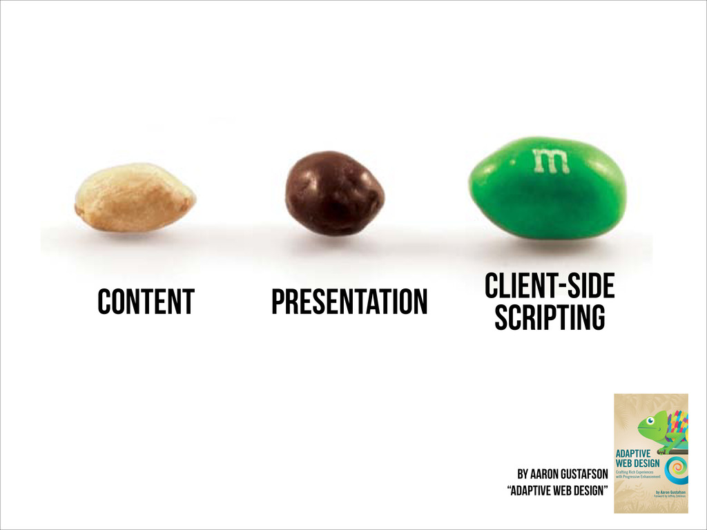
an allergy, of course). In a similar sense, the content of our website should be able to be enjoyed without embellishment. Figure 1.2: A confectionary continuum. THINK OF THE USER, NOT THE BROWSER content presentation client-side scripting by aaron gustafson “adaptive web design”
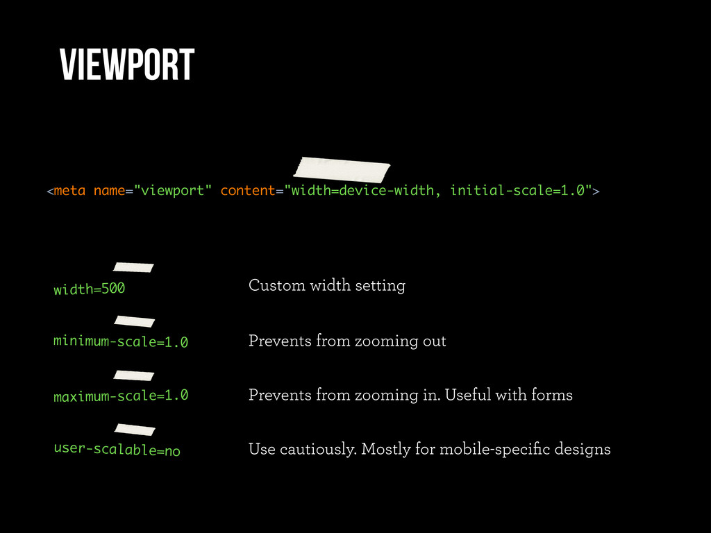
from zooming out maximum-scale=1.0 Prevents from zooming in. Useful with forms user-scalable=no Use cautiously. Mostly for mobile-specific designs viewport
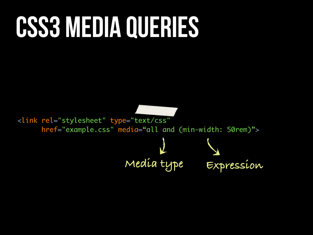
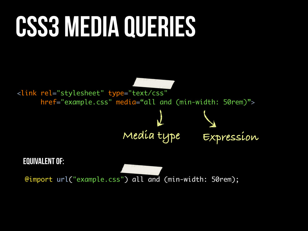
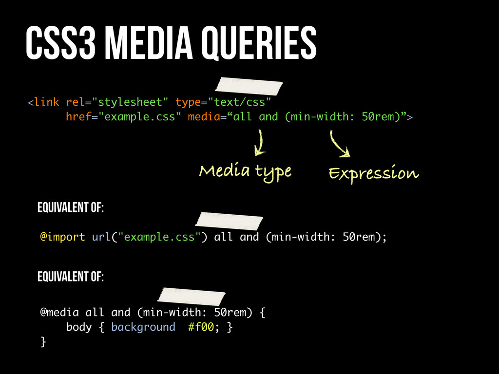
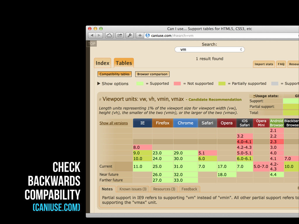
50rem)”> Media type Expression @import url("example.css") all and (min-width: 50rem); Equivalent of: @media all and (min-width: 50rem) { body { background: #f00; } } Equivalent of:
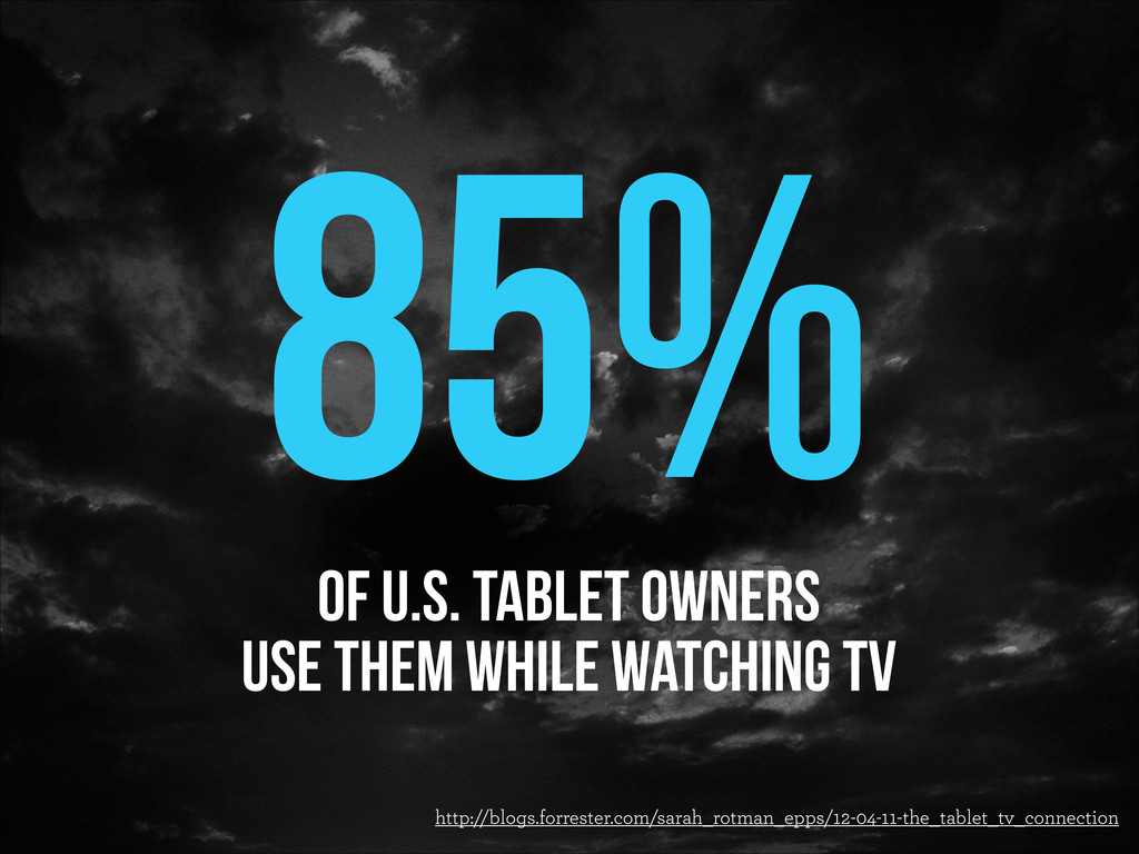
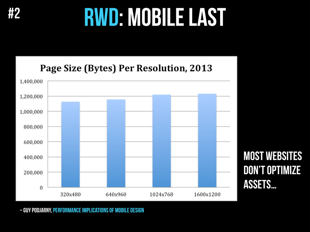
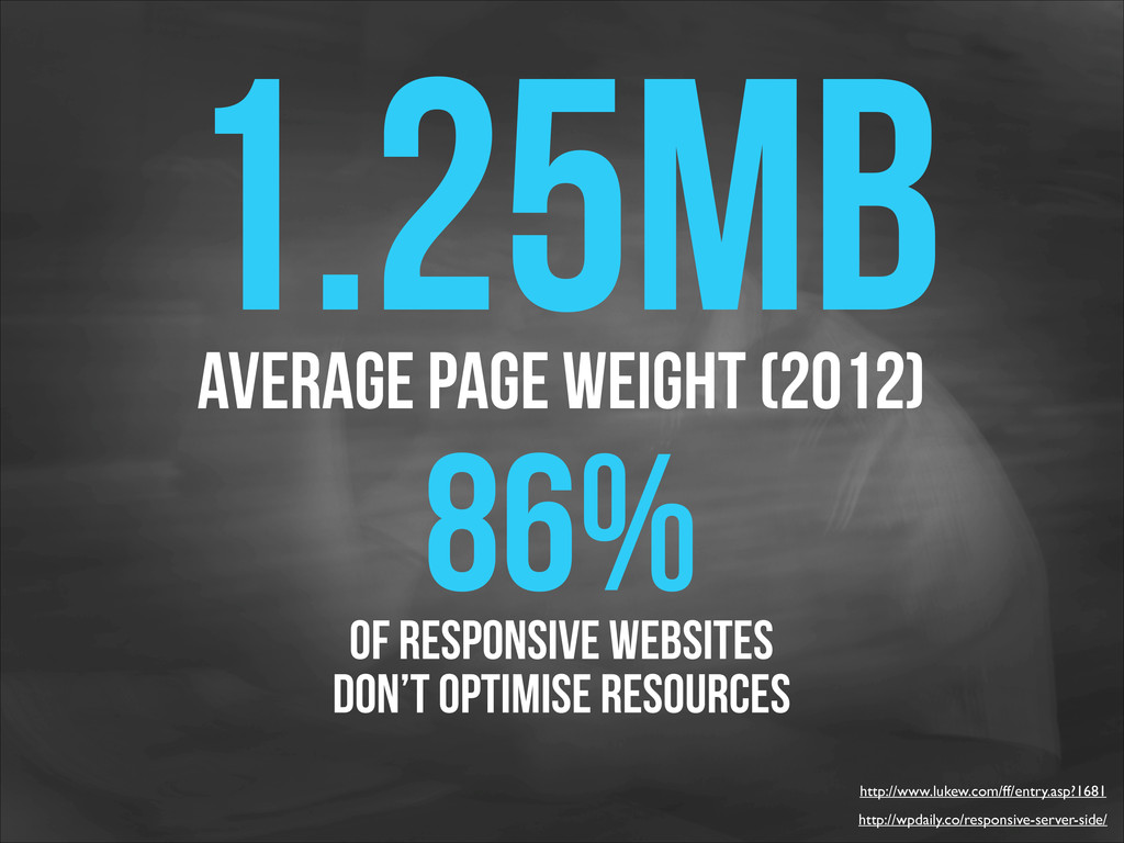
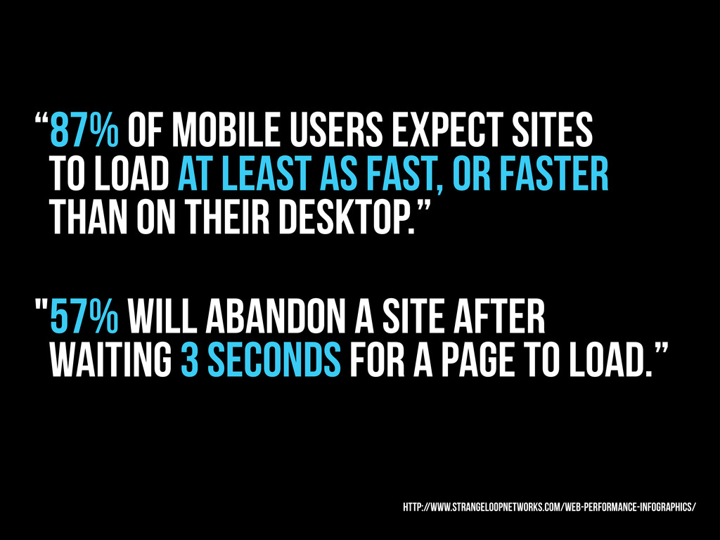
as fast, or faster than on their desktop.” "57% will abandon a site after waiting 3 seconds for a page to load.” http://www.strangeloopnetworks.com/web-performance-infographics/
 wzajac
 supurazako
 slashnephy
 iidatakuma
 utilforever
 jame2408
 rkaga
rkaga
 thasu0123
 rollbear
 pizzacat83
 sushichan044
 kuranuki
 ryugen04
 sarafernandez
 marktimemedia
 sachag
 sabderemane
 nwiizo
 techseoconnect
 apolaine
 akademiya2063
 eileencodes
 samanthasiow
 jacobian
 tomoyanonymous