Upgrade to Pro — share decks privately, control downloads, hide ads and more …

Design system - From a Developer Point-of-View

Yael Balla
April 04, 2019
190

Design system - From a Developer Point-of-View

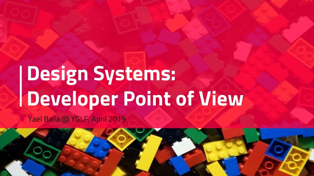
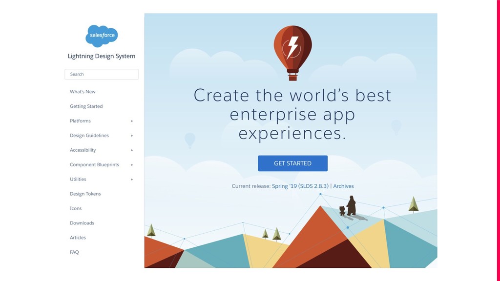
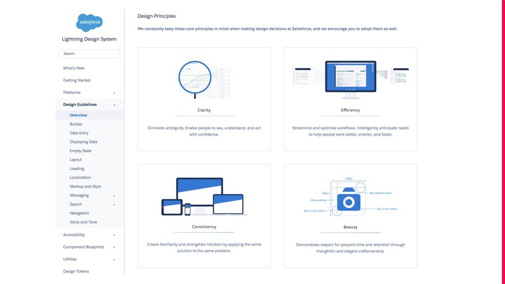
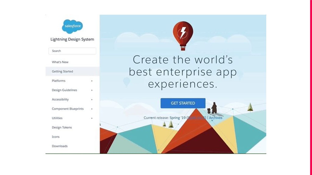
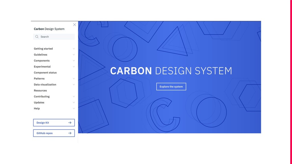
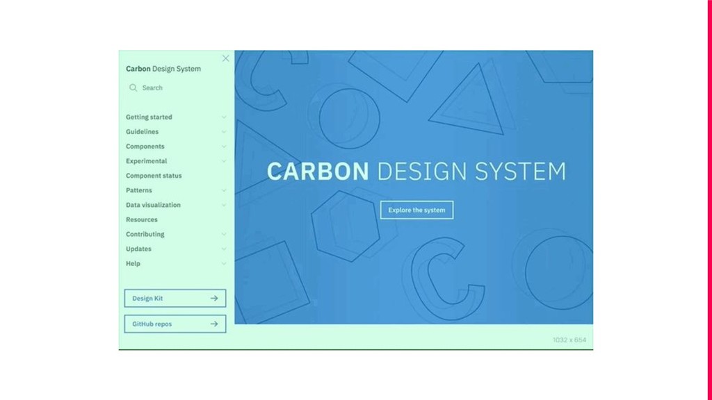
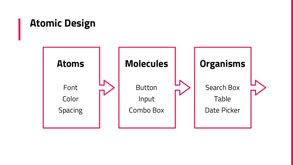
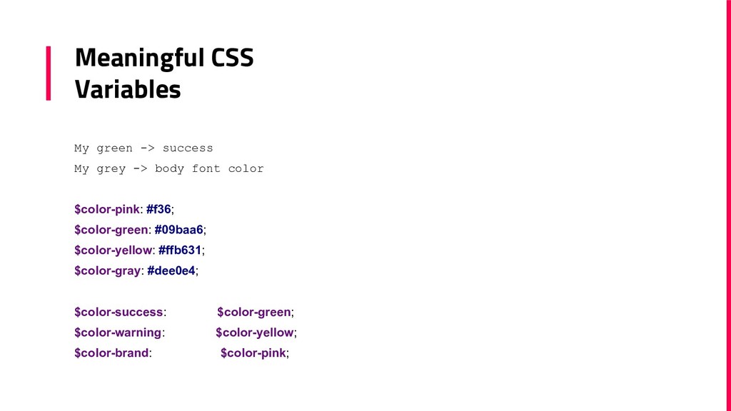
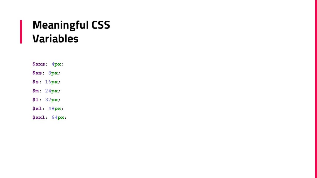
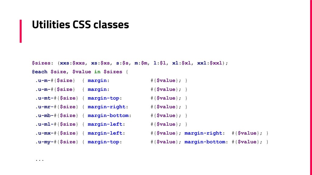
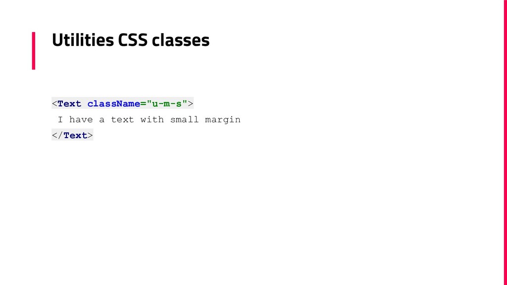
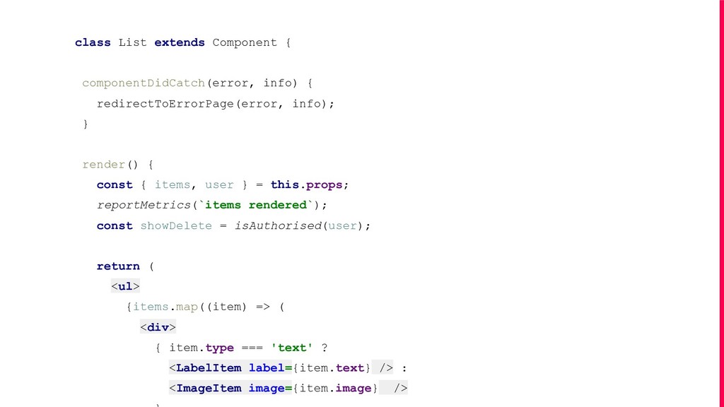
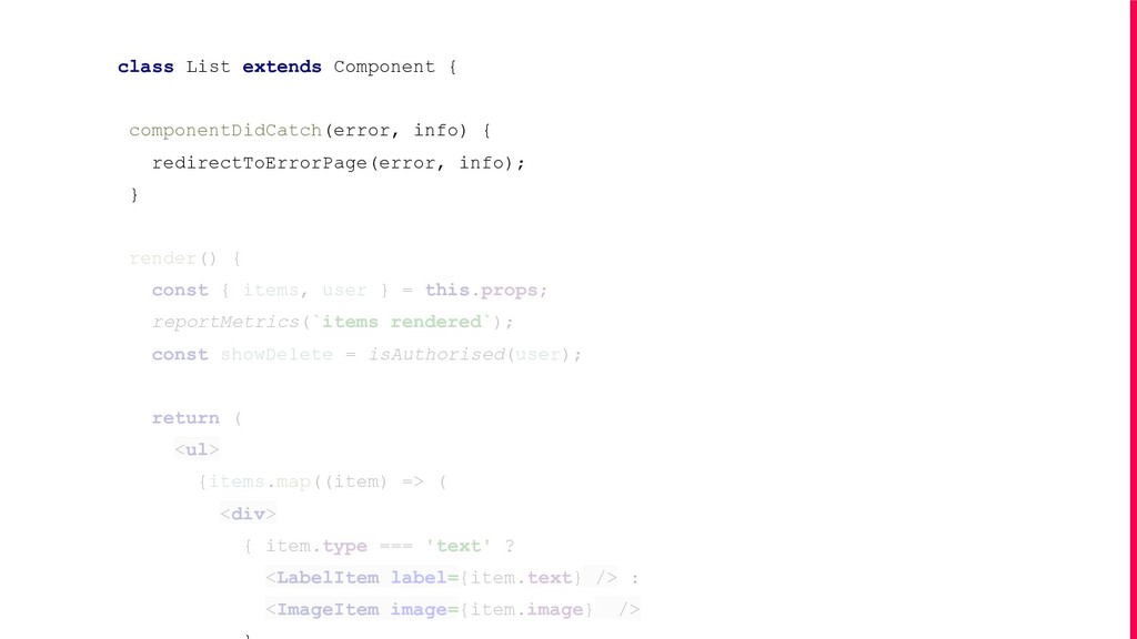
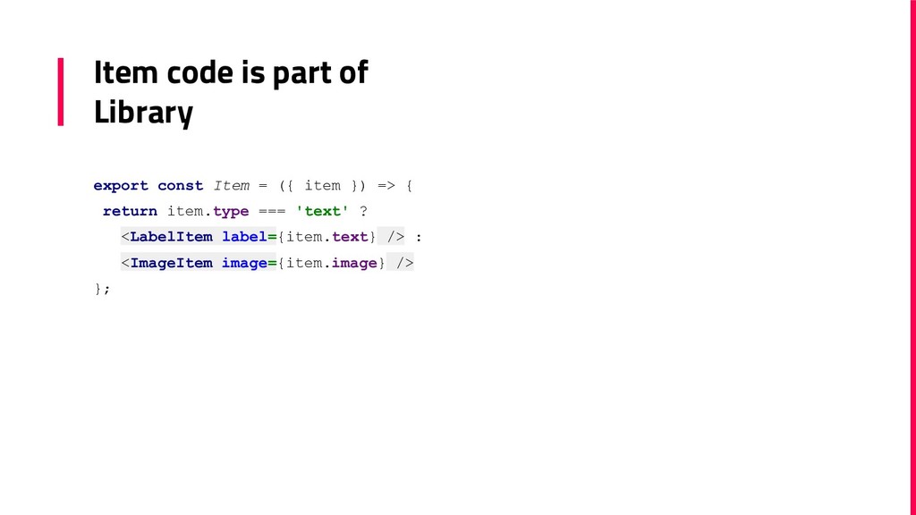
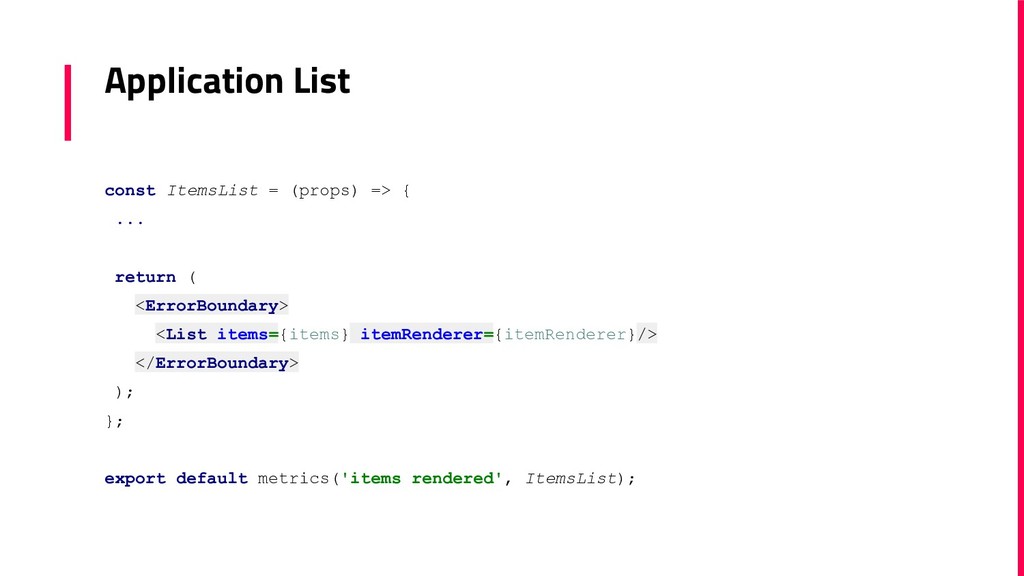
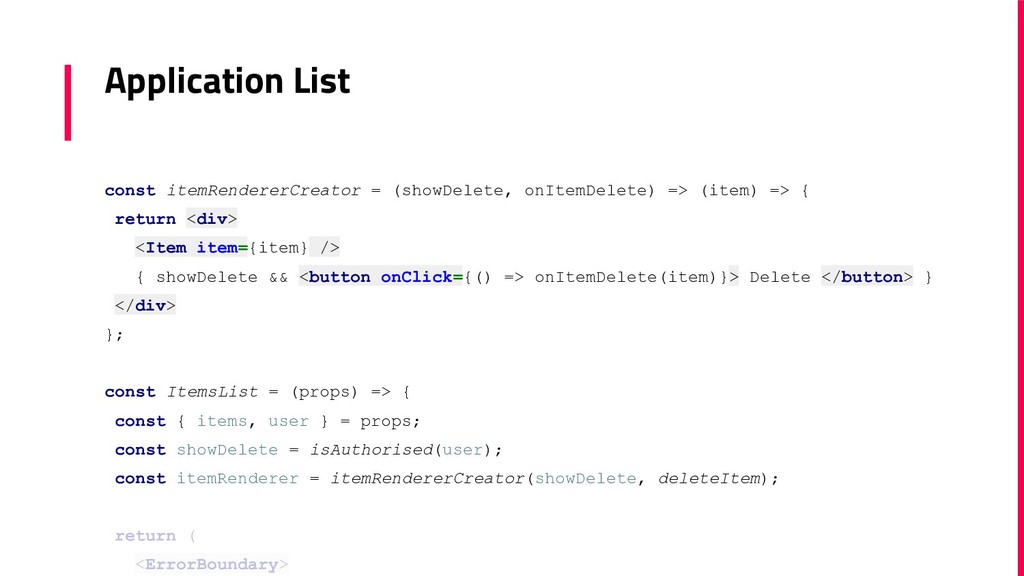
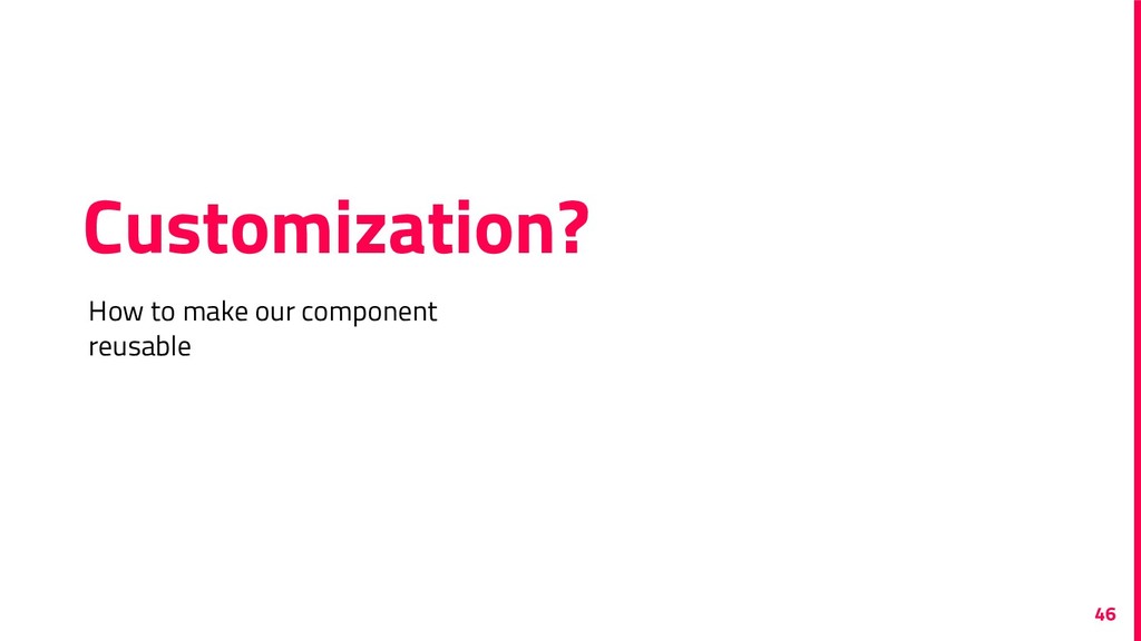
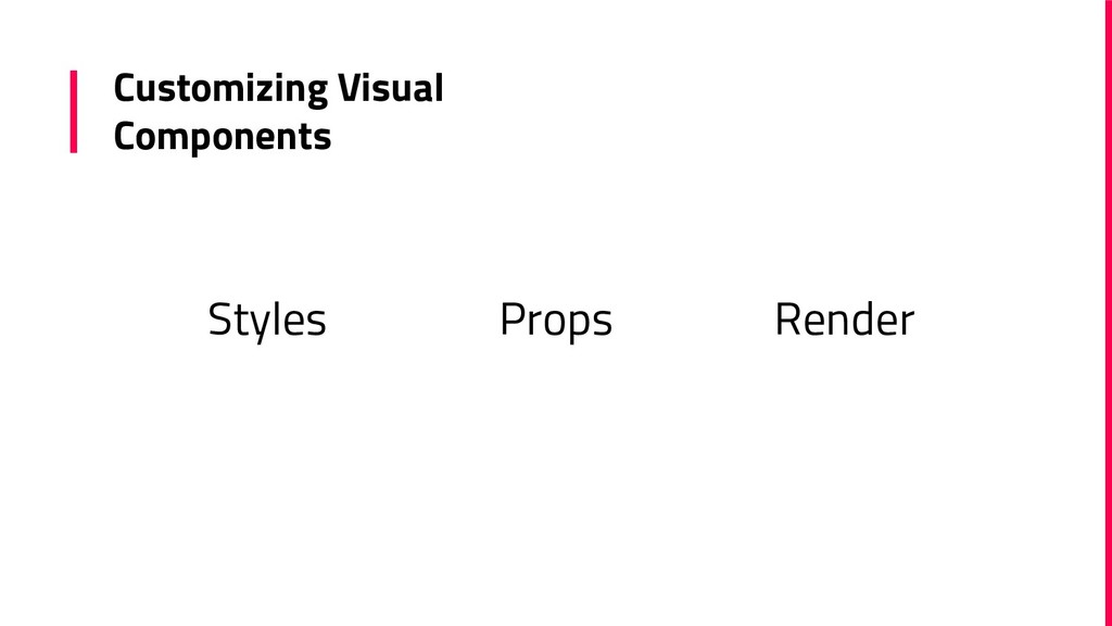
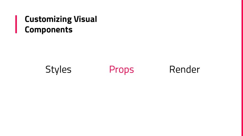
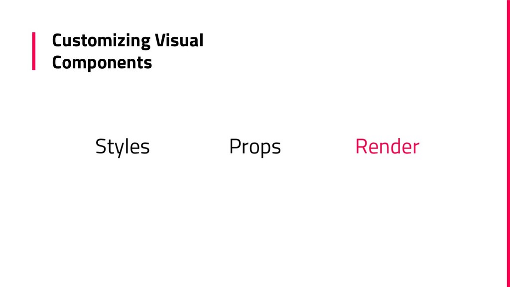
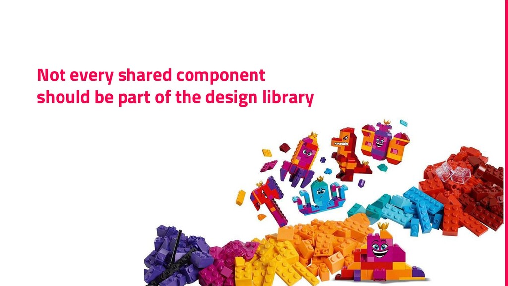
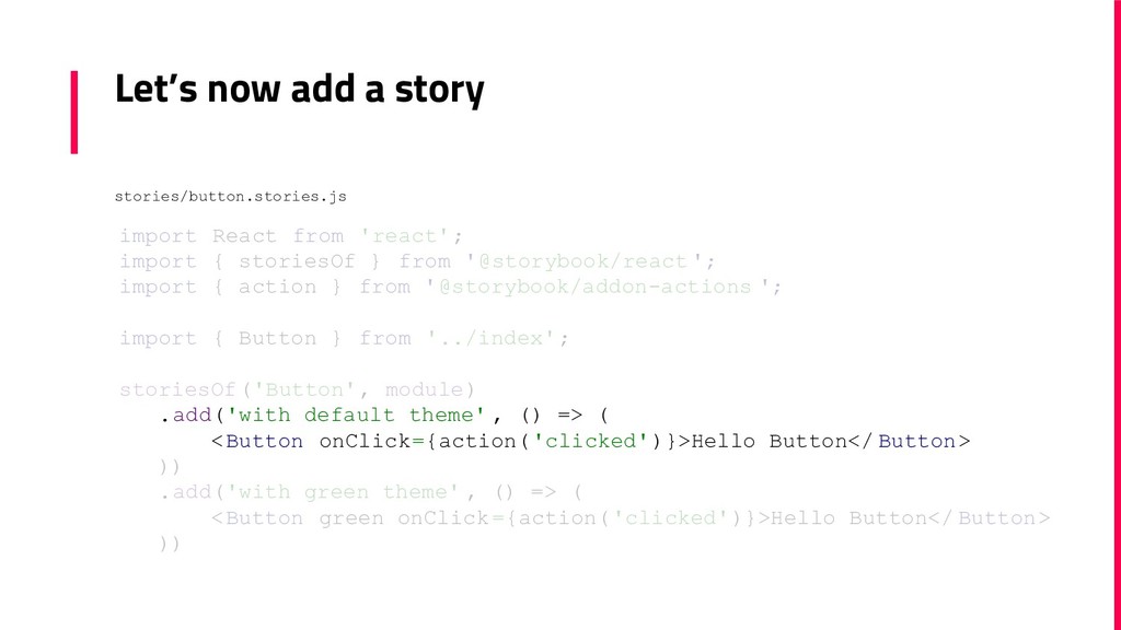
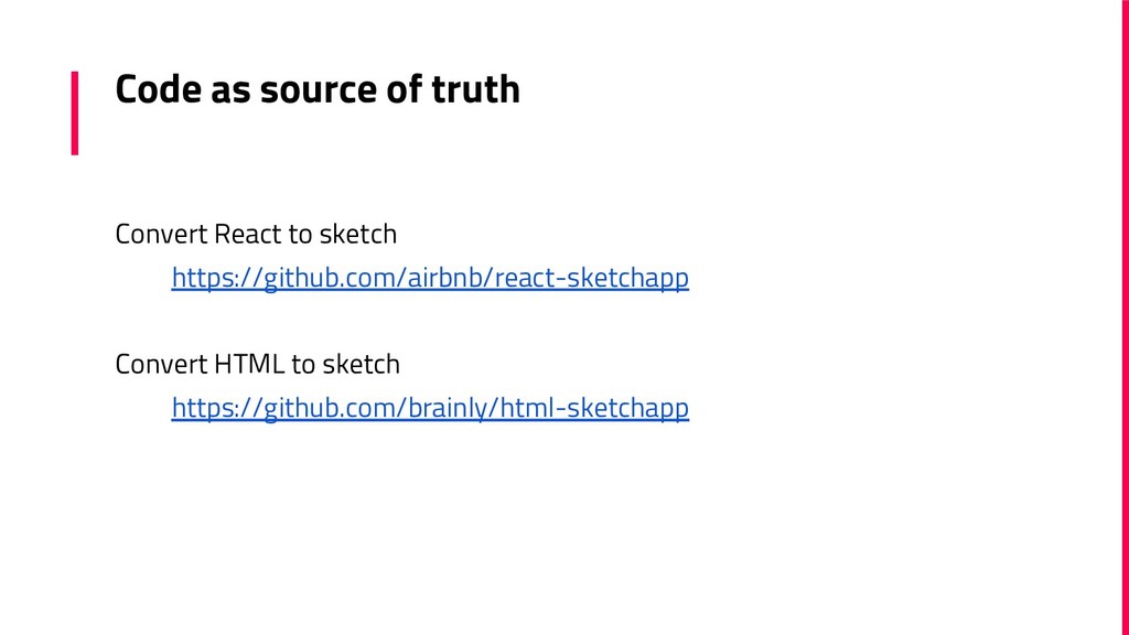
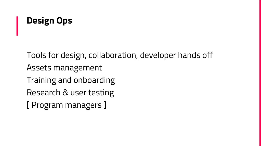
Design Systems is something every UX team is working on, planning to work on, or at least is talking about. But what does it mean for a developer to implement a new design system for the company products? Is it also better for the developer? In the talk I will share my experience with implementing a design system. How to share design tokens in the organization? How to create a component library and separate the visual layer from business logic? How do you keep sync between design and code? In this talk I will answer these questions, using code examples and relevant tools.

Presented in YGLF confrence, April 2019

Yael Balla

April 04, 2019
Tweet

Transcript

  1. Hello! I am Yael Balla You can find me at

    [email protected] www.linkedin.com/in/yael-oshri-balla-6b56686 2
  2. “ the complete set of design standards, documentation, and principles

    along with the toolkit (UI patterns and code components) to achieve those standards 6
  3. Design Systems Examples ▪ Salesforce - Lightning ▪ IBM -

    Carbon ▪ Google - Material Design ▪ Shopify - Polaris And many others… https://designsystemsrepo.com/design-systems/ 8
  4. “ Before this ... Designers and developers were trying their

    best to make good decisions about which components or patterns to use, but their main reference point was the existing product — which was decidedly inconsistent. Giorgio Lefeber, Xebia Studio
  5. Atomic Design Atoms Font Color Spacing Molecules Button Input Combo

    Box Organisms Search Box Table Date Picker
  6. Meaningful CSS Variables My green -> success My grey ->

    body font color $color-pink: #f36; $color-green: #09baa6; $color-yellow: #ffb631; $color-gray: #dee0e4; $color-success: $color-green; $color-warning: $color-yellow; $color-brand: $color-pink;
  7. Meaningful CSS Variables $xxs: 4px; $xs: 8px; $s: 16px; $m:

    24px; $l: 32px; $xl: 48px; $xxl: 64px;
  8. Utilities CSS classes $sizes: (xxs:$xxs, xs:$xs, s:$s, m:$m, l:$l, xl:$xl,

    xxl:$xxl); @each $size, $value in $sizes { .u-m-#{$size} { margin: #{$value}; } .u-m-#{$size} { margin: #{$value}; } .u-mt-#{$size} { margin-top: #{$value}; } .u-mr-#{$size} { margin-right: #{$value}; } .u-mb-#{$size} { margin-bottom: #{$value}; } .u-ml-#{$size} { margin-left: #{$value}; } .u-mx-#{$size} { margin-left: #{$value}; margin-right: #{$value}; } .u-my-#{$size} { margin-top: #{$value}; margin-bottom: #{$value}; } ...
  9. What is the best way to define these variables? It

    doesn’t matter - any technique that works for you ▪ CSS-in-JS ▪ SASS Variables ▪ React Components (like <Padded/>, <Title/>)
  10. class List extends Component { componentDidCatch(error, info) { redirectToErrorPage(error, info);

    } render() { const { items, user } = this.props; reportMetrics(`items rendered`); const showDelete = isAuthorised(user); return ( <ul> {items.map((item) => ( <div> { item.type === 'text' ? <LabelItem label={item.text} /> : <ImageItem image={item.image} />
  11. class List extends Component { componentDidCatch(error, info) { redirectToErrorPage(error, info);

    } render() { const { items, user } = this.props; reportMetrics(`items rendered`); const showDelete = isAuthorised(user); return ( <ul> {items.map((item) => ( <div> { item.type === 'text' ? <LabelItem label={item.text} /> : <ImageItem image={item.image} />
  12. class List extends Component { componentDidCatch(error, info) { redirectToErrorPage(error, info);

    } render() { const { items, user } = this.props; reportMetrics(`items rendered`); const showDelete = isAuthorised(user); return ( <ul> {items.map((item) => ( <div> { item.type === 'text' ? <LabelItem label={item.text} /> : <ImageItem image={item.image} />
  13. class List extends Component { componentDidCatch(error, info) { redirectToErrorPage(error, info);

    } render() { const { items, user } = this.props; reportMetrics(`items rendered`); const showDelete = isAuthorised(user); return ( <ul> {items.map((item) => ( <div> { item.type === 'text' ? <LabelItem label={item.text} /> : <ImageItem image={item.image} />
  14. class List extends Component { ... render() { ... return

    ( <ul> {items.map((item) => ( <div> { item.type === 'text' ? <LabelItem label={item.text} /> : <ImageItem image={item.image} /> } { showDelete && <button onClick={() => deleteItem(item)}> Delete </button> } </div> ))} </ul> )
  15. class List extends Component { ... render() { ... return

    ( <ul> {items.map((item) => ( <div> { item.type === 'text' ? <LabelItem label={item.text} /> : <ImageItem image={item.image} /> } { showDelete && <button onClick={() => deleteItem(item)}> Delete </button> } </div> ))} </ul> )
  16. class List extends Component { ... render() { ... return

    ( <ul> {items.map((item) => ( <div> { item.type === 'text' ? <LabelItem label={item.text} /> : <ImageItem image={item.image} /> } { showDelete && <button onClick={() => deleteItem(item)}> Delete </button> } </div> ))} </ul> )
  17. import React, { Component } from 'react'; import redirectToErrorPage from

    "./errors" class ErrorBoundary extends Component { componentDidCatch(error, info) { redirectToErrorPage(error, info); } render() { return this.props.children; } } ErrorBoundary Parent Component
  18. const metrics = (metric, WrappedComponent) => class MetricReport extends Component

    { render() { reportMetrics(metric); return <WrappedComponent {...this.props} />; } }; Metrics Higher Order Component
  19. class List extends Component { render() { const { items,

    itemRenderer } = this.props; return ( <ul> {items.map((item, index) => itemRenderer(item, index))} </ul> ) } } export default List; Render Props
  20. export const Item = ({ item }) => { return

    item.type === 'text' ? <LabelItem label={item.text} /> : <ImageItem image={item.image} /> }; Item code is part of Library
  21. Application List const ItemsList = (props) => { ... return

    ( <ErrorBoundary> <List items={items} itemRenderer={itemRenderer}/> </ErrorBoundary> ); }; export default metrics('items rendered', ItemsList);
  22. Application List const itemRendererCreator = (showDelete, onItemDelete) => (item) =>

    { return <div> <Item item={item} /> { showDelete && <button onClick={() => onItemDelete(item)}> Delete </button> } </div> }; const ItemsList = (props) => { const { items, user } = props; const showDelete = isAuthorised(user); const itemRenderer = itemRendererCreator(showDelete, deleteItem); return ( <ErrorBoundary>
  23. webpack.config.js module.exports = { … output: { path: path.resolve(__dirname, './dist/lib'),

    filename: 'index.js', library: 'MyDesignSystem', libraryTarget: 'commonjs' },
  24. webpack.config.js module.exports = { … output: { path: path.resolve(__dirname, './dist/lib'),

    filename: 'index.js', library: 'MyDesignSystem', libraryTarget: 'commonjs' },
  25. Version Management with semantic-release package, releases are handled by commit

    messages. Examples: “fix(button): change over color“ => Patch Release “major(button): change property name“ => Major Release And you can also integrate it into your CI...
  26. If a tree falls in a forest and no one

    is around to hear it, does it make a sound?
  27. Website A simple static website that includes: - Design Principles

    - What resources provided - Real live components
  28. Storybook is a UI component development environment Allows you to

    define ‘stories’ for your components Generate static website with live components
  29. Static Site Script to publish storybook as a static site

    is already added to your project "scripts": { … "build-storybook" : "build-storybook" }, package.json
  30. What is a story? Each story represent one state But

    it is all up to you ▪ Render one component ▪ Combine few states for comparison ▪ Build a form
  31. Let’s now add a story import React from 'react'; import

    { storiesOf } from '@storybook/react '; import { action } from '@storybook/addon-actions '; import { Button } from '../index'; storiesOf('Button', module) .add('with default theme and some text' , () => ( <Button onClick={action('clicked')}>Hello Button</ Button> )) .add('with green theme' , () => ( <Button green onClick={action('clicked')}>Hello Button</ Button> )) stories/button.stories.js
  32. Let’s now add a story import React from 'react'; import

    { storiesOf } from '@storybook/react '; import { action } from '@storybook/addon-actions '; import { Button } from '../index'; storiesOf('Button', module) .add('with default theme' , () => ( <Button onClick={action('clicked')}>Hello Button</ Button> )) .add('with green theme' , () => ( <Button green onClick={action('clicked')}>Hello Button</ Button> )) stories/button.stories.js
  33. Default is nice but ... By default Storybook arrive very

    thin. To add functionality need to enable some add-ons
  34. Recommended Add-on Info - generate readme for each component Knobs

    - allow the user to edit in live mode Options - control the storybook default UI settings
  35. Code as source of truth Convert React to sketch https://github.com/airbnb/react-sketchapp

    Convert HTML to sketch https://github.com/brainly/html-sketchapp
  36. Design Ops Tools for design, collaboration, developer hands off Assets

    management Training and onboarding Research & user testing [ Program managers ]
  37. Useful links ▪ Design Systems: ▫ https://www.carbondesignsystem.com ▫ https://www.lightningdesignsystem.com ▫

    https://material.io/design/introduction/# ▪ Extra reading: ▫ https://uxdesign.cc/can-design-systems-fix-the-relationship-between-designers-developers-eb12fc9329ab ▫ https://medium.com/@nthgergo/lessons-learned-from-working-on-a-design-system-as-an-engineering-mana ger-2f199cd4aac2 ▫ http://bradfrost.com/blog/post/atomic-web-design/ ▫ https://www.designbetter.co/design-systems-handbook/introducing-design-systems ▫ https://medium.com/amplify-design/operationalizing-design-operations-7846a23bc99b 82