Upgrade to Pro — share decks privately, control downloads, hide ads and more …

Visualizing Patterns in Rating Data

Visualizing Patterns in Rating Data

Avatar for zgalant

zgalant

March 19, 2012
Tweet

Other Decks in Programming

Transcript

  1. Visualizing Patterns in Ratings Data Jeremy Keeshin [email protected] Zach Galant

    [email protected] December 15, 2011 1 Introduction We have been building a website for the past half a year called Raunk.com. Raunk is a website where users can rate any items on a scale from 0 to 10, and from those ratings, users can create lists. Items can have different ratings in different lists, and items are also associated with a set of descriptive and orga- nizational tags. The site has about 65,000 ratings, and the goal of our project is to create a novel way to explore and discover patterns in ratings data be- tween users. The scope of our project was to create a few specific visualizations that are optimized for certain comparison tasks, and also to create a new interaction technique which allows you to create a list by assigning an absolute number to items, while also being able to manipulate the list in an interac- tive way. 2 Related Work There has been almost no related academic work in the area of visualizing ratings data or creating lists that we were able to find. We searched across the web to find existing points of comparison, and were able to find only extremely simplistic public views to explore rating data. In general, this data is pre- sented on websites as an average rating, or possibly a single histogram is shown to display the distribu- tion of the data (for example on Amazon.com and Yelp.com). There was no previous example of a tool to allow for comparisons between ratings data for different users. In terms of existing work in creating lists, the most common method is to allow for dragging to reorder the list. We only found one example of ratings that give both an absolute measure but also allow you to consider the relative placement in the list. Figure 1: http://blog.steepster.com/post/226679106/better- rating-system This was on Steepster.com, a tea rating website. They let you drag a slider to rate items, but also on the slider display tick marks of previous items you have rated to get a relative sense. 3 Methods We created three types of visualizations for our project, and one new technique. Relative List Creation on an Absolute Scale The main goal of the project is visualizing ratings, but an important and complementary goal was to create a new technique which allows users to create absolute ratings on items while they place it in a relative list. This idea has never been done before as far as we know, so we attempted to create a new system to allow for this interaction. The goal was to have the user rate an item on an absolute scale, from 0-10, because this is the infor- mation we are most interested in for aggregating 1
  2. Figure 2: An example of the main list view presented

    to users, with sliders to order the items the data. However, users naturally want to cre- ate lists in a relative manner. But in creating an only relative list, much of the information is lost. If you have a list of your one hundred top movies, how much better do you like the tenth than the fifteenth? This varies a lot by person, and while the entire 0-10 rating scale is subjective, we can still find out an objective metric by assigning a rat- ing. The notion of rating objects and the notion of ranking objects are both related and very common, but we want to create an interface where both can be done easily. Keeping in mind that the main consideration by users is the relative ordering, we designed the sys- tem with that idea as the foundation. Therefore, as you rate an item, you are simultaneously ranking it. As you drag the slider from 0-10, the item finds its proper place in the list. This immediate update helps users to position it in the intuitive relative position, but also assigns it the absolute number. When you start to drag the slider, that item pops out of the list and the rest of the list moves around Figure 3: When a slider is selected, other information is cleared from the display, and the current item is high- lighted. The list moves into place around the item as the rating changes. it. Although dragging may be more natural, this 2
  3. interface is entirely new and was picked up easily by

    new users, and recovers much more information. Grid Style List Comparison Raunk lets you see rankings according to your friends, and this visualizations goal is to give in- sight on how these rankings were calculated. You can visit the compare grid for any list on Raunk, and you can select up to 5 users who have made the list. It shows you the top 10 items in the list according to the average of the ratings of the users you selected. If you add or remove a user, it will recalculate the ratings based on the change. Figure 4: The list is now sorted according to all of the people contributing to it. Additionally, it shows you the exact ratings on the top items by each of the users. This lets you get a sense of why the top items made the top ten. You can spot outliers easily, if there are any ratings in the grid that are low. For example, in the figure above, Jeremy only rated The Graduate a 7.6, but it still made the top 10 because of the high ratings of the other people in the list. Figure 5: The list is now sorted according to the high- lighted user. The grid also allows you to sort by one specific user by clicking that users picture. It will then display the top 10 items according to that user. The rest of the grid is filled out with the other users ratings on those items, which may be different from the top items according to the group. You can also hover over a bold rating to see a note that the user wrote about that rating. In general, this is a good visualization for directly comparing a few users among a few items. Two Item Comparison Across Multiple Users The Raunk Faceoff allows you to compare ratings on items among many users at once. You select two items, and it creates a graph with one of the items on the X axis and the other on the Y axis. It then plots users as points. The coordinates are (User Rating of Item X, User Rating of Item Y). It plots the users using their photos, making the visualization interesting if you can spot one of your friends on the graph. There is also an option to display only your Facebook friends, so you can more easily find specific people you are interested in. It provides details on demand if you hover on a users picture by displaying the exact rating of each item and the name of the user. Figure 6: Ratings on these two items are very well correlated. The visualization is a useful exploration tool to see how your friends rated the two selected items. It is also an interesting way to spot trends, clusters, and outliers. For example, it appears that The God- 3
  4. Figure 7: Comparison between ratings on The Godfa- ther and

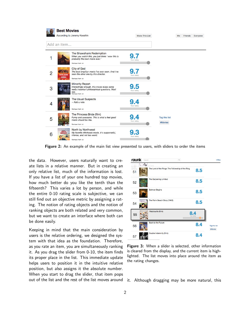
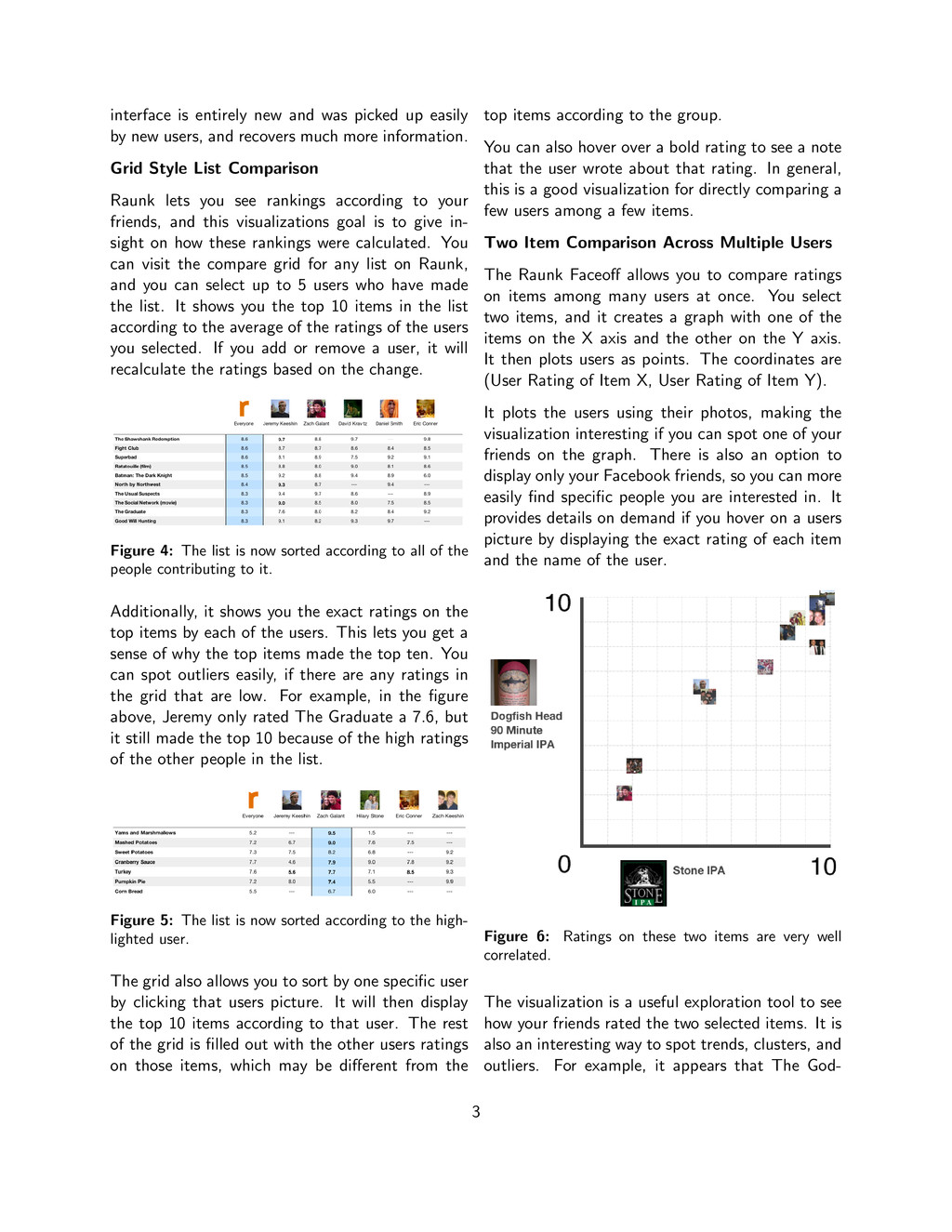
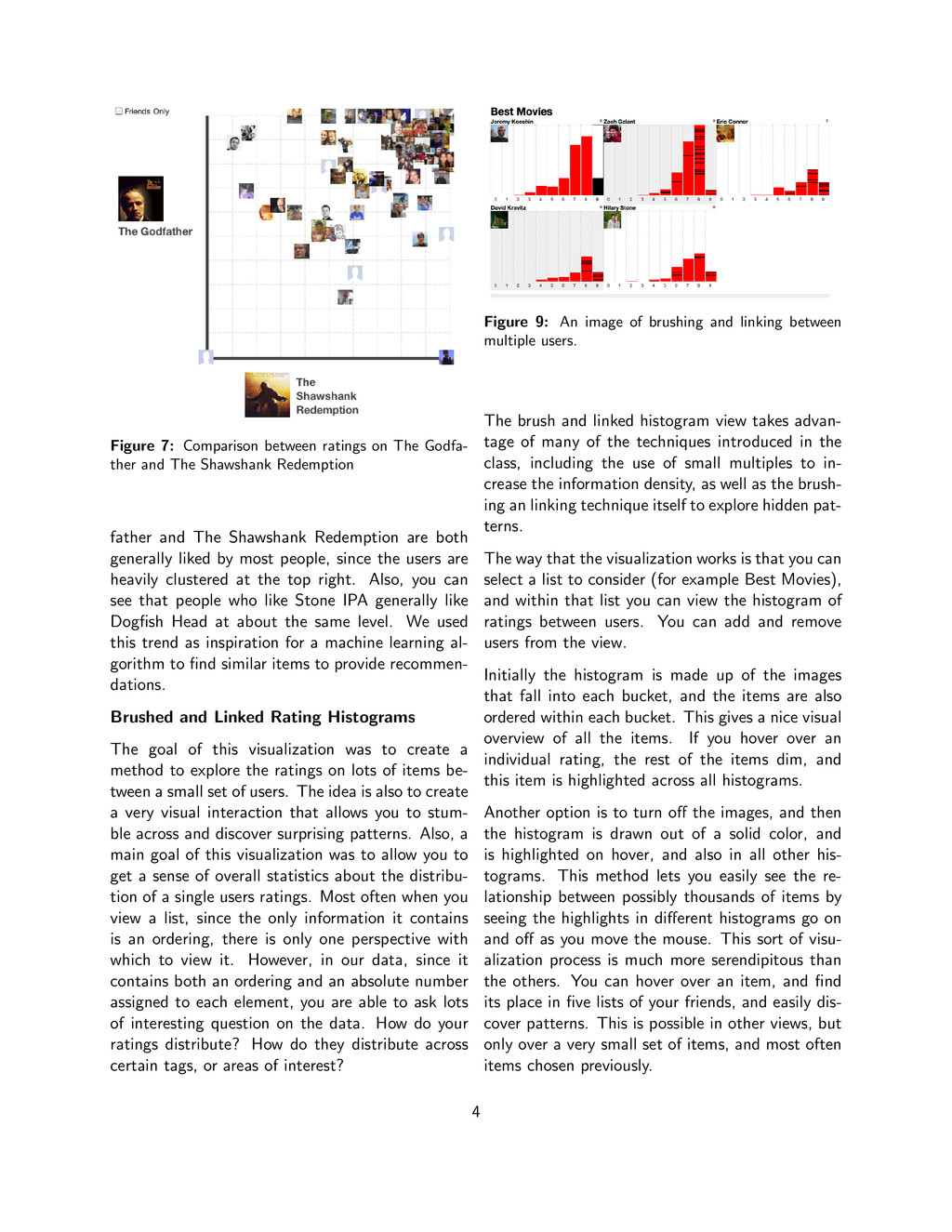
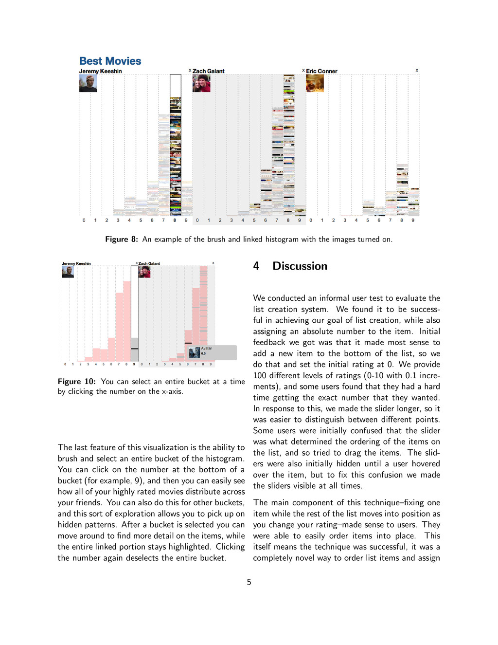
    The Shawshank Redemption father and The Shawshank Redemption are both generally liked by most people, since the users are heavily clustered at the top right. Also, you can see that people who like Stone IPA generally like Dogfish Head at about the same level. We used this trend as inspiration for a machine learning al- gorithm to find similar items to provide recommen- dations. Brushed and Linked Rating Histograms The goal of this visualization was to create a method to explore the ratings on lots of items be- tween a small set of users. The idea is also to create a very visual interaction that allows you to stum- ble across and discover surprising patterns. Also, a main goal of this visualization was to allow you to get a sense of overall statistics about the distribu- tion of a single users ratings. Most often when you view a list, since the only information it contains is an ordering, there is only one perspective with which to view it. However, in our data, since it contains both an ordering and an absolute number assigned to each element, you are able to ask lots of interesting question on the data. How do your ratings distribute? How do they distribute across certain tags, or areas of interest? Figure 9: An image of brushing and linking between multiple users. The brush and linked histogram view takes advan- tage of many of the techniques introduced in the class, including the use of small multiples to in- crease the information density, as well as the brush- ing an linking technique itself to explore hidden pat- terns. The way that the visualization works is that you can select a list to consider (for example Best Movies), and within that list you can view the histogram of ratings between users. You can add and remove users from the view. Initially the histogram is made up of the images that fall into each bucket, and the items are also ordered within each bucket. This gives a nice visual overview of all the items. If you hover over an individual rating, the rest of the items dim, and this item is highlighted across all histograms. Another option is to turn off the images, and then the histogram is drawn out of a solid color, and is highlighted on hover, and also in all other his- tograms. This method lets you easily see the re- lationship between possibly thousands of items by seeing the highlights in different histograms go on and off as you move the mouse. This sort of visu- alization process is much more serendipitous than the others. You can hover over an item, and find its place in five lists of your friends, and easily dis- cover patterns. This is possible in other views, but only over a very small set of items, and most often items chosen previously. 4
  5. Figure 8: An example of the brush and linked histogram

    with the images turned on. Figure 10: You can select an entire bucket at a time by clicking the number on the x-axis. The last feature of this visualization is the ability to brush and select an entire bucket of the histogram. You can click on the number at the bottom of a bucket (for example, 9), and then you can easily see how all of your highly rated movies distribute across your friends. You can also do this for other buckets, and this sort of exploration allows you to pick up on hidden patterns. After a bucket is selected you can move around to find more detail on the items, while the entire linked portion stays highlighted. Clicking the number again deselects the entire bucket. 4 Discussion We conducted an informal user test to evaluate the list creation system. We found it to be success- ful in achieving our goal of list creation, while also assigning an absolute number to the item. Initial feedback we got was that it made most sense to add a new item to the bottom of the list, so we do that and set the initial rating at 0. We provide 100 different levels of ratings (0-10 with 0.1 incre- ments), and some users found that they had a hard time getting the exact number that they wanted. In response to this, we made the slider longer, so it was easier to distinguish between different points. Some users were initially confused that the slider was what determined the ordering of the items on the list, and so tried to drag the items. The slid- ers were also initially hidden until a user hovered over the item, but to fix this confusion we made the sliders visible at all times. The main component of this technique–fixing one item while the rest of the list moves into position as you change your rating–made sense to users. They were able to easily order items into place. This itself means the technique was successful, it was a completely novel way to order list items and assign 5
  6. them an absolute score. 5 Future Work There is lots

    of room for future work in this area. As one of the main feedback points from users was that dragging should also be present, we want to search for a way to allow dragging as well but also keep assignment of absolute numbers. We could try to create a system where you would interpolate the assigned value based on its position relative to other items, and then still allow the user to modify this rating afterwards. This would also solve the problem of ordering items when they are assigned the same rating. For example, if you rate item A a 9.0 and item B a 9.0, but you still want to preserve an ordering between A and B, dragging them could create a simple ordering in addition to the slider system. To advance the linked histogram visualization, a few ideas are to allow more dynamic brushed selec- tions, possibly across histogram buckets. Other ex- tensions to this visualization would be to allow for searching, or allow for multiple selection of items (not necessarily in the same bucket). Users also commented that they wanted to see users who were most similar to them based on their ratings, and using clustering, we could try to create a better visualization of these results. For the Raunk Faceoff, viewers now have the ability to select two new items to compare, but a viewer may not know which items might be interesting or have a lot of data. One goal for the future is to give some suggestions for other faceoffs you might like on the side of the page. We can try giving suggestions based on the items you are currently viewing and the number of ratings in common they have with some other items. Also, since users log in to Raunk with Facebook, we have information about the users that we can use to create filters. Some of the filters could be gender, geographic location, or college major. We can allow for filtering of people you see on the graph based on certain filters. It could give the viewer a better sense of which types of people have certain opinions about things. For the grid style comparison, we hope to find a good way to allow you to select more users at a time. Right now, we limit it to 5 at once due to screen size constraints. Also, wed like to al- low you to select a group of people for a column. These groups could be related to the filters we dis- cussed using for the faceoff. For example, you could choose your columns to be different geographical regions, so you can get a breakdown of what peo- ple from different places think. 6