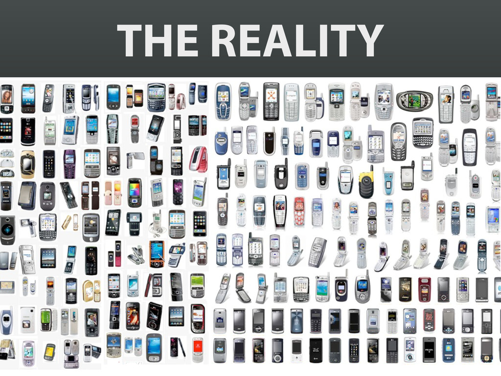
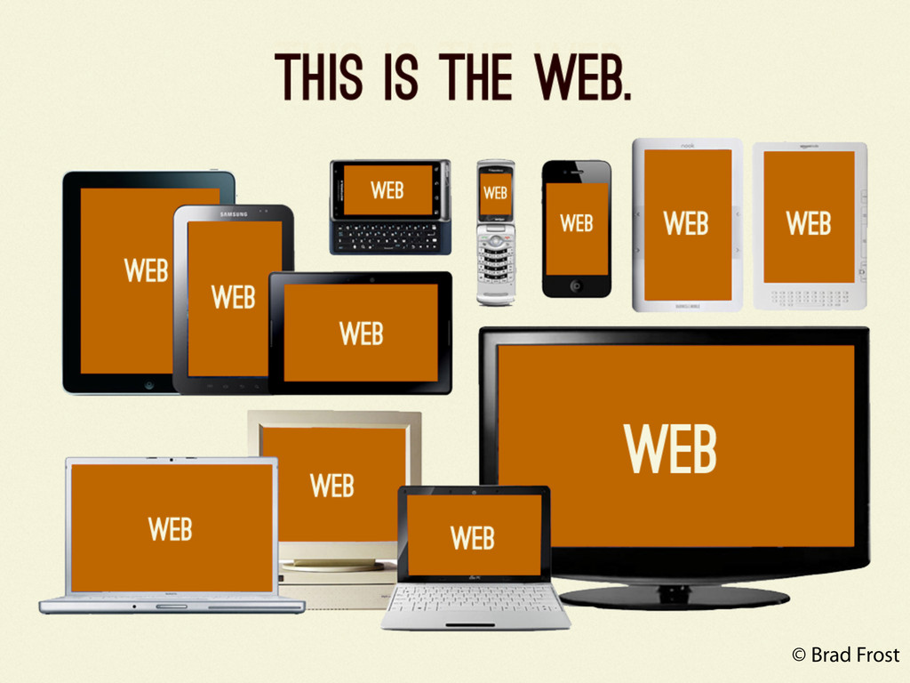
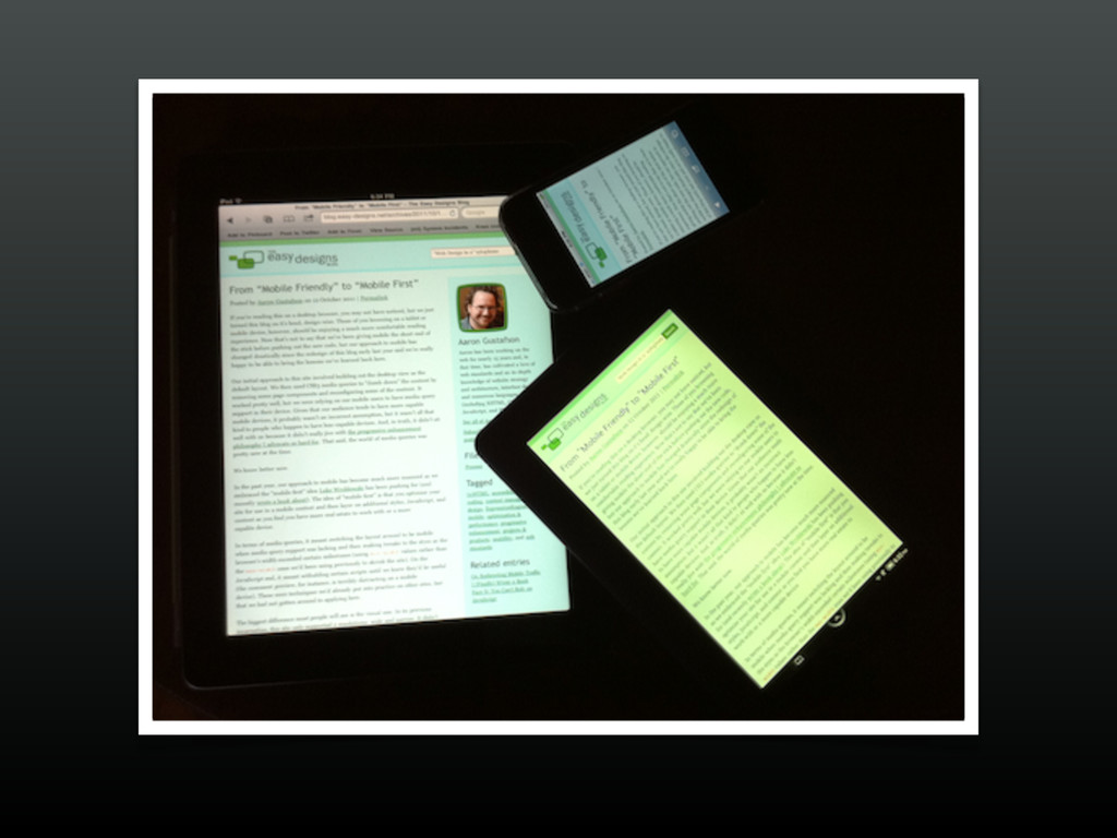
It seems like new browsers and devices are invented every day. This reality leaves us with a couple paths: ignore them but fall behind, or face ‘em head-on.
The problem is, trying to stay on top of these innovations can feel a bit like battling Sauron’s army. (And for those who don’t get the movie quip: very, very daunting.)
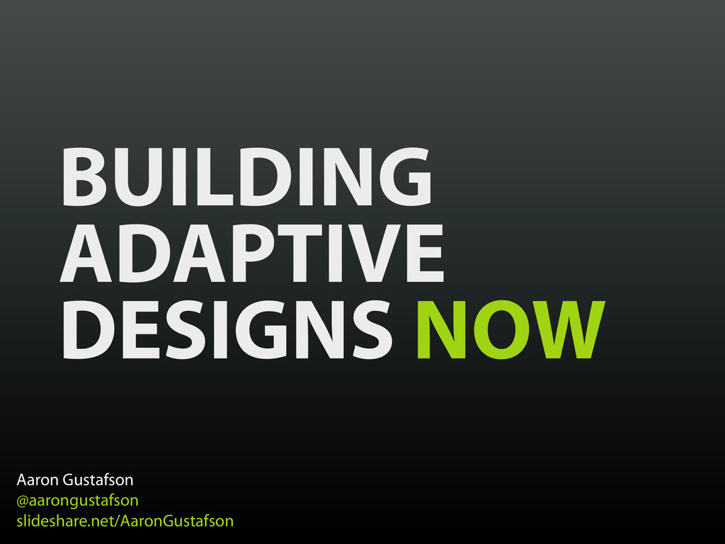
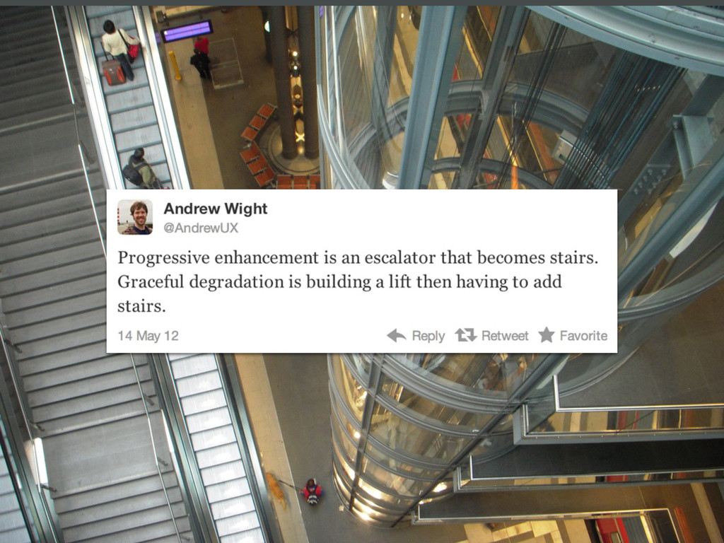
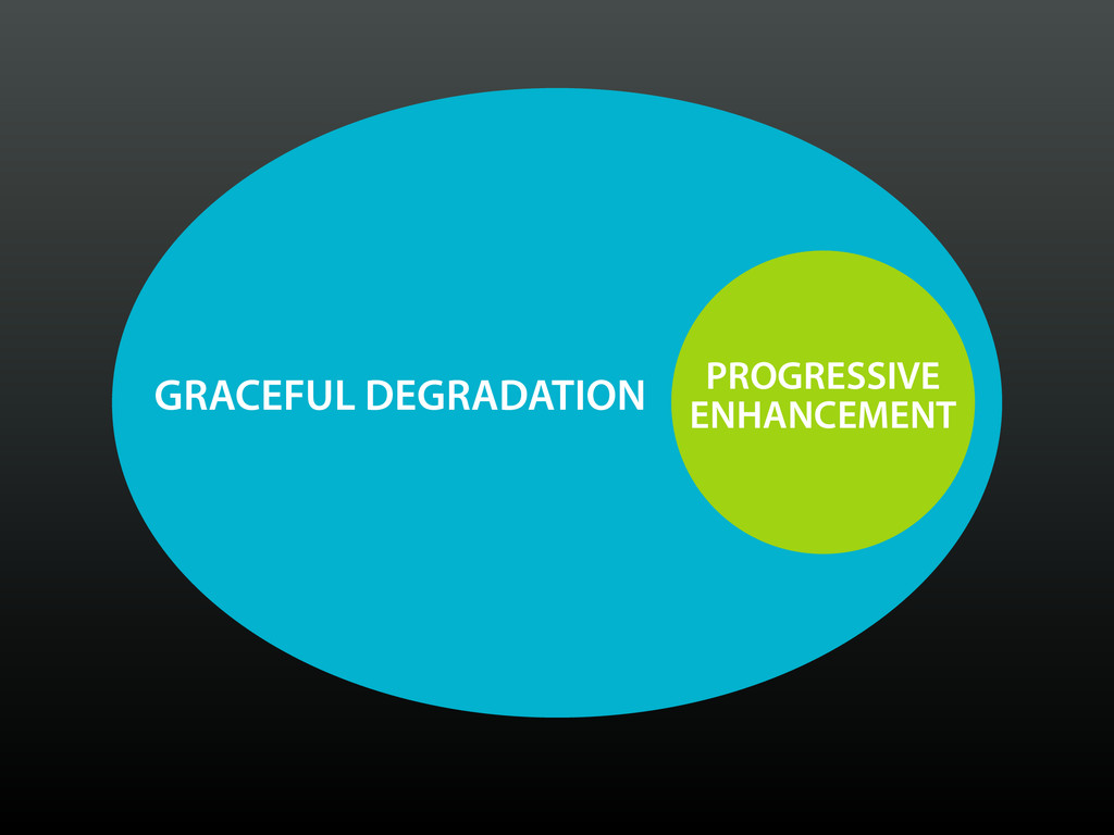
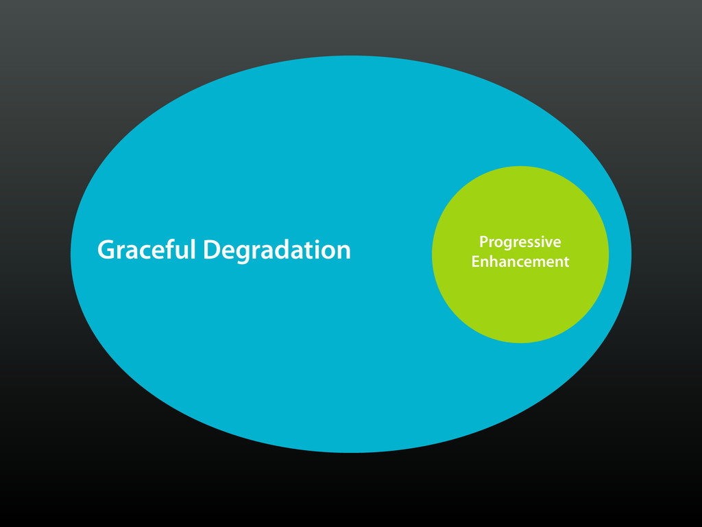
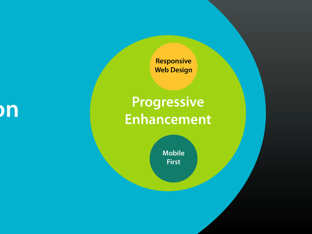
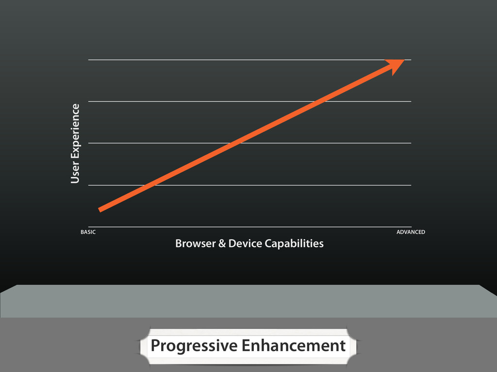
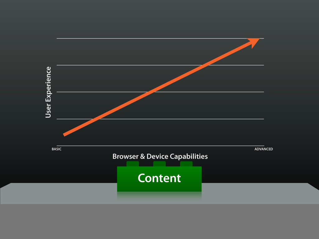
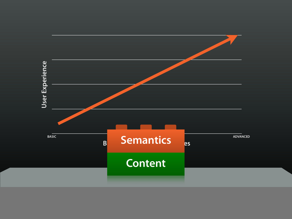
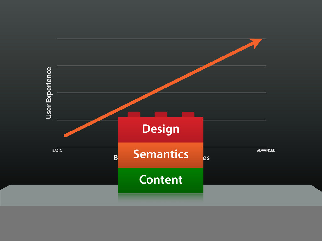
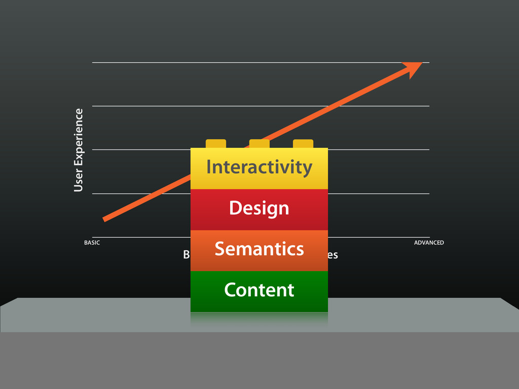
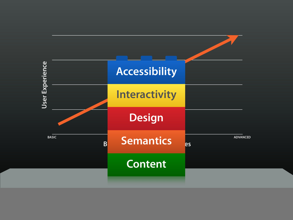
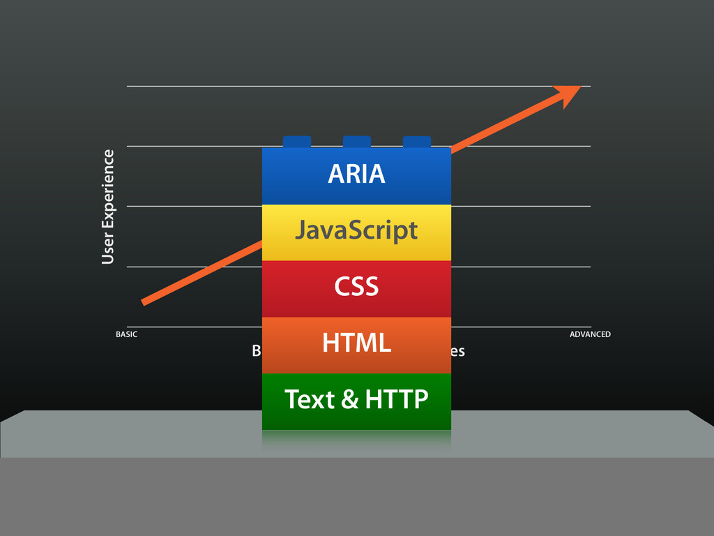
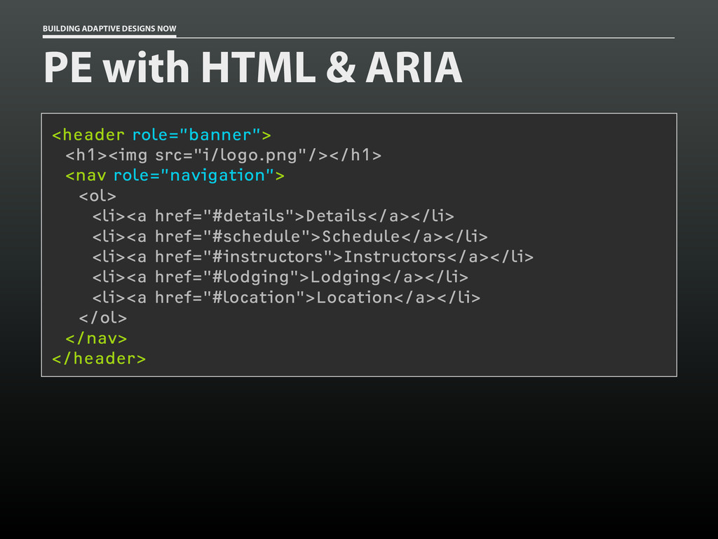
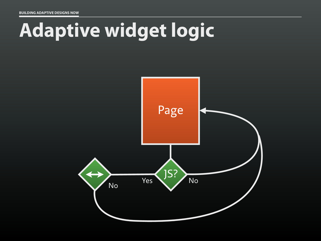
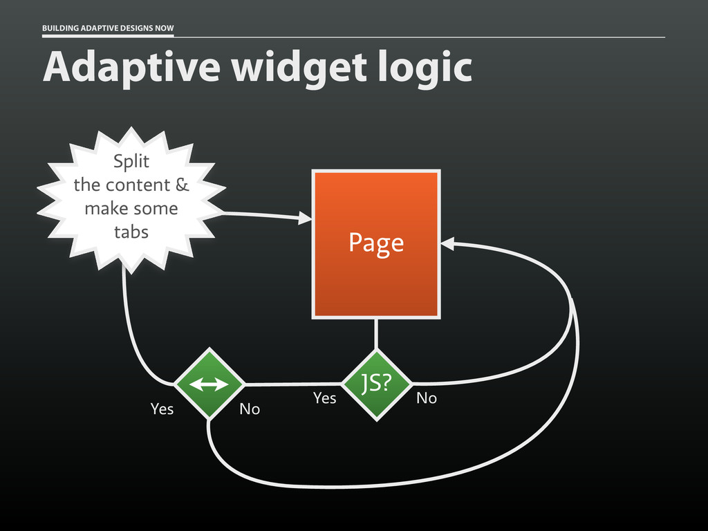
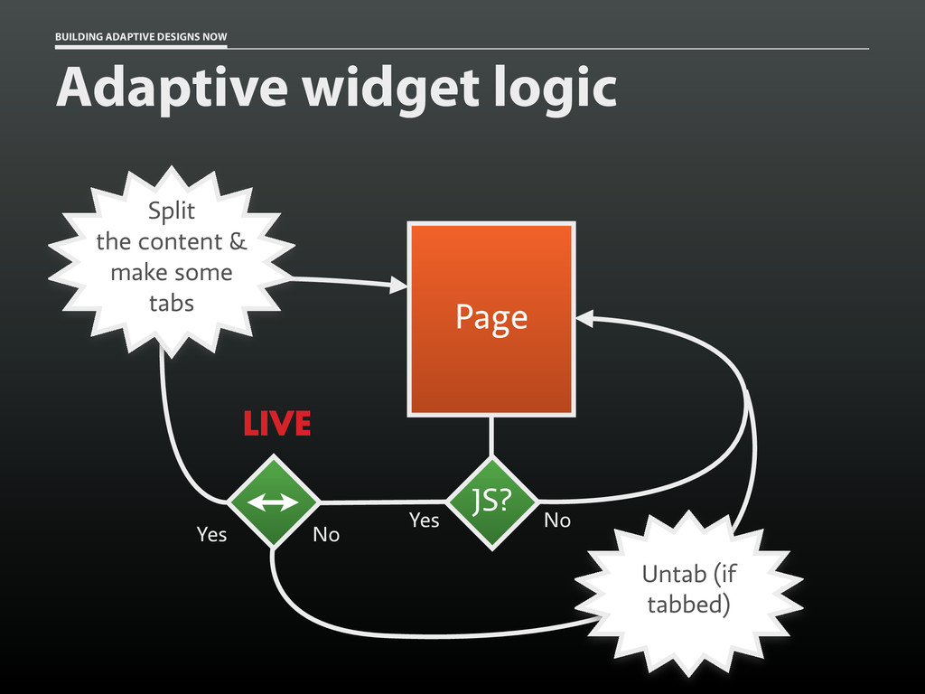
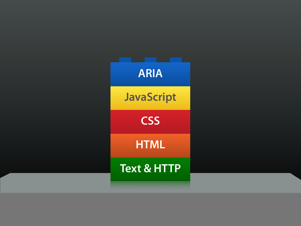
Fortunately, progressive enhancement is the way forward for web design — especially on mobile devices. By starting simple and building up, we can craft amazing experiences that work regardless of the capabilities or deficiencies of a given device.
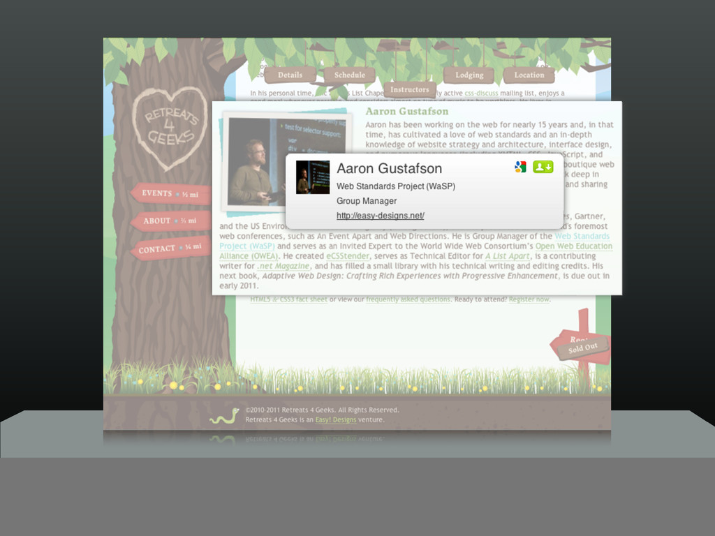
And Aaron Gustafson is just the man to describe how proven techniques like mobile first, responsive design, and adaptive UI can fit into your process while expanding your skill set.
Aaron talks about:
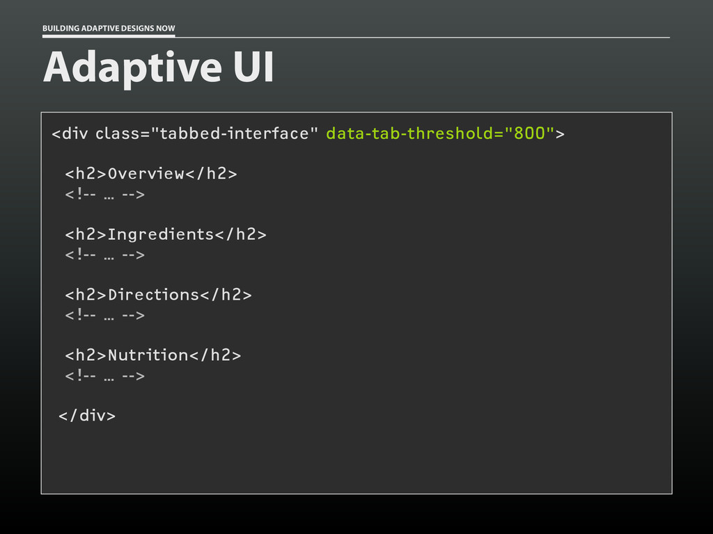
* Shifting your thinking to architect adaptive experiences right away
* Designing to take advantage of what’s possible on today’s mobile platforms
* Considering alternative ways to interact with UI components you design
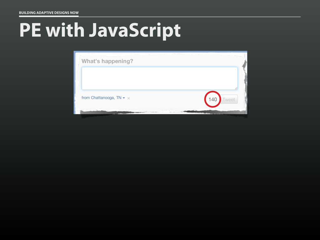
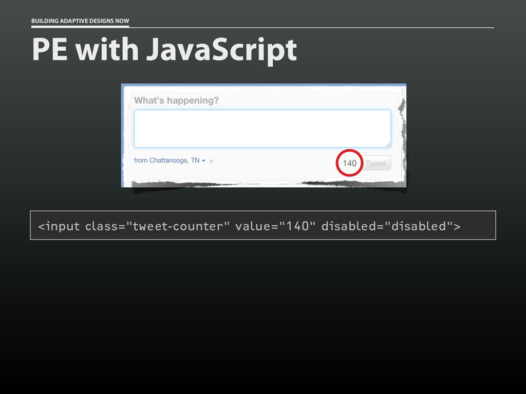
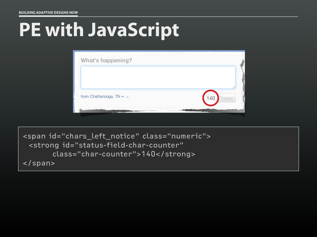
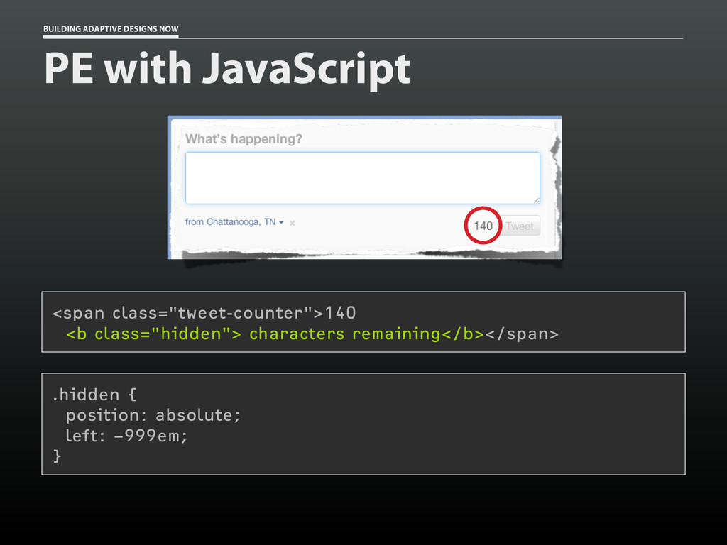
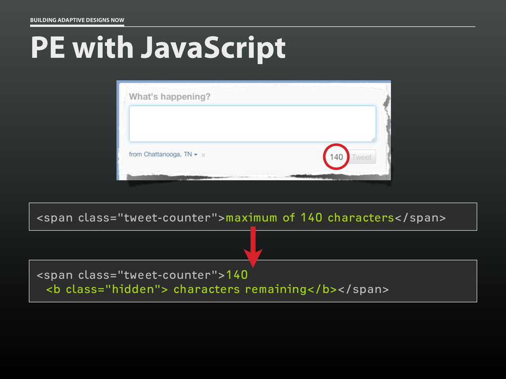
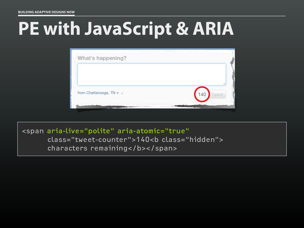
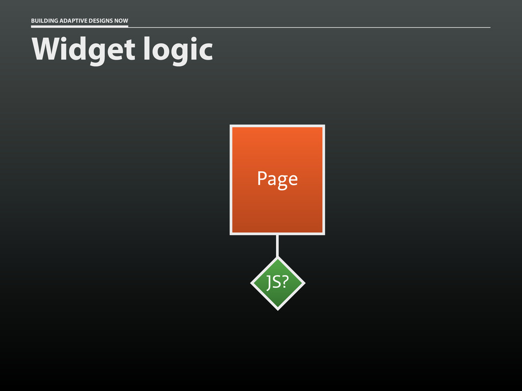
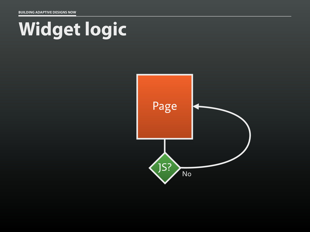
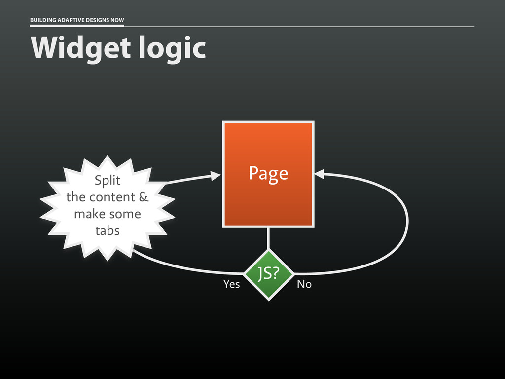
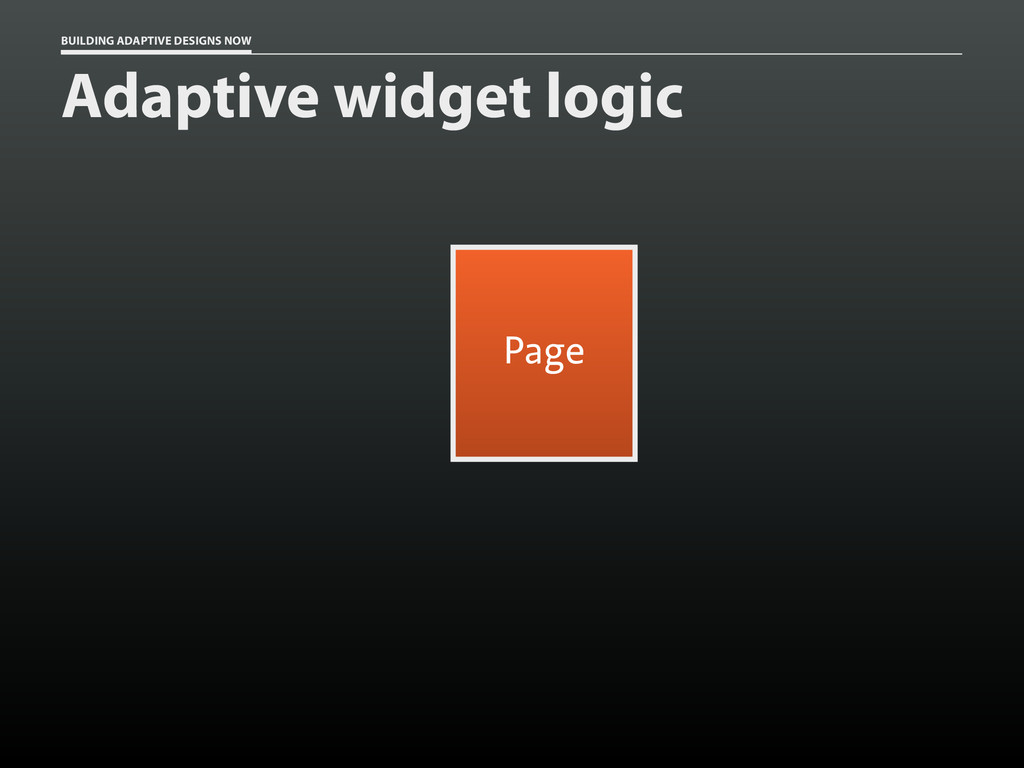
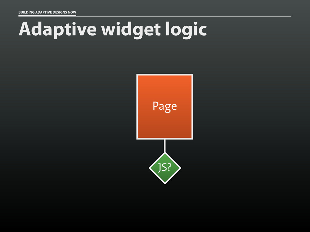
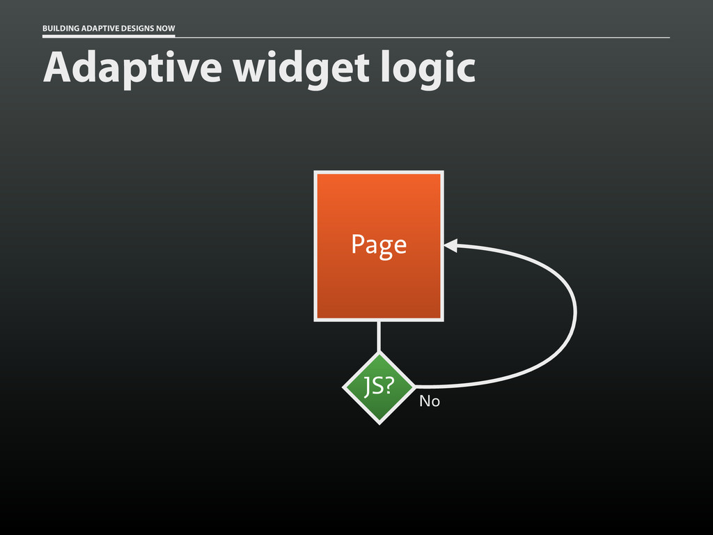
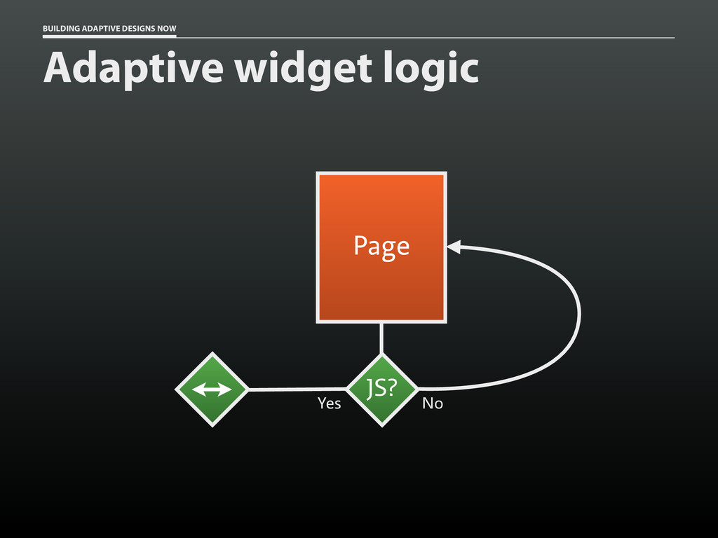
* Using JavaScript smartly to avoid creating a “house of cards”
 aarongustafson
 musubi
 ezaki
ezaki
 line_developers_tw
 demaecan
 nrug_member
 muehara
 civitaspo
 hssh2_bin
 ry
ry
 iwashi86
 seathinner
 inesmontani
 jmmastey
 jnunemaker
 quramy
 orderedlist
 bethany
 rocio
rocio
 ks91
ks91
 speakerdeck
 eileencodes
 csswizardry
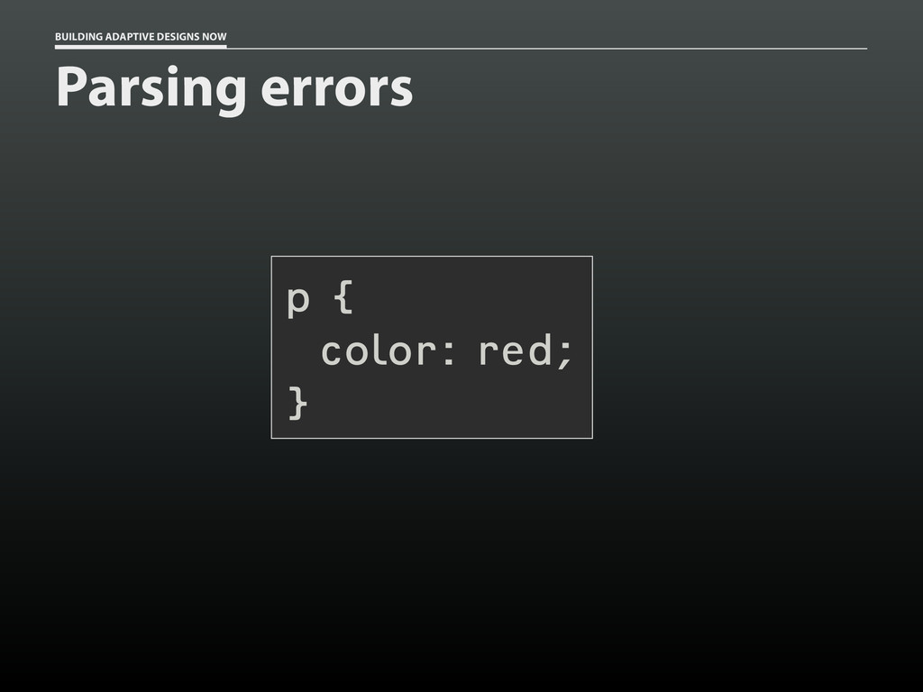
![BUILDING ADAPTIVE DESIGNS NOW Parsing errors html[lang] p { color:](https://files.speakerdeck.com/presentations/acb1ca5090210131fb6272fa4d45953a/slide_107.jpg)
![BUILDING ADAPTIVE DESIGNS NOW Parsing errors @-moz-document url-prefix() { html[lang]](https://files.speakerdeck.com/presentations/acb1ca5090210131fb6272fa4d45953a/slide_108.jpg)