Upgrade to Pro — share decks privately, control downloads, hide ads and more …

InstaPay Audit

InstaPay Audit

Avatar for Amr Shawki

Amr Shawki

June 19, 2026

More Decks by Amr Shawki

Other Decks in Design

Transcript

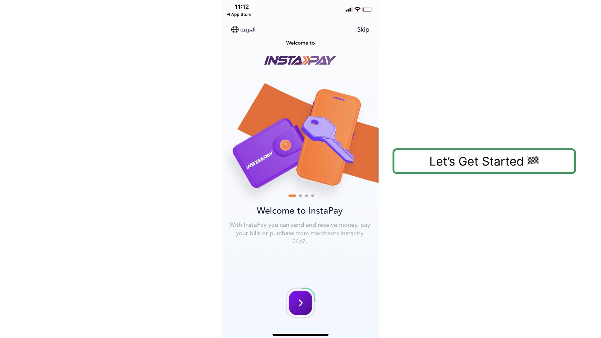
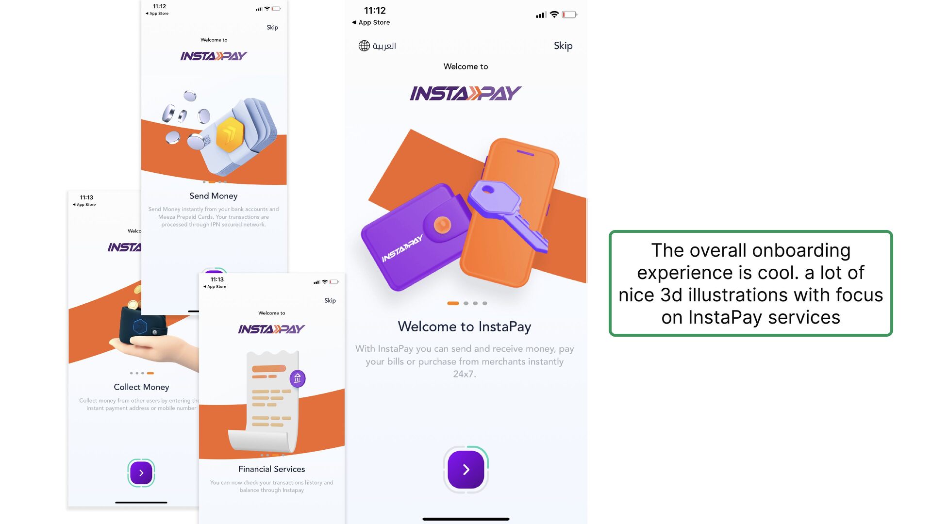
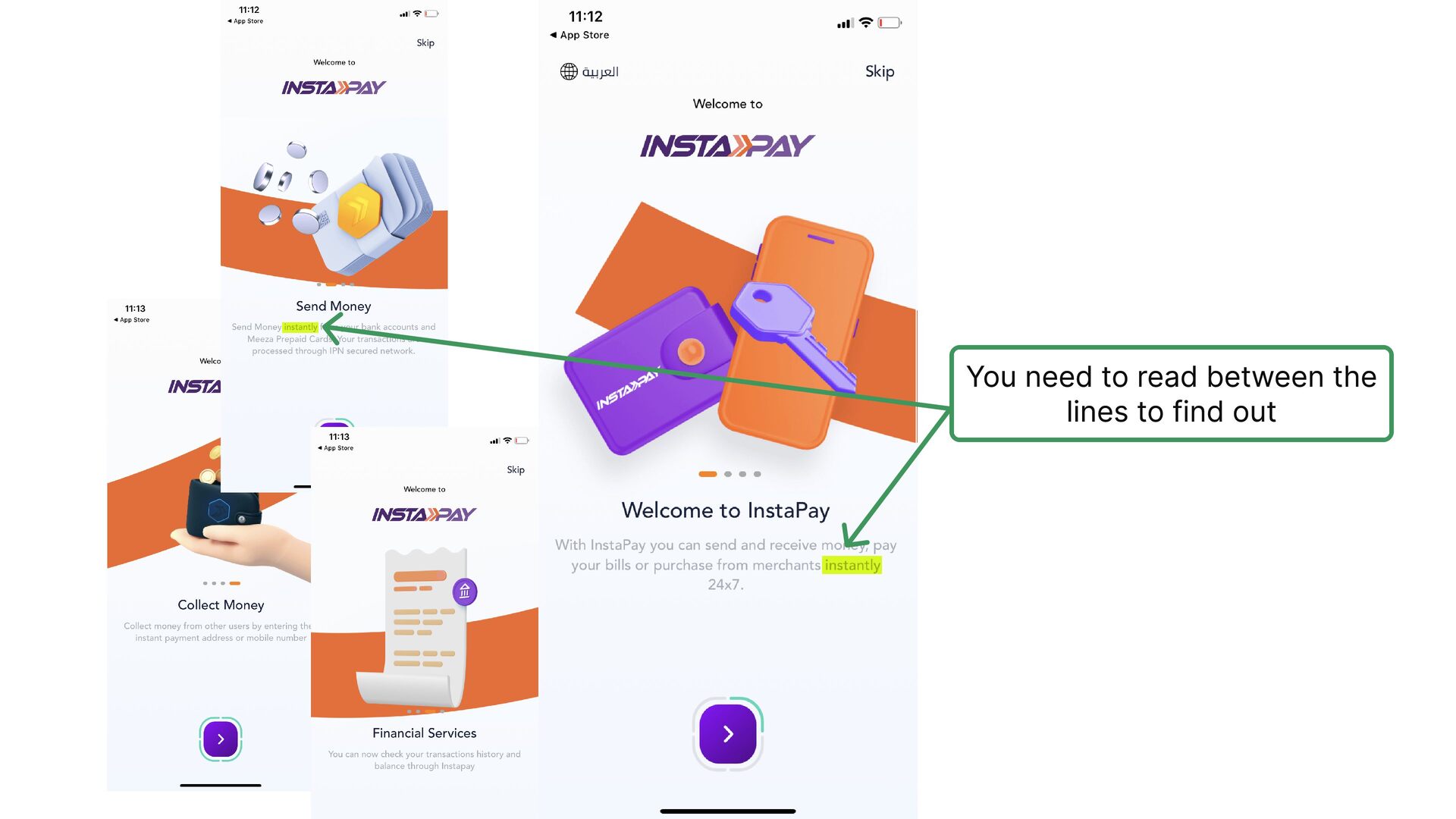
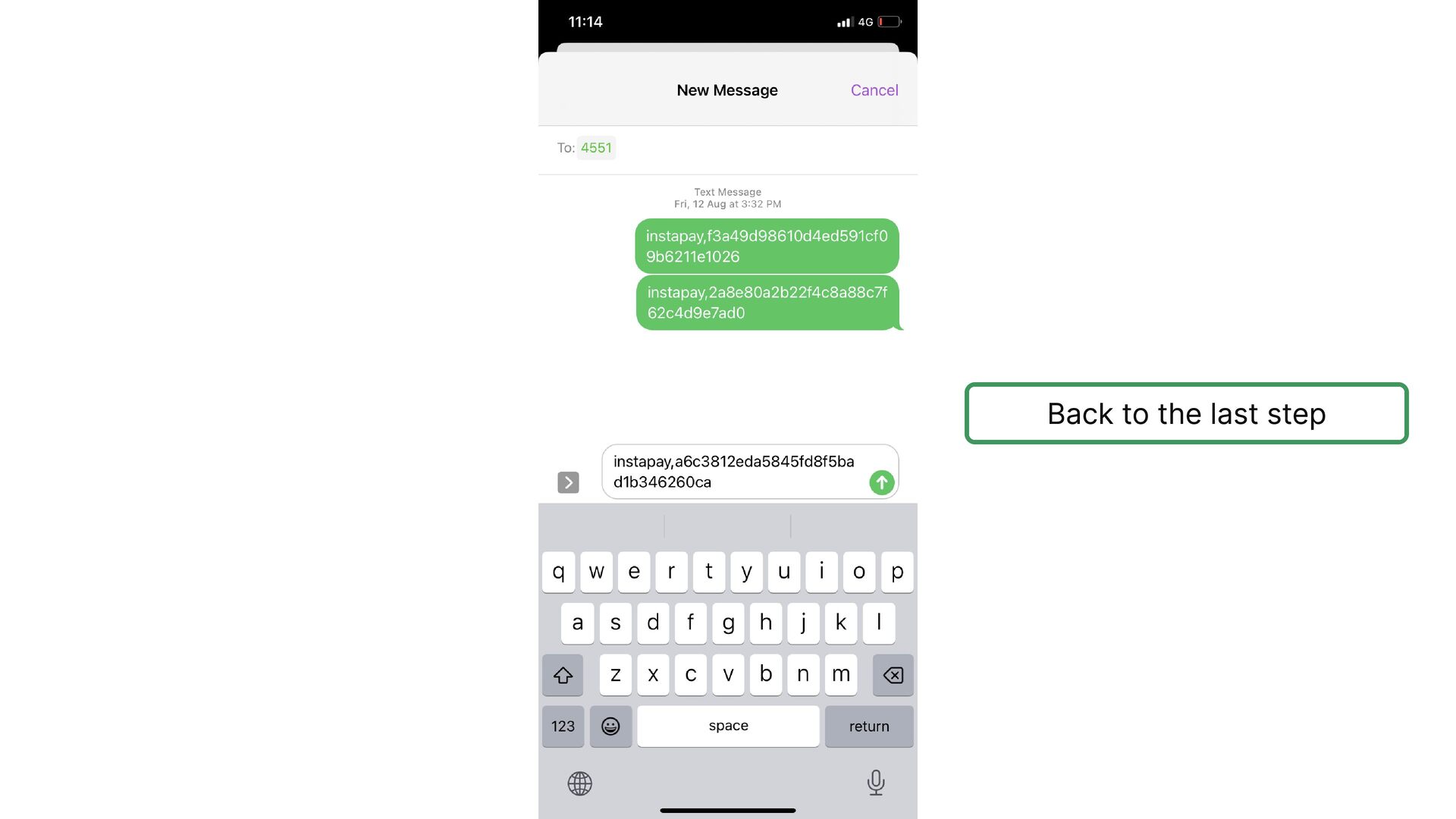
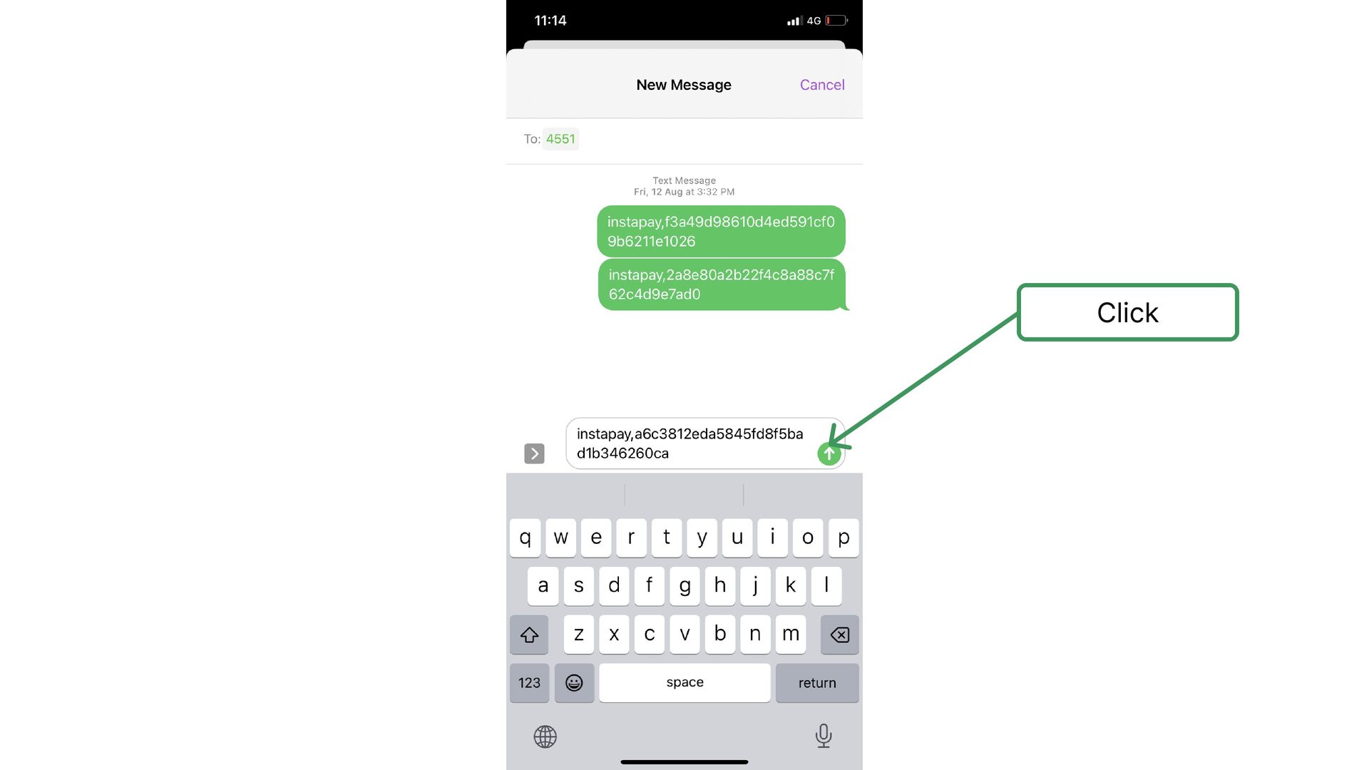
  1. The overall onboarding experience is cool. a lot of nice

    3d illustrations with focus on InstaPay services
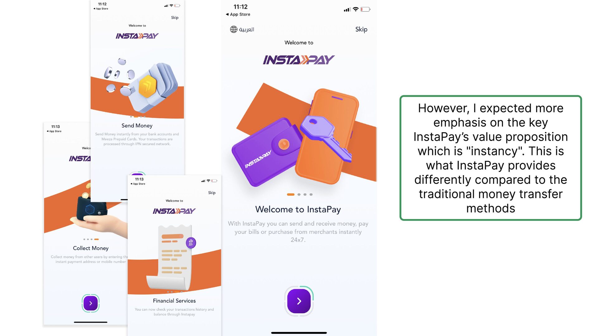
  2. However, I expected more emphasis on the key InstaPay’s value

    proposition which is "instancy". This is what InstaPay provides differently compared to the traditional money transfer methods
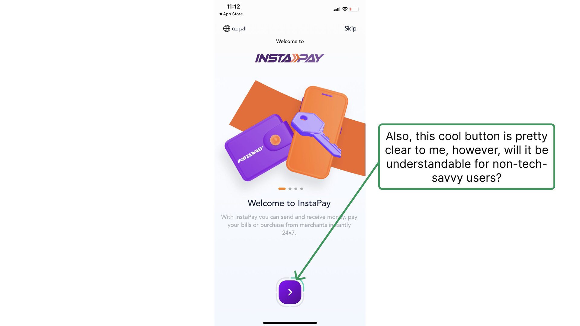
  3. Also, this cool button is pretty clear to me, however,

    will it be understandable for non-tech- savvy users?
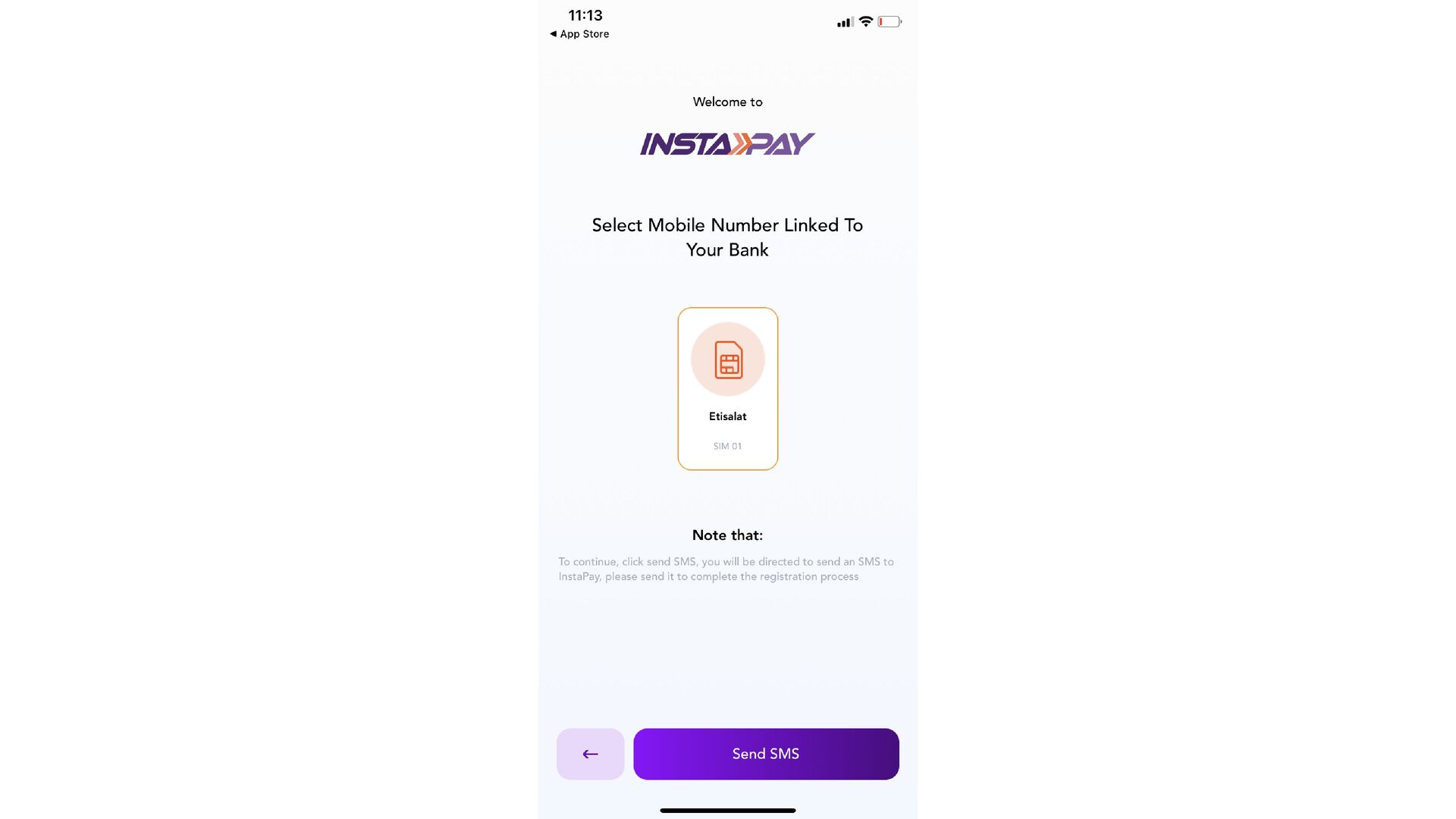
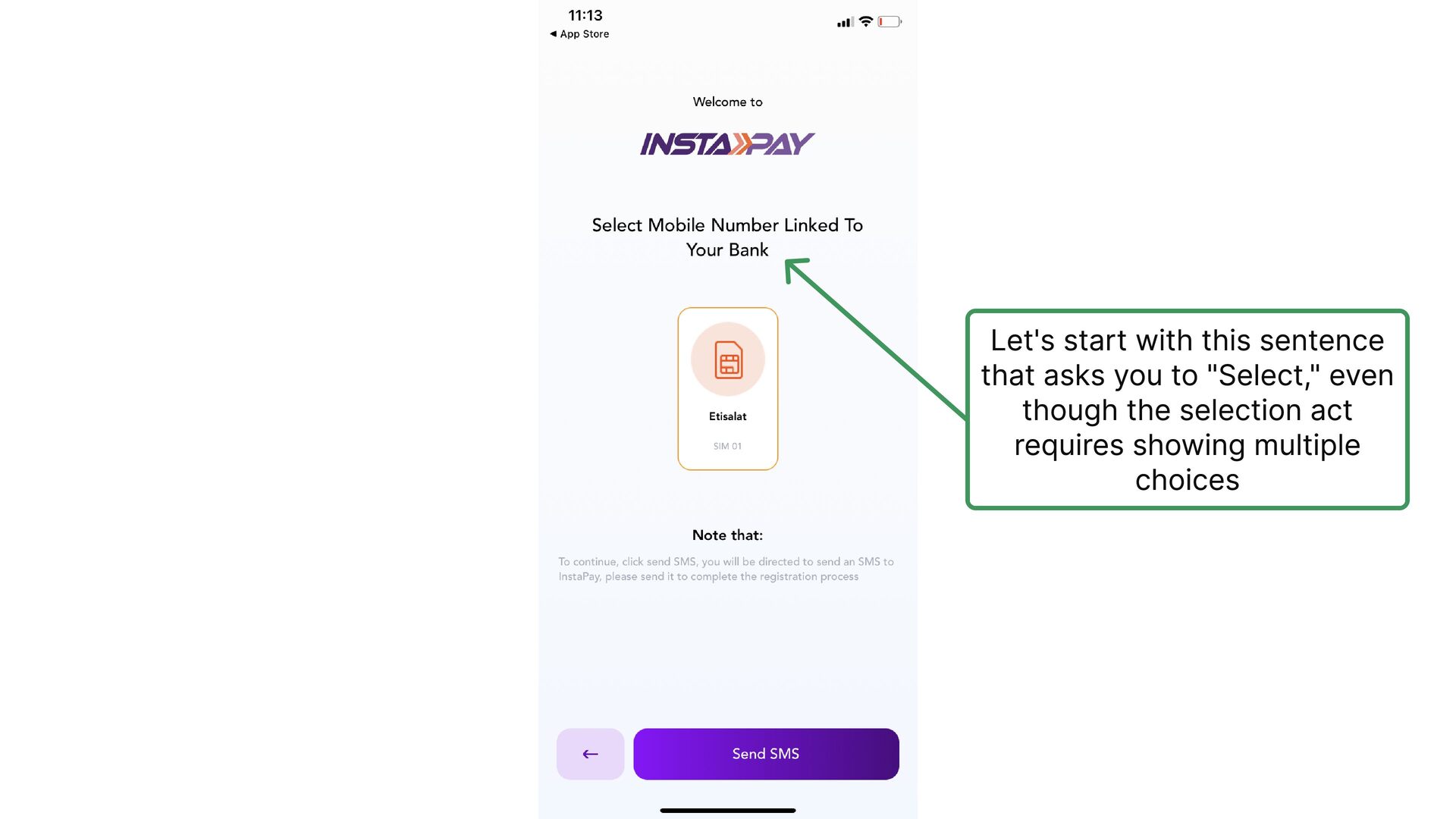
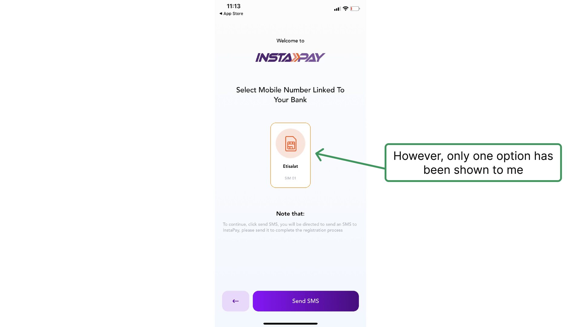
  4. Let's start with this sentence that asks you to "Select,"

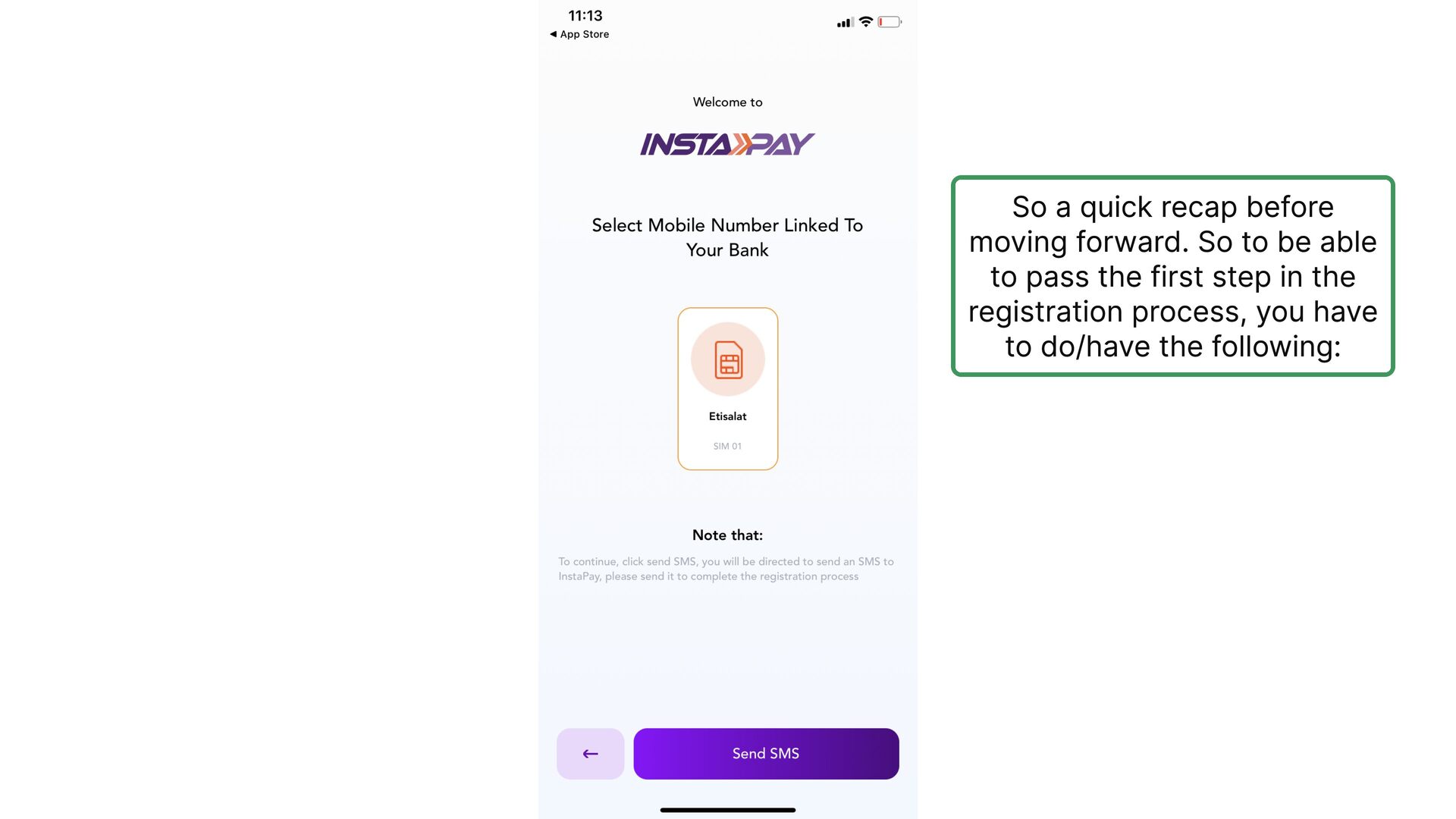
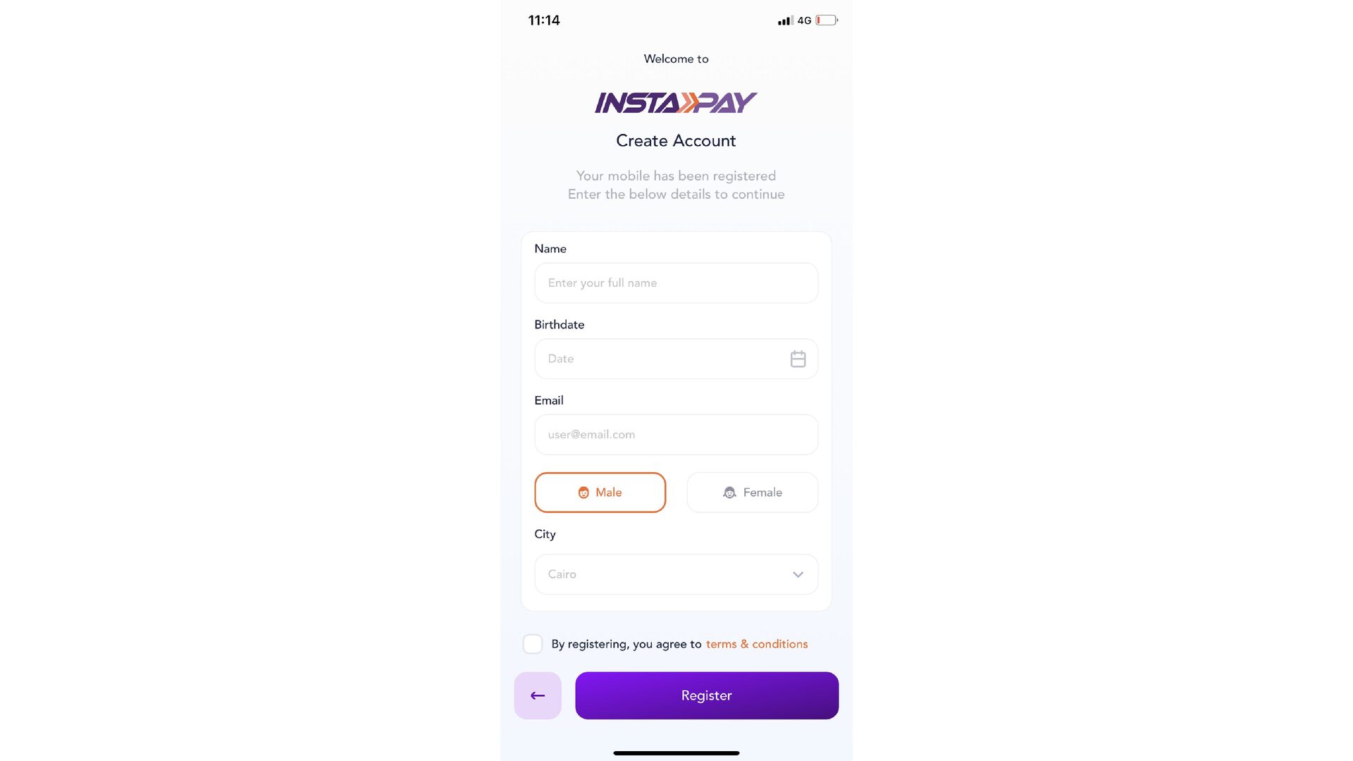
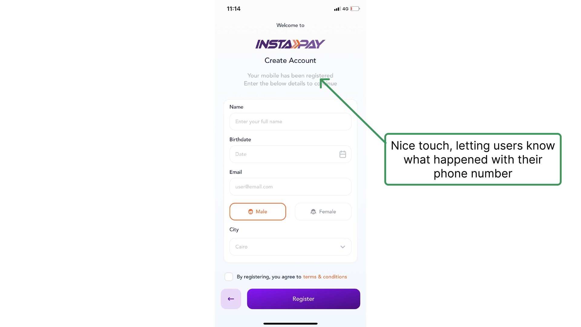
    even though the selection act requires showing multiple choices
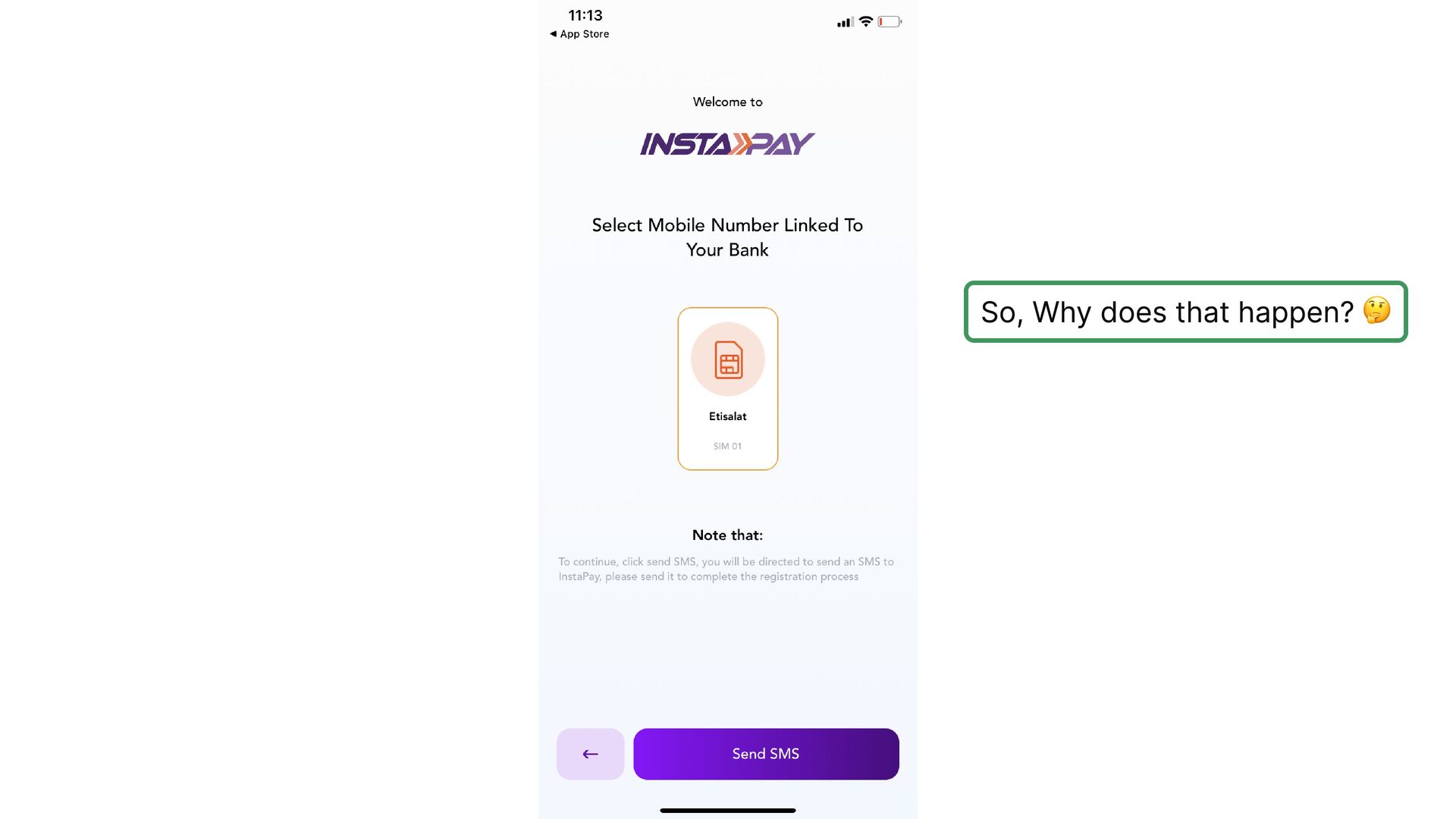
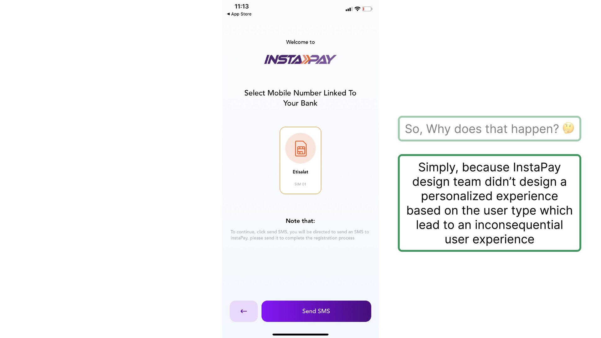
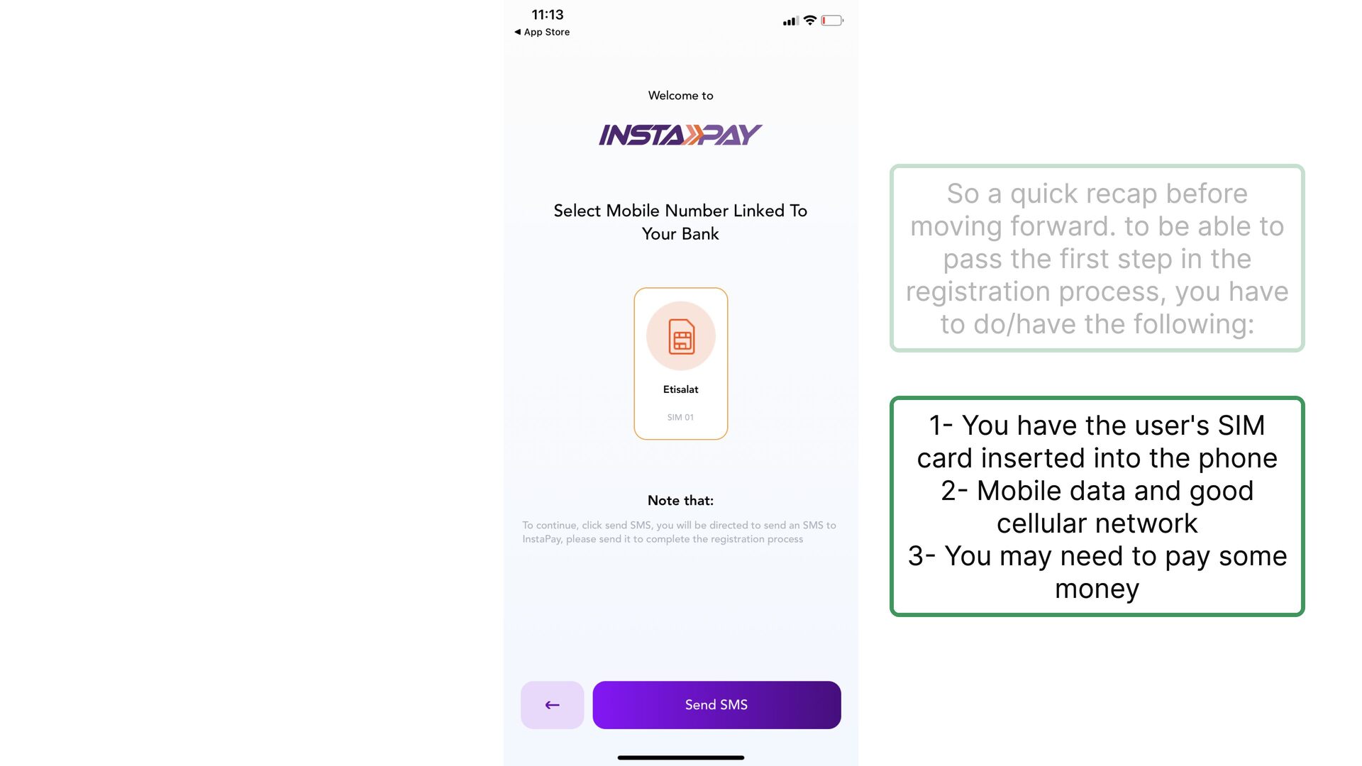
  5. So, Why does that happen? 🤔 Simply, because InstaPay design

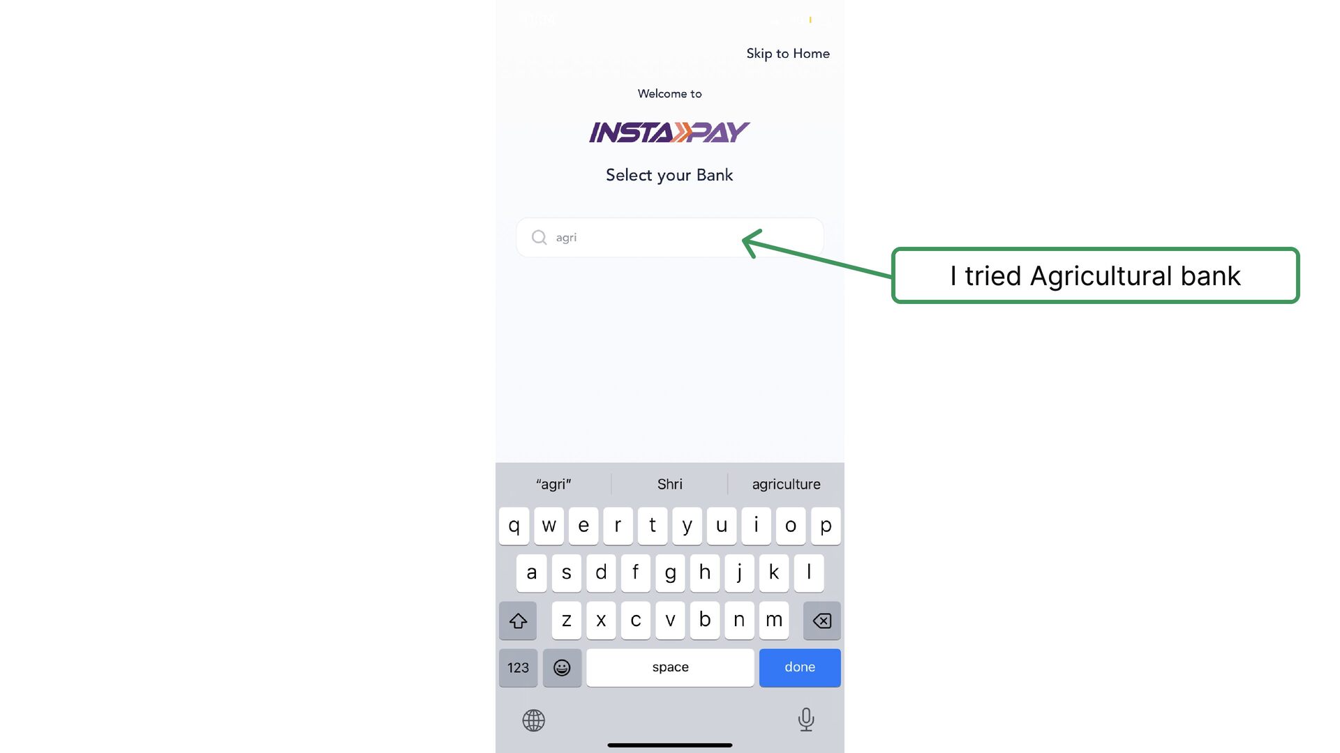
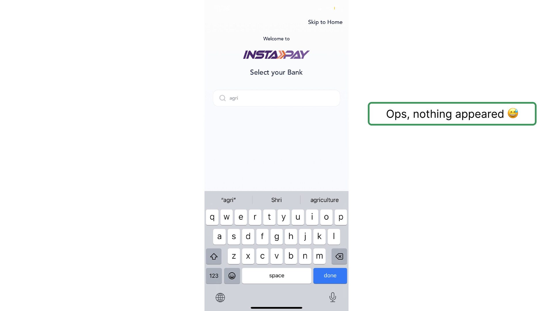
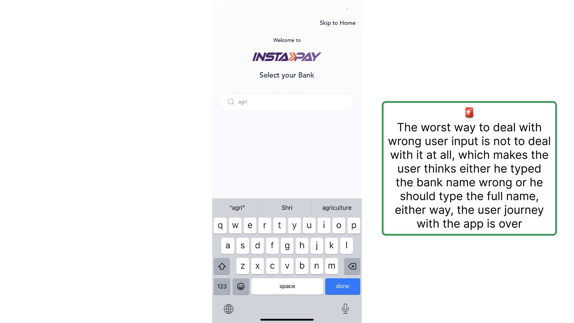
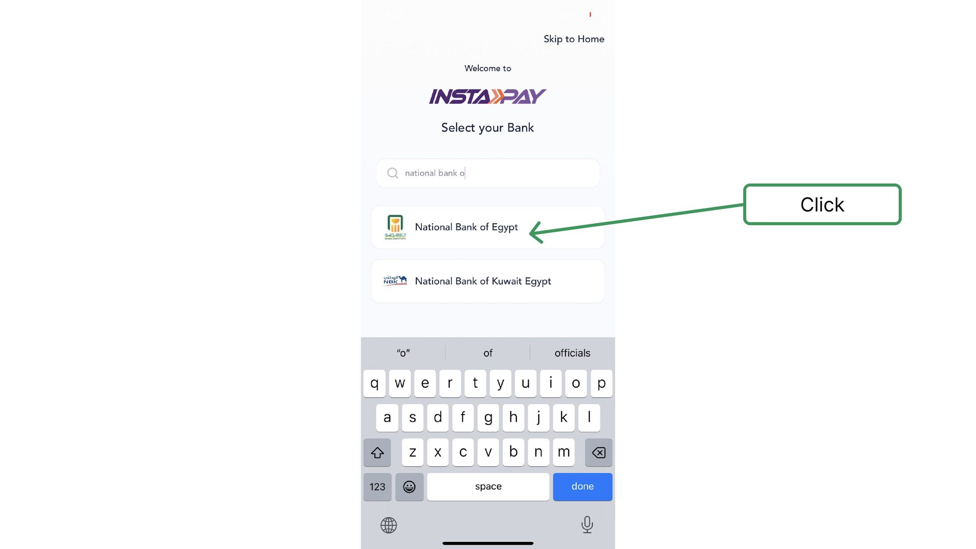
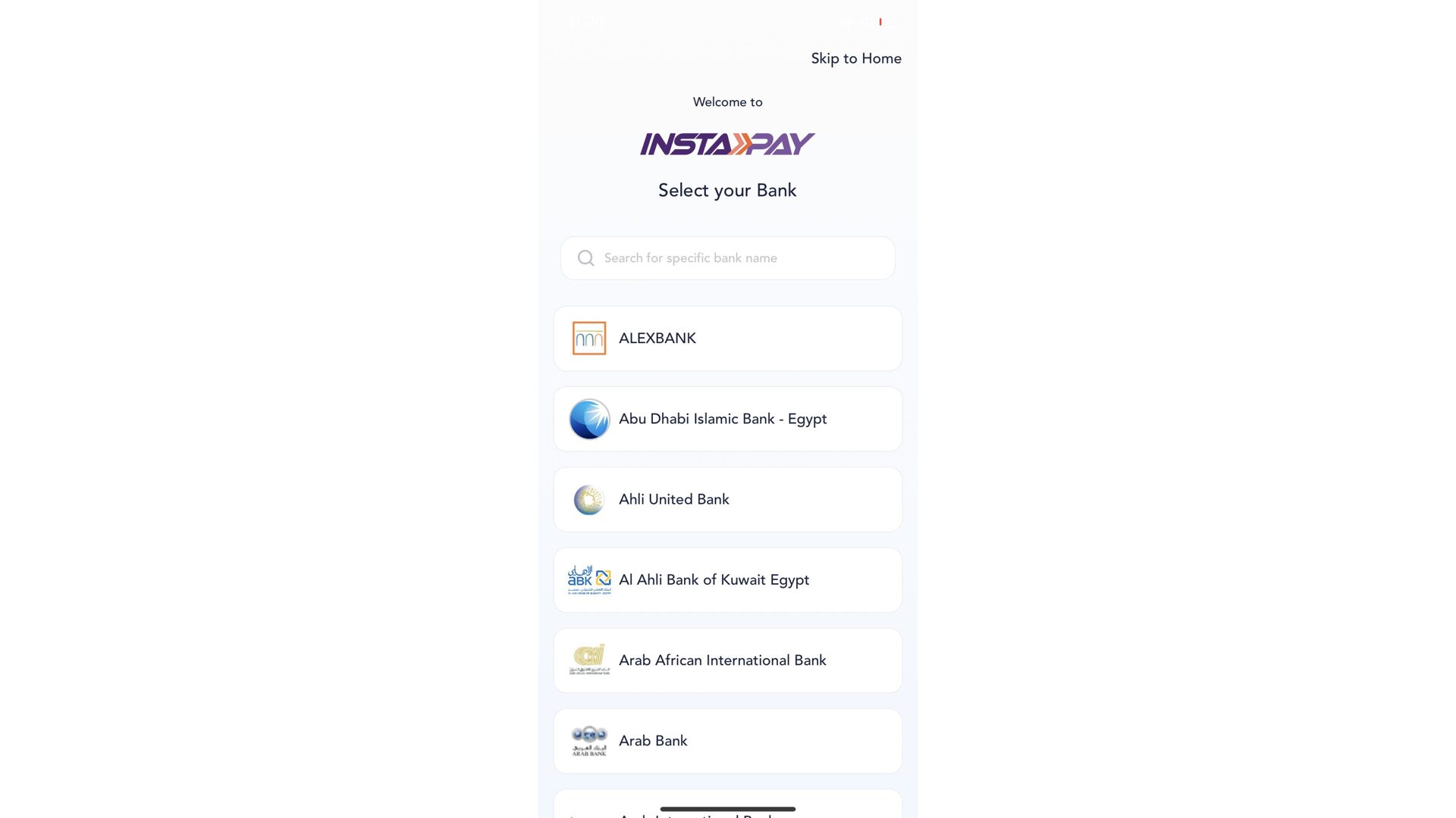
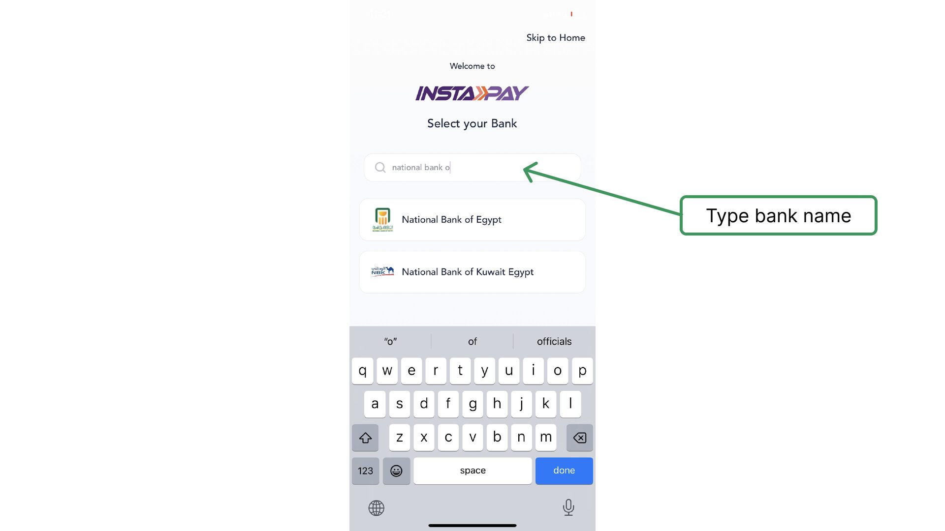
    team didn’t design a personalized experience based on the user type which lead to an inconsequential user experience
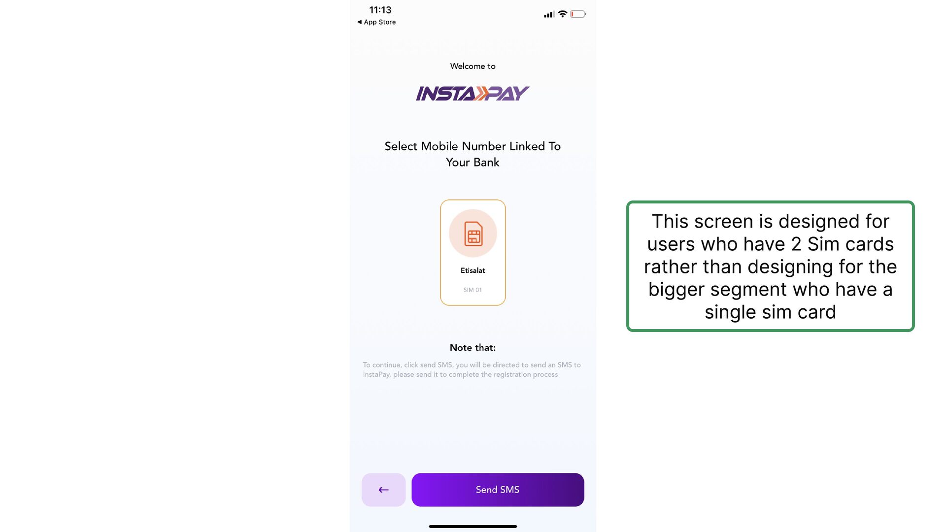
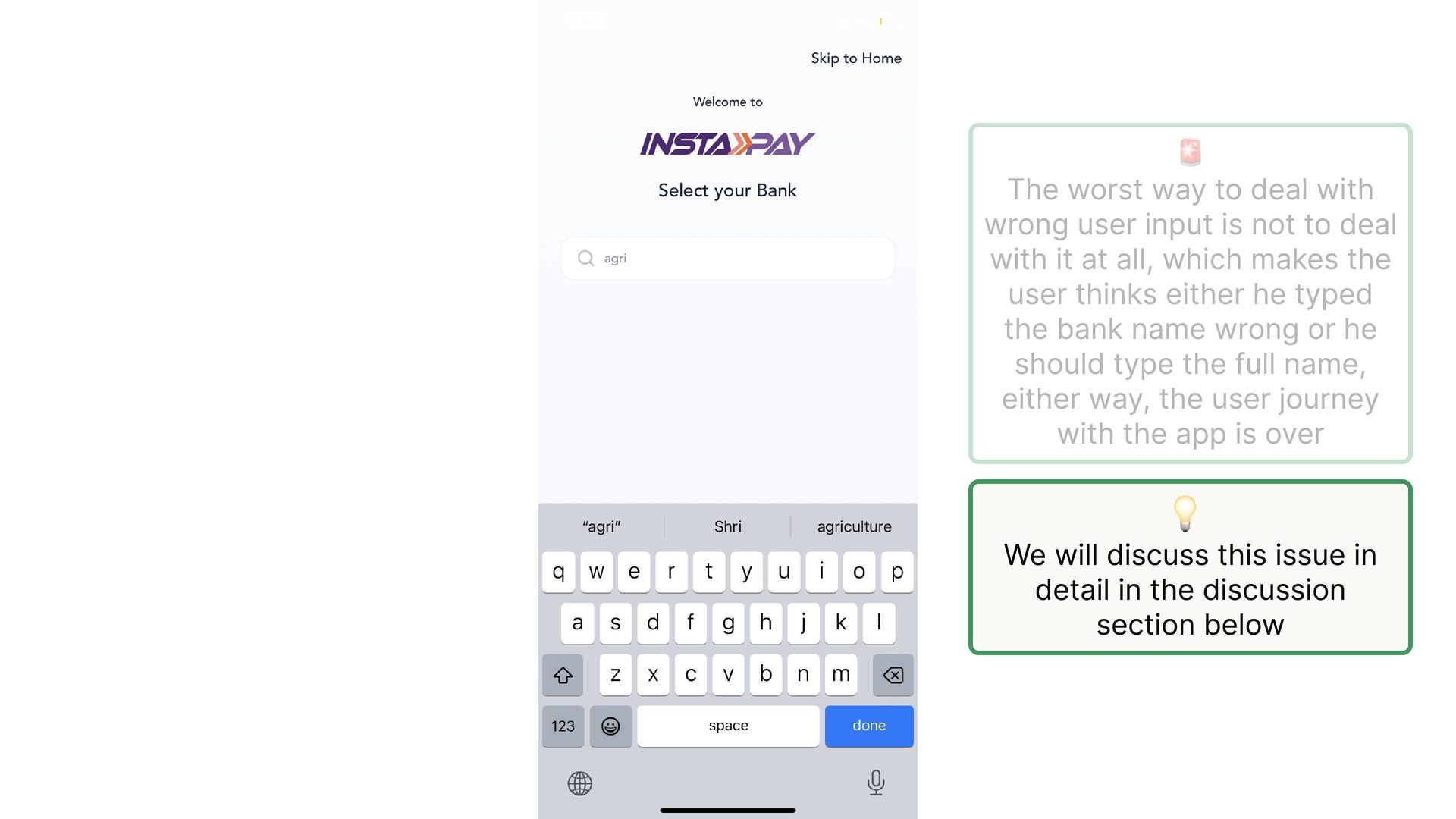
  6. This screen is designed for users who have 2 Sim

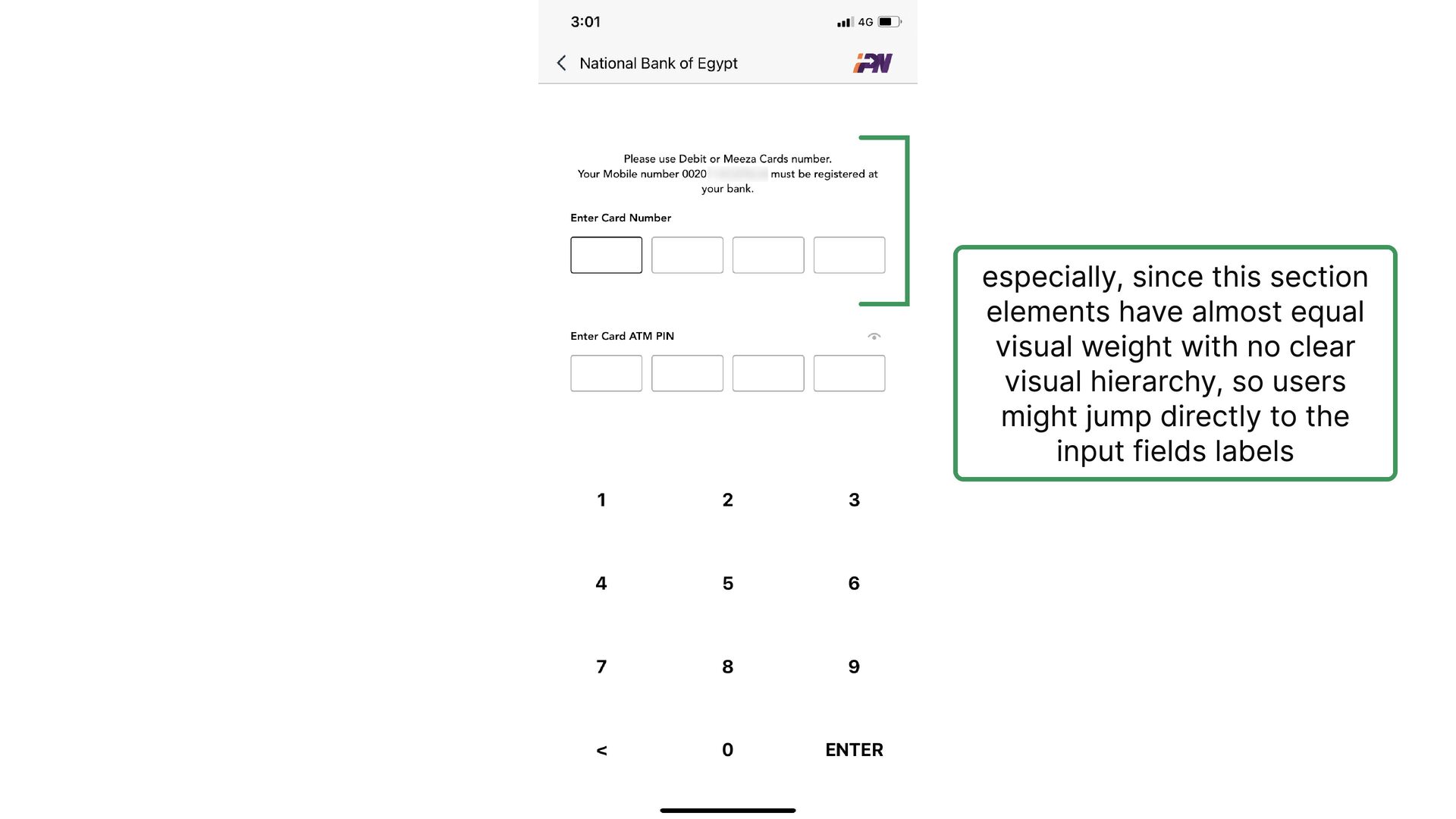
    cards rather than designing for the bigger segment who have a single sim card
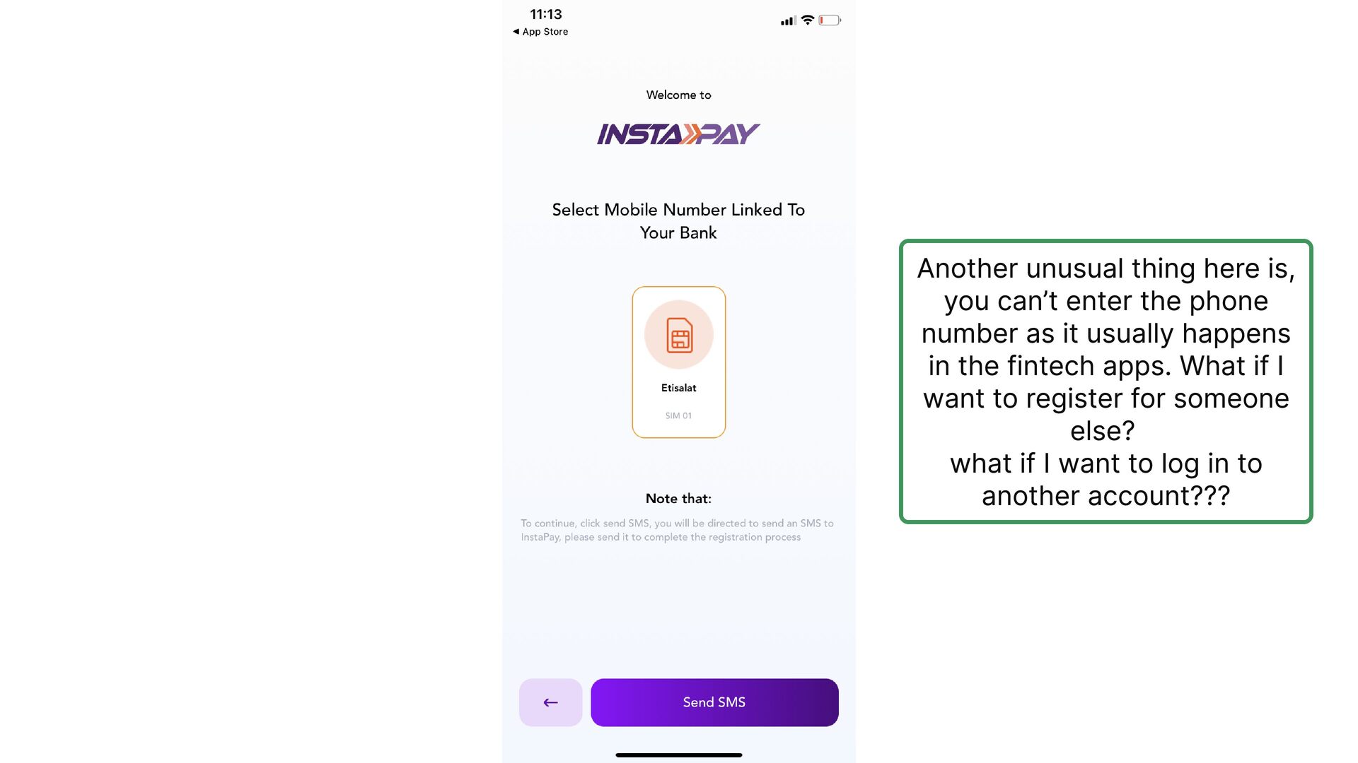
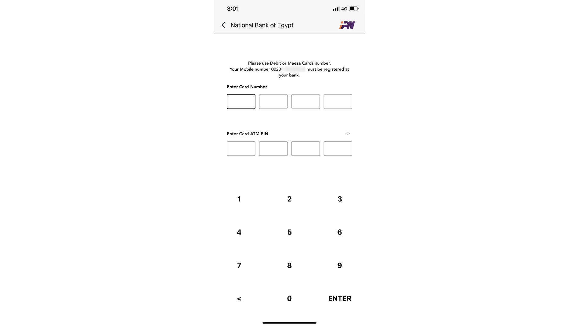
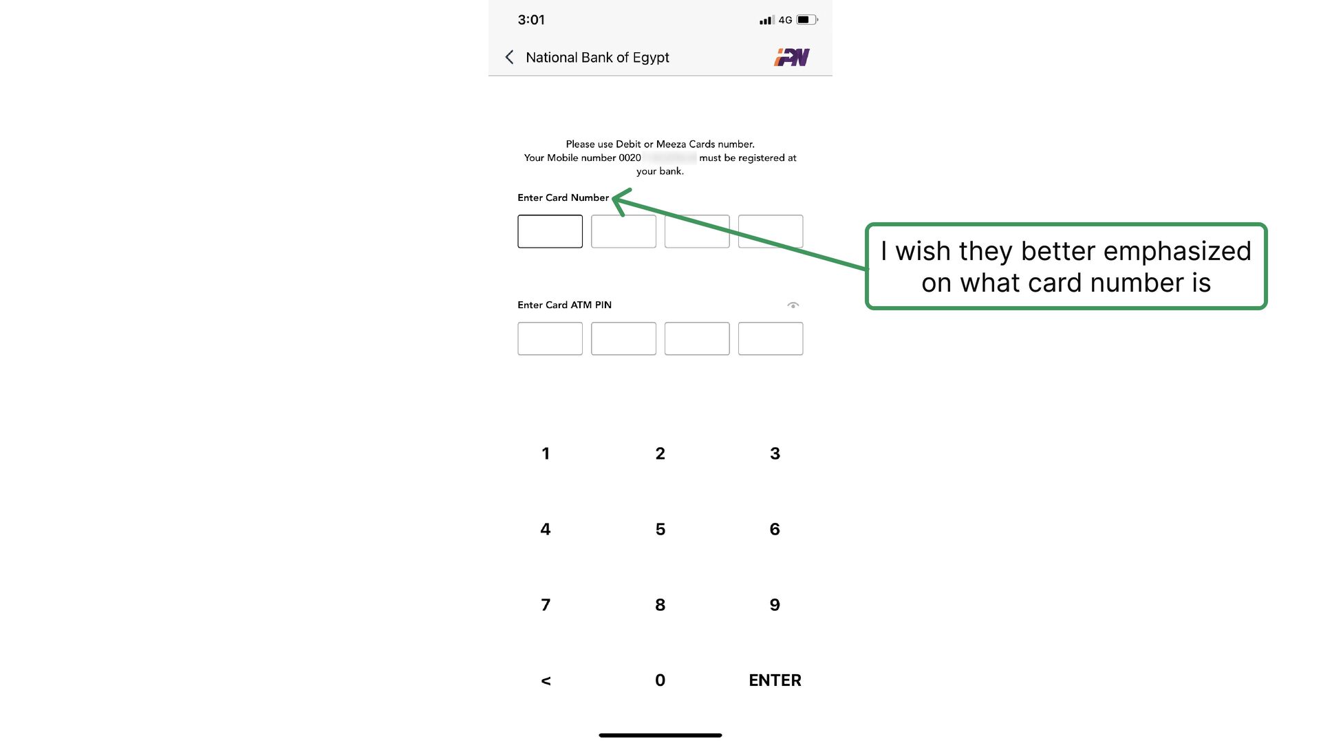
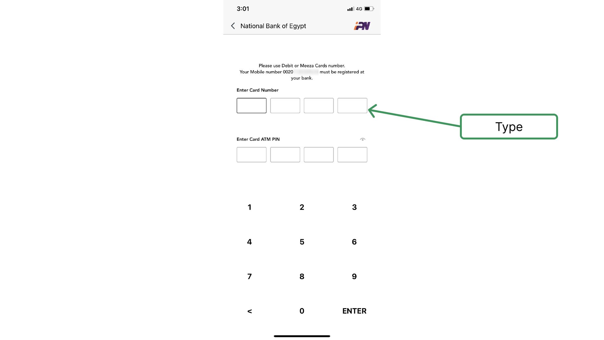
  7. Another unusual thing here is, you can’t enter the phone

    number as it usually happens in the fintech apps. What if I want to register for someone else? what if I want to log in to another account???
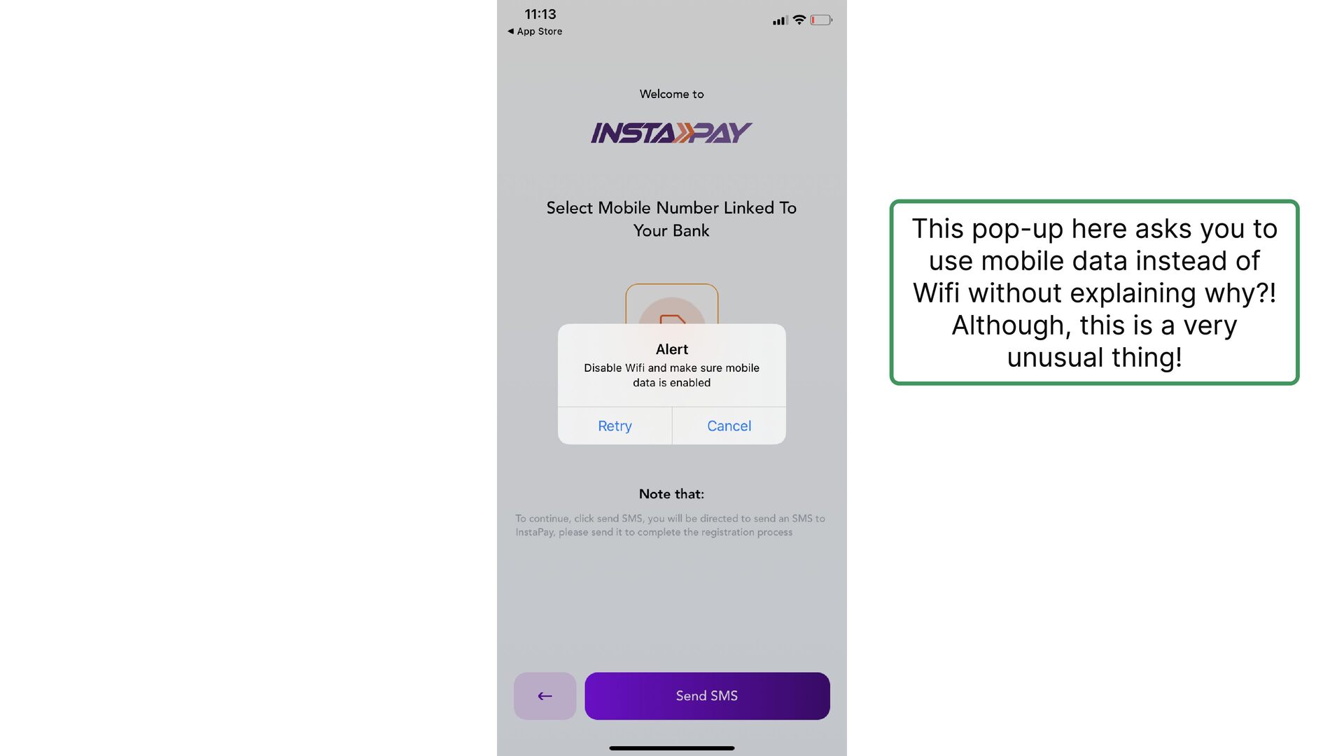
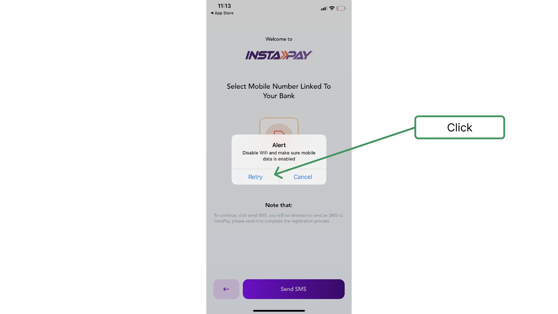
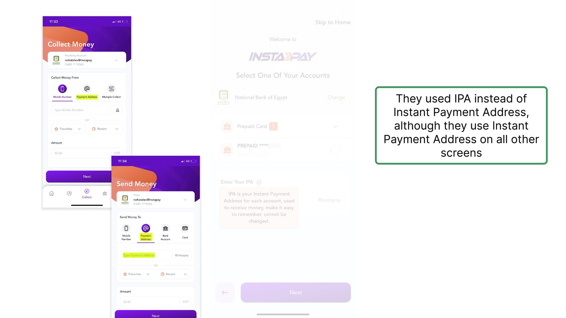
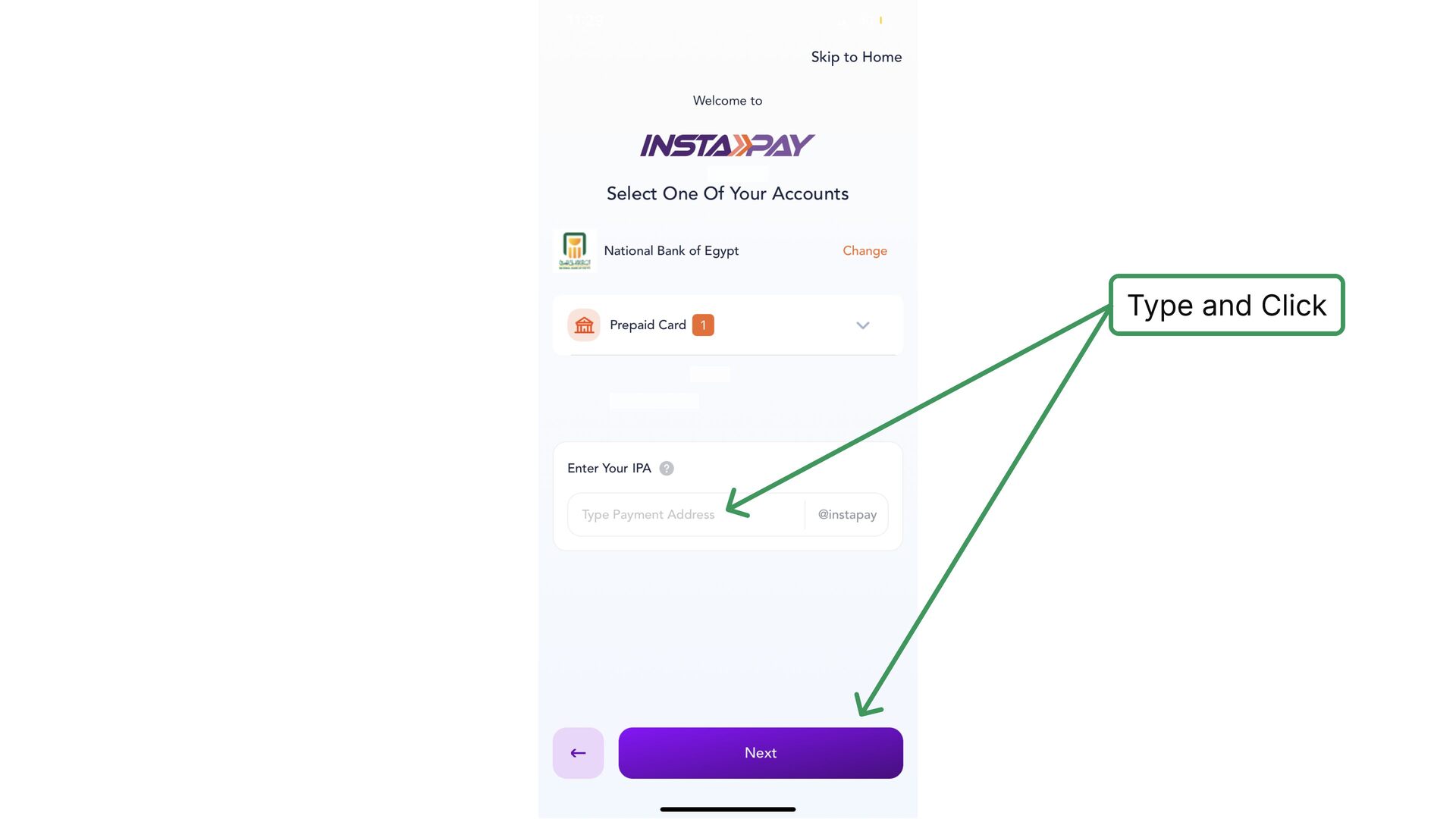
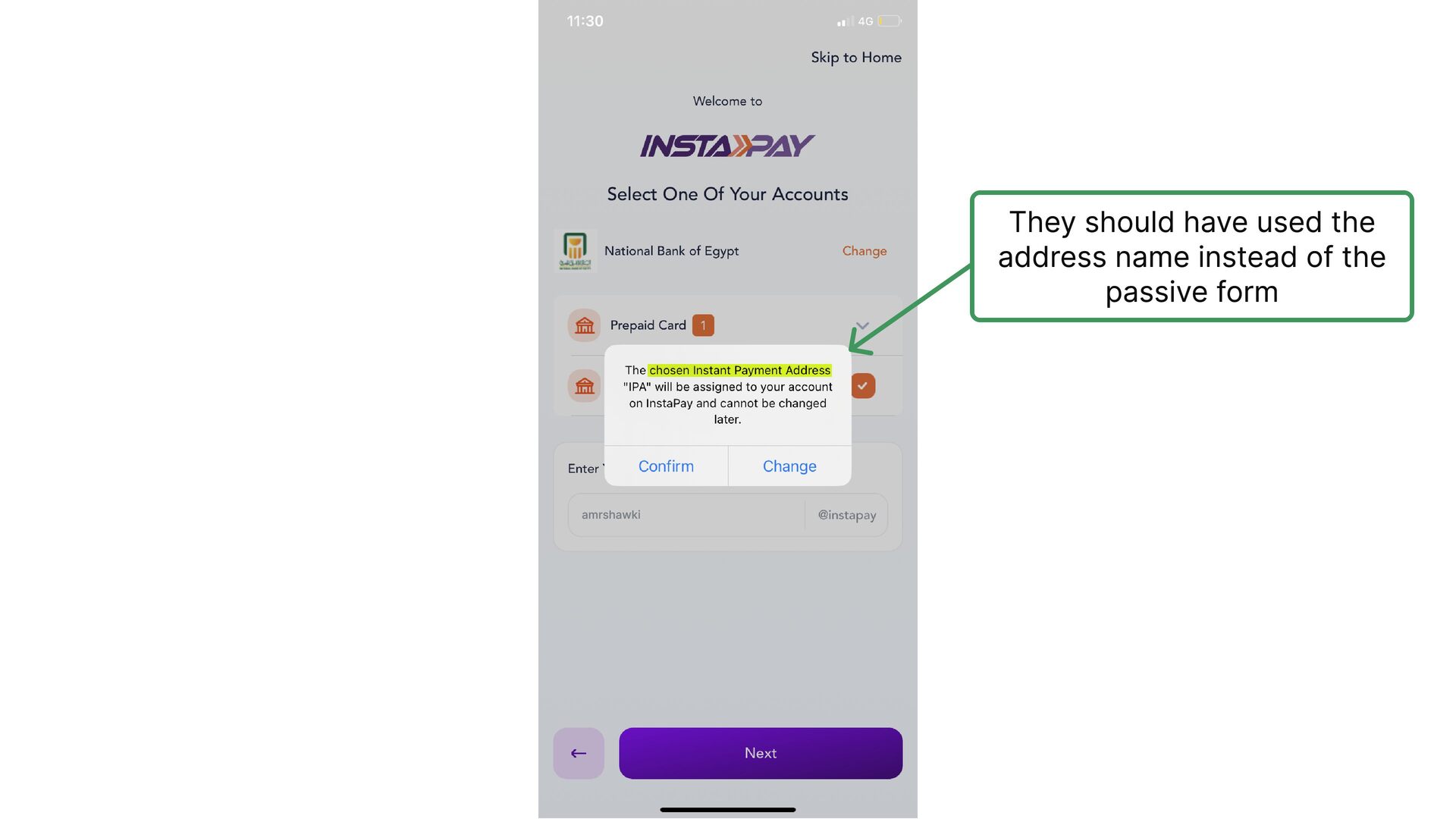
  8. This pop-up here asks you to use mobile data instead

    of Wifi without explaining why?! Although, this is a very unusual thing!
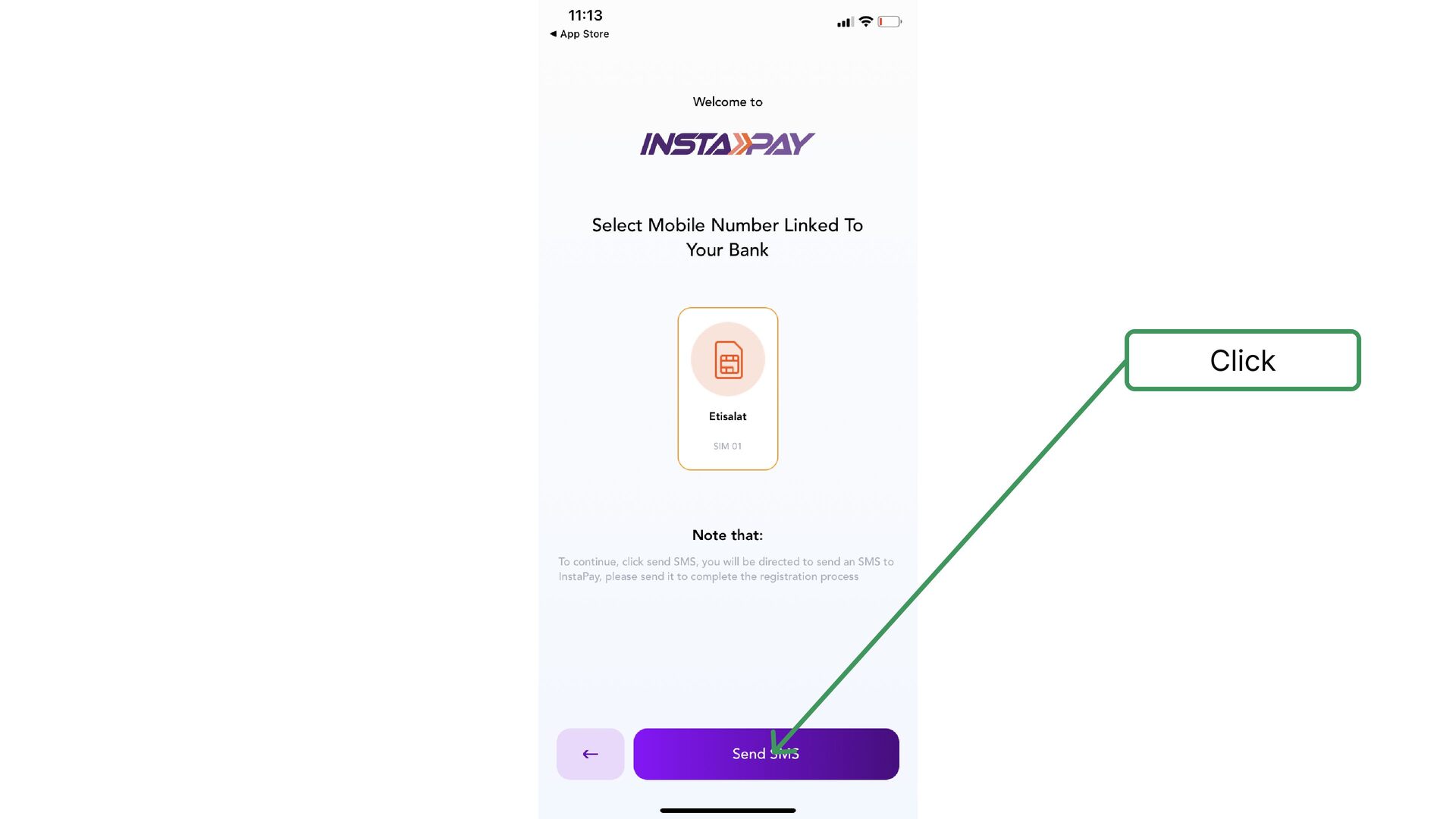
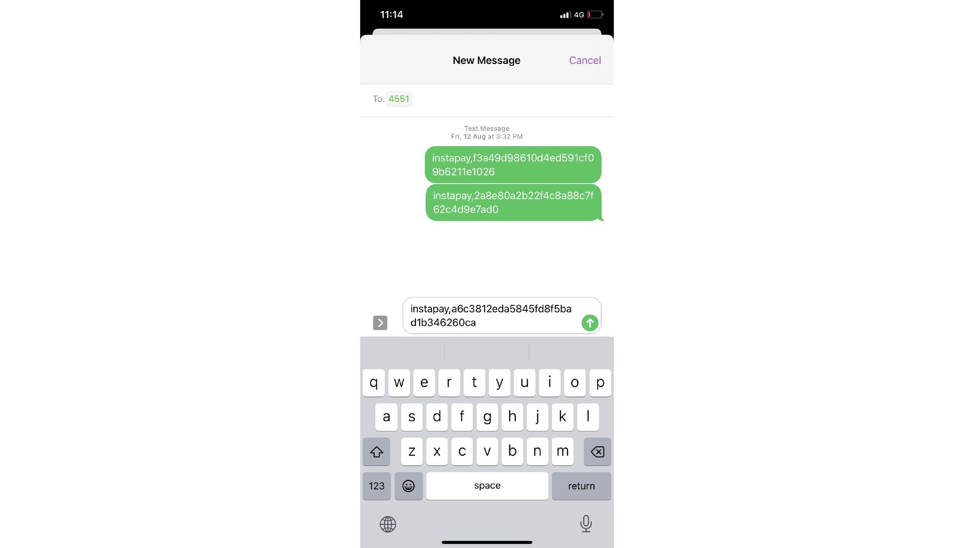
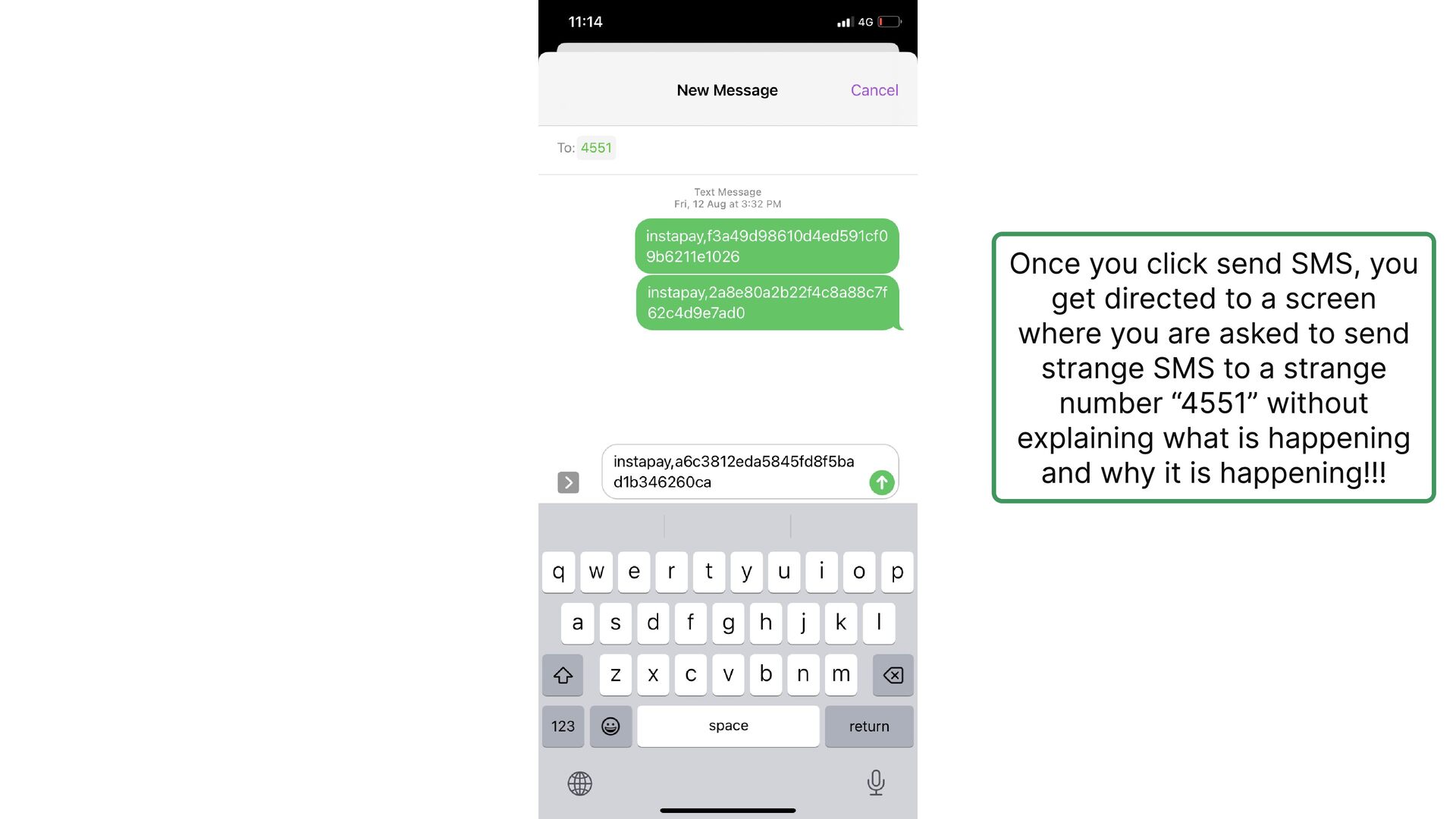
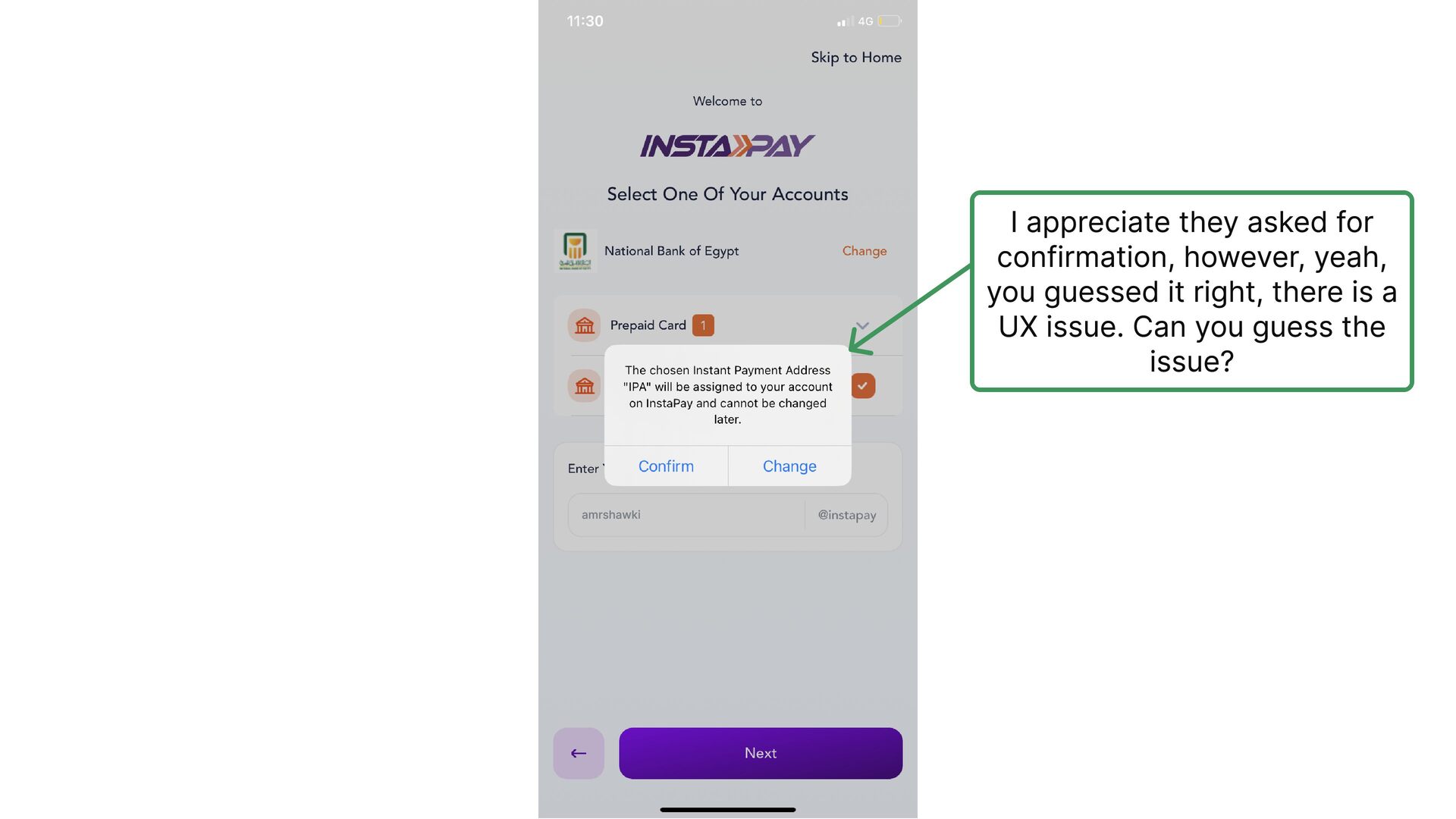
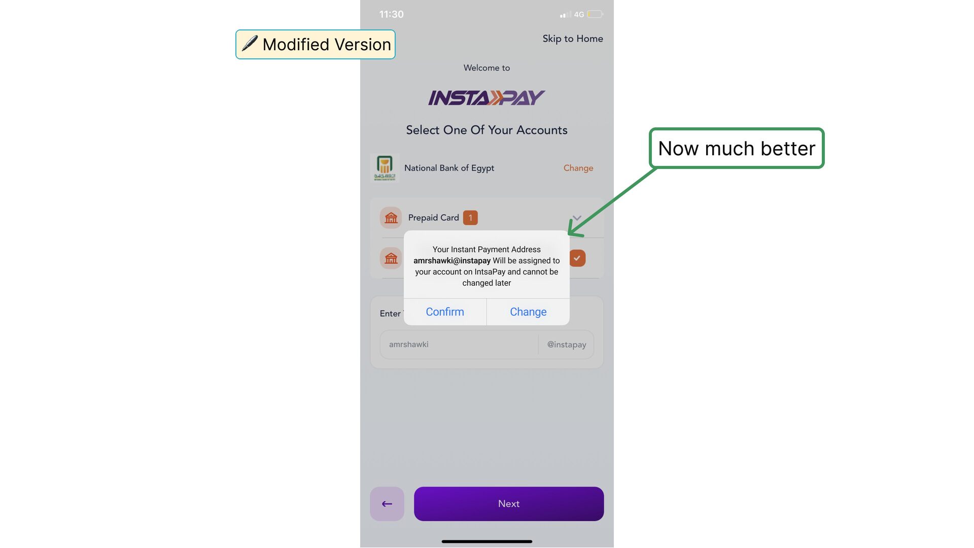
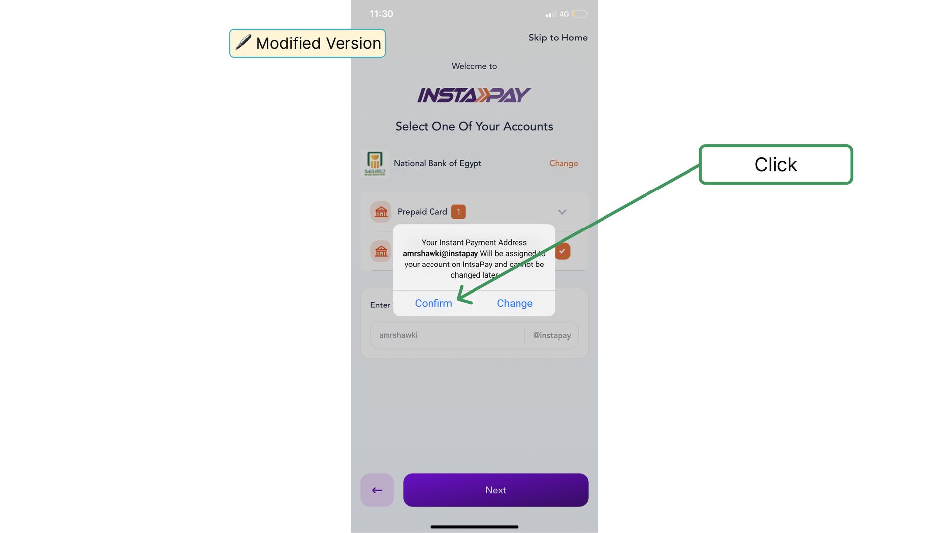
  9. Once you click send SMS, you get directed to a

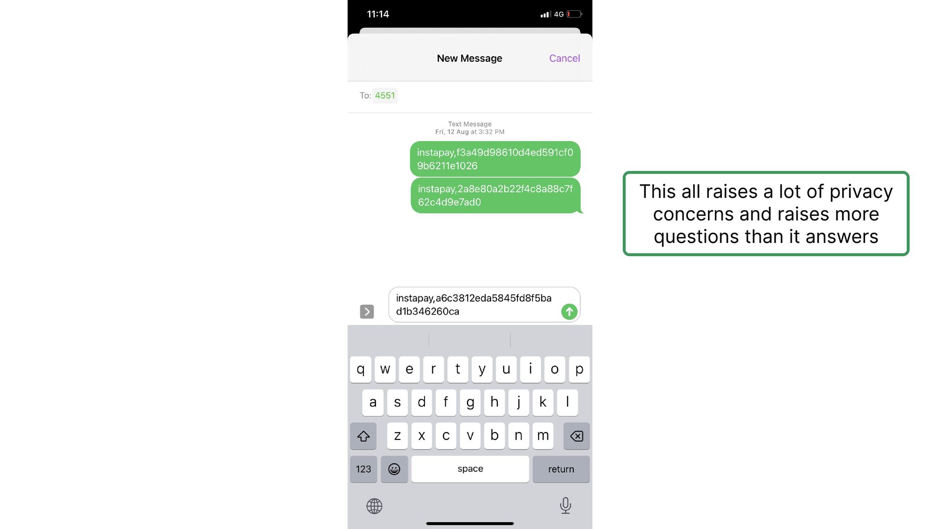
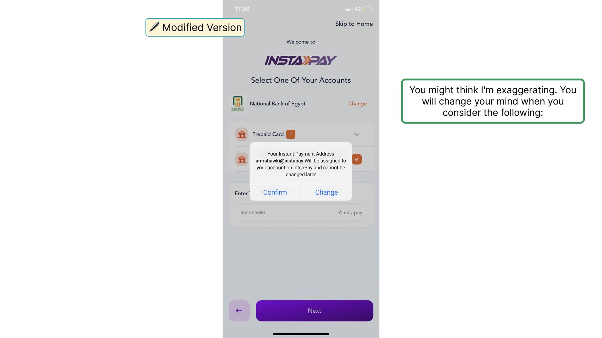
    screen where you are asked to send strange SMS to a strange number “4551” without explaining what is happening and why it is happening!!!
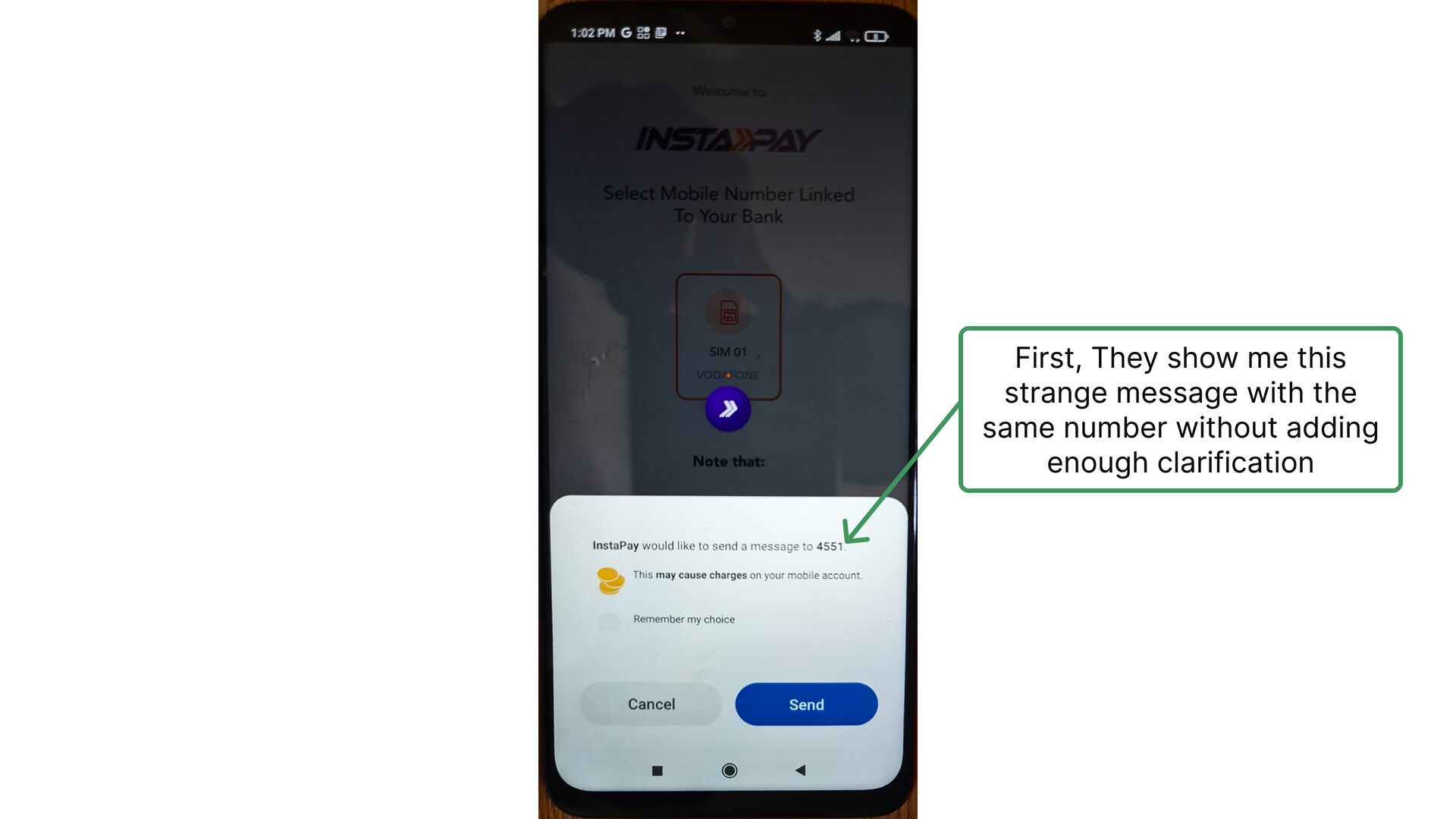
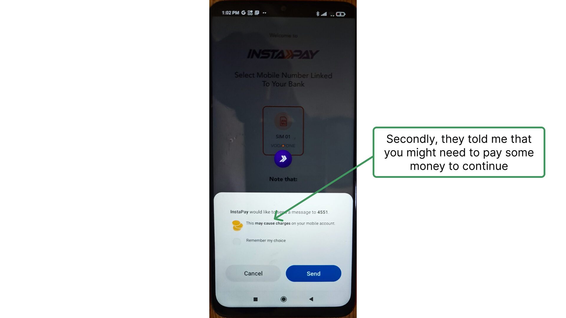
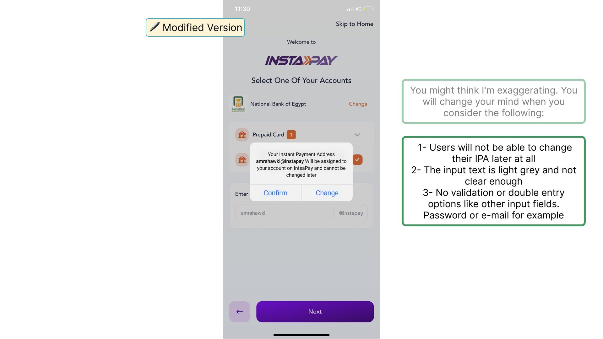
  10. First, They show me this strange message with the same

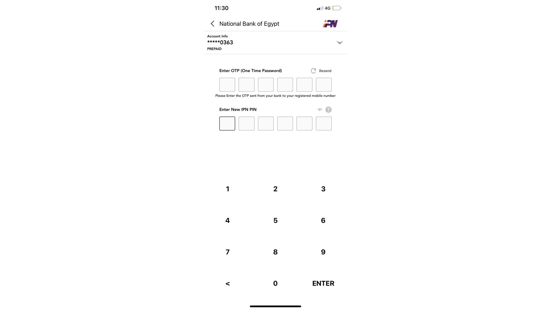
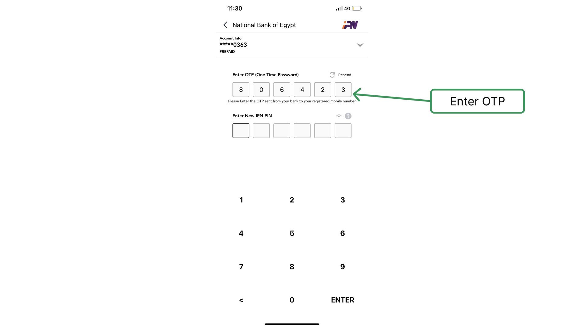
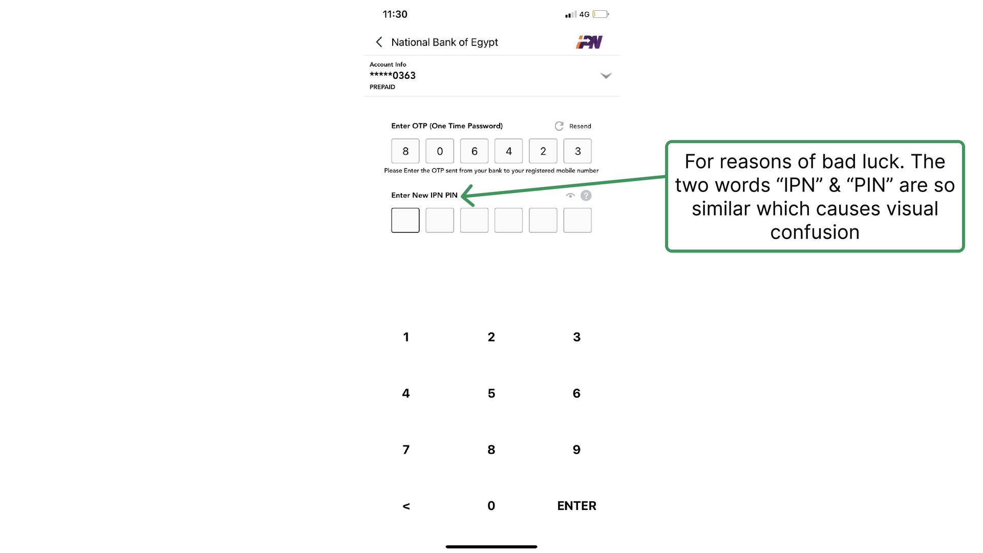
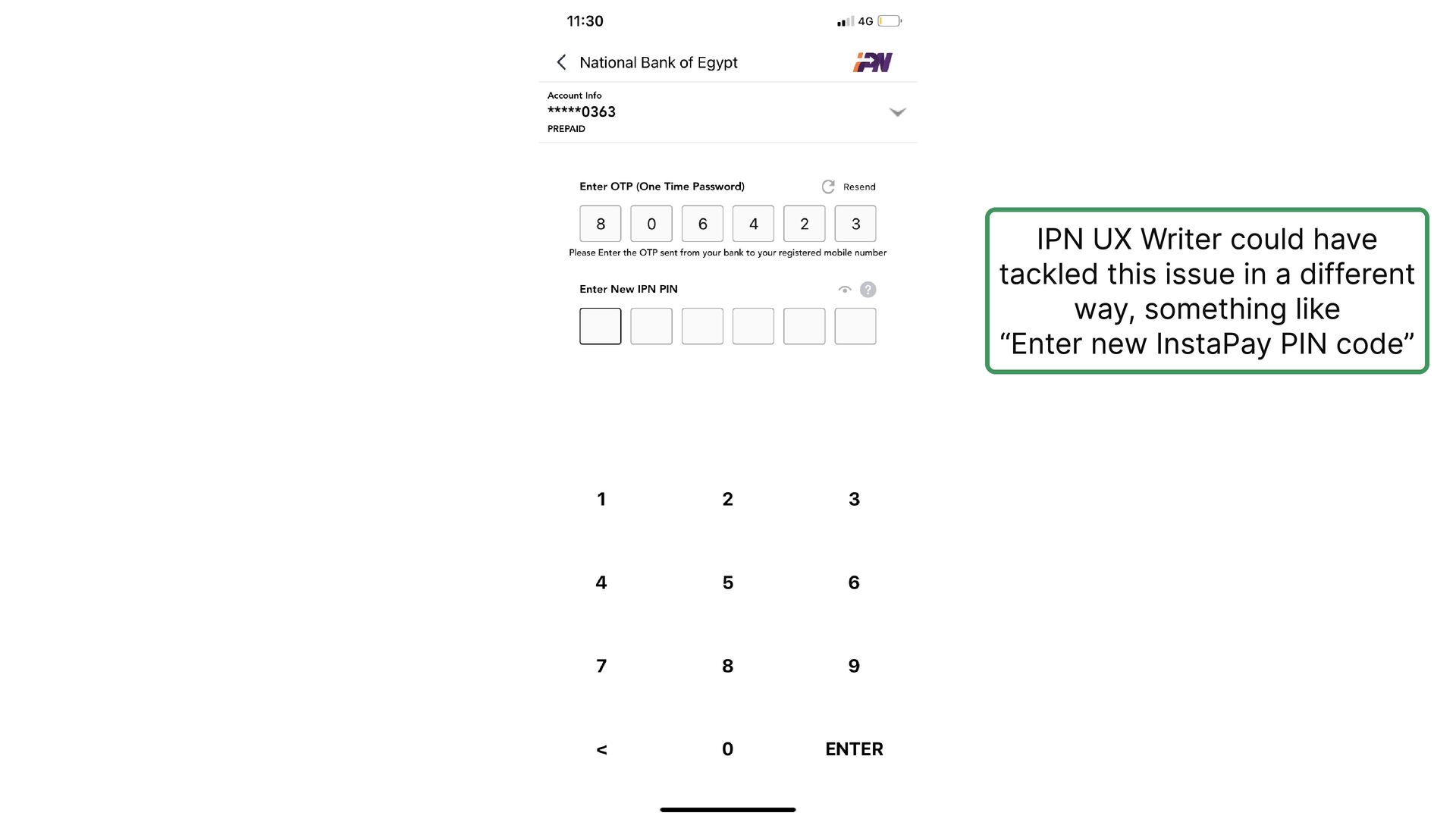
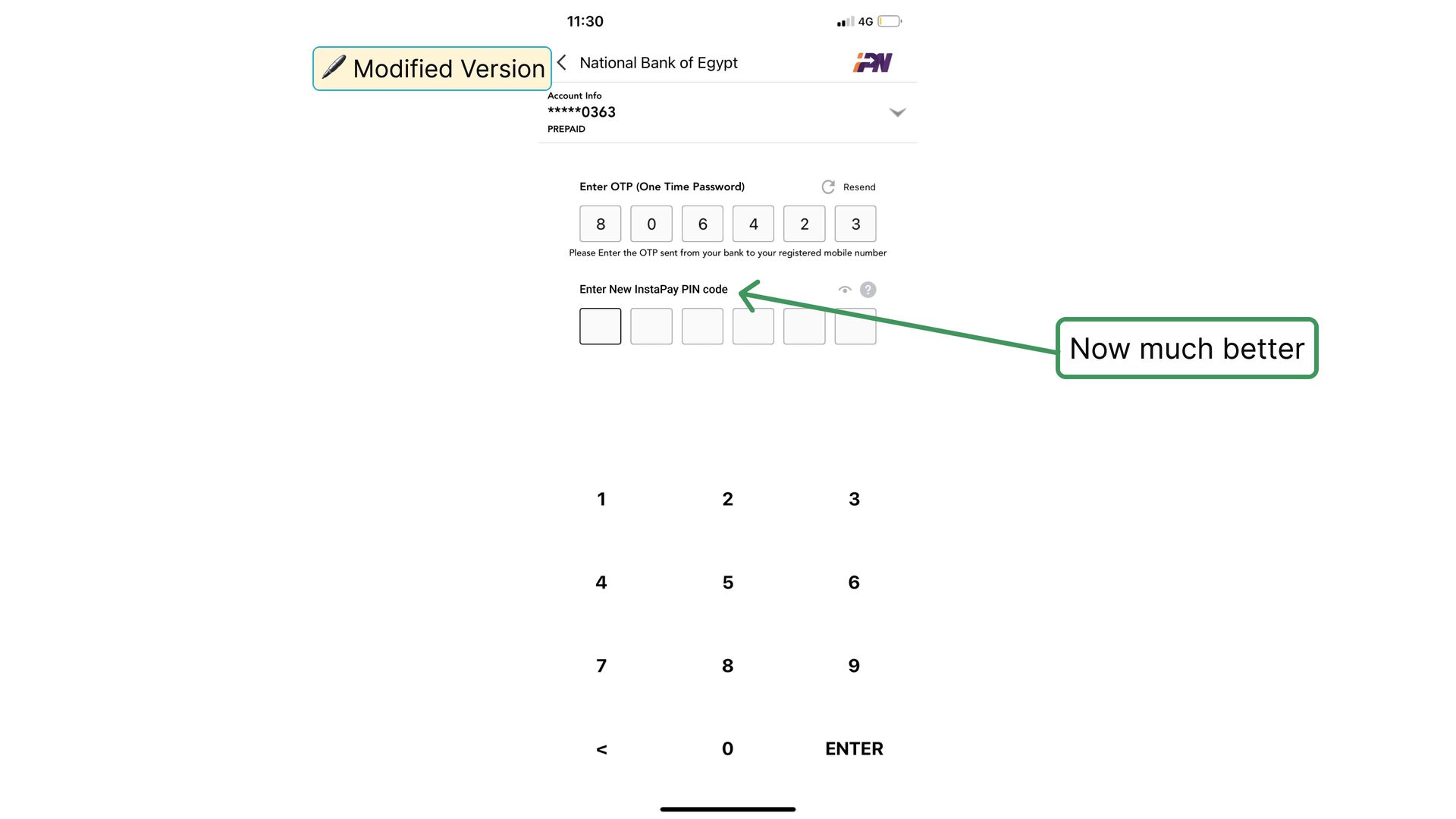
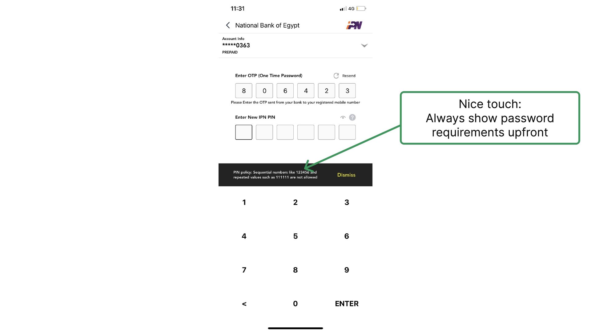
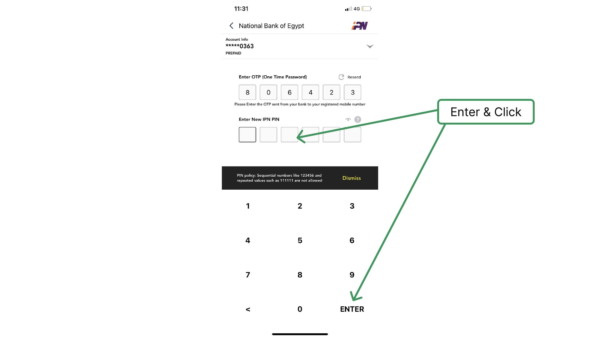
    number without adding enough clarification
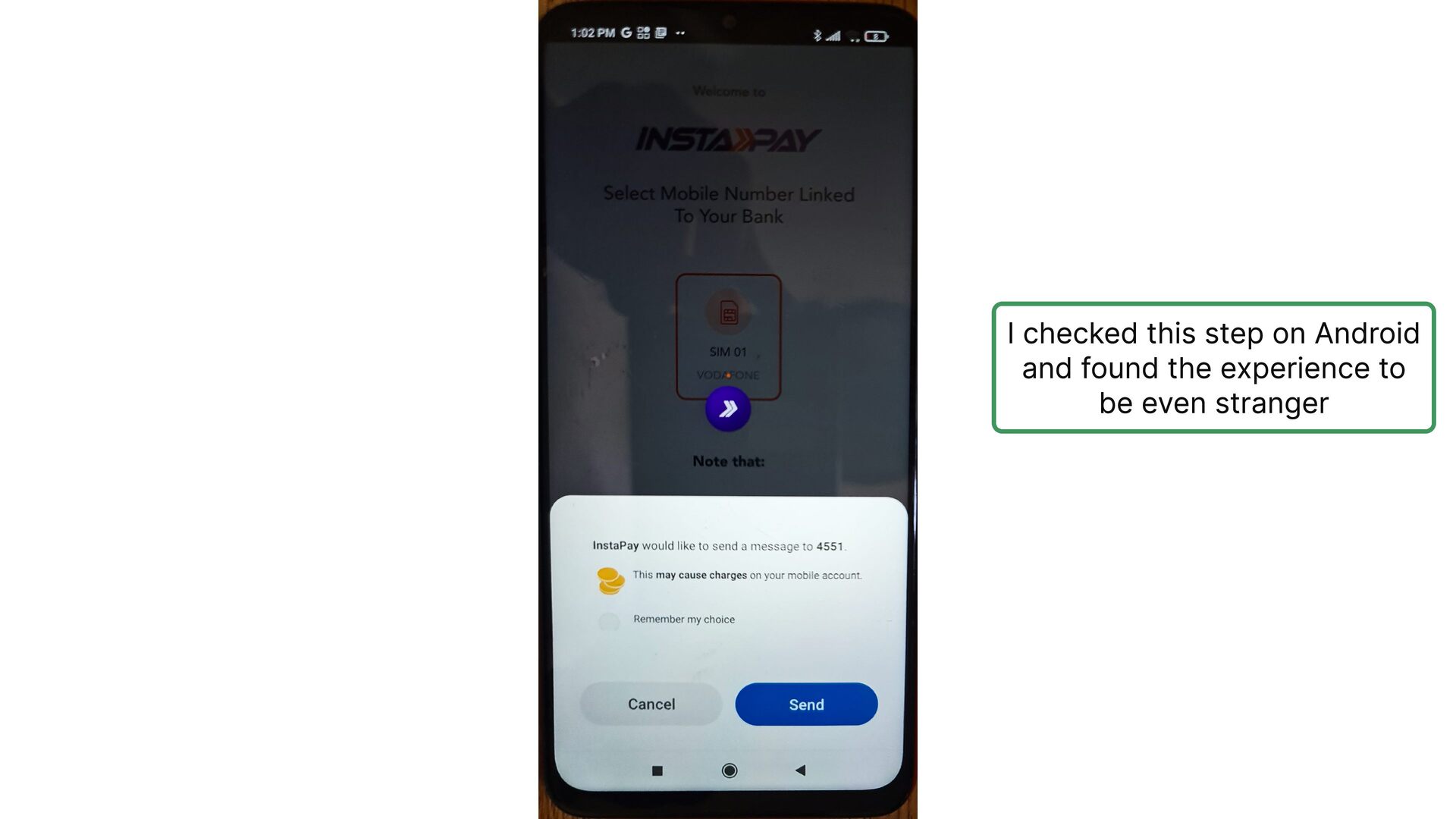
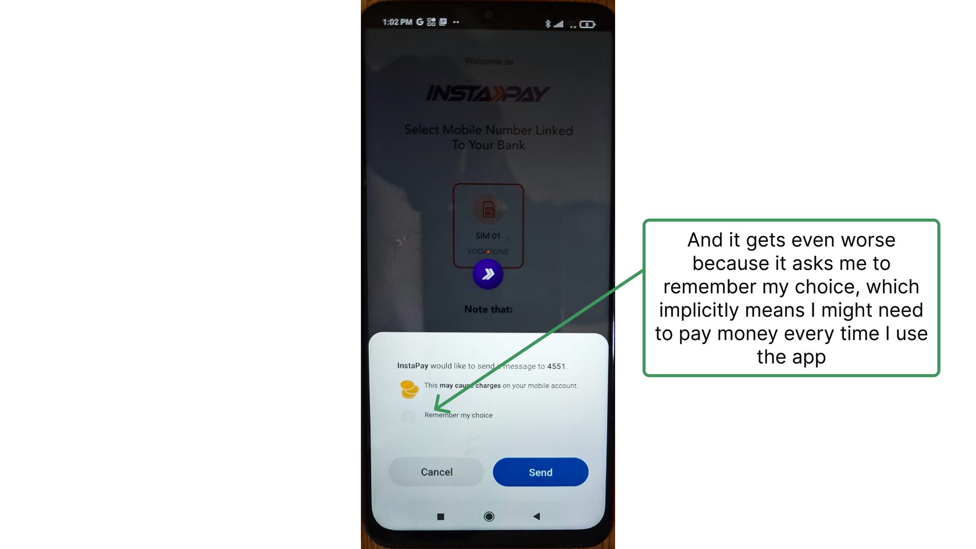
  11. And it gets even worse because it asks me to

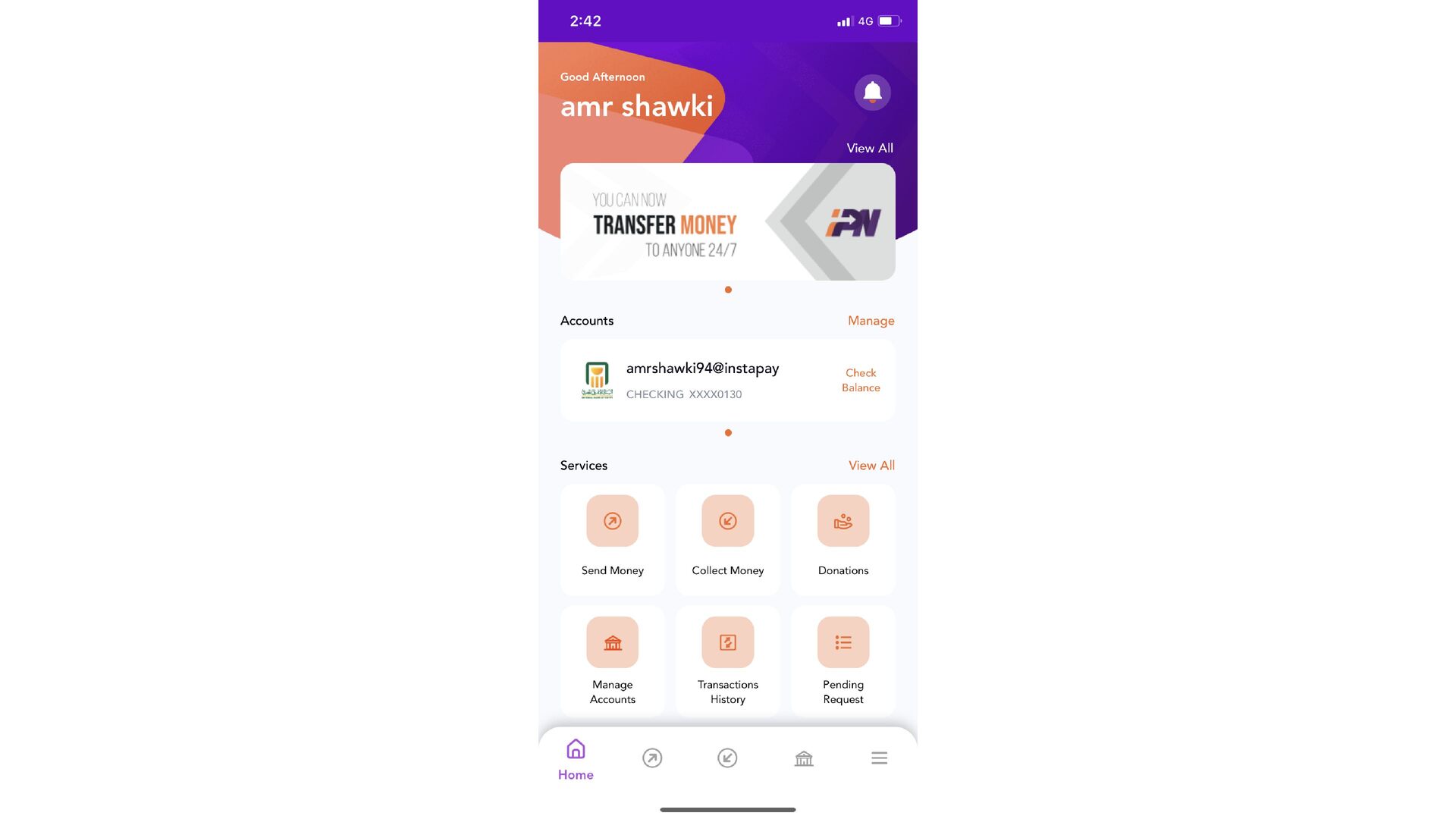
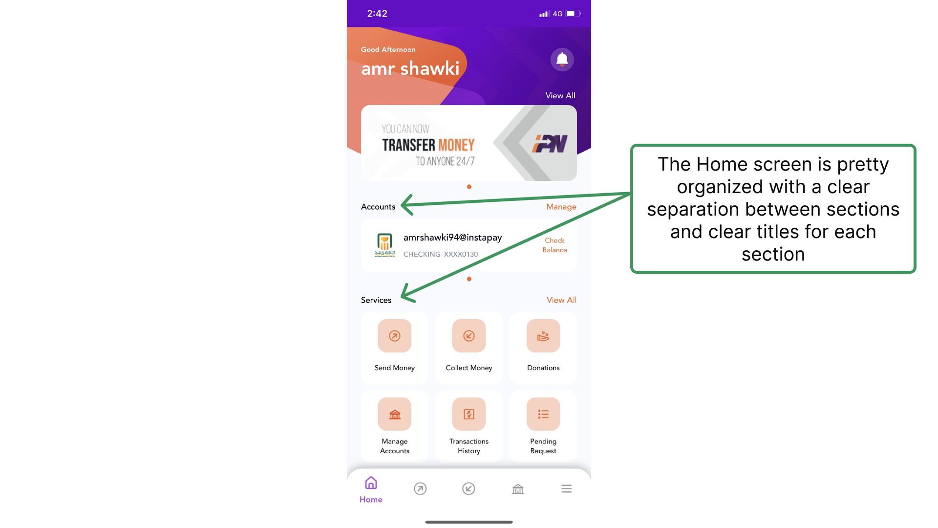
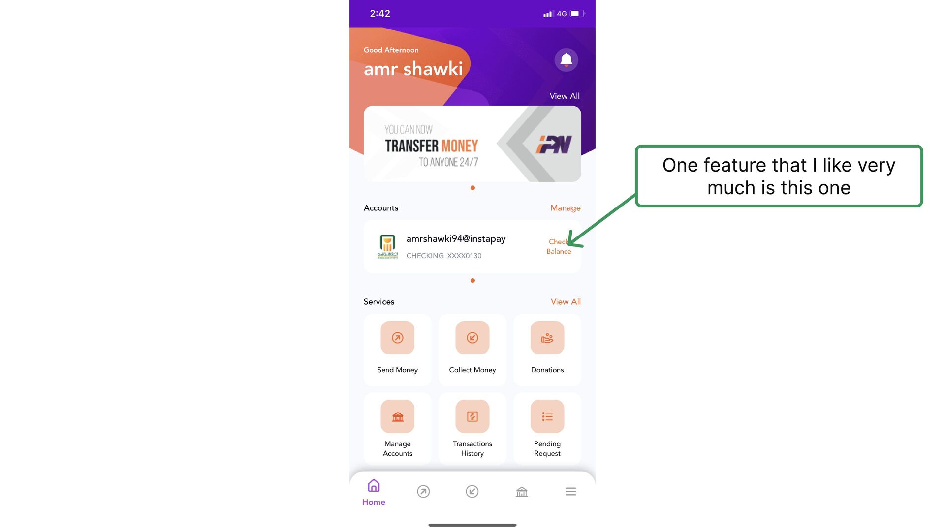
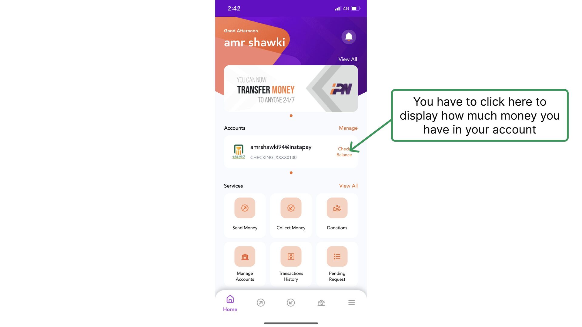
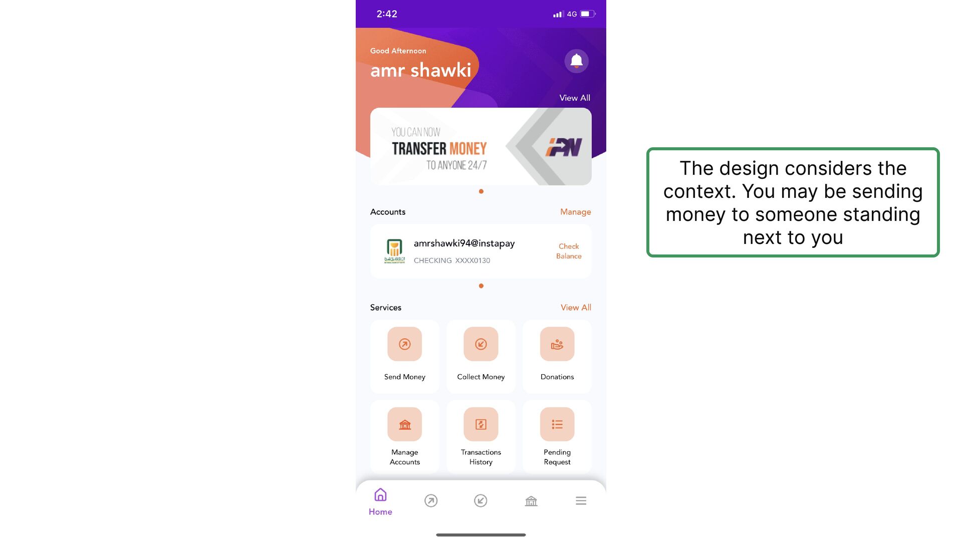
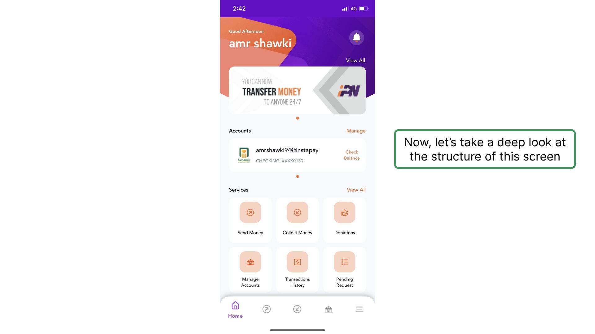
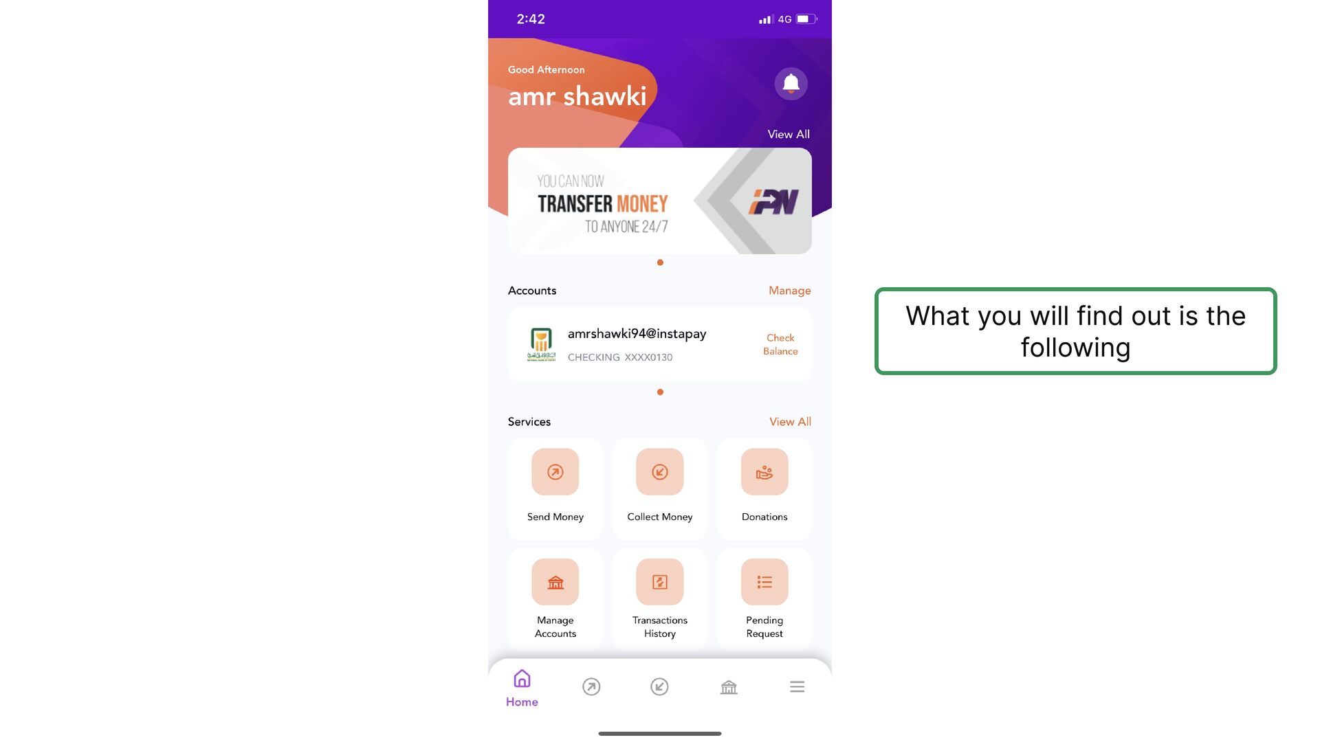
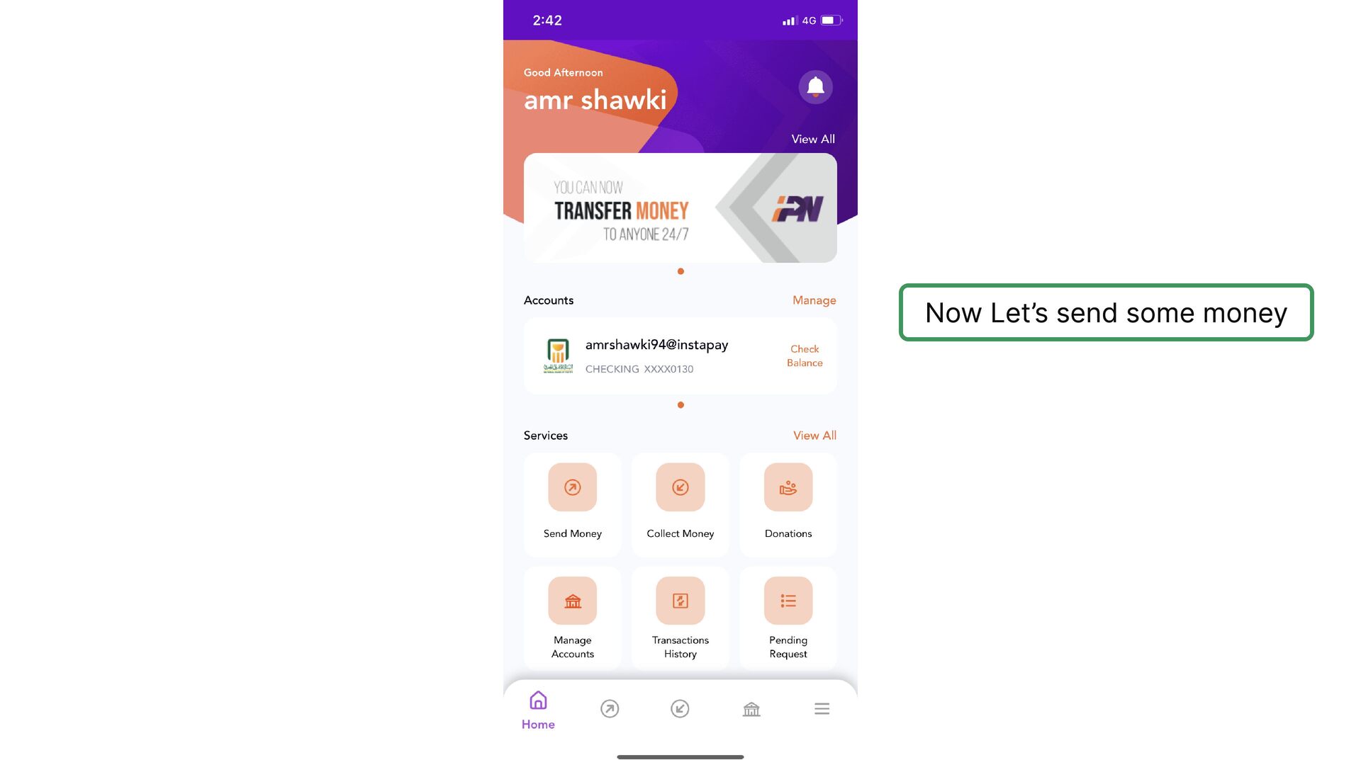
    remember my choice, which implicitly means I might need to pay money every time I use the app
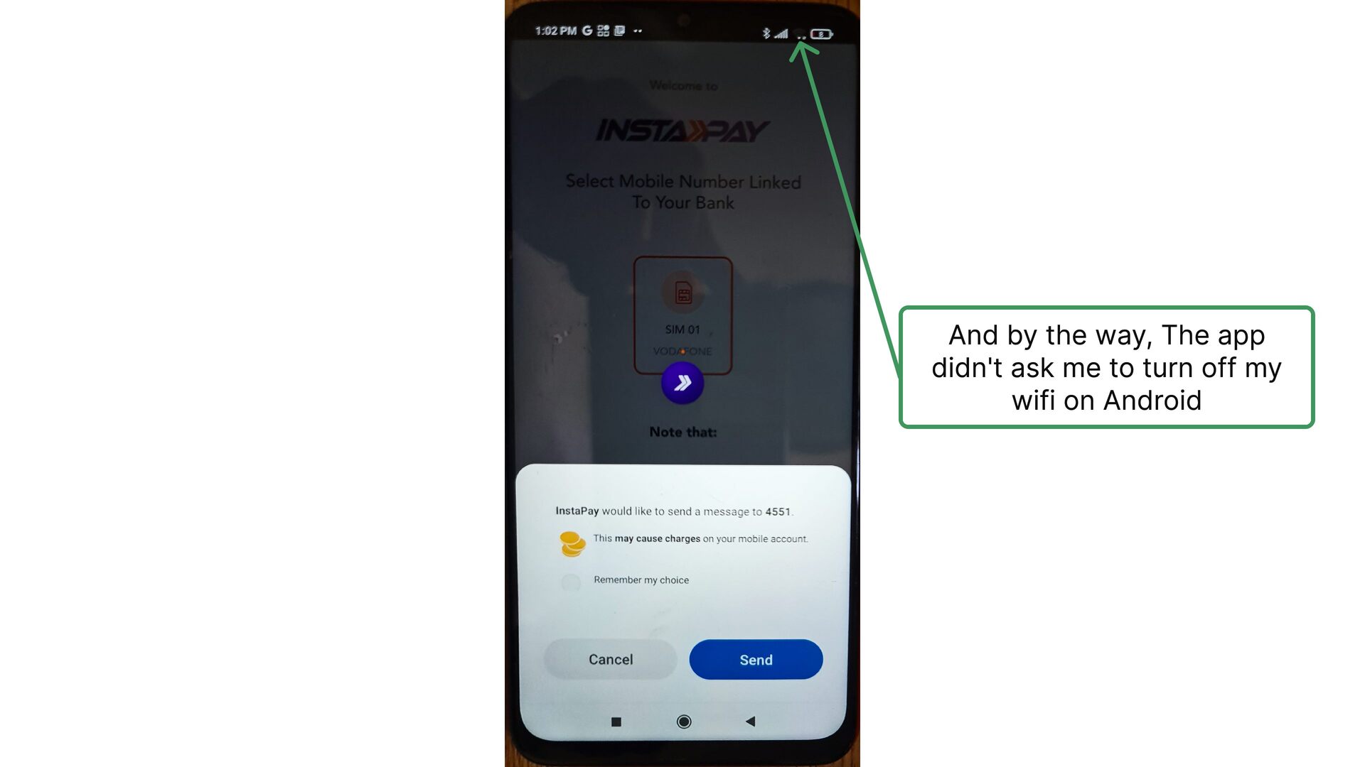
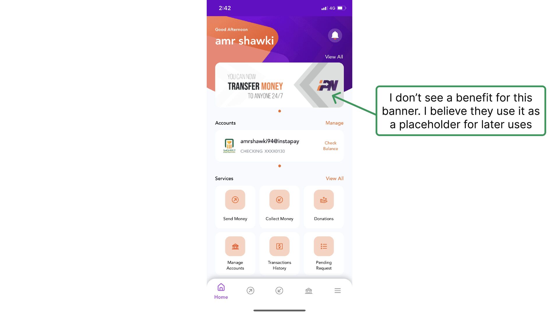
  12. And by the way, The app didn't ask me to

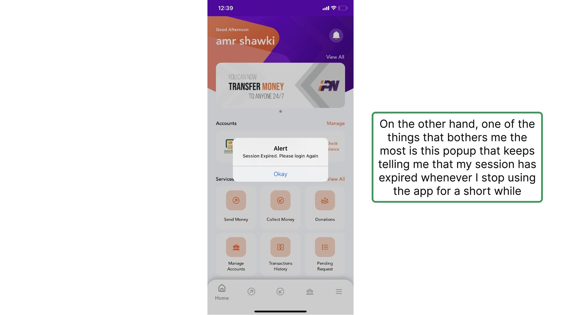
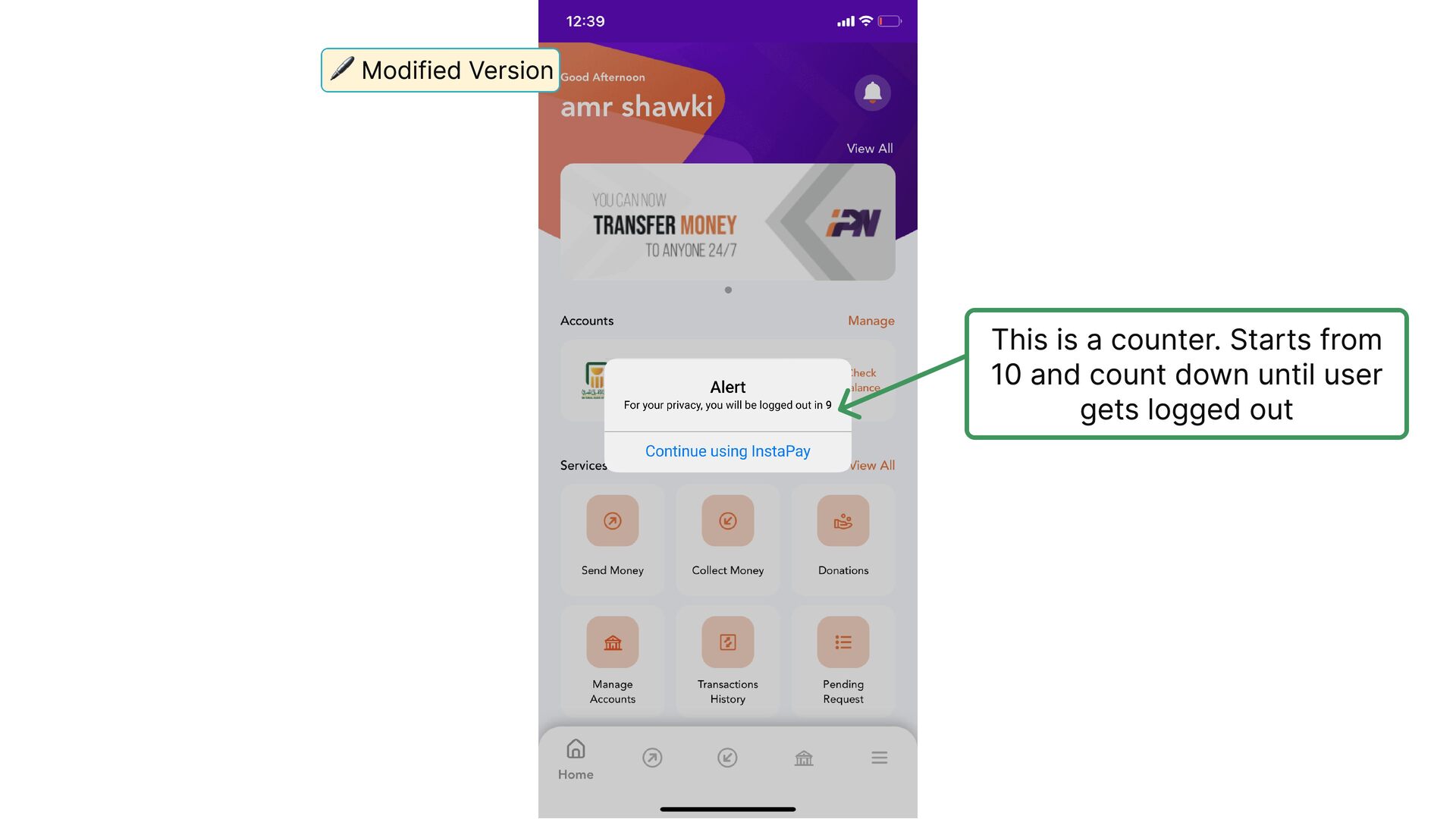
    turn off my wifi on Android
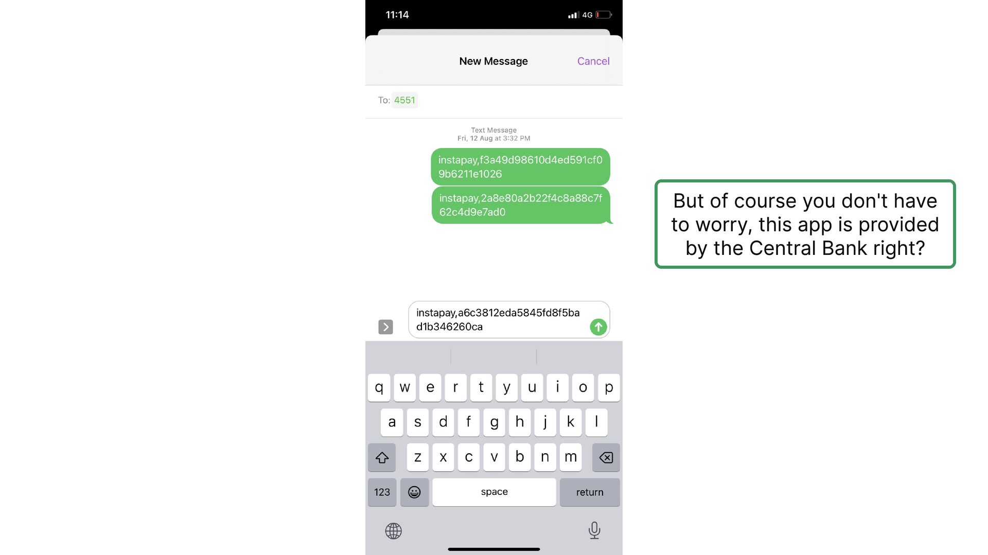
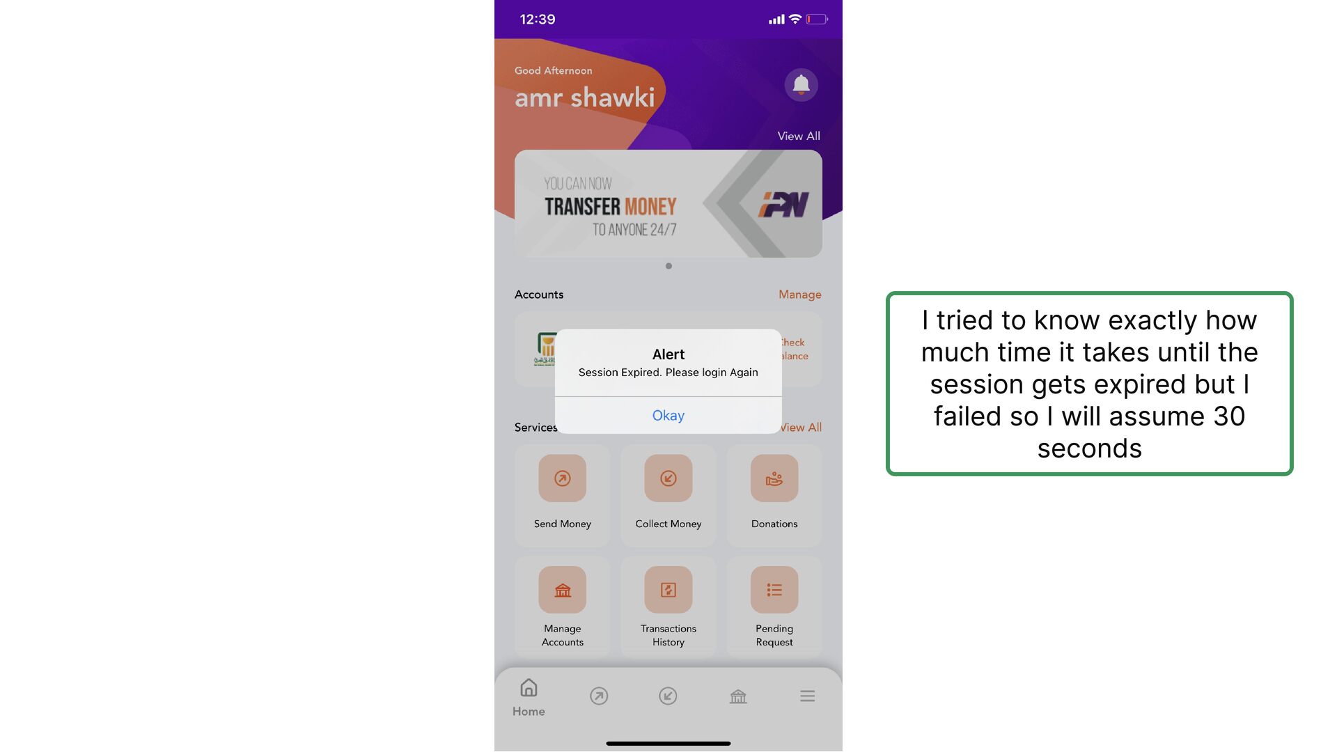
  13. But of course you don't have to worry, this app

    is provided by the Central Bank right?
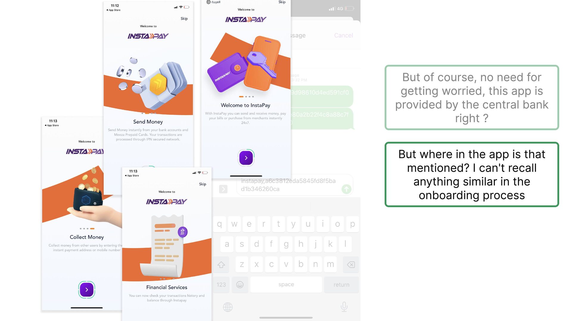
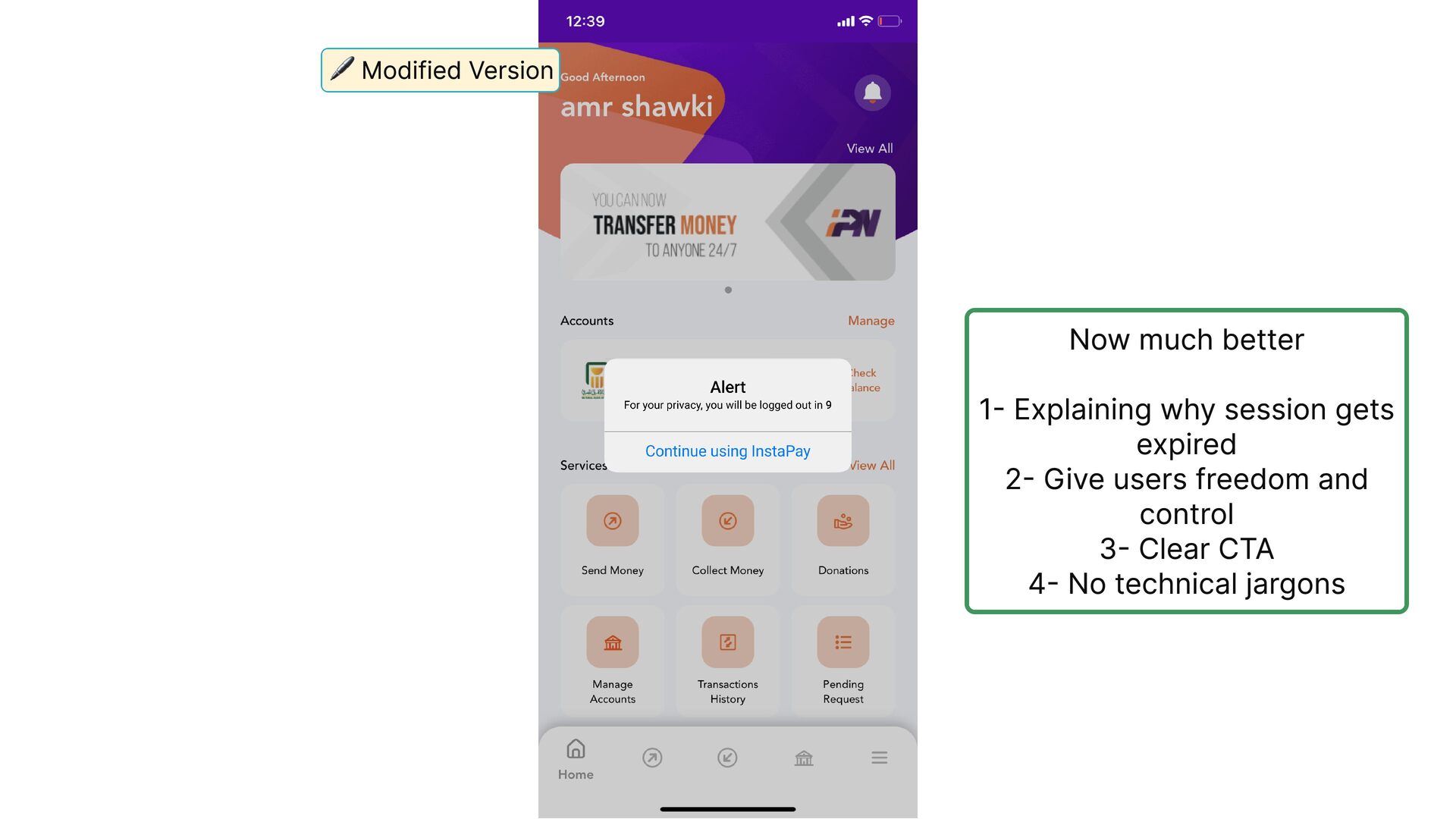
  14. But of course, no need for getting worried, this app

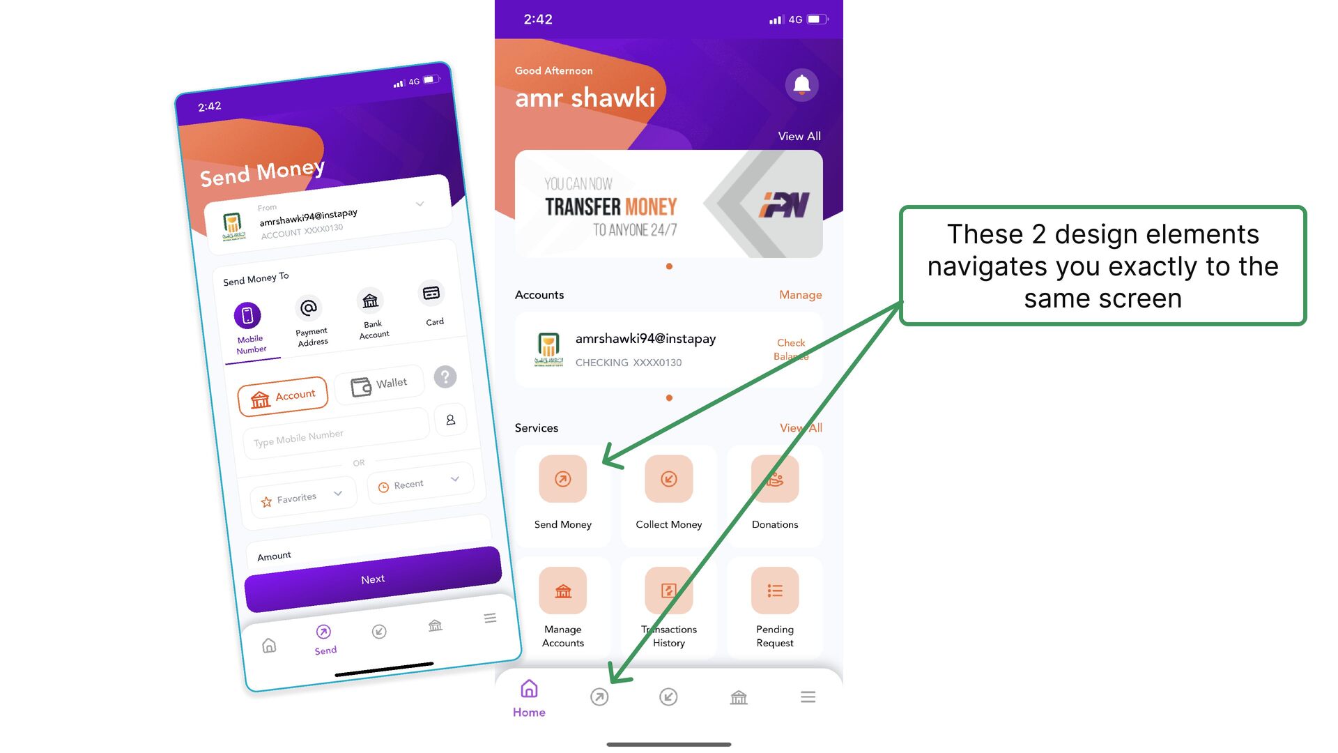
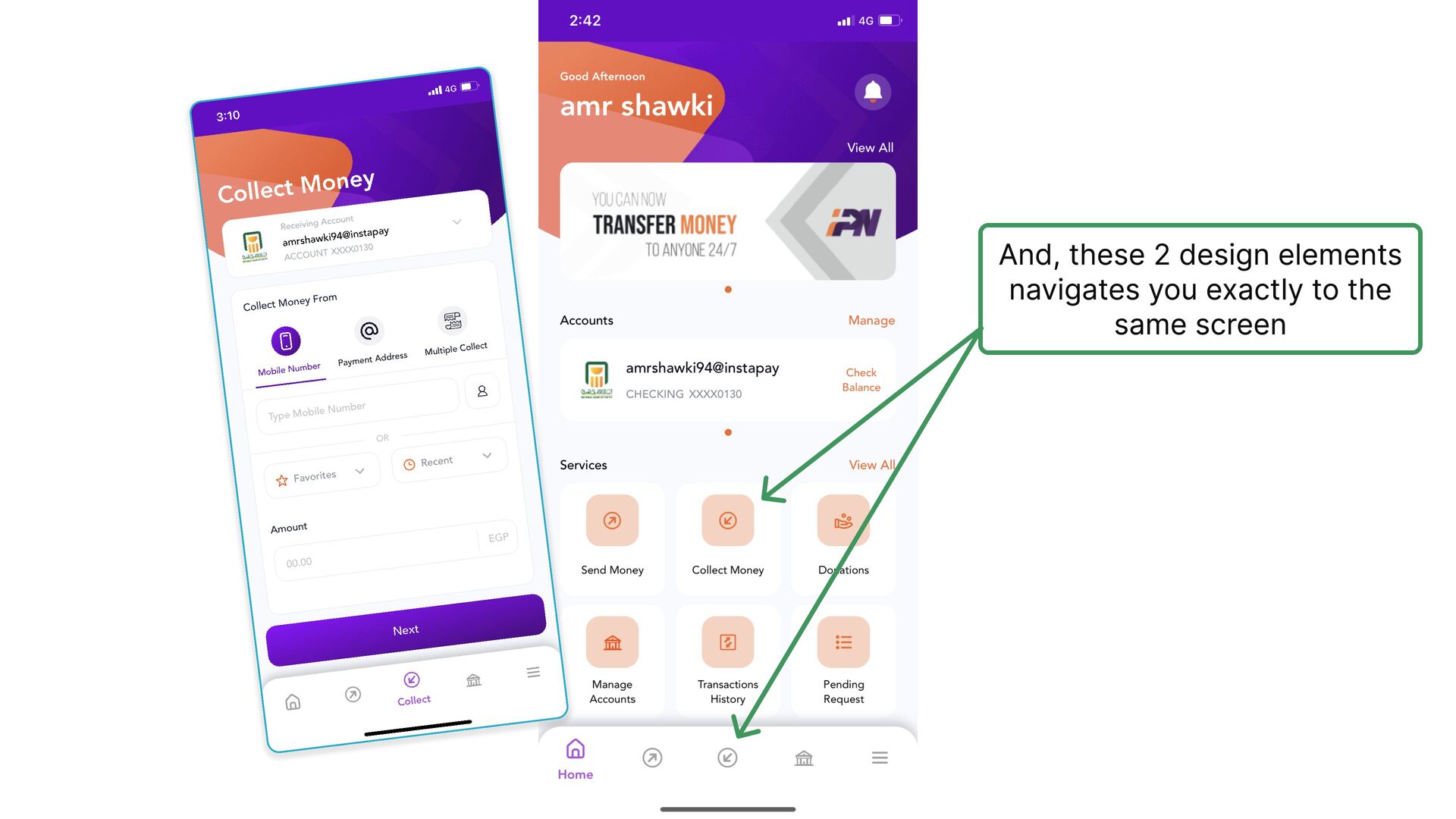
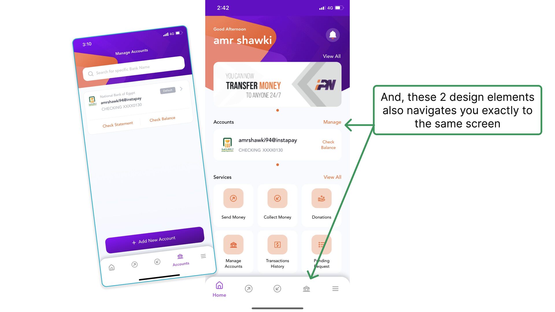
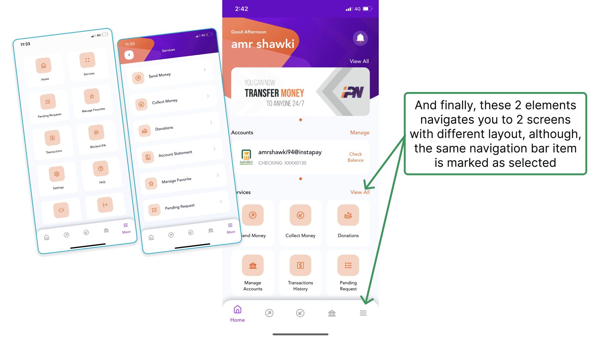
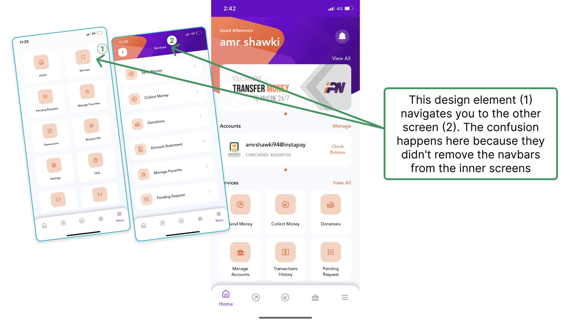
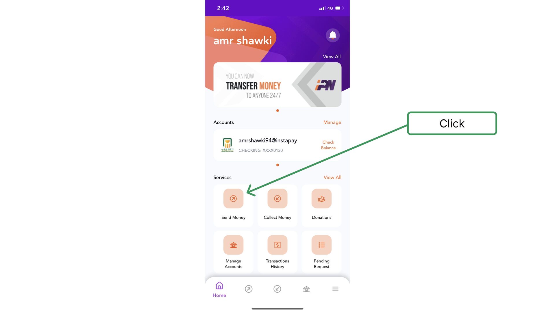
    is provided by the central bank right ? But where in the app is that mentioned? I can't recall anything similar in the onboarding process
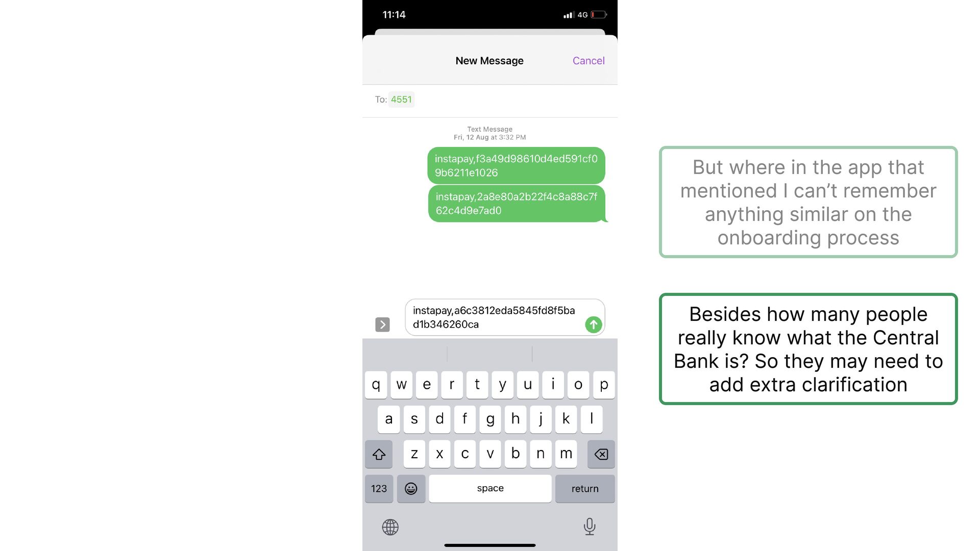
  15. But where in the app that mentioned I can’t remember

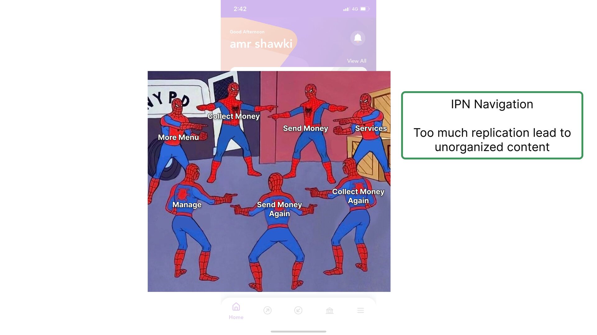
    anything similar on the onboarding process Besides how many people really know what the Central Bank is? So they may need to add extra clarification
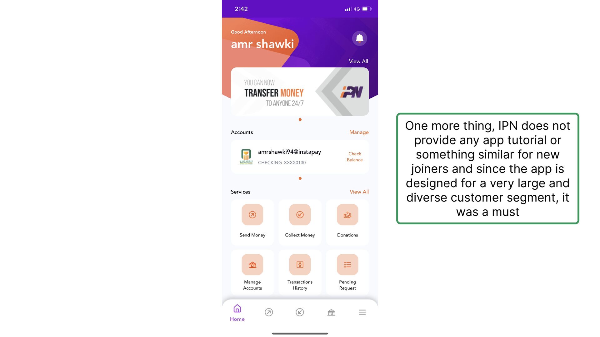
  16. So a quick recap before moving forward. So to be

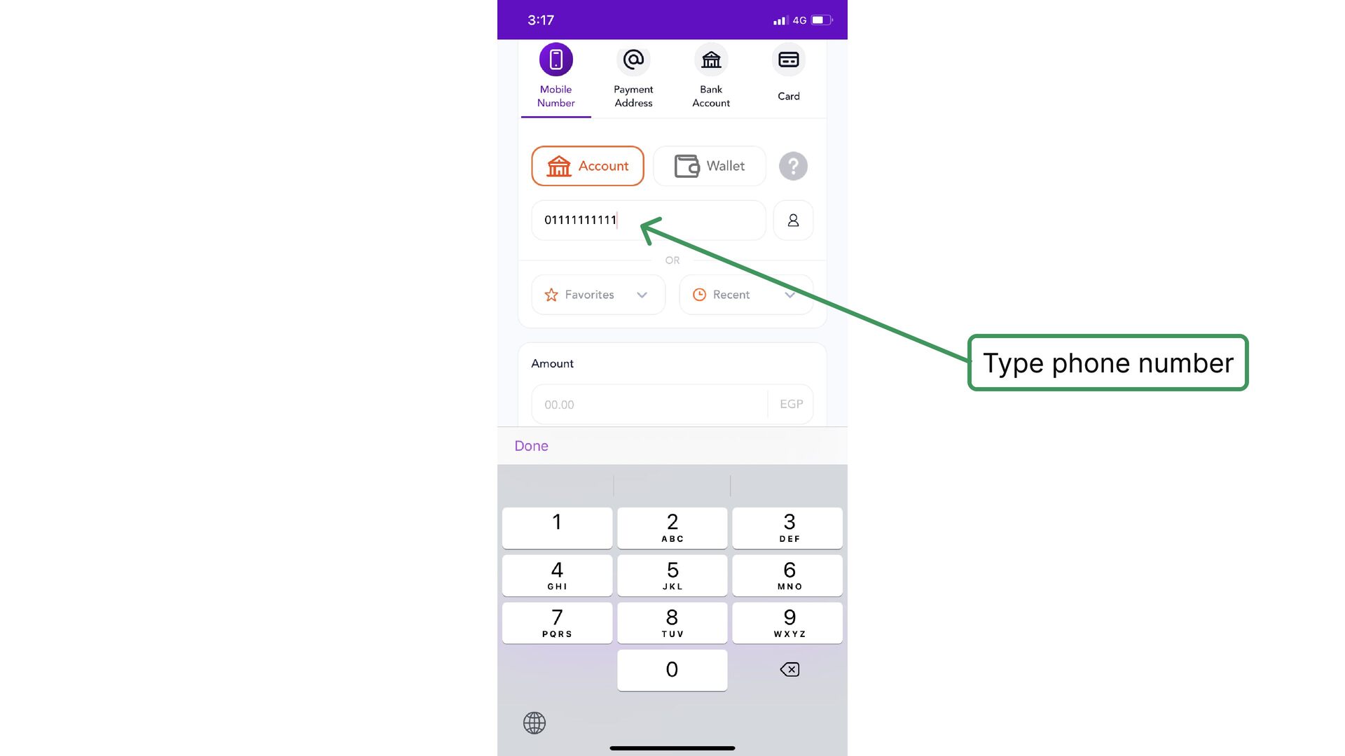
    able to pass the first step in the registration process, you have to do/have the following:
  17. So a quick recap before moving forward. to be able

    to pass the first step in the registration process, you have to do/have the following: 1- You have the user's SIM card inserted into the phone 2- Mobile data and good cellular network 3- You may need to pay some money
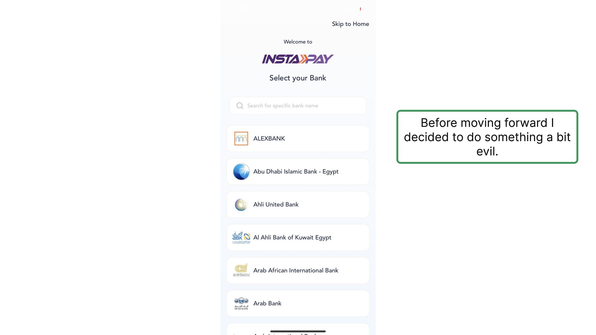
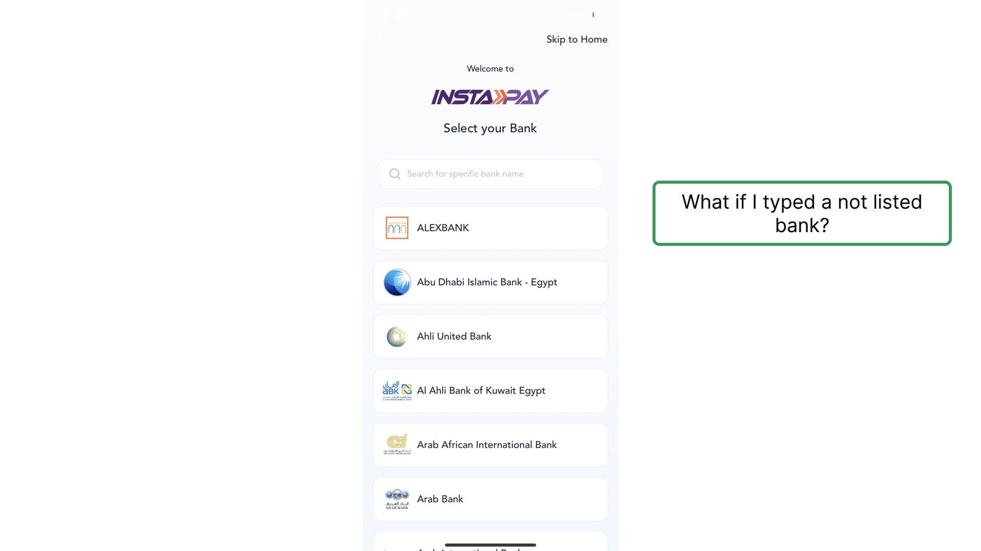
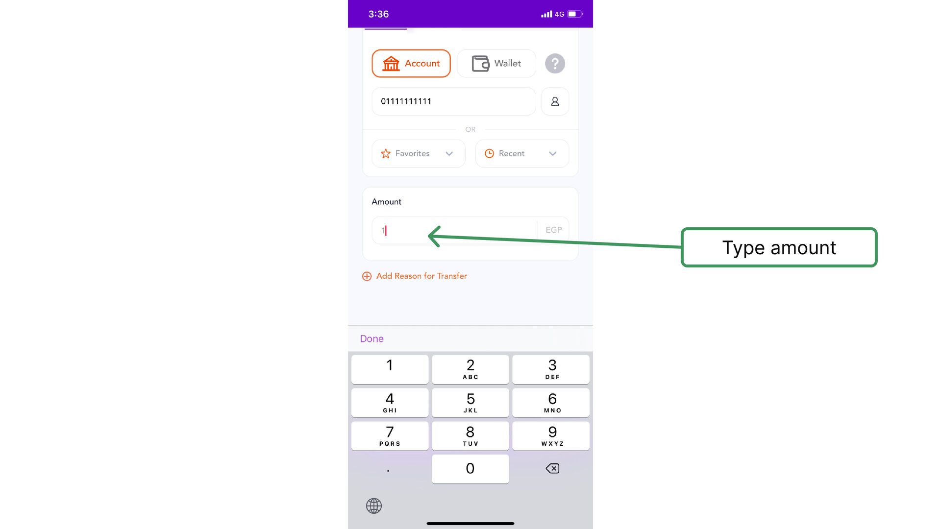
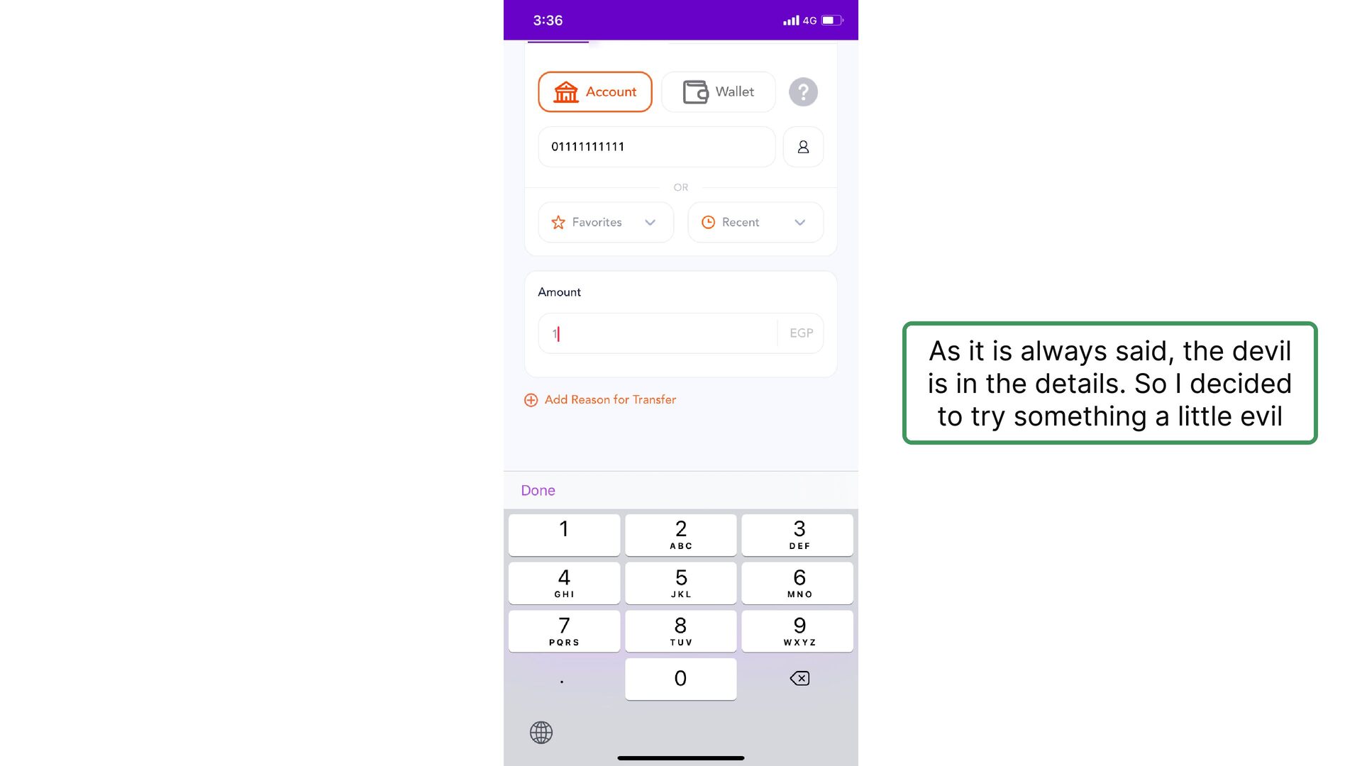
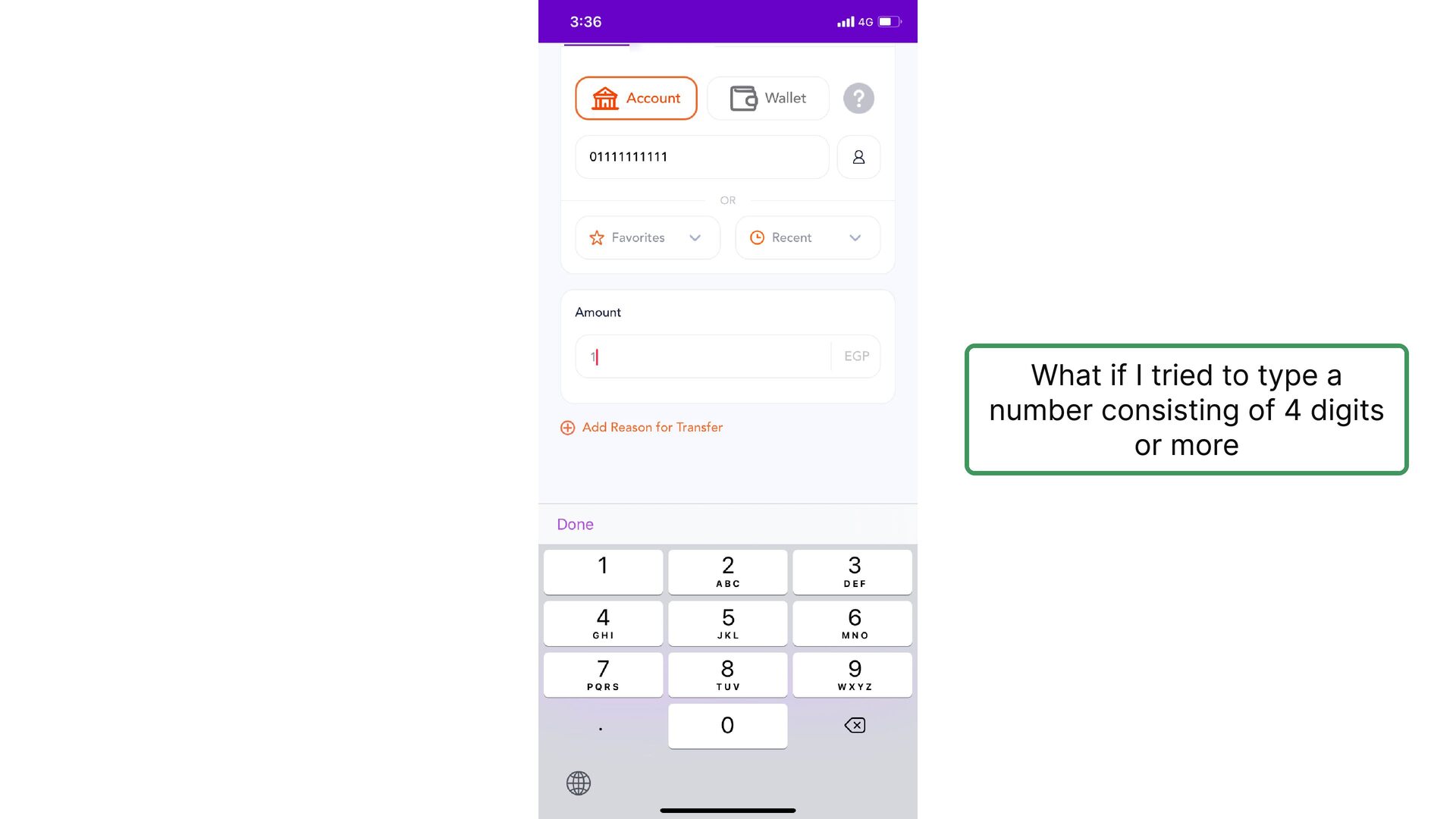
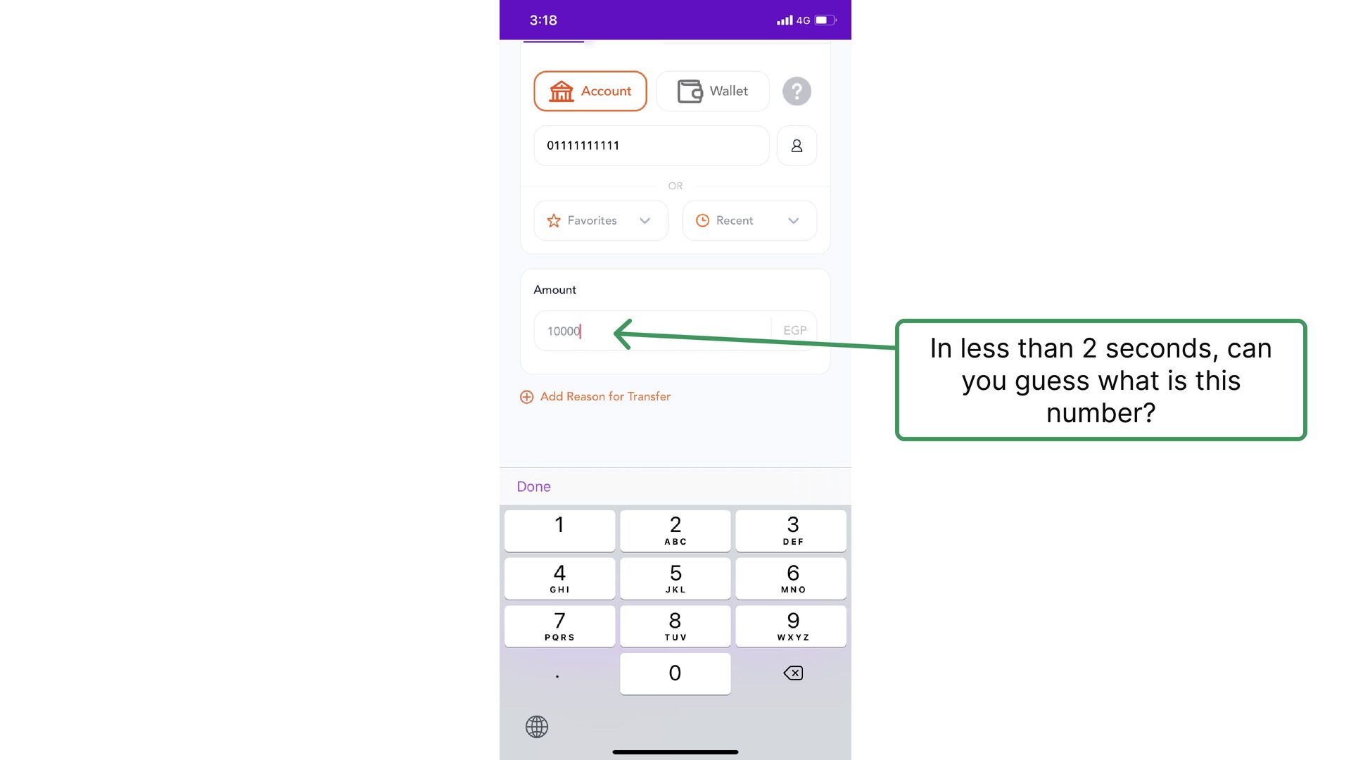
  18. 🚨️ The worst way to deal with wrong user input

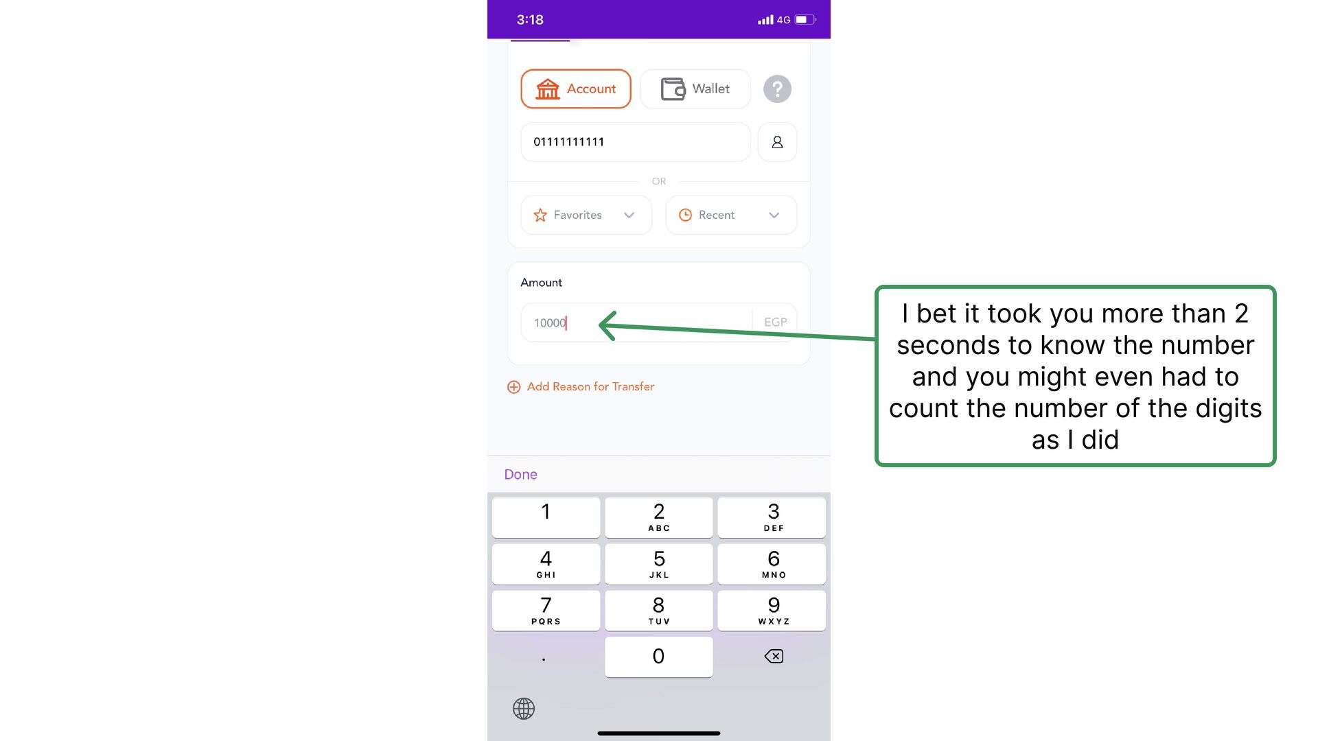
    is not to deal with it at all, which makes the user thinks either he typed the bank name wrong or he should type the full name, either way, the user journey with the app is over
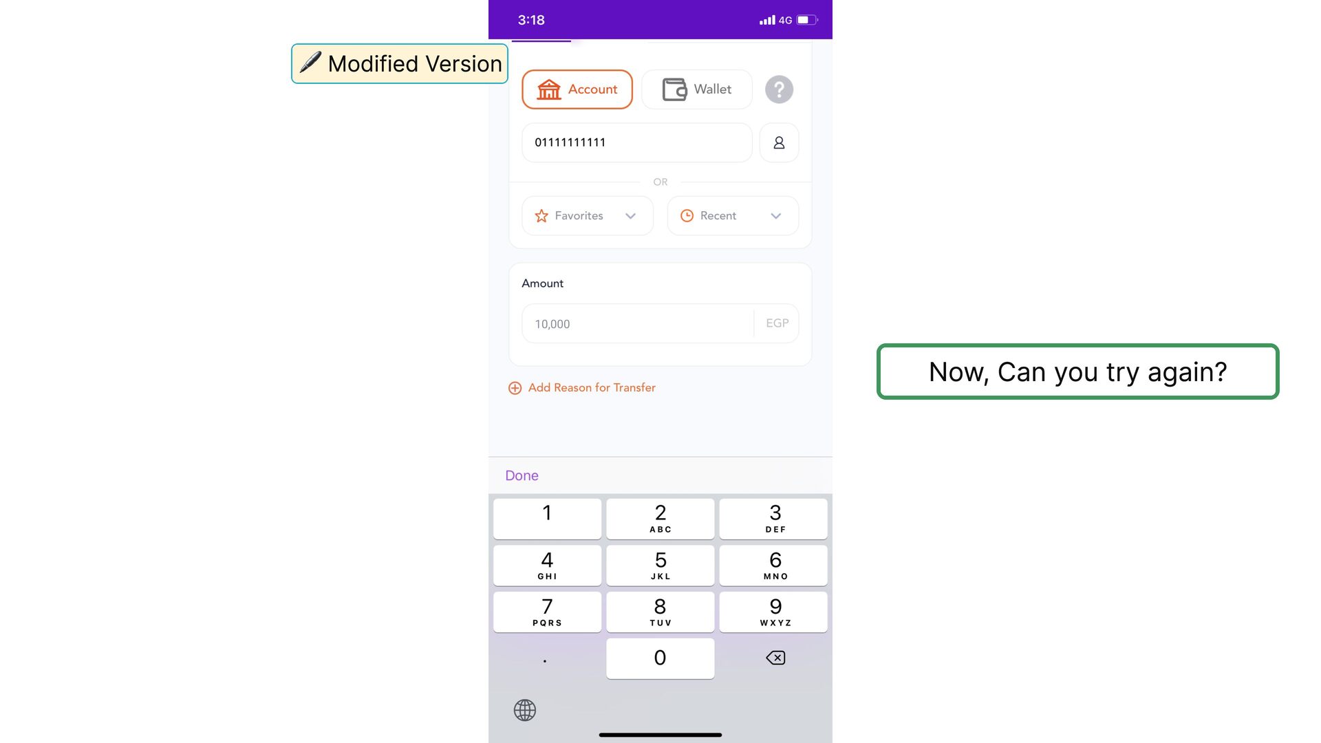
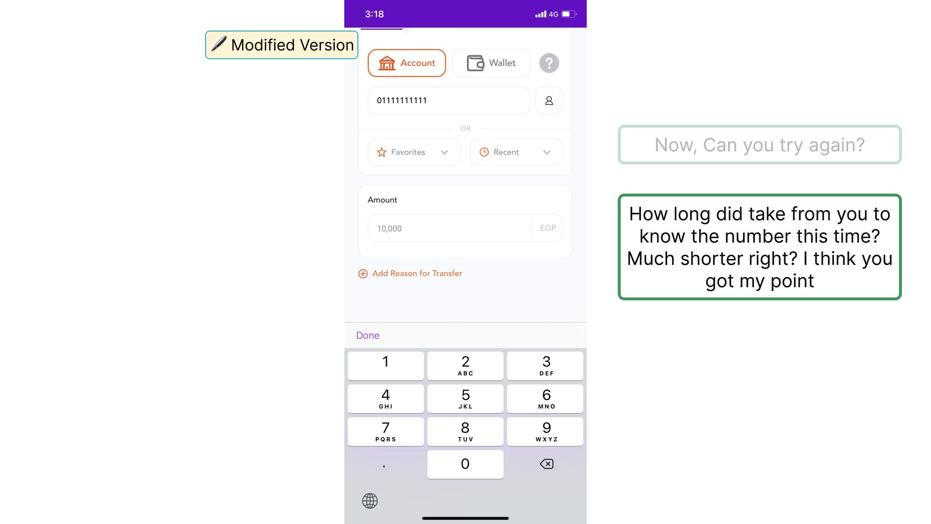
  19. 🚨️ The worst way to deal with wrong user input

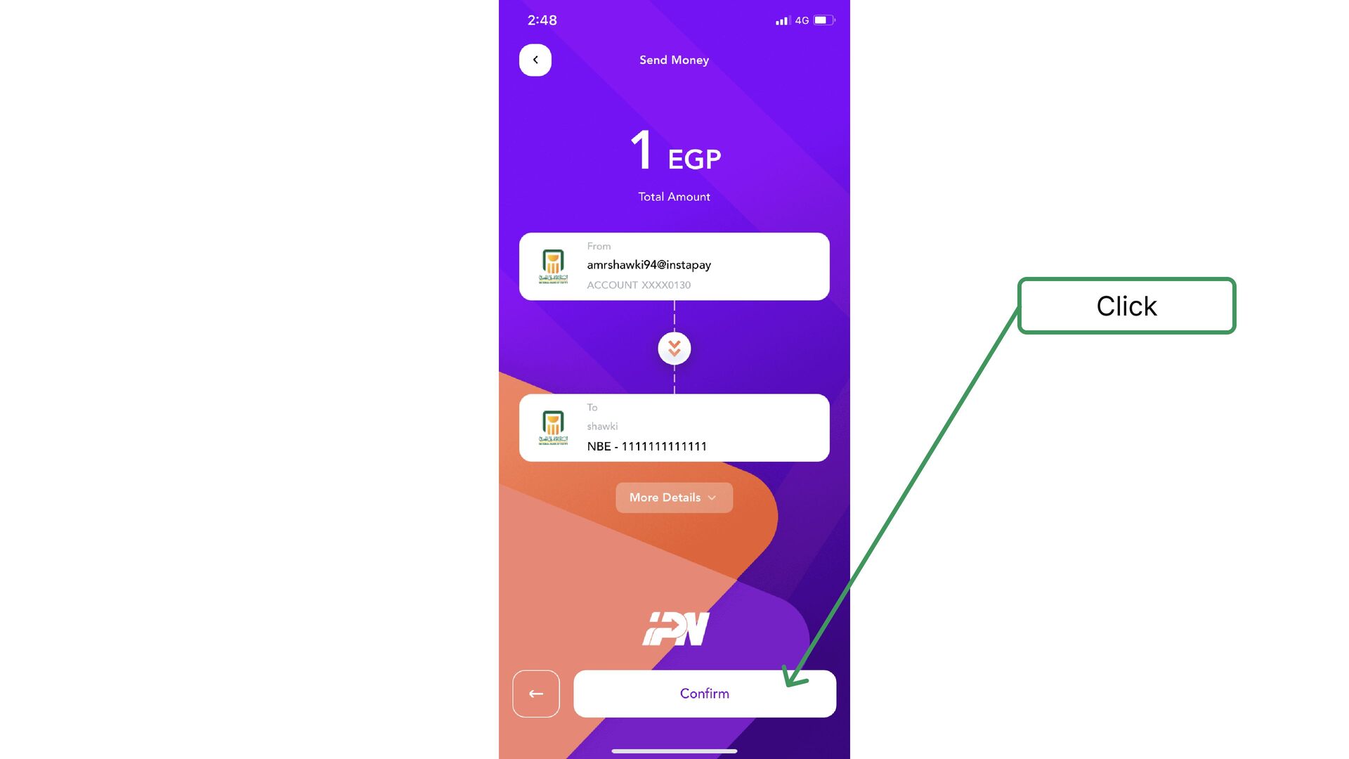
    is not to deal with it at all, which makes the user thinks either he typed the bank name wrong or he should type the full name, either way, the user journey with the app is over 💡 We will discuss this issue in detail in the discussion section below
  20. especially, since this section elements have almost equal visual weight

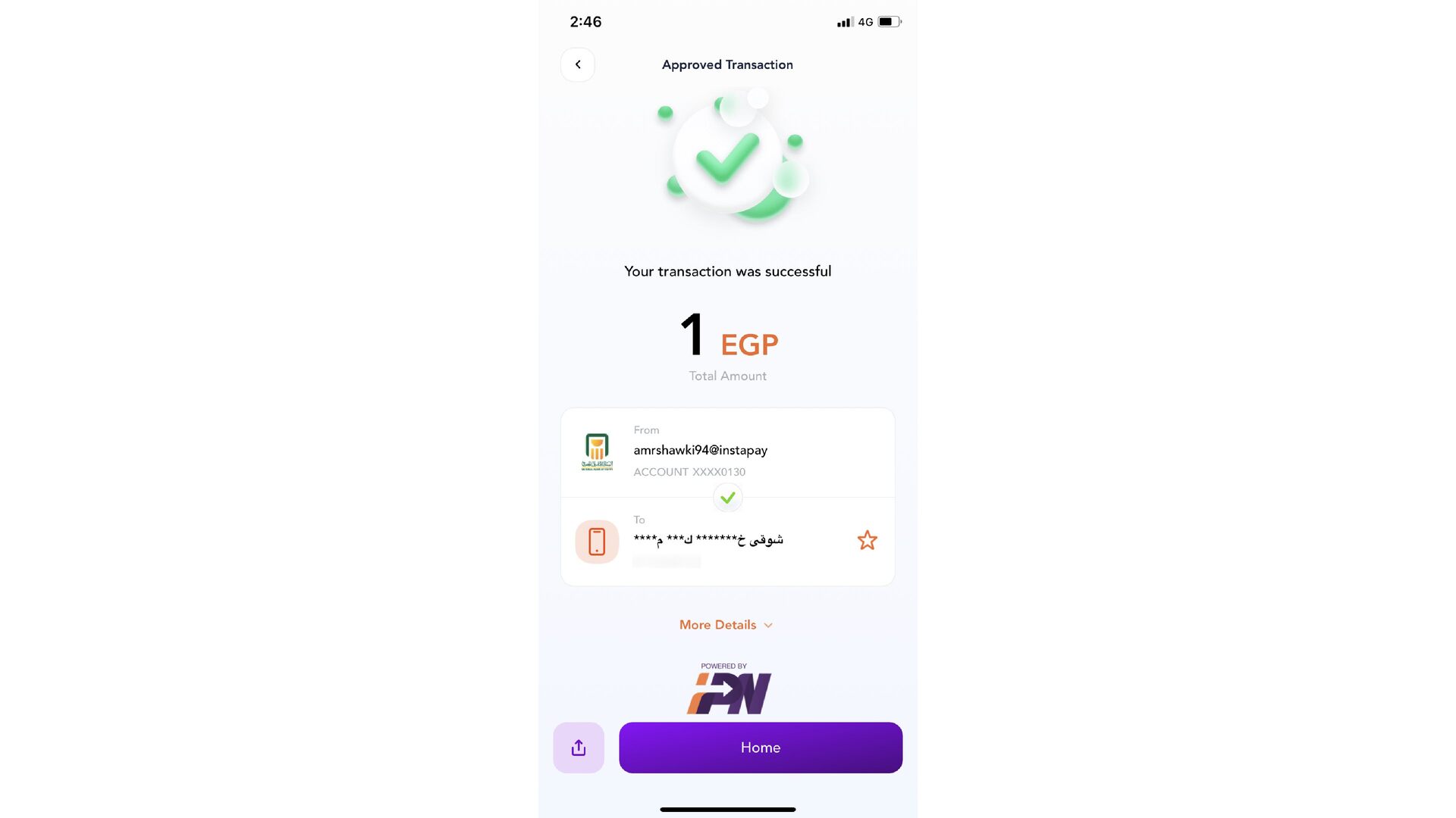
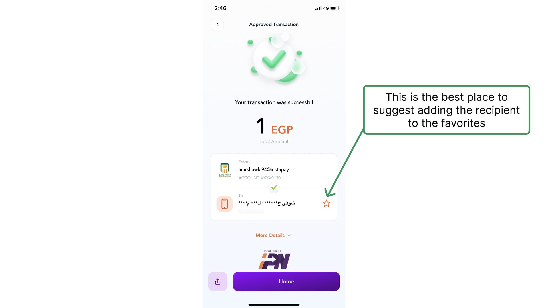
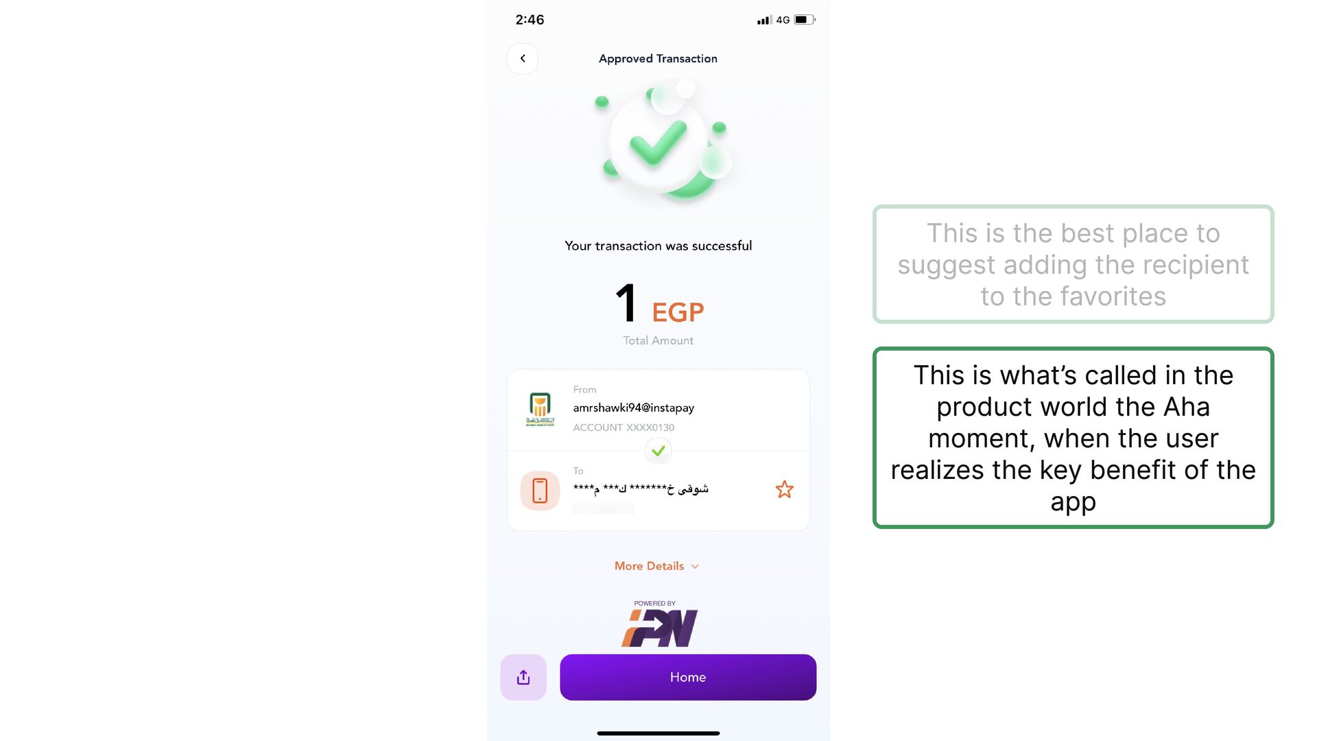
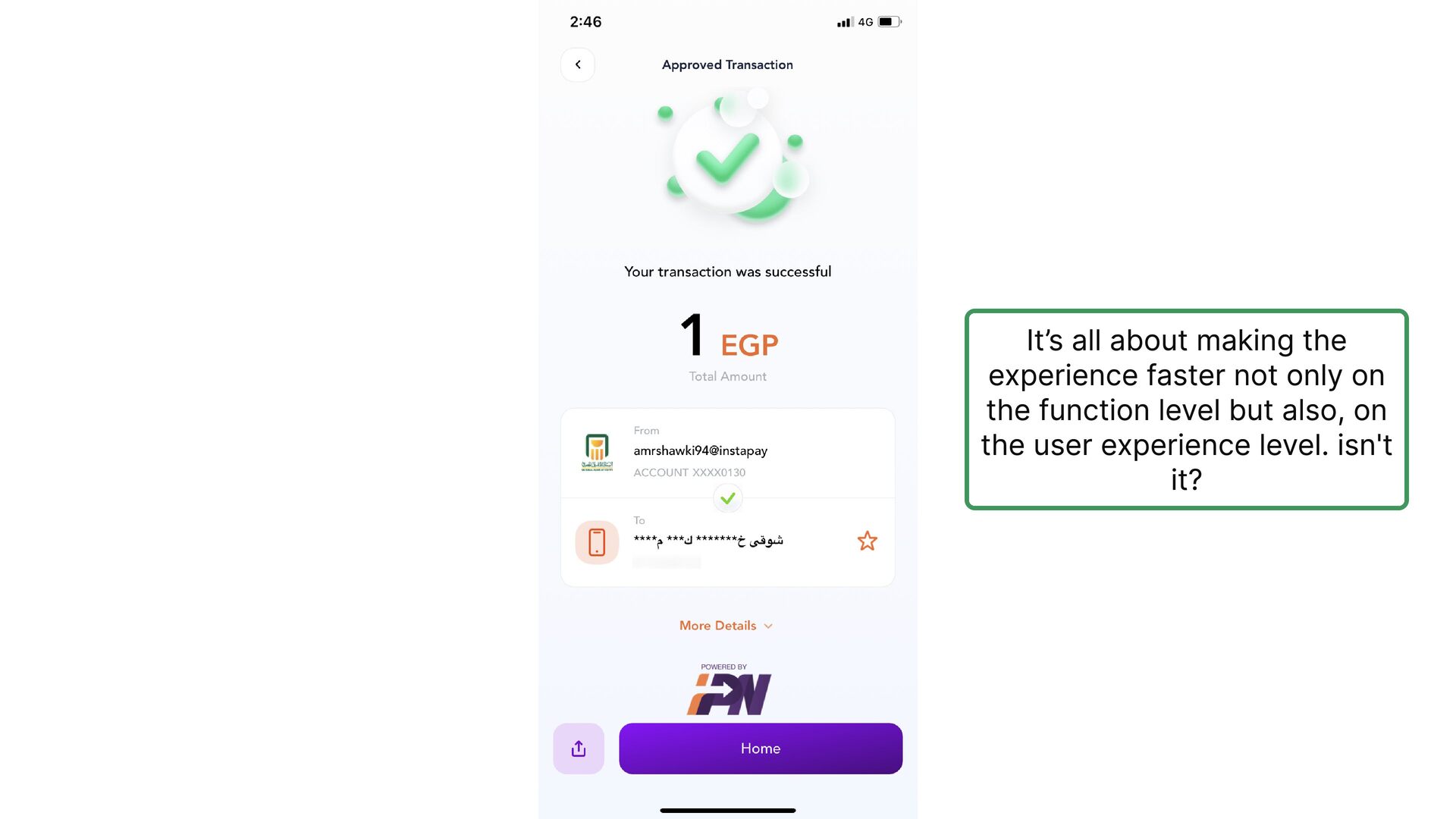
    with no clear visual hierarchy, so users might jump directly to the input fields labels
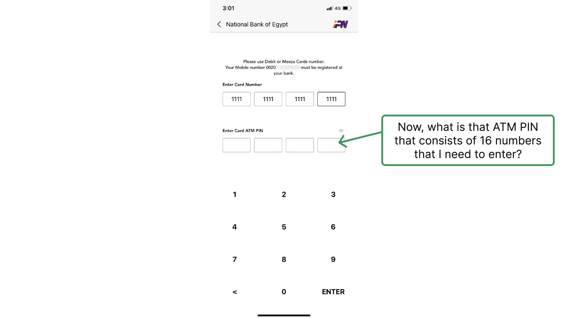
  21. Now, what is that ATM PIN that consists of 16

    numbers that I need to enter?
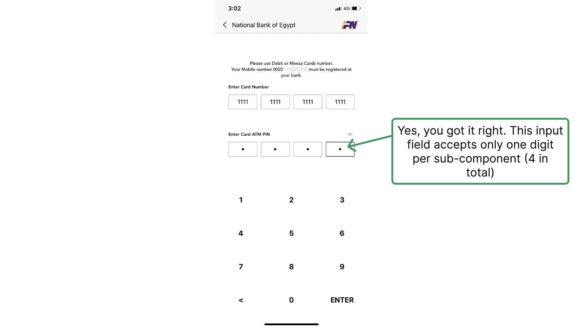
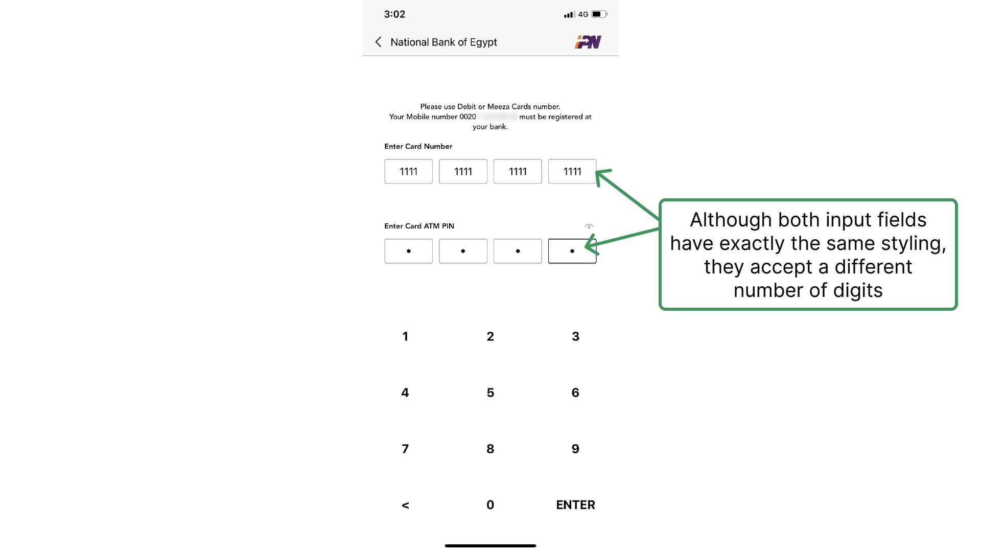
  22. Yes, you got it right. This input field accepts only

    one digit per sub-component (4 in total)
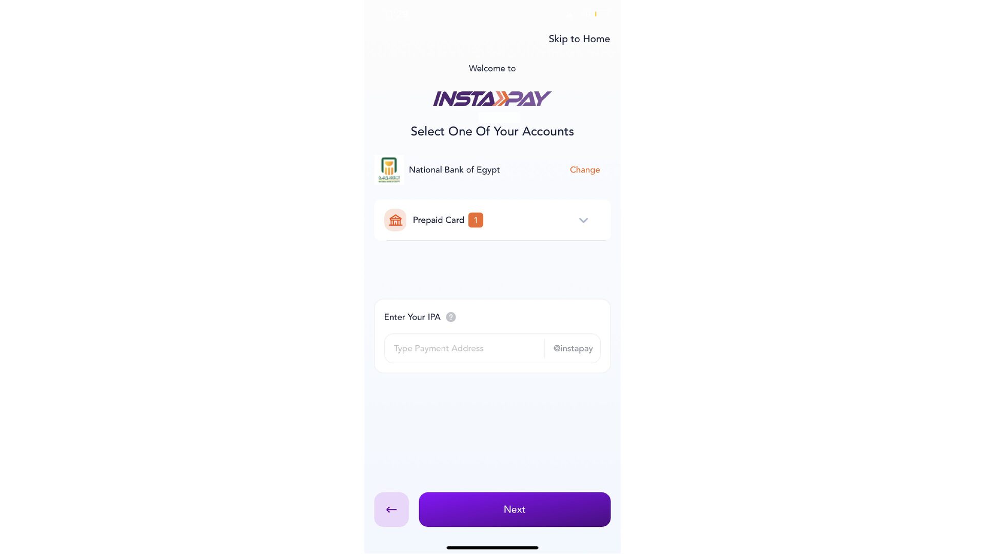
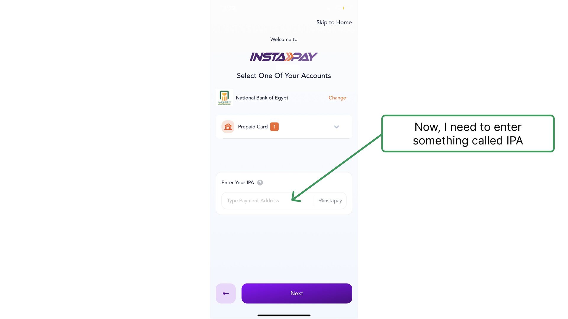
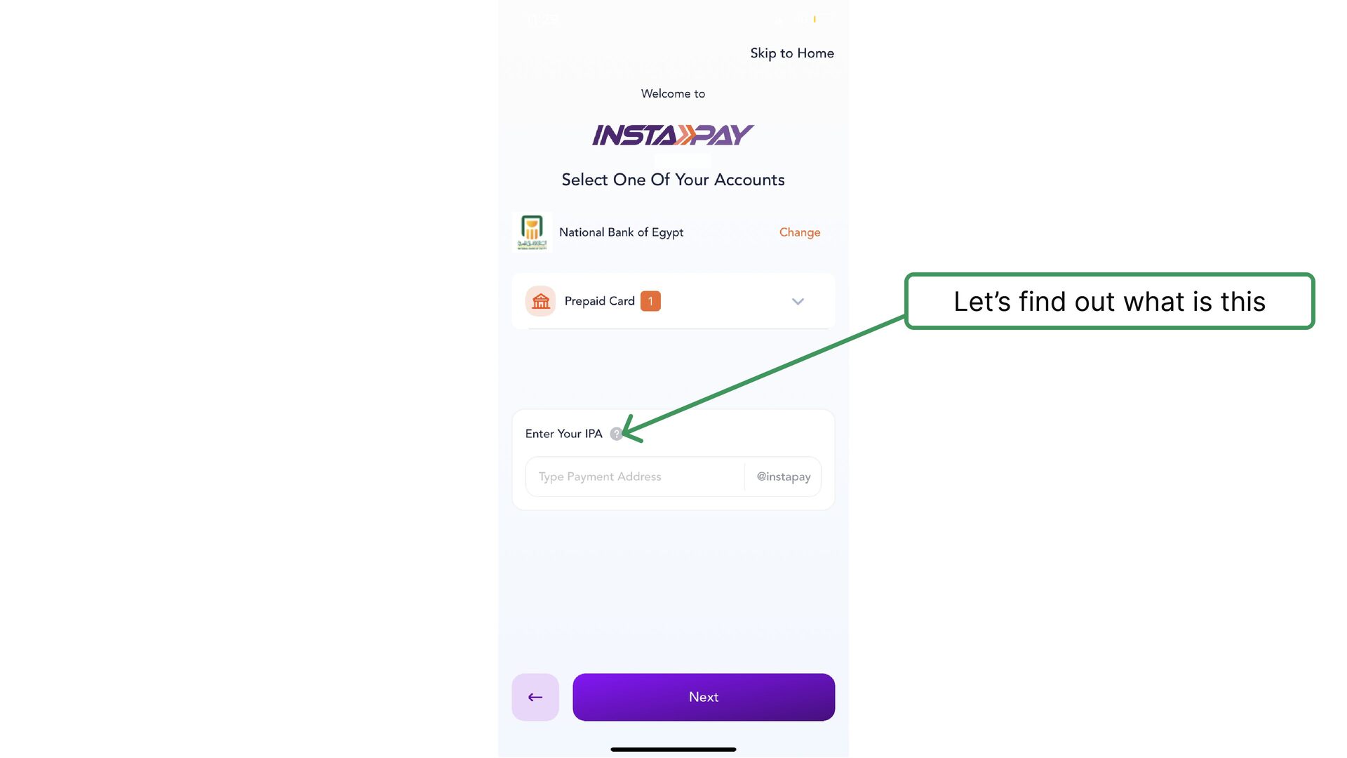
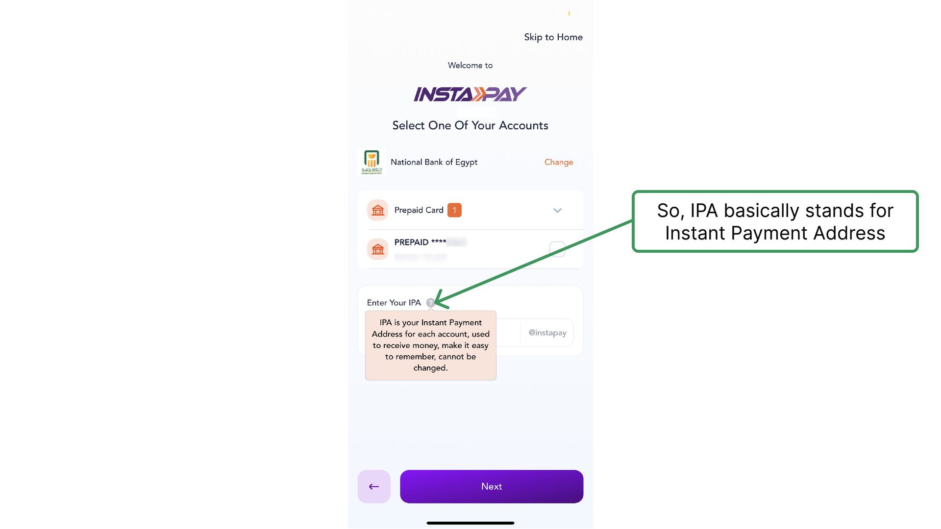
  23. They used IPA instead of Instant Payment Address, although they

    use Instant Payment Address on all other screens
  24. They used IPA instead of Instant Payment Address, although they

    use Instant Payment Address on all other screens
  25. amrshawki I appreciate they asked for confirmation, however, yeah, you

    guessed it right, there is a UX issue. Can you guess the issue?
  26. 🖊️ Modified Version amrshawki You might think I'm exaggerating. You

    will change your mind when you consider the following:
  27. 🖊️ Modified Version amrshawki You might think I'm exaggerating. You

    will change your mind when you consider the following: 1- Users will not be able to change their IPA later at all 2- The input text is light grey and not clear enough 3- No validation or double entry options like other input fields. Password or e-mail for example
  28. For reasons of bad luck. The two words “IPN” &

    “PIN” are so similar which causes visual confusion
  29. IPN UX Writer could have tackled this issue in a

    different way, something like “Enter new InstaPay PIN code”
  30. The Home screen is pretty organized with a clear separation

    between sections and clear titles for each section
  31. I don’t see a benefit for this banner. I believe

    they use it as a placeholder for later uses
  32. On the other hand, one of the things that bothers

    me the most is this popup that keeps telling me that my session has expired whenever I stop using the app for a short while
  33. I tried to know exactly how much time it takes

    until the session gets expired but I failed so I will assume 30 seconds
  34. 🖊️ Modified Version This is a counter. Starts from 10

    and count down until user gets logged out
  35. 🖊️ Modified Version Now much better 1- Explaining why session

    gets expired 2- Give users freedom and control 3- Clear CTA 4- No technical jargons
  36. And finally, these 2 elements navigates you to 2 screens

    with different layout, although, the same navigation bar item is marked as selected
  37. 1 2 This design element (1) navigates you to the

    other screen (2). The confusion happens here because they didn't remove the navbars from the inner screens
  38. More Menu Collect Money Send Money Manage Send Money Again

    Services Collect Money Again IPN Navigation Too much replication lead to unorganized content
  39. One more thing, IPN does not provide any app tutorial

    or something similar for new joiners and since the app is designed for a very large and diverse customer segment, it was a must
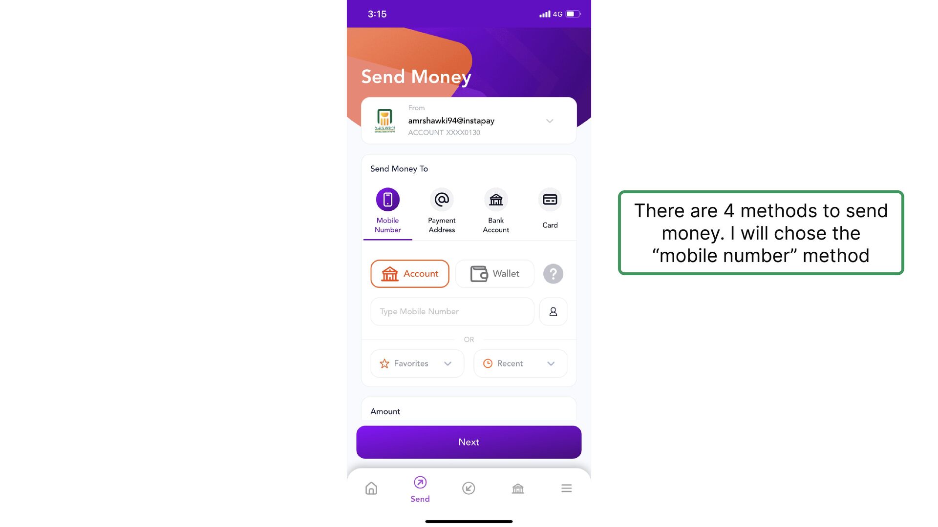
  40. There are 4 methods to send money. I will chose

    the “mobile number” method
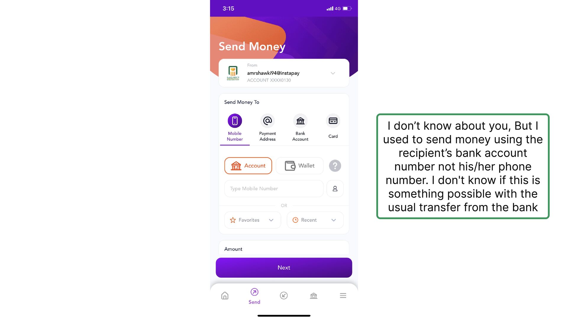
  41. I don’t know about you, But I used to send

    money using the recipient’s bank account number not his/her phone number. I don't know if this is something possible with the usual transfer from the bank
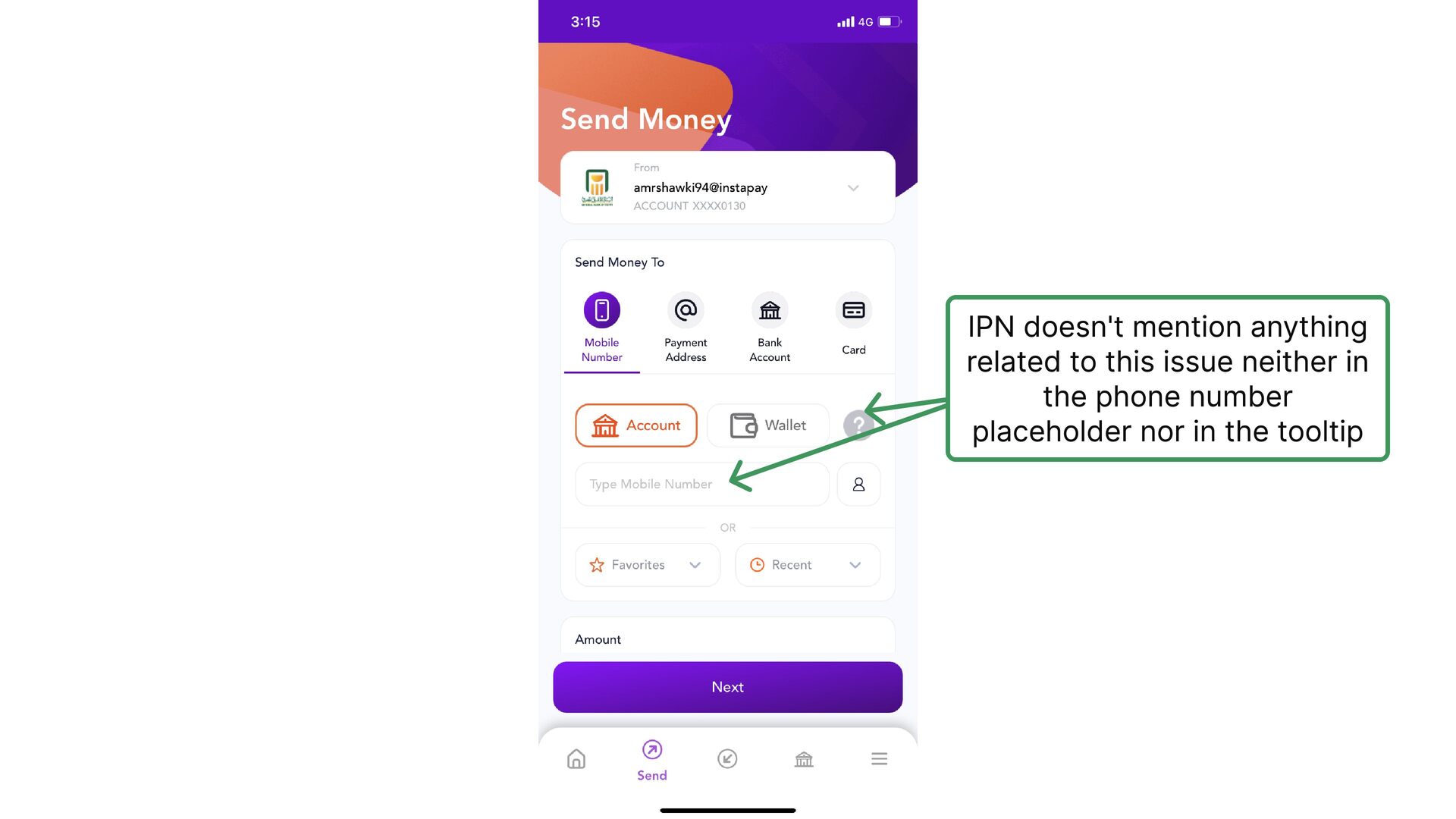
  42. IPN doesn't mention anything related to this issue neither in
    the phone number placeholder nor in the tooltip
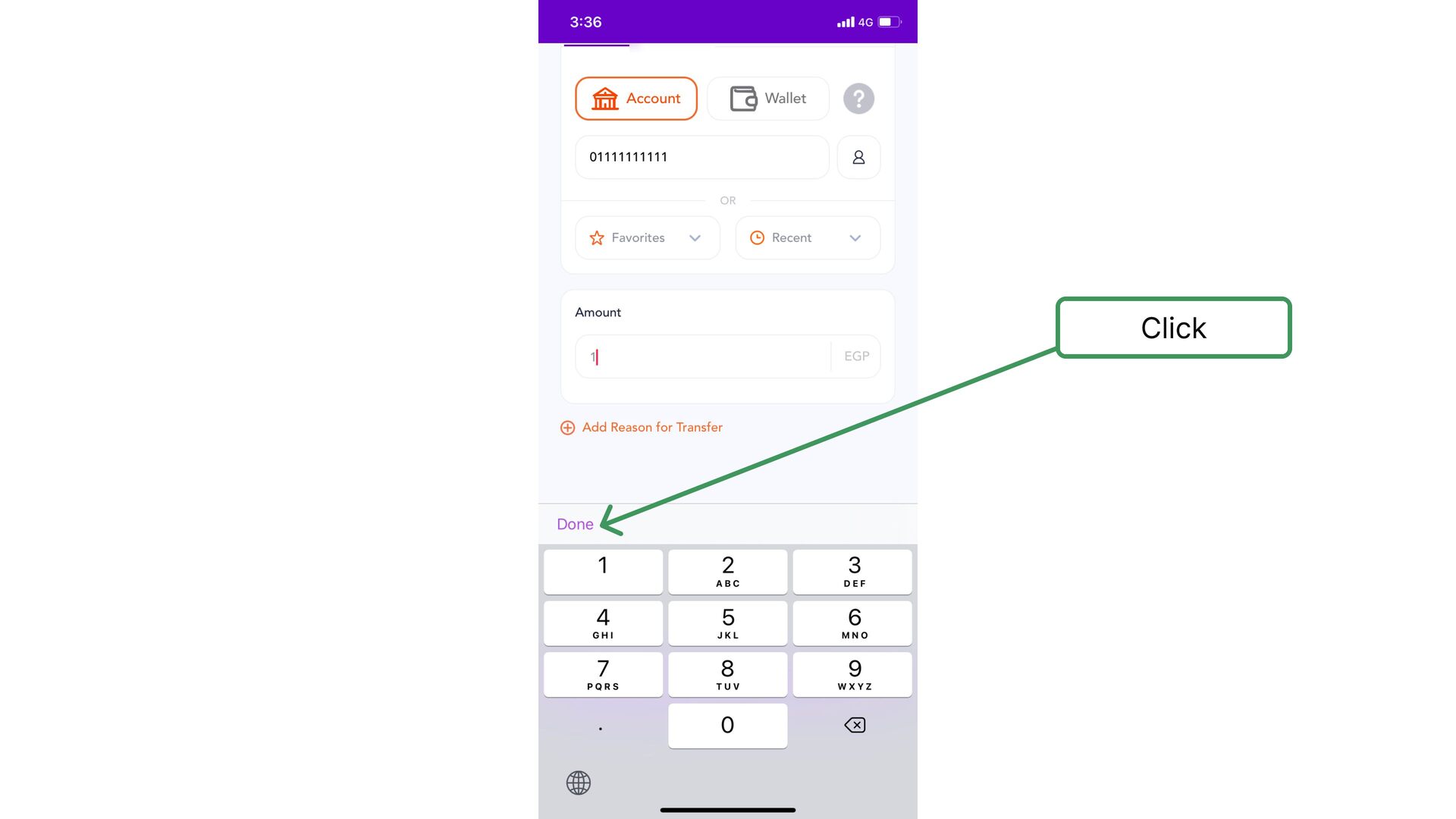
  43. As it is always said, the devil is in the

    details. So I decided to try something a little evil
  44. I bet it took you more than 2 seconds to

    know the number and you might even had to count the number of the digits as I did
  45. 🖊️ Modified Version Now, Can you try again? How long

    did take from you to know the number this time? Much shorter right? I think you got my point
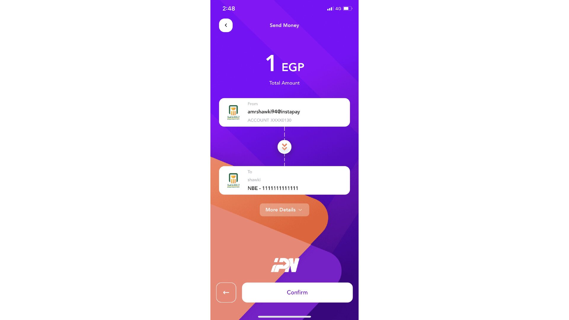
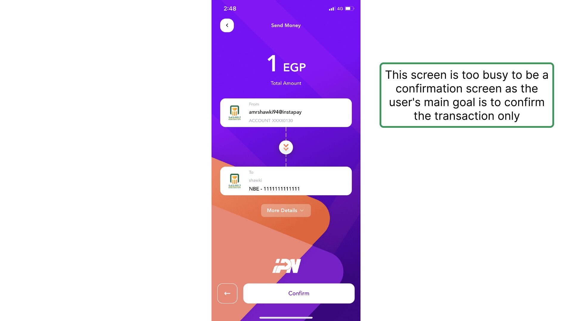
  46. This screen is too busy to be a confirmation screen

    as the user's main goal is to confirm the transaction only
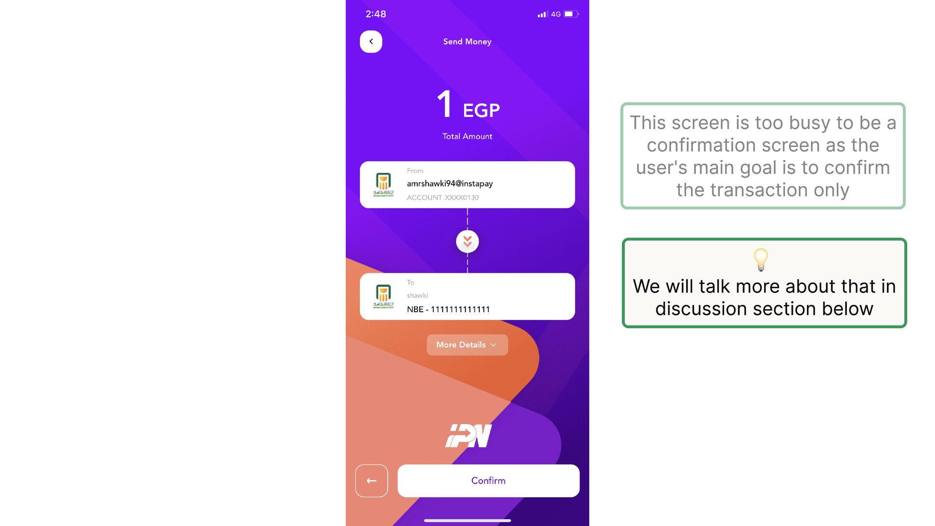
  47. This screen is too busy to be a confirmation screen

    as the user's main goal is to confirm the transaction only 💡 We will talk more about that in discussion section below
  48. This is the best place to suggest adding the recipient

    to the favorites This is what’s called in the product world the Aha moment, when the user realizes the key benefit of the app
  49. It’s all about making the experience faster not only on

    the function level but also, on the user experience level. isn't it?
  50. In the discussion section below, we will discuss in detail

    a few things we mentioned in the slideshow. Enjoy reading 🍿