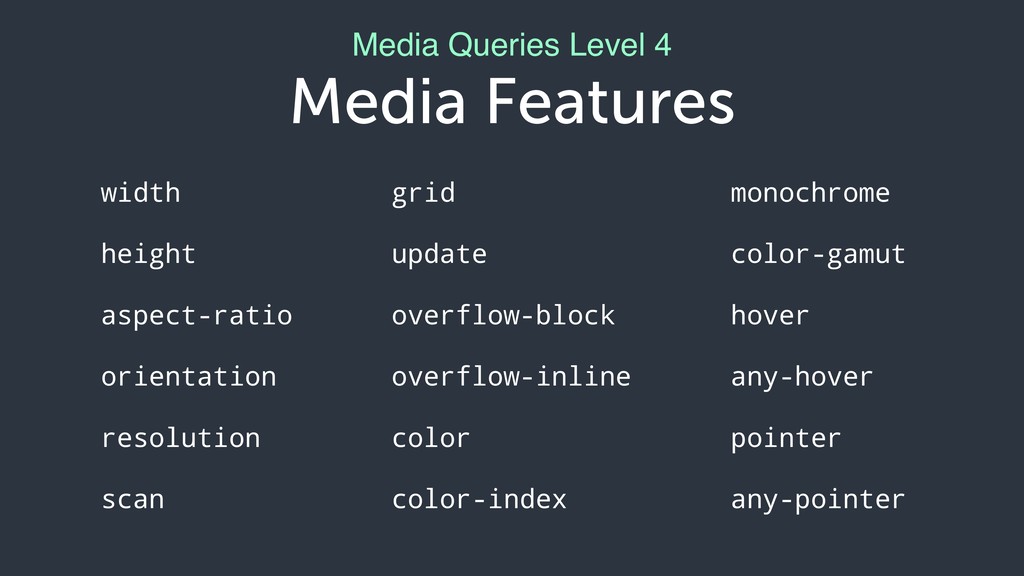
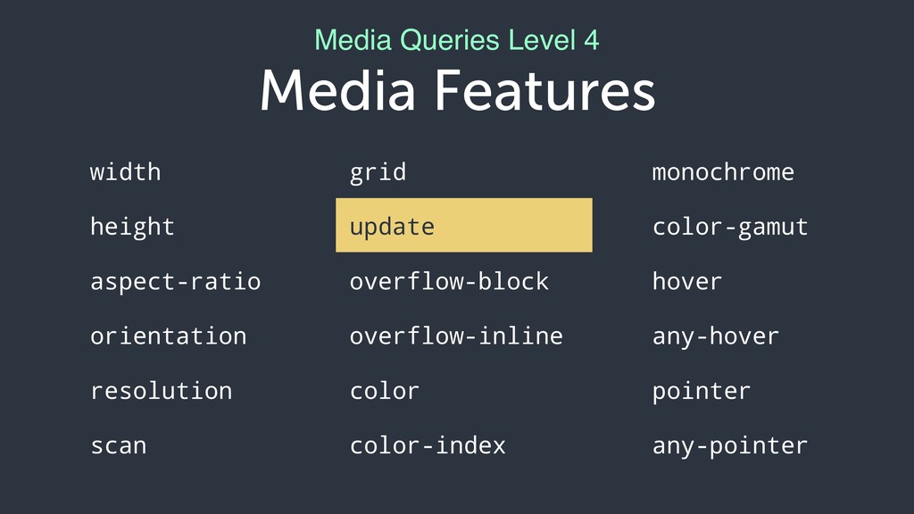
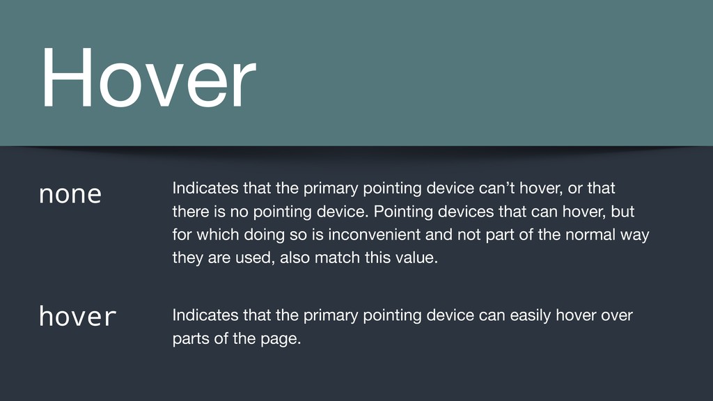
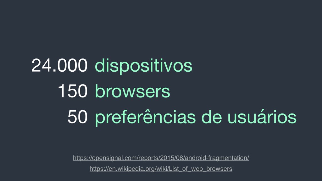
hover, or that there is no pointing device. Pointing devices that can hover, but for which doing so is inconvenient and not part of the normal way they are used, also match this value. Indicates that the primary pointing device can easily hover over parts of the page.
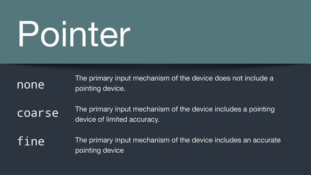
device does not include a pointing device. The primary input mechanism of the device includes a pointing device of limited accuracy. The primary input mechanism of the device includes an accurate pointing device
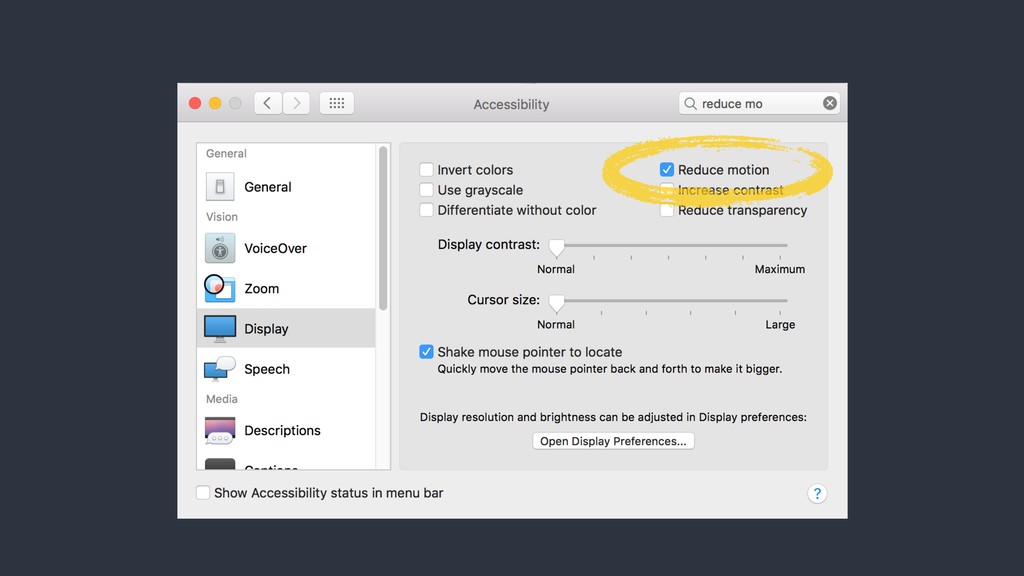
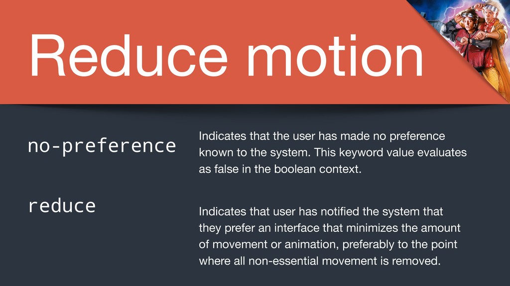
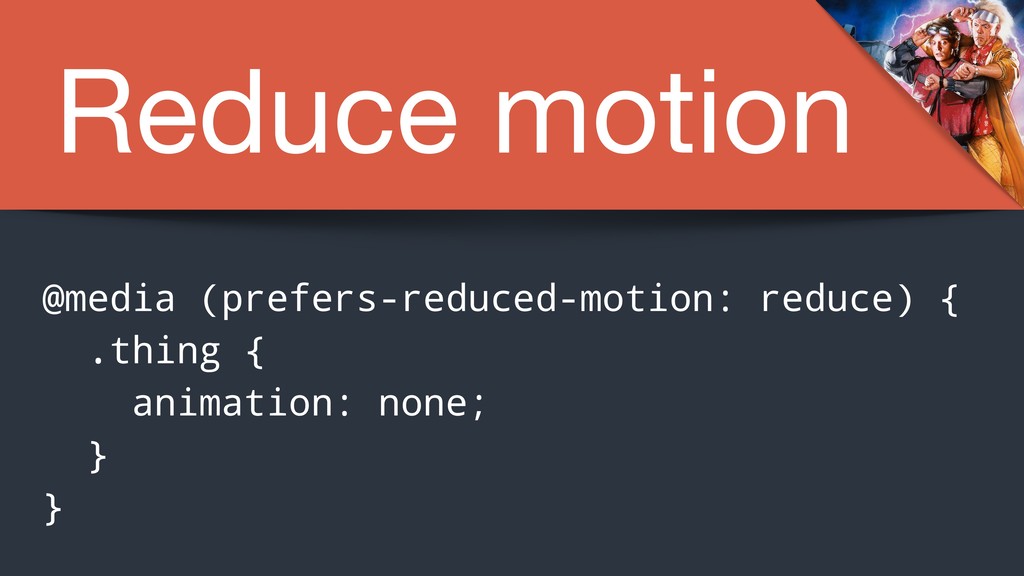
no preference known to the system. This keyword value evaluates as false in the boolean context. Indicates that user has notified the system that they prefer an interface that minimizes the amount of movement or animation, preferably to the point where all non-essential movement is removed.
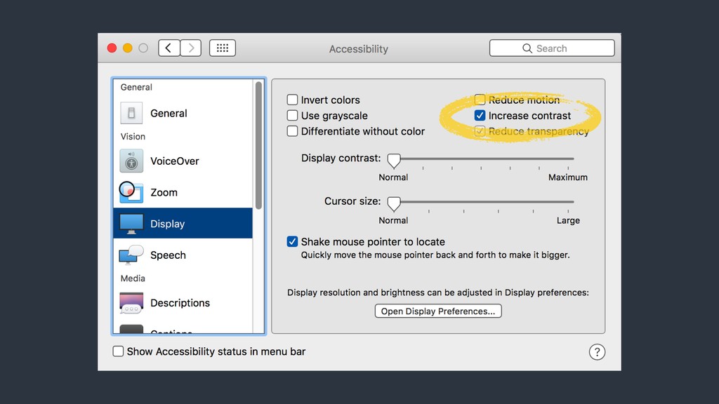
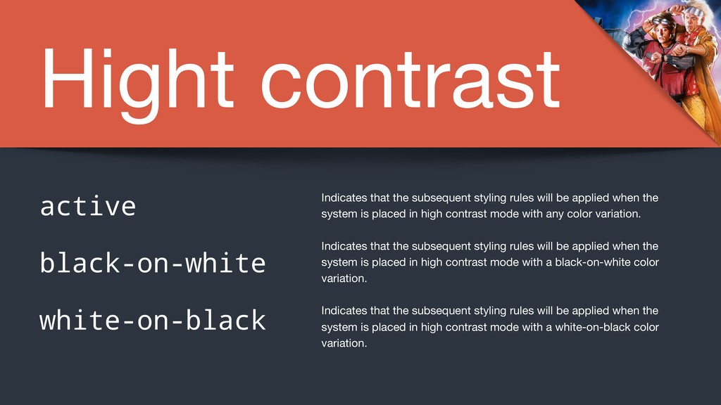
applied when the system is placed in high contrast mode with any color variation. Indicates that the subsequent styling rules will be applied when the system is placed in high contrast mode with a black-on-white color variation. Indicates that the subsequent styling rules will be applied when the system is placed in high contrast mode with a white-on-black color variation. active black-on-white white-on-black
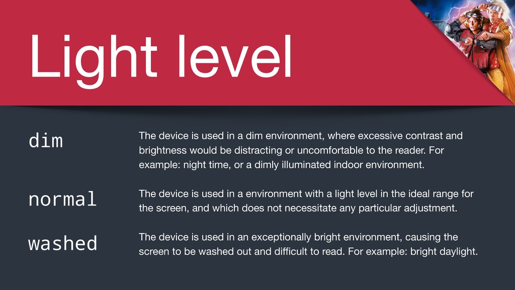
a dim environment, where excessive contrast and brightness would be distracting or uncomfortable to the reader. For example: night time, or a dimly illuminated indoor environment. The device is used in a environment with a light level in the ideal range for the screen, and which does not necessitate any particular adjustment. The device is used in an exceptionally bright environment, causing the screen to be washed out and difficult to read. For example: bright daylight.
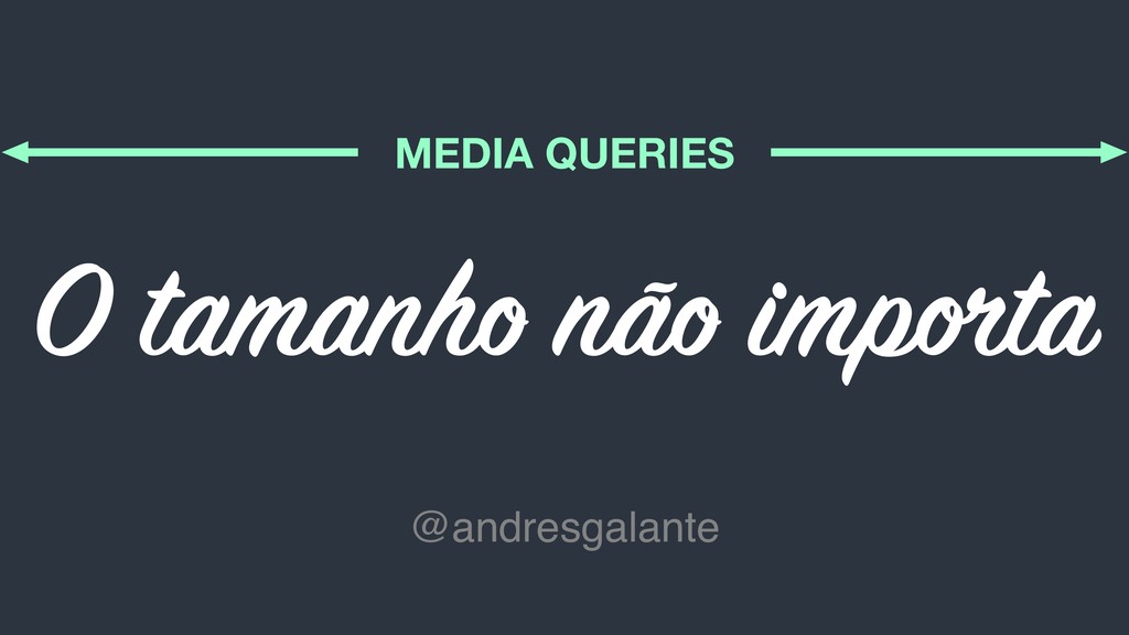
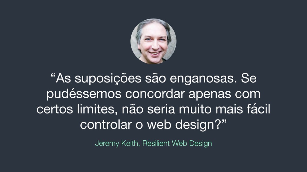
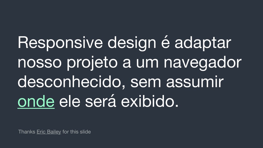
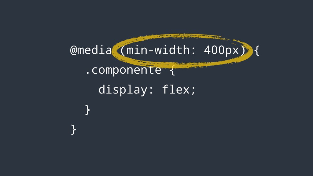
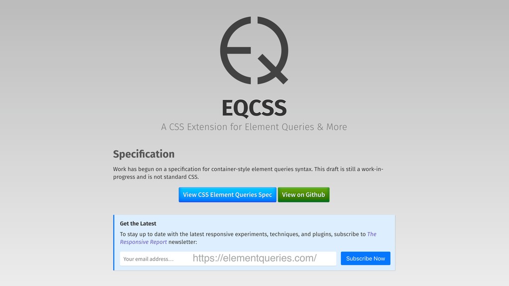
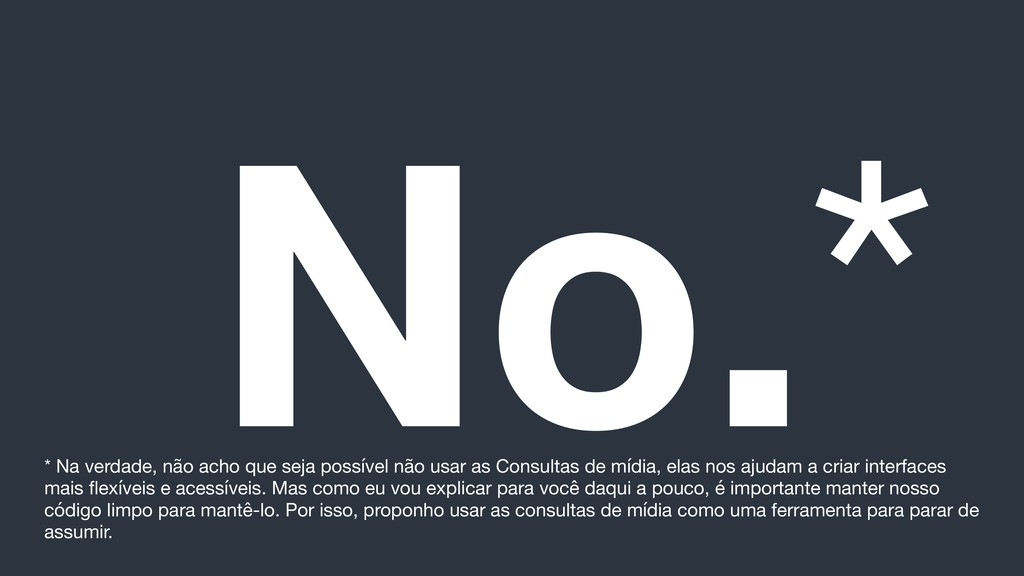
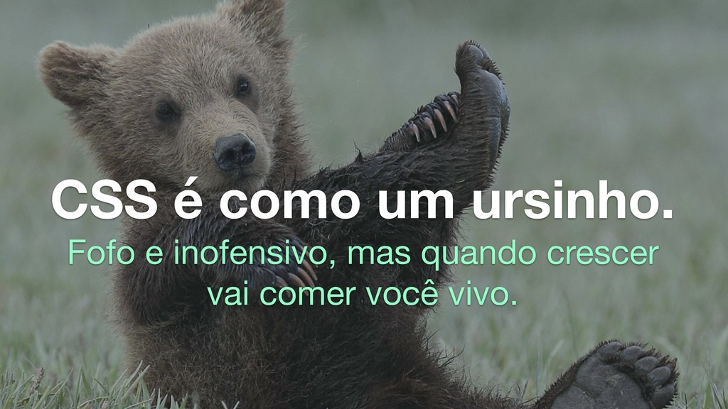
usar as Consultas de mídia, elas nos ajudam a criar interfaces mais flexíveis e acessíveis. Mas como eu vou explicar para você daqui a pouco, é importante manter nosso código limpo para mantê-lo. Por isso, proponho usar as consultas de mídia como uma ferramenta para parar de assumir.
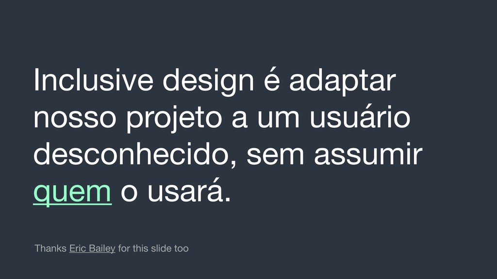
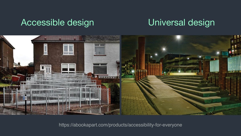
usados por todas as pessoas, na maior medida do possível, sem a necessidade de adaptação ou design especializado. https://abookapart.com/products/accessibility-for-everyone
 SiteGround - Reliable hosting with speed, security, and support you can count on.
 andresgalante
 noriyukitakei
 naokiakai
 jnchito
 minorun365
 eller86
 bata_24
 ymhiroki
 lycorptech_jp
 ks91
ks91
 uhyo
uhyo
 fullkaiten
 kaminashi
 chriscoyier
 katarinadahlin
 mraible
 marktimemedia
 skoyamalab
 retrage
 skipperchong
 ivargrimstad
 paigeccino
 letsgokoyo
 kneath
 nwiizo