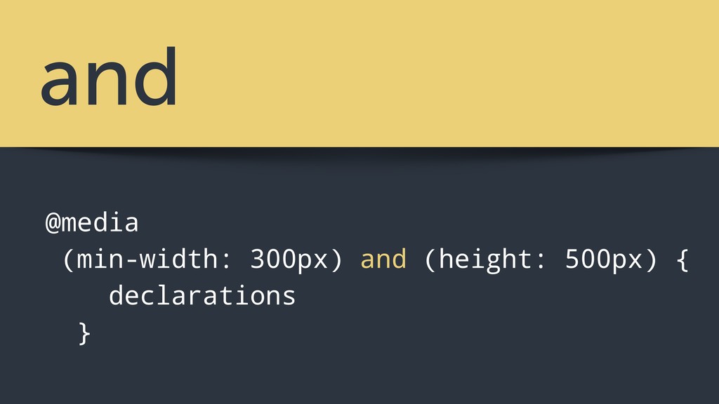
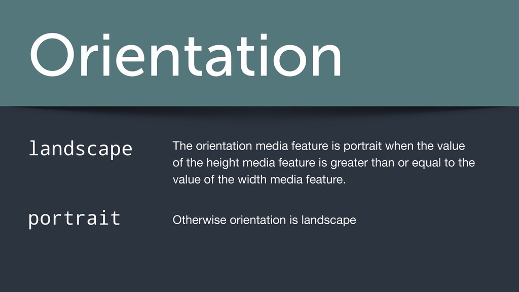
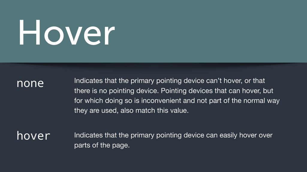
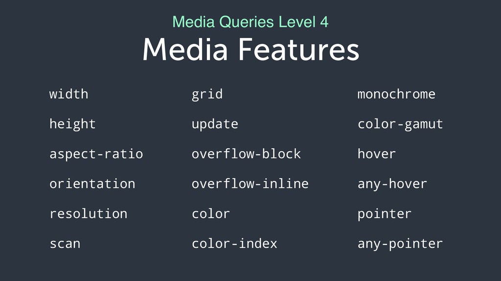
hover, or that there is no pointing device. Pointing devices that can hover, but for which doing so is inconvenient and not part of the normal way they are used, also match this value. Indicates that the primary pointing device can easily hover over parts of the page.
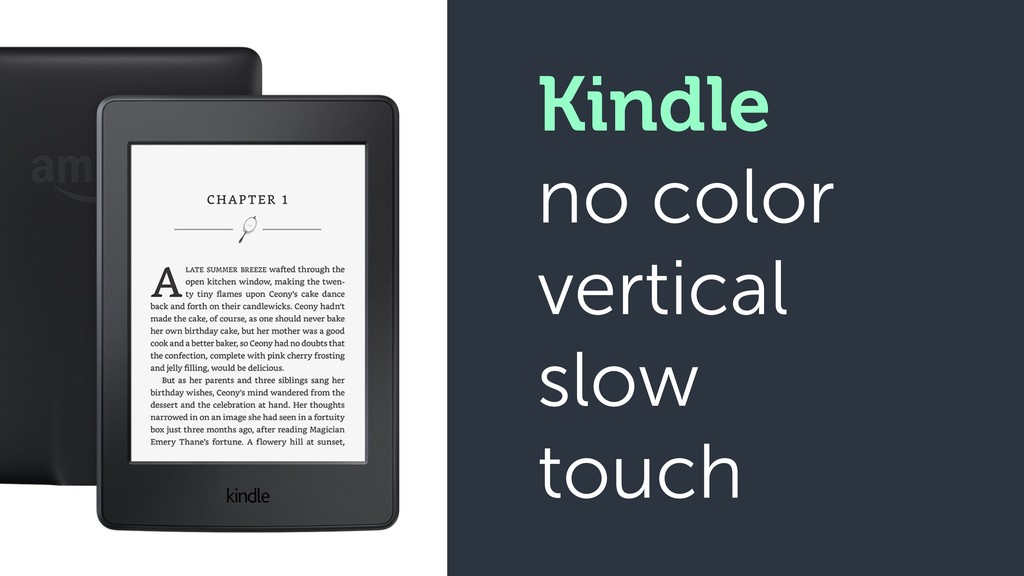
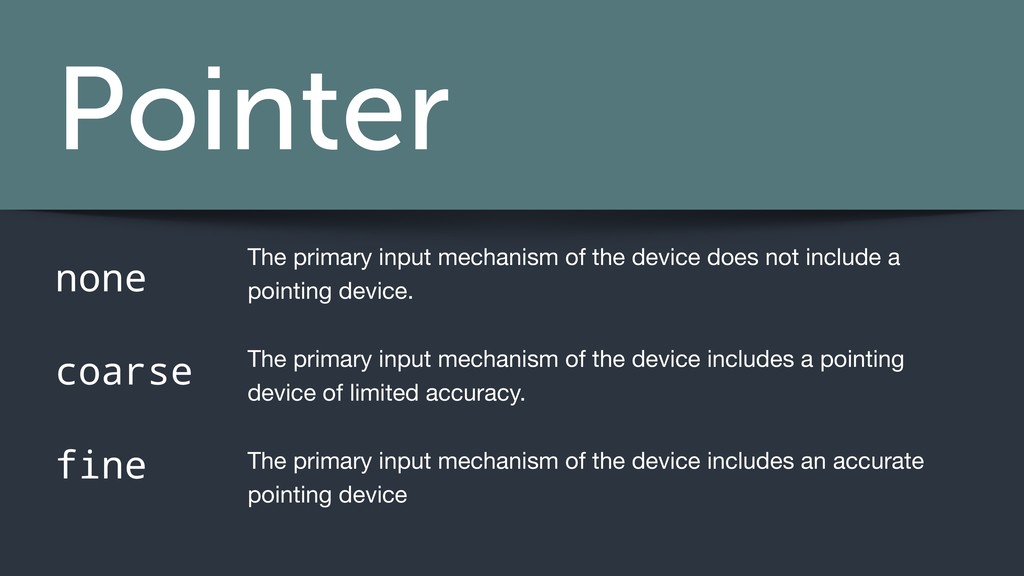
device does not include a pointing device. The primary input mechanism of the device includes a pointing device of limited accuracy. The primary input mechanism of the device includes an accurate pointing device
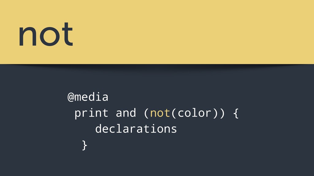
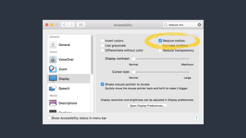
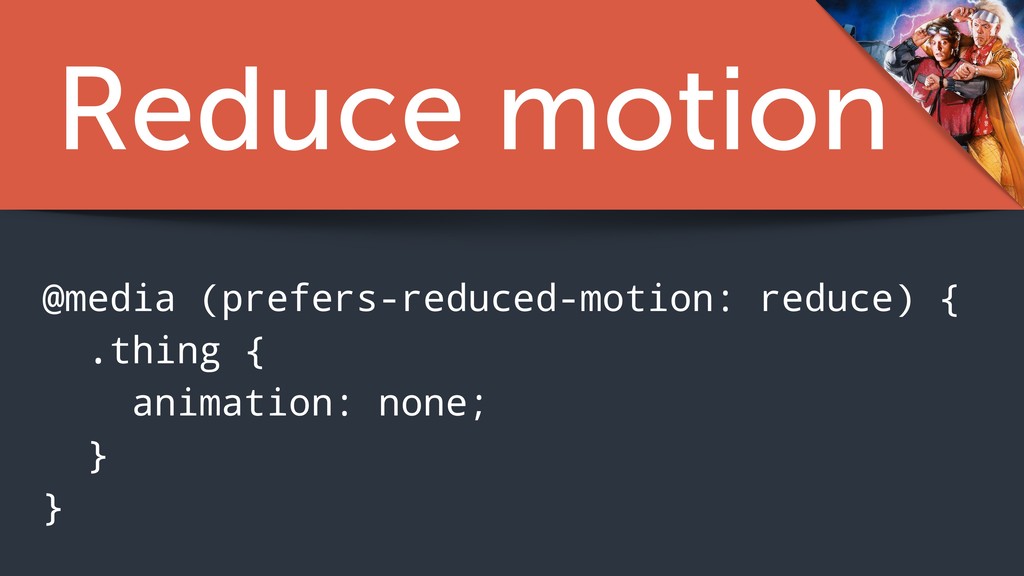
no preference known to the system. This keyword value evaluates as false in the boolean context. Indicates that user has notified the system that they prefer an interface that minimizes the amount of movement or animation, preferably to the point where all non-essential movement is removed.
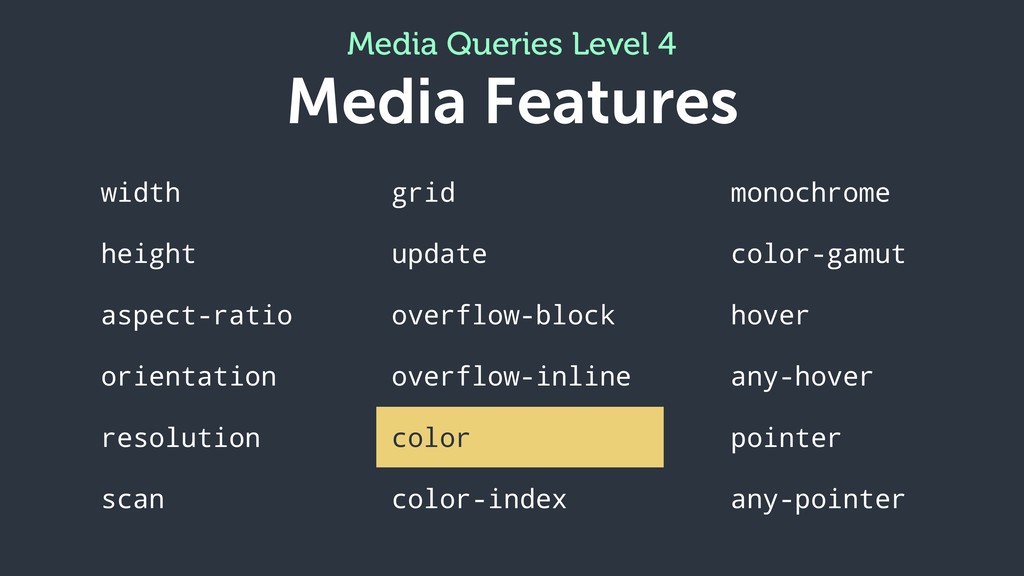
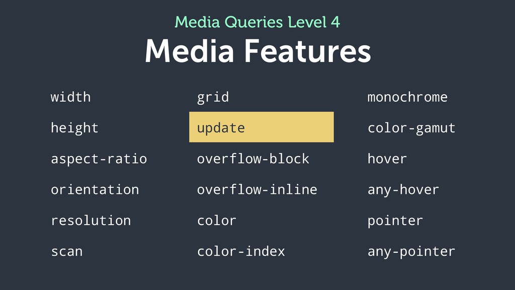
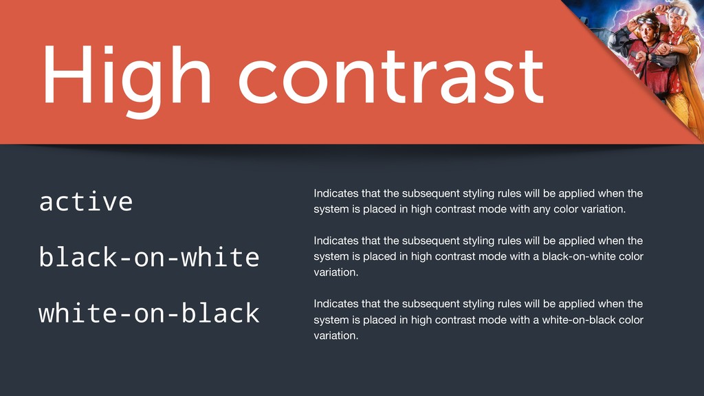
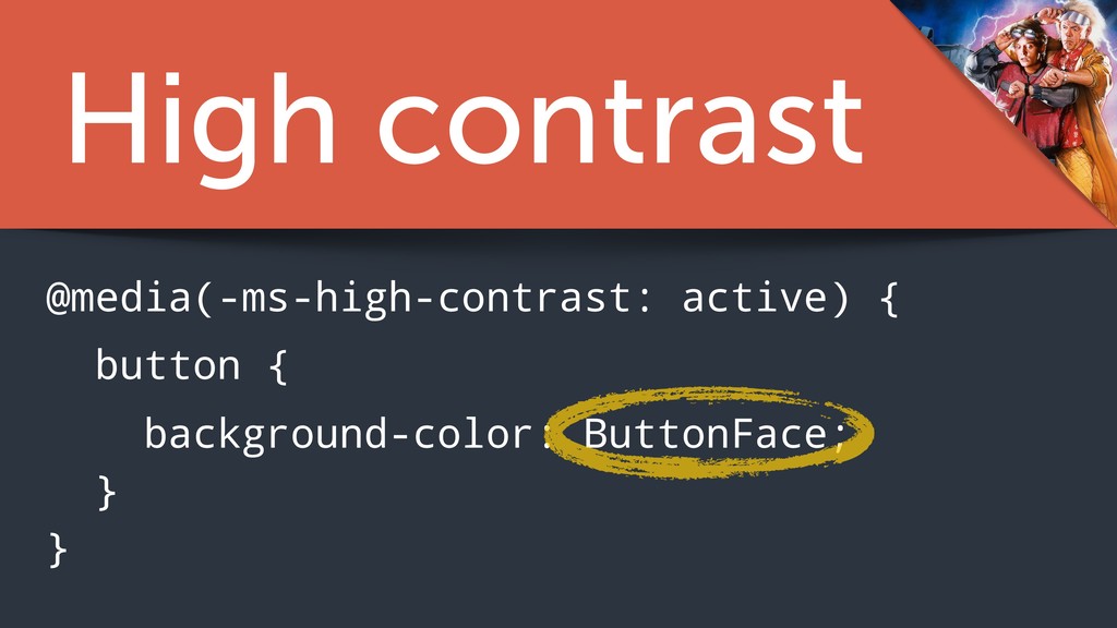
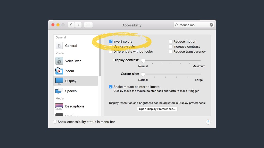
applied when the system is placed in high contrast mode with any color variation. Indicates that the subsequent styling rules will be applied when the system is placed in high contrast mode with a black-on-white color variation. Indicates that the subsequent styling rules will be applied when the system is placed in high contrast mode with a white-on-black color variation. active black-on-white white-on-black
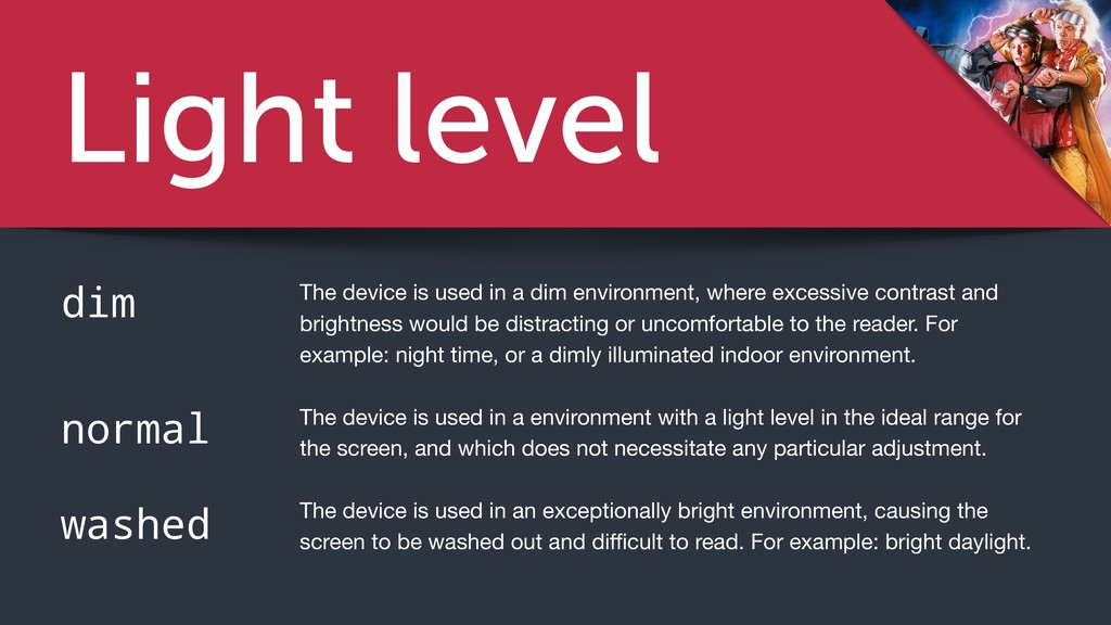
a dim environment, where excessive contrast and brightness would be distracting or uncomfortable to the reader. For example: night time, or a dimly illuminated indoor environment. The device is used in a environment with a light level in the ideal range for the screen, and which does not necessitate any particular adjustment. The device is used in an exceptionally bright environment, causing the screen to be washed out and difficult to read. For example: bright daylight.
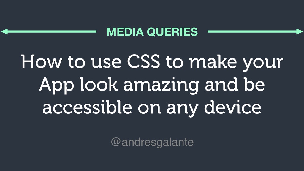
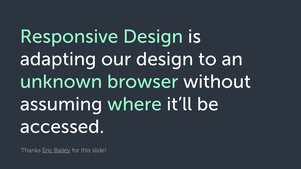
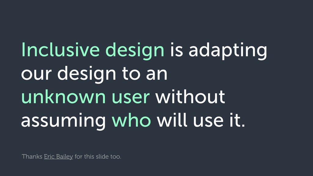
by all people, to the greatest extent possible, without the need for adaptation or specialized design. https://abookapart.com/products/accessibility-for-everyone
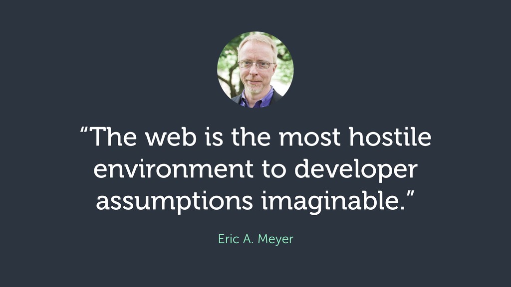
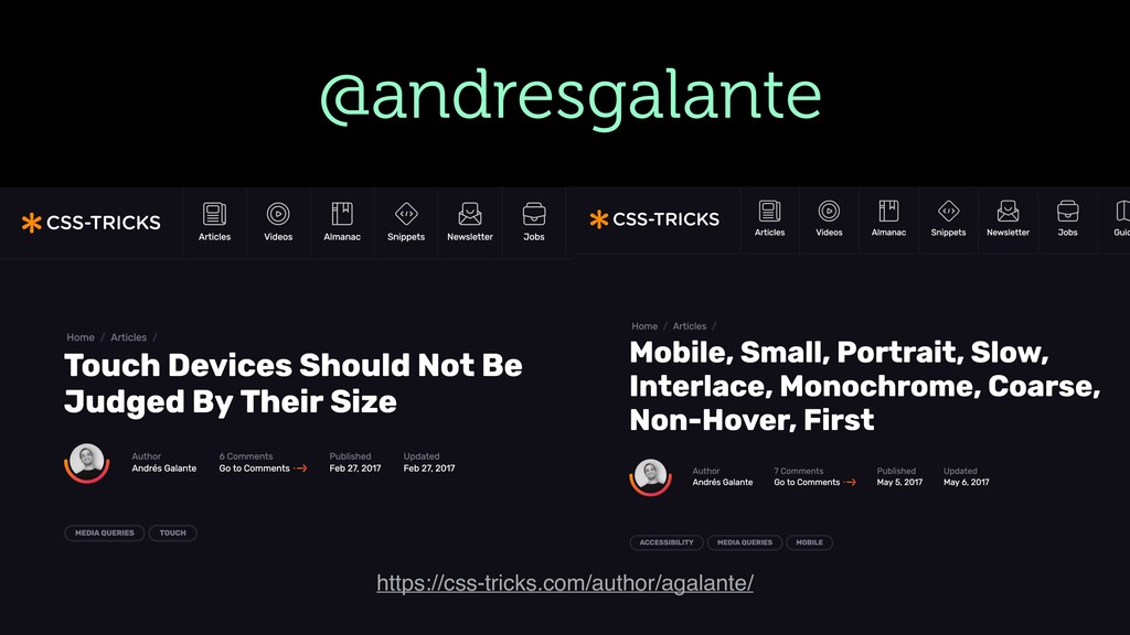
 andresgalante
 eller86
 ymty
ymty
 kintotechdev
 naitosatoshi
 estie
estie
 ueponx
 ritou
ritou
 sugupoko
 uhyo
uhyo
 sansantech
 lycorptech_jp
 oprstchn
 sferik
 jct
jct
 mclloyd
 garrettdimon
 keathley
 addyosmani
 baasie
 jmmastey
 greggifford
 szymonslowik
 thekraken