describing scientific documents. HTML is now used to display all types of documents, interactive experiences, as well as audio and visual media. Development on HTML5 began in the Web Hypertext Application Technology Working Group (WHATWG) in 2004. HTML5 attempts to improve the language with support for the latest multimedia, while maintaining readability by humans and consistent rendering across devices.
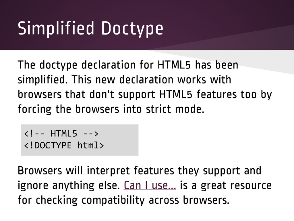
This new declaration works with browsers that don't support HTML5 features too by forcing the browsers into strict mode. Browsers will interpret features they support and ignore anything else. Can I use... is a great resource for checking compatibility across browsers. <!-- HTML5 --> <!DOCTYPE html>
content on a page. HTML5 introduces semantic elements that more accurately describe the content in the element. Div elements can still be used when no other suitable element exists or when an element is needed only for styling purposes or as a convenience for scripting.
a document. The article element could be used for a magazine article, news story, blog entry, or any other independent item of content. The section element should be used for a generic document or application section. Each section should be identified with a heading (h1- h6) element.
and typically contains the site name, logo, and the site's navigation. The nav section element contains the navigational links for the page. There can be several nav sections in one page. The footer section element defines the page's footer and typically contains things like a copyright and legal notice. An aside section element defines a section that doesn't belong to the main flow (ex: information boxes and advertisements).
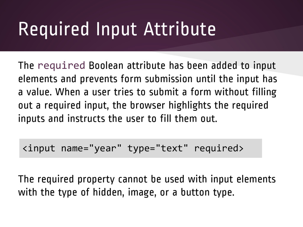
to input elements and prevents form submission until the input has a value. When a user tries to submit a form without filling out a required input, the browser highlights the required inputs and instructs the user to fill them out. The required property cannot be used with input elements with the type of hidden, image, or a button type. <input name="year" type="text" required>
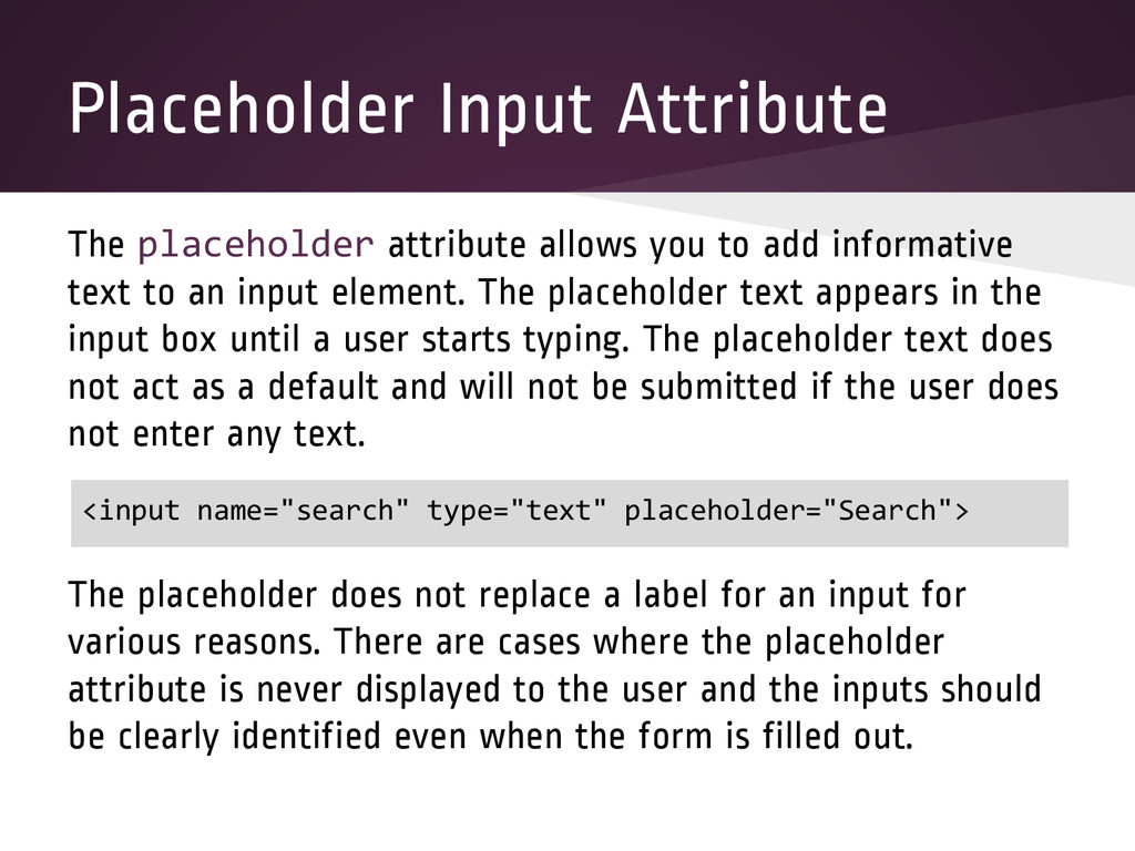
informative text to an input element. The placeholder text appears in the input box until a user starts typing. The placeholder text does not act as a default and will not be submitted if the user does not enter any text. The placeholder does not replace a label for an input for various reasons. There are cases where the placeholder attribute is never displayed to the user and the inputs should be clearly identified even when the form is filled out. <input name="search" type="text" placeholder="Search">
control should have focus when a page loads. A common practice is to set this on the form control that a user should fill out first. Only one form control in a document can have the autofocus attribute and the autofocus attribute cannot be applied if the type of the input is hidden. <input name="first_name" type="text" autofocus> <input name="last_name" type="text">
predefined options to the user. The value of the list should equal the id of the datalist element in the same document. The datalist element contains a set of options that will be used in the list. <input name="drummer" list="drummers"> <datalist id="drummers"> <option value="Dave Grohl"> <option value="Joey Castillo"> <option value="Jon Theodore"> </datalist>
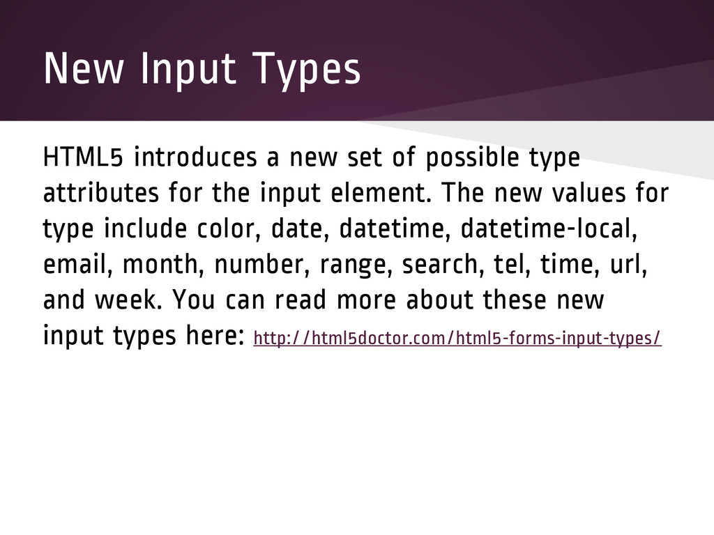
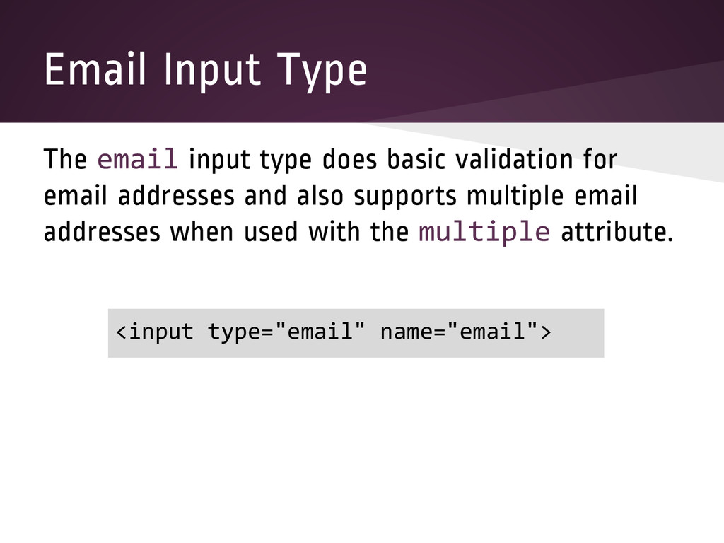
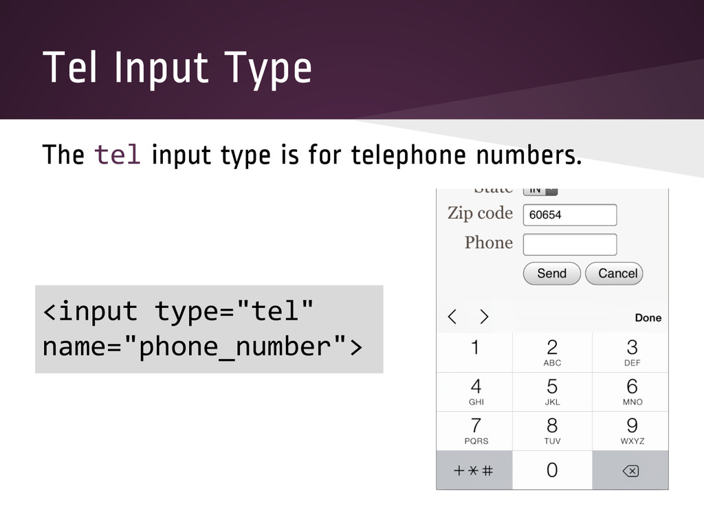
type attributes for the input element. The new values for type include color, date, datetime, datetime-local, email, month, number, range, search, tel, time, url, and week. You can read more about these new input types here: http://html5doctor.com/html5-forms-input-types/
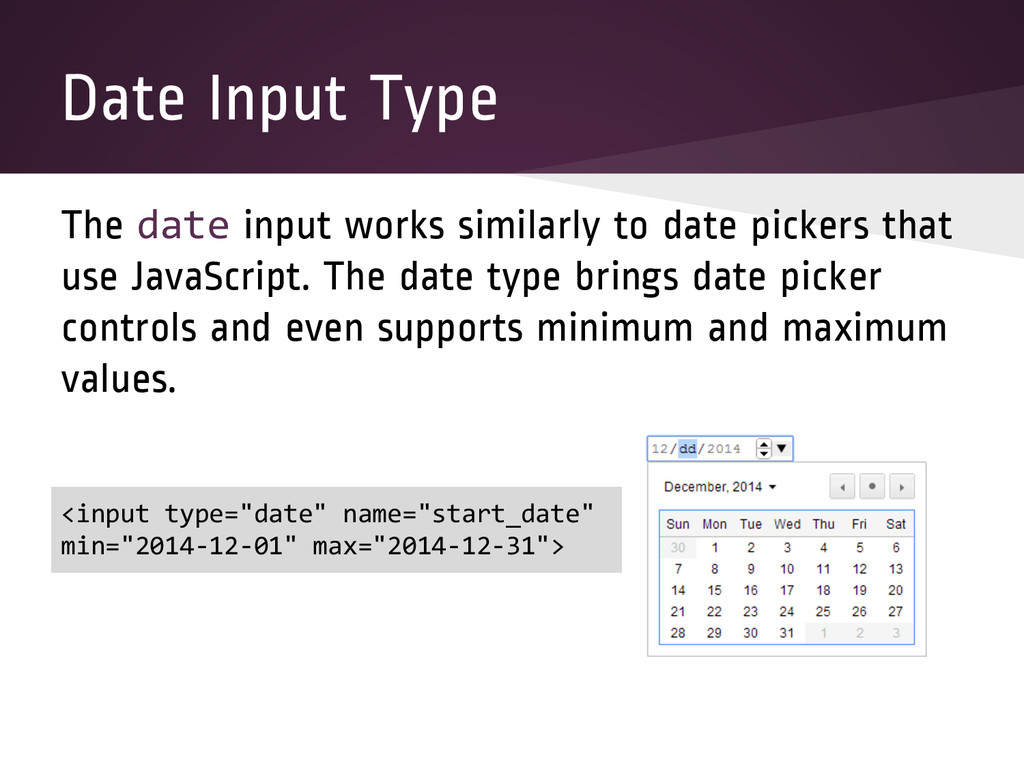
pickers that use JavaScript. The date type brings date picker controls and even supports minimum and maximum values. <input type="date" name="start_date" min="2014-12-01" max="2014-12-31">
and decrement the value that is entered. This value can also be limited by with min and max values and the step can change the increment value. <input type="number" name="order_id" min="1" max="9999999">
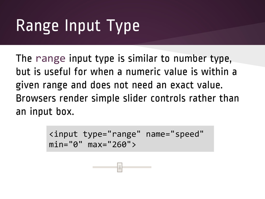
number type, but is useful for when a numeric value is within a given range and does not need an exact value. Browsers render simple slider controls rather than an input box. <input type="range" name="speed" min="0" max="260">
addresses. Browsers do simple validation on this type. If the multiple attribute is used, multiple web addresses can be entered. <input type="url" name="home_page">
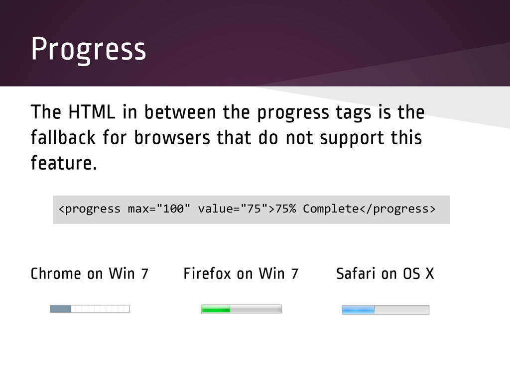
progress of a task. The style of the bar varies across browsers, but the style can also be customized using CSS. The progress element has the optional attributes max and value. Max is a floating point number that indicates how much of the task must be performed for it to be considered complete. The default value for max is 1.0. The value attribute is a floating point number that indicates the current progress of the task. If the value is not present, the progress is considered indeterminate.
fallback for browsers that do not support this feature. Chrome on Win 7 Firefox on Win 7 Safari on OS X <progress max="100" value="75">75% Complete</progress>
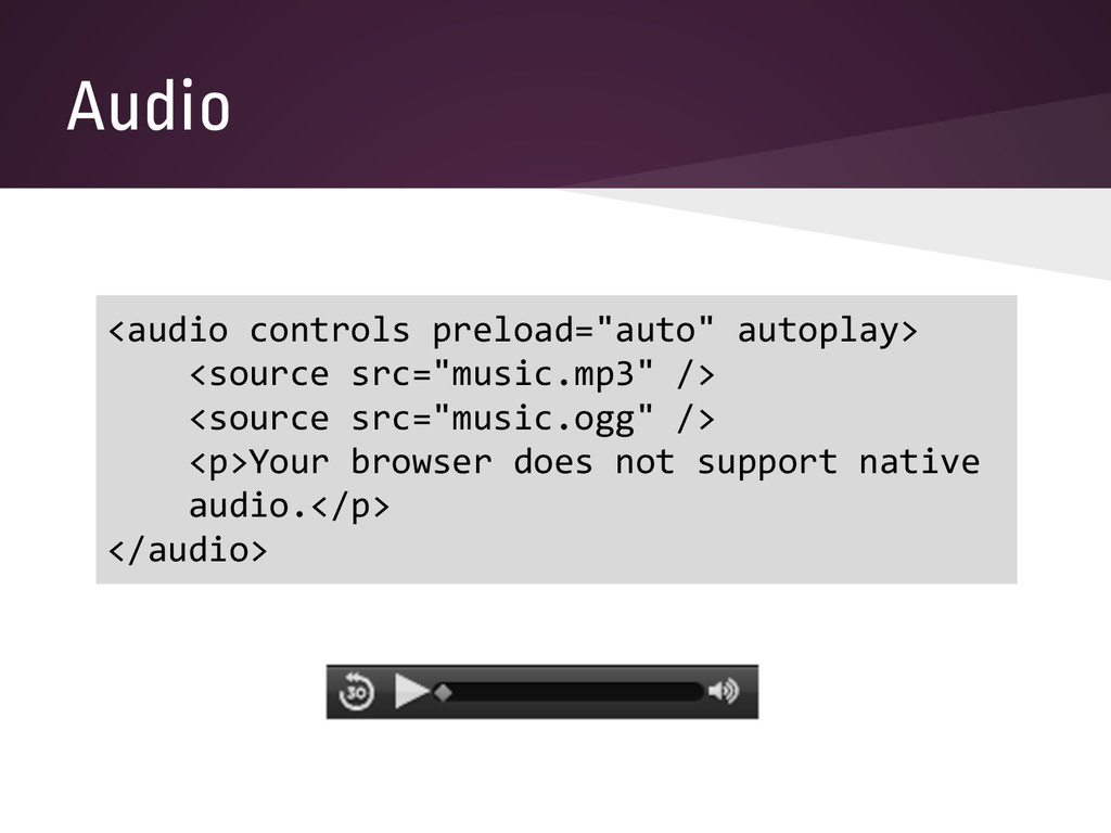
the use of plugins. The src attribute defines the location of the content. This location can also be defined in a source element. The HTML5 spec allows multiple sources and the browser will try each source (in order) until the browser finds an audio source it can play. The preload attribute can have the value "none", "metadata", or "auto". The none value does not preload the content, metadata just preloads the metadata, and auto lets the browser decide whether or not to preload the content file.
or not the audio should display controls, begin playing automatically, and play repeatedly, respectively. The muted boolean attribute indicates whether or not the audio should be initially silenced (default is false). The volume attribute indicates the playback volume of the audio. The range for volume goes from 0.0 (silent) to 1.0 (loudest).
needing to use plugins (like Flash). The video element simplifies the syntax for embedding videos and aims to make it easier to show videos across many browsers. The src attribute defines the location of the content. This location can also be defined in a source element nested in the video element.
and width of the video in CSS pixels. The poster attribute is a URL indicating a poster frame to show until the user plays or seeks. If this attribute isn't specified, nothing will be displayed until the first frame of the video is available. The preload attribute can have the value "none", "metadata", or "auto". The none value does not preload the content, metadata just preloads the metadata, and auto lets the browser decide whether or not to preload the content file. If the preload is not set, the default value is browser-defined.
or not the audio should display controls, begin playing automatically, and play repeatedly, respectively. The muted boolean attribute indicates whether or not the audio should be initially silenced (default is false). <video src="movie.mp4" controls width="480" height="360"> <p>Your browser does not support native video.</p> </video>
 ben010783
 mizchi
 yukikurage
 ochtum
 16bitidol
 oniak3ibm
 oku053
 tooppoo
 nrslib
 panda728
 jsoizo
.png) takahirom
takahirom
 geekplus_tech
 danielanewman
 tmiket
 rocio
rocio
 tammyeverts
 davidcarrasco
 geshan
 malarkey
 aleyda
 lara
lara
 rkendrick25
 inesmontani
 bermonpainter