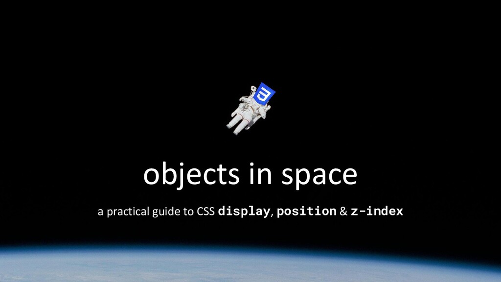
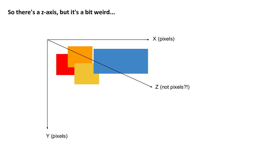
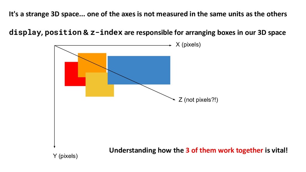
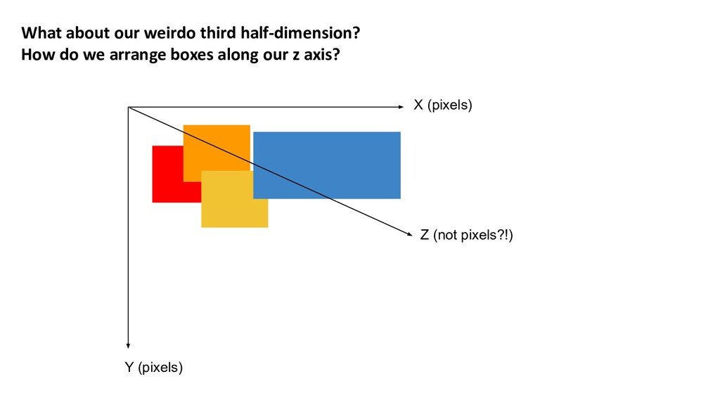
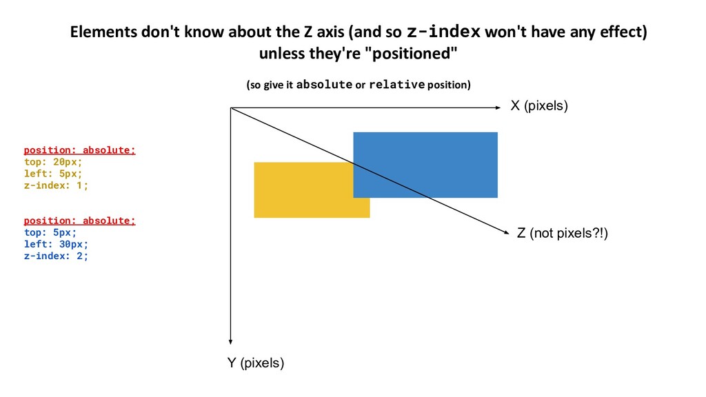
of the axes is not measured in the same units as the others display, position & z-index are responsible for arranging boxes in our 3D space Z (not pixels?!) Understanding how the 3 of them work together is vital!
these properties to 🚢 stuff Not a comprehensive guide to everything the spec says you can/should do. (Nobody you know who is good at CSS got good at CSS by reading specs) I'm probably definitely misusing some of the terminology It's the broad concepts that matter
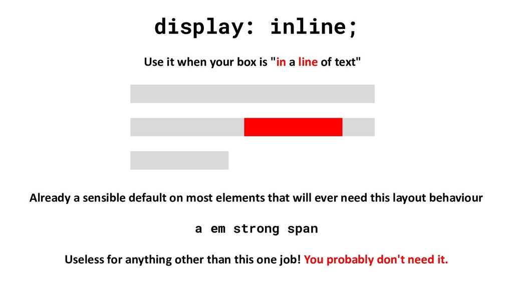
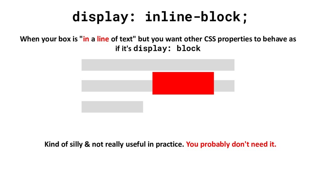
line of text" Already a sensible default on most elements that will ever need this layout behaviour a em strong span Useless for anything other than this one job! You probably don't need it.
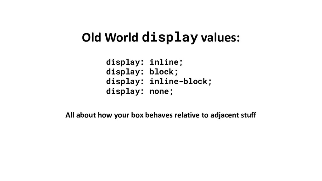
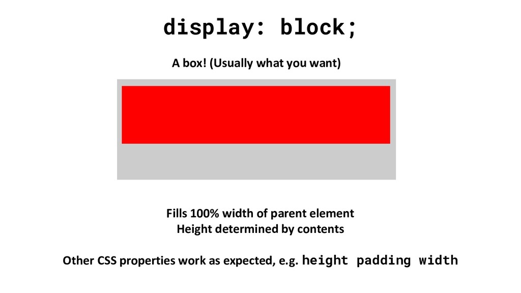
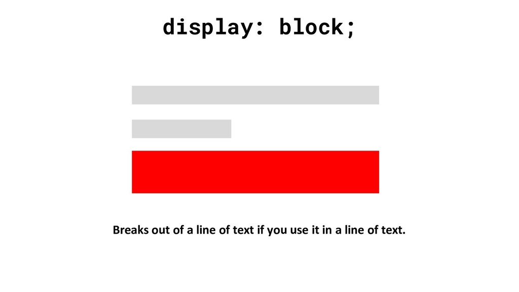
resort to things like display: inline-block; float: left; <table> or display: table; to make our boxes lay out in a way that look liked an application rather than a document No more!
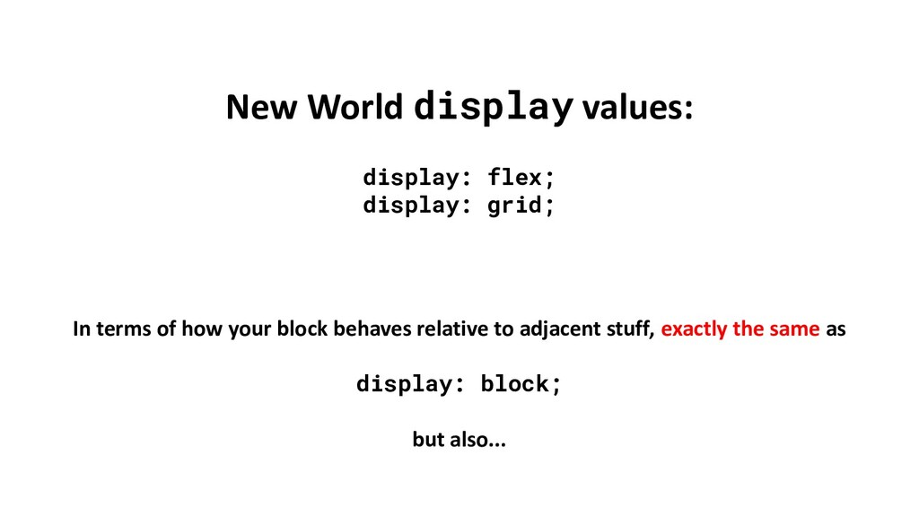
flex & grid Some people say "use Flexbox for 1 dimensional layouts & Grid for 2 dimensional layouts". Probably the spec's intention too Ignore them. Use whichever gets the job done with the simplest code. The main difference is how where you specify child item behaviour.
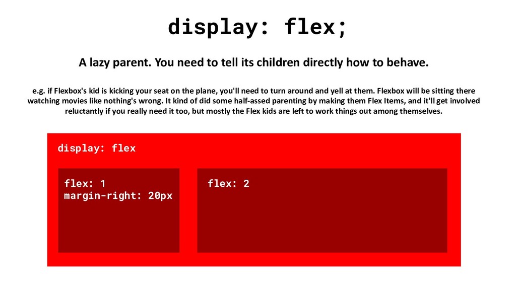
children directly how to behave. e.g. if Flexbox's kid is kicking your seat on the plane, you'll need to turn around and yell at them. Flexbox will be sitting there watching movies like nothing's wrong. It kind of did some half-assed parenting by making them Flex Items, and it'll get involved reluctantly if you really need it too, but mostly the Flex kids are left to work things out among themselves. display: flex flex: 1 margin-right: 20px flex: 2
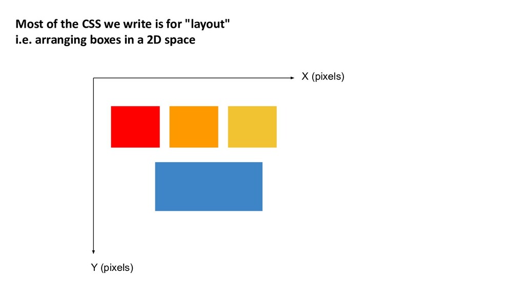
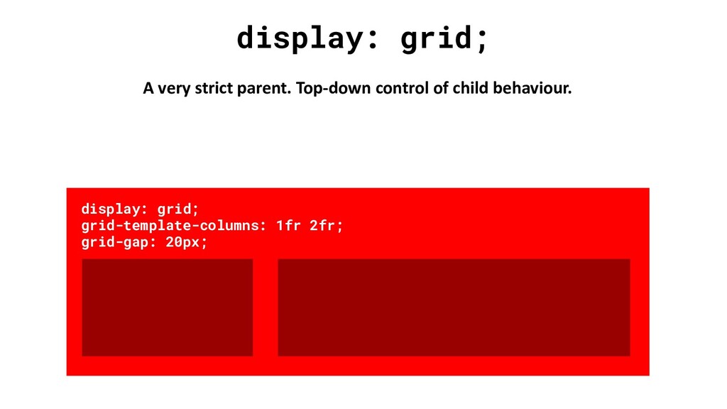
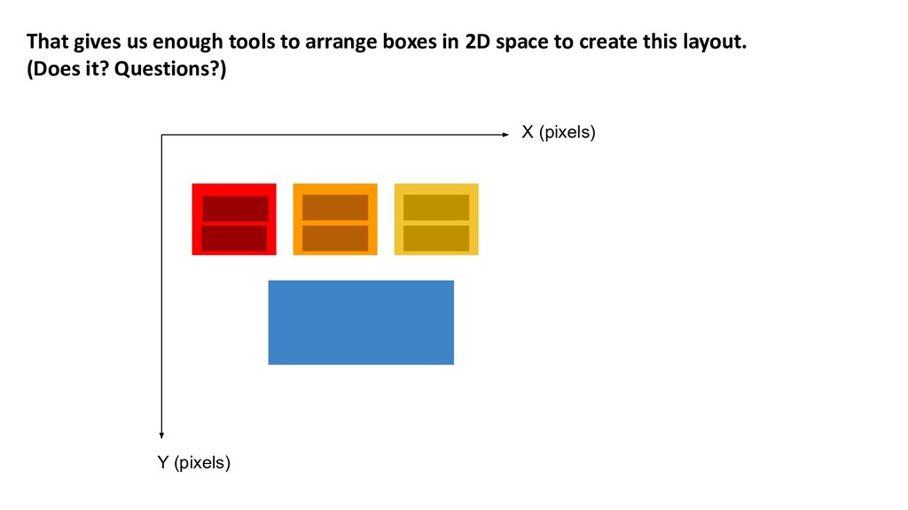
to clearly specify the roles we need to do "layout" in CSS • A 2D "space", within which we want to arrange some boxes ◦ i.e. the Flex or Grid Container • Some boxes that will be arranged within that space ◦ i.e. the Flex or Grid Items
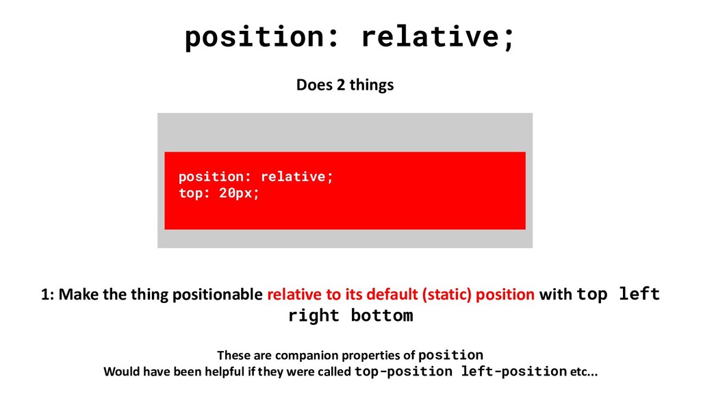
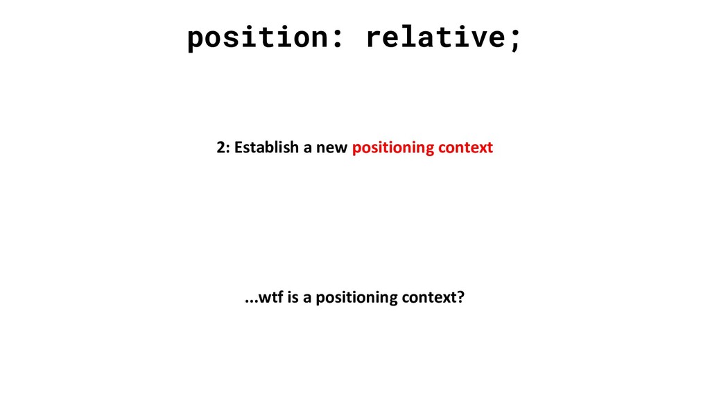
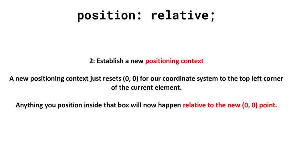
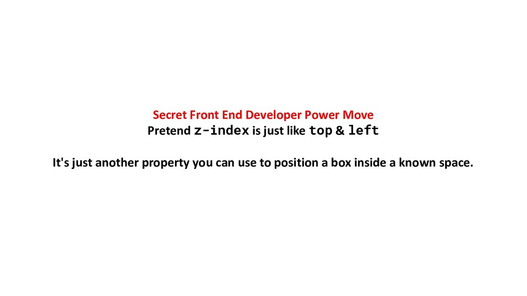
relative to its default (static) position with top left right bottom These are companion properties of position Would have been helpful if they were called top-position left-position etc... position: relative; top: 20px;
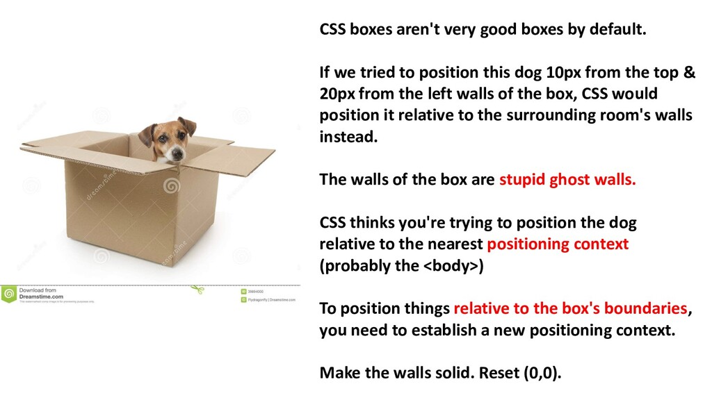
tried to position this dog 10px from the top & 20px from the left walls of the box, CSS would position it relative to the surrounding room's walls instead. The walls of the box are stupid ghost walls. CSS thinks you're trying to position the dog relative to the nearest positioning context (probably the <body>) To position things relative to the box's boundaries, you need to establish a new positioning context. Make the walls solid. Reset (0,0).
just resets (0, 0) for our coordinate system to the top left corner of the current element. Anything you position inside that box will now happen relative to the new (0, 0) point. position: relative; position: relative;
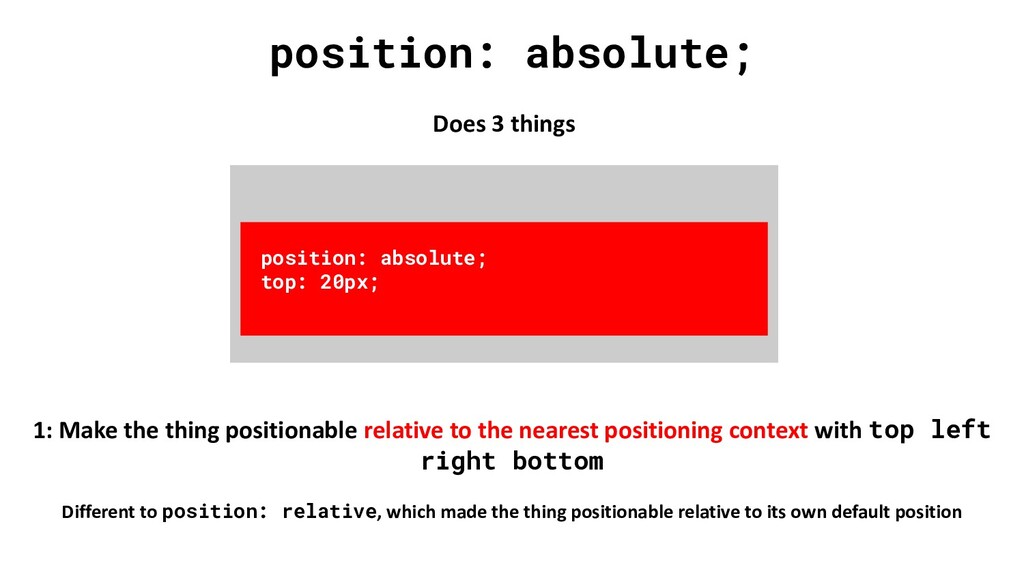
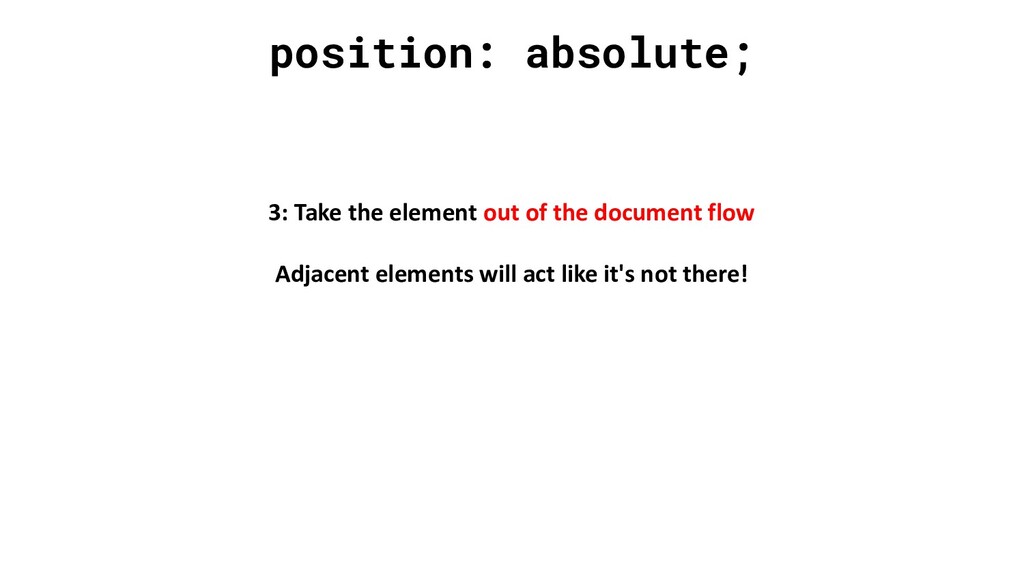
relative to the nearest positioning context with top left right bottom Different to position: relative, which made the thing positionable relative to its own default position position: absolute; top: 20px;
context. Literally the only difference... X axis units: pixels Y axis units: pixels Z axis units: stacking order relative to other things in the same positioning context
20px; left: 5px; z-index: 1; position: absolute; top: 5px; left: 30px; z-index: 2; Elements don't know about the Z axis (and so z-index won't have any effect) unless they're "positioned" (so give it absolute or relative position)
 bensmithett
 kuranuki
 ryugen04
 thasu0123
 okumin
 kotetuco
 monochromegane
 ryodeveloper
 kishida
 codmoninc
 mizchi
 kentaroutakeda
 luccafort
 ks91
ks91
 honzajavorek
 ryanjones
 jct
jct
 charlesmeaden
 lara
lara
 samtorres
 lemiorhan
 colly
colly
 eileencodes
 sarafernandez
 lindahogenes