Upgrade to Pro — share decks privately, control downloads, hide ads and more …

Inline Styles React Europe

Inline Styles React Europe

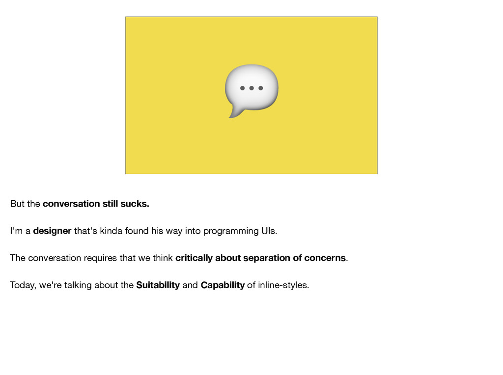
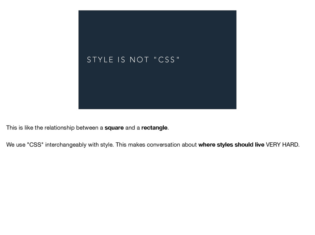
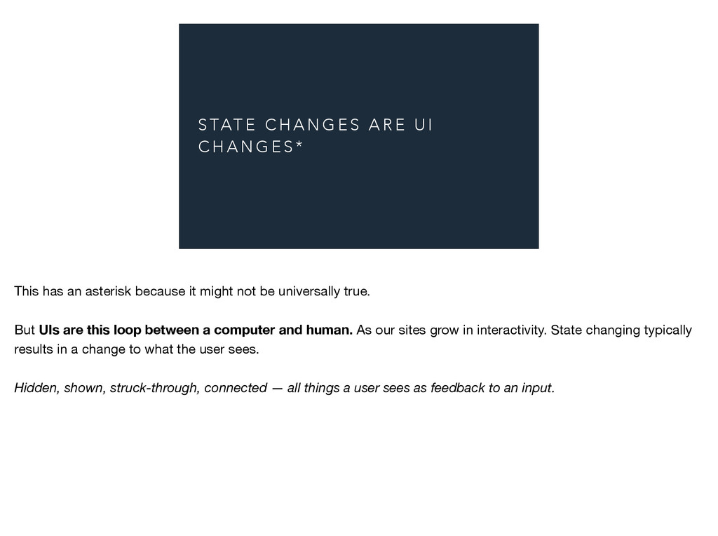
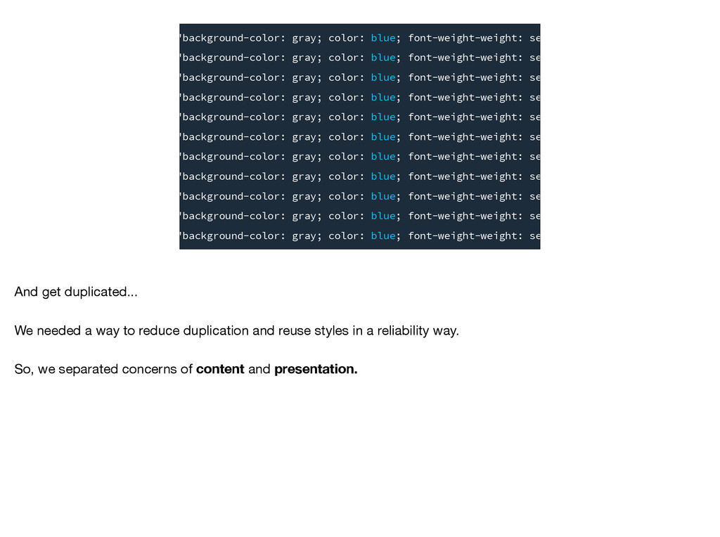
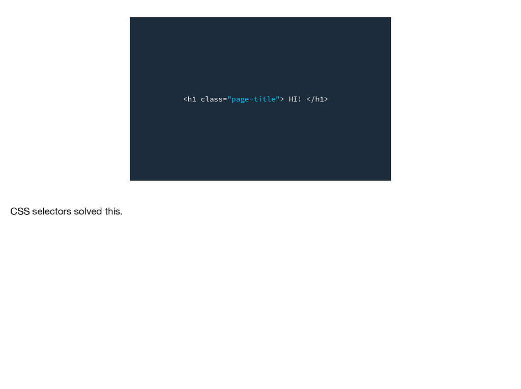
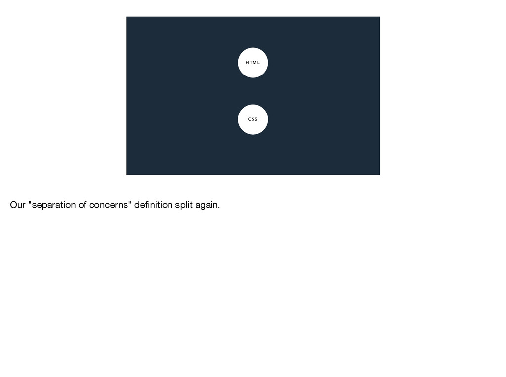
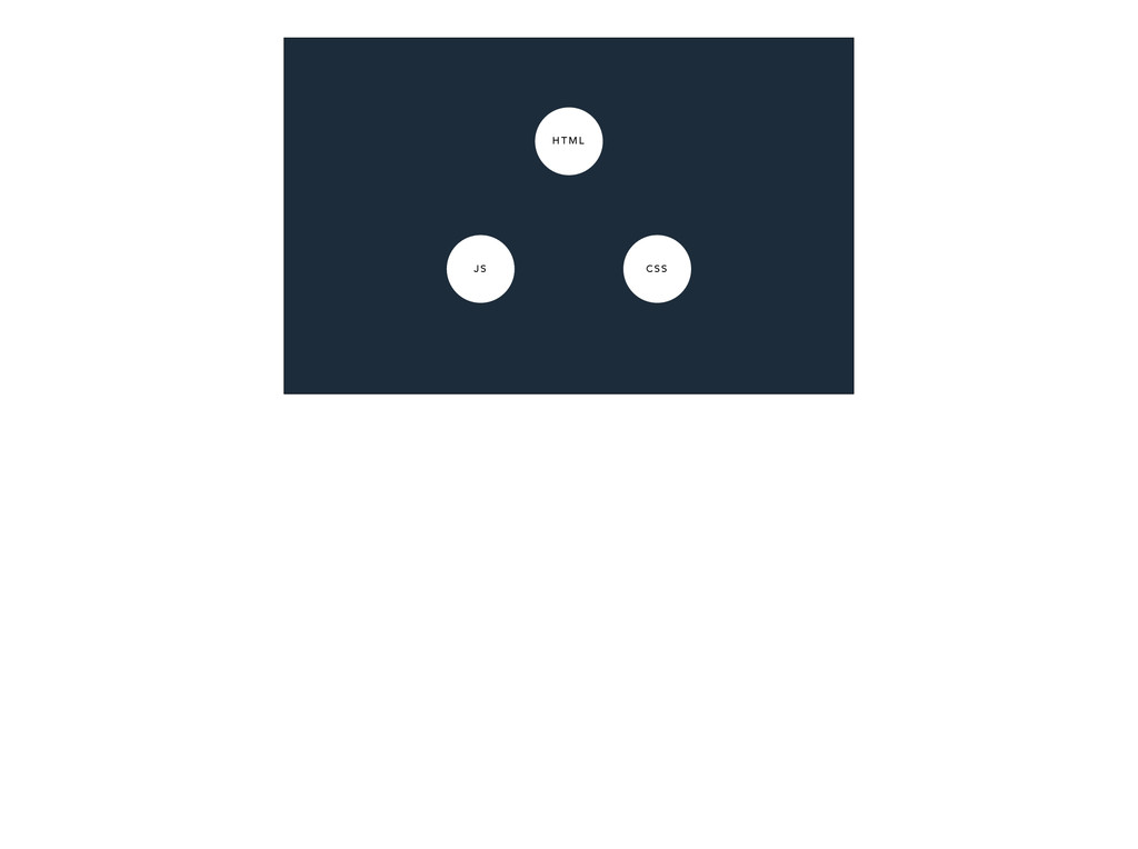
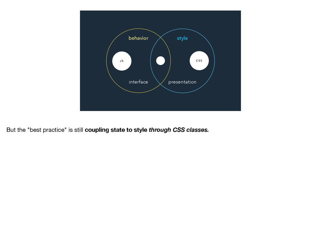
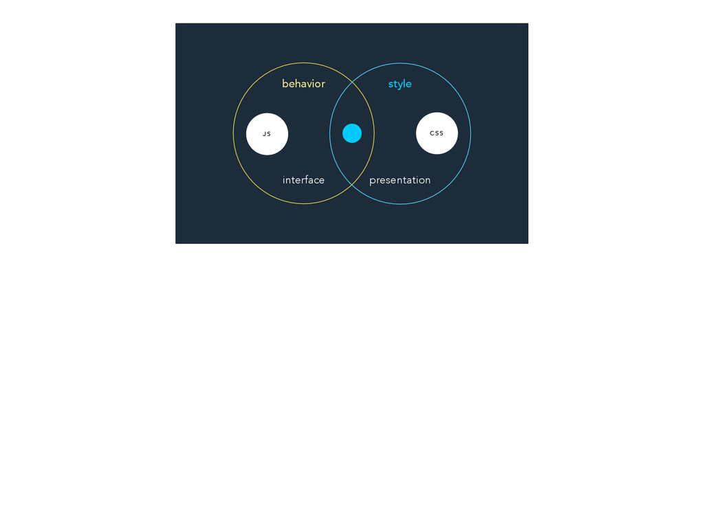
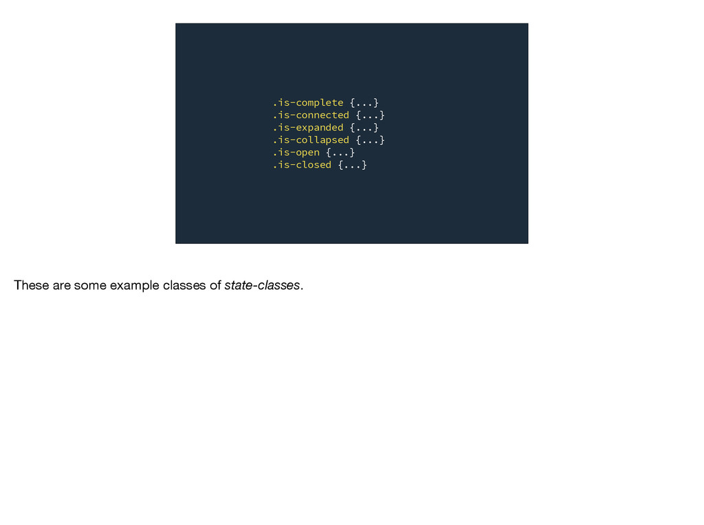
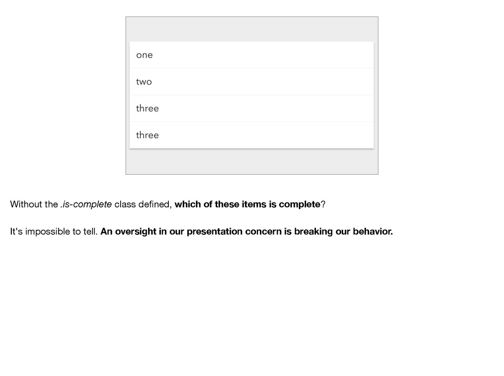
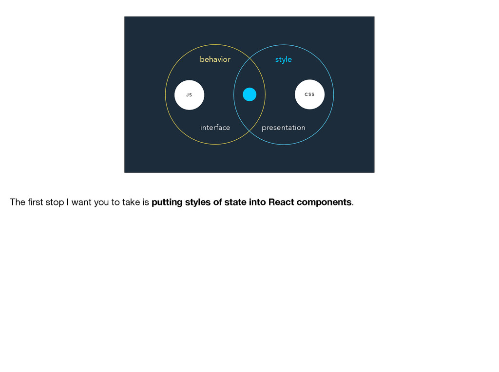
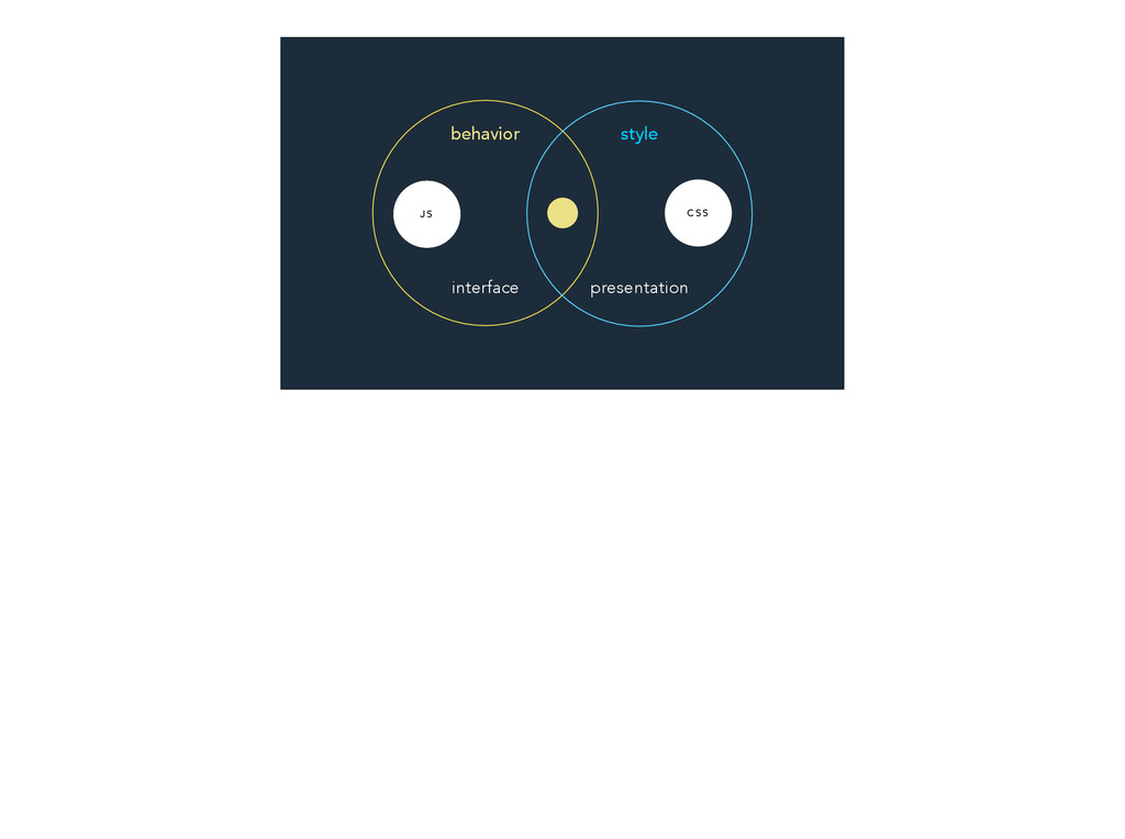
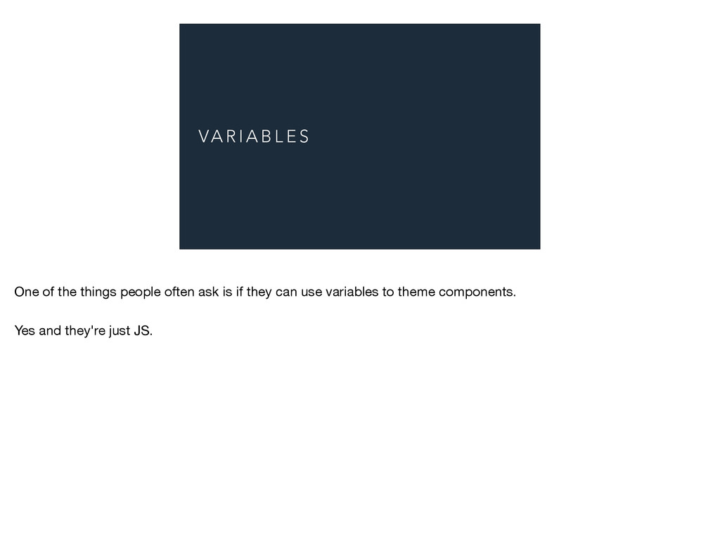
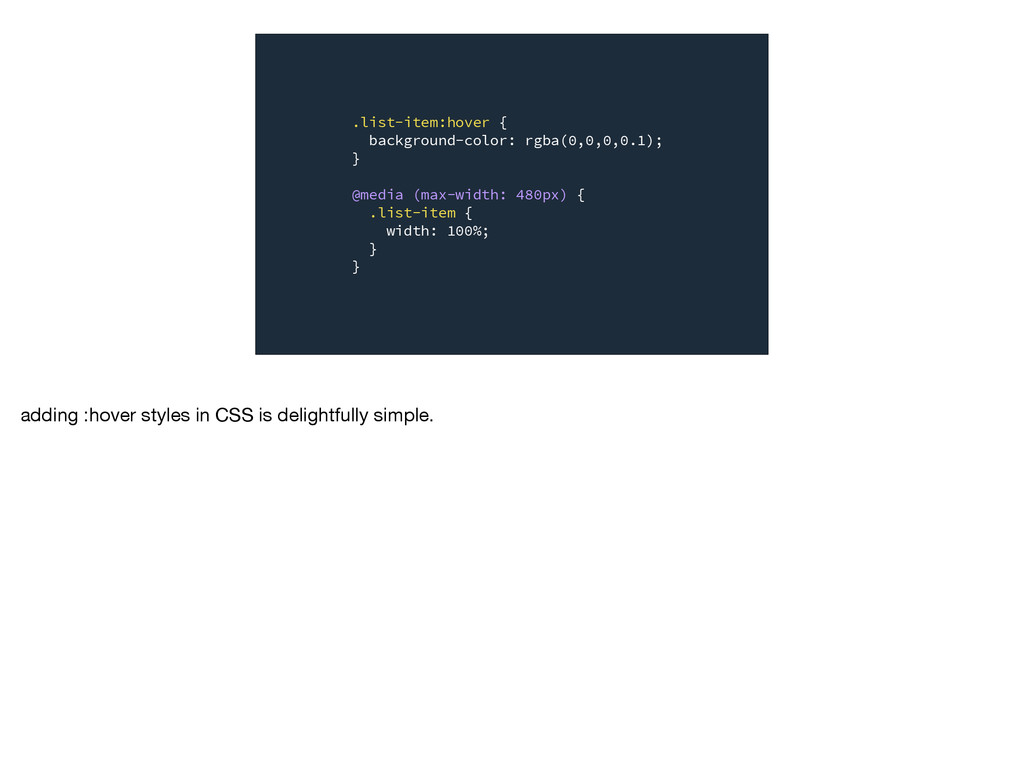
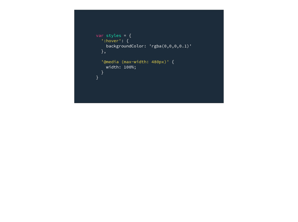
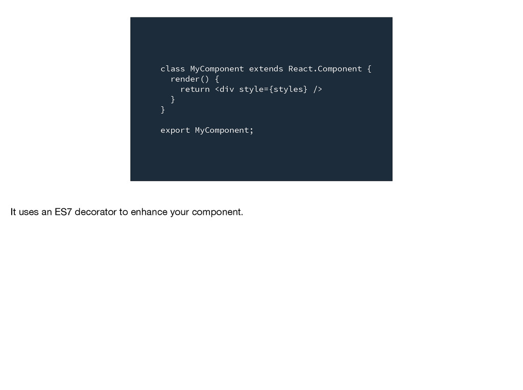
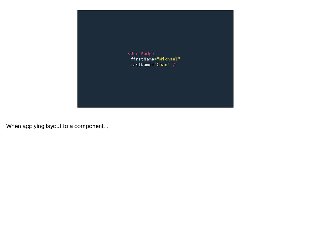
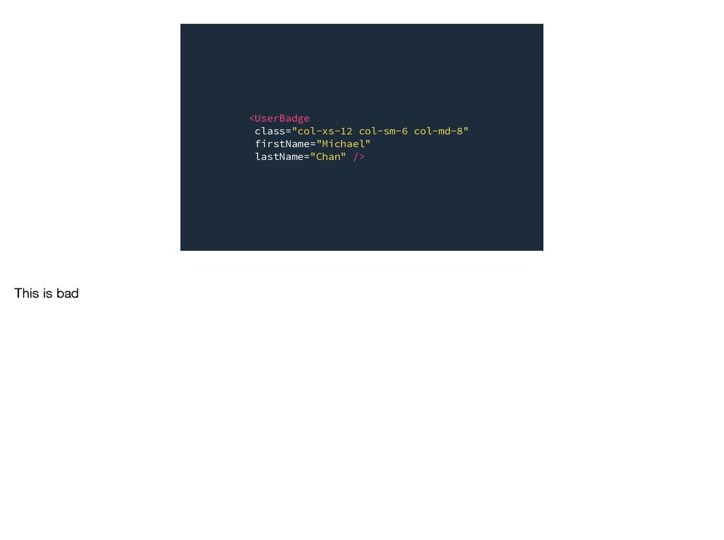
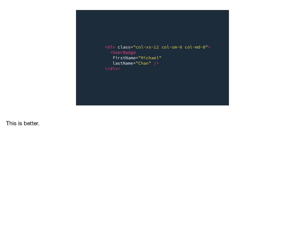
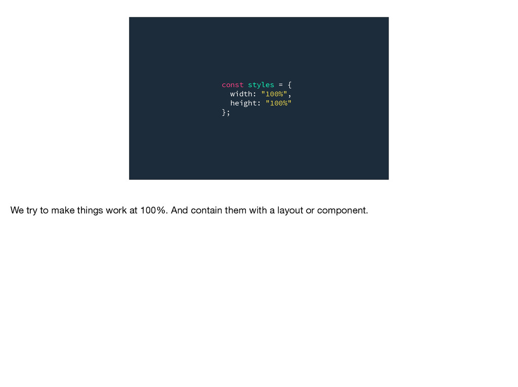
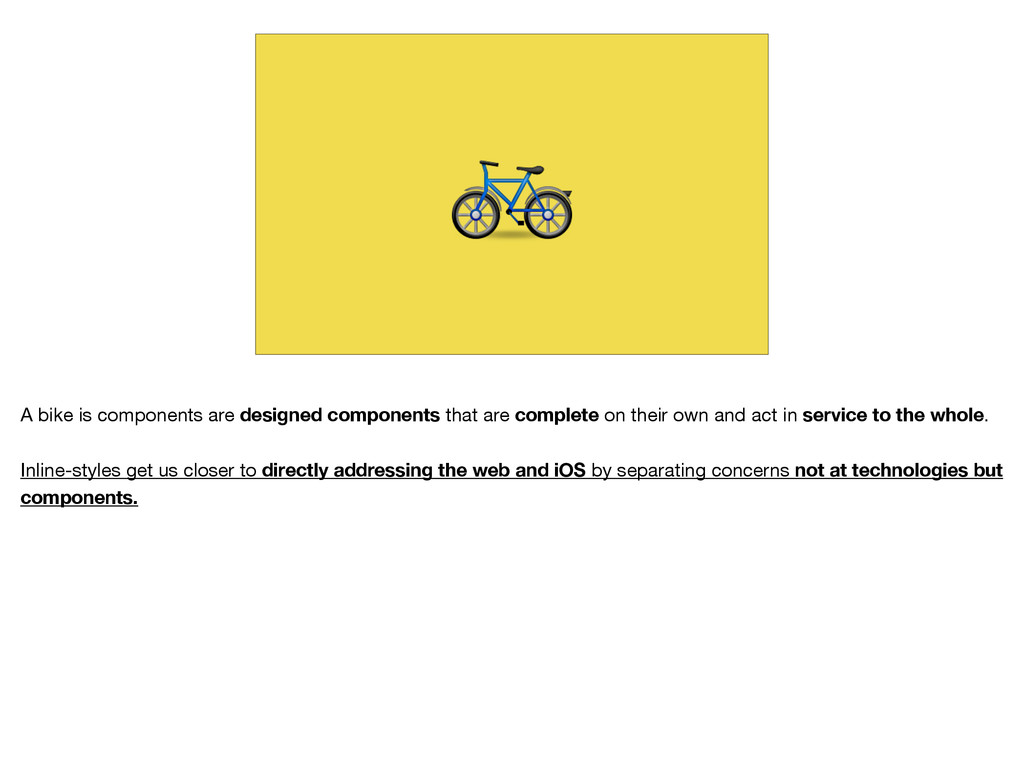
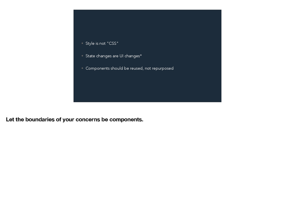
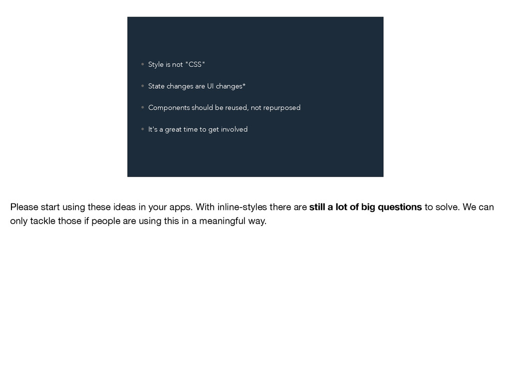
React allows you to write styles inline and bypass a host of CSS shortcomings. Scope, dependency management, dead code elimination, these problems go away when adding your styles directly to components. But it's not all rainbows and unicorns. Things like theming and media queries become much more difficult when all your styles live directly on components. In this talk, we'll look at how to solve these problems with contexts and plain old JavaScript. We'll also look at the role of container-components and when it's better to "just use CSS."

Michael Chan

July 02, 2015
Tweet

More Decks by Michael Chan

Other Decks in Programming

Transcript

  1. ⚛ ! I'm literally giddy to be at this conference.

    I'm love the community around React and how aggressively it's pushing the web forward.
  2. I'm here to talk about inline styles—or styling React components

    with JavaScript. In November, Vjeux talked about the technical benefits of CSS-in-JS and how it was improving their development story.
  3. That deck has over 400k views on SpeakerDeck. And it

    acts as the inspiration for a growing list of libraries. When I proposed this talk, it still felt like "one weird trick for styling your React components".
  4. “It's time to truly learn CSS.” This is a refrain

    I see a lot from those put off by the ideas of JavaScript styles.
  5. This is bullshit It sells books. But it isn't true.

    There's never been a better time not to learn CSS. If you can style an app without learning CSS. Don't React, has empowered us with a performant option that is totally modular and not selector-based.
  6. – J E R E M Y A S H

    K E N A S " R I S E O F T H E T R A N S P I L E R S " “Someone is going to unify these three different syntaxes and write a language that just addresses the web-platform directly and it's going to be insanely popular.” Jeremy Ashken gave a talk recently, at addressed this tangled relationship between HTML CSS and JS. [quote] https://www.youtube.com/watch?v=DspYurD75Ns&feature=youtu.be&t=2560 This is what I love about React. It Reduces the number of disparate technologies I need to know and align.
  7. The distance between knowledge and capability is getting shrinking. We're

    not restricted by a specific set of tools to be productive on the web or native.
  8. But the conversation still sucks. I'm a designer that's kinda

    found his way into programming UIs. The conversation requires that we think critically about separation of concerns. Today, we're talking about the Suitability and Capability of inline-styles.
  9. I want you to think of this talk as a

    metro train. We're going all the way to crazy town, but I'm going to make some stops along the way. You may get out where it makes the most practical sense for your team. You may find it's a little further than you might think :)
  10. • Style is not "CSS" • State changes are UI

    changes* • Components should be reused, not repurposed Here are a few themes:
  11. S T Y L E I S N O T

    " C S S " This is like the relationship between a square and a rectangle. We use "CSS" interchangeably with style. This makes conversation about where styles should live VERY HARD.
  12. S TAT E C H A N G E S

    A R E U I C H A N G E S * This has an asterisk because it might not be universally true. But UIs are this loop between a computer and human. As our sites grow in interactivity. State changing typically results in a change to what the user sees. Hidden, shown, struck-through, connected — all things a user sees as feedback to an input.
  13. C O M P O N E N T S

    S H O U L D B E R E U S E D , N O T R E P U R P O S E D Components are reusable in that they can be repeatedly used—not have multiple purposes. I would rather have 1000 components that do one thing than 100 components that do 2 things.
  14. I N T H E B E G I N

    N I N G . . . In the beginning, we didn't have CSS. Everything was styled inline.
  15. <h1 style="background-color: gray; color: blue; font-weight-weight: semibold;"> HI! </h1> <h1

    style="background-color: gray; color: blue; font-weight-weight: semibold;"> HI! </h1> <h1 style="background-color: gray; color: blue; font-weight-weight: semibold;"> HI! </h1> <h1 style="background-color: gray; color: blue; font-weight-weight: semibold;"> HI! </h1> <h1 style="background-color: gray; color: blue; font-weight-weight: semibold;"> HI! </h1> <h1 style="background-color: gray; color: blue; font-weight-weight: semibold;"> HI! </h1> <h1 style="background-color: gray; color: blue; font-weight-weight: semibold;"> HI! </h1> <h1 style="background-color: gray; color: blue; font-weight-weight: semibold;"> HI! </h1> <h1 style="background-color: gray; color: blue; font-weight-weight: semibold;"> HI! </h1> <h1 style="background-color: gray; color: blue; font-weight-weight: semibold;"> HI! </h1> <h1 style="background-color: gray; color: blue; font-weight-weight: semibold;"> HI! </h1> And get duplicated... We needed a way to reduce duplication and reuse styles in a reliability way. So, we separated concerns of content and presentation.
  16. T H E S E M A N T I

    C W E B CSS was was very popular with those evangelizing the semantic web. This established web standards that ensured content would be presented clearly, even if presentation wasn't fully rendered or supported by a browser. This was hugely important to everything we do today.
  17. h1 h2 h3 h4 h5 h6 p b i blockquote

    button table div span title ul li You had semantic elements and that was it.
  18. #header h1 #header h2 #header h3 #header h4 #header h5

    #header h6 #header p #header b #header i #header blockquote #header button #header table #header div #header span #header title #header ul #header li h1 h2 h3 h4 h5 h6 p b i blockquote button table div span title ul li If you needed more styles, you could just namespace a section of the page and start over.
  19. #header h1 #header h2 #header h3 #header h4 #header h5

    #header h6 #header p #header b #header i #header blockquote #header button #header table #header div #header span #header title #header ul #header li h1 h2 h3 h4 h5 h6 p b i blockquote button table div span title ul li #main h1 #main h2 #main h3 #main h4 #main h5 #main h6 #main p #main b #main i #main blockquote #main button #main table #main div #main span #main title #main ul #main li This was early approach to "Modularity". And it scaled indefinitely.... provided you don't need anymore semantic.
  20. C S S H T M L presentation We call

    this coupling presentation.
  21. T H E " W E B 2 . 0

    " W E B With the discovery of AJAX, we started to transition from content driven sites to data driven applications. CSS was reborn through more classically-rooted ideas.
  22. $("#todo-list ul li span") As we added interactivity, our selectors

    became coupled to markup. This isn't good.
  23. <ul class="todo-list"> <li class="item"> first </li> <li class="item"> second </li>

    </ul> Now the markup can change without affecting behavior.
  24. <div class="todo-list"> <div class="item"> first </div> <div class="item"> second </div>

    </div> But this is a problem. Anyone can change '.item' and we're hosed.
  25. J S H T M L C S S Our

    "separation of concerns" definition split again.
  26. J S H T M L C S S presentation

    We still have a presentation coupling.
  27. J S H T M L C S S behavior

    And we've added a new coupling that we call behavior.
  28. I N T E R A C T I V

    E W E B With the interactive web, we got state.
  29. J S H T M L C S S The

    problem is that we still regard "the separation of concerns" on the web as content/behavior/presentation. But with each new capability, these relationships grow and got more complex. Where is state in this Separation of concerns?
  30. J S H T M L C S S state

    EVERYWHERE. The old wisdom is that these "just have to work in perfect synchrony"—each part depending equally an the other. This seems naive. Fortunately, React helped tame this a bit.
  31. H T M L J S C S S state

    React made state a first-class concern.
  32. H T M L J S C S S interface

    presentation And looped markup into this tidy concept of an interface
  33. H T M L J S C S S interface

    presentation behavior style But the "best practice" is still coupling state to style through CSS classes.
  34. H T M L J S C S S interface

    presentation behavior style
  35. .is-complete {...} .is-connected {...} .is-expanded {...} .is-collapsed {...} .is-open {...}

    .is-closed {...} These are some example classes of state-classes.
  36. Without the .is-complete class defined, which of these items is

    complete? It's impossible to tell. An oversight in our presentation concern is breaking our behavior.
  37. H T M L J S C S S interface

    presentation behavior style The first stop I want you to take is putting styles of state into React components.
  38. H T M L J S C S S interface

    presentation behavior style
  39. We're going to build the dumbest component I can think

    of: A List of todos. When click, a todo gets crossed out.
  40. .todo-list { ... } .todo-list__item { ... } We'll start

    with our CSS classes The styles themselves are of no consequence.
  41. <ul className='todo-list'> {this.state.items.map((item, i) =>{ return ( <li className='todo-list__item'> {item.name}

    </li> ); })} </ul> We want to conditionally add the .is-complete class based on state.
  42. <ul className='todo-list'> {this.state.items.map((item, i) =>{ return ( <li className={classnames({ 'todo-list__item':

    true, 'is-complete': item.complete })}> {item.name} </li> ); })} </ul> We'll used Jed Watson's classnames library here. When an item is complete, we add the is-complete class.
  43. .todo-list { ... } .todo-list__item { ... &.is-complete { textDecoration:

    "line-through" } } We'll add this state class to our SCSS file. "does just hearing 'state-class' bother anyone else?" Anyway, moving on...
  44. describe("when item is is complete", () => { it("it has

    state-class is-complete", () => { // ... } } Let's look at what a test might look like for this. Without the style our behavior breaks SILENTLY. Let's take a look at what this looks like if we just put state styles inline.
  45. <ul className='todo-list'> {this.state.items.map((item, i) =>{ return ( <li className={classnames({ 'todo-list__item':

    true, 'is-complete': item.complete })}> {item.name} </li> ); })} </ul> Back at our component...
  46. let completedItemStyles = { textDecoration: 'line-through' }; return ( <ul

    className='todo-list'> {this.state.items.map((item, i) =>{ return ( <li className={classnames({ 'todo-list__item': true, 'is-complete': item.complete })}> {item.name} </li> ); })} </ul> ); Put our state-styles in a JS object
  47. let completedItemStyles = { textDecoration: 'line-through' }; return ( <ul

    className='todo-list'> {this.state.items.map((item, i) =>{ return ( <li className={classnames({ 'todo-list__item': true, 'is-complete': item.complete })} style={(item.complete) ? completeItemStyles : {} }> {item.name} </li> ); })} </ul> ); And add a condition that loads those based on state.
  48. let completedItemStyles = { textDecoration: 'line-through' }; return ( <ul

    className='todo-list'> {this.state.items.map((item, i) =>{ return ( <li 'todo-list__item' style={(item.complete) ? completeItemStyles : {} }> {item.name} </li> ); })} </ul> ); We can now remove the classnames dependency, and our '.is-complet' classname from the component.
  49. .todo-list { ... } .todo-list__item { ... &.is-complete { textDecoration:

    "line-through" } } Finally, we can remove this state-class that has always felt a little strange.
  50. .todo-list { ... } .todo-list__item { ... } Now this

    file is stateless again, only concerned with "appearance" not appearance and "behavioral"
  51. describe("when item is is complete", () => { it("it has

    state-class is-complete", () => { // ... } } I have a real problem with this. Without the style our behavior breaks.
  52. describe("when item is is complete", () => { it("it appears

    crossed out", () => { // ... } } Don't let styles break your behavior silently.
  53. H T M L J S C S S interface

    presentation behavior style ALL we've done is brought state fully into our React component.
  54. interface J S C S S appearance And we've freed

    CSS to ONLY care about appearance.
  55. let completedItemStyles = { textDecoration: 'line-through' }; return ( <ul

    className='todo-list'> {this.state.items.map((item, i) =>{ return ( <li 'todo-list__item' style={(item.complete) ? completeItemStyles : {} }> {item.name} </li> ); })} </ul> ); Back at our component...
  56. let completedItemStyles = { textDecoration: 'line-through' }; return ( <ul

    className='todo-list'> {this.state.items.map((item, i) =>{ return ( <li 'todo-list__item' style={Object.assign({}, item.complete && completeItemStyles )}> {item.name} </li> ); })} </ul> ); Let's bulk up our style equation to handle multiple conditions, using Object.assign.
  57. let completedItemStyles = { textDecoration: 'line-through' }; return ( <ul

    className='todo-list'> {this.state.items.map((item, i) =>{ return ( <li 'todo-list__item' style={Object.assign({}, item.complete && completeItemStyles, item.complete && this.props.completedItemStyle )}> {item.name} </li> ); })} </ul> ); Now, we can take a prop, call it completeItemStyle, and merge it in atop our base styles.
  58. W H AT W E D I D ? •

    State is fully owned by our component • Stateful classes removed from DOM and CSS • CSS reduced to "appearance"-only • Styles can be overridden at the call site • Better specs
  59. W H AT I T C O S T •

    State-styles written in JS objects I think that simple shift is a big win for established teams with an existing CSS codebase.
  60. CAPABILITY So, we've talked about suitability. I'd like to talk

    a little about capability. CAN we do the same things in JS that we can in CSS? This won't be an exhaustive list but I'll try to get through the most common questions.
  61. VA R I A B L E S One of

    the things people often ask is if they can use variables to theme components. Yes and they're just JS.
  62. $red: #ff4136; $orange: #ff851b; $yellow: #ffdc00; $green: #2ecc40; $blue: #0074d9;

    $indigo: #39cccc; $violet: #b10dc9; colors from mrmrs/colors variables.scss This is what variables look like in SCSS
  63. export default { red: "#ff4136", orange: "#ff851b", yellow: "#ffdc00", green:

    "#2ecc40", blue: "#0074d9", indigo: "#39cccc", violet: "#b10dc9" }; colors from mrmrs/colors variables.js And here's what the look like as a JS module.
  64. import darkColors from './themes/dark'; import lightColors from './themes/light'; ... let

    colors = (this.props.theme === 'dark') ? dark : light; ... And switch based on a prop.
  65. P S E U D O - C L A

    S S E S These are fake classes that allow you to make selections based on an elements relationship to other elements.
  66. let completedItemStyles = { textDecoration: 'line-through' }; return ( <ul

    className='todo-list'> {this.state.items.map((item, i) =>{ return ( <li 'todo-list__item' style={Object.assign({}, item.complete && completeItemStyles, item.complete && this.props.completedItemStyle )}> {item.name} </li> ); })} </ul> ); This is where we left our TodoList component.
  67. let completedItemStyles = { textDecoration: 'line-through' }; return ( <ul

    className='todo-list'> {this.state.items.map((item, i) =>{ return ( <li 'todo-list__item' style={Object.assign({}, item.complete && completeItemStyles, item.complete && this.props.completedItemStyle i % 2 && { backgroundColor: "#f2f2f2" } )}> {item.name} </li> ); })} </ul> ); Say we want change the background of every even element. We just add a condition.
  68. let completedItemStyles = { textDecoration: 'line-through' }; return ( <ul

    className='todo-list'> {this.state.items.map((item, i, arr) =>{ return ( <li 'todo-list__item' style={Object.assign({}, item.complete && completeItemStyles, item.complete && this.props.completedItemStyle i % 2 && { backgroundColor: "#f2f2f2" }} )}> {item.name} </li> ); })} </ul> ); If that condition requires the length of the items. We get get that through map
  69. let completedItemStyles = { textDecoration: 'line-through' }; return ( <ul

    className='todo-list'> {this.state.items.map((item, i, arr) =>{ return ( <li 'todo-list__item' style={Object.assign({}, item.complete && completeItemStyles, item.complete && this.props.completedItemStyle i === arr.length -1 && { backgroundColor: "#f2f2f2" } )}> {item.name} </li> ); })} </ul> ); and write our condition based on it.
  70. textDecoration: 'line-through' }; let tigerStripeStyle = { backgroundColor: "#f2f2f2" };

    return ( <ul className='todo-list'> {this.state.items.map((item, i, arr) =>{ return ( <li 'todo-list__item' style={Object.assign({}, item.complete && completeItemStyles, item.complete && this.props.completedItemStyle i === arr.length -1 && tigerStripeStyle} )}> {item.name} </li> ); })} </ul> And again, we can move this object as it continues to grow.
  71. :first-child :last-child :only-child :nth-child(even) :nth-child(odd) :nth-child(n) :nth-last-child(n) :nth-child(-n+3) i ===

    0 i === arr.length - 1 1 === arr.length i % 2 !(i % 2) i === n - 1 i === arr.length - n i < 3 common pseudo-class cheatsheet If your interested, here's a little cheatsheet.
  72. P S E U D O - E L E

    M E N T S Fake elements to keep semantics.
  73. .my-class::before { } .my-class::after { } In CSS, these are

    a godsend. They make things like: * clearfixes * iconfonts * some grids possible. They're completely useless in React because you're defining your own semantics.
  74. <span className="my-class"> <div style={beforeStyles} /> Hover here <div style={afterStyles} />

    </span> This is how you would do this in React and inline-styles.
  75. HARD PARTS Hard Parts When I proposed this talk. These

    details were going to be the core of my talk. In the past 5 month. Libraries have made it possible to to not have to solve this on your own.
  76. class ListItem extends React.Component { constructor(props) { super(props); this.state =

    { hovered: false }; this.handleMouseEnter = () => { this.setState({ hovered: true }); } this.handleMouseLeave = () => { this.setState({ hovered: false }); } } render() { return ( <li style={Object.assign({}, styles, this.state.hovered && {backgroundColor: "rgba(0,0,0,0.1)"} )} onMouseEnter={this.handleMouseEnter} onMouseLeave={this.handleMouseLeave} {...this.props} /> ); } } In React, it is not.
  77. class ListItem extends React.Component { constructor(props) { super(props); this.state =

    { hovered: false, smallScreen: false }; this.handleMouseEnter = () => { this.setState({ hovered: true }); } this.handleMouseLeave = () => { this.setState({ hovered: false }); } this.handleMatchMediaChange = (e) => { return this.setState({tabletContext: e.matches}); } } componentWillMount() { this.handleMatchMediaChange(window.matchMedia("(max-width: 480px)")); window.matchMedia( "(max-width: 480px)") .addListener(this.handleMatchMediaChange); } componentWillUnmount() { window.matchMedia("(max-width: 480px)") .removeListener(this.handleMatchMediaChange); } render() { return ( <li style={Object.assign({}, styles, this.state.hovered && {backgroundColor: "rgba(0,0,0,0.1)"} )} onMouseEnter={this.handleMouseEnter} onMouseLeave={this.handleMouseLeave} {...this.props} /> ); } } In React, it is not.
  78. T H I S I S N ' T B

    E T T E R This isn't easier. But it does give you some much needed control over events. The way that mobile browsers handle events like :hover for touch only gets harder and harder to reason about. But sometimes you just want sensible defaults.
  79. R A D I U M This is where libraries

    like Radium come in. There are 15-20 libraries now that take a similar but varied approach to adding nice conveniences to inline styles. I feature Radium because I think it's the most extremely "inline-styles" only. And because of that, it doesn't required a build-step; making it a great fit for any system, including integrated systems like .NET and Rails. By design, Radium allows you to style application components in a way that's very remeiscient of SASS or Less
  80. var styles = { ':hover': { backgroundColor: 'rgba(0,0,0,0.1)' } }

    In React, this is what's required to emulate the hover pseudo-class
  81. .list-item:hover { background-color: rgba(0,0,0,0.1); } @media (max-width: 480px) { .list-item

    { width: 100%; } } adding :hover styles in CSS is delightfully simple.
  82. H O W I T W O R K S

    How does it work?
  83. class MyComponent extends React.Component { render() { return <div style={styles}

    /> } } export MyComponent; It uses an ES7 decorator to enhance your component.
  84. @Radium class MyComponent extends React.Component { render() { return <div

    style={styles} /> } } export MyComponent; ES7 It uses an ES7 decorator to enhance your component.
  85. class MyComponent extends React.Component { render() { return <div style={styles}

    /> } } module.exports Radium(MyComponent); CommonJS w/enhancer But it supports CommonJS
  86. (() => { var MyComponent = React.createClass({ render() { return

    <div style={styles} /> } }); this.MyComponent = Radium(MyComponent); })(); ES5 / globals And with som old tricks, globals
  87. var styles = { color: '#0074d9', ':hover': { color: '#0088FF'

    }, '@media (max-width: 480px)': { width: '100%' } } .my-class { color: #0074d9; &:hover { color: #0088FF; } @media (max-width: 480px) { width: 100% } } JS + Radium SCSS Reads like SCSS, with nested syntax.
  88. T H E O T H E R S Radium

    has a very elaborate chart about alternative libraries, comparing: * syntax * override mechanism * ES-version * and isomorphic support. But Radium is hard to beat. It's passionately maintained, with excellent docs, and has no build-time phase, making it a great fit for integrated systems like Rails and .NET.
  89. GRAB BAG Grab bag. These are the things that didn't

    fit into the theme that I wanted to make slides for. Incase they were where your head was at.
  90. C O L O R S SCSS has some cool

    ways to manipulate colors.
  91. import Color from 'color'; harthur/color The great thing is that

    these are honest to goodness variables. Sass compiles these values to regular CSS. Whereas they can be edited on the fly in JS
  92. import { orange, indigo } from './colors'; import Color from

    'color'; harthur/color The great thing is that these are honest to goodness variables. Sass compiles these values to regular CSS. Whereas they can be edited on the fly in JS
  93. import { orange, indigo } from './colors'; import Color from

    'color'; let hoverStyles = { backgroundColor: Color(indigo).lighten(0.2); }; harthur/color The great thing is that these are honest to goodness variables. Sass compiles these values to regular CSS. Whereas they can be edited on the fly in JS
  94. L AY O U T If you're comfortable with an

    existing grid system. If you have one for your app --- There are a lot of mature layout systems out there. For our team, we don't use a react-specific layout system. For what we do, there's not really a need. Where reasonable, we make our components the full width and height of a container. So, we ALWAYS wrap a component in layout, instead of applying layout to the component directly.
  95. U S E A N Y L AY O U

    T L I B Y O U L I K E
  96. const styles = { width: "100%", height: "100%" }; We

    try to make things work at 100%. And contain them with a layout or component.
  97. D I S T R I B U T E

    D C O M P O N E N T S
  98. import { Media, MediaImg, MediaImgExt, MediaBd } 'react-media-object'; <Media style={...}>

    <MediaImg style={...}> <MediaImgExt style={...} /> </MediaImg> <MediaBd style={...}/> </Media>
  99. INLINE-STYLES I said we were going to take this all

    the way to crazy. Here's our last stop. I think that components are the cornerstone of interactive experience on the web and mobile. We should build that as singular blocks of code.
  100. <ul className="ChatMessageList"> {this.props.messages.map(function (message) {return ( <ChatMessage className="ChatMessage"> <div className="ChatMessage-time">{message.time}</div>

    <div className="ChatMessage-author">{message.author}</div> <div className="ChatMessage-body">{message.message}</div> </ChatMessage> ); })} </ul> I add my classes...
  101. • The component filename • The component class definition •

    The 5 uses of className • The stylesheet filename • The 5 class definition in the stylesheet There is so much naming duplication here. This is so much ceremony. I hated this invisible line that lived between these two totally desperate technologies. Literally held together by a strings.
  102. – S A N D I M E T Z

    , P R A C T I C A L O B J E C T- O R I E N T E D D E S I G N I N R U B Y “The purpose of design is to allow you to do design later, and it's primary goal is to reduce the cost of change.” With classes we're sacrificing "changeability" for the chance that we might be able to repurpose our styles by cascading styles alone. This is a pipedream.
  103. interface appearance So, we took the last part piece of

    our component and moved it inline.
  104. interface The best practices in modern CSS continue to move

    toward modularity. So why not just used modules.
  105. data EmailClient data ChatMessages data Document data Songs interface If

    we do this, we can fully live in the promise of React. With our separation of concerns at the boundaries of our components.
  106. This year I turned 32. I learned that, in your

    30s, you can't love eating everything and doing nothing at the same time. So I started riding a bike.
  107. A bike is made of components, designed specifically for a

    bike. I don't expect to repurpose my bike components: If my car gets a flat, I don't expect that the tires of my bike could act as a spare. However, I can switch components with another bike.
  108. My bikes behavior isn't defined by it's appearance. A bike

    is useless without a frame or handlebars or tires. but it works fine without paint or handlebar tape.
  109. A bike is components are designed components that are complete

    on their own and act in service to the whole. Inline-styles get us closer to directly addressing the web and iOS by separating concerns not at technologies but components.
  110. • Style is not "CSS" • State changes are UI

    changes* • Components should be reused, not repurposed Let the boundaries of your concerns be components.
  111. • Style is not "CSS" • State changes are UI

    changes* • Components should be reused, not repurposed • It's a great time to get involved Please start using these ideas in your apps. With inline-styles there are still a lot of big questions to solve. We can only tackle those if people are using this in a meaningful way.
  112. @chantastic I want to meet you. So, I have stickers.

    Come up. Say "hi". Tell me why you think I'm wrong about all this :)