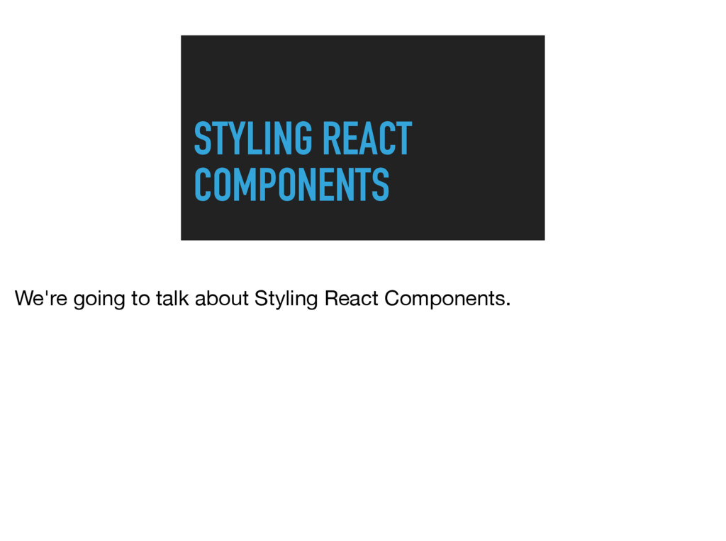
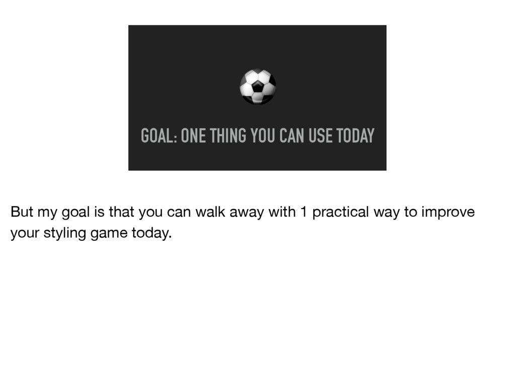
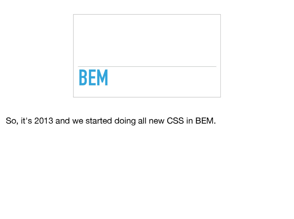
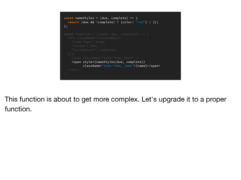
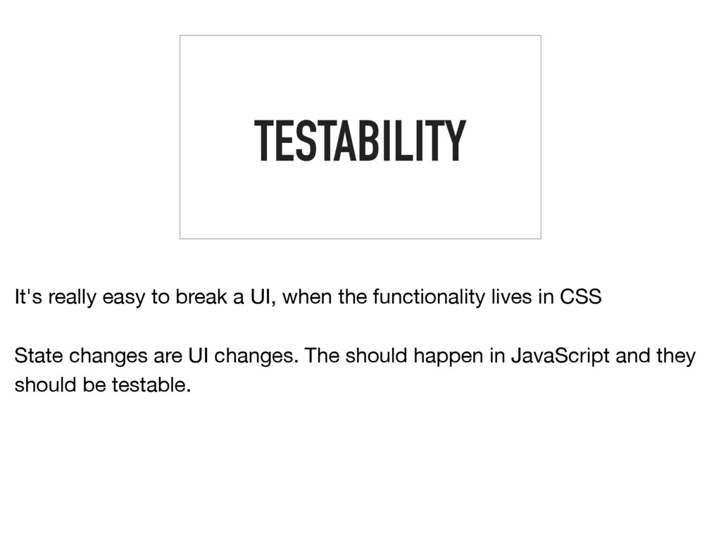
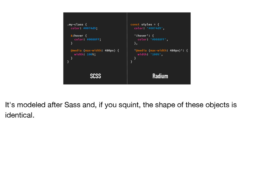
The styling of React components is a contentious topic in 2015.
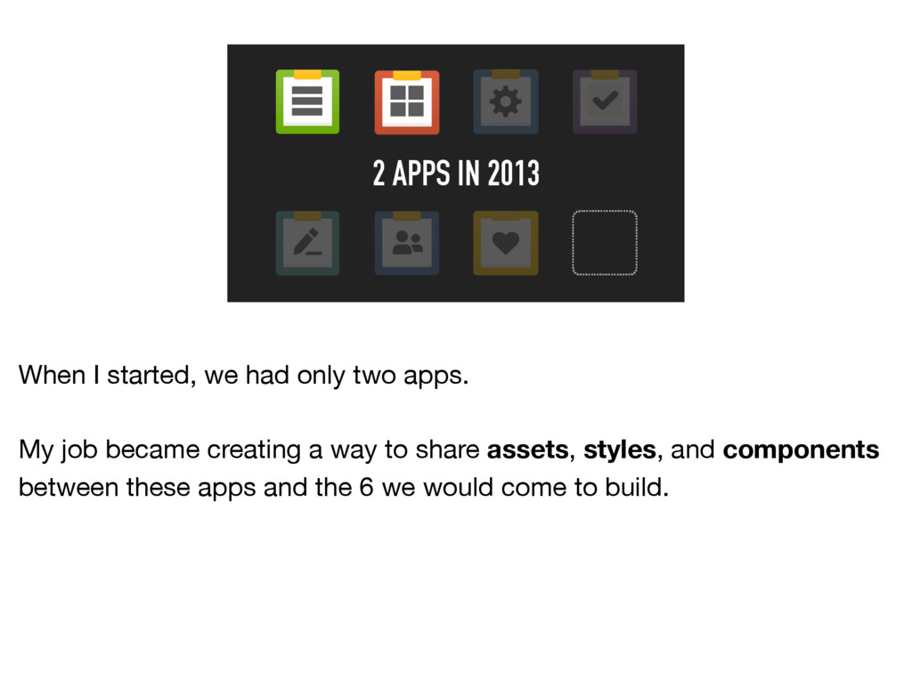
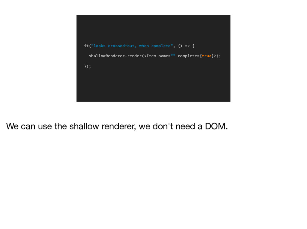
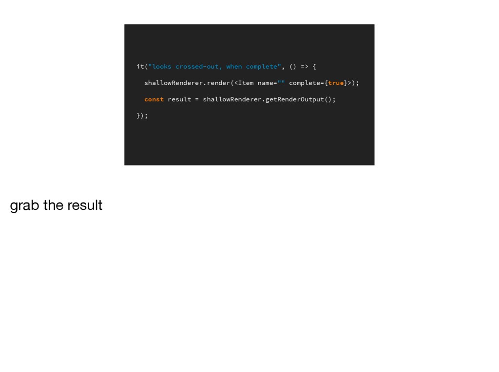
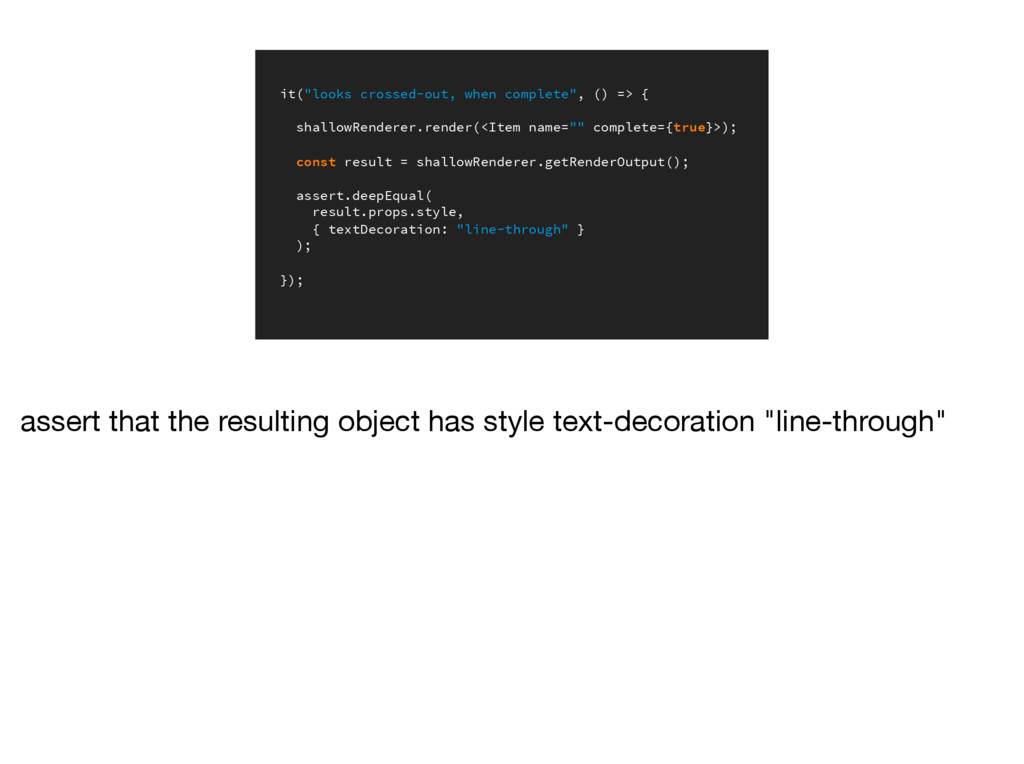
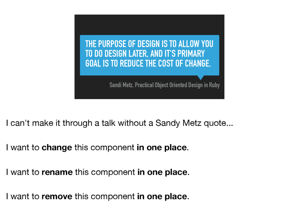
It challenges everything we know about styling apps. In this talk, we’ll take a practical look at styling components in JavaScript: good practices, libraries, testing, and how to expose great APIs for distributed components.
We’ll explore when styling in JavaScript is a great fit and when it might be best to "just use CSS."
 chantastic
 odan611
 nwiizo
 eitarosuda
 ritou
ritou
 a_ono
a_ono
 kawaguti
 zozotech
 you
you
 flatt_security
 kenichinakamura
 estie
estie
 uhyo
uhyo
 helmedeiros
 aleyda
 zakiyama
 aarron
 bluesmoon
 philnash
 carmenintech
 eileencodes
 sarafernandez
 jacobtomlinson
 baasie
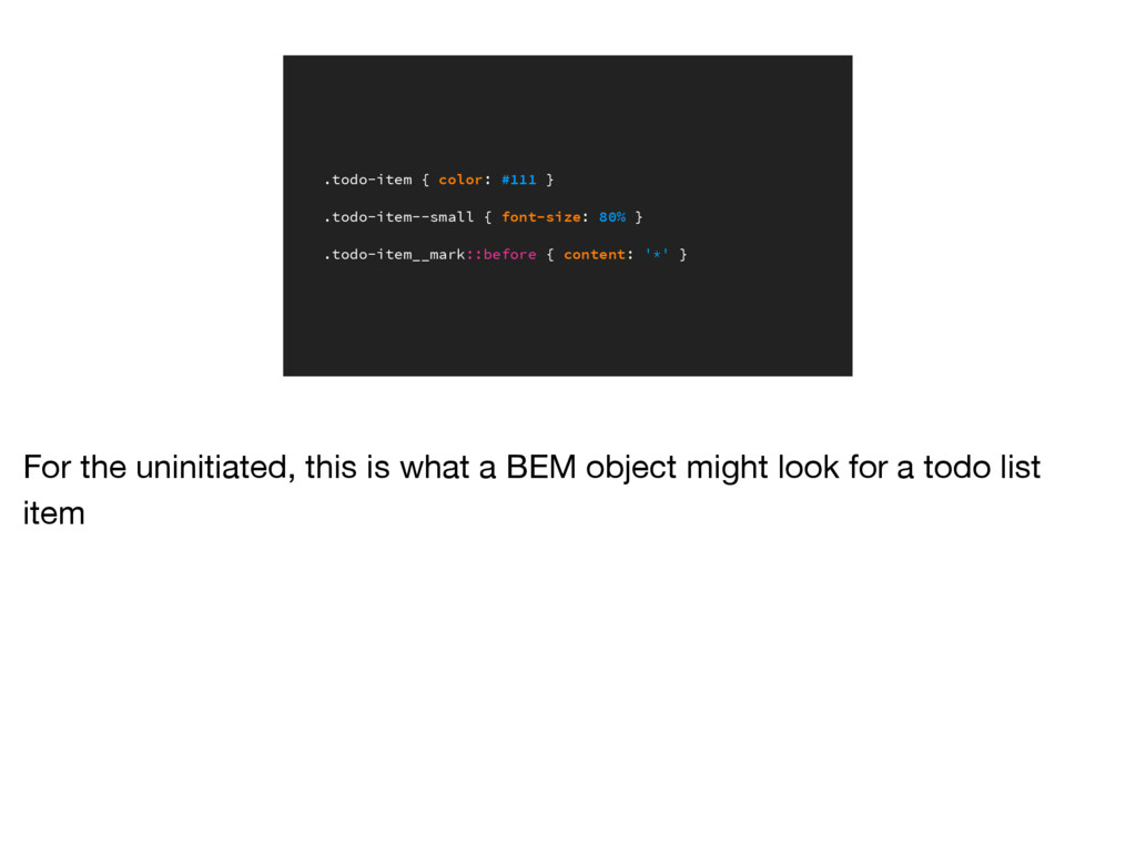
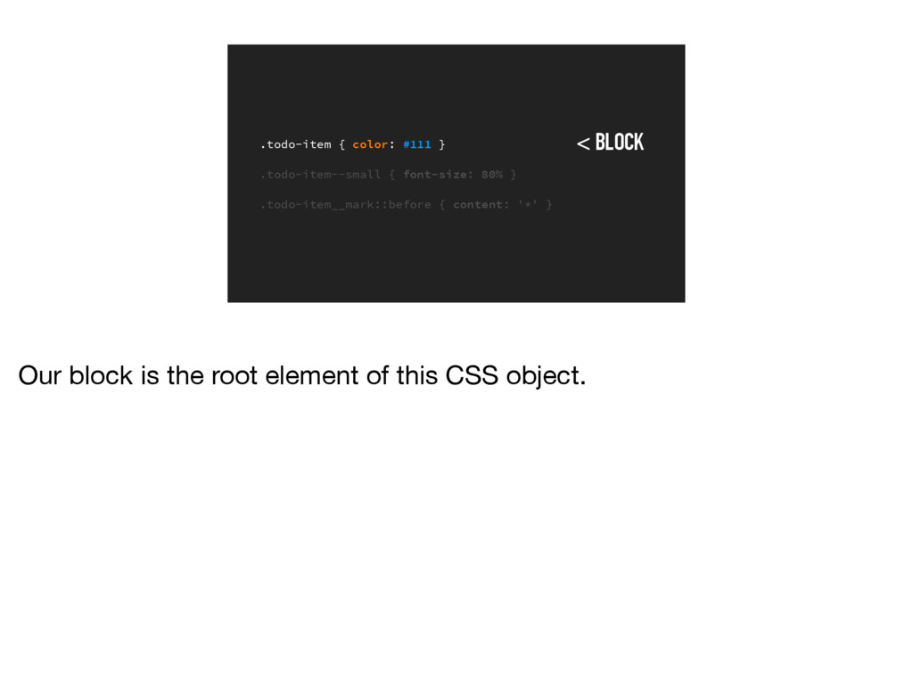
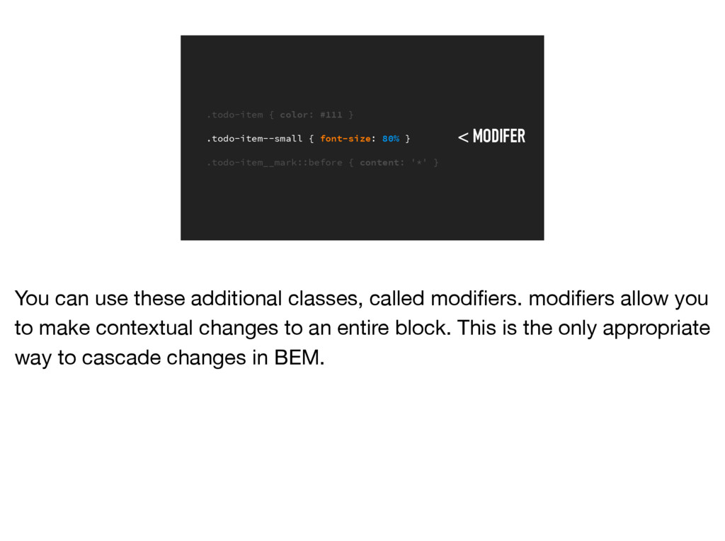
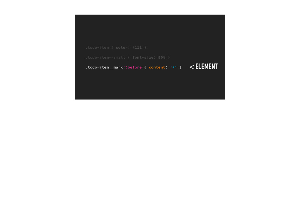
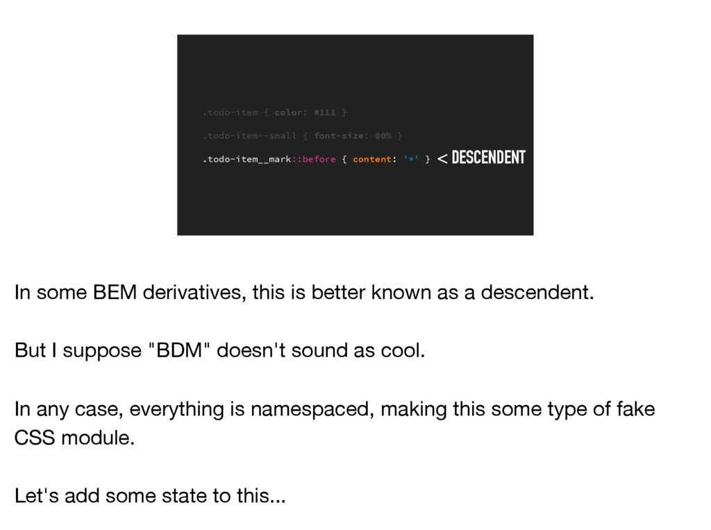
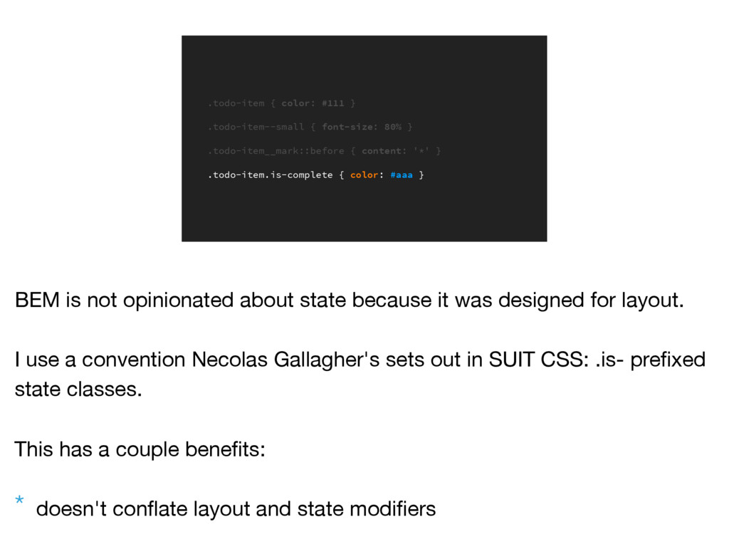
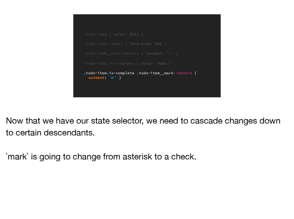
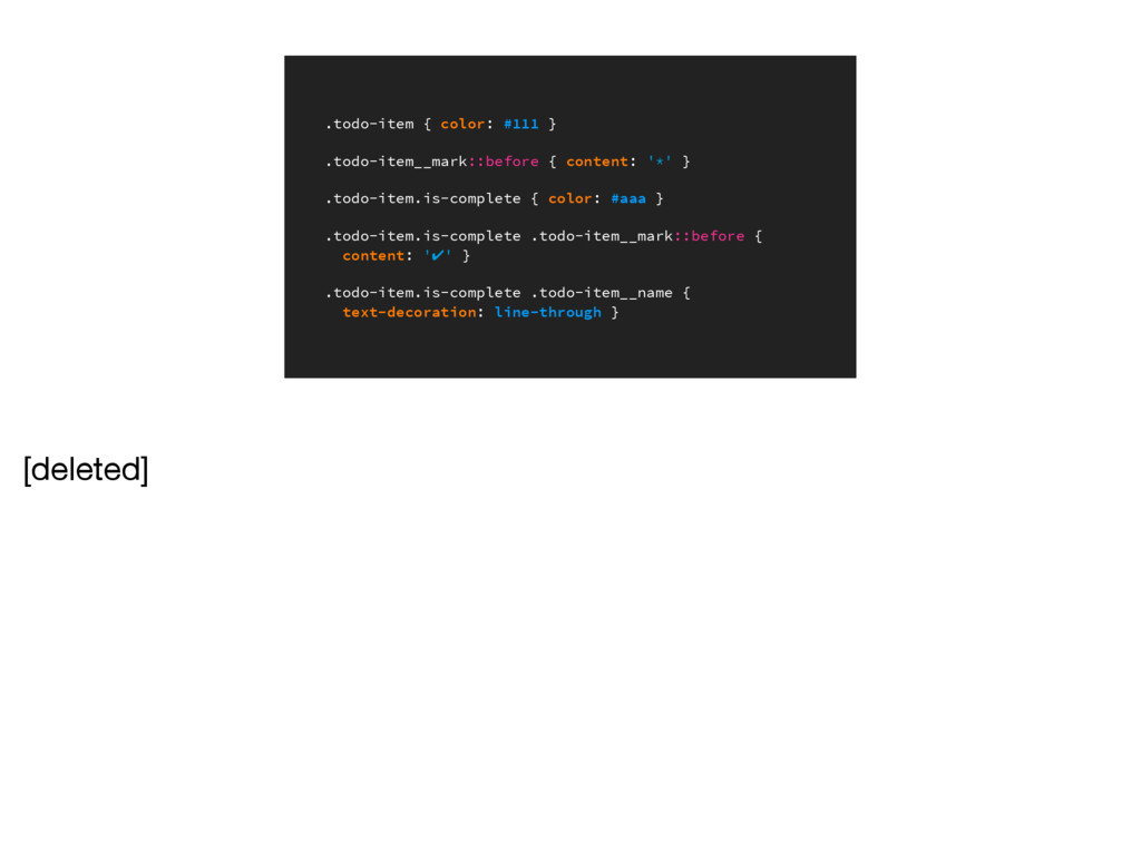
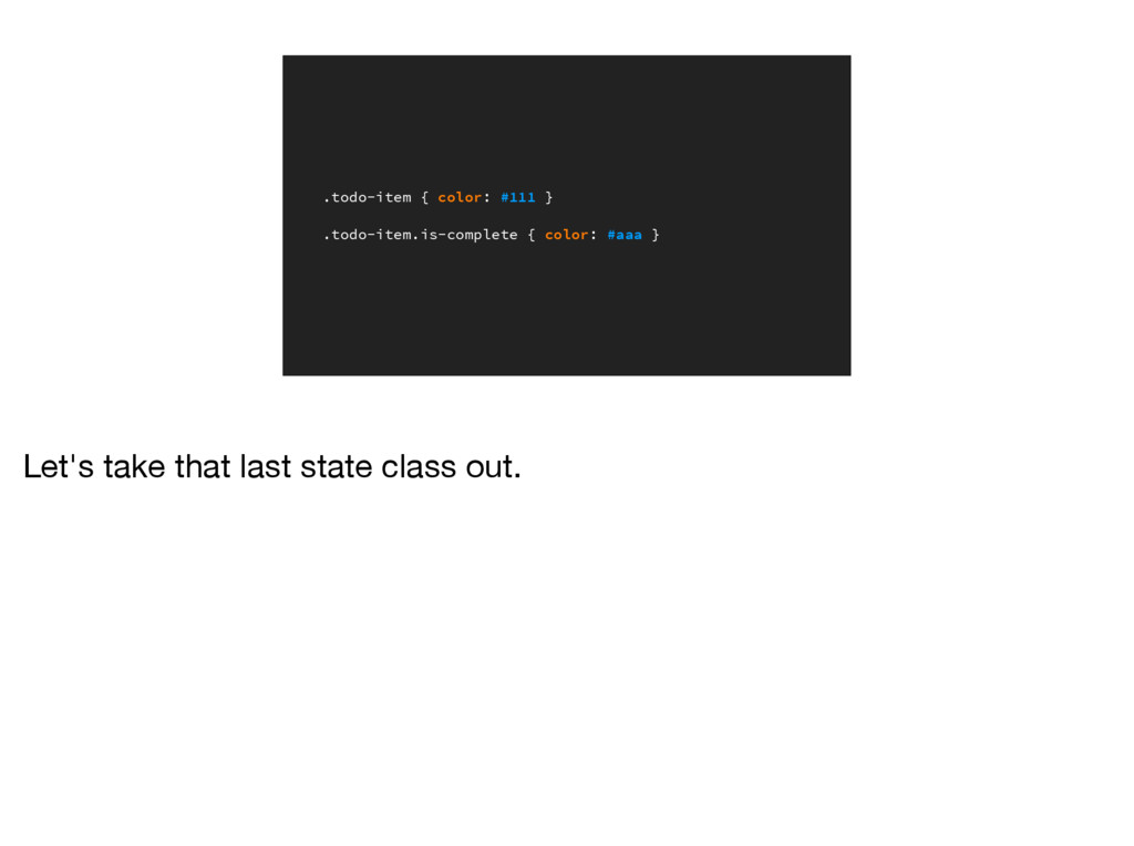
![.todo-item { color: #111 } [deleted]](https://files.speakerdeck.com/presentations/db919fbe210a4c698a31e6e05e92280a/slide_71.jpg)