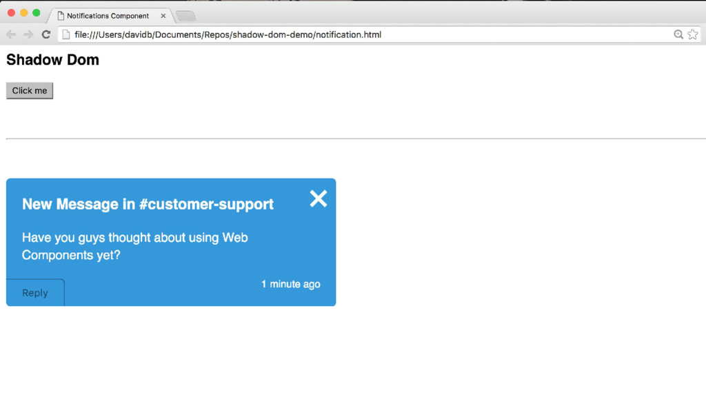
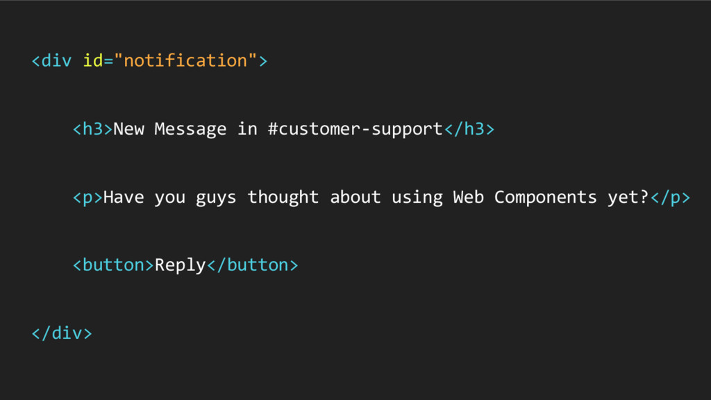
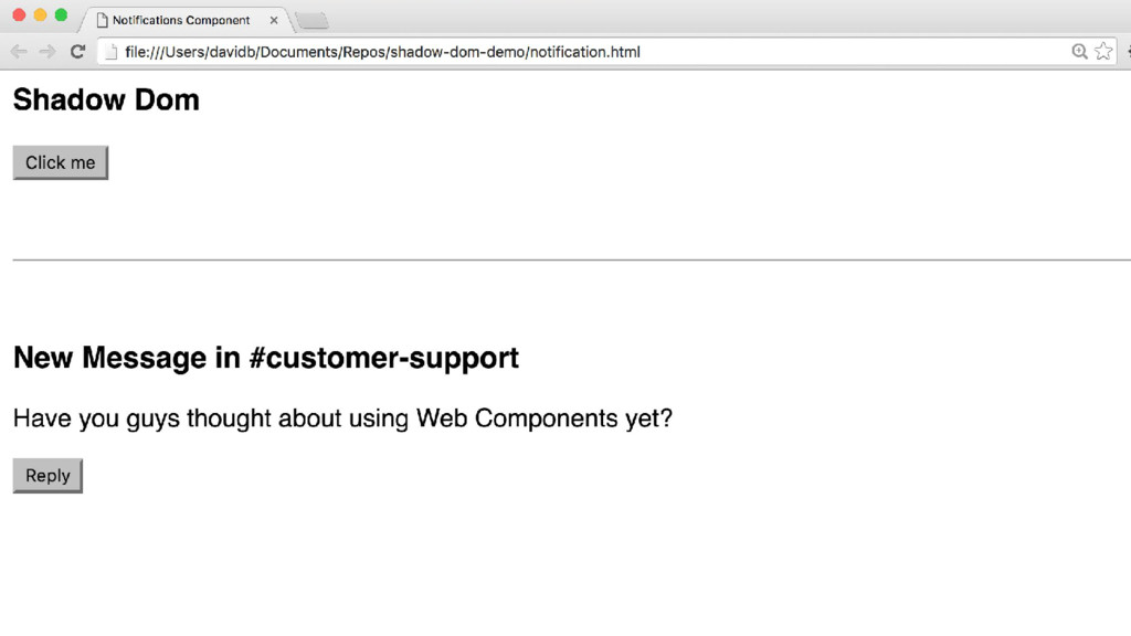
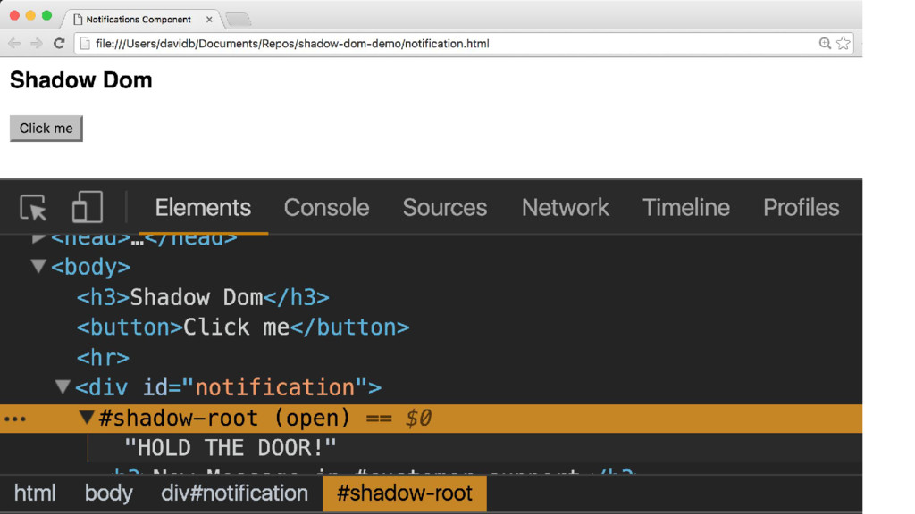
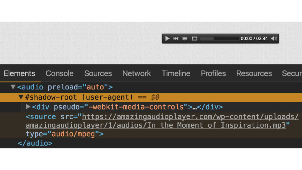
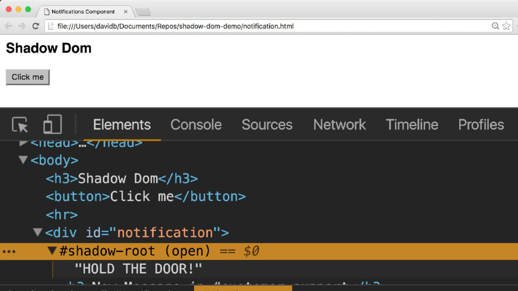
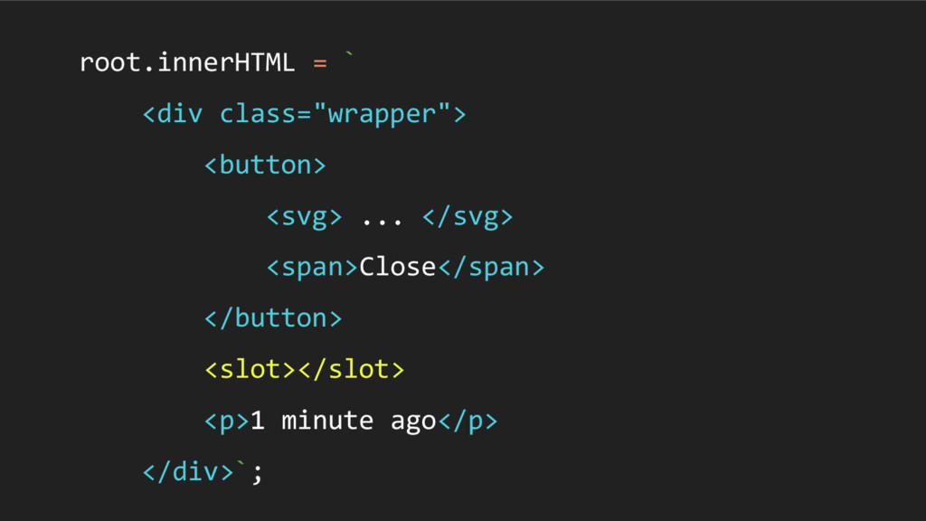
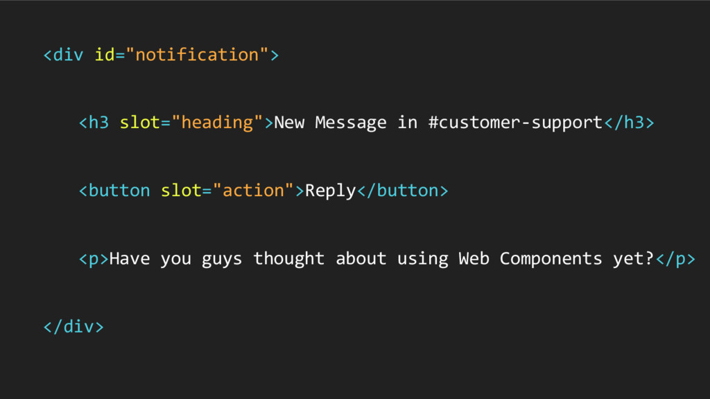
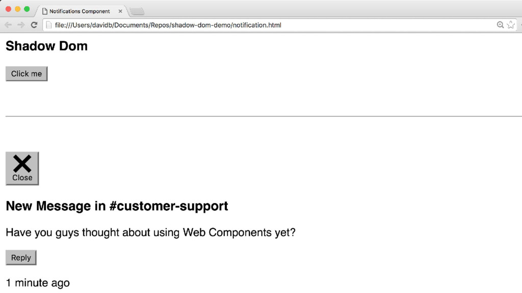
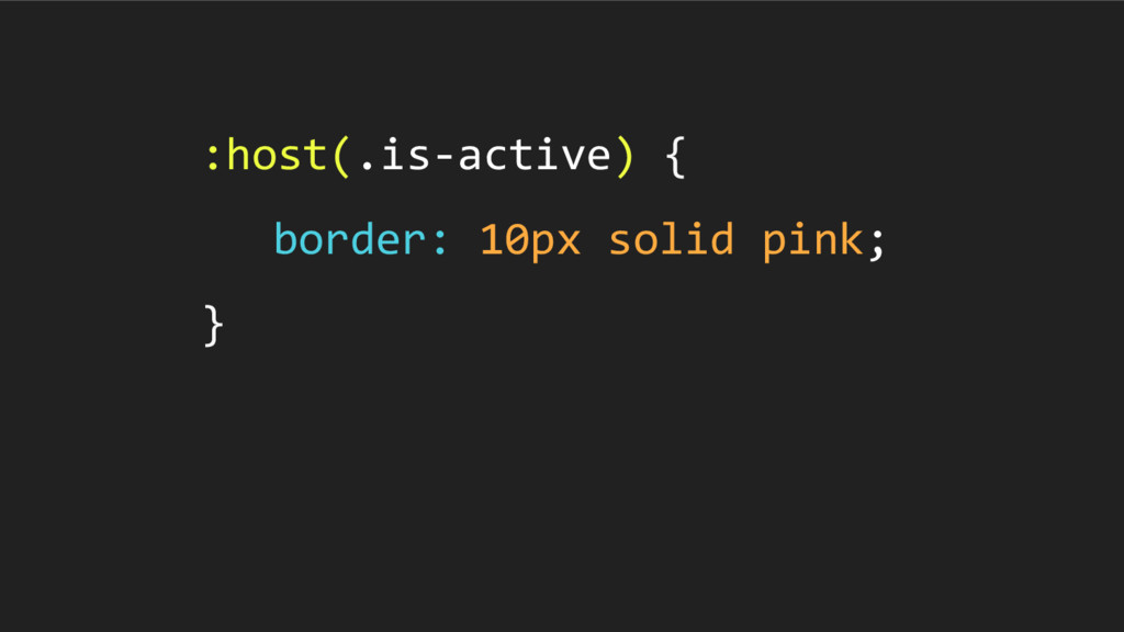
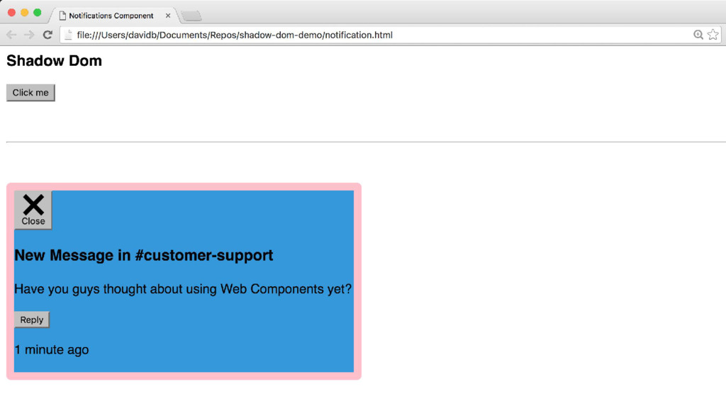
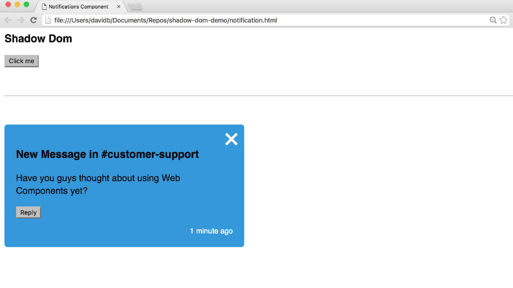
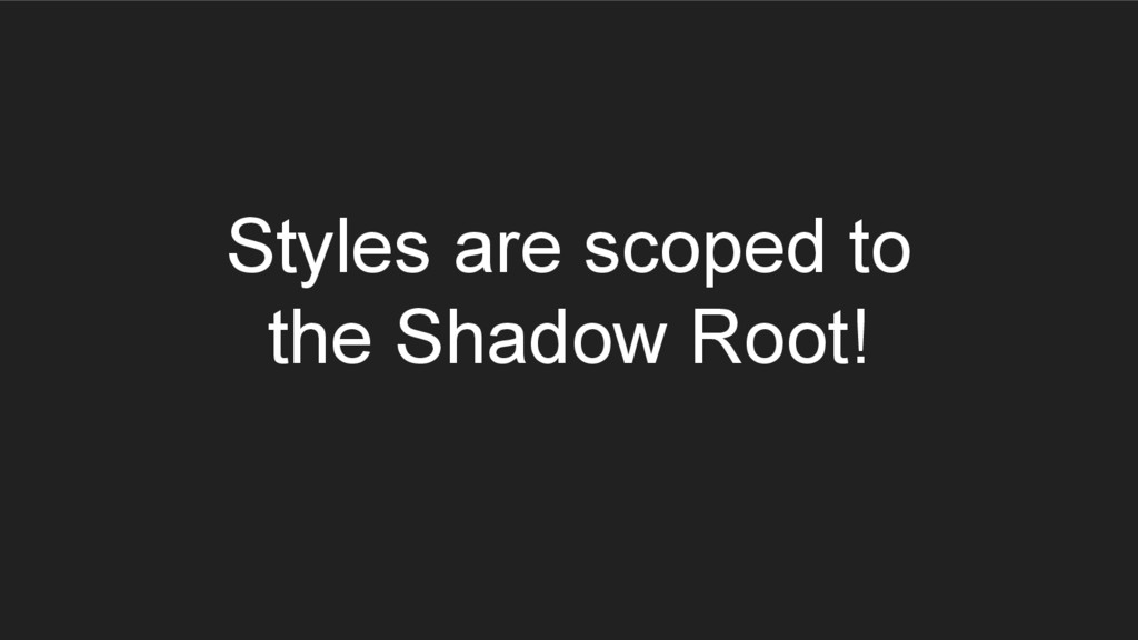
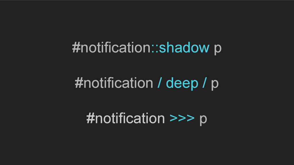
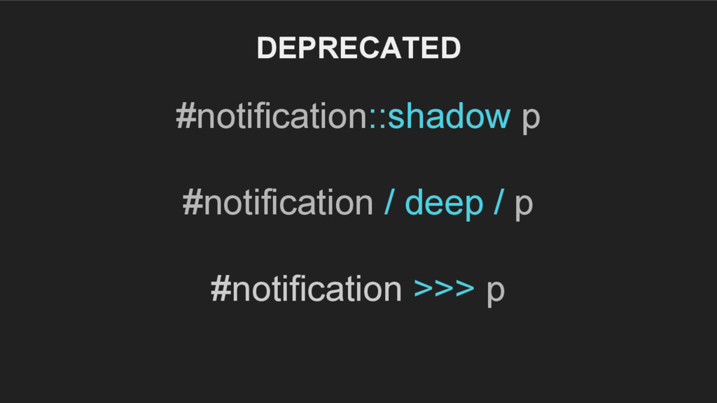
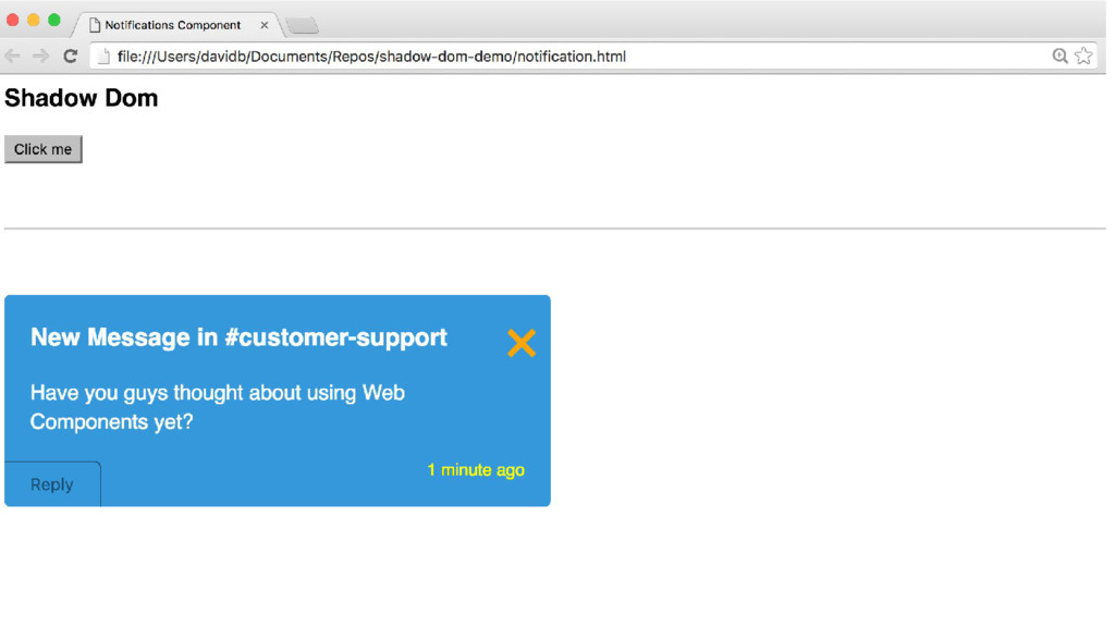
We have many problems that exist in modern CSS architecture including a lack of encapsulation, no facility to accurately remove dead code and of course, specificity conflicts.
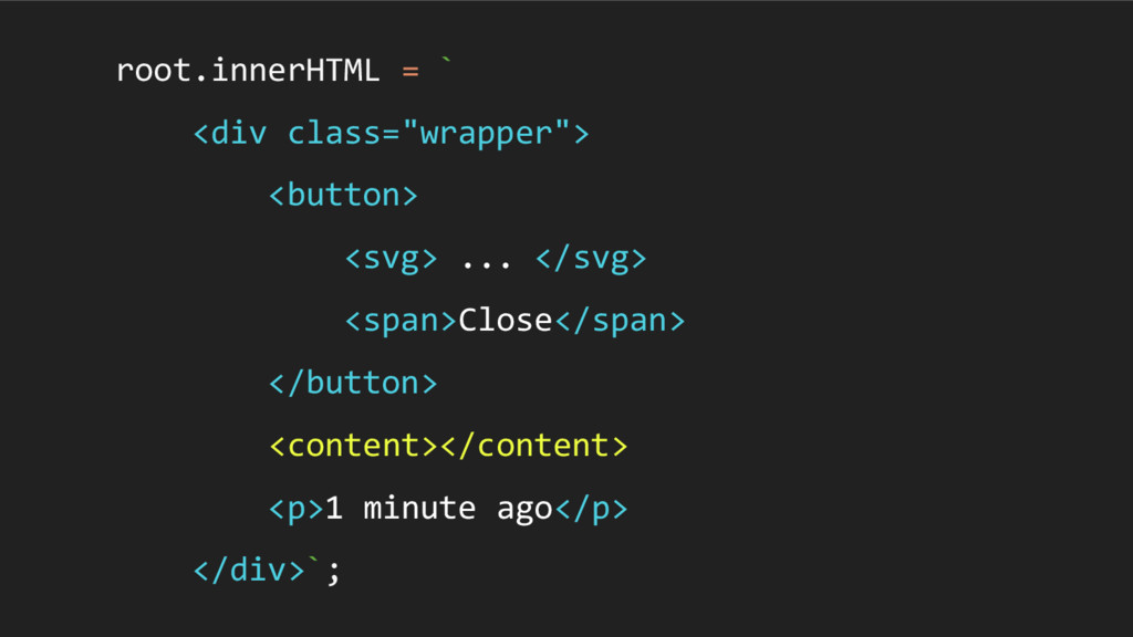
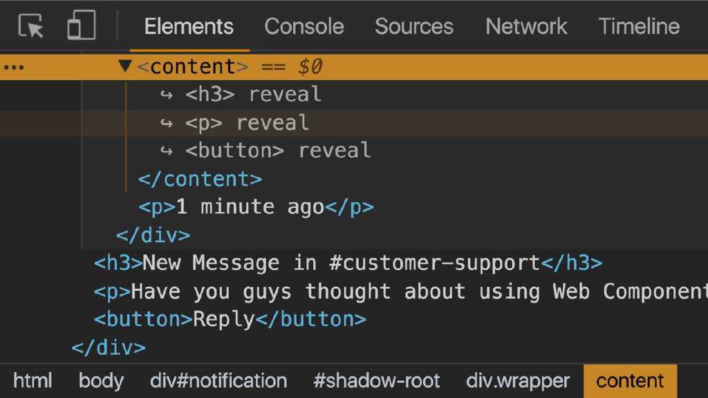
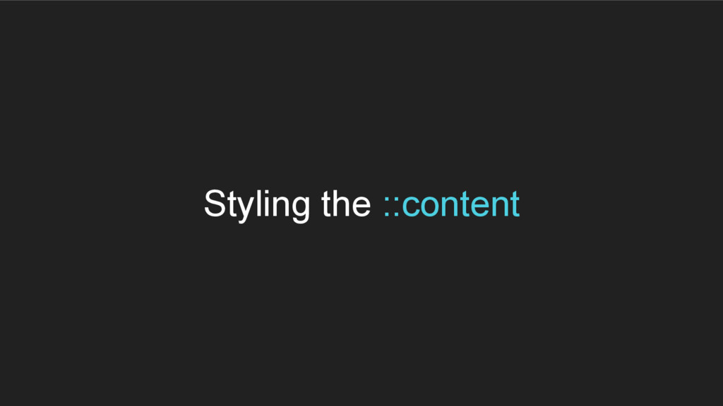
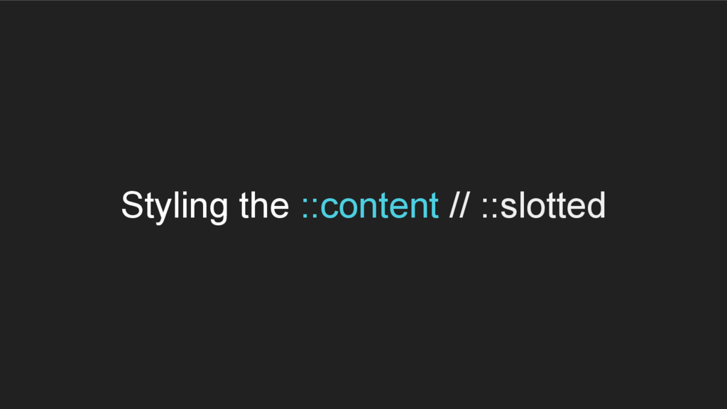
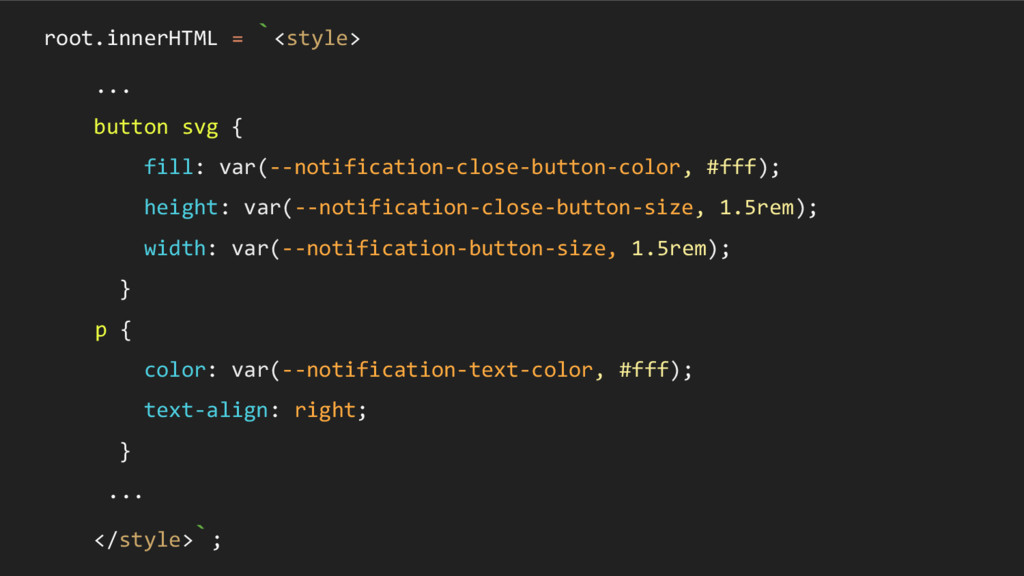
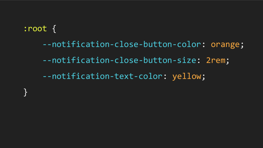
I will explain how the Shadow Dom specification can help to solve them by crafting reusable components using various pseudo selectors and slots. I'll also show you how to create an API for your components that consumers can access using CSS Custom Properties.
 k_adachi_01
 sue445
 ks91
ks91
 yanzm
yanzm
 mhrtech
 ry0_ka
 miyamu
 oracle4engineer
 jnishime_dresscode
 sugitak
 subroh0508
 leimatthew05
 carmenintech
 brettharned
 akashhashmi
 kimpetersen
.png) helenjbeal
helenjbeal
 madoxten
 cassininazir
 chriscoyier
 bluesmoon
 427marketing
 akademiya2063