Upgrade to Pro — share decks privately, control downloads, hide ads and more …

All Ages Productions Pitch Deck

Avatar for Ejun Hong Ejun Hong
February 08, 2024
680

All Ages Productions Pitch Deck

Avatar for Ejun Hong

Ejun Hong

February 08, 2024
Tweet

Transcript

  1. Ghetto Children Title & Lower Third Elements Link to files:

    https://drive.google.com/drive/folders/1N9akedNSNQWfJ63egGfUdtXYPz-O_mkj?usp=share_link
  2. V1.

  3. V2.

  4. V3.

  5. V4.

  6. V5.

  7. V6.

  8. Cash Cow Documentary (1) Location Titles & Name Title Cards

    Link to files: https://drive.google.com/drive/folders/1gSCle7GB5PaOY1eixWC5dDlri8BczME9?usp=share_link
  9. VERSION 1 - Font: DUBBO FREE - Retro and marketing

    feeling - Icons: Milk, Cow - Align with the documentary’s theme The location title and the name title cards have a consistent style (color scheme, elements, fonts)
  10. VERSION 1.2 - Font: DUBBO FREE - Retro and marketing

    feeling - Icons: Milk, Cow - Align with the documentary’s theme The name title cards for Joe and Brenda are combined in this version.
  11. VERSION 2 - Font: DIN Alternate Bold - More simple

    and rigid - Icons: Milk, Cow - Align with the documentary’s theme The location title and the name title cards have a consistent style (color scheme, elements, fonts) Different approaches in using the elements Use of different line weights
  12. VERSION 2 - Font: DUBBO FREE - Retro and marketing

    feeling - Icons: Milk, Cow - Align with the documentary’s theme The location title and the name title cards have a consistent style (color scheme, elements, fonts) More focus on the use of icons–milk, cow, barn
  13. Table of Contents • TW Music Video ◦ Bubble Designs

    (p.4) • Milk Documentary ◦ Poster Designs (p.17) ◦ Animated Scenes Designs (p.42) ▪ (1) National Milk Dairy Board Meeting Animations (p.43) ▪ (2) US Map Design (p.47) ▪ (3) Timeline scene (p.56) ◦ Overall Comments and Ideas for the Milk Documentary (p.69)
  14. Version 1 Link to a downloadable shared drive with design

    files:https://drive.google.com/drive/folders/ 18uCerOIlgs51wKEnjwZu0qzQ7teRoeKm ?usp=share_link
  15. Version 2 This version uses the similar paper-like texture used

    in the music video Link to a downloadable shared drive with design files: https://drive.google.com/drive/folders/191L nEYmnir5RwXHC9N4dekFFt2KpFXw3?us p=share_link
  16. Version 3 This version emphasizes the hand-drawn style Link to

    a downloadable shared drive with design files: https://drive.google.com/drive/folders/1Tt2 gm8-CjcLJgcx8qSosqeIfAOtR996s?usp=s hare_link
  17. Version 4 Left one has a brighter background and thicker

    lines for the bubbles Right one has a darker background and thinner lines for the bubbles Link to a downloadable shared drive with design files: https://drive.google.com/drive/folders/1H7 gGon_lvfJO-fwt0S8yRMwBCLMA2VQH?u sp=share_link
  18. Milk Documentary - Poster Designs (p.17~) - Animated Scenes Designs

    (p.42~) - (1) National Milk Dairy Board Meeting Animations (p.43~) - (2) US Map Design (p.47~) - (3) Timeline scene (p.56~) - Overall Comments and Ideas for the Milk Documentary (p.69)
  19. 1. THE LAND OF MILK & MONEY Link to a

    downloadable shared drive of the posters: https://drive.google.com/drive/folders/1s_DfhBUM91LQMHsCjc84ZhpnZ0JRr4Jm?usp=share_link
  20. Version 1_The Land of Milk & Money - Vintage milk

    container - Changed the name of the milk container to the title of the film “The Land of Milk & Money” - Added an illustration of dairy farm and cows on the right side of the milk container - Added paper-cut to match the film’s overall style - Added keywords / key phrases such as “got milk?” and “Dairy Farm” (placeholders - open to change)
  21. Version 2_The Land of Milk & Money - Combination of

    graphics and photo - Emphasizes the title, “The Land of Milk & Money,” by adding a dairy farm photo, a cow photo, and a line art of milk bottle
  22. Version 3_The Land of Milk & Money - Combination of

    graphics and photos (stills from the documentary) - Milk container
  23. Version 4_The Land of Milk & Money - The title

    of the film written on three vintage milk containers - Dairy farm line art illustration on the containers - Consistent with the color scheme used in the documentary Variations
  24. Version 5_The Land of Milk & Money - Combination of

    graphics and photos (milk container, dairy farm, cow) - Consistent with the color scheme of the documentary (red and green)
  25. Version 6_The Land of Milk & Money - Combination of

    graphics, still images from the documentar, and typography style poster
  26. 2. SPOILED Link to a downloadable shared drive of the

    posters: https://drive.google.com/drive/folders/1jvb7SWuznu9R8nzeKy0JLVljORrgQsvo?usp=share_link
  27. Version 1_SPOILED - Vintage milk container - Changed the name

    of the milk container to the title of the film “SPOILED” - Added an illustration of dairy farm and cows on the right side of the milk container - Added paper-cut to match the film’s overall style - Added keywords / key phrases such as “got milk?” and “Dairy Farm” (placeholders - open to change)
  28. Version 2_SPOILED - Minimalist design style - Line art of

    dairy farm inside of the blue milk bubble (or blue circle - below variation)
  29. Version 3_SPOILED - Combination of graphics and photo - Emphasizes

    the title, “The Land of Milk & Money,” by adding a dairy farm photo, a cow photo, and a line art of milk bottle
  30. Version 5_SPOILED - Combination of graphics and photos (milk container,

    dairy farm, cow) - Consistent with the color scheme of the documentary (red and green)
  31. 3. DAIRY NEVER DIES Link to a downloadable shared drive

    of the posters: https://drive.google.com/drive/folders/1U4MM3RHGG9uu1wta1dev0AJts5ILCEbl?usp=share_link
  32. Version 1_Dairy Never Dies - Vintage milk container - Changed

    the name of the milk container to the title of the film “The Land of Milk & Money” - Added an illustration of dairy farm and cows on the right side of the milk container - Added paper-cut to match the film’s overall style - Added keywords / key phrases such as “got milk?” and “Dairy Farm” (placeholders - open to change)
  33. Version 2_Dairy Never Dies - Combination of graphics and photo

    - Emphasizes the title, “The Land of Milk & Money,” by adding a dairy farm photo, a cow photo, and a line art of milk bottle
  34. Version 3_Dairy Never Dies - Combination of graphics and photos

    (stills from the documentary) - Milk container
  35. Version 4_Dairy Never Dies - Combination of graphics and photos

    (stills from the documentary) - Milk container
  36. 4. CASH COW Link to a downloadable shared drive of

    the posters: https://drive.google.com/drive/folders/1hk_iQjK5jO01LRlD75v3ZdJ1kqWUhdjY?usp=share_link
  37. Version 1_Cash Cow - Vintage milk container - Changed the

    name of the milk container to the title of the film “The Land of Milk & Money” - Added an illustration of dairy farm and cows on the right side of the milk container - Added paper-cut to match the film’s overall style - Added keywords / key phrases such as “got milk?” and “Dairy Farm” (placeholders - open to change)
  38. Version 2_Cash Cow - Combination of graphics and photo -

    Emphasizes the title, “The Land of Milk & Money,” by adding a dairy farm photo, a cow photo, and a line art of milk bottle
  39. Version 3_Cash Cow - Minimalist design style - Line art

    of dairy farm inside of the blue milk bubble
  40. Milk Documentary (2) Animated Scenes Designs - 1. National Milk

    Dairy Board Meeting Animations Animation that demonstrates Sarah vs. National Milk Dairy Board TC- 1:03:20// https://www.dropbox.com/s/v3yrgncjlf3ftai/milk__festival_link_073123_update%20%28Original%29.mp4?dl=0 Ejun Hong
  41. Style #1. Contemporary Collage Illustration style (1) Link to a

    downloadable shared drive with design files: https://drive.google.com/drive/folders/1rhJ4hiMYwWV06_7v6qbznxMFvX90qVS6?usp=share_link
  42. Style #2. Paper-figure animation (1): This design takes inspiration from

    paper-figure animations. It visualizes the past events with a paper puppet of Sarah. The puppet will be moving as Sarah speaks in this scene. Link to a downloadable shared drive with design files: https://drive.google.com/drive/folders/1HK_sJlYk2Ocl4-jcIQdWGqL6ZJjVAQTi?usp=share_link
  43. Style #2. Paper-figure animation (variation - with a text) This

    design takes inspiration from paper-figure animations. It visualizes the past events with a paper puppet of Sarah. The puppet will be moving as Sarah speaks in this scene.
  44. Milk Documentary (2) Animated Scenes Designs - 2. US Map

    Designs Ejun Hong Link to a downloadable shared drive with design png & illustrator files: https://drive.google.com/drive/folders/16hwKNyY5rofo2QtbvjuzeDdcQuJeuiqZ?usp=share_link
  45. - US map drawn on milk packages - Used the

    still cut of the nature scene in the documentary as the background - Featured icons to show the decrease in the number of “family farmers” (cows, milk, barn, etc) - Used texts to match the narration of the scene (“When we started dairy farm, there were about 660,000 dairy farmers in the US. Now there is less than 30,000.”) Before After Version 1
  46. - US map drawn on a milk package (unfolded) -

    Featured icons to show the decrease in the number of “family farmers” (cows, milk, barn, etc) - Used texts to match the narration of the scene (“When we started dairy farm, there were about 660,000 dairy farmers in the US. Now there is less than 30,000.”) - Consistent Color Scheme to make it look simple and clear Before After Version 2
  47. - Paper texture background and icons - Featured icons to

    show the decrease in the number of “family farmers” (cows, milk, barn, etc) - Used texts to match the narration of the scene (“When we started dairy farm, there were about 660,000 dairy farmers in the US. Now there is less than 30,000.”) - Limited & consistent color scheme to make it look clear and simple Before After Version 3
  48. - Followed the color scheme of the animated scenes in

    the documentary (red, blue, green) - Featured icons to show the decrease in the number of “family farmers” (cows, milk, barn, etc) Before After Version 4
  49. Milk Documentary (2) Animated Scenes Designs - 3. Timeline scene

    (1942-1981) Ejun Hong Link to a downloadable shared drive with design png & illustrator files: https://drive.google.com/drive/folders/1n0D1la5lI8tJtoNpjZfs_awOUmqCDvtk?usp=share_link
  50. Inspirations & Ideas behind the design Before designing, I rewatched

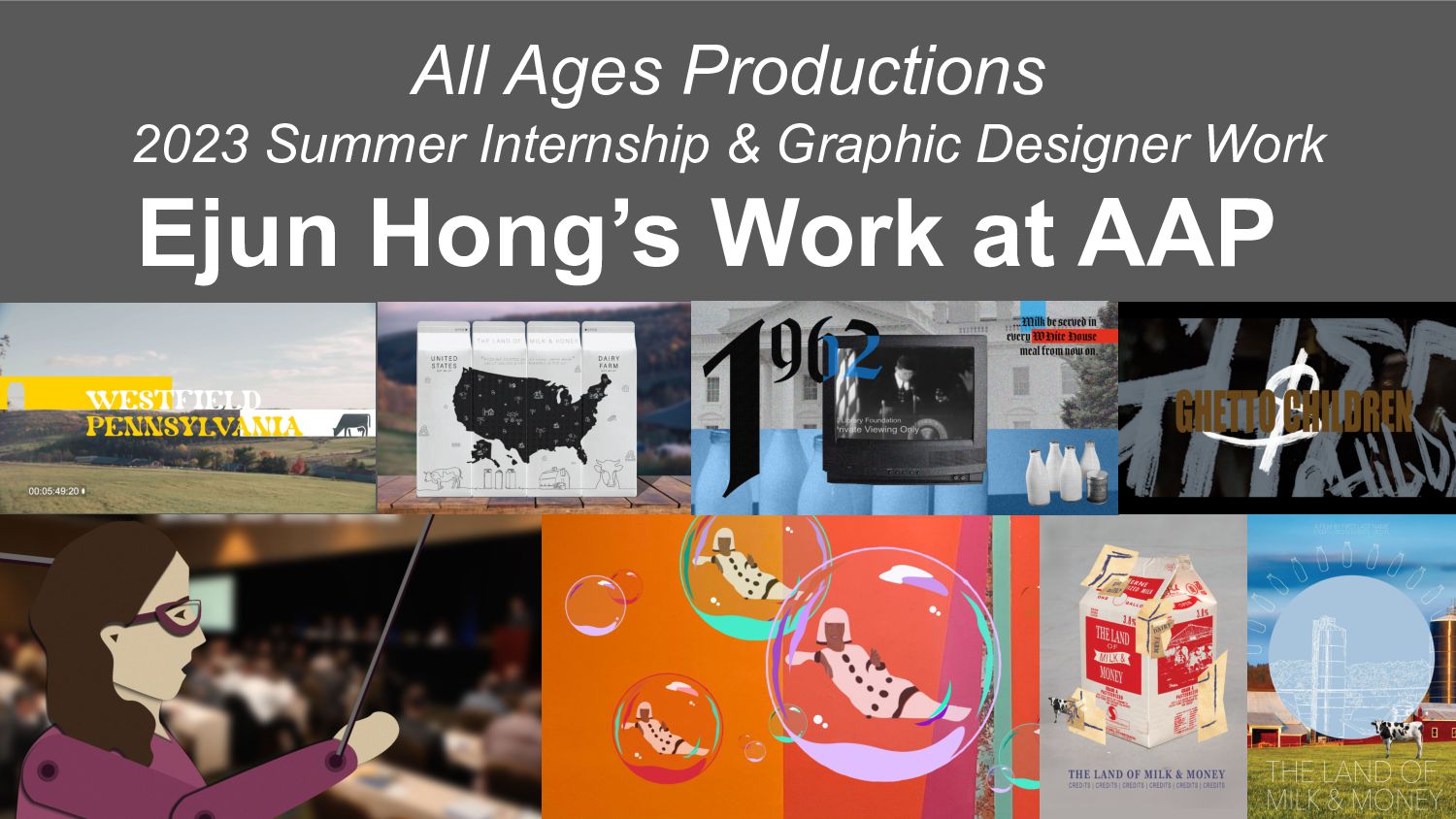
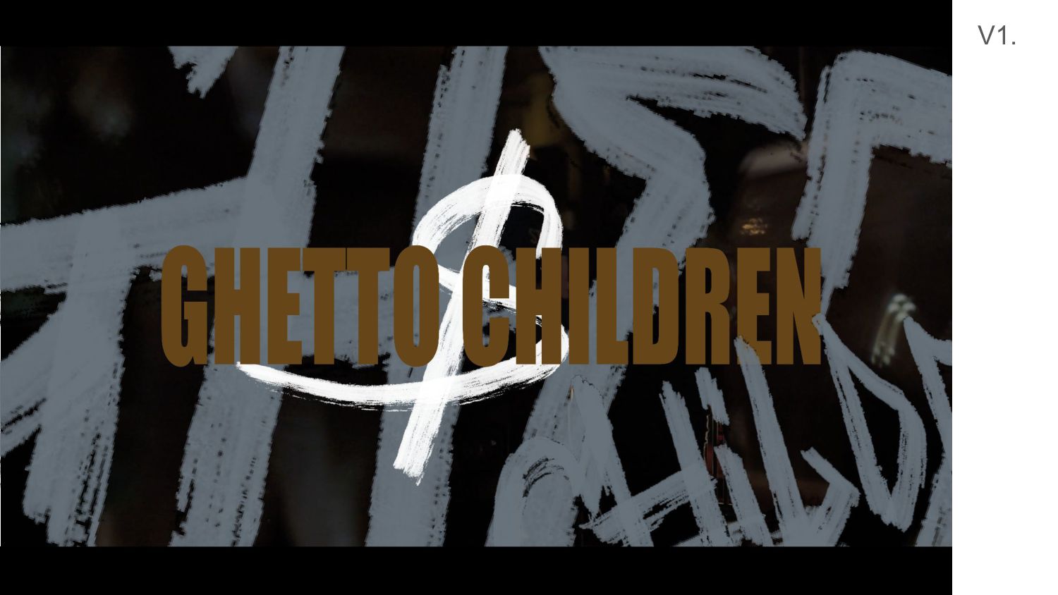
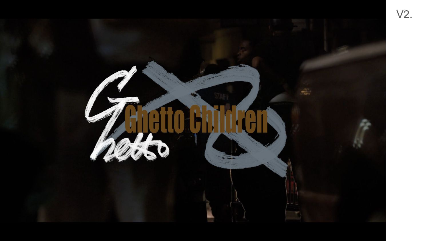
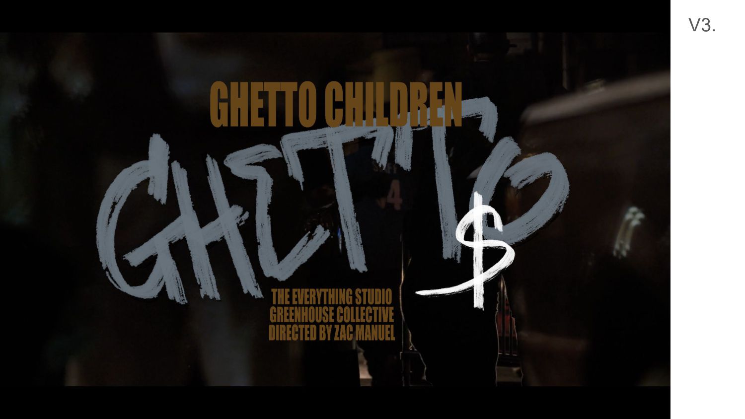
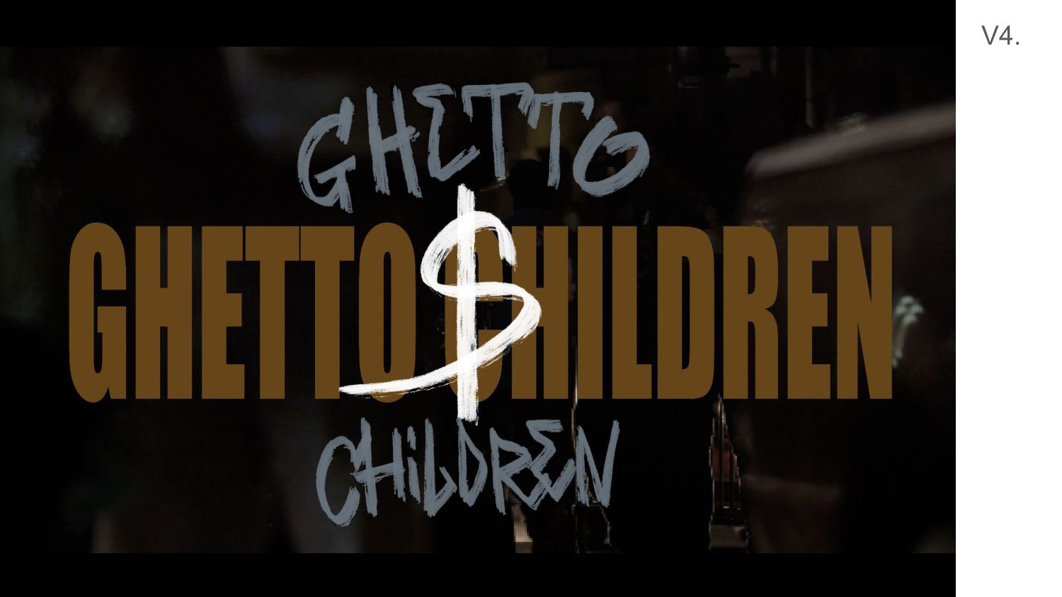
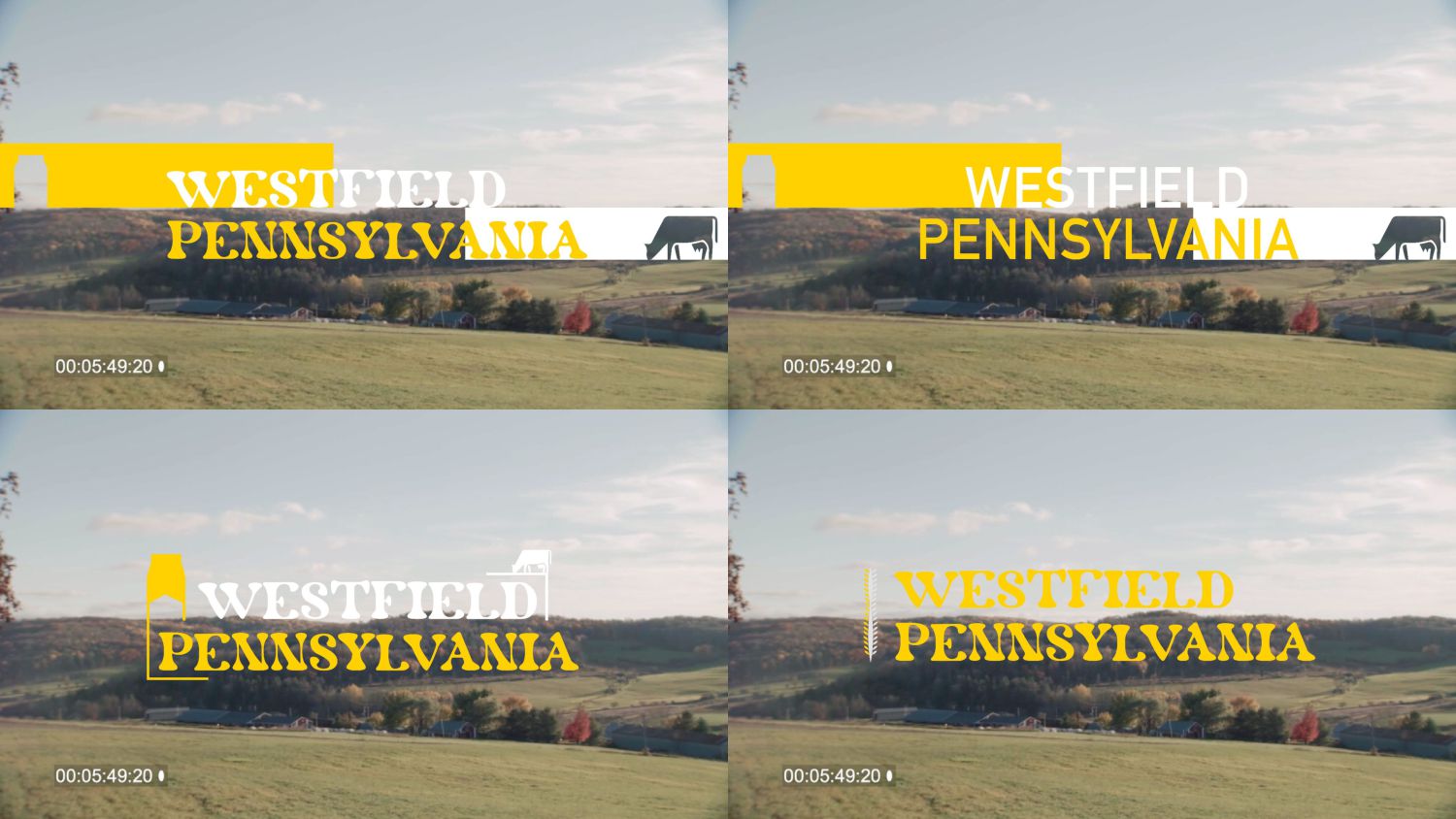
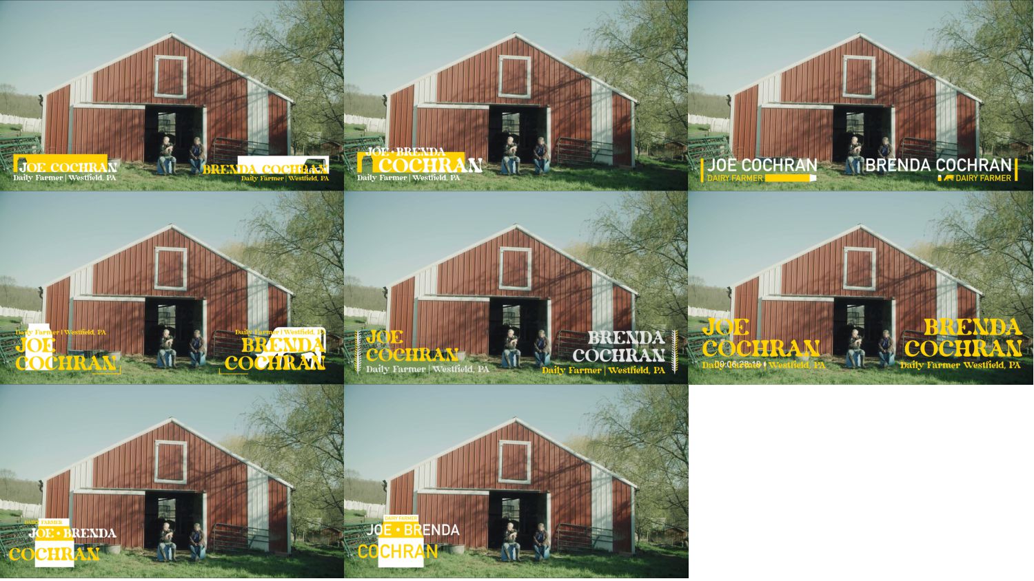
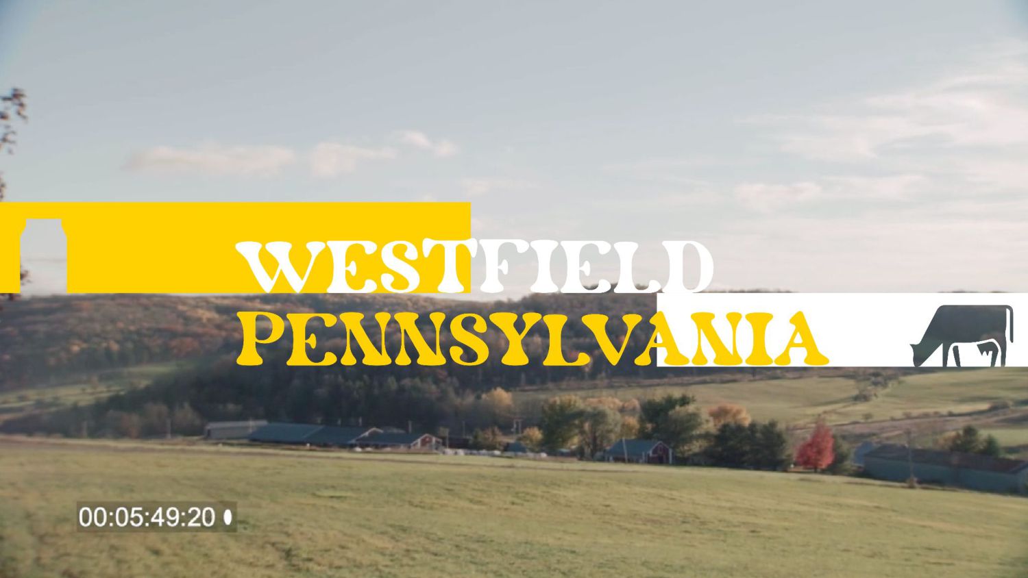
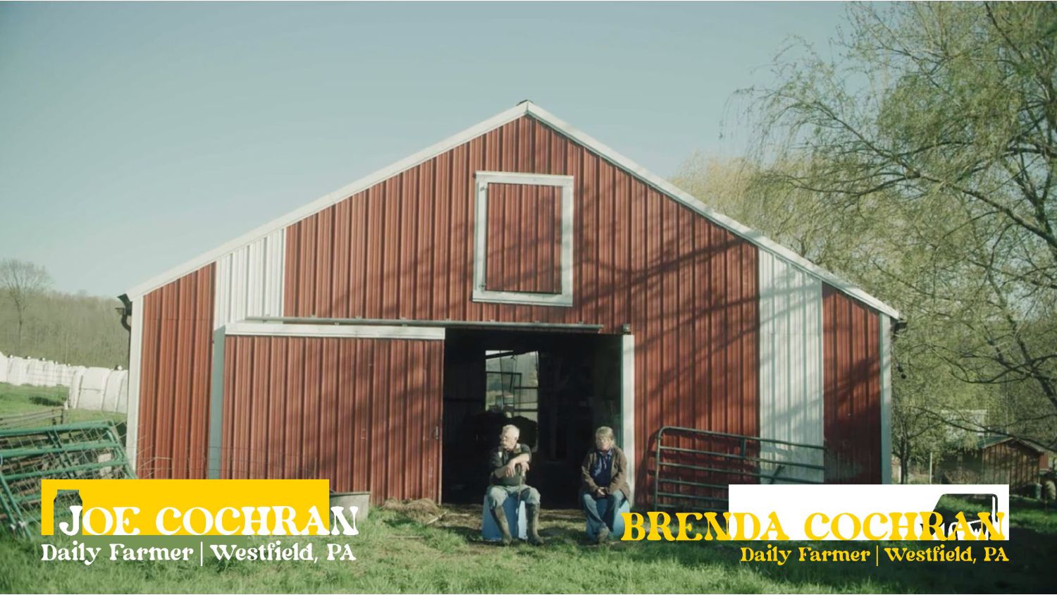
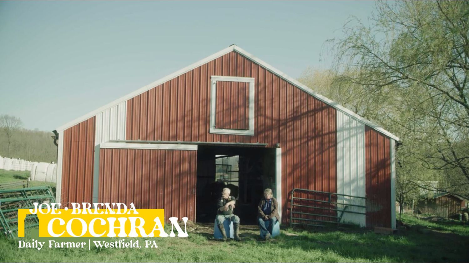
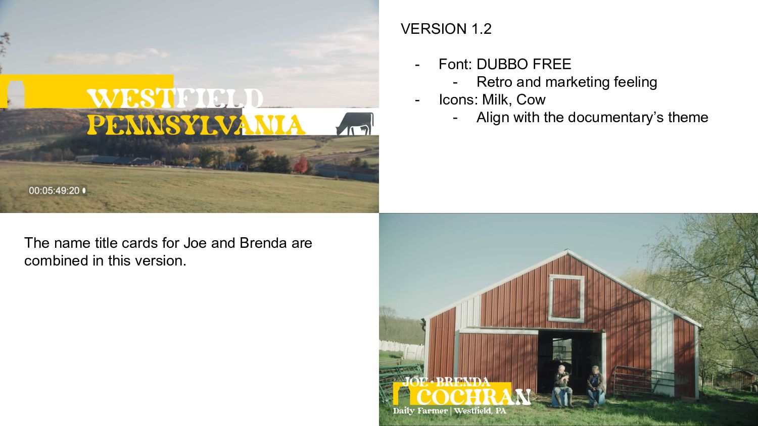
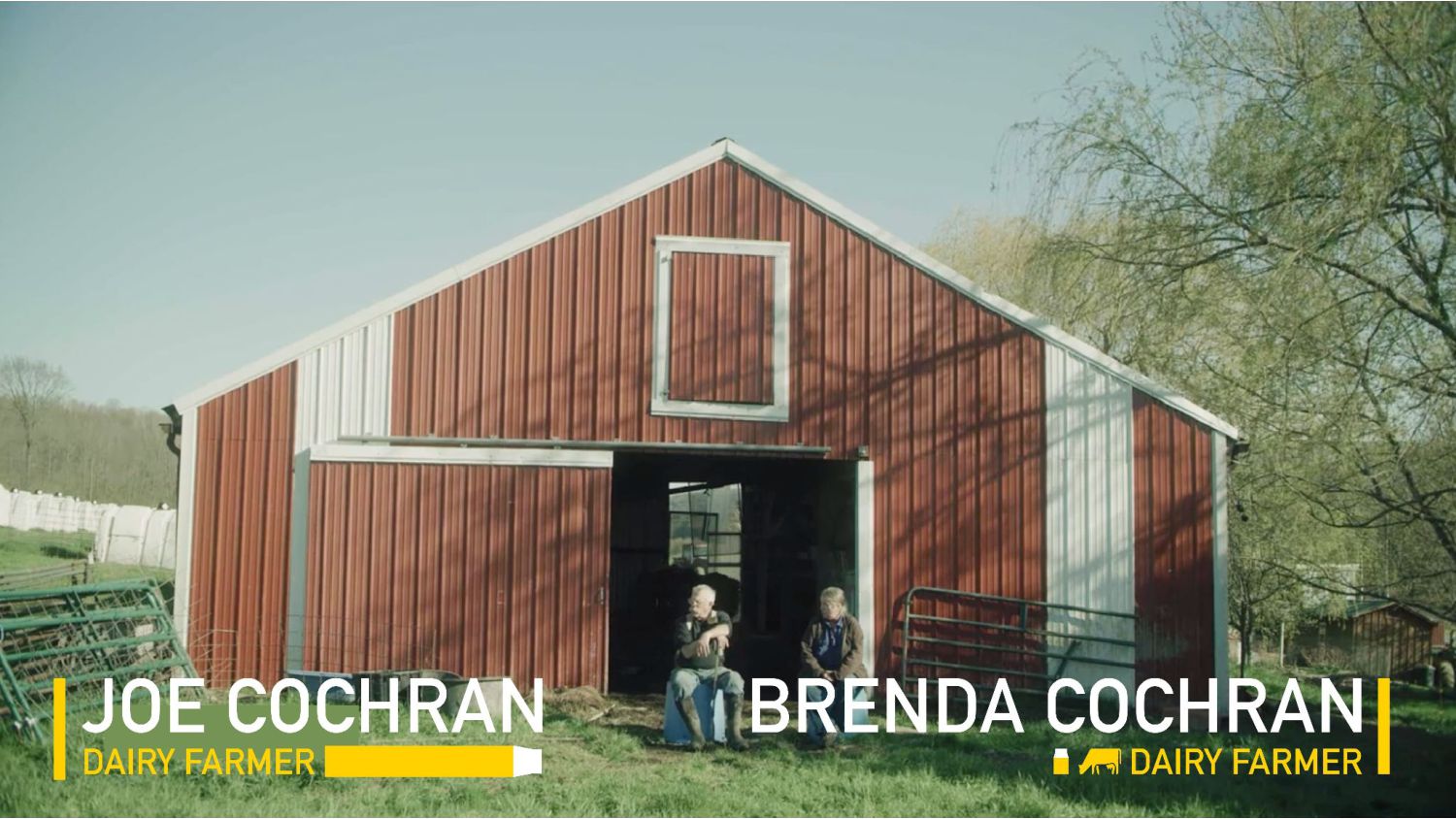
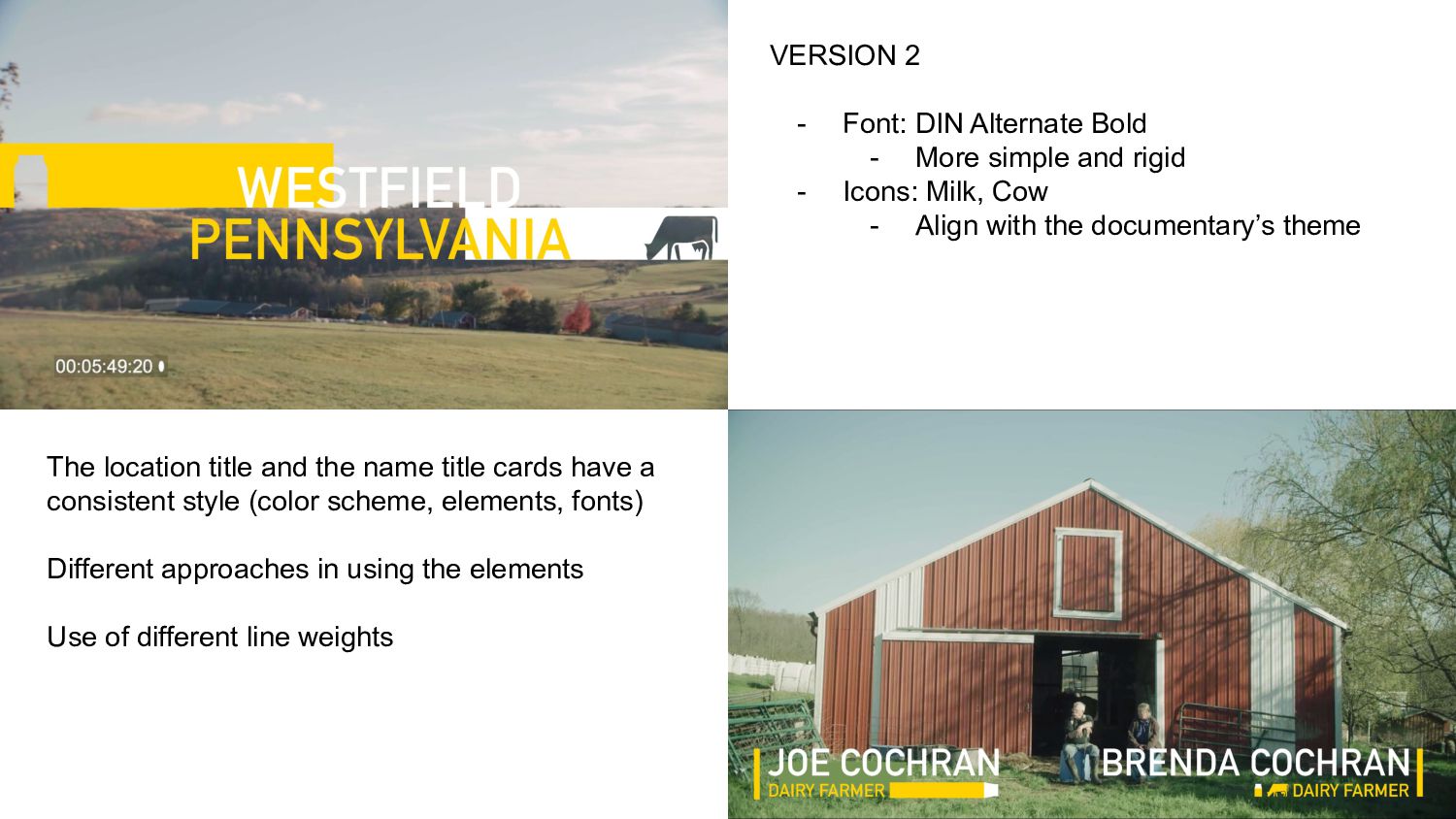
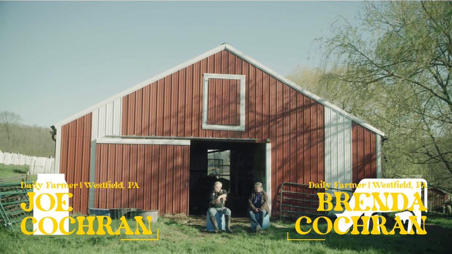
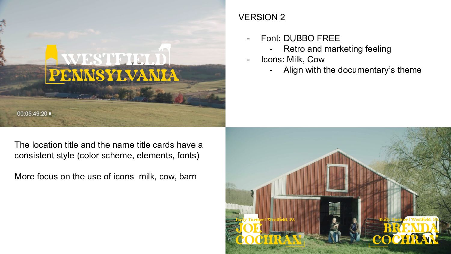
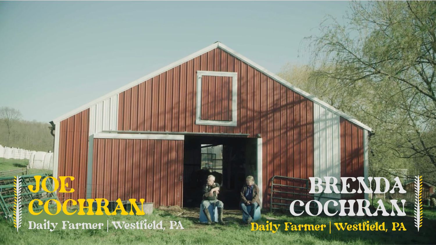
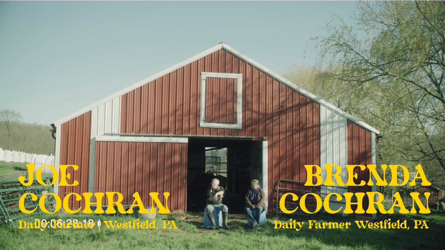
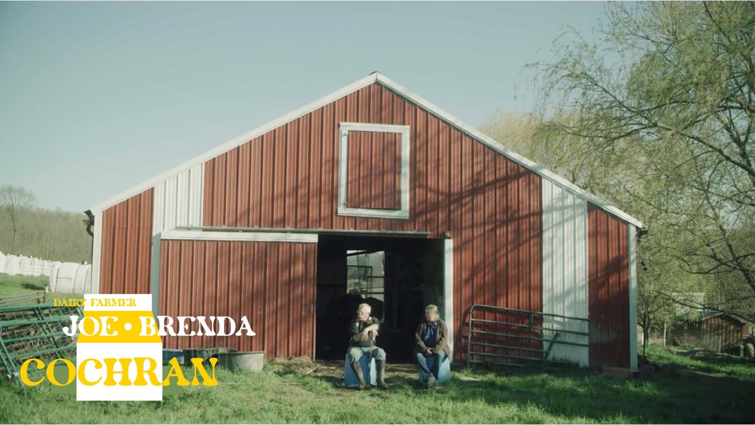
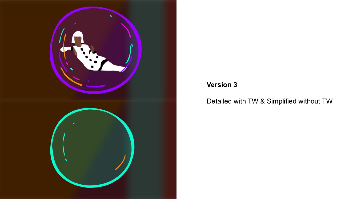
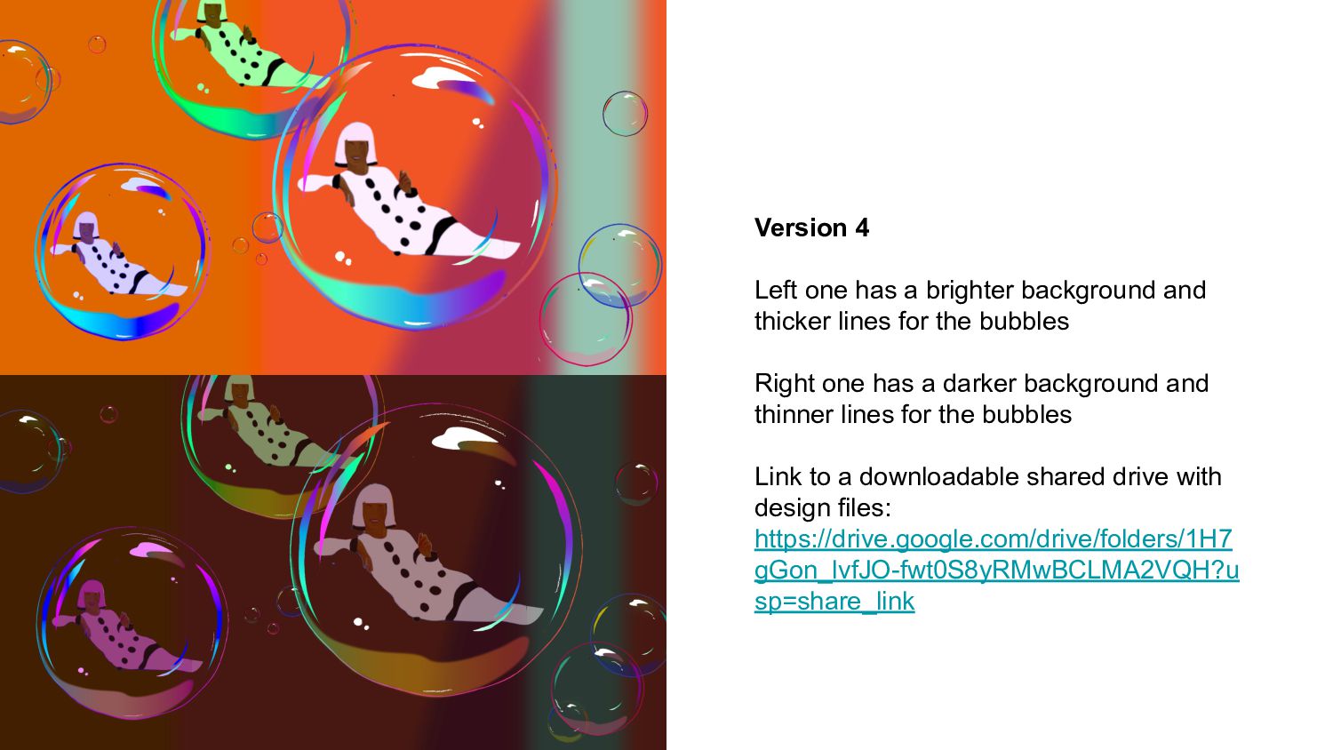
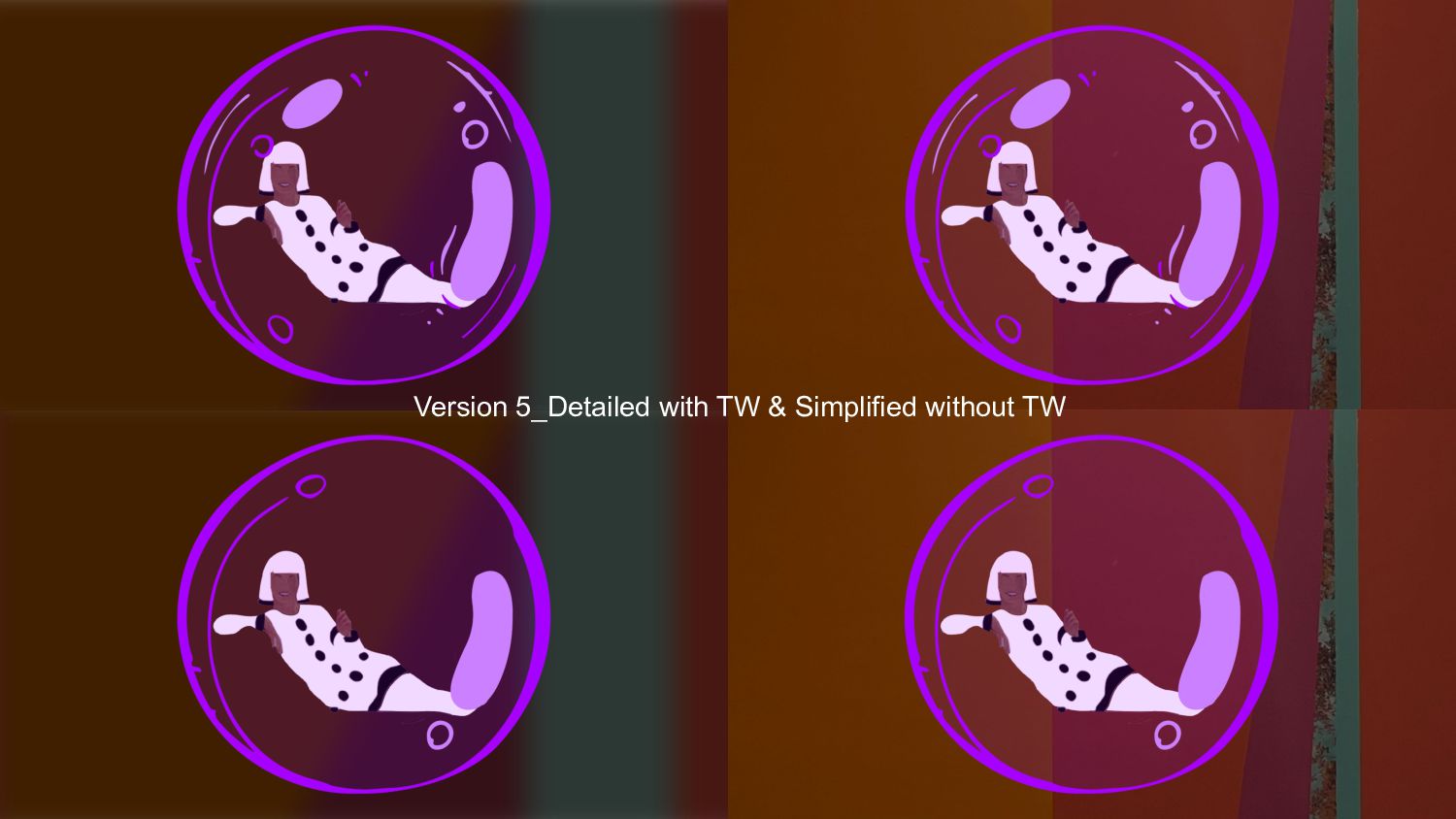
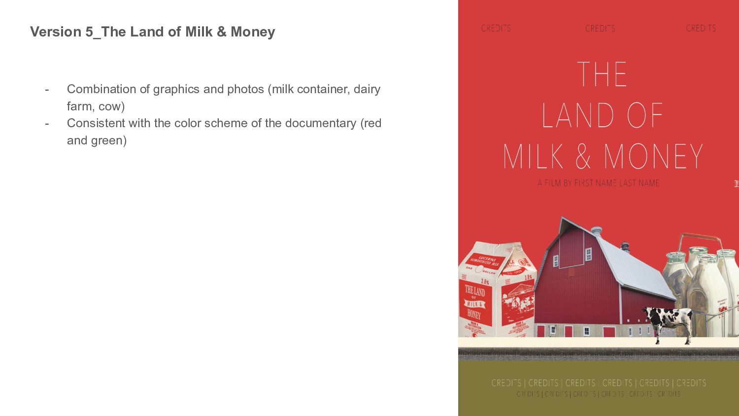
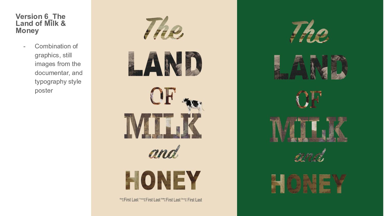
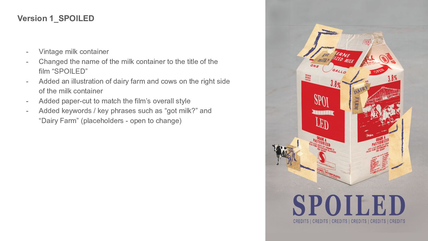
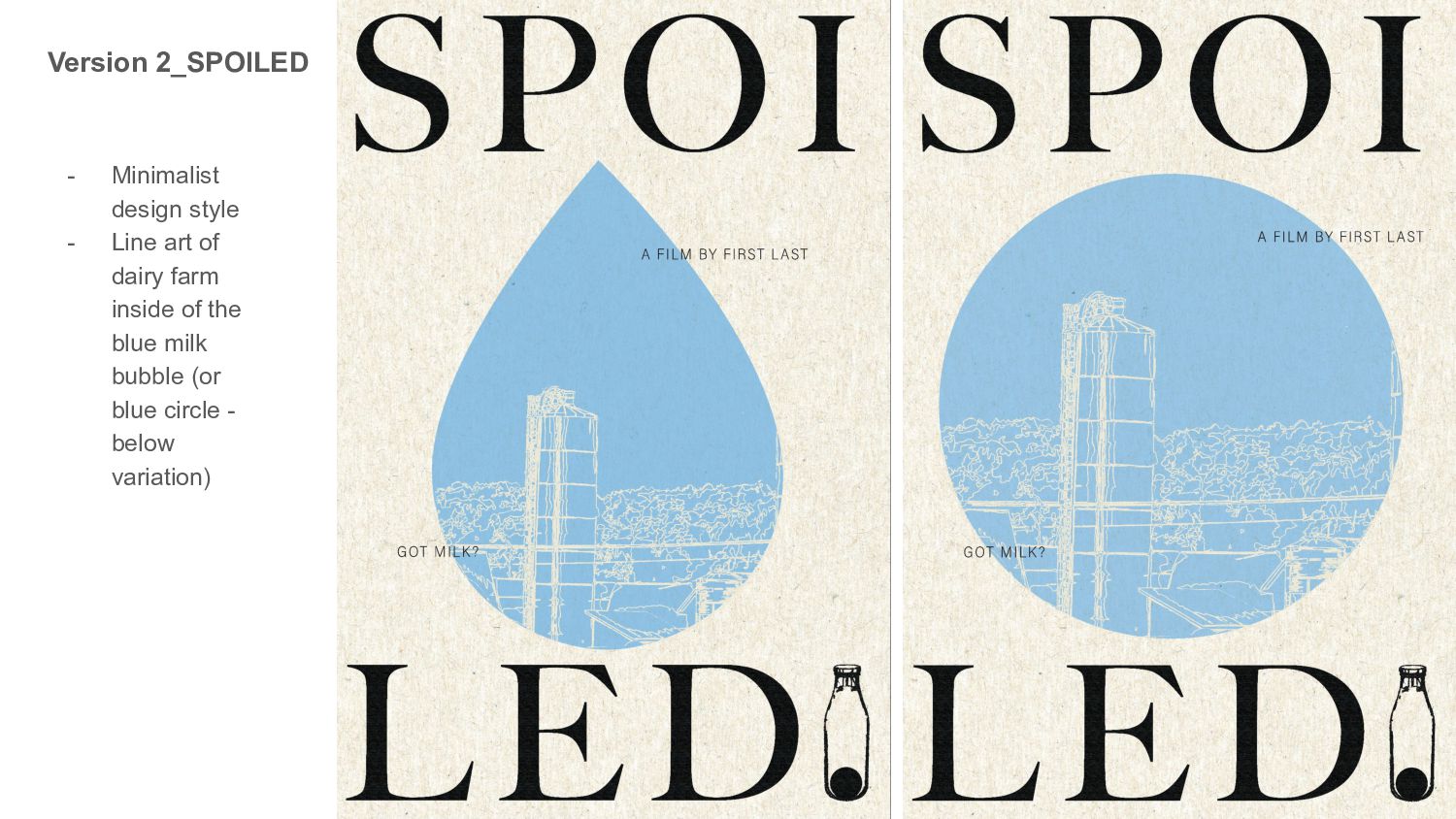
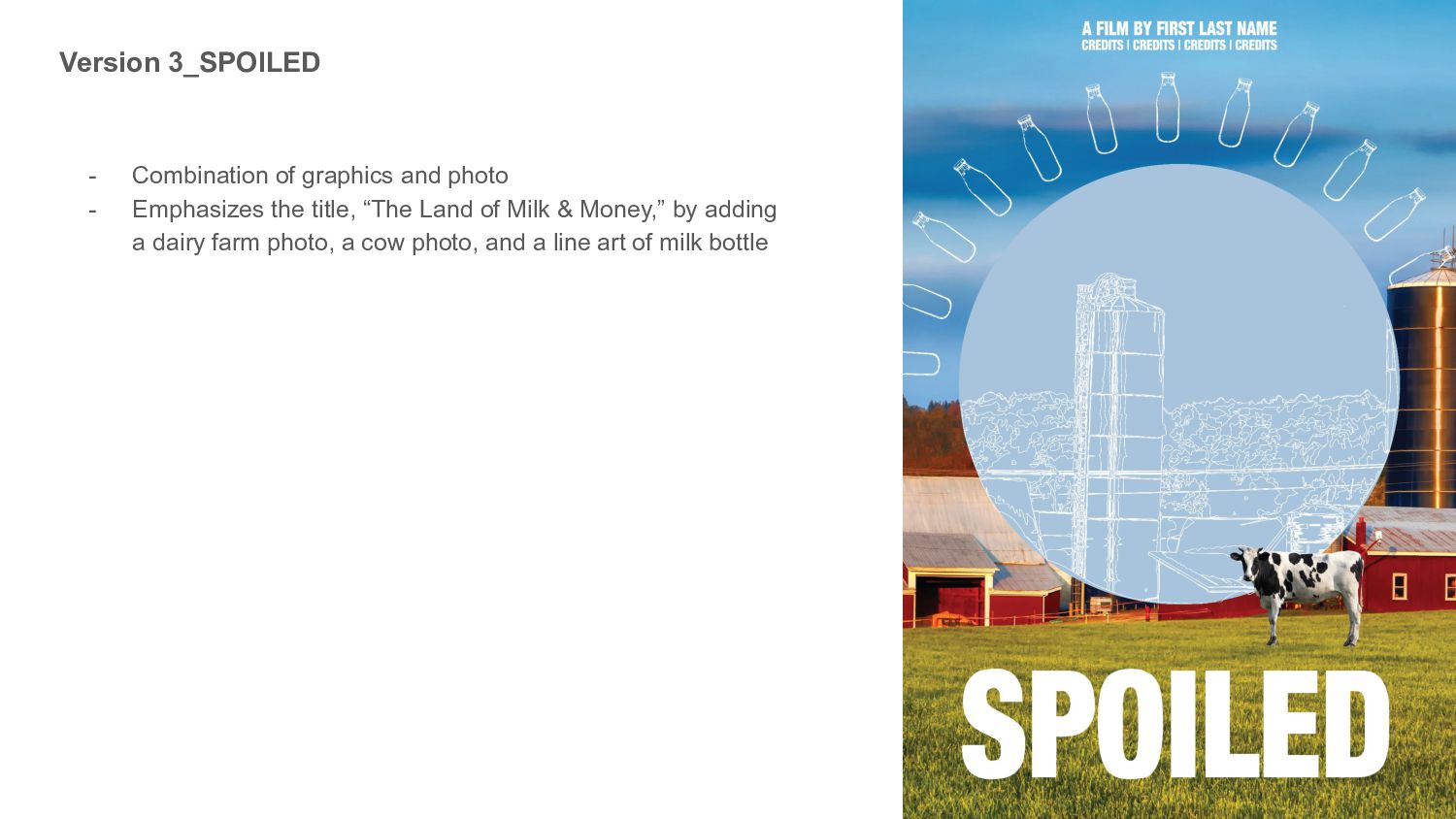
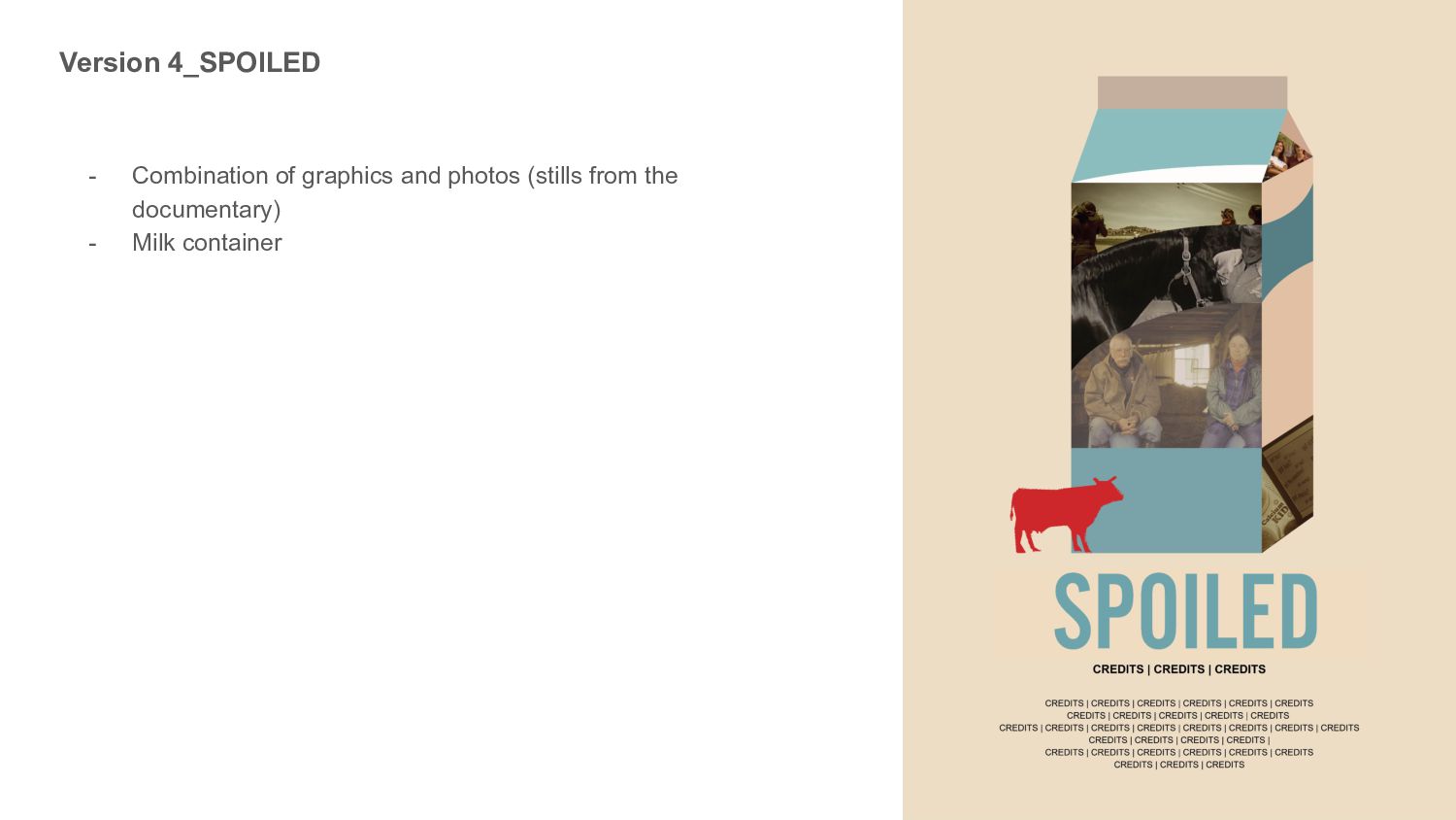
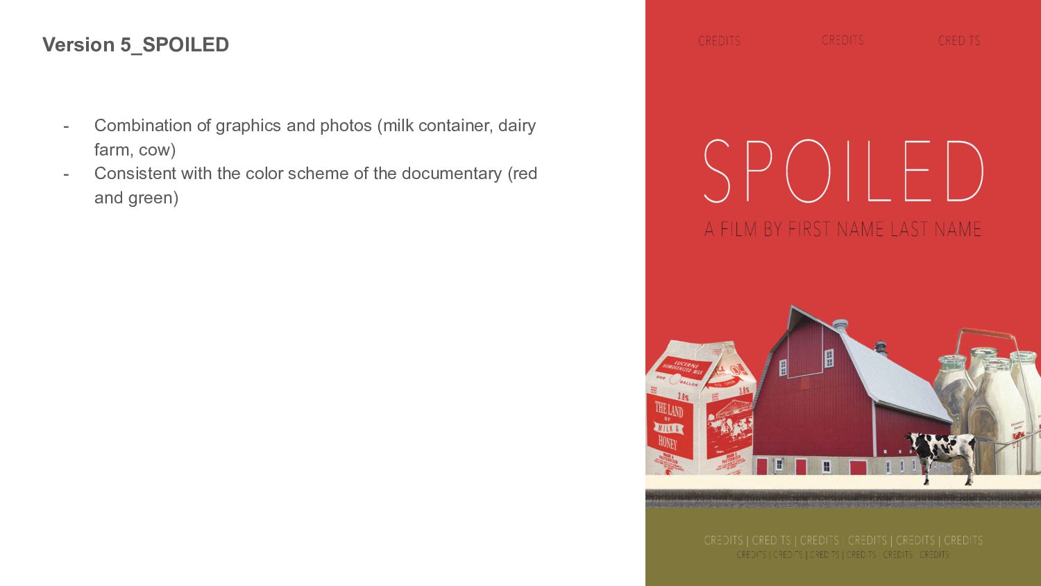
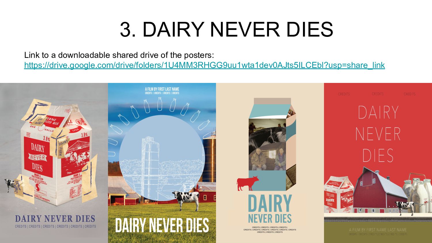
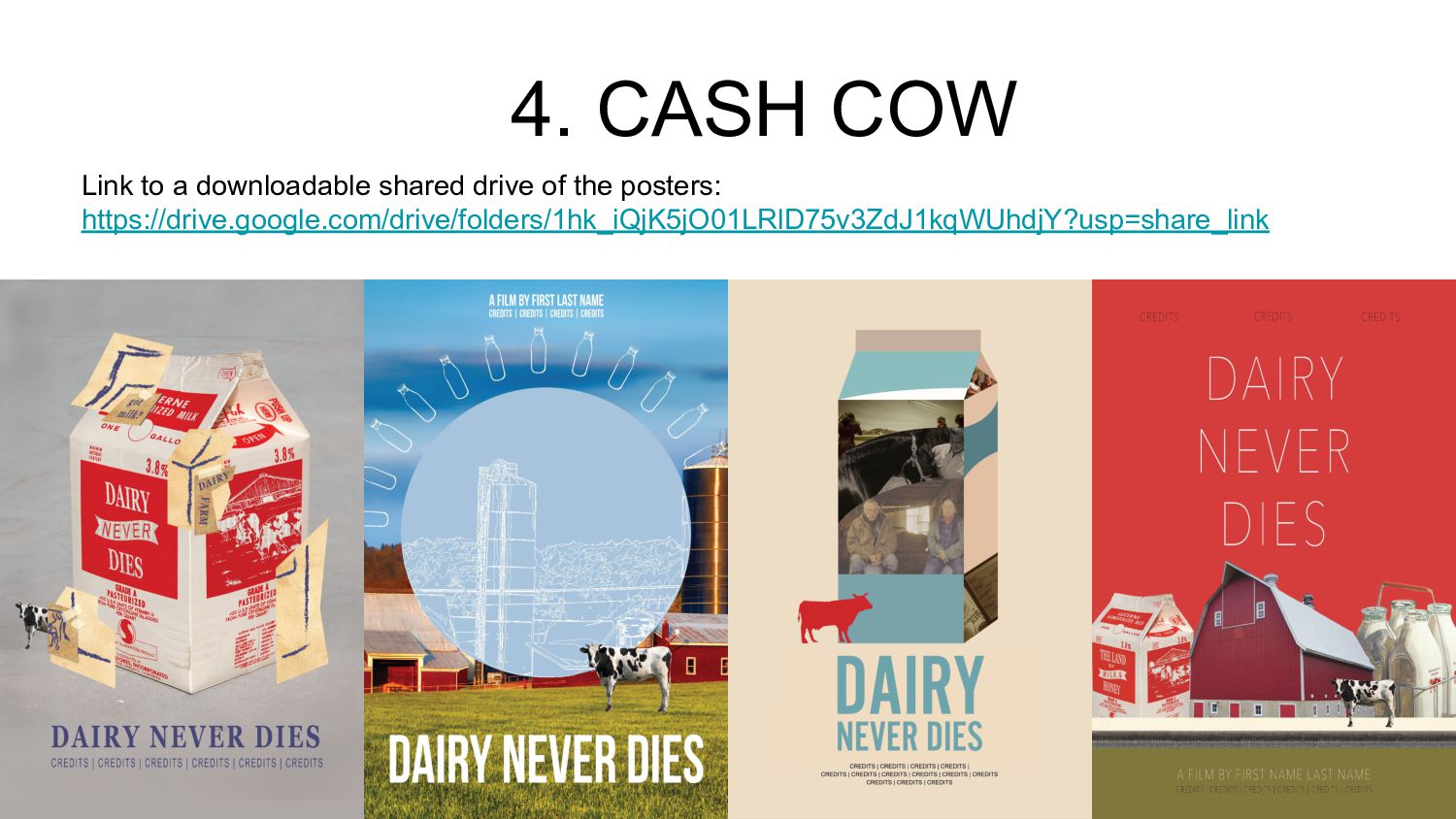
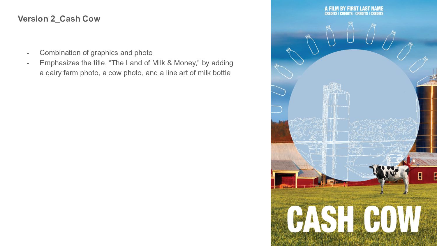
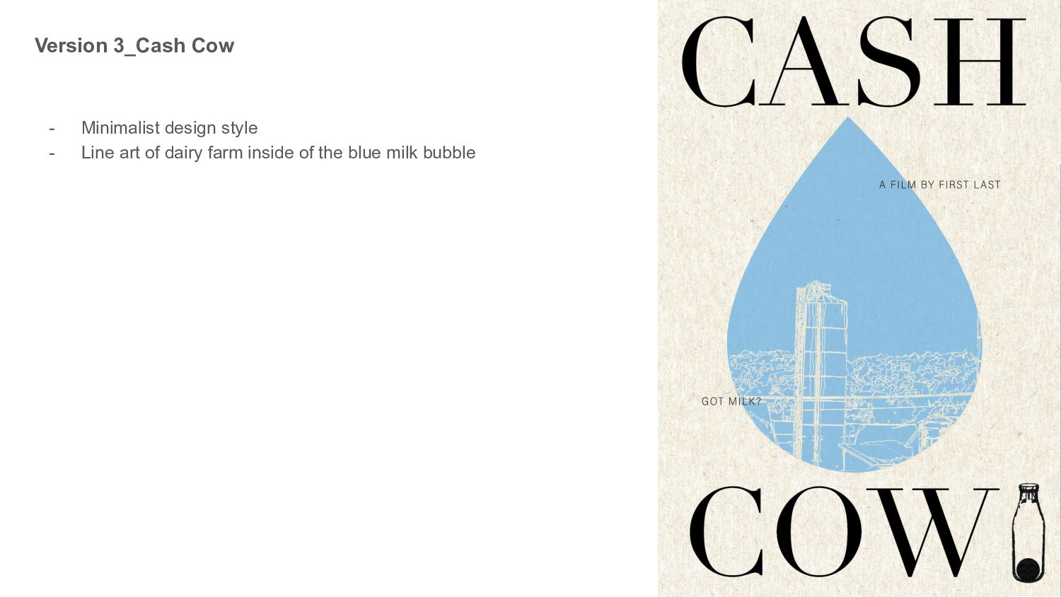
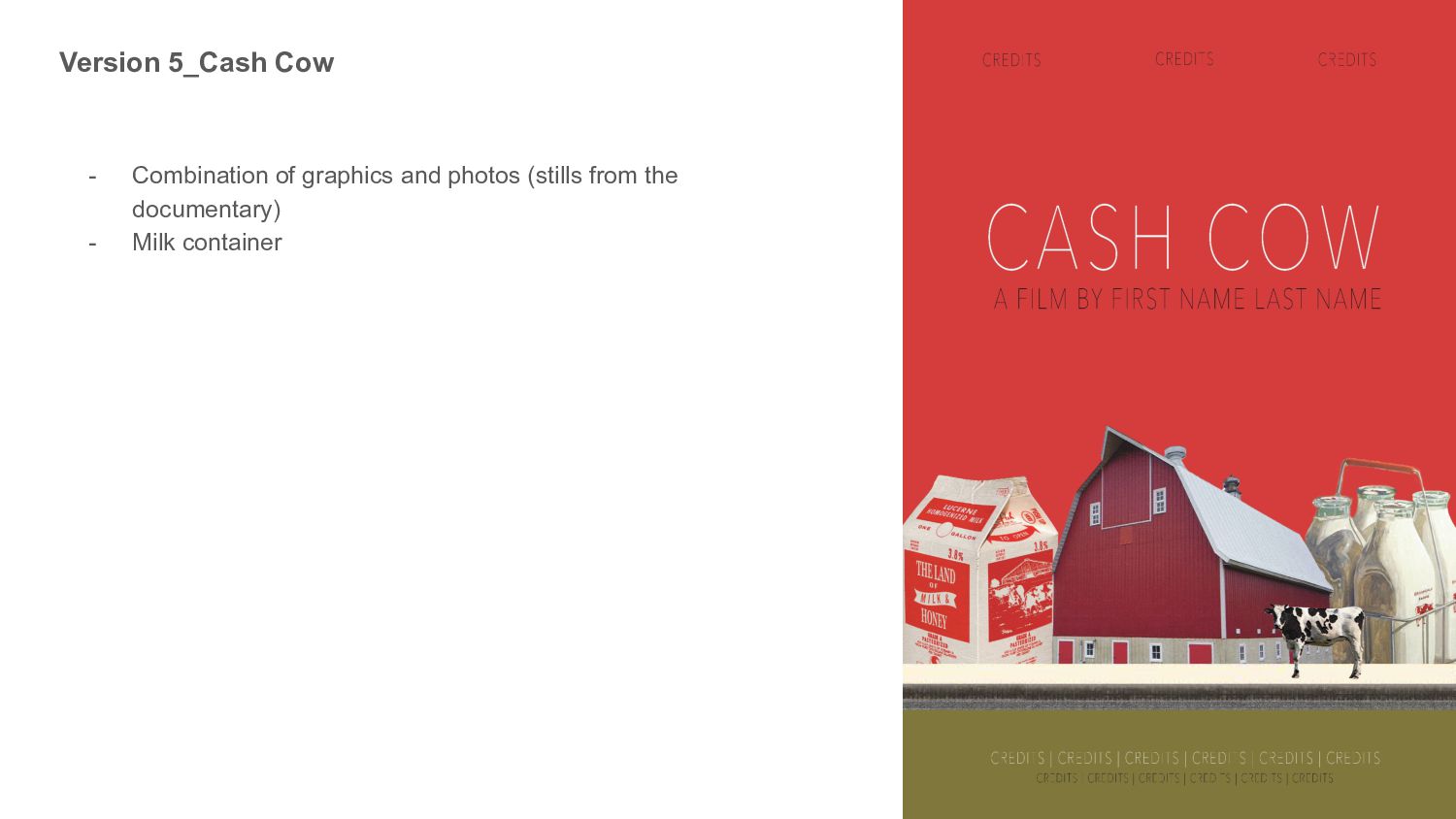
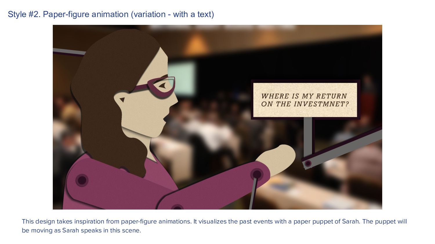
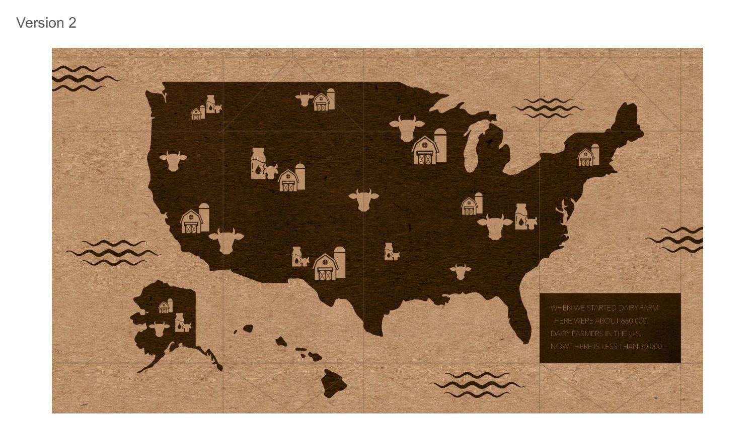
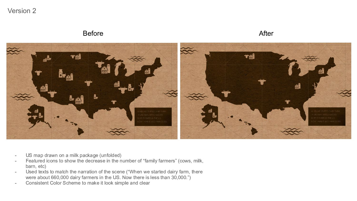
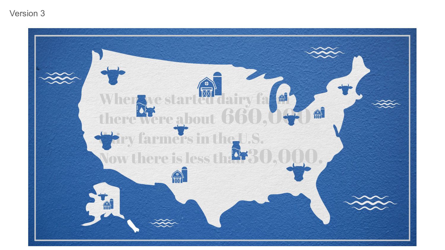
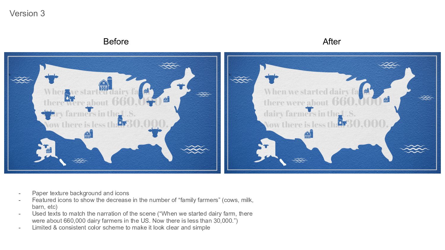
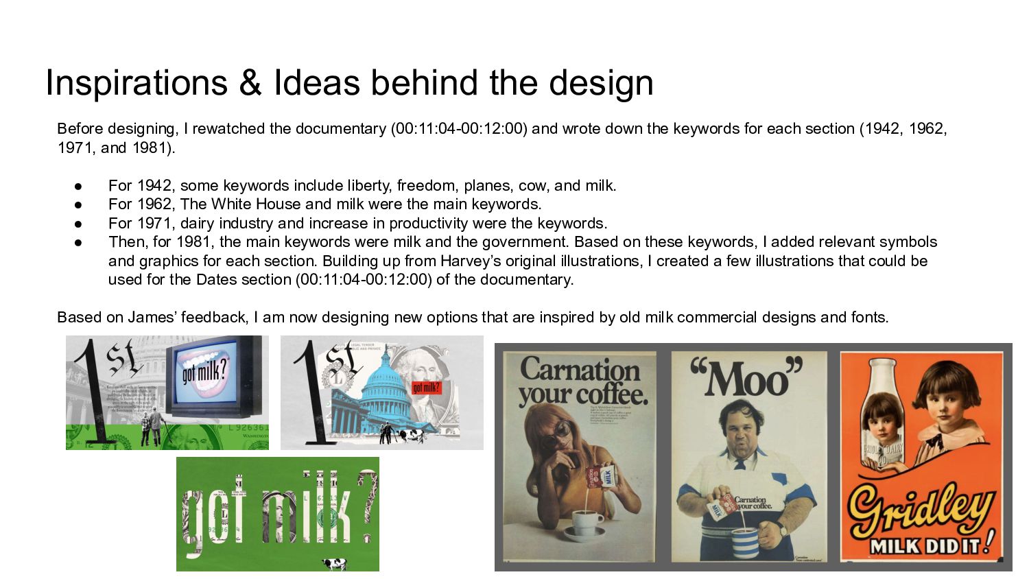
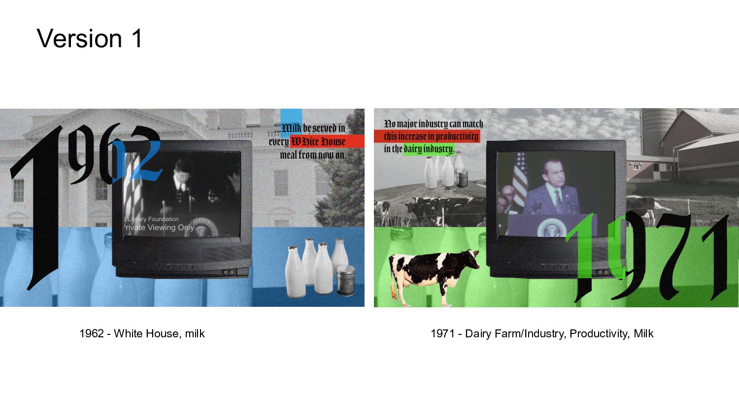
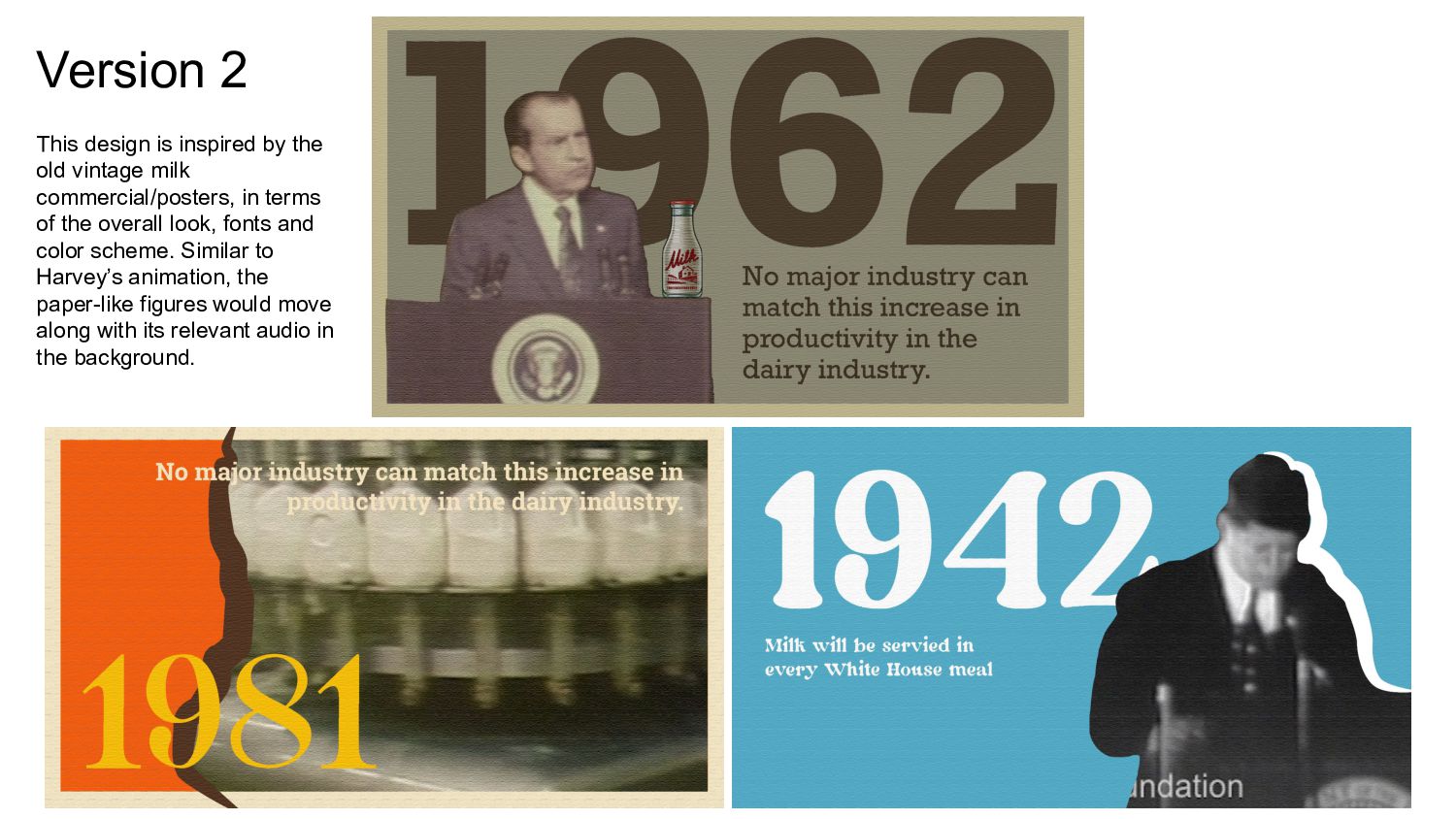
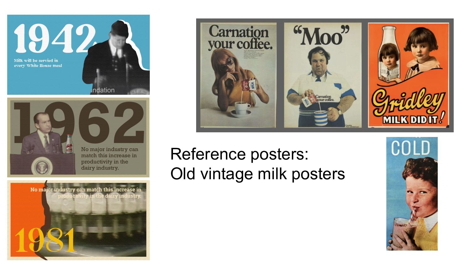
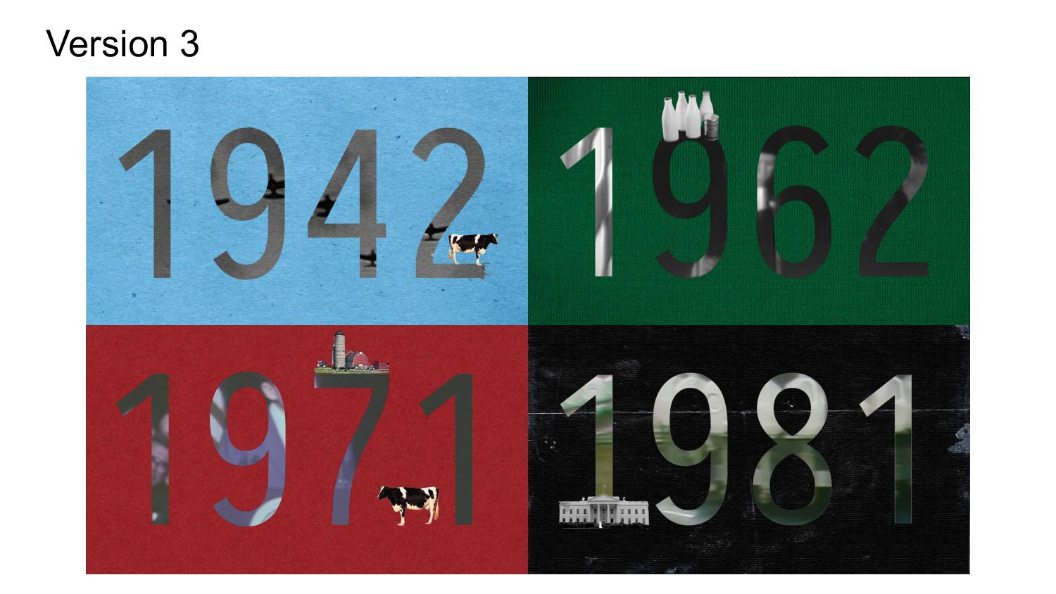
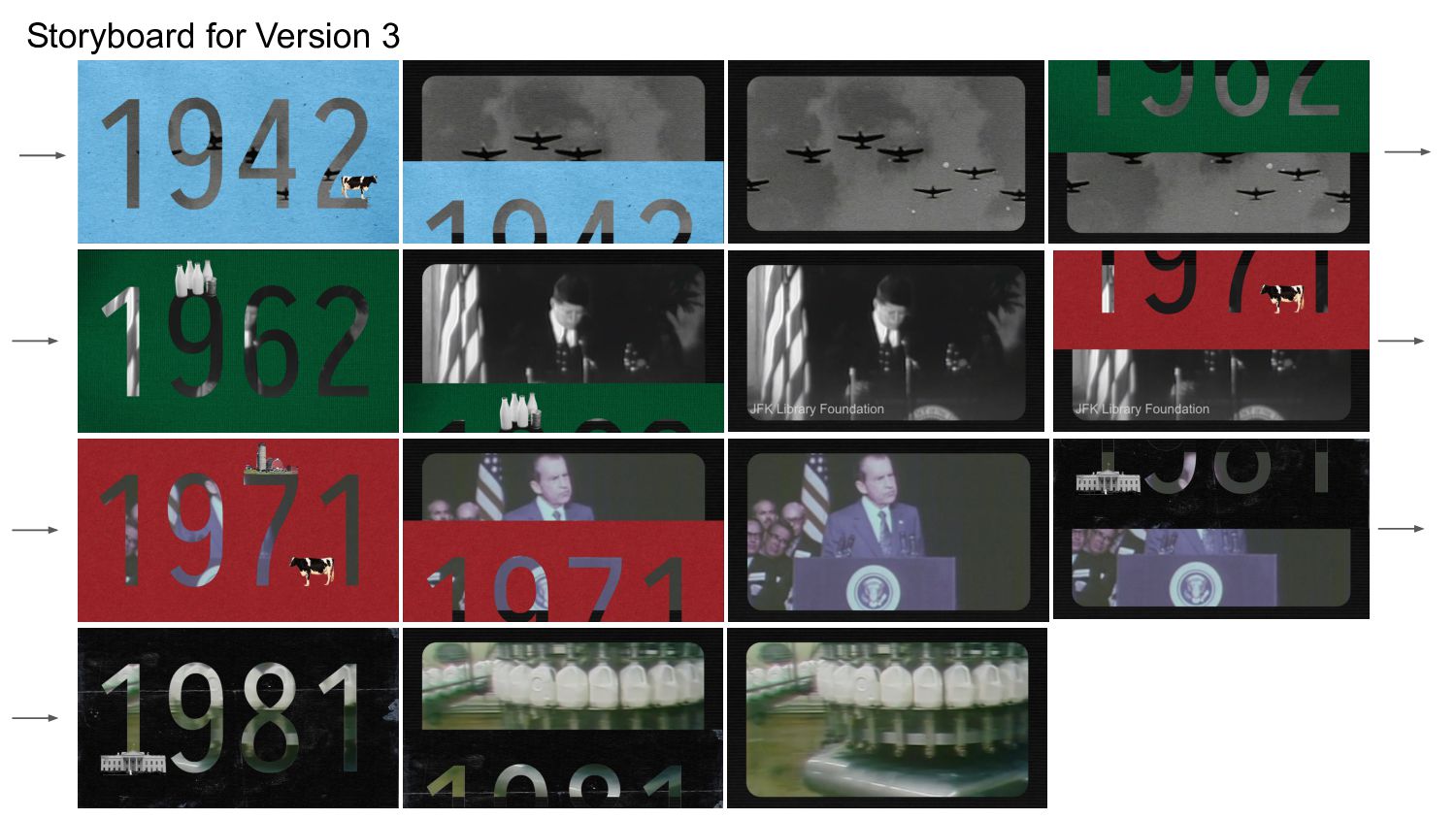
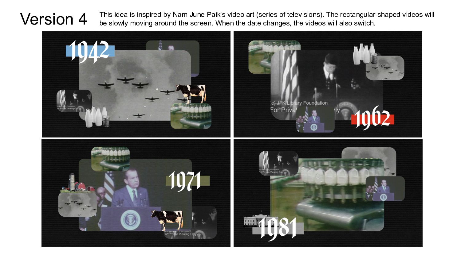
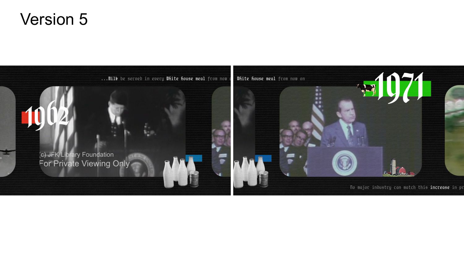
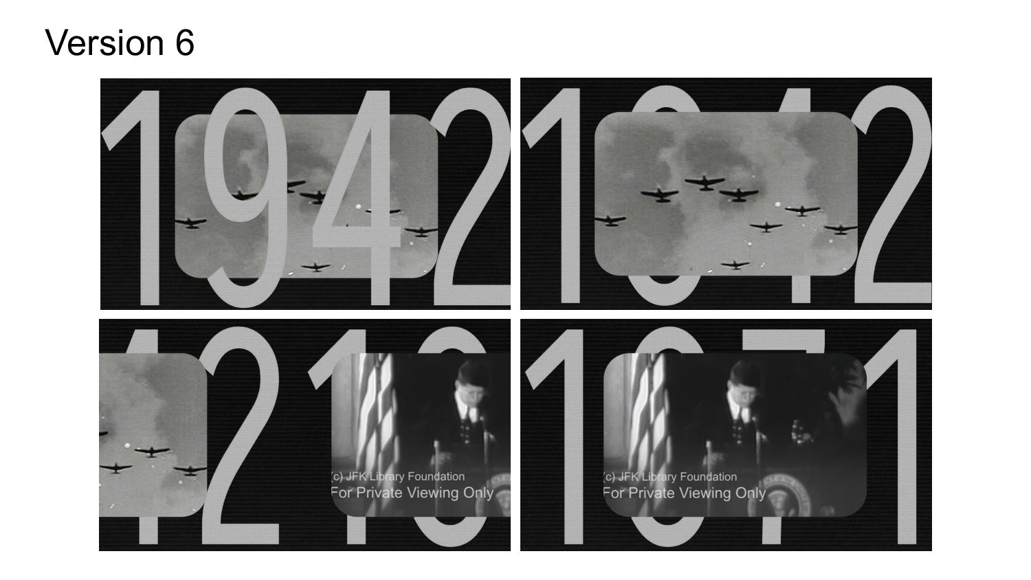
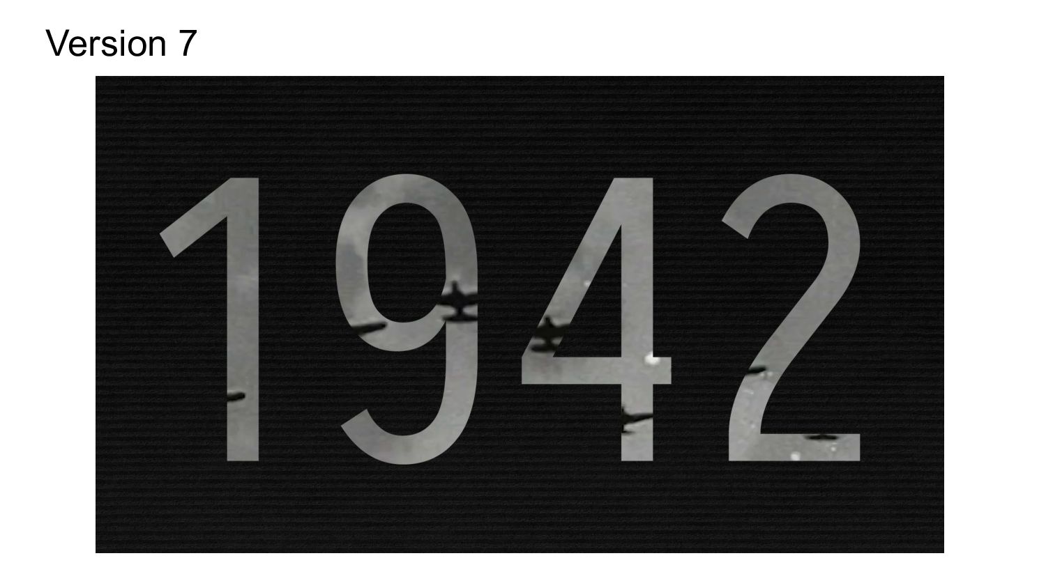
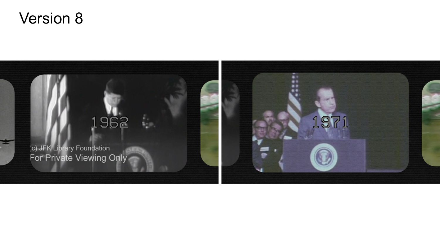
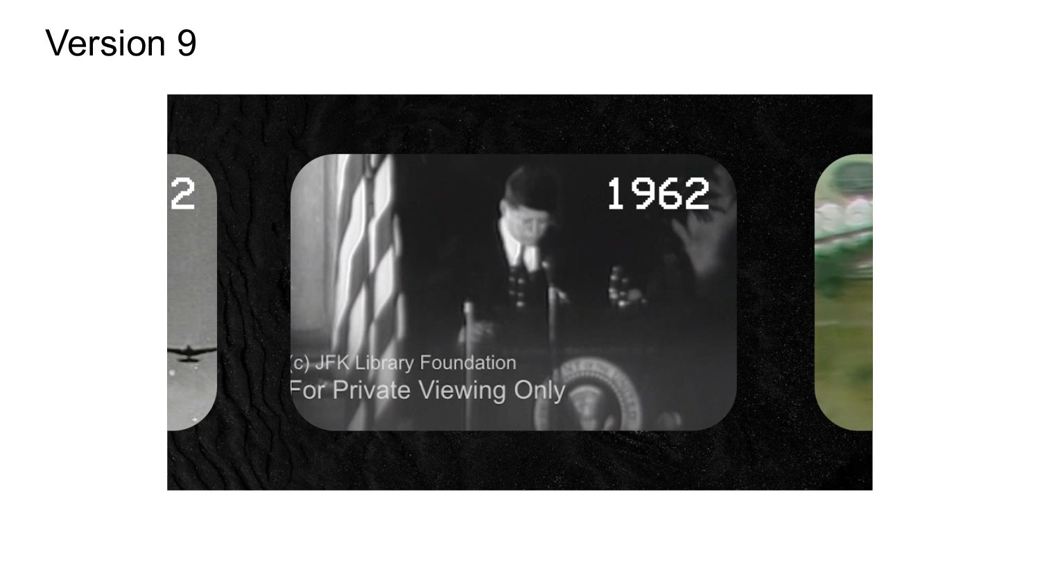
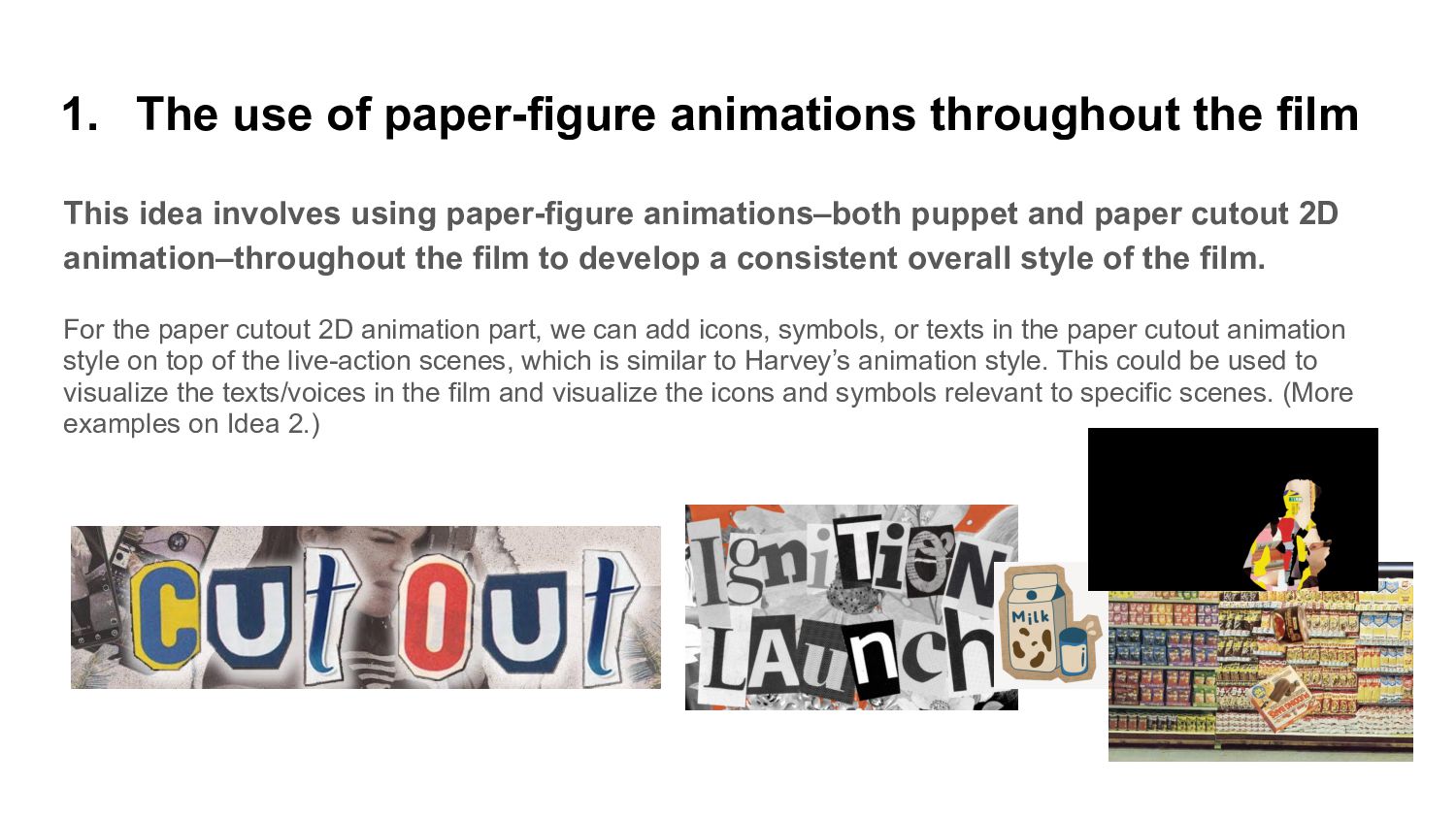
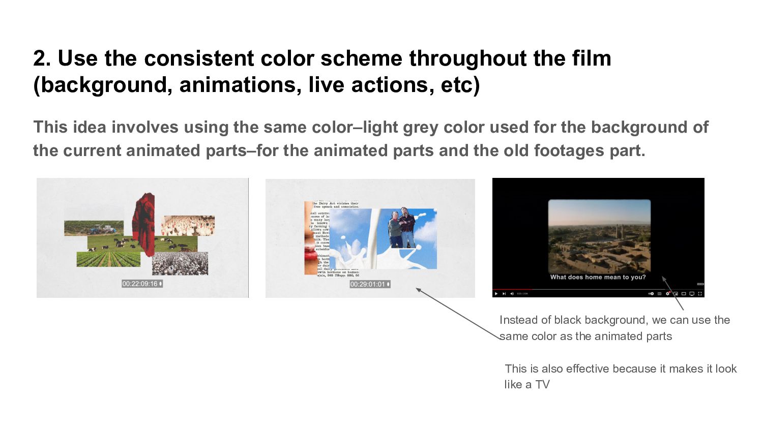
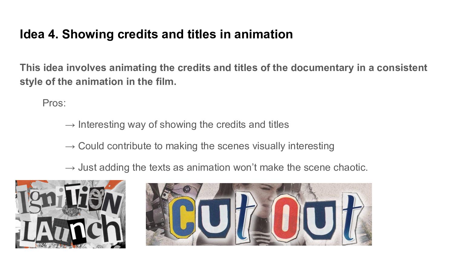
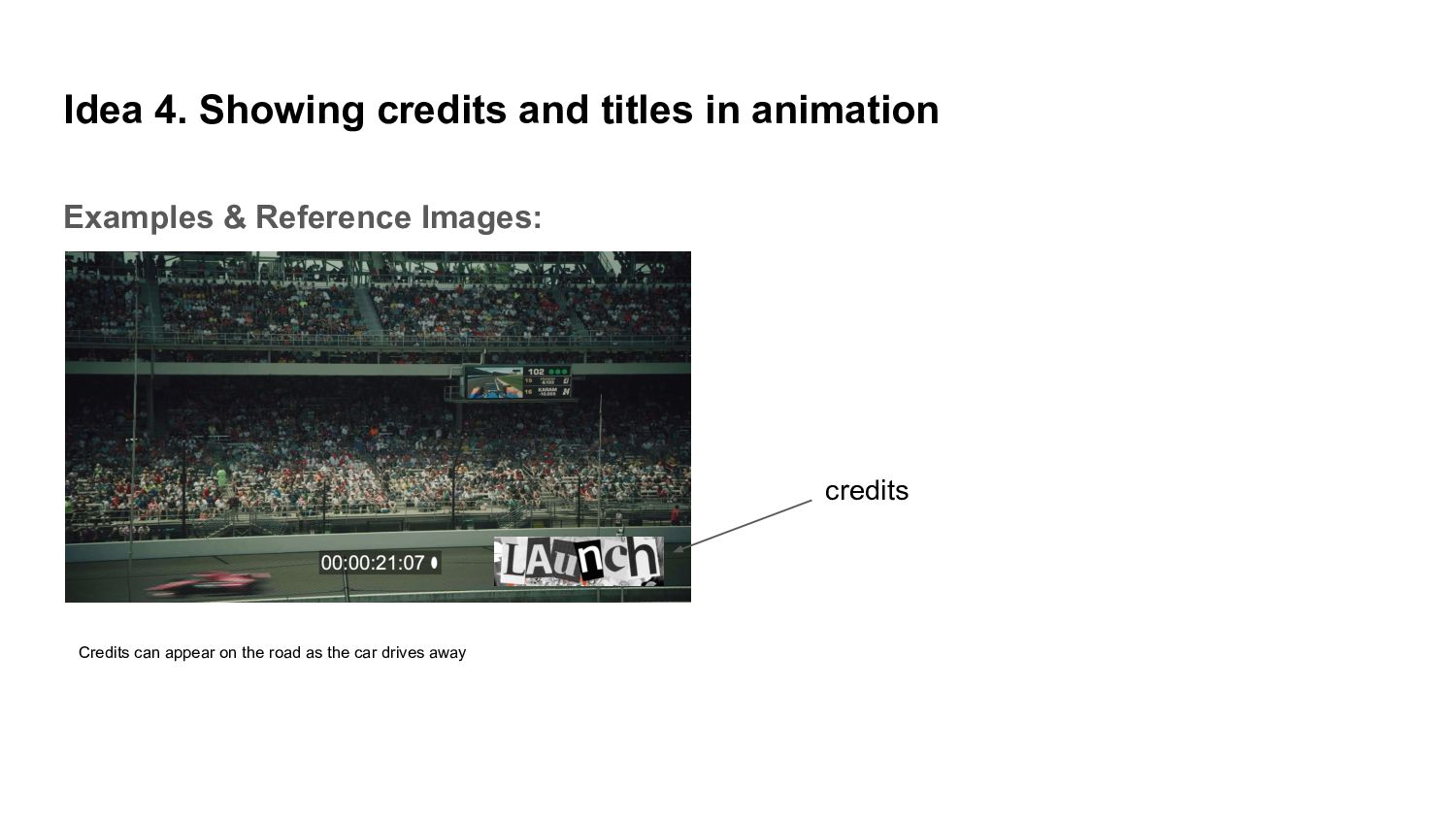
    the documentary (00:11:04-00:12:00) and wrote down the keywords for each section (1942, 1962, 1971, and 1981). • For 1942, some keywords include liberty, freedom, planes, cow, and milk. • For 1962, The White House and milk were the main keywords. • For 1971, dairy industry and increase in productivity were the keywords. • Then, for 1981, the main keywords were milk and the government. Based on these keywords, I added relevant symbols and graphics for each section. Building up from Harvey’s original illustrations, I created a few illustrations that could be used for the Dates section (00:11:04-00:12:00) of the documentary. Based on James’ feedback, I am now designing new options that are inspired by old milk commercial designs and fonts.
  51. Version 1 1962 - White House, milk 1971 - Dairy

    Farm/Industry, Productivity, Milk
  52. Version 2 This design is inspired by the old vintage

    milk commercial/posters, in terms of the overall look, fonts and color scheme. Similar to Harvey’s animation, the paper-like figures would move along with its relevant audio in the background.
  53. Version 4 This idea is inspired by Nam June Paik’s

    video art (series of televisions). The rectangular shaped videos will be slowly moving around the screen. When the date changes, the videos will also switch.
  54. Overall Comments • Storytelling, interview scenes, animated scenes are looking

    great. The way the footages are aligned is effective in grabbing the attention. • Learned a lot about the milk industry in the US and how the change in the industry and society affect the dairy farmers like the Cochran family. • Moving back and forth between the interview clips of the Cochran family and other footages (old pictures, footages, animations, other interviews, etc) make the documentary interesting • I especially found the ending part interesting and the parts that show how the different things the documentary talks about come together. • However, the graphics, animations, old footages/photos, live-action footages, and interview scenes don’t share a consistent style. ◦ I believe one of the reasons for this is because different footages from the past have drastically different style, color scheme, and dimension. Therefore, one of the solutions could be using animation to visualize the events happened in the past. • Animations & graphics appear too late in the film. It feels like the animation comes out of nowhere. • Opening scene (00:00:00~00:02:25) feels slightly long. However, if we incorporate the use of graphics and animations that can attract the audience’s attention, that would not only make the opening scene visually exciting but also create a consistent style of the documentary.
  55. Thoughts and Suggestions • Create a consistent overall look/style of

    the film • More frequent use of animations and graphics → especially in the opening scene → could also use when showing the old photos and footages • Mix animations/graphics and live-action footages → develop and experiment with the overall style/look of the film → follow Harvey’s animation style and combine it with live-action → experiment with different ways of mixing animation and live-action → could involve using animation as a transition, incorporating cut out paper animation style, using line arts and graphics on top of the live-action scene, showing credits as an animation, visualizing the background music with animation, visualizing the narration/voices in the film, visualizing the relevant icons and symbols in the film, etc • Pros: → The intersection between animation and documentary has a long history → Will be useful for purposeful storytelling & cinematic effects → Experimenting with different styles, especially by mixing animations and live-action footages, would not only make the film look interesting but also show the creativity and experimental mindset involved in the production of the film.
  56. 1. The use of paper-figure animations throughout the film This

    idea involves using paper-figure animations–both puppet and paper cutout 2D animation–throughout the film to develop a consistent overall style of the film. - Use puppet, stop-motion, and paper cut out animations to visualize the past events and the interview contents. - For the puppet animation (or perhaps both puppet and cutout), we can use milk container as the base of the puppet so it aligns with the theme/topic of the film) - Similar style with Harvey’s animations - References for puppet paper animation - “Animated Life” series: Used paper puppet animation to bring to life that cannot be directly observed Perhaps in the background of the puppet, we can put the old footages and photos.
  57. For the paper cutout 2D animation part, we can add

    icons, symbols, or texts in the paper cutout animation style on top of the live-action scenes, which is similar to Harvey’s animation style. This could be used to visualize the texts/voices in the film and visualize the icons and symbols relevant to specific scenes. (More examples on Idea 2.) 1. The use of paper-figure animations throughout the film This idea involves using paper-figure animations–both puppet and paper cutout 2D animation–throughout the film to develop a consistent overall style of the film.
  58. 2. Use the consistent color scheme throughout the film (background,

    animations, live actions, etc) This idea involves using the same color–light grey color used for the background of the current animated parts–for the animated parts and the old footages part. Instead of black background, we can use the same color as the animated parts This is also effective because it makes it look like a TV
  59. Idea 1. Using Animation as a transition This idea involves

    using animation to effectively and naturally transit from live-action parts to animated parts. Pros: → This can solve the problem of the abrupt transition from the live-action footage to the animated parts. → Interesting way to mix animation and live-action for a transition effect Cons: → The scenes might get busy and overwhelming. However, this can be prevented by keeping the animation very simple, minimalistic, and consistent to the overall style of the documentary
  60. Idea 1. Using Animation as a transition Examples & Reference

    Images: (1) 00:00:11:16–00:00:17:06 1. A film starts with a black screen 2. Once we hear the sound of the jets flying, paper textured jets graphic flies into the scene. 3. As it flies in and leaves the scene, it tears the paper in half. The paper splits into two pieces and fall down. 4. Once the papers are gone, we see the live-action footage behind (which is the current scene we have on the left)
  61. Idea 2. Incorporating the cut-out paper animation style This idea

    involves adding icons, symbols, or texts to the live-action scenes in the cut-out paper animation style, which is similar to Harvey’s animation style. This could be used to visualize the texts/voices in the film and visualize the icons and symbols relevant to specific scenes. Pros: → This idea can contribute to creating an overall look/style of the documentary → experimental way of mixing animation and live-action Cons: → Adding animation in the cut-out paper style could make the scenes look childlike. However, this can be avoided by designing the graphics and animation that follow the consistent style of the documentary and keeping the design and the color scheme consistent and neutral and simple.
  62. Idea 2. Incorporating the cut-out paper animation style Examples &

    Reference Images: Paper textured icons and texts on top of the live-action footage - Text “1939” - Glass milk bottle icon
  63. Idea 2. Incorporating the cut-out paper animation style Examples &

    Reference Images: Paper textured icons and texts on top of the live-action footage - When the person lists out the different types of milk, show the icon of milk in the cut-out paper animation style - Ex: Whole milk, skim milk, 2%, etc
  64. Idea 2. Incorporating the cut-out paper animation style Examples &

    Reference Images: Paper cut out graphic/animation of the text/voice: “What’s the deal with milk if you…”
  65. Idea 3. Using line arts and graphics on top of

    the live-action footage This idea involves adding line arts and graphics right on top of the live-action scenes. Pros: → This idea can contribute to creating an overall look/style of the documentary → The use of line arts and graphics can attract the audience’s attention and make the scenes visually impactful Cons: → Similar to other uses of animation, it could make the scenes look childlike and chaotic. However, this can be avoided by limiting the use of animation, designing the graphics and animation that follow the consistent style of the documentary and keeping the design and the color scheme consistent and neutral and simple.
  66. Idea 3. Using line arts and graphics on top of

    the live-action footage Examples & Reference Images: These two stills are from the film I created to experiment with combining animation and live-action
  67. Idea 3. Using line arts and graphics on top of

    the live-action footage Examples & Reference Images: Visual exhaust fumes or speed effects of the cars shown in line arts and graphics
  68. Idea 4. Showing credits and titles in animation This idea

    involves animating the credits and titles of the documentary in a consistent style of the animation in the film. Pros: → Interesting way of showing the credits and titles → Could contribute to making the scenes visually interesting → Just adding the texts as animation won’t make the scene chaotic.
  69. Idea 4. Showing credits and titles in animation Examples &

    Reference Images: Credits can appear on the road as the car drives away credits
  70. Idea 5. Visualizing the background music and sound effects with

    animation This idea involves visualizing the background music and sound effects with animation and graphics/symbols related to the documentary. For instance, when the background music hits high note, an animation of milk drops can appear. Similar to how animation Fantasia visualized classical music with animation, this idea involves combining the use of sound and animation in the film. Pros: → Interesting way to experiment with the use of animation