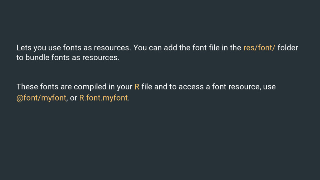
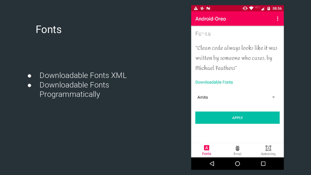
font file in the res/font/ folder to bundle fonts as resources. These fonts are compiled in your R file and to access a font resource, use @font/myfont, or R.font.myfont.
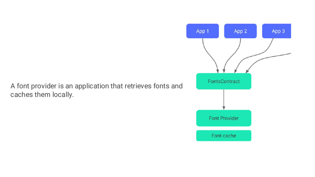
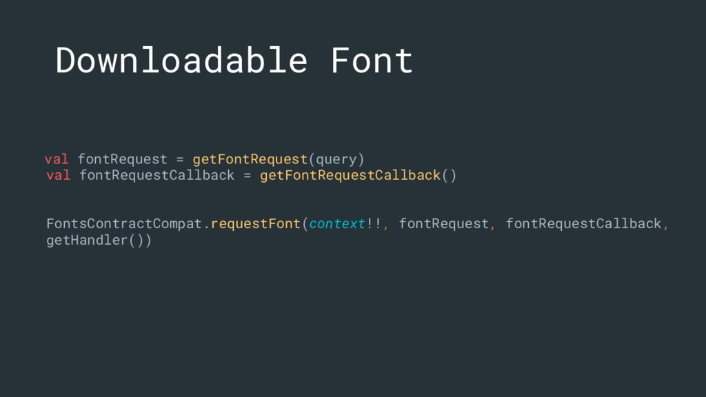
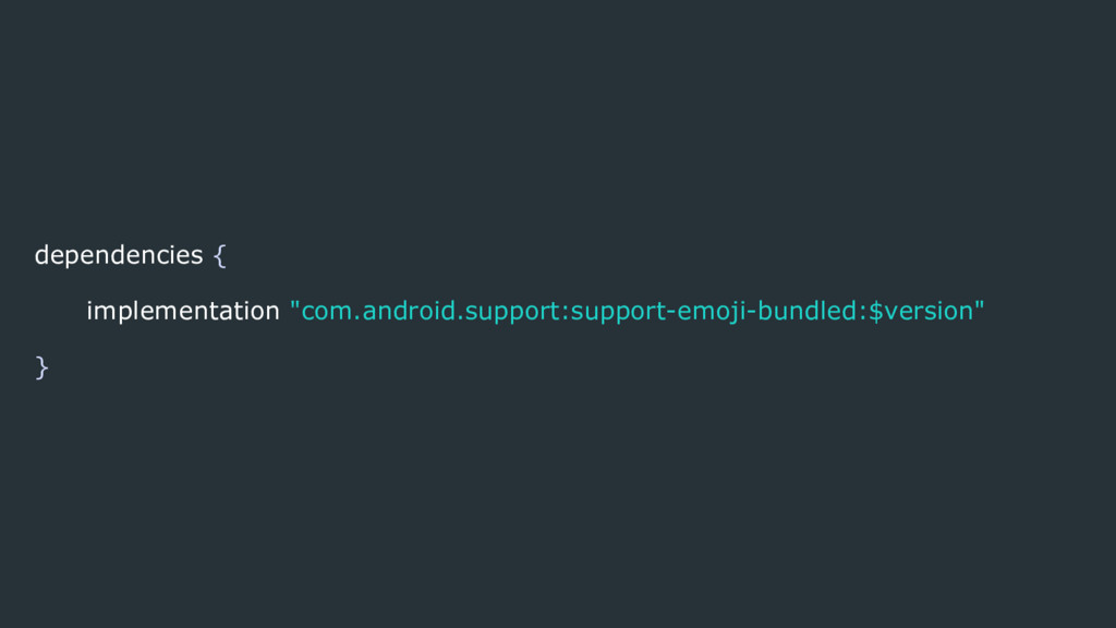
application. The Downloadable Fonts feature offers the following benefits: • Reduces the APK size • Increases the app installation success rate • Improves the overall system health as multiple APKs can share the same font through a provider.
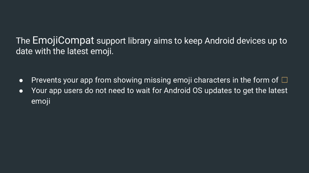
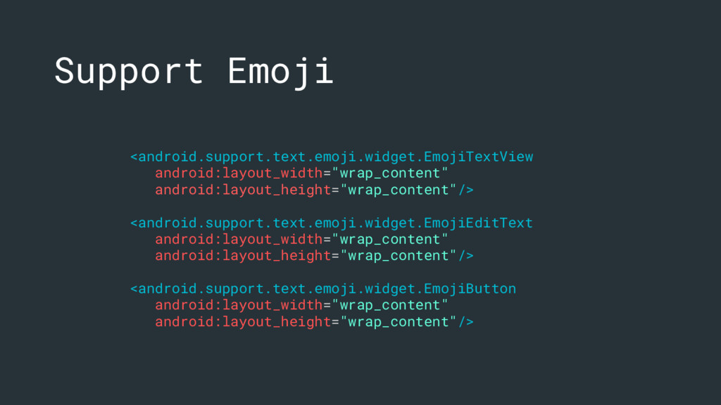
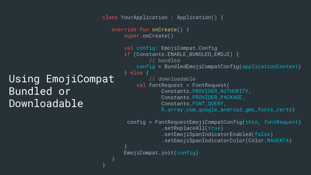
to date with the latest emoji. • Prevents your app from showing missing emoji characters in the form of ☐ • Your app users do not need to wait for Android OS updates to get the latest emoji
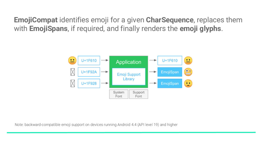
EmojiSpans, if required, and finally renders the emoji glyphs. Note: backward-compatible emoji support on devices running Android 4.4 (API level 19) and higher
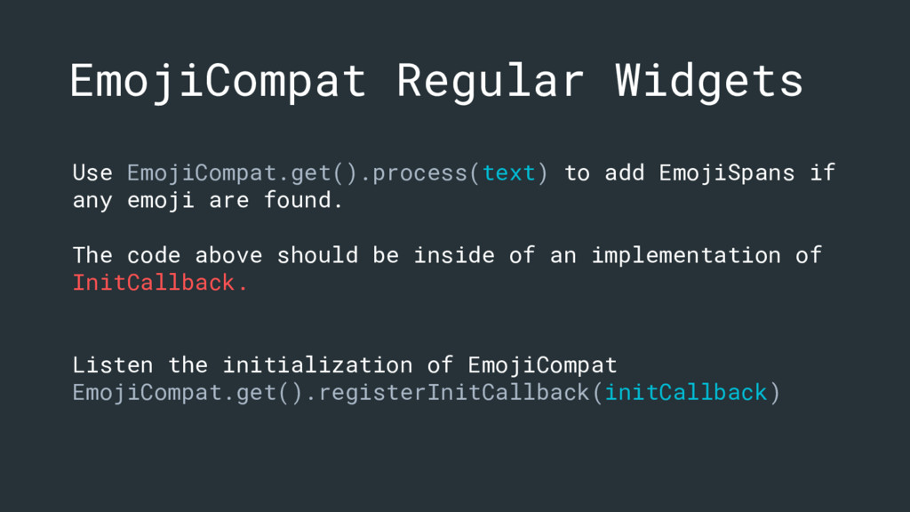
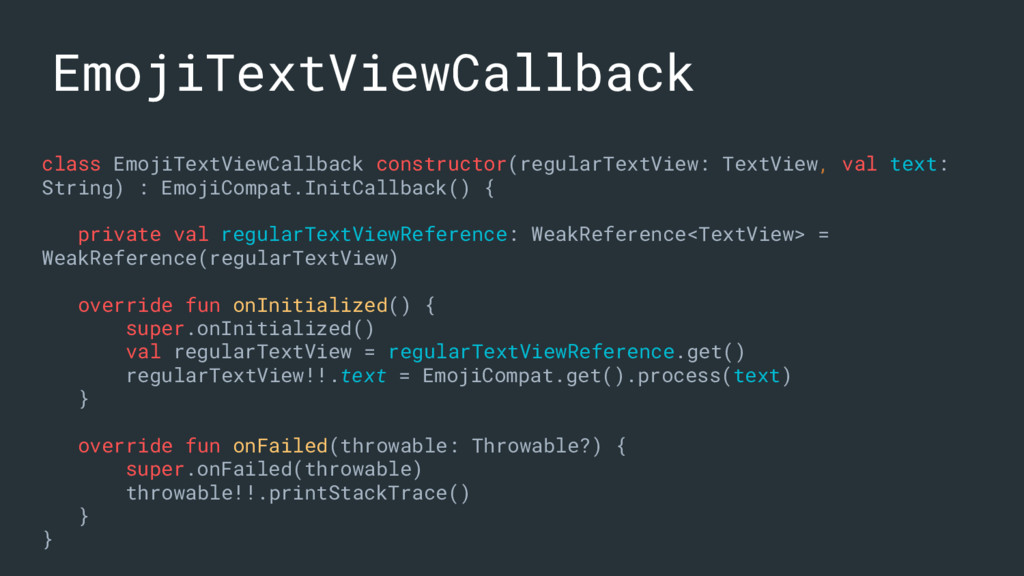
emoji are found. The code above should be inside of an implementation of InitCallback. Listen the initialization of EmojiCompat EmojiCompat.get().registerInitCallback(initCallback)
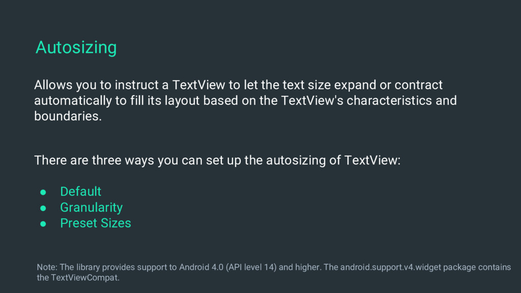
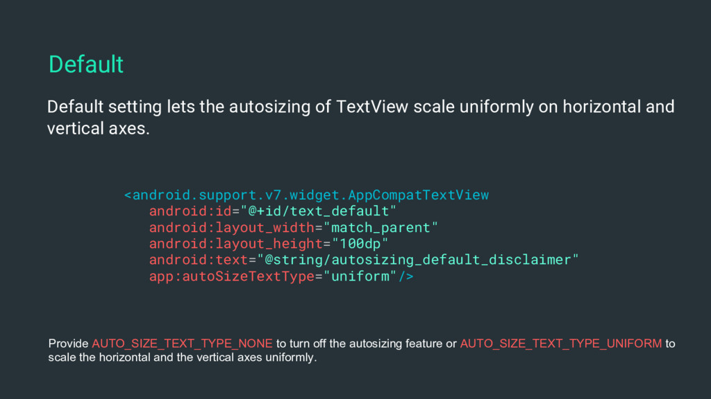
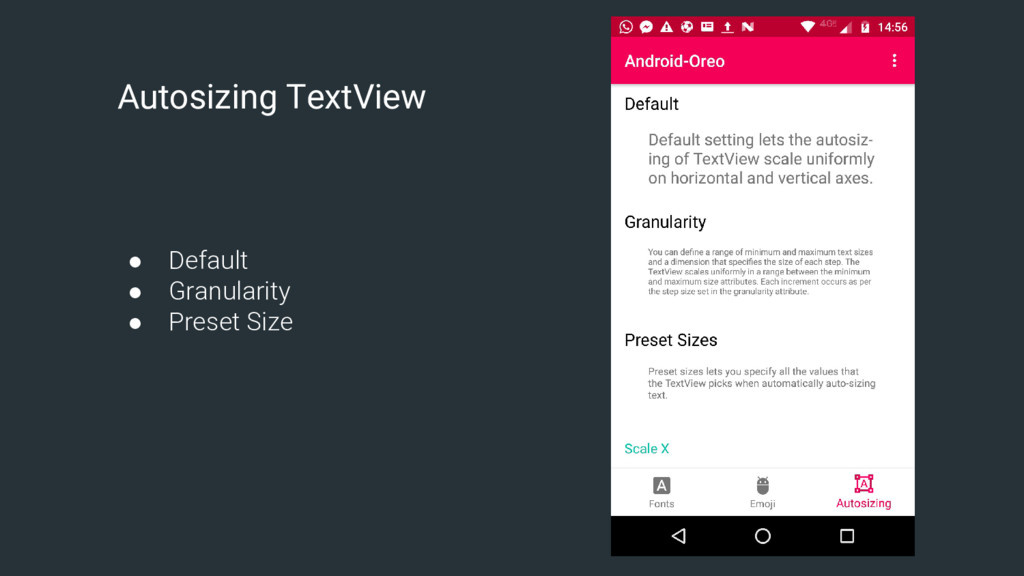
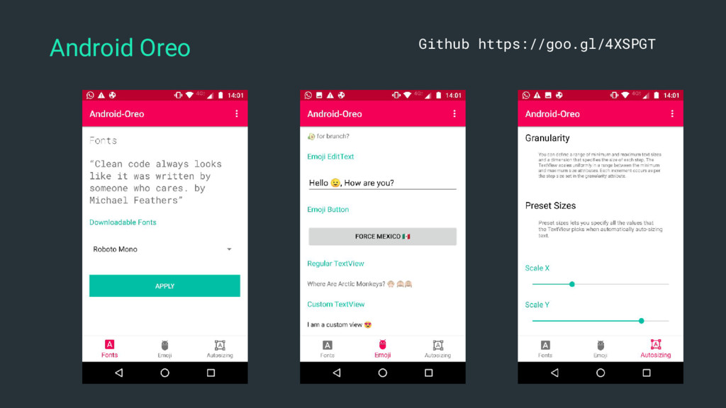
size expand or contract automatically to fill its layout based on the TextView's characteristics and boundaries. Autosizing There are three ways you can set up the autosizing of TextView: • Default • Granularity • Preset Sizes Note: The library provides support to Android 4.0 (API level 14) and higher. The android.support.v4.widget package contains the TextViewCompat.
horizontal and vertical axes. <android.support.v7.widget.AppCompatTextView android:id="@+id/text_default" android:layout_width="match_parent" android:layout_height="100dp" android:text="@string/autosizing_default_disclaimer" app:autoSizeTextType="uniform"/> Default Provide AUTO_SIZE_TEXT_TYPE_NONE to turn off the autosizing feature or AUTO_SIZE_TEXT_TYPE_UNIFORM to scale the horizontal and the vertical axes uniformly.
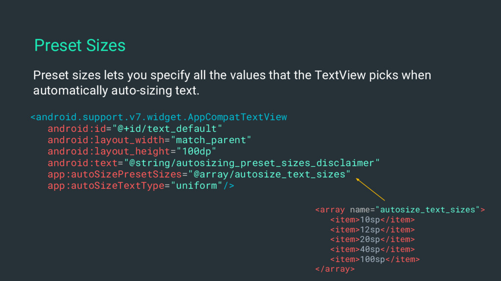
sizes and a dimension that specifies the size of each step. The TextView scales uniformly in a range between the minimum and maximum size attributes. Each increment occurs as per the step size set in the granularity attribute. <android.support.v7.widget.AppCompatTextView android:id="@+id/text_default" android:layout_width="match_parent" android:layout_height="100dp" android:text="@string/autosizing_granularity_disclaimer" app:autoSizeMaxTextSize="34sp" app:autoSizeMinTextSize="10sp" app:autoSizeStepGranularity="2sp" app:autoSizeTextType="uniform"/> Granularity
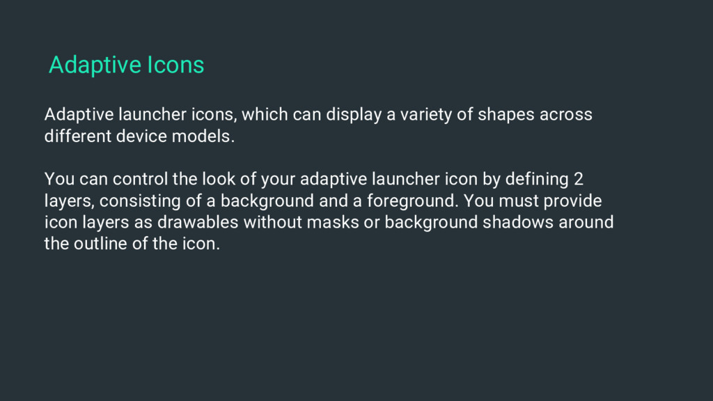
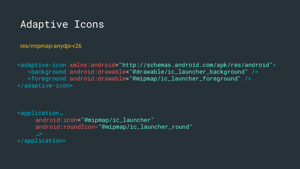
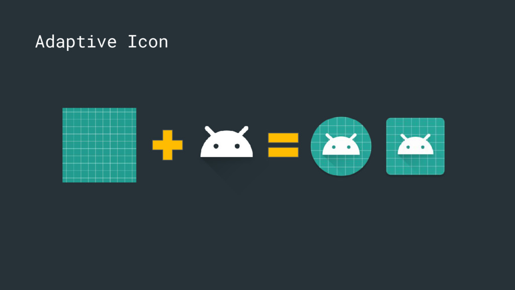
across different device models. You can control the look of your adaptive launcher icon by defining 2 layers, consisting of a background and a foreground. You must provide icon layers as drawables without masks or background shadows around the outline of the icon. Adaptive Icons
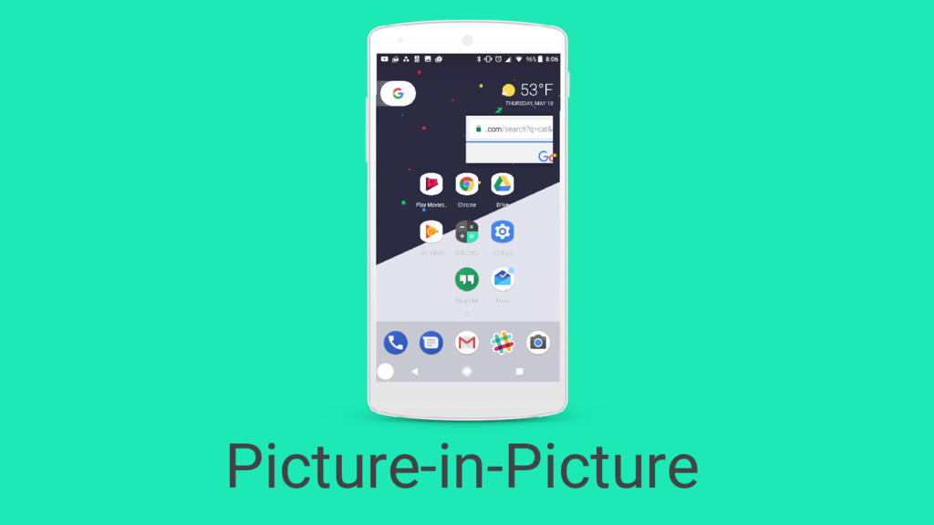
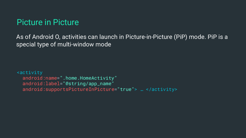
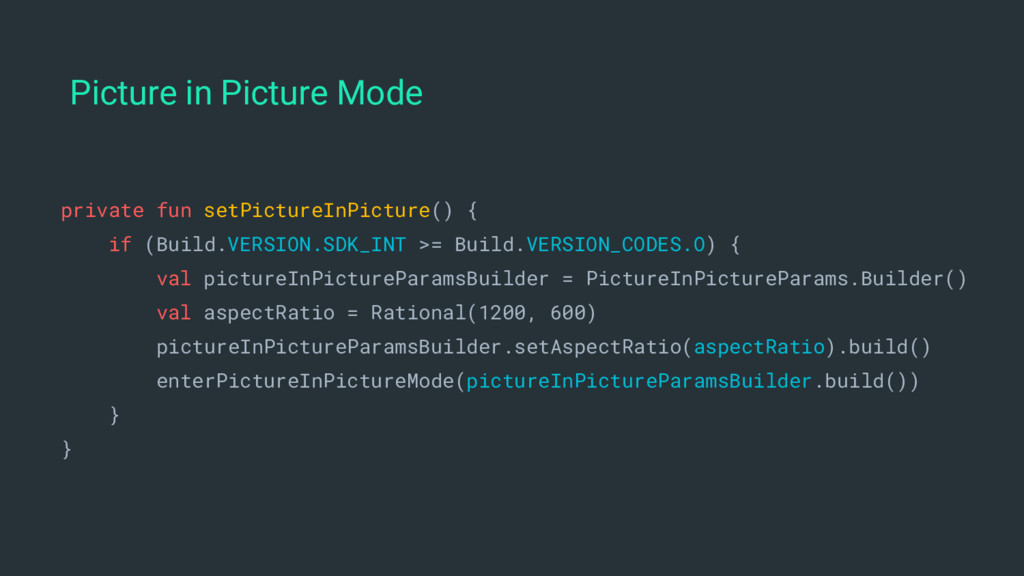
mode. PiP is a special type of multi-window mode <activity android:name=".home.HomeActivity" android:label="@string/app_name" android:supportsPictureInPicture="true"> … </activity> Picture in Picture
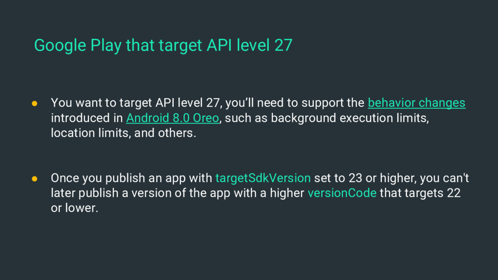
to support the behavior changes introduced in Android 8.0 Oreo, such as background execution limits, location limits, and others. • Once you publish an app with targetSdkVersion set to 23 or higher, you can't later publish a version of the app with a higher versionCode that targets 22 or lower. Google Play that target API level 27
 erikjhordan_rey
 nagise
 nakahara
 nrslib
 syumai
 vinceamstoutz
 16bitidol
 j5ik2o
 jinwatanabe
 mizchi
 tonkotsuboy_com
 rollbear
 badams
 andyhume
 brettharned
 michielstock
 asonas
 morganepeng
 rkendrick25
 destraynor
 michaelherold
 tenderlove
 cassininazir
 nmsamuel
![Erik Jhordan Rey Android Software Engineer [email protected] @ErikJhordan_Rey github.com/erikcaffrey](https://files.speakerdeck.com/presentations/52020f4333ce4ca3a9c1472d77dbad80/slide_1.jpg)
![Questions? Find me github.com/erikcaffrey [email protected] erikcaffrey.github.io @ErikJhordan_Rey +Erik Jhordan Rey](https://files.speakerdeck.com/presentations/52020f4333ce4ca3a9c1472d77dbad80/slide_67.jpg)