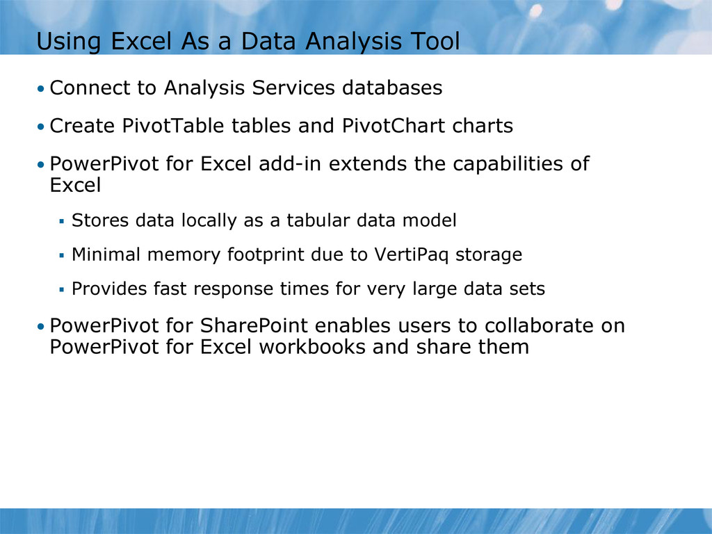
Analysis Services databases • Create PivotTable tables and PivotChart charts • PowerPivot for Excel add-in extends the capabilities of Excel Stores data locally as a tabular data model Minimal memory footprint due to VertiPaq storage Provides fast response times for very large data sets • PowerPivot for SharePoint enables users to collaborate on PowerPivot for Excel workbooks and share them
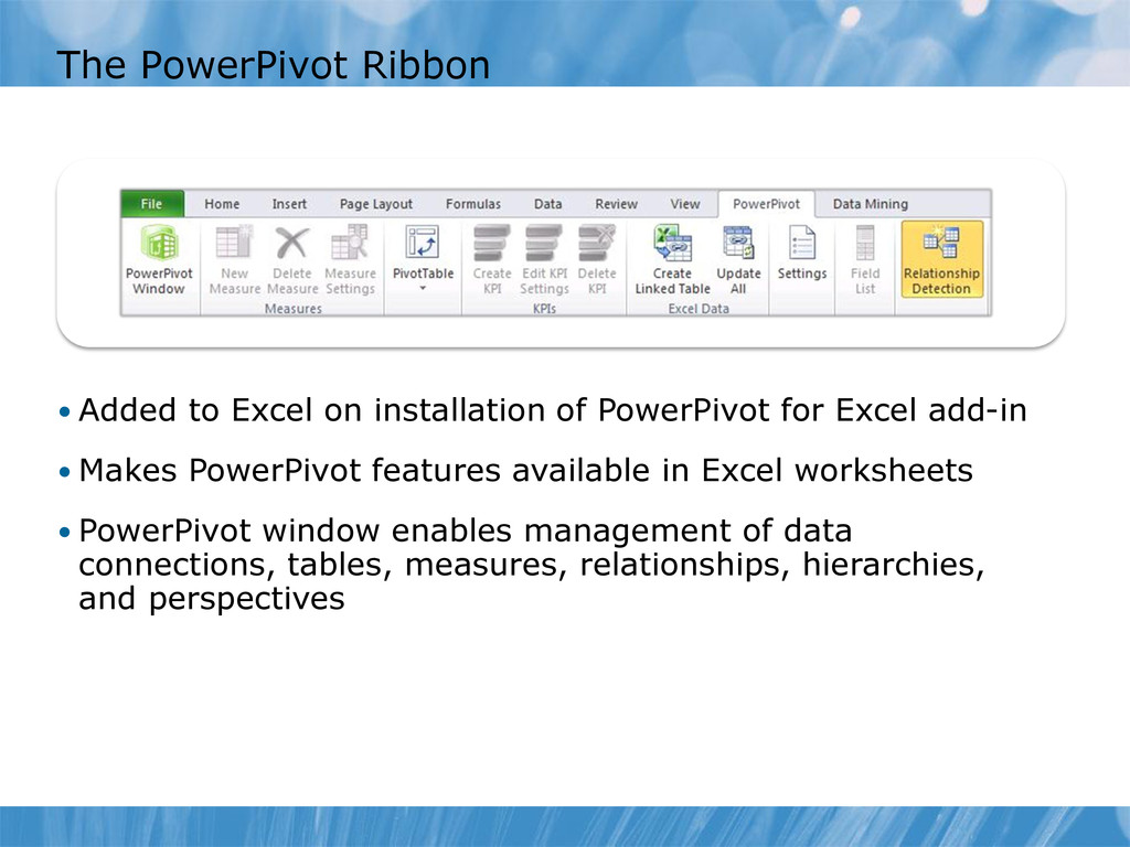
PowerPivot for Excel add-in • Makes PowerPivot features available in Excel worksheets • PowerPivot window enables management of data connections, tables, measures, relationships, hierarchies, and perspectives
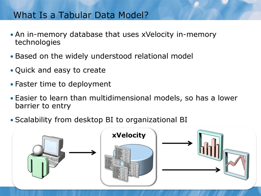
that uses xVelocity in-memory technologies • Based on the widely understood relational model • Quick and easy to create • Faster time to deployment • Easier to learn than multidimensional models, so has a lower barrier to entry • Scalability from desktop BI to organizational BI xVelocity
in PowerPivot for Excel Create a tabular data model in a Microsoft Excel workbook Importing data automatically creates a tabular data model The data is stored in the Excel workbook • Tabular Data Models in Microsoft SQL Server 2012 Analysis Services Create a tabular data model by using SQL Server Data Tools The data is stored in SQL Server 2012 Analysis Services There are additional features to support larger, more complex solutions: • Row-level security • Partitioning • DirectQuery mode • Deployment options
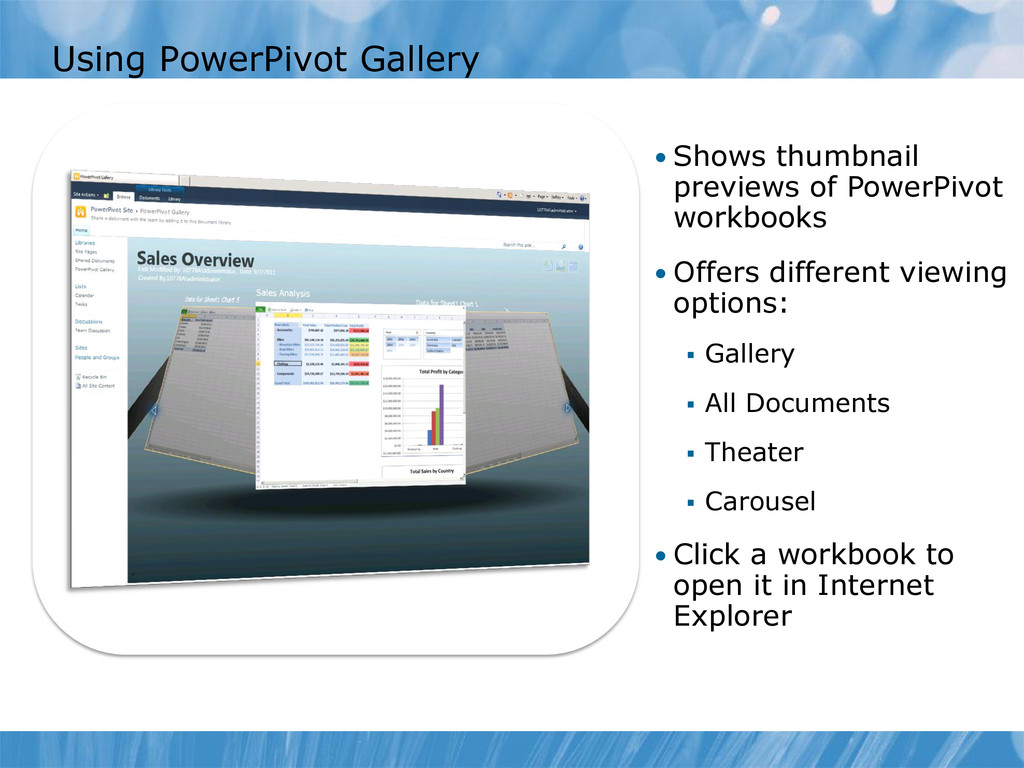
analysis solution Increased autonomy for information workers Fast query response times DAX for custom measures and calculated columns Diagram view for management of tables and relationships Hierarchies and perspectives • PowerPivot for SharePoint Portal for sharing and collaboration Gallery to browse and access workbooks and reports Server-side processing enables users to open workbooks in a browser Central management and security for workbooks
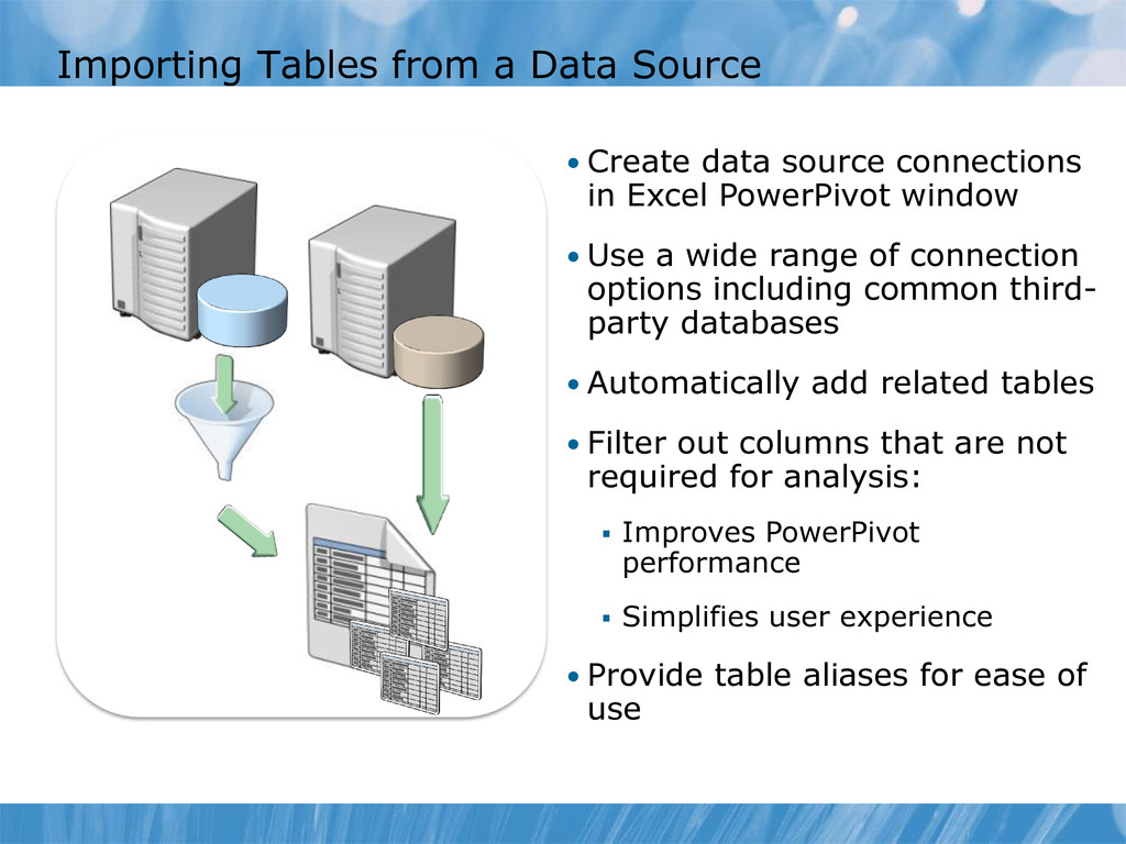
connections in Excel PowerPivot window • Use a wide range of connection options including common third- party databases • Automatically add related tables • Filter out columns that are not required for analysis: Improves PowerPivot performance Simplifies user experience • Provide table aliases for ease of use
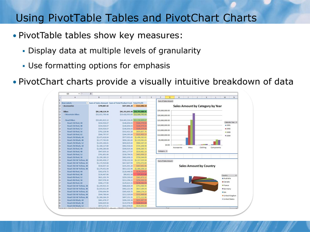
key measures: Display data at multiple levels of granularity Use formatting options for emphasis • PivotChart charts provide a visually intuitive breakdown of data
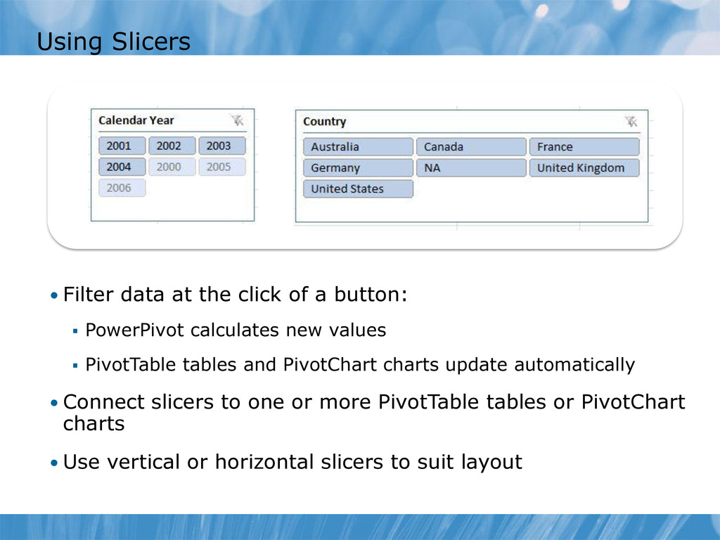
button: PowerPivot calculates new values PivotTable tables and PivotChart charts update automatically • Connect slicers to one or more PivotTable tables or PivotChart charts • Use vertical or horizontal slicers to suit layout
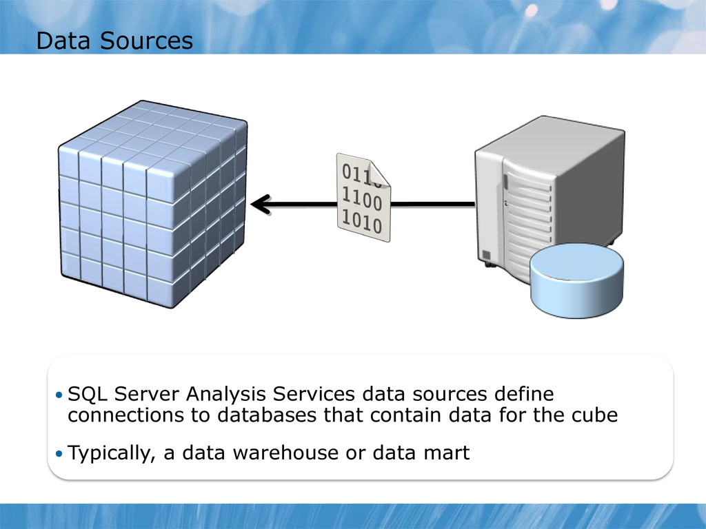
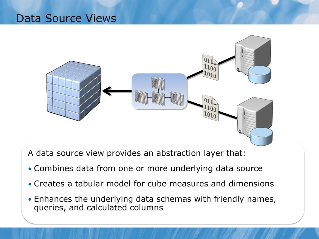
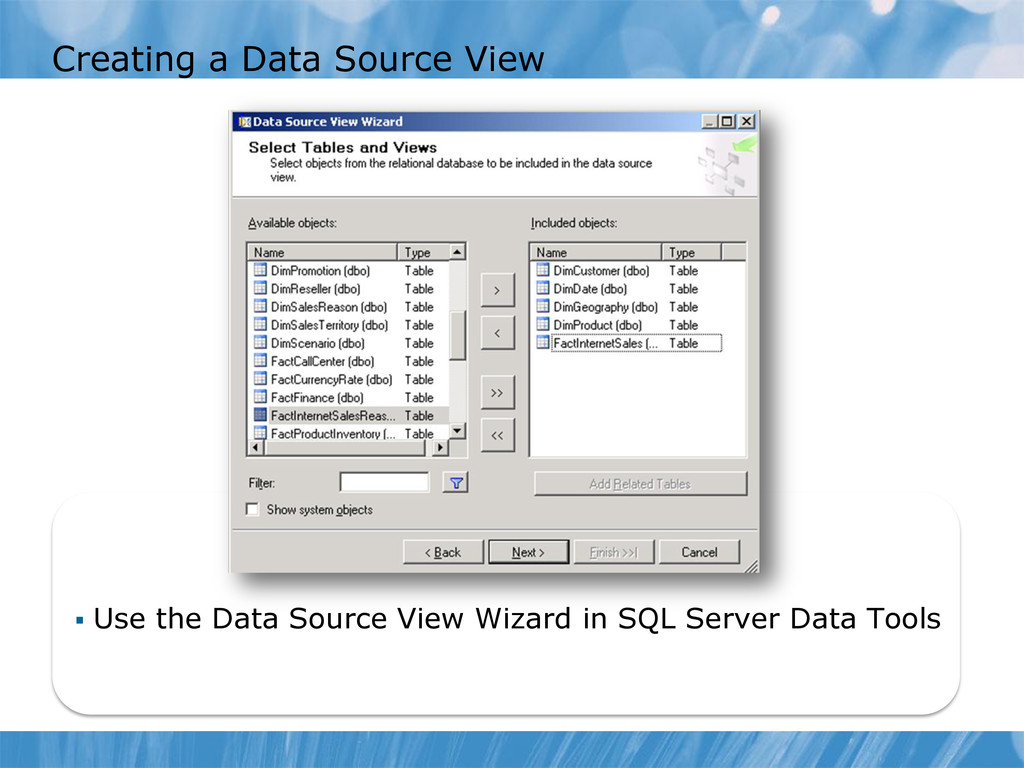
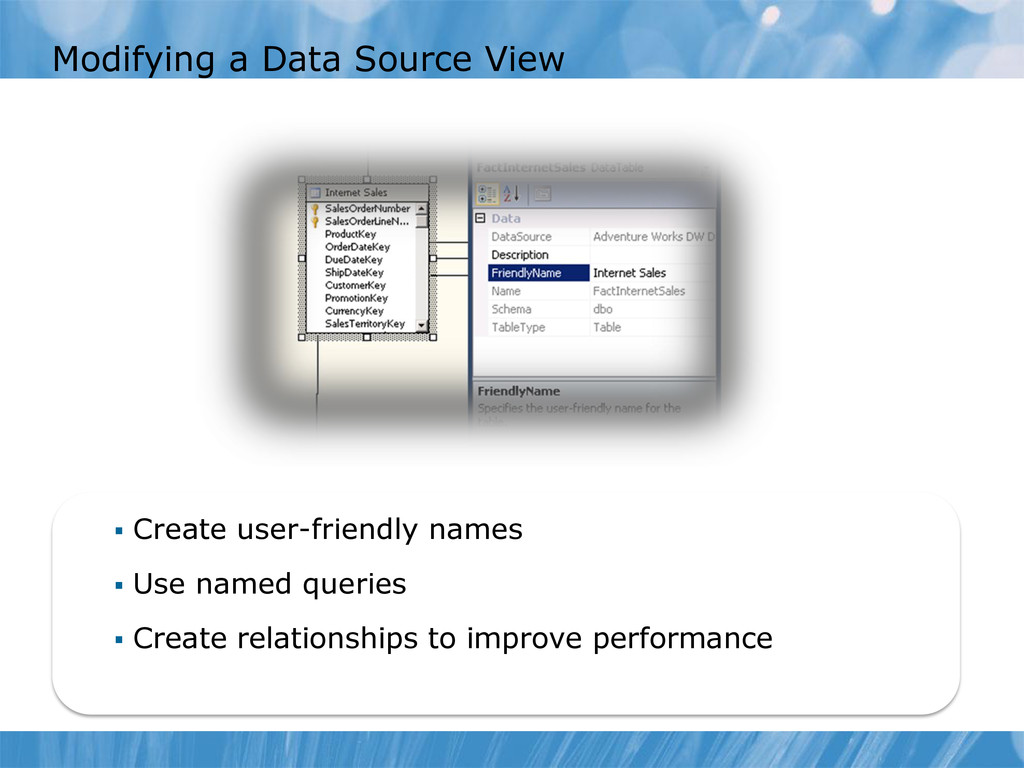
layer that: • Combines data from one or more underlying data source • Creates a tabular model for cube measures and dimensions • Enhances the underlying data schemas with friendly names, queries, and calculated columns
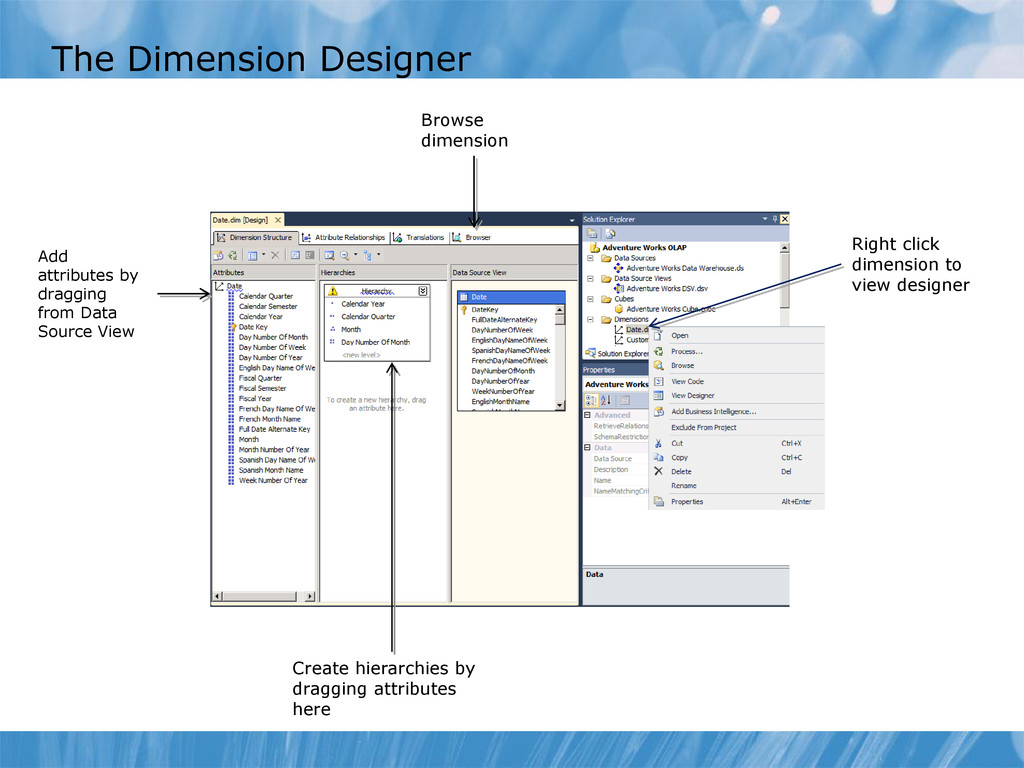
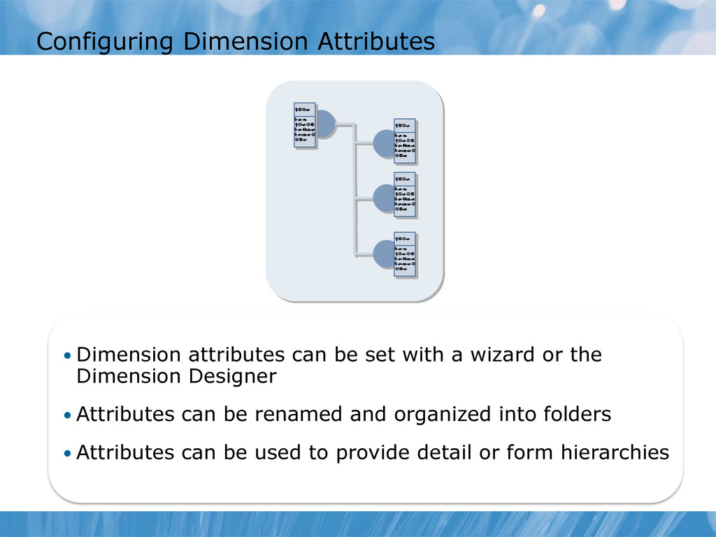
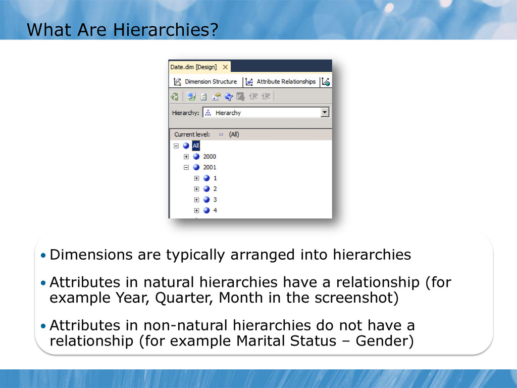
a wizard or the Dimension Designer • Attributes can be renamed and organized into folders • Attributes can be used to provide detail or form hierarchies
• Attributes in natural hierarchies have a relationship (for example Year, Quarter, Month in the screenshot) • Attributes in non-natural hierarchies do not have a relationship (for example Marital Status – Gender)
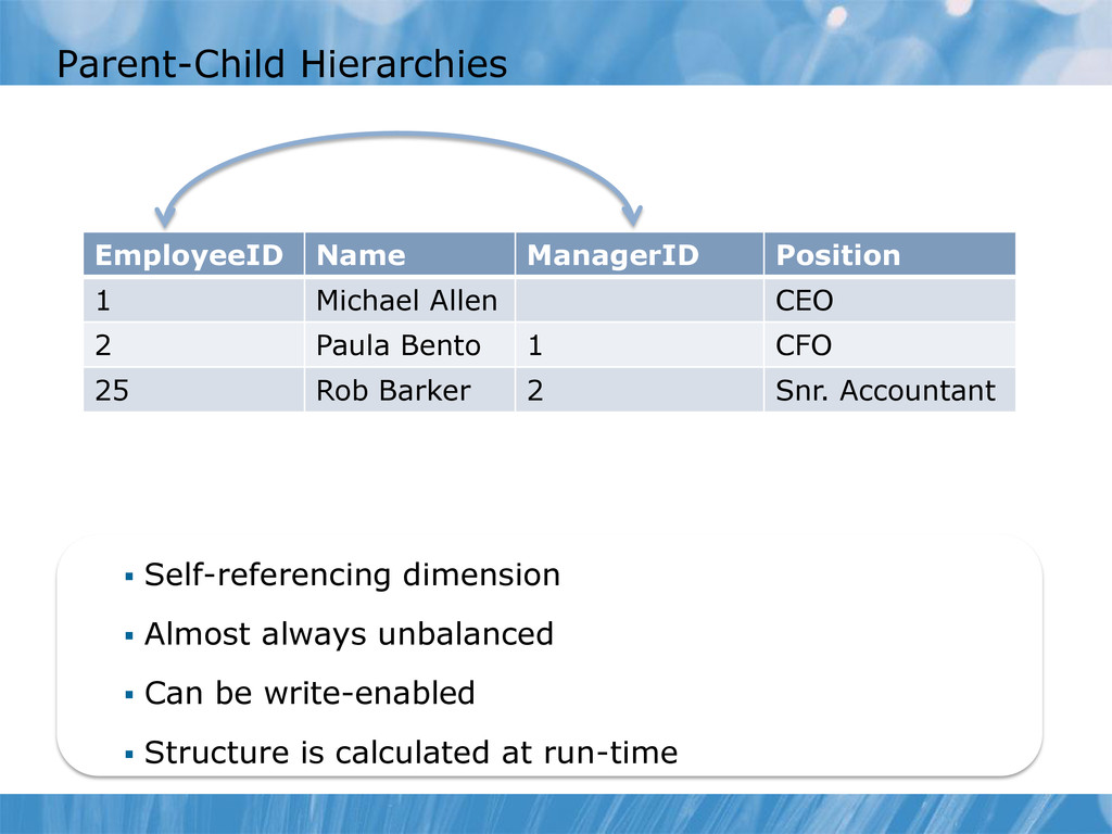
Can be write-enabled Structure is calculated at run-time EmployeeID Name ManagerID Position 1 Michael Allen CEO 2 Paula Bento 1 CFO 25 Rob Barker 2 Snr. Accountant
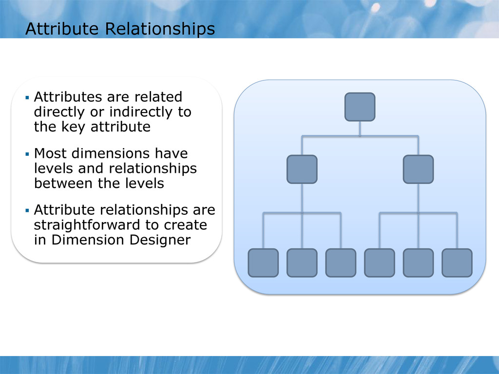
the key attribute Most dimensions have levels and relationships between the levels Attribute relationships are straightforward to create in Dimension Designer
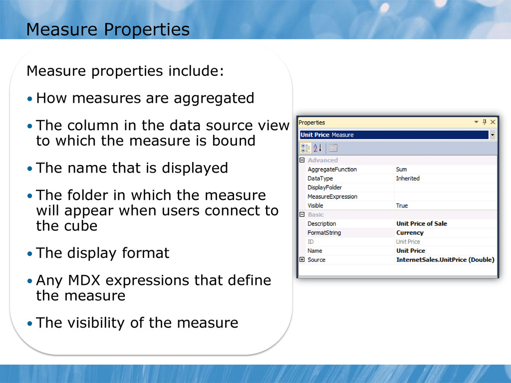
• The column in the data source view to which the measure is bound • The name that is displayed • The folder in which the measure will appear when users connect to the cube • The display format • Any MDX expressions that define the measure • The visibility of the measure
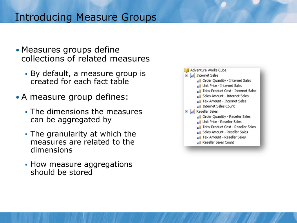
measures By default, a measure group is created for each fact table • A measure group defines: The dimensions the measures can be aggregated by The granularity at which the measures are related to the dimensions How measure aggregations should be stored
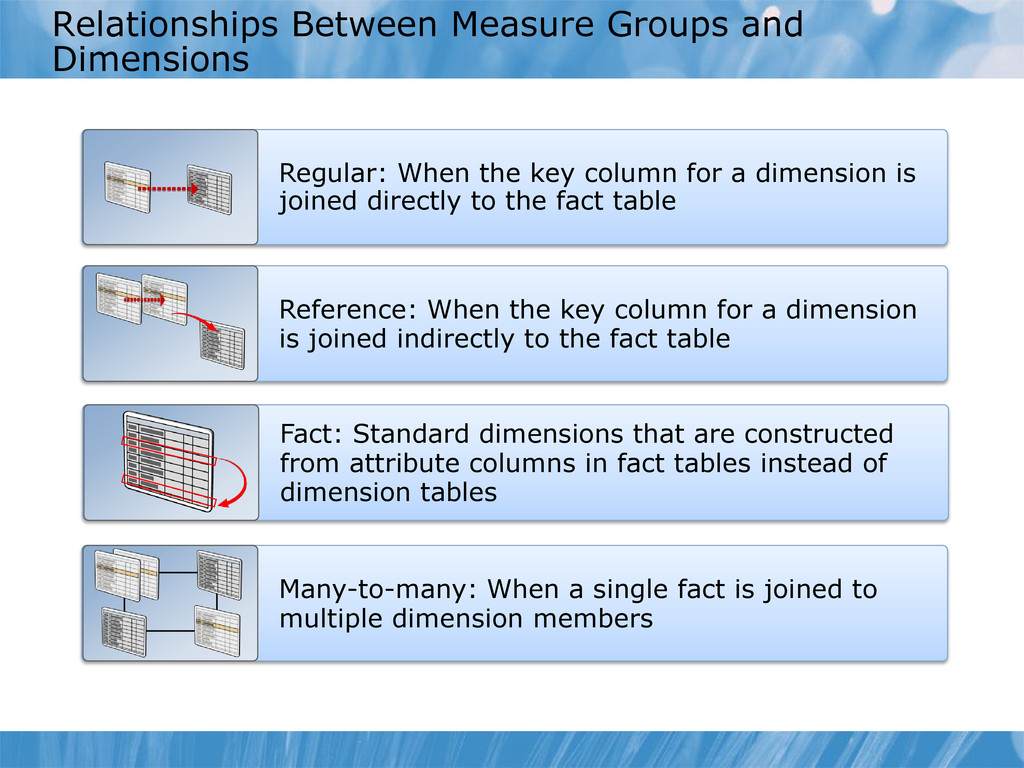
column for a dimension is joined directly to the fact table Reference: When the key column for a dimension is joined indirectly to the fact table Fact: Standard dimensions that are constructed from attribute columns in fact tables instead of dimension tables Many-to-many: When a single fact is joined to multiple dimension members
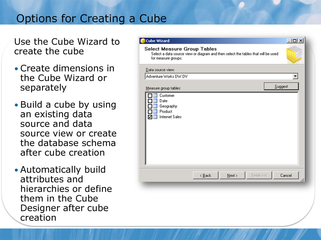
create the cube • Create dimensions in the Cube Wizard or separately • Build a cube by using an existing data source and data source view or create the database schema after cube creation • Automatically build attributes and hierarchies or define them in the Cube Designer after cube creation
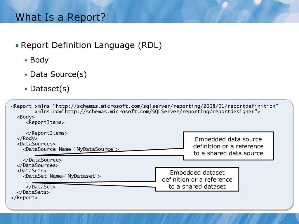
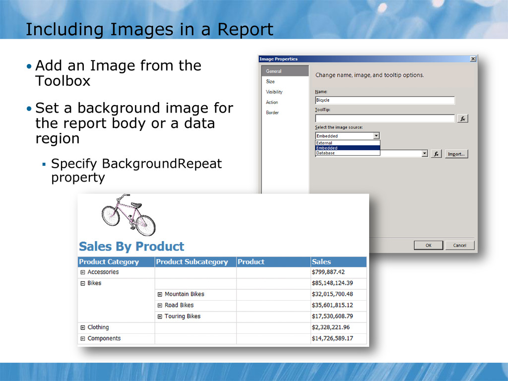
Body Data Source(s) Dataset(s) <Report xmlns="http://schemas.microsoft.com/sqlserver/reporting/2008/01/reportdefinition" xmlns:rd="http://schemas.microsoft.com/SQLServer/reporting/reportdesigner"> <Body> <ReportItems> … </ReportItems> </Body> <DataSources> <DataSource Name="MyDataSource"> … </DataSource> </DataSources> <DataSets> <DataSet Name="MyDataset"> … </DataSet> </DataSets> </Report> Embedded data source definition or a reference to a shared data source Embedded dataset definition or a reference to a shared dataset
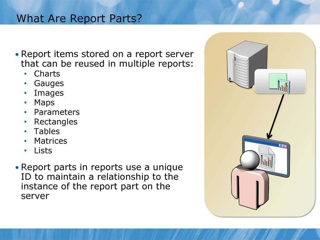
report server that can be reused in multiple reports: • Charts • Gauges • Images • Maps • Parameters • Rectangles • Tables • Matrices • Lists • Report parts in reports use a unique ID to maintain a relationship to the instance of the report part on the server
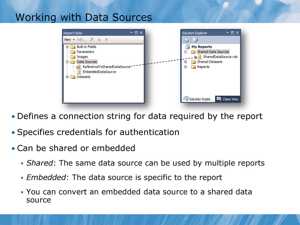
data required by the report • Specifies credentials for authentication • Can be shared or embedded Shared: The same data source can be used by multiple reports Embedded: The data source is specific to the report You can convert an embedded data source to a shared data source
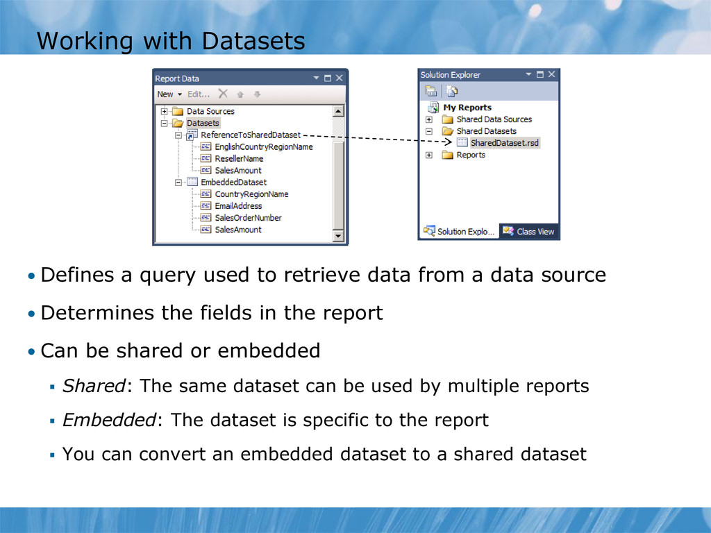
data from a data source • Determines the fields in the report • Can be shared or embedded Shared: The same dataset can be used by multiple reports Embedded: The dataset is specific to the report You can convert an embedded dataset to a shared dataset
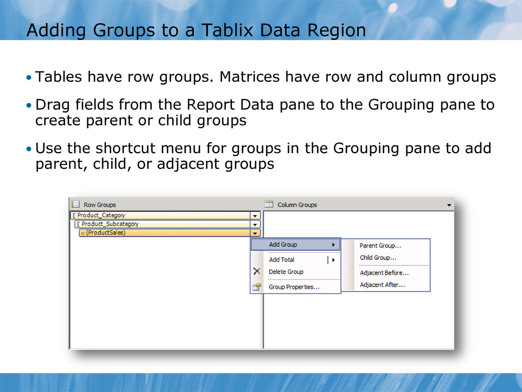
row groups. Matrices have row and column groups • Drag fields from the Report Data pane to the Grouping pane to create parent or child groups • Use the shortcut menu for groups in the Grouping pane to add parent, child, or adjacent groups
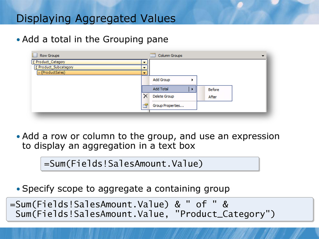
pane • Add a row or column to the group, and use an expression to display an aggregation in a text box • Specify scope to aggregate a containing group =Sum(Fields!SalesAmount.Value) =Sum(Fields!SalesAmount.Value) & " of " & Sum(Fields!SalesAmount.Value, "Product_Category")
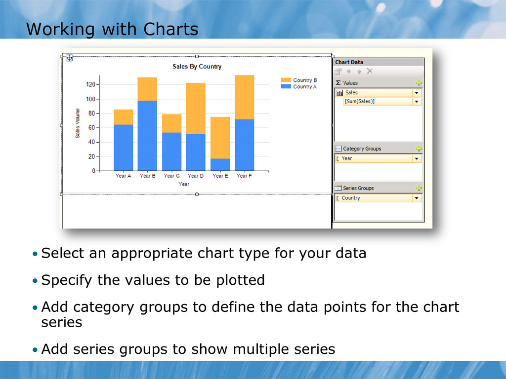
your data • Specify the values to be plotted • Add category groups to define the data points for the chart series • Add series groups to show multiple series
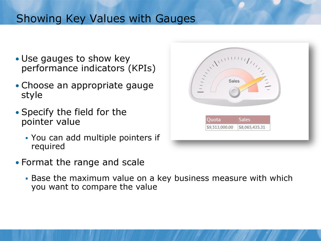
key performance indicators (KPIs) • Choose an appropriate gauge style • Specify the field for the pointer value You can add multiple pointers if required • Format the range and scale Base the maximum value on a key business measure with which you want to compare the value
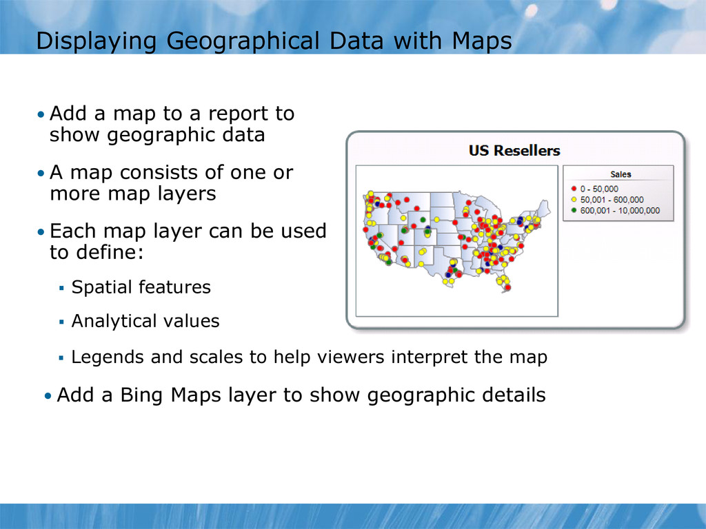
help viewers interpret the map • Add a map to a report to show geographic data • A map consists of one or more map layers • Each map layer can be used to define: Spatial features Analytical values • Add a Bing Maps layer to show geographic details
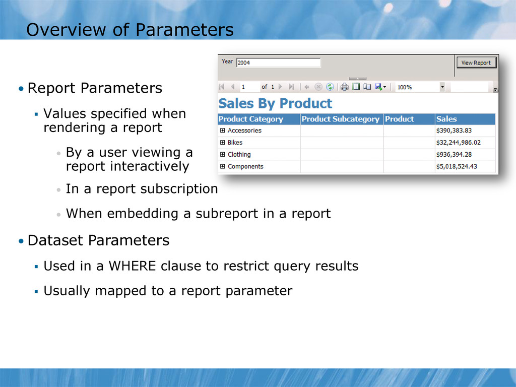
rendering a report • By a user viewing a report interactively • In a report subscription • When embedding a subreport in a report • Dataset Parameters Used in a WHERE clause to restrict query results Usually mapped to a report parameter
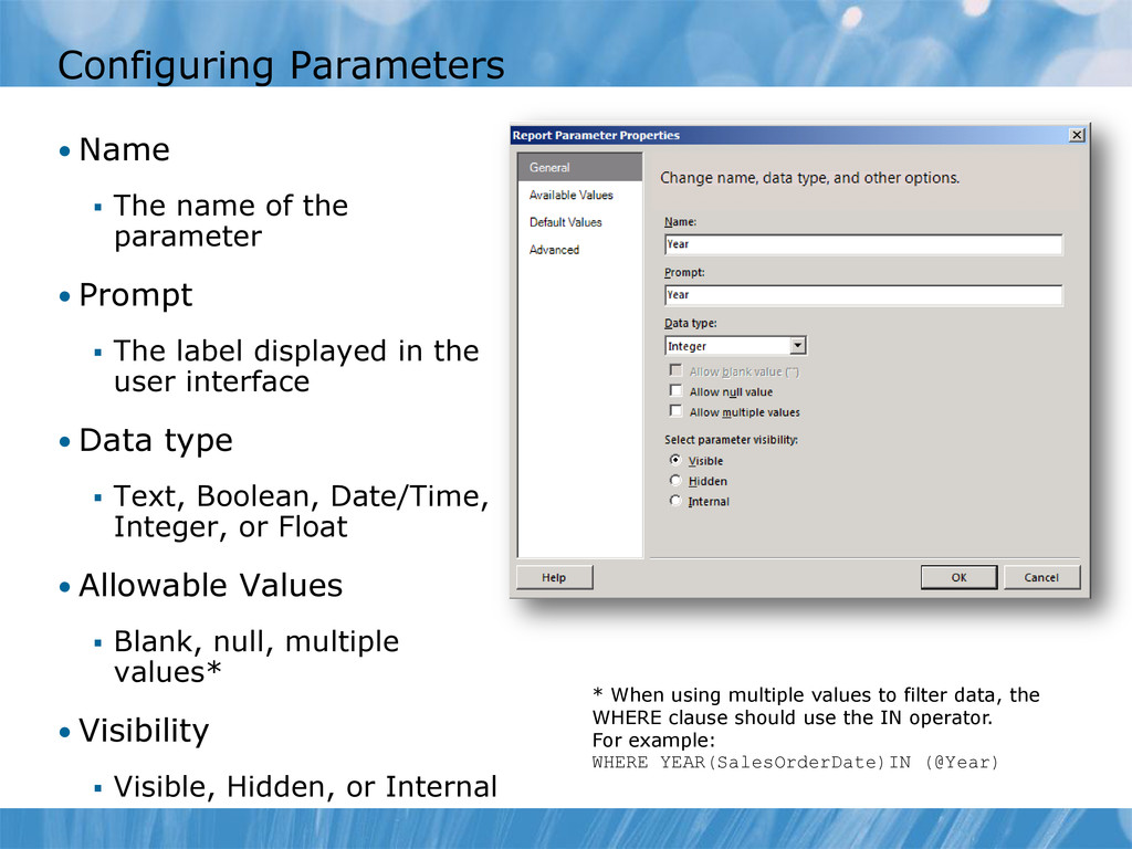
• Prompt The label displayed in the user interface • Data type Text, Boolean, Date/Time, Integer, or Float • Allowable Values Blank, null, multiple values* • Visibility Visible, Hidden, or Internal * When using multiple values to filter data, the WHERE clause should use the IN operator. For example: WHERE YEAR(SalesOrderDate)IN (@Year)
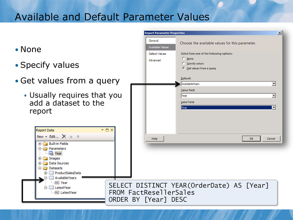
• Get values from a query Usually requires that you add a dataset to the report SELECT DISTINCT YEAR(OrderDate) AS [Year] FROM FactResellerSales ORDER BY [Year] DESC
![What Is MDX? SELECT { ([Measures].[Reseller Sales Amount], [Date].[Calendar Year].[CY](https://files.speakerdeck.com/presentations/5093fee1205e86000200be5a/slide_48.jpg)
![Basic MDX Query Syntax SELECT { ([Measures].[Reseller Sales Amount], [Date].[Calendar](https://files.speakerdeck.com/presentations/5093fee1205e86000200be5a/slide_49.jpg)