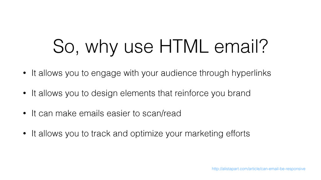
hyperlinks • It allows you to design elements that reinforce you brand • It can make emails easier to scan/read • It allows you to track and optimize your marketing efforts So, why use HTML email? http://alistapart.com/article/can-email-be-responsive
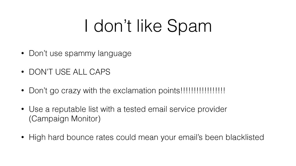
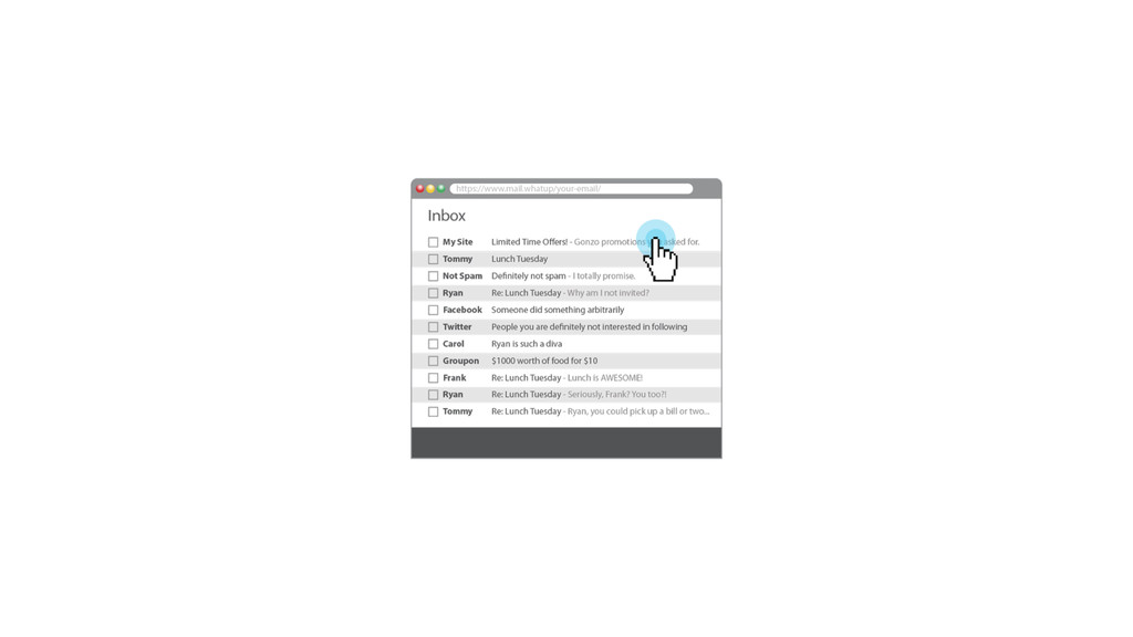
DON’T USE ALL CAPS • Don’t go crazy with the exclamation points!!!!!!!!!!!!!!!!! • Use a reputable list with a tested email service provider (Campaign Monitor) • High hard bounce rates could mean your email’s been blacklisted
(usually the company name or personality) • Don’t use a no-reply as the Reply To ([email protected]) • Make it clear that they subscribed to your email list
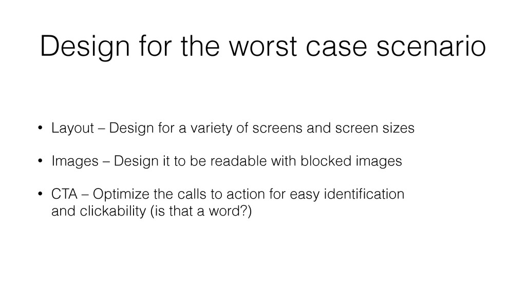
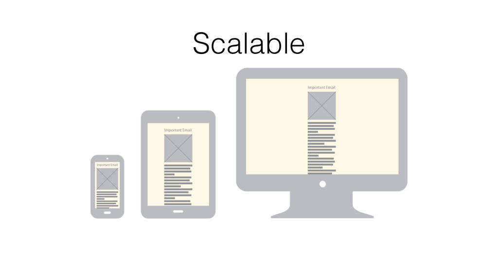
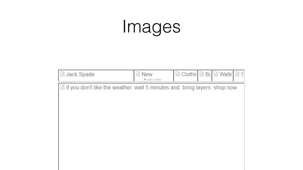
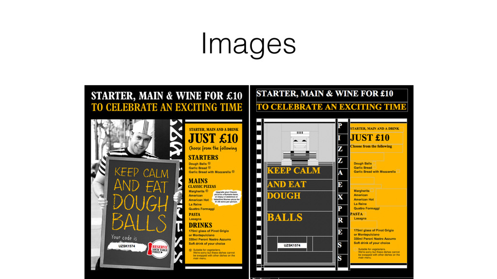
screen sizes • Images – Design it to be readable with blocked images • CTA – Optimize the calls to action for easy identification and clickability (is that a word?) Design for the worst case scenario
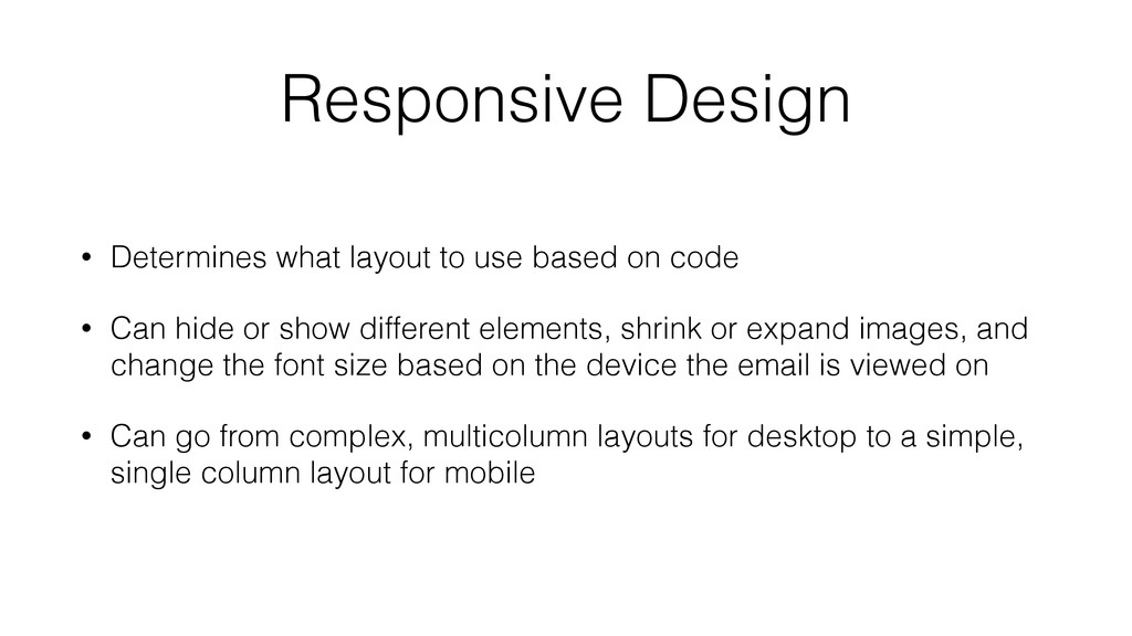
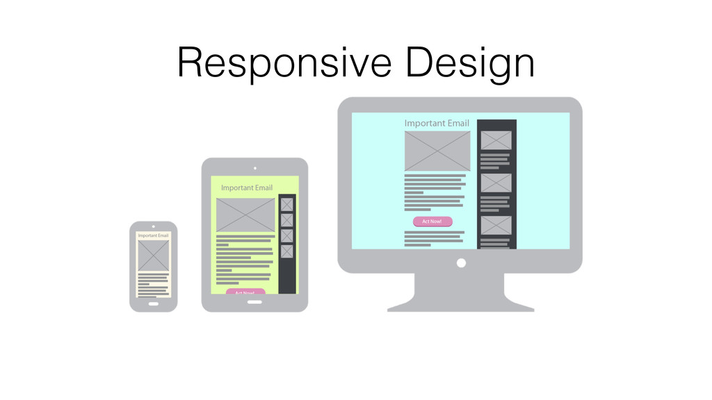
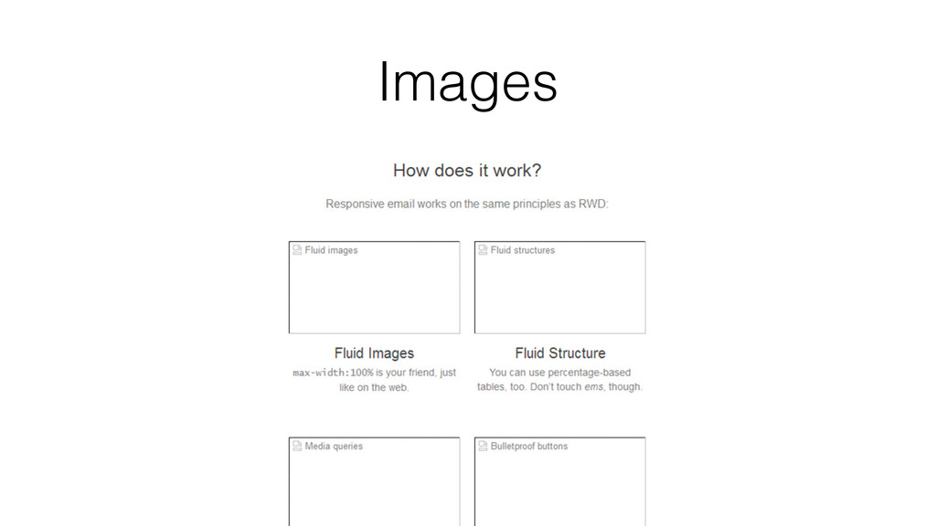
code • Can hide or show different elements, shrink or expand images, and change the font size based on the device the email is viewed on • Can go from complex, multicolumn layouts for desktop to a simple, single column layout for mobile
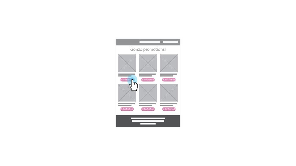
contrast of color, size, shape, and negative space to grab attention • If the email's long, consider repeating the CTA later in the email Call-to-action (CTA)
to make this easier to do) • Actually use the data, don't rely on other campaigns; every audience is different and responds differently • Always check what your layout looks like on multiple devices. • Read email blogs; there is always new research to use Test. Test. Test.
 falldowngoboone
 shoko_seven11
 hilokifigma
 ncdc
ncdc
 design_dolphins
 atsushihomma
 lynteo
 mewmo
mewmo
 saki822
 lw
lw
 ajstarks
 deadlinepoet
 kossykinto
 skipperchong
 aemeredith
 tmiket
 stuffmc
 baasie
 aleyda
.png) helenjbeal
helenjbeal
 jcasabona
 bluesmoon
 elsirapls
 akademiya2063