Upgrade to Pro — share decks privately, control downloads, hide ads and more …

CSS: Computer Style Science

fernahh
November 27, 2016

CSS: Computer Style Science

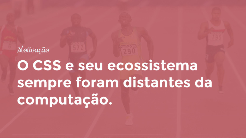
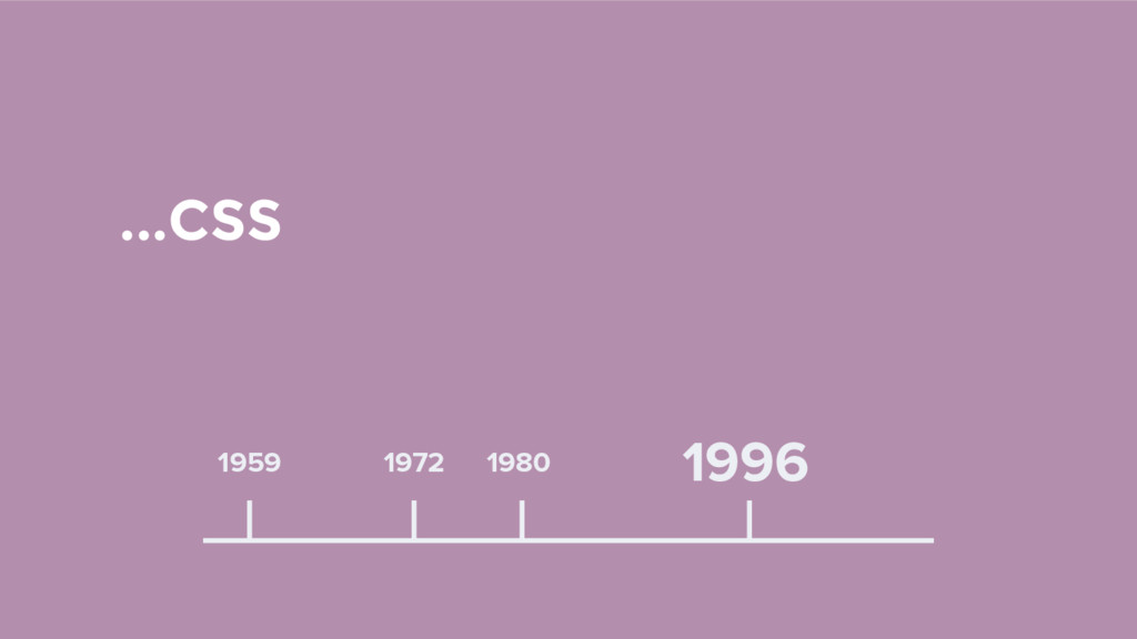
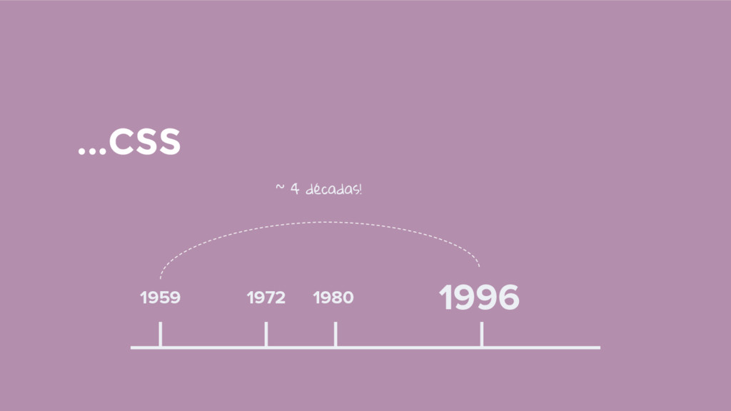
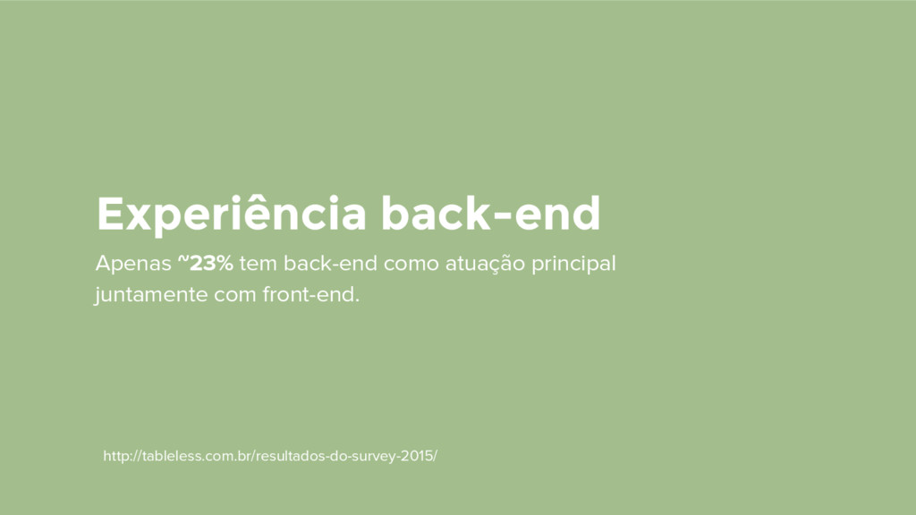
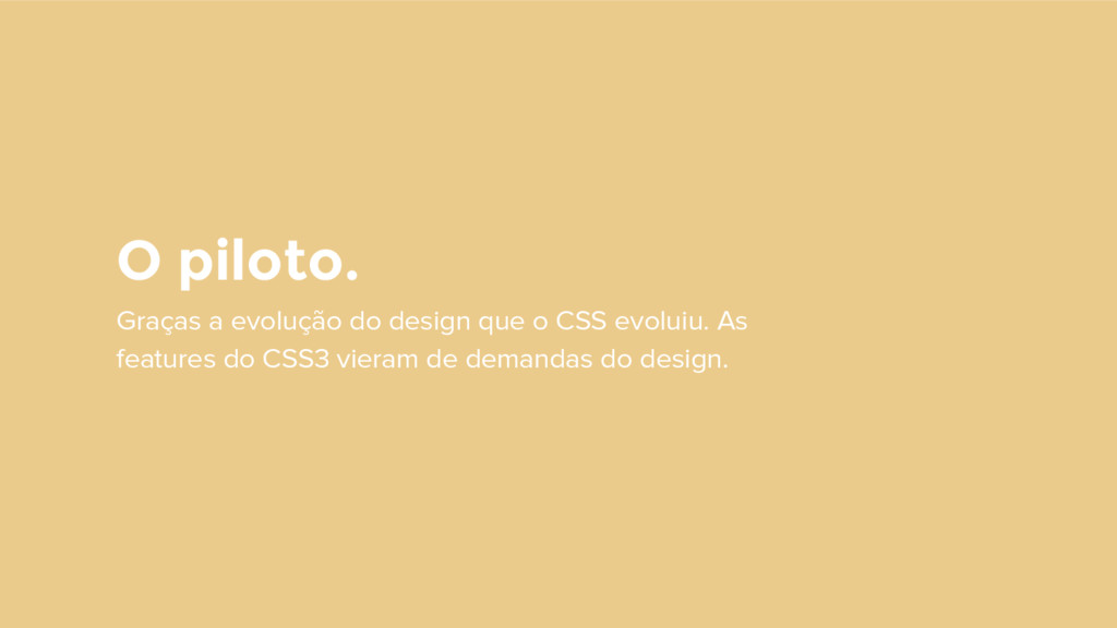
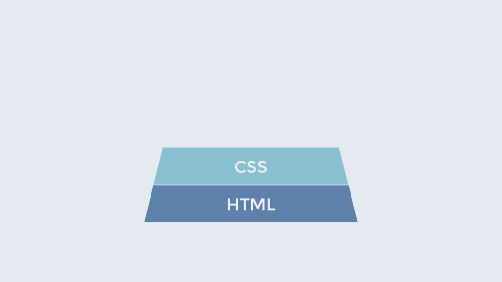
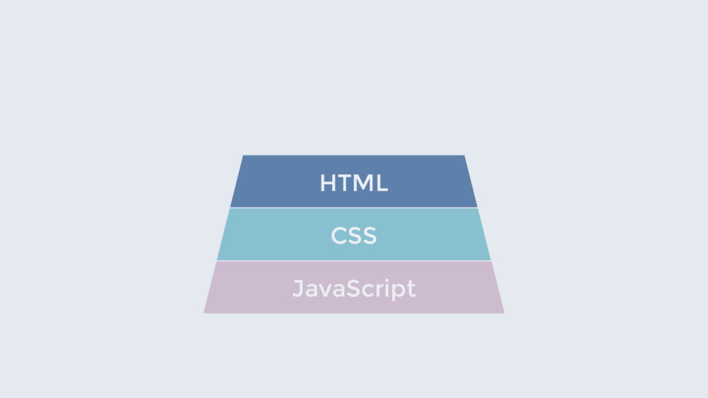
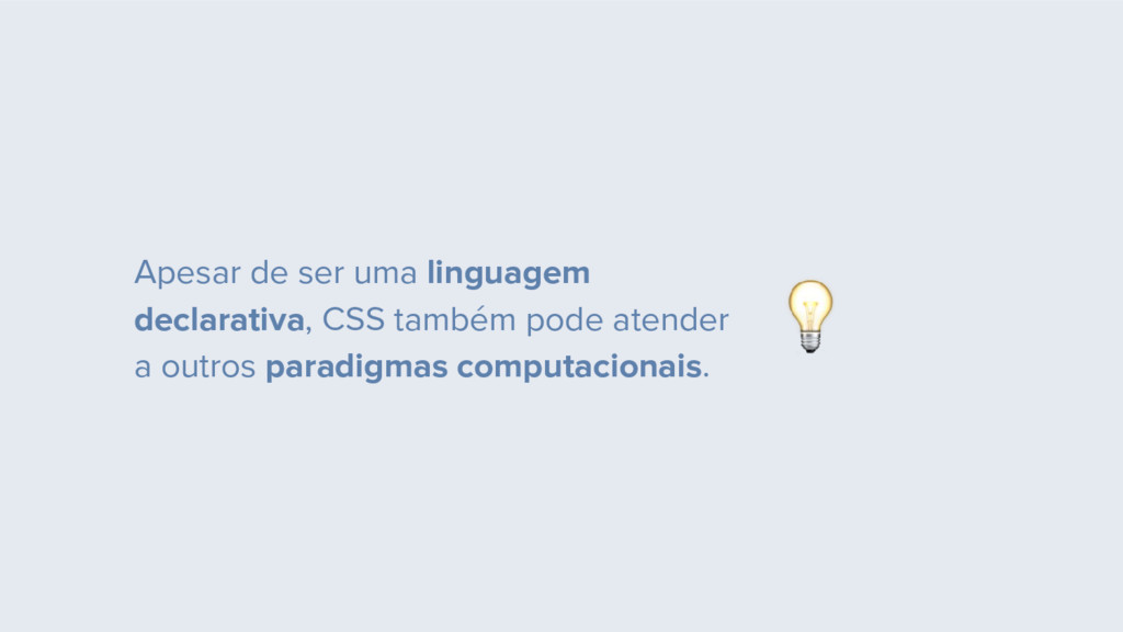
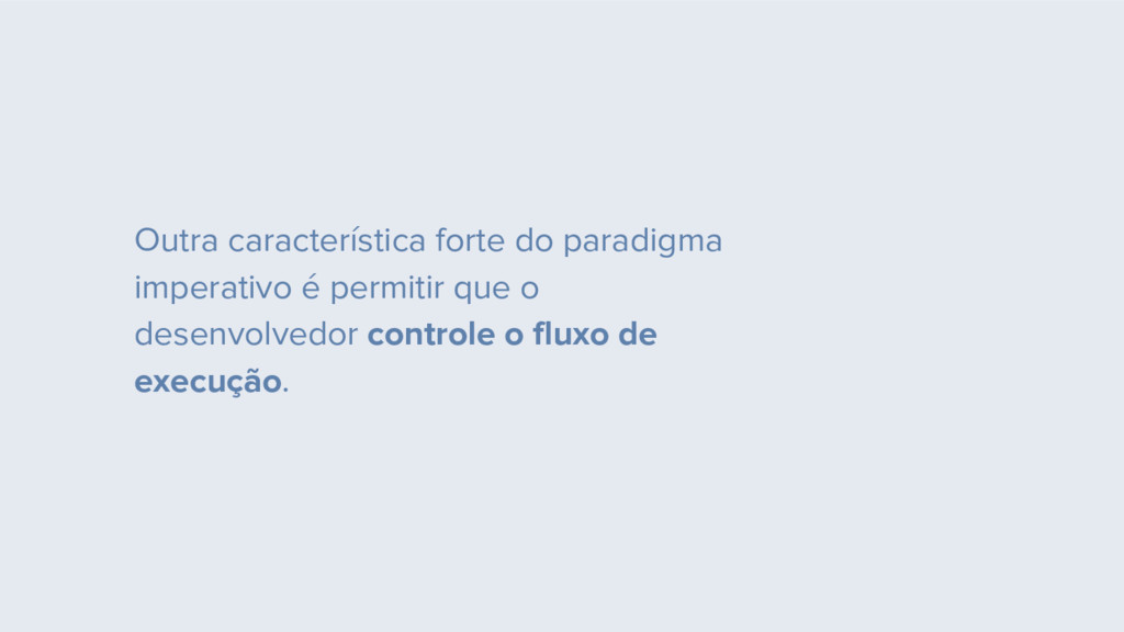
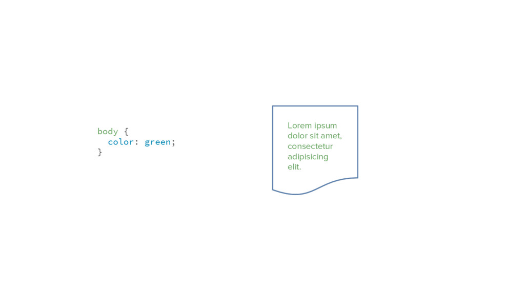
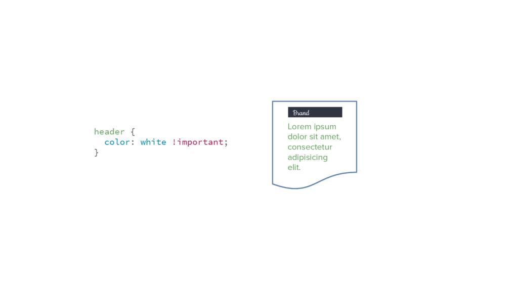
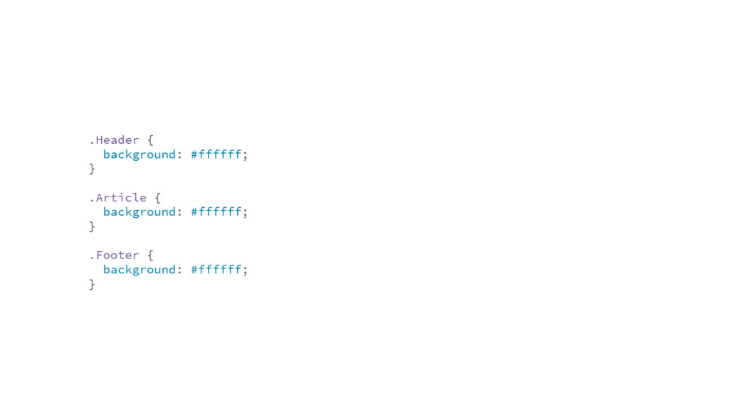
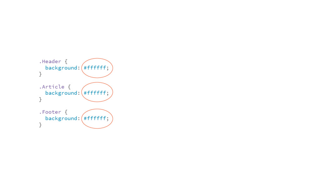
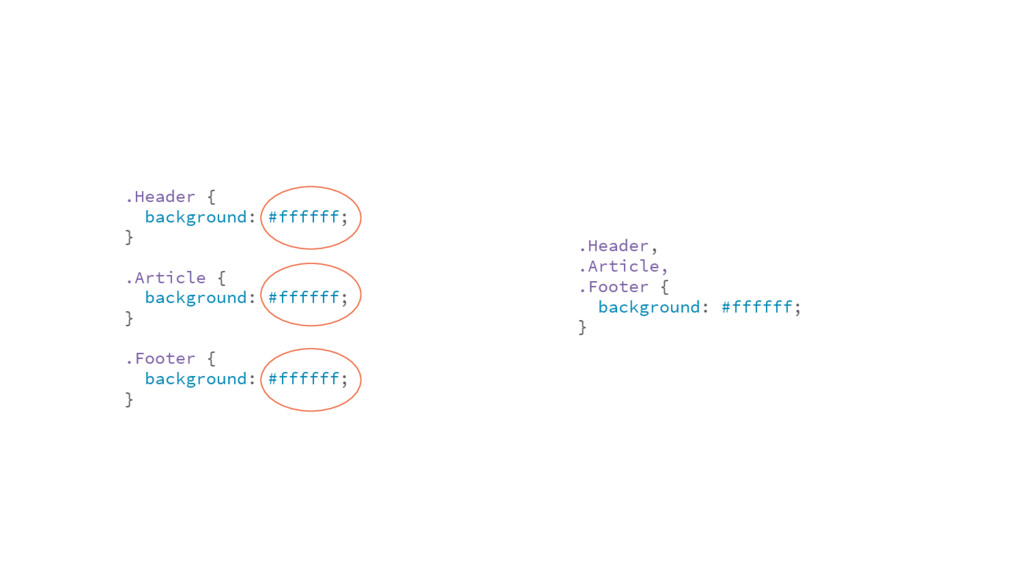
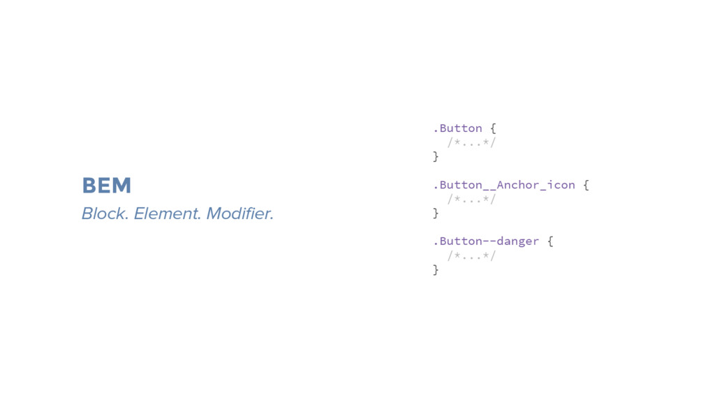
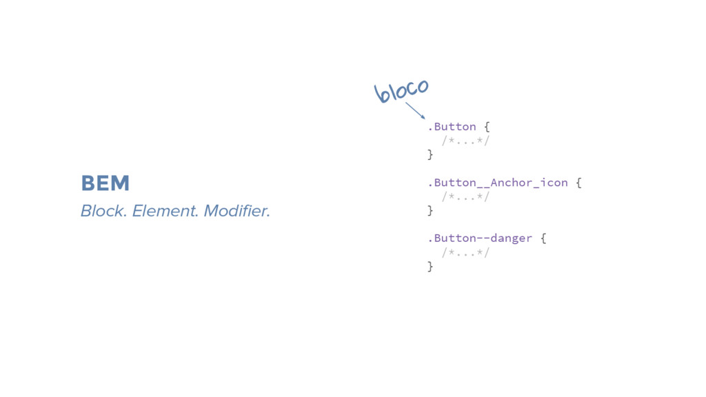
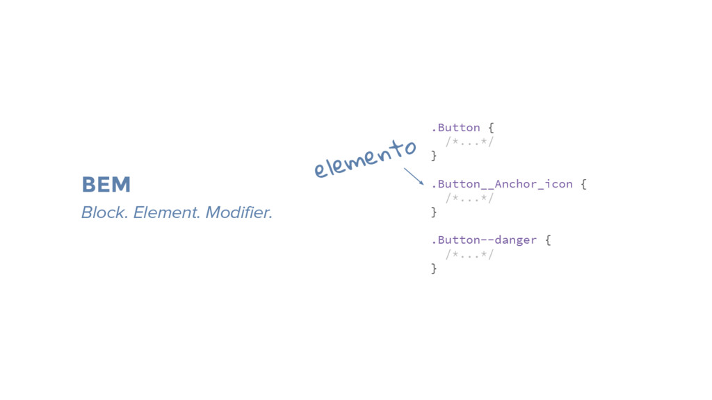
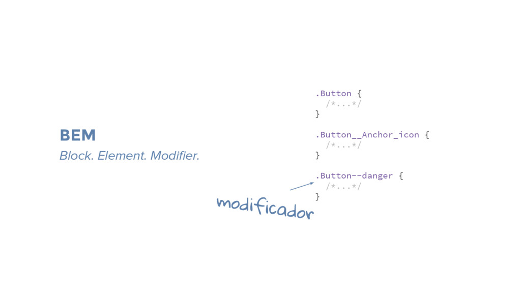
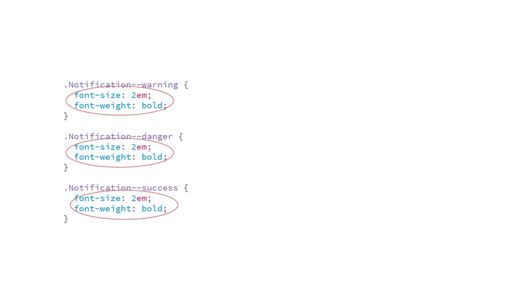
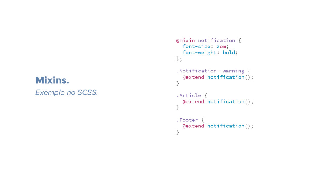
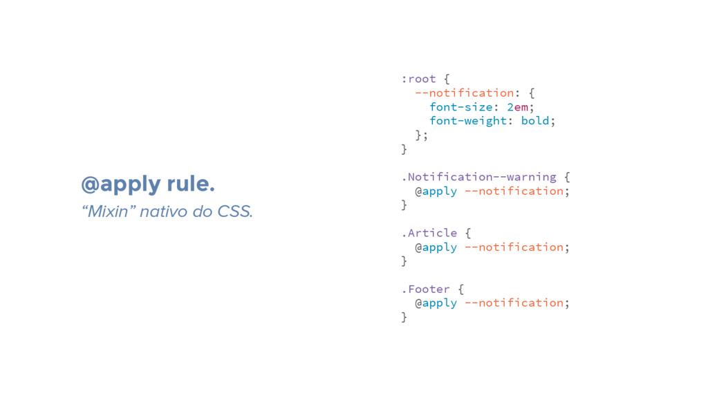
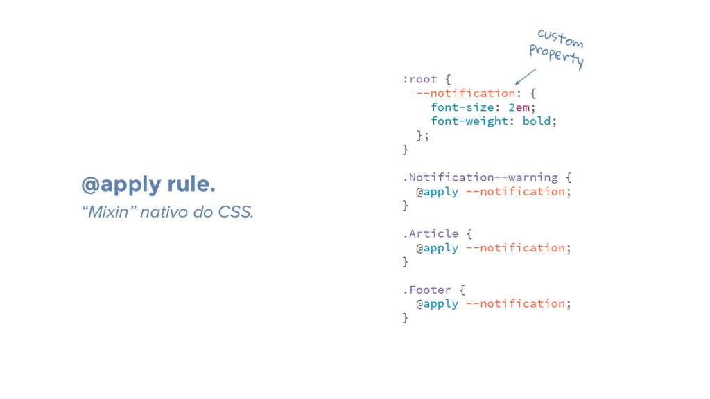
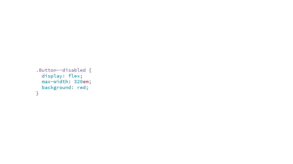
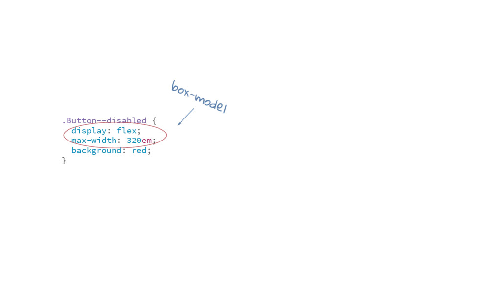
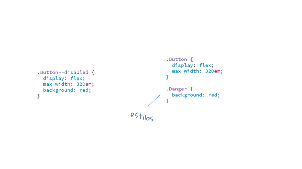
Entre o surgimento da primeira linguagem de programação e o CSS existem quase quatro décadas de diferença. Nesse tempo surgiram diversos conceitos, como a programação funcional, imperativa e orientada a objetos.

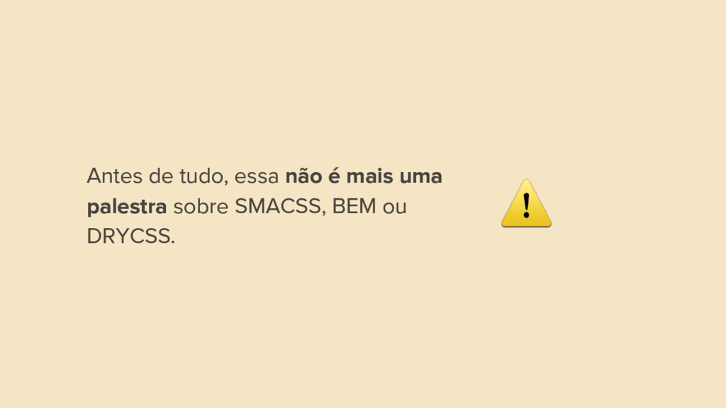
Nessa palestra mostro como podemos aplicar os principais paradigmas da ciência da computação e o como eles podem nos auxiliar na hora de escrevermos CSS.

fernahh

November 27, 2016
Tweet

More Decks by fernahh

Other Decks in Programming

Transcript

  1. “Designing simple style sheets is easy. One needs only to

    know a little HTML and some basic desktop publishing terminology. E.g., to set the text color of 'H1' elements to blue, one can say: H1 { color: blue }; The example is a simple CSS rule”
  2. “Designing simple style sheets is easy. One needs only to

    know a little HTML and some basic desktop publishing terminology. E.g., to set the text color of 'H1' elements to blue, one can say: H1 { color: blue }; The example is a simple CSS rule”
  3. Comunidade jovem ~76% dos profissionais tem menos de 30 anos,

    sendo que quase metade tem menos de 25 anos!
  4. Experiência back-end Apenas ~23% tem back-end como atuação principal juntamente

    com front-end. http://tableless.com.br/resultados-do-survey-2015/
  5. Fragmentação Além de já ser uma comunidade bastante específica, estamos

    nos dividindo entre “ui developers” e “javascript developers”.
  6. O piloto. Graças a evolução do design que o CSS

    evoluiu. As features do CSS3 vieram de demandas do design.
  7. O JavaScript se tornou o principal pilar da web. Além

    de comportamento, ele entrega conteúdo e (algumas vezes) é responsável pelo estilo de uma página web.
  8. html { font-family: sans-serif; line-height: 1.15; } body { margin:

    0; } article, aside, footer, header, section { display: block; } h1 { font-size: 2em; margin: 0.67em 0; }
  9. html { font-family: sans-serif; line-height: 1.15; } body { margin:

    0; } article, aside, footer, header, section { display: block; } h1 { font-size: 2em; margin: 0.67em 0; }
  10. html { font-family: sans-serif; line-height: 1.15; } body { margin:

    0; } article, aside, footer, header, section { display: block; } h1 { font-size: 2em; margin: 0.67em 0; } normalize.css 461 linhas. (com comentários)
  11. /* ========================== Section comment block ========================== */ /* Sub-section comment

    block ========================== */ /** * Short description using * Doxygen-style comment format * * The first sentence of the long * description starts here and * continues on this * line for a while finally concluding * here at the end of this paragraph. * */ /* Basic comment */ idiomatic-css https://github.com/necolas/idiomatic-css
  12. Outra característica forte do paradigma imperativo é permitir que o

    desenvolvedor controle o fluxo de execução.
  13. .Header { background: #ffffff; } .Article { background: #ffffff; }

    .Footer { background: #ffffff; } .Header, .Article, .Footer { background: #ffffff; }
  14. .Button { /*...*/ } .Button__Anchor_icon { /*...*/ } .Button--danger {

    /*...*/ } BEM Block. Element. Modifier. bloco
  15. .Button { /*...*/ } .Button__Anchor_icon { /*...*/ } .Button--danger {

    /*...*/ } BEM Block. Element. Modifier. elemento
  16. .Button { /*...*/ } .Button__Anchor_icon { /*...*/ } .Button--danger {

    /*...*/ } BEM Block. Element. Modifier. modificador
  17. .comment-box { /*...*/ } .comment-box.is-open { /*...*/ } .button-black {

    /*...*/ } SMACSS Scalable and Modular Architecture for CSS.
  18. .comment-box { /*...*/ } .comment-box.is-open { /*...*/ } .button-black {

    /*...*/ } SMACSS Scalable and Modular Architecture for CSS. módulo
  19. .comment-box { /*...*/ } .comment-box.is-open { /*...*/ } .button-black {

    /*...*/ } SMACSS Scalable and Modular Architecture for CSS. estado
  20. .comment-box { /*...*/ } .comment-box.is-open { /*...*/ } .button-black {

    /*...*/ } SMACSS Scalable and Modular Architecture for CSS. tema
  21. Variáveis. Exemplo no SCSS. $bgColor: #ffffff; .Header { background: $bgColor;

    } .Article { background: $bgColor; } .Footer { background: $bgColor; }
  22. :root { --bgColor: #ffffff; } .Header { background: var(--bgColor); }

    .Article { background: var(--bgColor); } .Footer { background: var(--bgColor); } Custom Properties. “Variáveis” nativas do CSS.
  23. .Notification--warning { font-size: 2em; font-weight: bold; } .Notification--danger { font-size:

    2em; font-weight: bold; } .Notification--success { font-size: 2em; font-weight: bold; }
  24. .Notification--warning { font-size: 2em; font-weight: bold; } .Notification--danger { font-size:

    2em; font-weight: bold; } .Notification--success { font-size: 2em; font-weight: bold; }
  25. @mixin notification { font-size: 2em; font-weight: bold; }; .Notification--warning {

    @extend notification(); } .Article { @extend notification(); } .Footer { @extend notification(); } Mixins. Exemplo no SCSS.
  26. :root { --notification: { font-size: 2em; font-weight: bold; }; }

    .Notification--warning { @apply --notification; } .Article { @apply --notification; } .Footer { @apply --notification; } @apply rule. “Mixin” nativo do CSS.
  27. :root { --notification: { font-size: 2em; font-weight: bold; }; }

    .Notification--warning { @apply --notification; } .Article { @apply --notification; } .Footer { @apply --notification; } @apply rule. “Mixin” nativo do CSS. custom property
  28. PostCSS é a crista da onda. Possui mais de 200

    plugins, é bem aceito pela comunidade e future proof!
  29. A era pós CSS3. A evolução das specs CSS estão

    rápidas e próximas dos approaches.
  30. Orientação a Objetos Possui classes que definem objetos de um

    sistema. Cada uma dessas especifica o comportamento e estados de seus objetos e o relacionamento com outros objetos.
  31. OOCSS foi importante para a sua época. Porém, desde 2011

    não há mais atualizações em sua especificação.
  32. O paradigma de Orientação a Objetos não se limita a

    implementação sugerida pelo OOCSS.
  33. .Button { display: flex; max-width: 320em; } .Button--disabled { display:

    flex; max-width: 320em; background: red; } box-model
  34. .Button { display: flex; max-width: 320em; } .Danger { background:

    red; } .Button--disabled { display: flex; max-width: 320em; background: red; } estilos
  35. Open Closed Principle: quando você tem uma abstração, ao invés

    de modificá-la, permita que ela possa ser estendida ou usada para compor algo.
  36. O @extend do Sass foi um grande vilão de projetos

    que estendem classes de frameworks CSS.
  37. .btn { display: block; /*...*/ } .btn-login { @extend .btn;

    } .btn, .btn-login { display: block; /*...*/ }
  38. .btn { display: block; /*...*/ } .btn-login { @extend .btn;

    } .header .btn { background: red; /*...*/ }
  39. .btn { display: block; /*...*/ } .btn-login { @extend .btn;

    }; .header .btn { background: red; /*...*/ };
  40. .btn { display: block; /*...*/ }; .btn-login { @extend .btn;

    } .header .btn { background: red; /*...*/ }
  41. .btn { display: block; /*...*/ } .btn-login { @extend .btn;

    } .header .btn { background: red; /*...*/ } .btn, .btn-login { display: block; /*...*/ } .header .btn, .header .btn-login { background: red; /*...*/ }
  42. Dica de ouro: se for usar @extend no Sass, evite

    usar classes, vá de placeholders.
  43. :root { --notification: { font-size: 2em; font-weight: bold; }; }

    .Notification--warning { @apply --notification; } .Article { @apply --notification; } .Footer { @apply --notification; } herança com @apply rule.
  44. :root { --fold: { /*...*/ } } .Card::before { @apply

    --fold; } Lorem ipsum dolor sit amet, consectetur adipisicing elit.
  45. Lembre-se: custom properties funcionam da mesma forma que as outras,

    ou seja, são manipuladas pelo efeito cascata.
  46. Programação Funcional É inspirado em funções matemáticas, ou seja, dado

    uma entrada você terá sempre a mesma saída. O paradigma funcional busca manter qualquer valor imutável.
  47. Precisávamos de uma classe que colocasse 100% de largura em

    botões. But, não tínhamos botões flexíveis componentizado...
  48. Imutabilidade: nos dá uma das coisas mais difíceis de se

    ter em CSS: confiança de que o que você escrever é o que vai ser renderizado.
  49. .no-text-transform { text-transform: none !important; } .no-padding-bottom { padding-bottom: 0

    !important; } .no-padding-top { padding-top: 0 !important; } Uma das formas de garantirmos a imutabilidade de uma classe é usando !important.