Upgrade to Pro — share decks privately, control downloads, hide ads and more …

Web Components 100% reutilizables

Web Components 100% reutilizables

En esta charla explico como crear Web Components y como usarlos en React, Svelte y Angular

Avatar for Freddy Montes

Freddy Montes

November 02, 2019
Tweet

More Decks by Freddy Montes

Other Decks in Programming

Transcript

  1. Freddy Montes @fmontes Lead Frontend Developer Web Designer @ DotCMS

    • Angular • Node • React • Web Components
  2. ¿De qué les voy a hablar hoy? ¿Qué son Web

    Components? y que solucionan 1 Como crearlos con LitElement 2 Como usarlos en React, Svelte y Angular 3
  3. ¿En qué se parecen a los componentes de frameworks? •

    Pueden o no tener state • Propiedades • Eventos • Encapsulan sus estilos • Lifecycle métodos o hooks
  4. – Chrome Platform Status Eso convierte a los Web Components

    en una de las características de plataforma web más exitosas lanzada en los últimos cinco años
  5. En resumen… • Web Components te permite desarrollar componentes reutilizables

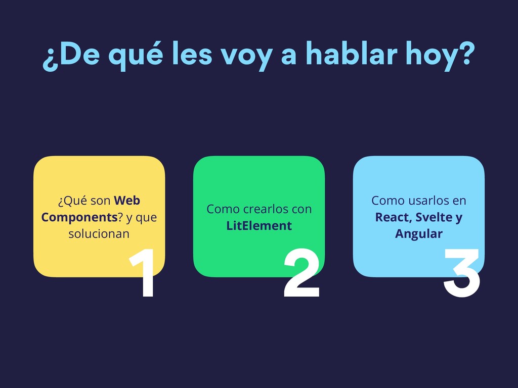
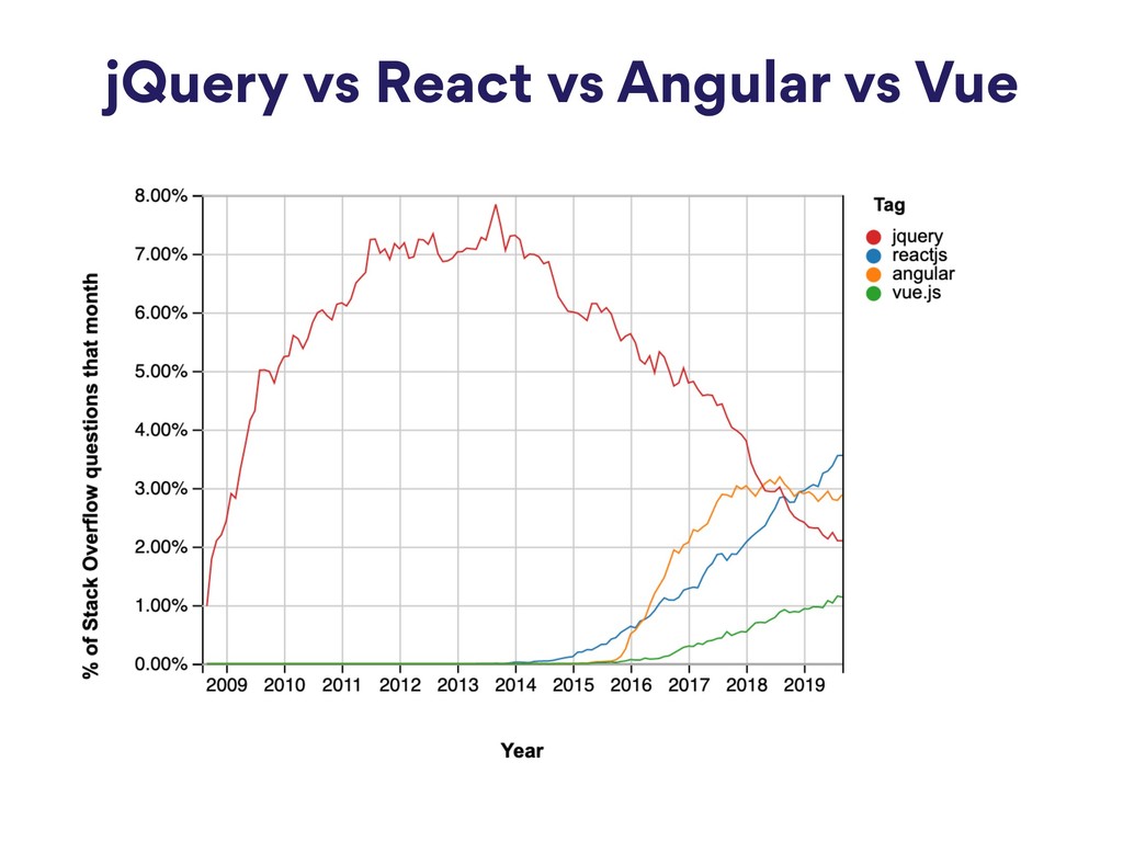
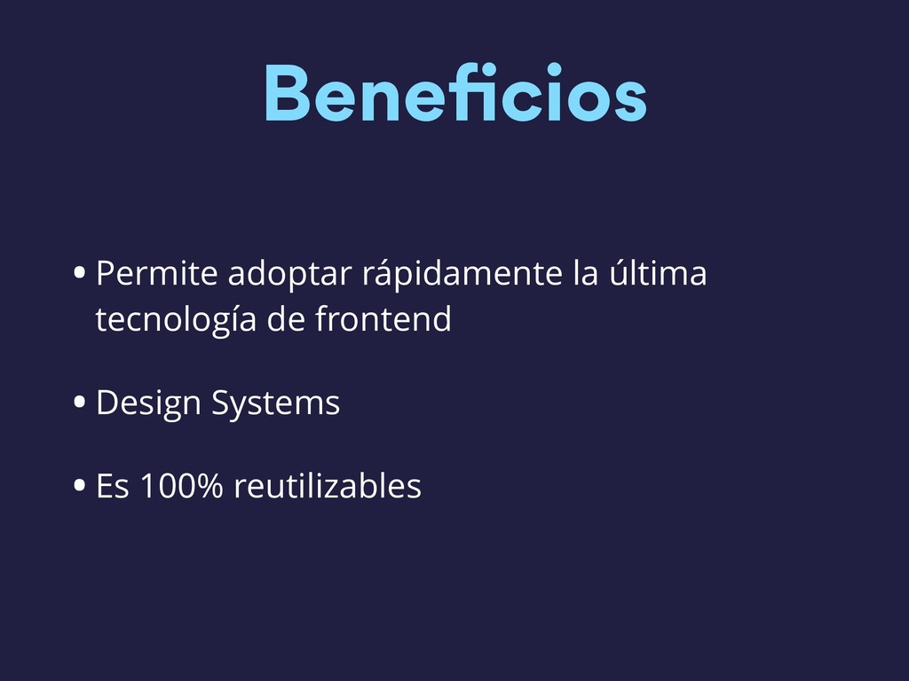
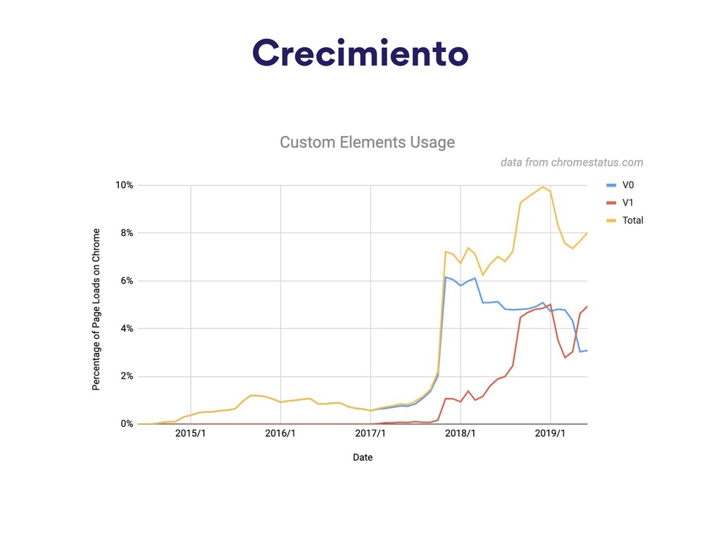
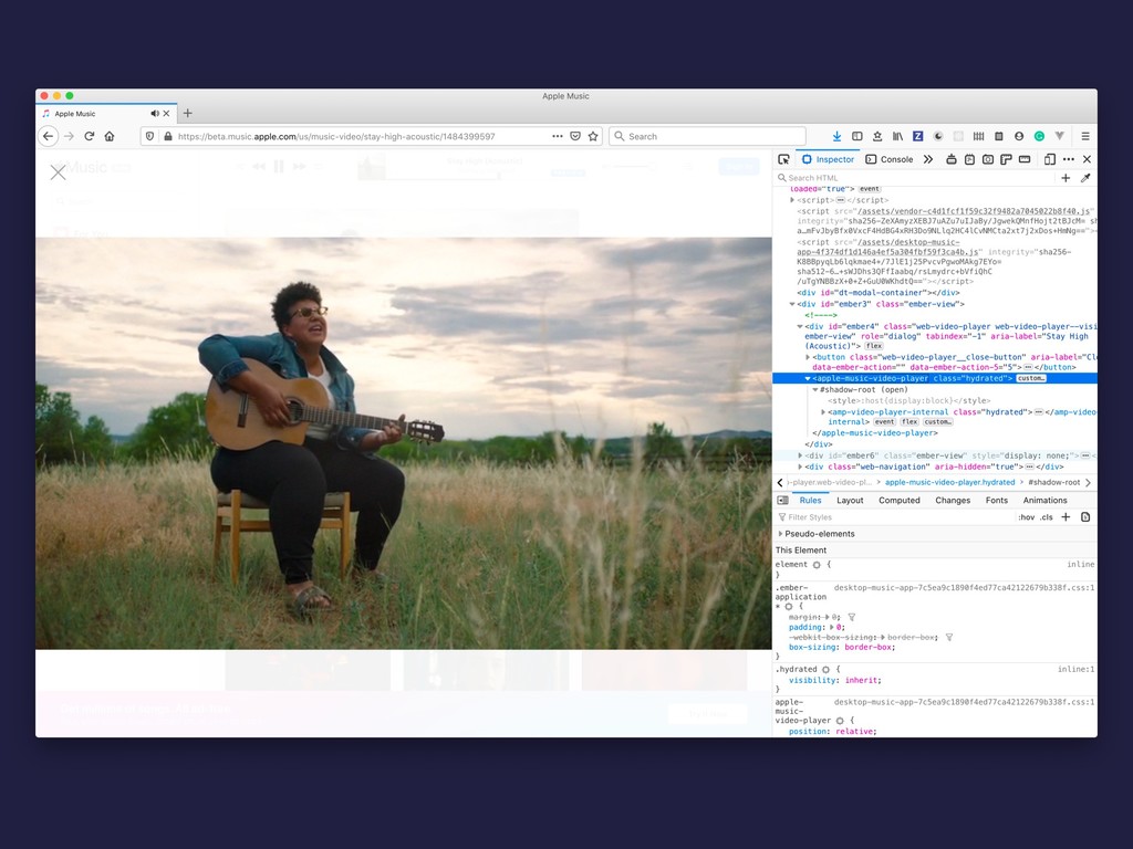
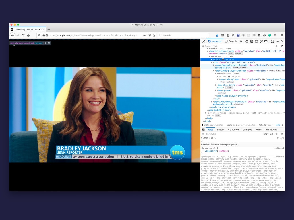
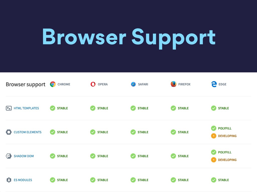
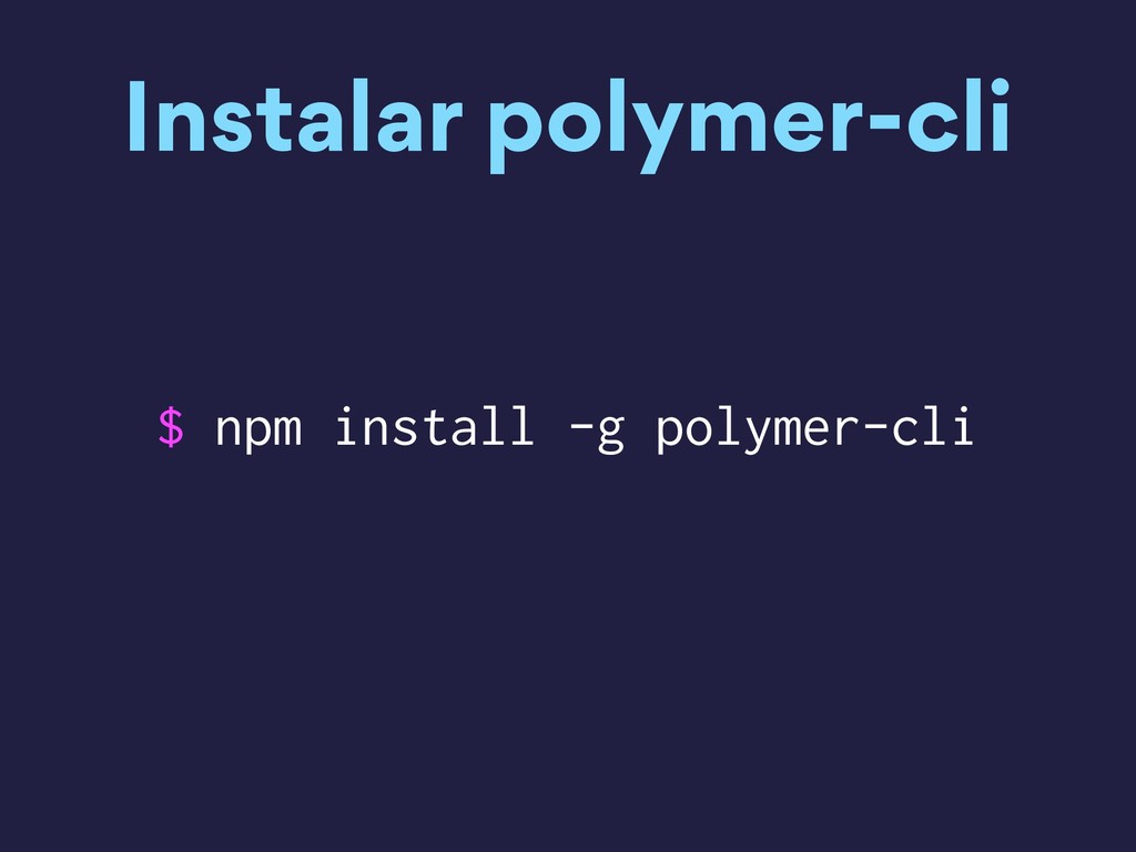
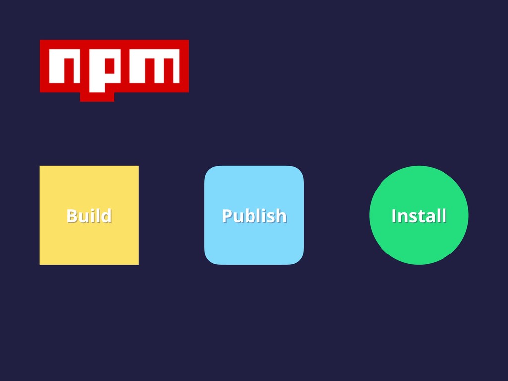
    • 5 y 8% de todas las páginas cargadas en Google Chrome • Usado por Google, Youtube, Apple, Github entre otros • Soportado por la mayoría de los browsers modernos y polyfills • No reemplaza frameworks sino complementa
  6. LitElement • Usa una librería propia de HTML para renderizar

    en el Shadow DOM • Agrega API para administrar propiedades y atributos • Los elementos se actualizan cuando cambian sus propiedades
  7. Inicializamos un proyecto • Creamos una carpeta con el nombre

    que queramos • Corremos $ npm init -y para crear el: package.json • Instalamos lit element $ npm i lit-element
  8. Estructura de archivos !"" src # $"" app-main # $""

    app-main.js !"" index.html $"" styles.css
  9. Index <!DOCTYPE html> <html lang="en"> <head> <meta charset="UTF-8" /> <meta

    name="viewport" content="width=device-width, initial-scale=1.0" /> <meta http-equiv="X-UA-Compatible" content="ie=edge" /> <title>LitElement</title> <script type="module" src="src/app-main/app-main.js"></script> <link rel="stylesheet" href="styles.css" /> </head> <body> <app-main></app-main> </body> </html> index.html
  10. Nuestro primer Web Component import { LitElement, html } from

    'lit-element'; class AppMain extends LitElement { render() { return html` <h1>Hello World</h1> `; } } customElements.define('app-main', AppMain); app-main.js
  11. render method import { LitElement, html } from 'lit-element'; class

    MyElement extends LitElement { render() { return html` <p>template content</p> `; } }
  12. Conditions render() { return html` ${this.myBool? html`<p>Render some HTML if

    myBool is true</p>`: html`<p>Render some other HTML if myBool is false</p>`} `; }
  13. Agregar estilos import { LitElement, css, html } from 'lit-element';

    class MyElement extends LitElement { static get styles() { return css` div { color: red; } `; } render() { return html` <div>I'm styled!</div> `; } }
  14. Estilos al component en si static get styles() { return

    css` :host { display: block; } :host([hidden]) { display: none; } `; }
  15. ¿Como funcionan? 1 Una propiedad puede (o no) reflejarse en

    un atributo del Web Component 2 Cada vez que una propiedad cambia se re-renderea 3 Direct comparison: oldValue !== newValue
  16. Declarar propiedades class MyElement extends LitElement { static get properties()

    { return { mystring: { type: String }, mynumber: { type: Number }, mybool: { type: Boolean } }; } render() { return html`<h1>Hello World</h1>`; } }
  17. Inicializar propiedades import { LitElement, html } from 'lit-element'; class

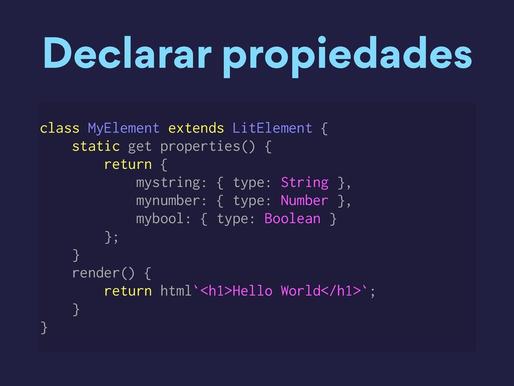
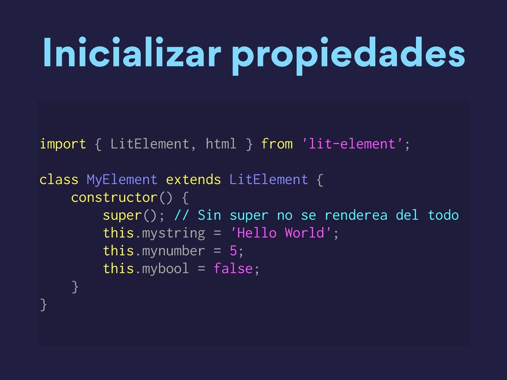
    MyElement extends LitElement { constructor() { super(); // Sin super no se renderea del todo this.mystring = 'Hello World'; this.mynumber = 5; this.mybool = false; } }
  18. Escuchar eventos import { LitElement, html } from 'lit-element'; class

    MyElement extends LitElement { render() { return html`<button @click="${this.handleClick}">`; } }
  19. Eventos globales import { LitElement, html } from 'lit-element'; class

    MyElement extends LitElement { constructor() { super(); this.addEventListener('DOMContentLoaded', this.handleLoaded); } }
  20. Disparar eventos import { LitElement, html } from 'lit-element'; class

    MyElement extends LitElement { mouseoverHandler(e) { let click = new Event('click'); this.dispatchEvent(click); } render() { return html` <div @mouseover="${this.mouseoverHandler}"> Hello World </div> `; } }
  21. Custom Events class MyElement extends LitElement { mouseoverHandler(e) { let

    event = new CustomEvent('my-event', { detail: { message: 'Something important happened' } }); this.dispatchEvent(event); } render() { return html` <div @mouseover="${this.mouseoverHandler}"> Hello World </div> `; } }
  22. Nativos 1. connectedCallback: Se ejecuta cuando se agrega al DOM.

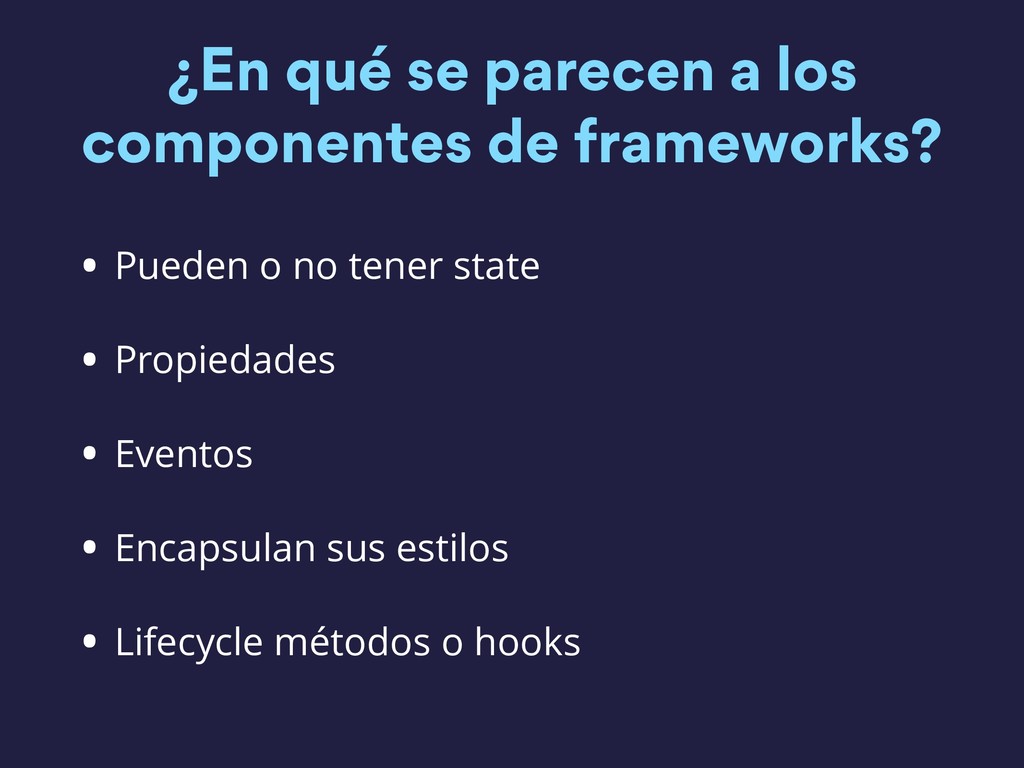
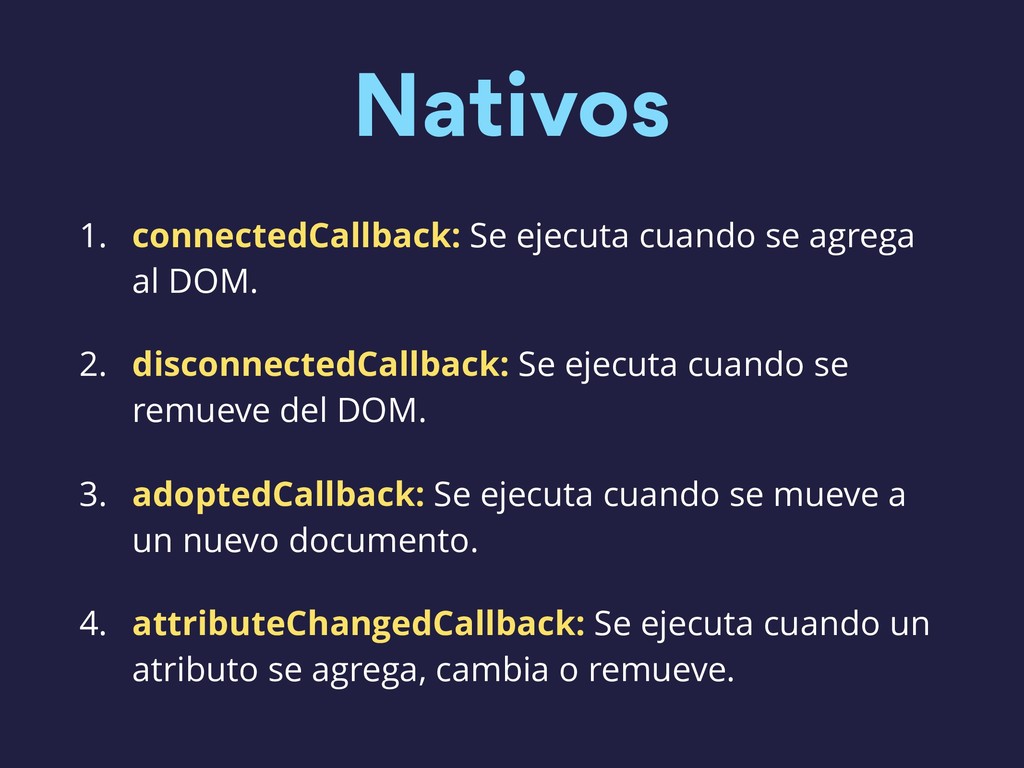
    2. disconnectedCallback: Se ejecuta cuando se remueve del DOM. 3. adoptedCallback: Se ejecuta cuando se mueve a un nuevo documento. 4. attributeChangedCallback: Se ejecuta cuando un atributo se agrega, cambia o remueve.
  23. Eventos en Window o Document class MyElement extends LitElement {

    connectedCallback() { super.connectedCallback(); document.addEventListener('readystatechange', this.handleChange); } disconnectedCallback() { document.removeEventListener('readystatechange', this.handleChange); super.disconnectedCallback(); } }
  24. Web Components • Piezas reusables de UI que se pueden

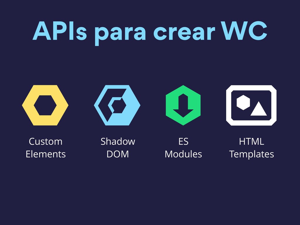
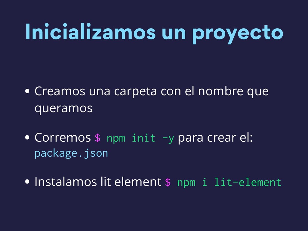
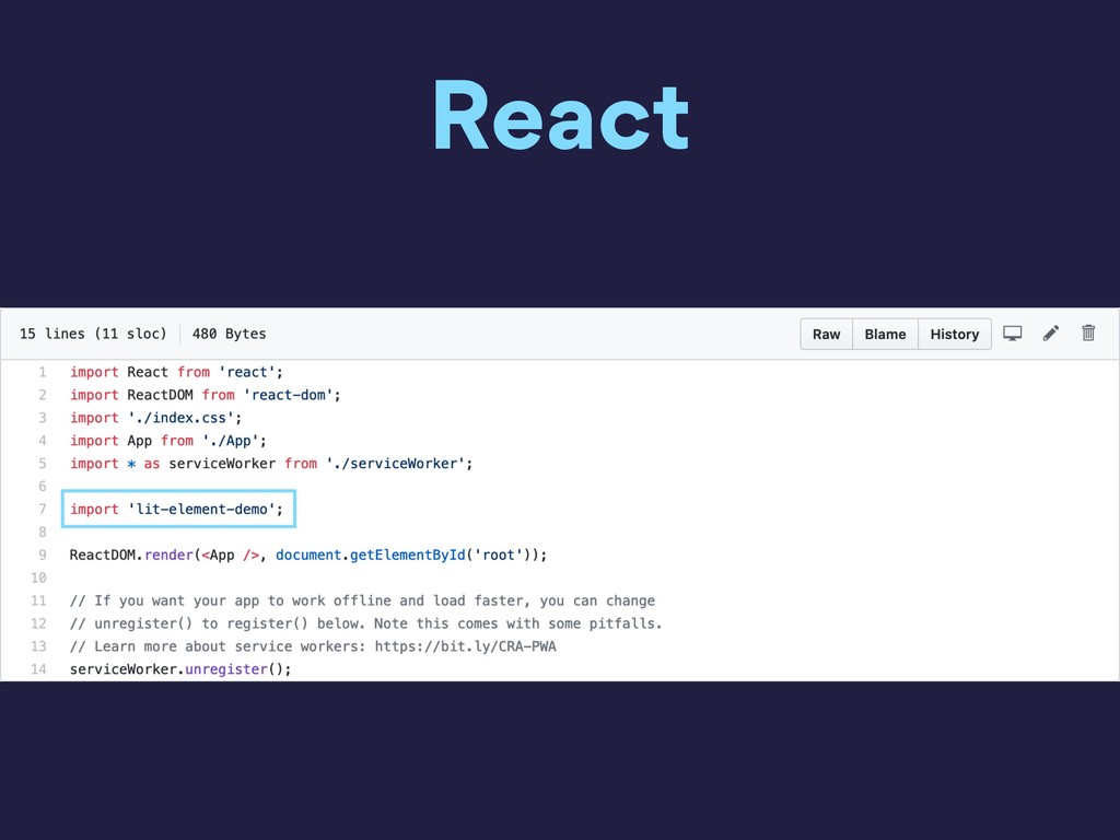
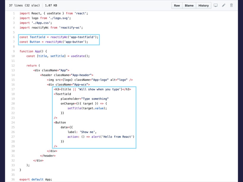
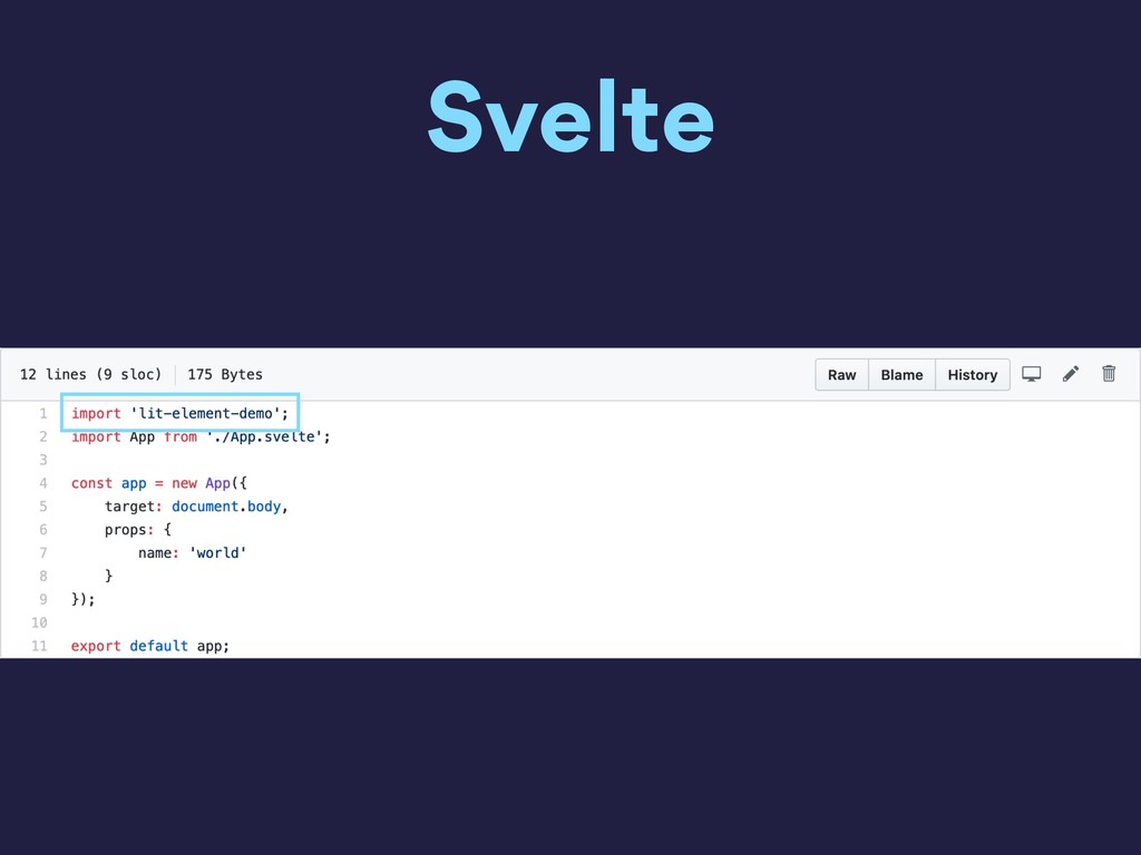
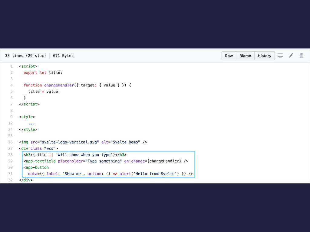
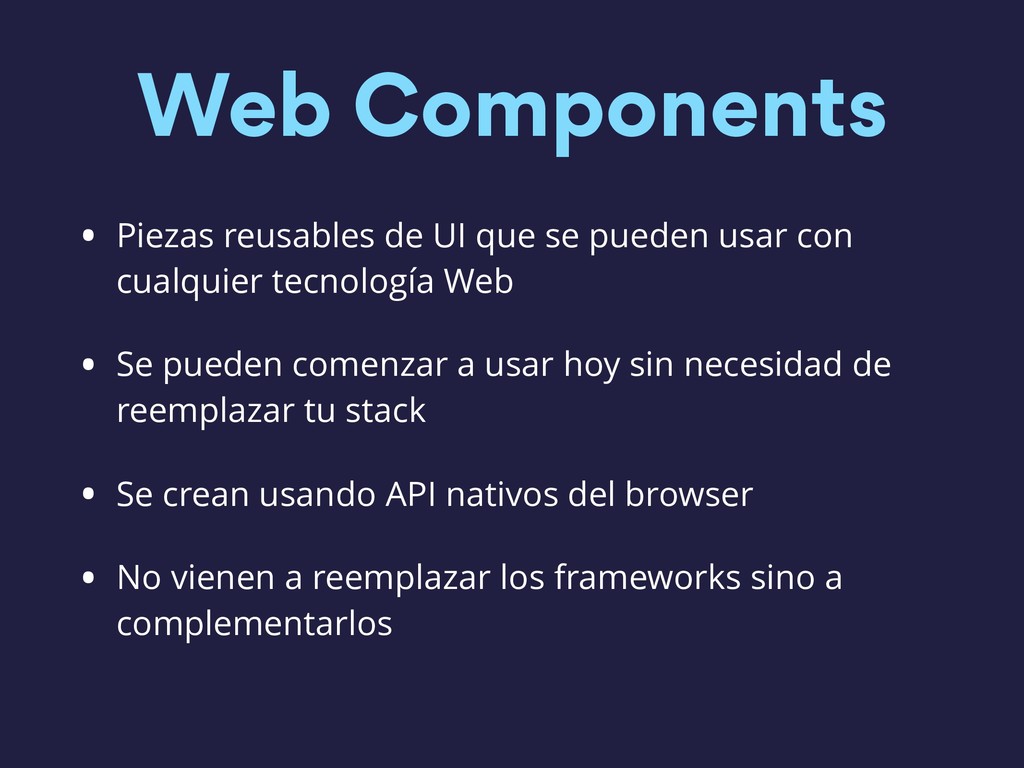
    usar con cualquier tecnología Web • Se pueden comenzar a usar hoy sin necesidad de reemplazar tu stack • Se crean usando API nativos del browser • No vienen a reemplazar los frameworks sino a complementarlos