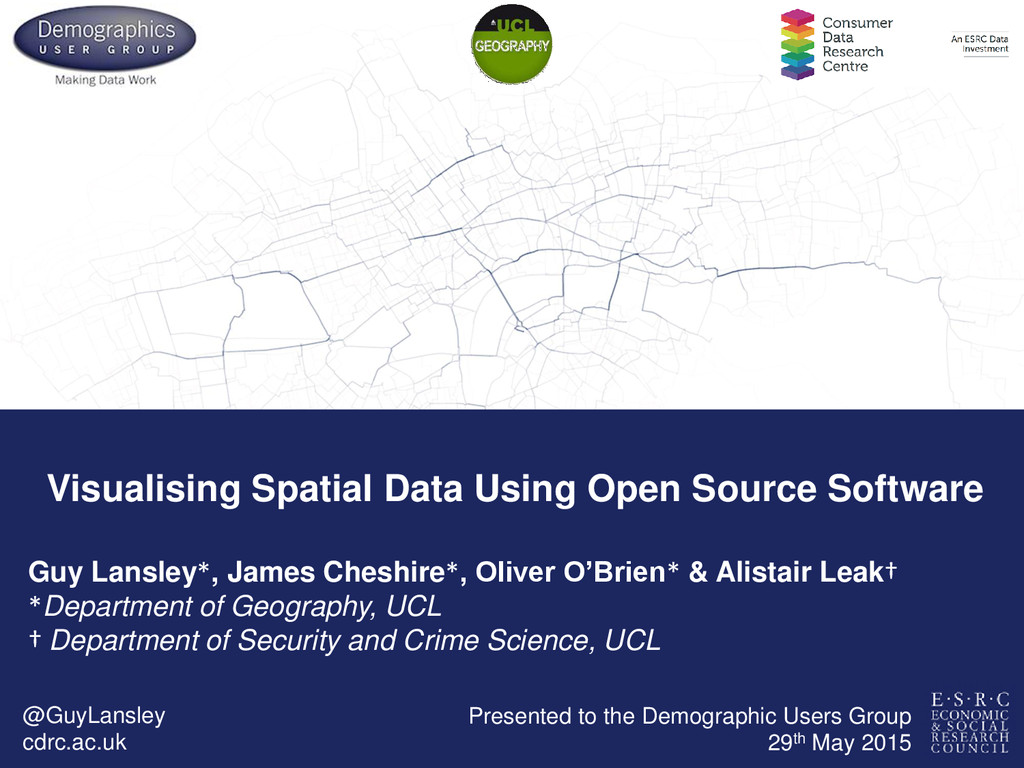
Cheshire*, Oliver O’Brien* & Alistair Leak† *Department of Geography, UCL † Department of Security and Crime Science, UCL @GuyLansley cdrc.ac.uk Presented to the Demographic Users Group 29th May 2015
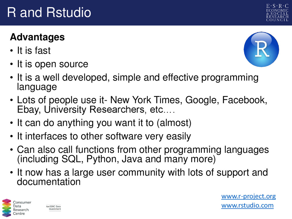
is open source • It is a well developed, simple and effective programming language • Lots of people use it- New York Times, Google, Facebook, Ebay, University Researchers, etc…. • It can do anything you want it to (almost) • It interfaces to other software very easily • Can also call functions from other programming languages (including SQL, Python, Java and many more) • It now has a large user community with lots of support and documentation www.rstudio.com www.r-project.org
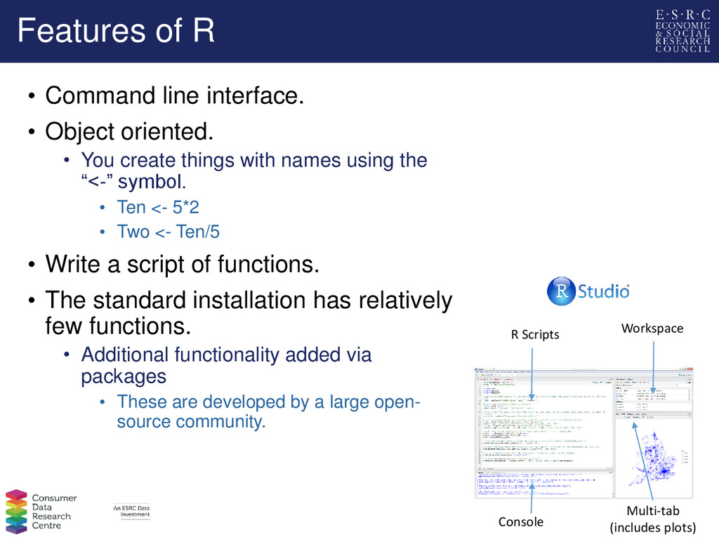
• You create things with names using the “<-” symbol. • Ten <- 5*2 • Two <- Ten/5 • Write a script of functions. • The standard installation has relatively few functions. • Additional functionality added via packages • These are developed by a large open- source community. R Scripts Workspace Console Multi-tab (includes plots)
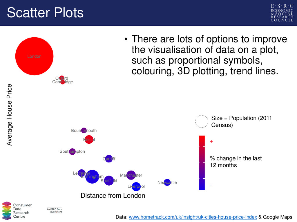
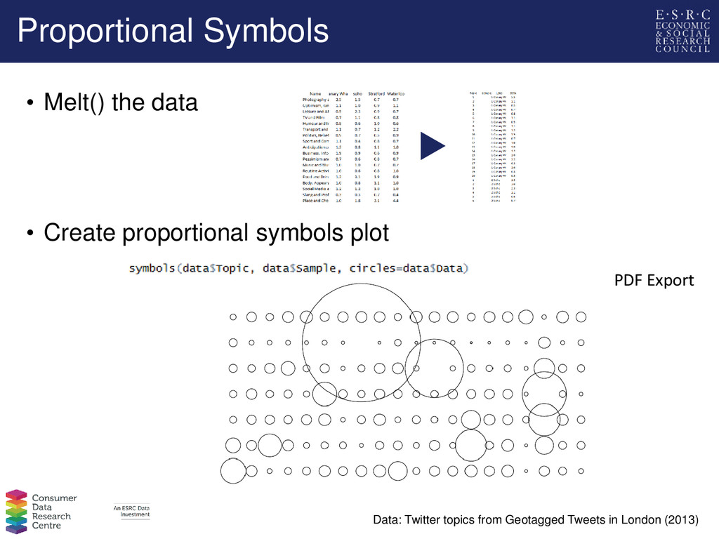
in the last 12 months Data: www.hometrack.com/uk/insight/uk-cities-house-price-index & Google Maps • There are lots of options to improve the visualisation of data on a plot, such as proportional symbols, colouring, 3D plotting, trend lines. Size = Population (2011 Census) + -
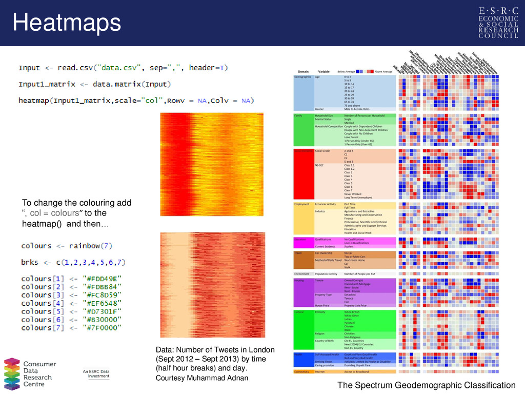
to the heatmap() and then… Data: Number of Tweets in London (Sept 2012 – Sept 2013) by time (half hour breaks) and day. Courtesy Muhammad Adnan The Spectrum Geodemographic Classification
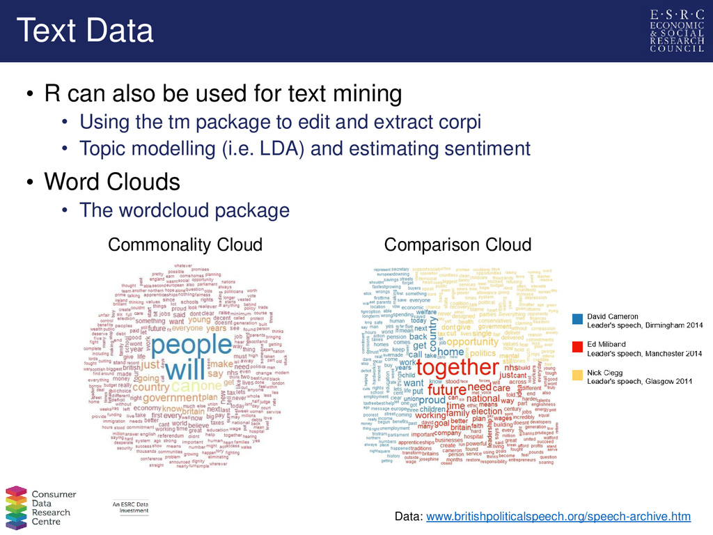
mining • Using the tm package to edit and extract corpi • Topic modelling (i.e. LDA) and estimating sentiment • Word Clouds • The wordcloud package Comparison Cloud Commonality Cloud Data: www.britishpoliticalspeech.org/speech-archive.htm
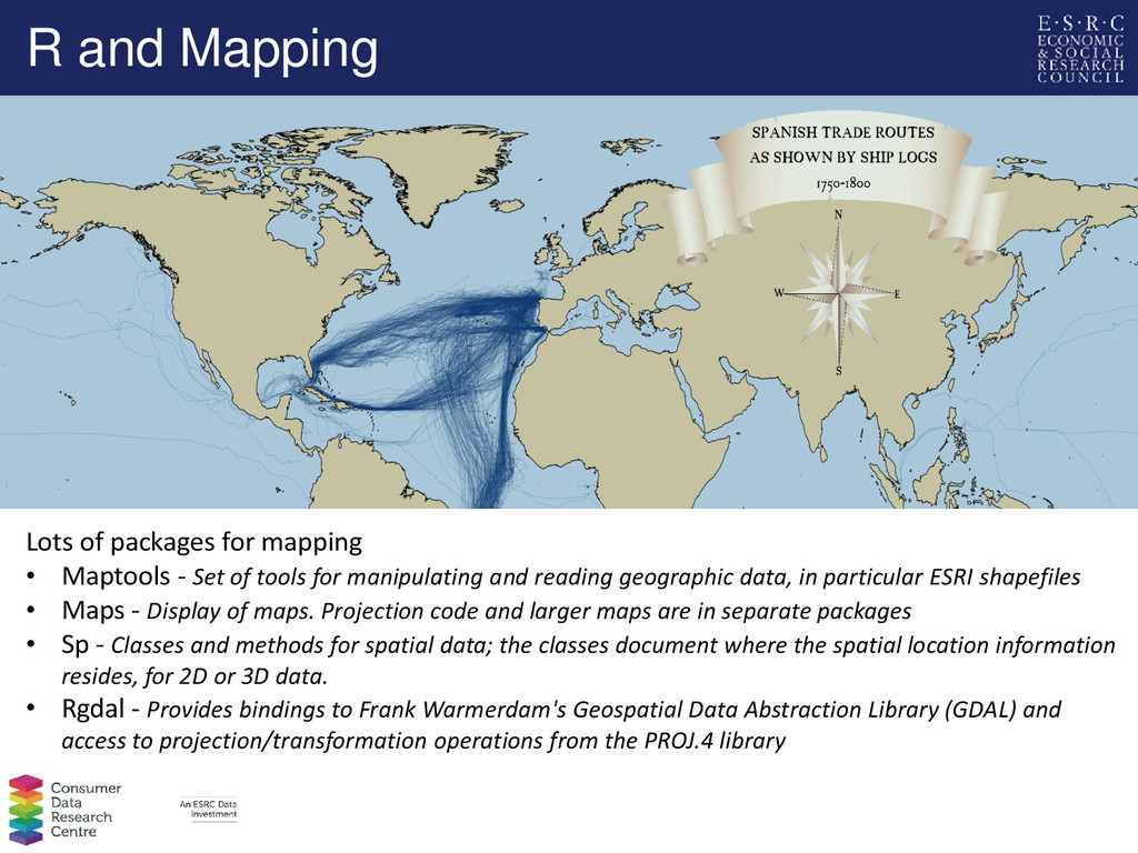
tools for manipulating and reading geographic data, in particular ESRI shapefiles • Maps - Display of maps. Projection code and larger maps are in separate packages • Sp - Classes and methods for spatial data; the classes document where the spatial location information resides, for 2D or 3D data. • Rgdal - Provides bindings to Frank Warmerdam's Geospatial Data Abstraction Library (GDAL) and access to projection/transformation operations from the PROJ.4 library R and Mapping
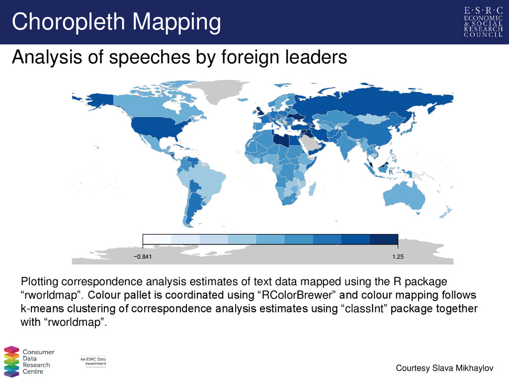
correspondence analysis estimates of text data mapped using the R package “rworldmap”. Colour pallet is coordinated using “RColorBrewer” and colour mapping follows k-means clustering of correspondence analysis estimates using “classInt” package together with “rworldmap”. Courtesy Slava Mikhaylov Analysis of speeches by foreign leaders
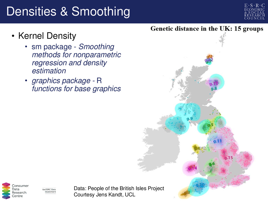
Smoothing methods for nonparametric regression and density estimation • graphics package - R functions for base graphics Data: People of the British Isles Project Courtesy Jens Kandt, UCL
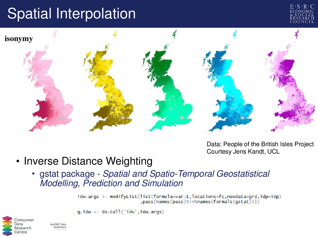
Spatial and Spatio-Temporal Geostatistical Modelling, Prediction and Simulation Data: People of the British Isles Project Courtesy Jens Kandt, UCL isonymy Data: People of the British Isles Project Courtesy Jens Kandt, UCL
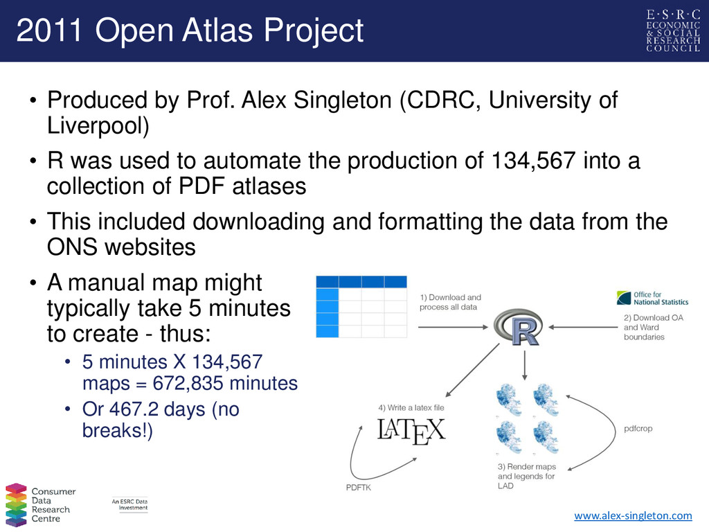
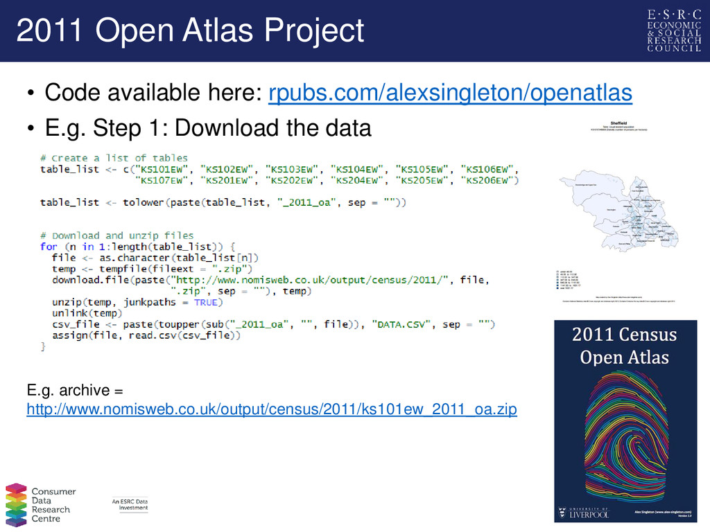
take 5 minutes to create - thus: • 5 minutes X 134,567 maps = 672,835 minutes • Or 467.2 days (no breaks!) www.alex-singleton.com • Produced by Prof. Alex Singleton (CDRC, University of Liverpool) • R was used to automate the production of 134,567 into a collection of PDF atlases • This included downloading and formatting the data from the ONS websites
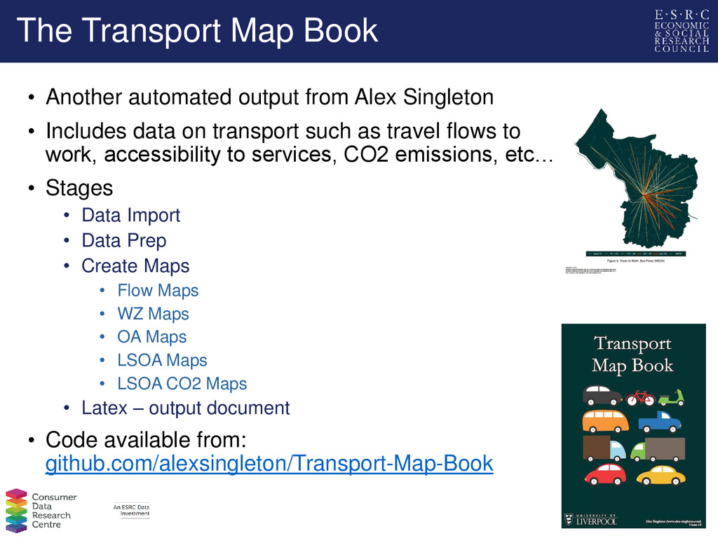
Singleton • Includes data on transport such as travel flows to work, accessibility to services, CO2 emissions, etc… • Stages • Data Import • Data Prep • Create Maps • Flow Maps • WZ Maps • OA Maps • LSOA Maps • LSOA CO2 Maps • Latex – output document • Code available from: github.com/alexsingleton/Transport-Map-Book
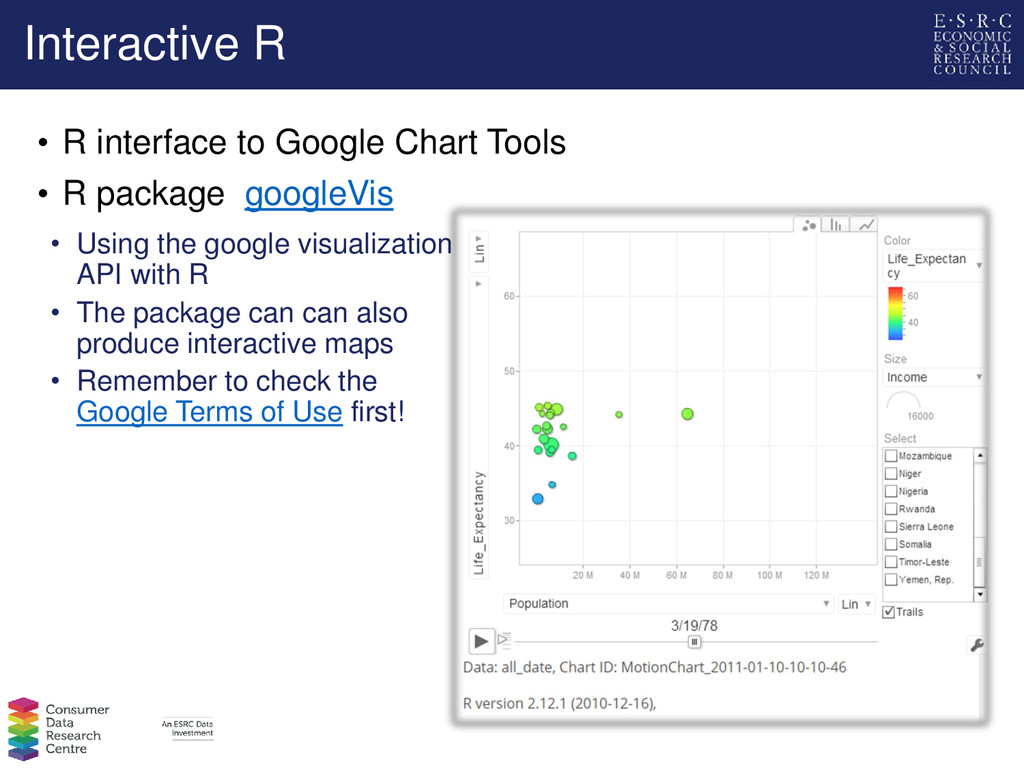
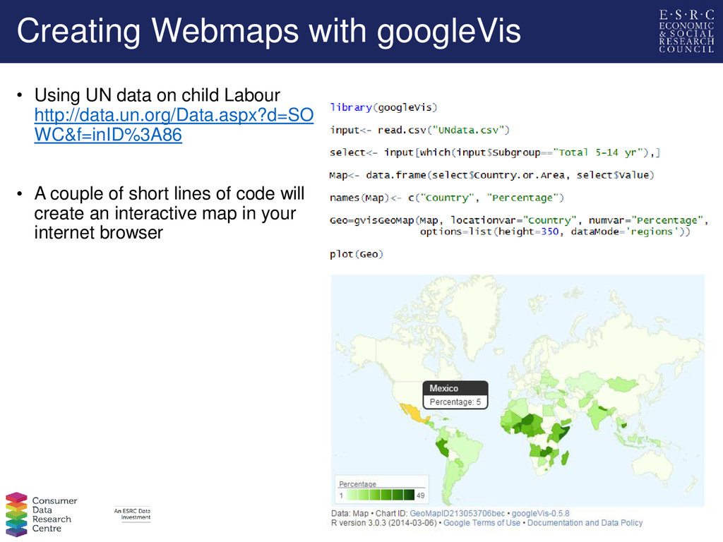
R package googleVis • Using the google visualization API with R • The package can can also produce interactive maps • Remember to check the Google Terms of Use first!
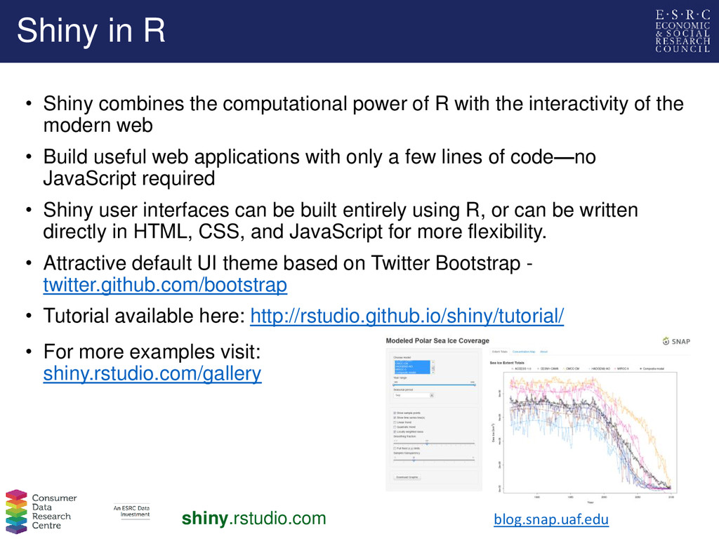
R with the interactivity of the modern web • Build useful web applications with only a few lines of code—no JavaScript required • Shiny user interfaces can be built entirely using R, or can be written directly in HTML, CSS, and JavaScript for more flexibility. • Attractive default UI theme based on Twitter Bootstrap - twitter.github.com/bootstrap • Tutorial available here: http://rstudio.github.io/shiny/tutorial/ blog.snap.uaf.edu • For more examples visit: shiny.rstudio.com/gallery shiny.rstudio.com
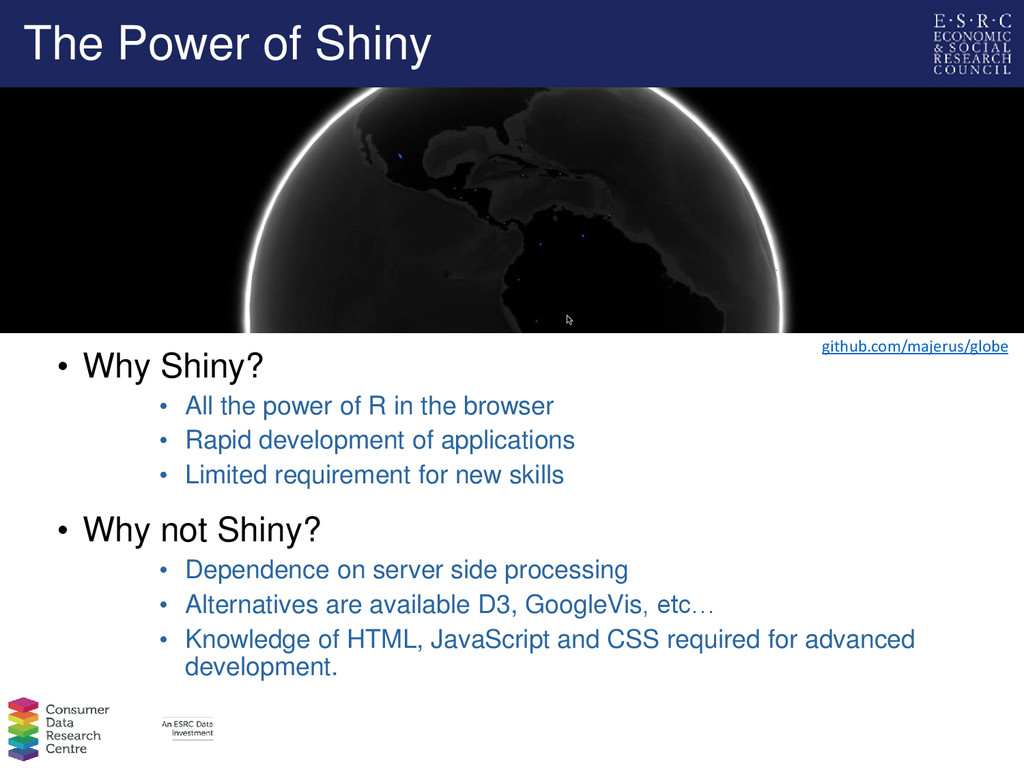
power of R in the browser • Rapid development of applications • Limited requirement for new skills • Why not Shiny? • Dependence on server side processing • Alternatives are available D3, GoogleVis, etc… • Knowledge of HTML, JavaScript and CSS required for advanced development. github.com/majerus/globe
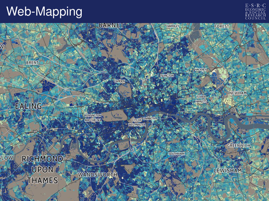
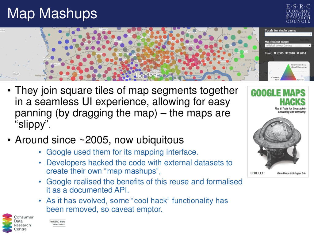
together in a seamless UI experience, allowing for easy panning (by dragging the map) – the maps are “slippy”. • Around since ~2005, now ubiquitous • Google used them for its mapping interface. • Developers hacked the code with external datasets to create their own “map mashups”, • Google realised the benefits of this reuse and formalised it as a documented API. • As it has evolved, some “cool hack” functionality has been removed, so caveat emptor.
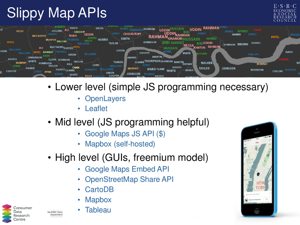
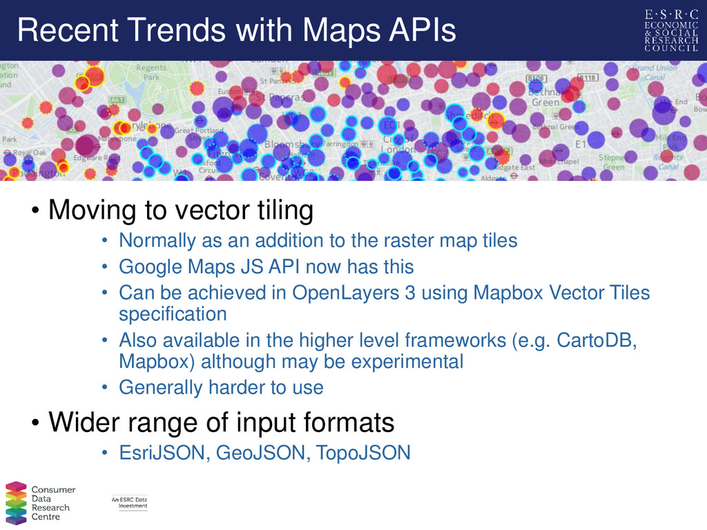
• Normally as an addition to the raster map tiles • Google Maps JS API now has this • Can be achieved in OpenLayers 3 using Mapbox Vector Tiles specification • Also available in the higher level frameworks (e.g. CartoDB, Mapbox) although may be experimental • Generally harder to use • Wider range of input formats • EsriJSON, GeoJSON, TopoJSON
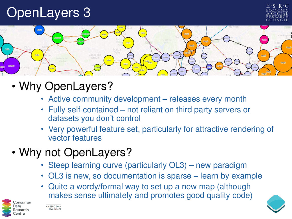
releases every month • Fully self-contained – not reliant on third party servers or datasets you don’t control • Very powerful feature set, particularly for attractive rendering of vector features • Why not OpenLayers? • Steep learning curve (particularly OL3) – new paradigm • OL3 is new, so documentation is sparse – learn by example • Quite a wordy/formal way to set up a new map (although makes sense ultimately and promotes good quality code)
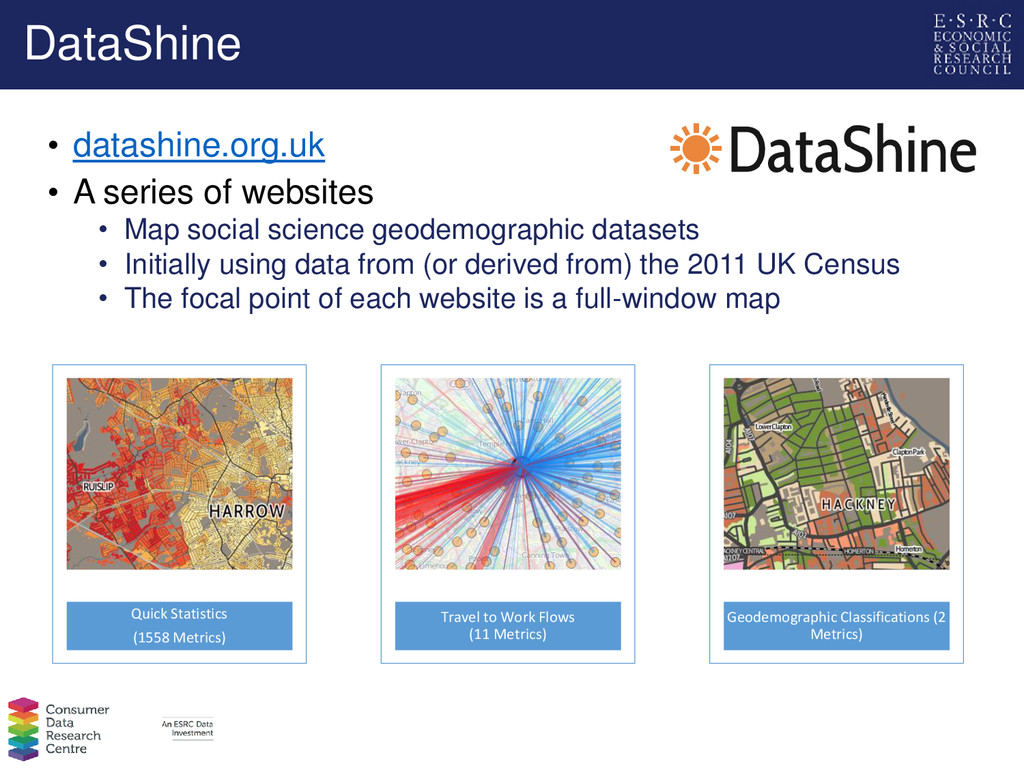
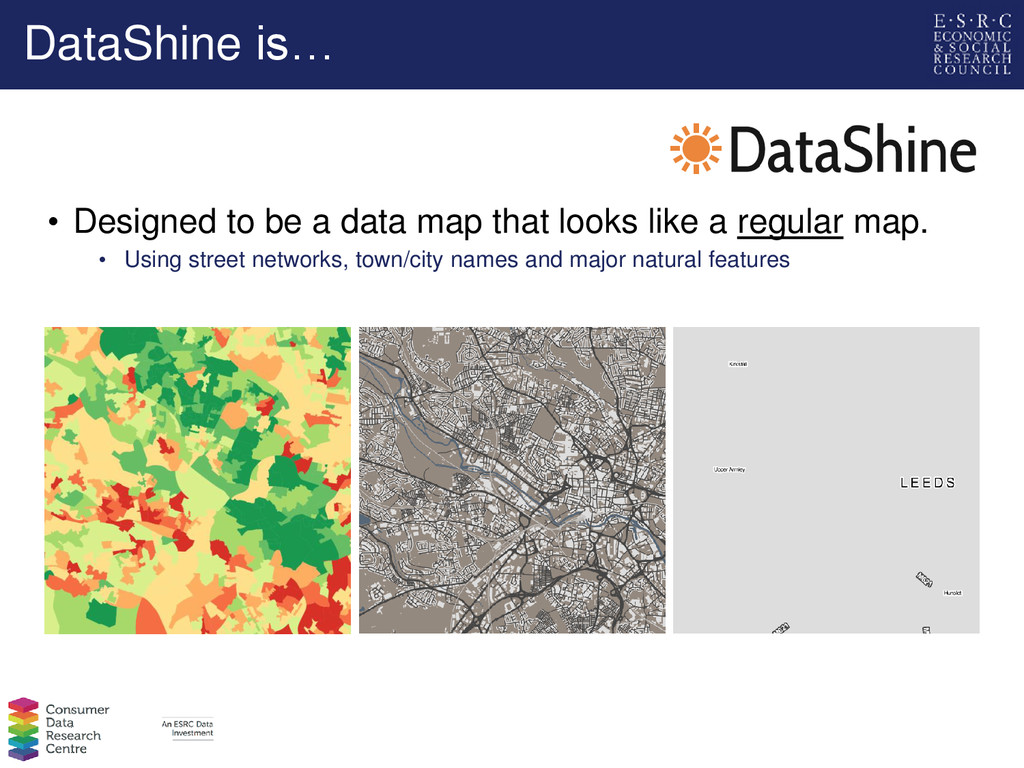
social science geodemographic datasets • Initially using data from (or derived from) the 2011 UK Census • The focal point of each website is a full-window map Quick Statistics (1558 Metrics) Travel to Work Flows (11 Metrics) Geodemographic Classifications (2 Metrics)
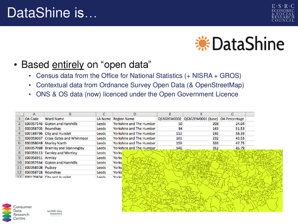
data from the Office for National Statistics (+ NISRA + GROS) • Contextual data from Ordnance Survey Open Data (& OpenStreetMap) • ONS & OS data (now) licenced under the Open Government Licence
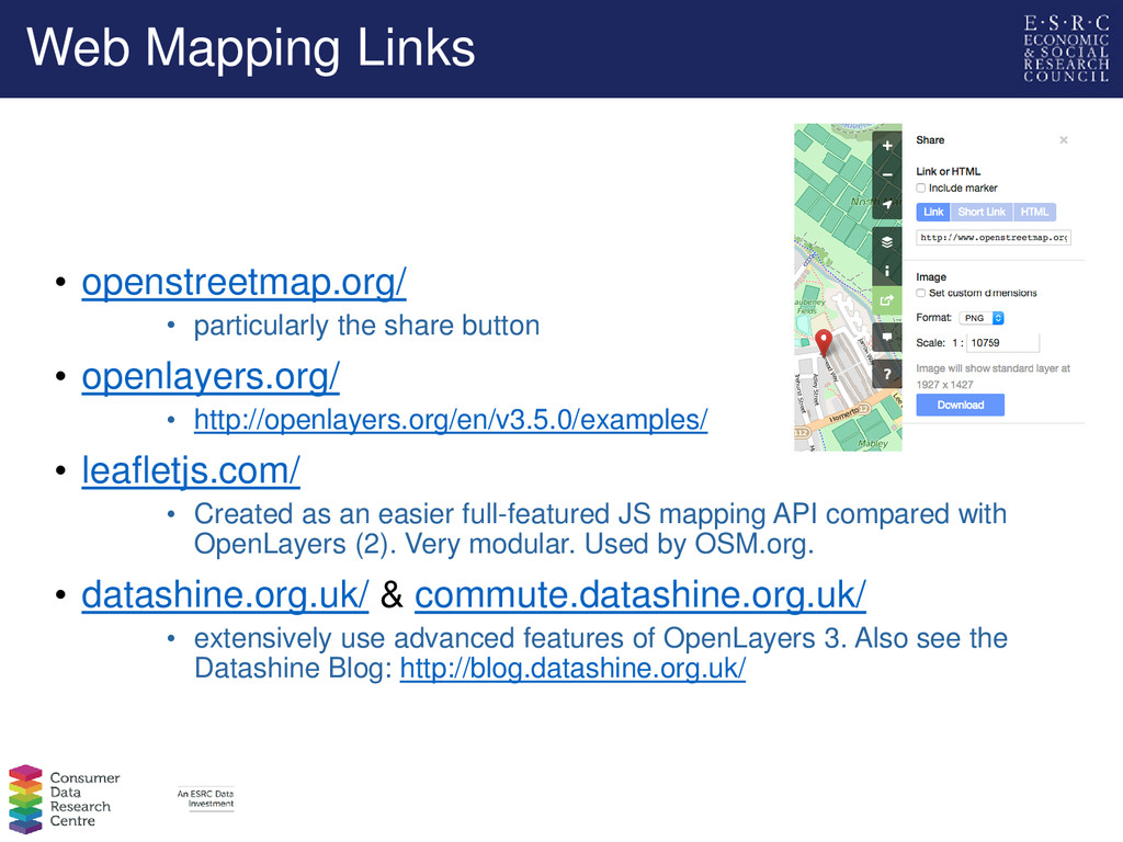
• openlayers.org/ • http://openlayers.org/en/v3.5.0/examples/ • leafletjs.com/ • Created as an easier full-featured JS mapping API compared with OpenLayers (2). Very modular. Used by OSM.org. • datashine.org.uk/ & commute.datashine.org.uk/ • extensively use advanced features of OpenLayers 3. Also see the Datashine Blog: http://blog.datashine.org.uk/
![The End Guy Lansley, [email protected] James Cheshire, [email protected] Oliver O’Brien,](https://files.speakerdeck.com/presentations/91901a0ebf53486d86e8d602f59b3374/slide_43.jpg)