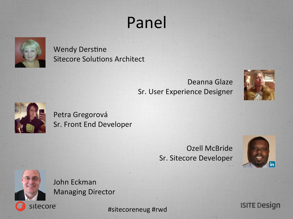
SoluKons Architect Deanna Glaze Sr. User Experience Designer Petra Gregorová Sr. Front End Developer Ozell McBride Sr. Sitecore Developer John Eckman Managing Director
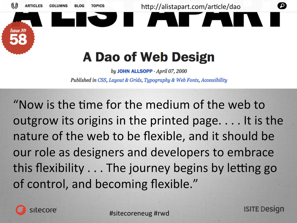
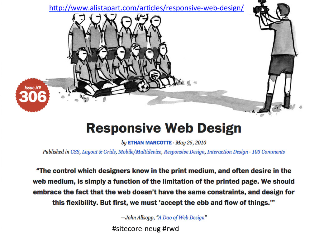
the medium of the web to outgrow its origins in the printed page. . . . It is the nature of the web to be flexible, and it should be our role as designers and developers to embrace this flexibility . . . The journey begins by le`ng go of control, and becoming flexible.”
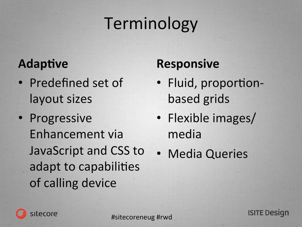
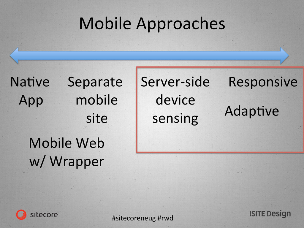
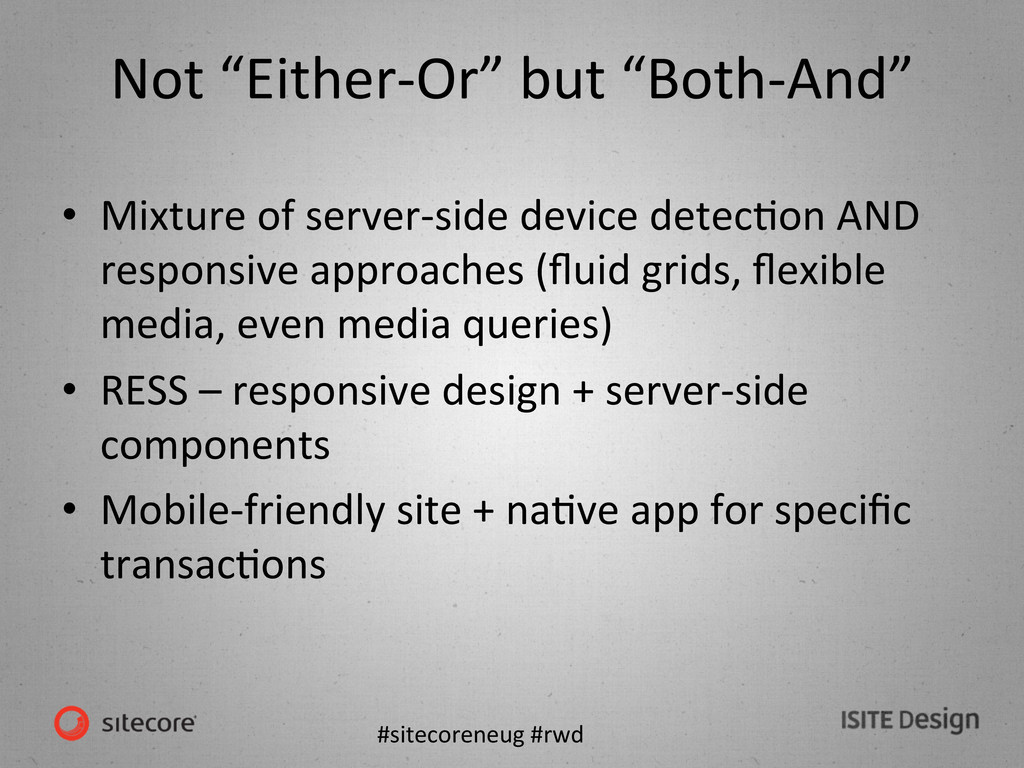
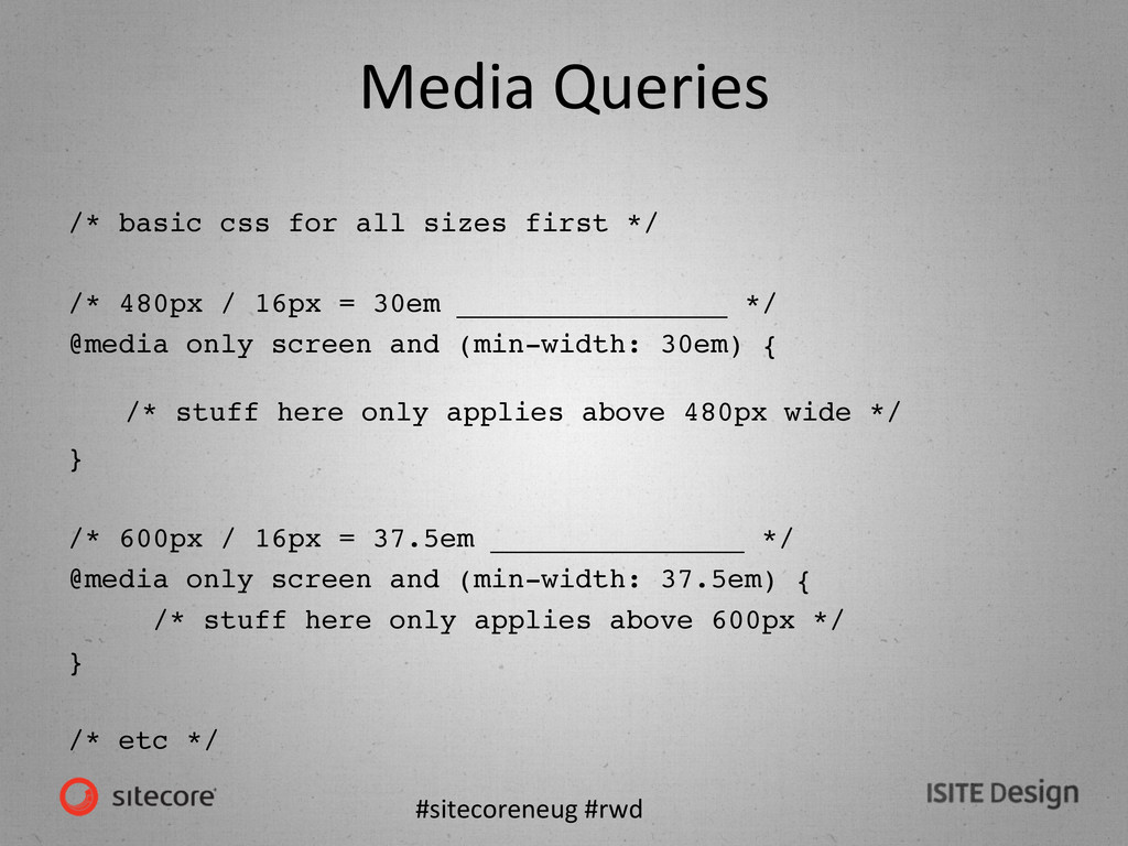
of layout sizes • Progressive Enhancement via JavaScript and CSS to adapt to capabiliKes of calling device Responsive • Fluid, proporKon-‐ based grids • Flexible images/ media • Media Queries
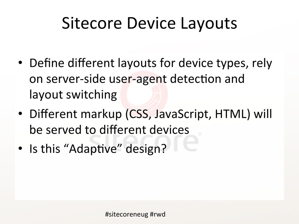
layouts for device types, rely on server-‐side user-‐agent detecKon and layout switching • Different markup (CSS, JavaScript, HTML) will be served to different devices • Is this “AdapKve” design? #sitecoreneug #rwd
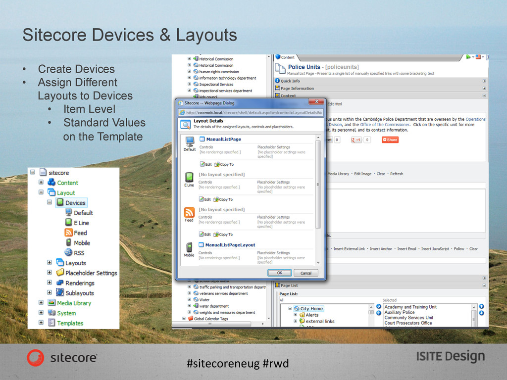
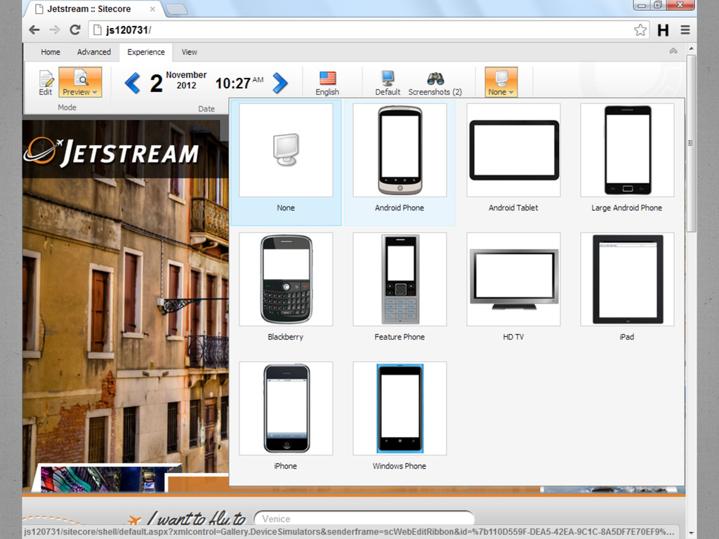
Brian Pedersen's Sitecore and .NET Blog Identifying mobile devices in Sitecore http://briancaos.wordpress.com/2012/04/12/identifying-mobile- devices-in-sitecore/ • John West Using the Sitecore Rules Engine in a Custom Context: Setting the Context Device hWp://www.sitecore.net/Community/Technical-‐Blogs/John-‐West-‐ Sitecore-‐Blog/Posts/2010/11/Using-‐the-‐Sitecore-‐Rules-‐Engine-‐in-‐a-‐ Custom-‐Context-‐Se`ng-‐the-‐Context-‐Device.aspx • Sitecore Mobile Device Detector Module • Alex Doroshenko hWp://marketplace.sitecore.net/Modules/Mobile_Device_Detector.aspx • 51Degrees.mobi database • Sitecore’s Rules engine
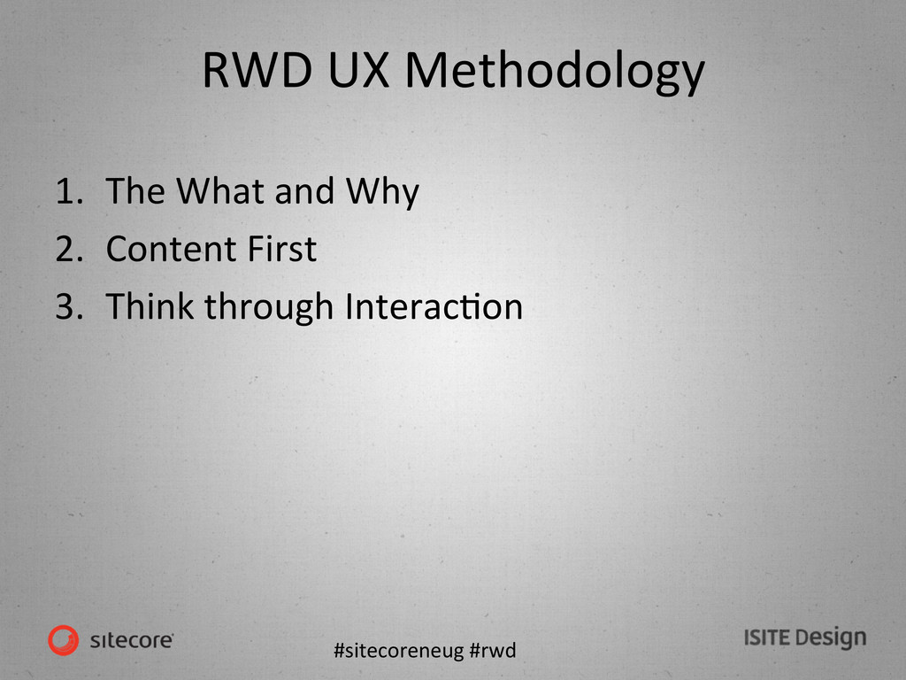
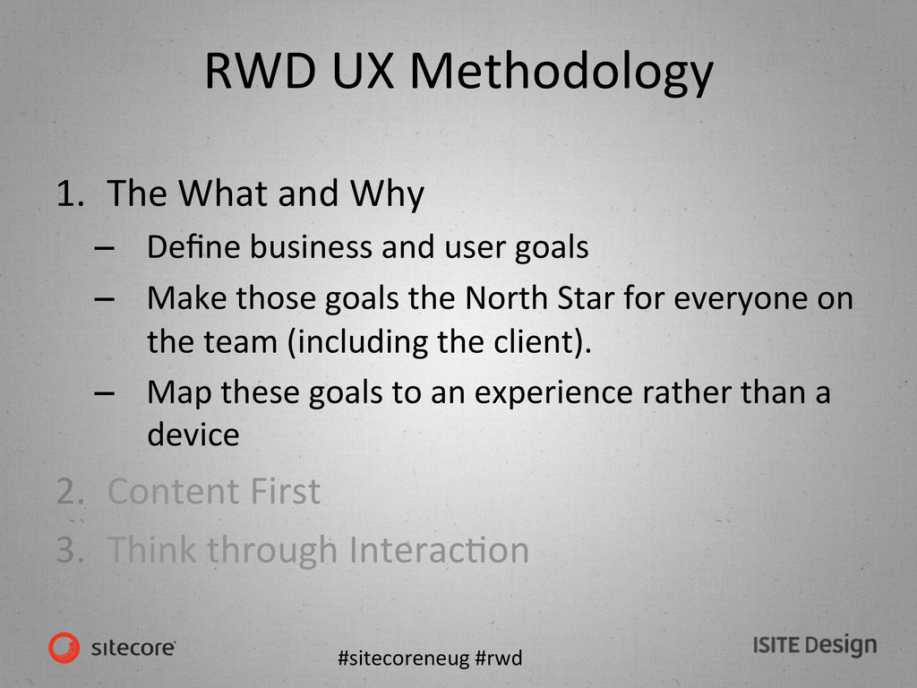
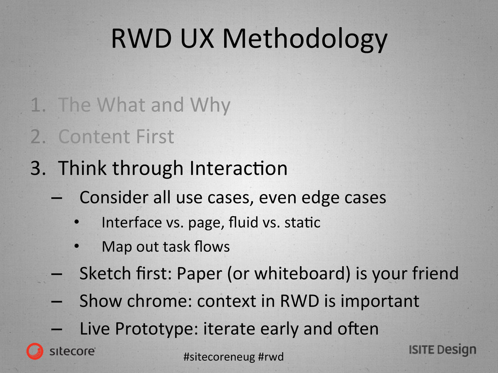
and Why – Define business and user goals – Make those goals the North Star for everyone on the team (including the client). – Map these goals to an experience rather than a device 2. Content First 3. Think through InteracKon
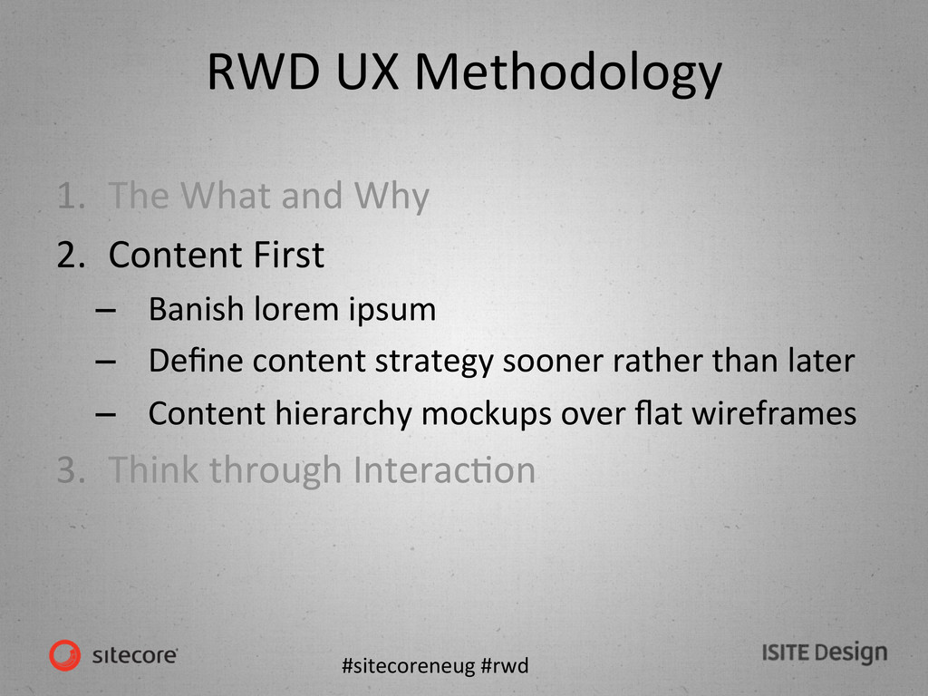
and Why 2. Content First – Banish lorem ipsum – Define content strategy sooner rather than later – Content hierarchy mockups over flat wireframes 3. Think through InteracKon
and Why 2. Content First 3. Think through InteracKon – Consider all use cases, even edge cases • Interface vs. page, fluid vs. staKc • Map out task flows – Sketch first: Paper (or whiteboard) is your friend – Show chrome: context in RWD is important – Live Prototype: iterate early and omen
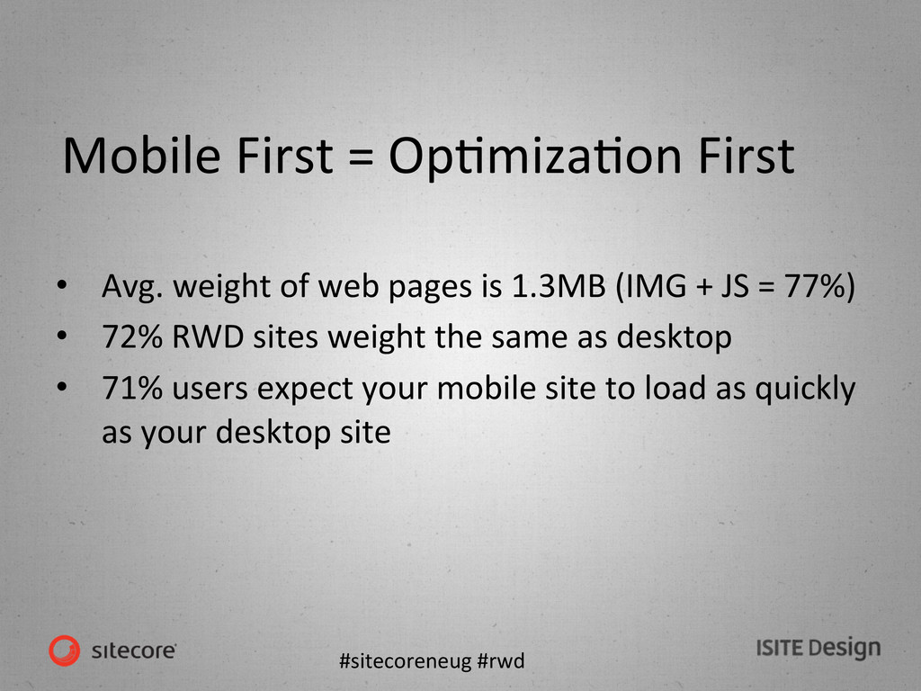
Avg. weight of web pages is 1.3MB (IMG + JS = 77%) • 72% RWD sites weight the same as desktop • 71% users expect your mobile site to load as quickly as your desktop site
DOM reflows & repaints – Defer js loading – Lazy load JS – comment out JS that isn’t required at load, uncomment & eval() when needed – Touch beats onclick – Avoid social media widgets: just link
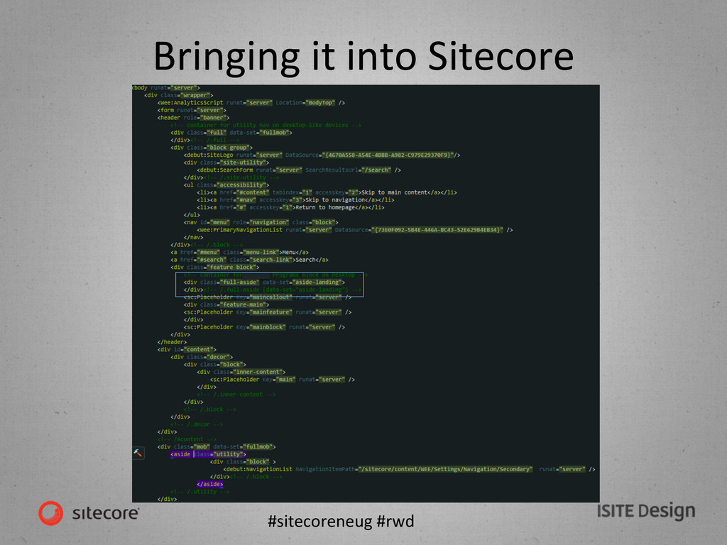
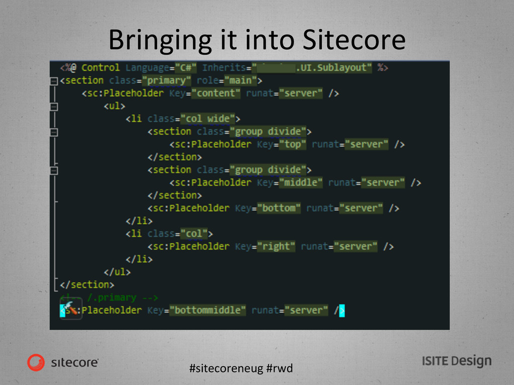
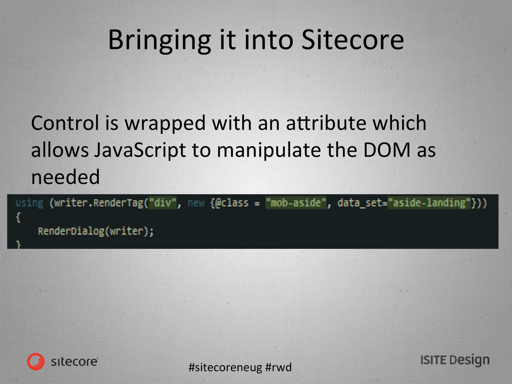
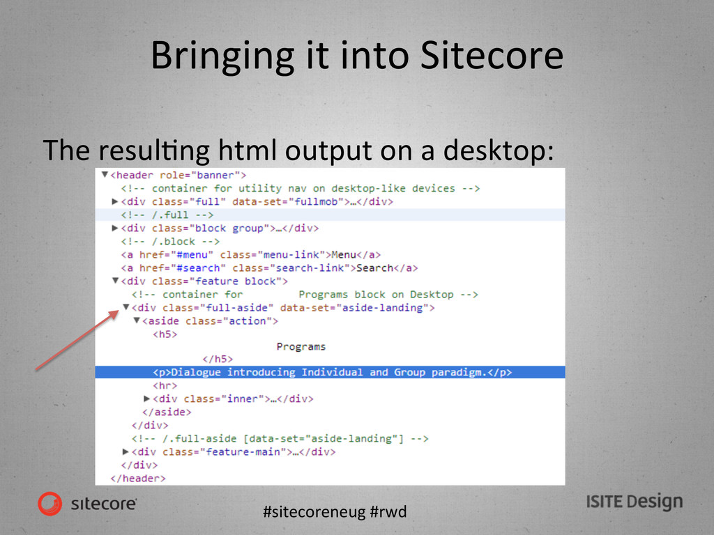
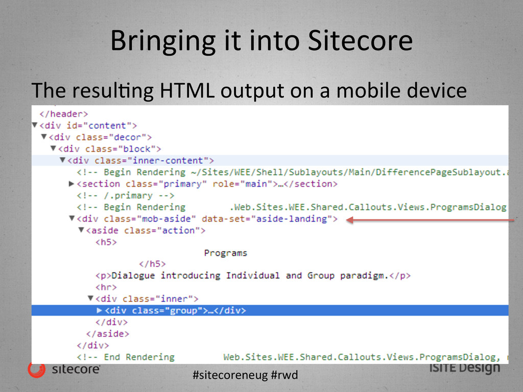
UX, CreaKve, Front End Development decisions have already been made • Get inserted into the RWD conversaKon as soon as possible • Understand the effect of priority placement of renderings.
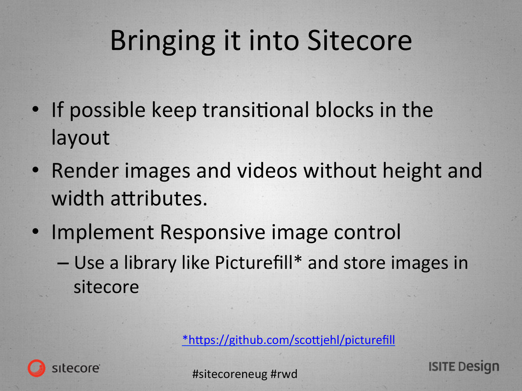
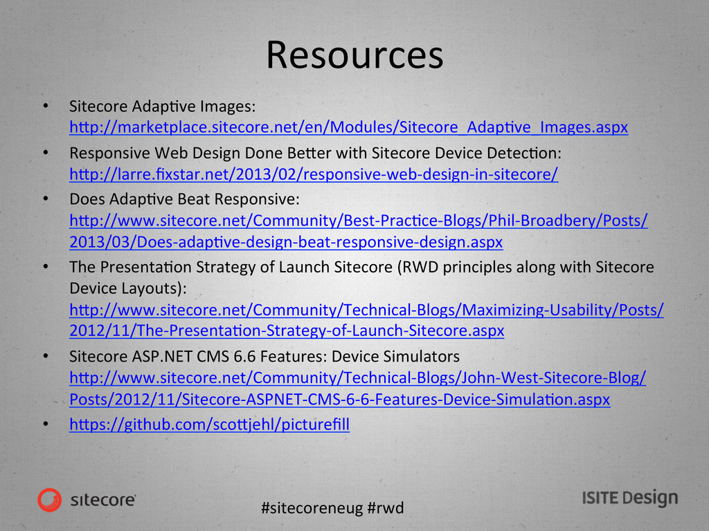
possible keep transiKonal blocks in the layout • Render images and videos without height and width aWributes. • Implement Responsive image control – Use a library like Picturefill* and store images in sitecore *hWps://github.com/scoWjehl/picturefill
Sitecore SoluKons Architect Deanna Glaze Sr. User Experience Designer Petra Gregorová Sr. Front End Developer Ozell McBride Sr. Sitecore Developer John Eckman Managing Director
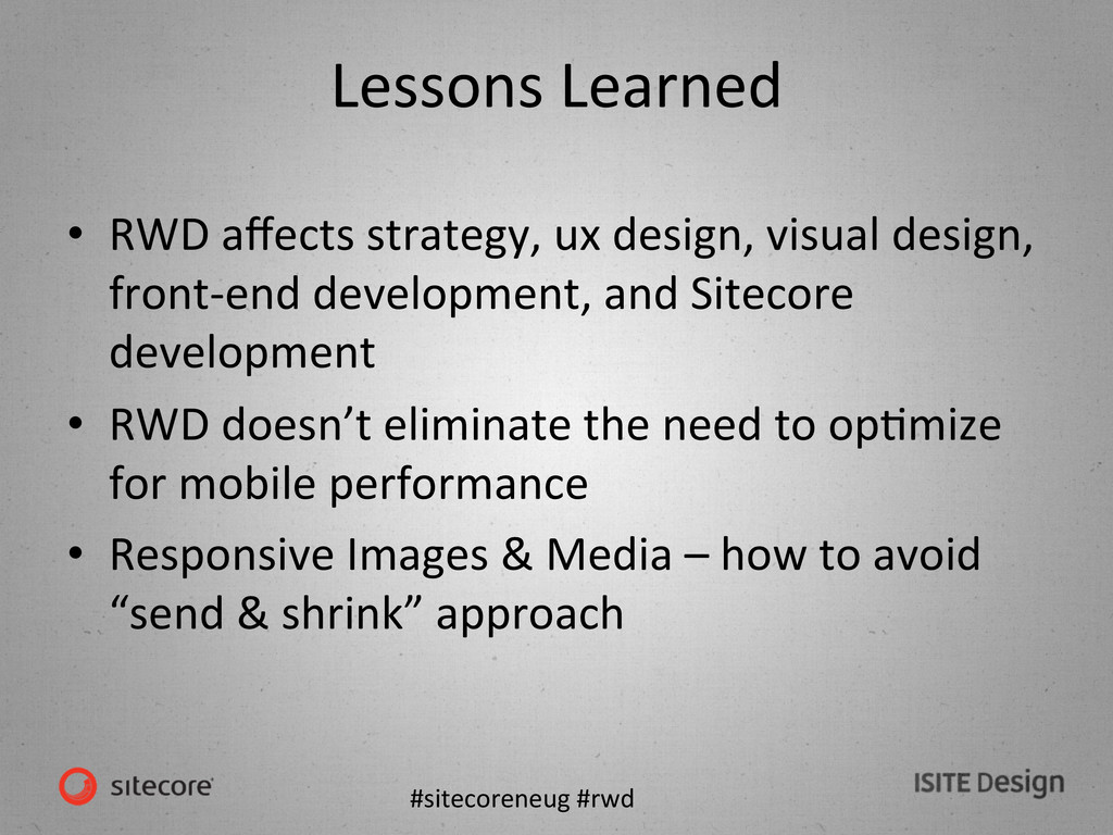
ux design, visual design, front-‐end development, and Sitecore development • RWD doesn’t eliminate the need to opKmize for mobile performance • Responsive Images & Media – how to avoid “send & shrink” approach
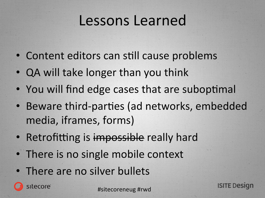
sKll cause problems • QA will take longer than you think • You will find edge cases that are subopKmal • Beware third-‐parKes (ad networks, embedded media, iframes, forms) • Retrofi`ng is impossible really hard • There is no single mobile context • There are no silver bullets
 jeckman
 ymty
ymty
 maf_0521
 kawaguti
 oikon48
 askul
askul
 ekispert_api
 nari_ex
 yurufuwahealer
 kanny
kanny
 tanimuyk
 oprstchn
 taddy_919
 axbom
axbom
 garrettdimon
 paigeccino
 sarafernandez
 lara
lara
 aleyda
 jeffersonlam
 leimatthew05
 jacobtomlinson
 mza
mza
 badams
 thirion