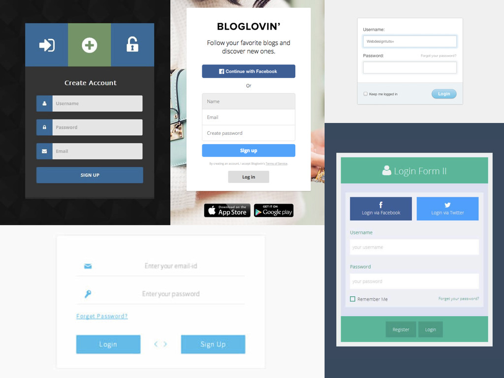
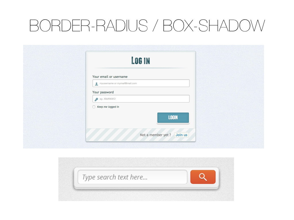
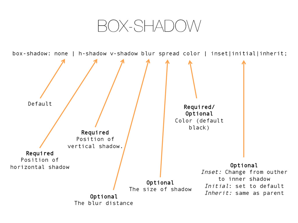
inset|initial|inherit; Default Required Position of horizontal shadow Required Position of vertical shadow. Optional The blur distance Optional The size of shadow Required/ Optional Color (default black) Optional Inset: Change from outher to inner shadow Initial: set to default Inherit: same as parent
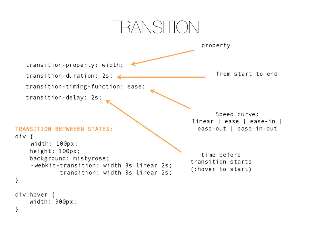
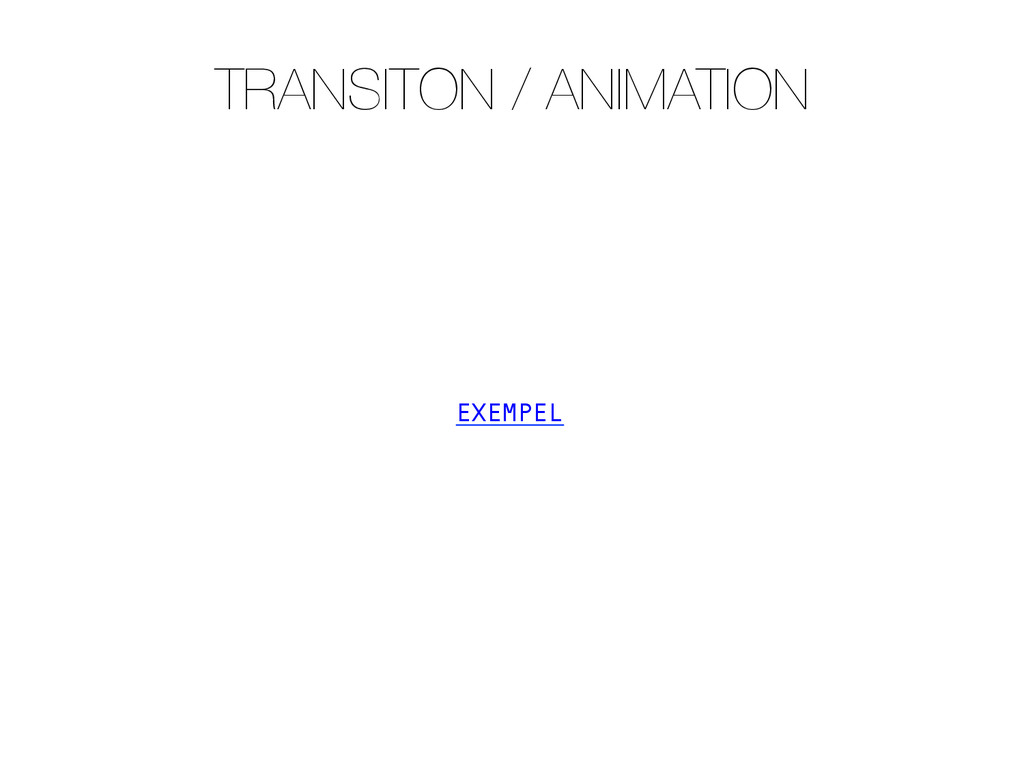
TRANSITION BETWEEEN STATES: div { width: 100px; height: 100px; background: mistyrose; -webkit-transition: width 3s linear 2s; transition: width 3s linear 2s; } div:hover { width: 300px; } from start to end Speed curve: linear | ease | ease-in | ease-out | ease-in-out time before transition starts (:hover to start)
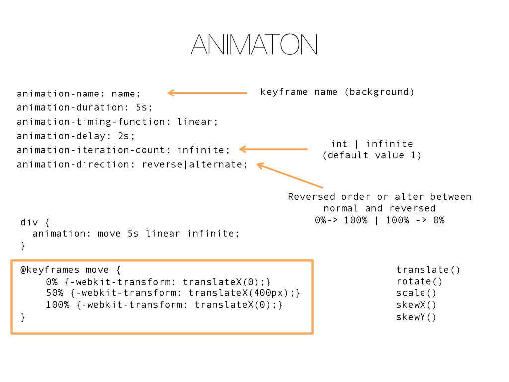
infinite; animation-direction: reverse|alternate; div { animation: move 5s linear infinite; } @keyframes move { 0% {-webkit-transform: translateX(0);} 50% {-webkit-transform: translateX(400px);} 100% {-webkit-transform: translateX(0);} } Reversed order or alter between normal and reversed 0%-> 100% | 100% -> 0% int | infinite (default value 1) keyframe name (background) translate() rotate() scale() skewX() skewY()
 signer
 coderdojokodaira
 matleenalaakso
 masakiokuda
 songchch
 harunakano
 robintux
 kaityo256
 eileencodes
 leimatthew05
 marketingsoph
 akashhashmi
 stephaniewalter
 maggiecrowley
 mkilby
 trishagee
 aleyda
 rasagy
 cassininazir