Upgrade to Pro — share decks privately, control downloads, hide ads and more …

Prototyping Layout with CSS Grid - Refresh DC

Prototyping Layout with CSS Grid - Refresh DC

Presented at Refresh DC, September 2017

Jessica Eldredge

September 20, 2017
Tweet

More Decks by Jessica Eldredge

Other Decks in Technology

Transcript

  1. Our requirements • Responsive: grid context changes across breakpoints •

    Use CSS Grid! • Fallback for browsers that don’t support grid
  2. Markup for grid 1 <div class="wrapper"> <section class="grid grid-1"> <h2

    class="heading"></h2> <div class="quote quote-1"></div> <div class="quote quote-2"></div> <div class="quote quote-3"></div> <div class="quote quote-4"></div> <div class="see-more"></div> </section> </div>
  3. Centering our content wrapper .wrapper { max-width: 20em; margin-left: auto;

    margin-right: auto; } @media screen and min-width(48em) { .wrapper { max-width: 38em; } } @media screen and min-width(64em) { .wrapper { max-width: 55em; } }
  4. Setting up grid: columns .grid { display: grid; grid-template-columns: 40px

    40px 40px; } 1fr 1fr 1fr; 1fr 2fr 1fr; 100px 25% 1fr;
  5. Setting up grid: rows .grid { display: grid; grid-template-columns: repeat(6,

    1fr); grid-template-rows: repeat(2, 1fr); } // Alternative syntax: // grid-template-rows: 75px 125px; // grid-template-rows: 100px 1fr;
  6. Setting up grid: gutters .grid { display: grid; grid-template-columns: repeat(6,

    1fr); grid-gap: 0.75em; } // Shorthand is equivalent to: // grid-column-gap: 0.75em; // grid-row-gap: 0.75em;
  7. Setting up grid: gutters .grid { display: grid; grid-template-columns: repeat(6,

    1fr); grid-gap: 0.75em; } // Shorthand is equivalent to: // grid-column-gap: 0.75em; // grid-row-gap: 0.75em;
  8. @media screen and (min-width: 48em) { .grid { grid-template-columns: repeat(12,

    1fr); } } @media screen and (min-width: 64em) { .grid { grid-template-columns: repeat(15, 1fr); grid-gap: 1.25em; } } Responsive grid settings
  9. Placing grid items .grid > * { grid-column-start: 1; grid-column-end:

    7; } // Alternative shorthand: // grid-column: 1 / 7;
  10. Placing grid items .grid > * { grid-column-start: 1; grid-column-end:

    7; } // Alternative shorthand: // grid-column: 1 / 7;
  11. Placing grid items .grid > * { grid-column-start: 1; grid-column-end:

    7; } // Alternative shorthand: // grid-column: 1 / 7;
  12. Placing grid items .grid > * { grid-column-start: 1; grid-column-end:

    7; } // Alternative shorthand: // grid-column: 1 / 7;
  13. Shorthand: span syntax .grid > * { grid-column: 1 /

    span 6;
 } // Shorthand is equivalent to: // grid-column-start: 1; // grid-column-end: span 6;
  14. Explicit vs implicit grid .grid { display: grid; grid-template-columns: repeat(6,

    1fr); grid-gap: 0.75em; } .grid > * { grid-column: 1 / span 6; }
  15. Explicit vs implicit grid .grid { display: grid; grid-template-columns: repeat(6,

    1fr); grid-gap: 0.75em; } .grid > * { grid-column: 1 / span 6; }
  16. Explicit vs implicit grid .grid { display: grid; grid-template-columns: repeat(6,

    1fr); grid-gap: 0.75em; } .grid > * { grid-column: 1 / span 6; }
  17. Explicit vs implicit grid .grid { display: grid; grid-template-columns: repeat(6,

    1fr); grid-gap: 0.75em; } .grid > * { grid-column: 1 / span 6; }
  18. Placing first items on the grid .heading { grid-column: 1

    / span 9; } .see-more { grid-column: 10 / span 3; } @media screen and (min-width: 48em)
  19. Placing first items on the grid .heading { grid-column: 1

    / span 9; } .see-more { grid-column: 10 / span 3; } @media screen and (min-width: 48em)
  20. Explicitly place link in the first row .heading { grid-column:

    1 / span 9; grid-row: 1; } .see-more { grid-column: 10 / span 3; grid-row: 1; } @media screen and (min-width: 48em)
  21. Placing quotes on the grid @media screen and (min-width: 48em)

    .quote-1 { grid-column: 1 / span 12; } .quote-2 { grid-column: 1 / span 4; } .quote-3 { grid-column: 5 / span 4; } .quote-4 { grid-column: 9 / span 4; }
  22. Placing quotes on the grid @media screen and (min-width: 48em)

    .quote-1 { grid-column: 1 / span 12; } .quote-2 { grid-column: 1 / span 4; } .quote-3 { grid-column: 5 / span 4; } .quote-4 { grid-column: 9 / span 4; }
  23. Placing heading and link again .heading { grid-column: 1 /

    span 12; } .see-more { grid-column: 13 / span 3; } @media screen and (min-width: 64em)
  24. Placing quotes .quote-1 { grid-column: 1 / span 12; }

    .quote-2 { grid-column: 13 / span 3; } .quote-3 { grid-column: 13 / span 3; } .quote-4 { grid-column: 13 / span 3; } @media screen and (min-width: 64em)
  25. Spanning rows .quote-1 { grid-column: 1 / span 12; grid-row:

    2 / span 3; } @media screen and (min-width: 64em)
  26. Adding flexbox media object <div class="quote quote-1"> <div class="media media-1">

    <div class="media-image"></div> <div class="media-content"></div> </div> </div> .media { display: flex; flex-direction: column; } .media-content { flex: 1 1 auto; } html css
  27. Markup for grid 2 <section class="grid grid-2"> <h2 class="heading"></h2> <div

    class="quote quote-5"> <div class="media media-2"> <div class="media-image"></div> <div class="media-content"></div> </div> </div> <div class="quote quote-6"></div> <div class="quote quote-7"></div> <div class="see-more"></div> </section>
  28. Medium screens: placing quotes .quote-5 { grid-column: 1 / span

    6; } .quote-6 { grid-column: 7 / span 3; } .quote-7 { grid-column: 10 / span 3; } @media screen and (min-width: 48em)
  29. Large screens: placing quotes @media screen and (min-width: 64em) .quote-5

    { grid-column: 9 / span 7; } .quote-6 { grid-column: 1 / span 4; } .quote-7 { grid-column: 5 / span 4; }
  30. CSS Grid auto placement • Explicit grid
 Rules dictated by

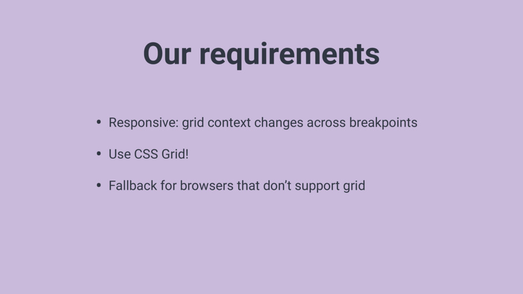
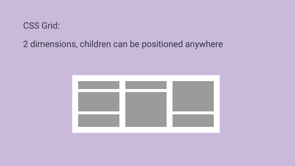
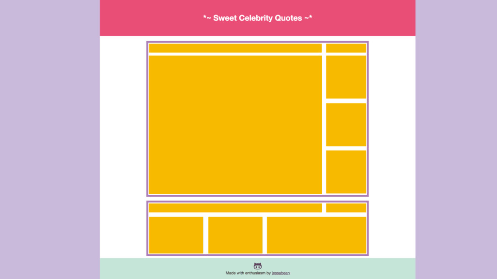
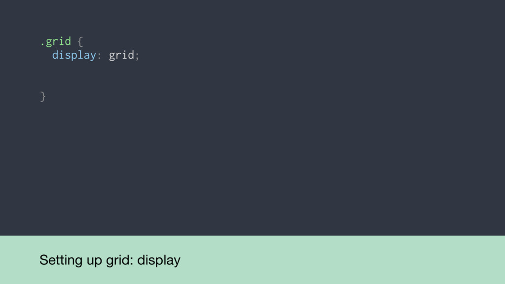
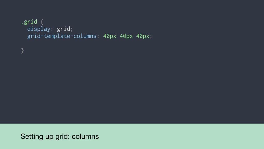
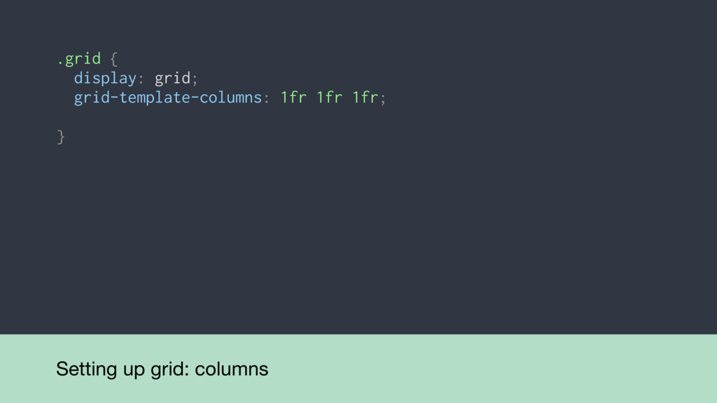
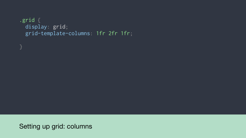
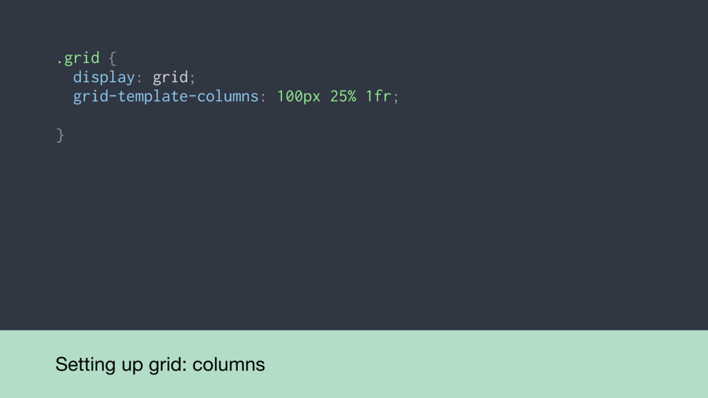
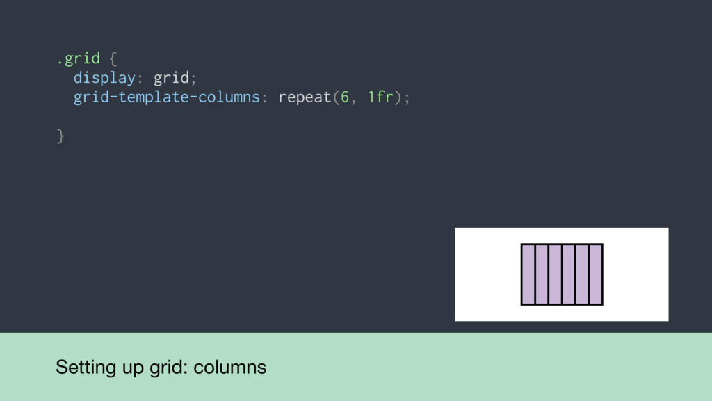
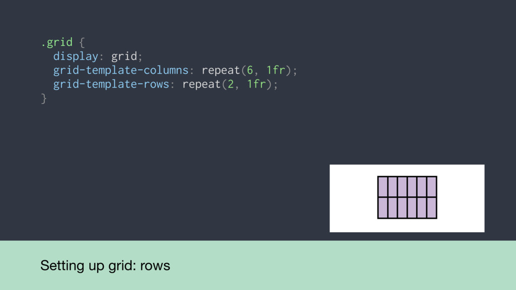
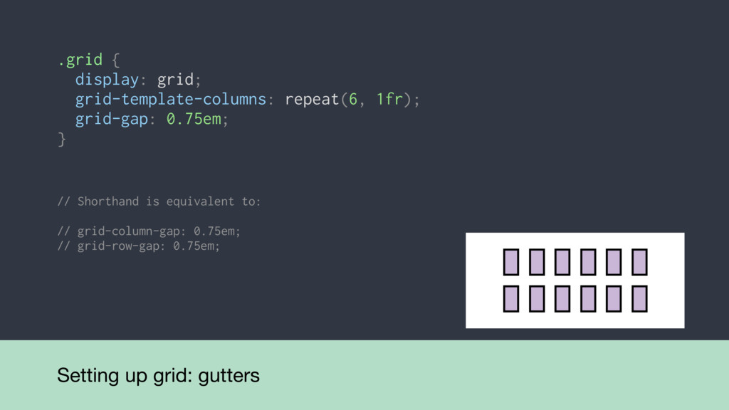
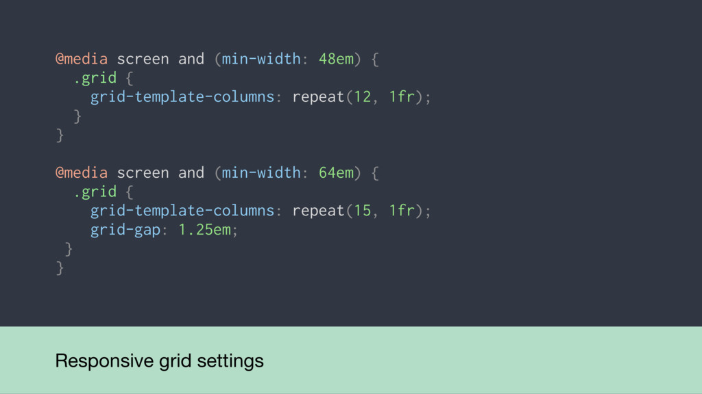
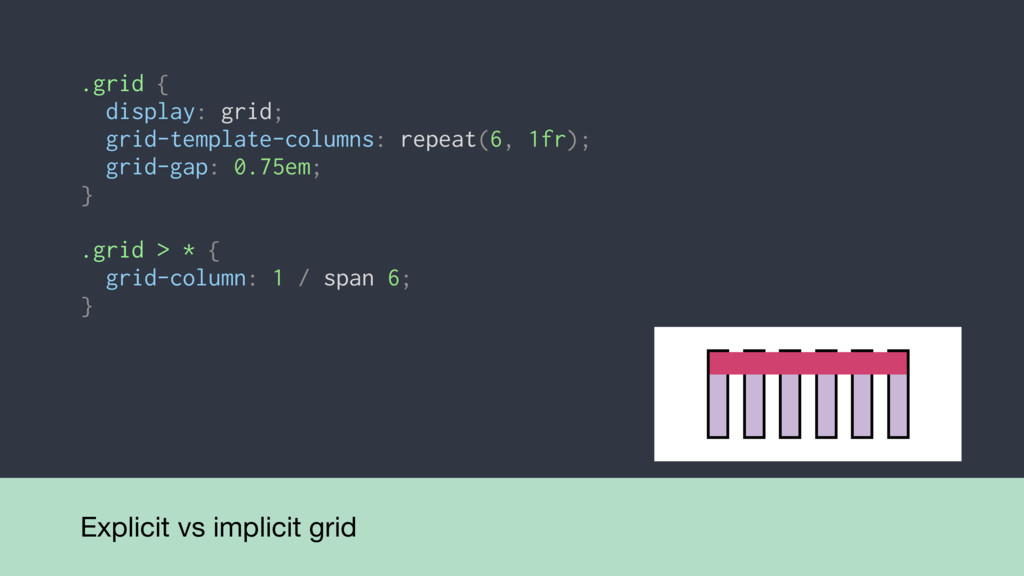
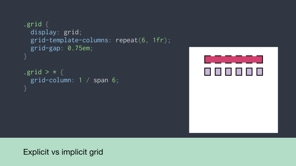
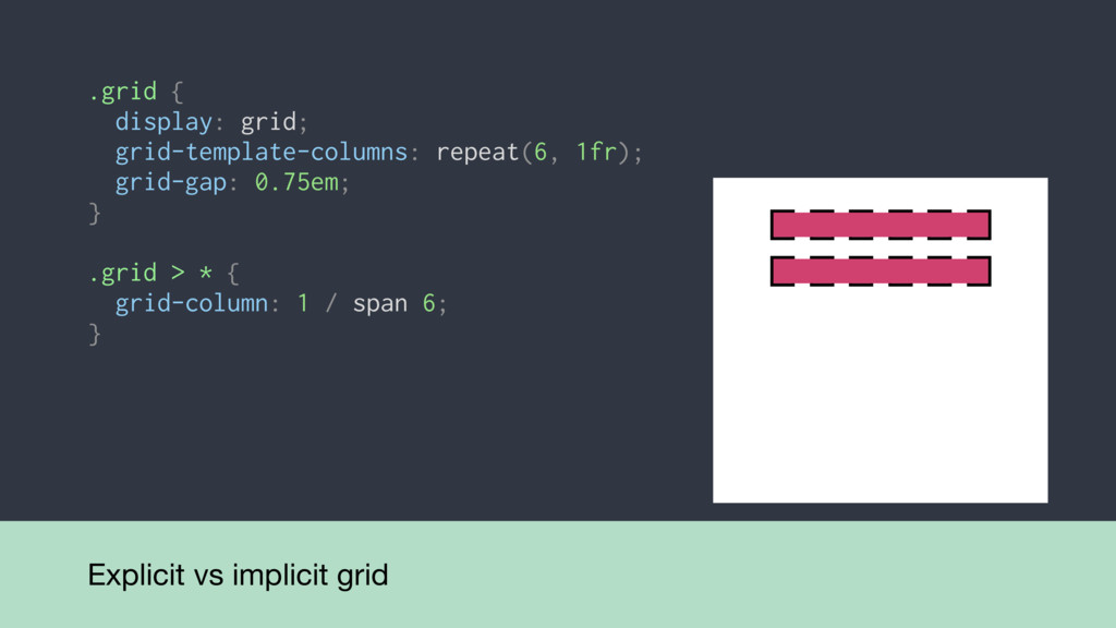
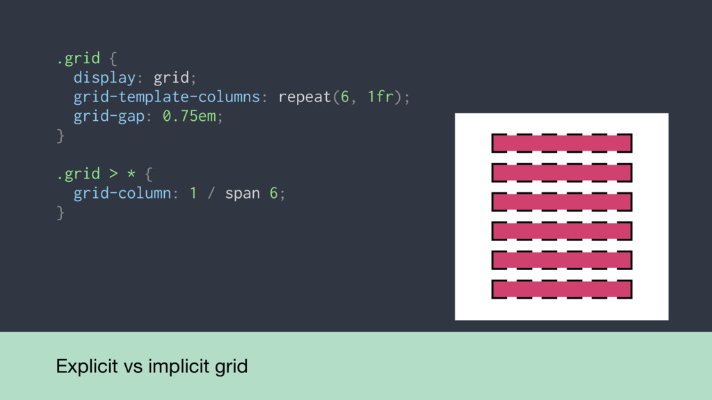
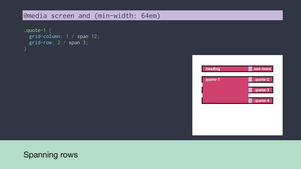
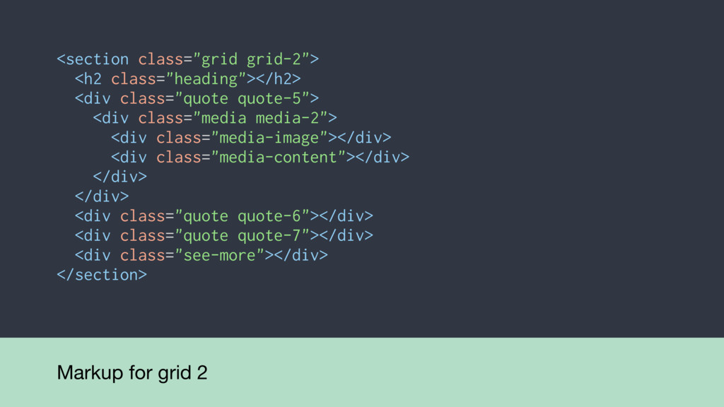
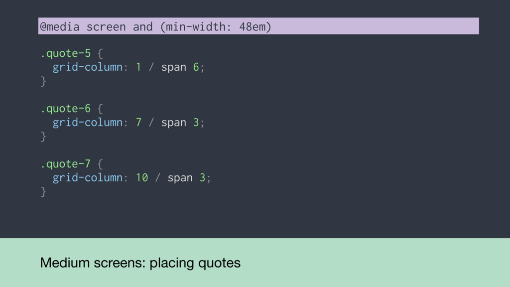
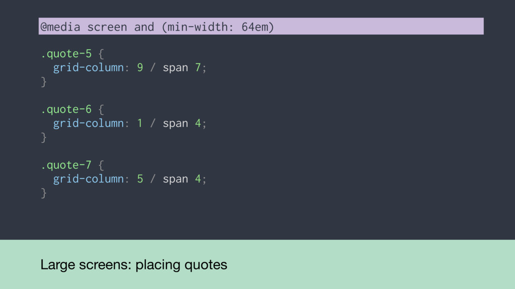
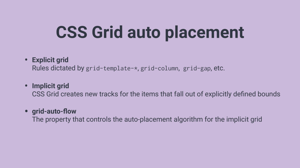
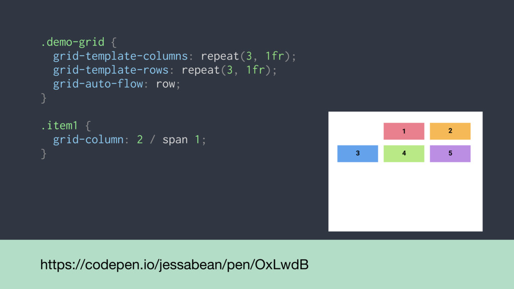
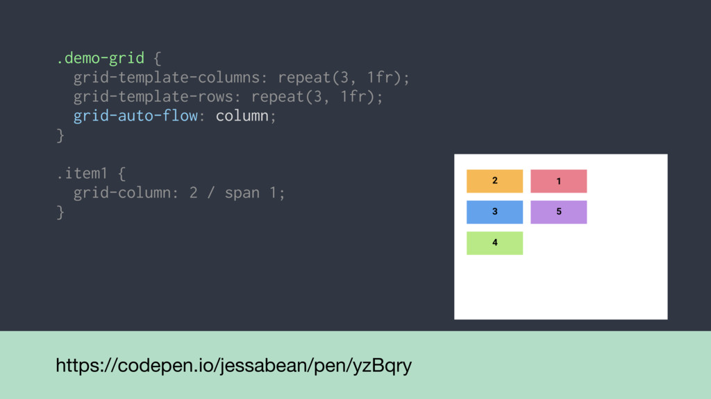
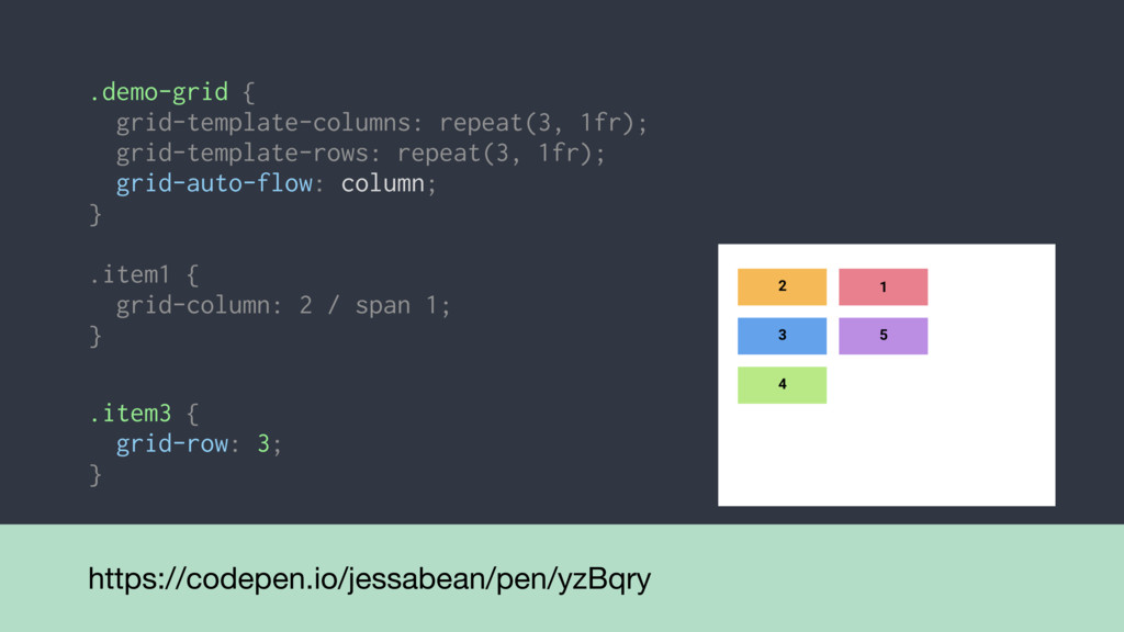
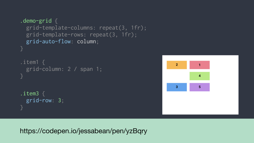
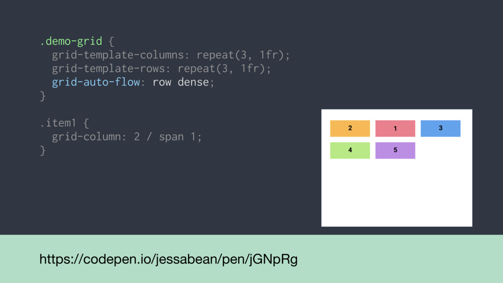
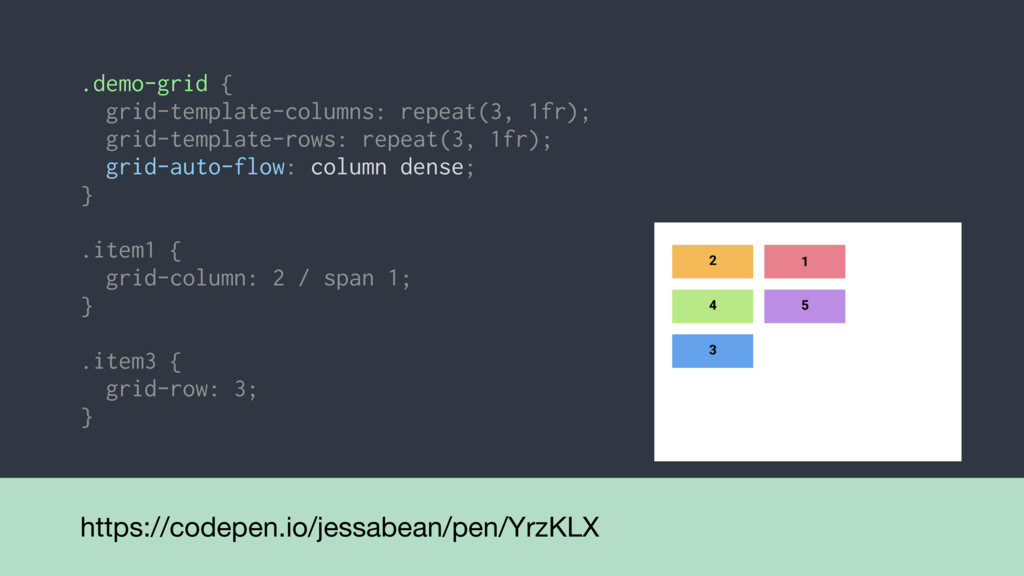
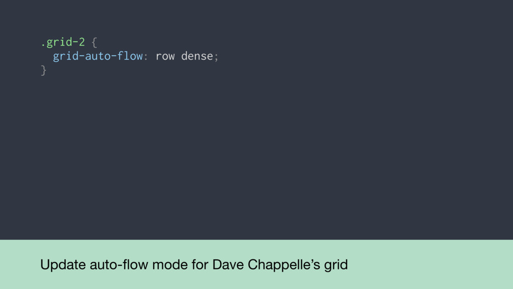
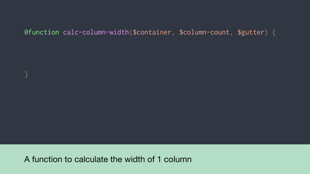
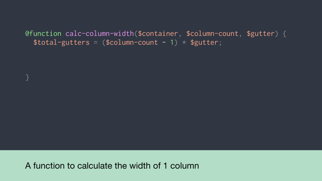
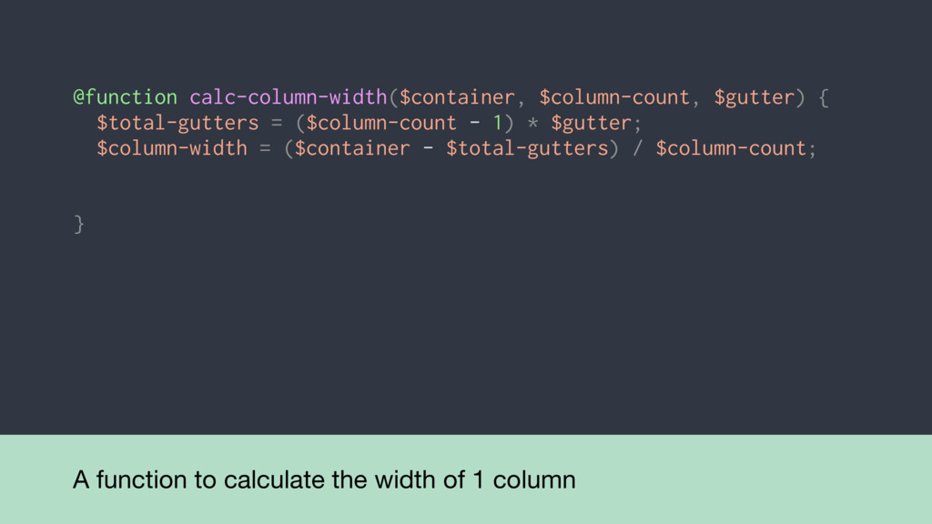
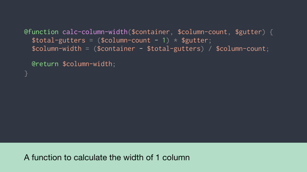
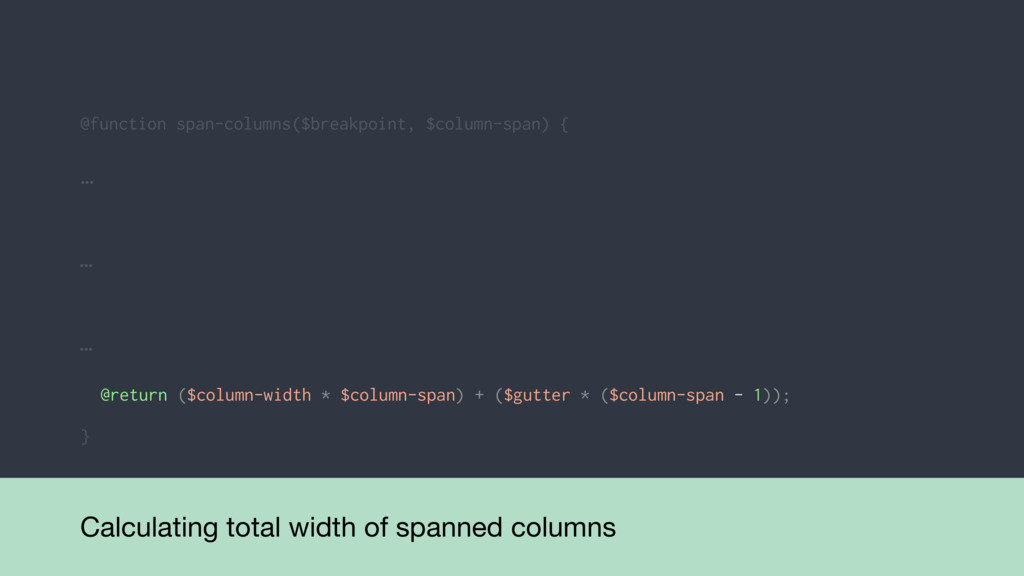
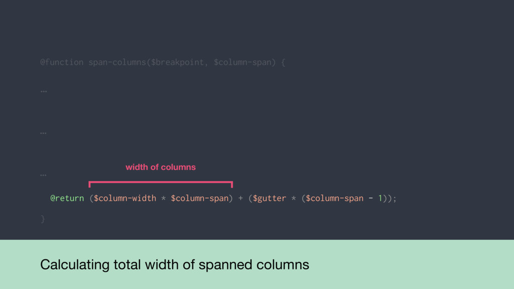
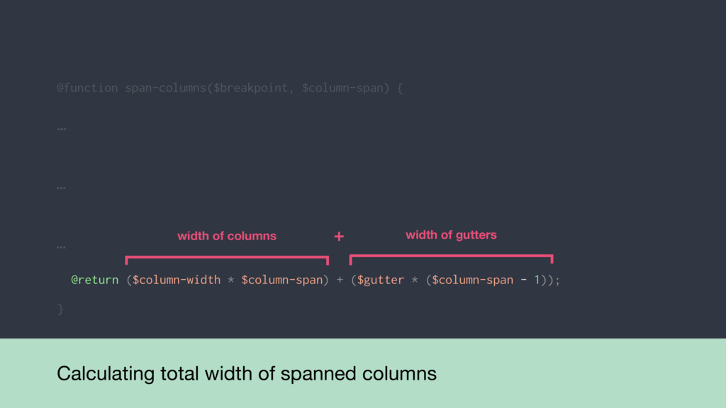
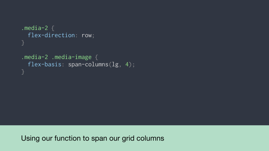
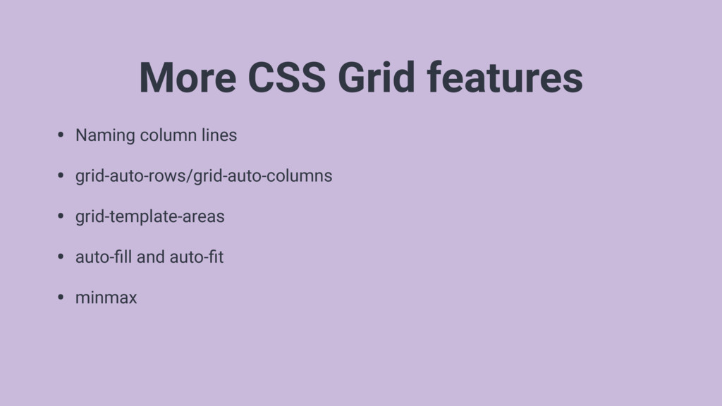
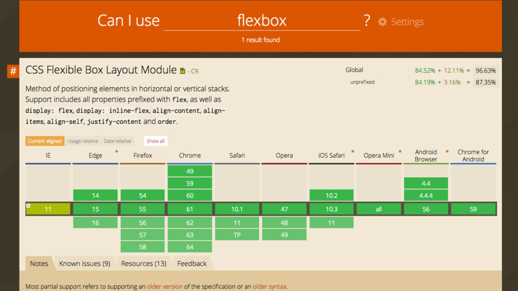
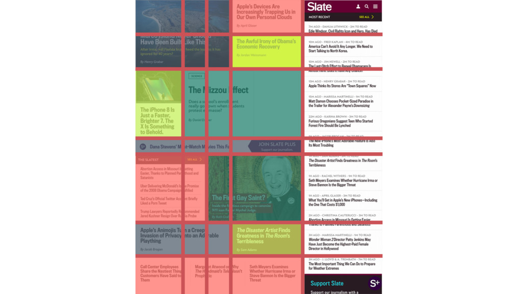
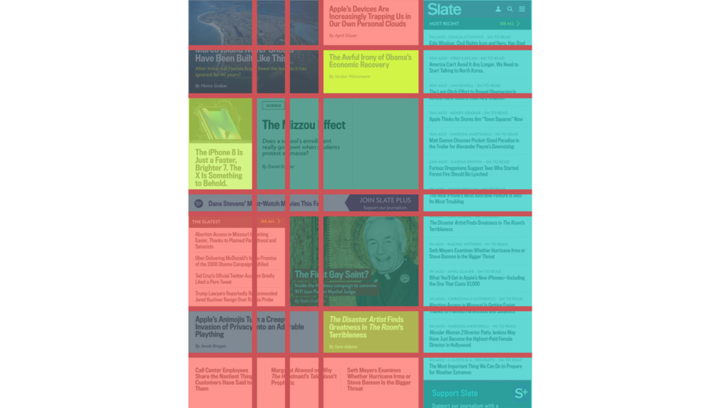
    grid-template-*, grid-column, grid-gap, etc. • Implicit grid
 CSS Grid creates new tracks for the items that fall out of explicitly defined bounds • grid-auto-flow
 The property that controls the auto-placement algorithm for the implicit grid
  31. https://codepen.io/jessabean/pen/yzBqry .item3 { grid-row: 3; } .demo-grid { grid-template-columns: repeat(3,

    1fr); grid-template-rows: repeat(3, 1fr); grid-auto-flow: column; } .item1 { grid-column: 2 / span 1; }
  32. https://codepen.io/jessabean/pen/yzBqry .item3 { grid-row: 3; } .demo-grid { grid-template-columns: repeat(3,

    1fr); grid-template-rows: repeat(3, 1fr); grid-auto-flow: column; } .item1 { grid-column: 2 / span 1; }
  33. Nested grid inception .quote-5 { display: grid; grid-template-columns: repeat(7, 1fr);

    } @media screen and (min-width: 48em) { .quote-5 { … } } @media screen and (min-width: 64em) { .quote-5 { … } }
  34. We need to calculate “1fr” explicitly .grid { grid-template-columns: repeat(6,

    1fr); grid-gap: 0.75em; } @media screen and (min-width: 48em) { .grid { grid-template-columns: repeat(12, 1fr); } } @media screen and (min-width: 64em) { .grid{ grid-template-columns: repeat(15, 1fr); grid-gap: 1.25em; } }
  35. Establish settings for each breakpoint in a Sass map $grid-config:

    ( sm: ( ), md: ( ), lg: ( ) ); container: 20em, column-count: 6, gutter: 0.75em
  36. Establish settings for each breakpoint in a Sass map $grid-config:

    ( sm: ( ), md: ( ), lg: ( ) ); container: 20em, column-count: 6, gutter: 0.75em container: 38em, column-count: 12, gutter: 0.75em container: 55em, column-count: 15, gutter: 1.25em
  37. A function to calculate the width of 1 column @function

    calc-column-width($container, $column-count, $gutter) { }
  38. A function to calculate the width of 1 column @function

    calc-column-width($container, $column-count, $gutter) { } $total-gutters = ($column-count - 1) * $gutter;
  39. A function to calculate the width of 1 column @function

    calc-column-width($container, $column-count, $gutter) { } $total-gutters = ($column-count - 1) * $gutter; $column-width = ($container - $total-gutters) / $column-count;
  40. A function to calculate the width of 1 column @function

    calc-column-width($container, $column-count, $gutter) { } $total-gutters = ($column-count - 1) * $gutter; $column-width = ($container - $total-gutters) / $column-count; @return $column-width;
  41. A function to calculate the column span // Calculate a

    fixed width that spans columns defined by CSS Grid @function span-columns($breakpoint, $column-span) { }
  42. Assigning breakpoint settings object to a variable @function span-columns($breakpoint, $column-span)

    { } // Get the $grid-config settings for the specified breakpoint $settings: map-get($grid-config, $breakpoint); $settings: ( container-width: 20em, column-count: 6, gutter-size: 0.75em )
  43. Fetching container width, column count, and gutter width @function span-columns($breakpoint,

    $column-span) { } … // Get the individual properties nested in the breakpoint $container: map-get($settings, container); $column-count: map-get($settings, column-count); $gutter: map-get($settings, gutter); $container: 20em; $totalcolumns: 6; $gutter: 0.75em;
  44. Using our column width function @function span-columns($breakpoint, $column-span) { }

    … … // Calculate individual column size based on config settings $column-width: calc-column-width($container, $column-count, $gutter);
  45. @function span-columns($breakpoint, $column-span) { } Calculating total width of spanned

    columns @return ($column-width * $column-span) + ($gutter * ($column-span - 1)); … … …
  46. @function span-columns($breakpoint, $column-span) { } Calculating total width of spanned

    columns @return ($column-width * $column-span) + ($gutter * ($column-span - 1)); … … … width of columns
  47. @function span-columns($breakpoint, $column-span) { } Calculating total width of spanned

    columns @return ($column-width * $column-span) + ($gutter * ($column-span - 1)); … … … width of columns width of gutters +
  48. Using our function to span our grid columns .media-2 {

    flex-direction: row; } .media-2 .media-image { flex-basis: span-columns(lg, 4); }
  49. Autoprefixer for CSS Grid: not recommended autoprefixer( { grid: false

    } ); IE limitations No auto-placement of grid items. No grid-gap support. No shorthand support for column start / end. No grid template areas.
  50. Using feature queries to target CSS Grid at modern browsers

    @supports (display: grid) { // css grid styles go here }
  51. Using feature queries to target CSS Grid at modern browsers

    @supports (display: grid) { // css grid styles go here } .grid { display: flex; }
  52. Additional styles for the flexbox fallback .grid { display: flex;

    flex-wrap: wrap; flex-direction: column; margin-top: -0.375em; margin-left: -0.375em; margin-right: -0.375em; } .grid > * { flex: 1 1 auto; margin: 0.375em; }
  53. Using our span-columns function to set width/flex-basis .grid { flex-direction:

    row; } .quote-1 { width: 100%; } .quote-2, .quote-3, .quote-4 { width: span-columns(md, 4); } @media screen and (min-width: 48em)
  54. Setting widths at the largest breakpoint .quote-1 { width: span-columns(lg,

    12); } .quote-2, .quote-3, .quote-4 { width: span-columns(lg, 3); } @media screen and (min-width: 64em)
  55. • Source order and semantics are still important • We

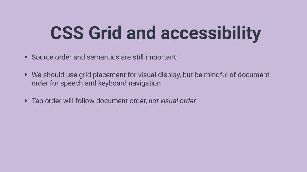
    should use grid placement for visual display, but be mindful of document order for speech and keyboard navigation • Tab order will follow document order, not visual order CSS Grid and accessibility
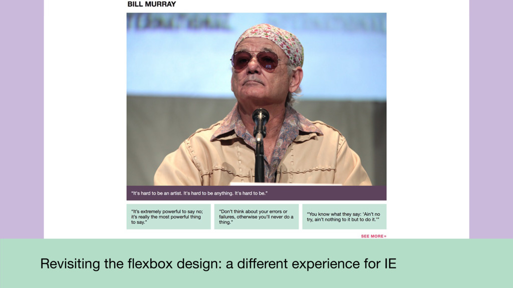
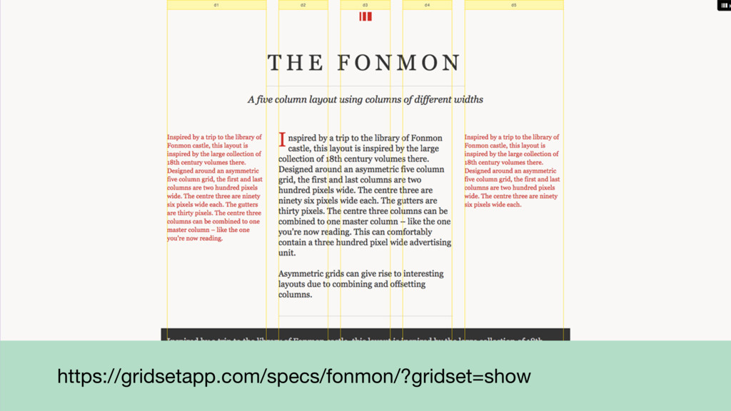
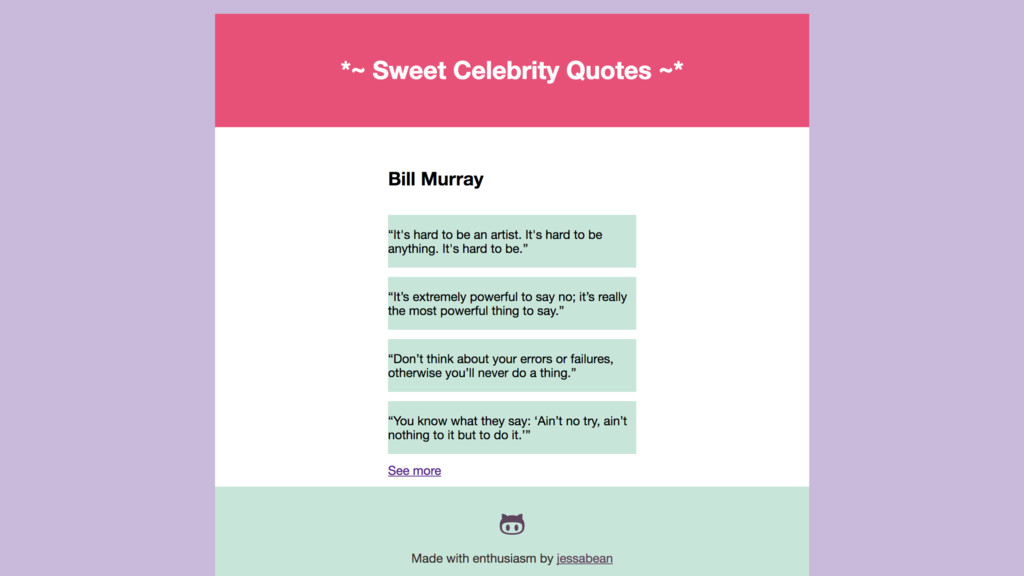
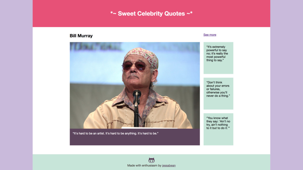
  56. – Miriam Suzanne http://oddbird.net/2017/06/28/susy3/ “If you have the browser-support matrix

    to start using the CSS Grid module directly, you should do it, and forget about Susy.”
  57. Resources • Rachel Andrew: https://gridbyexample.com/learn/ • Jen Simmons: http://jensimmons.com/post/feb-27-2017/learn-css-grid •

    MDN: https://developer.mozilla.org/en-US/docs/Web/CSS/CSS_Grid_Layout • Igalia: https://blogs.igalia.com/mrego/2015/02/25/grid-auto-placement-is-ready/