Upgrade to Pro
— share decks privately, control downloads, hide ads and more …
Speaker Deck
Features
Speaker Deck
PRO
Sign in
Sign up for free
Search
Search
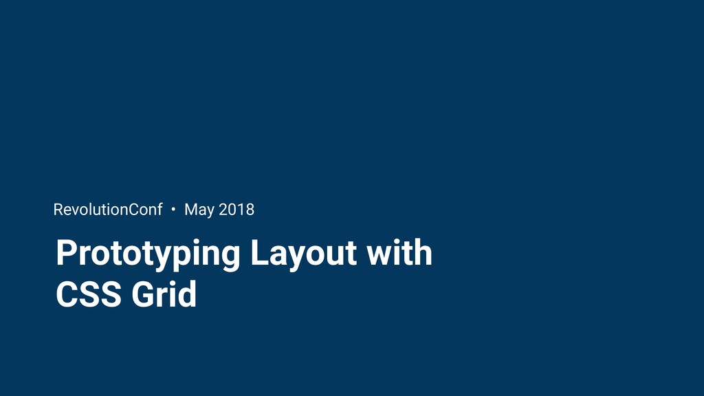
Prototyping Layout with CSS Grid - RevolutionCo...
Search
Jessica Eldredge
May 18, 2018
Technology
350
1
Share
Embed
Copy iframe code
Copy JS code
Copy link
Start on current slide
Prototyping Layout with CSS Grid - RevolutionConf 2018
Presented at RevolutionConf, May 2018
Jessica Eldredge
May 18, 2018
More Decks by Jessica Eldredge
See All by Jessica Eldredge
Prototyping Layout with CSS Grid - Refresh DC
jessabean
1
480
Sketchnoting: Creative Notes for Technical Content
jessabean
7
1.4k
Front End Badassery with Sass
jessabean
9
410
Other Decks in Technology
See All in Technology
AmplifyHostingConstructからSSRフレームワークのためのホスティング設計を考察する/amplify-hosting-construct
fossamagna
1
280
大量データに対しても、生成AIを用いてリーズナブルにデータ加工をしたい!Databricksのai_queryについて調べてみた
kamoshika
1
270
複数プロダクト組織のAIネイティブ化における戦略 / AICon2026_kude
rakus_dev
0
290
AI_Dev_Day_製造業領域でのAI活用から見た活用の罠と成功に導く実践知.pdf
kintotechdev
0
120
Oracle Exadata Database Service on Cloud@Customer X11M (ExaDB-C@C) サービス概要
oracle4engineer
PRO
2
8.5k
Amazon Quick 入門!
ysuzuki
2
120
SREとQA 二人三脚で進めるSLO運用/sre-qa-slo
sugitak
0
1.2k
PHPで作って学ぶリアルタイム音声対話AIとWebSocket入門 by ムナカタ
munakata
0
110
データエンジニアリングとドメイン駆動設計
masuda220
PRO
14
2.3k
AI時代におけるテストの基礎の再定義 / Rethinking the Fundamentals of Testing in the AI Era
mineo_matsuya
5
2k
OpenTelemetryにおけるGoのゼロコード・コンパイル時計装について #fukuokago
quiver
0
190
JAWS_ICEBERG_BASECAMP
iqbocchi
2
110
Featured
See All Featured
Practical Tips for Bootstrapping Information Extraction Pipelines
honnibal
25
2k
How STYLIGHT went responsive
nonsquared
100
6.2k
Winning Ecommerce Organic Search in an AI Era - #searchnstuff2025
aleyda
1
2.1k
Responsive Adventures: Dirty Tricks From The Dark Corners of Front-End
smashingmag
254
22k
Ethics towards AI in product and experience design
skipperchong
2
330
Helping Users Find Their Own Way: Creating Modern Search Experiences
danielanewman
31
3.3k
Embracing the Ebb and Flow
colly
88
5.1k
For a Future-Friendly Web
brad_frost
183
10k
Effective software design: The role of men in debugging patriarchy in IT @ Voxxed Days AMS
baasie
0
450
Kristin Tynski - Automating Marketing Tasks With AI
techseoconnect
PRO
0
410
Docker and Python
trallard
47
4k
It's Worth the Effort
3n
188
29k
Transcript
Prototyping Layout with CSS Grid RevolutionConf • May 2018
Hello! Jess Eldredge Senior front-end engineer, Splice @jessabean
Grid systems: the foundation of design
None
None
None
None
Design challenge
None
None
None
Our requirements • Responsive: grid context changes across breakpoints •
Use CSS Grid! • Fallback for browsers that don’t support grid
What is CSS Grid Layout?
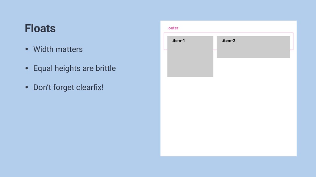
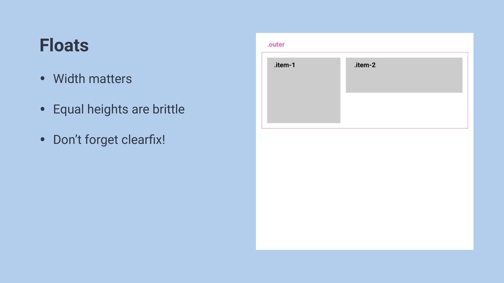
Floats • Width matters • Equal heights are brittle •
Don’t forget clearfix!
Floats • Width matters • Equal heights are brittle •
Don’t forget clearfix!
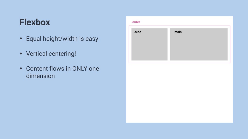
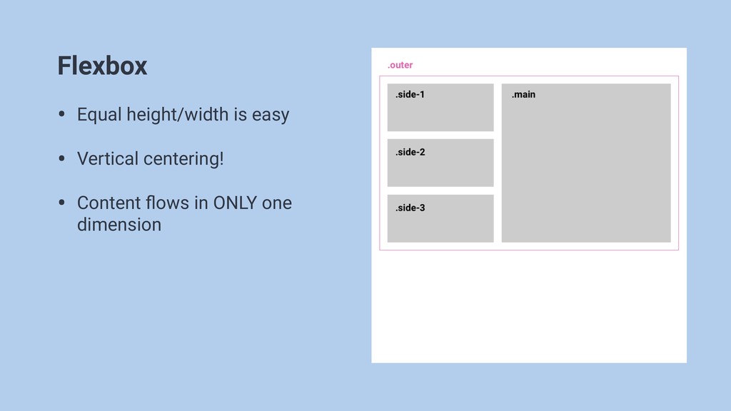
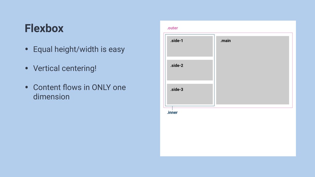
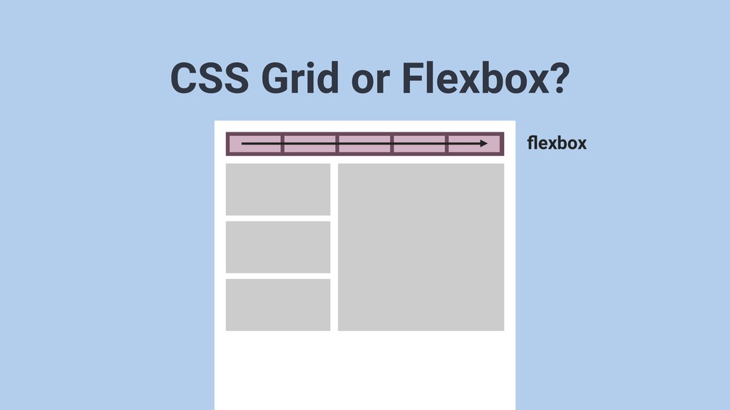
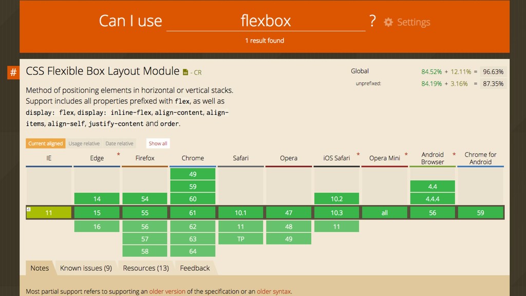
Flexbox • Equal height/width is easy • Vertical centering! •
Content flows in ONLY one dimension
Flexbox • Equal height/width is easy • Vertical centering! •
Content flows in ONLY one dimension
Flexbox • Equal height/width is easy • Vertical centering! •
Content flows in ONLY one dimension
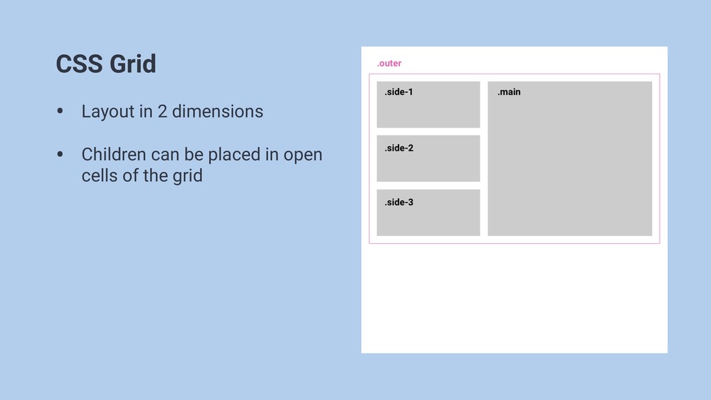
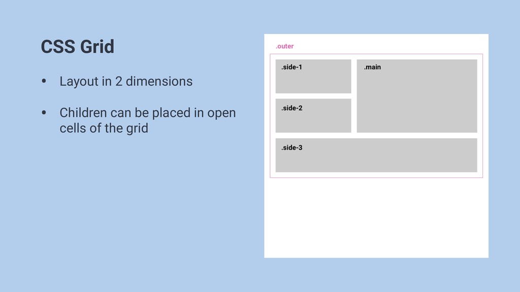
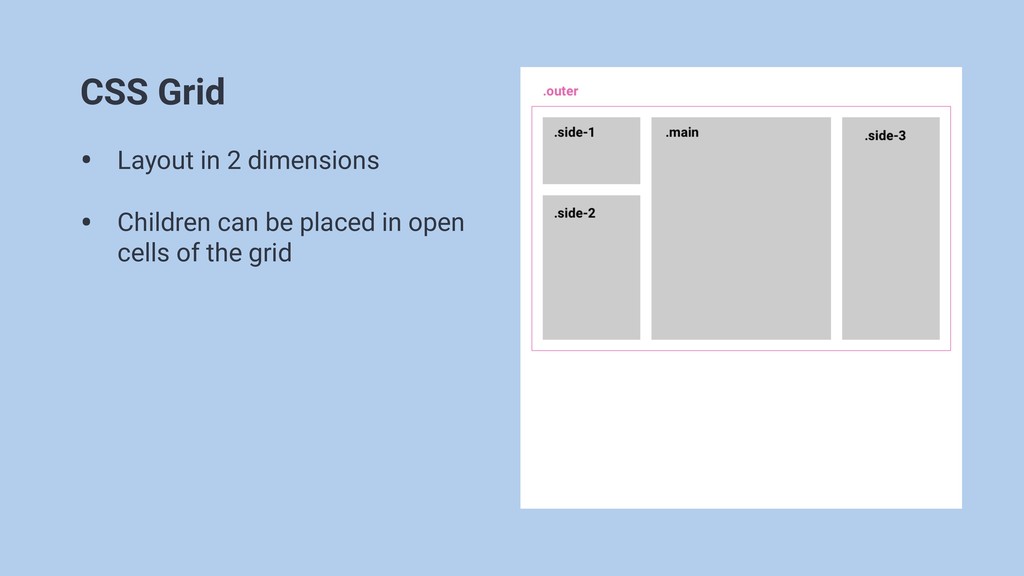
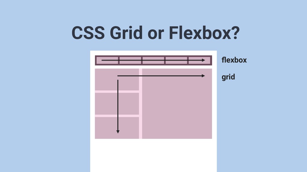
CSS Grid • Layout in 2 dimensions • Children can
be placed in open cells of the grid
CSS Grid • Layout in 2 dimensions • Children can
be placed in open cells of the grid
CSS Grid • Layout in 2 dimensions • Children can
be placed in open cells of the grid
CSS Grid terms
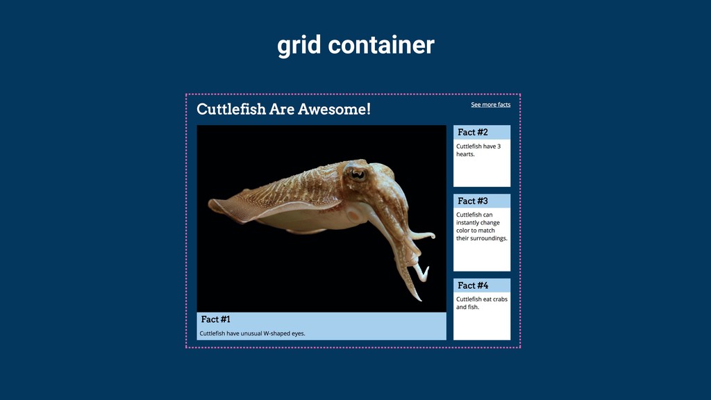
grid container
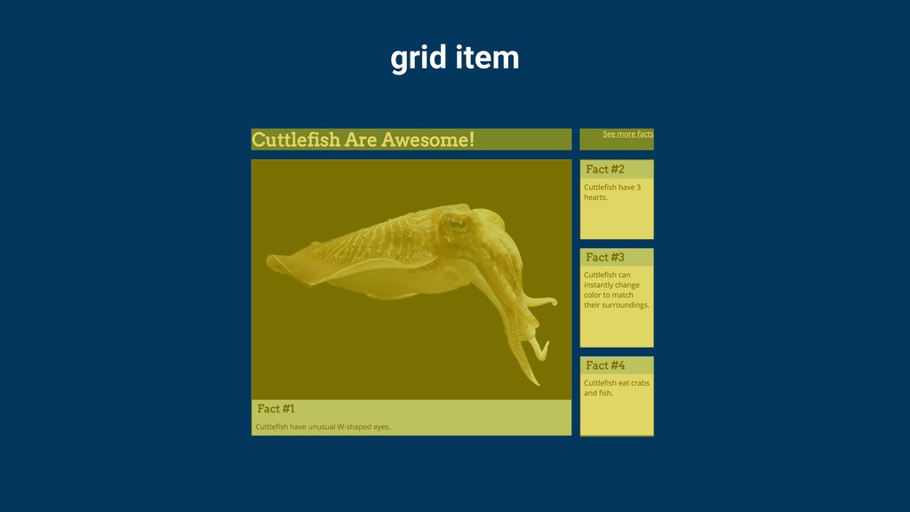
grid item
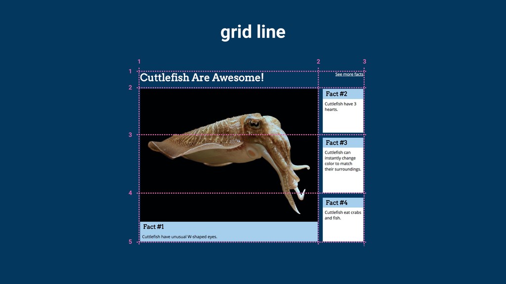
grid line
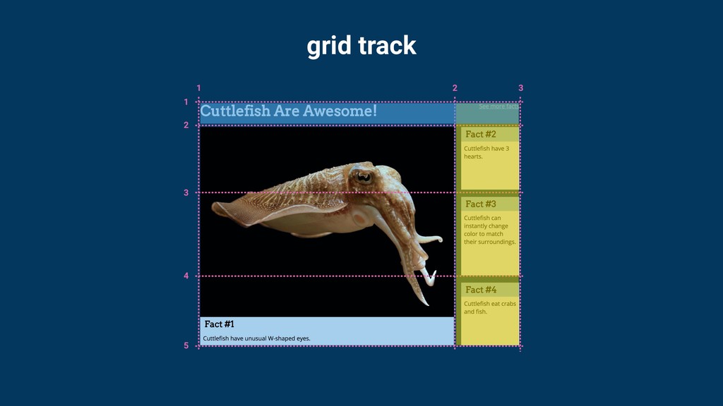
grid track
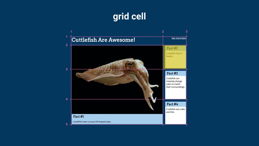
grid cell
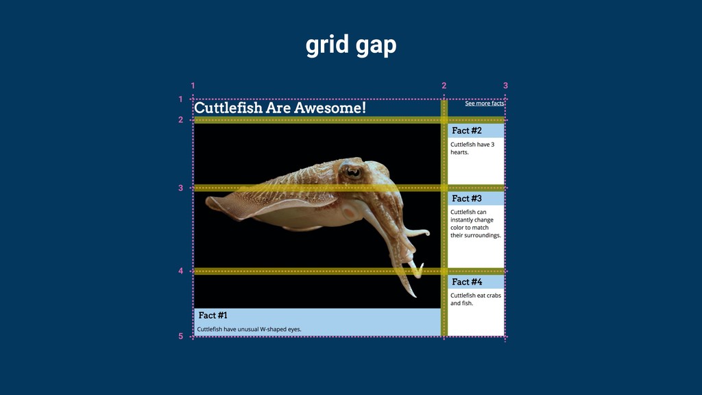
grid gap
grid gap
Setting up the grid
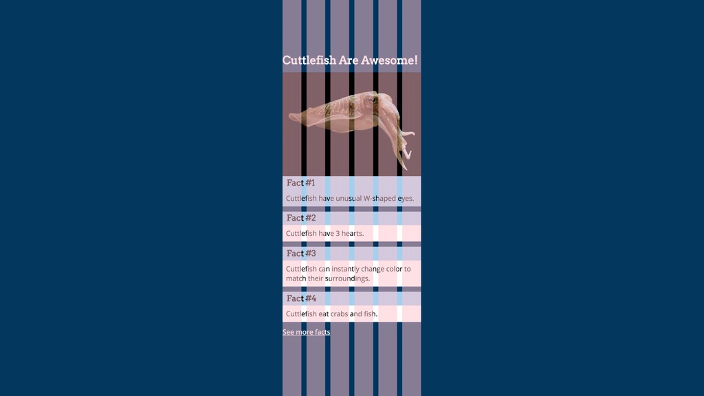
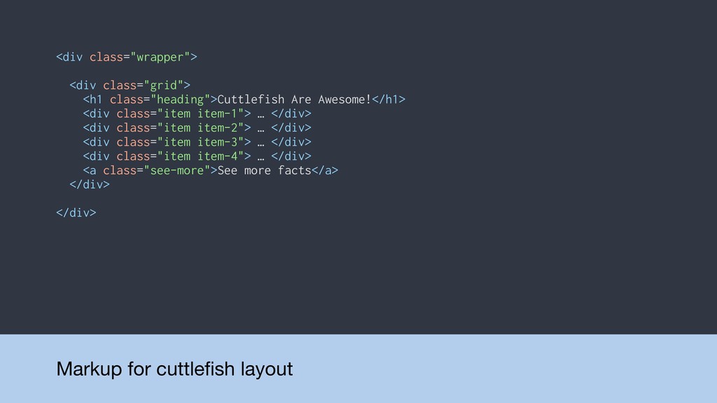
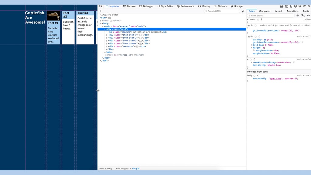
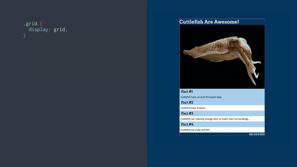
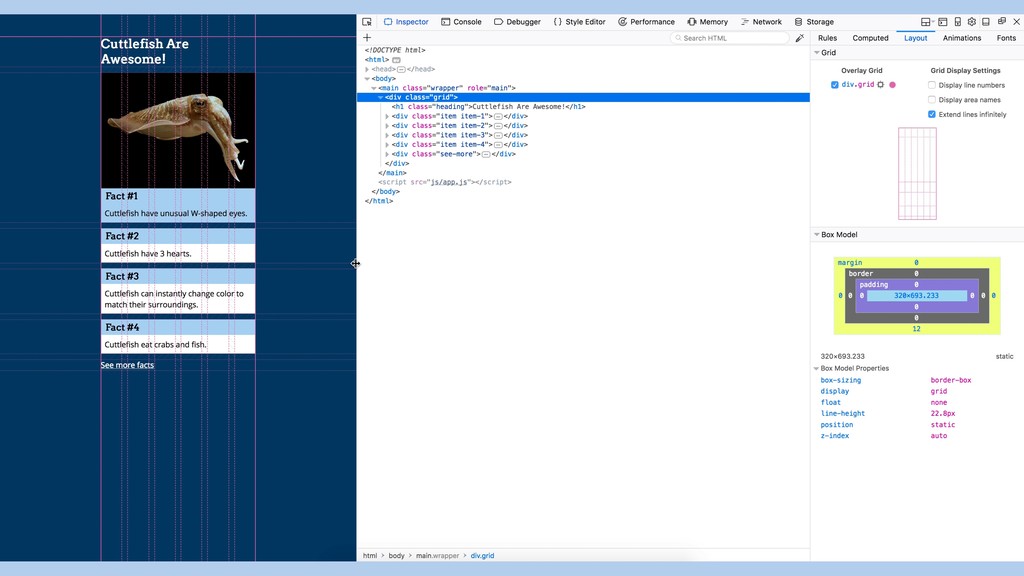
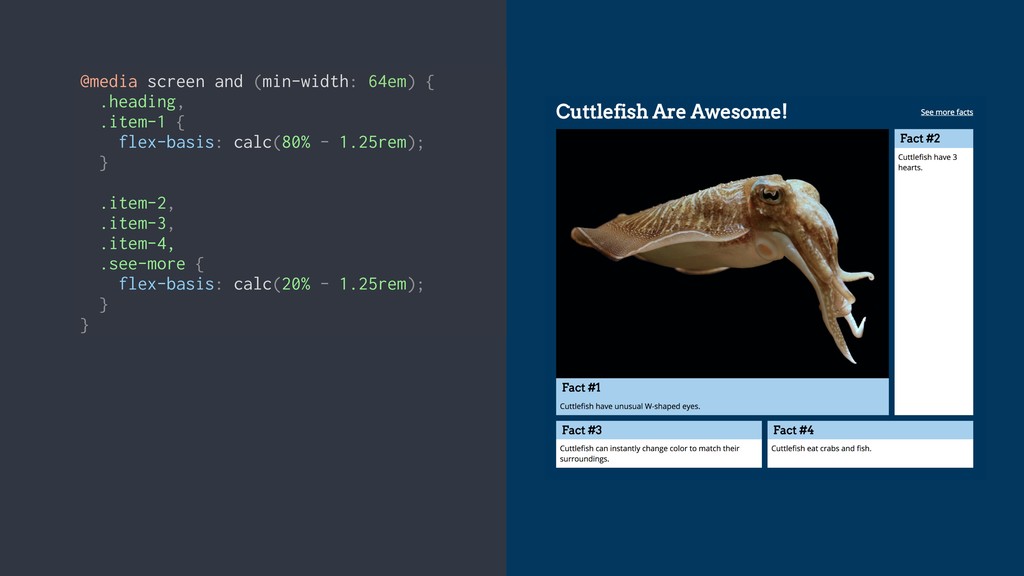
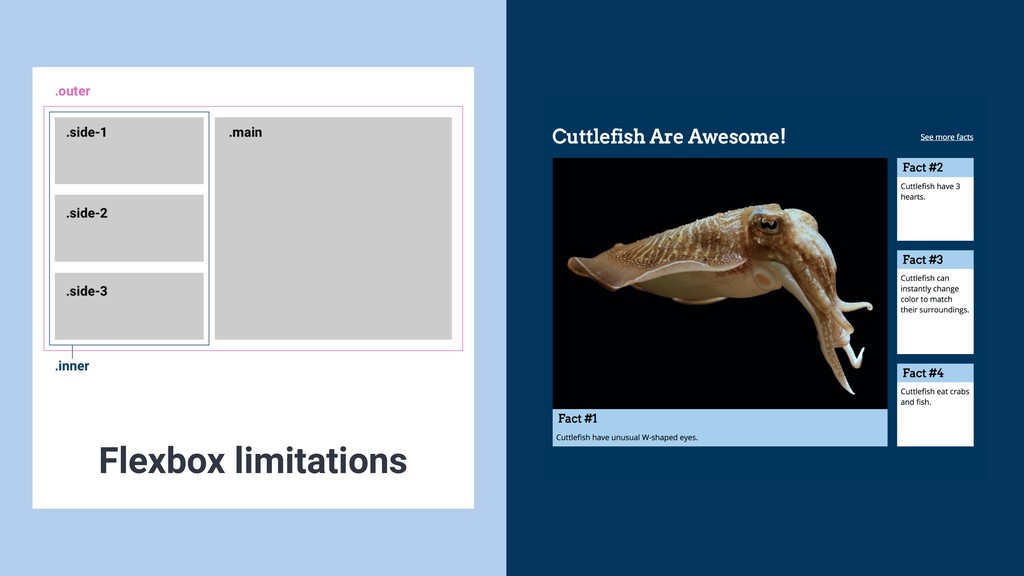
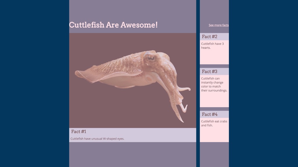
Markup for cuttlefish layout <div class="wrapper"> <div class="grid"> <h1 class="heading">Cuttlefish
Are Awesome!</h1> <div class="item item-1"> … </div> <div class="item item-2"> … </div> <div class="item item-3"> … </div> <div class="item item-4"> … </div> <a class="see-more">See more facts</a> </div> </div>
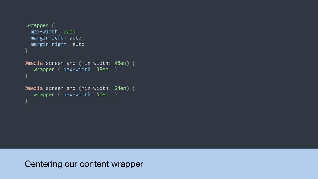
Centering our content wrapper .wrapper { max-width: 20em; margin-left: auto;
margin-right: auto; } @media screen and (min-width: 48em) { .wrapper { max-width: 38em; } } @media screen and (min-width: 64em) { .wrapper { max-width: 55em; } }
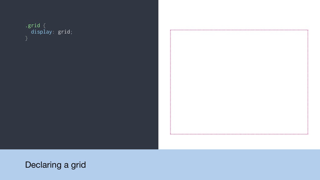
.grid { display: grid; } Declaring a grid
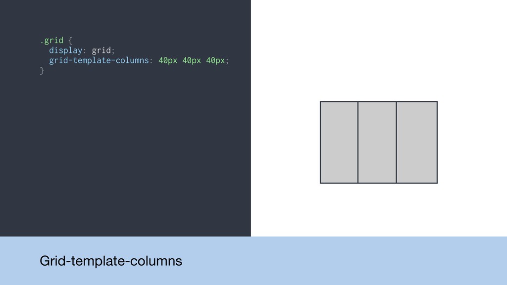
.grid { display: grid; grid-template-columns: 40px 40px 40px; } Grid-template-columns
.grid { display: grid; grid-template-columns: 40px 40px 40px; } .grid
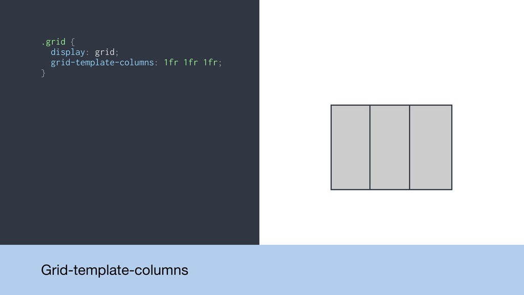
{ display: grid; grid-template-columns: 1fr 1fr 1fr; } Grid-template-columns
.grid { display: grid; grid-template-columns: 40px 40px 40px; } .grid
{ display: grid; grid-template-columns: 1fr 1fr 1fr; } .grid { display: grid; grid-template-columns: 1fr 2fr 1fr; } Grid-template-columns
.grid { display: grid; grid-template-columns: 40px 40px 40px; } .grid
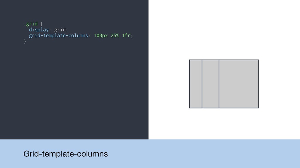
{ display: grid; grid-template-columns: 1fr 1fr 1fr; } .grid { display: grid; grid-template-columns: 1fr 2fr 1fr; } .grid { display: grid; grid-template-columns: 100px 25% 1fr; } Grid-template-columns
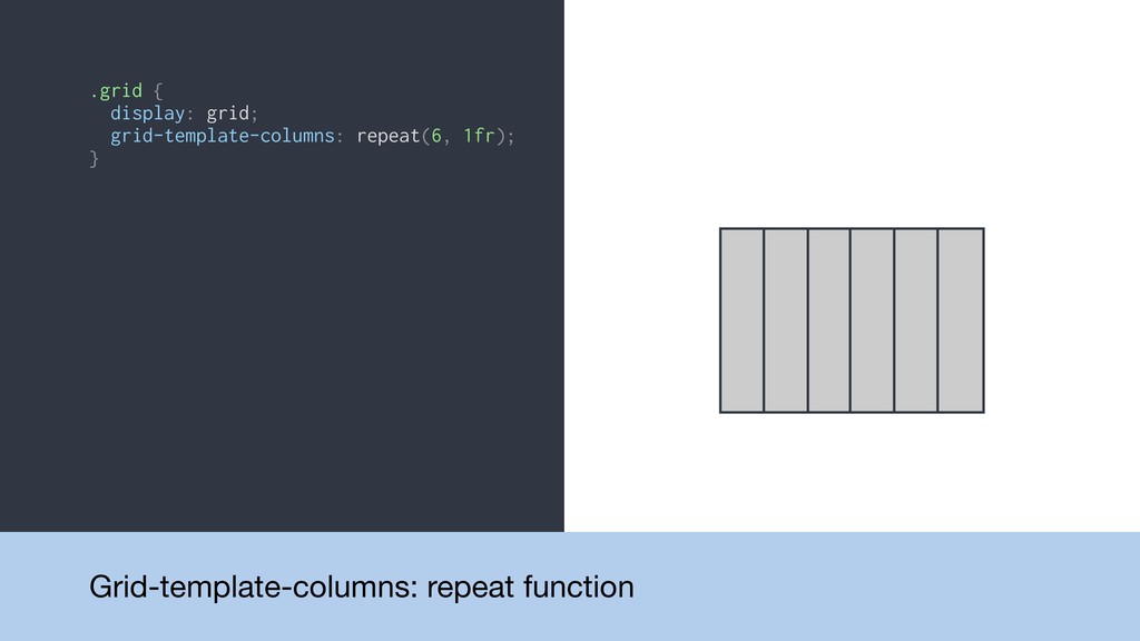
.grid { display: grid; grid-template-columns: repeat(6, 1fr); } Grid-template-columns: repeat
function
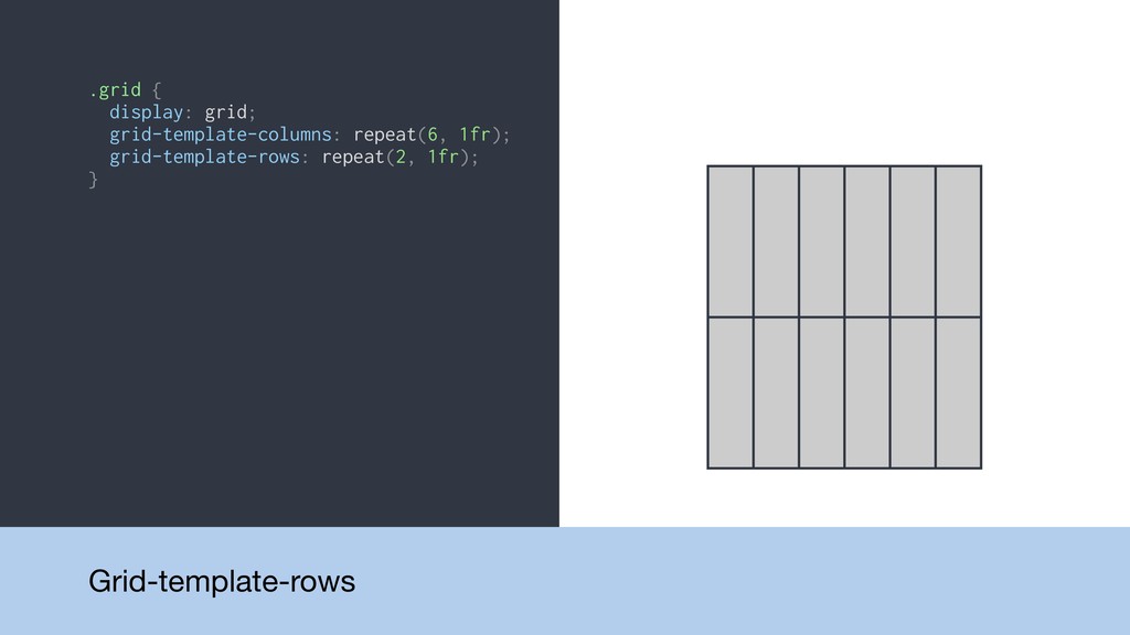
.grid { display: grid; grid-template-columns: repeat(6, 1fr); grid-template-rows: repeat(2, 1fr);
} Grid-template-rows
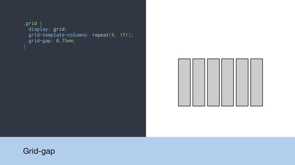
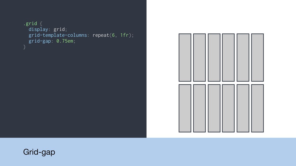
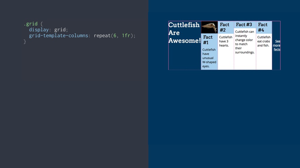
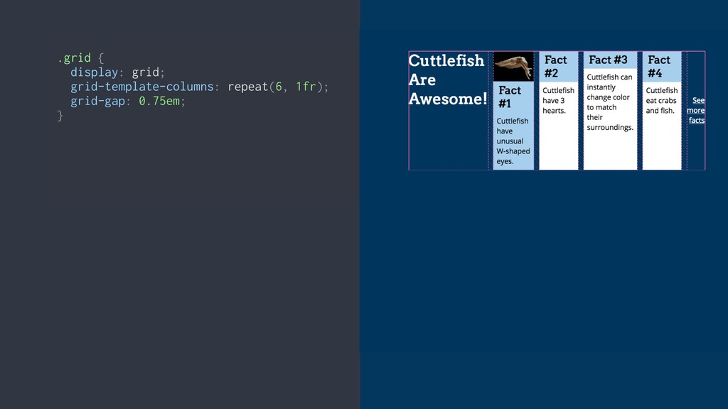
.grid { display: grid; grid-template-columns: repeat(6, 1fr); grid-gap: 0.75em; }
Grid-gap
.grid { display: grid; grid-template-columns: repeat(6, 1fr); grid-gap: 0.75em; }
Grid-gap
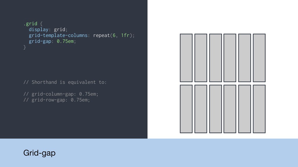
.grid { display: grid; grid-template-columns: repeat(6, 1fr); grid-gap: 0.75em; }
// Shorthand is equivalent to: // grid-column-gap: 0.75em; // grid-row-gap: 0.75em; Grid-gap
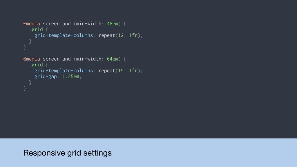
@media screen and (min-width: 48em) { .grid { grid-template-columns: repeat(12,
1fr); } } @media screen and (min-width: 64em) { .grid { grid-template-columns: repeat(15, 1fr); grid-gap: 1.25em; } } Responsive grid settings
DEMO: Basic grid
Placing items on the grid
None
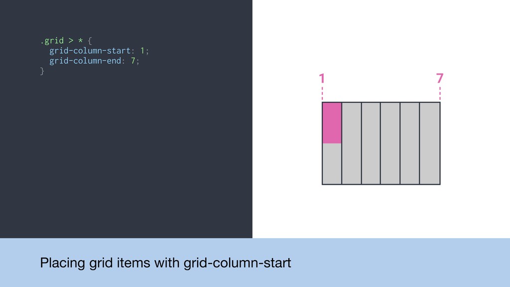
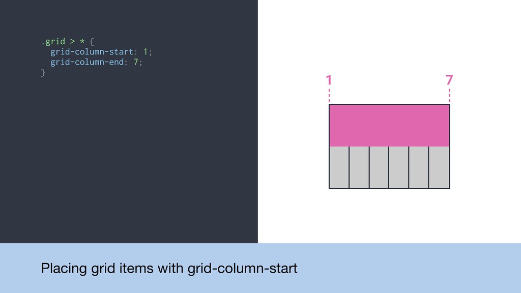
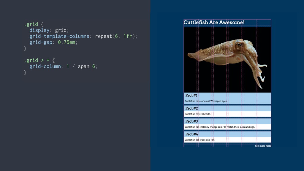
.grid > * { grid-column-start: 1; grid-column-end: 7; } Placing
grid items with grid-column-start
.grid > * { grid-column-start: 1; grid-column-end: 7; } Placing
grid items with grid-column-start
.grid > * { grid-column-start: 1; grid-column-end: 7; } Placing
grid items with grid-column-start
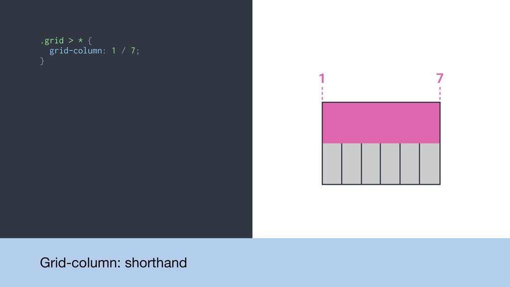
.grid > * { grid-column: 1 / 7; } Grid-column:
shorthand
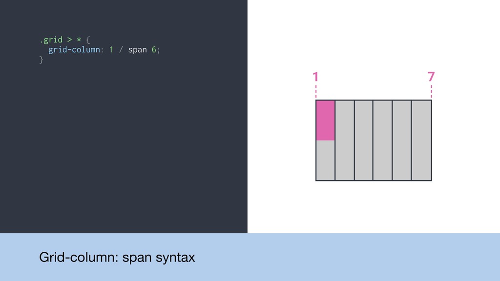
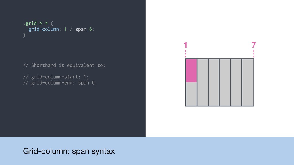
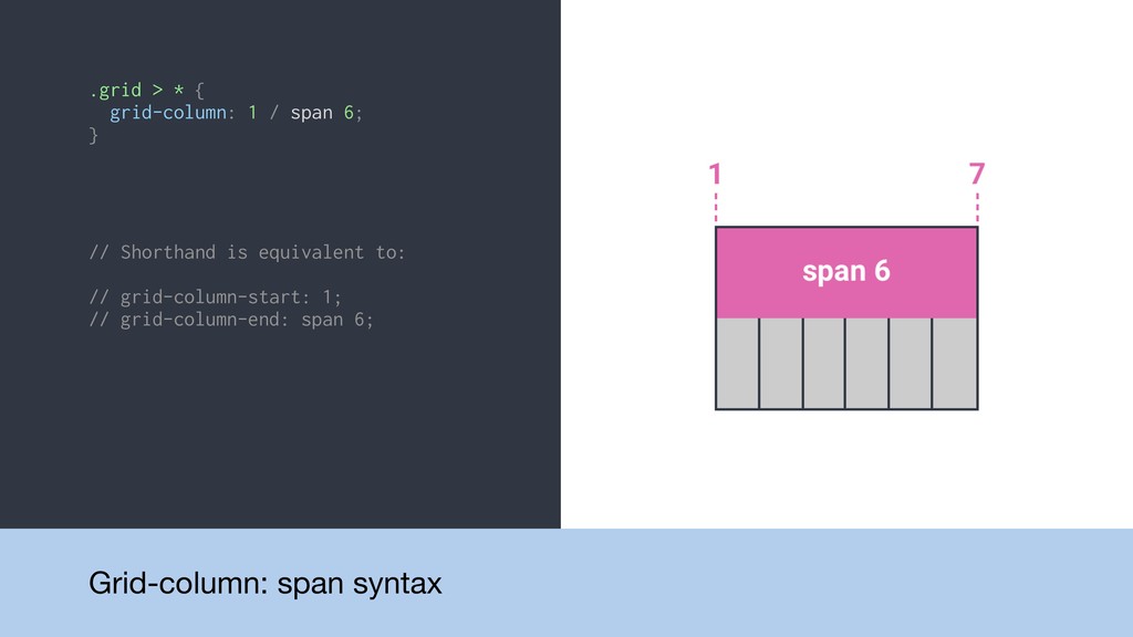
.grid > * { grid-column: 1 / span 6; }
Grid-column: span syntax
.grid > * { grid-column: 1 / span 6; }
// Shorthand is equivalent to: // grid-column-start: 1; // grid-column-end: span 6; Grid-column: span syntax
.grid > * { grid-column: 1 / span 6; }
// Shorthand is equivalent to: // grid-column-start: 1; // grid-column-end: span 6; Grid-column: span syntax
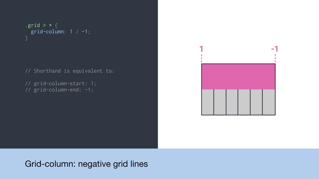
.grid > * { grid-column: 1 / -1; } Grid-column:
negative grid lines
.grid > * { grid-column: 1 / -1; } //
Shorthand is equivalent to: // grid-column-start: 1; // grid-column-end: -1; Grid-column: negative grid lines
.grid { display: grid; }
.grid { display: grid; } .grid { display: grid; grid-template-columns:
repeat(6, 1fr); }
.grid { display: grid; } .grid { display: grid; grid-template-columns:
repeat(6, 1fr); } .grid { display: grid; grid-template-columns: repeat(6, 1fr); grid-gap: 0.75em; }
.grid { display: grid; } .grid { display: grid; grid-template-columns:
repeat(6, 1fr); } .grid { display: grid; grid-template-columns: repeat(6, 1fr); grid-gap: 0.75em; } .grid { display: grid; grid-template-columns: repeat(6, 1fr); grid-gap: 0.75em; } .grid > * { grid-column: 1 / span 6; }
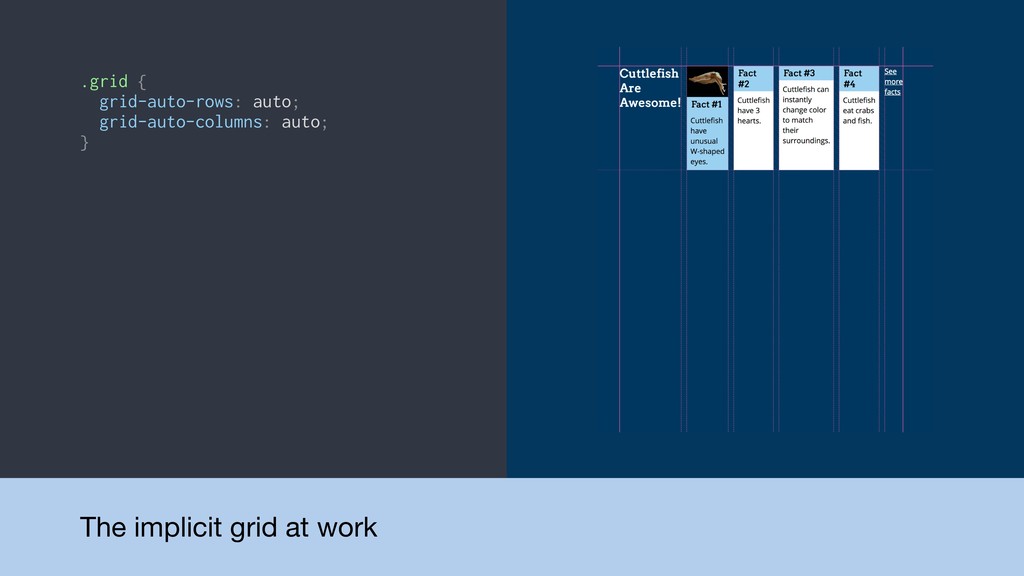
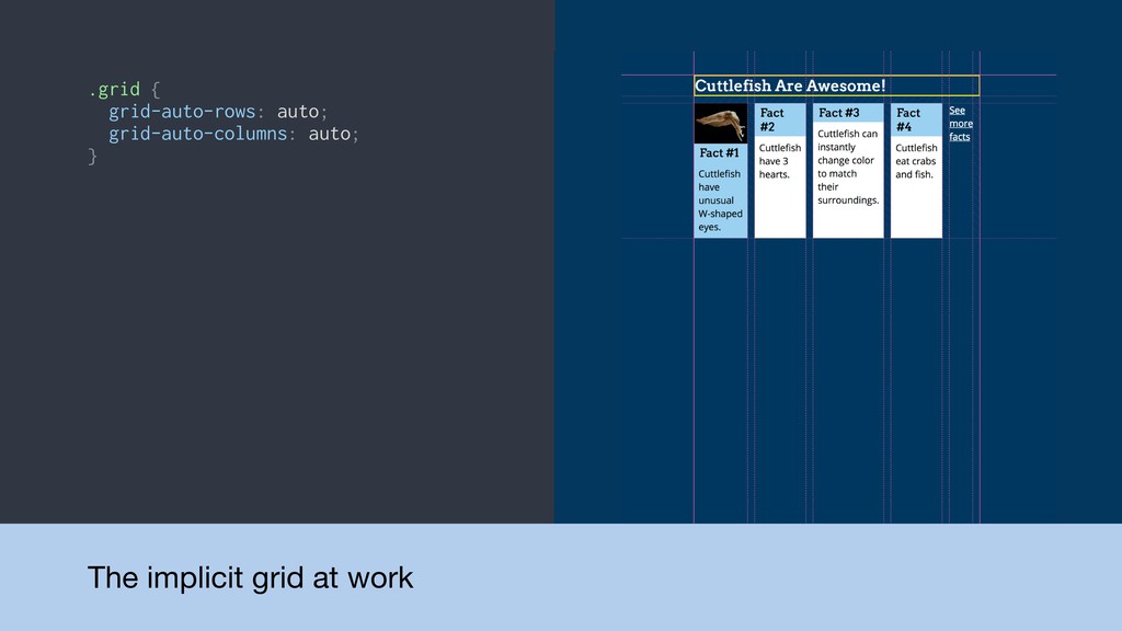
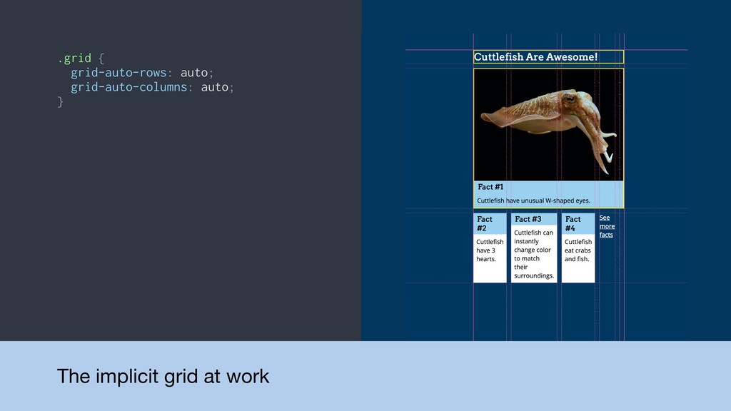
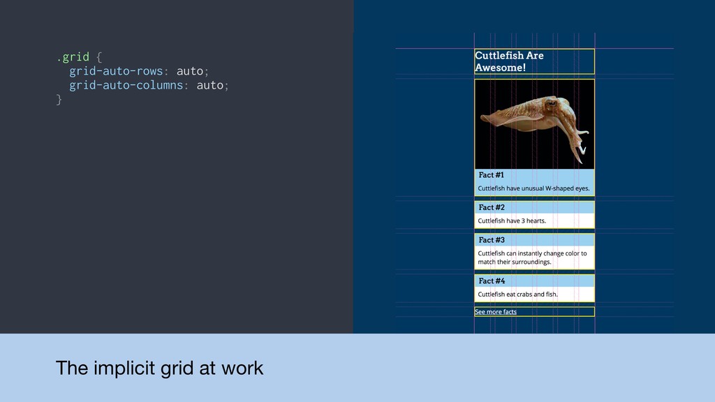
Detour! The implicit grid • Explicit grid: The grid
we define with grid-template-columns or grid-template-rows • Implicit grid: Automatically-created tracks to accommodate additional content
.grid { grid-auto-rows: auto; grid-auto-columns: auto; } The implicit grid
at work
.grid { grid-auto-rows: auto; grid-auto-columns: auto; } The implicit grid
at work
.grid { grid-auto-rows: auto; grid-auto-columns: auto; } The implicit grid
at work
.grid { grid-auto-rows: auto; grid-auto-columns: auto; } The implicit grid
at work
None
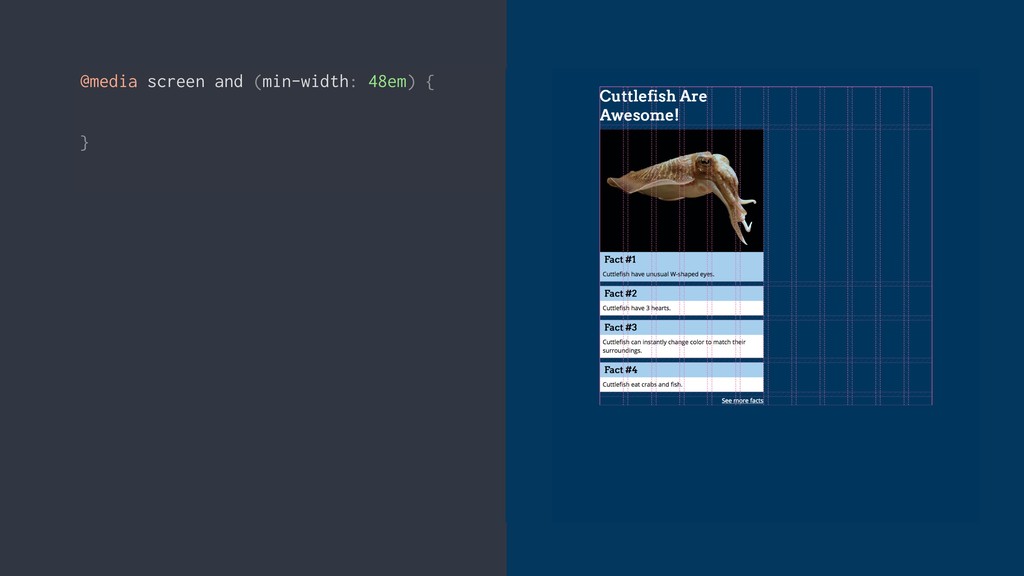
@media screen and (min-width: 48em) { }
@media screen and (min-width: 48em) { } @media screen and
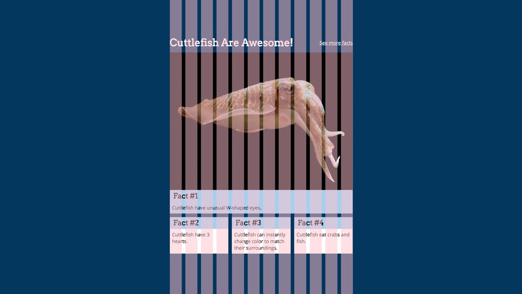
(min-width: 48em) { .heading { grid-column: 1 / span 9; } .see-more { grid-column: 10 / span 3; } }
@media screen and (min-width: 48em) { .heading { grid-column: 1
/ span 9; grid-row: 1; } .see-more { grid-column: 10 / span 3; grid-row: 1; } }
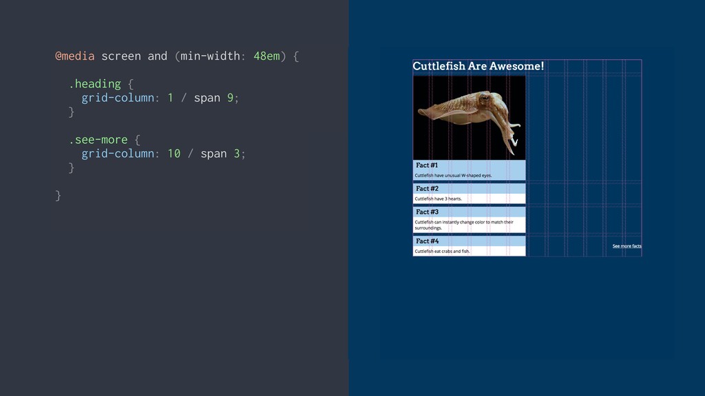
@media screen and (min-width: 48em) { .item-1 { grid-column: 1
/ span 12; } .item-2 { grid-column: 1 / span 4; } .item-3 { grid-column: 5 / span 4; } .item-4 { grid-column: 9 / span 4; } }
None
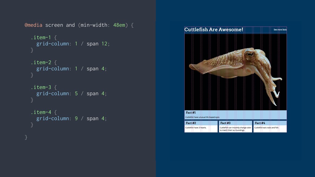
@media screen and (min-width: 64em) { }
@media screen and (min-width: 64em) { } @media screen and
(min-width: 64em) { .heading { grid-column: 1 / span 12; } .see-more { grid-column: 13 / span 3; } }
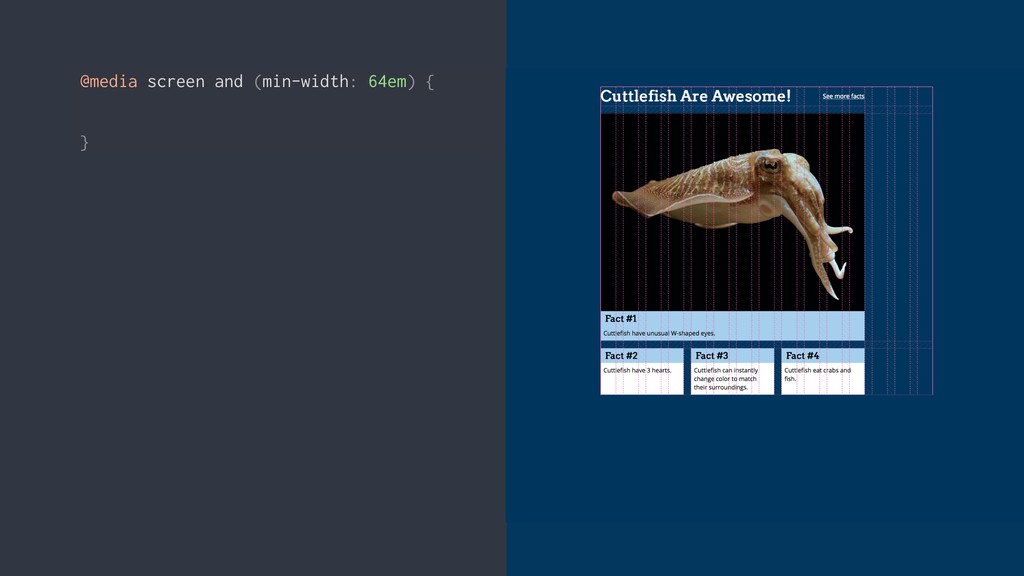
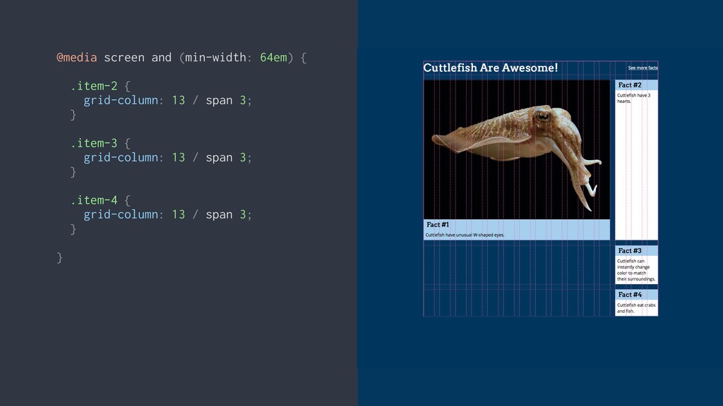
@media screen and (min-width: 64em) { .item-2 { grid-column: 13
/ span 3; } .item-3 { grid-column: 13 / span 3; } .item-4 { grid-column: 13 / span 3; } }
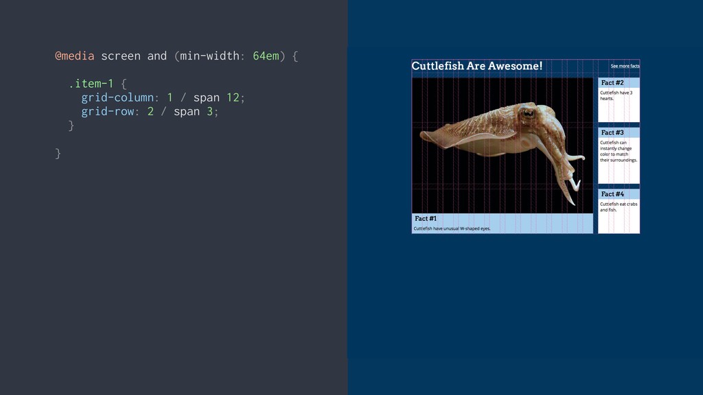
@media screen and (min-width: 64em) { .item-1 { grid-column: 1
/ span 12; grid-row: 2 / span 3; } }
VIDEO: Final grid at all breakpoints
Progressive enhancement
None
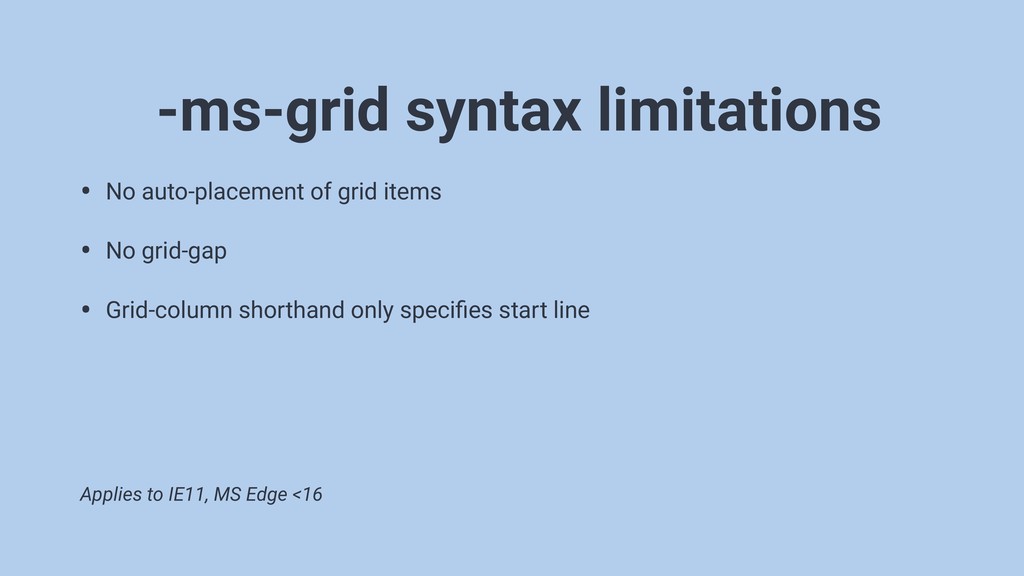
• No auto-placement of grid items • No grid-gap •
Grid-column shorthand only specifies start line -ms-grid syntax limitations Applies to IE11, MS Edge <16
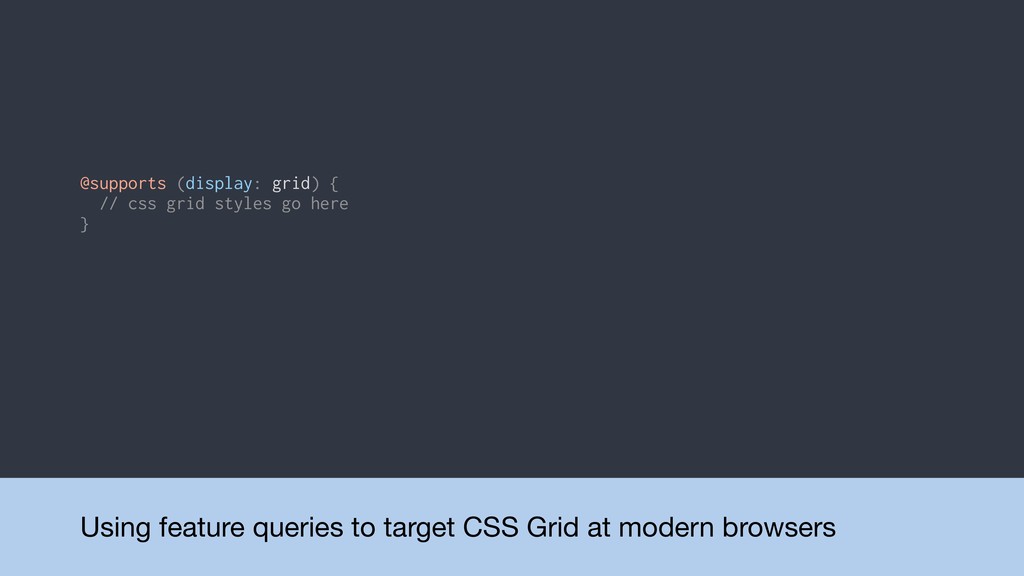
Using feature queries to target CSS Grid at modern browsers
@supports (display: grid) { // css grid styles go here }
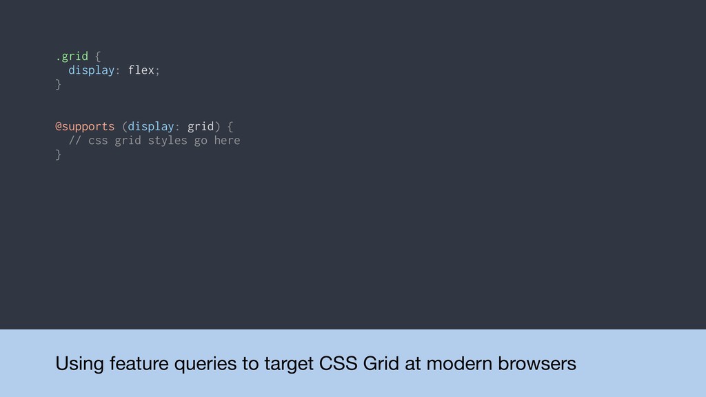
Using feature queries to target CSS Grid at modern browsers
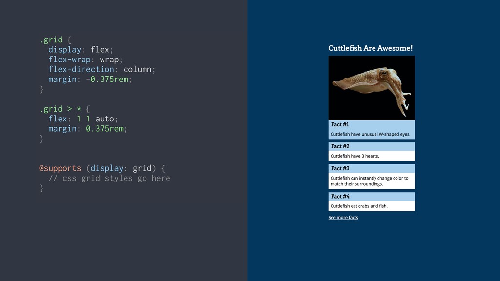
@supports (display: grid) { // css grid styles go here } .grid { display: flex; }
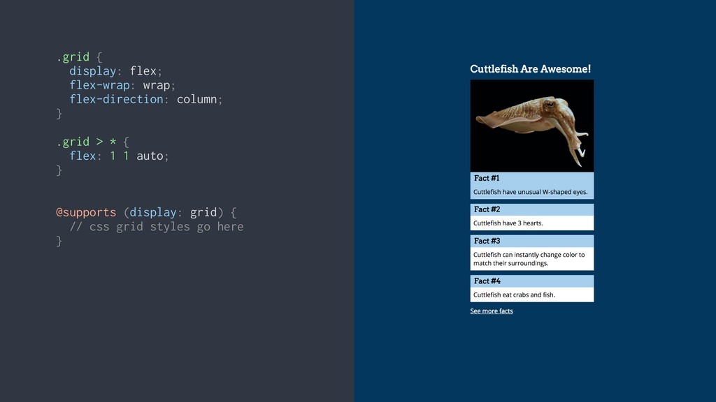
.grid { display: flex; flex-wrap: wrap; flex-direction: column; } .grid
> * { flex: 1 1 auto; } @supports (display: grid) { // css grid styles go here }
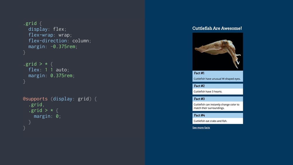
.grid { display: flex; flex-wrap: wrap; flex-direction: column; margin: -0.375rem;
} .grid > * { flex: 1 1 auto; margin: 0.375rem; } @supports (display: grid) { // css grid styles go here }
.grid { display: flex; flex-wrap: wrap; flex-direction: column; margin: -0.375rem;
} .grid > * { flex: 1 1 auto; margin: 0.375rem; } @supports (display: grid) { // css grid styles go here } .grid { display: flex; flex-wrap: wrap; flex-direction: column; margin: -0.375rem; } .grid > * { flex: 1 1 auto; margin: 0.375rem; } @supports (display: grid) { .grid, .grid > * { margin: 0; } }
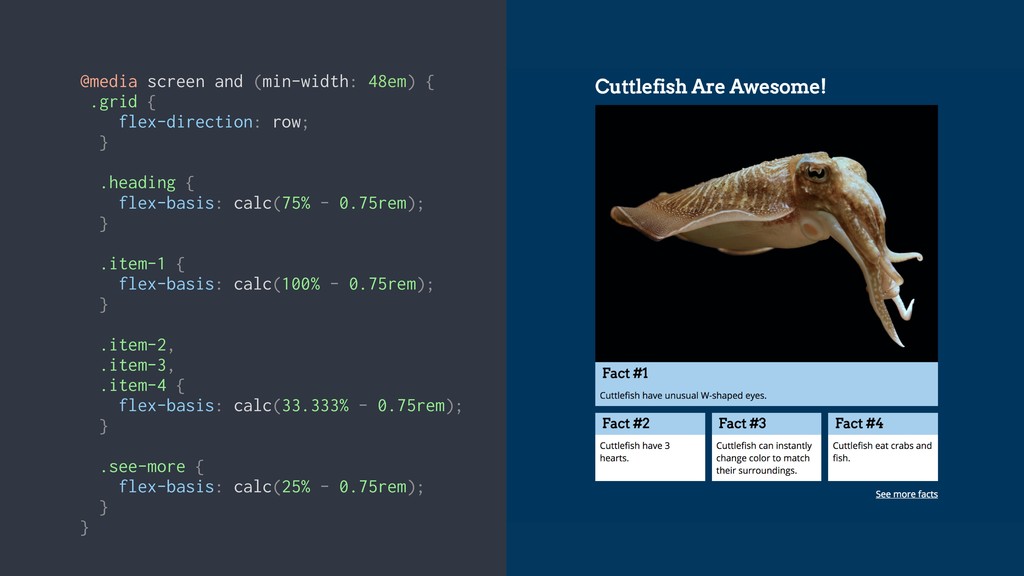
@media screen and (min-width: 48em) { .grid { flex-direction: row;
} .heading { flex-basis: calc(75% - 0.75rem); } .item-1 { flex-basis: calc(100% - 0.75rem); } .item-2, .item-3, .item-4 { flex-basis: calc(33.333% - 0.75rem); } .see-more { flex-basis: calc(25% - 0.75rem); } }
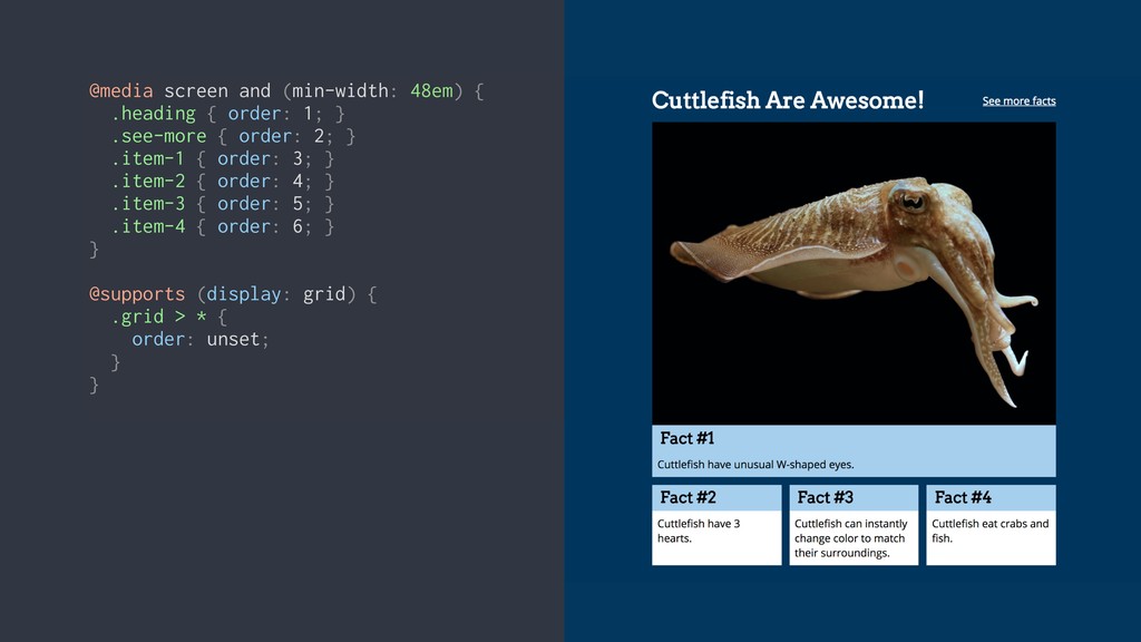
@media screen and (min-width: 48em) { .heading { order: 1;
} .see-more { order: 2; } .item-1 { order: 3; } .item-2 { order: 4; } .item-3 { order: 5; } .item-4 { order: 6; } } @supports (display: grid) { .grid > * { order: unset; } }
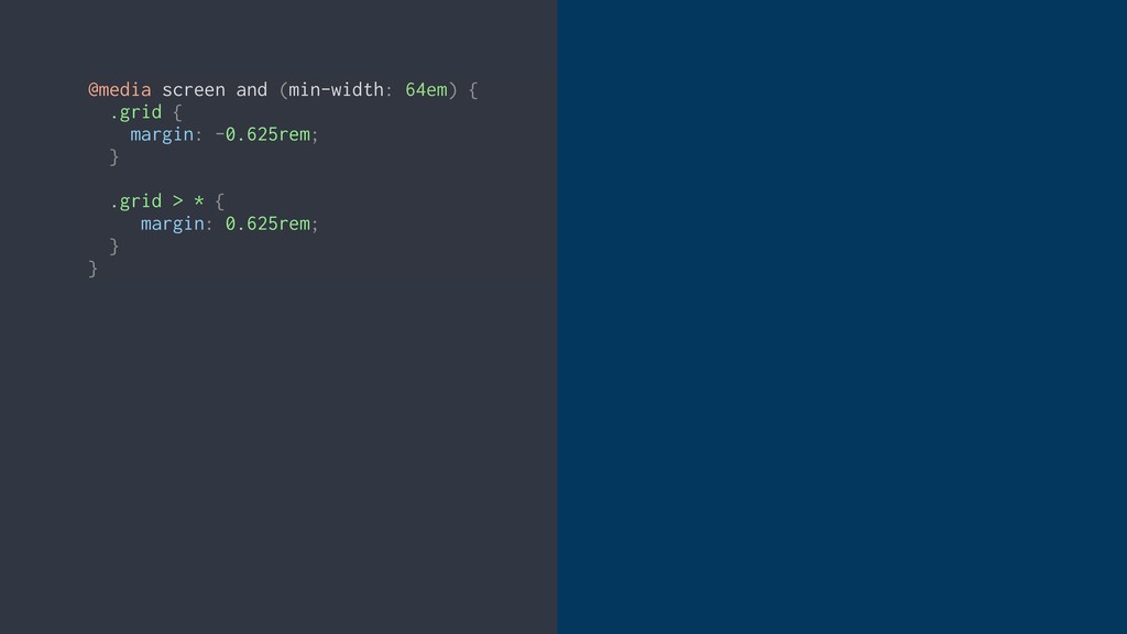
@media screen and (min-width: 64em) { .grid { margin: -0.625rem;
} .grid > * { margin: 0.625rem; } }
@media screen and (min-width: 64em) { .grid { margin: -0.625rem;
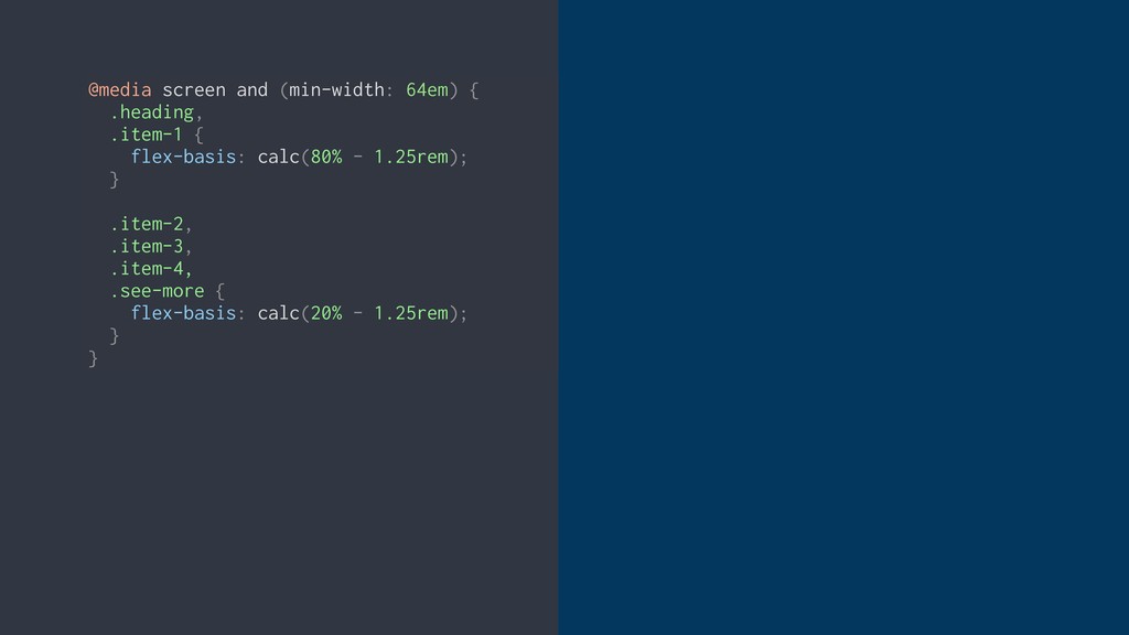
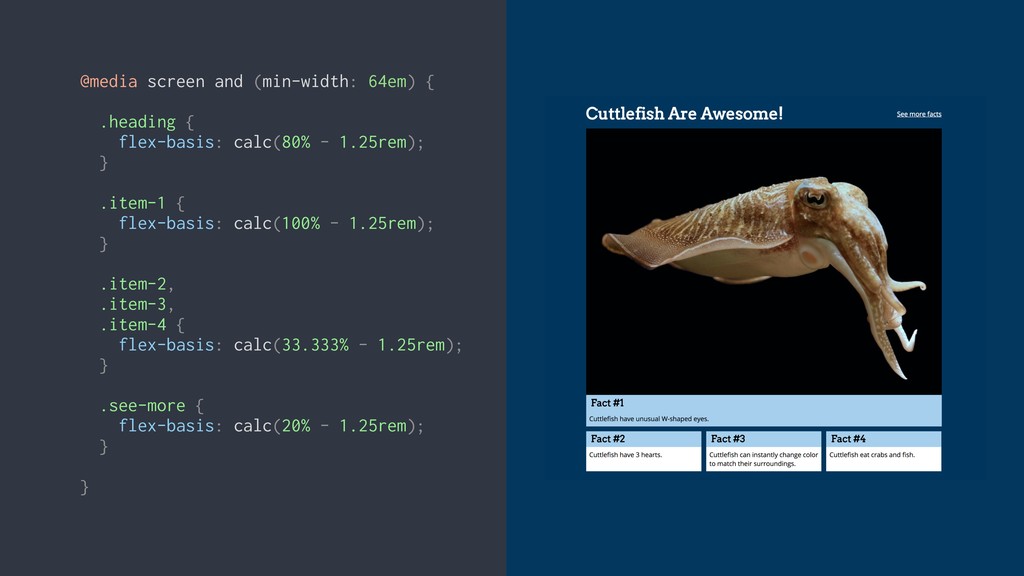
} .grid > * { margin: 0.625rem; } } @media screen and (min-width: 64em) { .heading, .item-1 { flex-basis: calc(80% - 1.25rem); } .item-2, .item-3, .item-4, .see-more { flex-basis: calc(20% - 1.25rem); } }
@media screen and (min-width: 64em) { .grid { margin: -0.625rem;
} .grid > * { margin: 0.625rem; } } @media screen and (min-width: 64em) { .heading, .item-1 { flex-basis: calc(80% - 1.25rem); } .item-2, .item-3, .item-4, .see-more { flex-basis: calc(20% - 1.25rem); } }
Flexbox limitations
@media screen and (min-width: 64em) { .heading { flex-basis: calc(80%
- 1.25rem); } .item-1 { flex-basis: calc(100% - 1.25rem); } .item-2, .item-3, .item-4 { flex-basis: calc(33.333% - 1.25rem); } .see-more { flex-basis: calc(20% - 1.25rem); } }
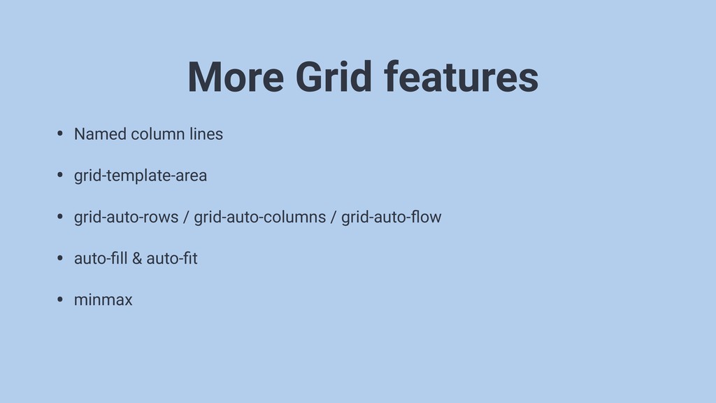
There’s a lot more to CSS Grid
• Named column lines • grid-template-area • grid-auto-rows / grid-auto-columns
/ grid-auto-flow • auto-fill & auto-fit • minmax More Grid features
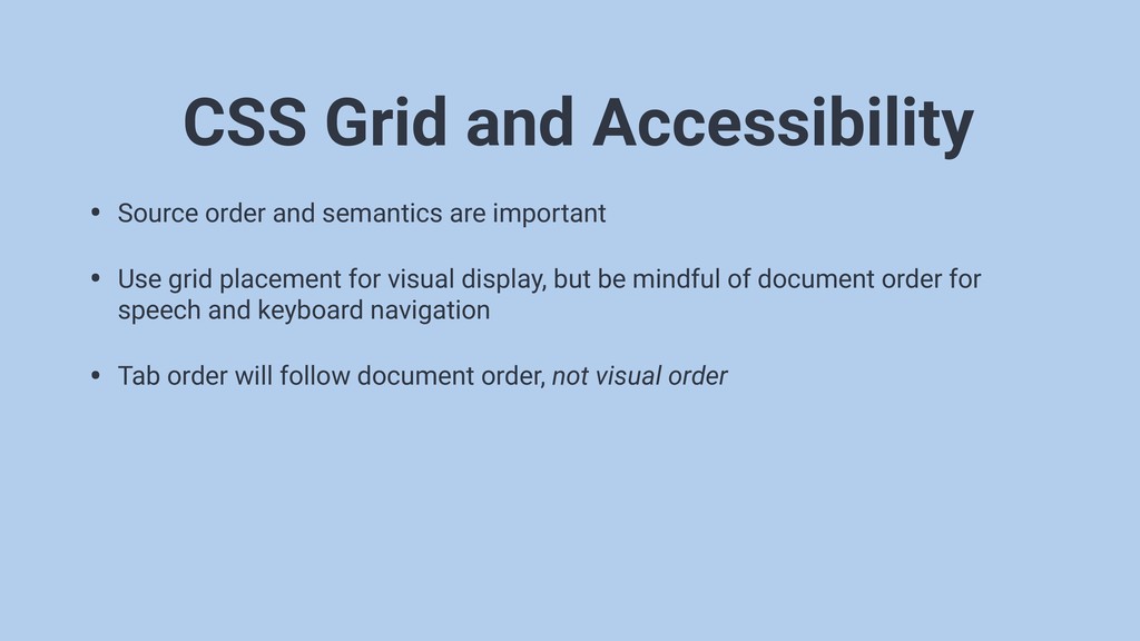
• Source order and semantics are important • Use grid
placement for visual display, but be mindful of document order for speech and keyboard navigation • Tab order will follow document order, not visual order CSS Grid and Accessibility
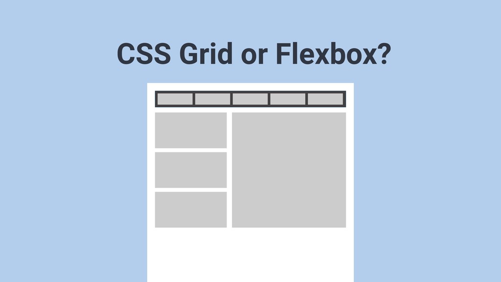
CSS Grid or Flexbox?
CSS Grid or Flexbox?
CSS Grid or Flexbox?
You can use CSS Grid TODAY
None
None
None
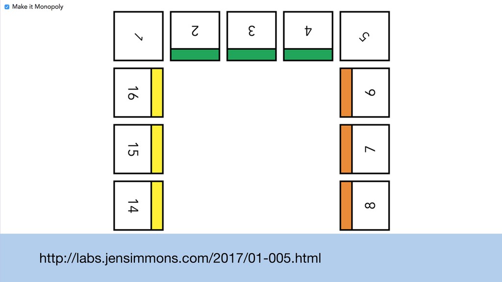
http://labs.jensimmons.com/2017/01-005.html
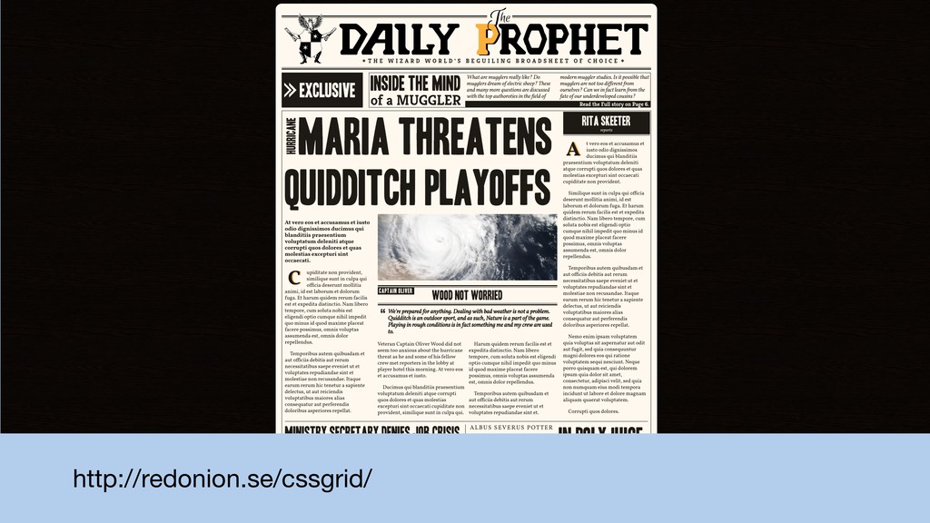
http://redonion.se/cssgrid/
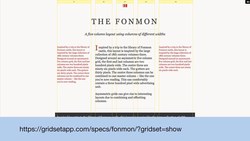
https://gridsetapp.com/specs/fonmon/?gridset=show
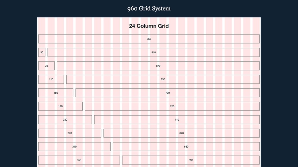
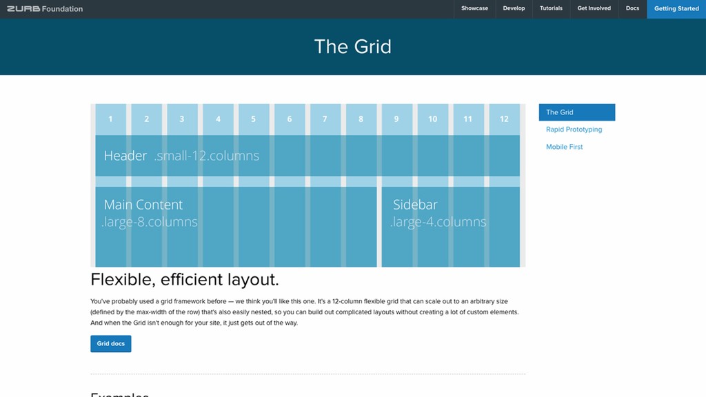
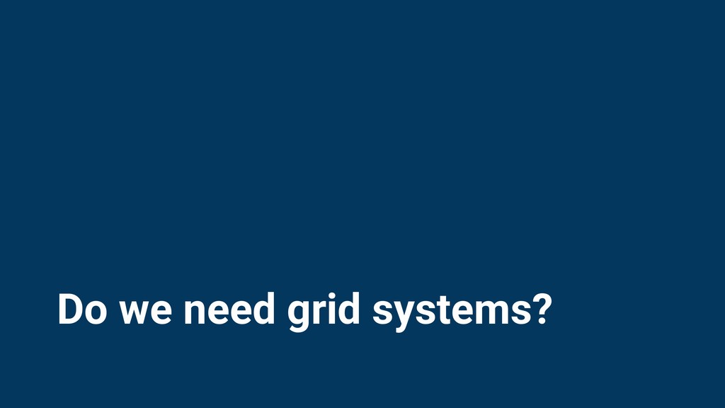
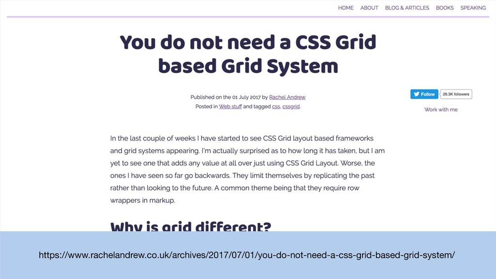
Do we need grid systems?
https://www.rachelandrew.co.uk/archives/2017/07/01/you-do-not-need-a-css-grid-based-grid-system/
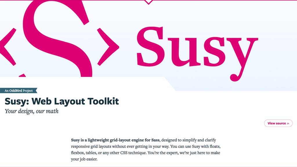
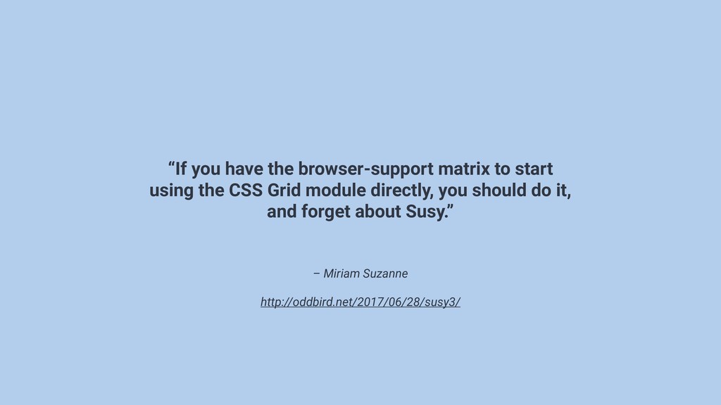
– Miriam Suzanne http://oddbird.net/2017/06/28/susy3/ “If you have the browser-support matrix
to start using the CSS Grid module directly, you should do it, and forget about Susy.”
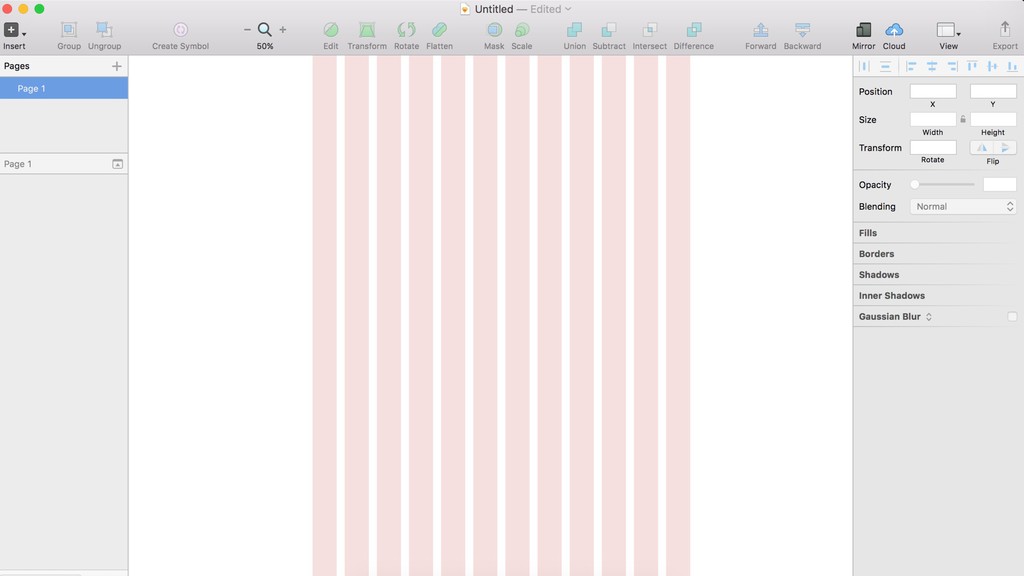
placeholder: screenshot simplified grid for prototype
placeholder: screenshot simplified grid for prototype
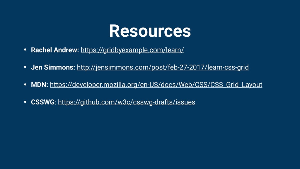
Resources • Rachel Andrew: https://gridbyexample.com/learn/ • Jen Simmons: http://jensimmons.com/post/feb-27-2017/learn-css-grid •
MDN: https://developer.mozilla.org/en-US/docs/Web/CSS/CSS_Grid_Layout • CSSWG: https://github.com/w3c/csswg-drafts/issues
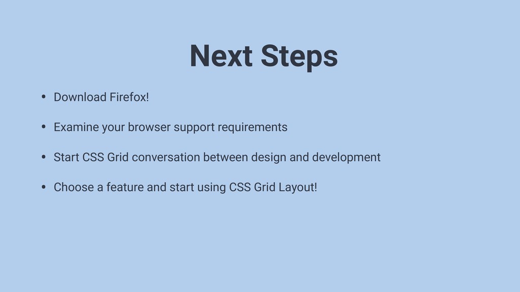
• Download Firefox! • Examine your browser support requirements •
Start CSS Grid conversation between design and development • Choose a feature and start using CSS Grid Layout! Next Steps
None
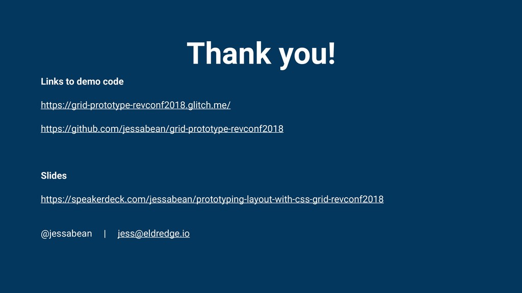
Thank you! Links to demo code https://grid-prototype-revconf2018.glitch.me/ https://github.com/jessabean/grid-prototype-revconf2018 Slides https://speakerdeck.com/jessabean/prototyping-layout-with-css-grid-revconf2018
@jessabean |
[email protected]
 jessabean
 fossamagna
 kamoshika
 rakus_dev
 kintotechdev
 oracle4engineer
 ysuzuki
 sugitak
 munakata
 masuda220
 mineo_matsuya
 quiver
 iqbocchi
 honnibal
 nonsquared
 aleyda
 smashingmag
 skipperchong
 danielanewman
 colly
colly
 brad_frost
 baasie
 techseoconnect
 trallard
 3n
3n