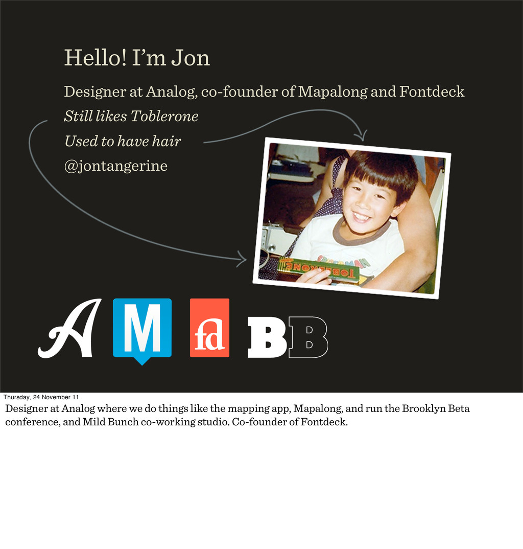
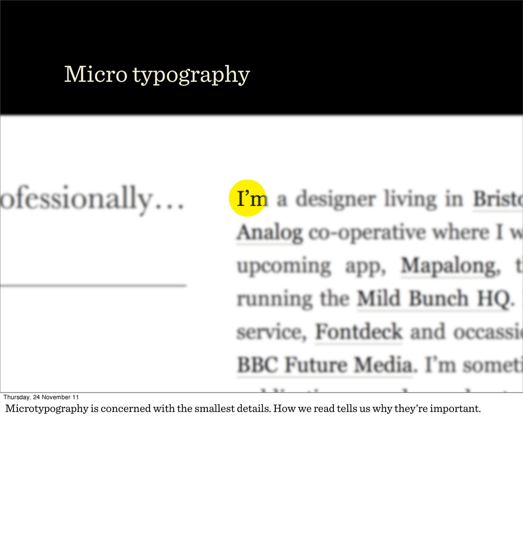
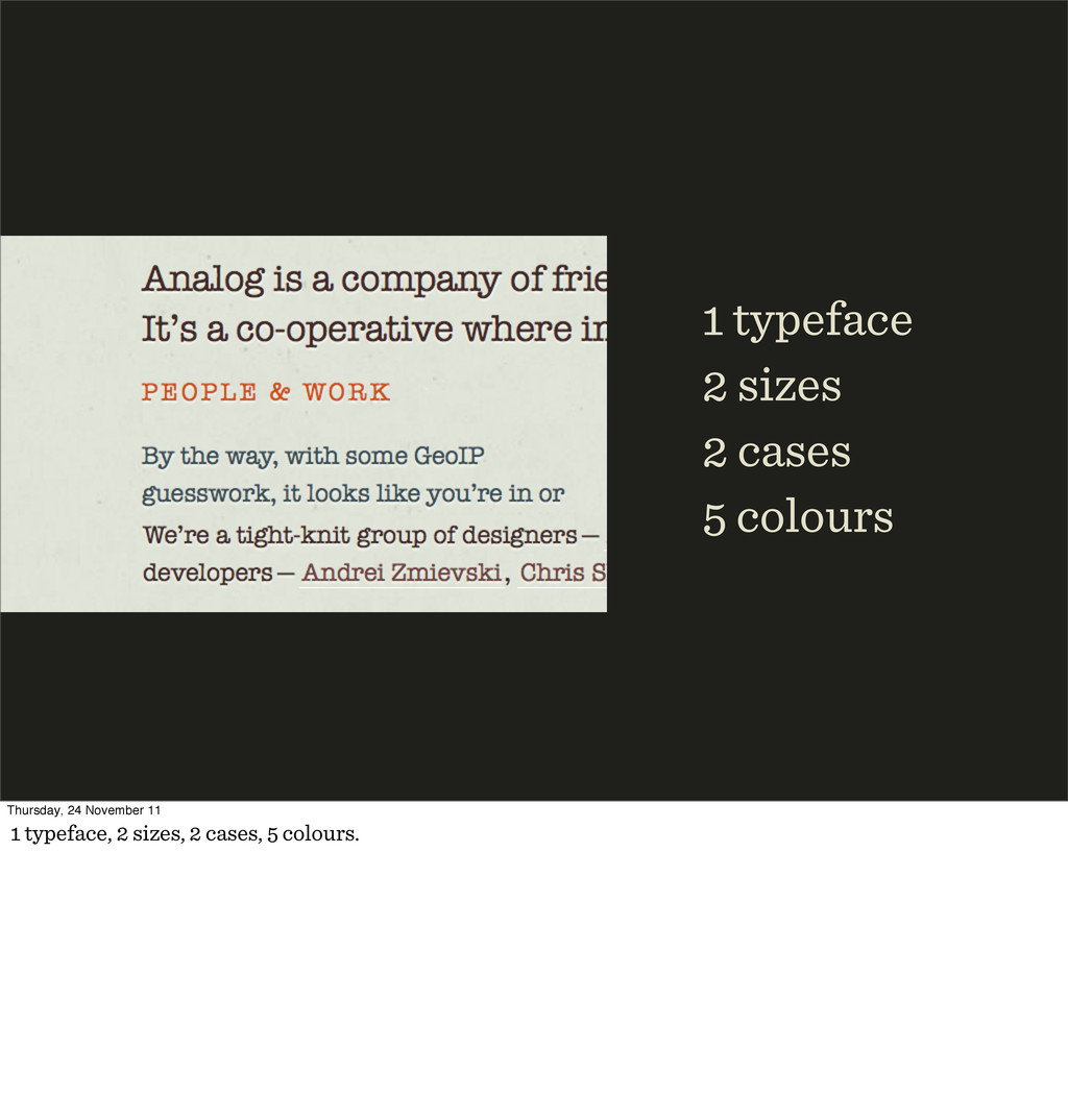
Fontdeck Still likes Toblerone Used to have hair @jontangerine Thursday, 24 November 11 Designer at Analog where we do things like the mapping app, Mapalong, and run the Brooklyn Beta conference, and Mild Bunch co-working studio. Co-founder of Fontdeck.
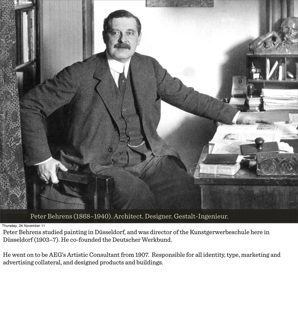
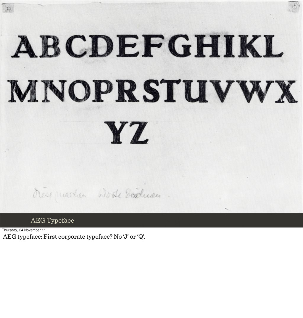
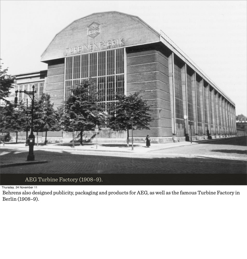
Peter Behrens studied painting in Düsseldorf, and was director of the Kunstgerwerbeschule here in Düsseldorf (1903–7). He co-founded the Deutscher Werkbund. He went on to be AEG’s Artistic Consultant from 1907. Responsible for all identity, type, marketing and advertising collateral, and designed products and buildings.
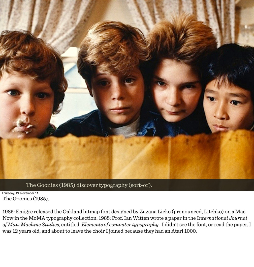
The Goonies (1985). 1985: Emigre released the Oakland bitmap font designed by Zuzana Licko (pronounced, Litchko) on a Mac. Now in the MoMA typography collection. 1985: Prof. Ian Witten wrote a paper in the International Journal of Man-Machine Studies, entitled, Elements of computer typography. I didn’t see the font, or read the paper. I was 12 years old, and about to leave the choir I joined because they had an Atari 1000.
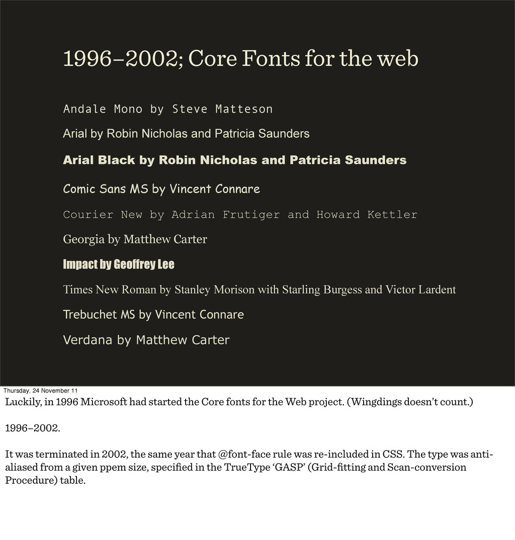
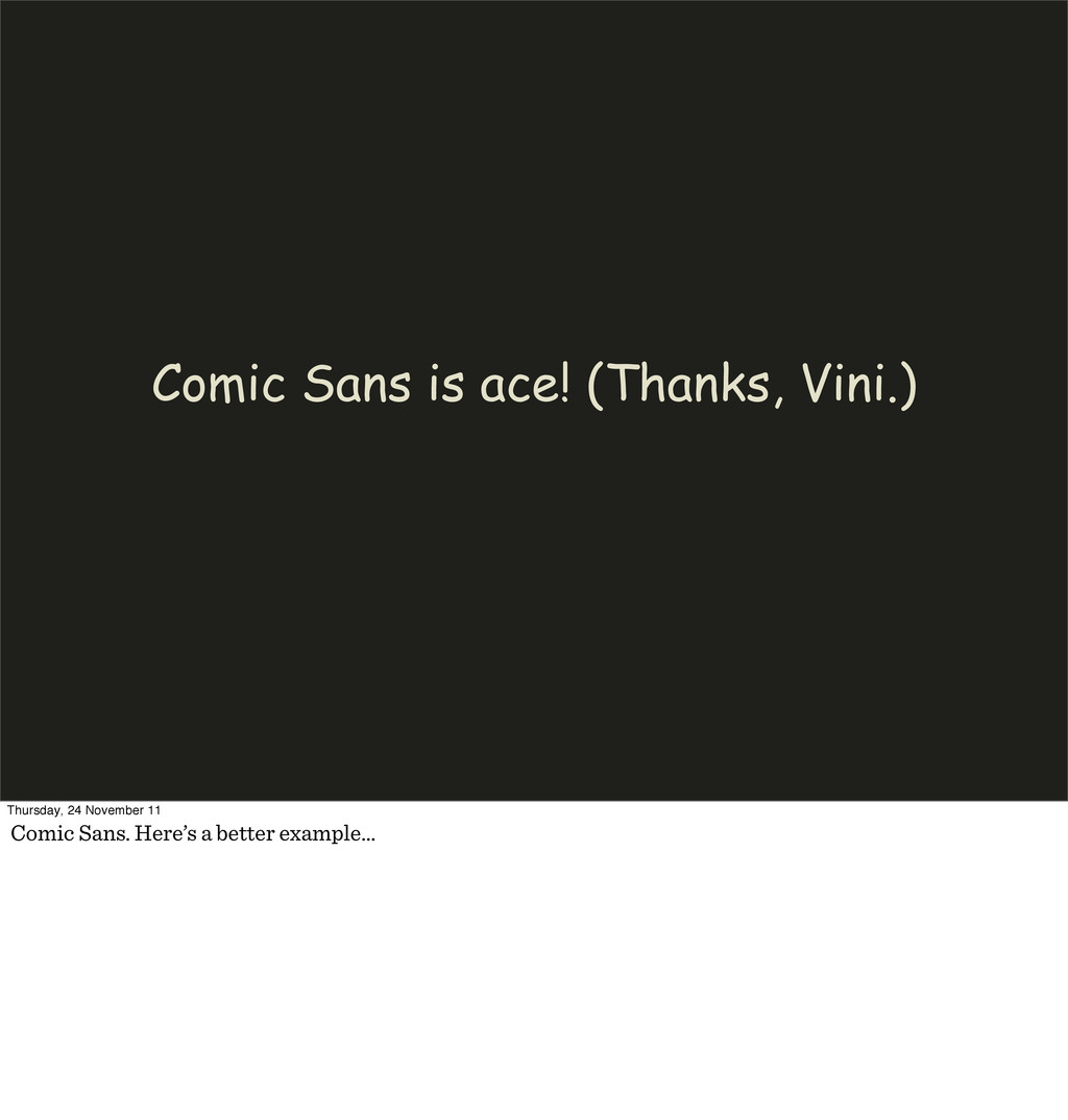
Patricia Saunders Arial Black by Robin Nicholas and Patricia Saunders Comic Sans MS by Vincent Connare Courier New by Adrian Frutiger and Howard Kettler Georgia by Matthew Carter Impact by Geoffrey Lee Times New Roman by Stanley Morison with Starling Burgess and Victor Lardent Trebuchet MS by Vincent Connare Verdana by Matthew Carter 1996–2002; Core Fonts for the web Thursday, 24 November 11 Luckily, in 1996 Microsoft had started the Core fonts for the Web project. (Wingdings doesn’t count.) 1996–2002. It was terminated in 2002, the same year that @font-face rule was re-included in CSS. The type was anti- aliased from a given ppem size, specified in the TrueType ‘GASP’ (Grid-fitting and Scan-conversion Procedure) table.
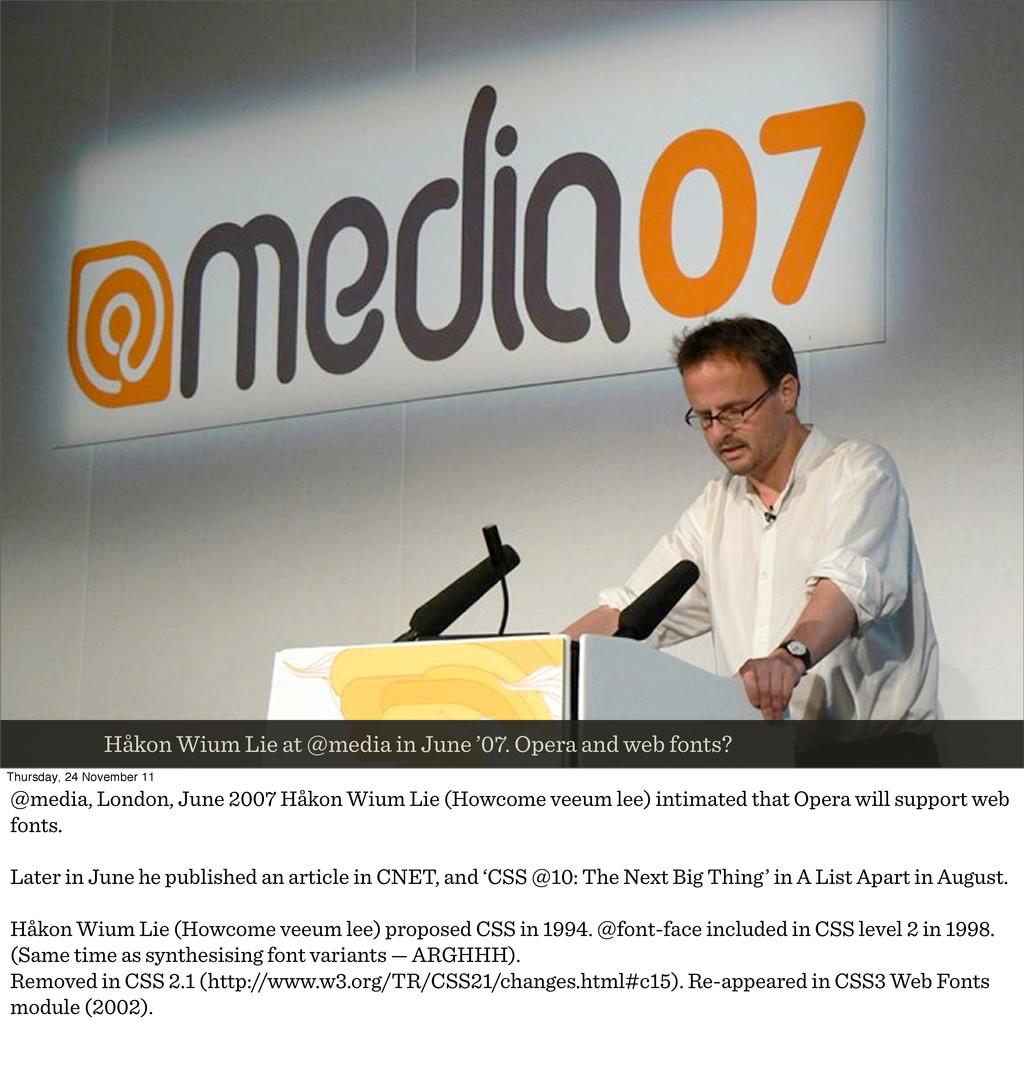
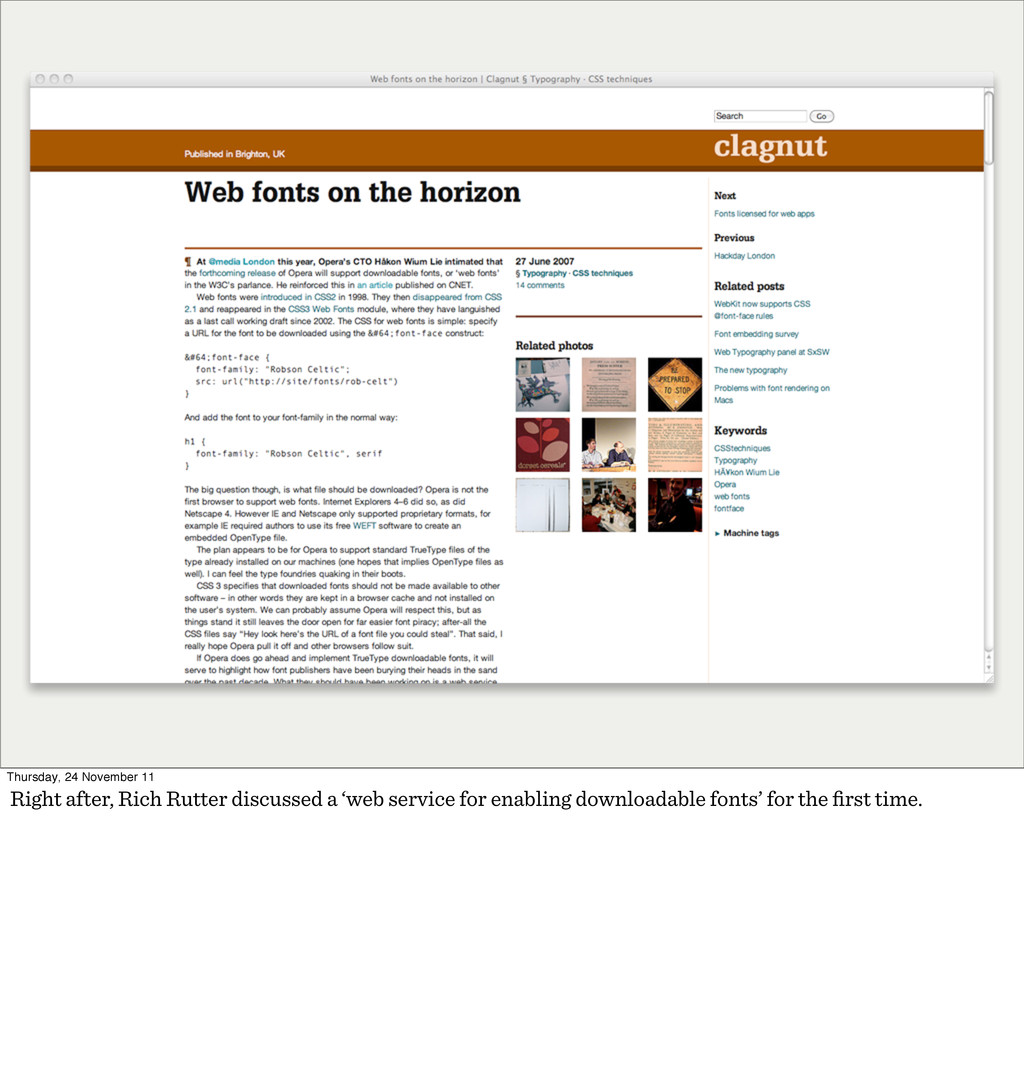
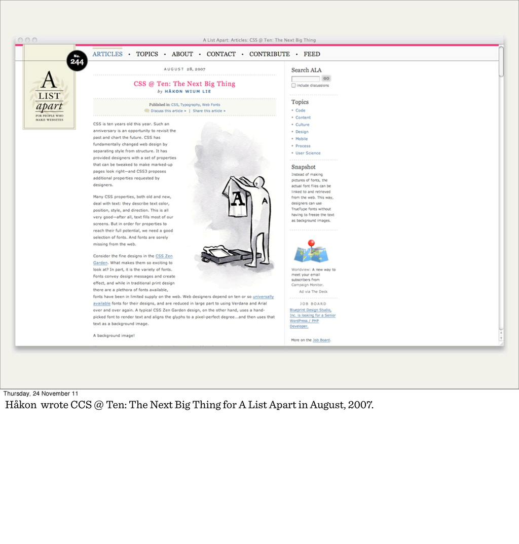
web fonts? Thursday, 24 November 11 @media, London, June 2007 Håkon Wium Lie (Howcome veeum lee) intimated that Opera will support web fonts. Later in June he published an article in CNET, and ‘CSS @10: The Next Big Thing’ in A List Apart in August. Håkon Wium Lie (Howcome veeum lee) proposed CSS in 1994. @font-face included in CSS level 2 in 1998. (Same time as synthesising font variants — ARGHHH). Removed in CSS 2.1 (http://www.w3.org/TR/CSS21/changes.html#c15). Re-appeared in CSS3 Web Fonts module (2002).
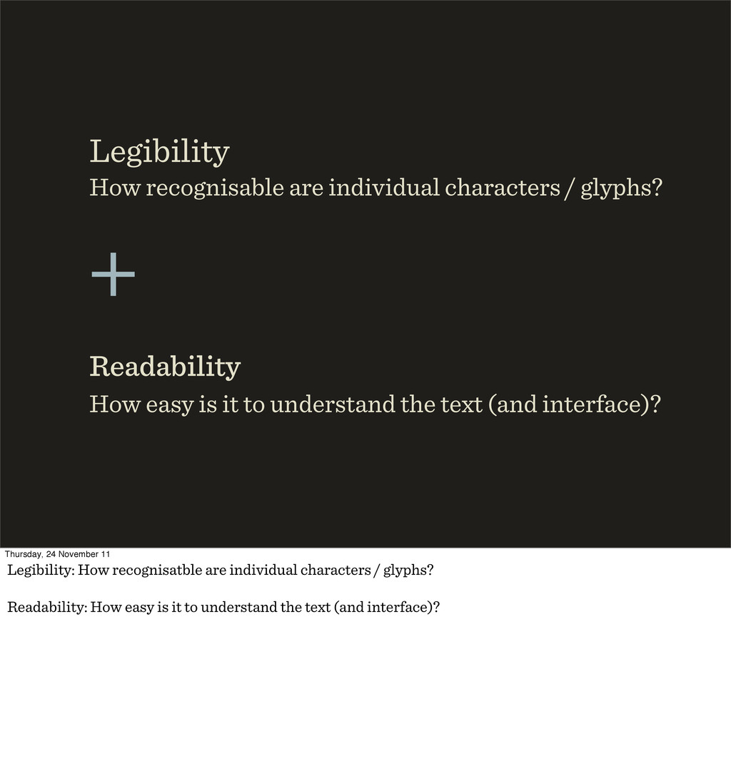
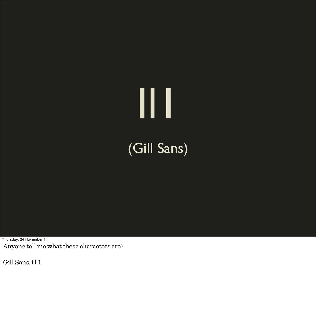
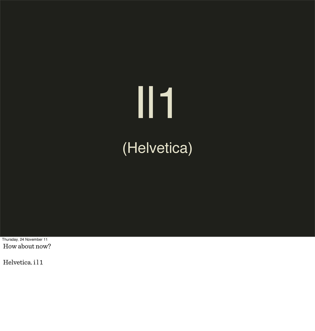
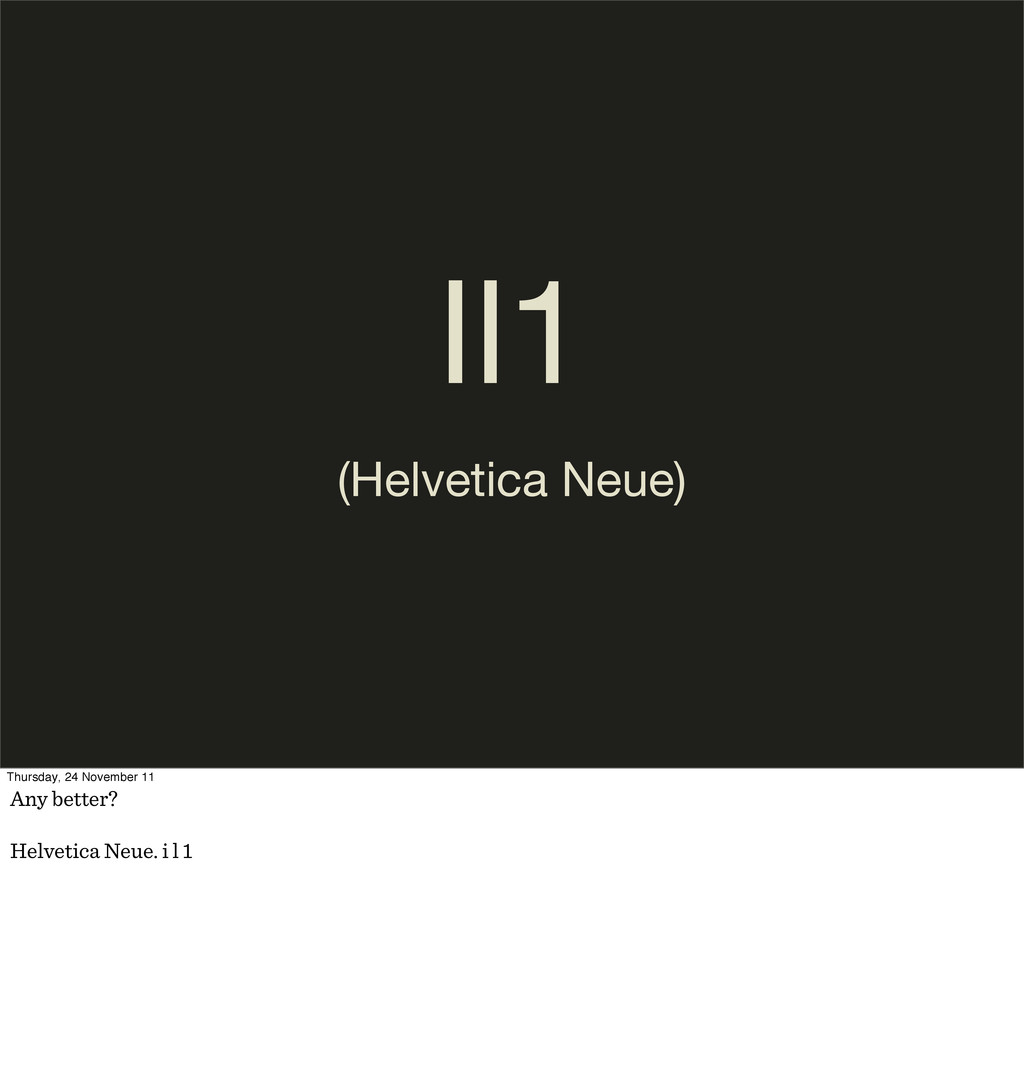
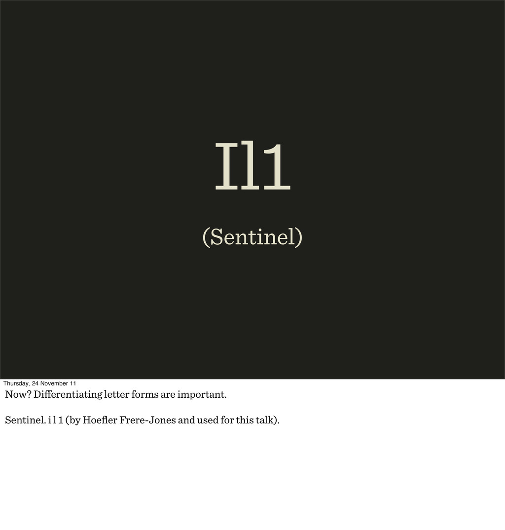
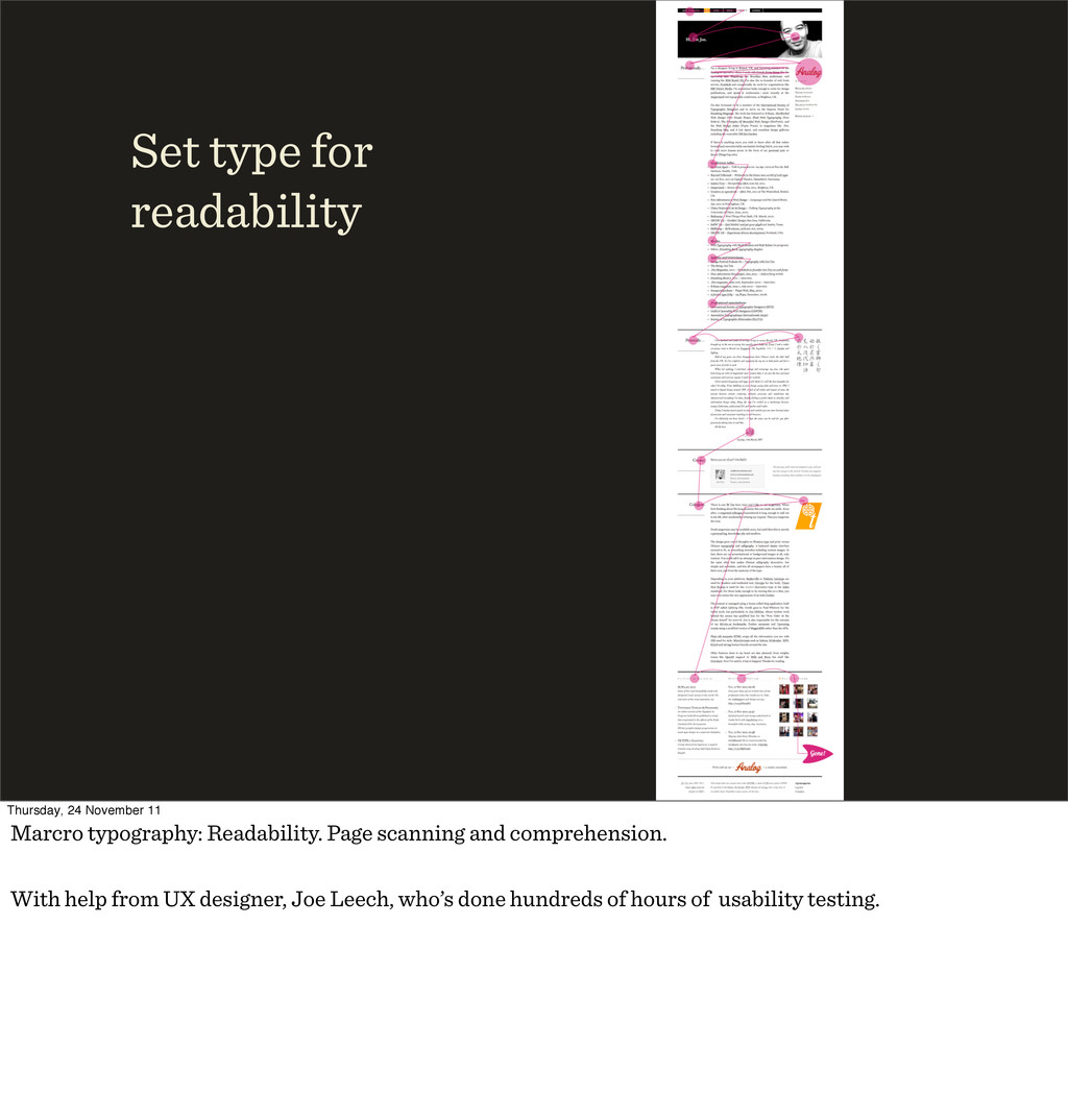
is it to understand the text (and interface)? Readability + Thursday, 24 November 11 Legibility: How recognisatble are individual characters / glyphs? Readability: How easy is it to understand the text (and interface)?
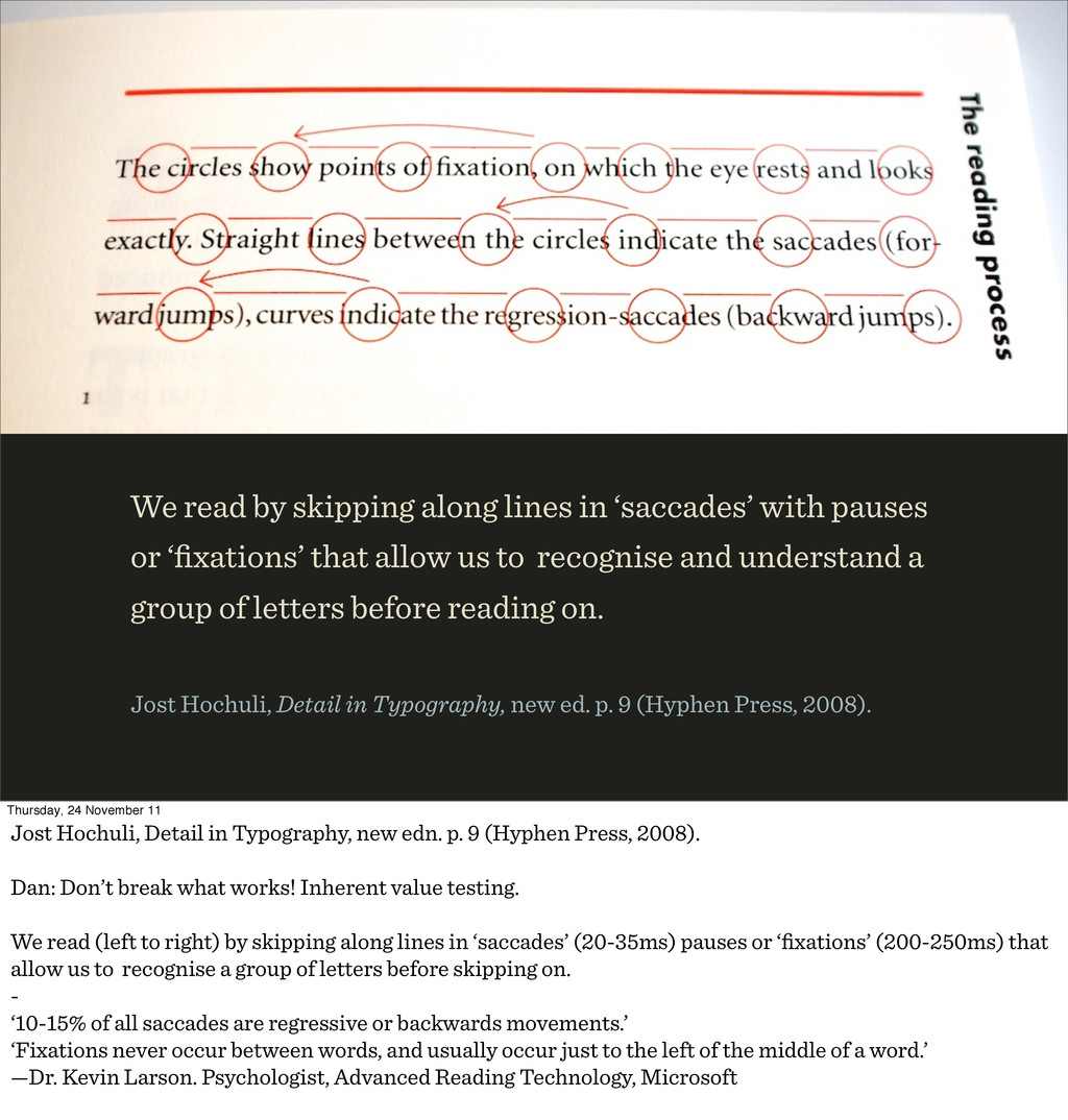
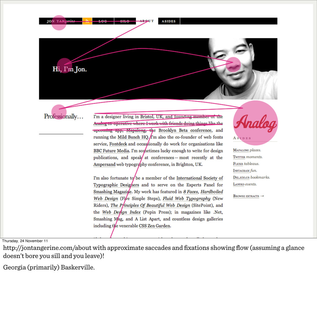
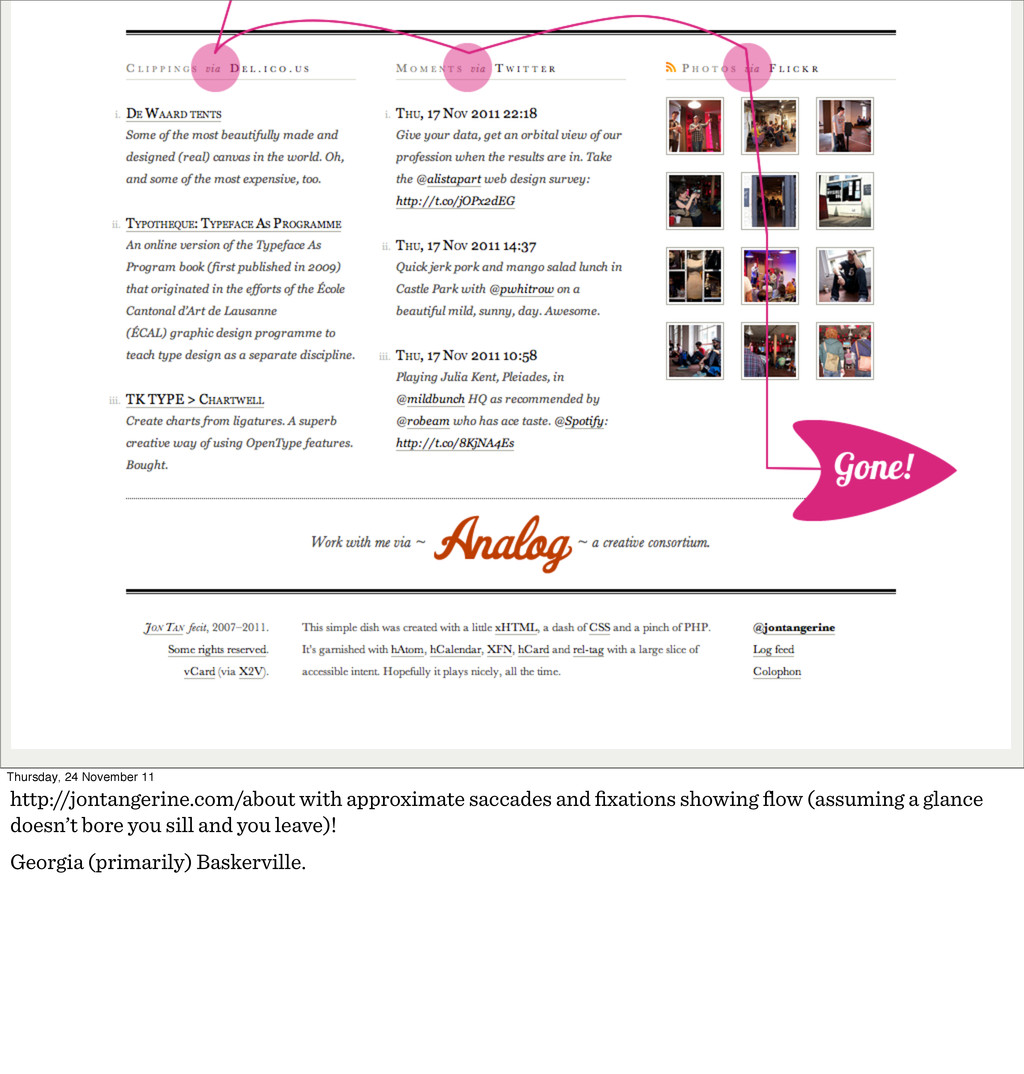
or ‘fixations’ that allow us to recognise and understand a group of letters before reading on. Jost Hochuli, Detail in Typography, new ed. p. 9 (Hyphen Press, 2008). Thursday, 24 November 11 Jost Hochuli, Detail in Typography, new edn. p. 9 (Hyphen Press, 2008). Dan: Don’t break what works! Inherent value testing. We read (left to right) by skipping along lines in ‘saccades’ (20-35ms) pauses or ‘fixations’ (200-250ms) that allow us to recognise a group of letters before skipping on. - ‘10-15% of all saccades are regressive or backwards movements.’ ‘Fixations never occur between words, and usually occur just to the left of the middle of a word.’ —Dr. Kevin Larson. Psychologist, Advanced Reading Technology, Microsoft
information is used to recognise the words.” —Dr. Kevin Larson. Advanced Reading Technology, Microsoft The Science of Word Recognition: http://microsoft.com/typography/ctfonts/WordRecognition.aspx Thursday, 24 November 11 ‘…letters within a word are recognised simultaneously, and the letter information is used to recognise the words.’ —Dr. Kevin Larson. Psychologist, Advanced Reading Technology, Microsoft describing parallel letter recognition. Also: ‘The bulk of scientific evidence says that we recognize a word’s component letters, then use that visual information to recognize a word.’
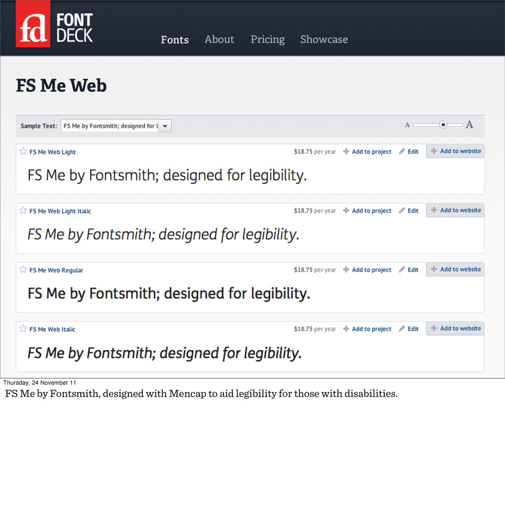
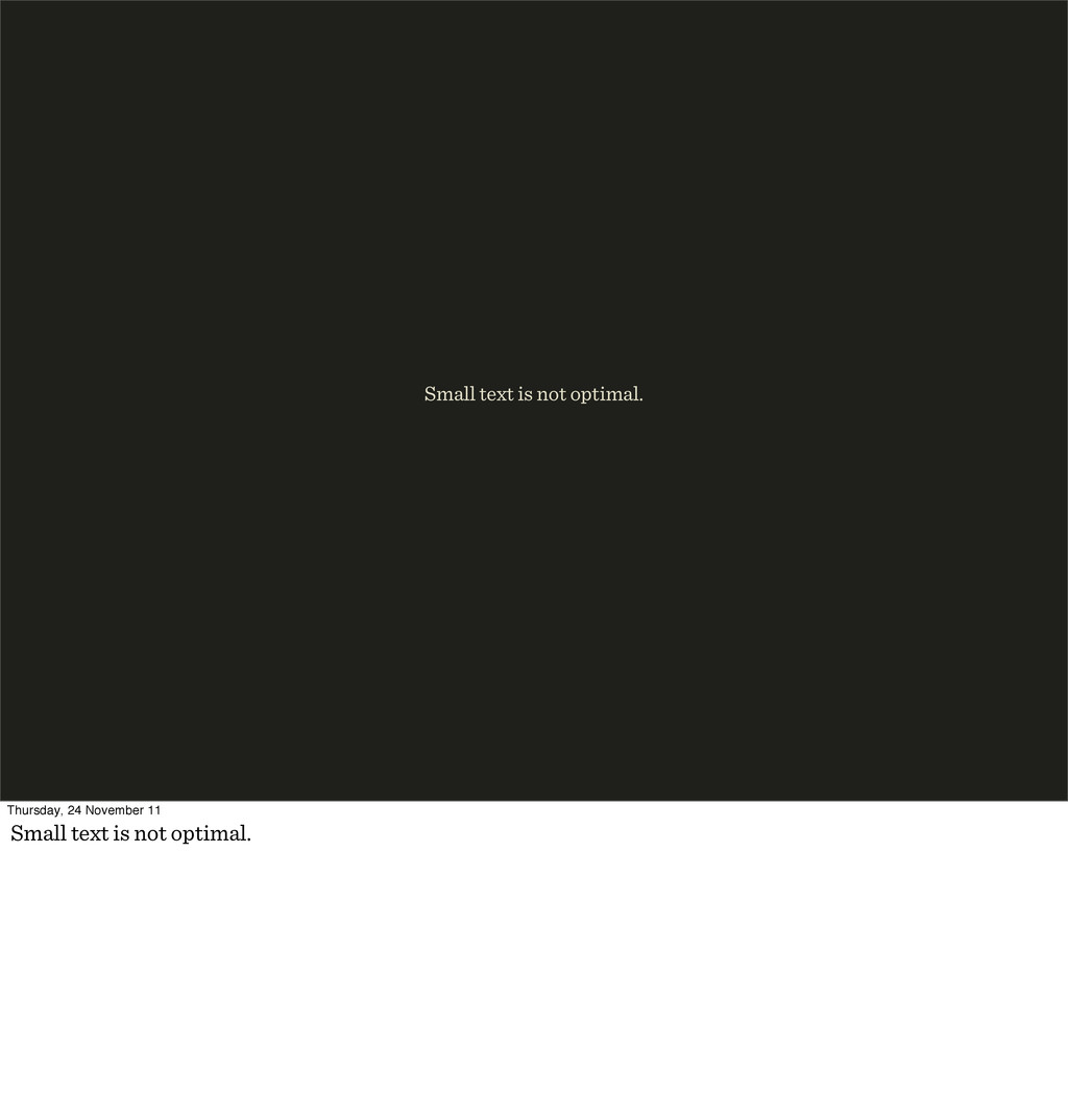
contrast is not optimal. Also beware thin type, it has a low contrast (like typographic “colour”) or colour density of positive space inside the glyphs on the page.
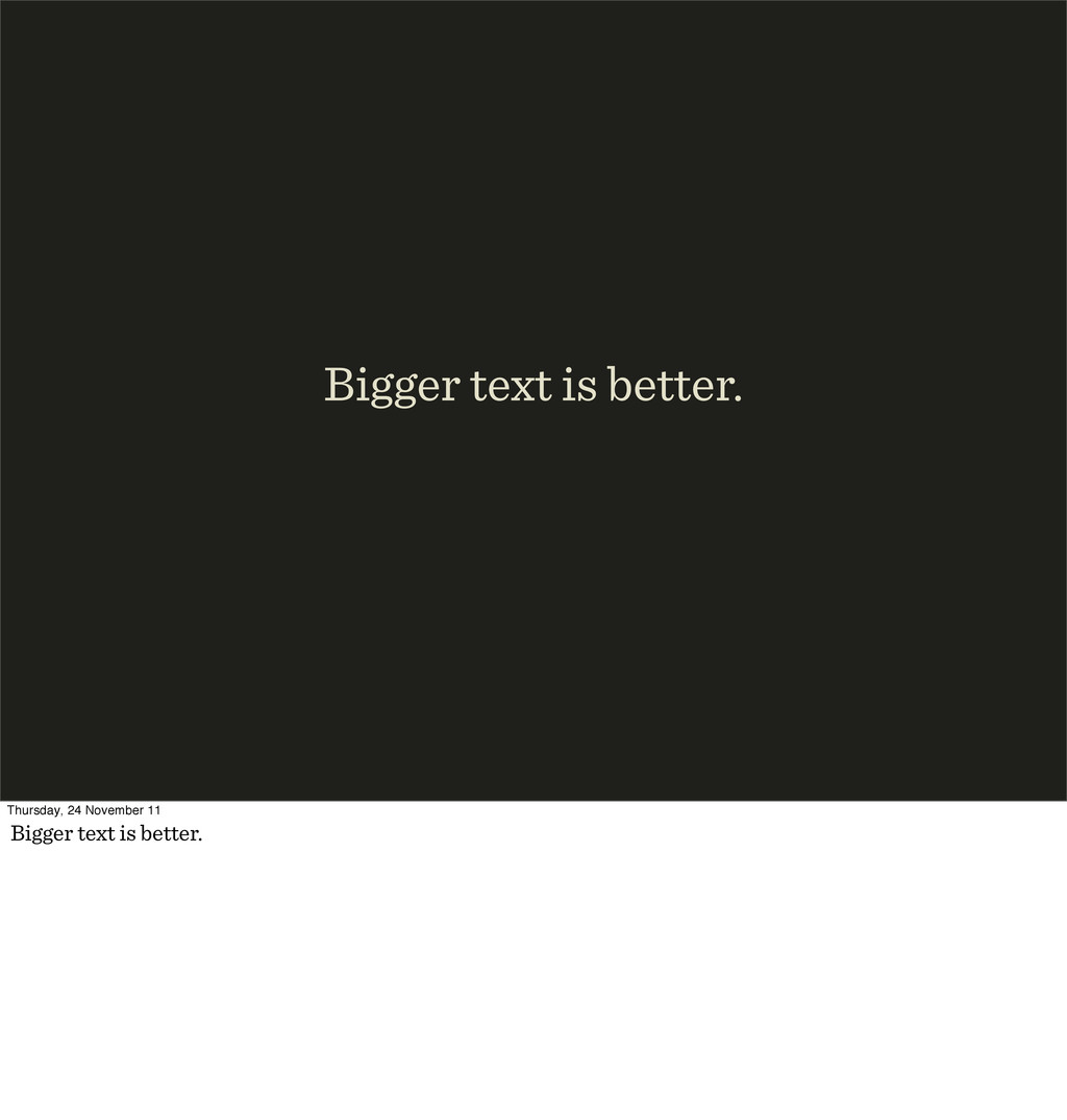
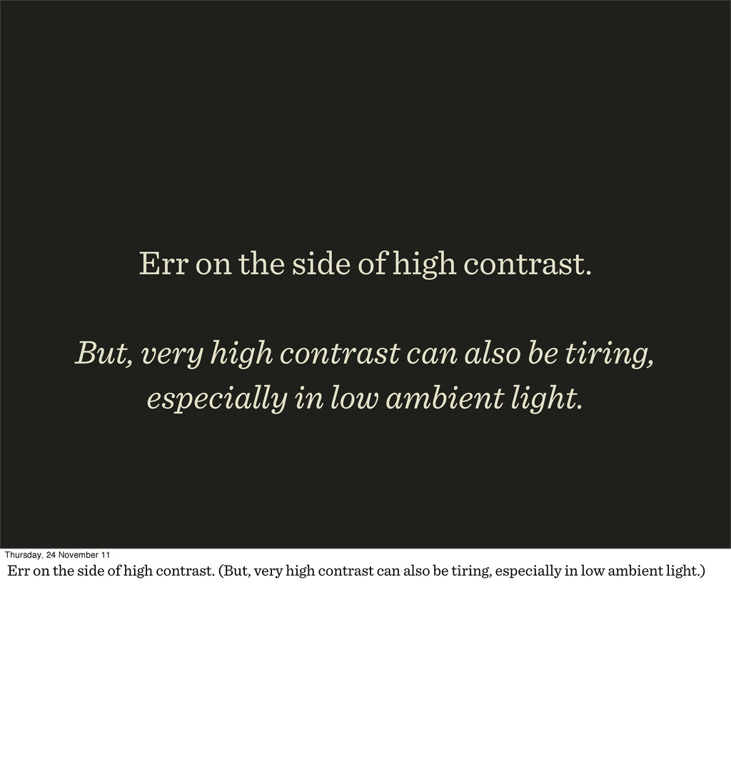
contrast can also be tiring, especially in low ambient light. Thursday, 24 November 11 Err on the side of high contrast. (But, very high contrast can also be tiring, especially in low ambient light.)
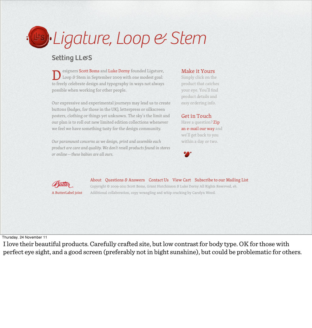
crafted site, but low contrast for body type. OK for those with perfect eye sight, and a good screen (preferably not in bight sunshine), but could be problematic for others.
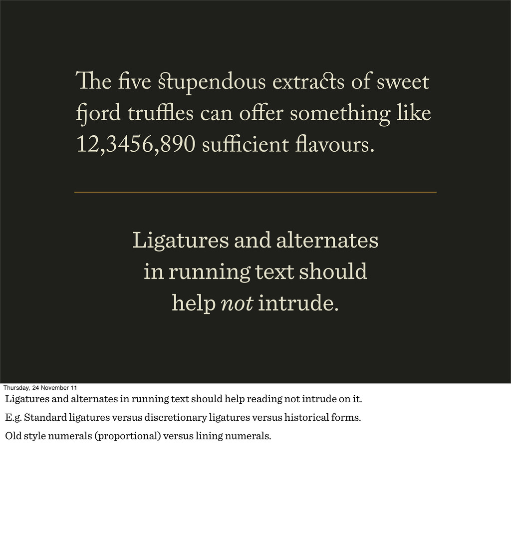
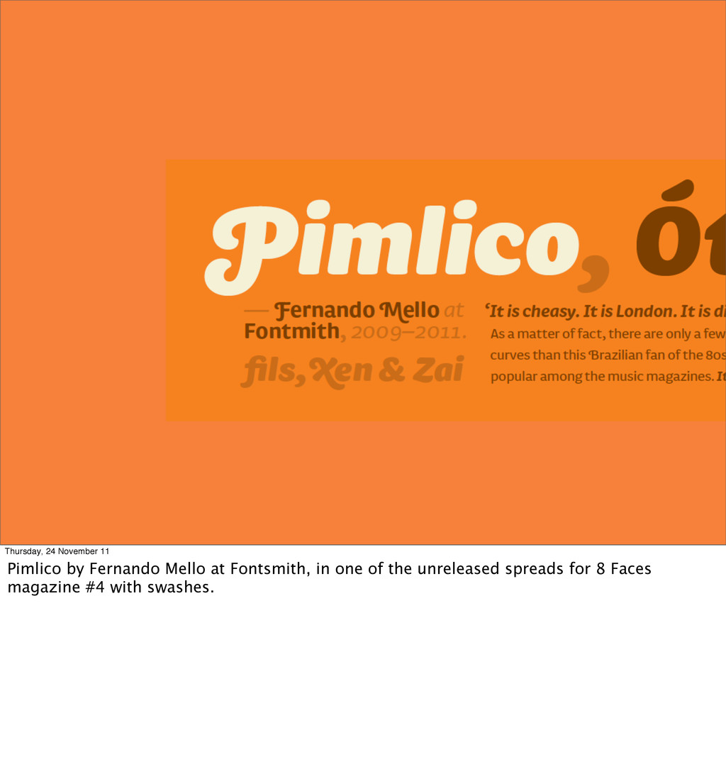
e ve upendous extra s of sweet ord truffles can offer something like 12,3456,890 sufficient avours. Thursday, 24 November 11 Ligatures and alternates in running text should help reading not intrude on it. E.g. Standard ligatures versus discretionary ligatures versus historical forms. Old style numerals (proportional) versus lining numerals.
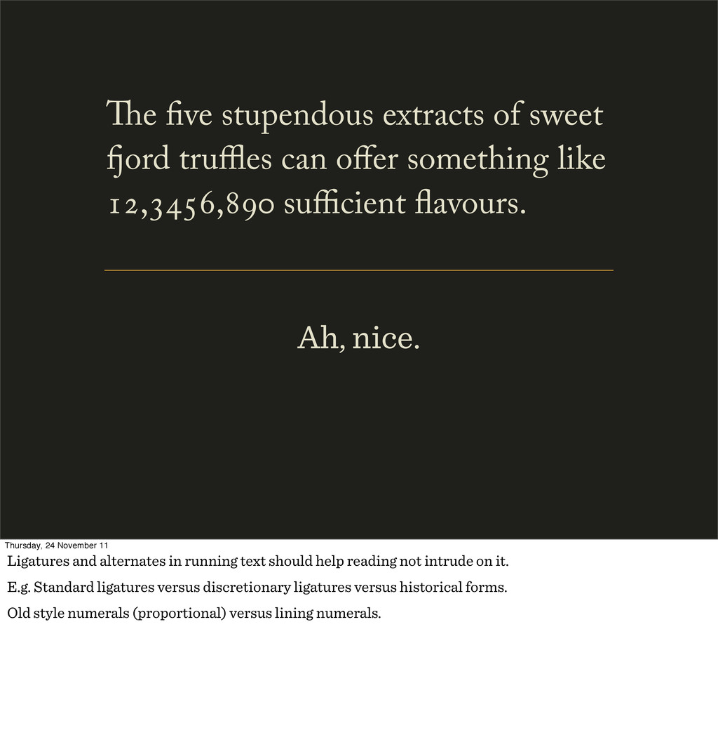
can offer something like , , sufficient avours. Thursday, 24 November 11 Ligatures and alternates in running text should help reading not intrude on it. E.g. Standard ligatures versus discretionary ligatures versus historical forms. Old style numerals (proportional) versus lining numerals.
readers, and search engines, as well as eyes. but… Thursday, 24 November 11 But: Web type must be read by machines like screen readers, and search engines, as well as eyes.
eyes. web != prin Thursday, 24 November 11 Web != print. The reader comes first, always! Design for reading before style. (We’ll get to the psychology of style later.)
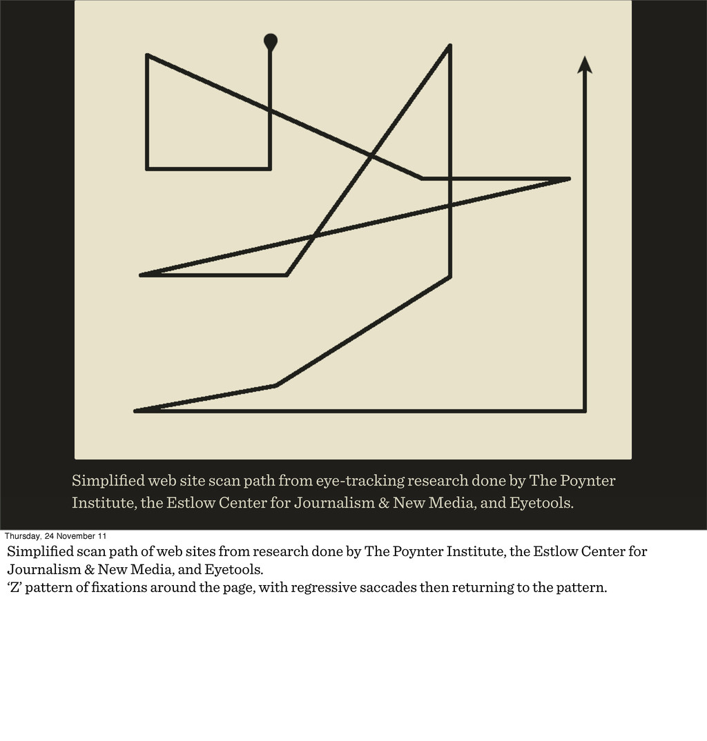
The Poynter Institute, the Estlow Center for Journalism & New Media, and Eyetools. Thursday, 24 November 11 Simplified scan path of web sites from research done by The Poynter Institute, the Estlow Center for Journalism & New Media, and Eyetools. ‘Z’ pattern of fixations around the page, with regressive saccades then returning to the pattern.
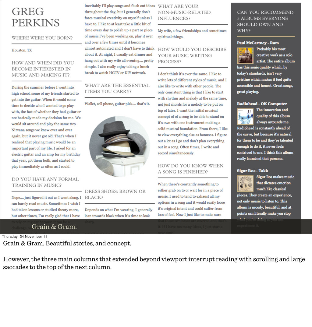
Beautiful stories, and concept. However, the three main columns that extended beyond viewport interrupt reading with scrolling and large saccades to the top of the next column.
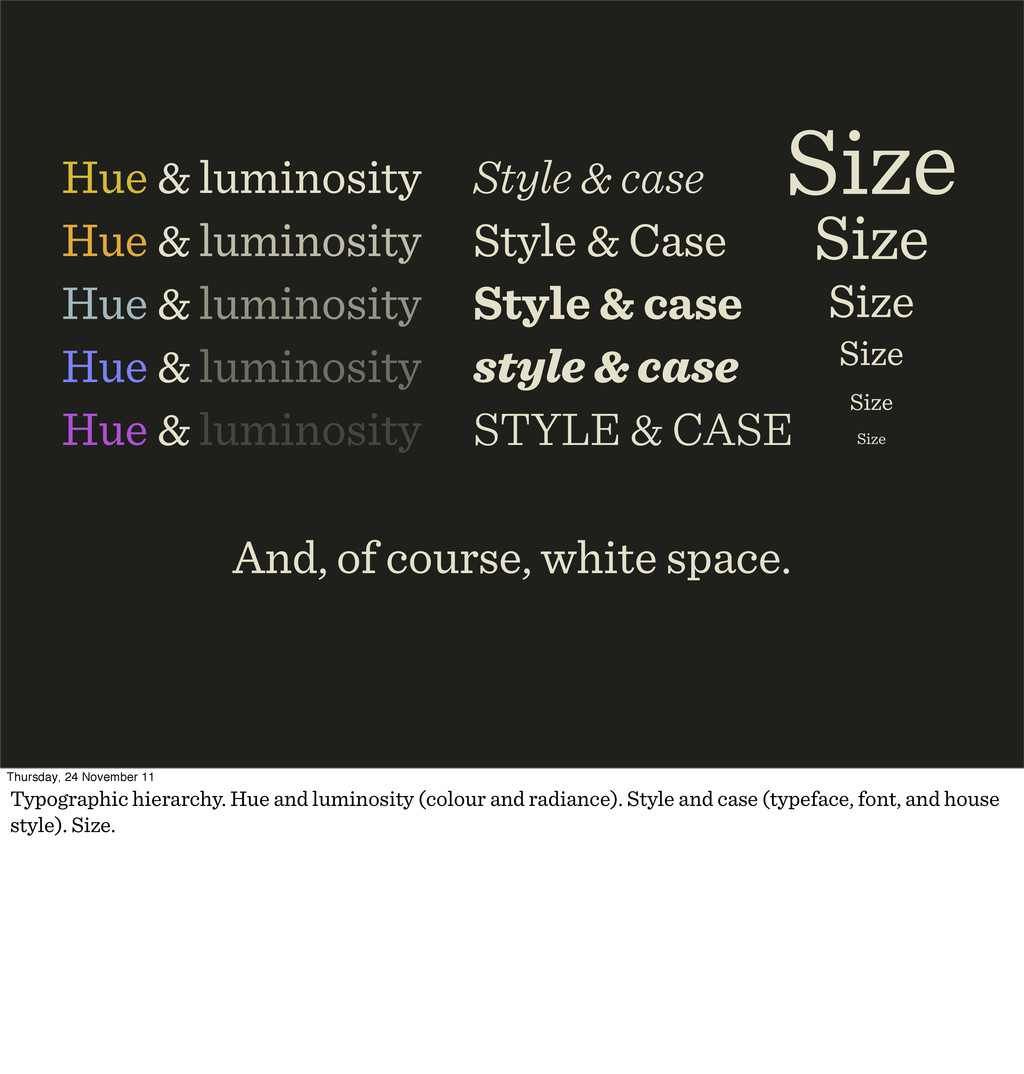
& luminosity Hue & luminosity Hue & luminosity Hue & luminosity Style & case Style & Case Style & case style & case STYLE & CASE And, of course, white space. Thursday, 24 November 11 Typographic hierarchy. Hue and luminosity (colour and radiance). Style and case (typeface, font, and house style). Size.
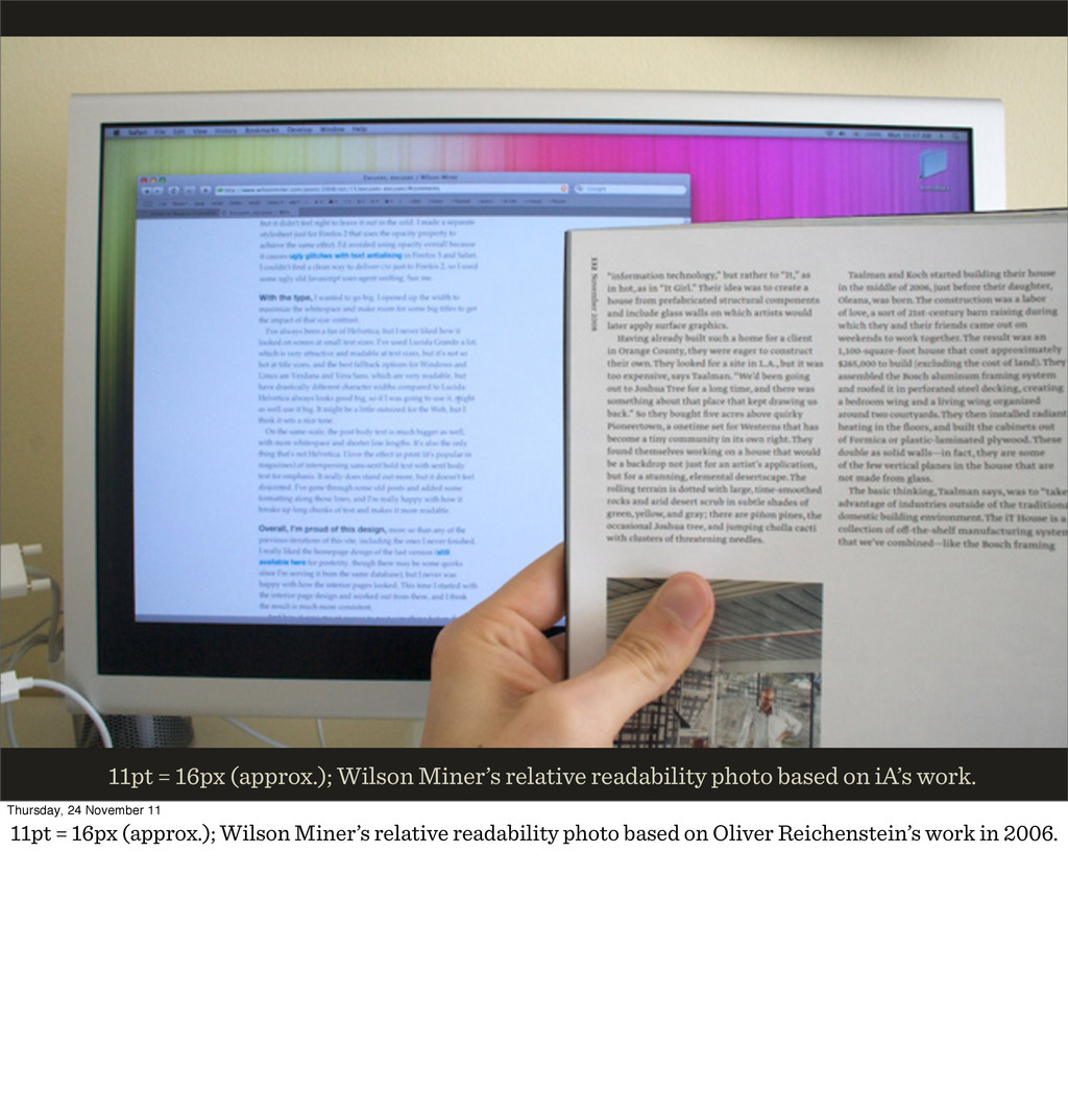
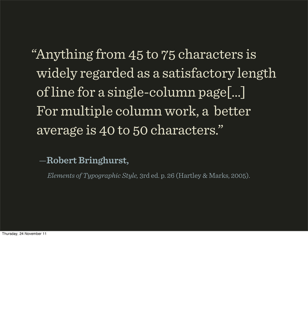
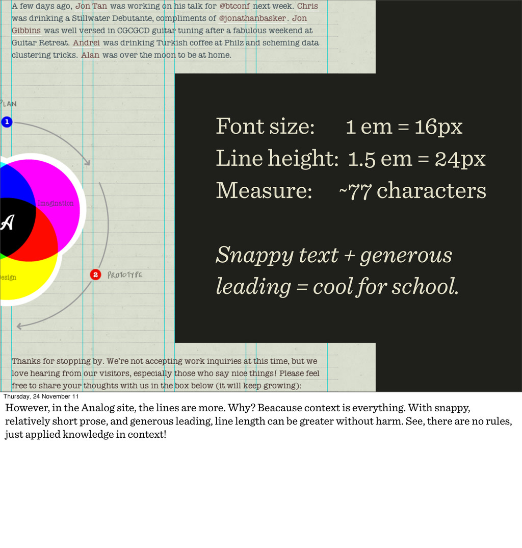
length of line for a single-column page[…] For multiple column work, a better average is to characters.” —Robert Bringhurst, Elements of Typographic Style, rd ed. p. (Hartley & Marks, ). Thursday, 24 November 11
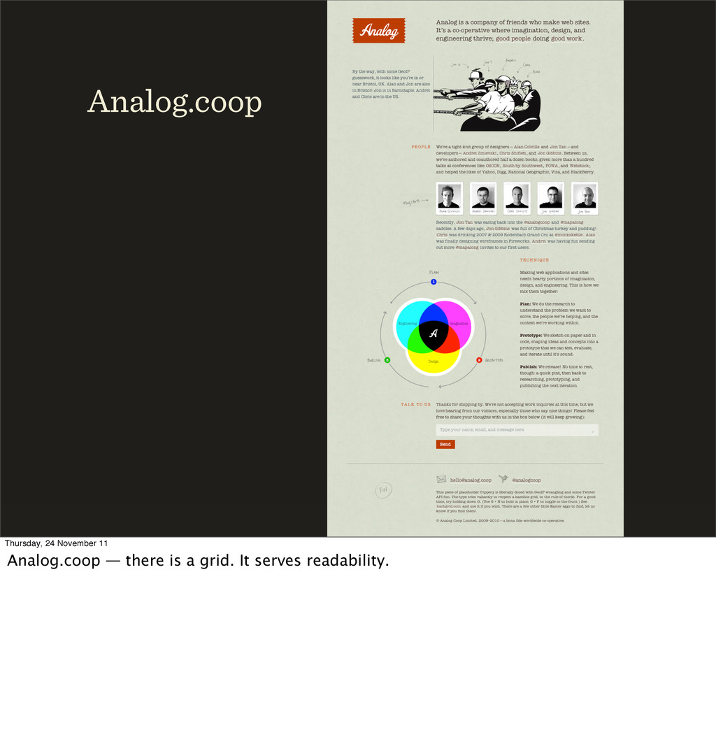
px Measure: ~ characters Snappy text + generous leading = cool for school. Thursday, 24 November 11 However, in the Analog site, the lines are more. Why? Beacause context is everything. With snappy, relatively short prose, and generous leading, line length can be greater without harm. See, there are no rules, just applied knowledge in context!
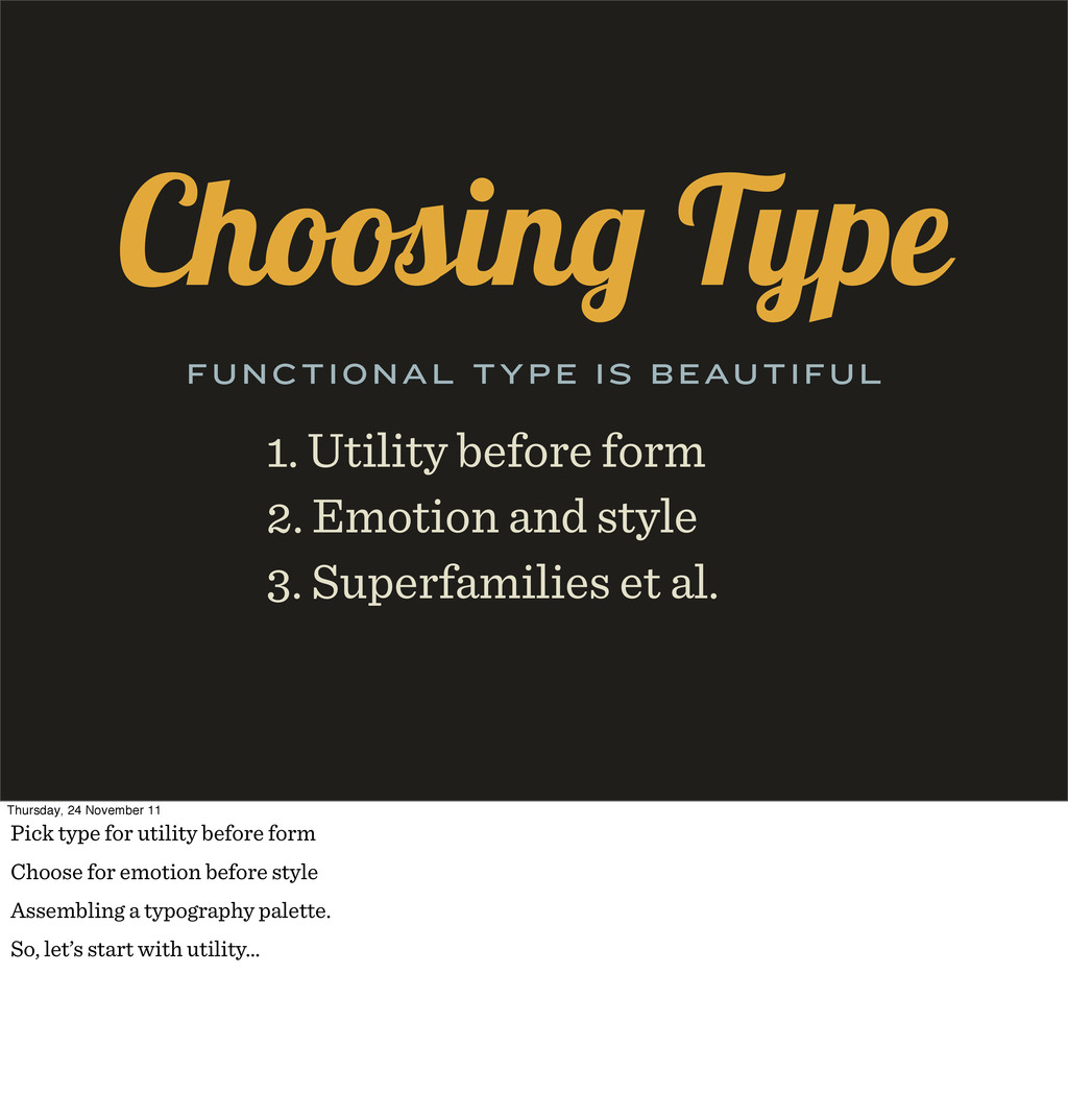
. Superfamilies et al. FUNCTIONAL TYPE IS BEAUTIFUL Thursday, 24 November 11 Pick type for utility before form Choose for emotion before style Assembling a typography palette. So, let’s start with utility…
24 November 11 Choose from licensed web fonts. May sound obvious, but many don’t. Disregard system fonts unless you know you can get a web font equivalent.
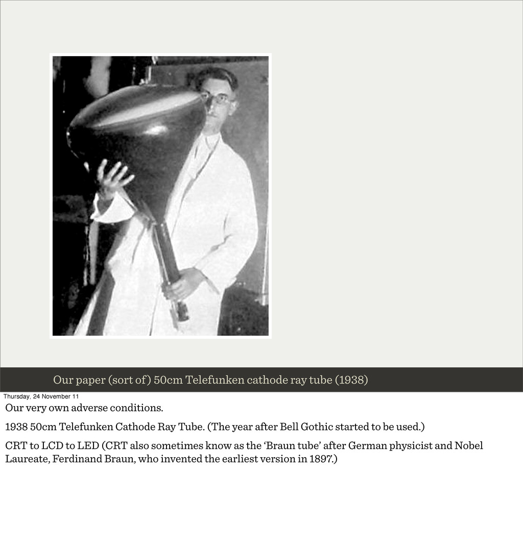
Thursday, 24 November 11 Our very own adverse conditions. 1938 50cm Telefunken Cathode Ray Tube. (The year after Bell Gothic started to be used.) CRT to LCD to LED (CRT also sometimes know as the ‘Braun tube’ after German physicist and Nobel Laureate, Ferdinand Braun, who invented the earliest version in 1897.)
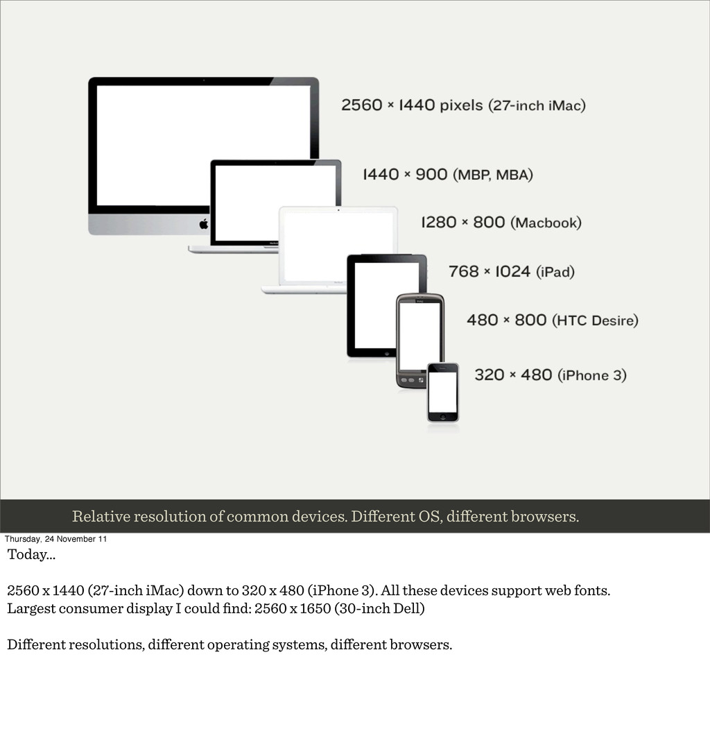
24 November 11 Today… 2560 x 1440 (27-inch iMac) down to 320 x 480 (iPhone 3). All these devices support web fonts. Largest consumer display I could find: 2560 x 1650 (30-inch Dell) Different resolutions, different operating systems, different browsers.
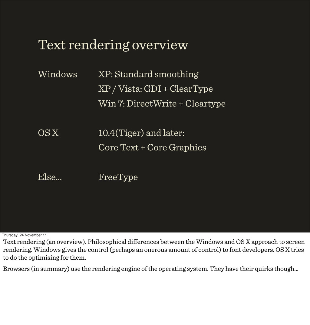
7: DirectWrite + Cleartype 10.4(Tiger) and later: Core Text + Core Graphics FreeType Text rendering overview Windows OS X Else… Thursday, 24 November 11 Text rendering (an overview). Philosophical differences between the Windows and OS X approach to screen rendering. Windows gives the control (perhaps an onerous amount of control) to font developers. OS X tries to do the optimising for them. Browsers (in summary) use the rendering engine of the operating system. They have their quirks though…
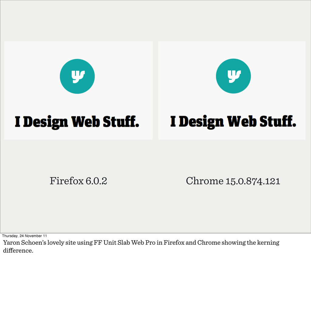
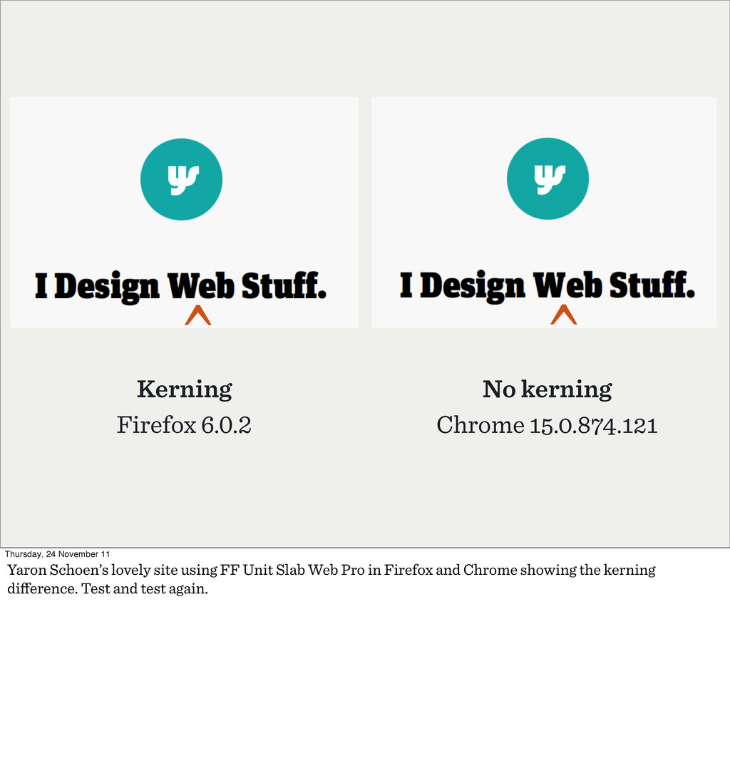
^ Thursday, 24 November 11 Yaron Schoen’s lovely site using FF Unit Slab Web Pro in Firefox and Chrome showing the kerning difference. Test and test again.
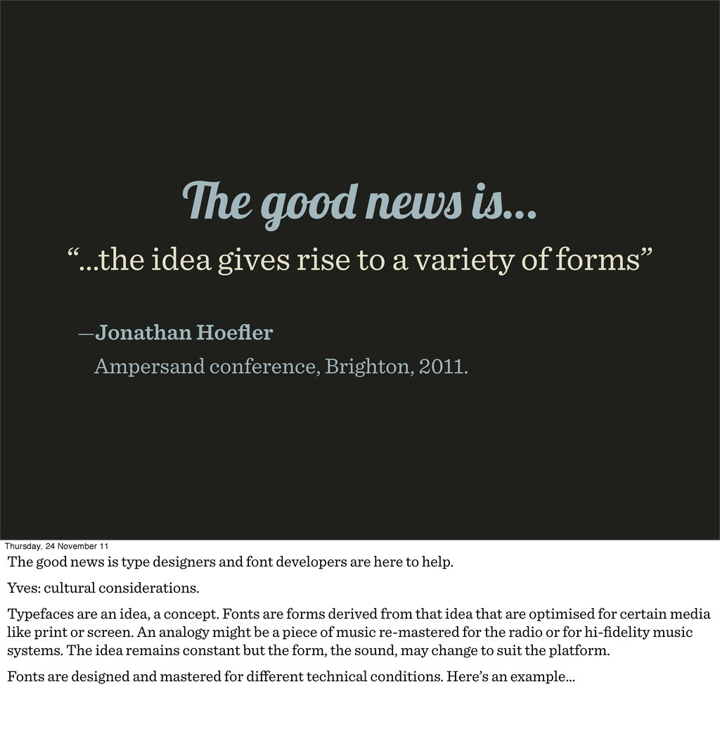
Hoefler Ampersand conference, Brighton, 2011. e goo new i … Thursday, 24 November 11 The good news is type designers and font developers are here to help. Yves: cultural considerations. Typefaces are an idea, a concept. Fonts are forms derived from that idea that are optimised for certain media like print or screen. An analogy might be a piece of music re-mastered for the radio or for hi-fidelity music systems. The idea remains constant but the form, the sound, may change to suit the platform. Fonts are designed and mastered for different technical conditions. Here’s an example…
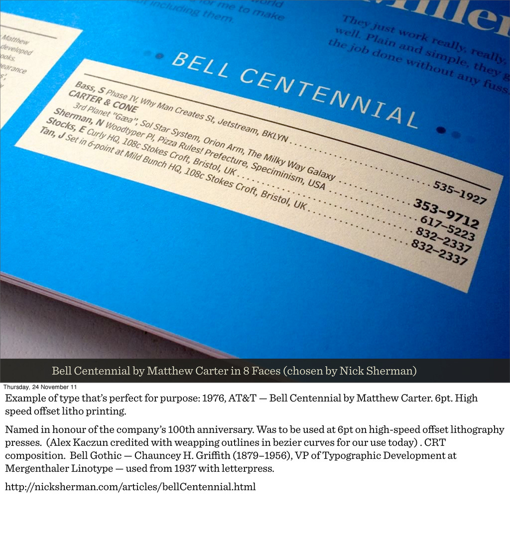
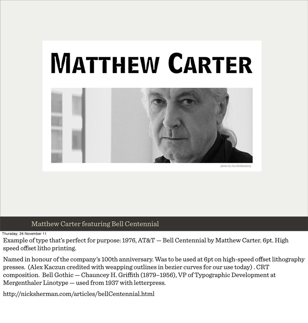
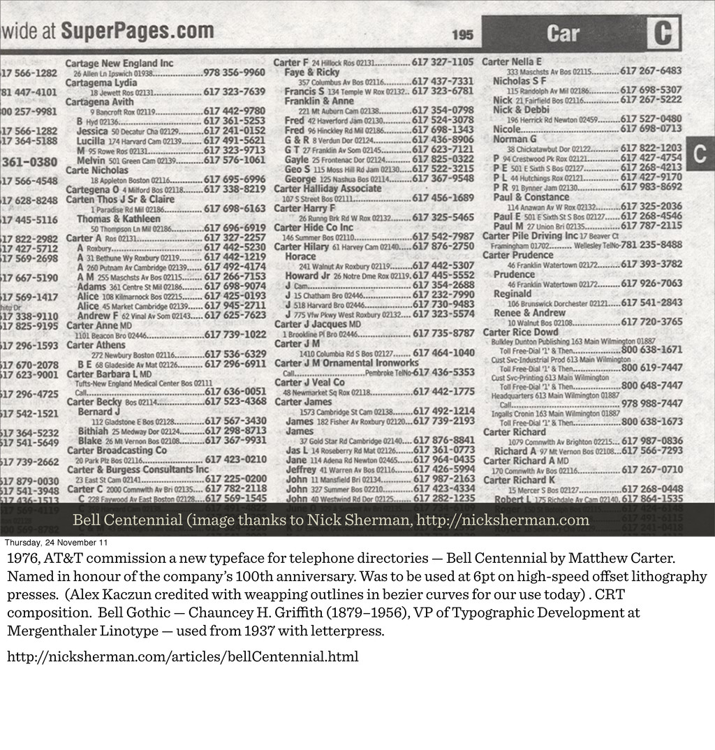
Nick Sherman) Thursday, 24 November 11 Example of type that’s perfect for purpose: 1976, AT&T — Bell Centennial by Matthew Carter. 6pt. High speed offset litho printing. Named in honour of the company’s 100th anniversary. Was to be used at 6pt on high-speed offset lithography presses. (Alex Kaczun credited with weapping outlines in bezier curves for our use today) . CRT composition. Bell Gothic — Chauncey H. Griffith (1879–1956), VP of Typographic Development at Mergenthaler Linotype — used from 1937 with letterpress. http://nicksherman.com/articles/bellCentennial.html
of type that’s perfect for purpose: 1976, AT&T — Bell Centennial by Matthew Carter. 6pt. High speed offset litho printing. Named in honour of the company’s 100th anniversary. Was to be used at 6pt on high-speed offset lithography presses. (Alex Kaczun credited with weapping outlines in bezier curves for our use today) . CRT composition. Bell Gothic — Chauncey H. Griffith (1879–1956), VP of Typographic Development at Mergenthaler Linotype — used from 1937 with letterpress. http://nicksherman.com/articles/bellCentennial.html
November 11 1976, AT&T commission a new typeface for telephone directories — Bell Centennial by Matthew Carter. Named in honour of the company’s 100th anniversary. Was to be used at 6pt on high-speed offset lithography presses. (Alex Kaczun credited with weapping outlines in bezier curves for our use today) . CRT composition. Bell Gothic — Chauncey H. Griffith (1879–1956), VP of Typographic Development at Mergenthaler Linotype — used from 1937 with letterpress. http://nicksherman.com/articles/bellCentennial.html
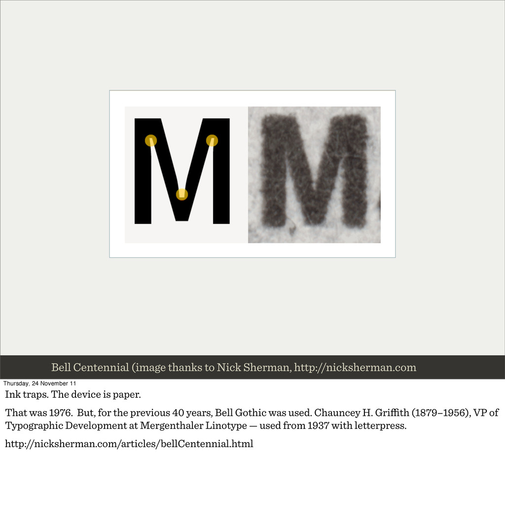
November 11 Ink traps. The device is paper. That was 1976. But, for the previous 40 years, Bell Gothic was used. Chauncey H. Griffith (1879–1956), VP of Typographic Development at Mergenthaler Linotype — used from 1937 with letterpress. http://nicksherman.com/articles/bellCentennial.html
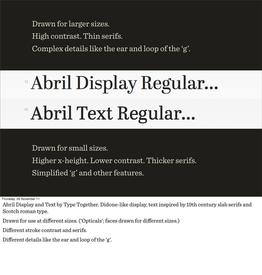
like the ear and loop of the ‘g’. Drawn for small sizes. Higher x-height. Lower contrast. Thicker serifs. Simplified ‘g’ and other features. Thursday, 24 November 11 Abril Display and Text by Type Together. Didone-like display, text inspired by 19th century slab serifs and Scotch roman type. Drawn for use at different sizes. (‘Opticals’; faces drawn for different sizes.) Different stroke contrast and serifs. Different details like the ear and loop of the ‘g’.
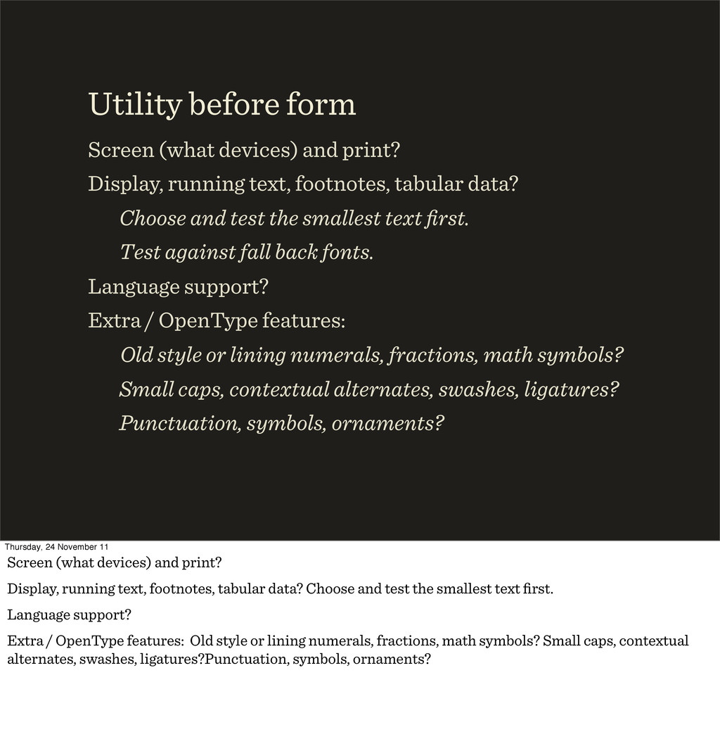
data? Choose and test the smallest text first. Test against fall back fonts. Language support? Extra / OpenType features: Old style or lining numerals, fractions, math symbols? Small caps, contextual alternates, swashes, ligatures? Punctuation, symbols, ornaments? Utility before form Thursday, 24 November 11 Screen (what devices) and print? Display, running text, footnotes, tabular data? Choose and test the smallest text first. Language support? Extra / OpenType features: Old style or lining numerals, fractions, math symbols? Small caps, contextual alternates, swashes, ligatures?Punctuation, symbols, ornaments?
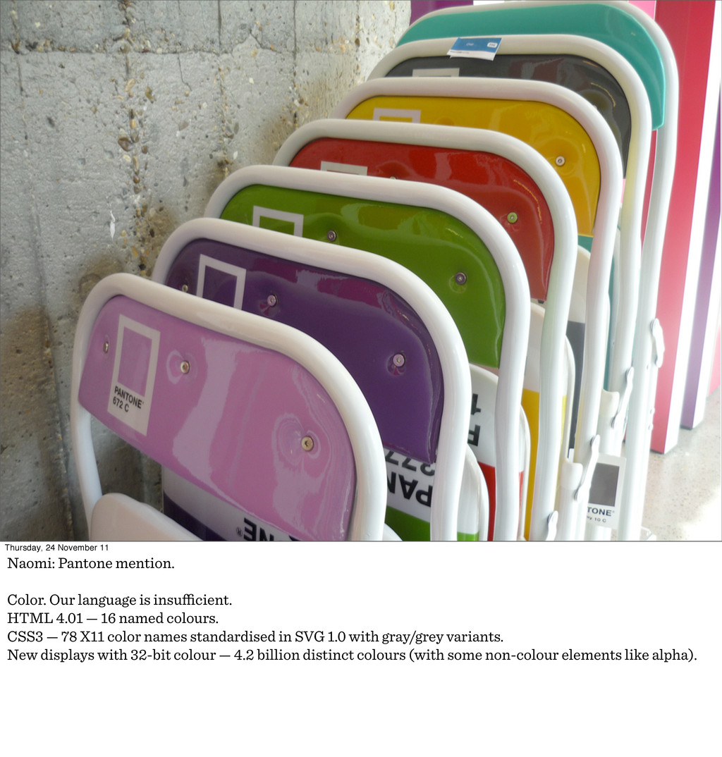
is insufficient. HTML 4.01 — 16 named colours. CSS3 — 78 X11 color names standardised in SVG 1.0 with gray/grey variants. New displays with 32-bit colour — 4.2 billion distinct colours (with some non-colour elements like alpha).
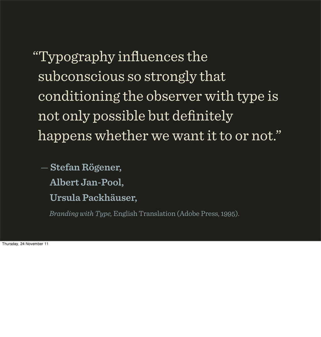
with type is not only possible but definitely happens whether we want it to or not.” — Stefan Rögener, Albert Jan-Pool, Ursula Packhäuser, Branding with Type, English Translation (Adobe Press, ). Thursday, 24 November 11
and find the historical and cultural forms that fit. Thursday, 24 November 11 Go armed into type galleries. Learn the historical and cultural context. Evoke emotion.
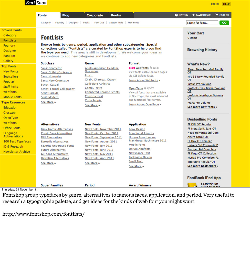
to famous faces, application, and period. Very useful to research a typographic palette, and get ideas for the kinds of web font you might want. http://www.fontshop.com/fontlists/
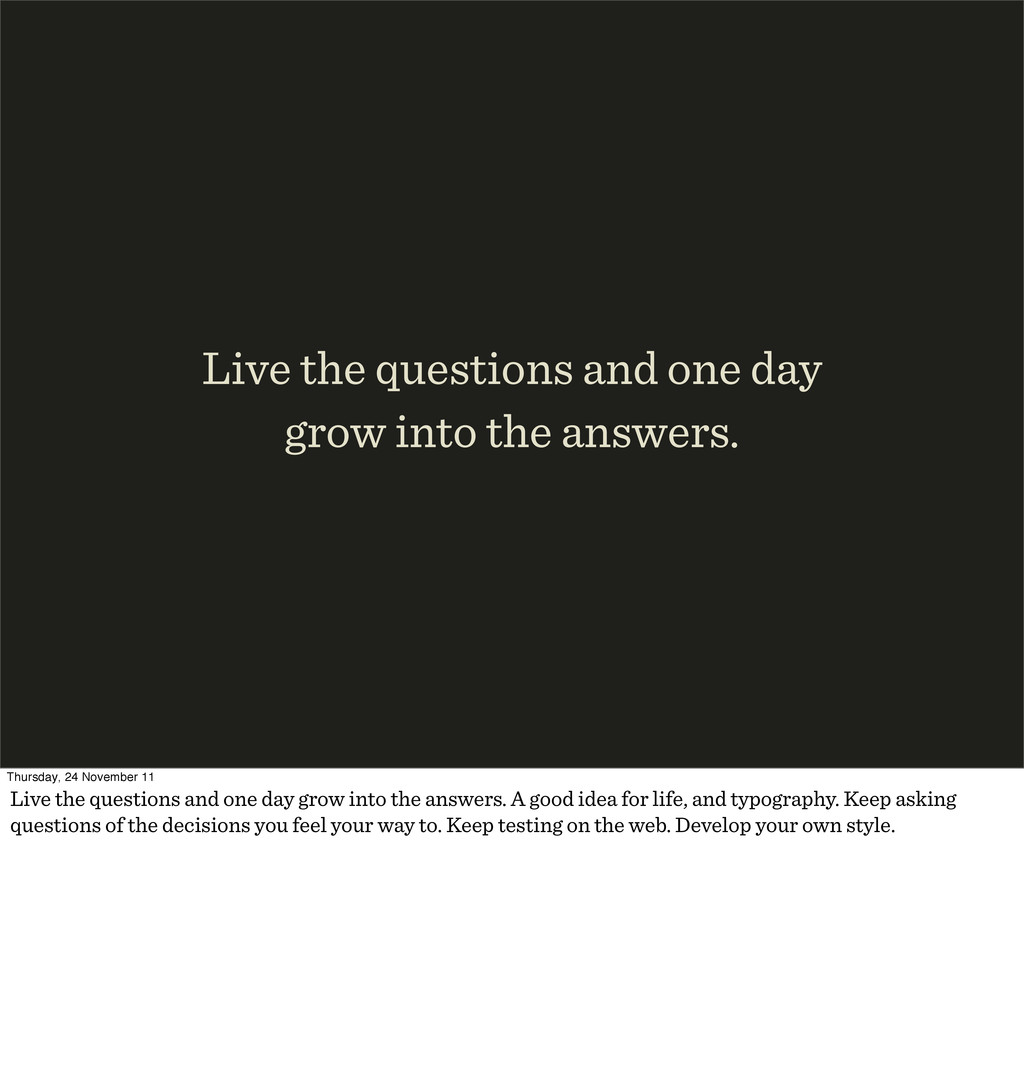
Thursday, 24 November 11 Live the questions and one day grow into the answers. A good idea for life, and typography. Keep asking questions of the decisions you feel your way to. Keep testing on the web. Develop your own style.
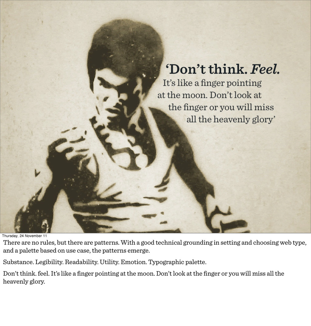
are patterns. With a good technical grounding in setting and choosing web type, and a palette based on use case, the patterns emerge. Substance. Legibility. Readability. Utility. Emotion. Typographic palette. Don’t think. feel. It’s like a finger pointing at the moon. Don’t look at the finger or you will miss all the heavenly glory.
edn. p. 9 (Hyphen Press, 2008). Matthew Carter Bell Centennial sample and Jan Middendorp photo: http://new.myfonts.com/newsletters/sp/200705.html http://www.flickr.com/photos/nickfindley/3528858451/ http://www.flickr.com/photos/37010090@N04/5136170057/ Credits Thursday, 24 November 11