Upgrade to Pro — share decks privately, control downloads, hide ads and more …

Web programming - Bootstrap

Web programming - Bootstrap

University of Stavanger, DAT310

Krisztian Balog

April 11, 2016
Tweet

More Decks by Krisztian Balog

Other Decks in Programming

Transcript

  1. Fixed-width vs fluid layouts - Fixed-width layout - Components inside

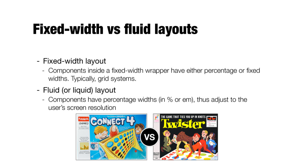
    a fixed-width wrapper have either percentage or fixed widths. Typically, grid systems. - Fluid (or liquid) layout - Components have percentage widths (in % or em), thus adjust to the user’s screen resolution
  2. Responsive design - Tailoring layout specifically for the type of

    screen - E.g., three column layout for desktops, a two column layout for tablets, and a single column layout on smartphones - Using a fluid grid and media queries in CSS
  3. Front-end frameworks 
 (a.k.a. CSS boilerplates) - Provide a common

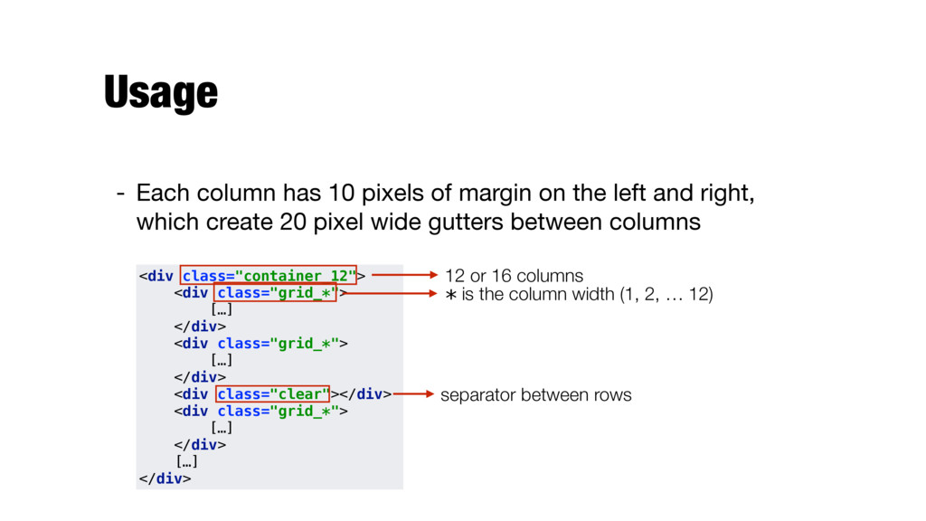
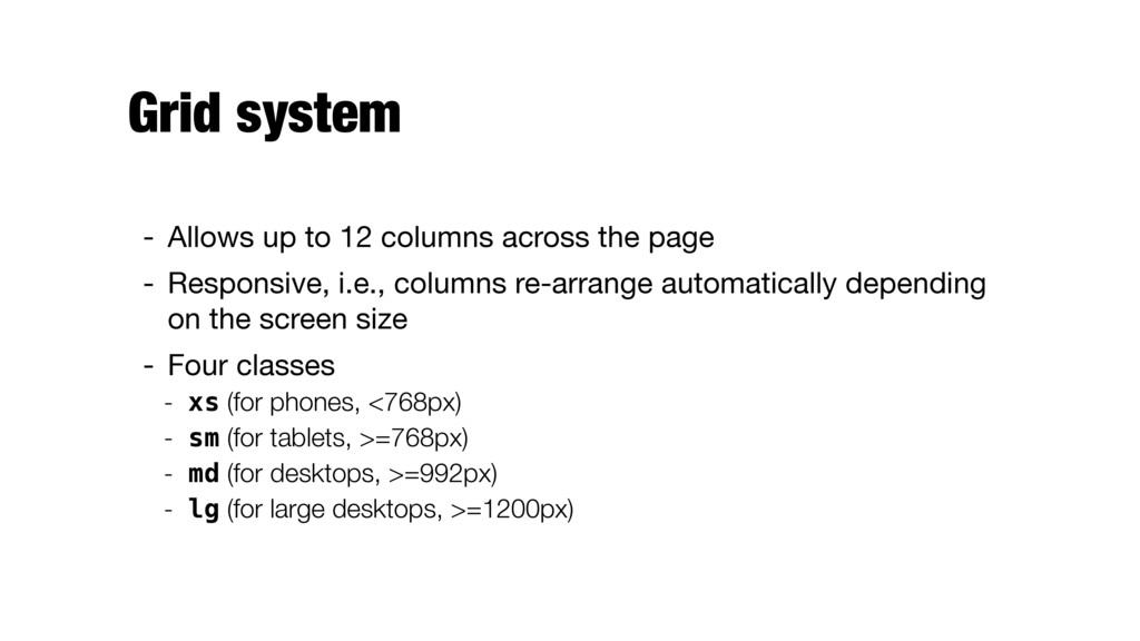
    structure - Usually a mix of HTML, CSS, and JS code - Typical components - Positioning blocks (often based on a grid system) - Typography style definitions for HTML elements - Solutions for browser (in)compatibility - Advanced components
  4. Grid systems - 960gs
 http://960.gs/ - Golden grid
 http://goldengridsystem.com/ -

    Responsive grid
 http://www.responsivegridsystem.com/ - Gridiculo.us
 http://gridiculo.us/
  5. Pros and cons for using frameworks Advantages - Speeds up

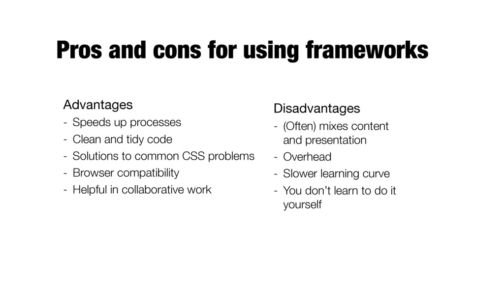
    processes - Clean and tidy code - Solutions to common CSS problems - Browser compatibility - Helpful in collaborative work Disadvantages - (Often) mixes content and presentation - Overhead - Slower learning curve - You don’t learn to do it yourself
  6. 960 Grid System http://960.gs/ - Provide commonly used dimensions based

    on a width of 960 pixels - Why 960? - 12 or 16 columns - can be used separately or in tandem - each column has 10px of margin on the left and right
  7. Usage - Each column has 10 pixels of margin on

    the left and right, which create 20 pixel wide gutters between columns <div class="container_12"> 
 <div class="grid_*">
 […]
 </div>
 <div class="grid_*">
 […]
 </div> 
 <div class="clear"></div>
 <div class="grid_*">
 […]
 </div>
 […]
 </div> 12 or 16 columns * is the column width (1, 2, … 12) separator between rows
  8. Solution
 solutions/bootstrap/exercise1.html <div class="container_12">
 
 <div class="grid_6">
 <div class="blue"></div>
 </div>


    <div class="grid_6">
 <div class="blue"></div>
 </div>
 
 <div class="clear"></div>
 
 <div class="grid_4">
 <div class="yellow"></div>
 </div>
 <div class="grid_4">
 <div class="yellow"></div>
 </div>
 <div class="grid_4">
 <div class="yellow"></div>
 </div>

  9. Bootstrap http://getbootstrap.com/ - Powerful front-end framework - Developed by Twitter,

    open sourced in 2011 - Responsive, mobile-first - Common HTML elements - Custom HTML and CSS components - jQuery plugins
  10. Getting started - Download or include it from CDN <!DOCTYPE

    html>
 <html lang="en">
 <head>
 <title>Bootstrap Example</title>
 <meta charset="utf-8">
 <meta name="viewport" content="width=device-width, initial-scale=1">
 <!-- Latest compiled and minified CSS -->
 <link rel="stylesheet" href="http://maxcdn.bootstrapcdn.com/bootstrap/3.3.6/ css/bootstrap.min.css">
 <!-- jQuery library -->
 <script src="https://ajax.googleapis.com/ajax/libs/jquery/1.12.0/ jquery.min.js"></script>
 <!-- Latest compiled JavaScript -->
 <script src="http://maxcdn.bootstrapcdn.com/bootstrap/3.3.6/js/ bootstrap.min.js"></script>
 </head> HTML5 doctype is required! Bootstrap is mobile-first. To ensure propert rendering and touch zooming, include:
  11. Containers - Two container classes to wrap site contents -

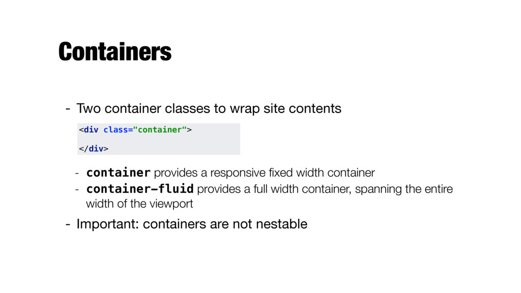
    container provides a responsive fixed width container - container-fluid provides a full width container, spanning the entire width of the viewport - Important: containers are not nestable <div class="container">
 
 </div>
  12. Grid system - Allows up to 12 columns across the

    page - Responsive, i.e., columns re-arrange automatically depending on the screen size - Four classes - xs (for phones, <768px) - sm (for tablets, >=768px) - md (for desktops, >=992px) - lg (for large desktops, >=1200px)
  13. Grid system (2) - Basic structure - If more than

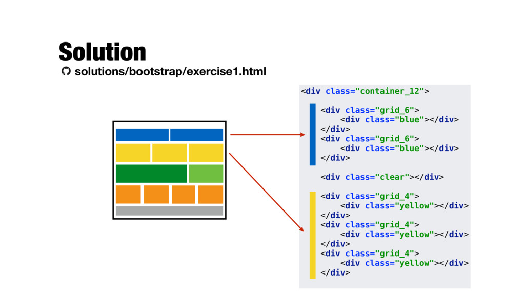
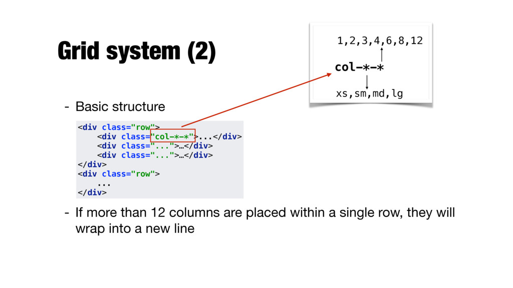
    12 columns are placed within a single row, they will wrap into a new line col-*-* xs,sm,md,lg 1,2,3,4,6,8,12 <div class="row">
 <div class="col-*-*">...</div>
 <div class="...">…</div>
 <div class="...">…</div>
 </div>
 <div class="row">
 ...
 </div>
  14. Responsive classes - Visible only on certain devices - Hidden

    on certain devices (visible on all other) visible-*-* hidden-* xs,sm,md,lg block,inline,inline-block xs,sm,md,lg
  15. Solution
 solutions/bootstrap/exercise2.html <div class="row">
 <div class="col-xs-12 col-md-6">
 <div class="blue"></div>
 </div>


    <div class="col-xs-12 col-md-6">
 <div class="blue"></div>
 </div>
 </div> <div class="row hidden-xs hidden-sm">
 <div class="col-md-3">
 <div class="orange"></div>
 </div>
 <div class="col-md-3">
 <div class="orange"></div>
 </div>
 …
 </div>
  16. Style definitons for HTML elements - Basic text - Tables

    - Images - Buttons - Forms - Helpers - See http://getbootstrap.com/css/
  17. Text/Typography - Elements are styled differently from browser defaults -

    Headings - Marks - Blockquotes - … - Contextual classes (for colors and backgrounds) - See http://www.w3schools.com/bootstrap/ bootstrap_typography.asp
  18. Tables - .table — basic table - .table-striped — adds

    zebra-stripes - .table-bordered — adds borders (on all sides of the table/cells) - .table-hover — enables a hover state on table rows - .table-condensed — makes a table more compact - Contextual classes can also be used (e.g., .active, .info) - See http://www.w3schools.com/bootstrap/bootstrap_tables.asp
  19. Images - .img-rounded — adds rounded corners to an image

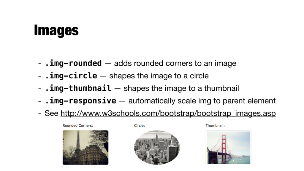
    - .img-circle — shapes the image to a circle - .img-thumbnail — shapes the image to a thumbnail - .img-responsive — automatically scale img to parent element - See http://www.w3schools.com/bootstrap/bootstrap_images.asp
  20. <input type="submit" class="btn btn-info btn-md" value="Submit Button"> Buttons - Styles

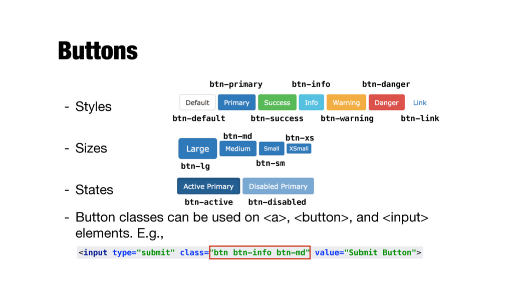
    - Sizes - States - Button classes can be used on <a>, <button>, and <input> elements. E.g., btn-default btn-primary btn-success btn-info btn-warning btn-danger btn-link btn-lg btn-md btn-sm btn-xs btn-active btn-disabled
  21. Forms - Individual form controls - Inline vs. horizontal forms

    - States (focused, disabled, readonly) - Help text - Validation states - See http://getbootstrap.com/css/#forms
  22. Forms <form>
 <div class="form-group">
 <label for="email">Email address:</label>
 <input type="email" class="form-control"

    id="email">
 </div>
 <div class="form-group">
 <label for="pwd">Password:</label>
 <input type="password" class="form-control" id="pwd">
 </div>
 <div class="checkbox">
 <label><input type="checkbox"> Remember me</label>
 </div>
 <button type="submit" class="btn btn-default">Submit</button>
 </form>

  23. Forms <form>
 <div class="form-group">
 <label for="email">Email address:</label>
 <input type="email" class="form-control"

    id="email">
 </div>
 <div class="form-group">
 <label for="pwd">Password:</label>
 <input type="password" class="form-control" id="pwd">
 </div>
 <div class="checkbox">
 <label><input type="checkbox"> Remember me</label>
 </div>
 <button type="submit" class="btn btn-default">Submit</button>
 </form>
 All textual <input>, <textarea>, and <select> elements with form-control are set to width: 100%.
  24. Forms <form>
 <div class="form-group">
 <label for="email">Email address:</label>
 <input type="email" class="form-control"

    id="email">
 </div>
 <div class="form-group">
 <label for="pwd">Password:</label>
 <input type="password" class="form-control" id="pwd">
 </div>
 <div class="checkbox">
 <label><input type="checkbox"> Remember me</label>
 </div>
 <button type="submit" class="btn btn-default">Submit</button>
 </form>
 Wrap labels and controls in form-group for optimal spacing.
  25. Glyphicons - Over 250 icons in font format - Can

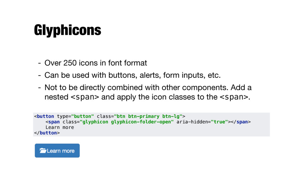
    be used with buttons, alerts, form inputs, etc. - Not to be directly combined with other components. Add a nested <span> and apply the icon classes to the <span>. <button type="button" class="btn btn-primary btn-lg">
 <span class="glyphicon glyphicon-folder-open" aria-hidden="true"></span> Learn more
 </button>
  26. Dropdowns - Toggleable, contextual menu for displaying lists of links

    - Made interactive with JavaScript <div class="dropdown">
 <button class="btn btn-default dropdown-toggle" type="button" id="dropdownMenu1" data-toggle="dropdown" aria- haspopup="true" aria-expanded="true">
 Dropdown
 <span class="caret"></span>
 </button>
 <ul class="dropdown-menu" aria-labelledby="dropdownMenu1">
 <li><a href="#">Action</a></li>
 <li><a href="#">Another action</a></li>
 <li><a href="#">Something else here</a></li>
 <li role="separator" class="divider"></li>
 <li><a href="#">Separated link</a></li>
 </ul>
 </div>
  27. Button groups - Group a series of buttons together on

    a single line <div class="btn-group" role="group" aria-label="...">
 <button type="button" class="btn btn-default">Left</button>
 <button type="button" class="btn btn-default">Middle</button>
 <button type="button" class="btn btn-default">Right</button>
 </div>
  28. Navbar - Navigation header for the application or site -

    Collapsed in mobile views and become horizontal as the viewport increases - Requires JS
  29. Pagination - Pagination links (e.g., for search results) <nav>
 <ul

    class="pagination">
 <li>
 <a href="#" aria-label="Previous">
 <span aria-hidden="true">&laquo;</span>
 </a>
 </li>
 <li><a href="#">1</a></li>
 […] <li><a href="#">5</a></li>
 <li>
 <a href="#" aria-label="Next">
 <span aria-hidden="true">&raquo;</span>
 </a>
 </li>
 </ul>
 </nav>
  30. Labels - Labes in rounded boxes - Size is adjusted

    automatically <h3>Example heading <span class="label label-default">New</span></h3>
  31. Badges - For highlighting new or unread items - Can

    be added to links, Bootstrap navs, etc. <a href="#">Inbox <span class="badge">42</span></a>
 
 <button class="btn btn-primary" type="button">
 Messages <span class="badge">4</span>
 </button>
  32. Jumbotron - Component that can optionally extend the entire viewport

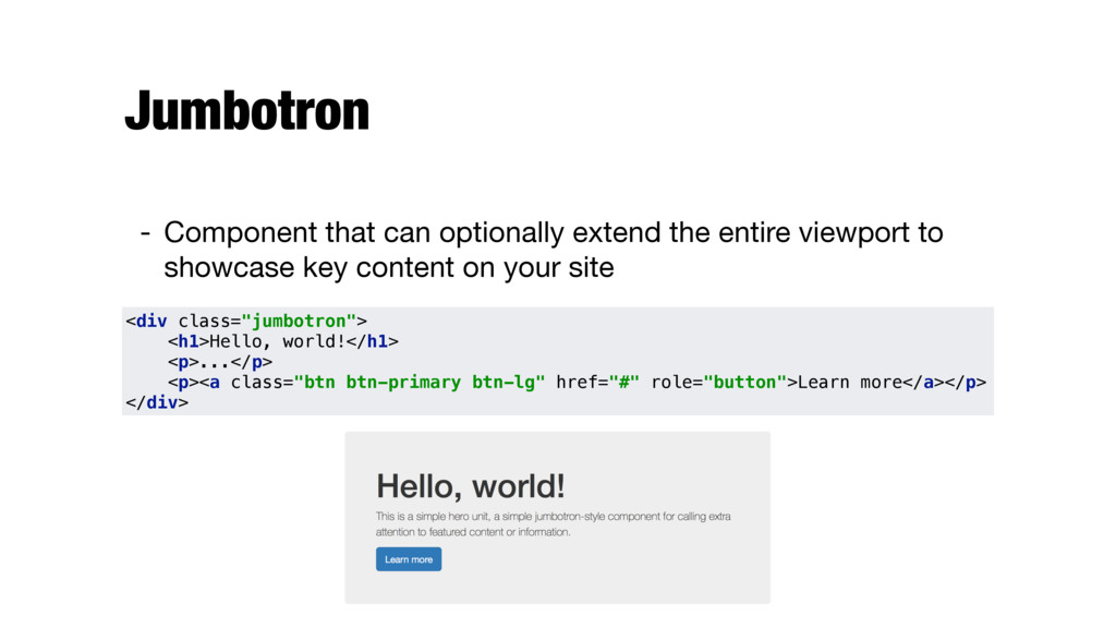
    to showcase key content on your site <div class="jumbotron">
 <h1>Hello, world!</h1>
 <p>...</p>
 <p><a class="btn btn-primary btn-lg" href="#" role="button">Learn more</a></p>
 </div>
  33. Alerts - Contextual feedback messages for typical user actions <div

    class="alert alert-warning" role="alert">
 <strong>Warning!</strong> Better check yourself, you're not looking too good.
 </div>
  34. Dismissible alerts - Make any alert "closeable" - Needs JS

    <div class="alert alert-warning alert-dismissible" role="alert">
 <button type="button" class="close" data-dismiss="alert" aria- label="Close"><span aria-hidden="true">&times;</span></button>
 <strong>Warning!</strong> Better check yourself, you're not looking too good.
 </div>
  35. Panels - For "boxing" content <div class="panel panel-default panel-primary">
 <div

    class="panel-heading">
 <h3 class="panel-title">Panel title</h3>
 </div>
 <div class="panel-body">
 […]
 </div>
 </div>
  36. DataTables http://www.datatables.net - jQuery Plugin for working with tables -

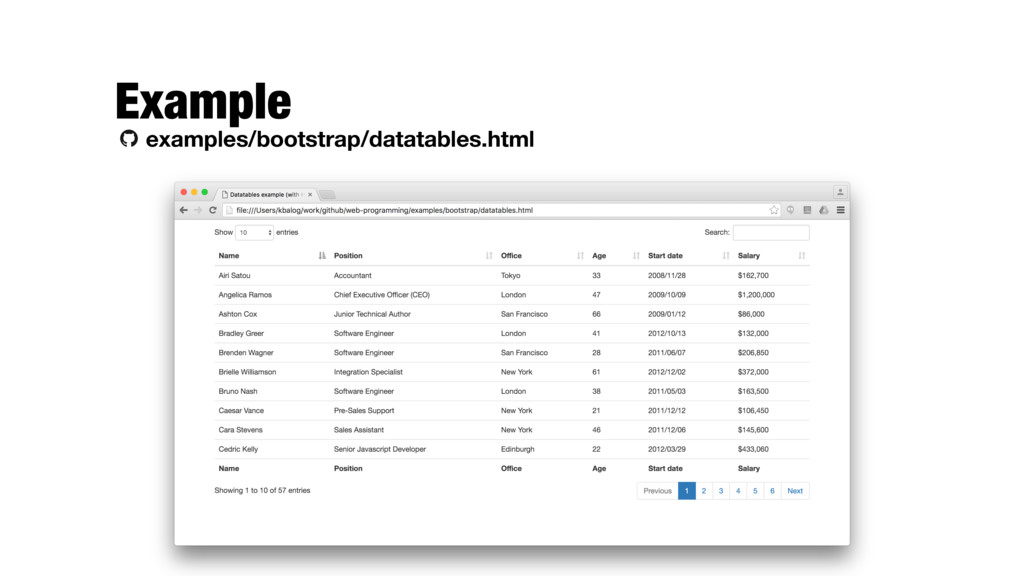
    Pagination, instant search, multi-column ordering - Can load data from various sources - HTML, JavaScript, AJAX - Theme-able - Styles for Bootstrap: 
 http://www.datatables.net/manual/styling/bootstrap
  37. Server-side processing - Needed if working with large databases -

    All paging, searching, ordering operations are handed off to the server (where an SQL engine performs them) - AJAX is used to get the required data from the server - Details: https://datatables.net/manual/server-side
  38. Bootstrap themes and admin dashboards - Building on the Bootstrap

    framework - Both paid and free alernatives
  39. References - Bootstrap - http://getbootstrap.com - http://www.w3schools.com/bootstrap - Lists of

    CSS boilerplates and frameworks - http://mashable.com/2013/04/26/css-boilerplates-frameworks/ - http://www.awwwards.com/what-are-frameworks-22-best-responsive- css-frameworks-for-web-design.html