Upgrade to Pro — share decks privately, control downloads, hide ads and more …

Final Assignment Inspirations

Kaylene
April 13, 2015

Final Assignment Inspirations

Kaylene

April 13, 2015
Tweet

Other Decks in Design

Transcript

  1. Concept-1 Instead of scrolling up and down, this following website

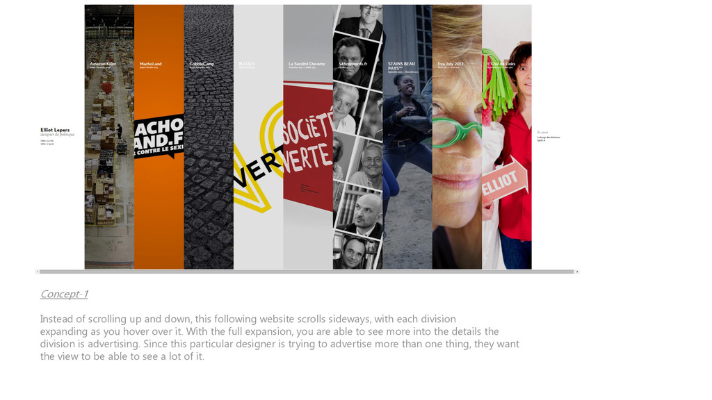
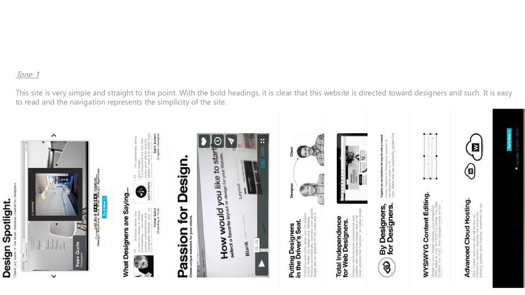
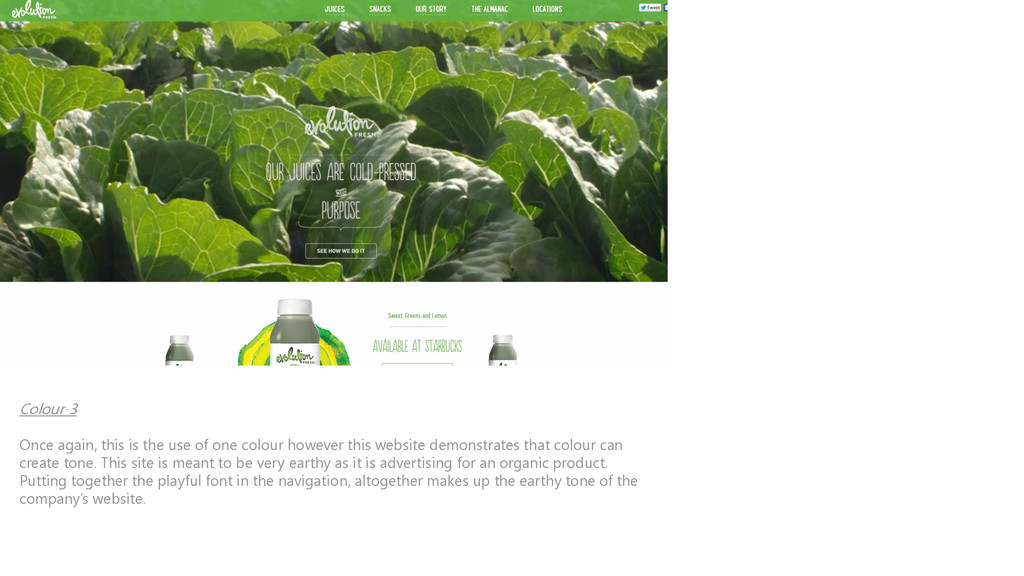
    scrolls sideways, with each division expanding as you hover over it. With the full expansion, you are able to see more into the details the division is advertising. Since this particular designer is trying to advertise more than one thing, they want the view to be able to see a lot of it.
  2. Concept-2 The main focus on this entire website was the

    fact that the entire header picture would move as you moved the mouse around. Since the website is called “Moovents,” I thought they did a good of playing with that idea. With the movement of colors also, it contributes to the advertisement of the company.
  3. Concept-3 The menu navigation on this website fits together of

    what kind of restaurant it is. With the typography used in the menu navigation, drags the viewer to focus on what the restaurant can offer. As this is one of my favourite concepts, I plan to use this in my final assignment.
  4. Tone-1 This site is very simple and straight to the

    point. With the bold headings, it is clear that this website is directed toward designers and such. It is easy to read and the navigation represents the simplicity of the site.
  5. Tone-2 With the right fonts and images, you can create

    the right feel for a website. I thought this winery website perfectly represented it’s product in a very sophisticated way. For this kind of business, the use of images is important to emphasizing the tone. (This was only a snippet of the site as it did not get all of the images in one screenshot)
  6. Tone-3 Right off the bat you know this is some

    sort of video/photography production website. The navigation is still clear which is perfect even with the production image as the background. The company name is also emphasized as the largest focus on the page. Overall, this was a great example of showing what the website is advertising.
  7. Colour-1 This was my favourite website I visited while searching

    for inspirations. It is meant to be an older diner so with the black and white background and bold coloured heading, demonstrates the combination of modern and classic. Not only does the bold colour make the company name stand out, it contributes to the older feeling of the diner with the font style used.
  8. Color-2 You don’t always have to have a lot of

    colours to make certain things stand out. The use of one color can be just as efficient. The use of the gradient used on this site shows the division between each section, also making I easier to read.
  9. Colour-3 Once again, this is the use of one colour

    however this website demonstrates that colour can create tone. This site is meant to be very earthy as it is advertising for an organic product. Putting together the playful font in the navigation, altogether makes up the earthy tone of the company’s website.