Upgrade to Pro — share decks privately, control downloads, hide ads and more …

Introduction to Data Visualization for the Web

Introduction to Data Visualization for the Web

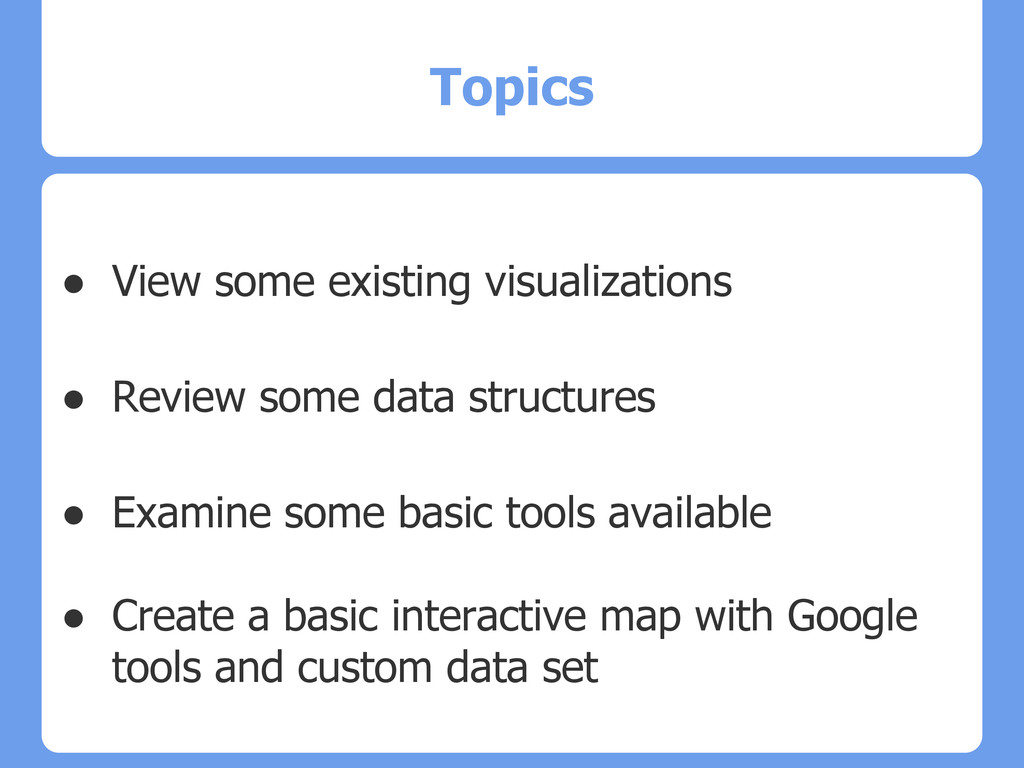
A brief outline of some of the canned visualization options available on the web. We'll walk through a quick geospatial mapping with Google Fusion Tables and a custom dataset.

Kristian

May 10, 2013
Tweet

More Decks by Kristian

Other Decks in Technology

Transcript

  1. Introduction to
    Data Visualization
    for the Web
    Kristian Allen
    Programmer - UCLA Digital Library

    View Slide

  2. Topics
    ● View some existing visualizations
    ● Review some data structures
    ● Examine some basic tools available
    ● Create a basic interactive map with Google
    tools and custom data set

    View Slide

  3. Demand for Data Visualization
    ● Draws users into content
    ● By exploring, users become participants
    ● Knowledge increases through discovery
    ● Consume mass amounts of data quickly

    View Slide

  4. Fun Interactive Visualizations
    ● Baby Name Wizard
    http://www.babynamewizard.com/voyager
    Data source: SSA records
    ● Growth of Walmart
    http://projects.flowingdata.com/walmart/
    Created by UCLA's own Nathan Yau
    ● Rich Blocks, Poor Blocks
    http://www.richblockspoorblocks.com/
    Data source: Census ACS -American Community Survey

    View Slide

  5. Some More Fun Examples
    ● Word Cloud
    http://www.tagxedo.com/app.html - Silverlight 
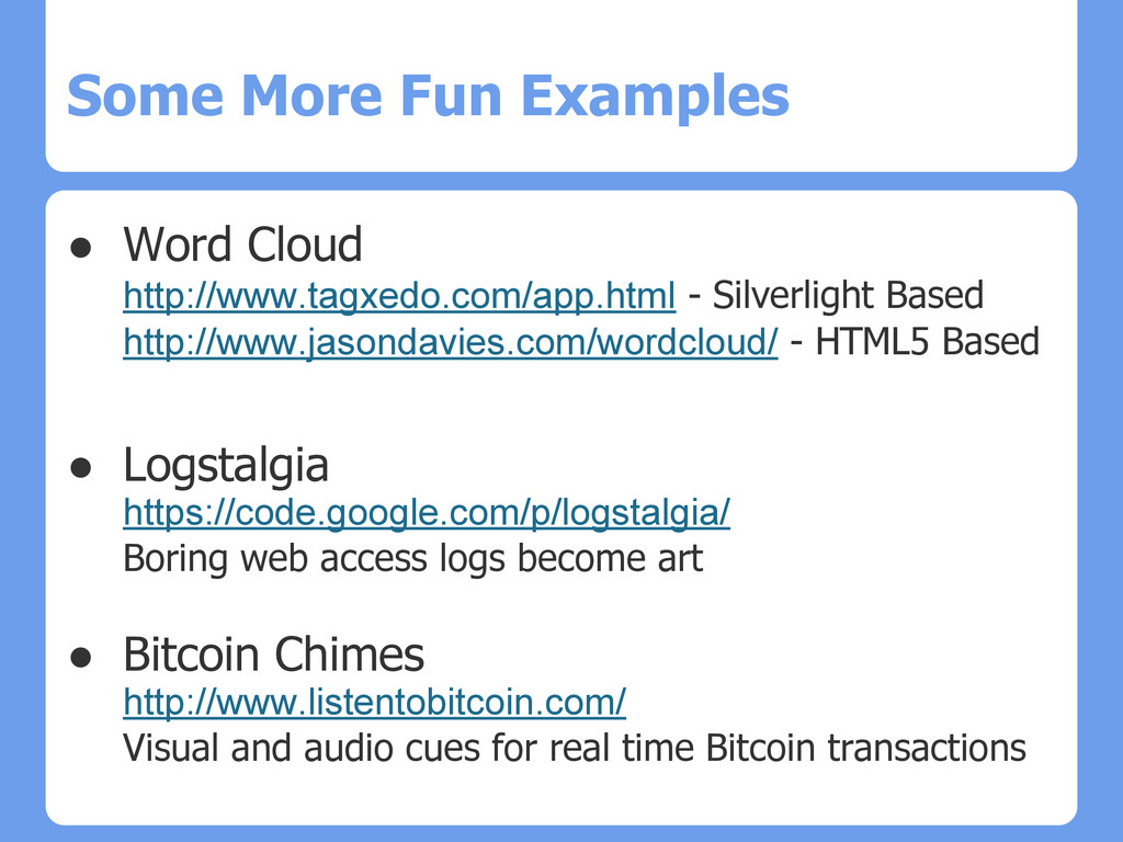
Based
    http://www.jasondavies.com/wordcloud/ - HTML5 Based
    ● Logstalgia
    https://code.google.com/p/logstalgia/
    Boring web access logs become art
    ● Bitcoin Chimes
    http://www.listentobitcoin.com/
    Visual and audio cues for real time Bitcoin transactions
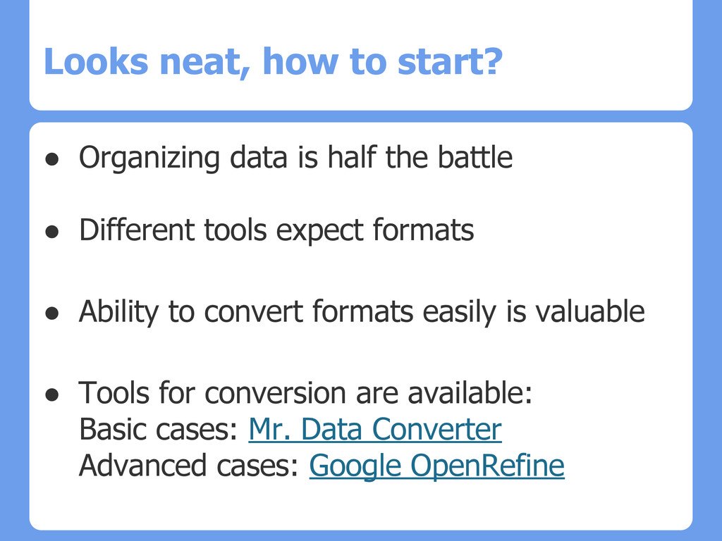
    View Slide

  6. Looks neat, how to start?
    ● Organizing data is half the battle
    ● Different tools expect formats
    ● Ability to convert formats easily is valuable
    ● Tools for conversion are available:
    Basic cases: Mr. Data Converter
    Advanced cases: Google OpenRefine
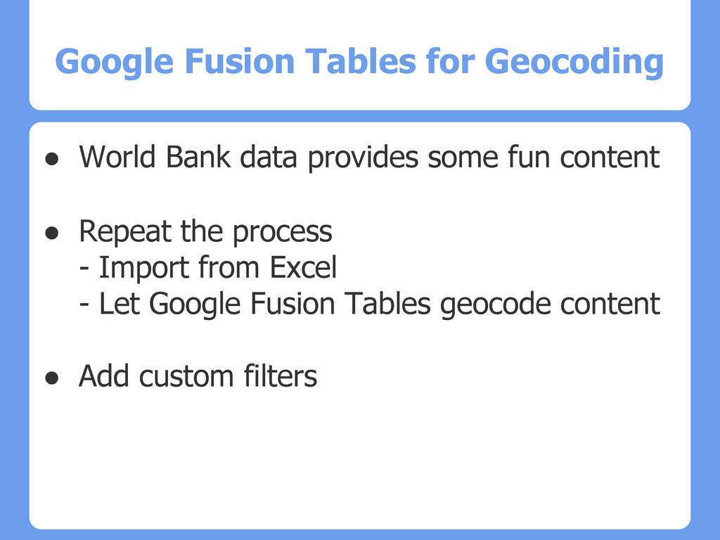
    View Slide

  7. Complexity
    ● Simple Text
    Plain Text File, CSV
    ● Structured Text and Spreadsheets
    JSON, XML, Excel
    ● Databases
    Filemaker Pro, Access, MySQL
    ● Industrial Strength, Specialized
    MongoDB, Hadoop, Oracle
    R, Processing, JS libraries

    View Slide

  8. Lets Try Some Tools
    ● IBM ManyEyes
    http://www-958.ibm.com/software/analytics/manyeyes/
    ● Great, I want to play!
    ● IBM ManyEyes Demo

    View Slide

  9. Google Charts Playground
    ● Quick way to prototype charts
    https://code.google.com/apis/ajax/playground/?type=visualization
    ● Nice way to provide quick dynamic data
    File -> Publish to the Web
    ● Basic search queries can be used
    Query language similar to SQL

    View Slide

  10. Google Charts with Library data
    ● Use case with UCLA Digital Library data
    ● We will:
    - Export from Digital Library
    - Import into Google Fusion Tables
    - Create a stand alone interactive map
    - Embed map in a web page
    - Export and view in Google Earth on laptop
    ● How to: http://bit.ly/14aCqS3

    View Slide

  11. Google Fusion Tables for Geocoding
    ● World Bank data provides some fun content
    ● Repeat the process
    - Import from Excel
    - Let Google Fusion Tables geocode content
    ● Add custom filters

    View Slide

  12. Next Steps
    ● Advanced interactivity
    Same data set, but custom programming
    ● We'll dig into D3 next session
    http://d3js.org/
    ● Other tools:
    Processing.js Raphael
    ● Data exploration:
    Tableau Orange

    View Slide

  13. Questions?

    View Slide

  14. Resources
    Flowing Data - http://flowingdata.com/
    Data Points - ISBN 9781118462195
    Visualize This - ISBN 9780470944882
    Nathan Yau - UCLA PhD
    Google Spreadsheet Query API
    https://developers.google.com/chart/interactive/docs/querylanguage
    URL Encoder/Decoder
    http://meyerweb.com/eric/tools/dencoder/

    View Slide