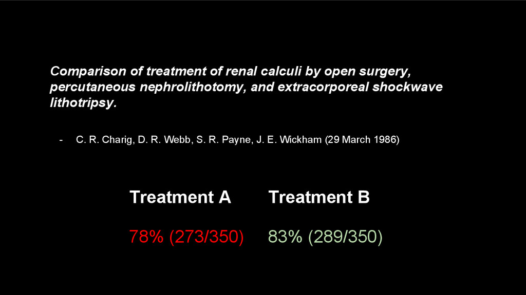
treatment of renal calculi by open surgery, percutaneous nephrolithotomy, and extracorporeal shockwave lithotripsy. - C. R. Charig, D. R. Webb, S. R. Payne, J. E. Wickham (29 March 1986)
greatest number of ideas in the shortest time with the least ink in the smallest space.” Edward R. Tufte The Visual Display of Quantitative Information (1983)
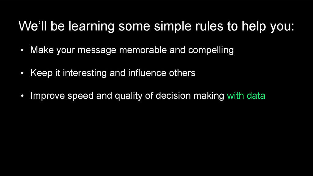
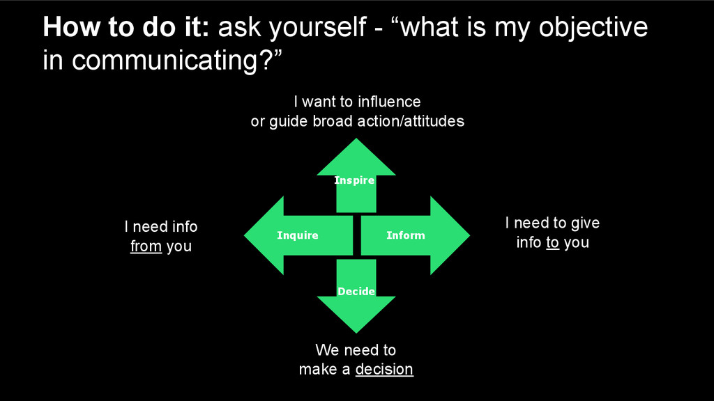
to you We need to make a decision Inform Decide Inspire I want to influence or guide broad action/attitudes Inquire How to do it: ask yourself - “what is my objective in communicating?”
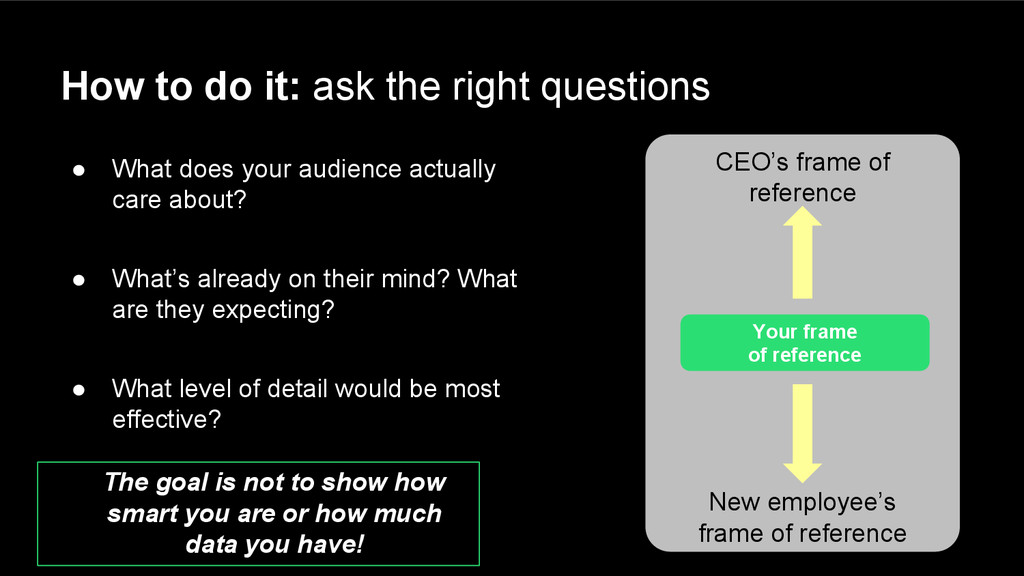
does your audience actually care about? • What’s already on their mind? What are they expecting? • What level of detail would be most effective? CEO’s frame of reference New employee’s frame of reference Your frame of reference The goal is not to show how smart you are or how much data you have!
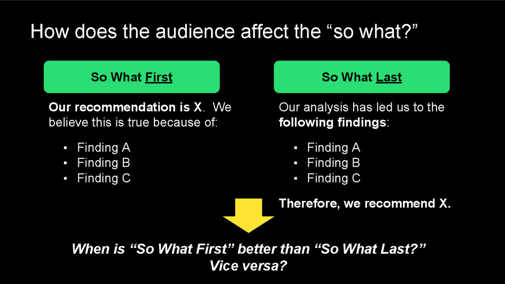
First So What Last Our recommendation is X. We believe this is true because of: ▪ Finding A ▪ Finding B ▪ Finding C Our analysis has led us to the following findings: ▪ Finding A ▪ Finding B ▪ Finding C Therefore, we recommend X. When is “So What First” better than “So What Last?” Vice versa?
Ensure there’s a flow of the story you’re conveying ▪ Bullets are your friend – both written and spoken ▪ So is bolding for emphasis – again, written and spoken Reminder: goal is convey understanding with clarity & simplicity, not to “impress” with detail & complexity
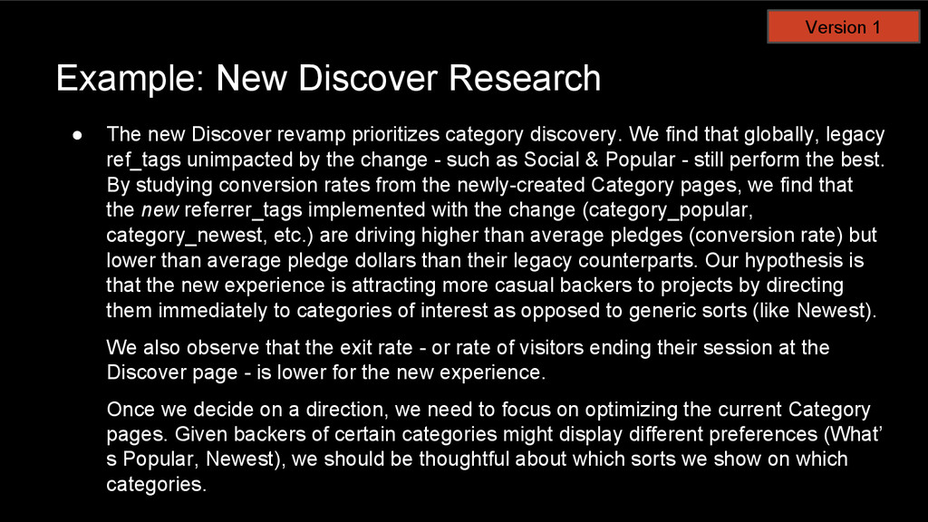
category discovery. We find that globally, legacy ref_tags unimpacted by the change - such as Social & Popular - still perform the best. By studying conversion rates from the newly-created Category pages, we find that the new referrer_tags implemented with the change (category_popular, category_newest, etc.) are driving higher than average pledges (conversion rate) but lower than average pledge dollars than their legacy counterparts. Our hypothesis is that the new experience is attracting more casual backers to projects by directing them immediately to categories of interest as opposed to generic sorts (like Newest). We also observe that the exit rate - or rate of visitors ending their session at the Discover page - is lower for the new experience. Once we decide on a direction, we need to focus on optimizing the current Category pages. Given backers of certain categories might display different preferences (What’ s Popular, Newest), we should be thoughtful about which sorts we show on which categories. Version 1
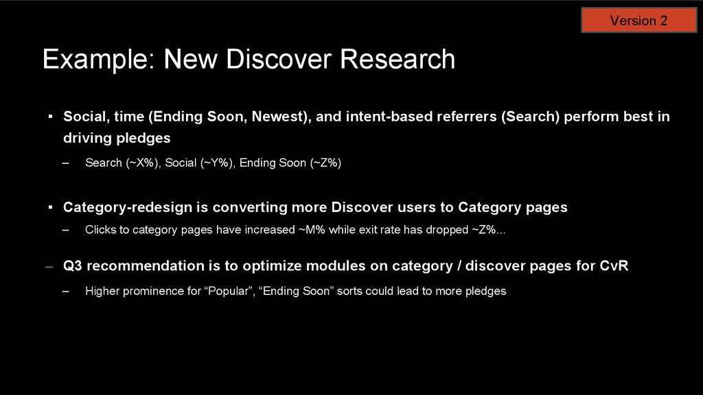
and intent-based referrers (Search) perform best in driving pledges – Search (~X%), Social (~Y%), Ending Soon (~Z%) ▪ Category-redesign is converting more Discover users to Category pages – Clicks to category pages have increased ~M% while exit rate has dropped ~Z%... – Q3 recommendation is to optimize modules on category / discover pages for CvR – Higher prominence for “Popular”, “Ending Soon” sorts could lead to more pledges Version 2
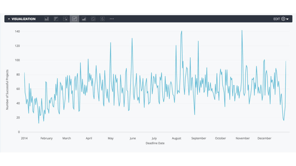
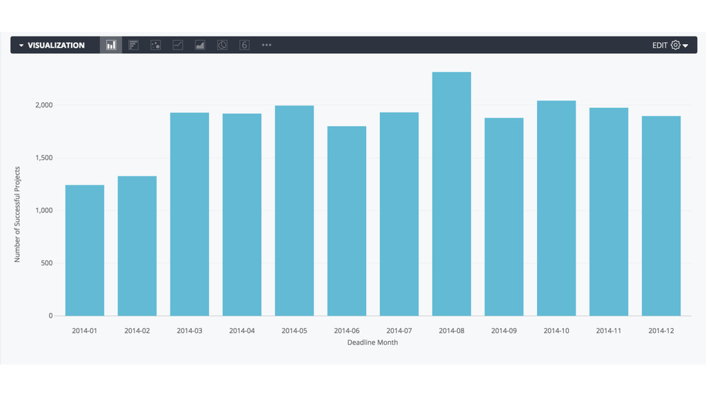
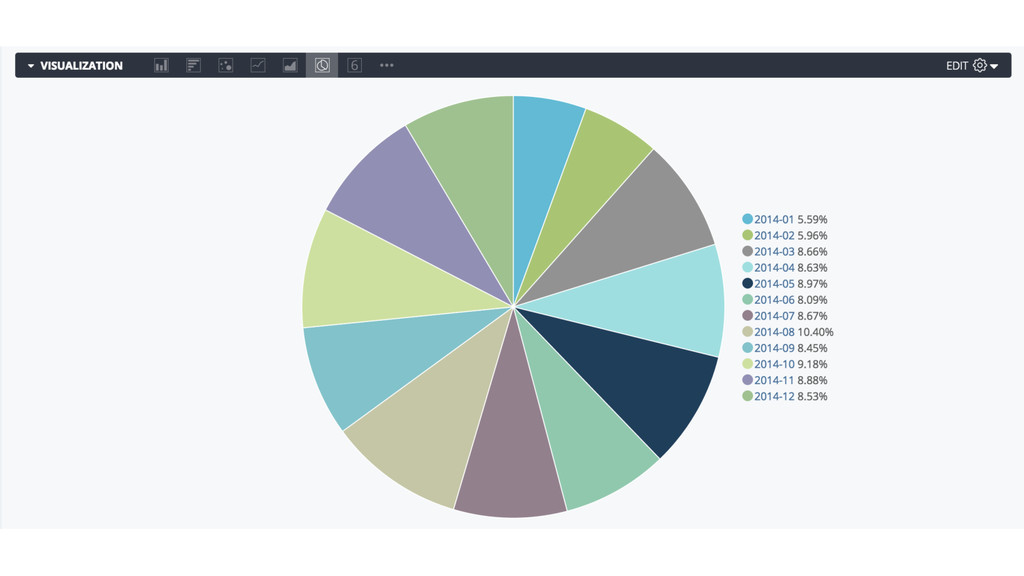
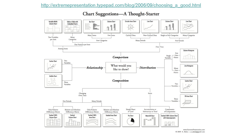
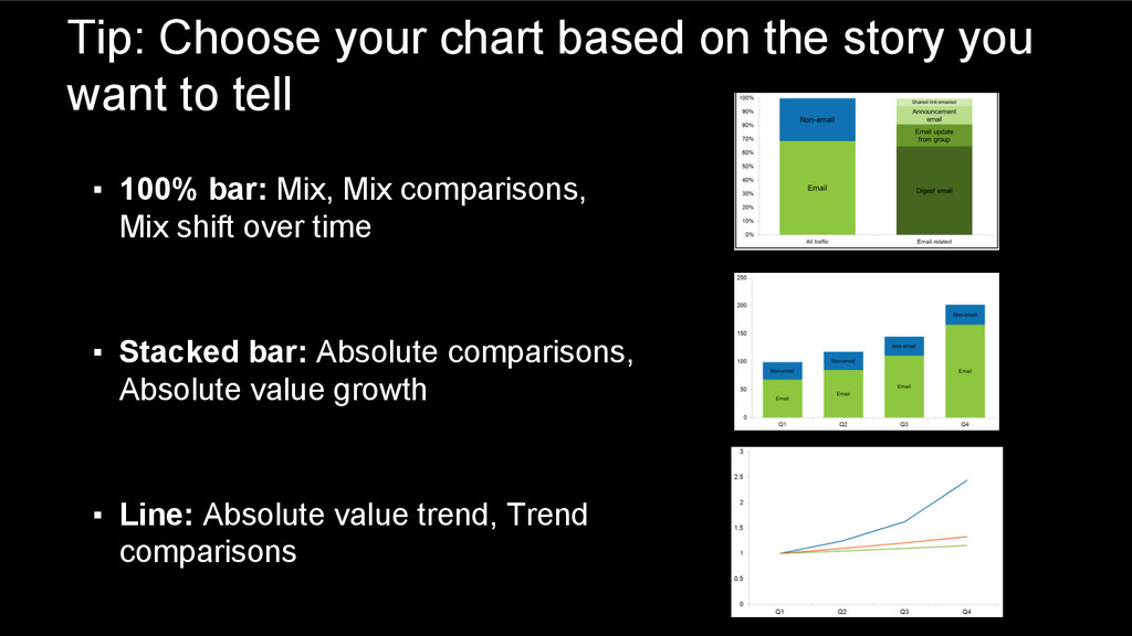
to tell ▪ 100% bar: Mix, Mix comparisons, Mix shift over time ▪ Stacked bar: Absolute comparisons, Absolute value growth ▪ Line: Absolute value trend, Trend comparisons