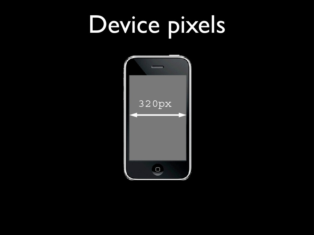
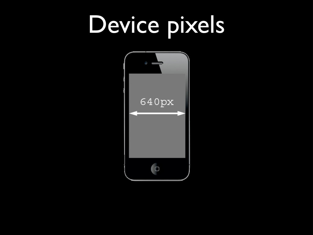
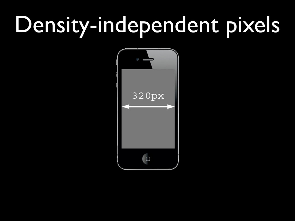
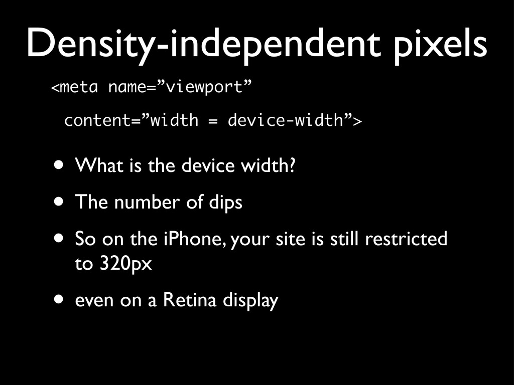
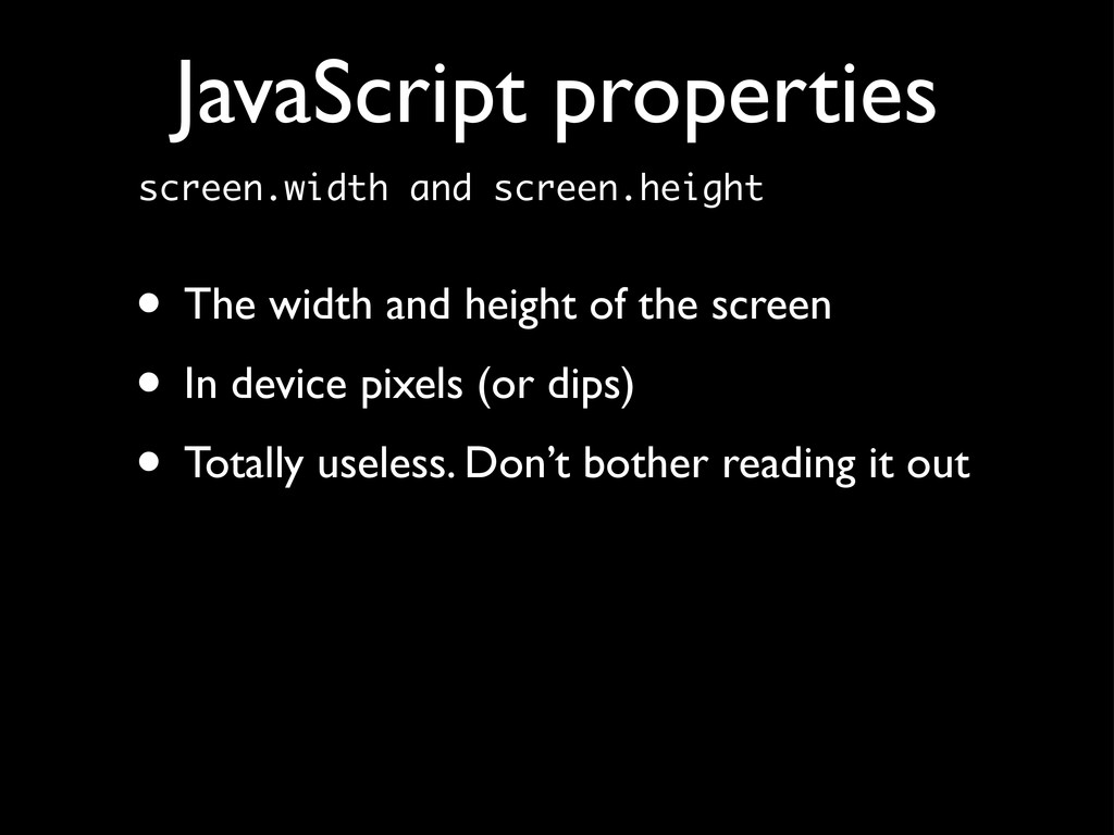
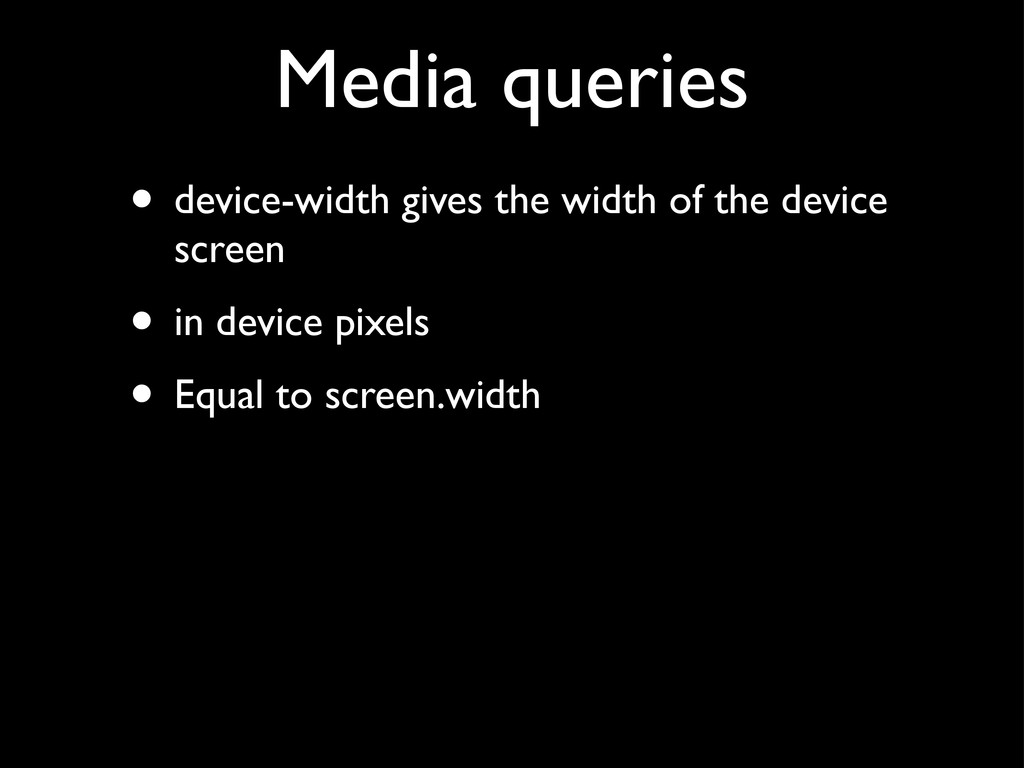
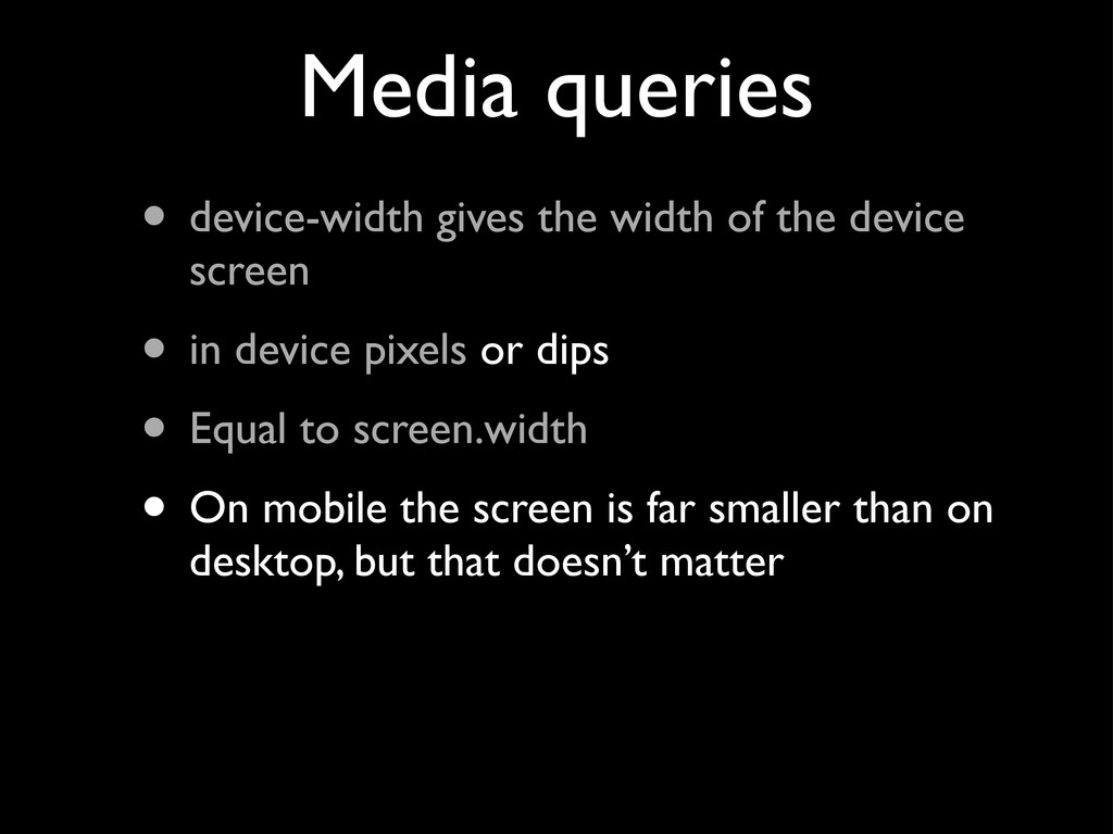
They are another abstraction layer • The number of dips is equal to the number of CSS pixels that is optimal for viewing a website on the device at 100% zoom • For the iPhone that’s 320px Density-independent pixels
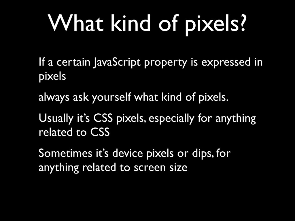
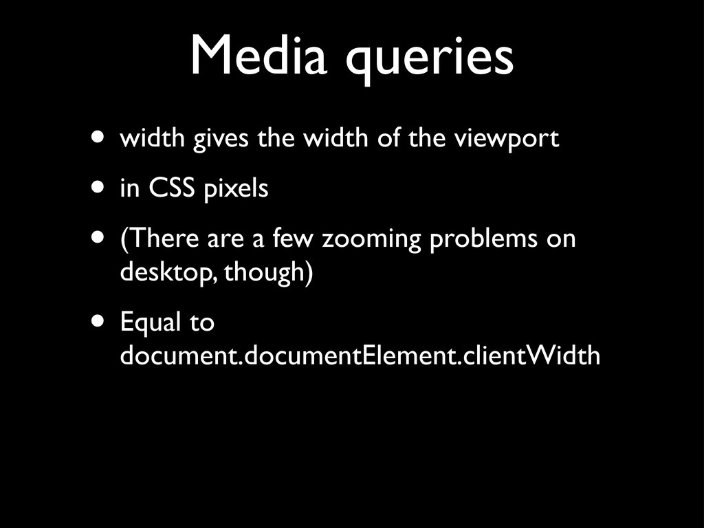
expressed in pixels always ask yourself what kind of pixels. Usually it’s CSS pixels, especially for anything related to CSS Sometimes it’s device pixels or dips, for anything related to screen size
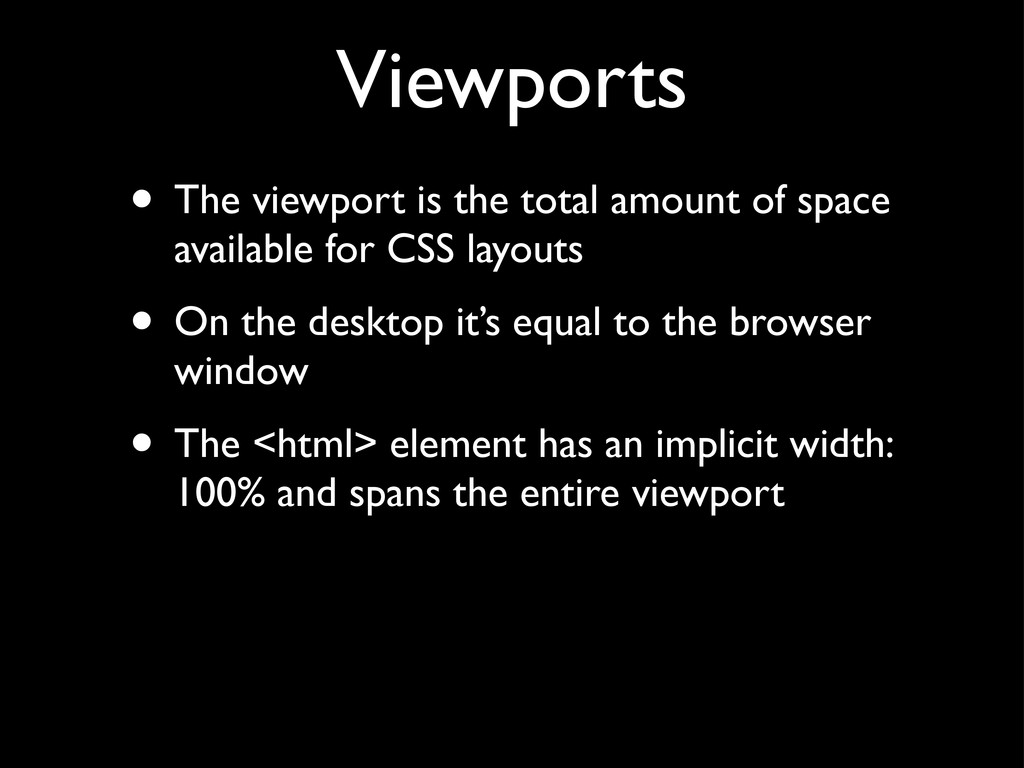
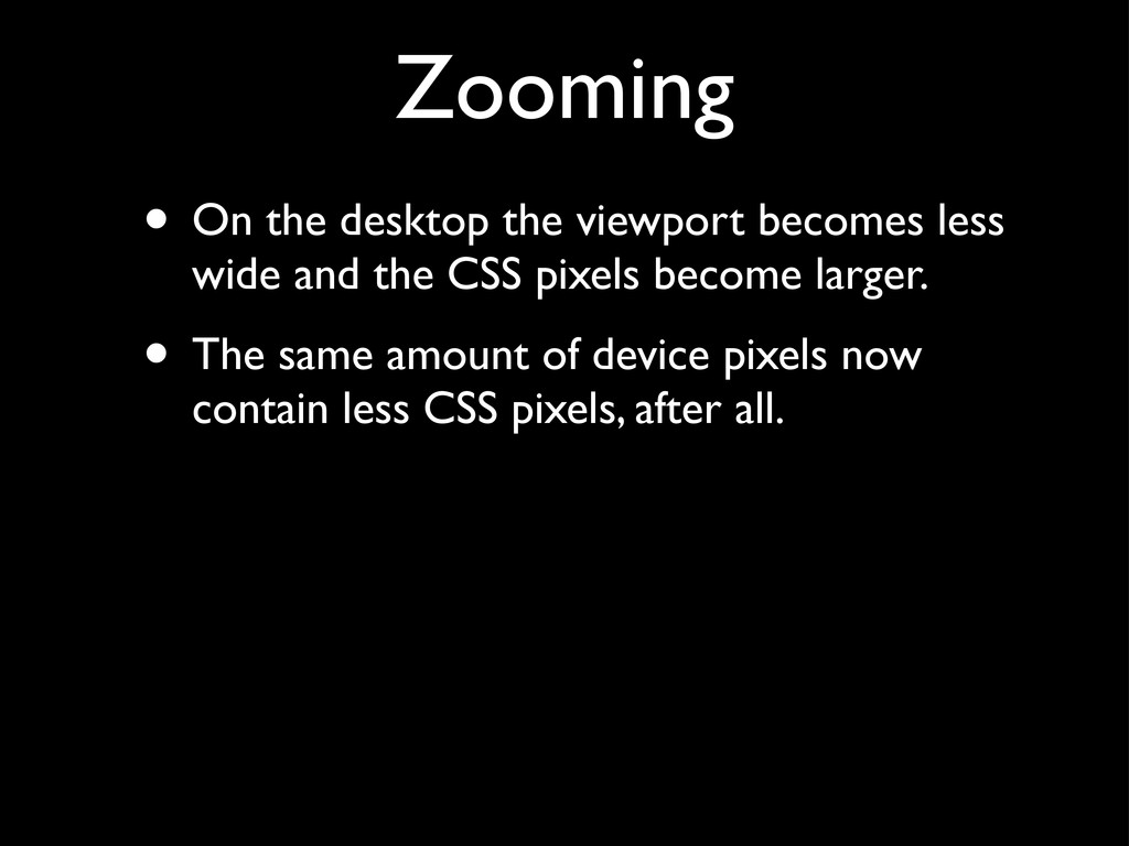
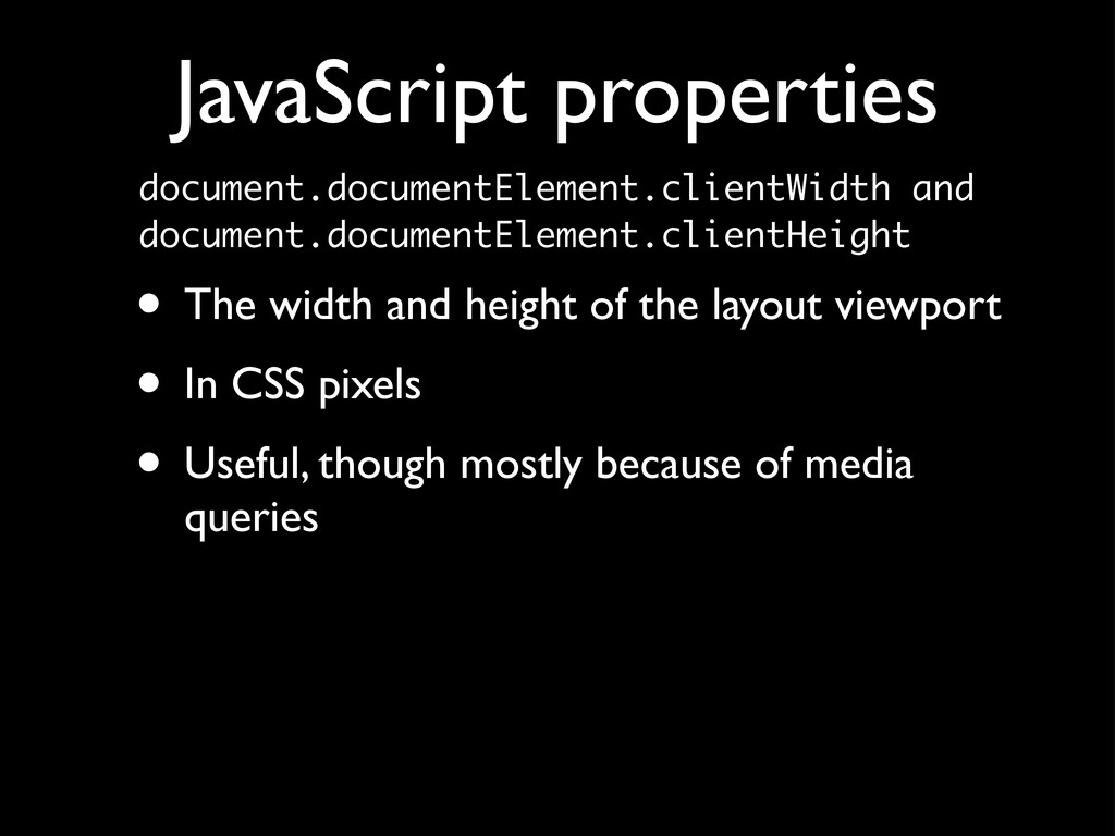
available for CSS layouts • On the desktop it’s equal to the browser window • The <html> element has an implicit width: 100% and spans the entire viewport
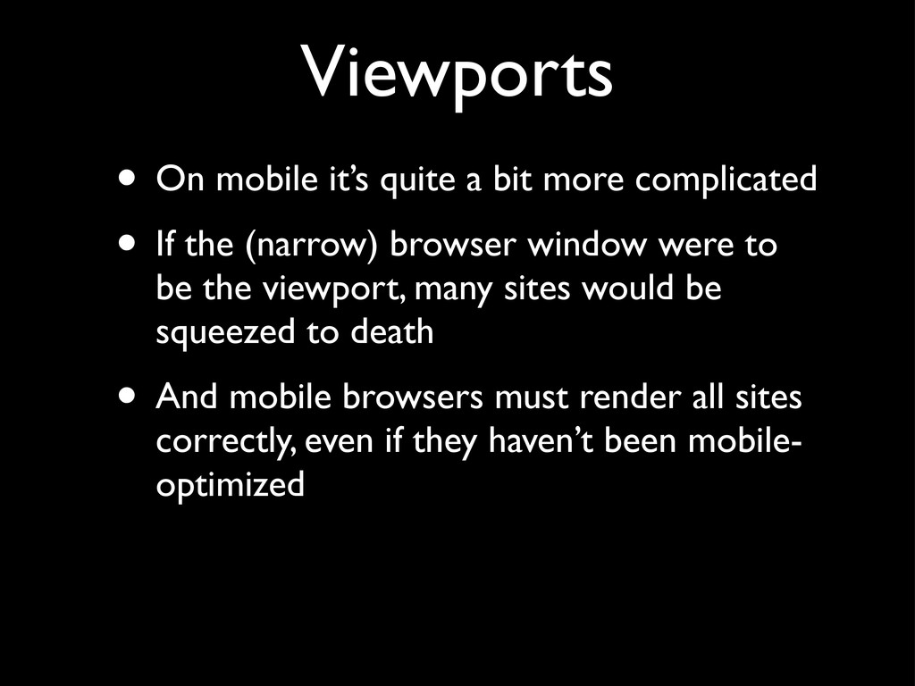
• If the (narrow) browser window were to be the viewport, many sites would be squeezed to death • And mobile browsers must render all sites correctly, even if they haven’t been mobile- optimized
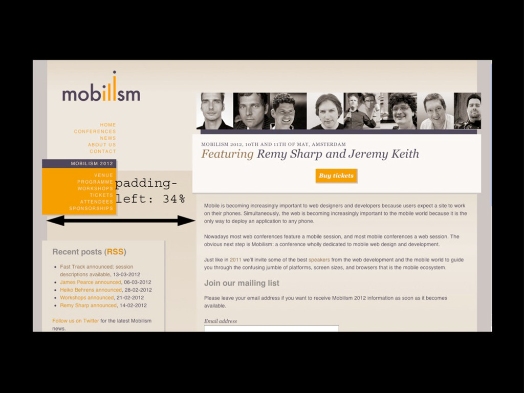
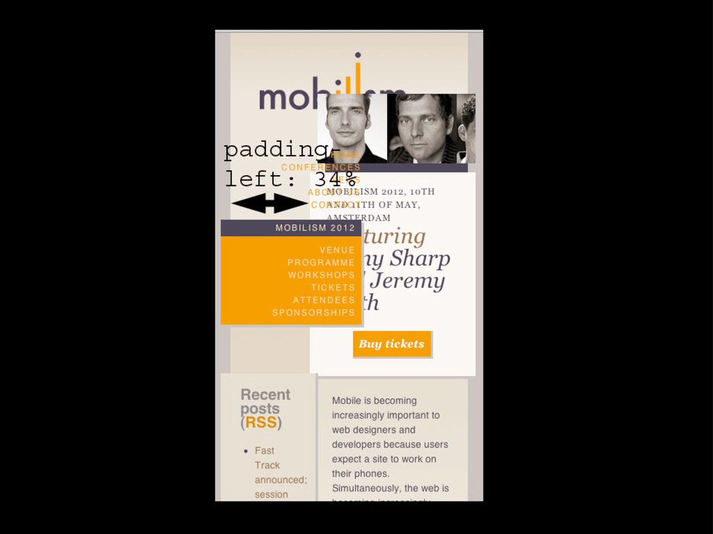
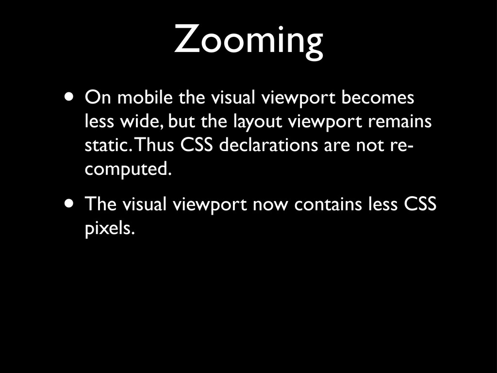
the viewport into two: • The layout viewport, the viewport that CSS declarations such as padding-left: 34% use, • and the visual viewport, which is the part of the page the user is currently seeing • Both are measured in CSS pixels
to the layout viewport • by zooming the page out as much as possible • Although the page is unreadable, the user can at least decide which part he’d like to concentrate on and zoom in on that part
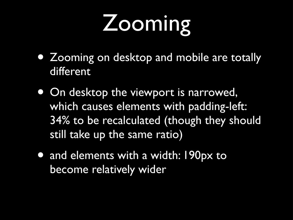
• On desktop the viewport is narrowed, which causes elements with padding-left: 34% to be recalculated (though they should still take up the same ratio) • and elements with a width: 190px to become relatively wider
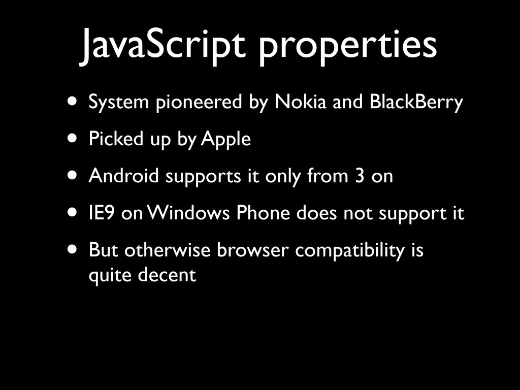
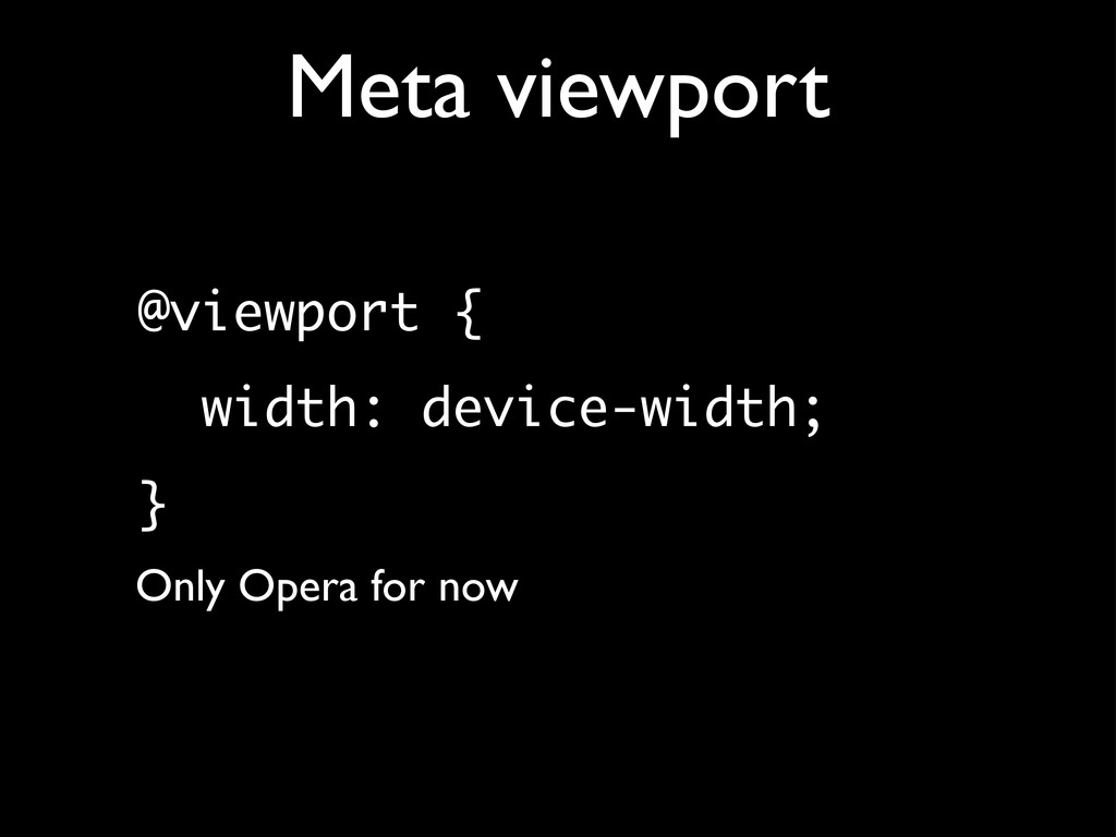
by Apple • Android supports it only from 3 on • IE9 on Windows Phone does not support it • But otherwise browser compatibility is quite decent JavaScript properties
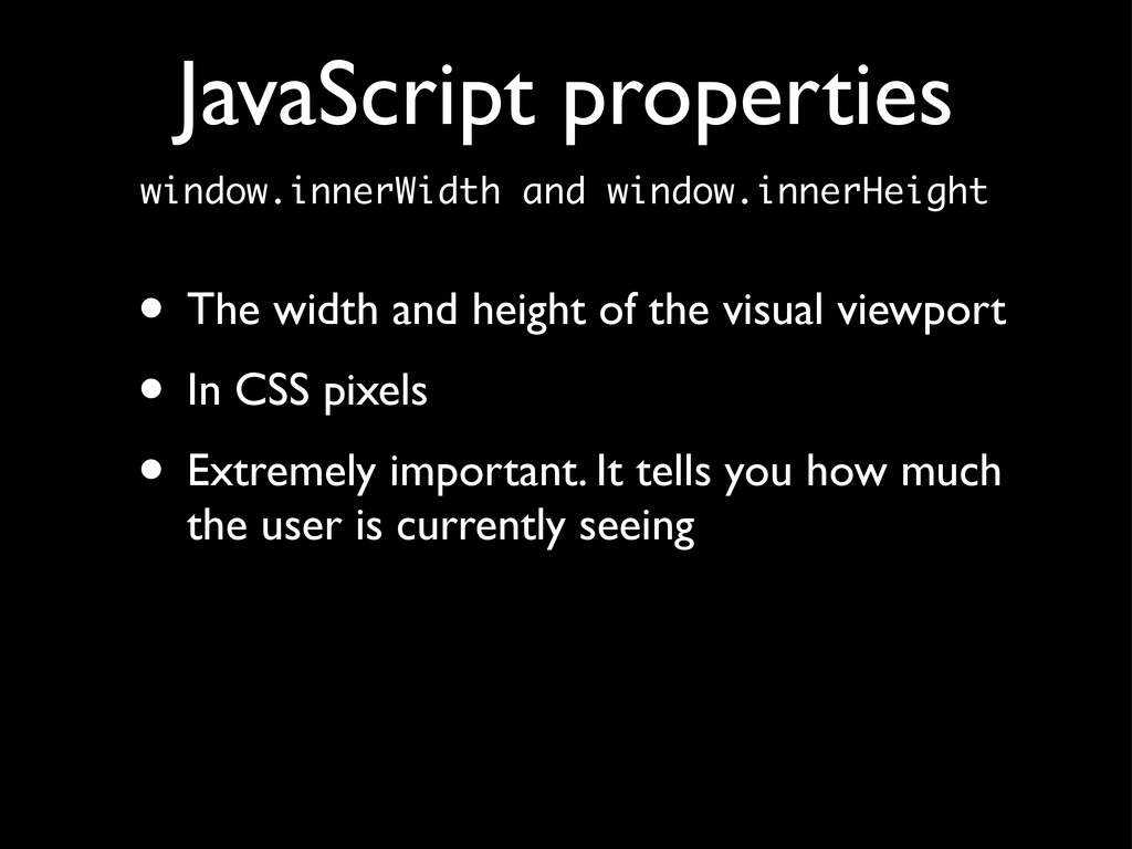
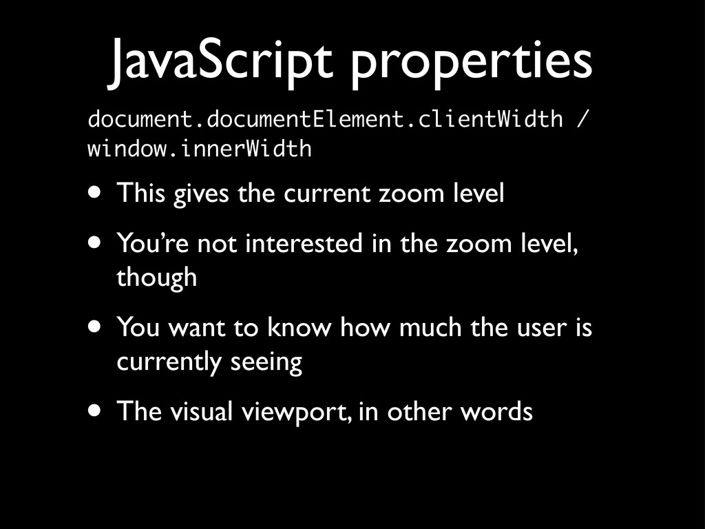
• You’re not interested in the zoom level, though • You want to know how much the user is currently seeing • The visual viewport, in other words JavaScript properties
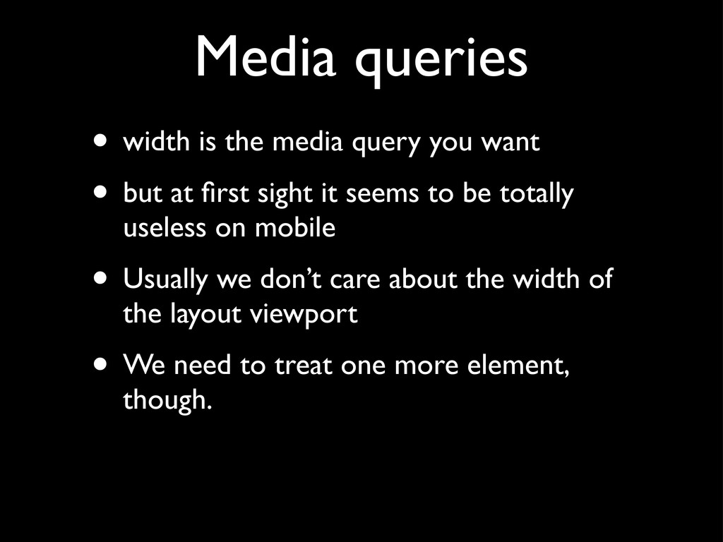
• but at first sight it seems to be totally useless on mobile • Usually we don’t care about the width of the layout viewport • We need to treat one more element, though.
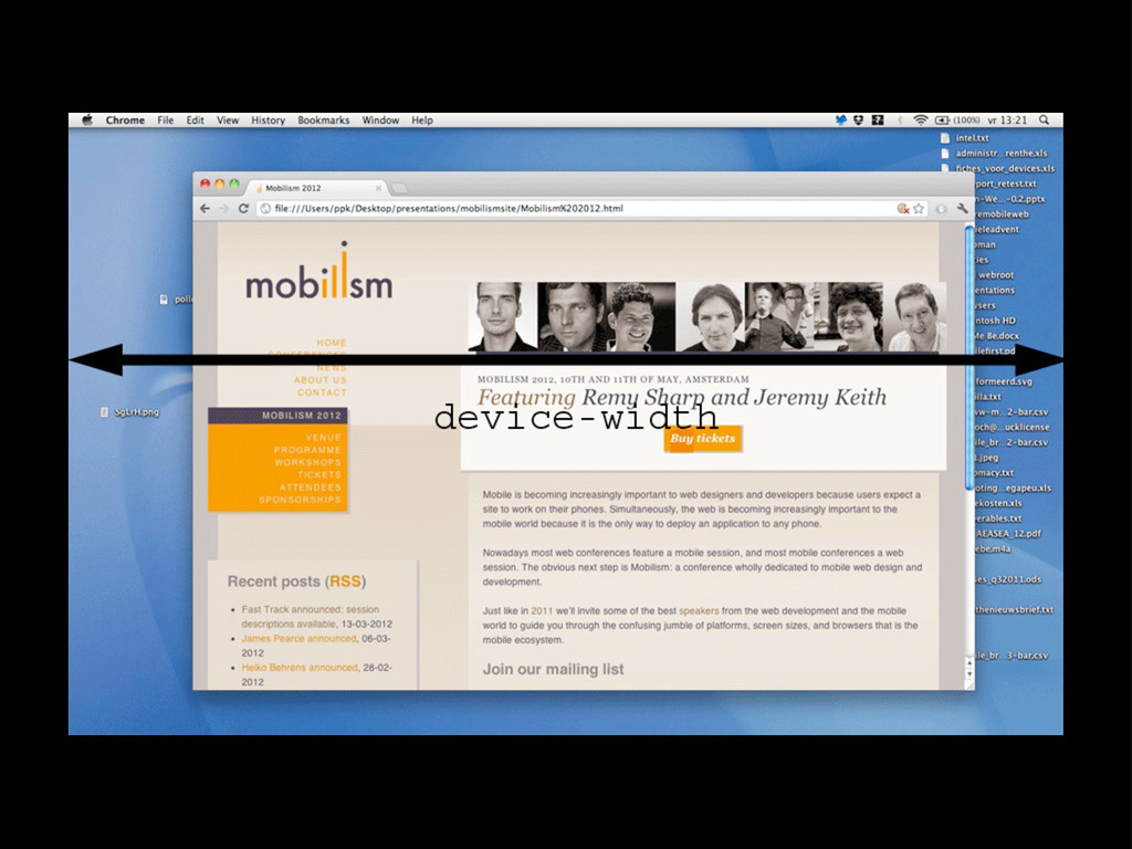
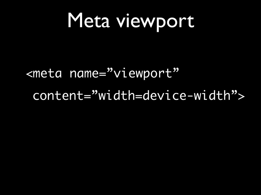
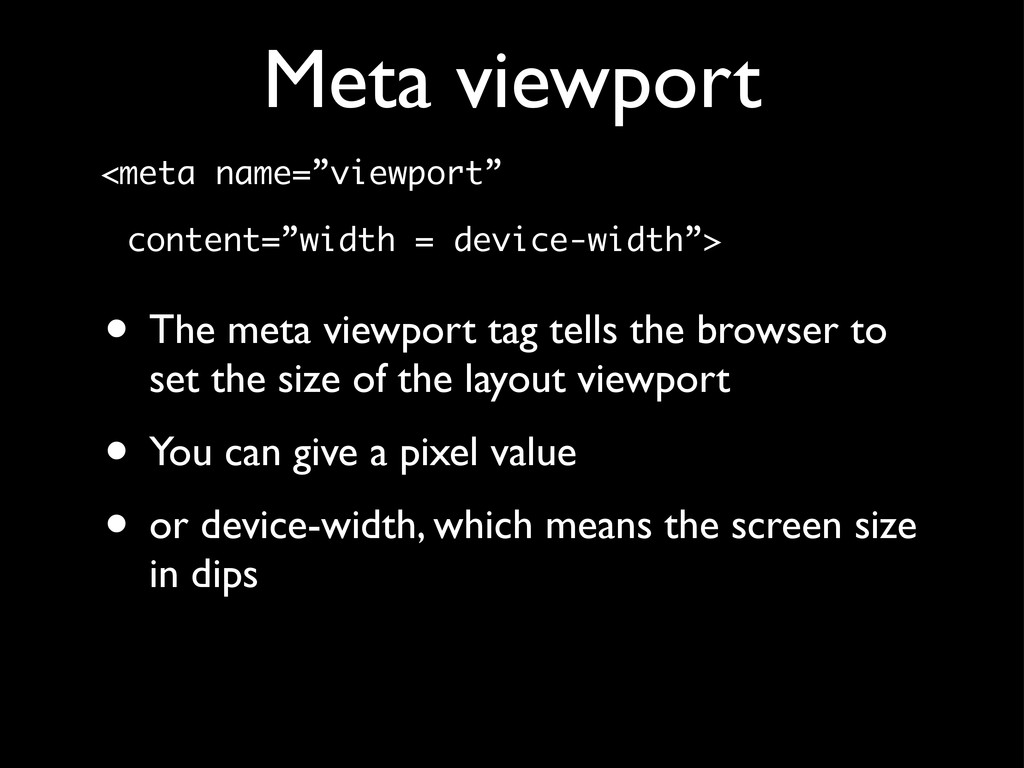
viewport tag tells the browser to set the size of the layout viewport • You can give a pixel value • or device-width, which means the screen size in dips
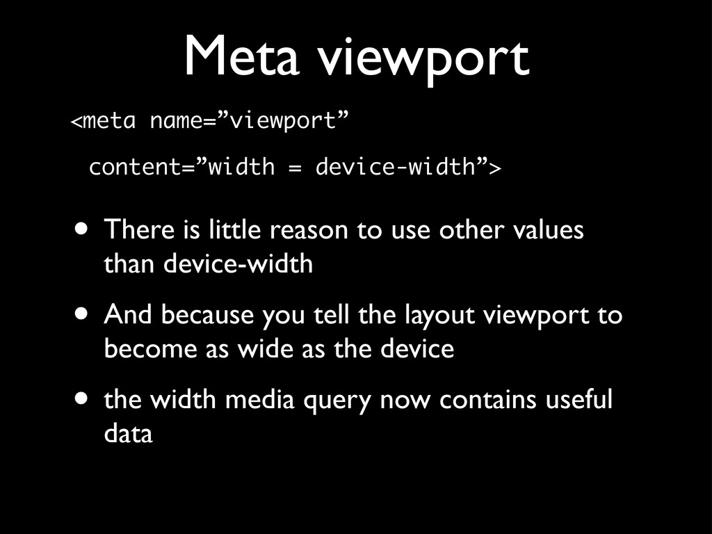
little reason to use other values than device-width • And because you tell the layout viewport to become as wide as the device • the width media query now contains useful data
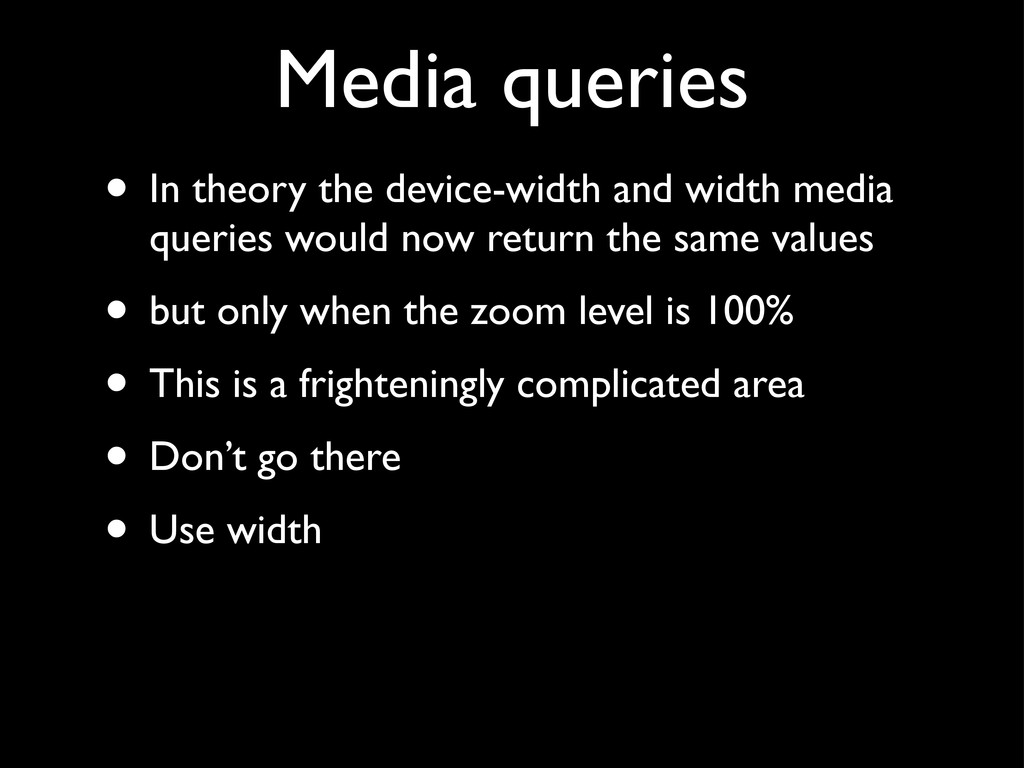
queries would now return the same values • but only when the zoom level is 100% • This is a frighteningly complicated area • Don’t go there • Use width
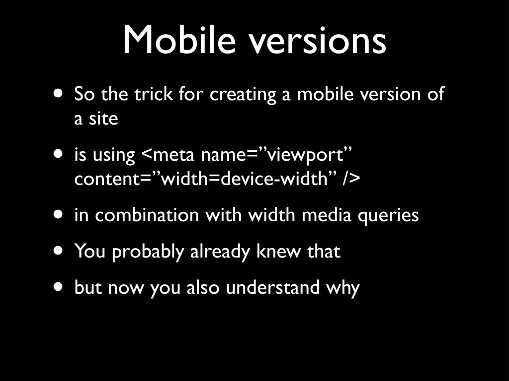
version of a site • is using <meta name=”viewport” content=”width=device-width” /> • in combination with width media queries • You probably already knew that • but now you also understand why
 marakana
 kentaroutakeda
 kotaminato
 panda728
 tatsuhiro
 raiga0310
 ryodeveloper
 kajitack
 kuranuki
 naoya
naoya
 andpad
 hananouchi
 pkshadeck
 swwweet
 reverentgeek
 honzajavorek
 eitanlees
 kimpetersen
 baasie
 inesmontani
 ivargrimstad
 techseoconnect
 wjessup
 tomoyanonymous
 chrislema