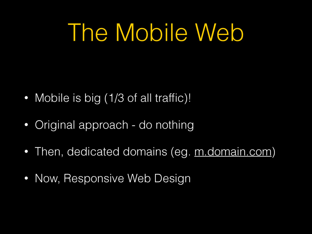
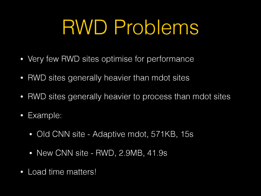
• RWD sites generally heavier than mdot sites • RWD sites generally heavier to process than mdot sites • Example: • Old CNN site - Adaptive mdot, 571KB, 15s • New CNN site - RWD, 2.9MB, 41.9s • Load time matters!
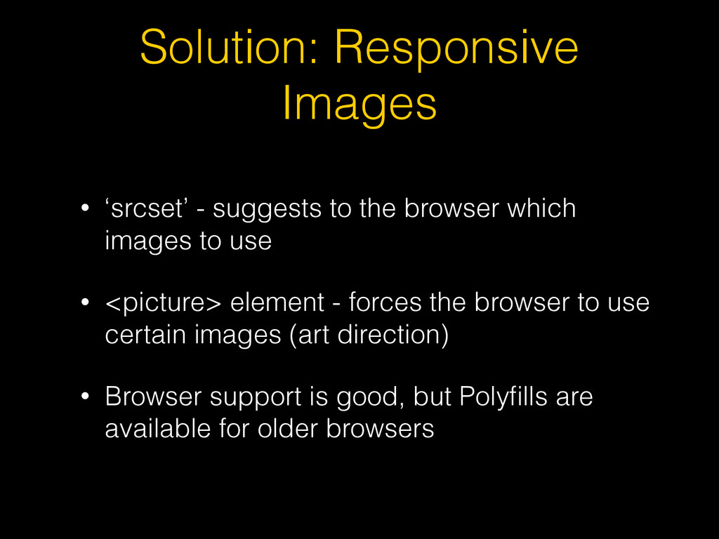
which images to use • <picture> element - forces the browser to use certain images (art direction) • Browser support is good, but Polyfills are available for older browsers
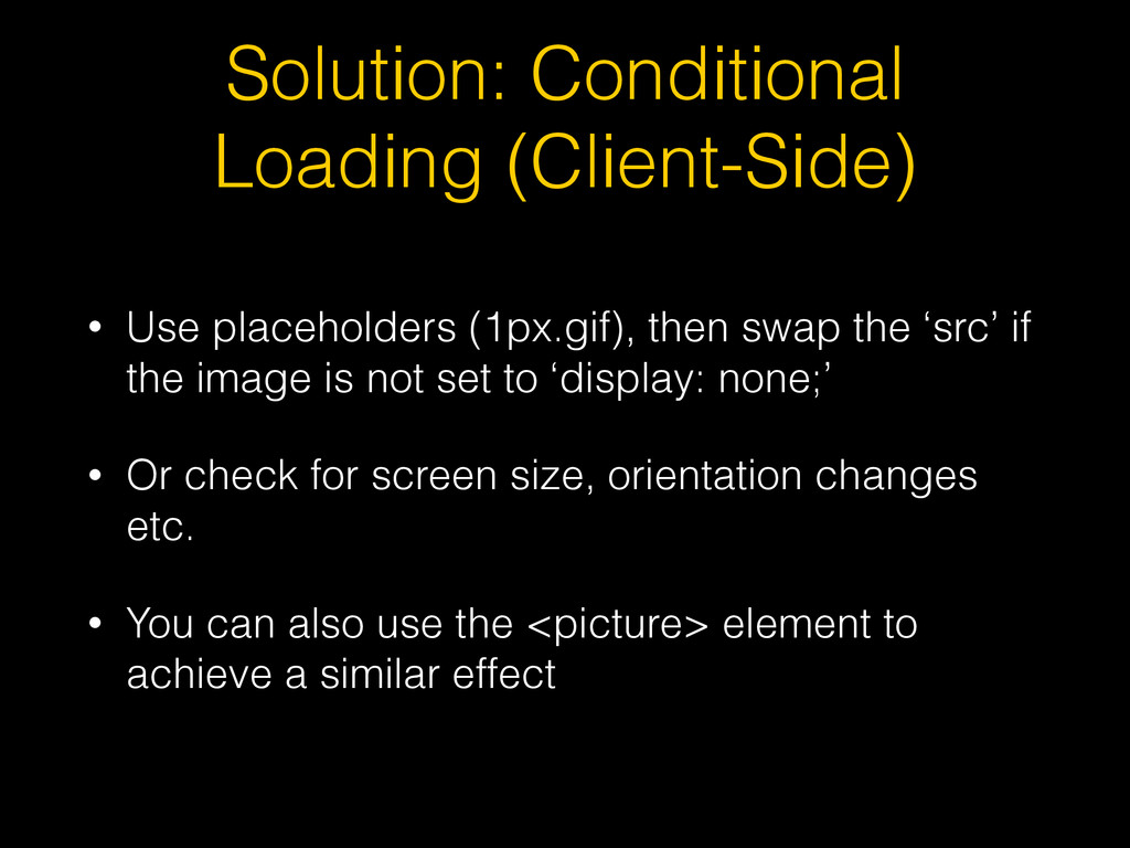
the ‘src’ if the image is not set to ‘display: none;’ • Or check for screen size, orientation changes etc. • You can also use the <picture> element to achieve a similar effect
each ‘breakpoint’ • Conditionally load each file using media queries • All files are still downloaded, but deferred so not render blocking • or JavaScript (async) • Design mobile first
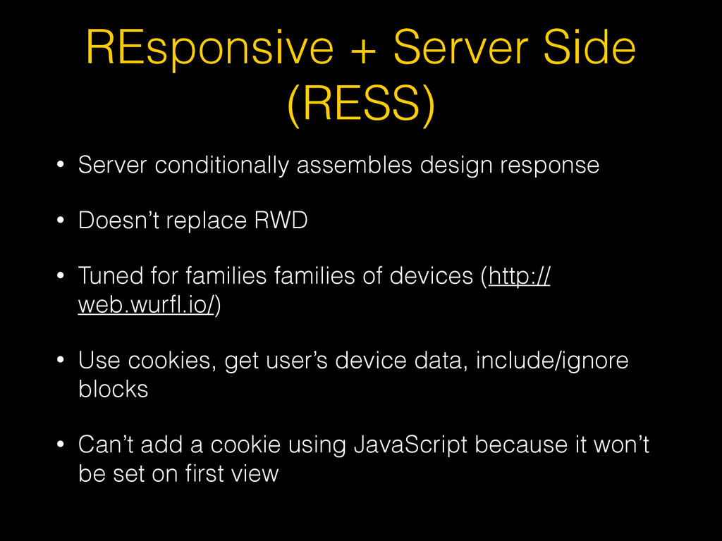
response • Doesn’t replace RWD • Tuned for families families of devices (http:// web.wurfl.io/) • Use cookies, get user’s device data, include/ignore blocks • Can’t add a cookie using JavaScript because it won’t be set on first view
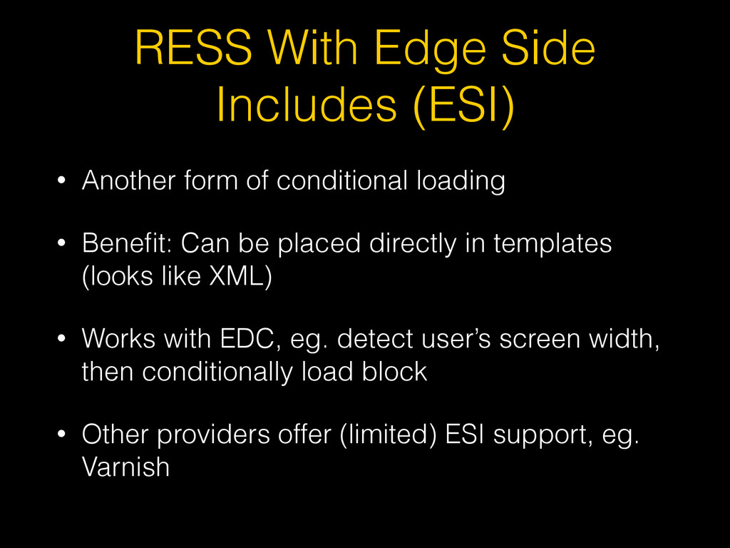
conditional loading • Benefit: Can be placed directly in templates (looks like XML) • Works with EDC, eg. detect user’s screen width, then conditionally load block • Other providers offer (limited) ESI support, eg. Varnish
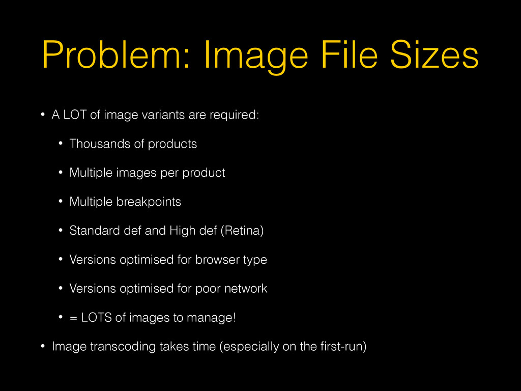
are required: • Thousands of products • Multiple images per product • Multiple breakpoints • Standard def and High def (Retina) • Versions optimised for browser type • Versions optimised for poor network • = LOTS of images to manage! • Image transcoding takes time (especially on the first-run)
to load the right sized images • Use <picture> to load the right image format • Akamai Image Manager can also adjust image compression based on network performance
 mattbailey
 srenext
 taka_aki
 joooee0000
 kakehashi
 i35_267
 kaminashi
 jnishime_dresscode
 pict3
pict3
 oracle4engineer
 ming_ayami
 ak1210
 nttcom
 maltzj
 addyosmani
 tomoyanonymous
 eileencodes
 marketingsoph
 twada
twada
 codingconduct
 speakerdeck
 katiecoart
 cassininazir
 aleyda
.png) helenjbeal
helenjbeal