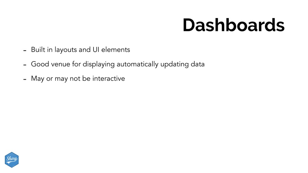
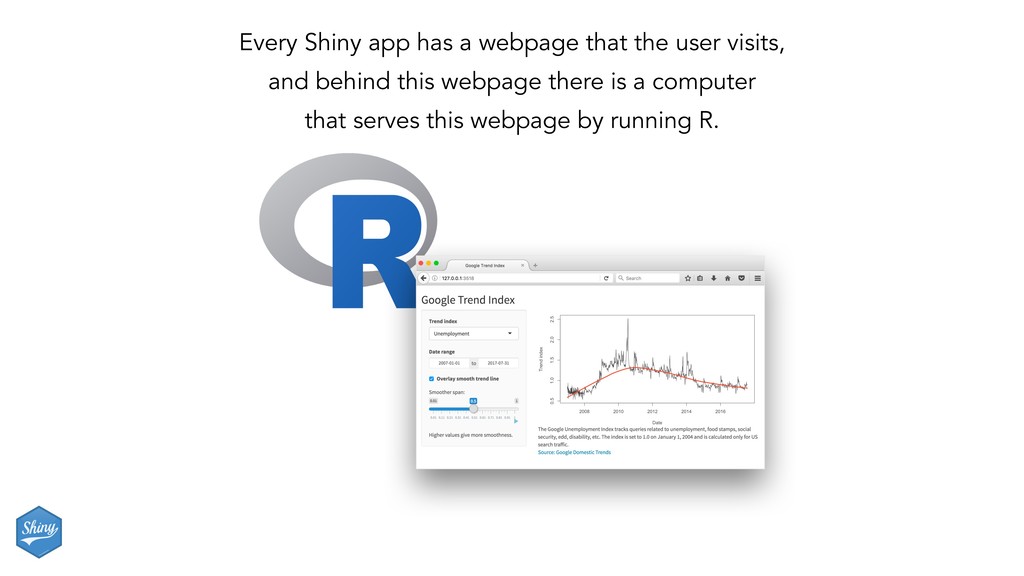
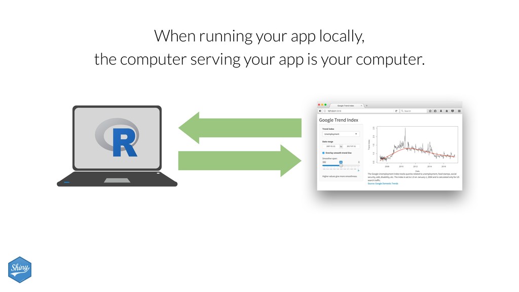
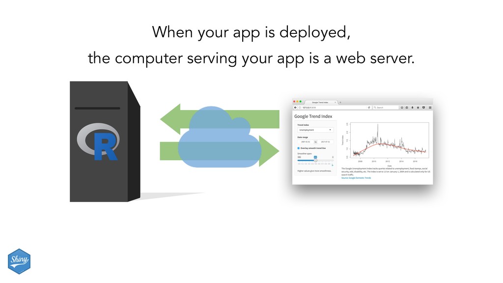
an HTML page - Generation of this HTML can be scheduled - Dynamic: - Client web browser connects to an R session running on server - User input causes server to do things and send information back to client - Interactivity can be on client and server - Can update data in real time - User potentially can do anything that R can do
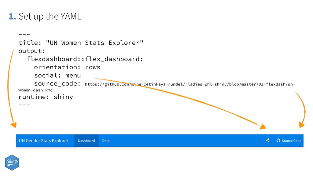
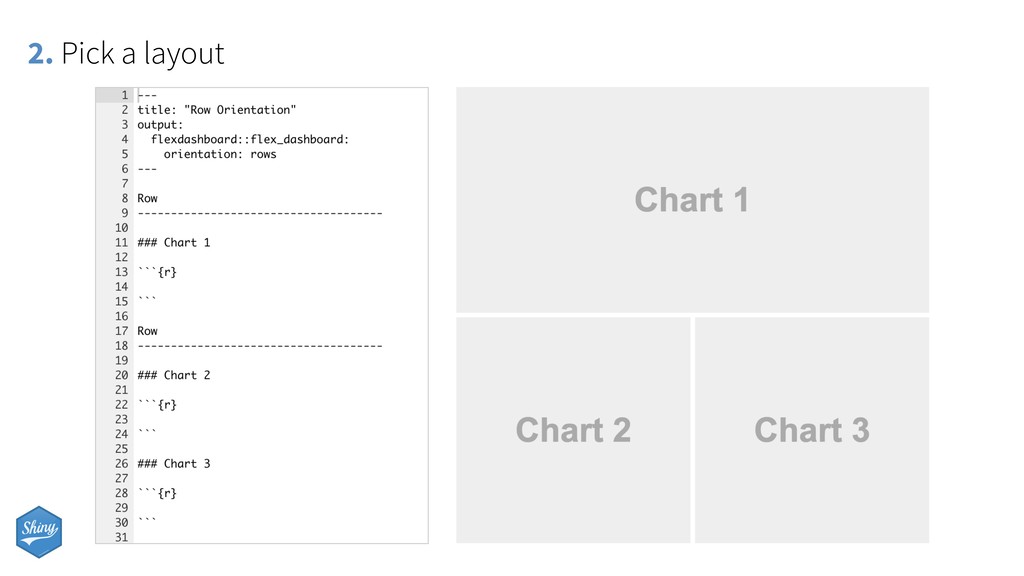
social: menu source_code: https://github.com/mine-cetinkaya-rundel/rladies-phl-shiny/blob/master/01-flexdash/un- women-dash.Rmd runtime: shiny --- 1. Set up the YAML
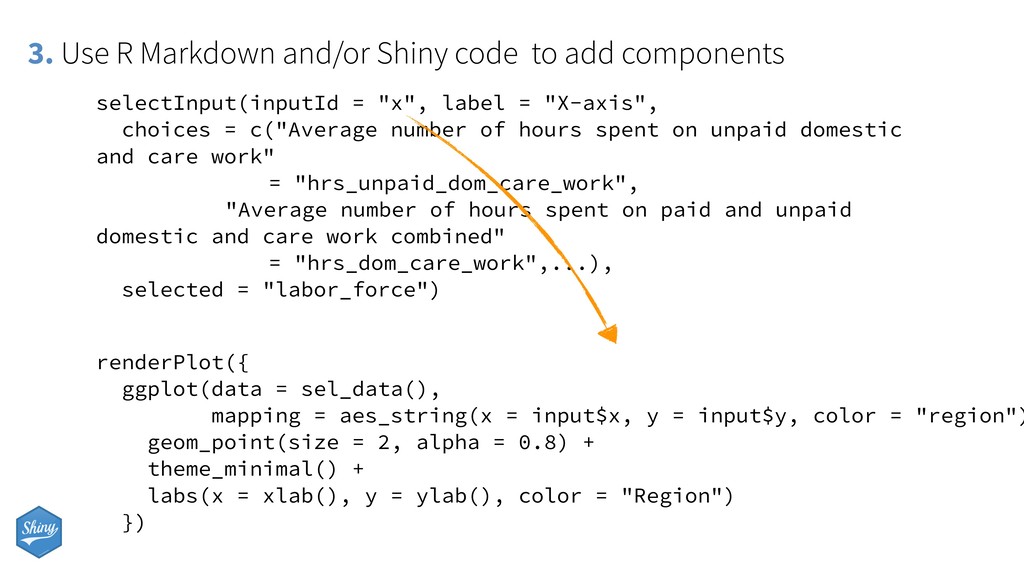
selectInput(inputId = "x", label = "X-axis", choices = c("Average number of hours spent on unpaid domestic and care work" = "hrs_unpaid_dom_care_work", "Average number of hours spent on paid and unpaid domestic and care work combined" = "hrs_dom_care_work",...), selected = "labor_force") renderPlot({ ggplot(data = sel_data(), mapping = aes_string(x = input$x, y = input$y, color = "region") geom_point(size = 2, alpha = 0.8) + theme_minimal() + labs(x = xlab(), y = ylab(), color = "Region") })
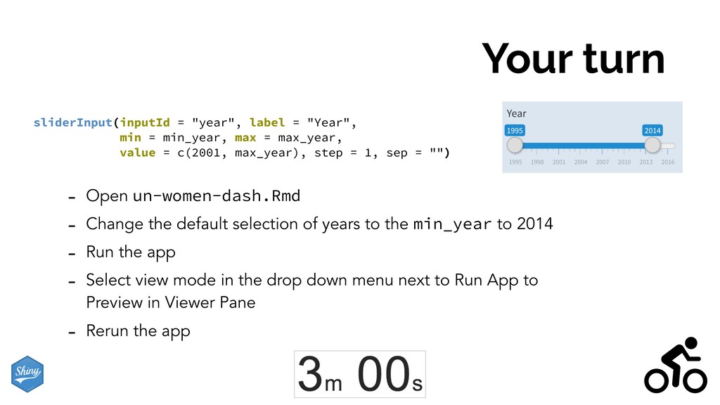
of years to the min_year to 2014 - Run the app - Select view mode in the drop down menu next to Run App to Preview in Viewer Pane - Rerun the app sliderInput(inputId = "year", label = "Year", min = min_year, max = max_year, value = c(2001, max_year), step = 1, sep = "")
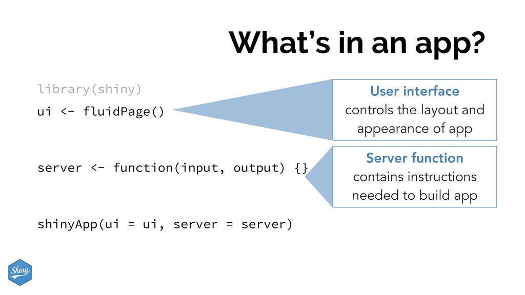
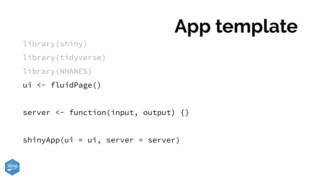
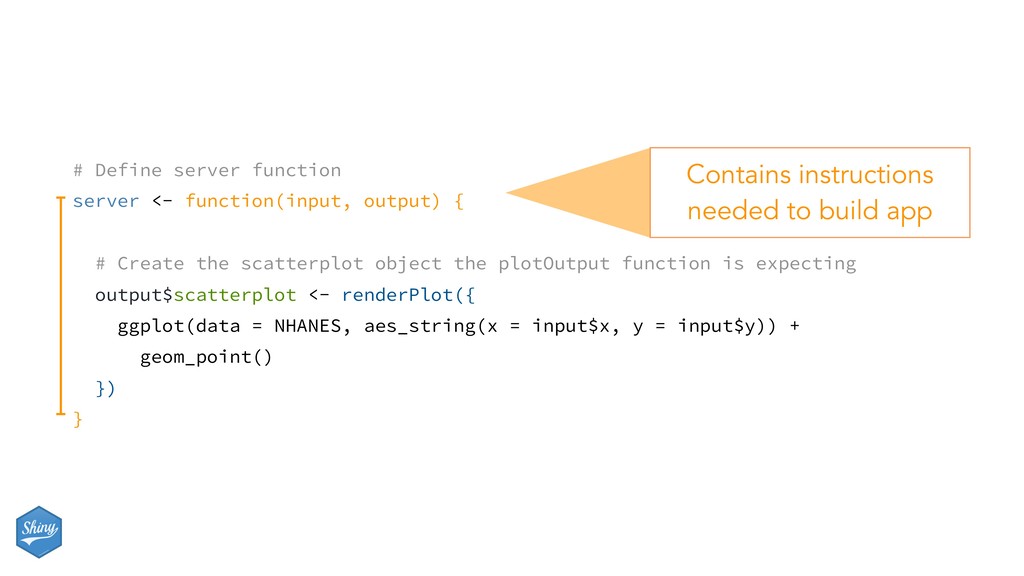
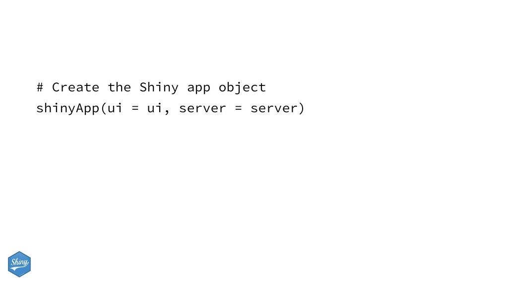
function(input, output) {} shinyApp(ui = ui, server = server) User interface controls the layout and appearance of app Server function contains instructions needed to build app
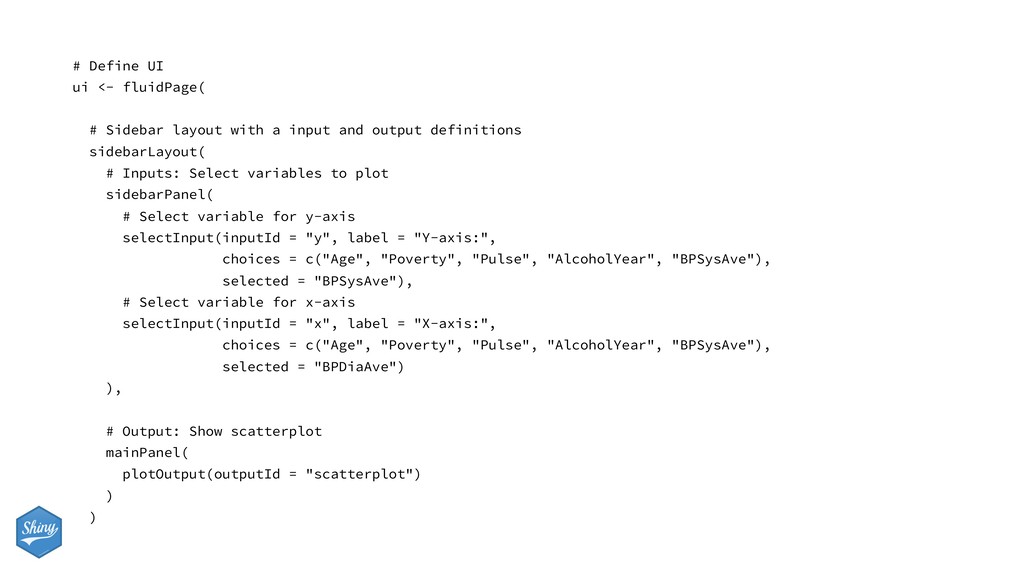
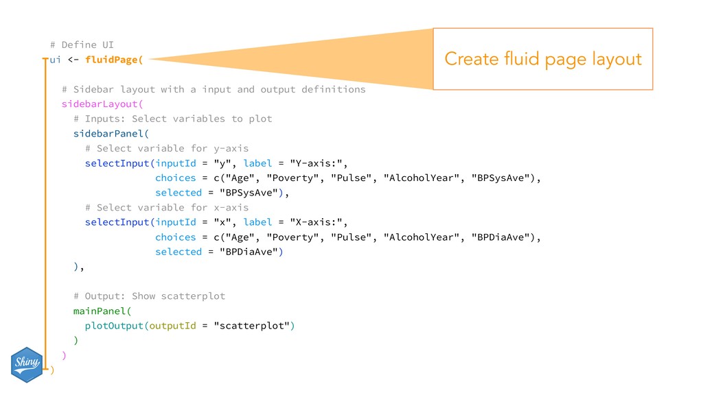
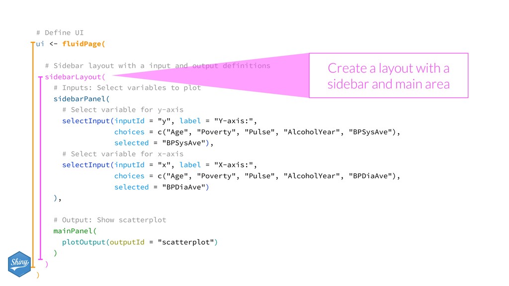
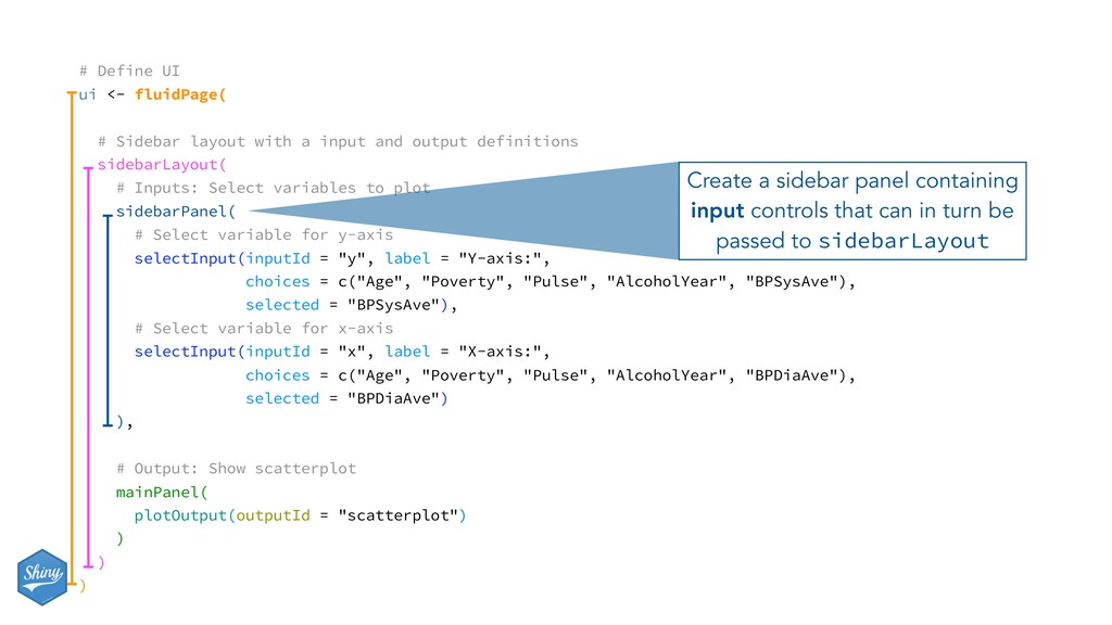
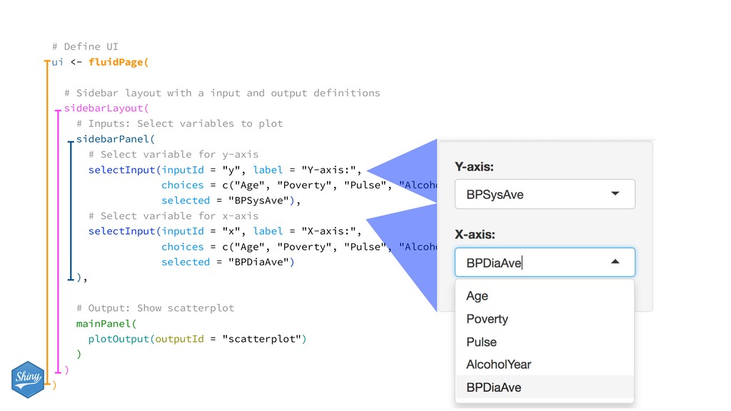
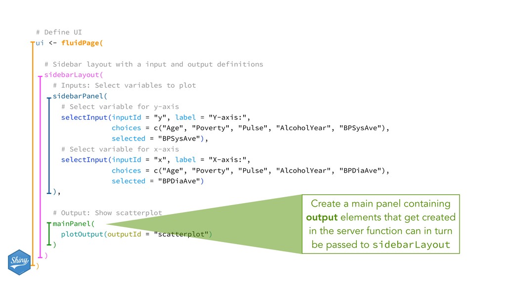
a input and output definitions sidebarLayout( # Inputs: Select variables to plot sidebarPanel( # Select variable for y-axis selectInput(inputId = "y", label = "Y-axis:", choices = c("Age", "Poverty", "Pulse", "AlcoholYear", "BPSysAve"), selected = "BPSysAve"), # Select variable for x-axis selectInput(inputId = "x", label = "X-axis:", choices = c("Age", "Poverty", "Pulse", "AlcoholYear", "BPDiaAve"), selected = "BPDiaAve") ), # Output: Show scatterplot mainPanel( plotOutput(outputId = "scatterplot") ) ) ) Create a main panel containing output elements that get created in the server function can in turn be passed to sidebarLayout
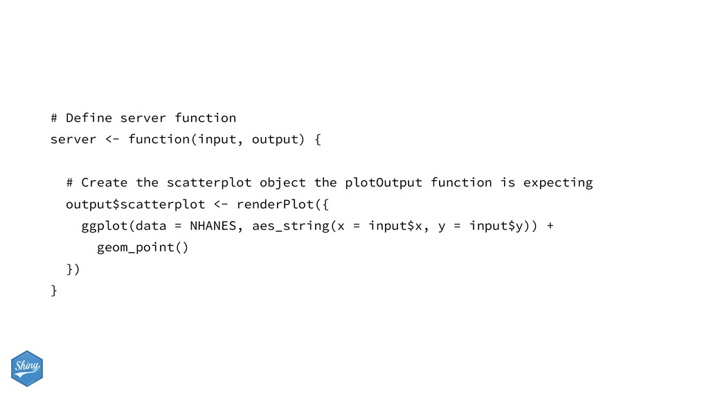
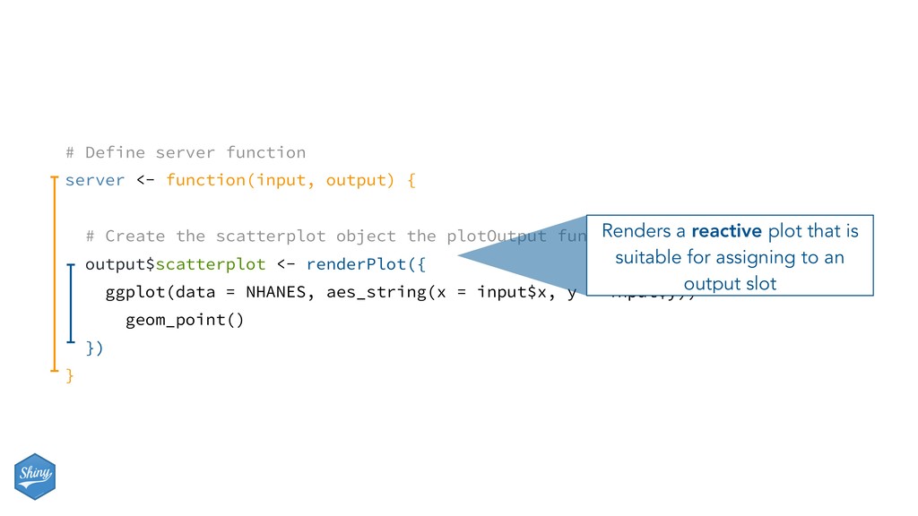
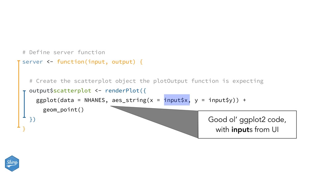
Create the scatterplot object the plotOutput function is expecting output$scatterplot <- renderPlot({ ggplot(data = NHANES, aes_string(x = input$x, y = input$y)) + geom_point() }) }
Create the scatterplot object the plotOutput function is expecting output$scatterplot <- renderPlot({ ggplot(data = NHANES, aes_string(x = input$x, y = input$y)) + geom_point() }) } Renders a reactive plot that is suitable for assigning to an output slot
Create the scatterplot object the plotOutput function is expecting output$scatterplot <- renderPlot({ ggplot(data = NHANES, aes_string(x = input$x, y = input$y)) + geom_point() }) } Good ol’ ggplot2 code, with inputs from UI
points by - inputId = "z" - label = "Color by:" - choices = c("Gender", "Depressed", "SleepTrouble", "SmokeNow", "Marijuana") - selected = "SleepTrouble" - Use this variable in the aesthetics of the ggplot function as the color argument to color the points by - Run the app in the Viewer Pane - Compare your code / output with the person sitting next to / nearby you
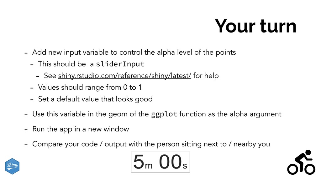
alpha level of the points - This should be a sliderInput - See shiny.rstudio.com/reference/shiny/latest/ for help - Values should range from 0 to 1 - Set a default value that looks good - Use this variable in the geom of the ggplot function as the alpha argument - Run the app in a new window - Compare your code / output with the person sitting next to / nearby you
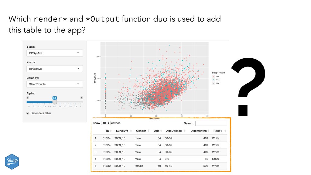
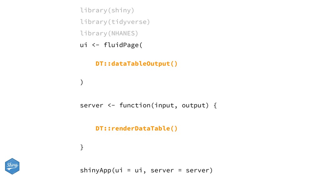
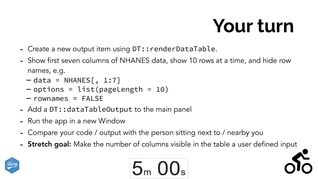
- Show first seven columns of NHANES data, show 10 rows at a time, and hide row names, e.g. - data = NHANES[, 1:7] - options = list(pageLength = 10) - rownames = FALSE - Add a DT::dataTableOutput to the main panel - Run the app in a new Window - Compare your code / output with the person sitting next to / nearby you - Stretch goal: Make the number of columns visible in the table a user defined input
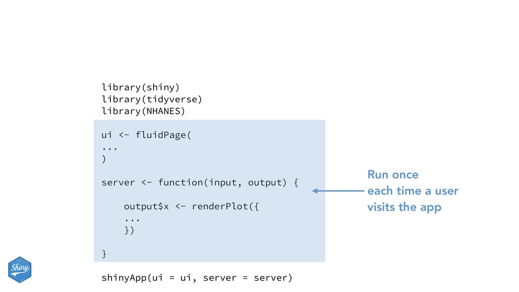
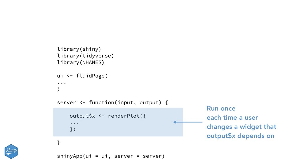
many times they are run (or re-run), which will in turn affect the performance of your app, since Shiny will run some sections your app script more often than others. library(shiny) library(tidyverse) library(NHANES) ui <- fluidPage( ... ) server <- function(input, output) { output$x <- renderPlot({ ... }) } shinyApp(ui = ui, server = server) Run once when app is launched
function(input, output) { output$x <- renderPlot({ ... }) } shinyApp(ui = ui, server = server) Run once each time a user changes a widget that output$x depends on
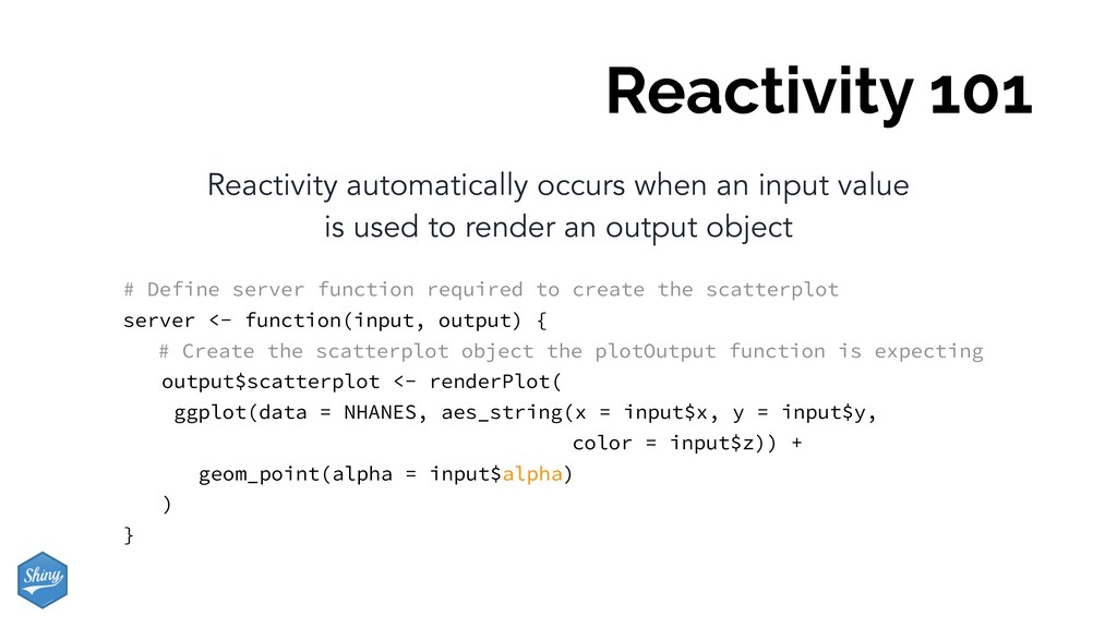
used to render an output object # Define server function required to create the scatterplot server <- function(input, output) { # Create the scatterplot object the plotOutput function is expecting output$scatterplot <- renderPlot( ggplot(data = NHANES, aes_string(x = input$x, y = input$y, color = input$z)) + geom_point(alpha = input$alpha) ) }
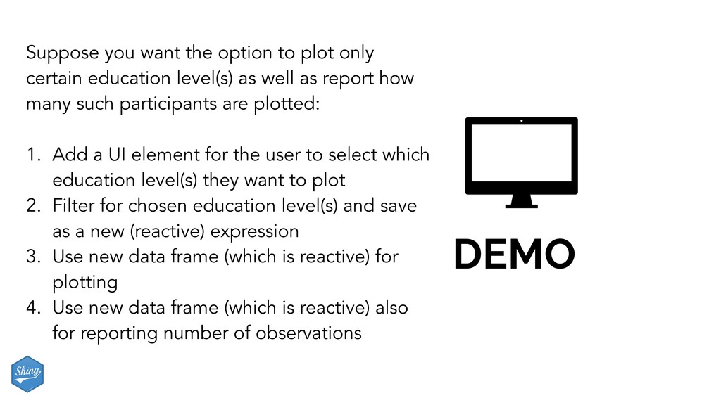
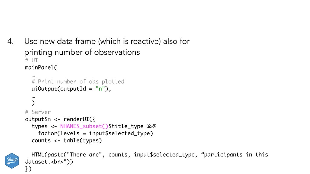
education level(s) as well as report how many such participants are plotted: 1. Add a UI element for the user to select which education level(s) they want to plot 2. Filter for chosen education level(s) and save as a new (reactive) expression 3. Use new data frame (which is reactive) for plotting 4. Use new data frame (which is reactive) also for reporting number of observations
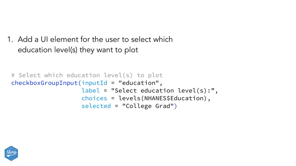
label = "Select education level(s):”, choices = levels(NHANES$Education), selected = "College Grad") 1. Add a UI element for the user to select which education level(s) they want to plot
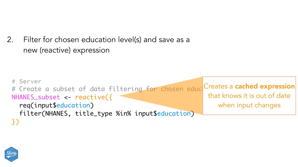
chosen education level(s) NHANES_subset <- reactive({ req(input$education) filter(NHANES, title_type %in% input$education) }) 2. Filter for chosen education level(s) and save as a new (reactive) expression Creates a cached expression that knows it is out of date when input changes
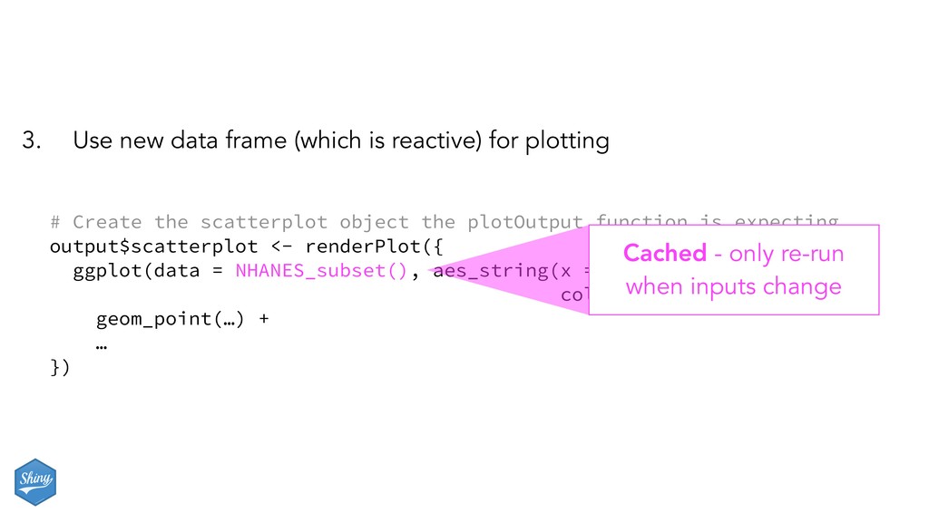
# Create the scatterplot object the plotOutput function is expecting output$scatterplot <- renderPlot({ ggplot(data = NHANES_subset(), aes_string(x = input$x, y = input$y, color = input$z)) + geom_point(…) + … }) Cached - only re-run when inputs change
for the subsetted data frame, we were able to get away with subsetting once and then using the result twice - In general, reactive conductors let you - not repeat yourself (i.e. avoid copy-and-paste code) which is a maintenance boon) - decompose large, complex (code-wise, not necessarily CPU-wise) calculations into smaller pieces to make them more understandable - These benefits are similar to what happens when you decompose a large complex R script into a series of small functions that build on each other
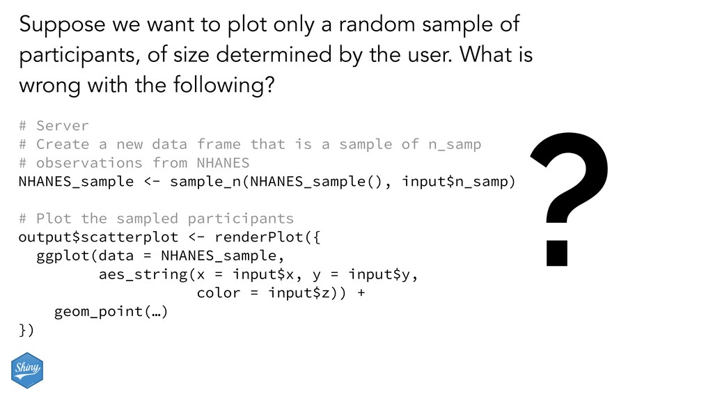
of participants, of size determined by the user. What is wrong with the following? # Server # Create a new data frame that is a sample of n_samp # observations from NHANES NHANES_sample <- sample_n(NHANES_sample(), input$n_samp) # Plot the sampled participants output$scatterplot <- renderPlot({ ggplot(data = NHANES_sample, aes_string(x = input$x, y = input$y, color = input$z)) + geom_point(…) })
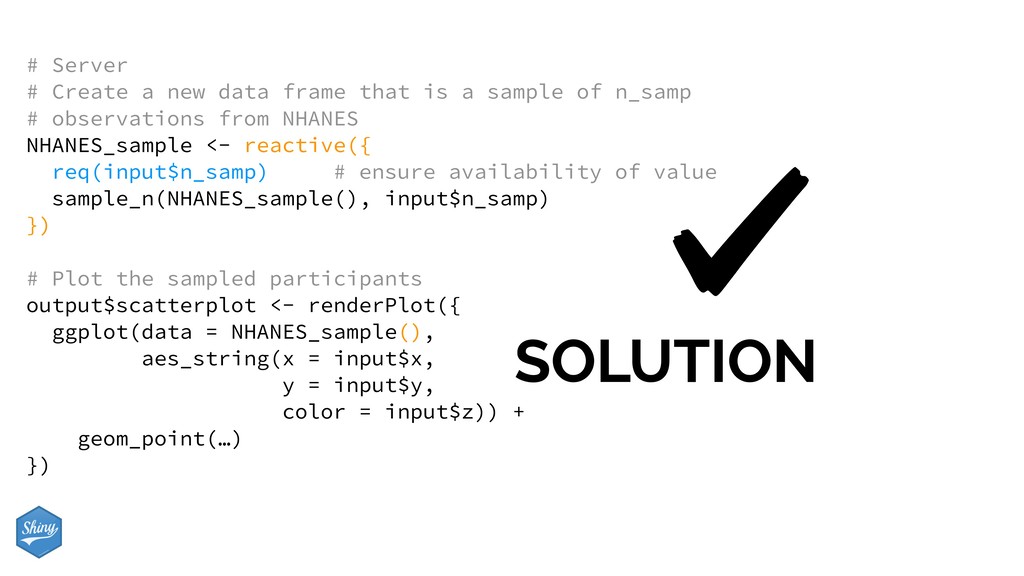
is a sample of n_samp # observations from NHANES NHANES_sample <- reactive({ req(input$n_samp) # ensure availability of value sample_n(NHANES_sample(), input$n_samp) }) # Plot the sampled participants output$scatterplot <- renderPlot({ ggplot(data = NHANES_sample(), aes_string(x = input$x, y = input$y, color = input$z)) + geom_point(…) })
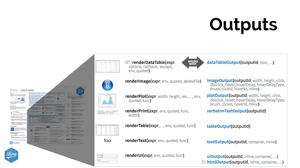
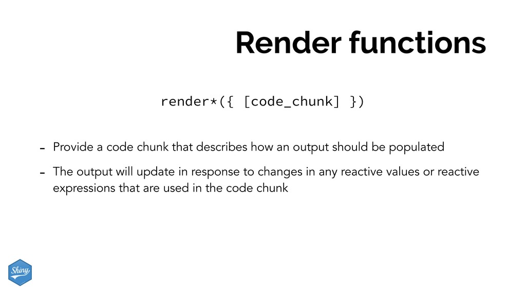
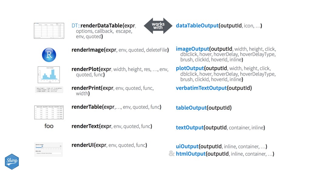
an output should be populated - The output will update in response to changes in any reactive values or reactive expressions that are used in the code chunk render*({ [code_chunk] })
should always be saved to output$ - They make an observer object that has a block of code associated with it - The object will rerun the entire code block to update itself whenever it is invalidated render*({ [code_chunk] })
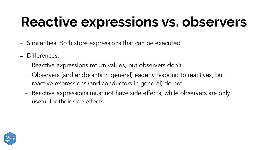
input: which looks like a list, and contains many individual reactive values that are set by input from the web browser - Reactive expressions – reactive(): they depend on reactive values and observers depend on them - Can access reactive values or other reactive expressions, and they return a value - Useful for caching the results of any procedure that happens in response to user input - e.g. reactive data frame subsets we created earlier - Observers – observe(): they depend on reactive expressions, but nothing else depends on them - Can access reactive sources and reactive expressions, but they don’t return a value; they are used for their side effects - e.g. output object is a reactive observer, which also looks like a list, and contains many individual reactive observers that are created by using reactive values and expressions in reactive functions
can be executed - Differences: - Reactive expressions return values, but observers don’t - Observers (and endpoints in general) eagerly respond to reactives, but reactive expressions (and conductors in general) do not - Reactive expressions must not have side effects, while observers are only useful for their side effects
![Mine Çetinkaya-Rundel @ mine-cetinkaya-rundel [email protected] @minebocek Dashboards Apps & with](https://files.speakerdeck.com/presentations/65d9287622b542ccbe4d8711587c7ed6/slide_0.jpg)
![Mine Çetinkaya-Rundel mine-cetinkaya-rundel [email protected] @minebocek bit.ly/shiny-rlphl-git](https://files.speakerdeck.com/presentations/65d9287622b542ccbe4d8711587c7ed6/slide_77.jpg)