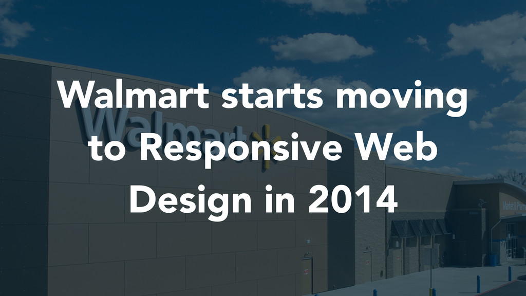
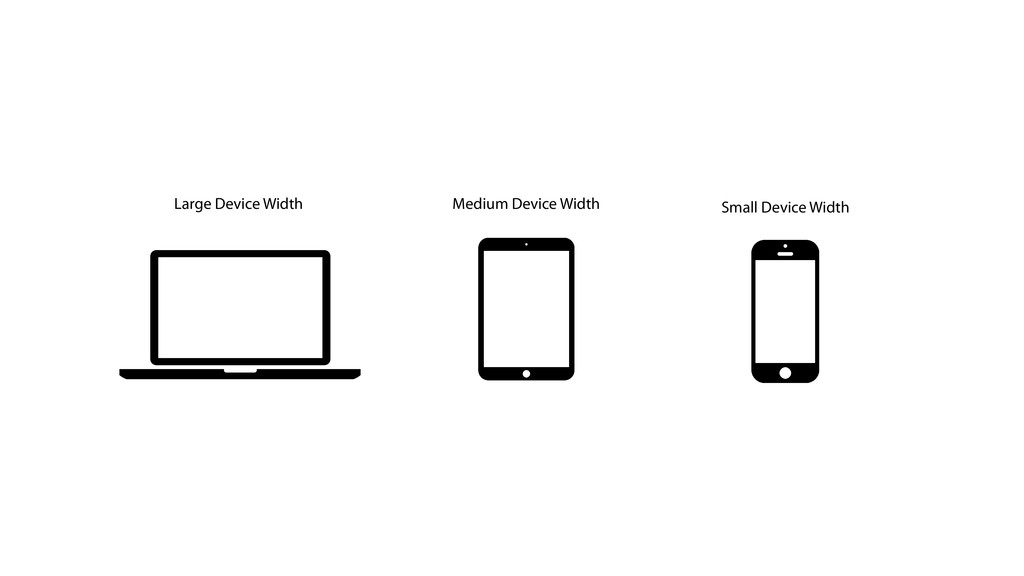
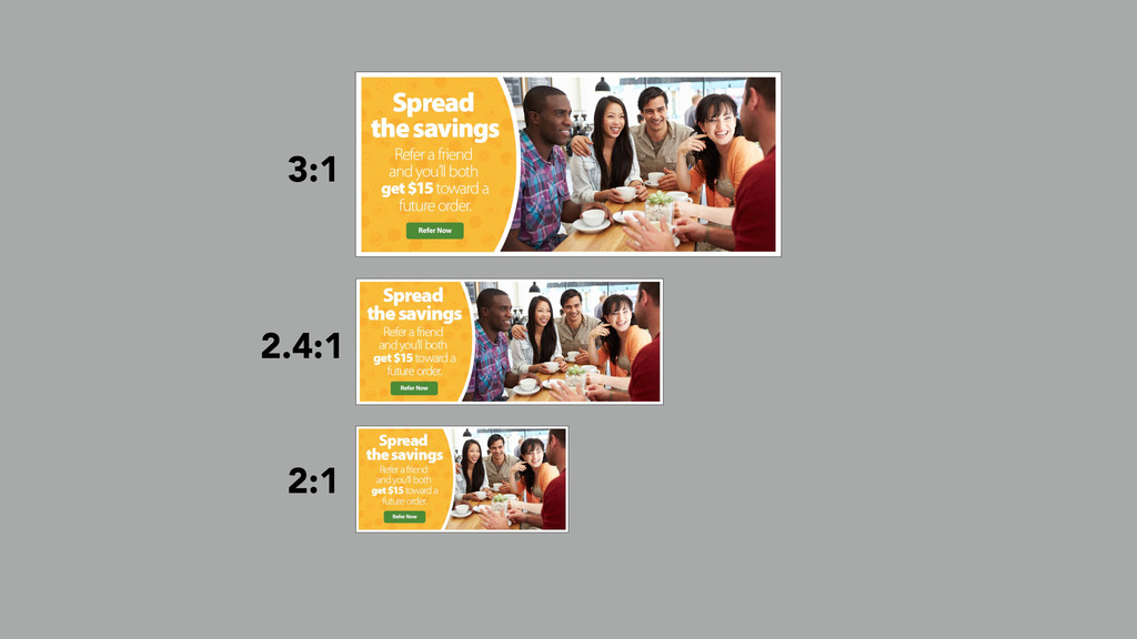
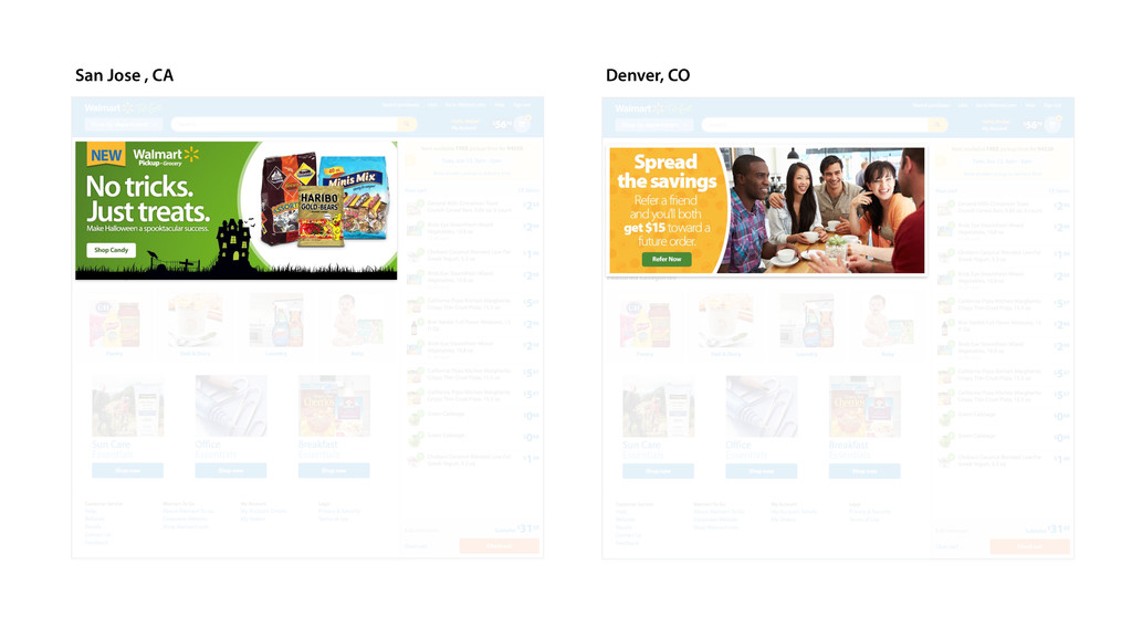
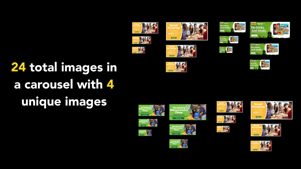
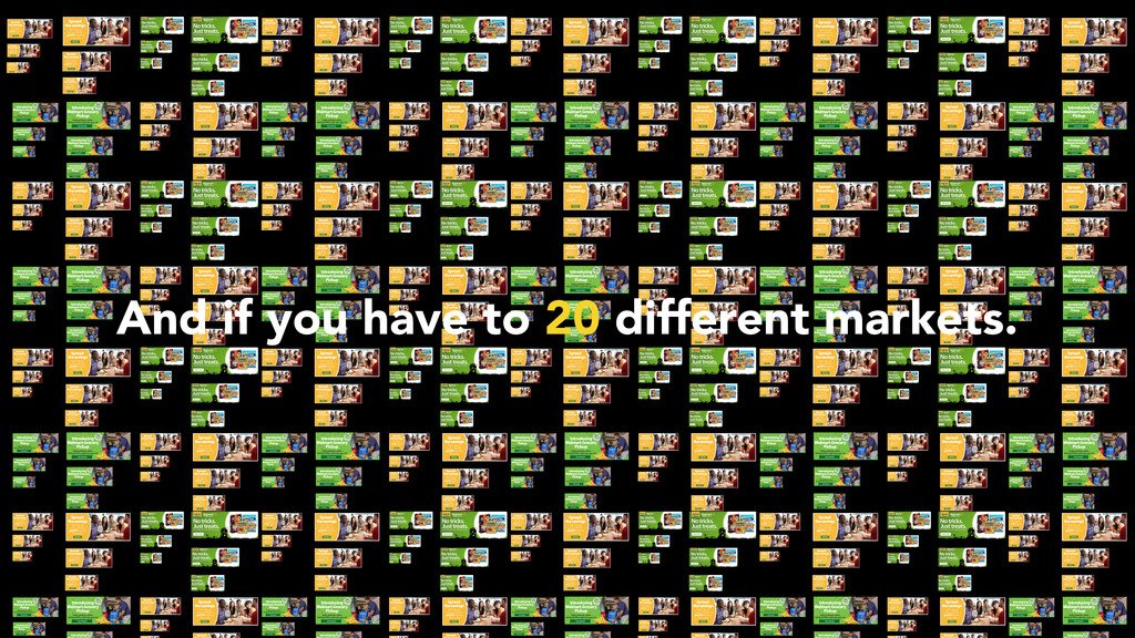
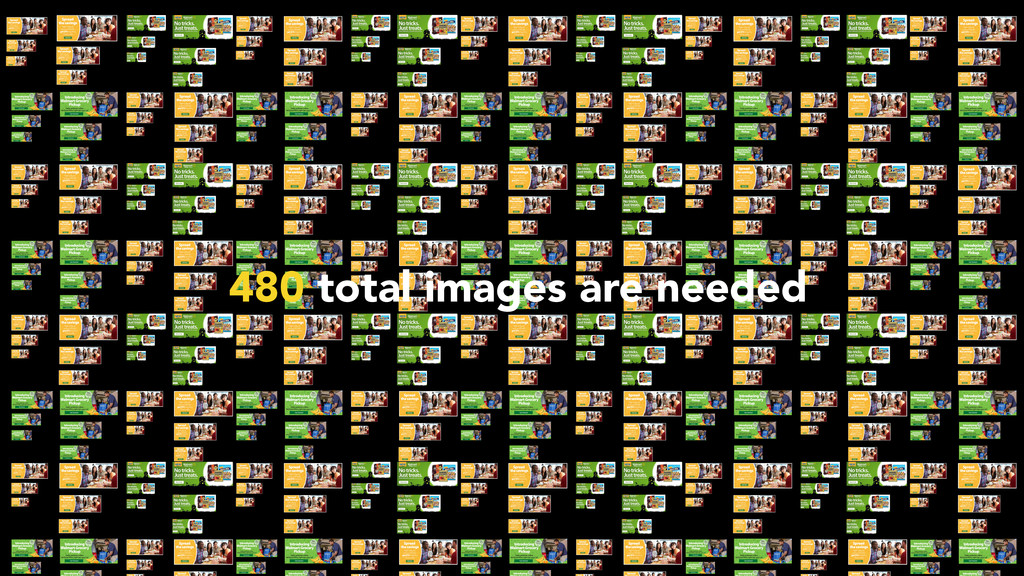
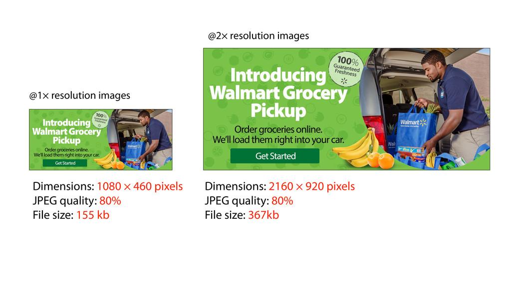
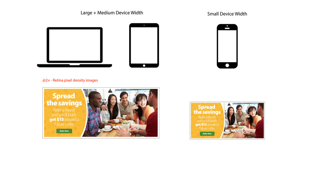
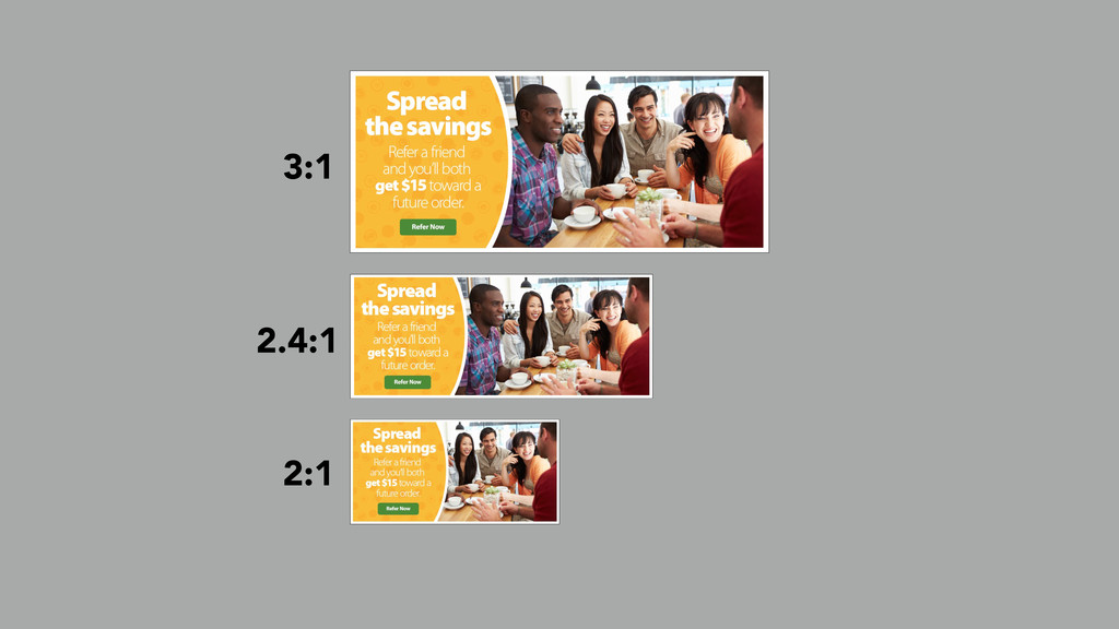
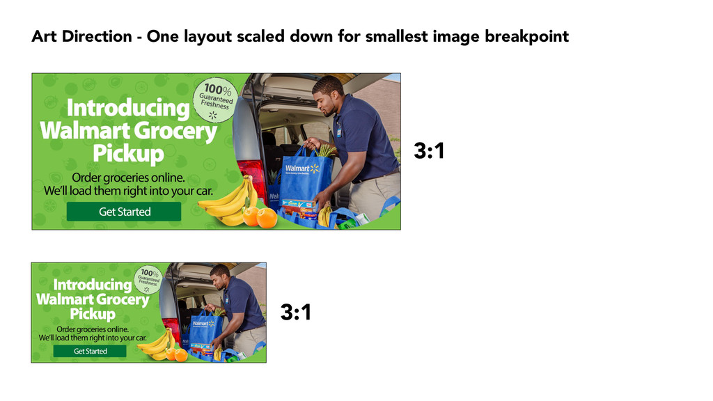
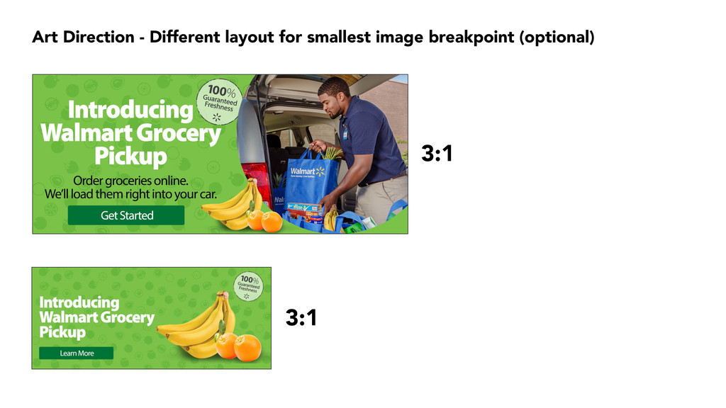
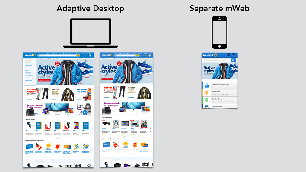
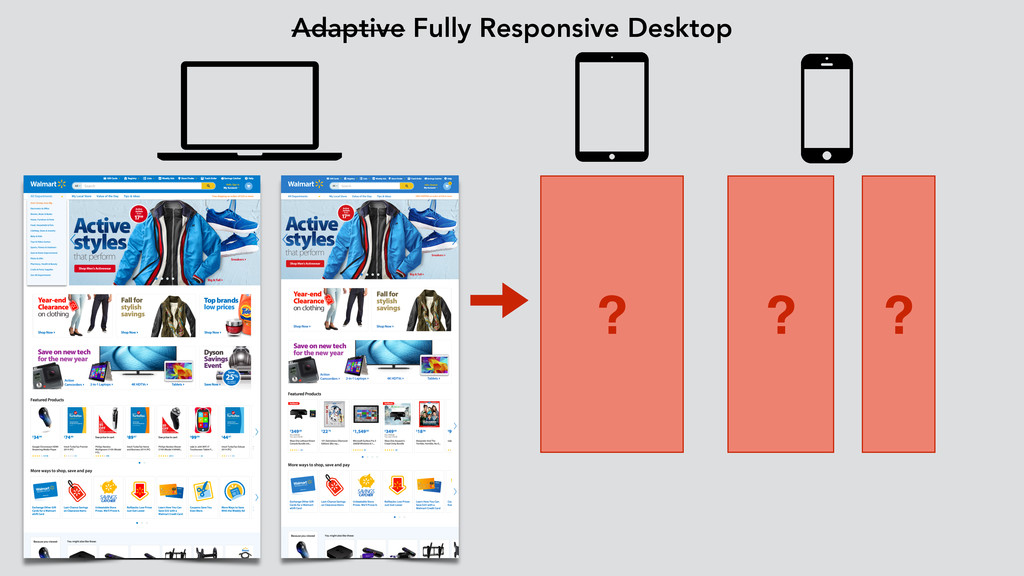
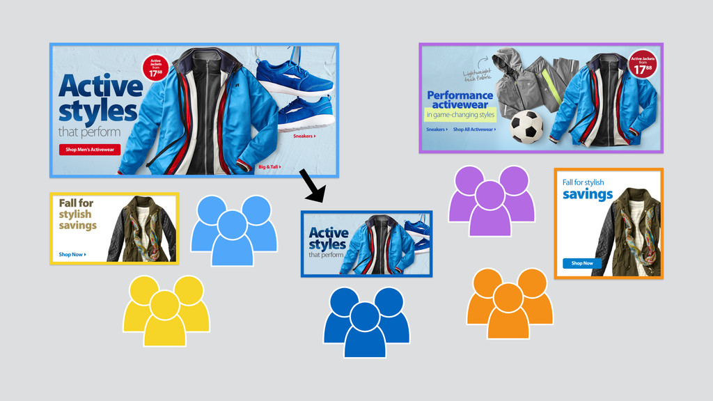
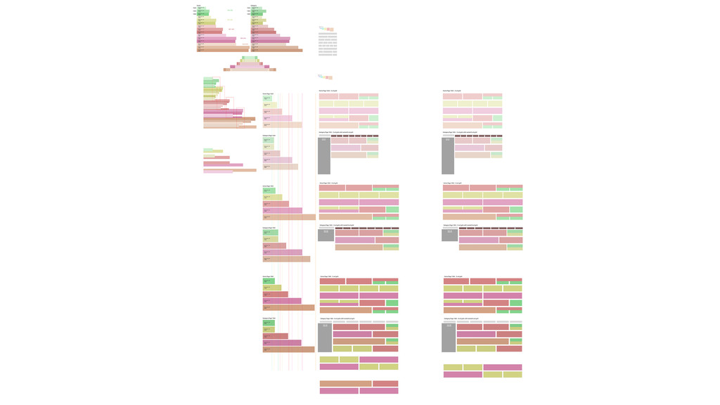
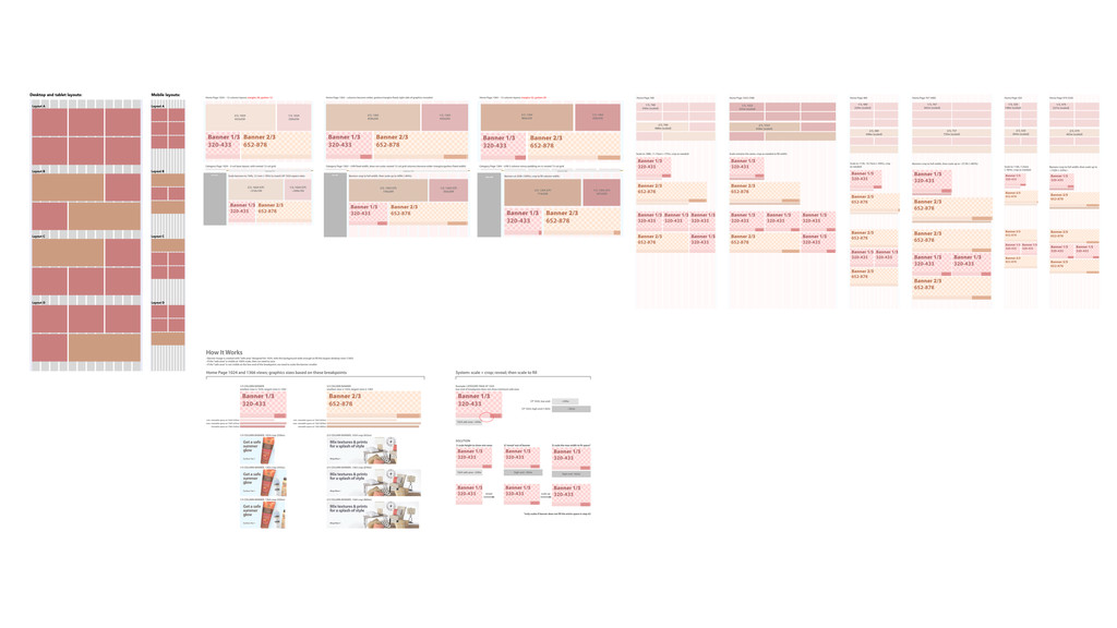
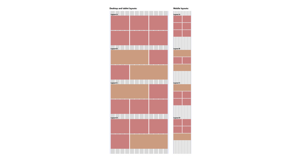
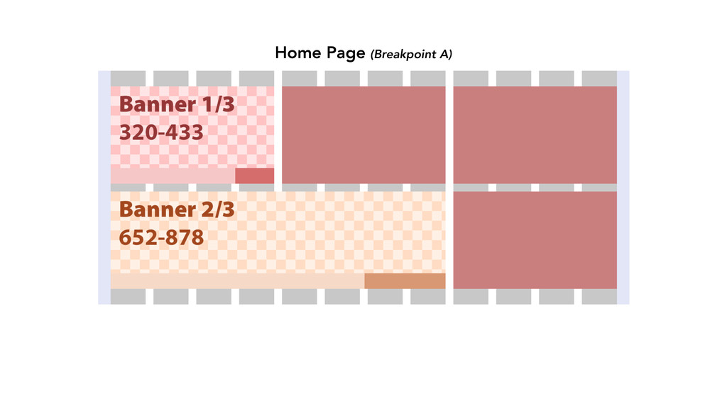
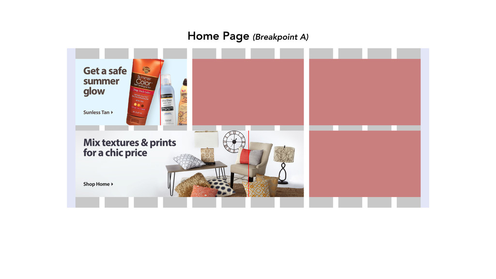
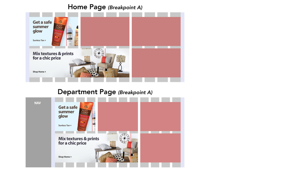
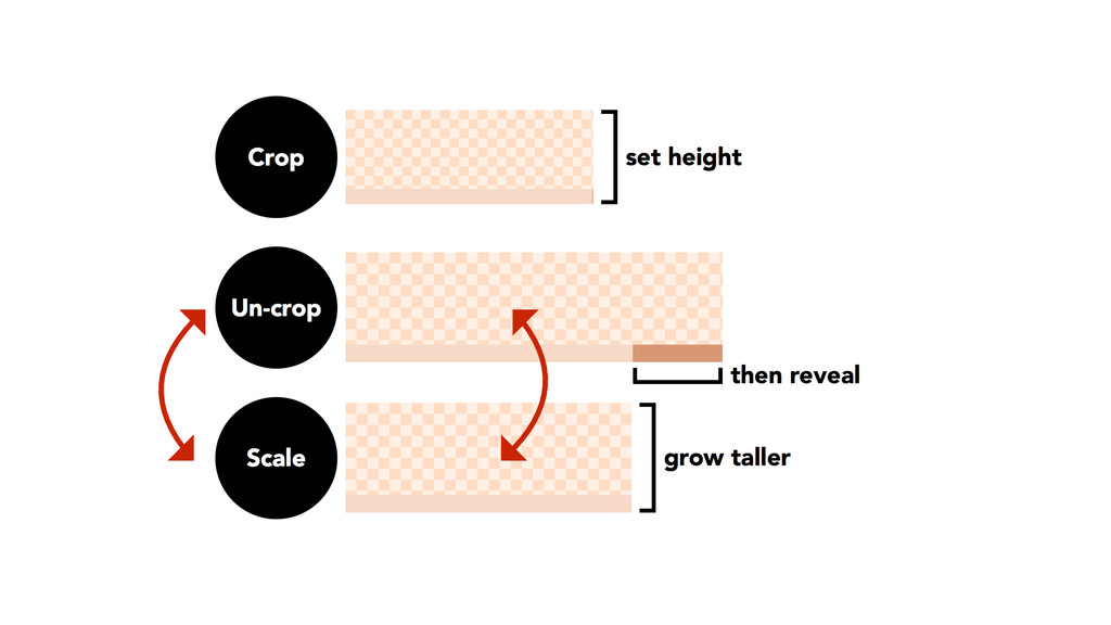
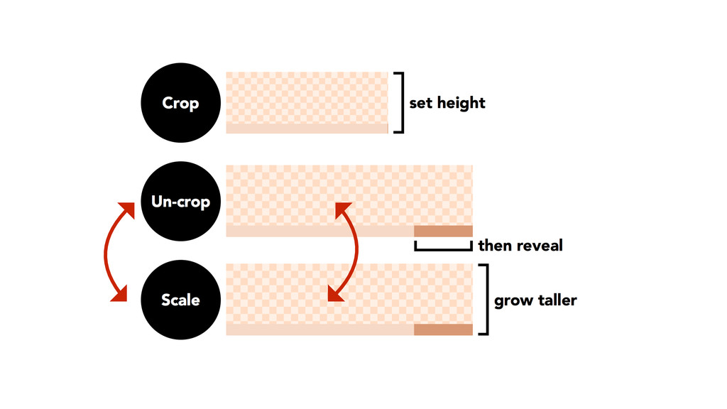
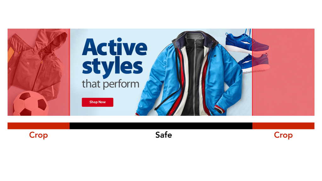
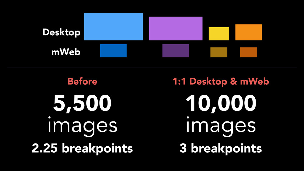
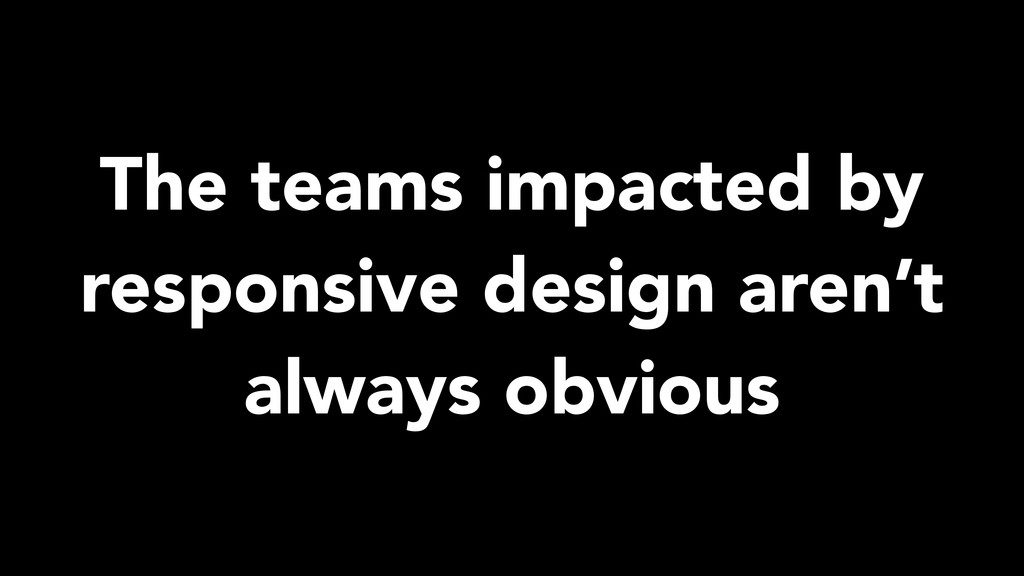
By Olawale Oladunni and Mini Kurhan. Creating images that work across multiple device breakpoints is difficult. As designers at @Walmartlabs, we’ve faced this challenge at an enormous scale. We learned that, beyond technical details, there are a host of factors that determine a successful outcome. We’ll share solutions that helped our teams adapt their current processes to execute quickly.
 ranyfardiany
 sevendex
 aonomasahiro
 kenichiota0711
 stmn
stmn
 yuri_ohashi
 securecat
 a2k
a2k
 godlingkogami
 teba_eleven
 kitanosirokuma
 nishame
 csswizardry
 honzajavorek
 stephaniewalter
 3n
3n
 aleyda
 khoart
 wayneb77
 rocio
rocio
 codingconduct
 inesmontani