Upgrade to Pro
— share decks privately, control downloads, hide ads and more …
Speaker Deck
Features
Speaker Deck
PRO
Sign in
Sign up for free
Search
Search
Styling React Applications
Search
Max Stoiber
October 28, 2016
Technology
730
2
Share
Embed
Copy iframe code
Copy JS code
Copy link
Start on current slide
Styling React Applications
Max Stoiber
October 28, 2016
More Decks by Max Stoiber
See All by Max Stoiber
Testing React Applications
mxstbr
3
350
Styling Intro
mxstbr
3
400
Introduction to React.js
mxstbr
1
170
Scaling React.js Applications (short version)
mxstbr
2
440
Scaling React.js Applications
mxstbr
0
440
Offline is the new Black
mxstbr
3
1.1k
Exploring ES6
mxstbr
1
340
Testing React.js Applications
mxstbr
4
740
Other Decks in Technology
See All in Technology
“それは自分の仕事じゃない"を 越えて行け
yuukiyo
1
470
ボーイスカウトルールでメモリやスキルを改善しよう
azukiazusa1
4
1.4k
Control Planeで育てるBtoB SaaSの認証基盤 - SRE NEXT 2026
pokohide
1
2.6k
マルチアカウント環境でSecurity Hubの運用、その後どうなった? / SRE NEXT 2026 miniLT会
genda
0
100
脱金融のフューチャー・デザイン / Future Design Beyond Finance
ks91
PRO
0
160
SRE本の知られざる名シーン / The Hidden Gems of Google SRE Book
nari_ex
1
420
OPENLOGI Company Profile for engineer
hr01
1
74k
公式ドキュメントの歩き方etc
coco_se
1
120
AIコード生成×サプライチェーン攻撃 — PHPが直面する“二重の信頼問題
shinyasaita
0
190
「守りたい体験」を渡すだけで E2E を生成させられるようになった話
hinac0
0
180
穢れた技術選定について
watany
17
5.4k
AIが実装を自走する時代の認知負債との戦い
lycorptech_jp
PRO
0
150
Featured
See All Featured
The Success of Rails: Ensuring Growth for the Next 100 Years
eileencodes
47
8.2k
Learning to Love Humans: Emotional Interface Design
aarron
275
41k
It's Worth the Effort
3n
188
29k
VelocityConf: Rendering Performance Case Studies
addyosmani
333
25k
Rails Girls Zürich Keynote
gr2m
96
14k
Bioeconomy Workshop: Dr. Julius Ecuru, Opportunities for a Bioeconomy in West Africa
akademiya2063
PRO
1
180
Reflections from 52 weeks, 52 projects
jeffersonlam
356
21k
How to build an LLM SEO readiness audit: a practical framework
nmsamuel
1
810
Why Your Marketing Sucks and What You Can Do About It - Sophie Logan
marketingsoph
0
270
RailsConf & Balkan Ruby 2019: The Past, Present, and Future of Rails at GitHub
eileencodes
141
35k
ピンチをチャンスに:未来をつくるプロダクトロードマップ #pmconf2020
aki_iinuma
128
56k
Google's AI Overviews - The New Search
badams
0
1.1k
Transcript
<> styled-components Max Stoiber @mxstbr Open Source Developer, Thinkmill
None
None
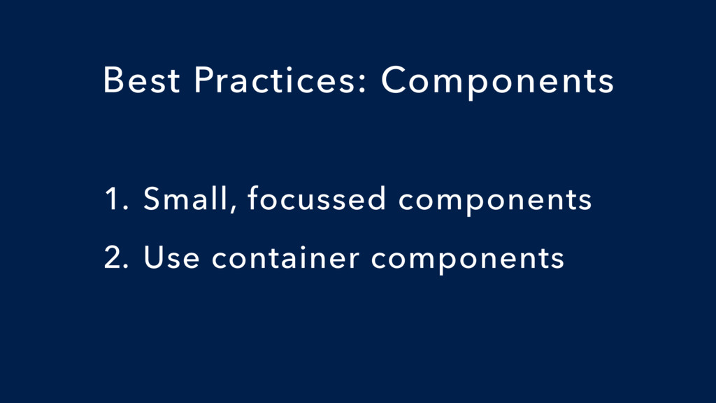
The Component Age
1. Small, focussed components 2. Use container components Best Practices:
Components
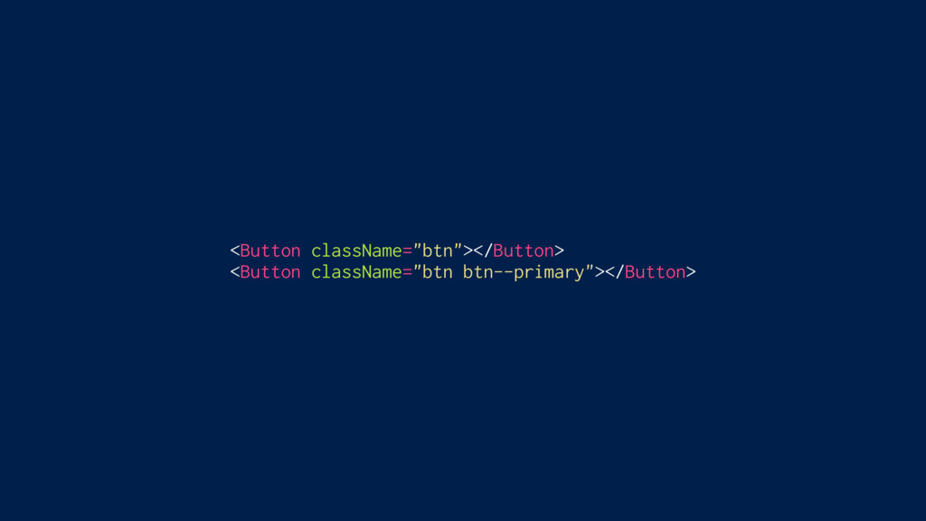
Small, focussed components
<Button className="btn"></Button> <Button className="btn btn--primary"></Button>
<Button className="btn"></Button> <Button className="btn btn--primary"></Button> Implementation detail! Implementation detail!
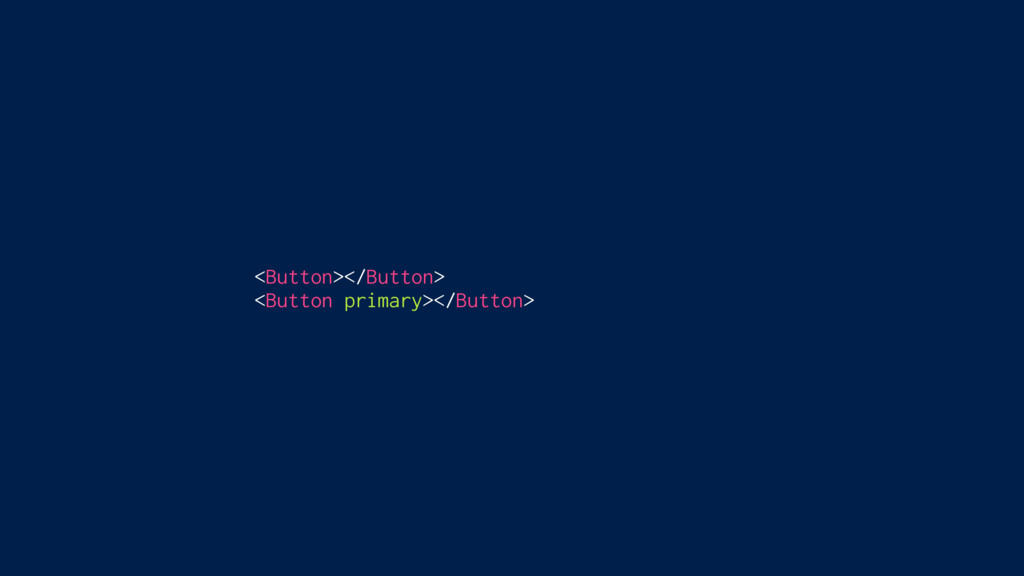
<Button></Button> <Button primary></Button>
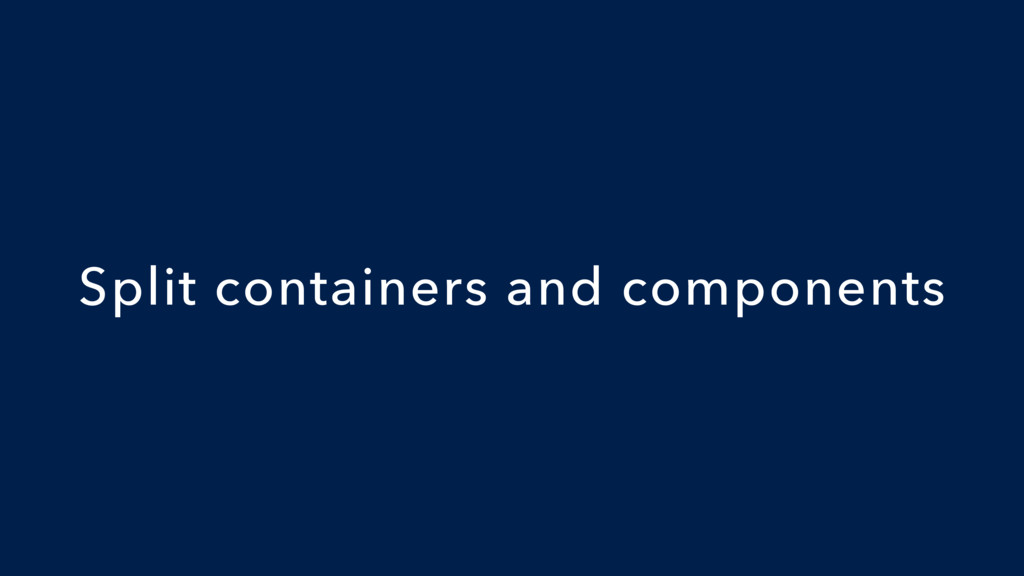
Split containers and components
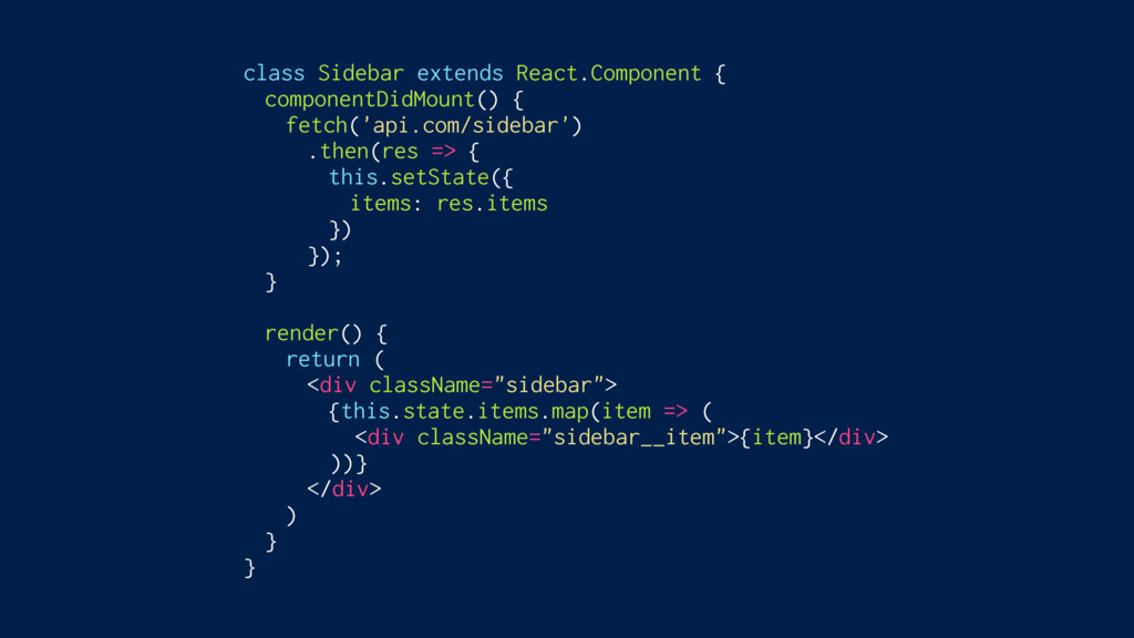
class Sidebar extends React.Component { componentDidMount() { fetch('api.com/sidebar') .then(res =>
{ this.setState({ items: res.items }) }); } render() { return ( <div className="sidebar"> {this.state.items.map(item => ( <div className="sidebar__item">{item}</div> ))} </div> ) } }
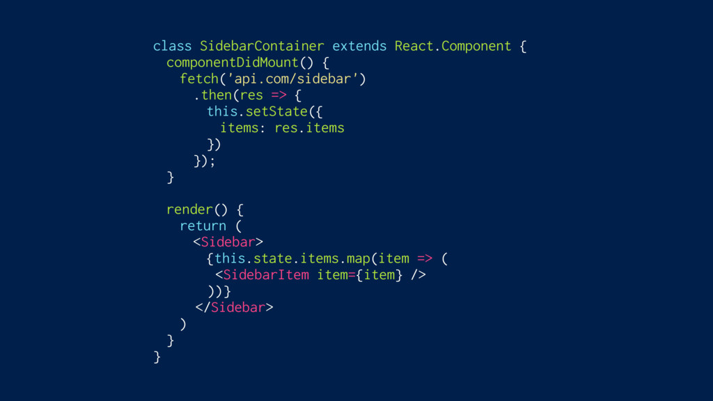
class SidebarContainer extends React.Component { componentDidMount() { fetch('api.com/sidebar') .then(res =>
{ this.setState({ items: res.items }) }); } render() { return ( <Sidebar> {this.state.items.map(item => ( <SidebarItem item={item} /> ))} </Sidebar> ) } }
Containers = How things work Components = How things look
What about styling?
1. Single-use classes 2. Components as a styling construct Best
Practices: Styling
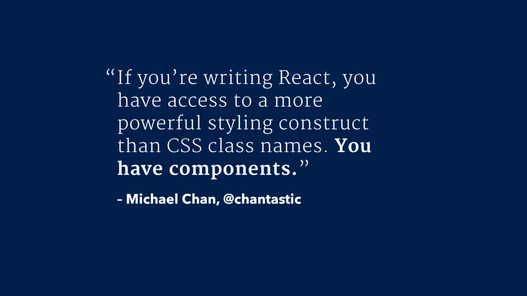
If you’re writing React, you have access to a more
powerful styling construct than CSS class names. You have components.” – Michael Chan, @chantastic “
Enforcing best practices?
styled-components
Glen Maddern frontend.center
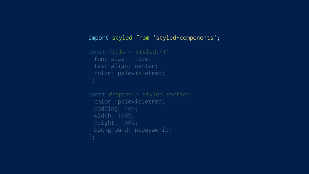
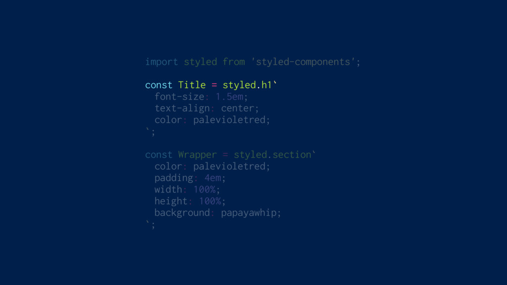
Remove the mapping between styles and components
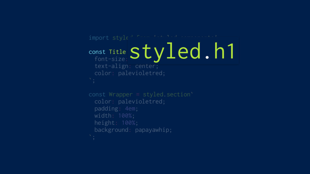
import styled from 'styled-components'; const Title = styled.h1` font-size: 1.5em;
text-align: center; color: palevioletred; `; const Wrapper = styled.section` color: palevioletred; padding: 4em; width: 100%; height: 100%; background: papayawhip; `;
import styled from 'styled-components'; const Title = styled.h1` font-size: 1.5em;
text-align: center; color: palevioletred; `; const Wrapper = styled.section` color: palevioletred; padding: 4em; width: 100%; height: 100%; background: papayawhip; `;
import styled from 'styled-components'; const Title = styled.h1` font-size: 1.5em;
text-align: center; color: palevioletred; `; const Wrapper = styled.section` color: palevioletred; padding: 4em; width: 100%; height: 100%; background: papayawhip; `; styled.h1
import styled from 'styled-components'; const Title = styled.h1` font-size: 1.5em;
text-align: center; color: palevioletred; `; const Wrapper = styled.section` color: palevioletred; padding: 4em; width: 100%; height: 100%; background: papayawhip; `;
import styled from 'styled-components'; const Title = styled.h1` font-size: 1.5em;
text-align: center; color: palevioletred; `; const Wrapper = styled.section` color: palevioletred; padding: 4em; width: 100%; height: 100%; background: papayawhip; `;
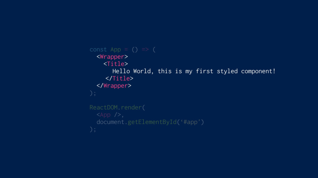
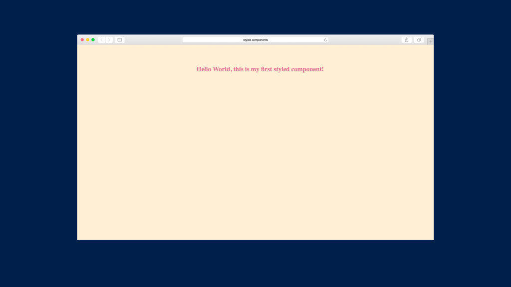
const App = () => ( <Wrapper> <Title> Hello World,
this is my first styled component! </Title> </Wrapper> ); ReactDOM.render( <App />, document.getElementById(‘#app') );
styled-components
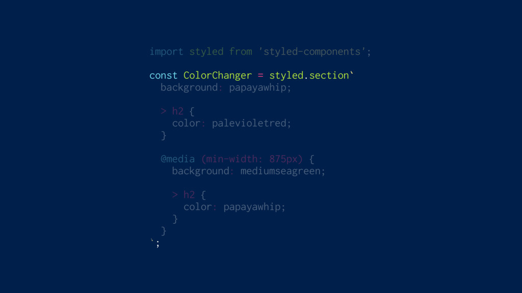
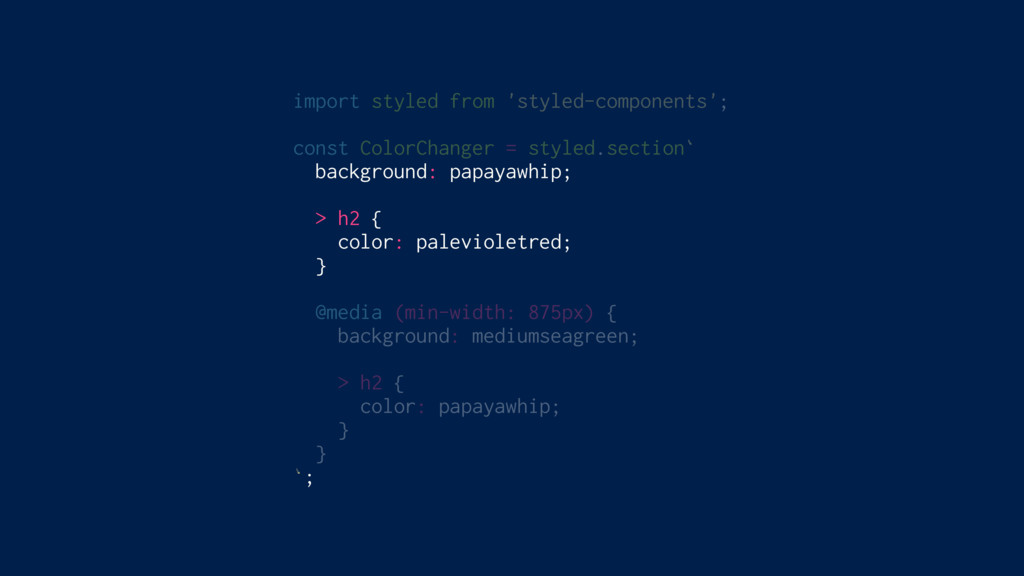
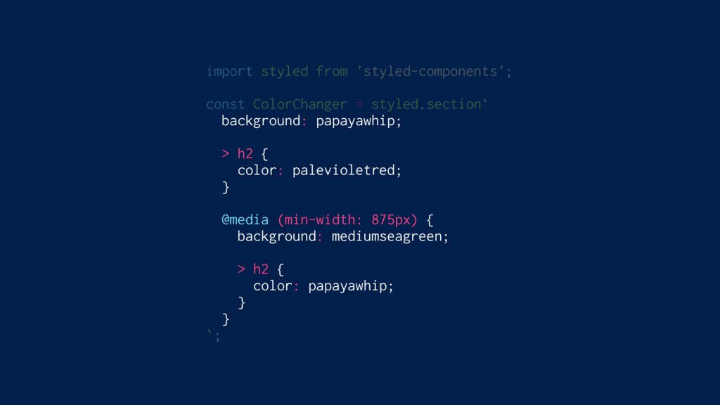
Write actual CSS
import styled from 'styled-components'; const ColorChanger = styled.section` background: papayawhip;
> h2 { color: palevioletred; } @media (min-width: 875px) { background: mediumseagreen; > h2 { color: papayawhip; } } `;
import styled from 'styled-components'; const ColorChanger = styled.section` background: papayawhip;
> h2 { color: palevioletred; } @media (min-width: 875px) { background: mediumseagreen; > h2 { color: papayawhip; } } `;
import styled from 'styled-components'; const ColorChanger = styled.section` background: papayawhip;
> h2 { color: palevioletred; } @media (min-width: 875px) { background: mediumseagreen; > h2 { color: papayawhip; } } `;
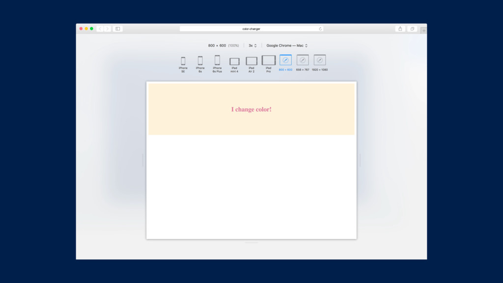
color-changer
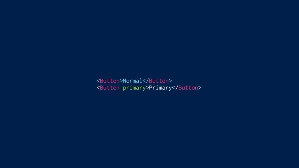
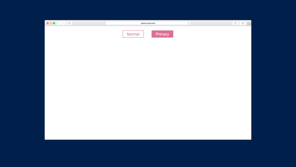
Adapting based on props
<Button>Normal</Button> <Button primary>Primary</Button>
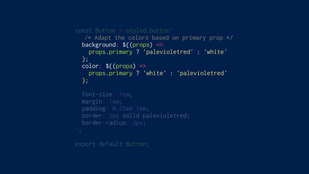
const Button = styled.button` /* Adapt the colors based on
primary prop */ background: ${(props) => props.primary ? 'palevioletred' : 'white' }; color: ${(props) => props.primary ? 'white' : 'palevioletred' }; font-size: 1em; margin: 1em; padding: 0.25em 1em; border: 2px solid palevioletred; border-radius: 3px; `; export default Button;
<Button>Normal</Button> <Button primary>Primary</Button>
styled-components
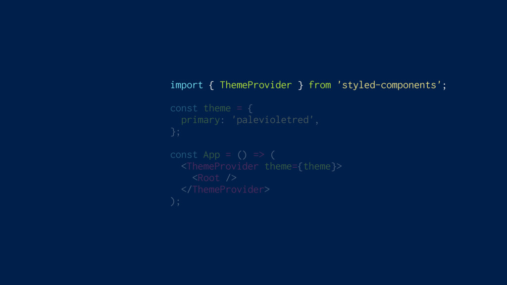
Theming Built In
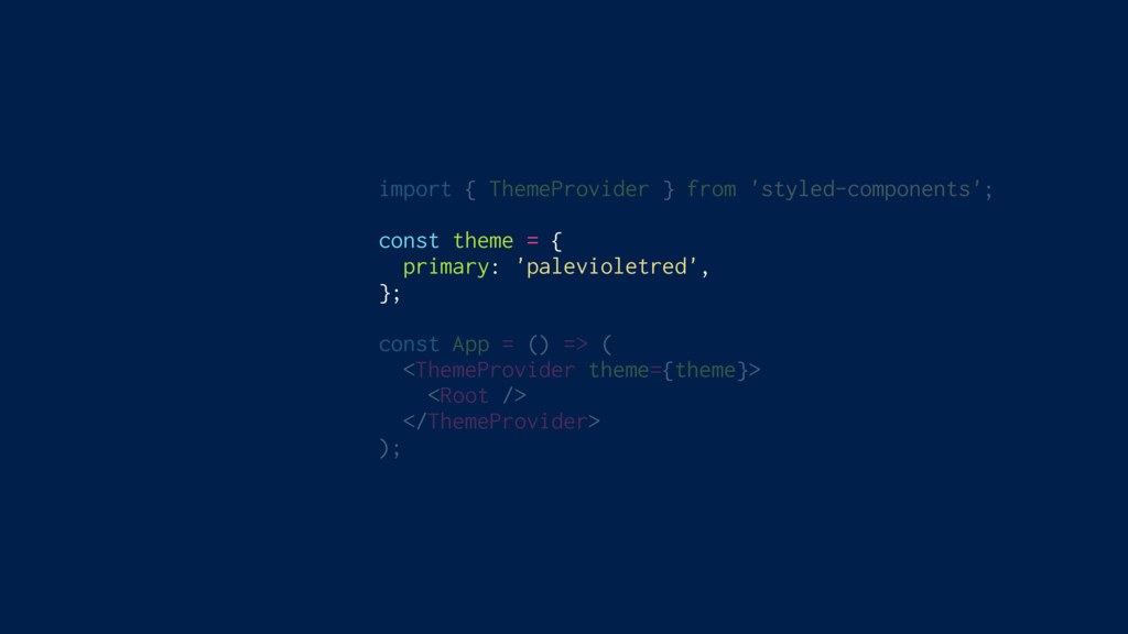
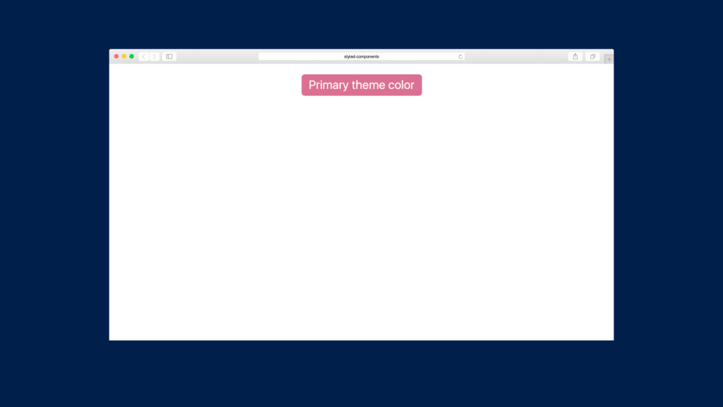
import { ThemeProvider } from 'styled-components'; const theme = {
primary: 'palevioletred', }; const App = () => ( <ThemeProvider theme={theme}> <Root /> </ThemeProvider> );
import { ThemeProvider } from 'styled-components'; const theme = {
primary: 'palevioletred', }; const App = () => ( <ThemeProvider theme={theme}> <Root /> </ThemeProvider> );
import { ThemeProvider } from 'styled-components'; const theme = {
primary: 'palevioletred', }; const App = () => ( <ThemeProvider theme={theme}> <Root /> </ThemeProvider> );
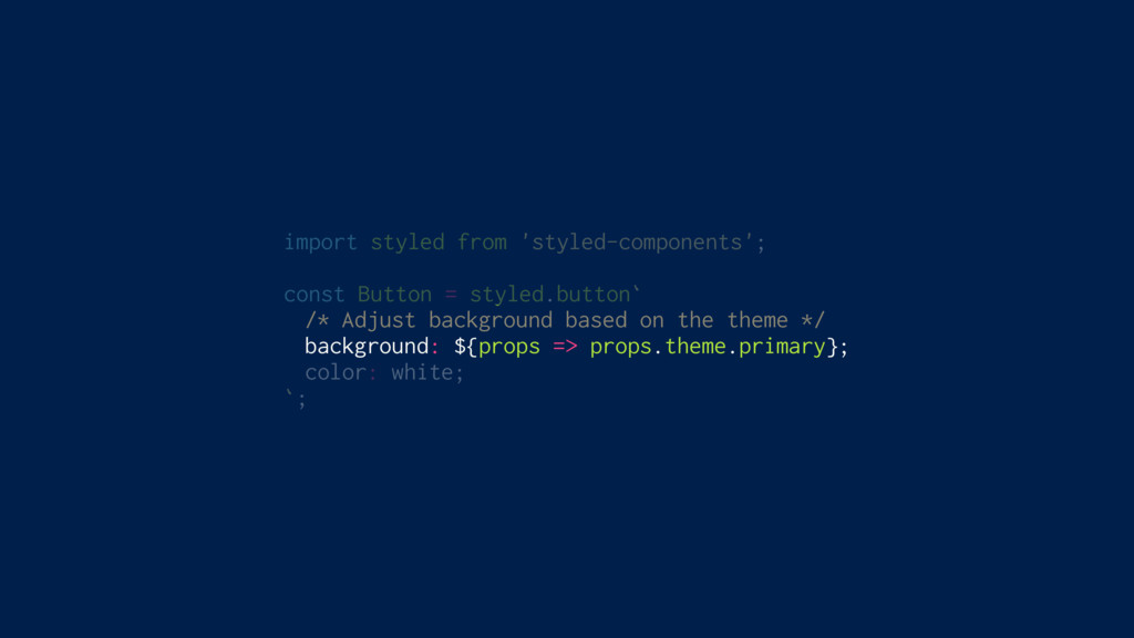
import styled from 'styled-components'; const Button = styled.button` /* Adjust
background based on the theme */ background: ${props => props.theme.primary}; color: white; `;
styled-components
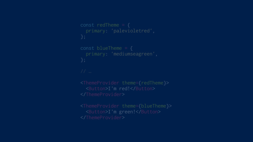
const redTheme = { primary: 'palevioletred', }; const blueTheme =
{ primary: 'mediumseagreen', }; // … <ThemeProvider theme={redTheme}> <Button>I'm red!</Button> </ThemeProvider> <ThemeProvider theme={blueTheme}> <Button>I'm green!</Button> </ThemeProvider>
styled-components
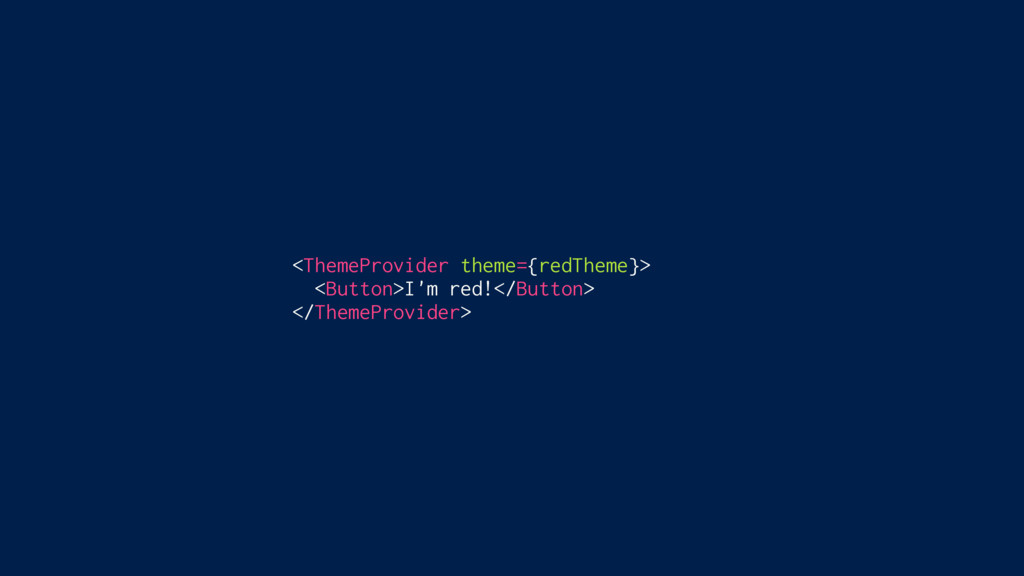
<ThemeProvider theme={redTheme}> <Button>I'm red!</Button> </ThemeProvider>
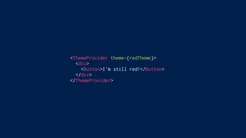
<ThemeProvider theme={redTheme}> <div> <Button>I'm still red!</Button> </div> </ThemeProvider>
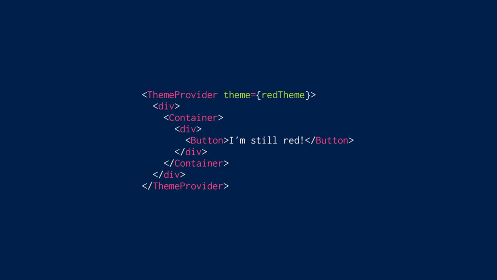
<ThemeProvider theme={redTheme}> <div> <Container> <Button>I'm still red!</Button> </Container> </div> </ThemeProvider>
<ThemeProvider theme={redTheme}> <div> <Container> <div> <Button>I'm still red!</Button> </div> </Container>
</div> </ThemeProvider>
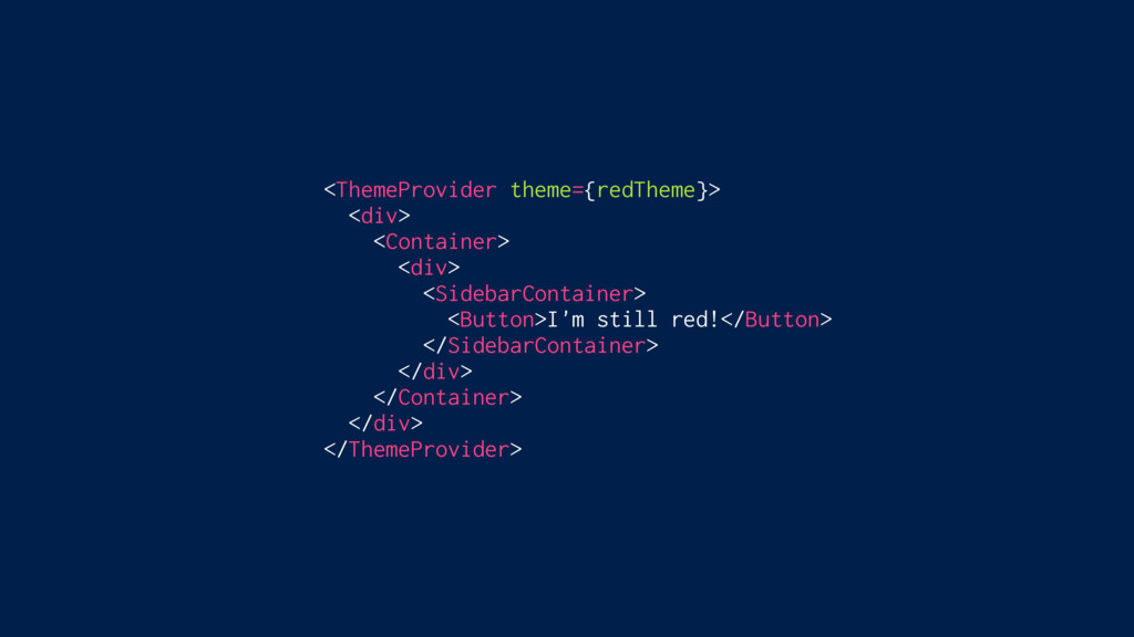
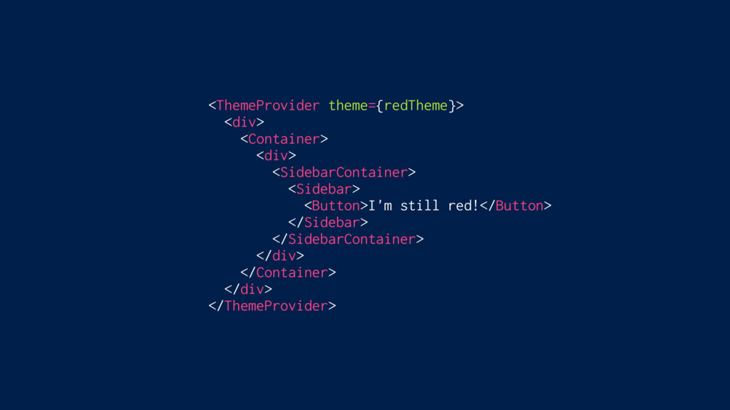
<ThemeProvider theme={redTheme}> <div> <Container> <div> <SidebarContainer> <Button>I'm still red!</Button> </SidebarContainer>
</div> </Container> </div> </ThemeProvider>
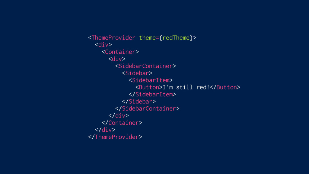
<ThemeProvider theme={redTheme}> <div> <Container> <div> <SidebarContainer> <Sidebar> <Button>I'm still red!</Button>
</Sidebar> </SidebarContainer> </div> </Container> </div> </ThemeProvider>
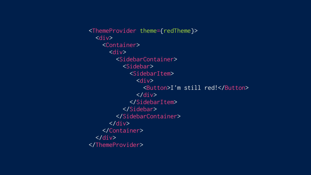
<ThemeProvider theme={redTheme}> <div> <Container> <div> <SidebarContainer> <Sidebar> <SidebarItem> <Button>I'm still
red!</Button> </SidebarItem> </Sidebar> </SidebarContainer> </div> </Container> </div> </ThemeProvider>
<ThemeProvider theme={redTheme}> <div> <Container> <div> <SidebarContainer> <Sidebar> <SidebarItem> <div> <Button>I'm
still red!</Button> </div> </SidebarItem> </Sidebar> </SidebarContainer> </div> </Container> </div> </ThemeProvider>
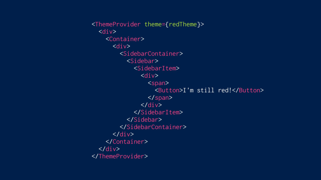
<ThemeProvider theme={redTheme}> <div> <Container> <div> <SidebarContainer> <Sidebar> <SidebarItem> <div> <span>
<Button>I'm still red!</Button> </span> </div> </SidebarItem> </Sidebar> </SidebarContainer> </div> </Container> </div> </ThemeProvider>
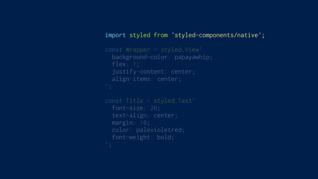
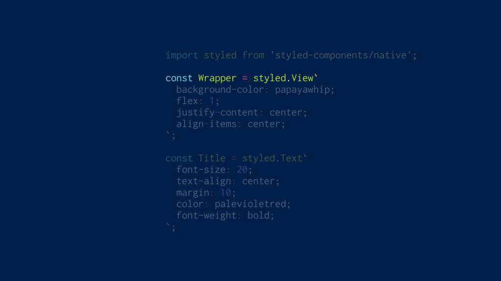
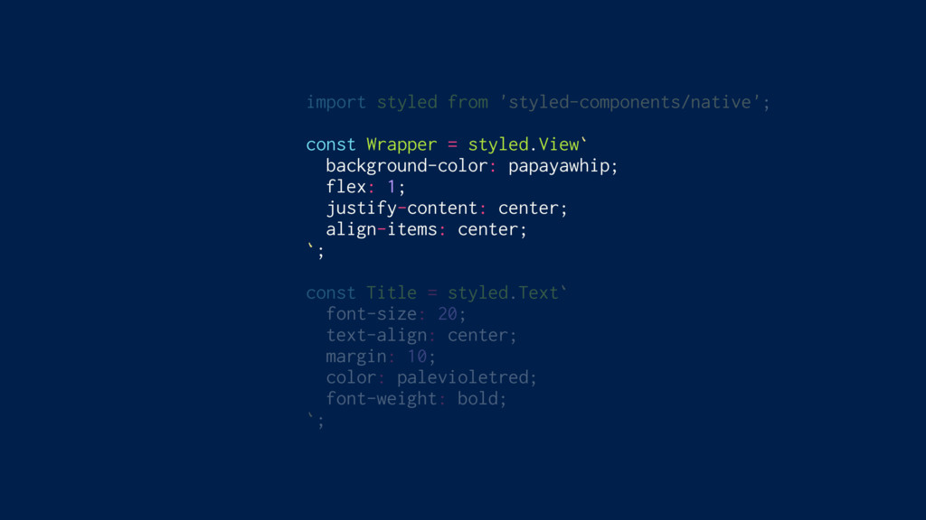
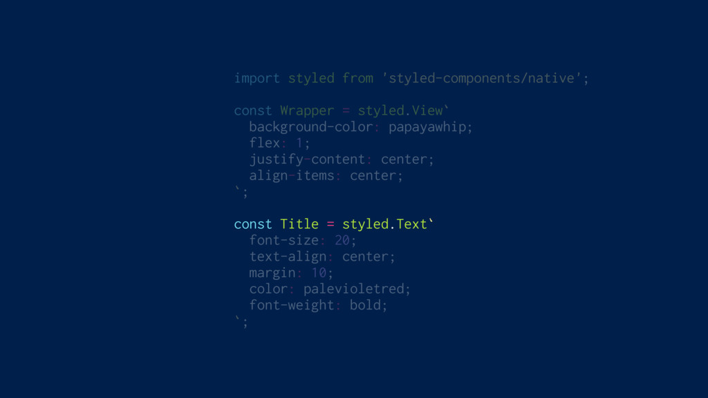
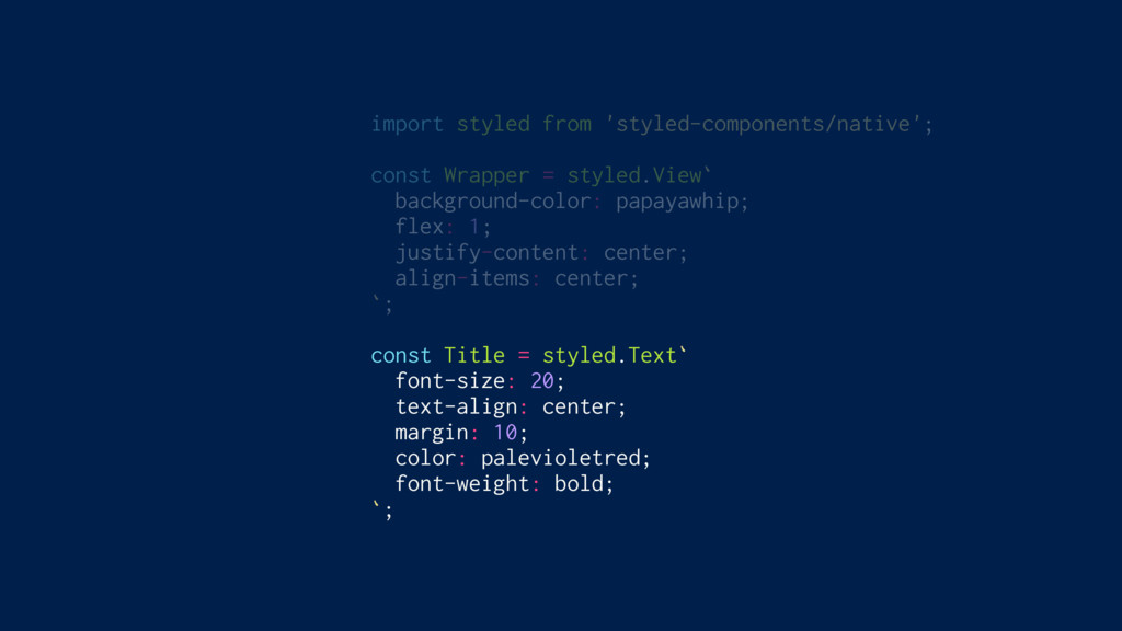
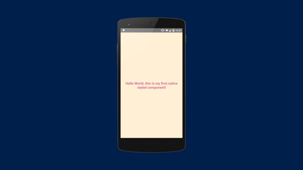
Full ReactNative Support
import styled from 'styled-components/native'; const Wrapper = styled.View` background-color: papayawhip;
flex: 1; justify-content: center; align-items: center; `; const Title = styled.Text` font-size: 20; text-align: center; margin: 10; color: palevioletred; font-weight: bold; `;
import styled from 'styled-components/native'; const Wrapper = styled.View` background-color: papayawhip;
flex: 1; justify-content: center; align-items: center; `; const Title = styled.Text` font-size: 20; text-align: center; margin: 10; color: palevioletred; font-weight: bold; `;
import styled from 'styled-components/native'; const Wrapper = styled.View` background-color: papayawhip;
flex: 1; justify-content: center; align-items: center; `; const Title = styled.Text` font-size: 20; text-align: center; margin: 10; color: palevioletred; font-weight: bold; `;
import styled from 'styled-components/native'; const Wrapper = styled.View` background-color: papayawhip;
flex: 1; justify-content: center; align-items: center; `; const Title = styled.Text` font-size: 20; text-align: center; margin: 10; color: palevioletred; font-weight: bold; `;
import styled from 'styled-components/native'; const Wrapper = styled.View` background-color: papayawhip;
flex: 1; justify-content: center; align-items: center; `; const Title = styled.Text` font-size: 20; text-align: center; margin: 10; color: palevioletred; font-weight: bold; `;
class StyledComponentsNative extends Component { render() { return ( <Wrapper>
<Title> Hello World, this is my first native styled component! </Title> </Wrapper> ); } }
None
$ yarn add styled-components github.com/styled-components/styled-components $ npm install styled-components
Thank you! Max Stoiber @mxstbr Come talk to me!
None
 mxstbr
 yuukiyo
 azukiazusa1
 pokohide
 genda
genda
 ks91
ks91
 nari_ex
 hr01
hr01
 coco_se
 shinyasaita
 hinac0
 watany
 lycorptech_jp
 eileencodes
 aarron
 3n
3n
 addyosmani
 gr2m
gr2m
 akademiya2063
 jeffersonlam
 nmsamuel
 marketingsoph
 aki_iinuma
 badams