Upgrade to Pro
— share decks privately, control downloads, hide ads and more …
Speaker Deck
Features
Speaker Deck
PRO
Sign in
Sign up for free
Search
Search
Styling Intro
Search
Max Stoiber
February 28, 2017
Technology
400
3
Share
Embed
Copy iframe code
Copy JS code
Copy link
Start on current slide
Styling Intro
React in Flip Flops satyling talk
Max Stoiber
February 28, 2017
More Decks by Max Stoiber
See All by Max Stoiber
Testing React Applications
mxstbr
3
350
Introduction to React.js
mxstbr
1
170
Styling React Applications
mxstbr
2
730
Scaling React.js Applications (short version)
mxstbr
2
440
Scaling React.js Applications
mxstbr
0
440
Offline is the new Black
mxstbr
3
1.1k
Exploring ES6
mxstbr
1
340
Testing React.js Applications
mxstbr
4
740
Other Decks in Technology
See All in Technology
穢れた技術選定について
watany
17
5.4k
Kaggleで成長するために意識したこと
prgckwb
2
410
AI Agent SaaS を支える自社仮想化基盤への挑戦と実運用 / ai-agent-saas-virtualization
flatt_security
3
4.1k
LLM/Agent評価:トップ営業の発言を「正解」にする 〜暗黙的正解による評価を営業資産に変える〜
takkuhiro
1
230
AICoEでAIネイティブ組織への進化
yukiogawa
0
190
大量データに対しても、生成AIを用いてリーズナブルにデータ加工をしたい!Databricksのai_queryについて調べてみた
kamoshika
1
220
SREとQA 二人三脚で進めるSLO運用/sre-qa-slo
sugitak
0
830
AI Driven AI Governance
pict3
0
480
OPENLOGI Company Profile for engineer
hr01
1
74k
Claude Code公式skillで 自分の仕事を少しずつ手放そう!(Claude Code開発ノウハウ大公開スペシャル by クラスメソッド)
kaym
1
480
企業でAWS Organizationsを動かすための組織設計の考え方
nrinetcom
PRO
1
110
Terraform共通モジュールをチーム横断で“変えられる”運用へ ― リリースと適用の分離
kekke_n
1
3.3k
Featured
See All Featured
Agile Actions for Facilitating Distributed Teams - ADO2019
mkilby
0
220
Getting science done with accelerated Python computing platforms
jacobtomlinson
2
310
Visualizing Your Data: Incorporating Mongo into Loggly Infrastructure
mongodb
49
10k
Skip the Path - Find Your Career Trail
mkilby
1
170
Keith and Marios Guide to Fast Websites
keithpitt
413
23k
Sam Torres - BigQuery for SEOs
techseoconnect
PRO
0
300
Lessons Learnt from Crawling 1000+ Websites
charlesmeaden
PRO
1
1.4k
No one is an island. Learnings from fostering a developers community.
thoeni
21
3.8k
How to train your dragon (web standard)
notwaldorf
97
6.7k
RailsConf & Balkan Ruby 2019: The Past, Present, and Future of Rails at GitHub
eileencodes
141
35k
How To Stay Up To Date on Web Technology
chriscoyier
790
250k
How to Talk to Developers About Accessibility
jct
2
390
Transcript
Styling React Applications Max Stoiber @mxstbr Open Source Developer, Thinkmill
Let’s talk about styling
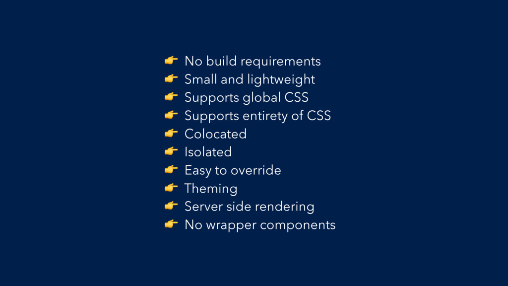
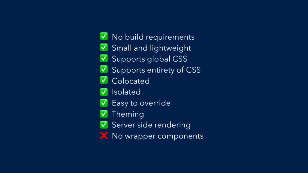
The Checklist
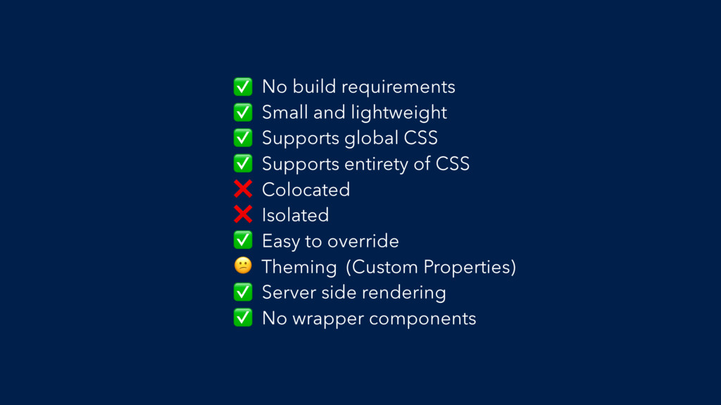
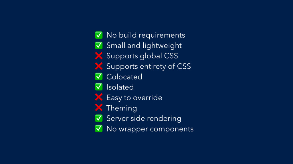
No build requirements Small and lightweight Supports global CSS Supports
entirety of CSS Colocated Isolated Easy to override Theming Server side rendering No wrapper components
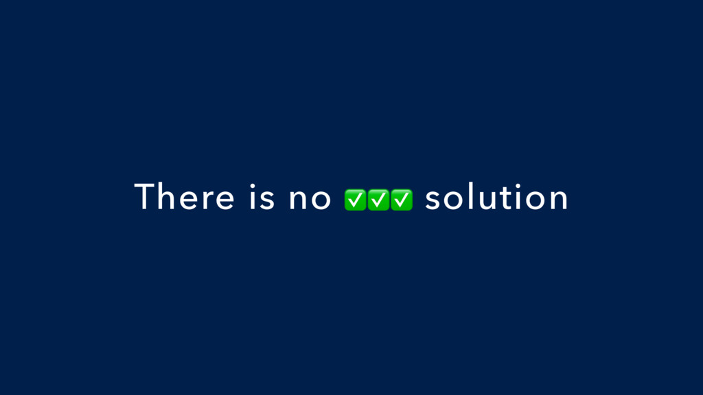
There is no ✅✅✅ solution
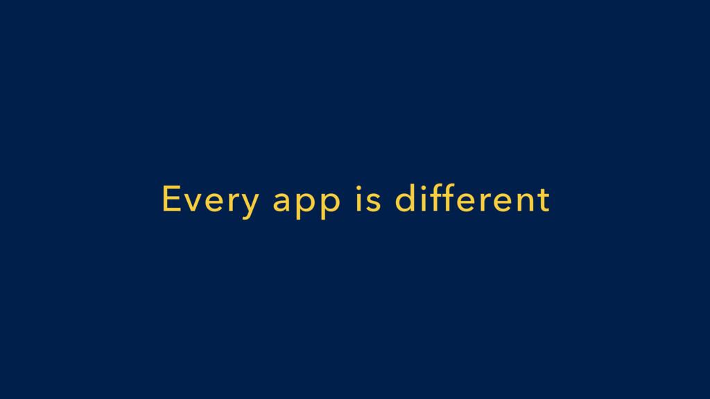
Every app is different
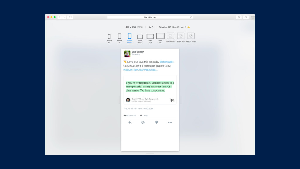
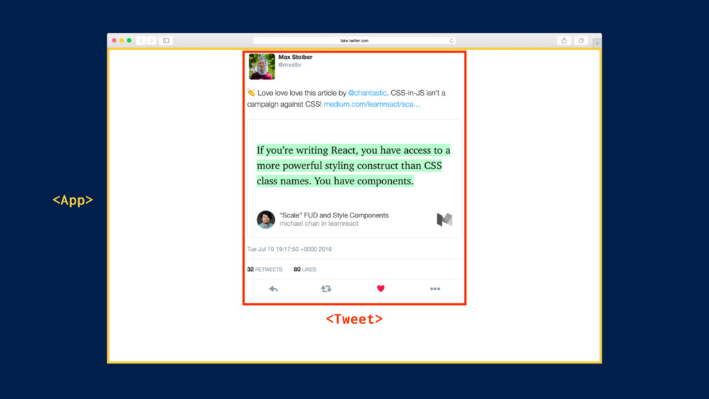
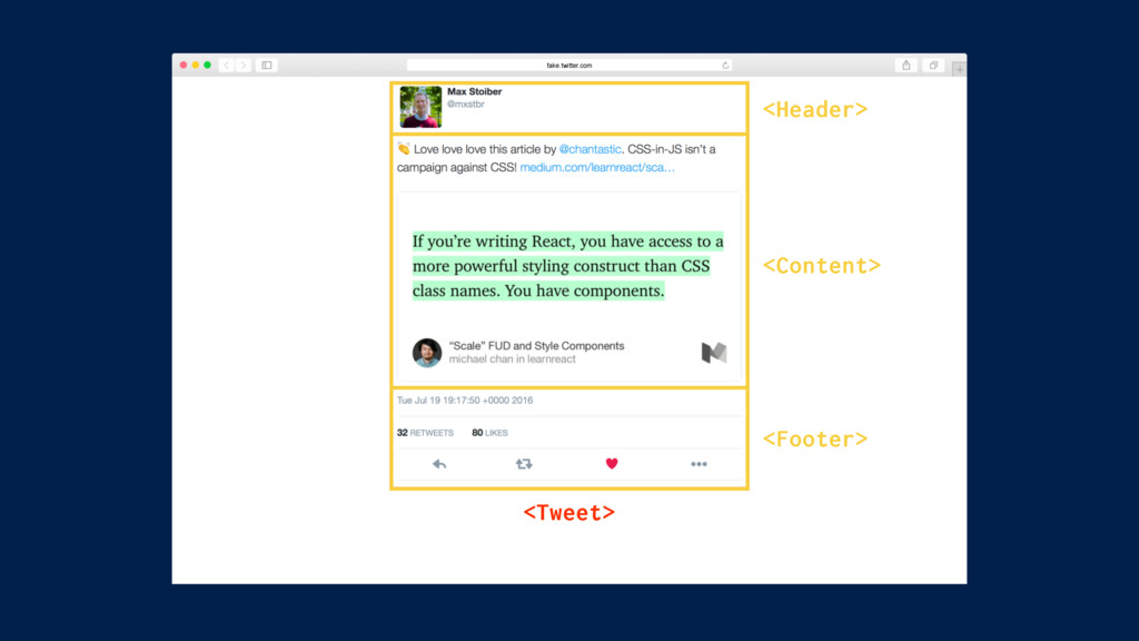
The Example
fake.twitter.com
fake.twitter.com
fake.twitter.com <Tweet> <App>
fake.twitter.com <Tweet> <Header> <Content> <Footer>
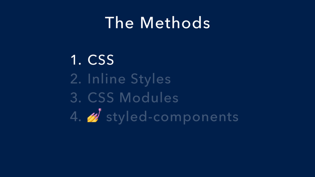
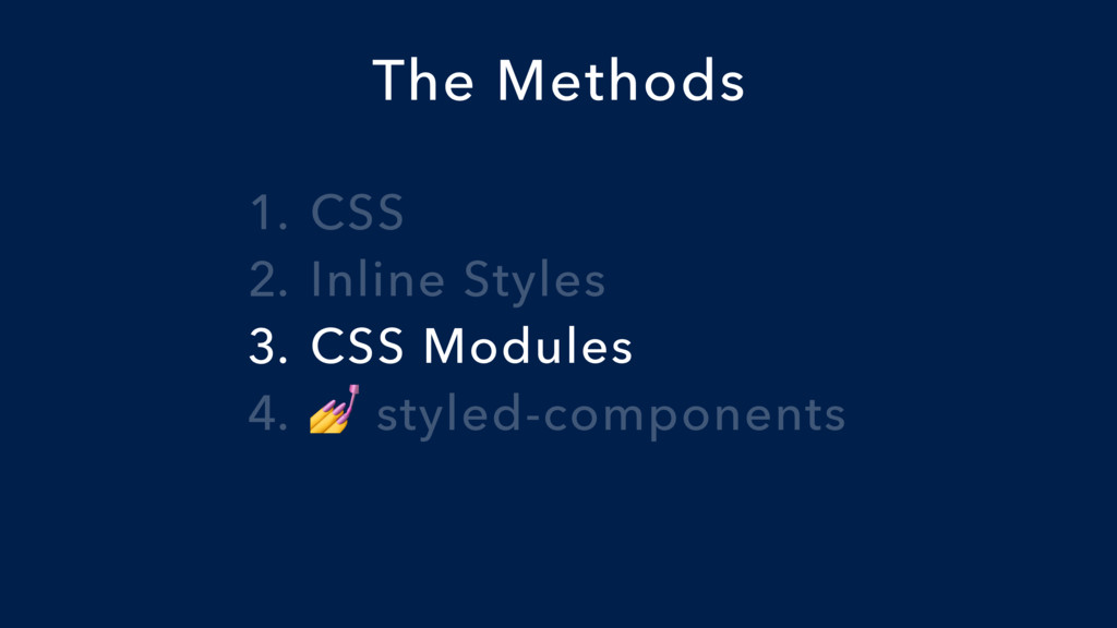
1. CSS 2. Inline Styles 3. CSS Modules 4. styled-components
The Methods
1. CSS 2. Inline Styles 3. CSS Modules 4. styled-components
The Methods
html { color: #292f33; font-family: Helvetica, Arial, sans-serif; font-size: 14px;
line-height: 1.3125; } .container { margin: 0 auto; width: 100%; } @media screen and (min-width: 360px) { html { font-size: 15px; } .container { max-width: 400px; } }
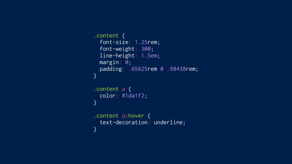
.tweet__content { font-size: 1.25rem; font-weight: 300; line-height: 1.5em; margin: 0;
padding: .65625rem 0 .98438rem; } .tweet__content a { color: #1da1f2; } .tweet__content a:hover { text-decoration: underline; }
const Content = ({ text, media }) => ( <div>
<p className=“tweet__content" dangerouslySetInnerHTML={{ __html: text }} /> <a className=“tweet__media" target=“_blank" href={media.expanded_url} > <img className=“tweet__image" src={media.media_url_https} alt=“" /> </a> </div> );
No build requirements Small and lightweight Supports global CSS Supports
entirety of CSS Colocated Isolated Easy to override Theming Server side rendering No wrapper components ✅ ✅ ✅ ✅ ❌ ❌ ✅ (Custom Properties) ✅ ✅
1. CSS 2. Inline Styles 3. CSS Modules 4. styled-components
The Methods
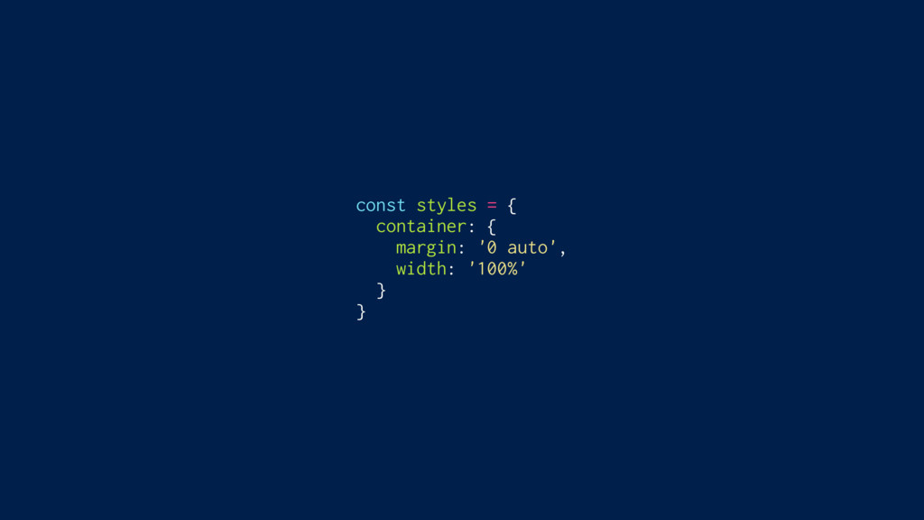
const styles = { container: { margin: '0 auto', width:
'100%' } }
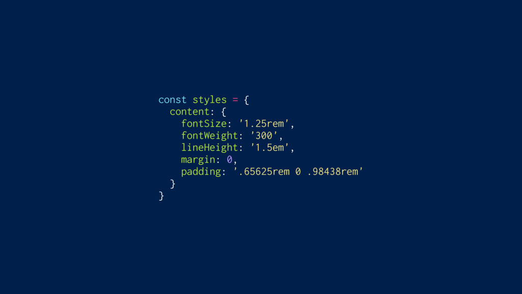
const styles = { content: { fontSize: '1.25rem', fontWeight: '300',
lineHeight: '1.5em', margin: 0, padding: '.65625rem 0 .98438rem' } }
const Content = ({ text, media }) => ( <div>
<p style={styles.content} dangerouslySetInnerHTML={{ __html: text }} /> <a style={styles.media} target=“_blank" href={media.expanded_url} > <img style={styles.image} src={media.media_url_https} alt=“" /> </a> </div> );
<p style="font-size: 1.25rem; font-weight: 300; line-height: 1.5em; margin: 0; padding:
.65625rem 0 .98438rem" />
No build requirements Small and lightweight Supports global CSS Supports
entirety of CSS Colocated Isolated Easy to override Theming Server side rendering No wrapper components ✅ ✅ ❌ ❌ ✅ ✅ ❌ ❌ ✅ ✅
1. CSS 2. Inline Styles 3. CSS Modules 4. styled-components
The Methods
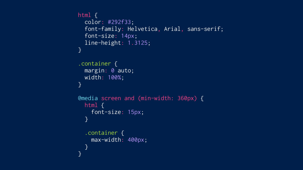
html { color: #292f33; font-family: Helvetica, Arial, sans-serif; font-size: 14px;
line-height: 1.3125; } .container { margin: 0 auto; width: 100%; } @media screen and (min-width: 360px) { html { font-size: 15px; } .container { max-width: 400px; } }
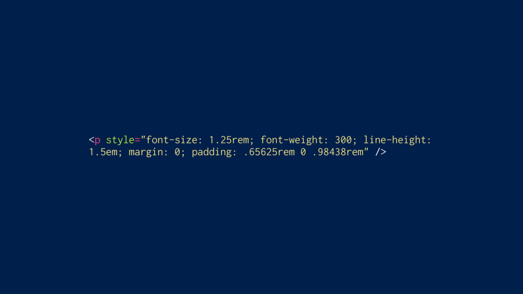
.content { font-size: 1.25rem; font-weight: 300; line-height: 1.5em; margin: 0;
padding: .65625rem 0 .98438rem; } .content a { color: #1da1f2; } .content a:hover { text-decoration: underline; }
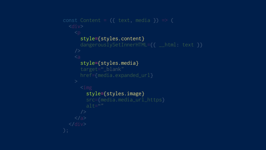
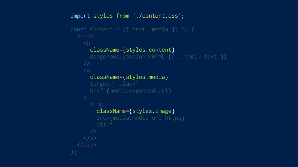
import styles from './content.css'; const Content = ({ text, media
}) => ( <div> <p className={styles.content} dangerouslySetInnerHTML={{ __html: text }} /> <a className={styles.media} target=“_blank" href={media.expanded_url} > <img className={styles.image} src={media.media_url_https} alt=“" /> </a> </div> );
/* content.css */ .content { /* … */ } .content__content__a452s
{ /* … */ } /* home.css */ .content { /* … */ } .home__content__juz65 { /* … */ }
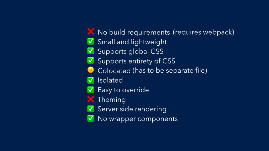
No build requirements Small and lightweight Supports global CSS Supports
entirety of CSS Colocated Isolated Easy to override Theming Server side rendering No wrapper components ❌ (requires webpack) ✅ ✅ ✅ (has to be separate file) ✅ ✅ ❌ ✅ ✅
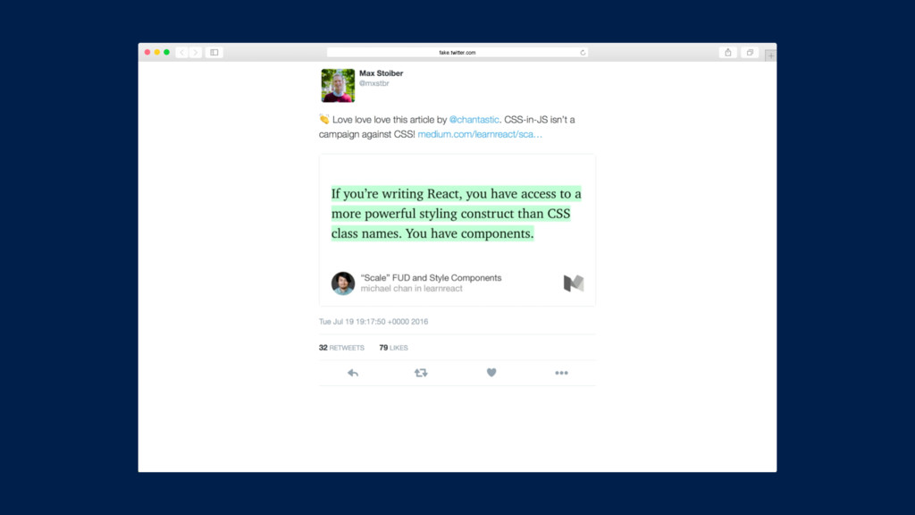
If you’re writing React, you have access to a more
powerful styling construct than CSS class names. You have components.” – Michael Chan, @chantastic “
1. CSS 2. Inline Styles 3. CSS Modules 4. styled-components
The Methods
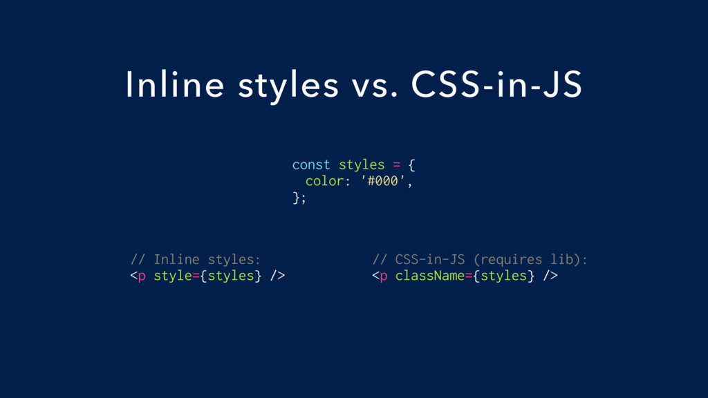
const styles = { color: '#000', }; Inline styles vs.
CSS-in-JS // Inline styles: <p style={styles} /> // CSS-in-JS (requires lib): <p className={styles} />
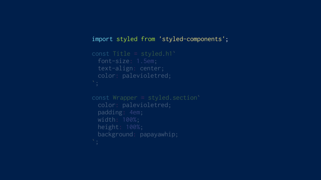
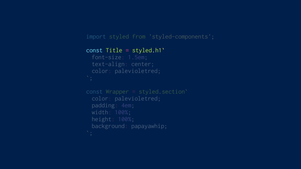
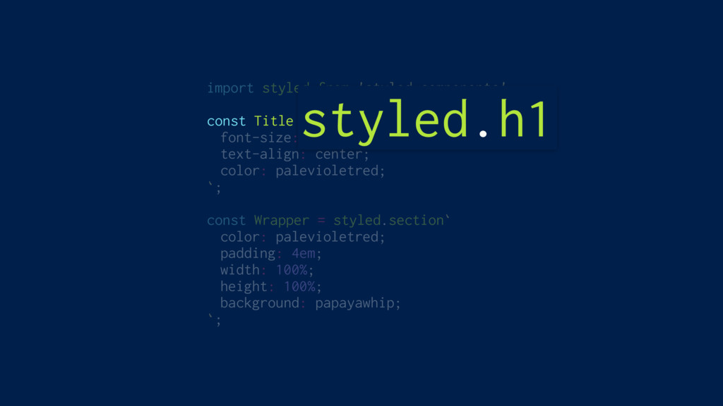
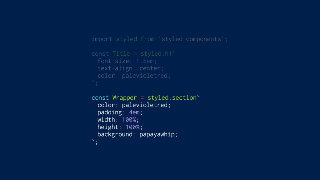
import styled from 'styled-components'; const Title = styled.h1` font-size: 1.5em;
text-align: center; color: palevioletred; `; const Wrapper = styled.section` color: palevioletred; padding: 4em; width: 100%; height: 100%; background: papayawhip; `;
import styled from 'styled-components'; const Title = styled.h1` font-size: 1.5em;
text-align: center; color: palevioletred; `; const Wrapper = styled.section` color: palevioletred; padding: 4em; width: 100%; height: 100%; background: papayawhip; `;
import styled from 'styled-components'; const Title = styled.h1` font-size: 1.5em;
text-align: center; color: palevioletred; `; const Wrapper = styled.section` color: palevioletred; padding: 4em; width: 100%; height: 100%; background: papayawhip; `; styled.h1
import styled from 'styled-components'; const Title = styled.h1` font-size: 1.5em;
text-align: center; color: palevioletred; `; const Wrapper = styled.section` color: palevioletred; padding: 4em; width: 100%; height: 100%; background: papayawhip; `;
import styled from 'styled-components'; const Title = styled.h1` font-size: 1.5em;
text-align: center; color: palevioletred; `; const Wrapper = styled.section` color: palevioletred; padding: 4em; width: 100%; height: 100%; background: papayawhip; `;
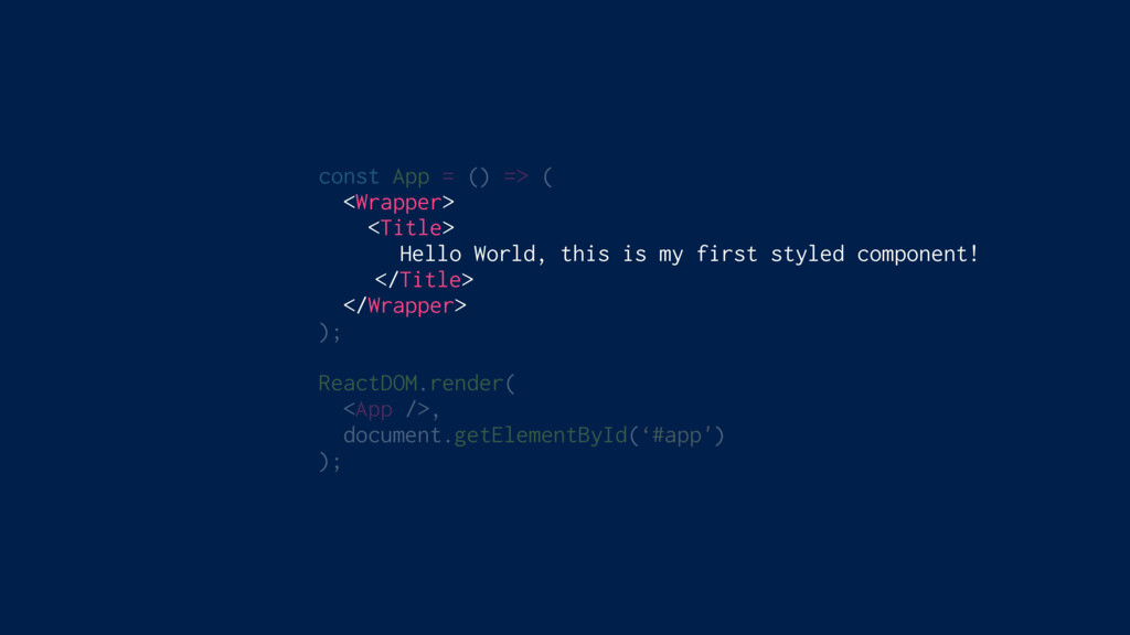
const App = () => ( <Wrapper> <Title> Hello World,
this is my first styled component! </Title> </Wrapper> ); ReactDOM.render( <App />, document.getElementById(‘#app') );
styled-components
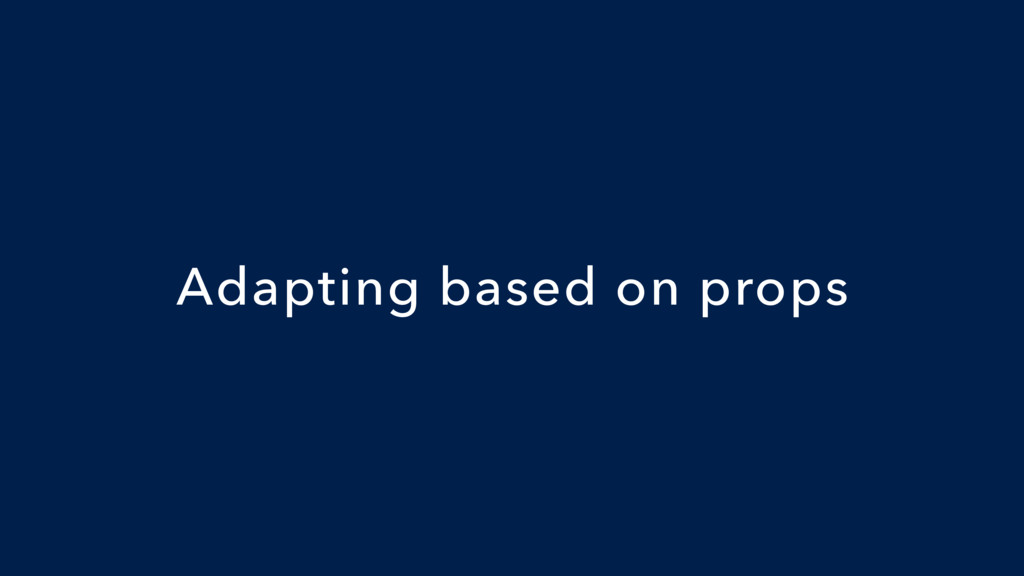
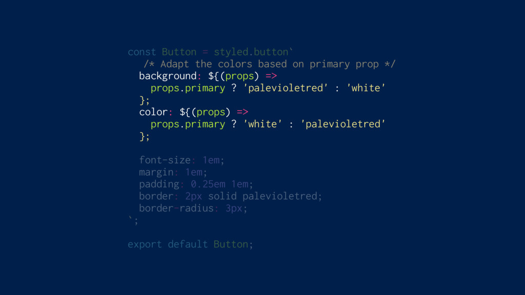
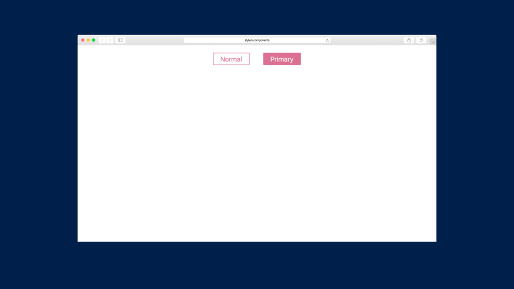
Adapting based on props
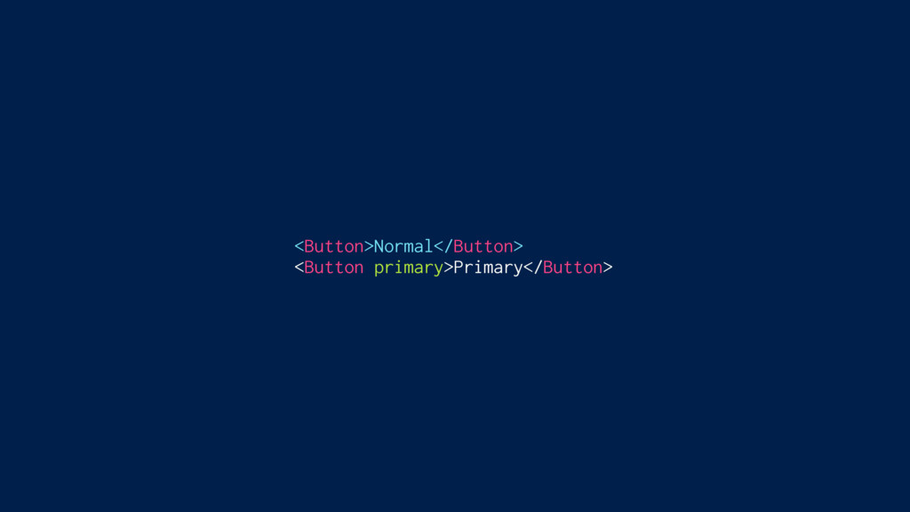
<Button>Normal</Button> <Button primary>Primary</Button>
const Button = styled.button` /* Adapt the colors based on
primary prop */ background: ${(props) => props.primary ? 'palevioletred' : 'white' }; color: ${(props) => props.primary ? 'white' : 'palevioletred' }; font-size: 1em; margin: 1em; padding: 0.25em 1em; border: 2px solid palevioletred; border-radius: 3px; `; export default Button;
<Button>Normal</Button> <Button primary>Primary</Button>
styled-components
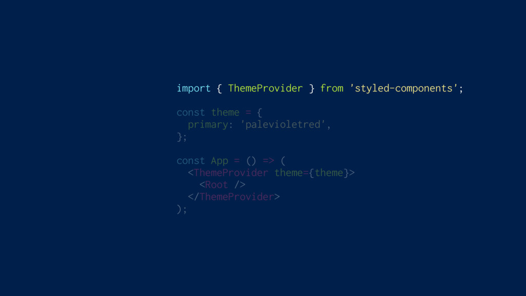
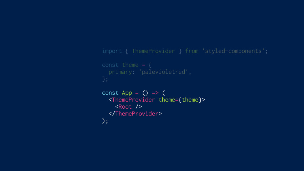
Theming Built In
import { ThemeProvider } from 'styled-components'; const theme = {
primary: 'palevioletred', }; const App = () => ( <ThemeProvider theme={theme}> <Root /> </ThemeProvider> );
import { ThemeProvider } from 'styled-components'; const theme = {
primary: 'palevioletred', }; const App = () => ( <ThemeProvider theme={theme}> <Root /> </ThemeProvider> );
import { ThemeProvider } from 'styled-components'; const theme = {
primary: 'palevioletred', }; const App = () => ( <ThemeProvider theme={theme}> <Root /> </ThemeProvider> );
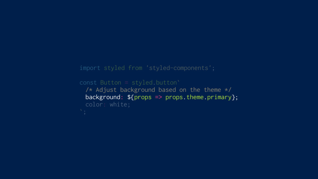
import styled from 'styled-components'; const Button = styled.button` /* Adjust
background based on the theme */ background: ${props => props.theme.primary}; color: white; `;
styled-components
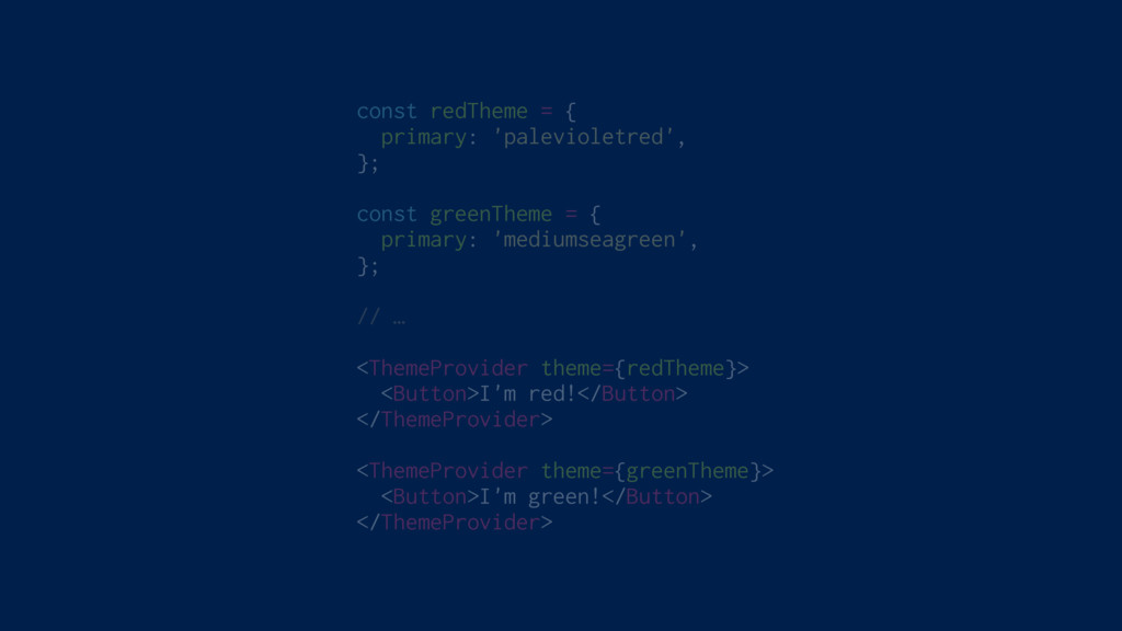
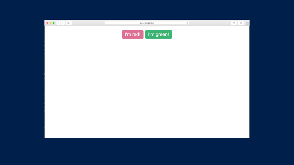
const redTheme = { primary: 'palevioletred', }; const greenTheme =
{ primary: 'mediumseagreen', }; // … <ThemeProvider theme={redTheme}> <Button>I'm red!</Button> </ThemeProvider> <ThemeProvider theme={greenTheme}> <Button>I'm green!</Button> </ThemeProvider>
styled-components
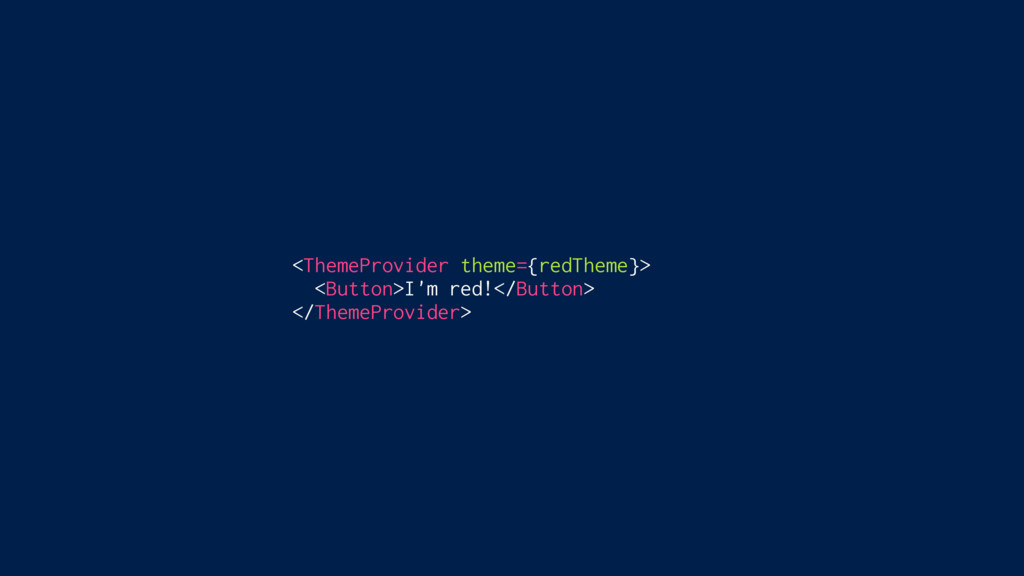
<ThemeProvider theme={redTheme}> <Button>I'm red!</Button> </ThemeProvider>
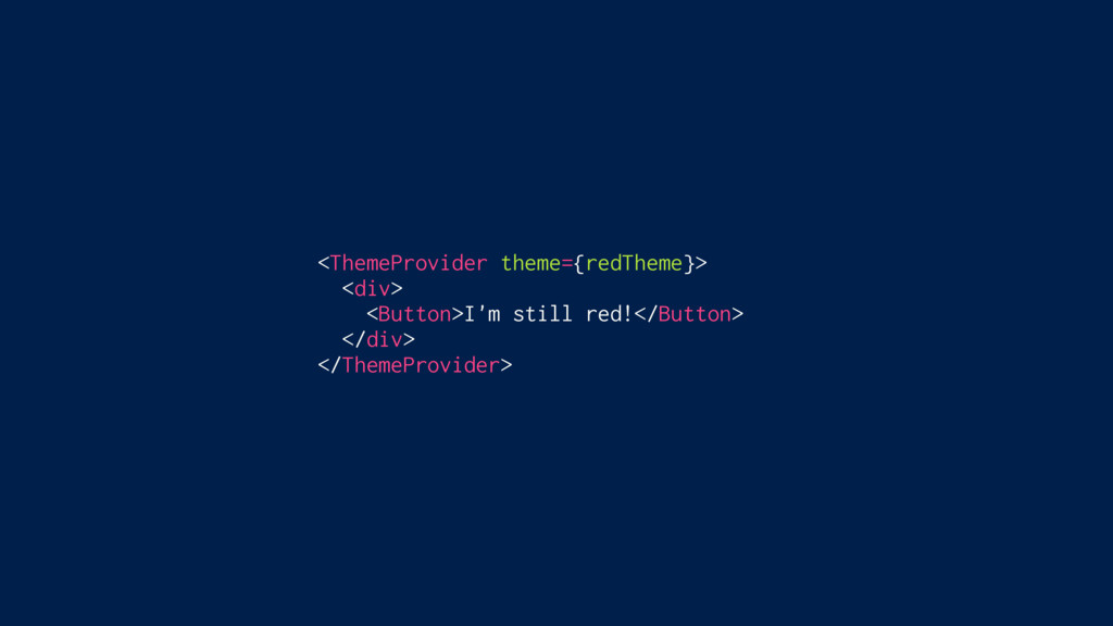
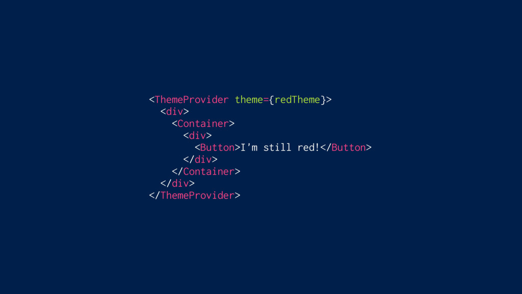
<ThemeProvider theme={redTheme}> <div> <Button>I'm still red!</Button> </div> </ThemeProvider>
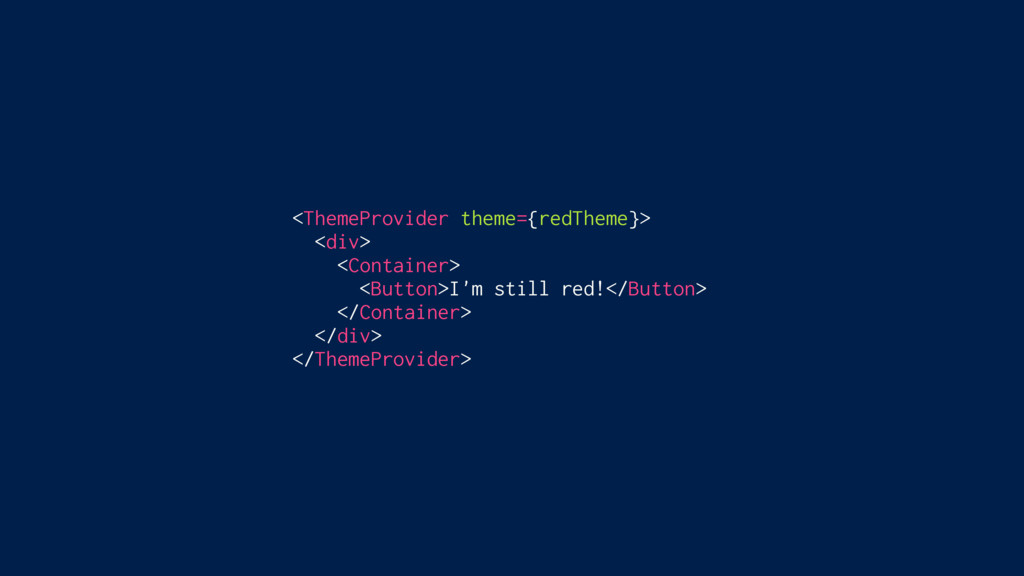
<ThemeProvider theme={redTheme}> <div> <Container> <Button>I'm still red!</Button> </Container> </div> </ThemeProvider>
<ThemeProvider theme={redTheme}> <div> <Container> <div> <Button>I'm still red!</Button> </div> </Container>
</div> </ThemeProvider>
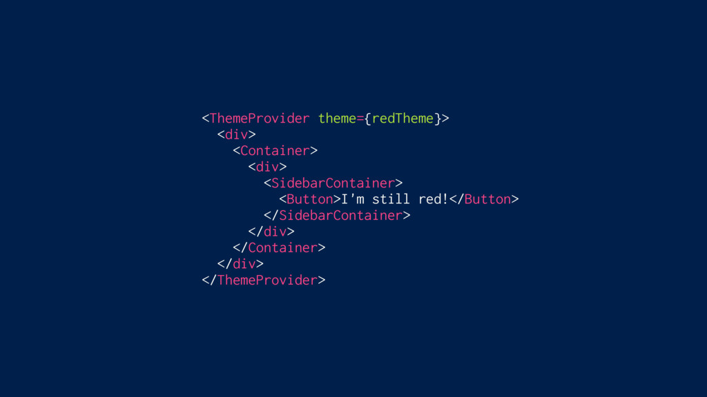
<ThemeProvider theme={redTheme}> <div> <Container> <div> <SidebarContainer> <Button>I'm still red!</Button> </SidebarContainer>
</div> </Container> </div> </ThemeProvider>
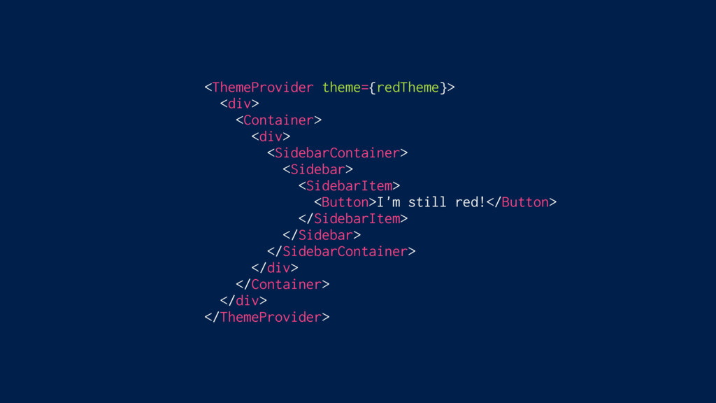
<ThemeProvider theme={redTheme}> <div> <Container> <div> <SidebarContainer> <Sidebar> <Button>I'm still red!</Button>
</Sidebar> </SidebarContainer> </div> </Container> </div> </ThemeProvider>
<ThemeProvider theme={redTheme}> <div> <Container> <div> <SidebarContainer> <Sidebar> <SidebarItem> <Button>I'm still
red!</Button> </SidebarItem> </Sidebar> </SidebarContainer> </div> </Container> </div> </ThemeProvider>
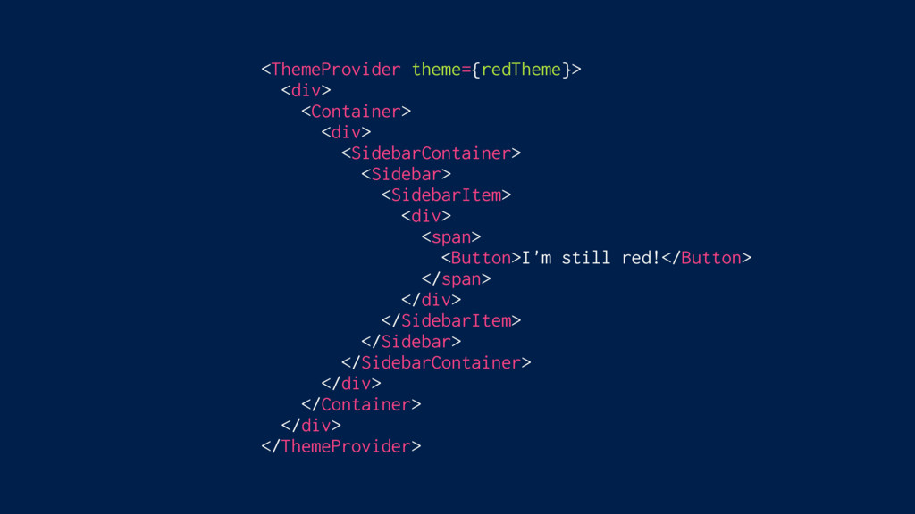
<ThemeProvider theme={redTheme}> <div> <Container> <div> <SidebarContainer> <Sidebar> <SidebarItem> <div> <Button>I'm
still red!</Button> </div> </SidebarItem> </Sidebar> </SidebarContainer> </div> </Container> </div> </ThemeProvider>
<ThemeProvider theme={redTheme}> <div> <Container> <div> <SidebarContainer> <Sidebar> <SidebarItem> <div> <span>
<Button>I'm still red!</Button> </span> </div> </SidebarItem> </Sidebar> </SidebarContainer> </div> </Container> </div> </ThemeProvider>
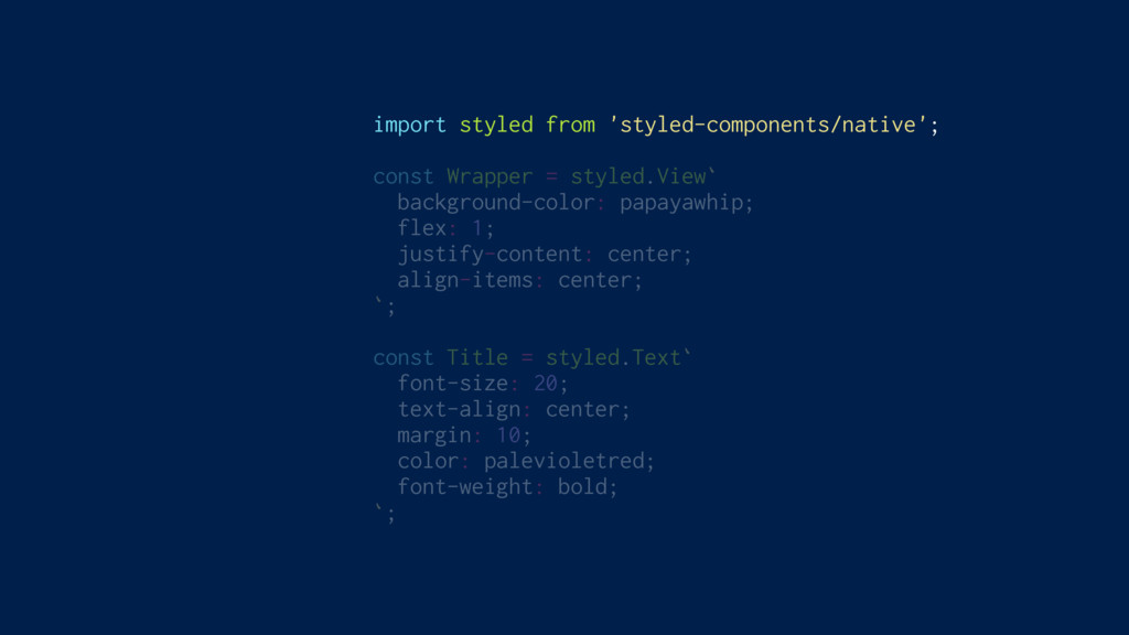
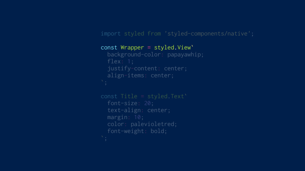
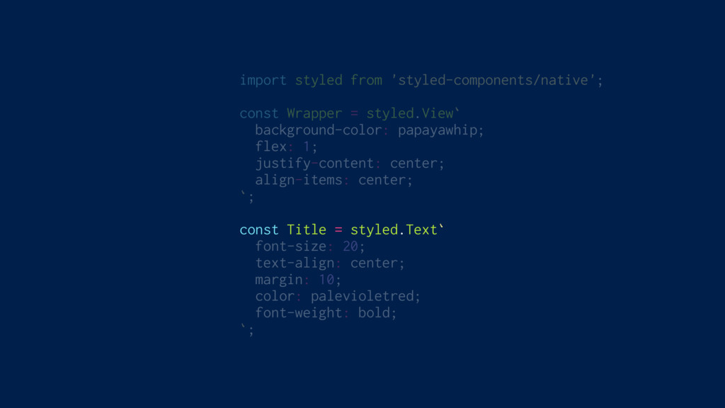
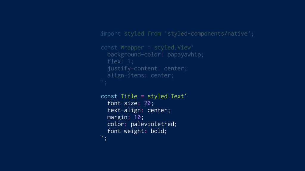
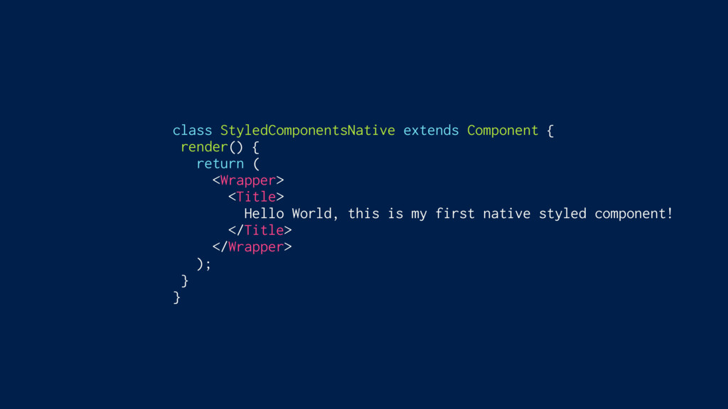
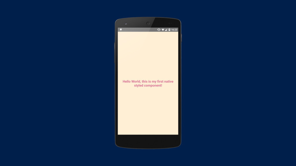
Full ReactNative Support
import styled from 'styled-components/native'; const Wrapper = styled.View` background-color: papayawhip;
flex: 1; justify-content: center; align-items: center; `; const Title = styled.Text` font-size: 20; text-align: center; margin: 10; color: palevioletred; font-weight: bold; `;
import styled from 'styled-components/native'; const Wrapper = styled.View` background-color: papayawhip;
flex: 1; justify-content: center; align-items: center; `; const Title = styled.Text` font-size: 20; text-align: center; margin: 10; color: palevioletred; font-weight: bold; `;
import styled from 'styled-components/native'; const Wrapper = styled.View` background-color: papayawhip;
flex: 1; justify-content: center; align-items: center; `; const Title = styled.Text` font-size: 20; text-align: center; margin: 10; color: palevioletred; font-weight: bold; `;
import styled from 'styled-components/native'; const Wrapper = styled.View` background-color: papayawhip;
flex: 1; justify-content: center; align-items: center; `; const Title = styled.Text` font-size: 20; text-align: center; margin: 10; color: palevioletred; font-weight: bold; `;
import styled from 'styled-components/native'; const Wrapper = styled.View` background-color: papayawhip;
flex: 1; justify-content: center; align-items: center; `; const Title = styled.Text` font-size: 20; text-align: center; margin: 10; color: palevioletred; font-weight: bold; `;
class StyledComponentsNative extends Component { render() { return ( <Wrapper>
<Title> Hello World, this is my first native styled component! </Title> </Wrapper> ); } }
None
No build requirements Small and lightweight Supports global CSS Supports
entirety of CSS Colocated Isolated Easy to override Theming Server side rendering No wrapper components ✅ ✅ ✅ ✅ ✅ ✅ ✅ ✅ ✅ ❌
Get styling! git checkout 4-styling
 mxstbr
 watany
 prgckwb
 flatt_security
 takkuhiro
 yukiogawa
 kamoshika
 sugitak
 pict3
pict3
 hr01
hr01
 kaym
kaym
 nrinetcom
 kekke_n
 mkilby
 jacobtomlinson
 mongodb
 keithpitt
 techseoconnect
 charlesmeaden
 thoeni
 notwaldorf
 eileencodes
 chriscoyier
 jct
jct