Upgrade to Pro
— share decks privately, control downloads, hide ads and more …
Speaker Deck
Features
Speaker Deck
PRO
Sign in
Sign up for free
Search
Search
Improving Performance with Responsive Images [j...
Search
newtron
March 15, 2014
Programming
710
4
Share
Embed
Copy iframe code
Copy JS code
Copy link
Start on current slide
Improving Performance with Responsive Images [jQueryTO]
jQueryTO
March 15, 2014
https://github.com/nwtn/pres-respimg-perf-jqueryto
newtron
March 15, 2014
More Decks by newtron
See All by newtron
Universal web design [Accessibility Camp Toronto]
newtron
0
250
Universal web design [HackerYou a11y club]
newtron
0
240
Universal web design [Full Stack Toronto]
newtron
0
280
Information architecture as knowledge translation [World IA Day]
newtron
0
320
Improving performance with responsive (and responsible!) images [CSSDay.io]
newtron
1
410
Universal Web Design: How to create an awesome experience for every user [Open Source Bridge]
newtron
0
300
Improving performance with responsive (and responsible!) images [CSSConf]
newtron
6
740
Universal Web Design: How to create an awesome experience for every user [OpenWest]
newtron
0
300
Improving performance with responsive (and responsible!) images [OpenWest]
newtron
2
390
Other Decks in Programming
See All in Programming
Javaの型とAI時代に型が大事な理由 / java types and type in AI era
kishida
2
170
キャリア迷子上等 ─ "ない道"は自分で作ればいい
16bitidol
3
2.7k
Developing with AI Agents — Codex, Claude Code & Cowork Practical Guide
x5gtrn
PRO
0
1.3k
LLM本来の能力を解き放つサンドボックス技術とAI民主化への適用
yukukotani
3
4.8k
Agentic UI
manfredsteyer
PRO
0
220
ローカルLLMでどこまでコードが書けるか -縮小版 / How much code can be written on a local LLM Shortened
kishida
2
170
act1-costs.pdf
sumedhbala
0
160
Honoでのサプライチェーン侵害対策 〜 3つのライブラリに学ぶ
yusukebe
7
1.7k
トークンをケチるな、設計しろ:GitHub Copilotを賢く使うコンテキスト戦略
ochtum
0
280
Semantic Version 単位で戦略を柔軟に変えて、パッケージアップデートを自動化する
daitasu
1
340
AI駆動開発を妨げる技術的負債の解消アプローチ / ai-refactoring-approach
minodriven
17
8.6k
Observability in Practice:Grafana 與 Edge Device SRE 的那些事
blueswen
0
190
Featured
See All Featured
Design of three-dimensional binary manipulators for pick-and-place task avoiding obstacles (IECON2024)
konakalab
0
480
Navigating the Design Leadership Dip - Product Design Week Design Leaders+ Conference 2024
apolaine
1
370
Darren the Foodie - Storyboard
khoart
PRO
3
3.4k
Agile Leadership in an Agile Organization
kimpetersen
PRO
0
180
Avoiding the “Bad Training, Faster” Trap in the Age of AI
tmiket
0
190
Chrome DevTools: State of the Union 2024 - Debugging React & Beyond
addyosmani
10
1.2k
From π to Pie charts
rasagy
0
230
CoffeeScript is Beautiful & I Never Want to Write Plain JavaScript Again
sstephenson
162
16k
Highjacked: Video Game Concept Design
rkendrick25
PRO
1
400
ピンチをチャンスに:未来をつくるプロダクトロードマップ #pmconf2020
aki_iinuma
128
56k
Testing 201, or: Great Expectations
jmmastey
46
8.2k
Put a Button on it: Removing Barriers to Going Fast.
kastner
60
4.3k
Transcript
None
Improving Performance with Responsive Images jQueryTO March 15, 2014
https://github.com/nwtn/ pres-respimg-perf-jqueryto
“Good performance is good design” Brad Frost
None
None
bradfrostweb.com
“More human beings today have access to a cellphone than
the United Nations says have access to a clean toilet.” Anand Giridharadas, New York Times, April 10 2010
“More human beings today have access to a cellphone than
the United Nations says have access to a clean toilet.” Anand Giridharadas, New York Times, April 10 2010
bradfrostweb.com
bradfrostweb.com
1.A flexible, grid-based layout, 2.Flexible images and media, 3.Media queries,
a module from the CSS3 specification
1.A flexible, grid-based layout, 2.Flexible images and media 3.Media queries,
a module from the CSS3 specification
img { max-width: 100%; }
None
None
A solution Serve one big image and let the browser
scale it
None
None
None
Average web page size: 1,703 KB. Images account
for 1,063 KB, over 62% of total. HTTP Archive, March 1 2014
2x resolution = 4x as many pixels
energy more pixels = more money time
“Good performance is good design” Brad Frost
A better solution Serve an appropriately-sized image to each user
Responsive Images
None
None
None
None
SVG, WebP, JPEG XR
<picture> + srcset: http://picture.responsiveimages.org/ Mozilla: Q1 Blink (Chrome/Opera): Soon Webkit
(Apple, etc.): Also soon? MS: ?
<picture> + srcset: http://picture.responsiveimages.org/ Mozilla Q1 Blink (Chrome/Opera) Soon Webkit
(Apple, etc.) Also soon? MS ?
Client Hints: http://tools.ietf.org/html/draft-grigorik-http-client-hints-01
None
<picture> <!-- art directed sources --> <source media="(min-width: 45em)" src="large.jpg"
/> <source media="(min-width: 18em)" src="med.jpg" /> ! <!-- fallback --> <img src="small.jpg" alt="A rad wolf" /> </picture>
<picture> <!-- art directed sources --> <source media="(min-width: 45em)" src="large.jpg"
/> <source media="(min-width: 18em)" src="med.jpg" /> ! <!-- fallback --> <img src="small.jpg" alt="A rad wolf" /> </picture>
<picture> <!-- art directed sources --> <source media="(min-width: 45em)" src="large.jpg"
/> <source media="(min-width: 18em)" src="med.jpg" /> ! <!-- fallback --> <img src="small.jpg" alt="A rad wolf" /> </picture>
<picture> <!-- art directed sources --> <source media="(min-width: 45em)" src="large.jpg"
/> <source media="(min-width: 18em)" src="med.jpg" /> ! <!-- fallback --> <img src="small.jpg" alt="A rad wolf" /> </picture>
<picture> <!-- art directed sources --> <source media="(min-width: 45em)" src="large.jpg"
/> <source media="(min-width: 18em)" src="med.jpg" /> ! <!-- fallback --> <img src="small.jpg" alt="A rad wolf" /> </picture>
<picture> <!-- art directed sources --> <source media="(min-width: 45em)" src="large.jpg"
/> <source media="(min-width: 18em)" src="med.jpg" /> ! <!-- fallback --> <img src="small.jpg" alt="A rad wolf" /> </picture>
<picture> <!-- art directed sources --> <source media="(min-width: 45em)" src="large.jpg"
/> <source media="(min-width: 18em)" src="med.jpg" /> ! <!-- fallback --> <img src="small.jpg" alt="A rad wolf" /> </picture>
<picture> <!-- art directed sources --> <source media="(min-width: 45em)" src="large.jpg"
/> <source media="(min-width: 18em)" src="med.jpg" /> ! <!-- fallback --> <img src="small.jpg" alt="A rad wolf" /> </picture>
None
<picture> <!-- sources @ different resolutions --> <source srcset="pic1x.jpg 1x,
pic2x.jpg 2x, pic4x.jpg 4x" /> ! <!-- fallback --> <img src="pic1x.jpg" alt="A rad wolf" /> </picture>
<picture> <!-- sources @ different resolutions --> <source srcset="pic1x.jpg 1x,
pic2x.jpg 2x, pic4x.jpg 4x" /> ! <!-- fallback --> <img src="pic1x.jpg" alt="A rad wolf" /> </picture>
<picture> <!-- sources @ different resolutions --> <source srcset="pic1x.jpg 1x,
pic2x.jpg 2x, pic4x.jpg 4x" /> ! <!-- fallback --> <img src="pic1x.jpg" alt="A rad wolf" /> </picture>
<picture> <!-- sources @ different resolutions --> <source srcset="pic1x.jpg 1x,
pic2x.jpg 2x, pic4x.jpg 4x" /> ! <!-- fallback --> <img src="pic1x.jpg" alt="A rad wolf" /> </picture>
<picture> <!-- sources @ different resolutions --> <source srcset="pic1x.jpg 1x,
pic2x.jpg 2x, pic4x.jpg 4x" /> ! <!-- fallback --> <img src="pic1x.jpg" alt="A rad wolf" /> </picture>
<picture> <!-- sources @ different resolutions --> <source srcset="pic1x.jpg 1x,
pic2x.jpg 2x, pic4x.jpg 4x" /> ! <!-- fallback --> <img src="pic1x.jpg" alt="A rad wolf" /> </picture>
None
<img srcset="pic1x.jpg 1x, pic2x.jpg 2x, pic4x.jpg 4x" src="pic1x.jpg" alt="A rad
wolf" />
<img srcset="pic1x.jpg 1x, pic2x.jpg 2x, pic4x.jpg 4x" src="pic1x.jpg" alt="A rad
wolf" />
<img srcset="pic1x.jpg 1x, pic2x.jpg 2x, pic4x.jpg 4x" src="pic1x.jpg" alt="A rad
wolf" />
<img srcset="pic1x.jpg 1x, pic2x.jpg 2x, pic4x.jpg 4x" src="pic1x.jpg" alt="A rad
wolf" />
<img srcset="pic1x.jpg 1x, pic1.5x.jpg 1.5x, pic2x.jpg 2x, pic4x.jpg 4x" src="pic1x.jpg"
alt="A rad wolf" />
None
<picture> <source media="(min-width: 45em)" srcset="large1.jpg 1x, large2.jpg 2x" /> <source
media="(min-width: 18em)" srcset="med1.jpg 1x, med2.jpg 2x" /> <source srcset="small1.jpg 1x, small2.jpg 2x" /> <img src="small1.jpg" alt="A rad wolf" /> </picture>
<picture> <source media="(min-width: 45em)" srcset="large1.jpg 1x, large2.jpg 2x" /> <source
media="(min-width: 18em)" srcset="med1.jpg 1x, med2.jpg 2x" /> <source srcset="small1.jpg 1x, small2.jpg 2x" /> <img src="small1.jpg" alt="A rad wolf" /> </picture>
<picture> <source media="(min-width: 45em)" srcset="large1.jpg 1x, large2.jpg 2x" /> <source
media="(min-width: 18em)" srcset="med1.jpg 1x, med2.jpg 2x" /> <source srcset="small1.jpg 1x, small2.jpg 2x" /> <img src="small1.jpg" alt="A rad wolf" /> </picture>
<picture> <source media="(min-width: 45em)" srcset="large1.jpg 1x, large2.jpg 2x" /> <source
media="(min-width: 18em)" srcset="med1.jpg 1x, med2.jpg 2x" /> <source srcset="small1.jpg 1x, small2.jpg 2x" /> <img src="small1.jpg" alt="A rad wolf" /> </picture>
<picture> <source media="(min-width: 45em)" srcset="large1.jpg 1x, large2.jpg 2x" /> <source
media="(min-width: 18em)" srcset="med1.jpg 1x, med2.jpg 2x" /> <source srcset="small1.jpg 1x, small2.jpg 2x" /> <img src="small1.jpg" alt="A rad wolf" /> </picture>
<picture> <source media="(min-width: 45em)" srcset="large1.jpg 1x, large2.jpg 2x" /> <source
media="(min-width: 18em)" srcset="med1.jpg 1x, med2.jpg 2x" /> <source srcset="small1.jpg 1x, small2.jpg 2x" /> <img src="small1.jpg" alt="A rad wolf" /> </picture>
None
<picture> <source sizes="100%" srcset="pic400.jpg 400w, pic800.jpg 800w, pic1600.jpg 1600w" />
! <img src="pic400.jpg" alt="A rad wolf" /> </picture>
<picture> <source sizes="100%" srcset="pic400.jpg 400w, pic800.jpg 800w, pic1600.jpg 1600w" />
! <img src="pic400.jpg" alt="A rad wolf" /> </picture>
<picture> <source sizes="100%" srcset="pic400.jpg 400w, pic800.jpg 800w, pic1600.jpg 1600w" />
! <img src="pic400.jpg" alt="A rad wolf" /> </picture>
<picture> <source sizes="100%" srcset="pic400.jpg 400w, pic800.jpg 800w, pic1600.jpg 1600w" />
! <img src="pic400.jpg" alt="A rad wolf" /> </picture>
<picture> <source sizes="100%" srcset="pic400.jpg 400w, pic800.jpg 800w, pic1600.jpg 1600w" />
! <img src="pic400.jpg" alt="A rad wolf" /> </picture>
<picture> <source sizes="100%" srcset="pic400.jpg 400w, pic800.jpg 800w, pic1600.jpg 1600w" />
! <img src="pic400.jpg" alt="A rad wolf" /> </picture>
None
<picture> <source sizes="(min-width: 45em) 33%, (min-width: 18em) 50%, 100%" srcset="pic400.jpg
400w, pic800.jpg 800w, pic1600.jpg 1600w" /> ! <img src="pic400.jpg" alt="A rad wolf" /> </picture>
<picture> <source sizes="(min-width: 45em) 33%, (min-width: 18em) 50%, 100%" srcset="pic400.jpg
400w, pic800.jpg 800w, pic1600.jpg 1600w" /> ! <img src="pic400.jpg" alt="A rad wolf" /> </picture>
None
<picture> <source type="image/webp" src="wolf.webp" /> <img src="wolf.jpg" alt="A rad wolf"
/> </picture>
<picture> <source type="image/webp" src="wolf.webp" /> <img src="wolf.jpg" alt="A rad wolf"
/> </picture>
<picture> <source type="image/webp" src="wolf.webp" /> <img src="wolf.jpg" alt="A rad wolf"
/> </picture>
<picture> <source type="image/webp" src="wolf.webp" /> <img src="wolf.jpg" alt="A rad wolf"
/> </picture>
http://picture.responsiveimages.org/
Picturefill by Scott Jehl https://github.com/scottjehl/picturefill
<span data-picture> <span data-source data-srcset="" data-src="" data-type="" data-media=""></span> <noscript> <img
/> </noscript> </span>
<span data-picture> <span data-source data-srcset="" data-src="" data-type="" data-media=""></span> <noscript> <img
/> </noscript> </span>
<span data-picture> <span data-source data-srcset="" data-src="" data-type="" data-media=""></span> <noscript> <img
/> </noscript> </span>
<span data-picture> <span data-source data-srcset="" data-src="" data-type="" data-media=""></span> <noscript> <img
/> </noscript> </span>
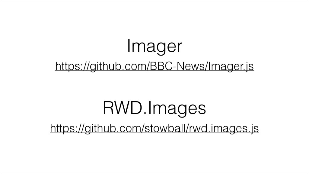
Imager https://github.com/BBC-News/Imager.js RWD.Images https://github.com/stowball/rwd.images.js
Responsible Images:! Responsive Images Resource Priorities Image Optimization Use Fewer
Images Use SVG
Responsible Images:! Responsive Images Resource Priorities Image Optimization Use Fewer
Images Use SVG
None
None
None
Resource Priorities http://www.w3.org/TR/resource-priorities/
Responsible Images:! Responsive Images Resource Priorities Image Optimization Use Fewer
Images Use SVG
Responsible Images:! Responsive Images Resource Priorities Image Optimization Use Fewer
Images Use SVG
ImageOptim-CLI http://jamiemason.github.io/ImageOptim-CLI/
grunt-svgmin https://github.com/sindresorhus/grunt-svgmin Scour https://launchpad.net/scour
Responsible Images:! Responsive Images Resource Priorities Image Optimization Use Fewer
Images Use SVG
Responsible Images:! Responsive Images Resource Priorities Image Optimization Use Fewer
Images Use SVG
Responsible Images:! Responsive Images Resource Priorities Image Optimization Fewer Images
Use SVG
Responsible Images:! Responsive Images Resource Priorities Image Optimization Fewer Images
SVG
Impact
None
None
1,870KB 564KB 3,505KB Images (content) Images (style) Other content
Optimizations • ImageOptim-CLI on all images • WebP • Responsive
images using Picturefill, for DPI- and viewport switching on content images
1,870KB 564KB 3,505KB Images (content) Images (style) Other content
1,870KB 72KB 261KB Images (content) Images (style) Other content
1,870KB 72KB 534KB Images (content) Images (style) Other content
None
“Good performance is good design” Brad Frost
“Responsible images are good design” Dave Newton
David Newton! @newtron on Twitter @nwtn on GitHub
[email protected]
 newtron
 kishida
 16bitidol
 x5gtrn
 yukukotani
 manfredsteyer
 sumedhbala
 yusukebe
 ochtum
 daitasu
 minodriven
 blueswen
 konakalab
 apolaine
 khoart
 kimpetersen
 tmiket
 addyosmani
 rasagy
 sstephenson
 rkendrick25
 aki_iinuma
 jmmastey
 kastner
![David Newton! @newtron on Twitter @nwtn on GitHub [email protected]](https://files.speakerdeck.com/presentations/70e80a308f7c0131941d3e2d8ace8b00/slide_110.jpg)