Upgrade to Pro
— share decks privately, control downloads, hide ads and more …
Speaker Deck
Features
Speaker Deck
PRO
Sign in
Sign up for free
Search
Search
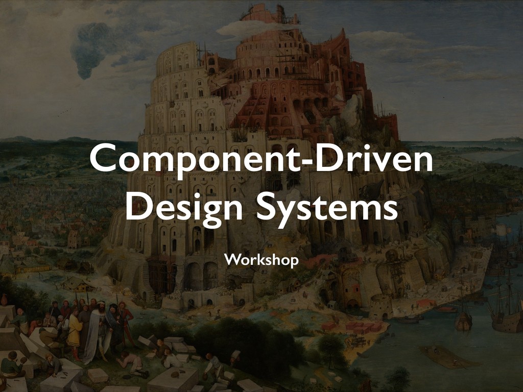
Component-Driven Design Systems Workshop
Search
Sponsored
·
Your Podcast. Everywhere. Effortlessly.
Share. Educate. Inspire. Entertain. You do you. We'll handle the rest.
→
Andrey Okonetchnikov
April 24, 2019
Education
240
0
Share
Embed
Copy iframe code
Copy JS code
Copy link
Start on current slide
Component-Driven Design Systems Workshop
https://component-driven.io
Andrey Okonetchnikov
April 24, 2019
More Decks by Andrey Okonetchnikov
See All by Andrey Okonetchnikov
A Common Design Language
okonet
2
2.1k
Make Linting Great Again (Long version)
okonet
0
110
Modular CSS v2 (CSS-in-JS edition)
okonet
3
1.1k
Make Linting Great Again
okonet
0
190
Modular CSS — Agent Conf '17 Edition
okonet
3
410
Modular CSS
okonet
3
300
JavaScript для насыщенных пользовательских интерфейсов
okonet
0
140
Профессия "Front-end архитектор"
okonet
0
180
Other Decks in Education
See All in Education
[2026前期火5] 論理学(京都大学文学部 前期 第6回)「かつとまたはの規則」
yatabe
0
400
Soluciones al examen de Geografía 2026. JULIO (Convocatoria Extraordinaria)
juanmartin2026
0
1.7k
0506
cbtlibrary
0
210
Catecismo 26 #2 - Do Credo; Introdução ao 1º artigo
cm_manaus
0
140
輻射安全管理系統2.0暨輻防e++學園平台說明會
aecrp
0
1.4k
Where Data Meets Storytelling
georgesinnott
0
120
Gitがない時代 インターネットがない時代の 開発話
sapi_kawahara
0
310
[2026前期火5] 論理学(京都大学文学部 前期 第10回)「論理学の哲学——意味とは何か(Tonkと推論主義)」
yatabe
0
160
View Manipulation and Reduction - Lecture 9 - Information Visualisation (4019538FNR)
signer
PRO
1
2.8k
[2026前期火5] 論理学(京都大学文学部 前期 第8回)「正規化定理の証明」
yatabe
0
210
Course Review - Lecture 13 - Next Generation User Interfaces (4018166FNR)
signer
PRO
0
2.3k
!コスパよくインターンに受かる方法!
ruribou
1
290
Featured
See All Featured
Pawsitive SEO: Lessons from My Dog (and Many Mistakes) on Thriving as a Consultant in the Age of AI
davidcarrasco
0
180
The Hidden Cost of Media on the Web [PixelPalooza 2025]
tammyeverts
2
340
Google's AI Overviews - The New Search
badams
0
1.1k
Heart Work Chapter 1 - Part 1
lfama
PRO
8
36k
Evolving SEO for Evolving Search Engines
ryanjones
0
230
jQuery: Nuts, Bolts and Bling
dougneiner
66
8.5k
Claude Code のすすめ
schroneko
67
230k
Designing for Performance
lara
611
70k
Unsuck your backbone
ammeep
672
58k
We Have a Design System, Now What?
morganepeng
55
8.2k
Highjacked: Video Game Concept Design
rkendrick25
PRO
1
400
Accessibility Awareness
sabderemane
1
150
Transcript
Component-Driven Design Systems Workshop
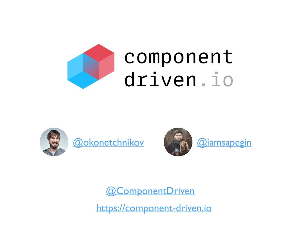
component driven.io https://component-driven.io @okonetchnikov @iamsapegin @ComponentDriven
@okonetchnikov UI developer with an experience in both design and
development who specializes in interaction design, design systems and modern frontend development.
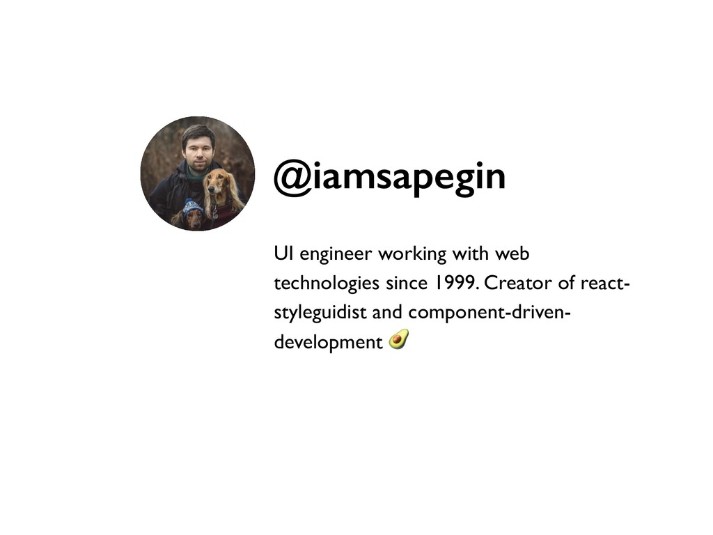
UI engineer working with web technologies since 1999. Creator of
react- styleguidist and component-driven- development @iamsapegin
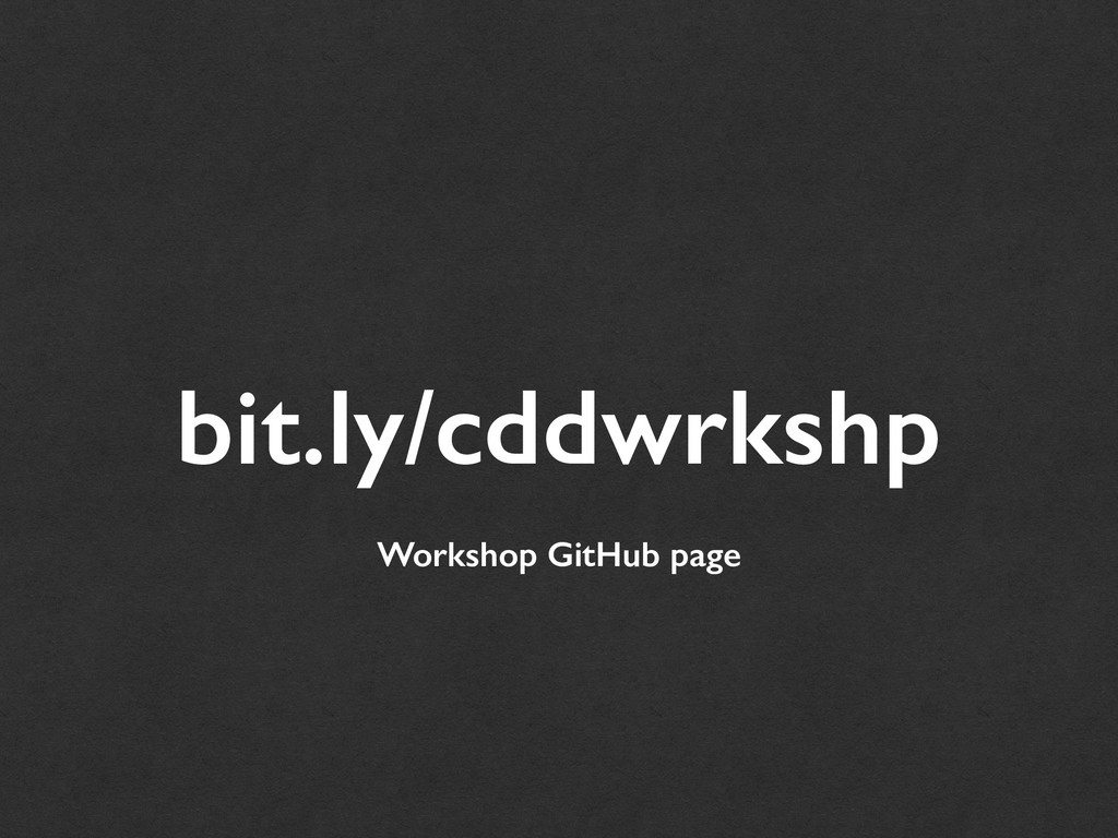
bit.ly/cddwrkshp Workshop GitHub page
What’s on your mind?
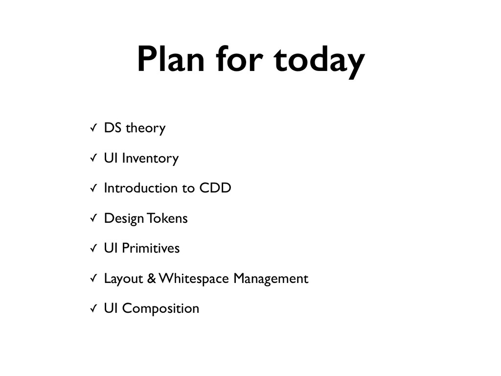
Plan for today
Plan for today ✓ DS theory ✓ UI Inventory ✓
Introduction to CDD ✓ Design Tokens ✓ UI Primitives ✓ Layout & Whitespace Management ✓ UI Composition
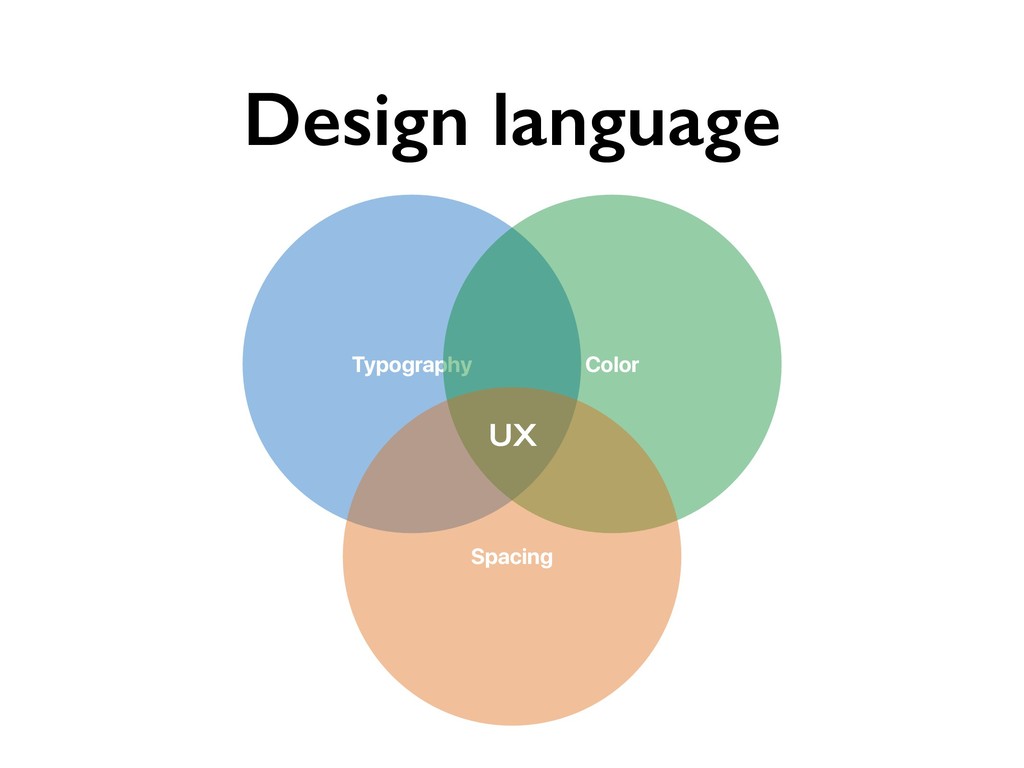
Design language Typography Color Spacing UX
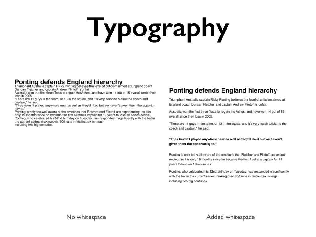
No whitespace Added whitespace Typography
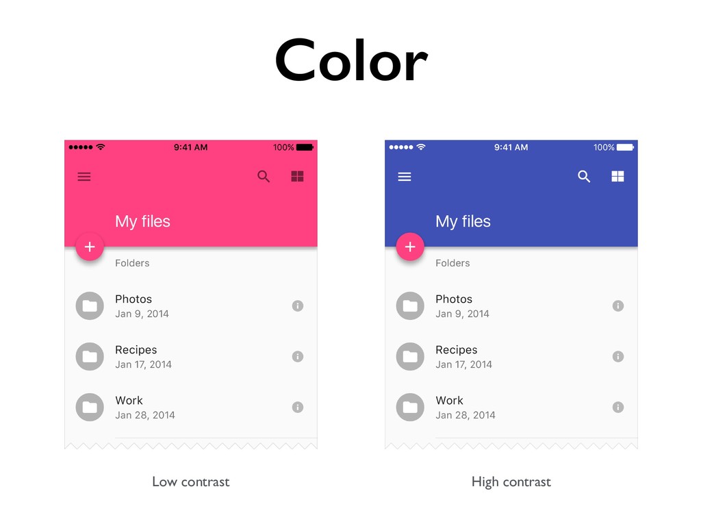
Low contrast High contrast Color
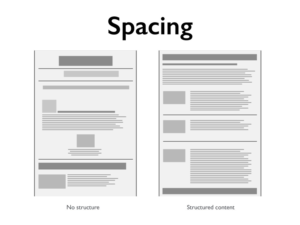
Spacing No structure Structured content
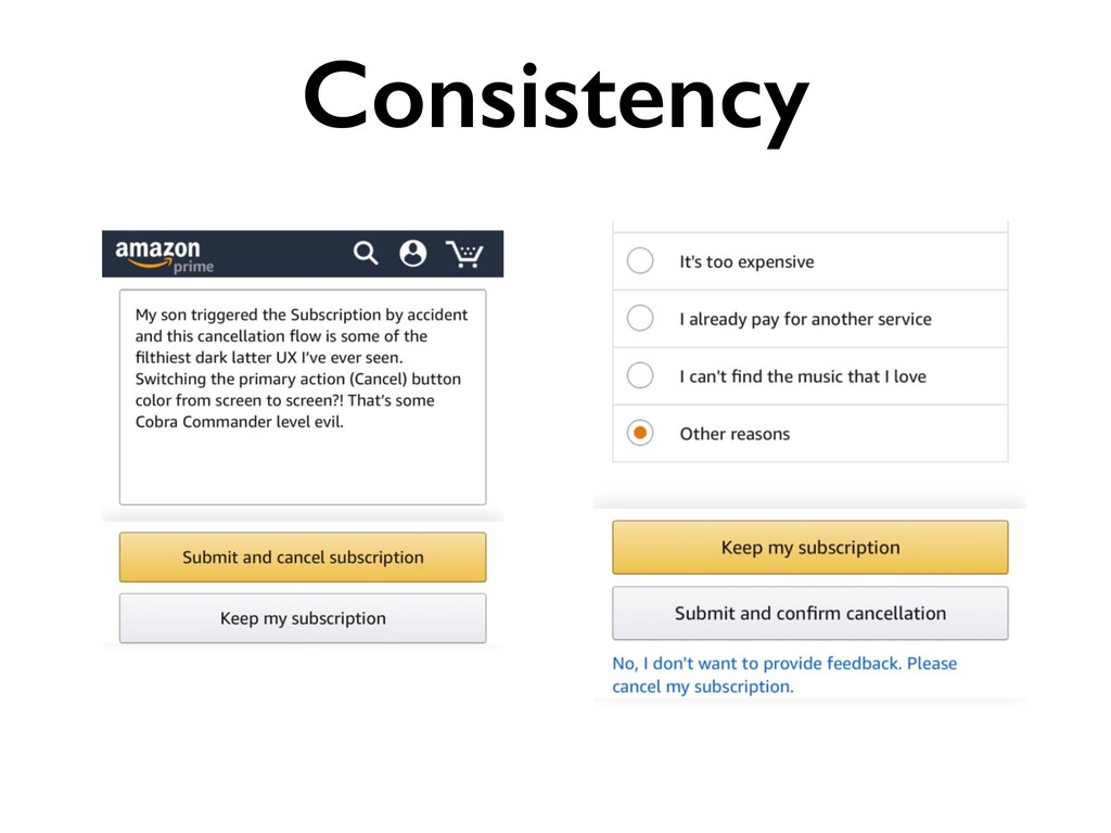
Design language • Establishes the brand • Adds consistency •
Improves accessibility
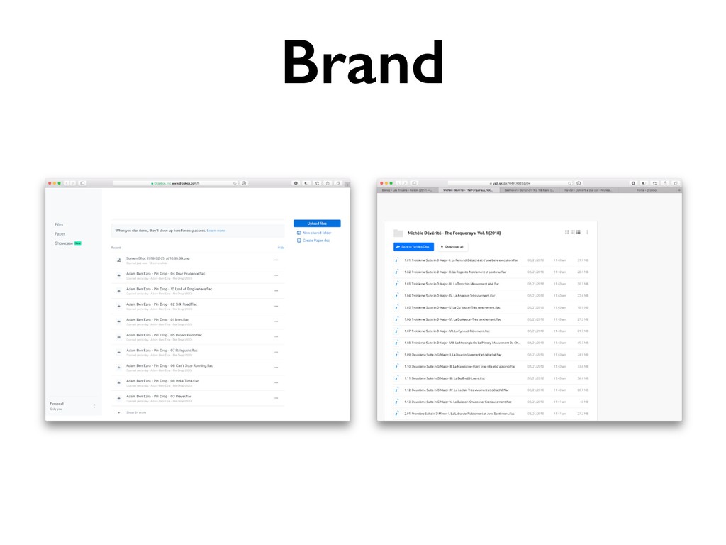
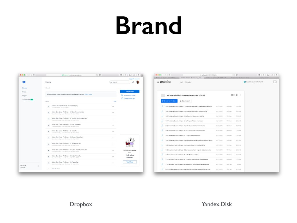
Brand
Dropbox Yandex.Disk Brand
Consistency
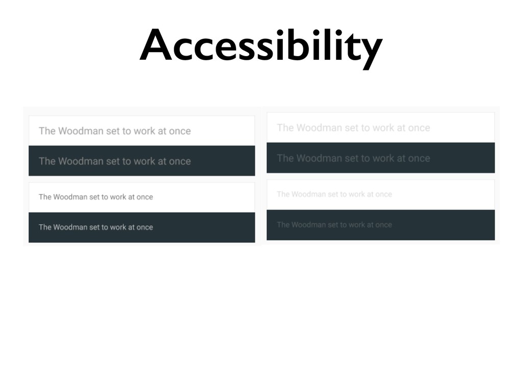
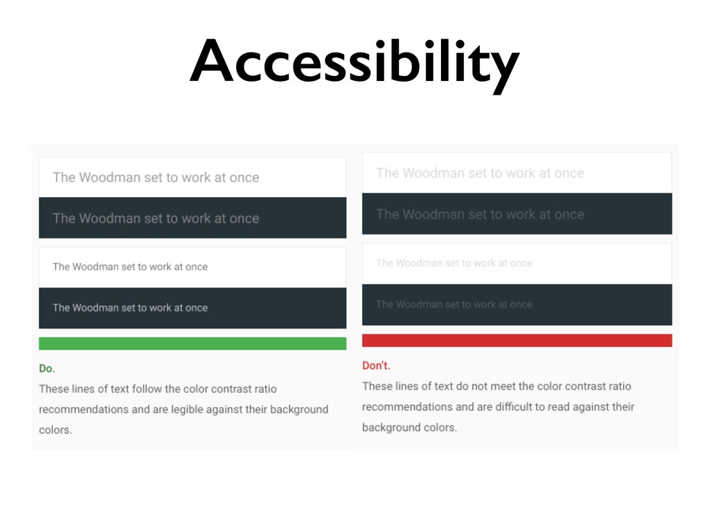
Accessibility
Accessibility
How do we enforce design language?
Design Systems
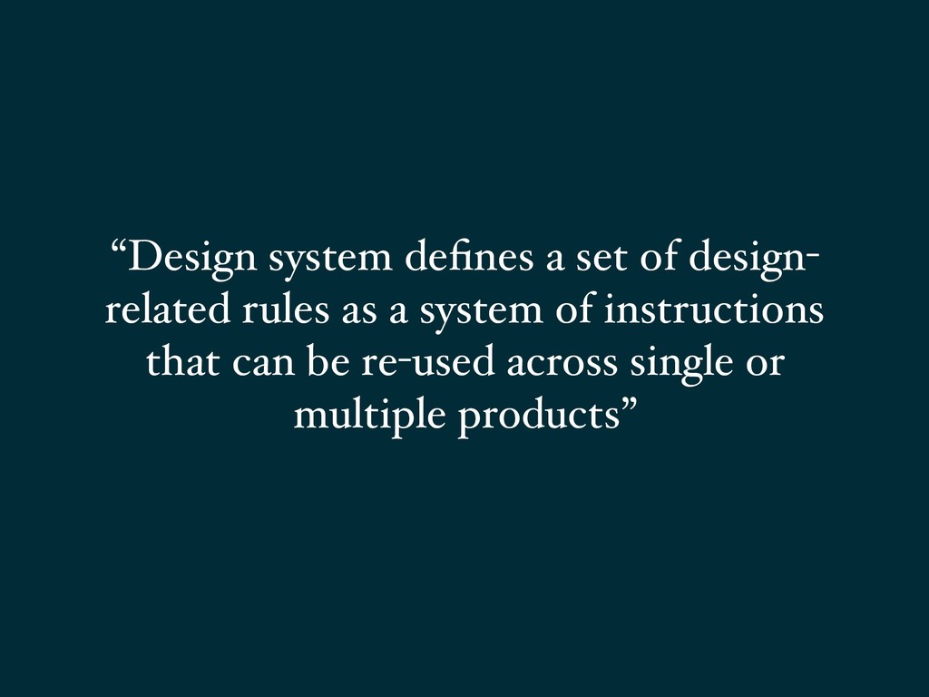
“Design system defines a set of design- related rules as
a system of instructions that can be re-used across single or multiple products”
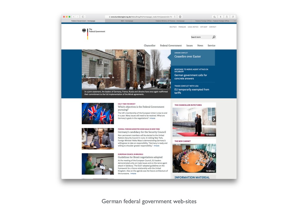
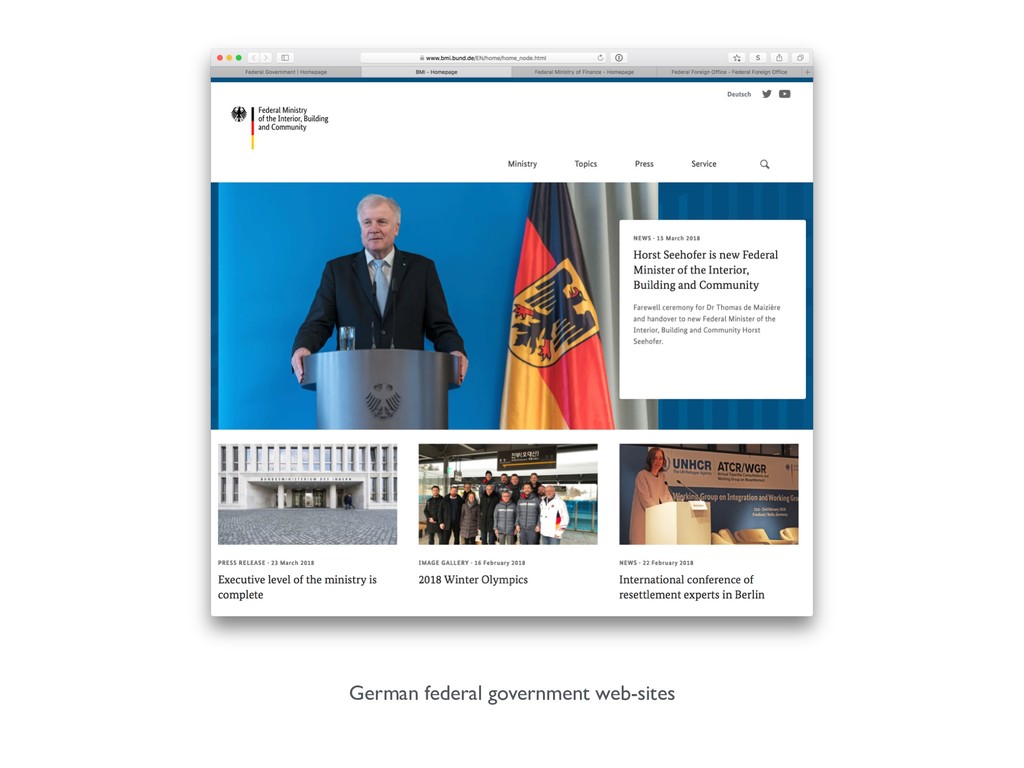
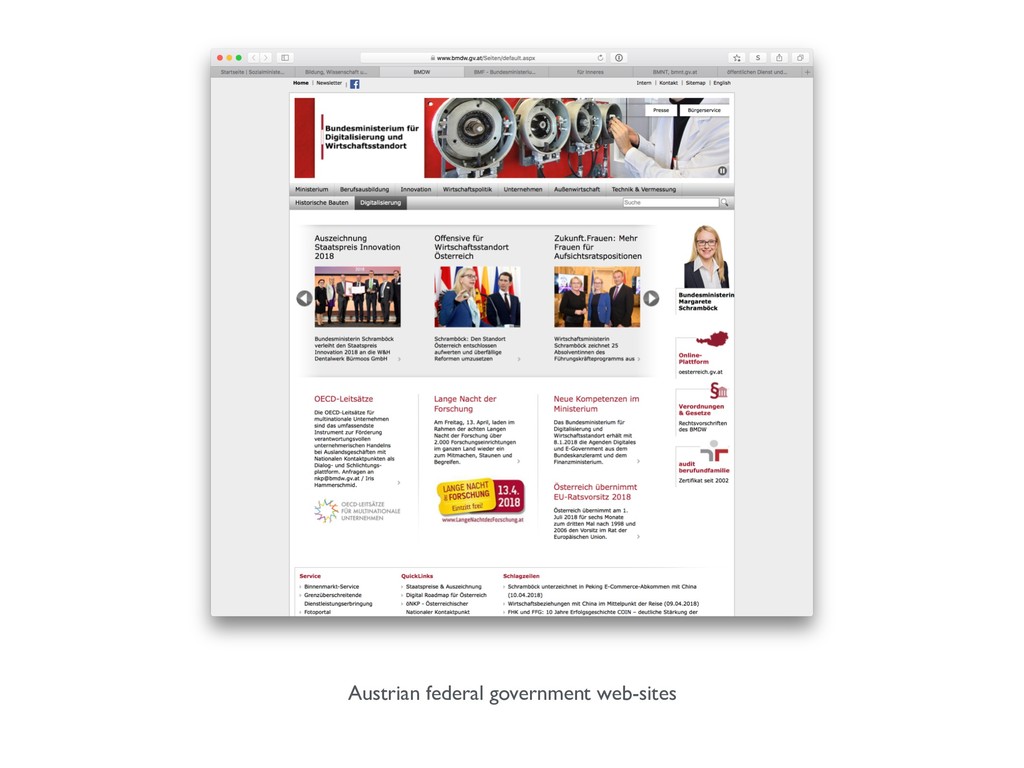
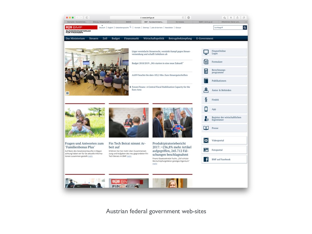
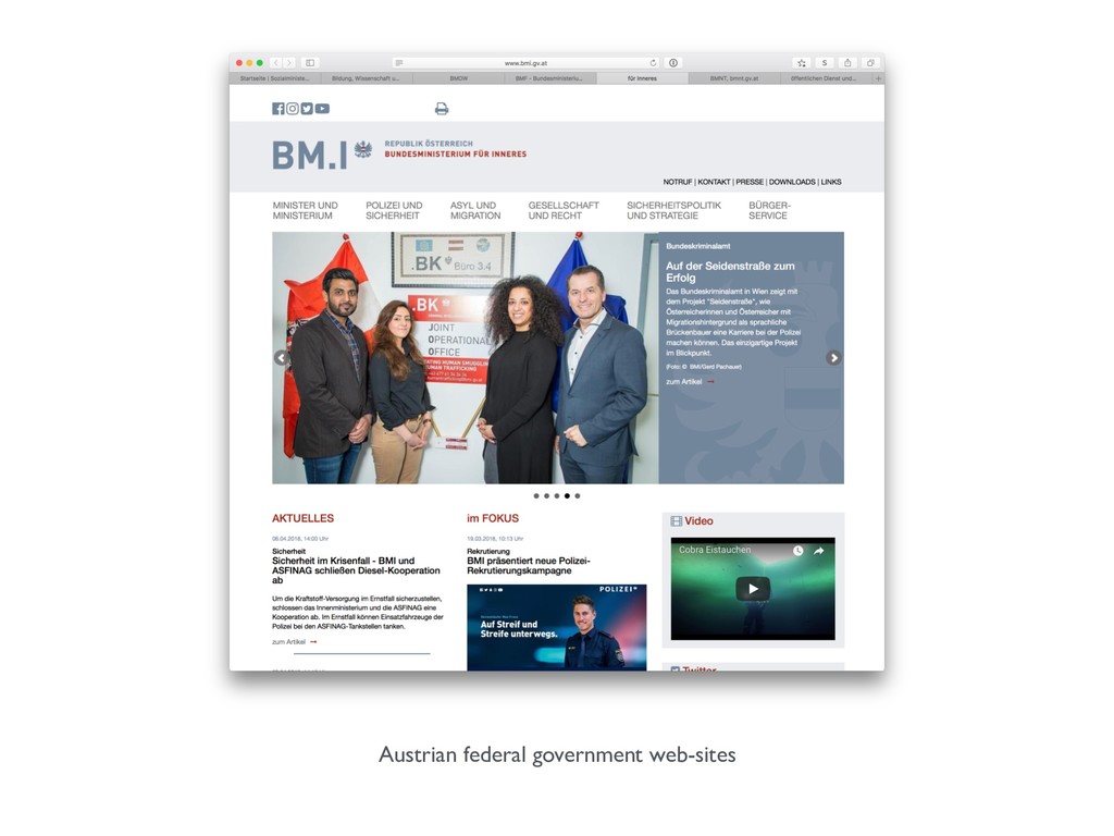
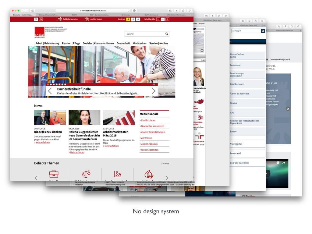
German government vs Austrian government
German federal government web-sites
German federal government web-sites
German federal government web-sites
Design system
Austrian federal government web-sites
Austrian federal government web-sites
Austrian federal government web-sites
Austrian federal government web-sites
No design system
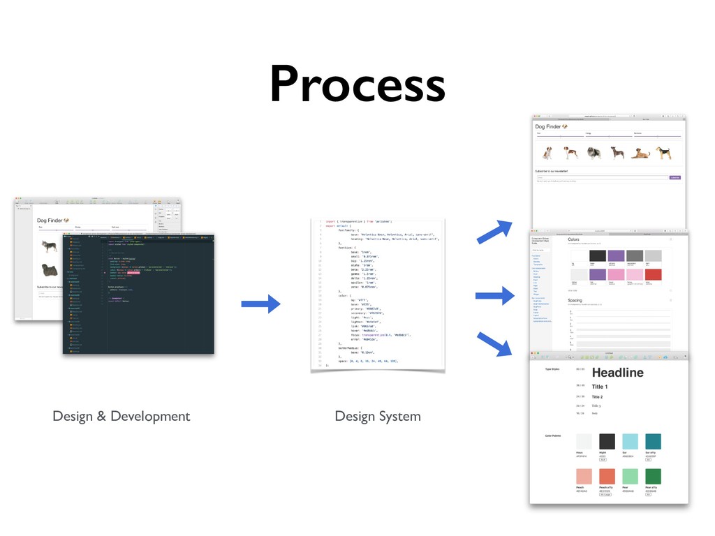
Component-driven Design Systems
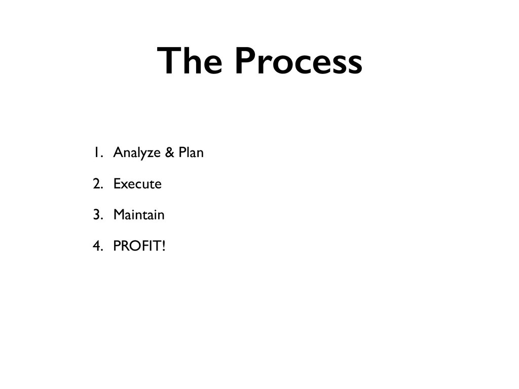
The Process 1. Analyze & Plan 2. Execute 3. Maintain
4. PROFIT!
1. Analyze & Plan
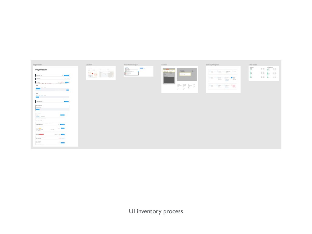
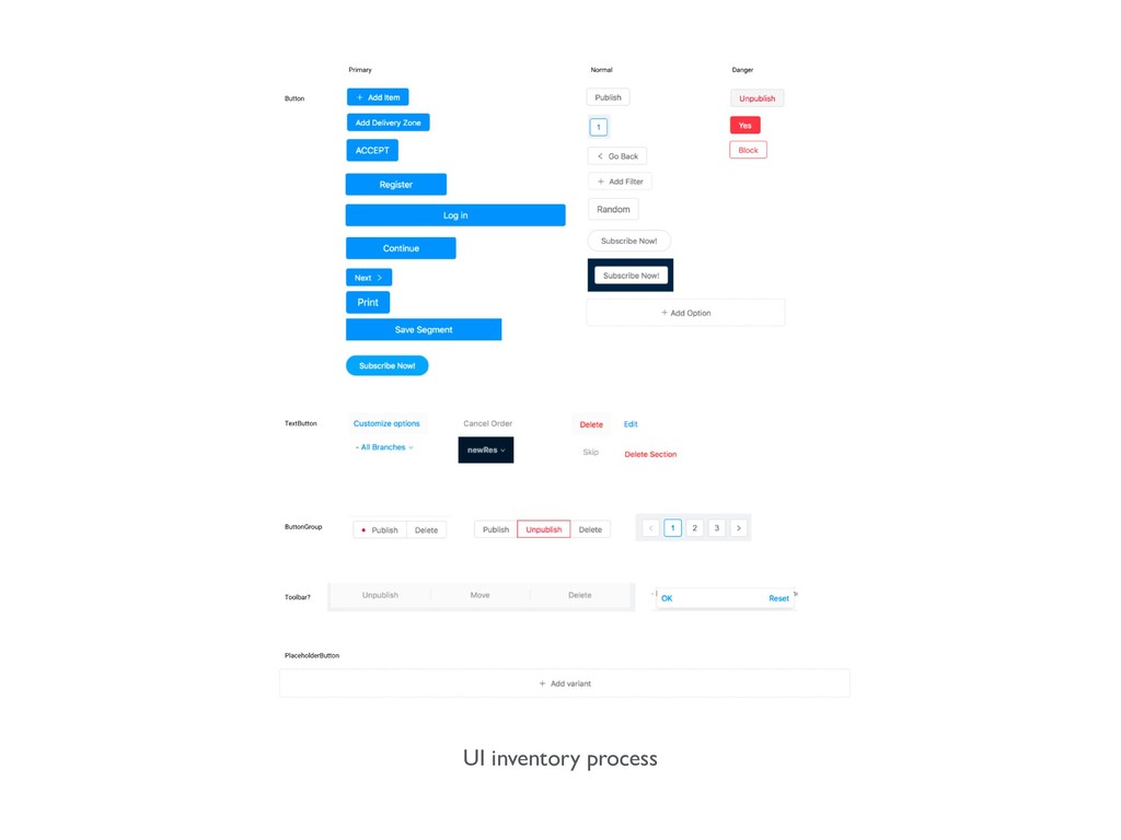
Where to start 1. Analyze & find problems (UI Inventory)
2. Document 3. Plan 4. Execute!
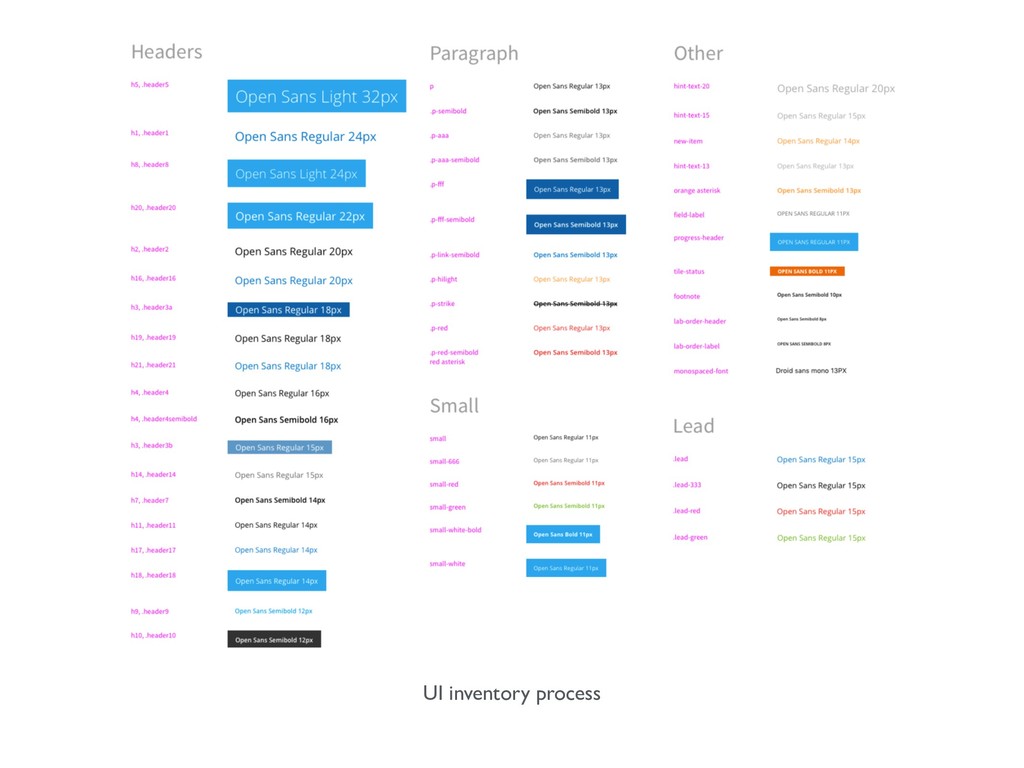
UI inventory process
UI inventory process
UI inventory process
UI inventory process
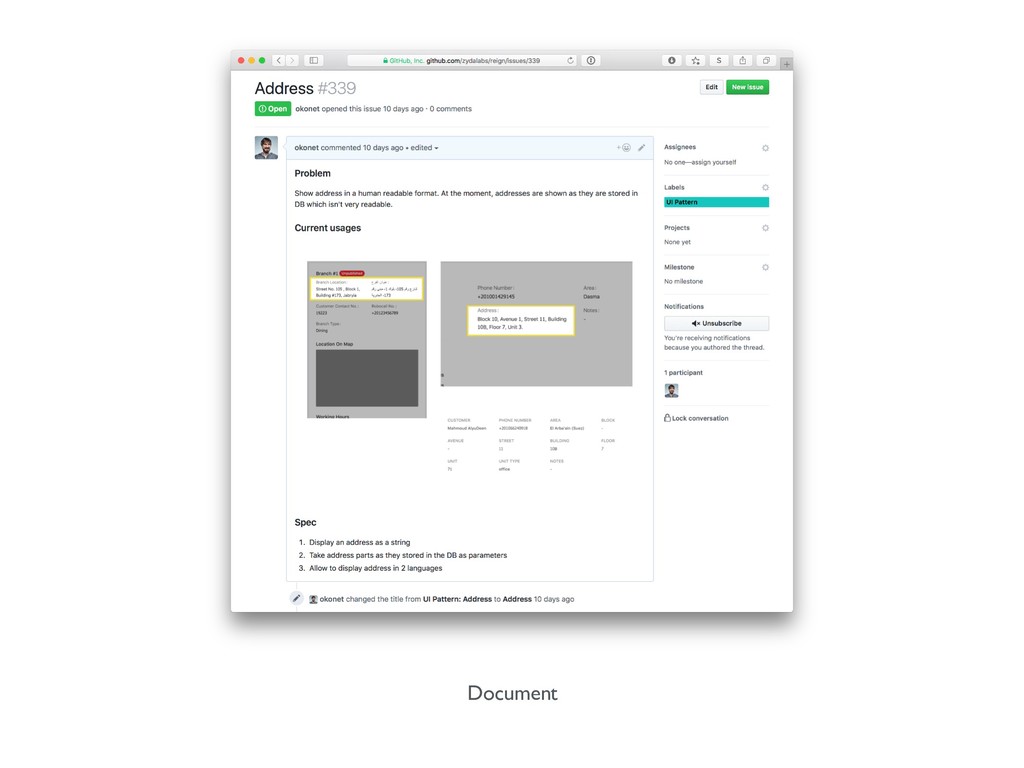
Document
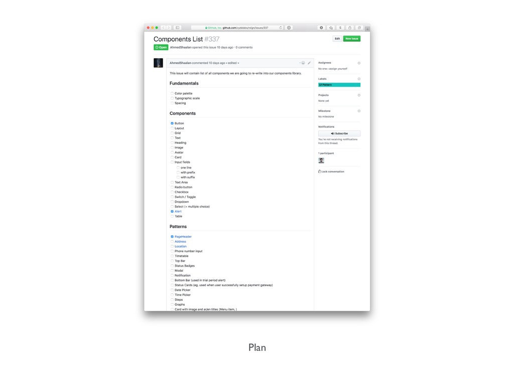
Plan
https://bit.ly/2U3hdss
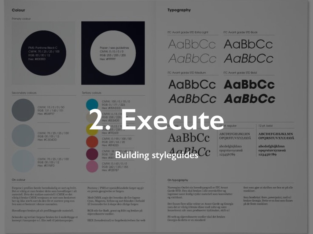
2. Execute Building styleguides
Styleguides
“Styleguide is a collection of rules, patterns and components that
are re- usable across single or multiple products.”
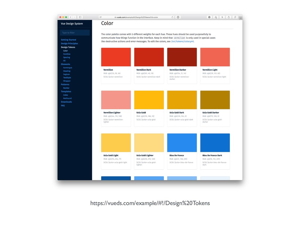
https://vueds.com/example/#!/Design%20Tokens
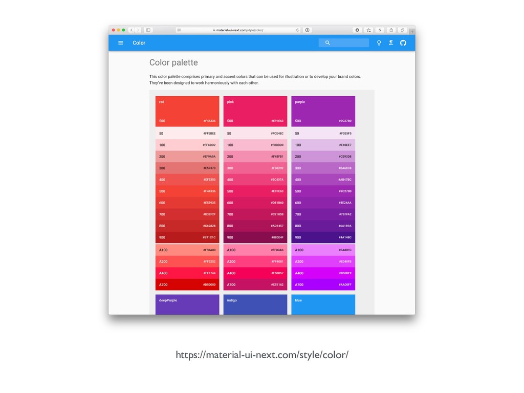
https://material-ui-next.com/style/color/
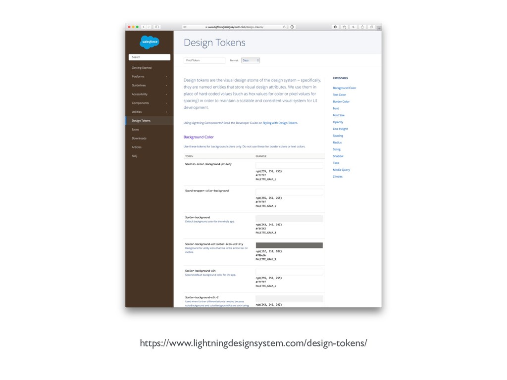
https://www.lightningdesignsystem.com/design-tokens/
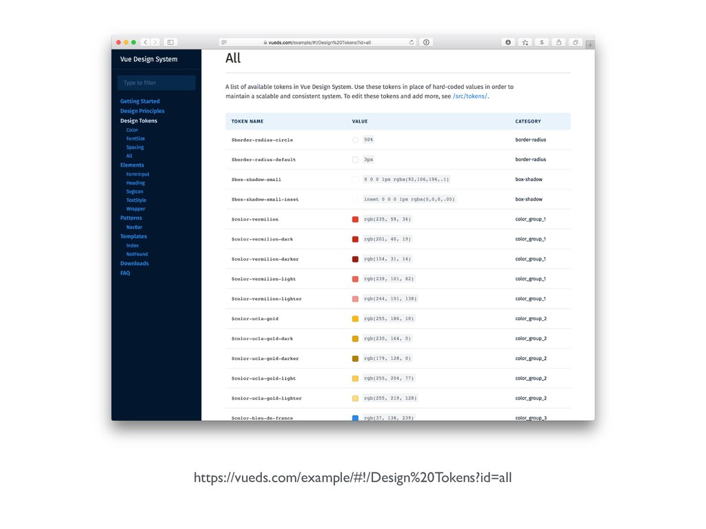
https://vueds.com/example/#!/Design%20Tokens?id=all
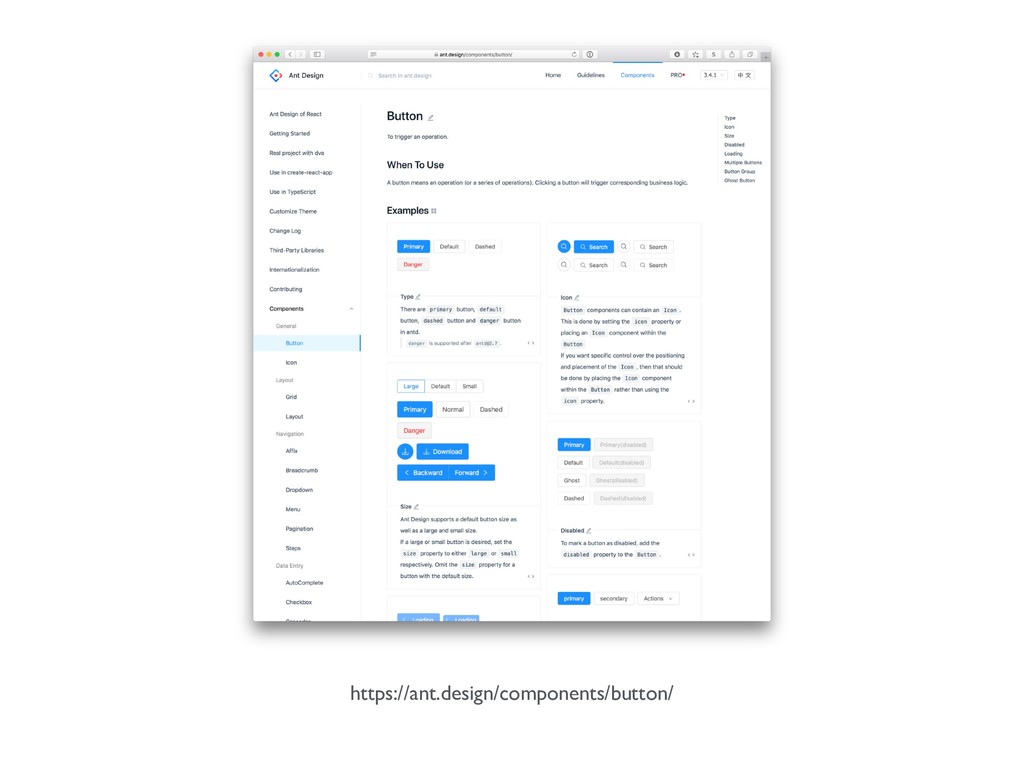
https://ant.design/components/button/
https://react-bootstrap.github.io/components/buttons/
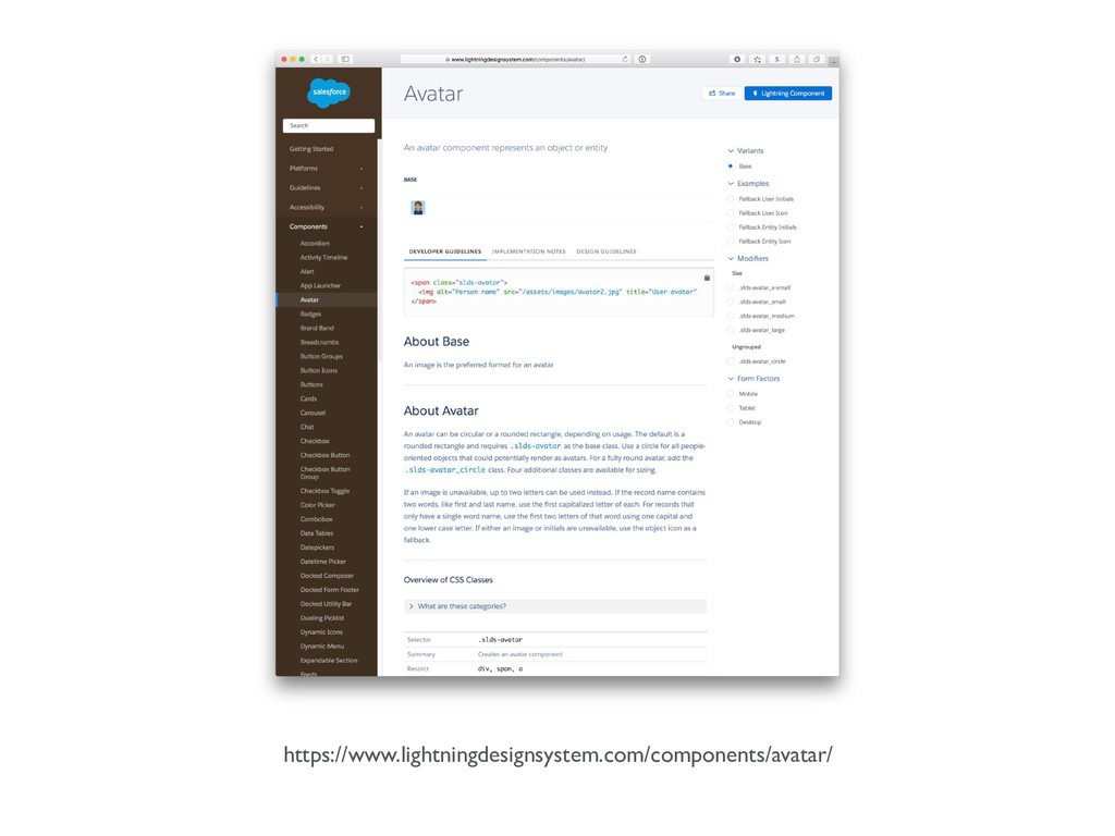
https://www.lightningdesignsystem.com/components/avatar/
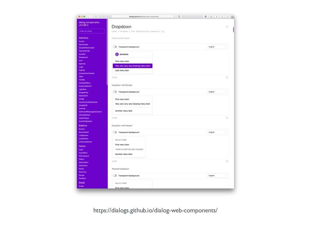
https://dialogs.github.io/dialog-web-components/
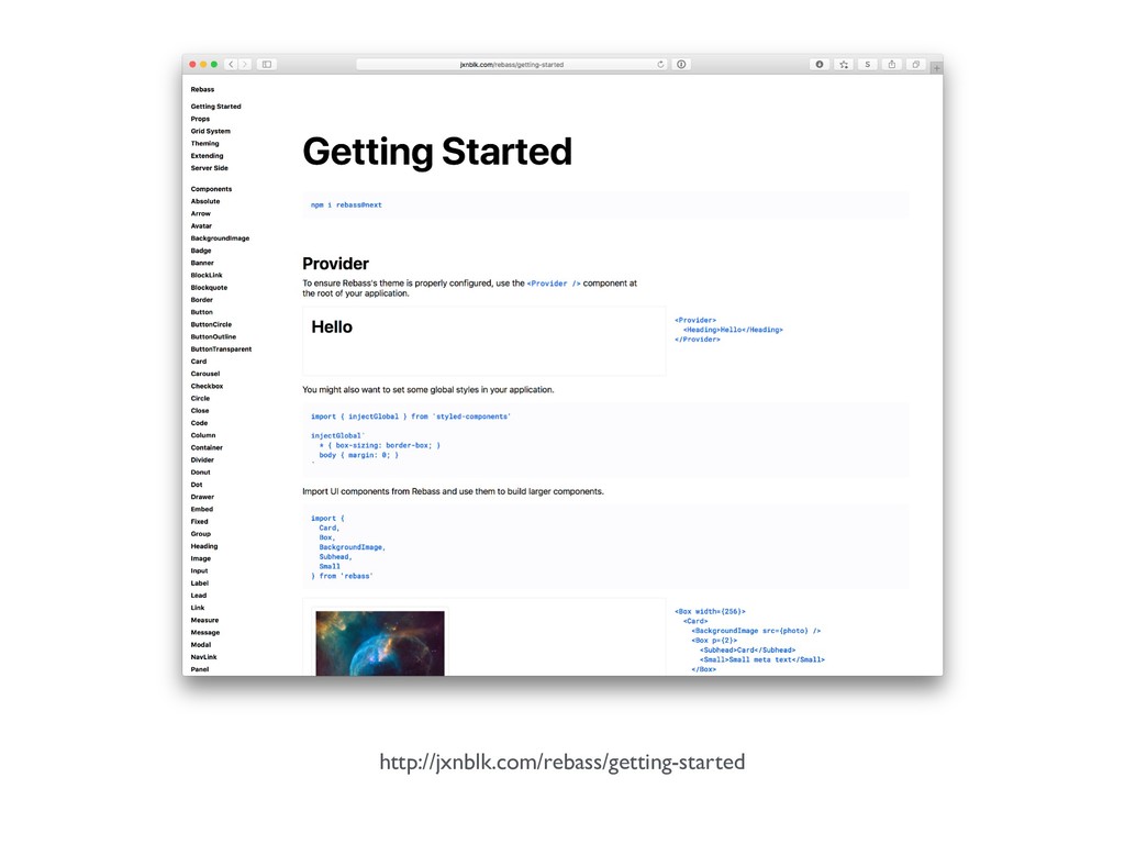
http://jxnblk.com/rebass/getting-started
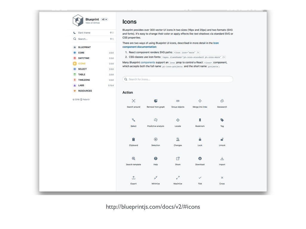
http://blueprintjs.com/docs/v2/#icons
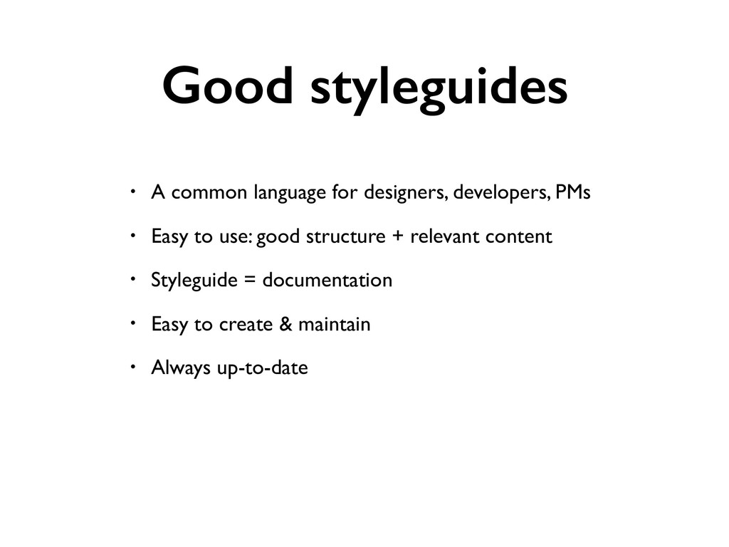
Good styleguides • A common language for designers, developers, PMs
• Easy to use: good structure + relevant content • Styleguide = documentation • Easy to create & maintain • Always up-to-date
Styleguide generators
None
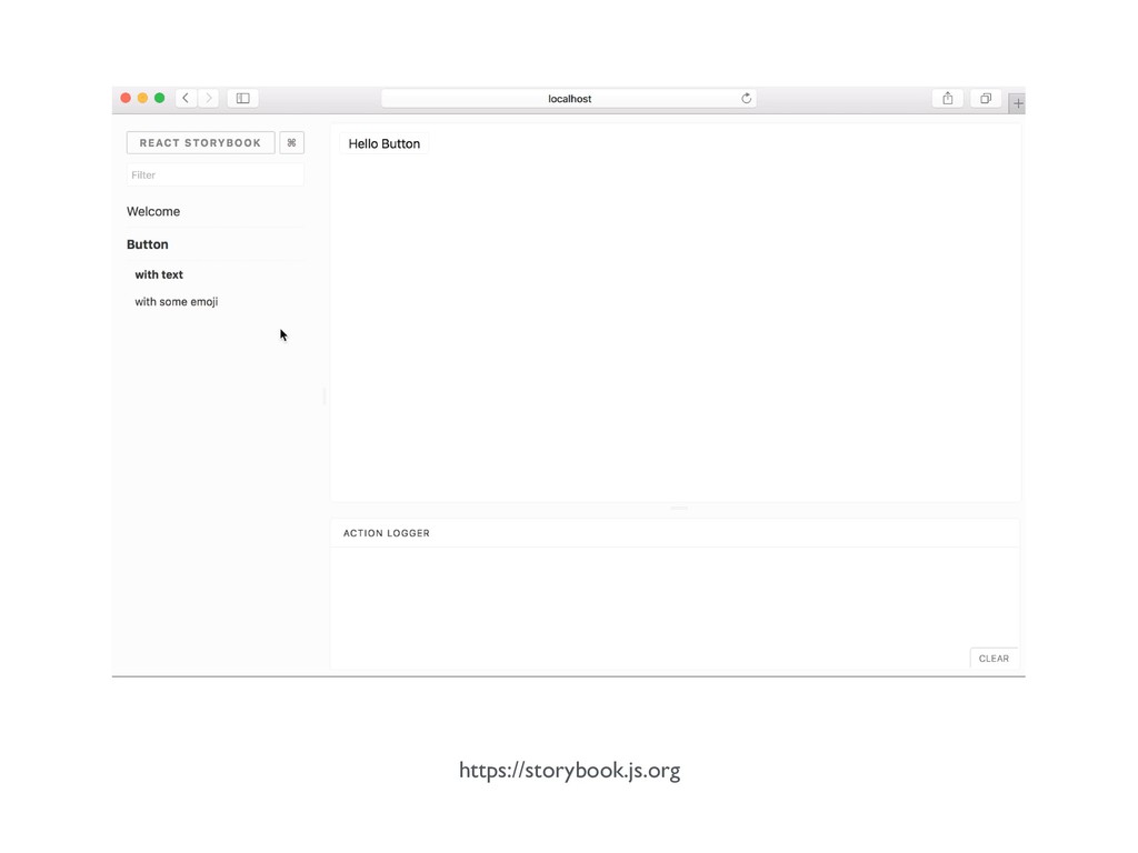
https://storybook.js.org
None
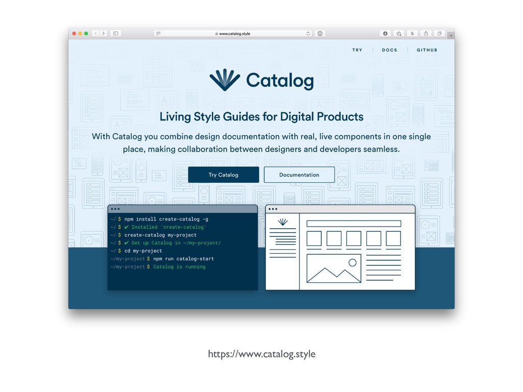
https://www.catalog.style
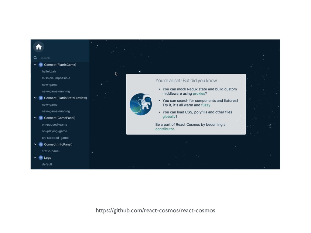
react-cosmos
https://github.com/react-cosmos/react-cosmos
None
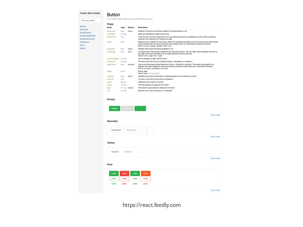
https://react.feedly.com
npm start
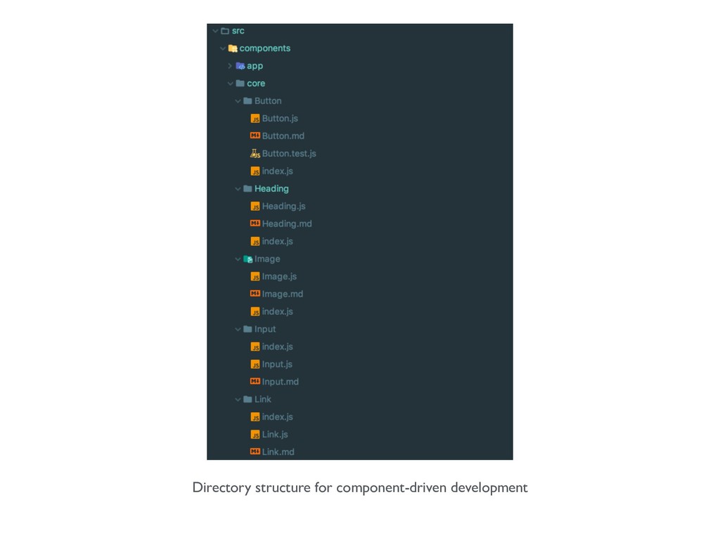
Directory structure for component-driven development
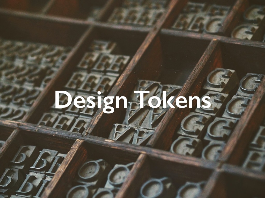
Design Tokens
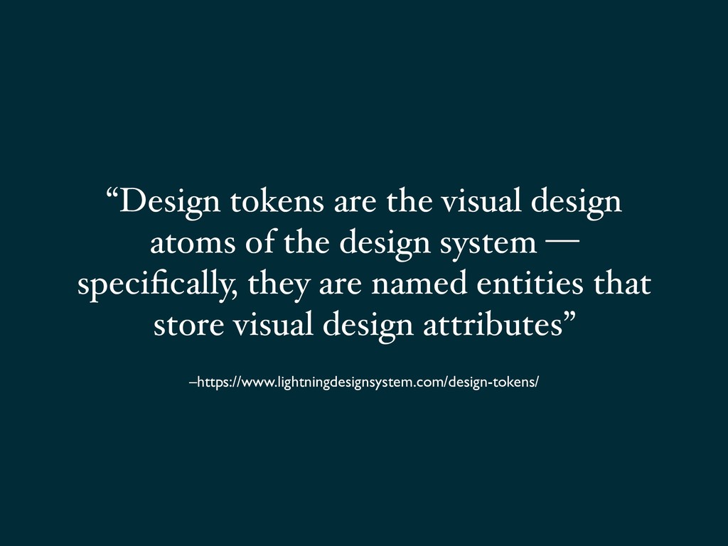
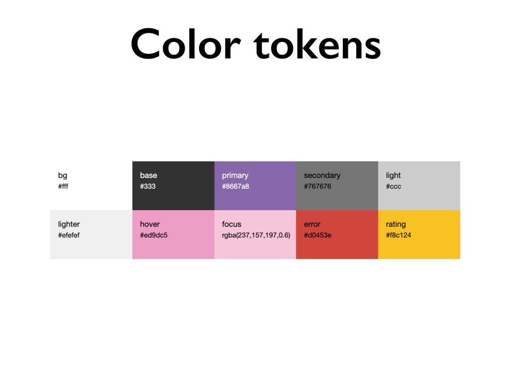
–https://www.lightningdesignsystem.com/design-tokens/ “Design tokens are the visual design atoms of the
design system — specifically, they are named entities that store visual design attributes”
Typography scale a a a a a a a a
a a a a a a a a a
http://webtypography.net/3.1.1
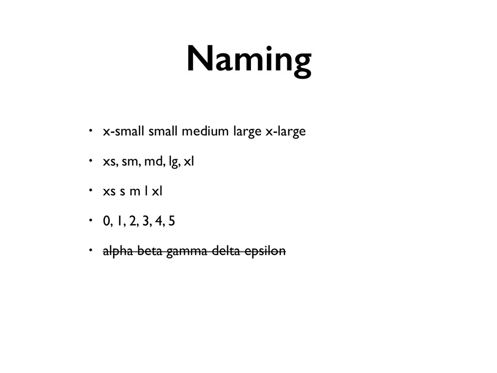
Naming • x-small small medium large x-large • xs, sm,
md, lg, xl • xs s m l xl • 0, 1, 2, 3, 4, 5 • alpha beta gamma delta epsilon
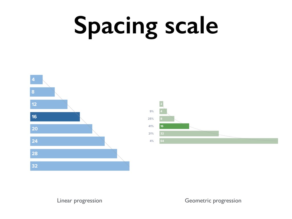
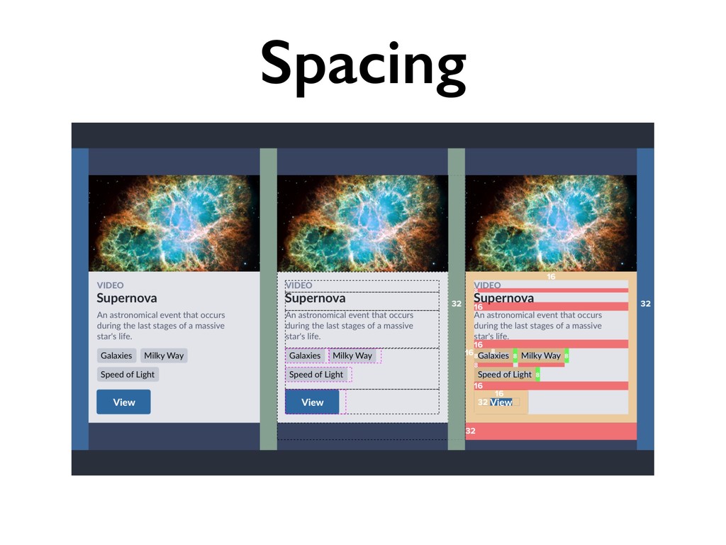
Linear progression Geometric progression Spacing scale
Spacing
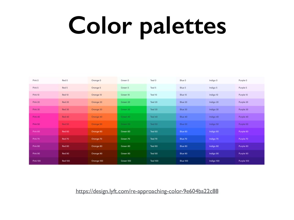
https://design.lyft.com/re-approaching-color-9e604ba22c88 Color palettes
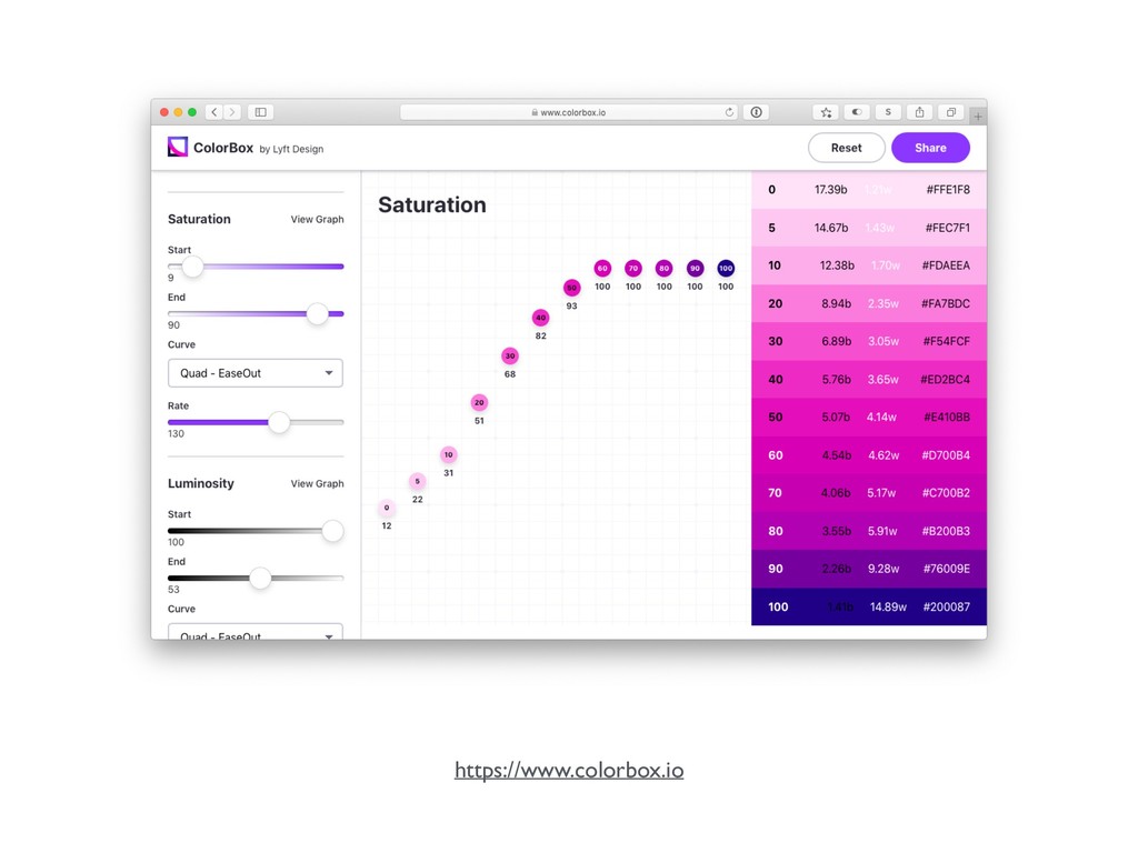
https://www.colorbox.io
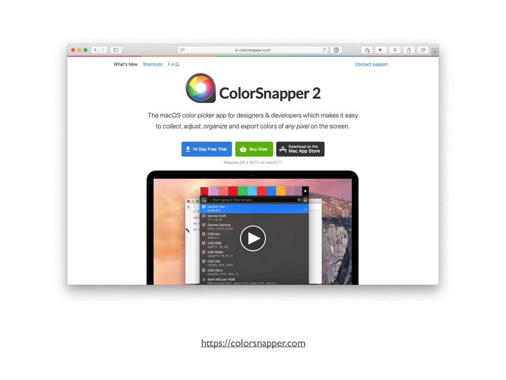
https://colorsnapper.com
Color tokens
⚒ DesignTokens
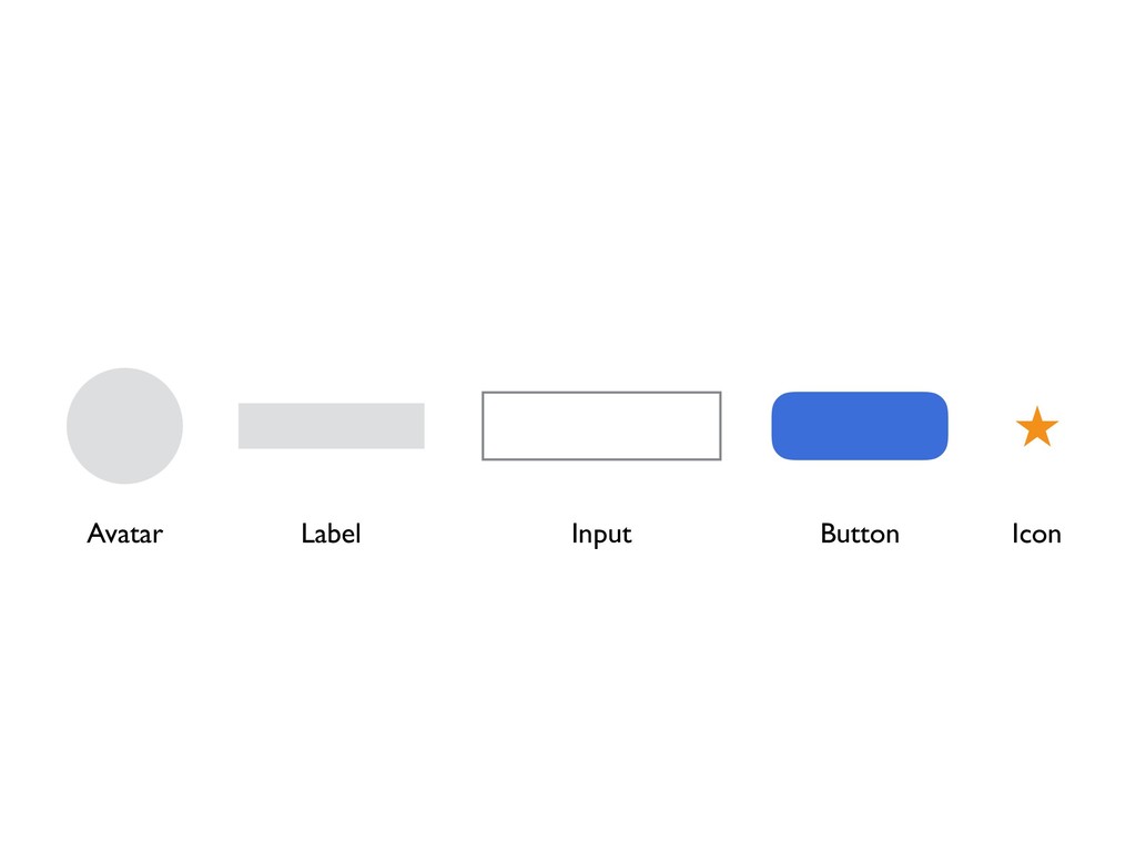
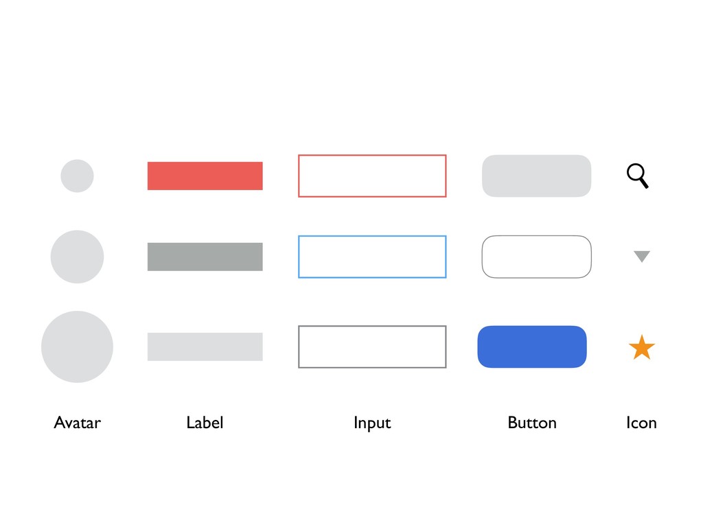
UI Primitives
None
Button
Label Button Icon Input Avatar
Label Button Icon Input Avatar
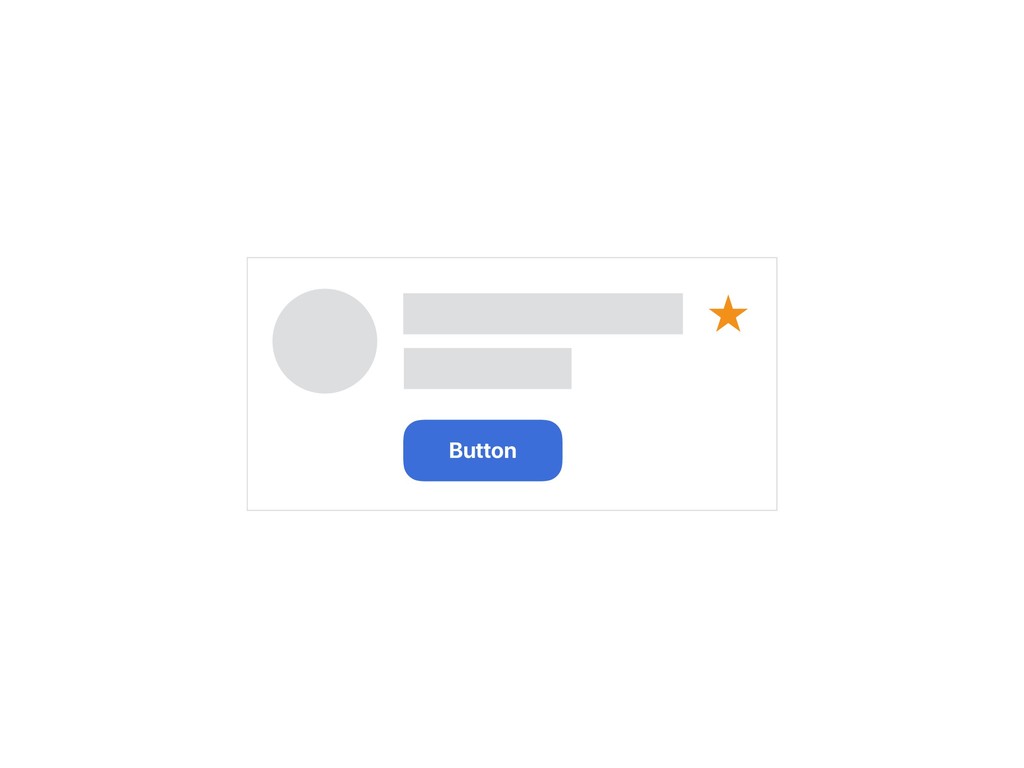
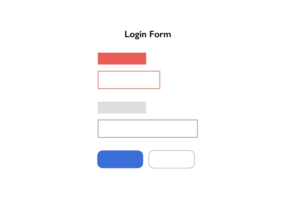
Login Form
Label Button Icon Input Avatar
Search Toolbar
Label Button Icon Input Avatar
⚒ Primitives
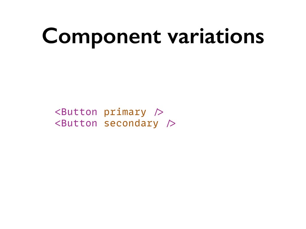
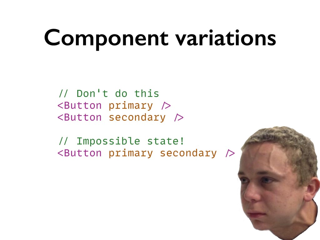
Component variations <Button primary /> <Button secondary />
Component variations // Don't do this <Button primary /> <Button
secondary /> // Impossible state! <Button primary secondary />
Component variations // Do this instead! <Button variant="primary" /> <Button
variant="secondary" />
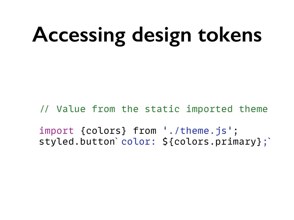
Accessing design tokens // Hard coded value styled.button`color: tomato;`
Accessing design tokens // Value from the static imported theme
import {colors} from './theme.js'; styled.button`color: ${colors.primary};`
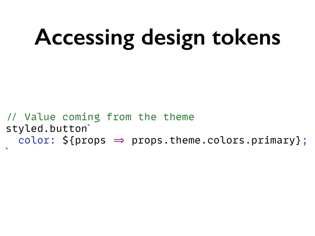
Accessing design tokens // Value coming from the theme styled.button`
color: ${props => props.theme.colors.primary}; `
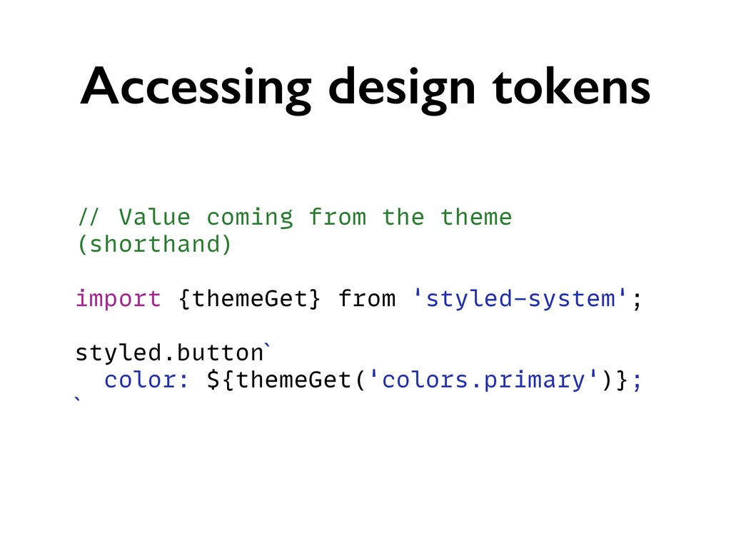
Accessing design tokens // Value coming from the theme (shorthand)
import {themeGet} from 'styled-system'; styled.button` color: ${themeGet('colors.primary')}; `
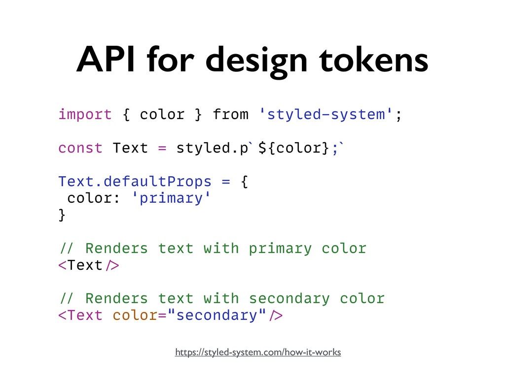
API for design tokens import { color } from 'styled-system';
const Text = styled.p`${color};` Text.defaultProps = { color: 'primary' } // Renders text with primary color <Text/> // Renders text with secondary color <Text color="secondary"/> https://styled-system.com/how-it-works
⚒ Whitespace & Layout
UI Patterns
None
–https://en.wikipedia.org/wiki/Design_pattern “A design pattern is the re-usable form of a
solution to a design problem.”
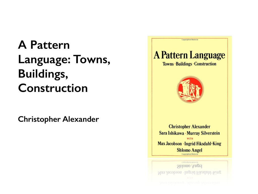
A Pattern Language: Towns, Buildings, Construction Christopher Alexander
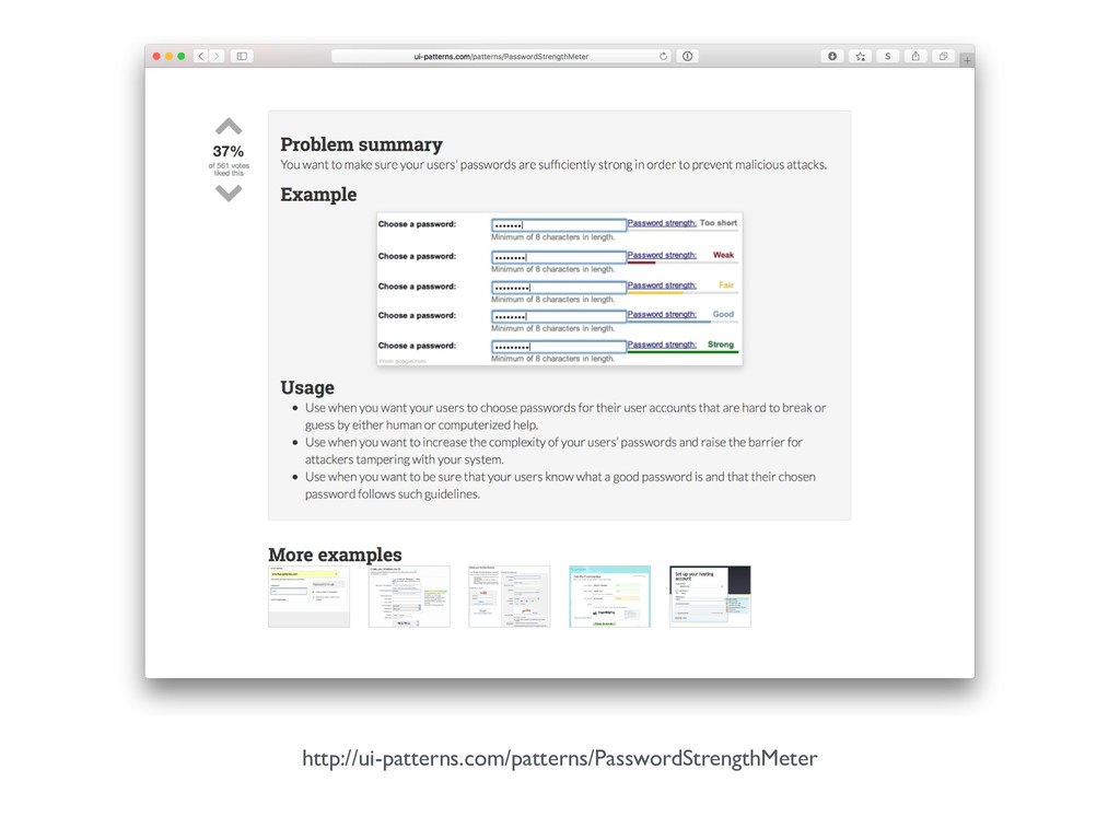
http://ui-patterns.com/patterns/PasswordStrengthMeter
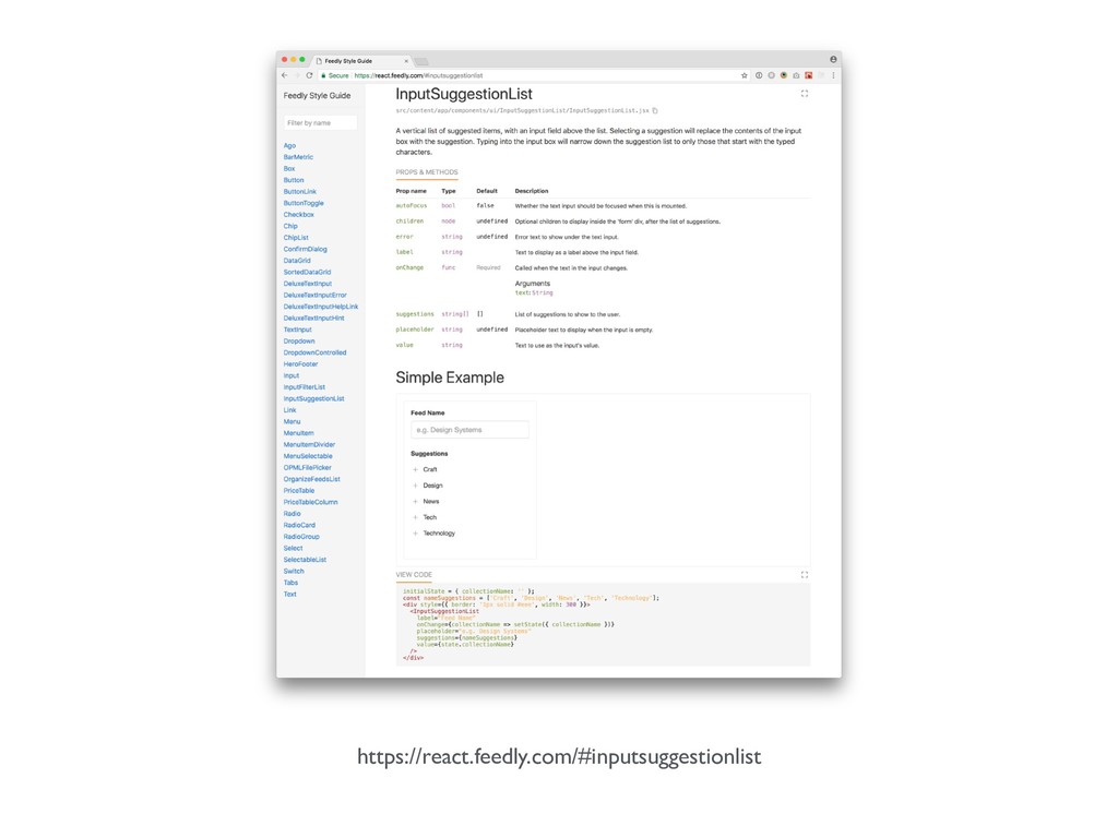
https://react.feedly.com/#inputsuggestionlist
Patterns • A great way to communicate • Suitable for
both designers & developers (and many others) • Solve particular design problems • Re-usable • …
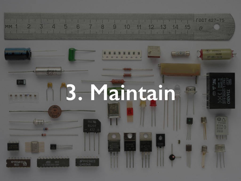
3. Maintain
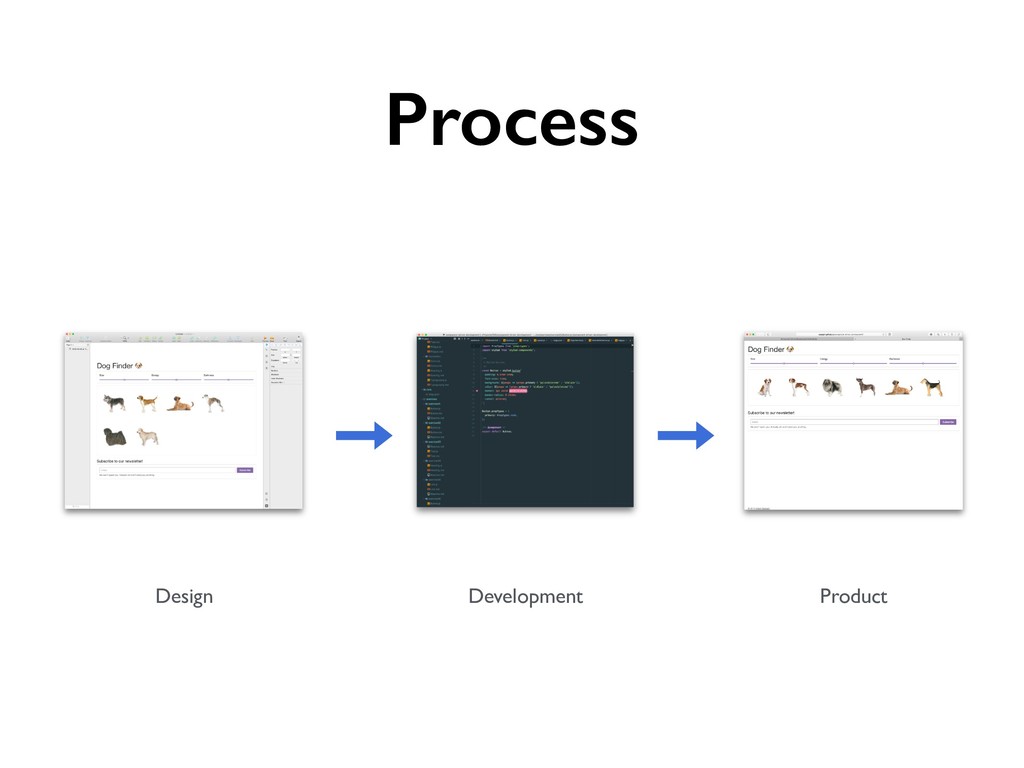
Process Development Product Design
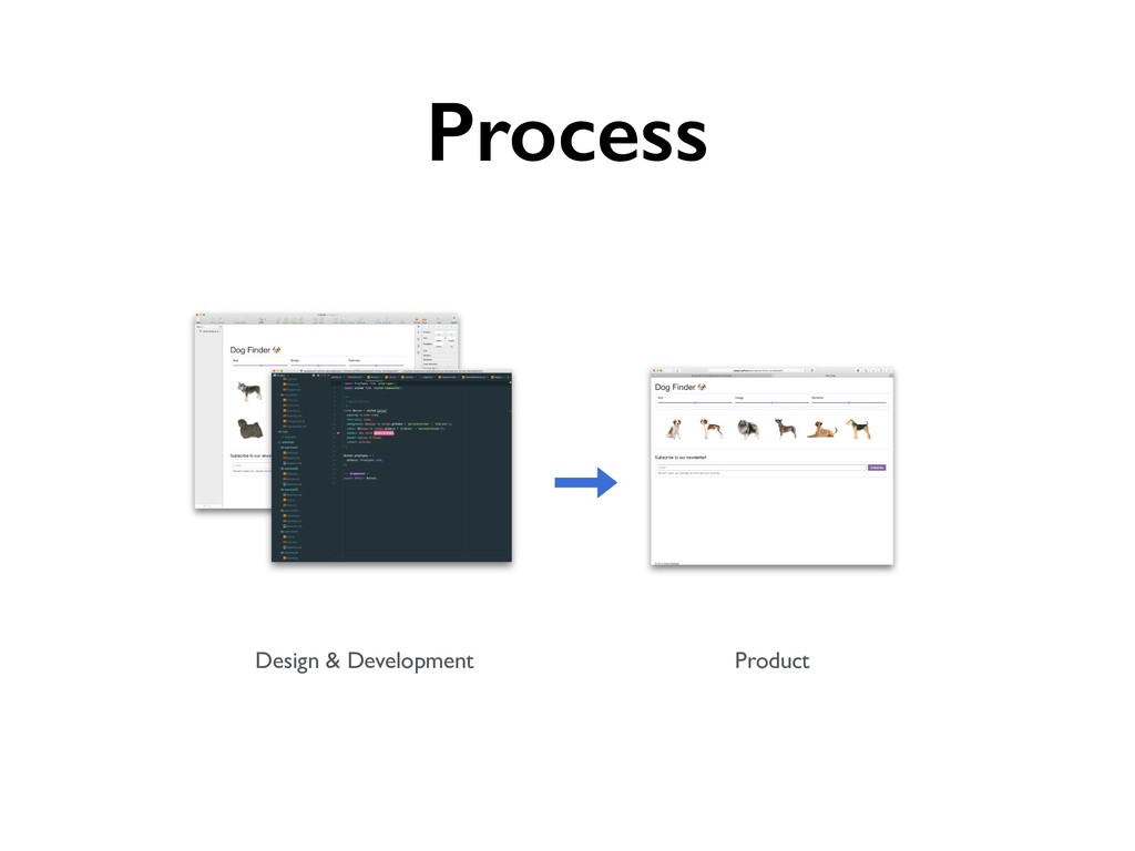
Process Product Design & Development
Process Product Design & Development Styleguide
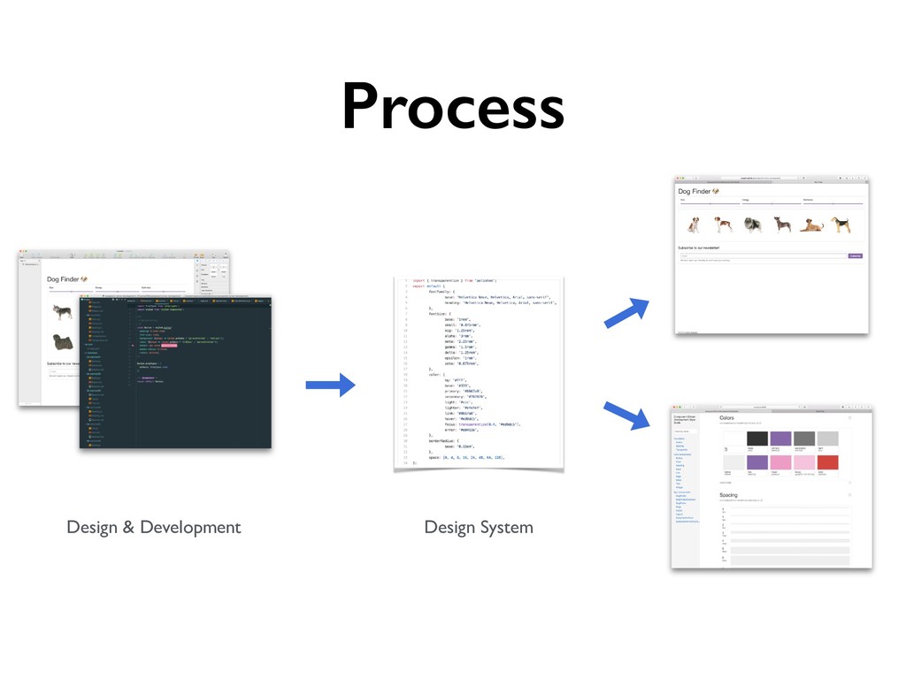
Process Design & Development Design System
Process Design & Development Design System
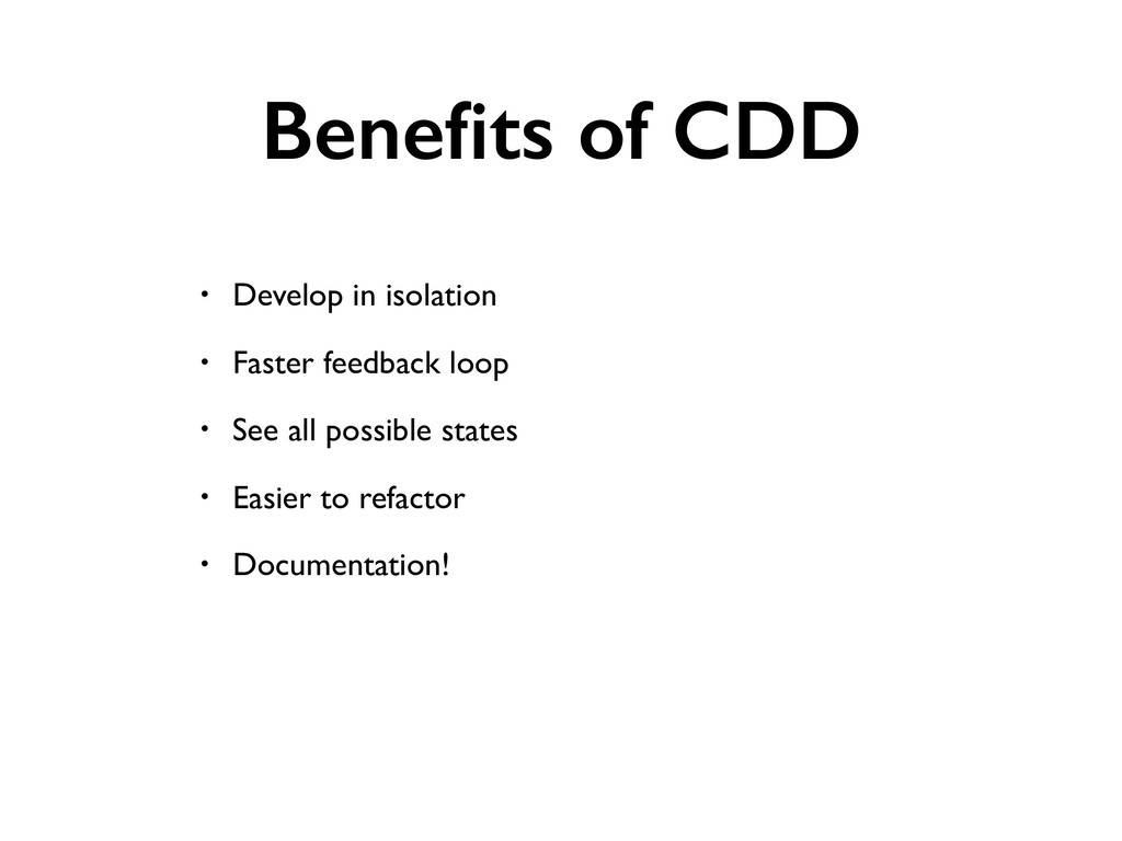
Benefits of CDD • Develop in isolation • Faster feedback
loop • See all possible states • Easier to refactor • Documentation!
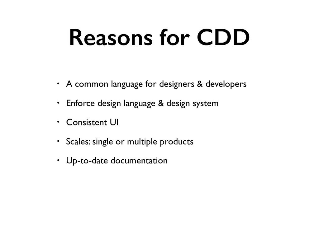
Reasons for CDD • A common language for designers &
developers • Enforce design language & design system • Consistent UI • Scales: single or multiple products • Up-to-date documentation
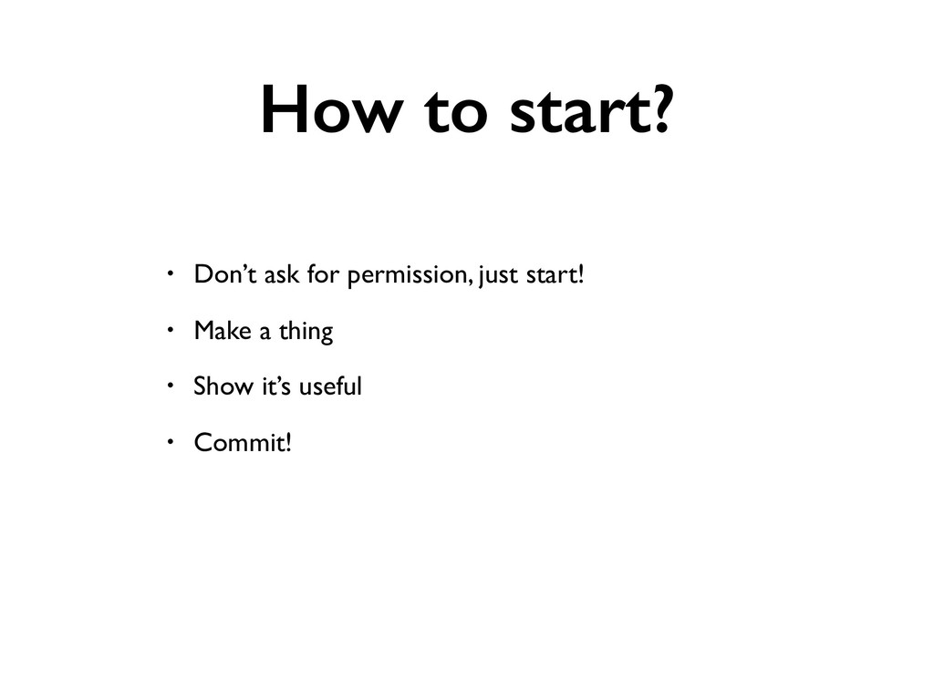
How to start? • Don’t ask for permission, just start!
• Make a thing • Show it’s useful • Commit!
Discussion What problems are you facing…
Further reading
Atomic Design Brad Frost
Design Systems Alla Kholmatova
A Pattern Language: Towns, Buildings, Construction Christopher Alexander
The Elements of Typographic Style Robert Bringhurst
http://webtypography.net
• https://www.styled-components.com • github.com/jxnblk/styled-system • https://github.com/rebassjs/grid • https://github.com/rebassjs/space • https://github.com/sapegin/stack-styled
• github.com/jxnblk/macro-components
component driven.io https://component-driven.io @okonetchnikov @iamsapegin @ComponentDriven
 okonet
 yatabe
 juanmartin2026
 cbtlibrary
 cm_manaus
 aecrp
aecrp
 georgesinnott
 sapi_kawahara
 signer
 ruribou
 davidcarrasco
 tammyeverts
 badams
 lfama
lfama
 ryanjones
 dougneiner
 schroneko
 lara
lara
 ammeep
 morganepeng
 rkendrick25
 sabderemane