Upgrade to Pro — share decks privately, control downloads, hide ads and more …

Modular CSS

Modular CSS

Slides from my HolyJS presentation (http://holyjs.ru/en/talks/modular-css/)

Andrey Okonetchnikov

December 11, 2016
Tweet

More Decks by Andrey Okonetchnikov

Other Decks in Programming

Transcript

  1. Button.js 1 const Button = ({ children }) => {

    2 return ( 3 <button 4 type="button" 5 > 6 { children } 7 </button> 8 ) 9 }
  2. Button.js 1 const Button = ({ children }) => {

    2 return ( 3 <button 4 type="button" 5 className="btn" 6 > 7 <span className="label"> 8 { children } 9 </span> 10 </button> 11 ) 12 }
  3. Button.js 1 const Button = ({ children, disabled }) =>

    { 2 return ( 3 <button 4 type="button" 5 disabled={disabled} 6 className="btn" 7 > 8 <span className="label"> 9 { children } 10 </span> 11 </button> 12 ) 13 }
  4. Button.js 1 const Button = ({ children, disabled }) =>

    { 2 let classNames = 'btn' 3 if (disabled) classNames += ' btn --disabled' 4 return ( 5 <button 6 type="button" 7 disabled={disabled} 8 className={classNames} 9 > 10 <span className="label"> 11 { children } 12 </span> 13 </button> 14 ) 15 }
  5. Button.js 1 const Button = ({ children, disabled, primary })

    => { 2 let classNames = 'btn' 3 if (disabled) classNames += ' btn --disabled' 4 if (primary) classNames += ' btn --primary’ 5 return ( 6 <button 7 type="button" 8 disabled={disabled} 9 className={classNames} 10 > 11 <span className="label"> 12 { children } 13 </span> 14 </button> 15 ) 16 }
  6. • Input • State • Behavior • Styles Button •

    Input • State • Behavior • Styles • Input • State • Behavior • Styles
  7. • Input • State • Behavior • Styles Button •

    Input • State • Behavior • Styles • Input • State • Behavior • Styles
  8. • Input • State • Behavior • Styles Button •

    Input • State • Behavior • Styles • Input • State • Behavior • Styles Global styles
  9. Problems with CSS on scale Disconnected from component’s code Implicit

    dependencies No styles isolation Constants sharing Minification
  10. Where is my CSS? 1 const Button = ({ children

    }) => { 2 return ( 3 <button 4 type="button" 5 className="btn" 6 > 7 <span className="label"> 8 { children } 9 </span> 10 </button> 11 ) 12 }
  11. Where is my CSS? Where is this class coming from?

    1 const Button = ({ children }) => { 2 return ( 3 <button 4 type="button" 5 className="btn" 6 > 7 <span className="label"> 8 { children } 9 </span> 10 </button> 11 ) 12 }
  12. Components > Files public ├── images │ └── icon.svg ├──

    javascripts │ ├── Button.js │ └── Dropdown.js └── stylesheets ├── Buttons.css └── Dropdown.css public ├── images │ └── icon.svg ├── javascripts │ └── application.js └── stylesheets └── application.css
  13. Separation of concerns? public ├── images │ └── icon.svg ├──

    javascripts │ ├── Button.js │ └── Dropdown.js └── stylesheets ├── Buttons.css └── Dropdown.css
  14. Separation of concerns technologies public ├── images │ └── icon.svg

    ├── javascripts │ ├── Button.js │ └── Dropdown.js └── stylesheets ├── Buttons.css └── Dropdown.css
  15. Separation of concerns components ├── Button │ ├── Button.css │

    ├── Button.js │ ├── Button.spec.js │ ├── icon.svg │ └── index.js └── Dropdown public ├── images │ └── icon.svg ├── javascripts │ ├── Button.js │ └── Dropdown.js └── stylesheets ├── Buttons.css └── Dropdown.css
  16. Explicit dependencies 1 import './Button.css' 2 3 const Button =

    ({ children, disabled, primary }) => { 4 let classNames = 'btn' 5 if (disabled) classNames += ' btn-disabled' 6 if (primary) classNames += ' btn-primary' 7 return ( 8 <button 9 type="button" 10 disabled={disabled} 11 className={classNames} 12 > 13 <span className="btn_label"> 14 { children } 15 </span> 16 </button> 17 ) 18 } 19 export default Button
  17. Allow requiring CSS with Webpack module.exports = { module: {

    loaders: [ { test: /\.css$/, loader: "style-loader!css-loader" }, { test: /\.png$/, loader: "url-loader?limit=10000" }, { test: /\.js$/, loader: "babel-loader" } ] } }; • Load CSS files, • Embed PNG images under 10Kb as Data URIs • Transpile JS files with Babel
  18. Now we can just import CSS! 1 import './Button.css' 2

    3 const Button = ({ children, disabled, primary }) => { 4 let classNames = 'btn' 5 if (disabled) classNames += ' btn-disabled' 6 if (primary) classNames += ' btn-primary' 7 return ( 8 <button 9 type="button" 10 disabled={disabled} 11 className={classNames} 12 > 13 <span className="btn_label"> 14 { children } 15 </span> 16 </button> 17 ) 18 } 19 export default Button
  19. Tips & Tricks ✅ Split your code by components ✅

    One directory per UI component ✅ One CSS file per UI component ✅ Explicit dependencies ✅ Co-locate JS, CSS and assets
  20. How are we doing so far? No styles isolation Constants

    sharing Minification ✅ Disconnected from component’s code ✅ Implicit dependencies
  21. – MDN “Three main sources of style information form a

    cascade. […] The user's style modifies the browser's default style. The document author's style then modifies the style some more.”
  22. – by @kangax http://perfectionkills.com/whats-wrong-with-extending-the-dom/ “DOM extension seemed so temptingly useful

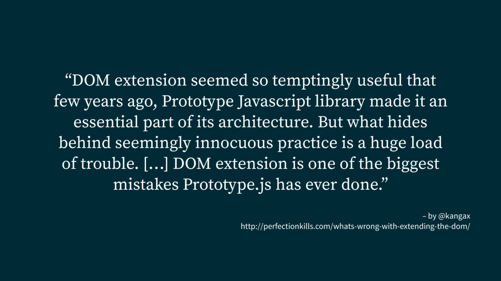
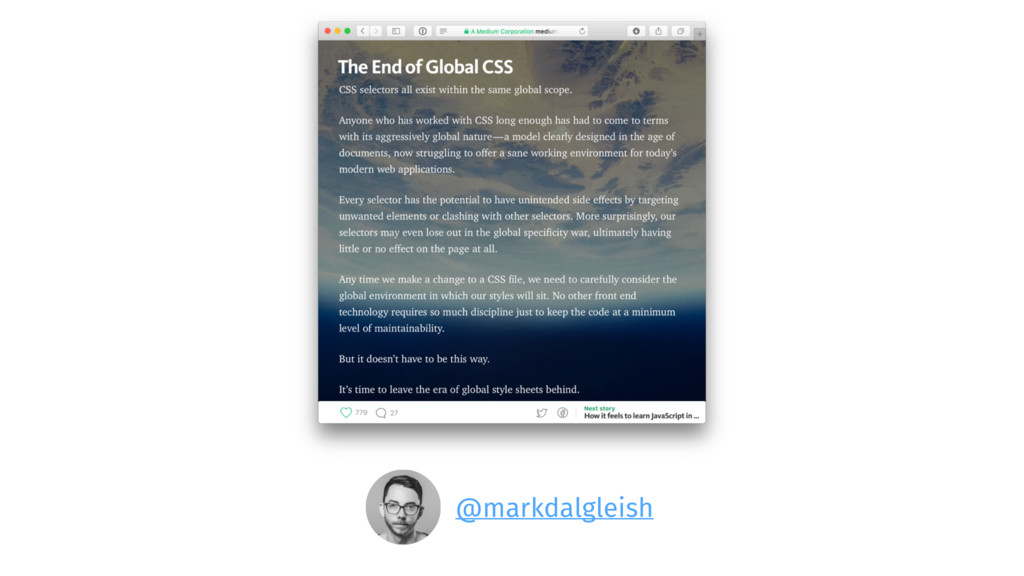
    that few years ago, Prototype Javascript library made it an essential part of its architecture. But what hides behind seemingly innocuous practice is a huge load of trouble. […] DOM extension is one of the biggest mistakes Prototype.js has ever done.”
  23. Using BEM 1 import './Button.css' 2 3 const Button =

    ({ children, disabled, primary }) => { 4 let classNames = 'Button' 5 if (disabled) classNames += ' Button --disabled' 6 if (primary) classNames += ' Button --primary' 7 return ( 8 <button 9 type="button" 10 disabled={disabled} 11 className={classNames} 12 > 13 <span className="Button__label"> 14 { children } 15 </span> 16 </button> 17 ) 18 } 19 export default Button
  24. Using BEM 1 /* Button.css */ 2 3 .Button {

    /* general rules */ } 4 .Button --disabled { /* disabled rules */ } 5 .Button --primary { /* primary rules */ } 6 .Button__label { /* label rules */ }
  25. BEM ✅ Global namespace ✅ Cascade* ✅ No styles isolation

    Not beginner friendly Very verbose Requires discipline Minification
  26. Enabling CSS-modules 1 // webpack.config.js 2 3 module.exports = {

    4 module: { 5 loaders: [ 6 { 7 test: /\.css$/, 8 loader: "css" 9 } 10 ] 11 } 12 };
  27. Enabling CSS-modules 1 // webpack.config.js 2 3 module.exports = {

    4 module: { 5 loaders: [ 6 { 7 test: /\.css$/, 8 loader: "css?modules" 9 } 10 ] 11 } 12 };
  28. Before: BEM-style 1 /* Button.css */ 2 3 .Button {

    /* general rules */ } 4 .Button --disabled { /* disabled rules */ } 5 .Button --primary { /* primary rules */ } 6 .Button__label { /* label rules */ }
  29. After: CSS-modules 1 /* Button.css */ 2 3 .root {

    /* general rules */ } 4 .disabled { /* disabled rules */ } 5 .primary { /* primary rules */ } 6 .label { /* label rules */ }
  30. Before: BEM-style 1 import './Button.css' 2 3 const Button =

    ({ children, disabled, primary }) => { 4 let classNames = 'Button' 5 if (disabled) classNames += ' Button --disabled' 6 if (primary) classNames += ' Button --primary' 7 return ( 8 <button 9 type="button" 10 disabled={disabled} 11 className={classNames} 12 > 13 <span className="Button__label"> 14 { children } 15 </span> 16 </button> 17 ) 18 } 19 export default Button
  31. 1 import styles from './Button.css' 2 3 const Button =

    ({ children, disabled, primary }) => { 4 let className = {styles.root} 5 if (disabled) className = {styles.disabled} 6 if (primary) className = {styles.primary} 7 return ( 8 <button 9 type="button" 10 disabled={disabled} 11 className={className} 12 > 13 <span className={styles.label}> 14 { children } 15 </span> 16 </button> 17 ) 18 } 19 export default Button After: CSS-modules
  32. The result <button class="Button"> <span class="Button__label"> Click me! </span> </button>

    <button class="Button_root_3fslE"> <span class="Button_label_I8bKh"> Click me! </span> </button>
  33. The result 1 styles: { 2 root: "Button__root__abc5436", 3 disabled:

    "Button__disabled__def6 4 primary: "Button__primary__1638bc 5 label: "Button__label__5dfg462" 5 } 1 /* Button.css */ 2 3 .root { /* general rules */ } 4 .disabled { /* disabled rules */ } 5 .primary { /* primary rules */ } 6 .label { /* label rules */ }
  34. 1 import styles from './Button.css' 2 3 const Button =

    ({ children, disabled, primary }) => { 4 let className = {styles.root} 5 if (disabled) className = {styles.disabled} 6 if (primary) className = {styles.primary} 7 return ( 8 <button 9 type="button" 10 disabled={disabled} 11 className={className} 12 > 13 <span className={styles.label}> 14 { children } 15 </span> 16 </button> 17 ) 18 } 19 export default Button The result
  35. Prettier class names in dev 1 // webpack.config.js 2 3

    module.exports = { 4 module: { 5 loaders: [ 6 { 7 test: /\.css$/, 8 loader: "css?modules 9 &localIdentName=[name]__[local]__[hash:base64:5]" 10 11 } 12 ] 13 } 14 };
  36. Prettier class names in dev import styles from './Button.css' /*

    styles = { button: ‘Button__root__3fslE’, label: ‘Button__label__I8bKh’ } */ name local hash
  37. Composition with Sass 1 /* Button.css */ 2 3 .Button

    { /* common rules */ } 4 .Button --disabled { /* disabled rules */ } 5 .Button --primary { /* primary rules */ }
  38. Composition with Sass 1 .Button --common { /* common rules

    */ } 2 .Button --disabled { 3 @extends .Button --common; 4 /* gray color, light background */ 5 } 6 .Button --primary { 7 @extends .Button --common; 8 /* white color, blue background */ 9 }
  39. Composition with Sass 1 .Button --common, .Button --disabled, .Button --primary

    { 2 /* common rules */ 3 } 4 .Button --disabled { 5 /* gray color, light background */ 6 } 7 .Button --primary { 8 /* white color, blue background */ 9 }
  40. Composition with CSS-modules 1 /* Button.css */ 2 3 .root

    { /* general rules */ } 4 .disabled { /* disabled rules */ } 5 .primary { /* primary rules */ }
  41. Composition with CSS-modules 1 /* Button.css */ 2 3 .root

    { /* general rules */ } 4 .disabled { 5 composes: root; 6 /* disabled rules */ 7 } 8 .primary { 9 composes: root; 10 /* primary rules */ 11 }
  42. Composition with CSS-modules 1 styles: { 2 root: "Button__root__abc5436", 3

    disabled: "Button__root__abc5436 Button__disabled__def6547", 4 primary: "Button__root__abc5436 Button__primary__1638bcd" 5 }
  43. Use only one class name! 1 /* Don't do this

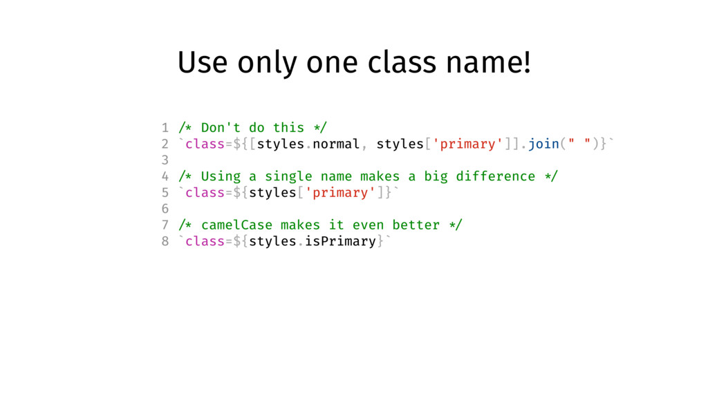
    */ 2 `class=${[styles.normal, styles['primary']].join(" ")}` 3 4 /* Using a single name makes a big difference */ 5 `class=${styles['primary']}` 6 7 /* camelCase makes it even better */ 8 `class=${styles.isPrimary}`
  44. The result <button class=“Button Button --primary"> <span class=“Button__label”> Click me!

    </span> </button> <button class=“Button_root_3fslE Button_primary_Hf415”> <span class="Button_label_I8bKh"> Click me! </span> </button>
  45. Compose from other files! 1 /* colors.css */ 2 .primary

    { 3 background-color: #4399fa; 4 } 5 .secondary { 6 background-color: #999; 7 } 1 /* Button.css */ 2 .root { /* general rules */ } 3 .primary { 4 composes: root; 5 composes: primary from ' ../colors.css'; 6 /* primary rules */ 7 }
  46. Or use variables! /* variables.css */ @value small: (max-width: 599px);

    /* component.css */ @value small from "./variables.css"; .pageContent { background: green; @media small { background: red; } }
  47. Minification 1 // webpack.config.js 2 3 module.exports = { 4

    module: { 5 loaders: [ 6 { 7 test: /\.css$/, 8 loader: "css?modules" 9 } 10 ] 11 } 12 };
  48. Minification <button class="button"> <span class="label"> Click me! </span> </button> <button

    class="1s6s23ca312"> <span class="sdp9423cadg"> Click me! </span> </button>
  49. Solved with CSS-modules ✅ No styles isolation ✅ Constants sharing

    ✅ Minification ✅ Disconnected from component’s code ✅ Implicit dependencies
  50. Local by default but allows exceptions .local-class { color: red;

    } :global(.prefix-modal-open) .local-class { color: green; }
  51. Composition .common { /* all the common styles you want

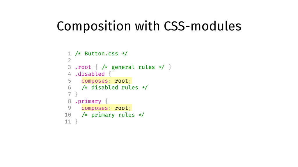
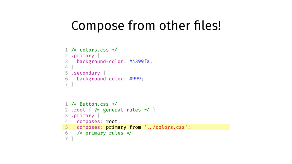
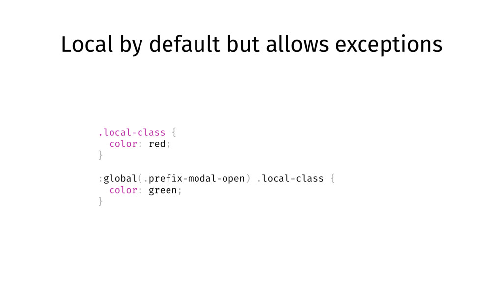
    */ } .normal { composes: common; /* anything that only applies to Normal */ } .disabled { composes: common; /* anything that only applies to Disabled */ }
  52. Import variables /* variables.css */ @value small: (max-width: 599px); /*

    component.css */ @value small from "./breakpoints.scss"; .pageContent { background: green; @media small { background: red; } }
  53. Use with pre-processors like Sass or Less :global { .this-is-global

    { color: yellow; } .potential-collision-city { color: crap; } }
  54. CSS next :root { --red: #d33; } a { &:hover

    { color: color(var( --red) a(54%)); } } a:hover { color: #dd3333; color: rgba(221, 51, 51, 0.54); }
  55. PostCSS overview 1. More powerful than pre-processors thanks AST 2.

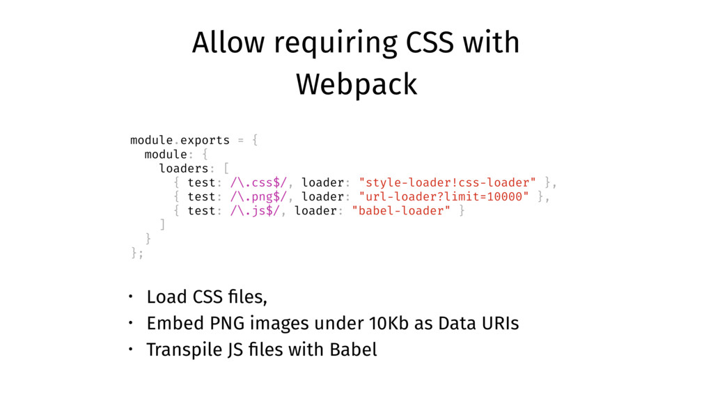
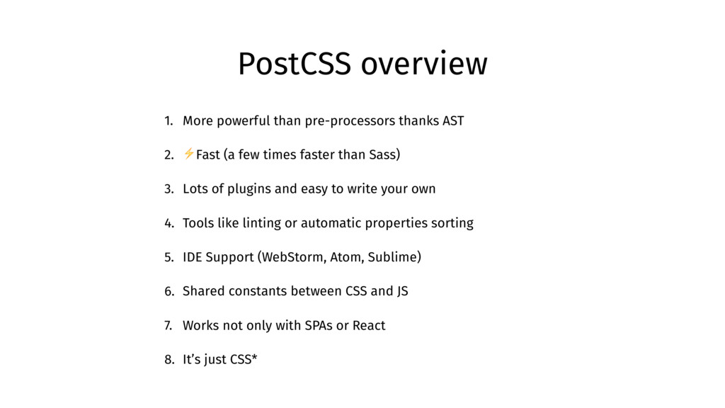
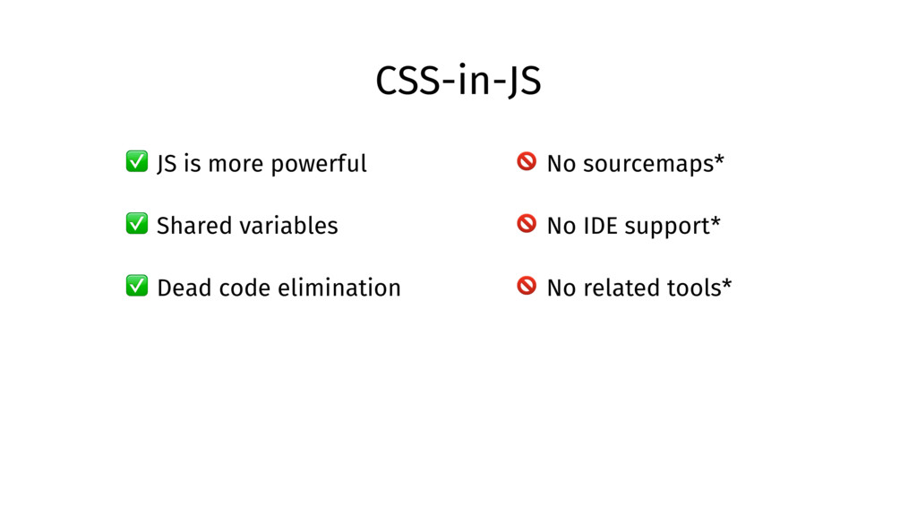
    ⚡Fast (a few times faster than Sass) 3. Lots of plugins and easy to write your own 4. Tools like linting or automatic properties sorting 5. IDE Support (WebStorm, Atom, Sublime) 6. Shared constants between CSS and JS 7. Works not only with SPAs or React 8. It’s just CSS*
  56. Example setup with Webpack module.exports = { module: { loaders:

    [ { test: /\.css$/, loader: ‘style!css&importLoaders=1!postcss-loader' } ] }, postcss: function() { return [ require('precss'), require('postcss-calc'), require('autoprefixer')({ browsers: ['last 2 version'] }) ]; } };
  57. Lint CSS as pre-commit hook 1 { 2 "lint-staged": {

    3 "*.css": "stylelint" 4 }, 5 "pre-commit": "lint-staged", 6 "stylelint": { 7 "extends": "stylelint-config-standard" 8 } 9 } https://github.com/okonet/lint-staged
  58. Do I need it? ✅ You work in a team

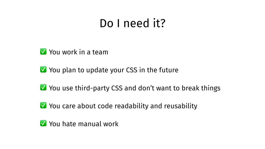
    ✅ You plan to update your CSS in the future ✅ You use third-party CSS and don’t want to break things ✅ You care about code readability and reusability ✅ You hate manual work
  59. Inline styles in JSX ✅ JS is more powerful ✅

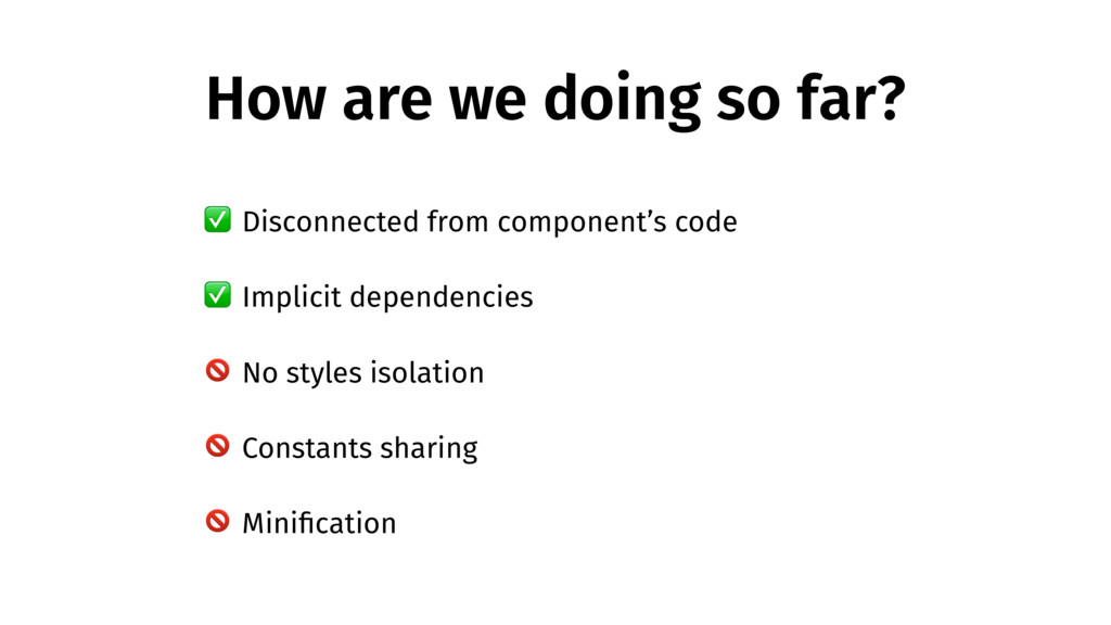
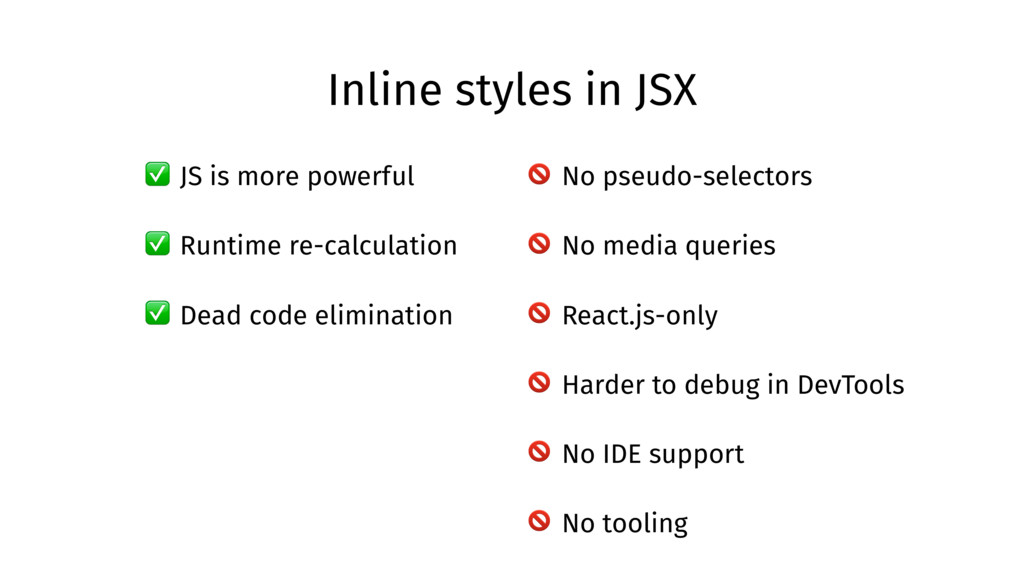
    Runtime re-calculation ✅ Dead code elimination No pseudo-selectors No media queries React.js-only Harder to debug in DevTools No IDE support No tooling
  60. CSS-in-JS ✅ JS is more powerful ✅ Shared variables ✅

    Dead code elimination No sourcemaps* No IDE support* No related tools*