Upgrade to Pro — share decks privately, control downloads, hide ads and more …

Modular CSS — Agent Conf '17 Edition

Modular CSS — Agent Conf '17 Edition

Slides from my talk at Agent Conf 2017

Andrey Okonetchnikov

January 21, 2017
Tweet

More Decks by Andrey Okonetchnikov

Other Decks in Programming

Transcript

  1. Button.js 1 const Button = ({ children }) => {

    2 return ( 3 <button 4 type="button" 5 > 6 { children } 7 </button> 8 ) 9 }
  2. Button.js 1 const Button = ({ children }) => {

    2 return ( 3 <button 4 type="button" 5 className="btn" 6 > 7 <span className="label"> 8 { children } 9 </span> 10 </button> 11 ) 12 }
  3. Button.js 1 const Button = ({ children, disabled }) =>

    { 2 return ( 3 <button 4 type="button" 5 disabled={disabled} 6 className="btn" 7 > 8 <span className="label"> 9 { children } 10 </span> 11 </button> 12 ) 13 }
  4. Button.js 1 const Button = ({ children, disabled }) =>

    { 2 let classNames = 'btn' 3 if (disabled) classNames += ' disabled' 4 return ( 5 <button 6 type="button" 7 disabled={disabled} 8 className={classNames} 9 > 10 <span className="label"> 11 { children } 12 </span> 13 </button> 14 ) 15 }
  5. Button.js 1 const Button = ({ children, disabled, active })

    => { 2 let classNames = 'btn' 3 if (disabled) classNames += ' disabled' 4 if (active) classNames += ' active’ 5 return ( 6 <button 7 type="button" 8 disabled={disabled} 9 className={classNames} 10 > 11 <span className="label"> 12 { children } 13 </span> 14 </button> 15 ) 16 }
  6. Let’s add some CSS 1 .btn { 2 /* styles

    for button */ 3 } 4 5 .active { 6 /* styles for active button */ 7 background-color: blue; 8 } 9 10 .label { 11 /* styles for button label */ 12 }
  7. Star.js 1 const Star = ({ active }) => {

    2 let classNames = 'star' 3 if (active) classNames += ' active' 4 return ( 5 <span className={classNames} /> 6 ) 7 }
  8. Let’s add some CSS 1 .star { 2 /* styles

    for star */ 3 } 4 5 .active { 6 /* styles for active star */ 7 background-color: orange; 8 } 9
  9. • Props • State • Styles Button • Props •

    State • Styles • Props • State • Styles
  10. • Props • State • Styles Button • Props •

    State • Styles • Props • State • Styles
  11. • Props • State • Styles Button • Props •

    State • Styles • Props • State • Styles Global styles
  12. Global CSS 1 .btn { 2 /* styles for button

    */ 3 } 4 5 .active { 6 /* styles for active button */ 7 background-color: blue; 8 } 9 10 .label { 11 /* styles for button label */ 12 } 1 .star { 2 /* styles for star */ 3 } 4 5 .active { 6 /* styles for active star */ 7 background-color: orange; 8 } 9
  13. Where is my CSS? 1 const Button = ({ children

    }) => { 2 return ( 3 <button 4 type="button" 5 className="btn" 6 > 7 <span className="label"> 8 { children } 9 </span> 10 </button> 11 ) 12 }
  14. Where is my CSS? Where is this class coming from?

    1 const Button = ({ children }) => { 2 return ( 3 <button 4 type="button" 5 className="btn" 6 > 7 <span className="label"> 8 { children } 9 </span> 10 </button> 11 ) 12 }
  15. Problems with CSS in Web Applications Disconnected from component’s code

    Implicit dependencies No styles isolation No composition & code sharing
  16. Components > Files public ├── images │ └── icon.svg ├──

    javascripts │ ├── Button.js │ └── Dropdown.js └── stylesheets ├── Buttons.css └── Dropdown.css public ├── images │ └── icon.svg ├── javascripts │ └── application.js └── stylesheets └── application.css
  17. Separation of concerns? public ├── images │ └── icon.svg ├──

    javascripts │ ├── Button.js │ └── Dropdown.js └── stylesheets ├── Buttons.css └── Dropdown.css
  18. Separation of concerns technologies public ├── images │ └── icon.svg

    ├── javascripts │ ├── Button.js │ └── Dropdown.js └── stylesheets ├── Buttons.css └── Dropdown.css
  19. Separation of concerns components ├── Button │ ├── Button.css │

    ├── Button.js │ ├── Button.spec.js │ ├── icon.svg │ └── index.js └── Dropdown public ├── images │ └── icon.svg ├── javascripts │ ├── Button.js │ └── Dropdown.js └── stylesheets ├── Buttons.css └── Dropdown.css
  20. Dependencies in Sass 1 /* Global styles */ 2 @import

    'reset.css'; 3 @import 'typography.css'; 4 @import 'grid.css'; 5 6 /* Components */ 7 @import 'button.css';
  21. Where is my CSS? Where is this class coming from?

    1 const Button = ({ children }) => { 2 return ( 3 <button 4 type="button" 5 className="btn" 6 > 7 <span className="label"> 8 { children } 9 </span> 10 </button> 11 ) 12 }
  22. Explicit dependencies FTW! 1 import './Button.css' 2 3 const Button

    = ({ children, disabled, active }) => { 4 let classNames = 'btn' 5 if (disabled) classNames += ' disabled' 6 if (active) classNames += ' active' 7 return ( 8 <button 9 type="button" 10 disabled={disabled} 11 className={classNames} 12 > 13 <span className="label"> 14 { children } 15 </span> 16 </button> 17 ) 18 } 19 export default Button
  23. Allow requiring CSS with Webpack 1 module.exports = { 2

    module: { 3 loaders: [ 4 { 5 test: /\.css$/, 6 use: ["style-loader", "css-loader"] 7 } 8 ] 9 } 10 };
  24. Now we can import CSS in JS! 1 import './Button.css'

    2 3 const Button = ({ children, disabled, active }) => { 4 let classNames = 'btn' 5 if (disabled) classNames += ' disabled' 6 if (active) classNames += ' active' 7 return ( 8 <button 9 type="button" 10 disabled={disabled} 11 className={classNames} 12 > 13 <span className="label"> 14 { children } 15 </span> 16 </button> 17 ) 18 } 19 export default Button
  25. Tips & Tricks ✅ Split your code by components ✅

    One directory per UI component ✅ One CSS file per UI component ✅ Explicit dependencies ✅ Co-locate JS, CSS and assets
  26. How are we doing so far? No styles isolation Composition

    & code sharing ✅ Disconnected from component’s code ✅ Implicit dependencies
  27. Global CSS 1 .btn { 2 /* styles for button

    */ 3 } 4 5 .active { 6 /* styles for active button */ 7 background-color: blue; 8 } 9 10 .label { 11 /* styles for button label */ 12 } 1 .star { 2 /* styles for star */ 3 } 4 5 .active { 6 /* styles for active star */ 7 background-color: orange; 8 } 9
  28. Using BEM 1 /* Button.css */ 2 3 .Button {

    /* general rules */ } 4 .Button --disabled { /* disabled rules */ } 5 .Button --active { /* active rules */ } 6 .Button__label { /* label rules */ }
  29. Using BEM 1 import './Button.css' 2 3 const Button =

    ({ children, disabled, active }) => { 4 let classNames = 'Button' 5 if (disabled) classNames += ' Button --disabled' 6 if (active) classNames += ' Button --active' 7 return ( 8 <button 9 type="button" 10 disabled={disabled} 11 className={classNames} 12 > 13 <span className="Button__label"> 14 { children } 15 </span> 16 </button> 17 ) 18 } 19 export default Button
  30. BEM ✅ Global namespace ✅ Styles isolation Not beginner friendly

    Very verbose Requires discipline Long class names
  31. Before: BEM-style 1 /* Button.css */ 2 3 .Button {

    /* general rules */ } 4 .Button --disabled { /* disabled rules */ } 5 .Button --active { /* active rules */ } 6 .Button__label { /* label rules */ }
  32. After: CSS-modules 1 /* Button.css */ 2 3 .root {

    /* general rules */ } 4 .disabled { /* disabled rules */ } 5 .active { /* active rules */ } 6 .label { /* label rules */ }
  33. The result 1 styles: { 2 root: "Button__root__abc5436", 3 disabled:

    "Button__disabled__def6 4 active: "Button__active__1638bcd" 5 label: "Button__label__5dfg462" 5 } 1 /* Button.css */ 2 3 .root { /* general rules */ } 4 .disabled { /* disabled rules */ } 5 .active { /* active rules */ } 6 .label { /* label rules */ }
  34. Before: BEM-style 1 import './Button.css' 2 3 const Button =

    ({ children, disabled, active }) => { 4 let classNames = 'Button' 5 if (disabled) classNames += ' Button --disabled' 6 if (active) classNames += ' Button --active' 7 return ( 8 <button 9 type="button" 10 disabled={disabled} 11 className={classNames} 12 > 13 <span className="Button__label"> 14 { children } 15 </span> 16 </button> 17 ) 18 } 19 export default Button
  35. 1 import styles from './Button.css' 2 3 const Button =

    ({ children, disabled, active }) => { 4 let className = {styles.root} 5 if (disabled) className = {styles.disabled} 6 if (active) className = {styles.active} 7 return ( 8 <button 9 type="button" 10 disabled={disabled} 11 className={className} 12 > 13 <span className={styles.label}> 14 { children } 15 </span> 16 </button> 17 ) 18 } 19 export default Button After: CSS-modules
  36. The result <button class="Button"> <span class="Button__label"> Click me! </span> </button>

    <button class="Button_root_3fslE"> <span class="Button_label_I8bKh"> Click me! </span> </button>
  37. 1 import styles from './Button.css' 2 3 const Button =

    ({ children, disabled, active }) => { 4 let className = {styles.root} 5 if (disabled) className = {styles.disabled} 6 if (active) className = {styles.active} 7 return ( 8 <button 9 type="button" 10 disabled={disabled} 11 className={className} 12 > 13 <span className={styles.label}> 14 { children } 15 </span> 16 </button> 17 ) 18 } 19 export default Button After: CSS-modules
  38. Enabling CSS-modules 1 // webpack.config.js 2 3 module.exports = {

    4 module: { 5 loaders: [ 6 { 7 test: /\.css$/, 8 loader: "css" 9 } 10 ] 11 } 12 };
  39. Enabling CSS-modules 1 // webpack.config.js 2 3 module.exports = {

    4 module: { 5 loaders: [ 6 { 7 test: /\.css$/, 8 loader: "css?modules" 9 } 10 ] 11 } 12 };
  40. BEM-like class names 1 // webpack.config.js 2 3 module.exports =

    { 4 module: { 5 loaders: [ 6 { 7 test: /\.css$/, 8 loader: "css?modules 9 &localIdentName=[name]__[local]__[hash:base64:5]" 10 11 } 12 ] 13 } 14 };
  41. import styles from './Button.css' /* styles = { button: ‘Button__root__3fslE’,

    label: ‘Button__label__I8bKh’ } */ name local hash BEM-like class names
  42. Composition with Sass 1 /* Button.css */ 2 3 .Button

    { /* common rules */ } 4 .Button --disabled { /* disabled rules */ } 5 .Button --active { /* active rules */ }
  43. Composition with Sass 1 .Button --common { /* common rules

    */ } 2 .Button --disabled { 3 @extends .Button --common; 4 /* gray color, light background */ 5 } 6 .Button --active { 7 @extends .Button --common; 8 /* white color, blue background */ 9 }
  44. Composition with Sass 1 .Button --common, .Button --disabled, .Button --active

    { 2 /* common rules */ 3 } 4 .Button --disabled { 5 /* gray color, light background */ 6 } 7 .Button --active { 8 /* white color, blue background */ 9 }
  45. Composition with CSS-modules 1 /* Button.css */ 2 3 .root

    { /* general rules */ } 4 .disabled { /* disabled rules */ } 5 .active { /* active rules */ }
  46. Composition with CSS-modules 1 /* Button.css */ 2 3 .root

    { /* general rules */ } 4 .disabled { 5 composes: root; 6 /* disabled rules */ 7 } 8 .active { 9 composes: root; 10 /* active rules */ 11 }
  47. Composition with CSS-modules 1 styles: { 2 root: "Button__root__abc5436", 3

    disabled: "Button__root__abc5436 Button__disabled__def6547", 4 active: "Button__root__abc5436 Button__active__1638bcd" 5 }
  48. Use only one class name! 1 /* Don't do this

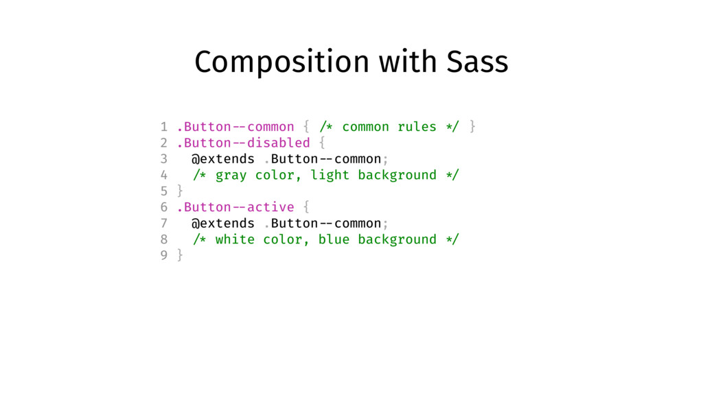
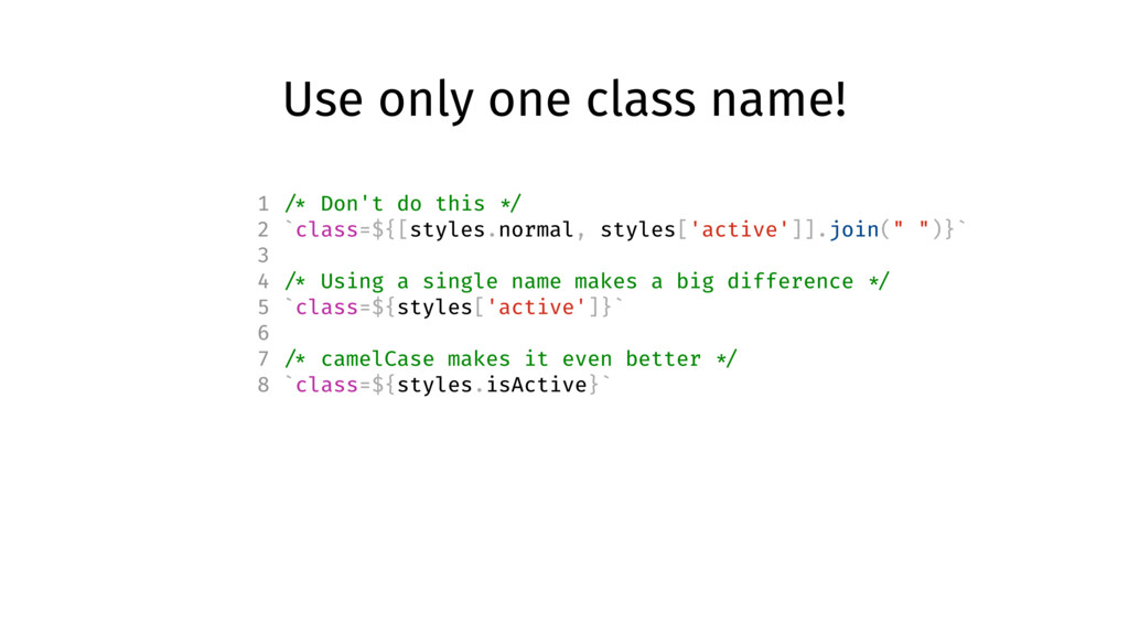
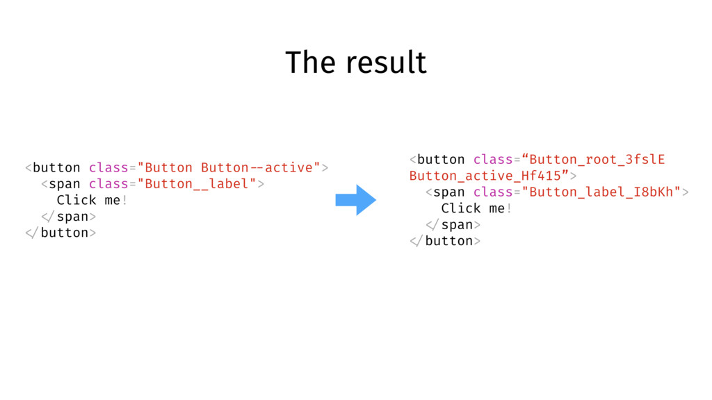
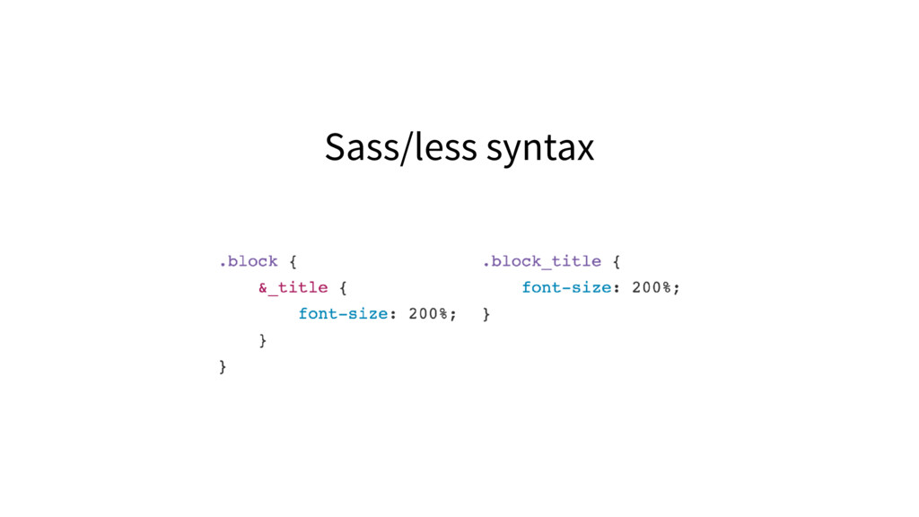
    */ 2 `class=${[styles.normal, styles['active']].join(" ")}` 3 4 /* Using a single name makes a big difference */ 5 `class=${styles['active']}` 6 7 /* camelCase makes it even better */ 8 `class=${styles.isActive}`
  49. The result <button class="Button Button --active"> <span class="Button__label"> Click me!

    </span> </button> <button class=“Button_root_3fslE Button_active_Hf415”> <span class="Button_label_I8bKh"> Click me! </span> </button>
  50. Compose from other files! 1 /* colors.css */ 2 .active

    { 3 background-color: blue; 4 } 5 .secondary { 6 background-color: #999; 7 } 1 /* Button.css */ 2 .root { /* general rules */ } 3 .active { 4 composes: root; 5 composes: active from ' ../colors.css'; 6 /* active rules */ 7 }
  51. Or use variables! /* variables.css */ @value small: (max-width: 599px);

    /* component.css */ @value small from "./variables.css"; .pageContent { background: green; @media small { background: red; } }
  52. Minification 1 // webpack.config.js 2 3 module.exports = { 4

    module: { 5 loaders: [ 6 { 7 test: /\.css$/, 8 loader: "css?modules" 9 } 10 ] 11 } 12 };
  53. Minification <button class="Button"> <span class="Button__label"> Click me! </span> </button> <button

    class="1s6s23ca312"> <span class="sdp9423cadg"> Click me! </span> </button>
  54. Solved with CSS-modules ✅ No styles isolation ✅ Constants sharing

    ✅ Minification ✅ Disconnected from component’s code ✅ Implicit dependencies
  55. Local by default but allow exceptions .local-class { color: red;

    } :global(.prefix-modal-open) .local-class { color: green; }
  56. Composition .common { /* all the common styles you want

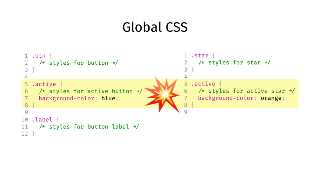
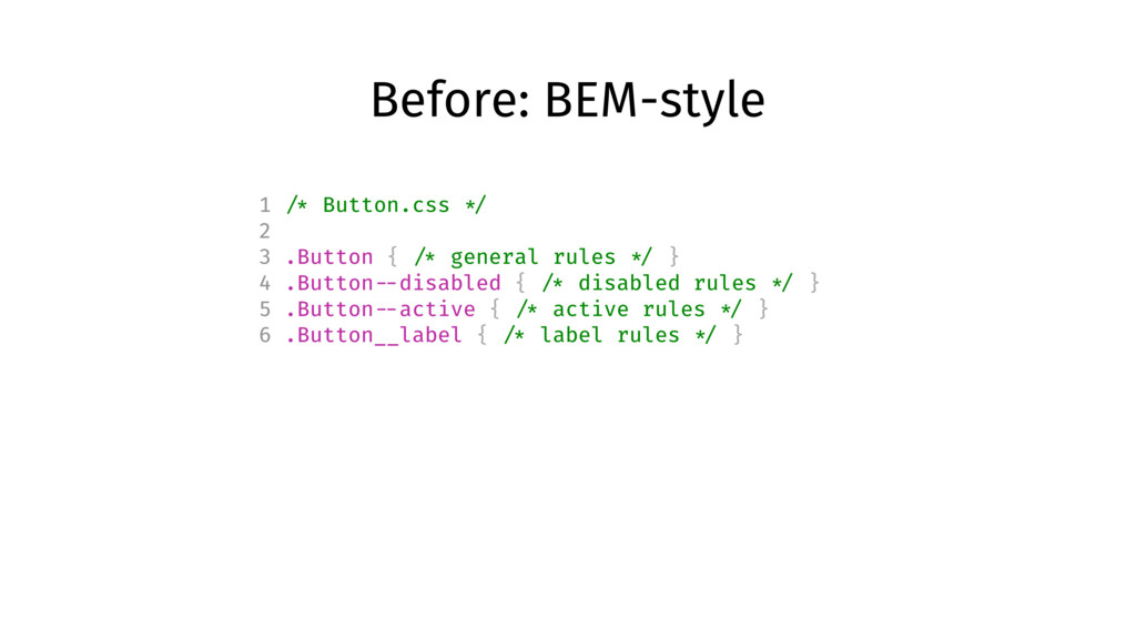
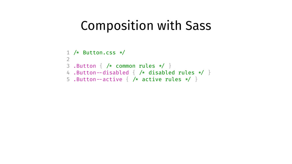
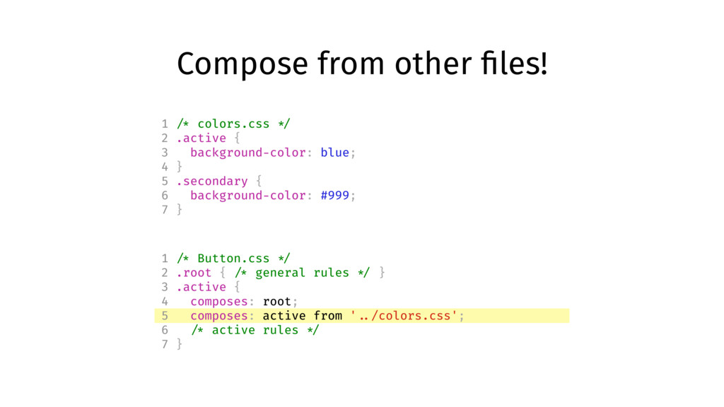
    */ } .normal { composes: common; /* anything that only applies to Normal */ } .disabled { composes: common; /* anything that only applies to Disabled */ }
  57. Import variables /* variables.css */ @value small: (max-width: 599px); /*

    component.css */ @value small from "./breakpoints.scss"; .pageContent { background: green; @media small { background: red; } }
  58. Use with pre-processors like Sass or Less :global { .this-is-global

    { color: yellow; } .potential-collision-city { color: crap; } }
  59. CSS next :root { --red: #d33; } a { &:hover

    { color: color(var( --red) a(54%)); } } a:hover { color: #dd3333; color: rgba(221, 51, 51, 0.54); }
  60. PostCSS overview 1. More powerful and faster than pre-processors thanks

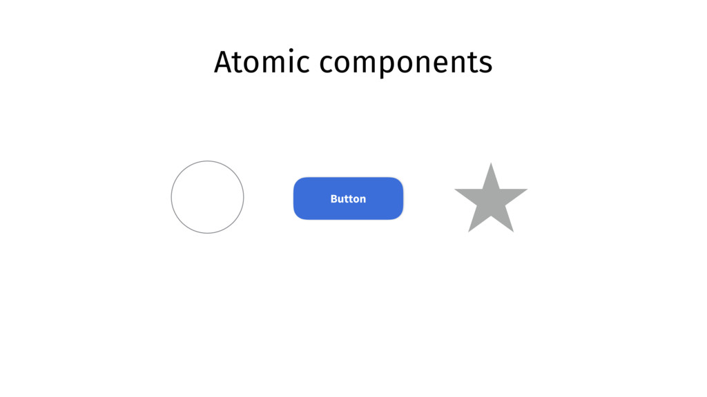
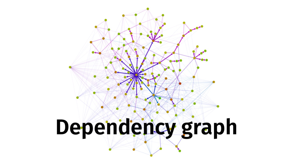
    AST 2. Lots of plugins and easy to write your own 3. Tools! stylelint or automatic properties sorting 4. IDE Support (WebStorm, Atom, Sublime) 5. Shared constants between CSS and JS 6. Works not only with SPAs or React 7. It’s just CSS*
  61. Example setup with Webpack module.exports = { module: { loaders:

    [ { test: /\.css$/, use: ['style-loader', 'css-lader', 'postcss-loader'] } ] }, postcss: function() { return [ require('autoprefixer')({ browsers: ['last 2 version'] }) ]; } };
  62. Lint CSS as pre-commit hook 1 { 2 "lint-staged": {

    3 "*.css": "stylelint" 4 }, 5 "pre-commit": "lint-staged", 6 "stylelint": { 7 "extends": "stylelint-config-standard" 8 } 9 } https://github.com/okonet/lint-staged
  63. Do I need it? ✅ You work in a team

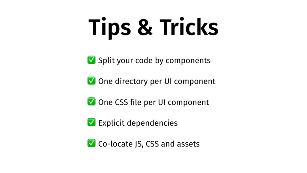
    ✅ You plan to update your CSS in the future ✅ You use third-party CSS and don’t want to break things ✅ You care about code readability and reusability ✅ You hate manual work
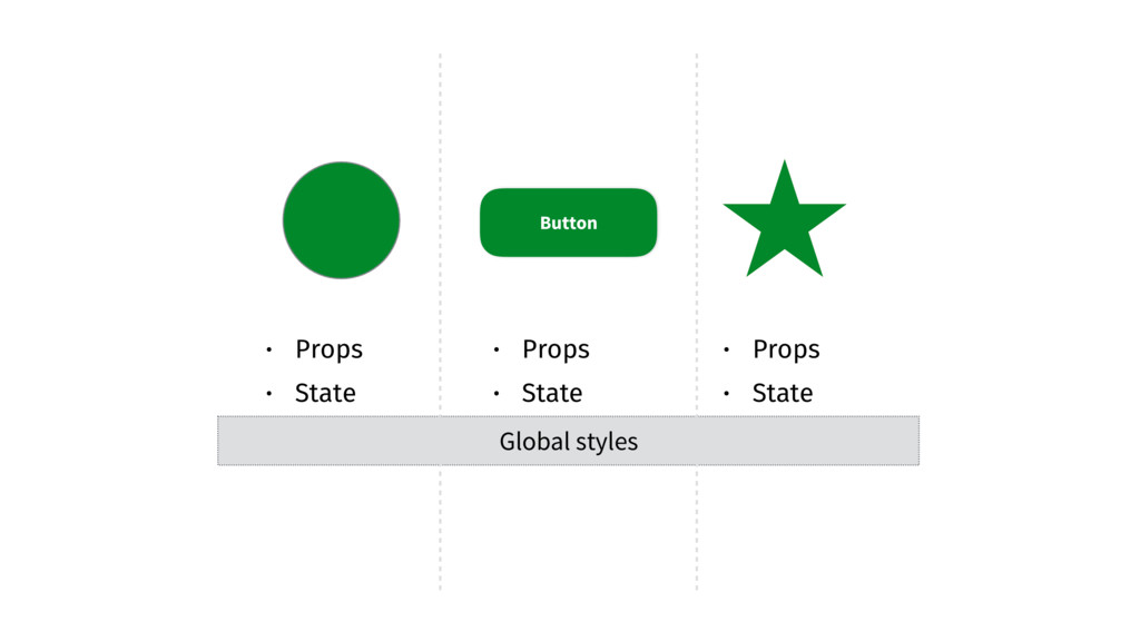