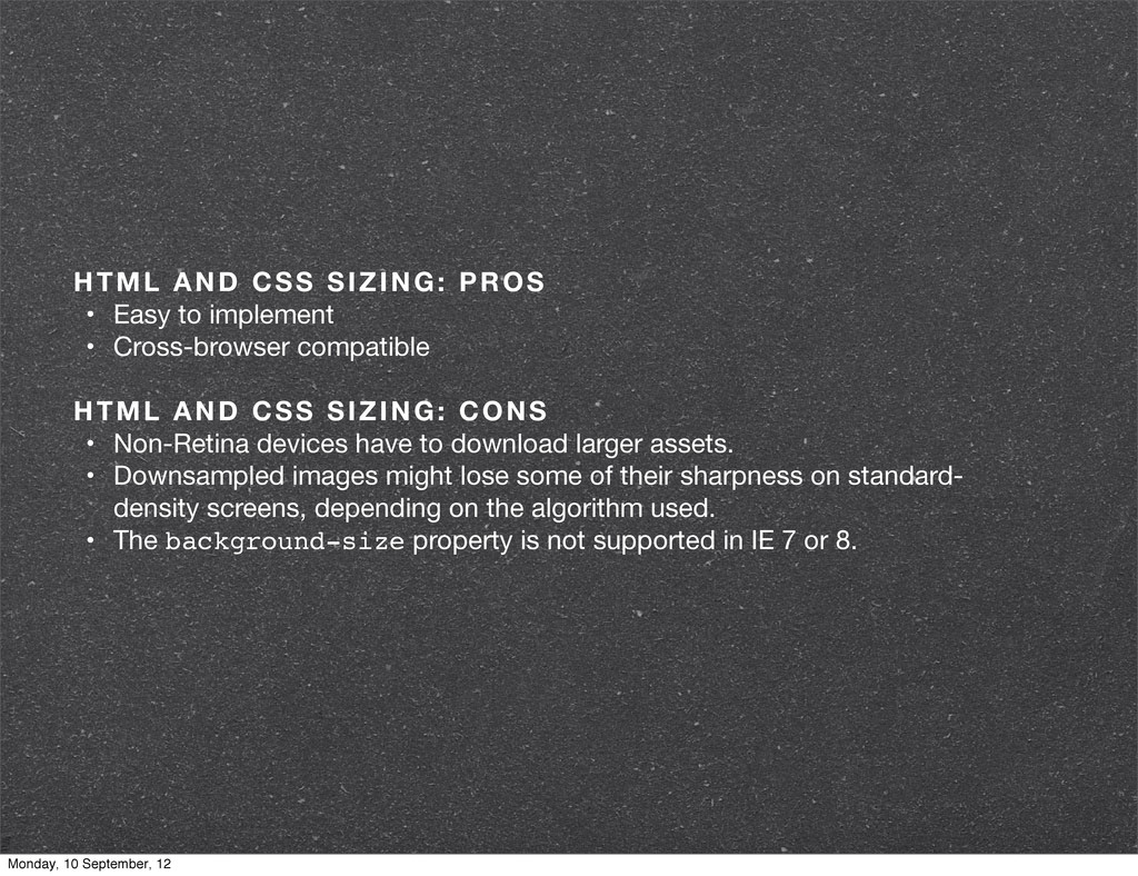
Cross-browser compatible HTML AND CSS SIZING: CONS • Non-Retina devices have to download larger assets. • Downsampled images might lose some of their sharpness on standard- density screens, depending on the algorithm used. • The background-size property is not supported in IE 7 or 8. Monday, 10 September, 12
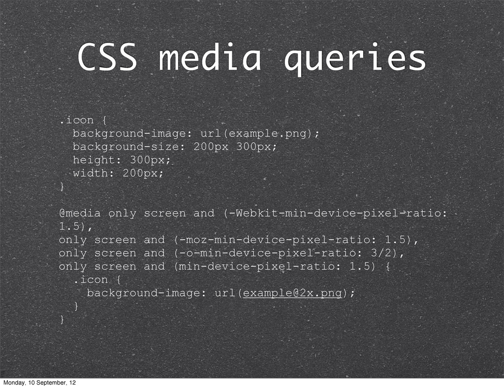
height: 300px; width: 200px; } @media only screen and (-Webkit-min-device-pixel-ratio: 1.5), only screen and (-moz-min-device-pixel-ratio: 1.5), only screen and (-o-min-device-pixel-ratio: 3/2), only screen and (min-device-pixel-ratio: 1.5) { .icon { background-image: url([email protected]); } } Monday, 10 September, 12
target them. • Cross-browser compatible • Pixel-precise control CSS QUERYING: CONS • Tedious to implement, especially on large websites. • Displaying content images as backgrounds of other HTML elements is semantically incorrect. Monday, 10 September, 12
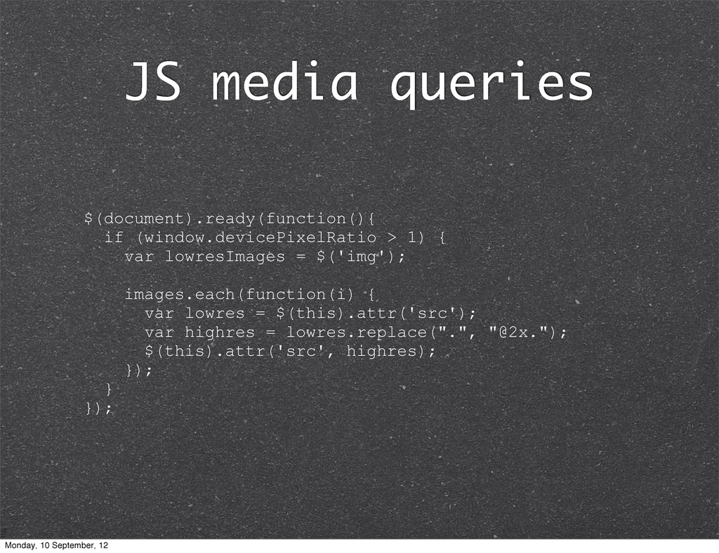
do not download large assets. • Pixel-precise control JAVASCRIPT QUERYING: CONS • Retina devices have to download both standard- and high-resolution images. • The image-swapping effect is visible on Retina devices. • Does not work on some popular browsers (such as IE and Firefox). Monday, 10 September, 12
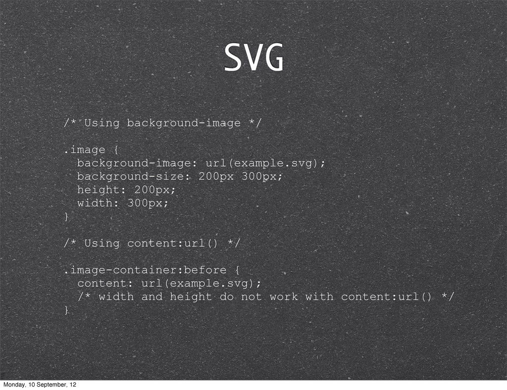
200px 300px; height: 200px; width: 300px; } /* Using content:url() */ .image-container:before { content: url(example.svg); /* width and height do not work with content:url() */ } Monday, 10 September, 12
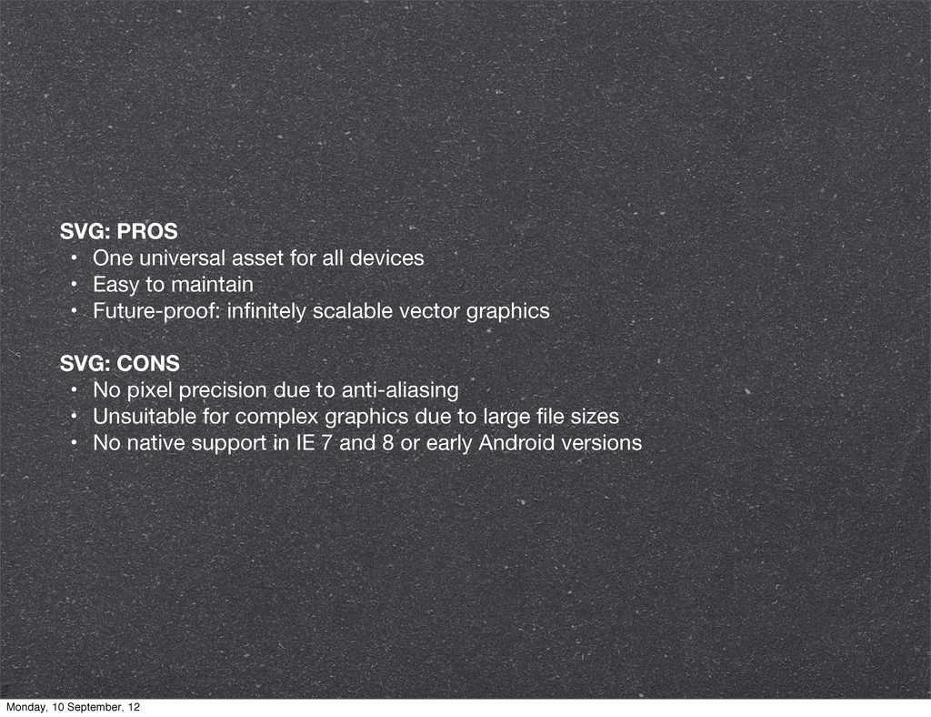
Easy to maintain • Future-proof: infinitely scalable vector graphics SVG: CONS • No pixel precision due to anti-aliasing • Unsuitable for complex graphics due to large file sizes • No native support in IE 7 and 8 or early Android versions Monday, 10 September, 12
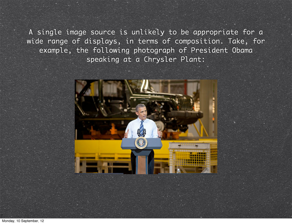
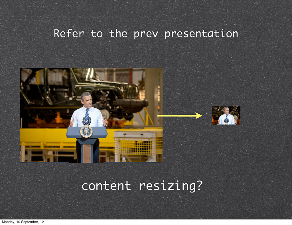
a wide range of displays, in terms of composition. Take, for example, the following photograph of President Obama speaking at a Chrysler Plant: Monday, 10 September, 12
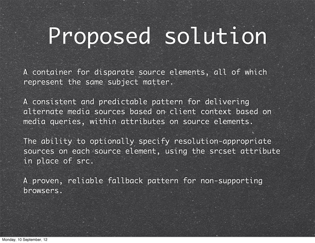
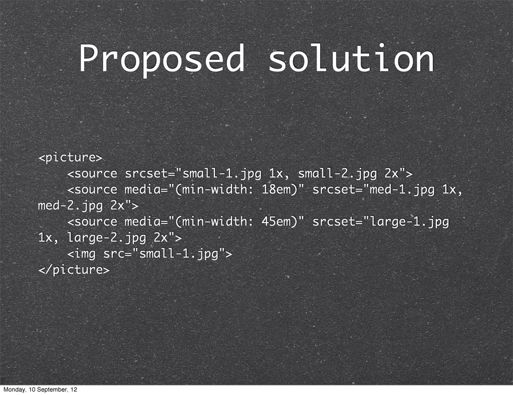
the same subject matter. A consistent and predictable pattern for delivering alternate media sources based on client context based on media queries, within attributes on source elements. The ability to optionally specify resolution-appropriate sources on each source element, using the srcset attribute in place of src. A proven, reliable fallback pattern for non-supporting browsers. Proposed solution Monday, 10 September, 12
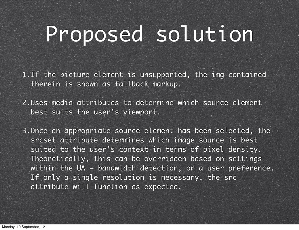
is shown as fallback markup. 2.Uses media attributes to determine which source element best suits the user’s viewport. 3.Once an appropriate source element has been selected, the srcset attribute determines which image source is best suited to the user’s context in terms of pixel density. Theoretically, this can be overridden based on settings within the UA — bandwidth detection, or a user preference. If only a single resolution is necessary, the src attribute will function as expected. Proposed solution Monday, 10 September, 12
 oursky
 addyosmani
 jonoalderson
 holman
 yeseniaperezcruz
 reverentgeek
 axbom
axbom
 baasie
 swwweet
 schroneko
 szymonslowik
 aleyda
 konakalab
![HTML <img src="[email protected]" width="200" height="300" /> Monday, 10 September, 12](https://files.speakerdeck.com/presentations/504da2a5d3696f0002031b40/slide_2.jpg)
![CSS .image { background-image: url([email protected]); background-size: 200px 300px; /* Alternatively](https://files.speakerdeck.com/presentations/504da2a5d3696f0002031b40/slide_4.jpg)
![Proposed by Apple... .image { background-image: -Webkit-image-set(url(example.png) 1x, url([email protected]) 2x);](https://files.speakerdeck.com/presentations/504da2a5d3696f0002031b40/slide_14.jpg)