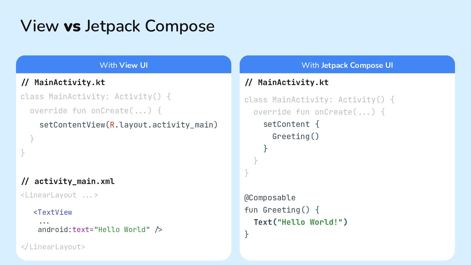
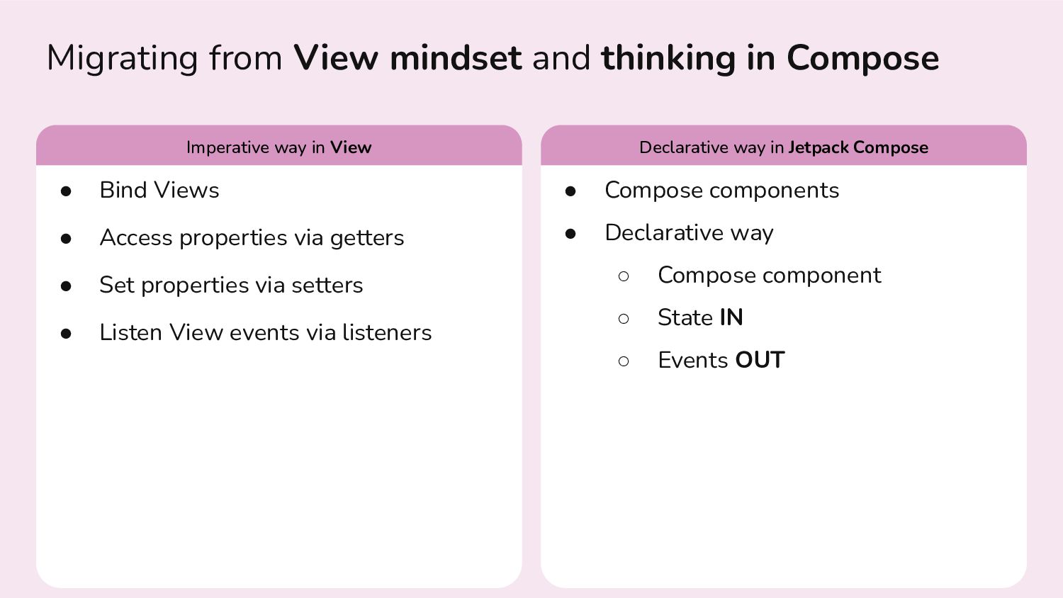
Views • Access properties via getters • Set properties via setters • Listen View events via listeners • Compose components • Declarative way ◦ Compose component ◦ State IN ◦ Events OUT Imperative way in View Declarative way in Jetpack Compose
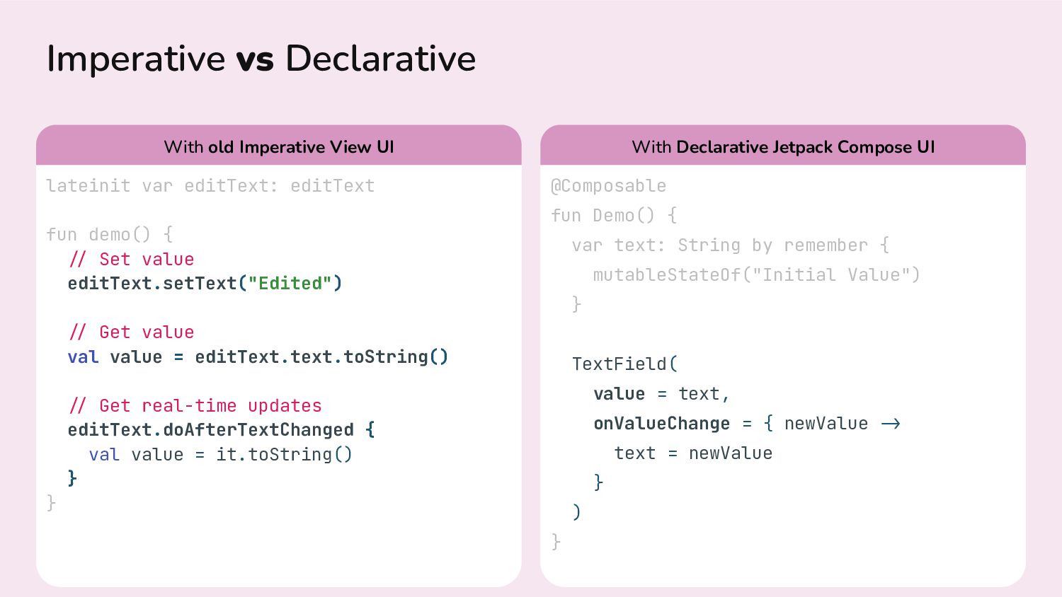
./ Set value editText.setText("Edited") ./ Get value val value = editText.text.toString() ./ Get real-time updates editText.doAfterTextChanged { val value = it.toString() } } @Composable fun Demo() { var text: String by remember { mutableStateOf("Initial Value") } TextField( value = text, onValueChange = { newValue .> text = newValue } ) } With old Imperative View UI With Declarative Jetpack Compose UI
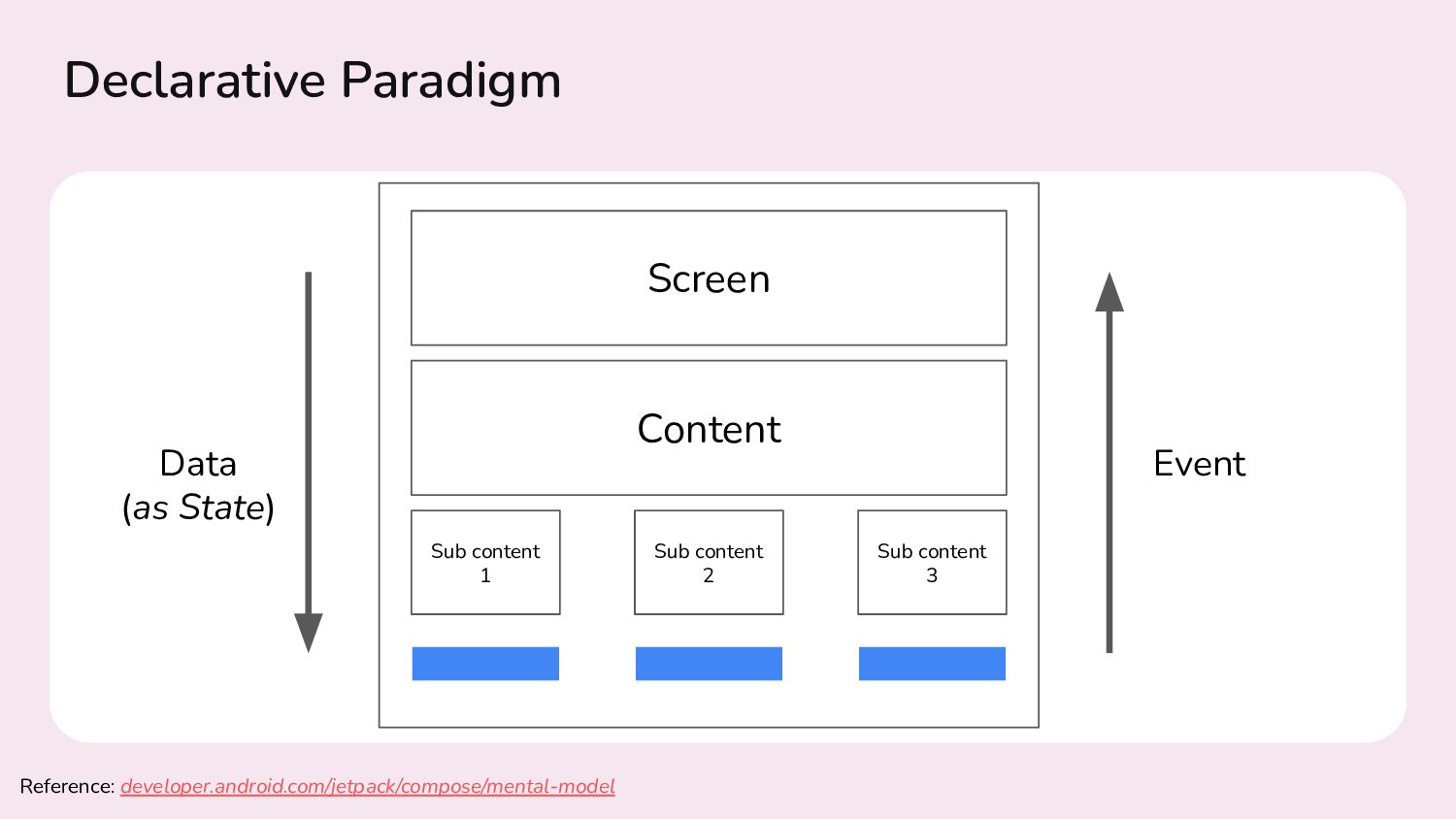
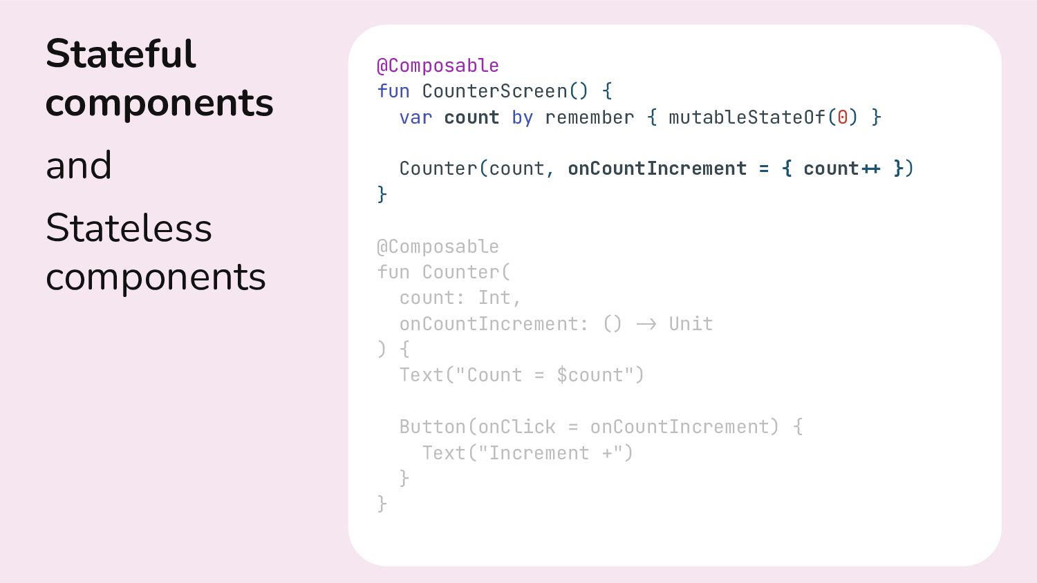
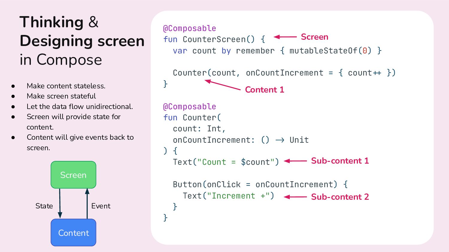
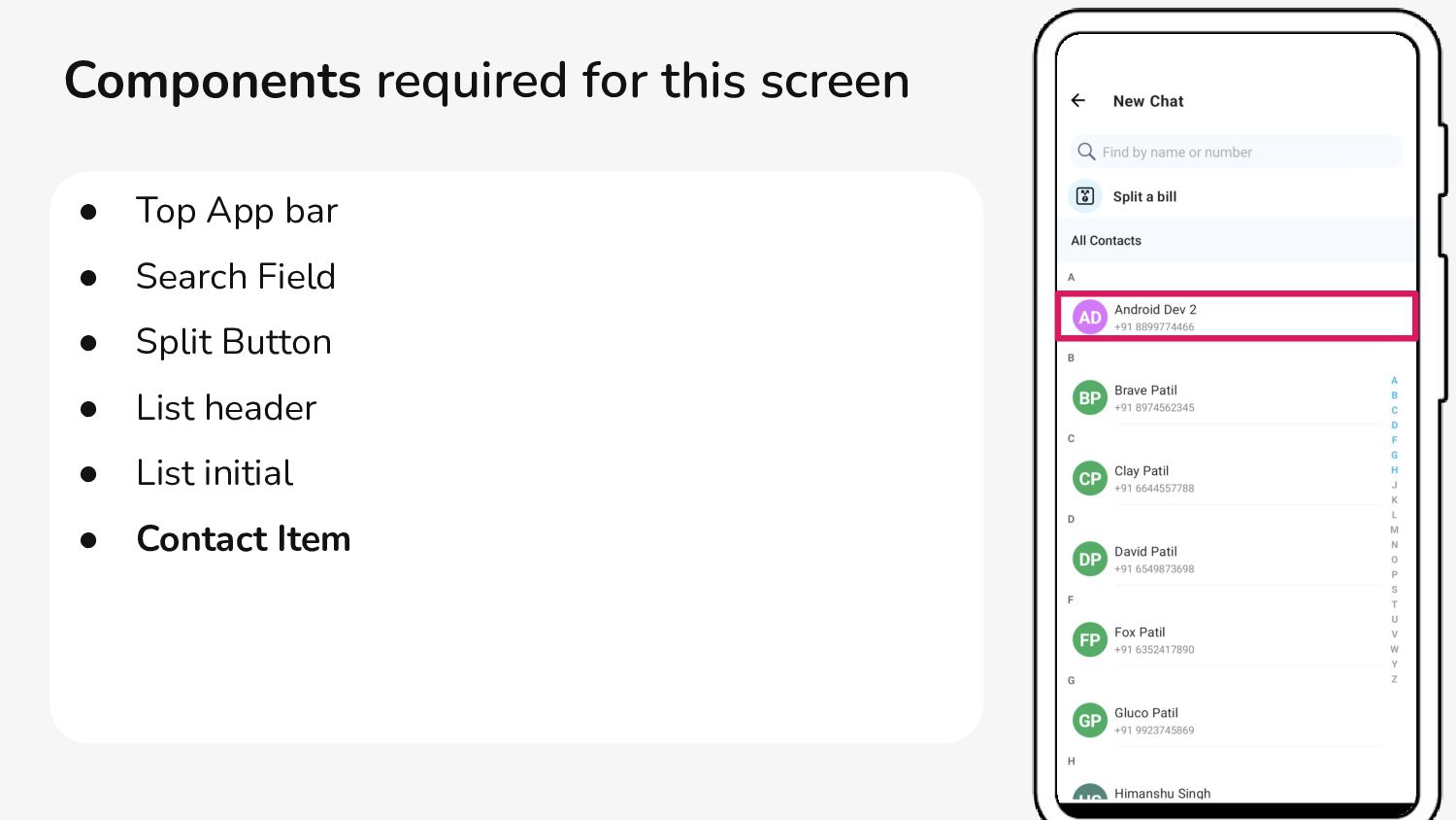
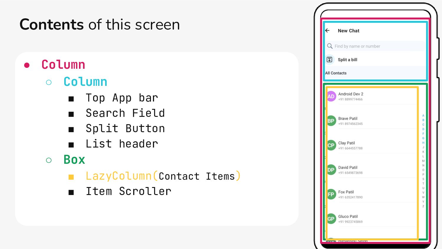
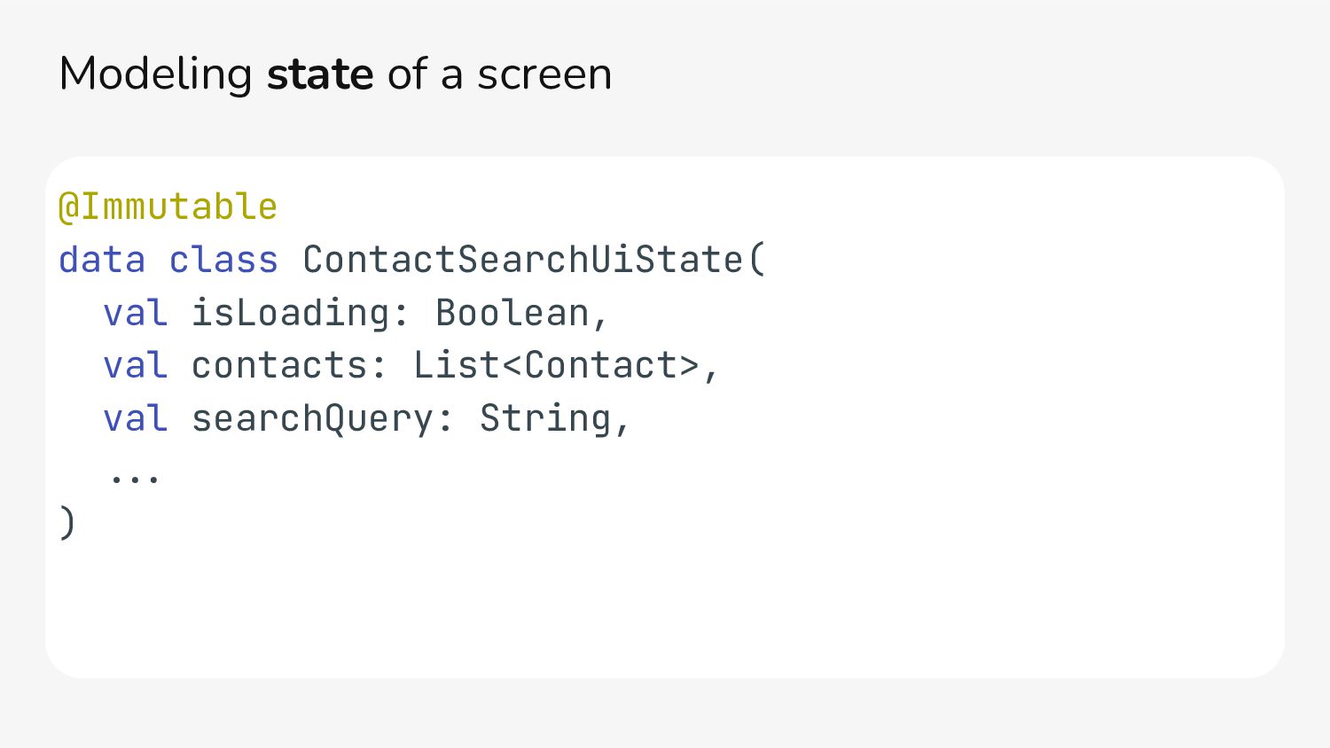
} Counter(count, onCountIncrement = { count.+ }) } @Composable fun Counter( count: Int, onCountIncrement: () .> Unit ) { Text("Count = $count") Button(onClick = onCountIncrement) { Text("Increment +") } } Thinking & Designing screen in Compose Screen Content State Event Sub-content 1 Sub-content 2 Content 1 Screen • Make content stateless. • Make screen stateful • Let the data flow unidirectional. • Screen will provide state for content. • Content will give events back to screen.
in the existing UI. • Start replacing the simplest and small components first in the existing UI. • Migrate screen fully into Jetpack Compose. • Design new components or screens in Compose.
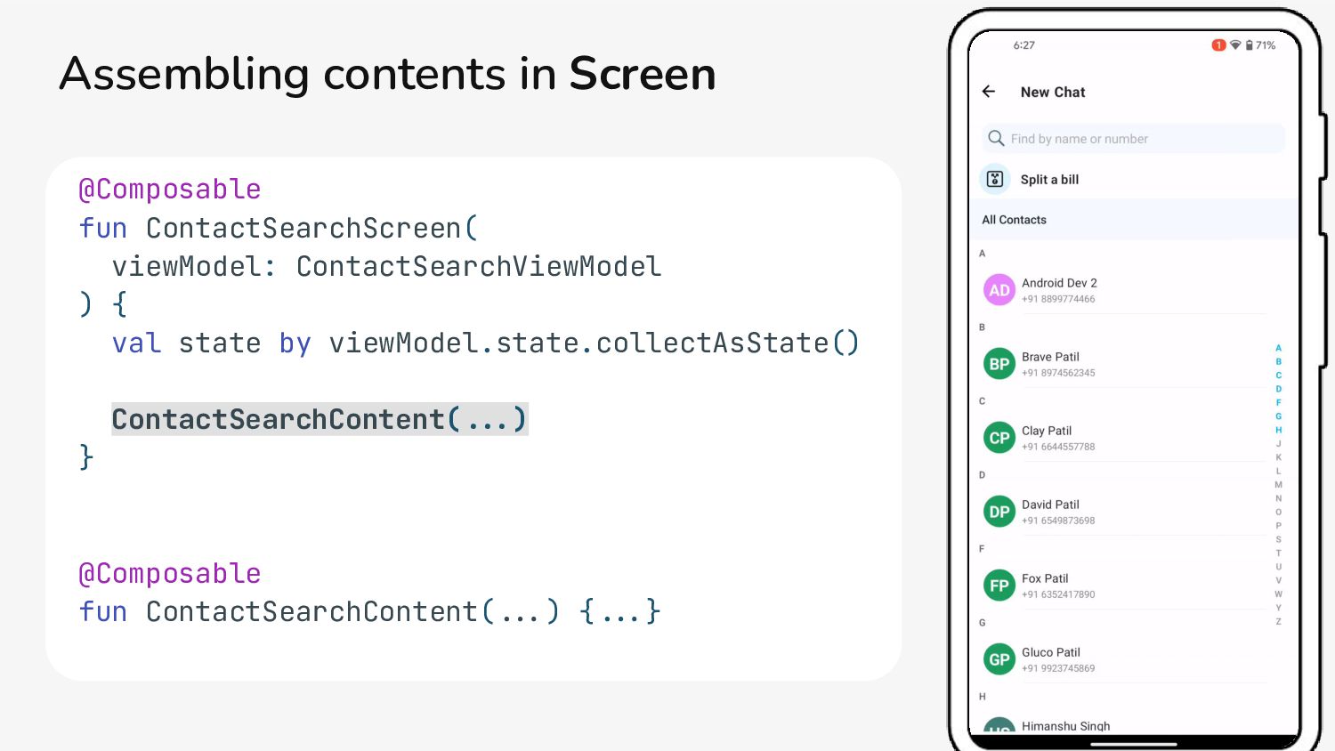
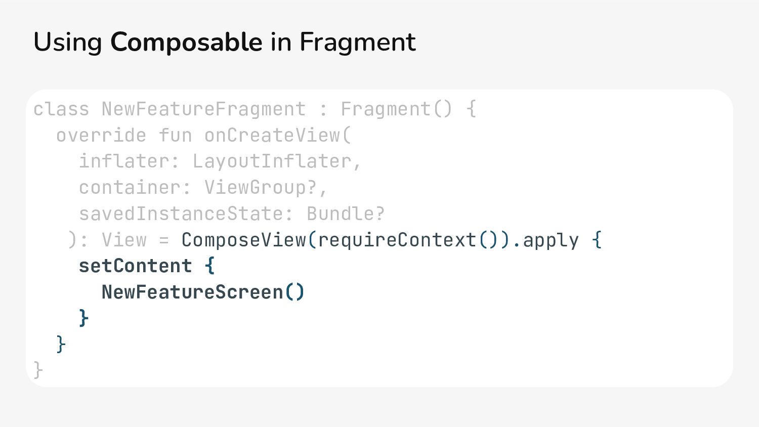
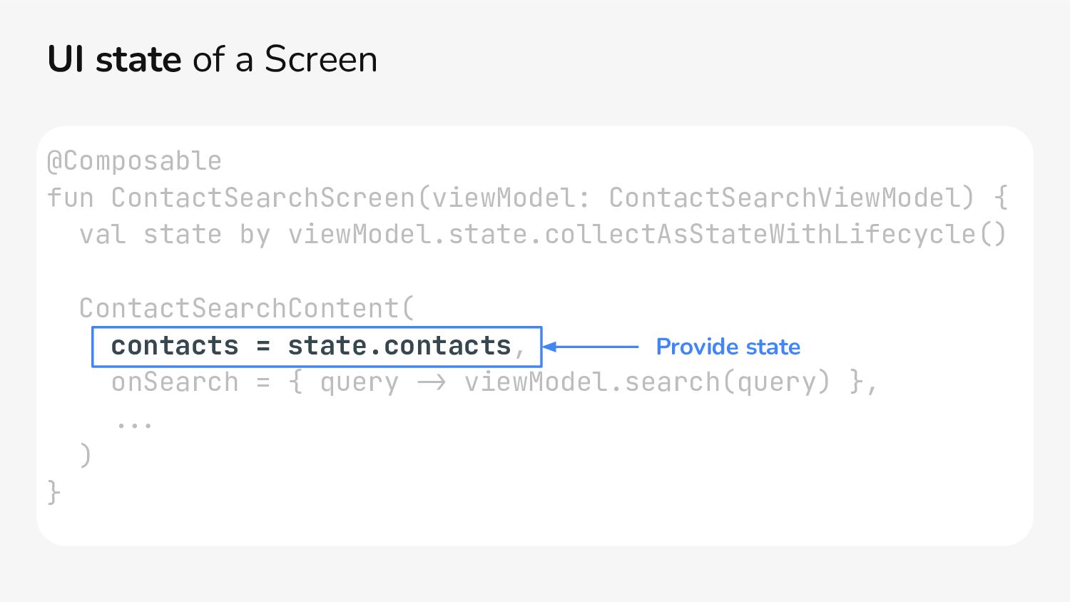
{ ContactSearchScreen(viewModel) } } } @Composable fun ContactSearchScreen(viewModel: ContactSearchViewModel) { val state by viewModel.state.collectAsState() ContactSearchContent(...) } Render Screen in Activity
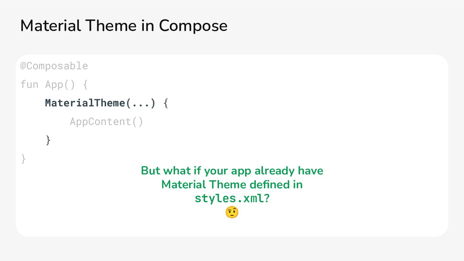
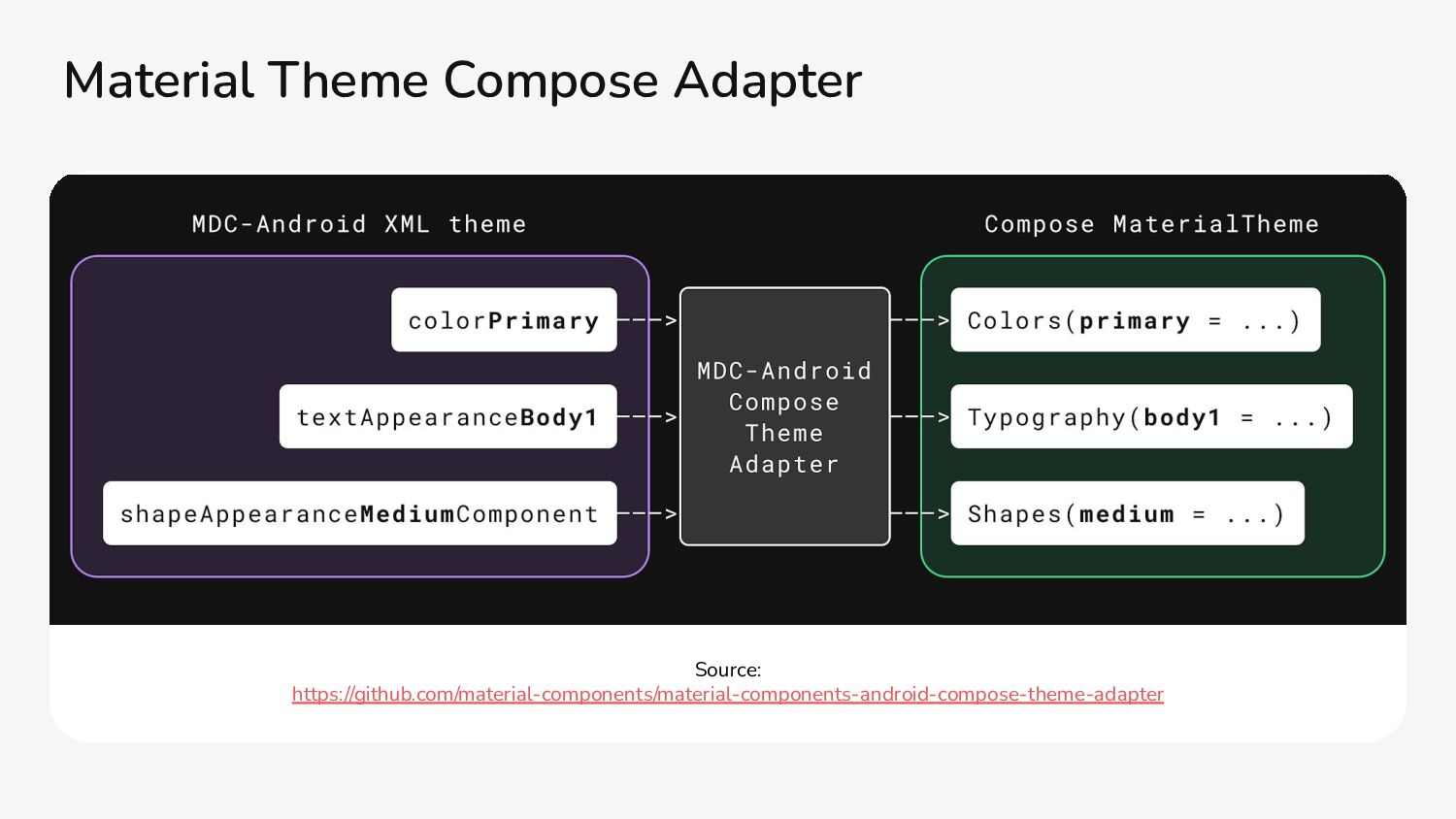
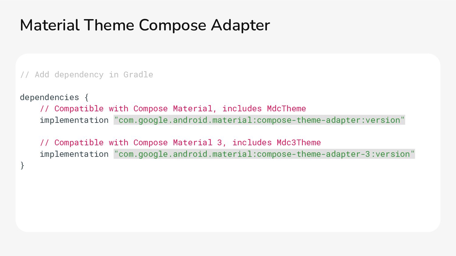
Compose Material, includes MdcTheme implementation "com.google.android.material:compose-theme-adapter:version" // Compatible with Compose Material 3, includes Mdc3Theme implementation "com.google.android.material:compose-theme-adapter-3:version" } Material Theme Compose Adapter
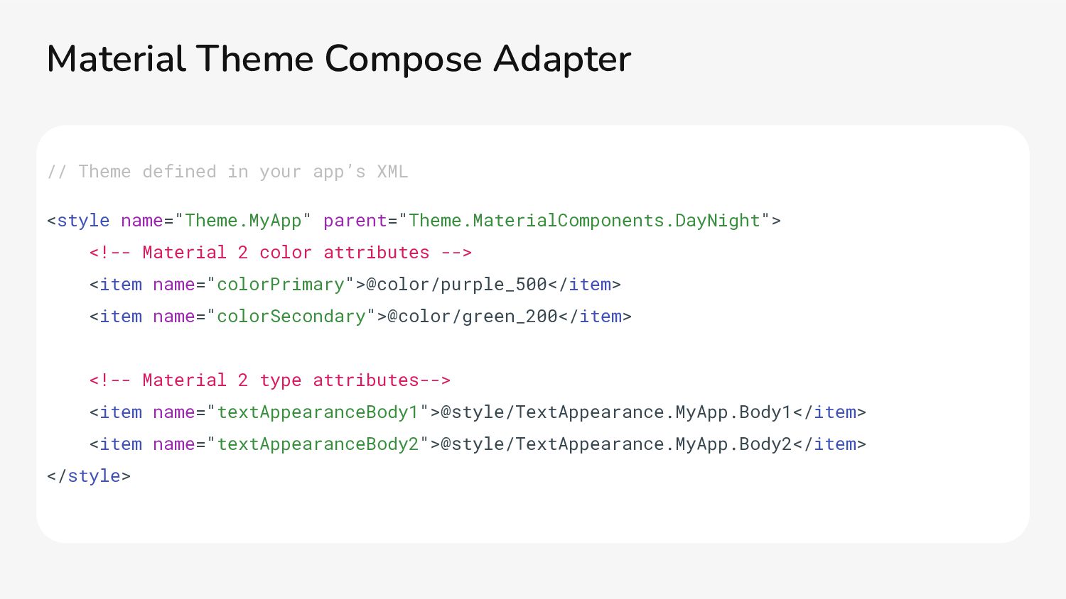
<!-- Material 2 color attributes --> <item name="colorPrimary">@color/purple_500</item> <item name="colorSecondary">@color/green_200</item> <!-- Material 2 type attributes--> <item name="textAppearanceBody1">@style/TextAppearance.MyApp.Body1</item> <item name="textAppearanceBody2">@style/TextAppearance.MyApp.Body2</item> </style> Material Theme Compose Adapter
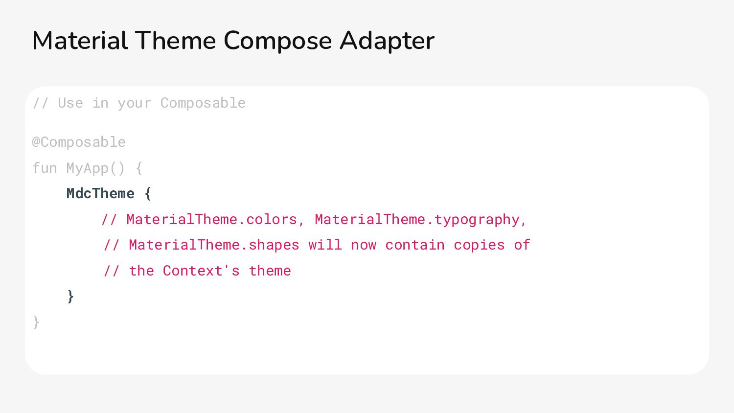
{ // MaterialTheme.colors, MaterialTheme.typography, // MaterialTheme.shapes will now contain copies of // the Context's theme } } Material Theme Compose Adapter
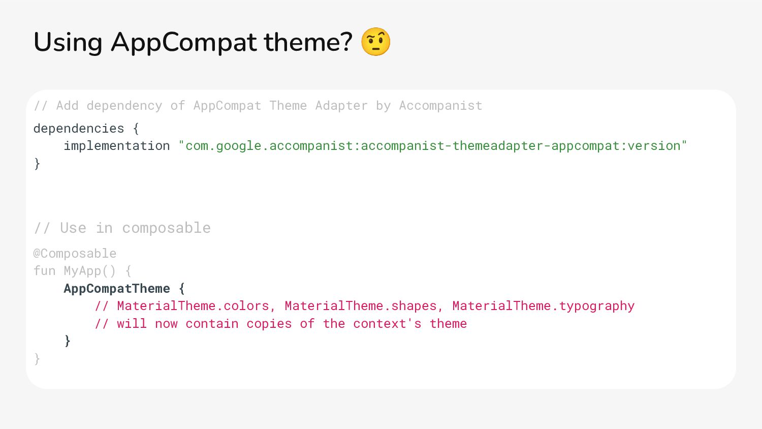
{ implementation "com.google.accompanist:accompanist-themeadapter-appcompat:version" } // Use in composable @Composable fun MyApp() { AppCompatTheme { // MaterialTheme.colors, MaterialTheme.shapes, MaterialTheme.typography // will now contain copies of the context's theme } } Using AppCompat theme? 🤨
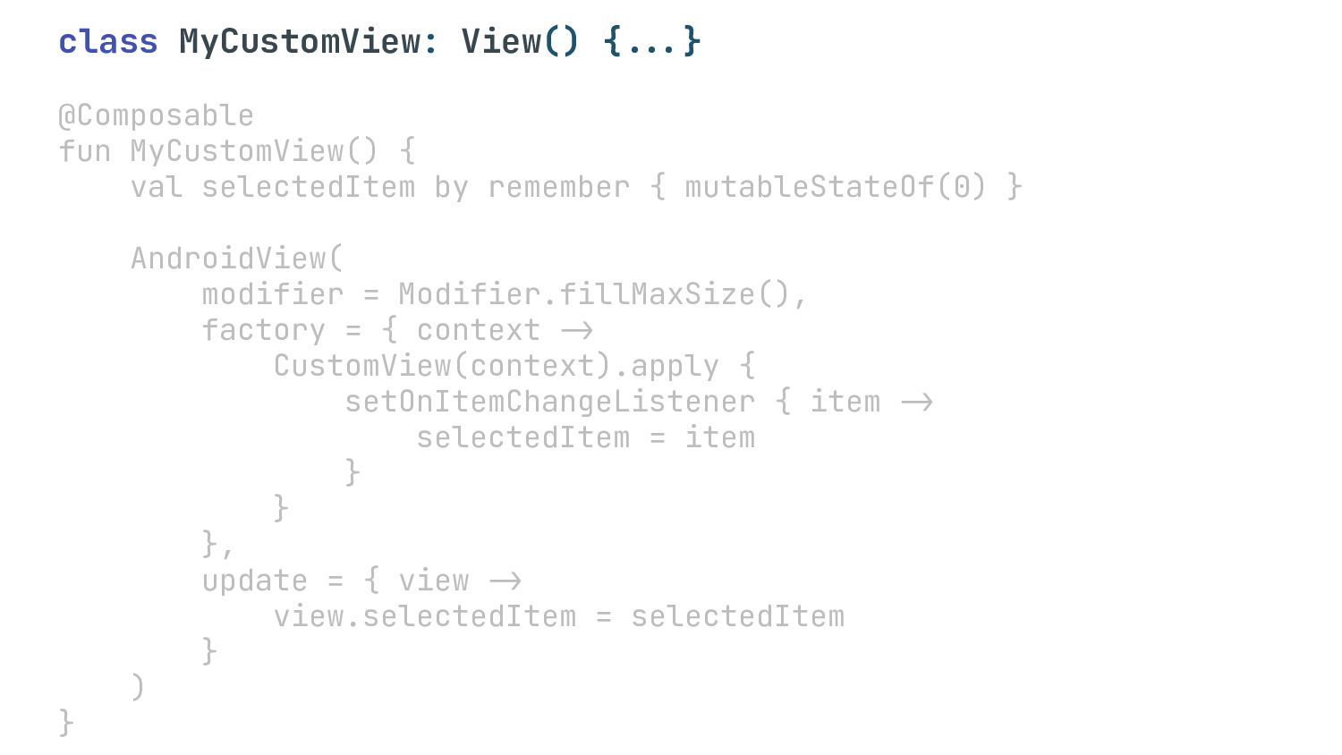
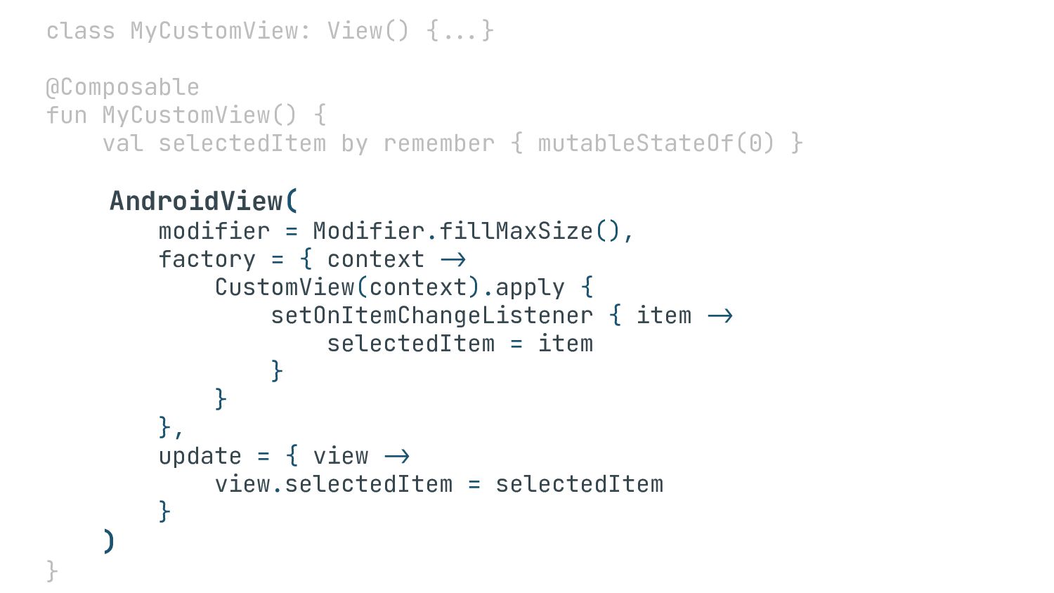
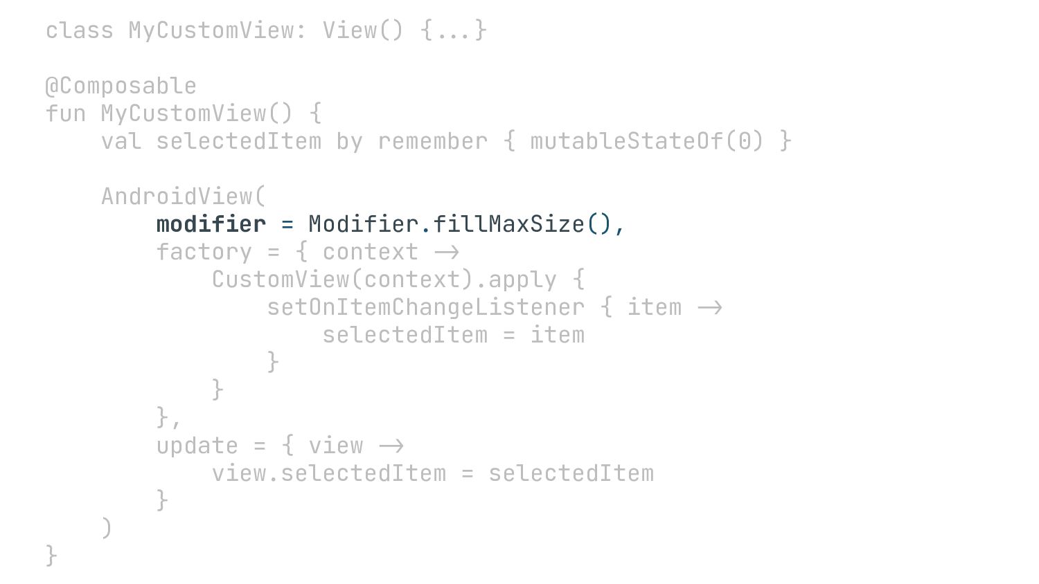
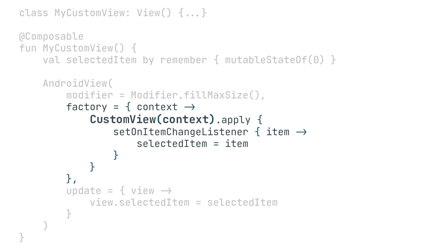
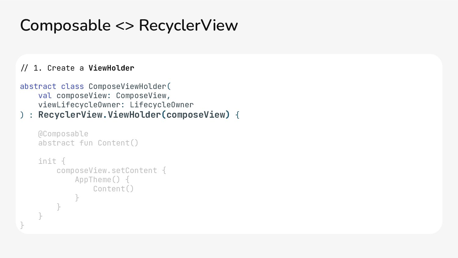
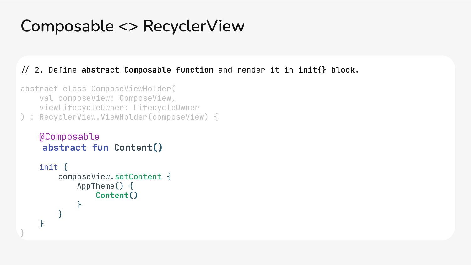
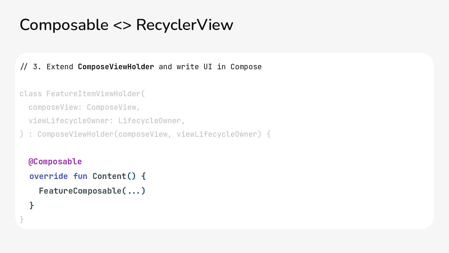
Example: New view type introduced in product which is going to be displayed in existing list powered by RecyclerView. Firefox using composables in ViewHolder: github.com/mozilla-mobile/fenix/ Composable <> RecyclerView Source: developer.android.com/
val state by viewModel.state.collectAsStateWithLifecycle() ContactSearchContent( contacts = state.contacts, onSearch = { query .> viewModel.search(query) }, ... ) } Provide state
 miyakemito
 yuukiyo
 smt7174
 twada
twada
 tomzoh
 bash0c7
 watany
 fkmy
fkmy
 you
you
 flatt_security
 kaonavi
 lara
lara
 aki_iinuma
 aleyda
 palkan
 letsgokoyo
 oripsolob
 addyosmani
 bcantrill
 mfonobong
 axbom
axbom
 maltzj