Upgrade to Pro — share decks privately, control downloads, hide ads and more …

Accessibility_for_Design_System_2019.pdf

Paya Do
November 02, 2019
34

 Accessibility_for_Design_System_2019.pdf

Paya Do

November 02, 2019
Tweet

Transcript

  1. Introduction Countries i have lived: Vietnam, US, Singapore, Japan Before

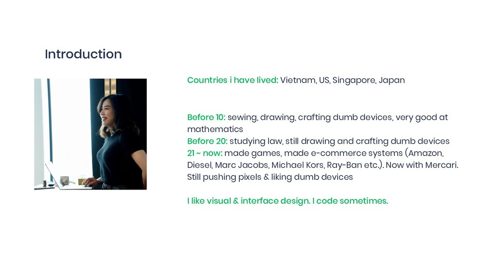
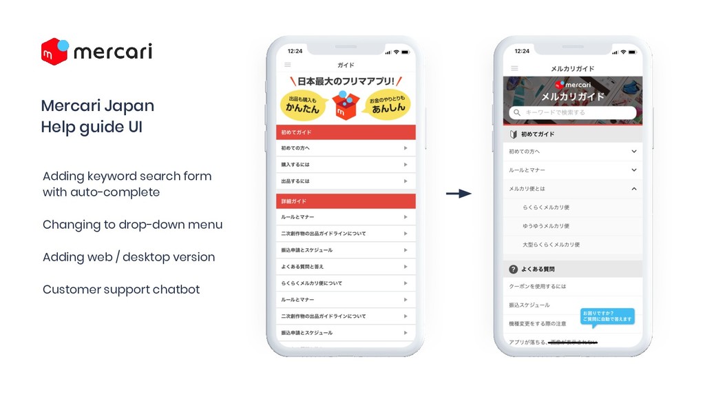
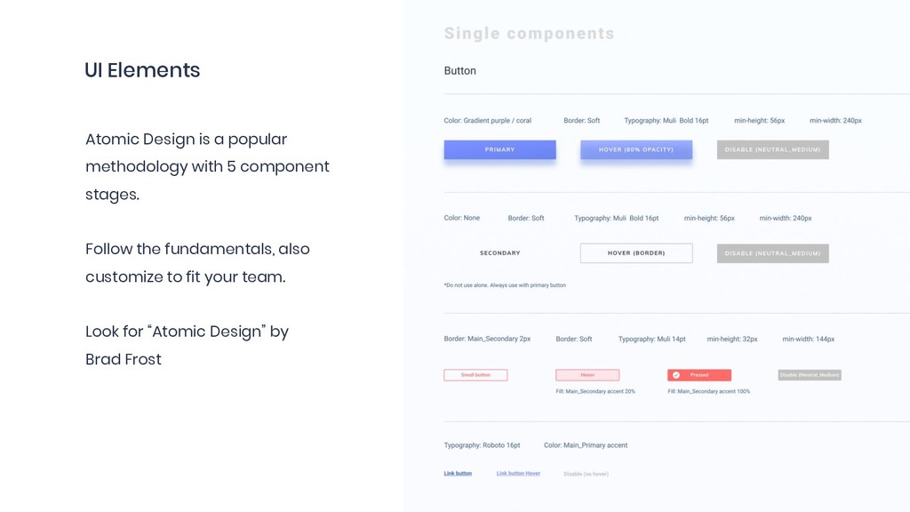
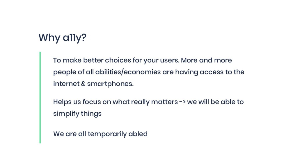
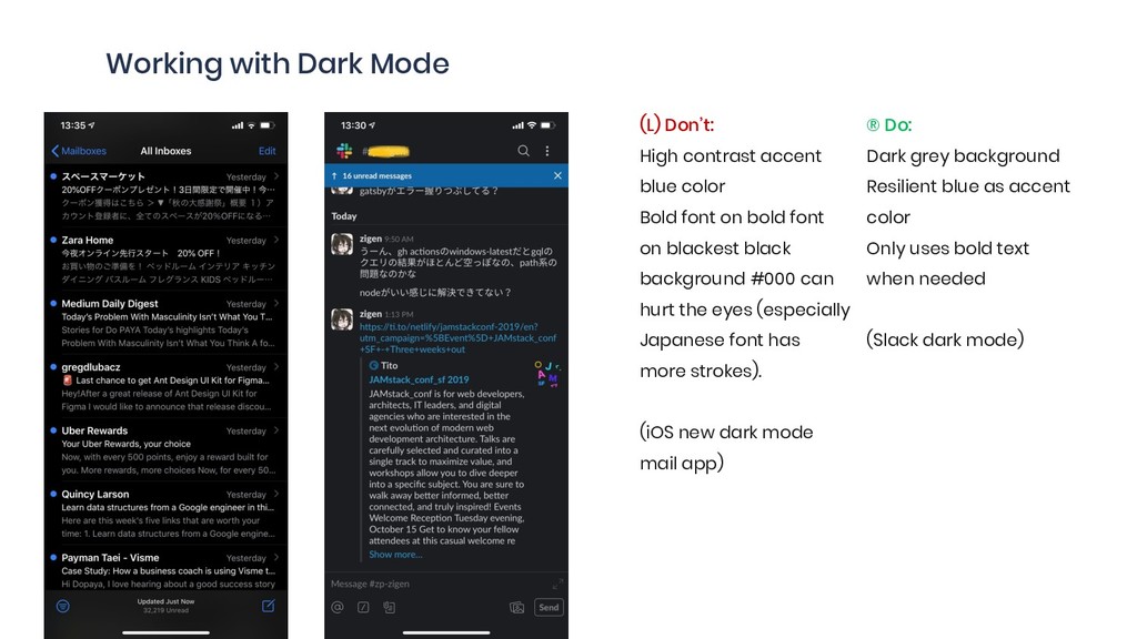
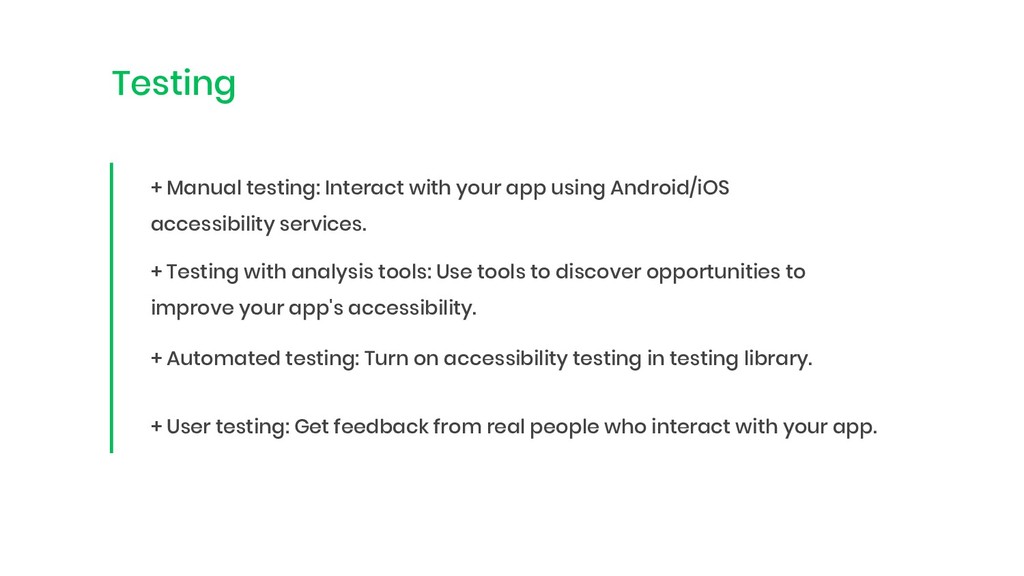
    10: sewing, drawing, crafting dumb devices, very good at mathematics Before 20: studying law, still drawing and crafting dumb devices 21 ~ now: made games, made e-commerce systems (Amazon, Diesel, Marc Jacobs, Michael Kors, Ray-Ban etc.). Now with Mercari. Still pushing pixels & liking dumb devices I like visual & interface design. I code sometimes.
  2. What Is Mercari? The Mercari app is a C2C marketplace

    where individuals can easily sell used items. Mercari offers a unique customer experience, with a transaction environment that uses the payments Mercari holds in escrow, and simple and affordable shipping options.
  3. By the Numbers (JP/Full Year) 232 346.8 GMV¹ 490.2 B


    In: billion JPY FY 06/2017 FY 06/2018 21.2 33.4 Net Sales 46.2 B
 In: billion JPY FY 06/2017 FY 06/2018 8.45 10.75 MAU² 13.57 M
 In: Million people FY 06/2017 FY 06/2018 Source: Internal documents, from FY2018.6 Presentation Material
 1. GMV after cancellation
 2. Monthly Active Users in June. Number of registered users that used our app in the month
 490.2 FY 06/2019 46.2 FY 06/2019 13.57 FY 06/2019
  4. Mercari’s Strengths Fun & Engaging App use time on par

    with that of social media Source: Nielsen Digital (January 2018) *Nielsen’s data is based only on mobile app usage and does not include PC browser use. Average monthly usage time for unique users in January 2018. Frill and Rakuma merged in February 2018.

  5. My current duty mercari R4D is a research and development

    organization of Mercari, Inc. established in December 2017. Our goal is to conduct speedy research and development, and to implement them within society
  6. Mercari Japan Help guide UI Adding keyword search form with

    auto-complete Changing to drop-down menu Adding web / desktop version Customer support chatbot
  7. UI Elements Atomic Design is a popular methodology with 5

    component stages. Follow the fundamentals, also customize to fit your team. Look for “Atomic Design” by Brad Frost
  8. A simple example Letter “M” can look different and sound

    different on different browsers. Design system means working with small parts to create pattern. Ethan Marcotte - The World-Wide Work https://newadventuresconf.com/2019/coverage/ethan/
  9. Why a11y? To make better choices for your users. More

    and more people of all abilities/economies are having access to the internet & smartphones. Helps us focus on what really matters -> we will be able to simplify things We are all temporarily abled
  10. Accessibility: Live Caption Live, on-device captions for any video you

    watch on your Android device, coming later this year with Android Q Use cases: people with hearing difficulty, talking on a phone with noisy background, etc.
  11. Solve one, benefit others Situational limitation A solution can scale

    to broader audiences https://download.microsoft.com/download/b/0/d/b0d4bf87-09ce-4417-8f28-d60703d672ed/inclusive_toolkit_manual_final.pdf
  12. “In Vietnam, the survey found that over 7 per cent

    of the population aged 2 years and older, – around 6.2 million, have a disability but an additional 13 per cent - nearly 12 million, live in a household with a person with a disability.” “Asia is the largest growing market for smartphones.” “30% of users in India search primarily using voice.” https://www.unicef.org/vietnam/press-releases/launch-key-findings-viet-nams-first-large-scale-national-survey-people-disabilities
  13. Perceivable Color & Contrast Web Content Accessibility Guidelines (WCAG) 2.1

    285 million people who are visually impaired around the world https://www.butterfly.com.au/blog/design/heres-why-you-need-a-wcag-friendly-digital-design-system A (minimal): Low AA (mid): standard AAA (highest)
  14. Dark Theme Android Q Saving up to 60% of phone

    battery Enhance accessibility
  15. Working with Dark Mode (L) Don’t: High contrast accent blue

    color Bold font on bold font on blackest black background #000 can hurt the eyes (especially Japanese font has more strokes). (iOS new dark mode mail app) ® Do: Dark grey background Resilient blue as accent color Only uses bold text when needed (Slack dark mode)
  16. Operable Keyboard accessible, Navigation through things Mercari Transaction Checker Tool:

    navigation through keyboard, error tolerant, focus oder, used daily by non-dev employees.
  17. Operable Touch target sizing Simple principle: Make your targets big

    so that they are easy for the users to tap. Apple’s Human Interface Guidelines: minimum 44px Google’s Material Design: minimum 48px Microsoft’s Windows Phone UI Design & Interaction Guide: recommended 34px
  18. Understandable Predictable & consistent Labelling: screen readers can render to

    explain the meaning of UI elements Keyword: screen reader as “assistive technology”
  19. Robust “Everything works” Some are slower, some are faster to

    adopt new technologies. But everyone is allowed to choose their own method to access the internet content. Clean, standard code that helps assistive technologies react correctly.
  20. A11y is not difficult. One bite at a time. Start

    with... Focus on user, not the technology
  21. The repository of publicly available design systems and pattern libraries.

    Contrast Analysis & Accessibility guidelines ready-systems are some good references (with Material Design too) ‘https://adele.uxpin.com/’
  22. Check the contrast ratio The most common accessibility failure. Golden

    number 4:5:1 or at least meet the AA standard Colorable tool https://colorable.jxnblk.com/
  23. Clean code & robust content 68% of homepages are missing

    alternative text/image. Lighthouse tool for Chrome
  24. The web components problem: - No focus styles - Lack

    of keyboard access - Poor contrast, font size - Inability to zoom - No screen reader (assistive technology support) - Autoplaying motion - Cryptic, unlabeled icons - No captions/alt/descriptions
  25. Testing + Manual testing: Interact with your app using Android/iOS

    accessibility services. + Testing with analysis tools: Use tools to discover opportunities to improve your app's accessibility. + Automated testing: Turn on accessibility testing in testing library. + User testing: Get feedback from real people who interact with your app.
  26. Any product, that doesn’t fulfill all the standards regarding accessibility

    has the power to do harm and exclude people Design has power to improve inequality for internet users.
  27. Go beyond & do not stay average Devices are getting

    more affordable. Communication technology and designing for the extreme can develop better solutions, and make a good product, not just to do good. Let’s include as many people as possible.