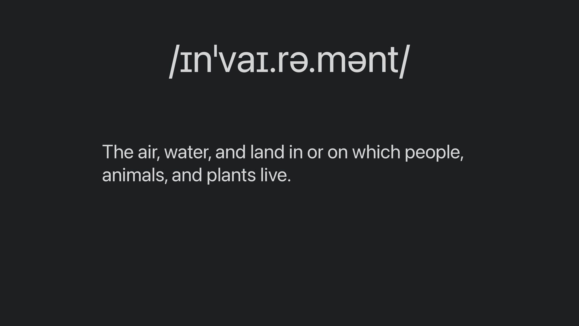
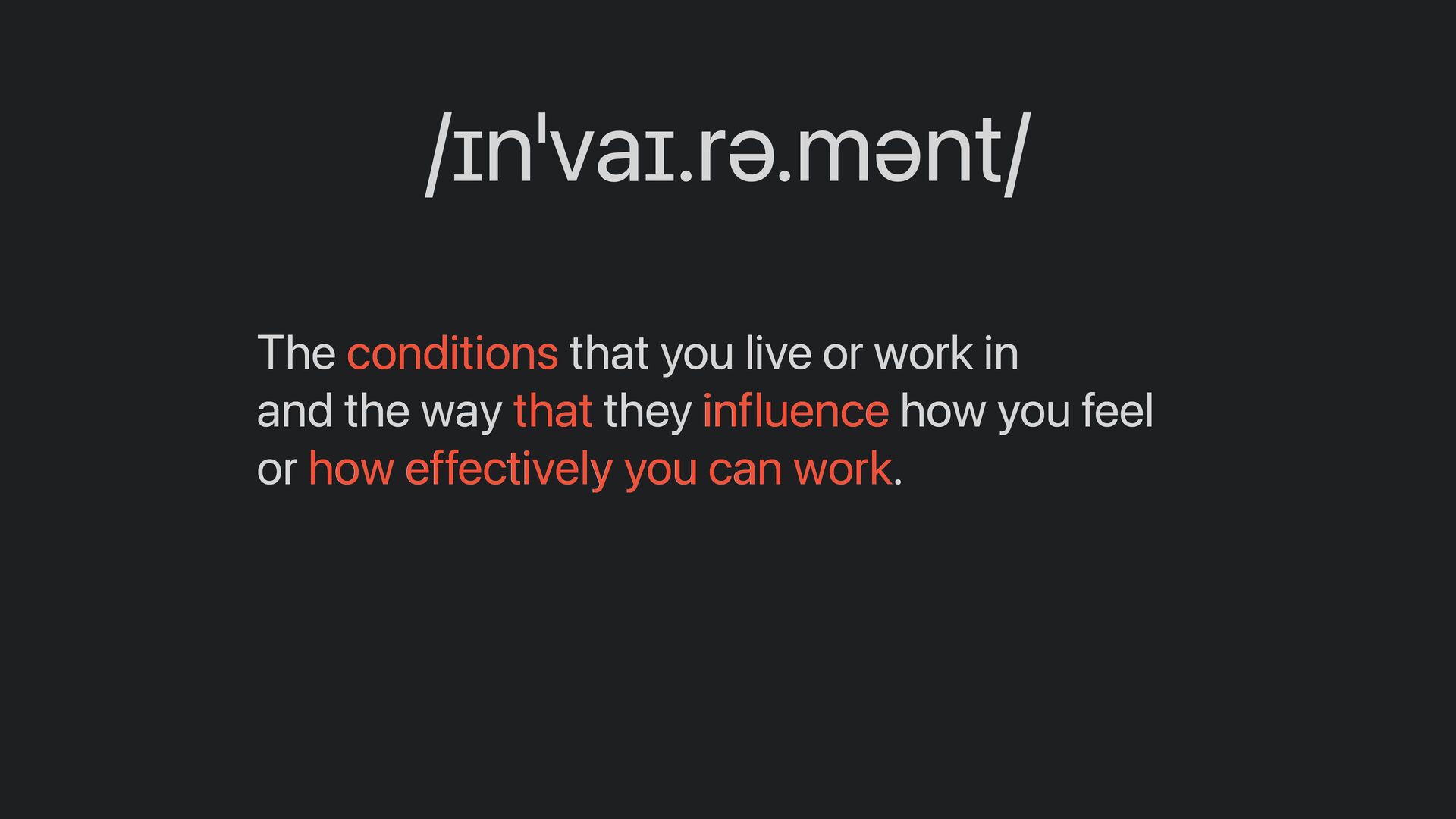
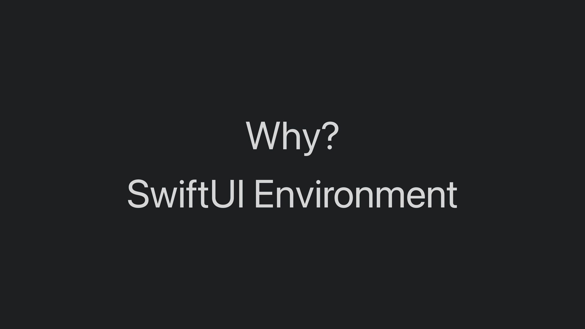
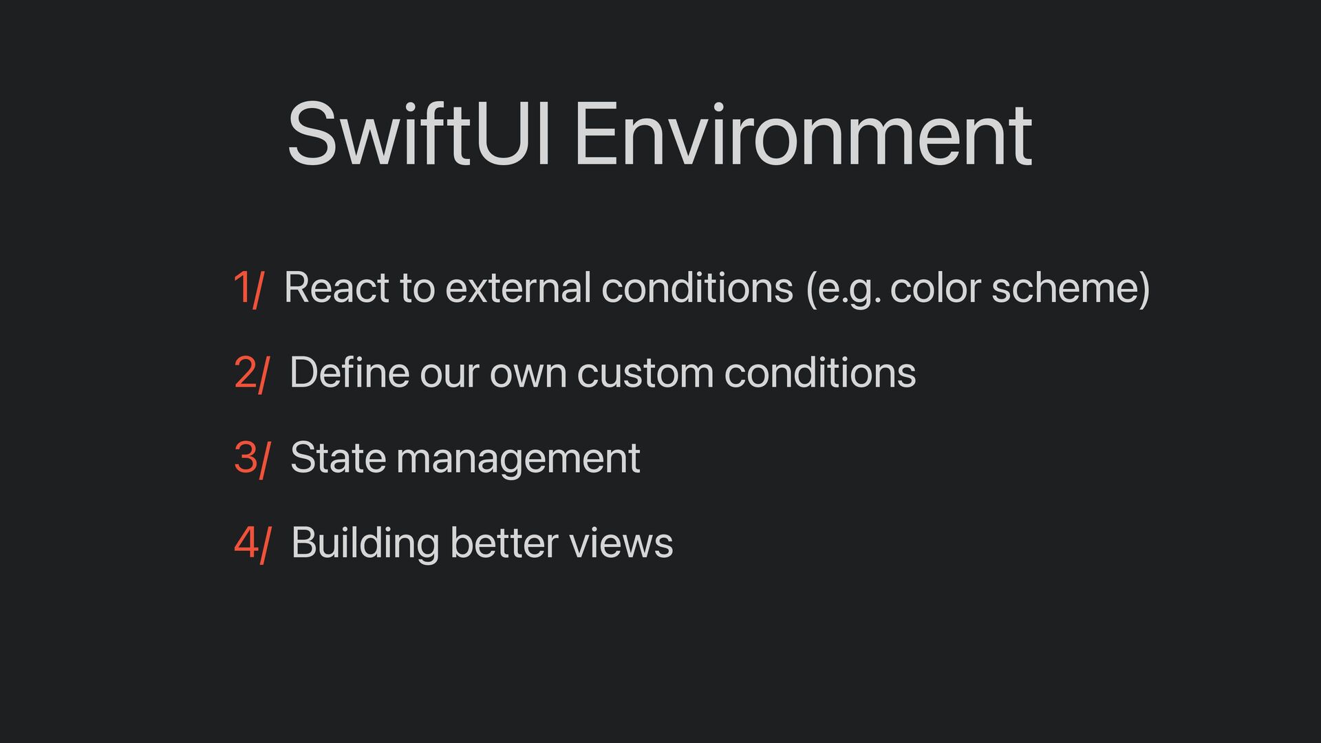
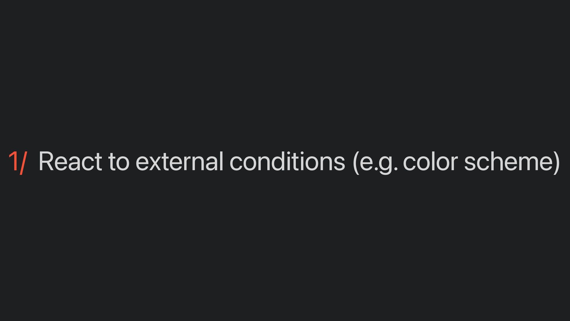
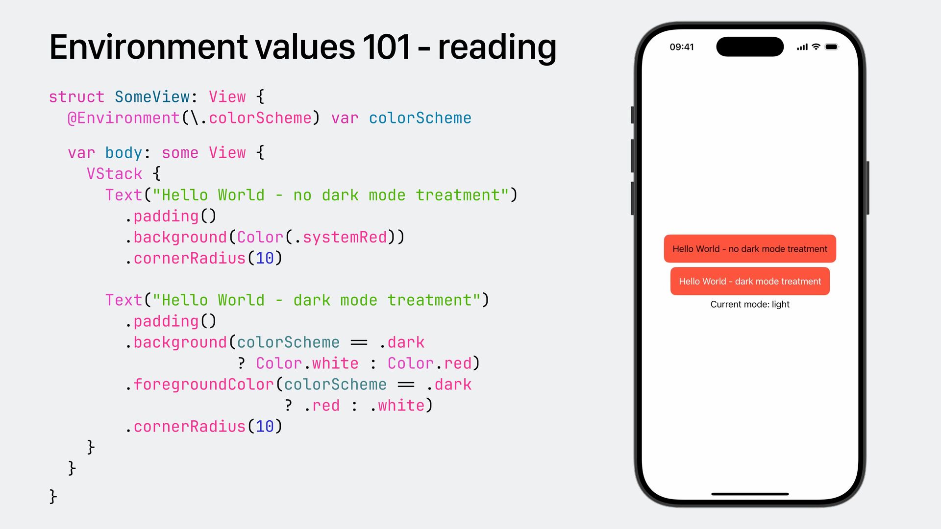
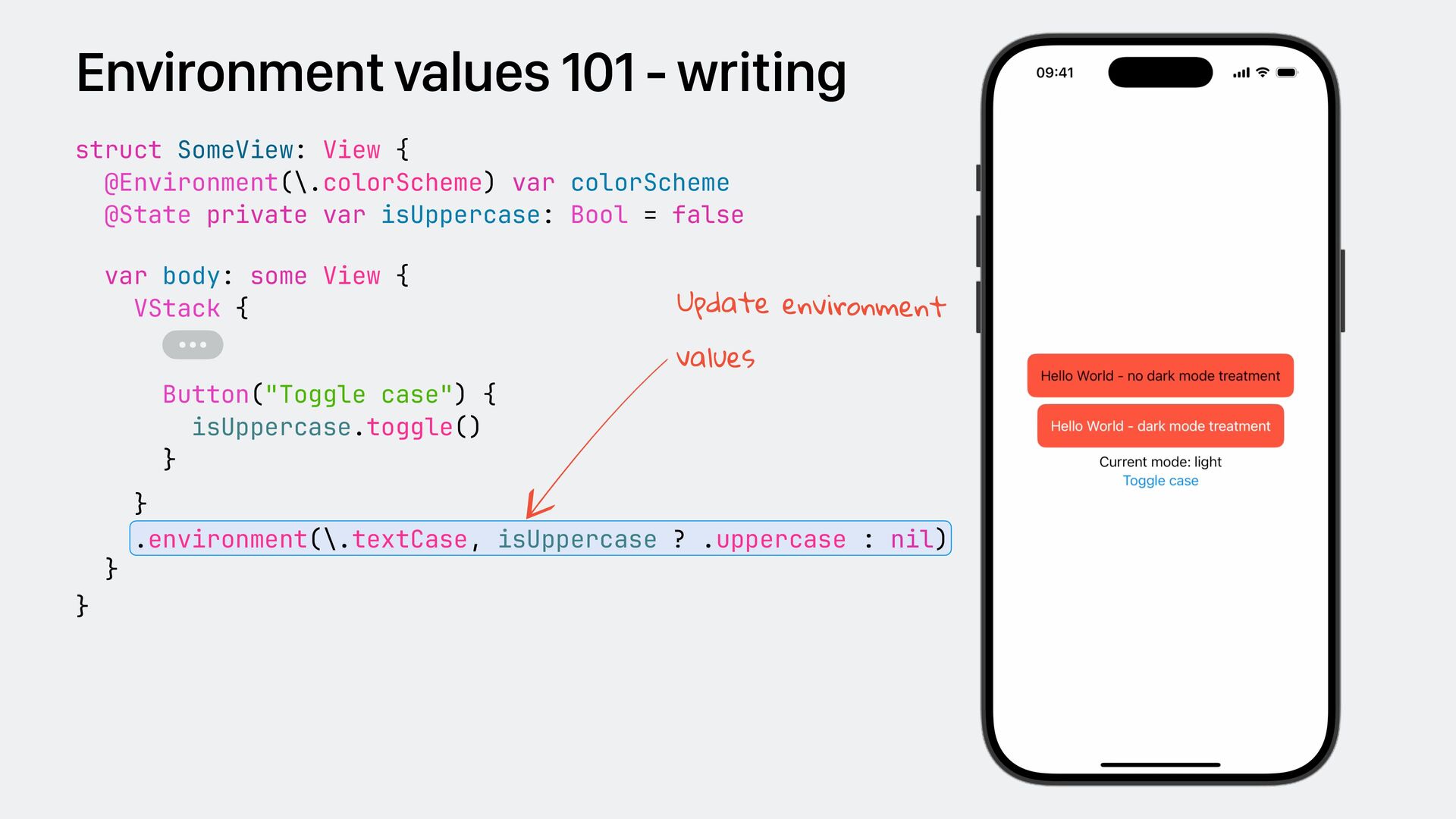
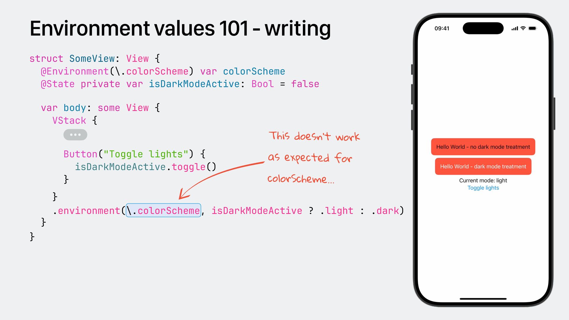
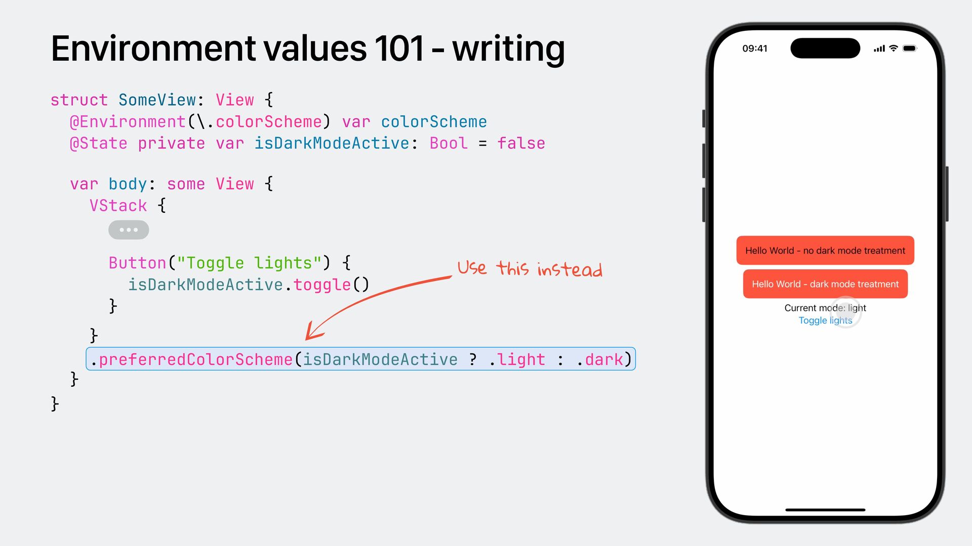
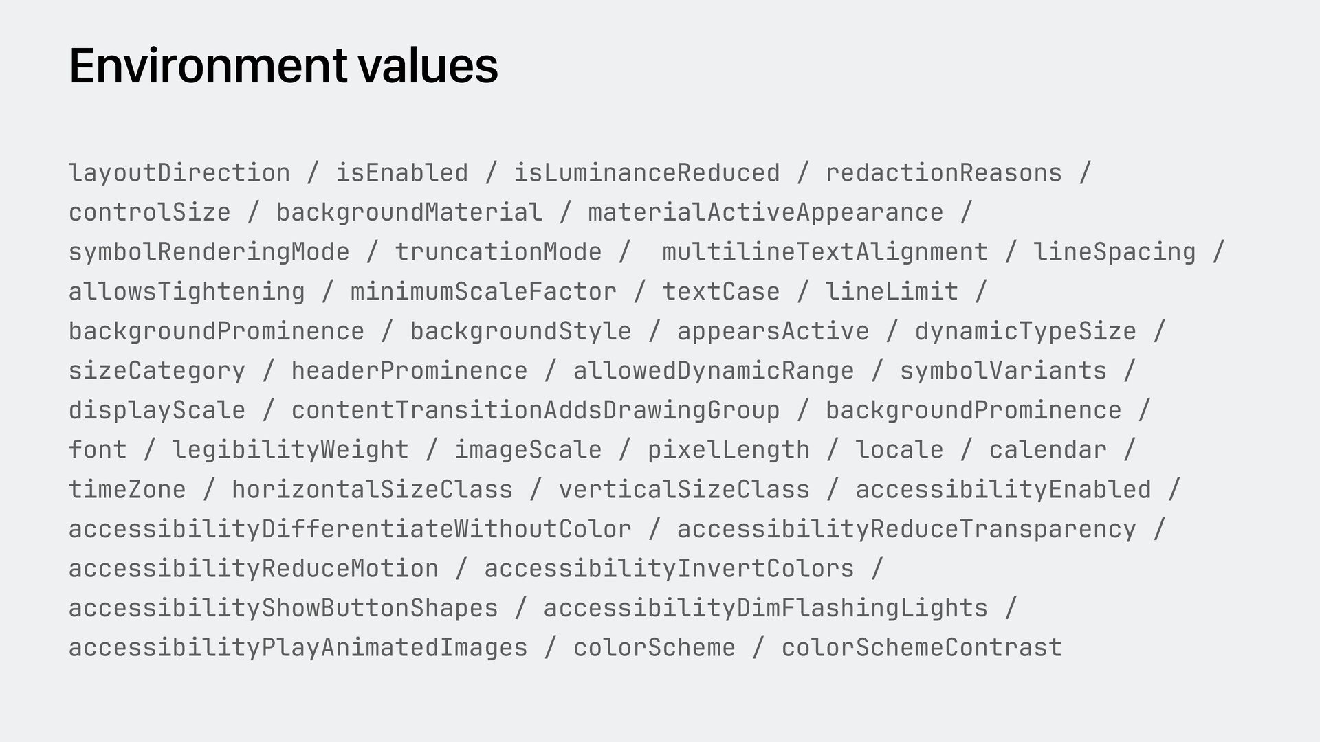
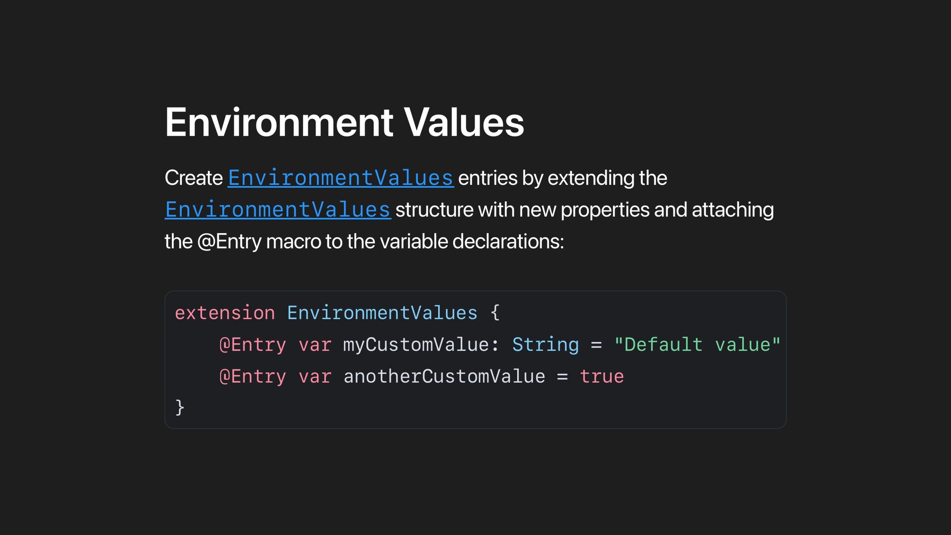
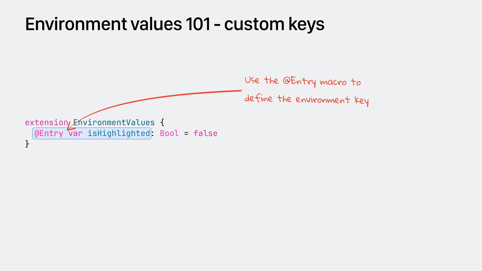
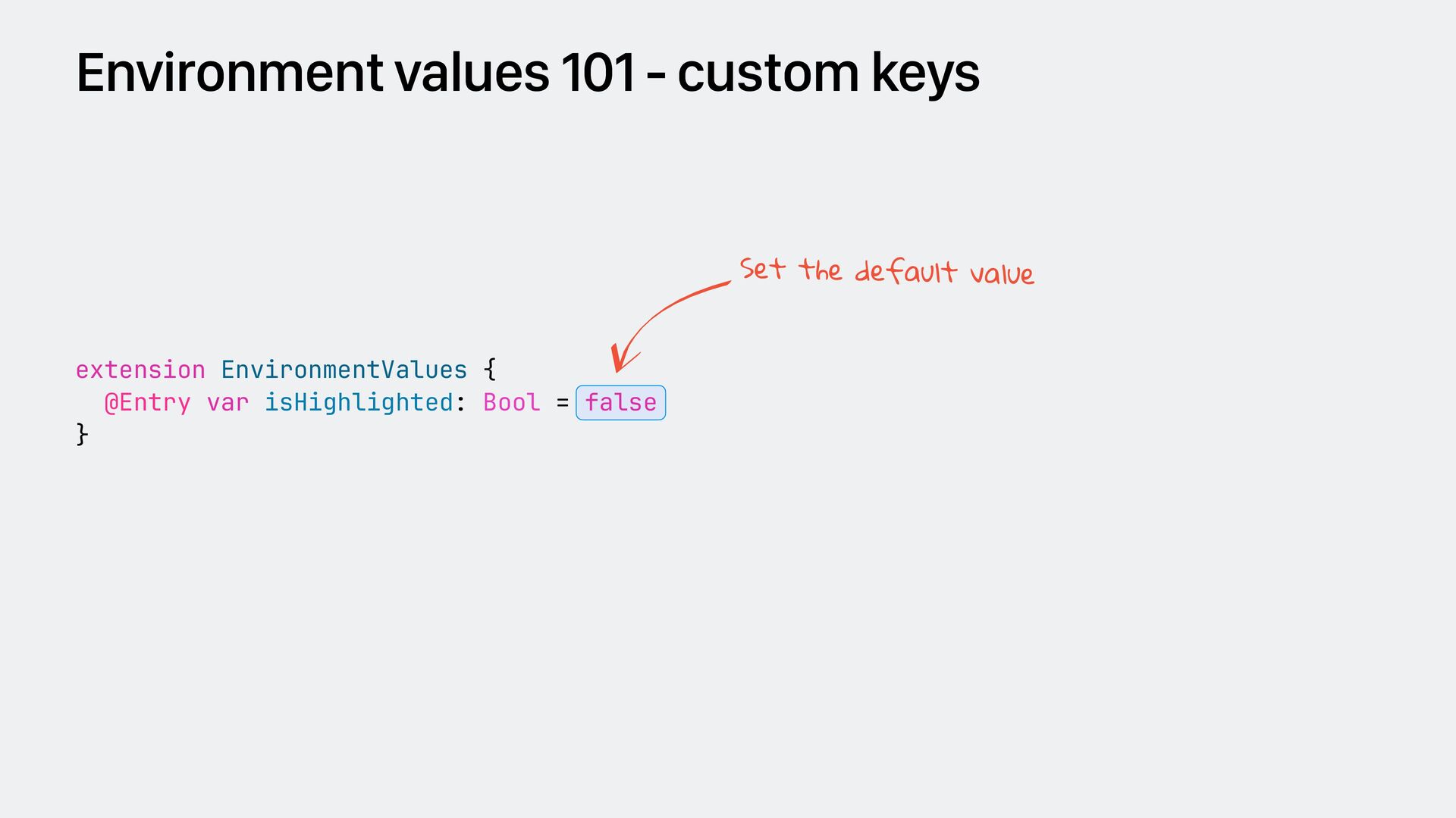
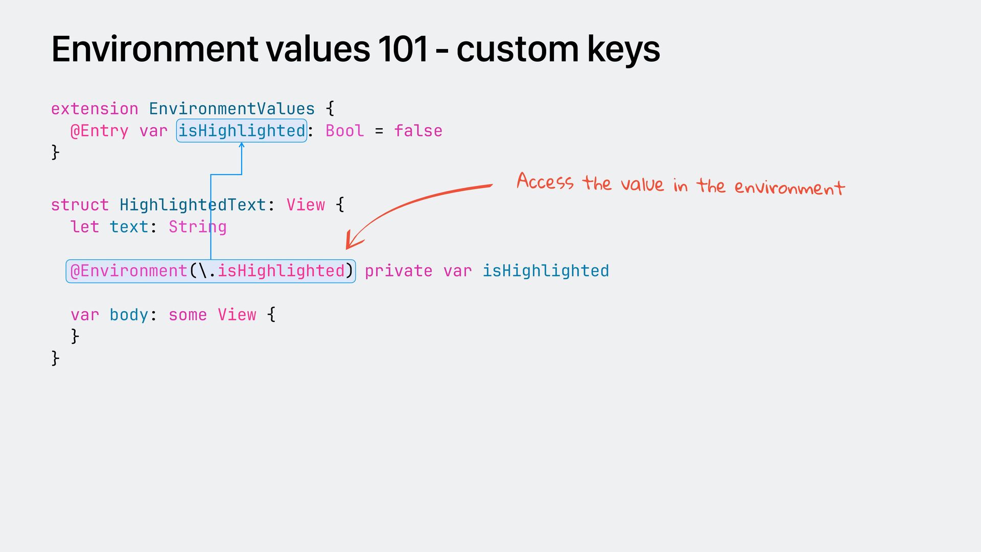
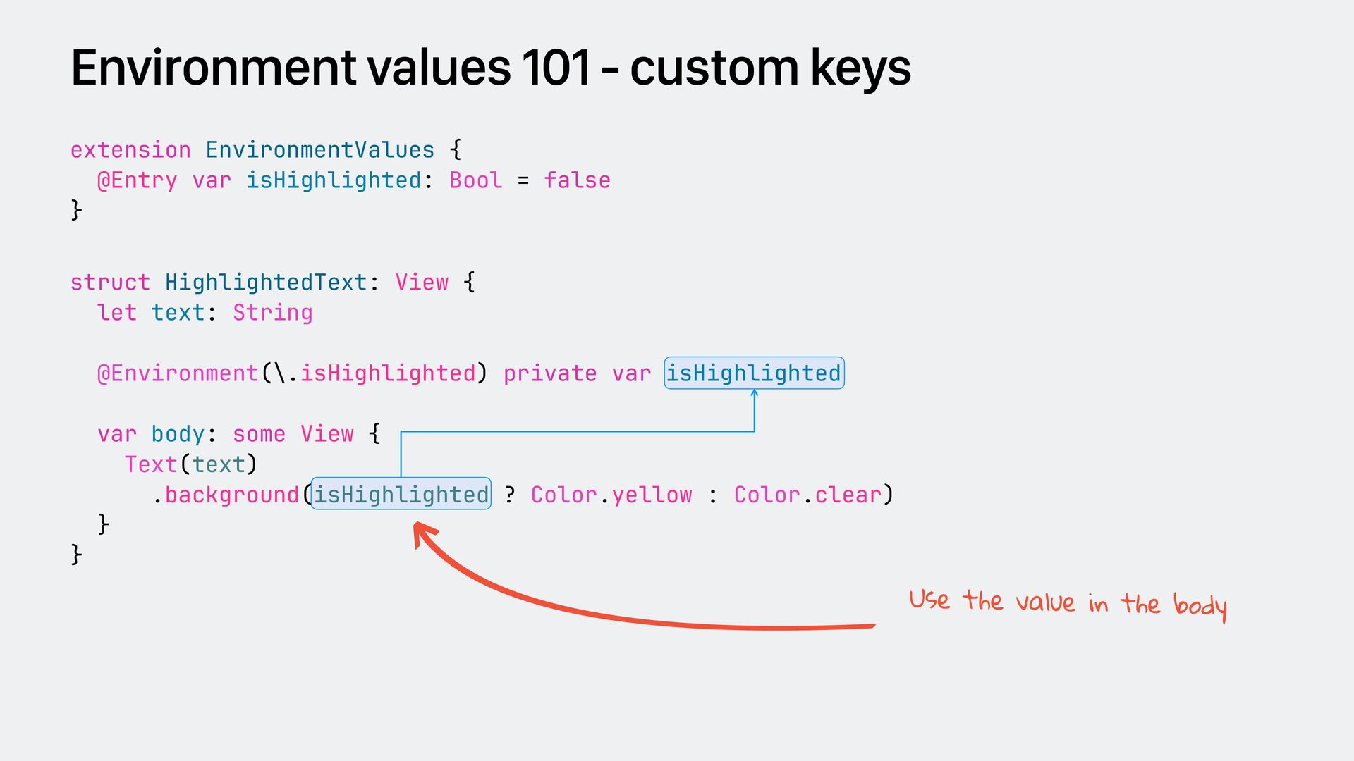
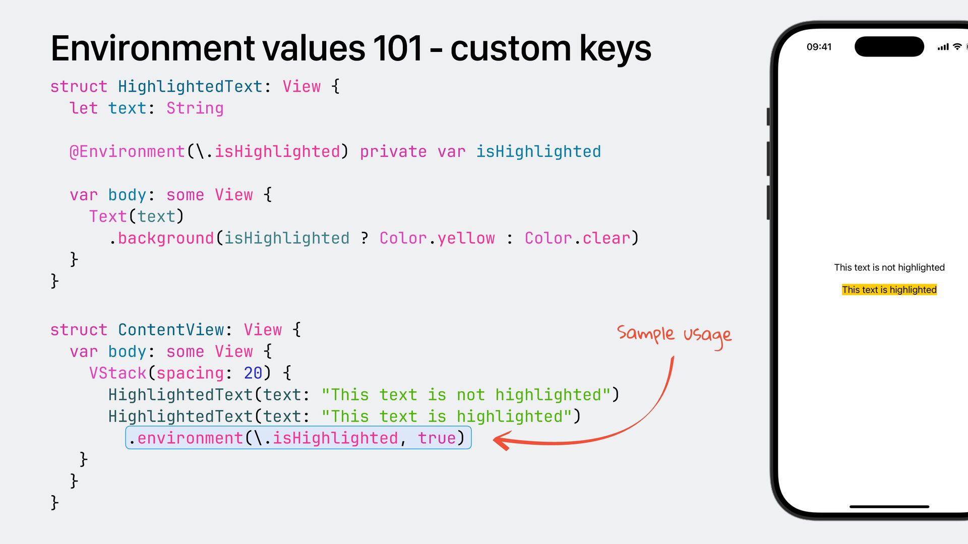
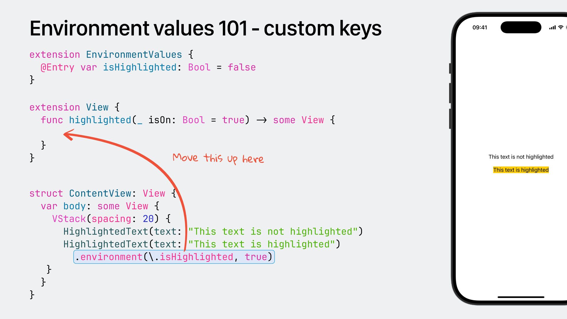
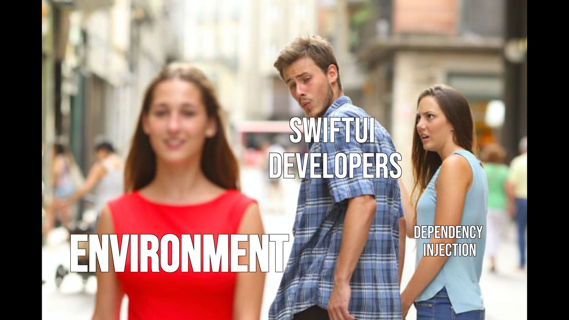
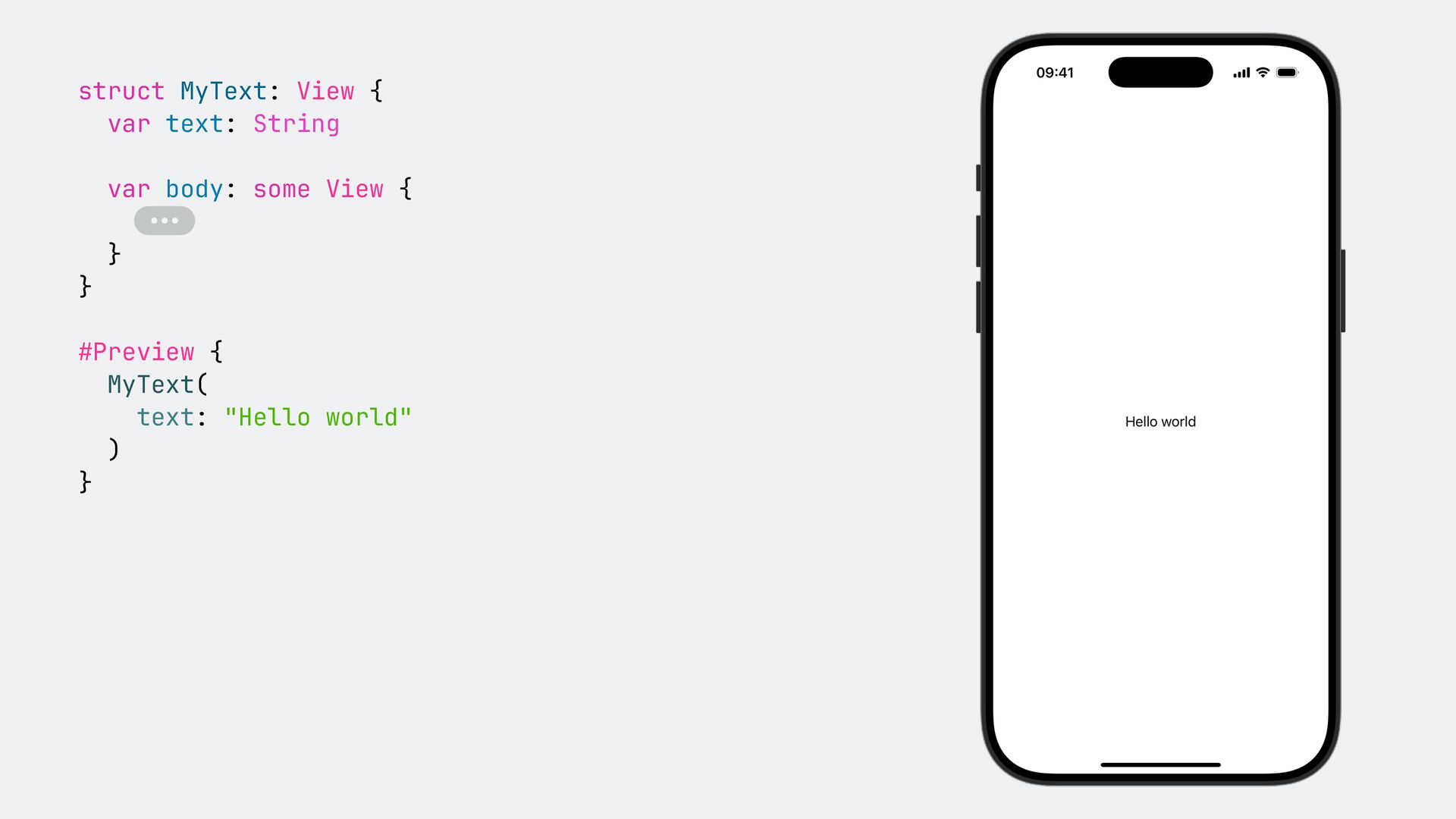
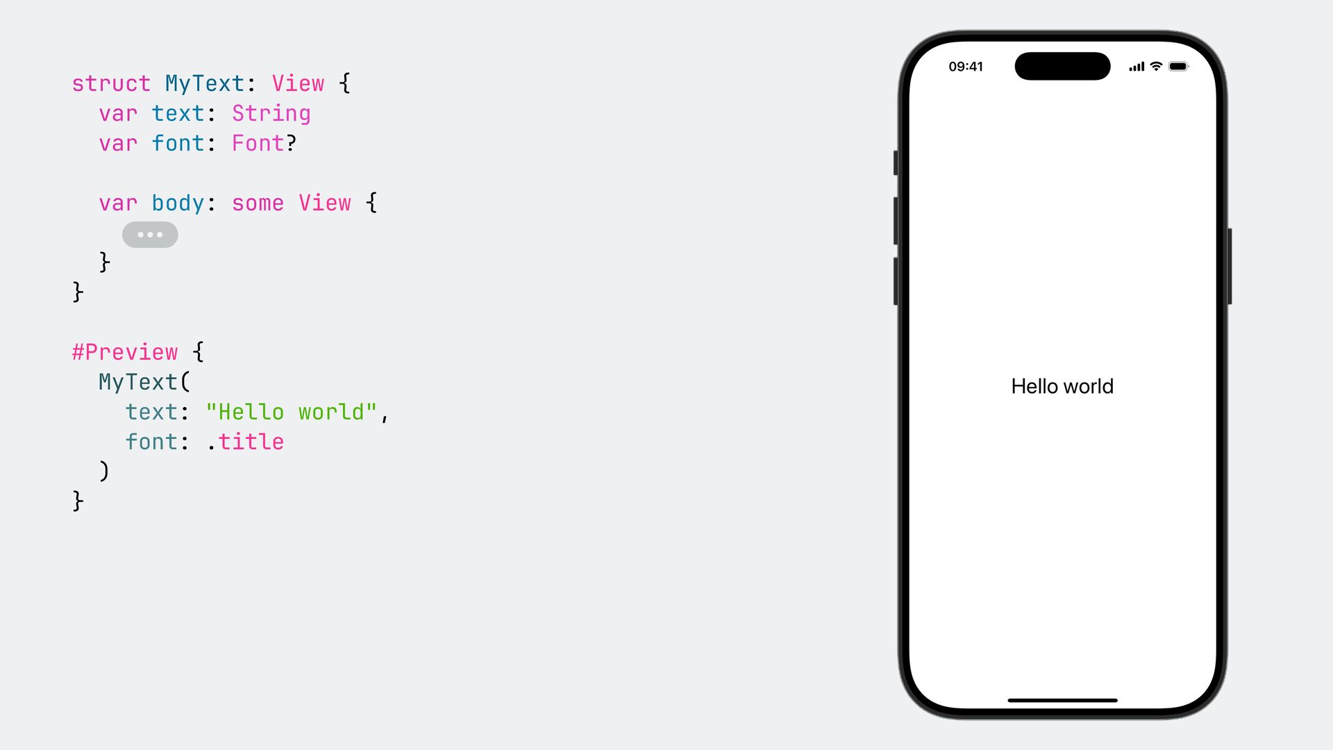
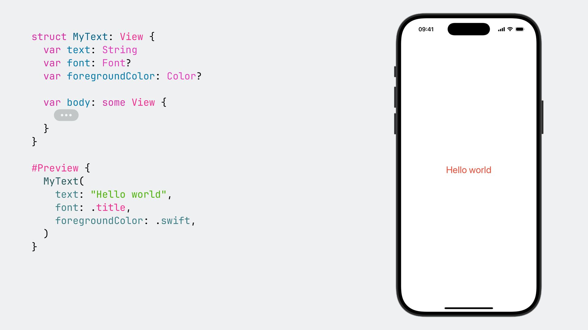
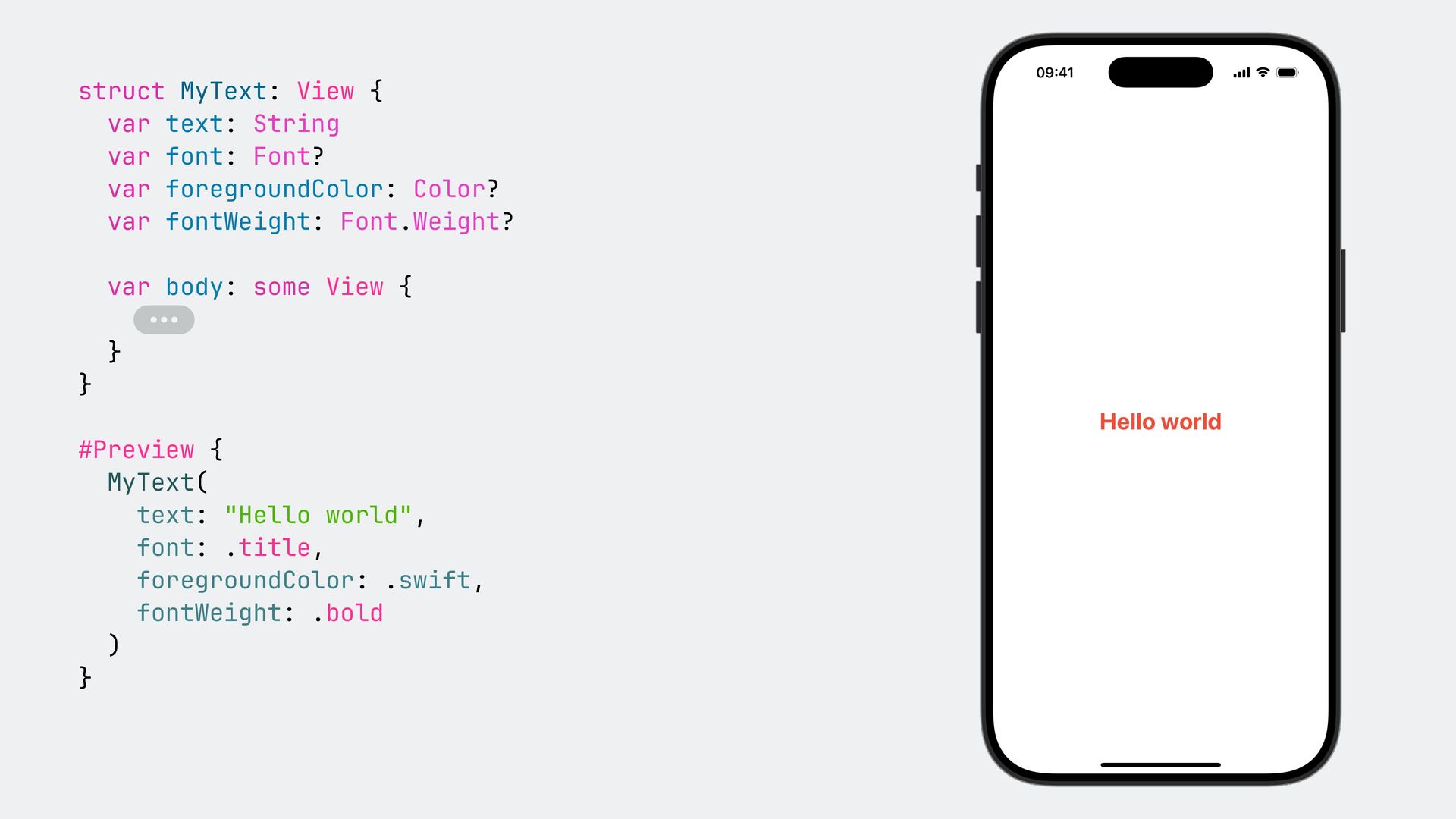
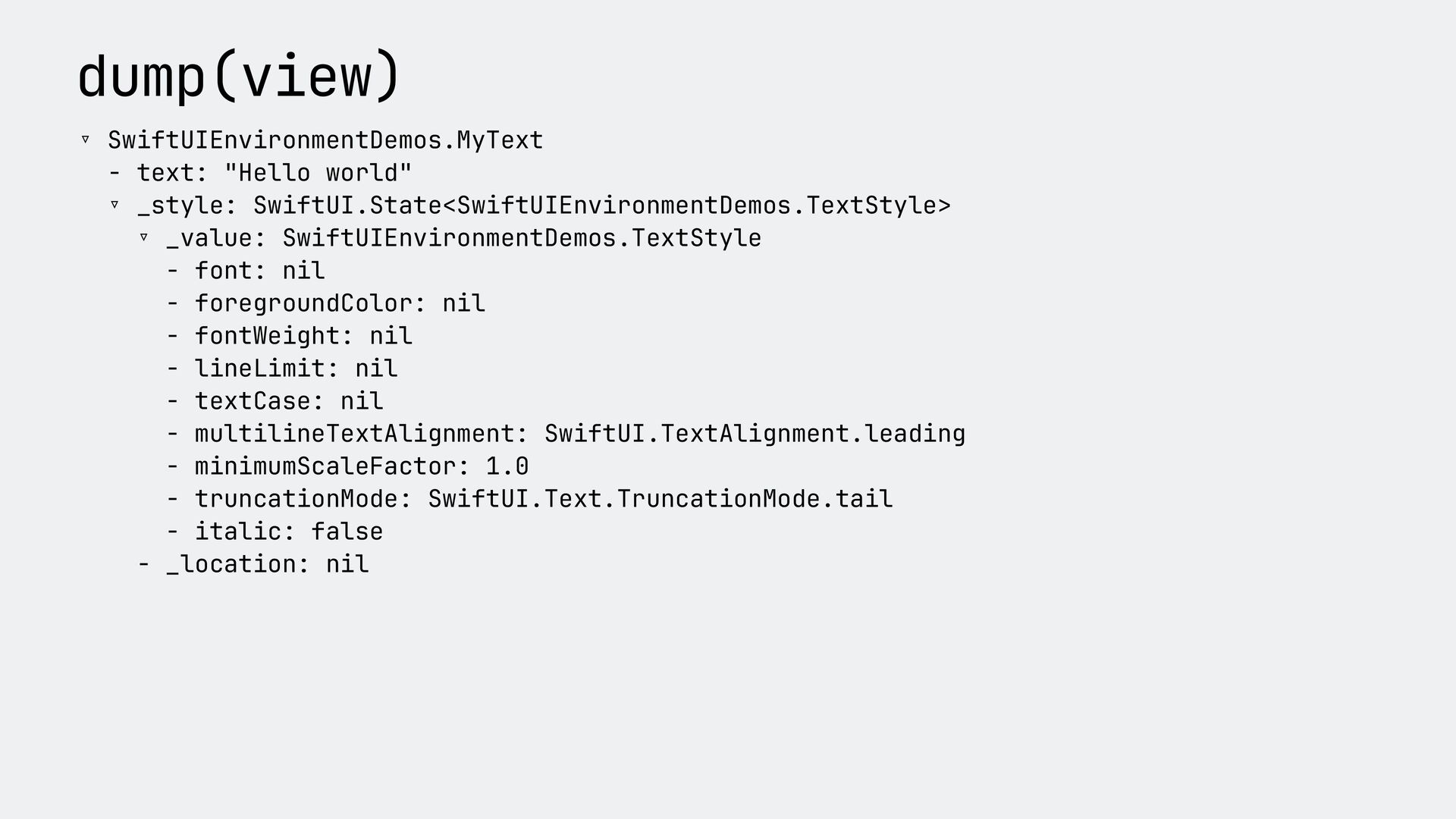
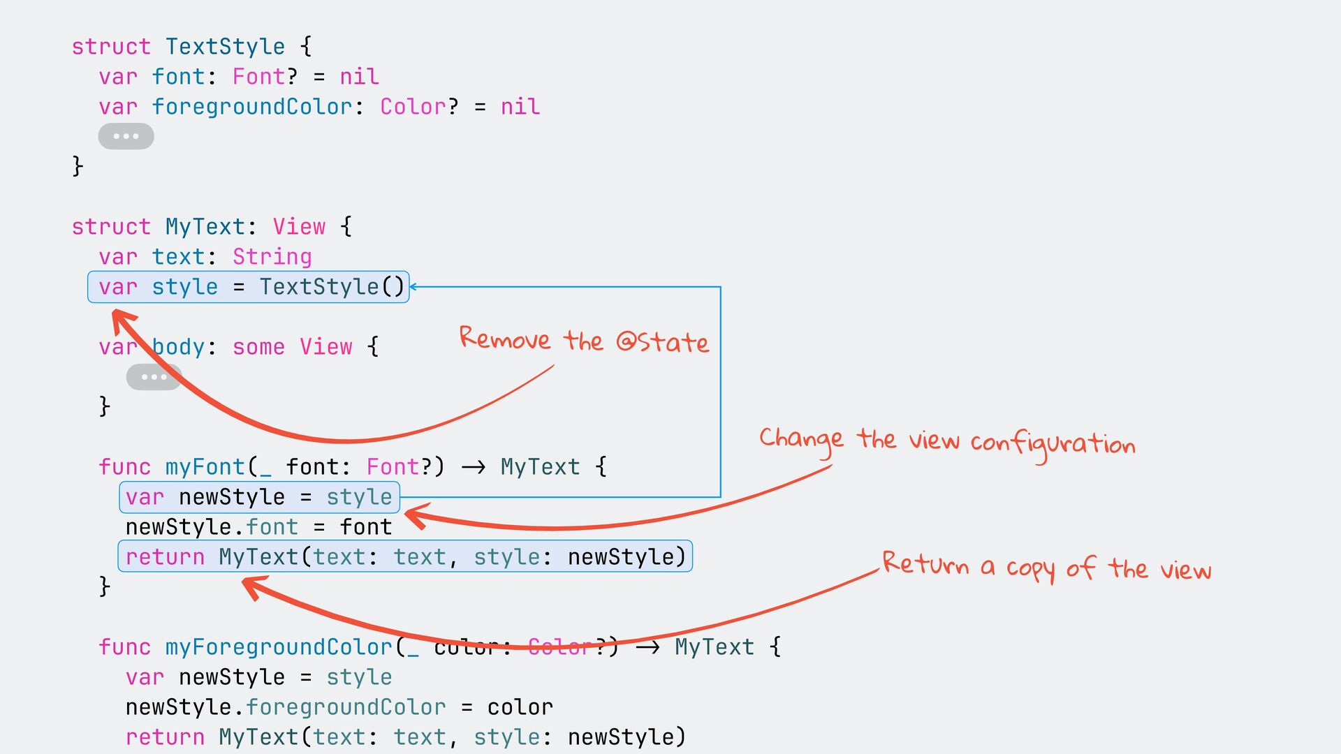
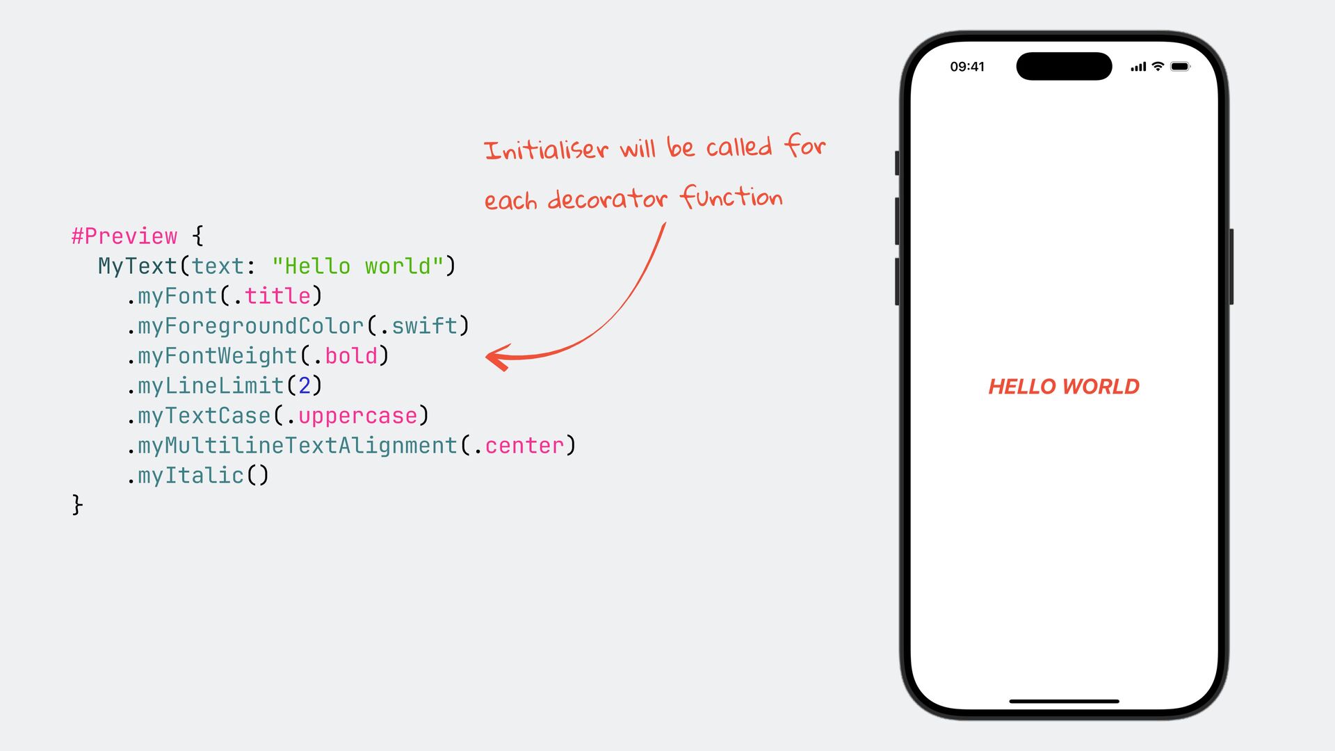
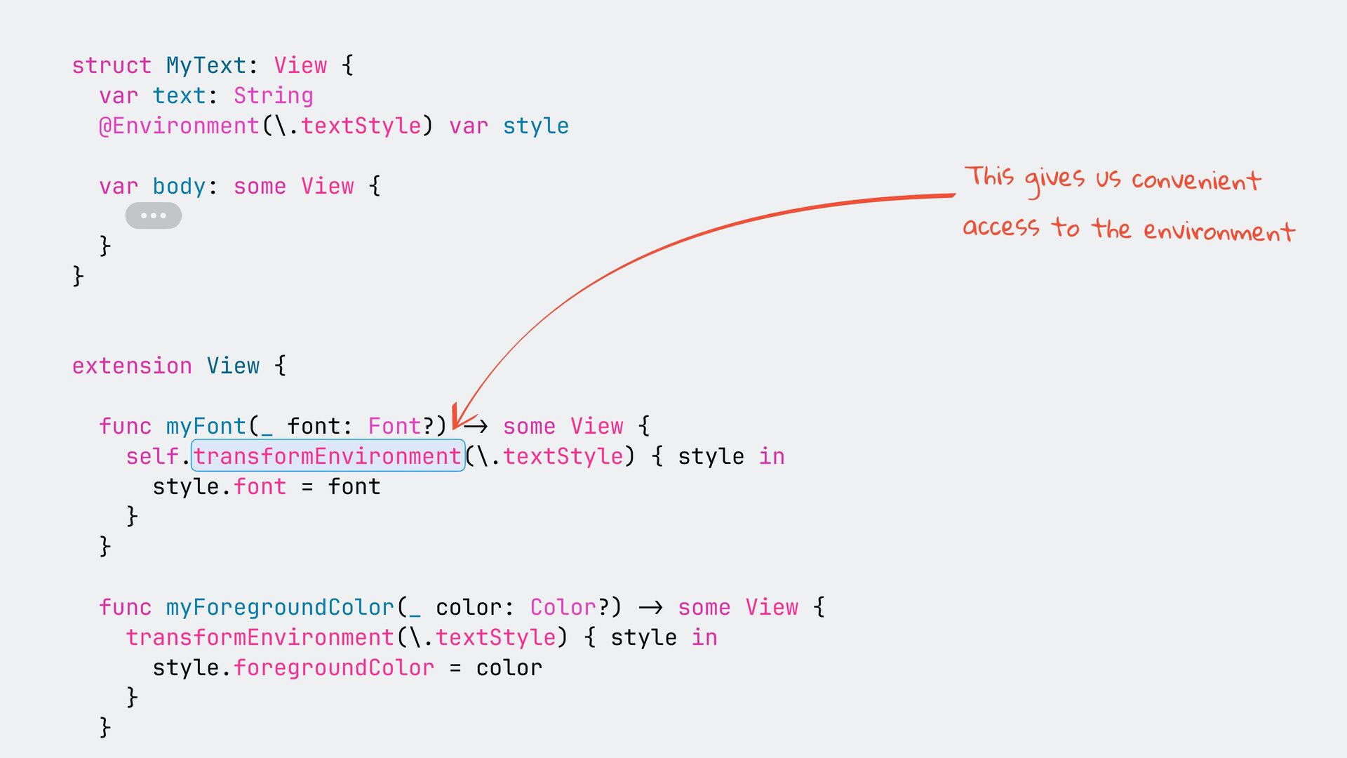
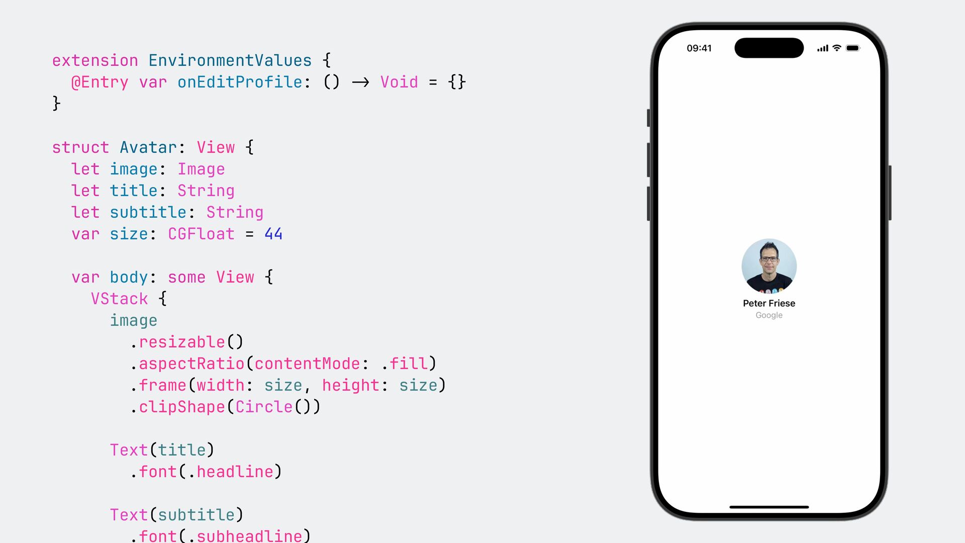
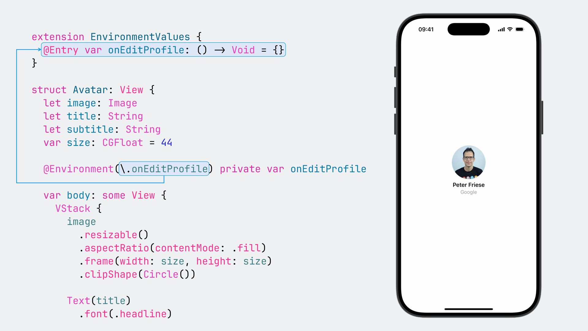
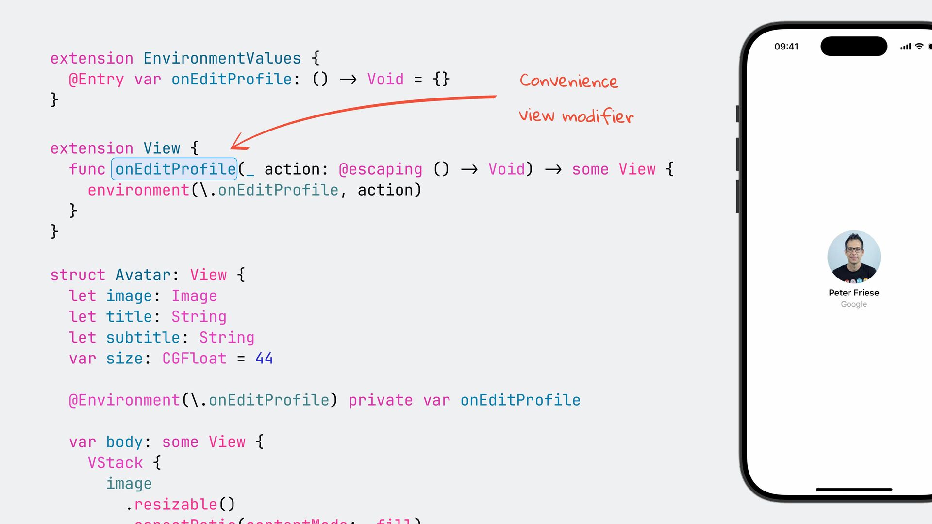
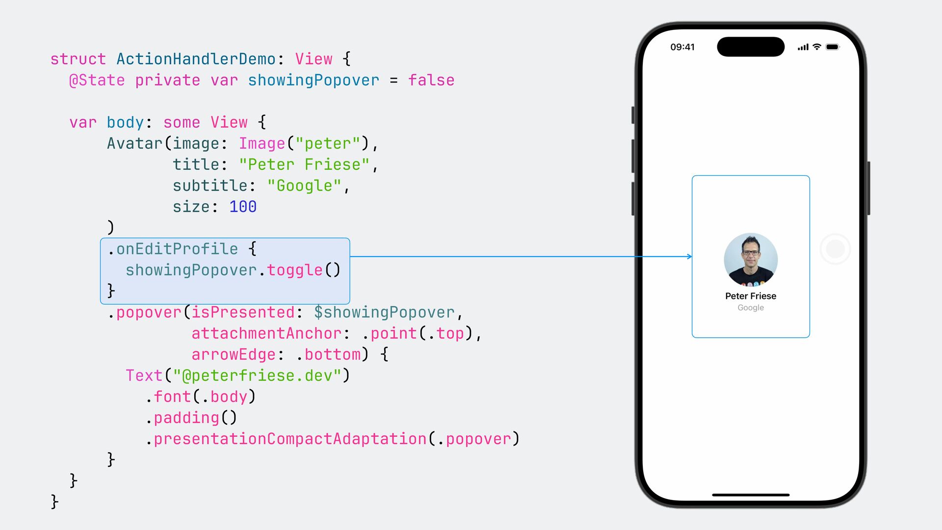
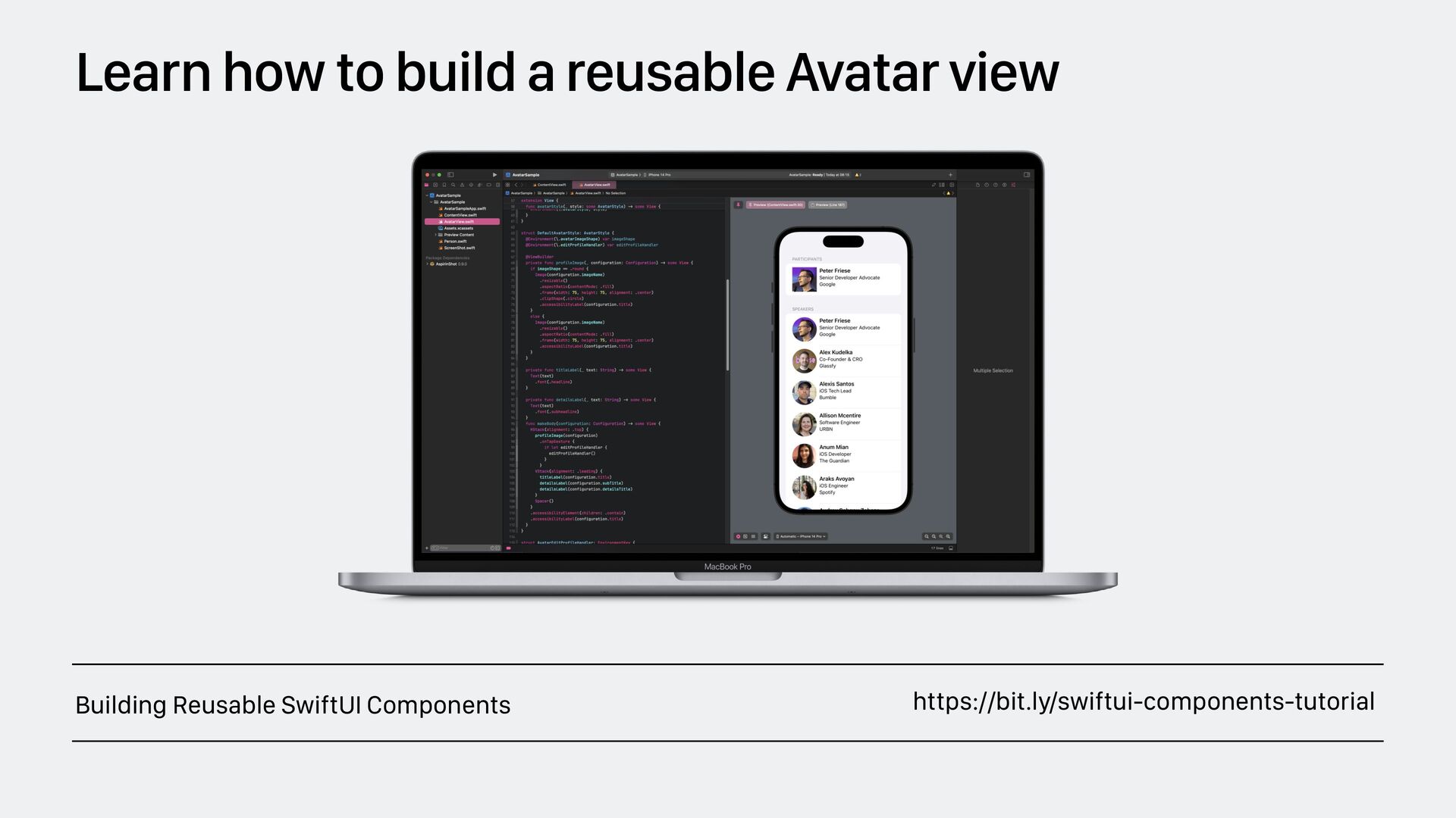
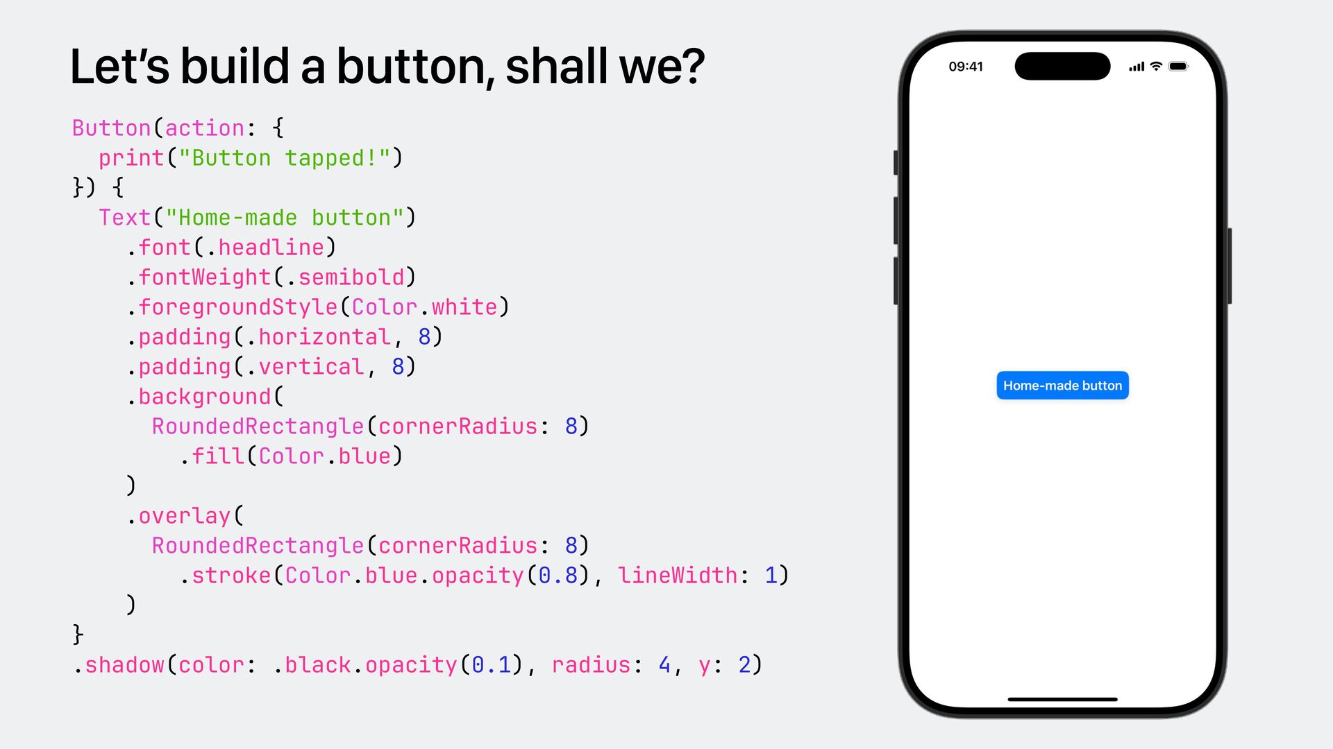
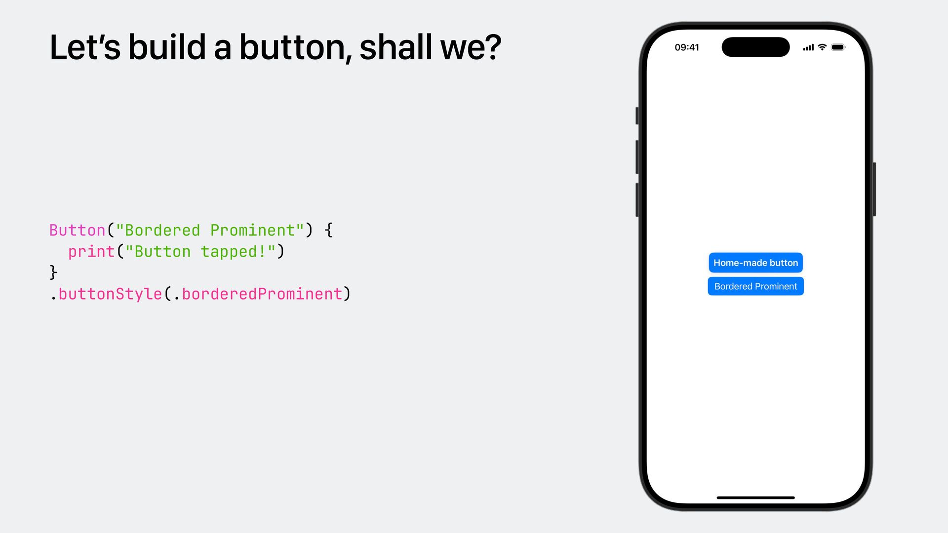
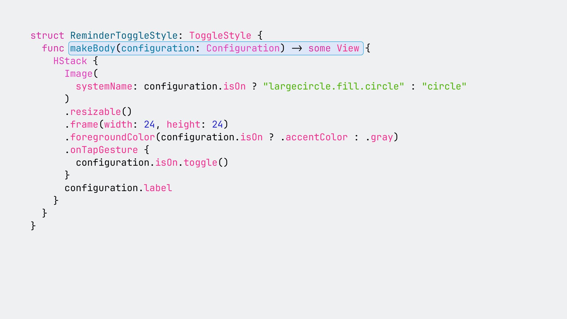
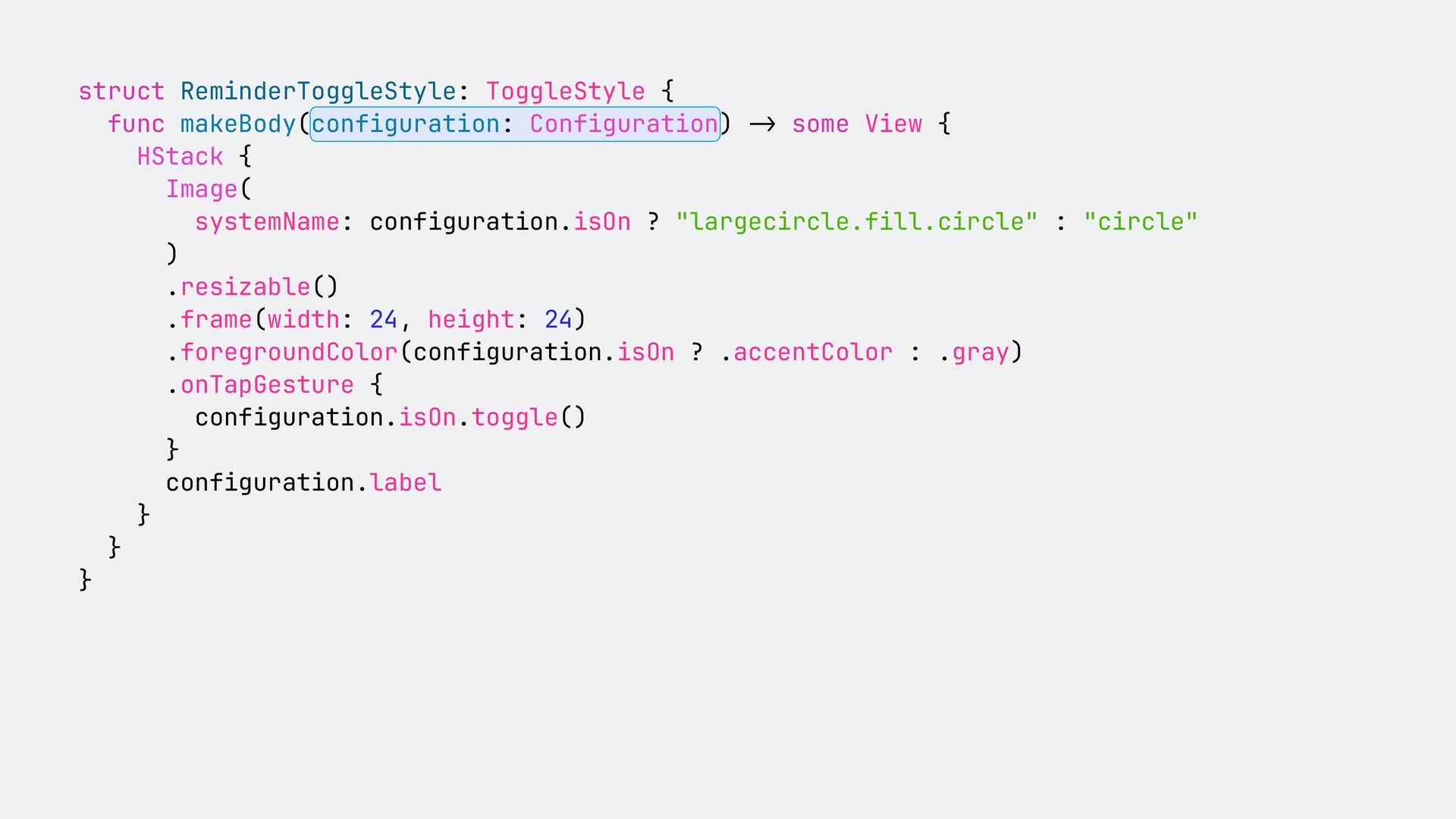
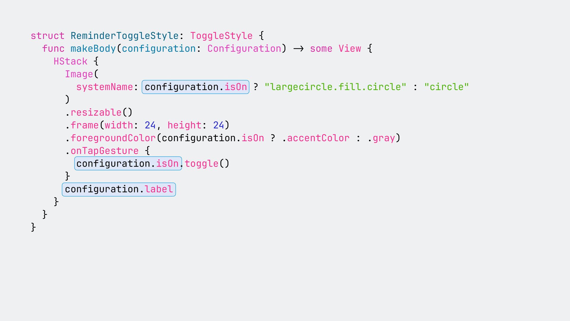
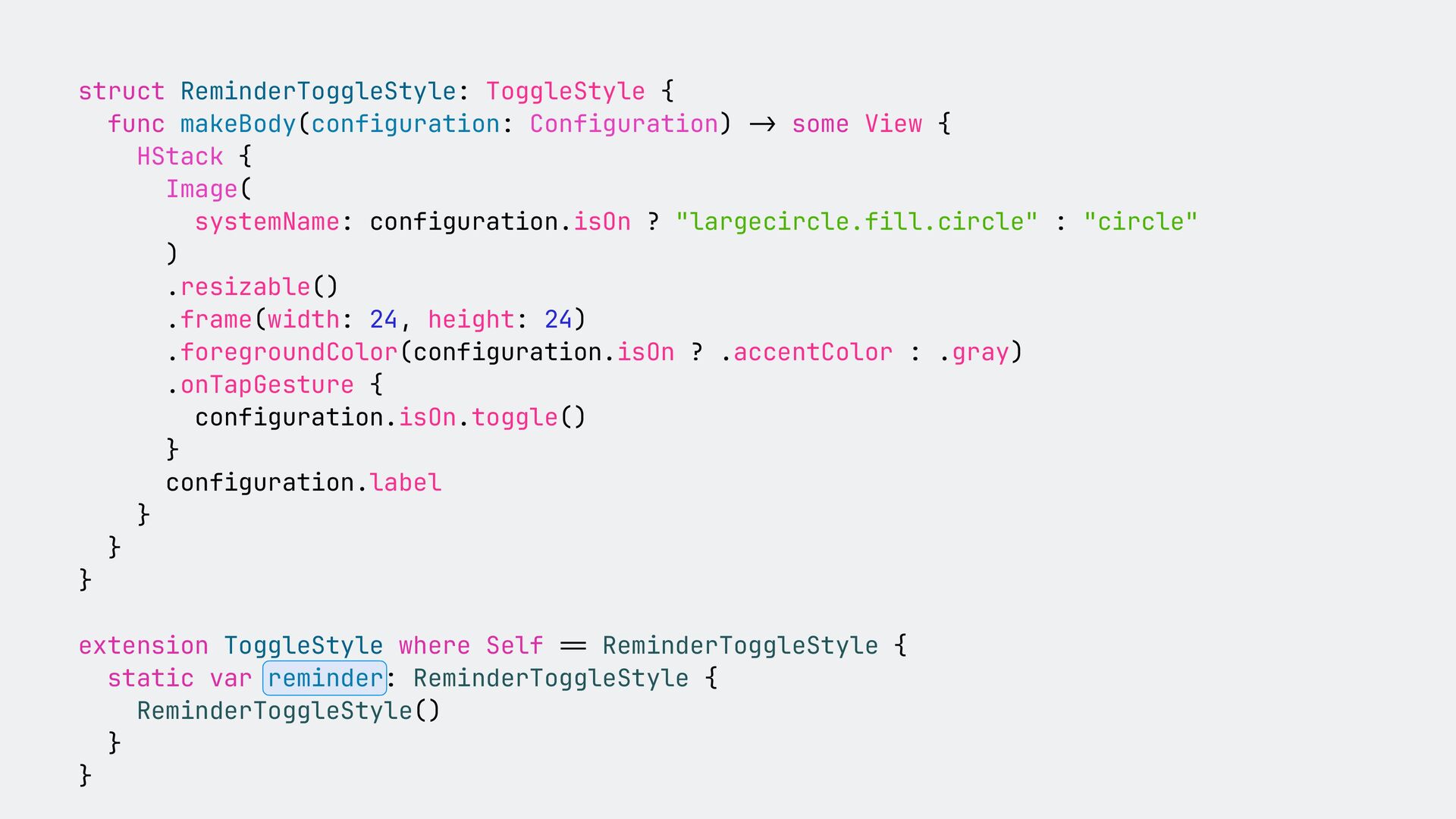
The SwiftUI environment is one of the backbones of SwiftUI, yet – in my opinion – it is completely underrated. In this talk, I am going to explain what the SwiftUI environment is, and how it powers SwiftUI. You are going to learn how to use the SwiftUI environment to avoid prop drilling, how to use it do make your views configurable, and what are the commonalities between the environment and SwiftUI preferences. In addition to taking a look behind the scenes, we will also look at some practical use cases.
 peterfriese
 minorun365
 nomizone
 yamasaki696
 y150saya
 iwatatomoya
 kekke_n
 sakajunquality
 moznion
 poropinai1966
 oikon48
 glaforge
 bto
bto
 schlessera
 takai
takai
 codingconduct
 khoart
 addyosmani
 shlominoach
 asonas
 brad_frost
 smashingmag
 sabderemane
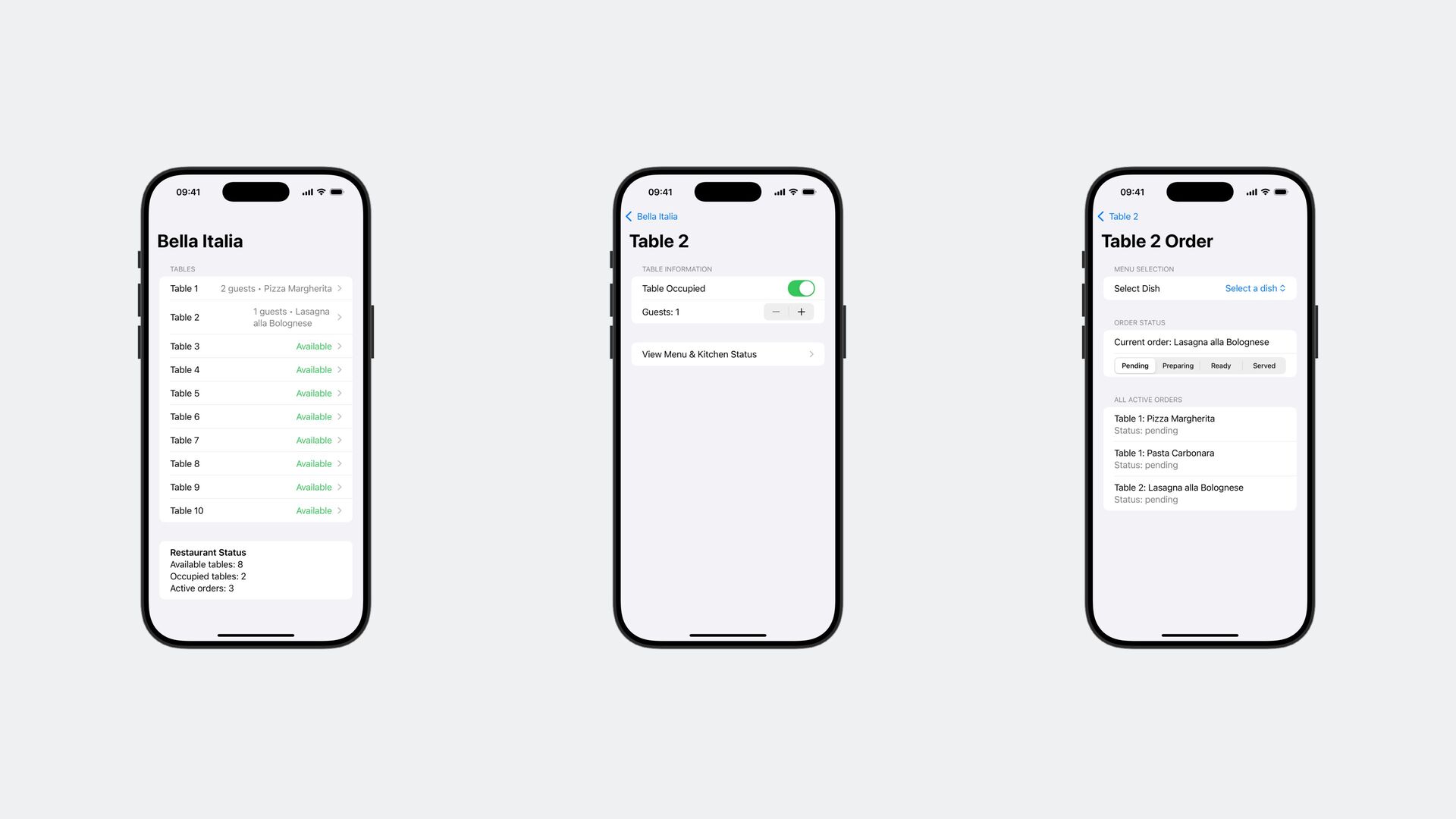
![KitchenStore - activeOrders: [Order] - foodItems: [String] DiningAreaStore - tables:](https://files.speakerdeck.com/presentations/94bdb58b546140d7b5e7f5e0d60749c1/slide_32.jpg)
![KitchenStore - activeOrders: [Order] - foodItems: [String] DiningAreaStore - tables:](https://files.speakerdeck.com/presentations/94bdb58b546140d7b5e7f5e0d60749c1/slide_33.jpg)