Upgrade to Pro — share decks privately, control downloads, hide ads and more …

Organise your styles with component-based CSS approach

Organise your styles with component-based CSS approach

Slides to my talk at the FrontConf Munich 2019.
You can find the examples and further reading links here: https://github.com/programmiri/component-based-functional-css-examples

Mirjam Aulbach

April 27, 2019
Tweet

More Decks by Mirjam Aulbach

Other Decks in Programming

Transcript

  1. Frontend Engineer Special ! for JavaScript, Unit-Testing and full aboard

    the Game of Thrones Hype train Twitter: @mirjam_diala
  2. 3. Just don't write CSS CSS-in-JS: ... JSS & Styled

    Components & Emotion & Radium & ...
  3. We’re not designing pages, we’re designing systems of components.1 —

    Stephen Hay 1 From his book "Responsive Design Workflow". Read more: http://bradfrost.com/blog/post/bdconf-stephen-hay-presents- responsive-design-workflow/
  4. Components let you split the UI into independent, reusable pieces,

    and think about each piece in isolation.2 2 https://reactjs.org/docs/components-and-props.html
  5. Style every component separately • components are easily reusable •

    easy to delete components • no side-effects when adding or removing styles
  6. .component-one { position: relative; font-family: 'Fancy Font'; font-weight: 500; font-size:

    20px; color: var(--color-blue); margin-bottom: 2rem; padding: 1rem 1.5rem; background-color: var(--color-black); } .component-two { position: relative; font-family: 'Fancy Font'; font-weight: 700; font-size: 15px; color: var(--color-blue); margin-top: 2rem; padding: 1rem 1.5rem; background-color: var(--color-black); }
  7. .arial { font-family: Arial; } .font-1rem { font-size: 1rem; }

    .font-1.5rem { font-size: 1.5rem; } .font-color-primary { color: var(--color-primary) } .font-color-highlight { color: yellow; } <h2 class="font-1.5-rem font-color-primary arial">Headline</h2>
  8. First try: content-specific classes Component based approach <p class="profil-lead"> I'm

    Mirjam and I'm a cat AND dog person! </p> .profil-lead { font-size: 150%; color: yellow; }
  9. Second try: style-specific classes Functional CSS approach <p class="text-highlight text-big">

    I'm Mirjam and I'm a cat AND dog person! </p> .text-big { font-size: 150%; } .text-highlight { color: yellow; }
  10. My current approach for separation Basic general styles like: font

    styles, colors Utility (functional) classes repeating styles that can be used universally CSS Component Counterpart to our website component
  11. Basic - Characteristics • They are like a styleguide. •

    They tell you how your brand looks and behaves.
  12. :root { --font-headline: 'Domine', serif; --font-standard: 'Roboto', sans-serif; } html

    { font-size: 16px; } body { font-family: var(--font-standard); font-weight: 200; } h1,h2,h3,h4,h5,h6 { font-family: var(--font-headline); } .h1 { font-size: 3.5rem; }
  13. Utility - Characteristics • They help you with all styles

    you would write over and over again. • They support you - and your team! - with a consistent style.
  14. .display-flex { display: flex; } .display-inline-flex { display: inline-flex; }

    .flex-direction-row { flex-direction: row; } .flex-direction-column { flex-direction: column; } .text-center { text-align: center; } .text-left { text-align: left; }
  15. .margin-0 { margin: var(--spacer-0); } .margin-1 { margin: var(--spacer-1); }

    .margin-2 { margin: var(--spacer-2); } .padding-bottom-0 { padding-bottom: var(--spacer-0); } .padding-bottom-1 { padding-bottom: var(--spacer-1); } .padding-bottom-2 { padding-bottom: var(--spacer-2); }
  16. CSS Component - Characteristics • They determine the rules how

    a specific website component has to look like. • This component style will work in every place of the markup.
  17. .Button { display: inline-block; font-weight: 500; text-align: center; vertical-align: middle;

    border: 1px solid transparent; padding: 0.375rem 0.75rem; font-size: 1rem; line-height: 1.5; border-radius: 0.25rem; transition: color 0.15s ease-in-out, background-color 0.15s ease-in-out, border-color 0.15s ease-in-out, box-shadow 0.15s ease-in-out; } .Button:hover { border: 1px solid var(--color-black); } .Button.Button-primary { background-color: var(--color-primary); } .Button.Button-secondary { color: var(--color-white); background-color: var(--color-secondary); }
  18. 1. Use classes • use classes to define styles •

    use styles on elements very carefully • don't use IDs to style
  19. 2. Naming: consistent and clear • use speaking, semantic class

    names in basic and utility classes .text-lg { font-size: 150%; } .d-flex { display-flex; } .background-warning { background-color: var(--color-warning) } // ( ᐛ )و
  20. Keep in mind: don't generate unexpected results (side effects)! .background-red

    { background-color: var(--color-warning); // var(--color-warning)= orange; font-weight: bold; } // <(ҹ^´)>
  21. 2. Naming: consistent and clear Naming approach for the CSS

    Components • mirror the website component name <blockquote class="Quote">Text</blockquote> .Quote { width: 75%; margin-left: auto; margin-right: auto; }
  22. • add classes with a prefix to style nested elements

    <blockquote class="Quote"> <div class="Quote-text"> <p> Imagine a inspirational quotes about dogs here. It's a really nice one and gives you a warm and fuzzy feeling, I promise! </p> <cite class="Quote-cite">Mirjam</cite> </div> </blockquote> .Quote .Quote-text { margin-top: 2rem; margin-bottom: 2rem; border-left: 10px solid var(--color-primary); padding-top: 1rem; padding-bottom: 1rem; padding-left: 2rem; font-size: 1.25rem; }
  23. That's how it looks • A lot of compositions to

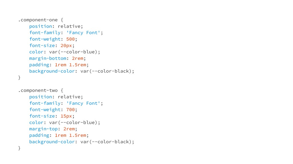
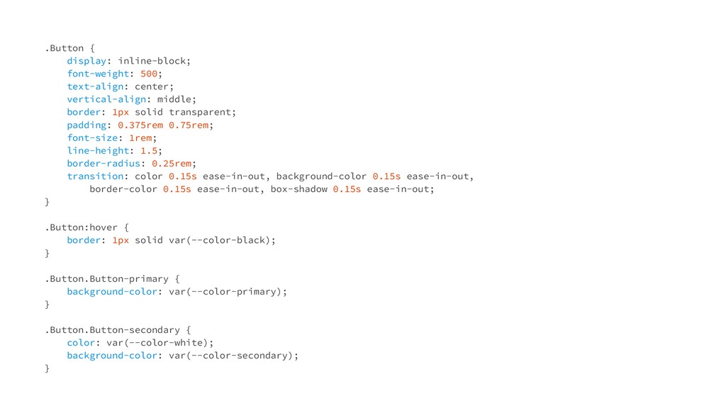
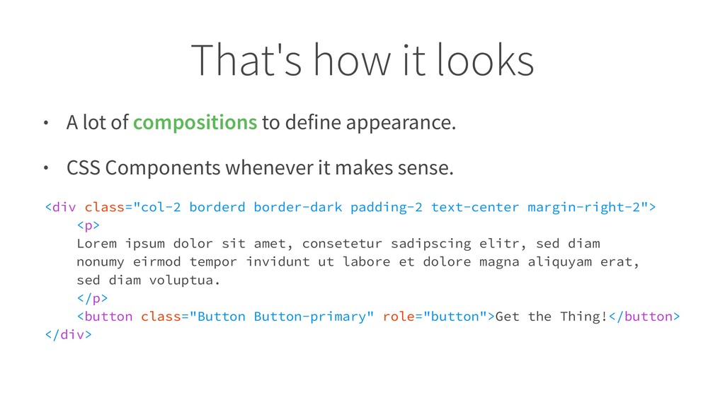
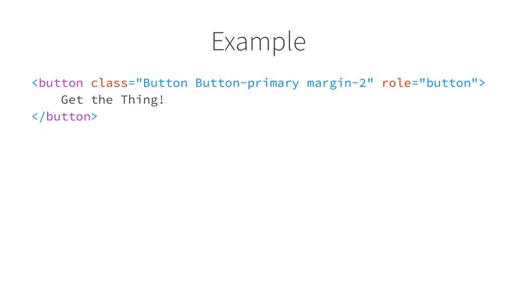
    define appearance. • CSS Components whenever it makes sense. <div class="col-2 borderd border-dark padding-2 text-center margin-right-2"> <p> Lorem ipsum dolor sit amet, consetetur sadipscing elitr, sed diam nonumy eirmod tempor invidunt ut labore et dolore magna aliquyam erat, sed diam voluptua. </p> <button class="Button Button-primary" role="button">Get the Thing!</button> </div>
  24. Build CSS components when it's useful • its style can't

    be accomplished easily with utility and basic classes • it's is a piece of content • it will be used in the same manner at least thrice
  25. Build independent components Style components should only contain styles that

    define their unique appearance. They're independent from their environment. You should be able to put them anywhere in the markup.
  26. How to use it - summary • Use compositions •

    Duplication cheaper than wrong abstraction • Discipline!
  27. Nest components, not styles Components can be nested in other

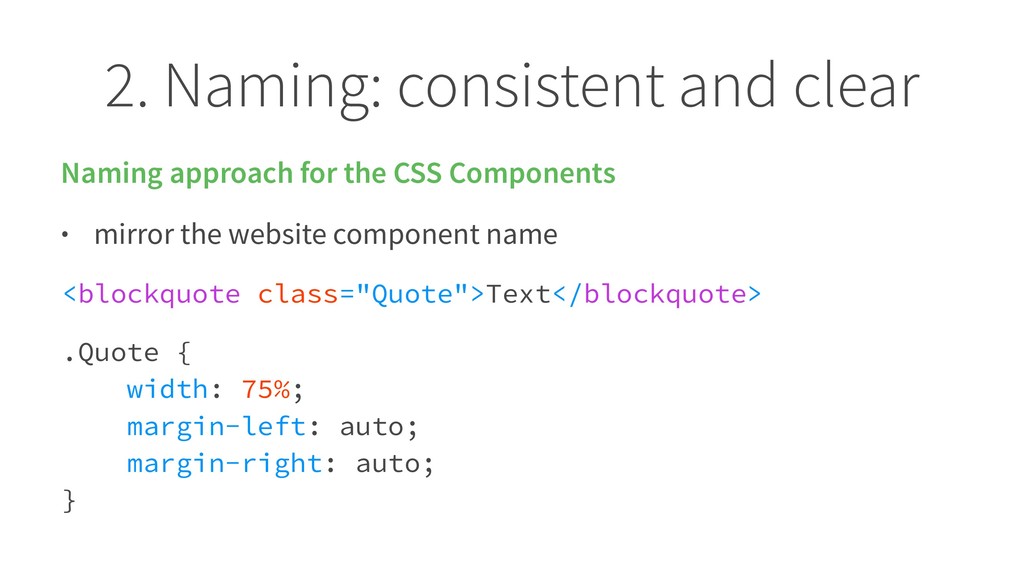
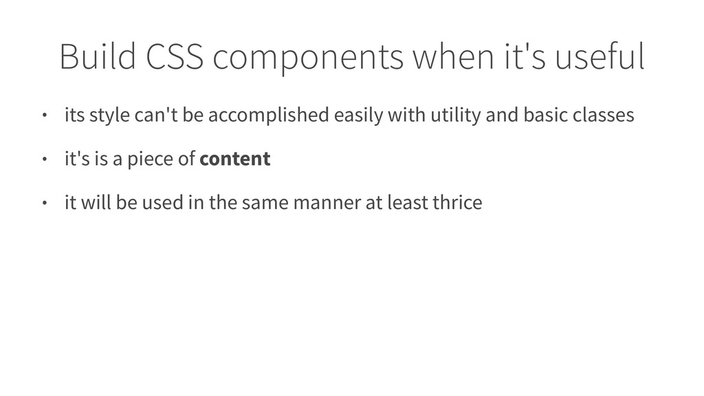
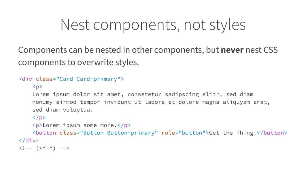
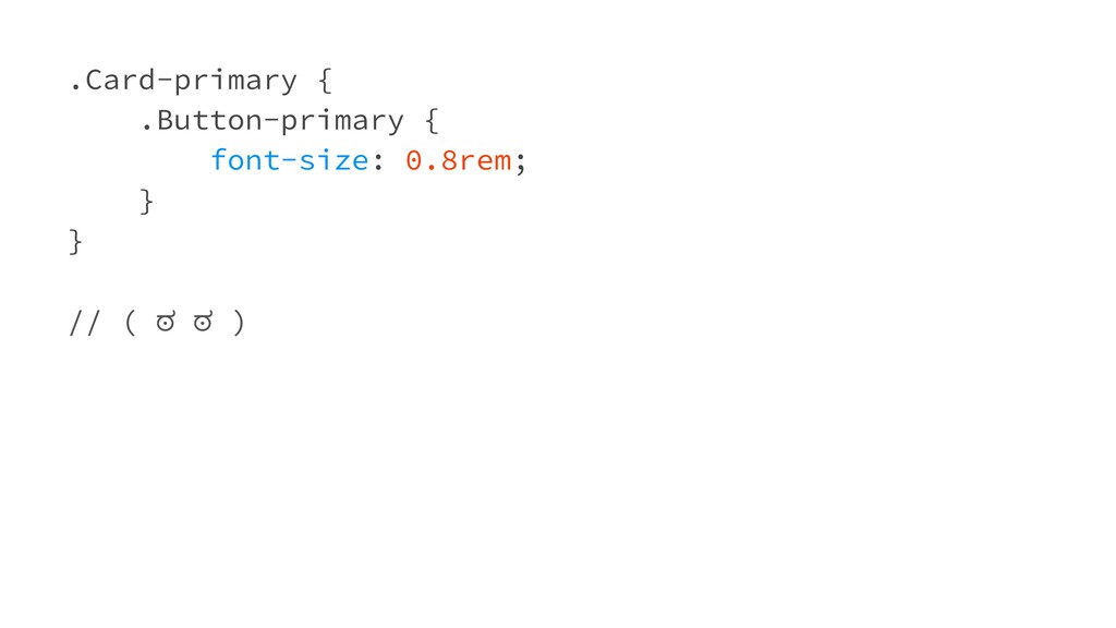
    components, but never nest CSS components to overwrite styles. <div class="Card Card-primary"> <p> Lorem ipsum dolor sit amet, consetetur sadipscing elitr, sed diam nonumy eirmod tempor invidunt ut labore et dolore magna aliquyam erat, sed diam voluptua. </p> <p>Lorem ipsum some more.</p> <button class="Button Button-primary" role="button">Get the Thing!</button> </div> <!-- (*^-^) -->