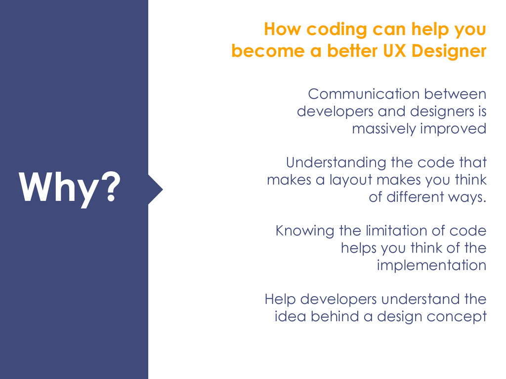
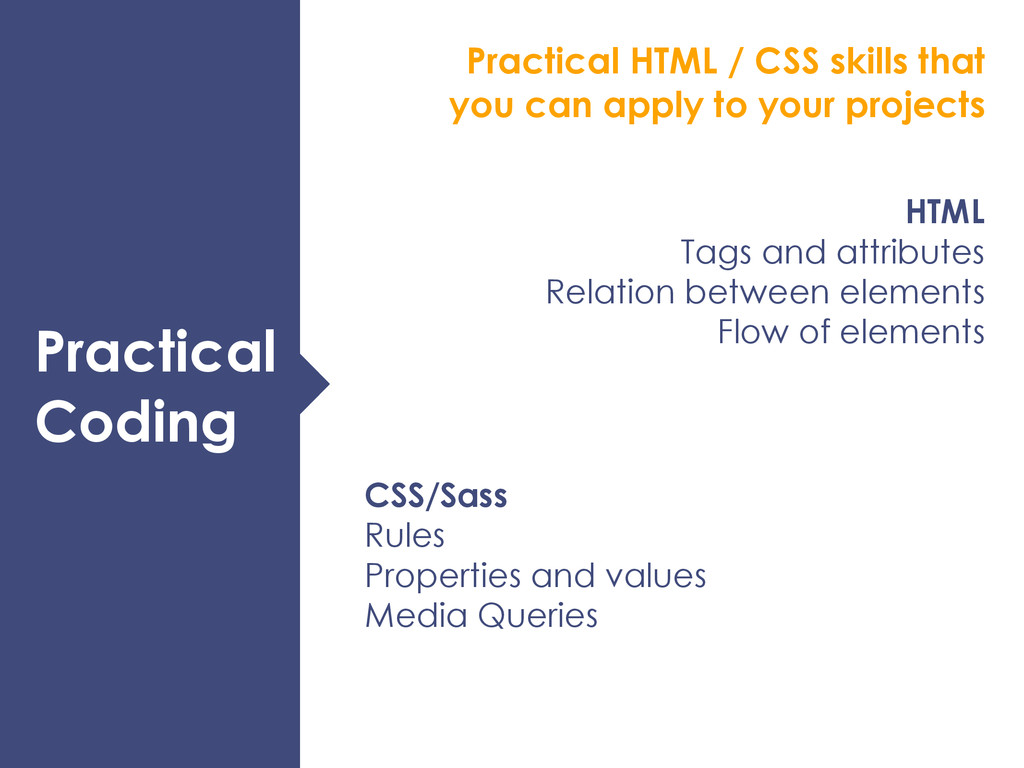
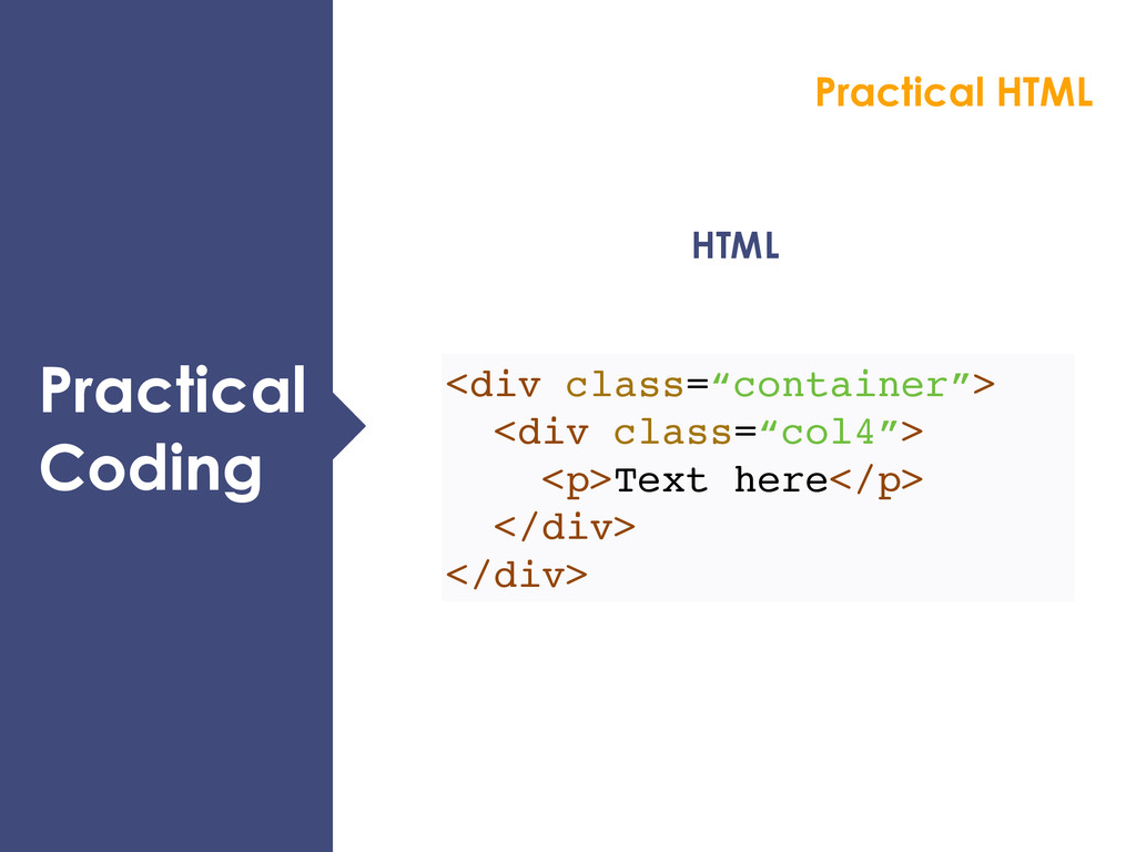
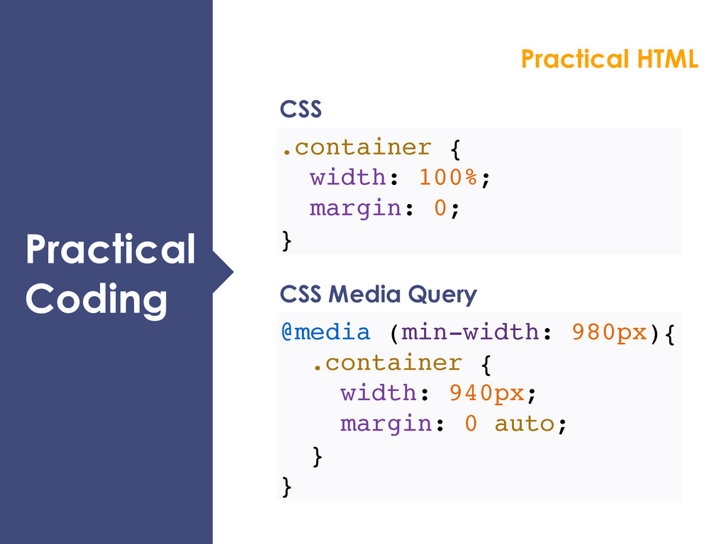
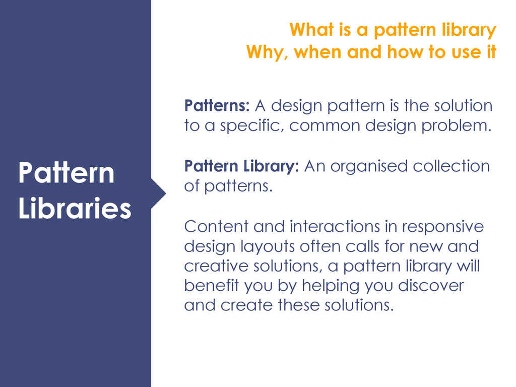
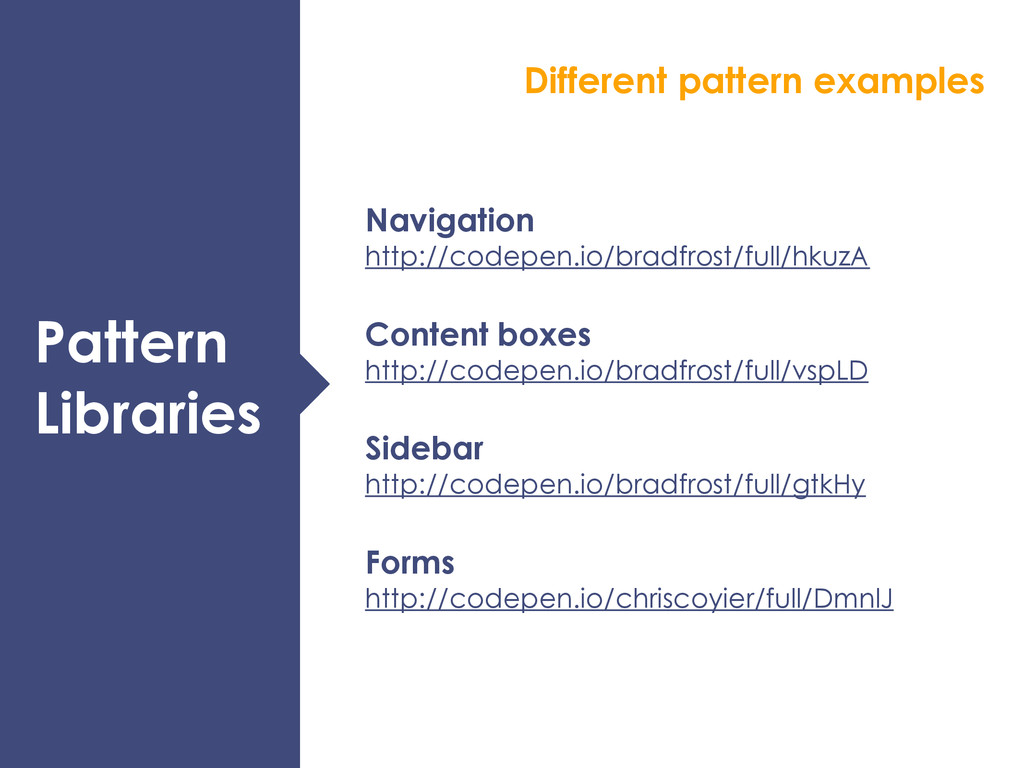
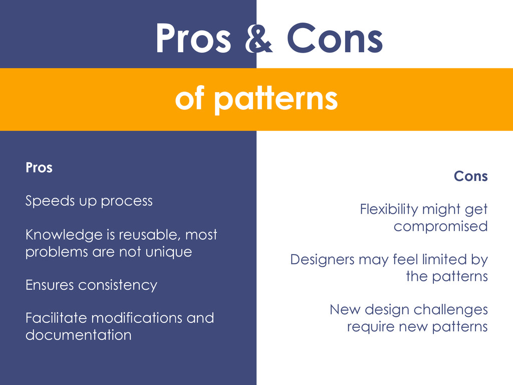
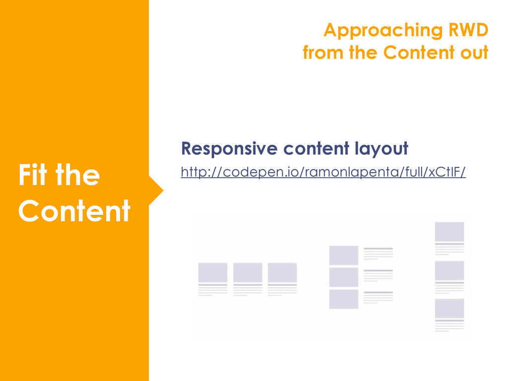
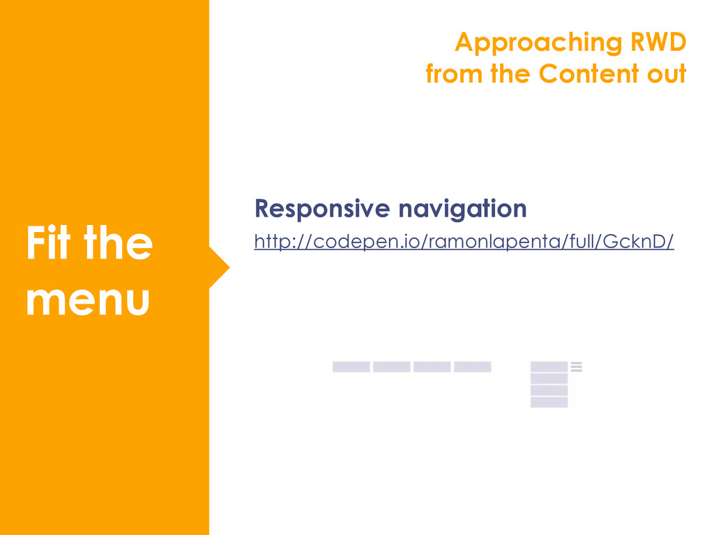
The web is a fluid and inherently flexible medium - to design effectively for it you need to understand it better. In this hands-on workshop we will look to level up your HTML & CSS skills to learn how you can create responsive prototypes and re-usable pattern libraries for your web projects. We’ll explore how to create layouts that flow beautifully from tiny screens to large ones and how to design responsive grids from the content-out. Through practical examples we’ll discuss the benefits of developing responsive pattern libraries including when and how to use them.


 daidaidai
 namiki64
 tetsuya28
 satoshi7
 sansantech
 pfn
 kworkdev
 yazm
 genda
 iktakahiro
 jyouryuusui
 moore
 skipperchong
 letsgokoyo
 cassininazir
 aleyda
 aemeredith
 lauravandoore
 samanthasiow
 sarafernandez
 sstephenson
 addyosmani