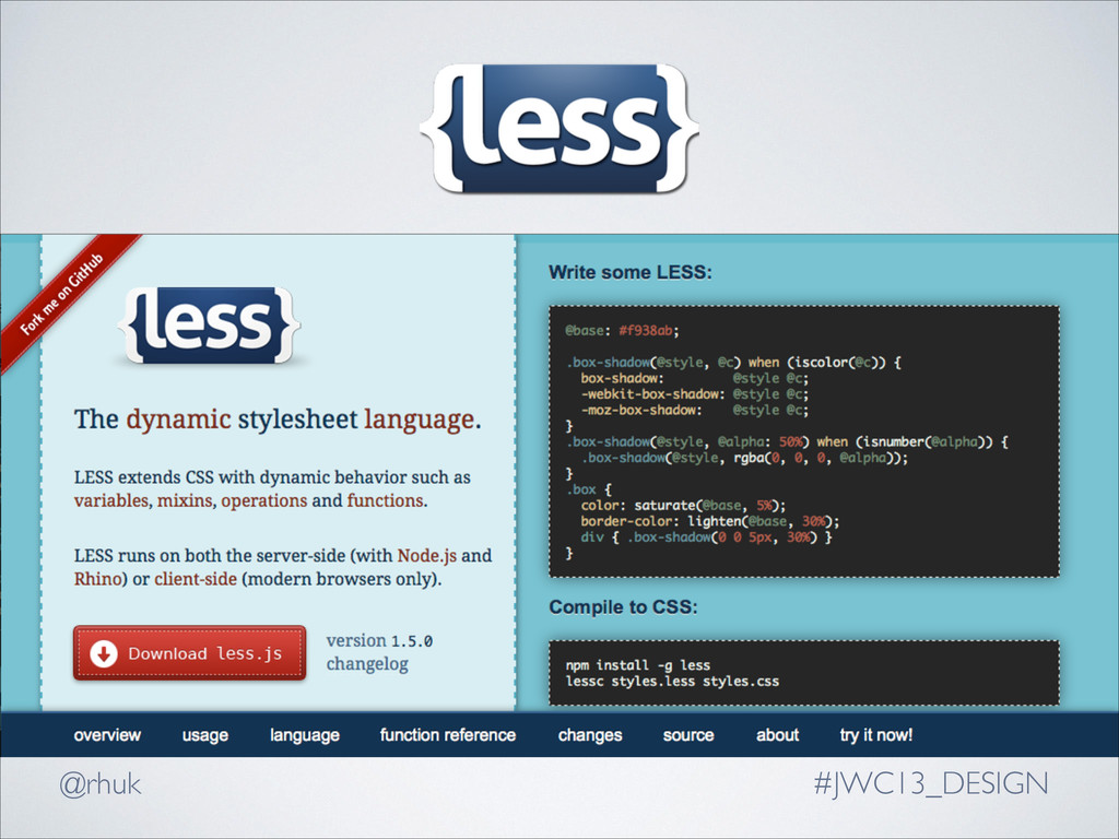
by Alexis Sellier in 2009. ! LESS compiles .less files at runtime and sends back CSS to the browser with the JS Script option, or can be done by developer using the Node.js version.
by Hampton Catlin in 2007. ! Sass compiles .sass files into .css. As of SASS 3, Sassy CSS or .scss files are the preferred format as it extends CSS syntax making any valid CSS file a valid Sass file.
your .less stylesheets with <link /> 3. Link your less.js file in a <script /> tag <link rel="stylesheet/less" type="text/css" href="styles.less" /> ! <script src="less.js" type="text/javascript"></script>
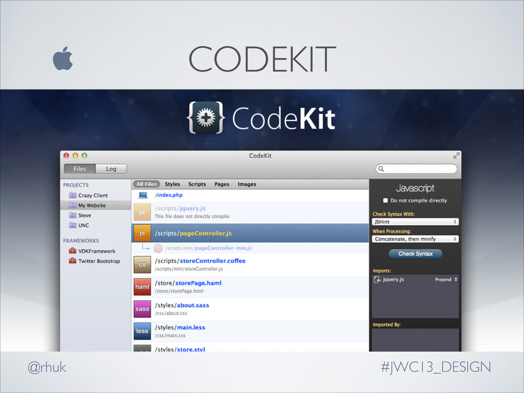
automatically watch and compile your LESS or Sass source files into CSS. ! They often also provide powerful features such as compression, JSLint, image optimization and live browser reloading
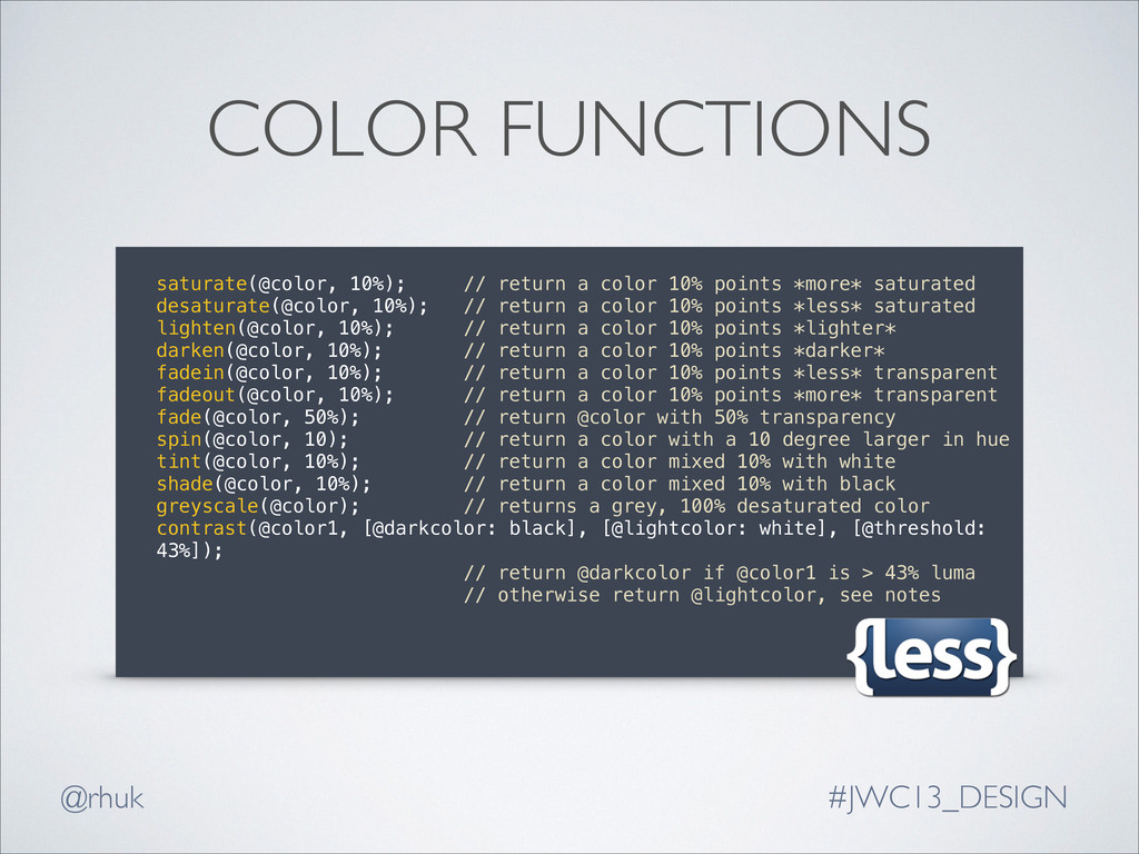
10% points *more* saturated desaturate(@color, 10%); // return a color 10% points *less* saturated lighten(@color, 10%); // return a color 10% points *lighter* darken(@color, 10%); // return a color 10% points *darker* fadein(@color, 10%); // return a color 10% points *less* transparent fadeout(@color, 10%); // return a color 10% points *more* transparent fade(@color, 50%); // return @color with 50% transparency spin(@color, 10); // return a color with a 10 degree larger in hue tint(@color, 10%); // return a color mixed 10% with white shade(@color, 10%); // return a color mixed 10% with black greyscale(@color); // returns a grey, 100% desaturated color contrast(@color1, [@darkcolor: black], [@lightcolor: white], [@threshold: 43%]); // return @darkcolor if @color1 is > 43% luma // otherwise return @lightcolor, see notes !
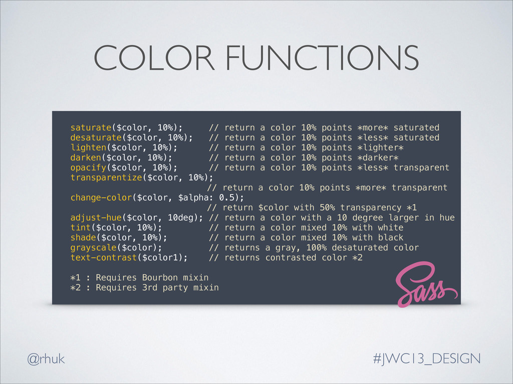
10% points *more* saturated desaturate($color, 10%); // return a color 10% points *less* saturated lighten($color, 10%); // return a color 10% points *lighter* darken($color, 10%); // return a color 10% points *darker* opacify($color, 10%); // return a color 10% points *less* transparent transparentize($color, 10%); // return a color 10% points *more* transparent change-color($color, $alpha: 0.5); // return $color with 50% transparency *1 adjust-hue($color, 10deg); // return a color with a 10 degree larger in hue tint($color, 10%); // return a color mixed 10% with white shade($color, 10%); // return a color mixed 10% with black grayscale($color); // returns a gray, 100% desaturated color text-contrast($color1); // returns contrasted color *2 ! *1 : Requires Bourbon mixin *2 : Requires 3rd party mixin
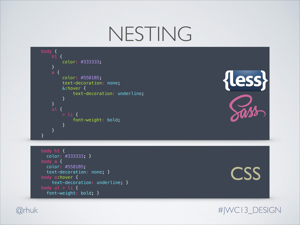
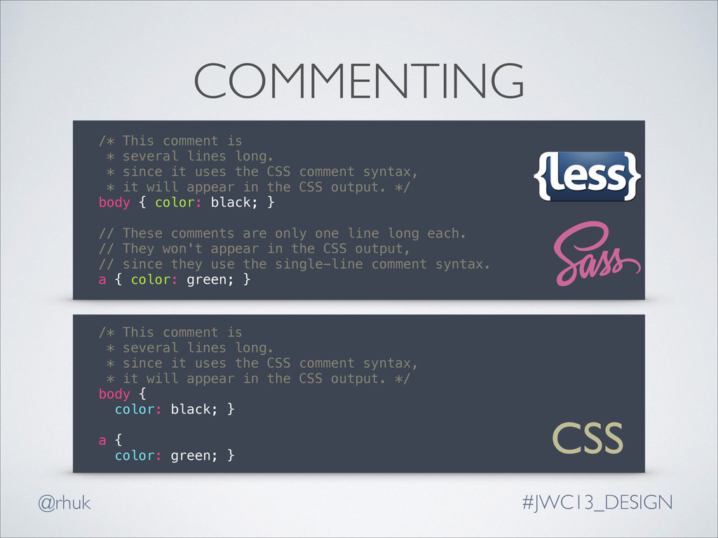
* since it uses the CSS comment syntax, * it will appear in the CSS output. */ body { color: black; } ! // These comments are only one line long each. // They won't appear in the CSS output, // since they use the single-line comment syntax. a { color: green; } /* This comment is * several lines long. * since it uses the CSS comment syntax, * it will appear in the CSS output. */ body { color: black; } ! a { color: green; } COMMENTING CSS
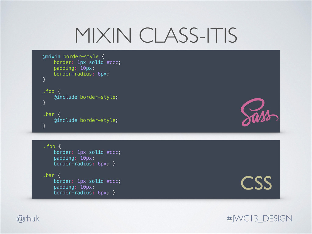
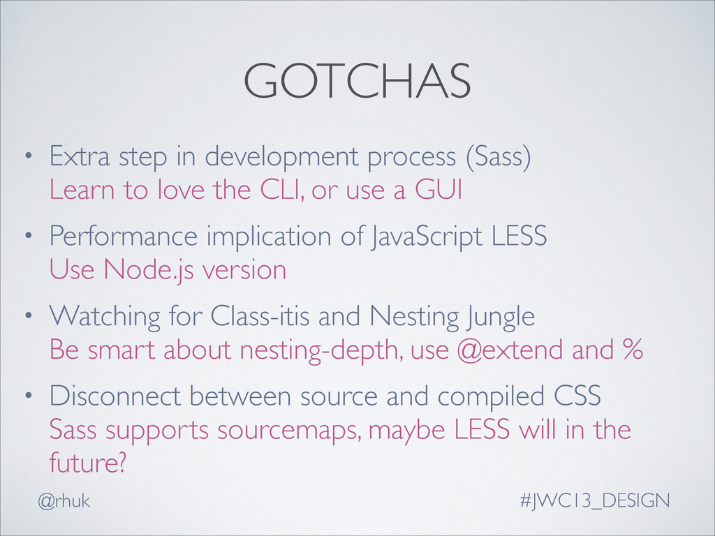
Learn to love the CLI, or use a GUI • Performance implication of JavaScript LESS Use Node.js version • Watching for Class-itis and Nesting Jungle Be smart about nesting-depth, use @extend and % • Disconnect between source and compiled CSS Sass supports sourcemaps, maybe LESS will in the future?
 okumin
 kyoko_nr_nr
 maroon8021
 javiergs
 kishikawakatsumi
 hayatokudou
 ryutaro_yako
 aurimas
 izumin5210
 h0r15h0
 pvcresin
 chobishiba
 tanoku
 mclloyd
 bermonpainter
 jeffersonlam
 sstephenson
 skoyamalab
 lara
lara
 mfonobong
 rasmusluckow
 lauravandoore
 katiecoart
 aleyda