Upgrade to Pro
— share decks privately, control downloads, hide ads and more …
Speaker Deck
Features
Speaker Deck
PRO
Sign in
Sign up for free
Search
Search
Sass: CSS com superpoderes
Search
Sponsored
·
Your Podcast. Everywhere. Effortlessly.
Share. Educate. Inspire. Entertain. You do you. We'll handle the rest.
→
Rômulo Machado
November 05, 2014
Programming
210
1
Share
Embed
Copy iframe code
Copy JS code
Copy link
Start on current slide
Sass: CSS com superpoderes
Minicurso ministrado na SCTI-UENF/2014
Rômulo Machado
November 05, 2014
More Decks by Rômulo Machado
See All by Rômulo Machado
Ember.js: building better apps in less time
romulomachado
4
160
Por que usar pré-processadores CSS?
romulomachado
0
2.3k
Como se manter atualizado com tecnologias front-end
romulomachado
2
160
Desenvolvimento Front End: o que não te ensinaram na escola
romulomachado
2
190
Other Decks in Programming
See All in Programming
Datadog × OpenTelemetry 入門と実践のあいだ
kn_to_maxpno
1
180
The ROI of Quarkus for Spring Boot Applications
hollycummins
0
150
Honoでのサプライチェーン侵害対策 〜 3つのライブラリに学ぶ
yusukebe
7
1.5k
過去最大のMCPアップデート! 2026-07-28 RC版の謎に迫る
licux
6
430
LLMによるContent Moderationの本番運用の裏側と品質担保への挑戦
suikabar
3
800
AI時代のUIはどこへ行く?その2!
yusukebe
22
7.6k
Language Server 使ってる? 〜VSCode と Zed の場合〜 / Are you using a Language Server? ~For VS Code and Zed~
handlename
0
810
AI 輔助遺留系統現代化的經驗分享
jame2408
1
1.1k
LaravelLive Japan の裏方のすべて — 第188回 PHP勉強会@東京 (2026-06-24)
suguruooki
2
130
Skillsは効率化、Agentsは"自分の拡張"——Builder時代のエージェント編成(CC Night 2026)
wemra
1
180
さぁV100、メモリをお食べ・・・
nilpe
0
160
キャリア迷子上等 ─ "ない道"は自分で作ればいい
16bitidol
3
2.4k
Featured
See All Featured
A Soul's Torment
seathinner
6
3k
RailsConf & Balkan Ruby 2019: The Past, Present, and Future of Rails at GitHub
eileencodes
141
35k
SEOcharity - Dark patterns in SEO and UX: How to avoid them and build a more ethical web
sarafernandez
0
210
Reflections from 52 weeks, 52 projects
jeffersonlam
356
21k
Navigating Team Friction
lara
192
16k
Hiding What from Whom? A Critical Review of the History of Programming languages for Music
tomoyanonymous
2
870
Making the Leap to Tech Lead
cromwellryan
135
9.9k
Done Done
chrislema
186
16k
Scaling GitHub
holman
464
140k
Optimizing for Happiness
mojombo
378
71k
Chrome DevTools: State of the Union 2024 - Debugging React & Beyond
addyosmani
10
1.2k
Java REST API Framework Comparison - PWX 2021
mraible
34
9.4k
Transcript
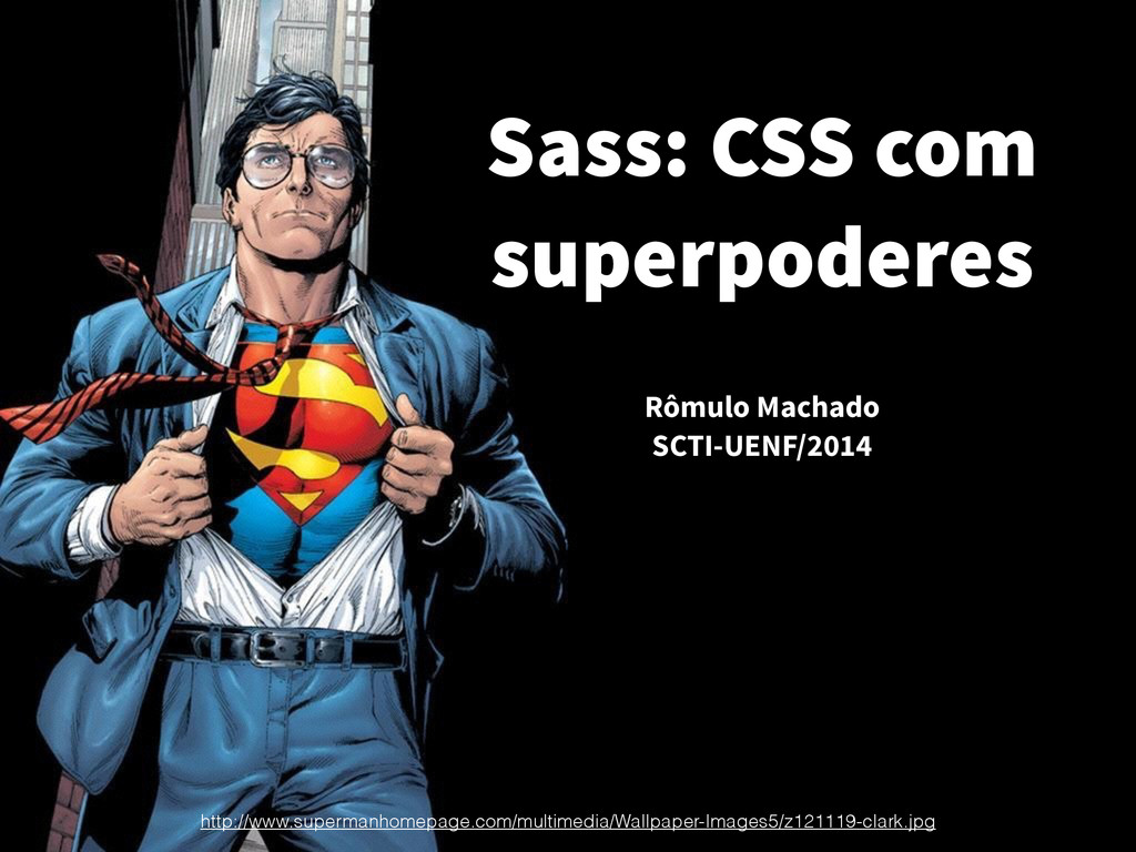
Sass: CSS com superpoderes Rômulo Machado SCTI-UENF/2014 http://www.supermanhomepage.com/multimedia/Wallpaper-Images5/z121119-clark.jpg
http://cdn.churchm.ag/wp-content/uploads/2012/02/Mario-Lamp-2-2.jpg
http://indiaandhoney.files.wordpress.com/2013/08/tumblr_lrzakjtqrc1qee7ixo1_500.gif?w=490
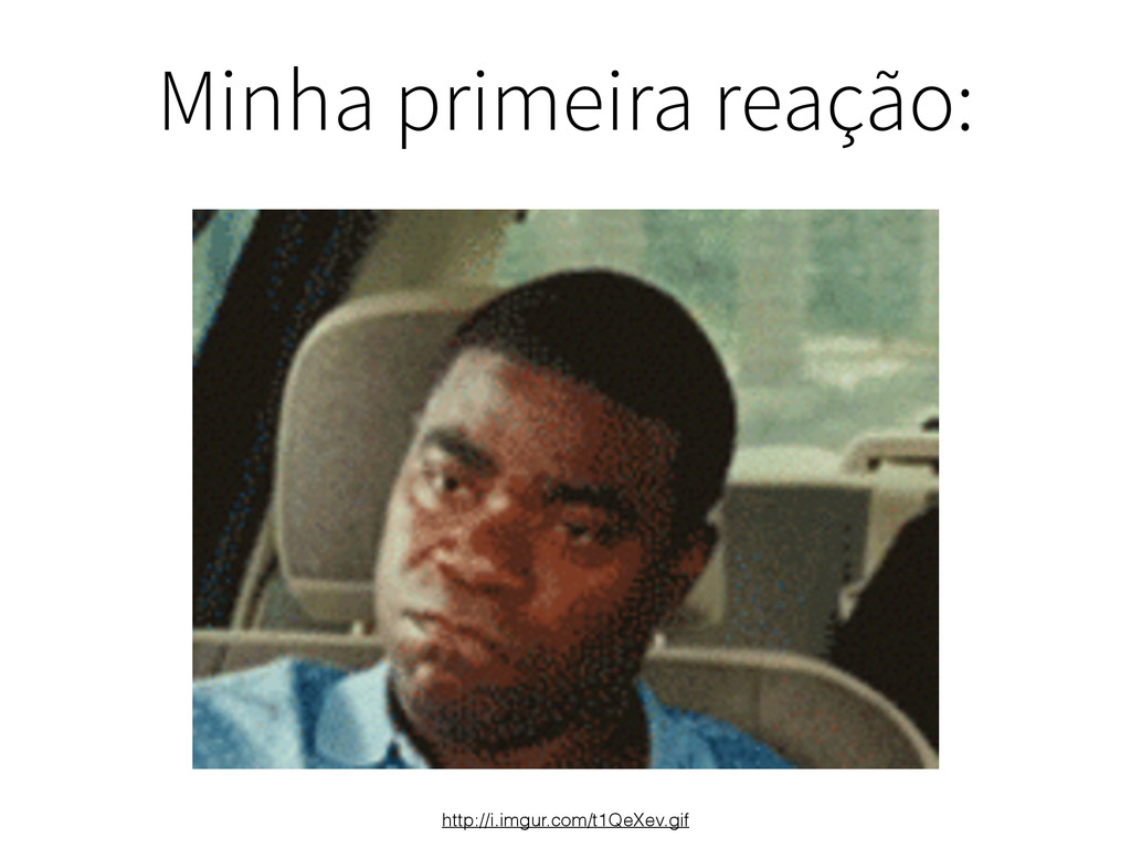
Quando eu ouvi falar de Sass:
Minha primeira reação: http://i.imgur.com/t1QeXev.gif
CSS foi feito para ser simples.
CSS foi feito para ser simples. E de fato é.
O problema é quando o projeto cresce.
http://i.imgur.com/qk96ytw.gif
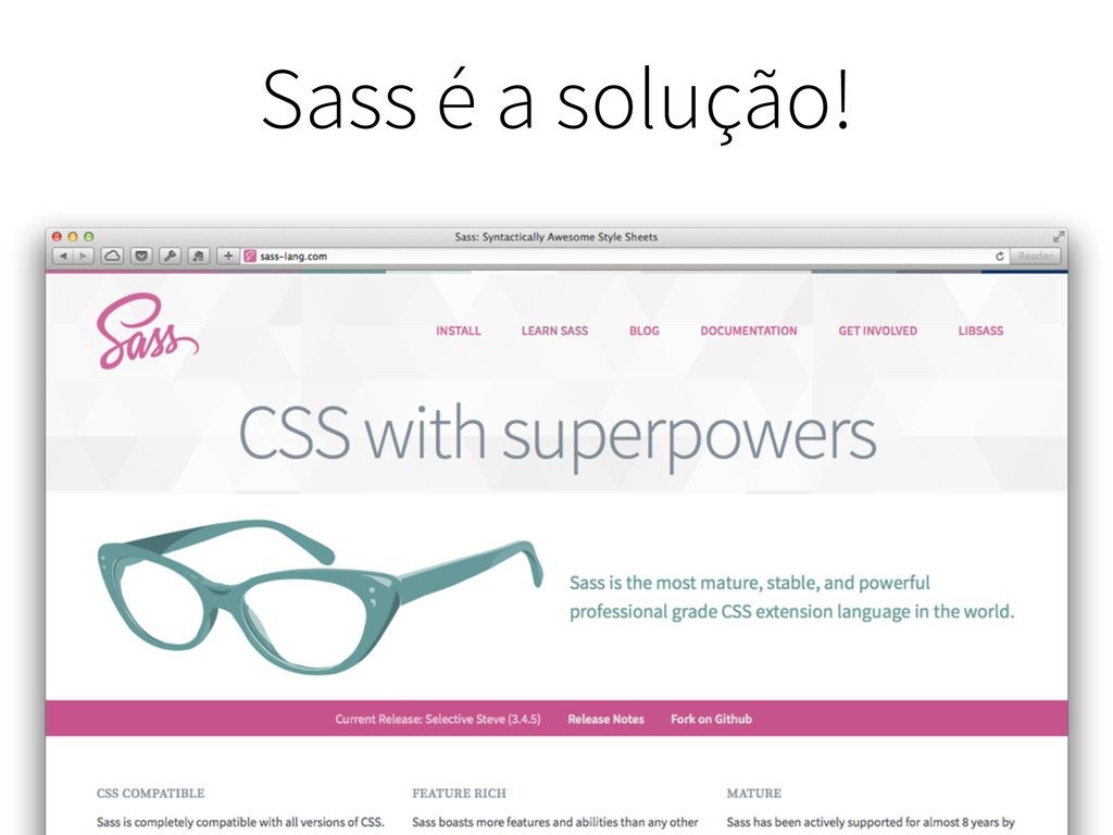
Sass é a solução!
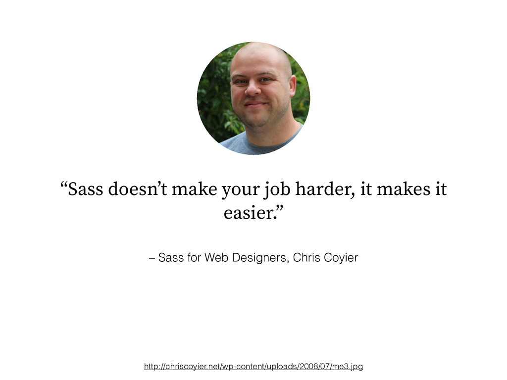
– Sass for Web Designers, Chris Coyier “Sass doesn’t make
your job harder, it makes it easier.” http://chriscoyier.net/wp-content/uploads/2008/07/me3.jpg
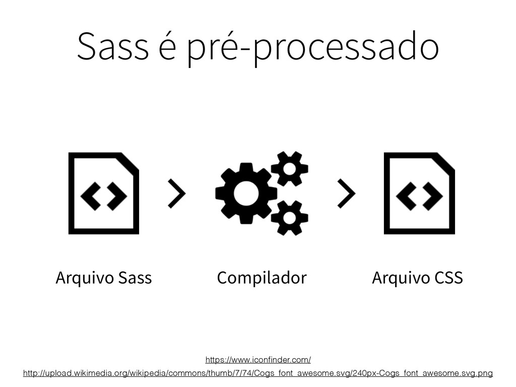
Arquivo Sass Arquivo CSS Sass é pré-processado http://upload.wikimedia.org/wikipedia/commons/thumb/7/74/Cogs_font_awesome.svg/240px-Cogs_font_awesome.svg.png Compilador https://www.iconfinder.com/
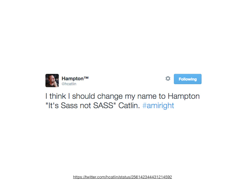
http://sassnotsass.com/
https://twitter.com/hcatlin/status/256142344431214592
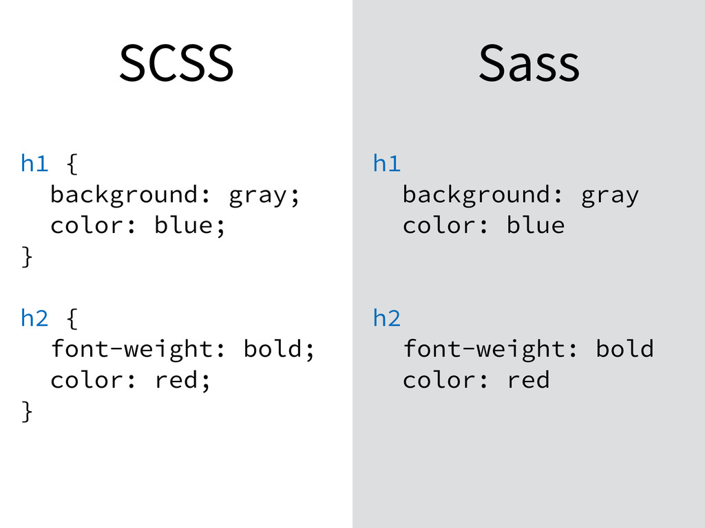
.scss ou .sass?
SCSS Sass h1 { background: gray; color: blue; } h2
{ font-weight: bold; color: red; } h1 background: gray color: blue h2 font-weight: bold color: red
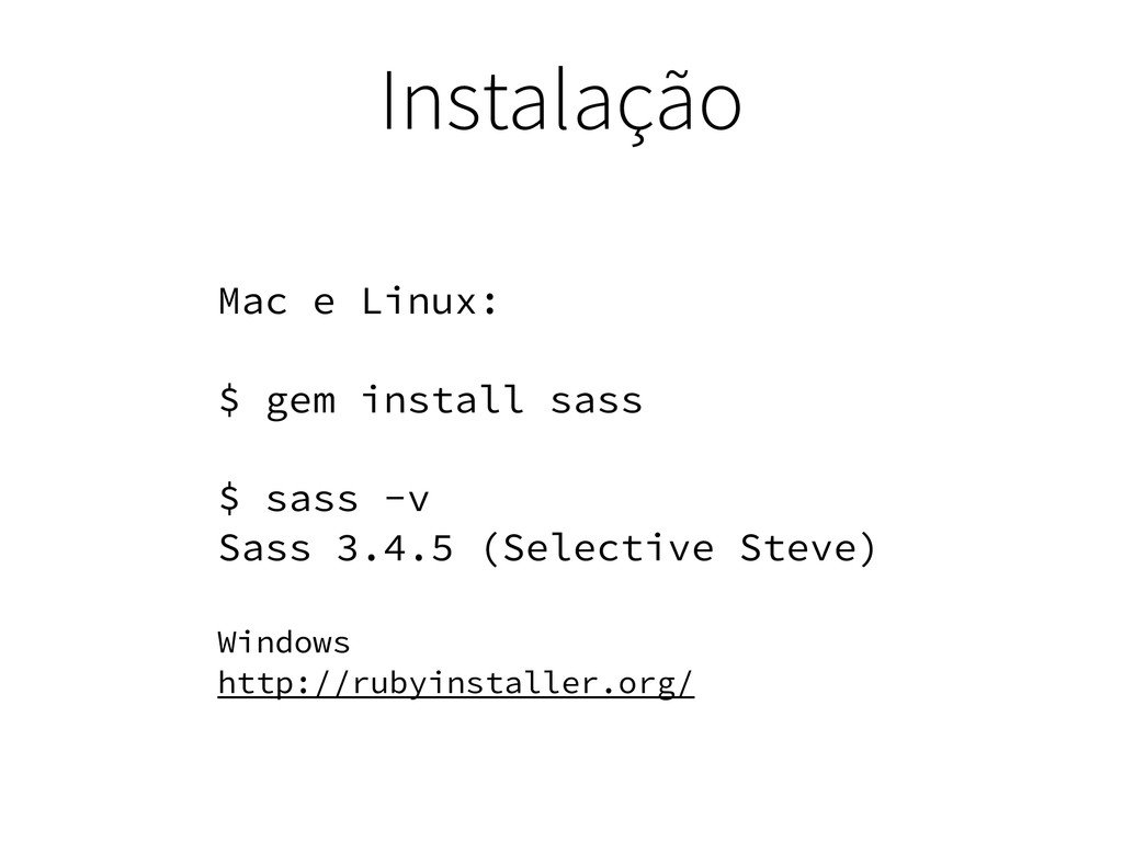
Instalação Mac e Linux: $ gem install sass $ sass
-v Sass 3.4.5 (Selective Steve) Windows http://rubyinstaller.org/
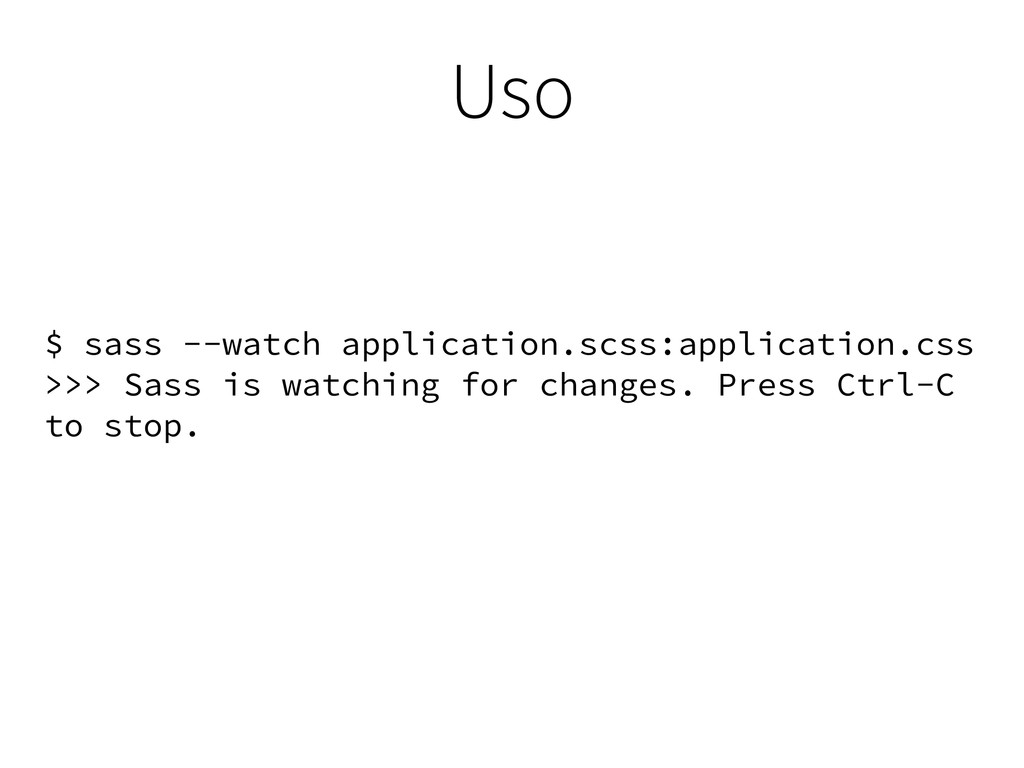
Uso $ sass --watch application.scss:application.css >>> Sass is watching for
changes. Press Ctrl-C to stop.
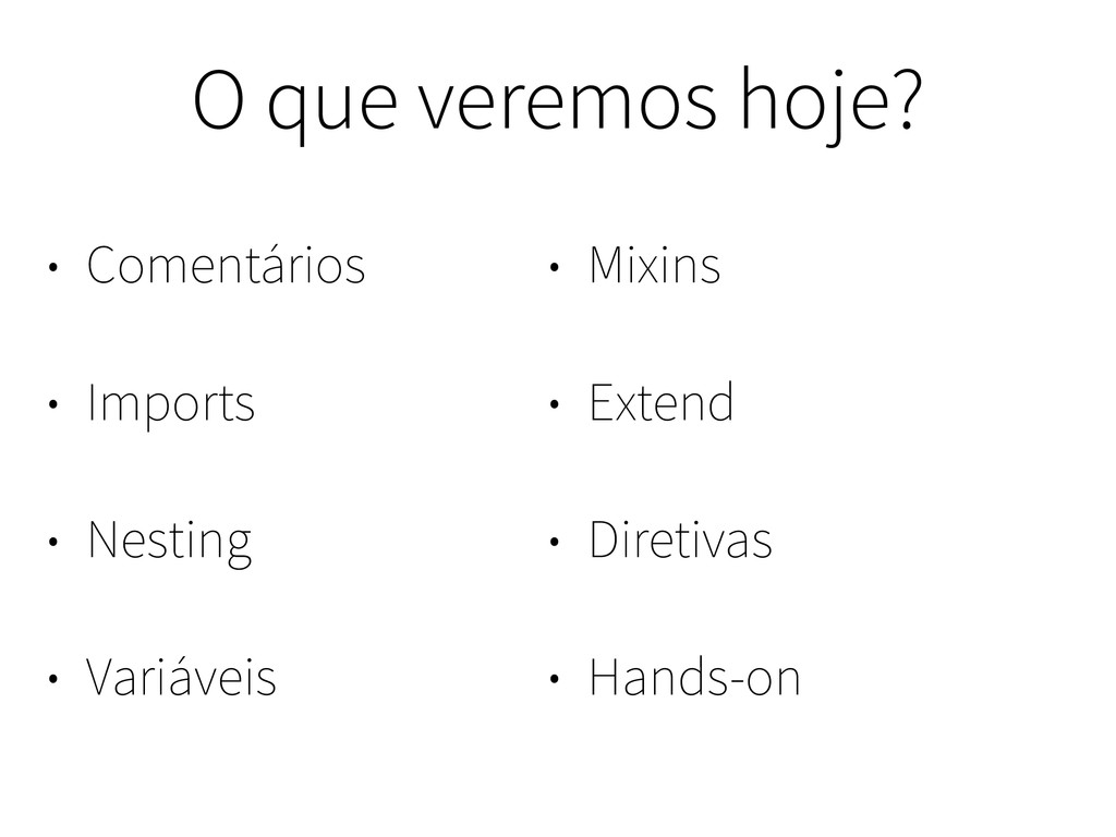
O que veremos hoje? • Comentários • Imports • Nesting
• Variáveis • Mixins • Extend • Diretivas • Hands-on
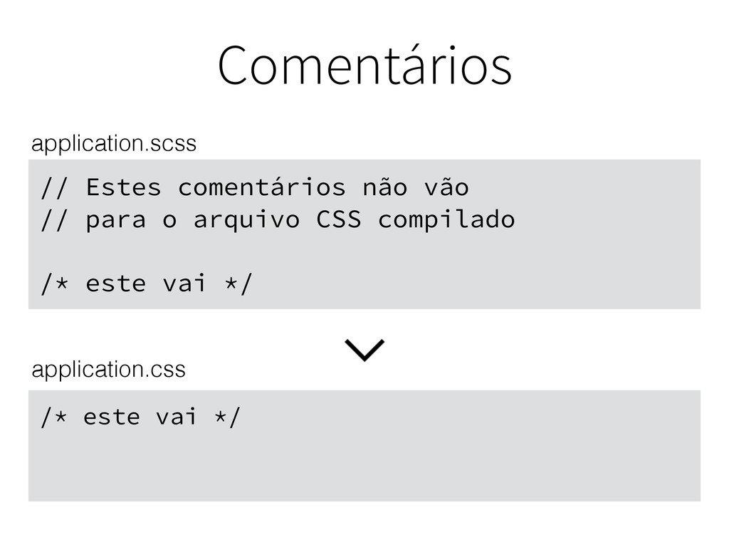
Comentários
// Estes comentários não vão // para o arquivo CSS
compilado /* este vai */ Comentários /* este vai */ application.scss application.css
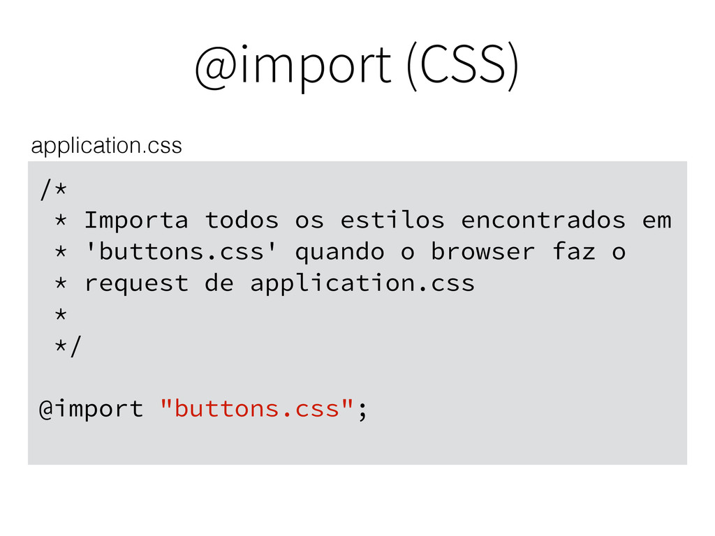
Imports
@import (CSS) /* * Importa todos os estilos encontrados em
* 'buttons.css' quando o browser faz o * request de application.css * */ @import "buttons.css"; application.css
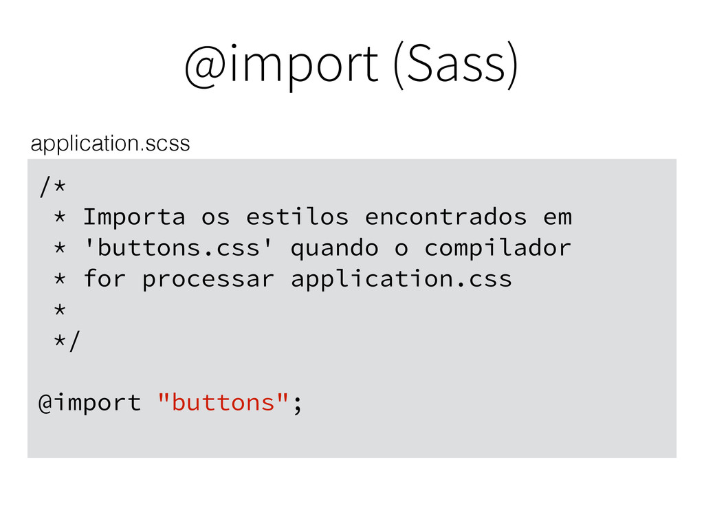
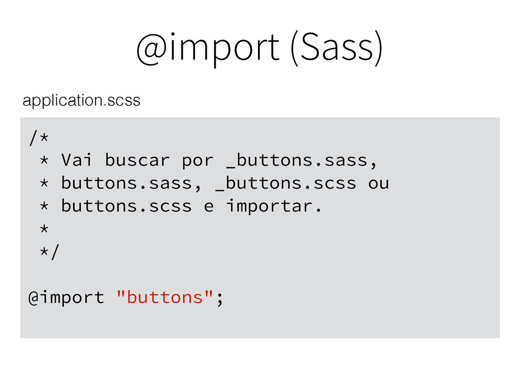
@import (Sass) /* * Importa os estilos encontrados em *
'buttons.css' quando o compilador * for processar application.css * */ @import "buttons"; application.scss
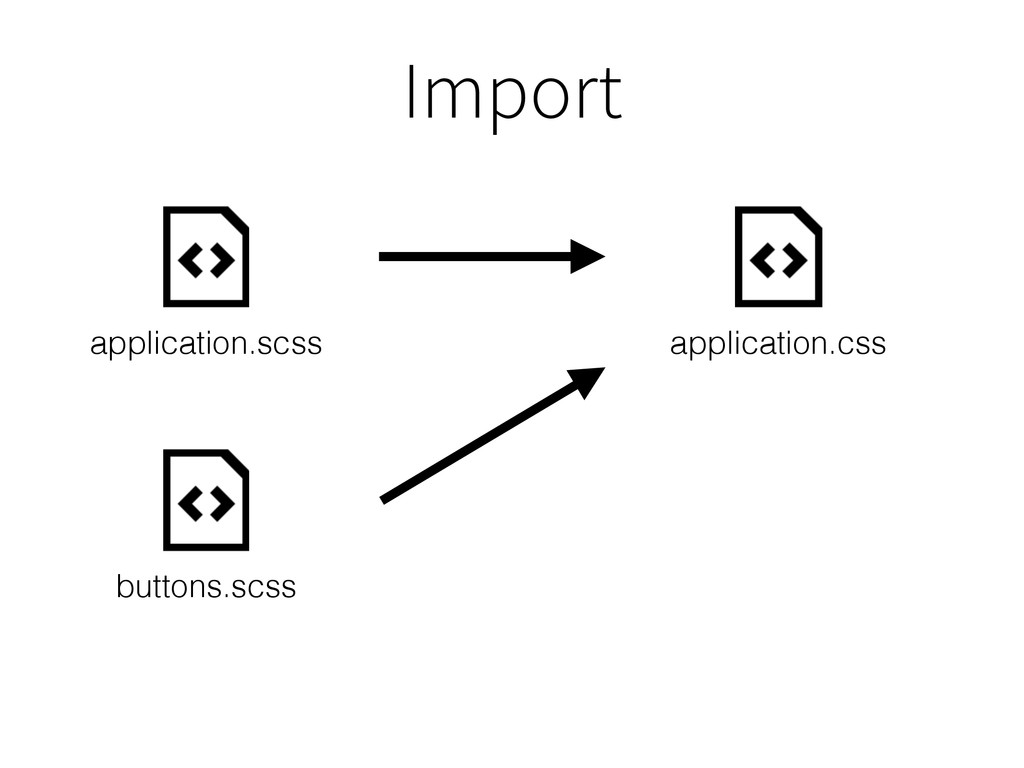
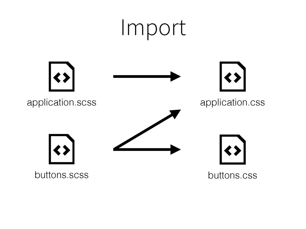
Import application.scss application.css buttons.scss
Import application.scss application.css buttons.scss buttons.css
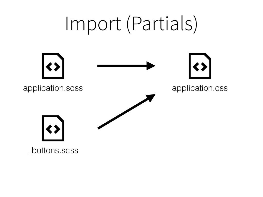
Import (Partials) application.scss application.css _buttons.scss
@import (Sass) /* * Vai buscar por _buttons.sass, * buttons.sass,
_buttons.scss ou * buttons.scss e importar. * */ @import "buttons"; application.scss
Nesting
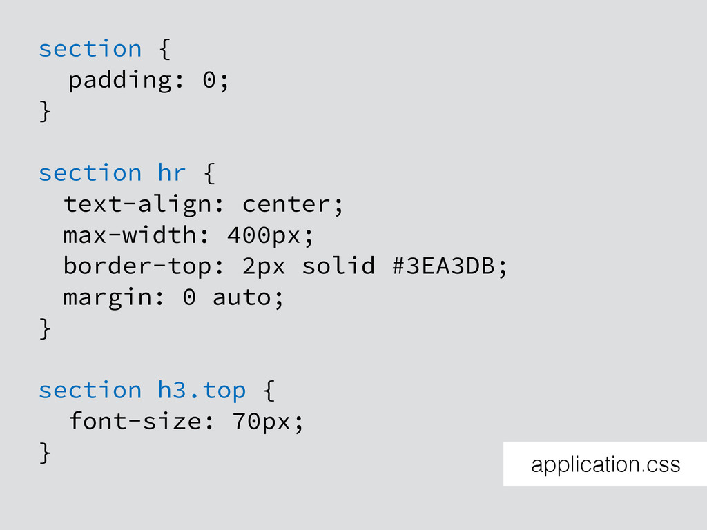
section { padding: 0; } section hr { text-align: center;
max-width: 400px; border-top: 2px solid #3EA3DB; margin: 0 auto; } section h3.top { font-size: 70px; } application.css
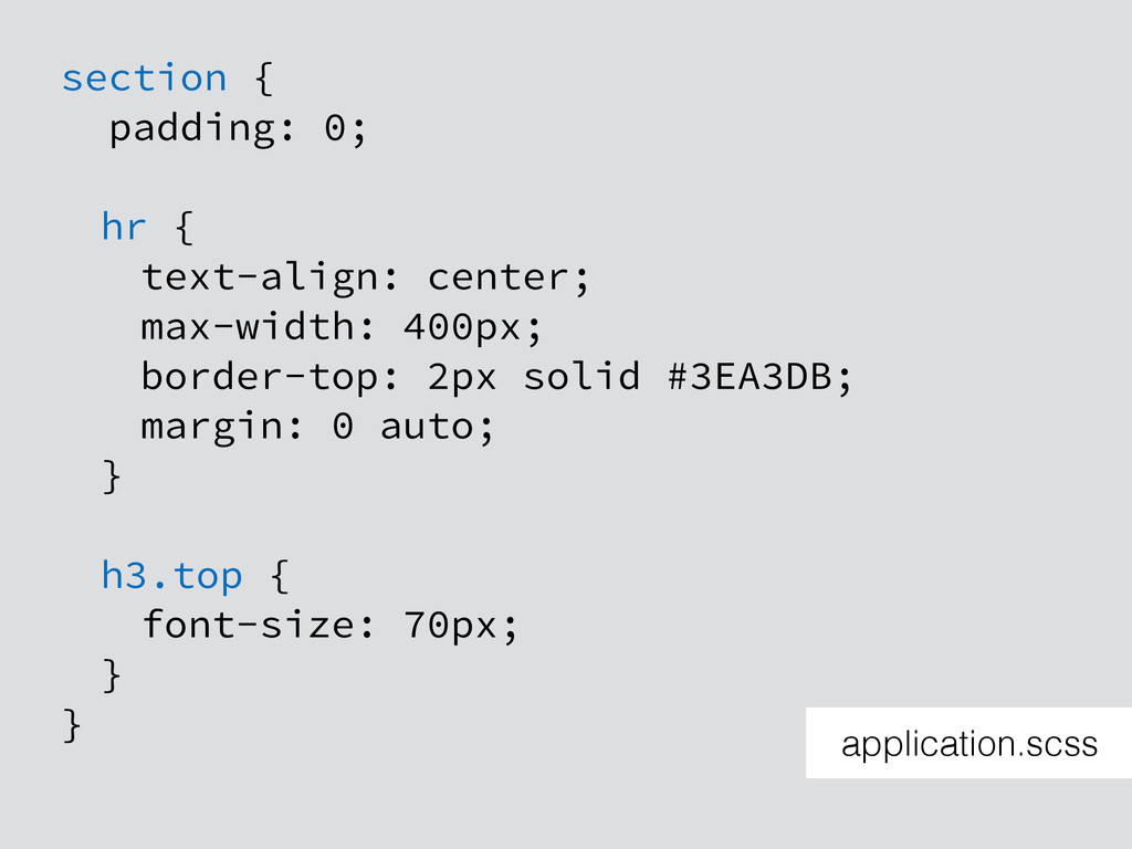
section { padding: 0; hr { text-align: center; max-width: 400px;
border-top: 2px solid #3EA3DB; margin: 0 auto; } h3.top { font-size: 70px; } } application.scss
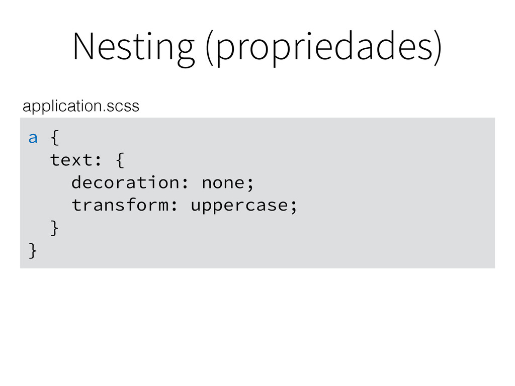
Nesting (propriedades) a { text: { decoration: none; transform: uppercase;
} } application.scss
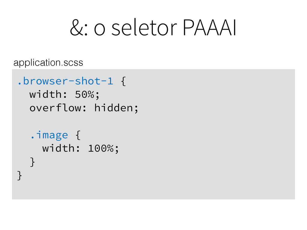
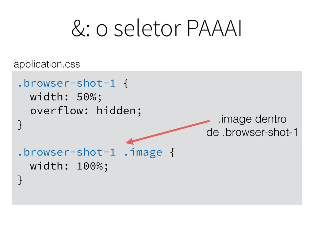
&: o seletor PAAAI .browser-shot-1 { width: 50%; overflow: hidden;
.image { width: 100%; } } application.scss
&: o seletor PAAAI .browser-shot-1 { width: 50%; overflow: hidden;
} .browser-shot-1 .image { width: 100%; } application.css
&: o seletor PAAAI .browser-shot-1 { width: 50%; overflow: hidden;
} .browser-shot-1 .image { width: 100%; } application.css .image dentro de .browser-shot-1
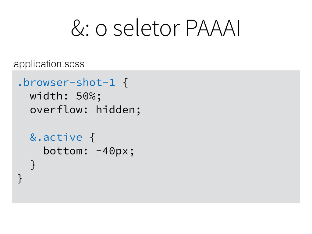
&: o seletor PAAAI .browser-shot-1 { width: 50%; overflow: hidden;
&.active { bottom: -40px; } } application.scss
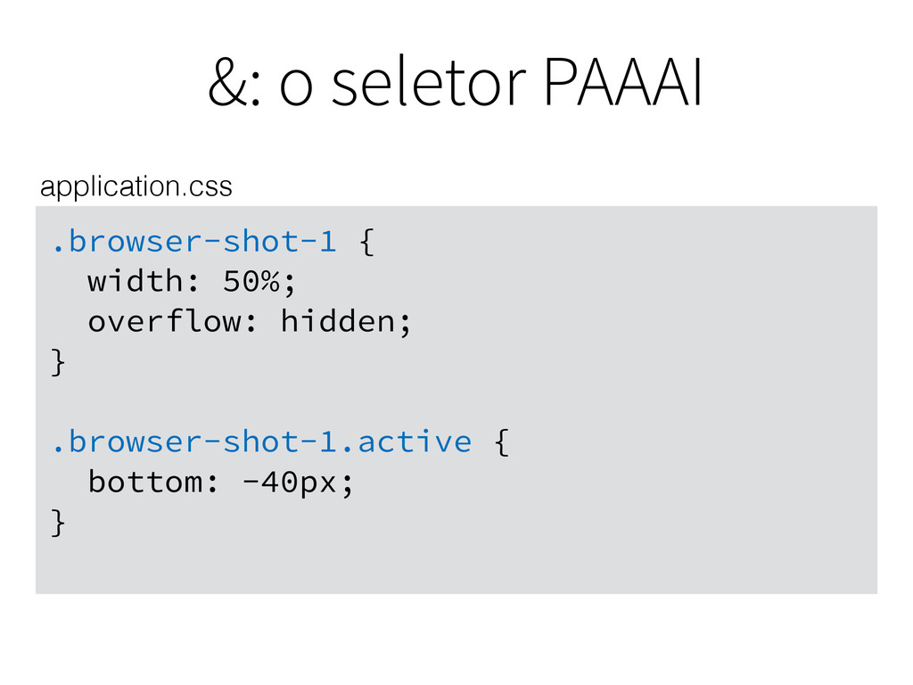
&: o seletor PAAAI .browser-shot-1 { width: 50%; overflow: hidden;
} .browser-shot-1.active { bottom: -40px; } application.css
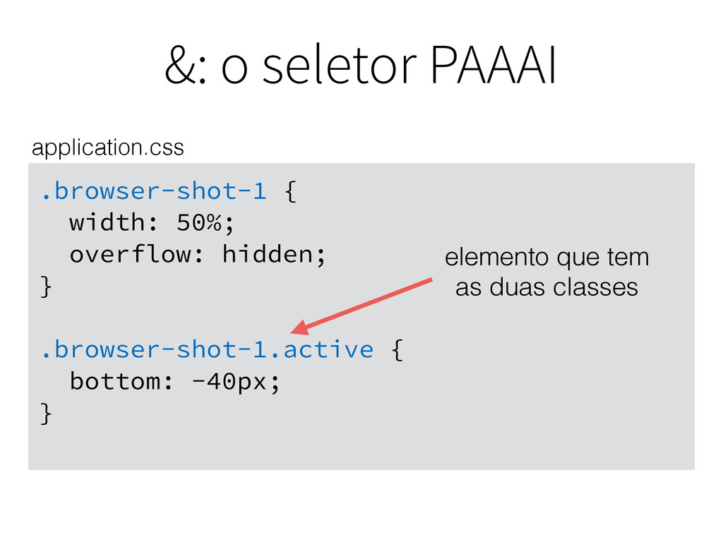
&: o seletor PAAAI .browser-shot-1 { width: 50%; overflow: hidden;
} .browser-shot-1.active { bottom: -40px; } application.css elemento que tem as duas classes
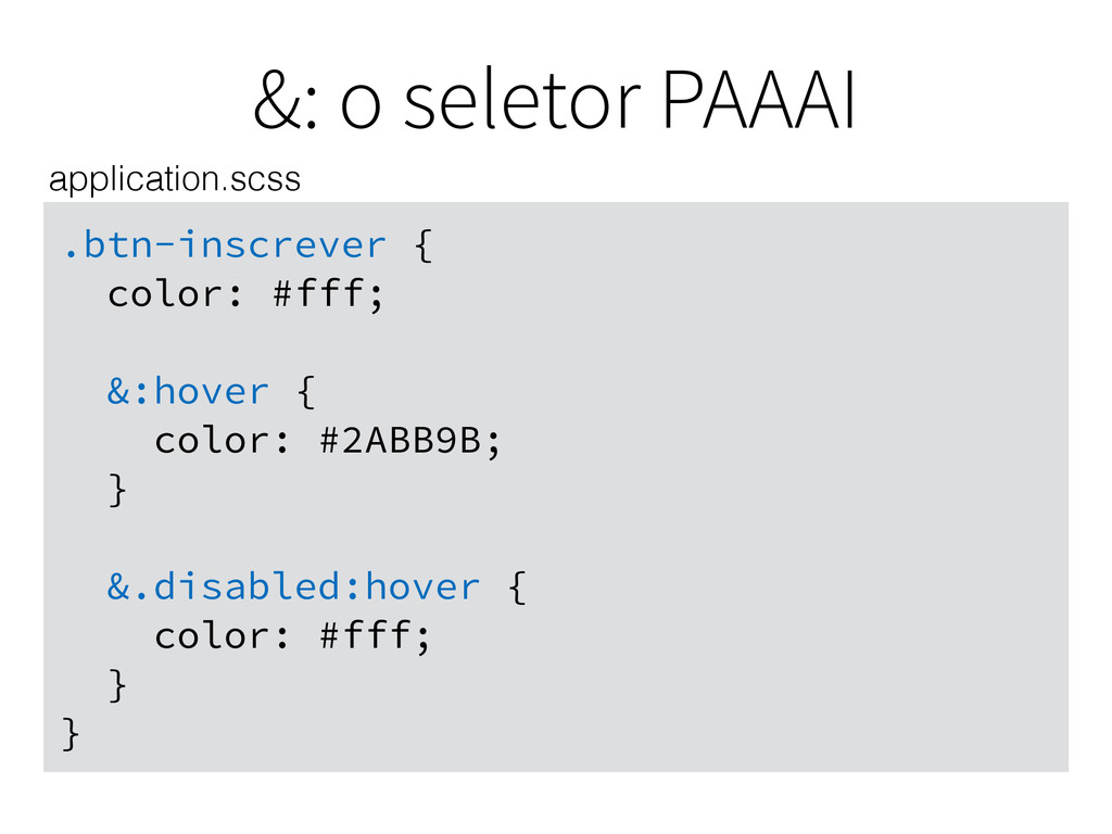
&: o seletor PAAAI .btn-inscrever { color: #fff; &:hover {
color: #2ABB9B; } &.disabled:hover { color: #fff; } } application.scss
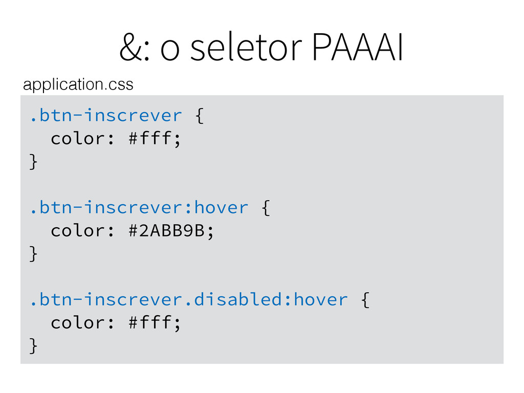
&: o seletor PAAAI .btn-inscrever { color: #fff; } .btn-inscrever:hover
{ color: #2ABB9B; } .btn-inscrever.disabled:hover { color: #fff; } application.css
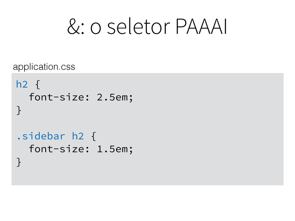
&: o seletor PAAAI h2 { font-size: 2.5em; } .sidebar
h2 { font-size: 1.5em; } application.css
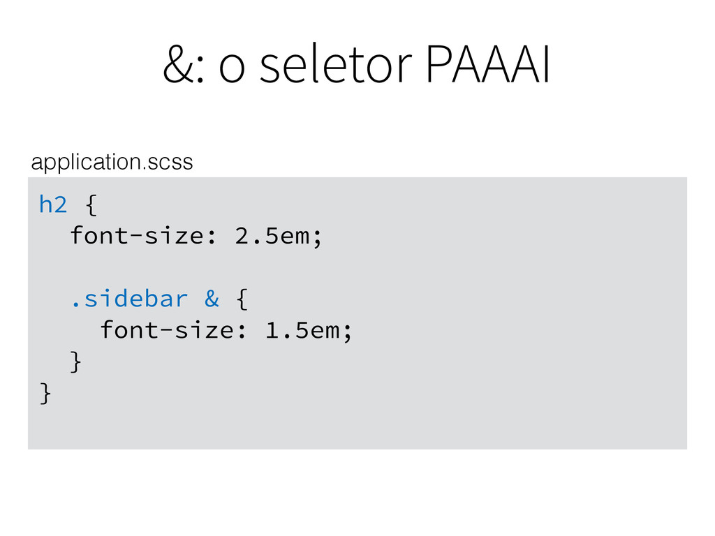
&: o seletor PAAAI h2 { font-size: 2.5em; .sidebar &
{ font-size: 1.5em; } } application.scss
Fácil, porém perigoso. http://s3-ec.buzzfed.com/static/2014-05/enhanced/webdr03/15/10/anigif_enhanced-buzz-29923-1400162648-5.gif
Variáveis
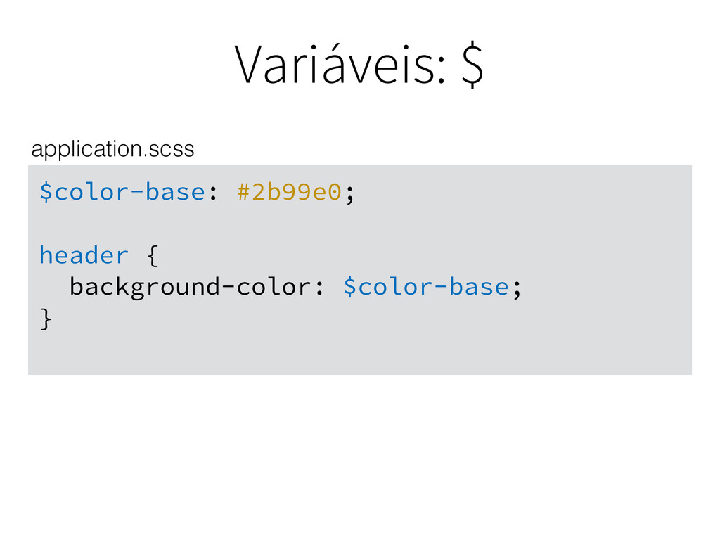
Variáveis: $ $color-base: #2b99e0; header { background-color: $color-base; } application.scss
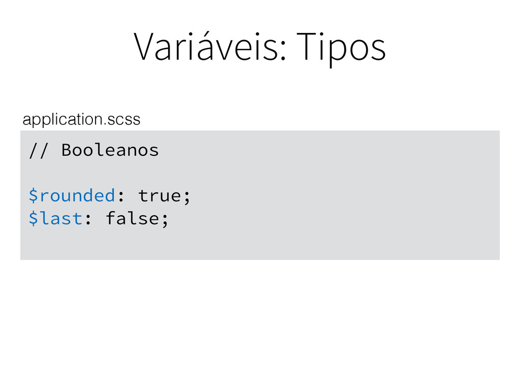
Variáveis: Tipos // Booleanos $rounded: true; $last: false; application.scss
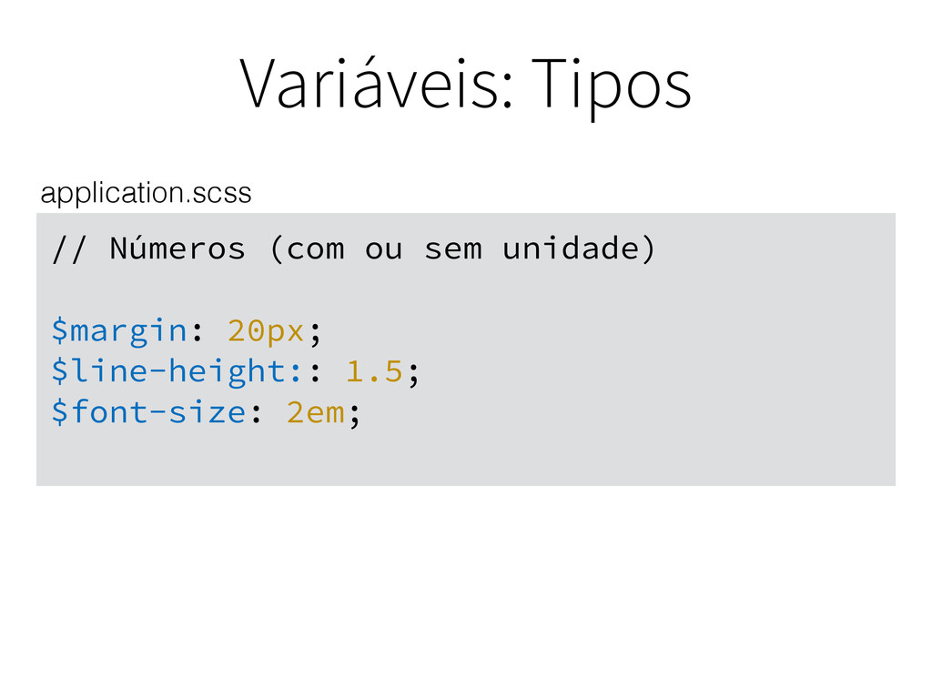
Variáveis: Tipos // Números (com ou sem unidade) $margin: 20px;
$line-height:: 1.5; $font-size: 2em; application.scss
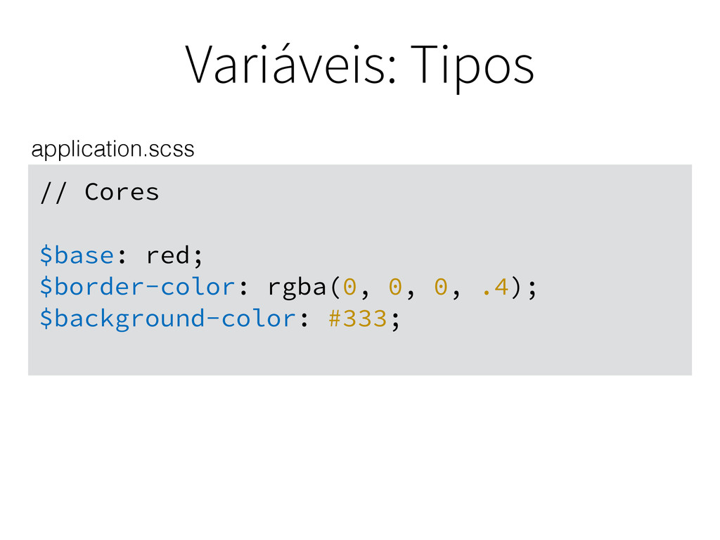
Variáveis: Tipos // Cores $base: red; $border-color: rgba(0, 0, 0,
.4); $background-color: #333; application.scss
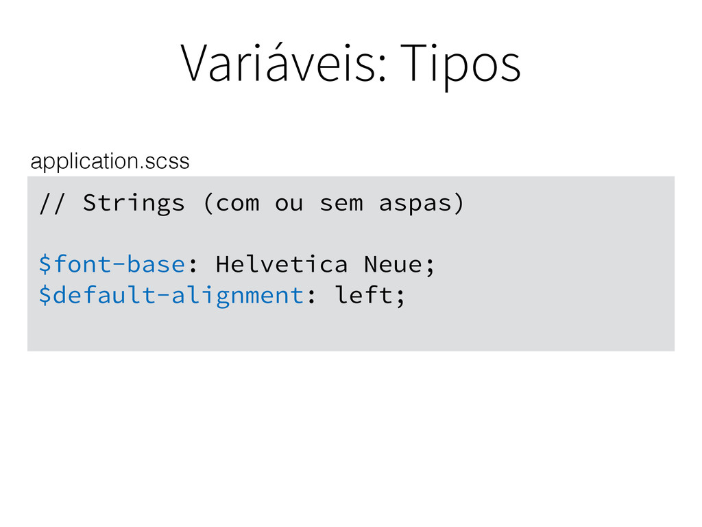
Variáveis: Tipos // Strings (com ou sem aspas) $font-base: Helvetica
Neue; $default-alignment: left; application.scss
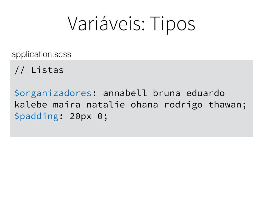
Variáveis: Tipos // Listas $organizadores: annabell bruna eduardo kalebe maira
natalie ohana rodrigo thawan; $padding: 20px 0; application.scss
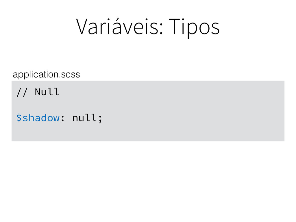
Variáveis: Tipos // Null $shadow: null; application.scss
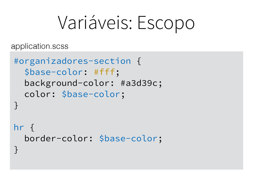
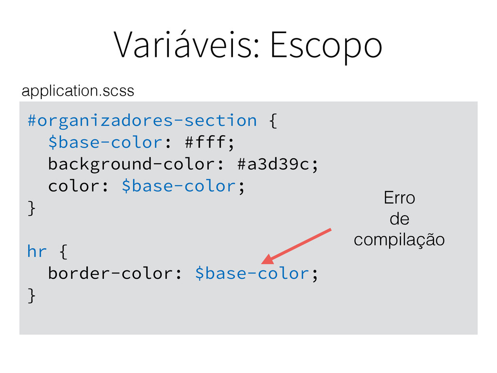
Variáveis: Escopo #organizadores-section { $base-color: #fff; background-color: #a3d39c; color: $base-color;
} hr { border-color: $base-color; } application.scss
Variáveis: Escopo #organizadores-section { $base-color: #fff; background-color: #a3d39c; color: $base-color;
} hr { border-color: $base-color; } application.scss Erro de compilação
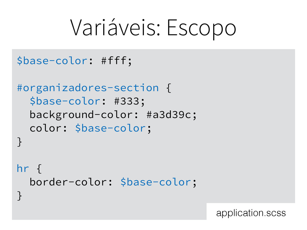
Variáveis: Escopo $base-color: #fff; #organizadores-section { $base-color: #333; background-color: #a3d39c;
color: $base-color; } hr { border-color: $base-color; } application.scss
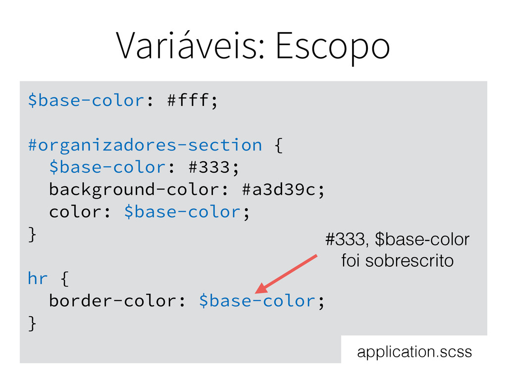
Variáveis: Escopo $base-color: #fff; #organizadores-section { $base-color: #333; background-color: #a3d39c;
color: $base-color; } hr { border-color: $base-color; } #333, $base-color foi sobrescrito application.scss
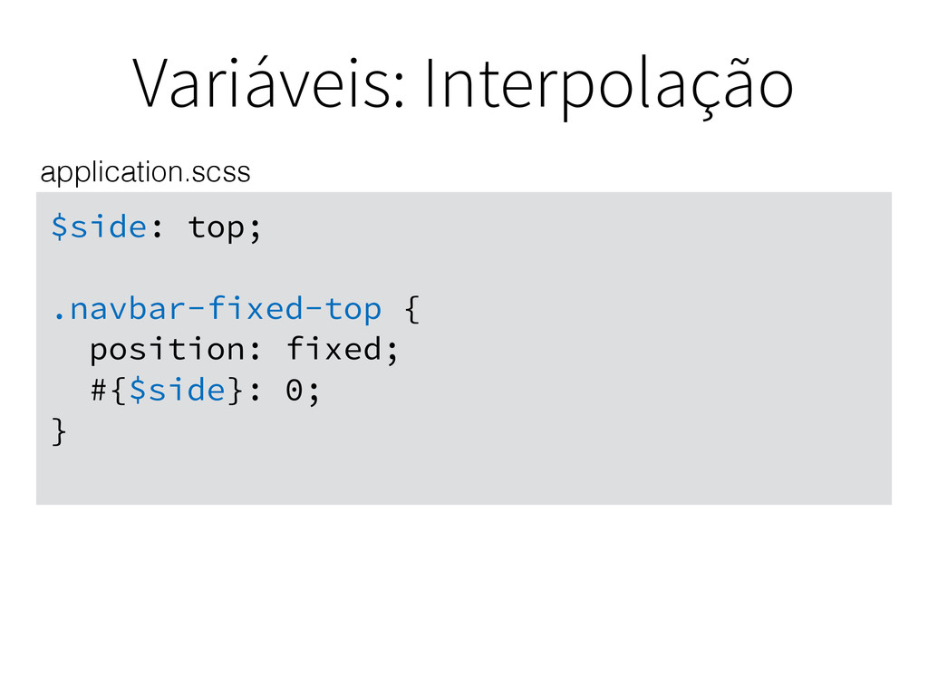
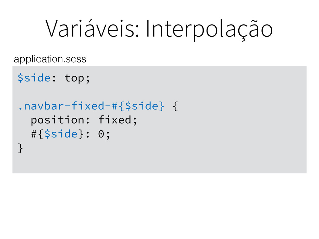
Variáveis: Interpolação Use a interpolação igual a do Ruby #{$variavel}
para completar seletores, propriedades ou valores.
Variáveis: Interpolação $side: top; .navbar-fixed-top { position: fixed; #{$side}: 0;
} application.scss
Variáveis: Interpolação $side: top; .navbar-fixed-#{$side} { position: fixed; #{$side}: 0;
} application.scss
Mixins
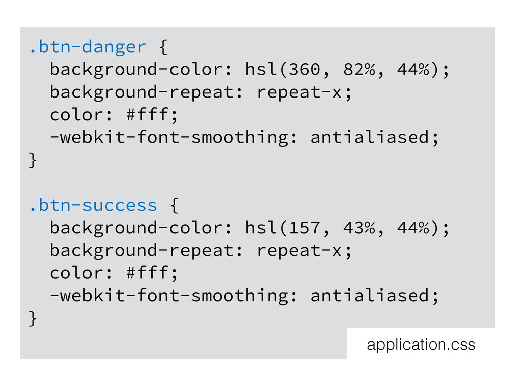
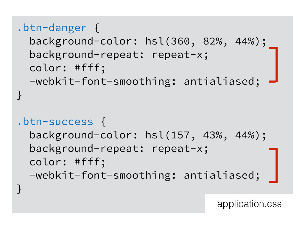
.btn-danger { background-color: hsl(360, 82%, 44%); background-repeat: repeat-x; color: #fff;
-webkit-font-smoothing: antialiased; } .btn-success { background-color: hsl(157, 43%, 44%); background-repeat: repeat-x; color: #fff; -webkit-font-smoothing: antialiased; } application.css
.btn-danger { background-color: hsl(360, 82%, 44%); background-repeat: repeat-x; color: #fff;
-webkit-font-smoothing: antialiased; } .btn-success { background-color: hsl(157, 43%, 44%); background-repeat: repeat-x; color: #fff; -webkit-font-smoothing: antialiased; } application.css
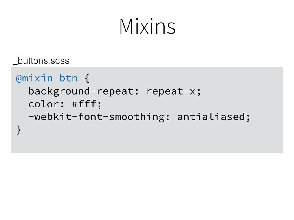
Mixins @mixin btn { background-repeat: repeat-x; color: #fff; -webkit-font-smoothing: antialiased;
} _buttons.scss
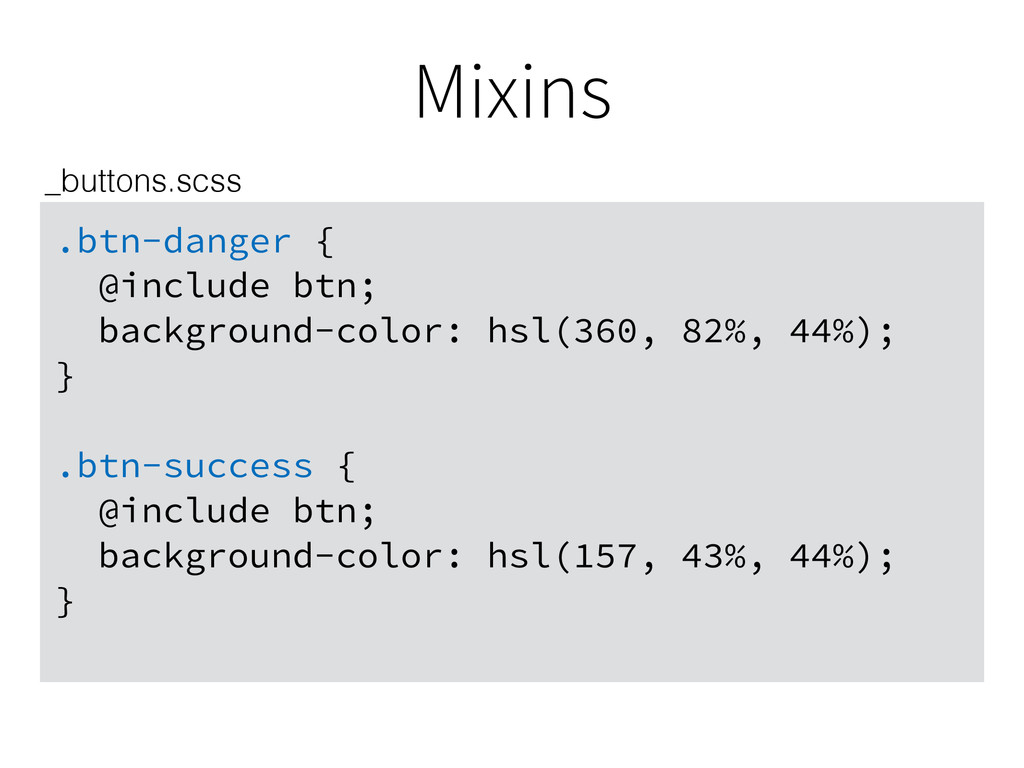
Mixins .btn-danger { @include btn; background-color: hsl(360, 82%, 44%); }
.btn-success { @include btn; background-color: hsl(157, 43%, 44%); } _buttons.scss
.btn-danger { background-color: hsl(360, 82%, 44%); background-repeat: repeat-x; color: #fff;
-webkit-font-smoothing: antialiased; } .btn-success { background-color: hsl(157, 43%, 44%); background-repeat: repeat-x; color: #fff; -webkit-font-smoothing: antialiased; } application.css
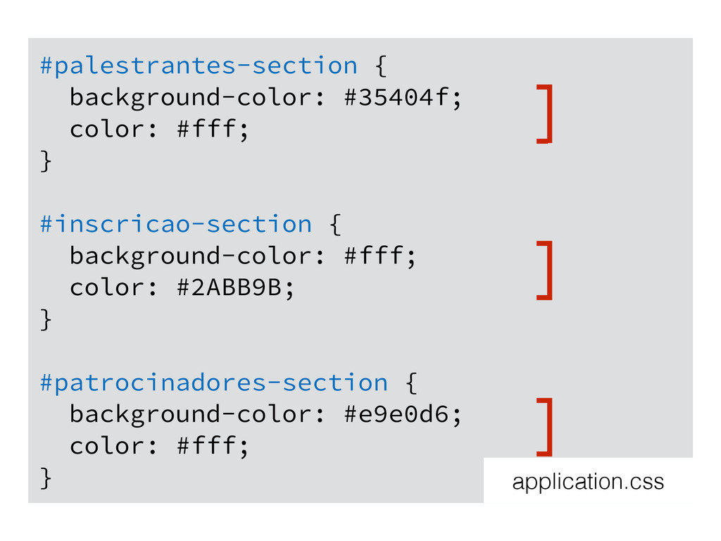
#palestrantes-section { background-color: #35404f; color: #fff; } #inscricao-section { background-color:
#fff; color: #2ABB9B; } #patrocinadores-section { background-color: #e9e0d6; color: #fff; } application.css
#palestrantes-section { background-color: #35404f; color: #fff; } #inscricao-section { background-color:
#fff; color: #2ABB9B; } #patrocinadores-section { background-color: #e9e0d6; color: #fff; } application.css
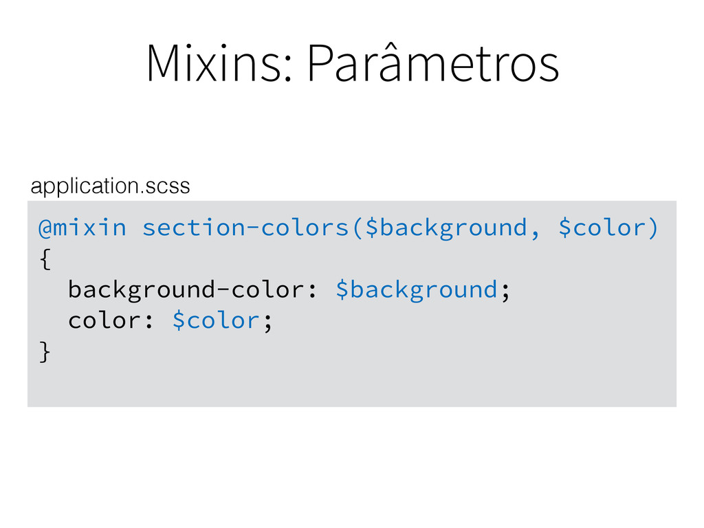
Mixins: Parâmetros @mixin section-colors($background, $color) { background-color: $background; color: $color;
} application.scss
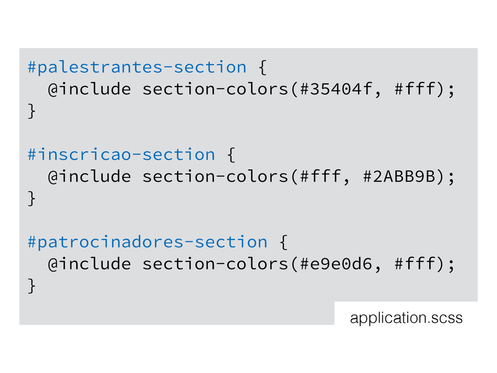
#palestrantes-section { @include section-colors(#35404f, #fff); } #inscricao-section { @include section-colors(#fff,
#2ABB9B); } #patrocinadores-section { @include section-colors(#e9e0d6, #fff); } application.scss
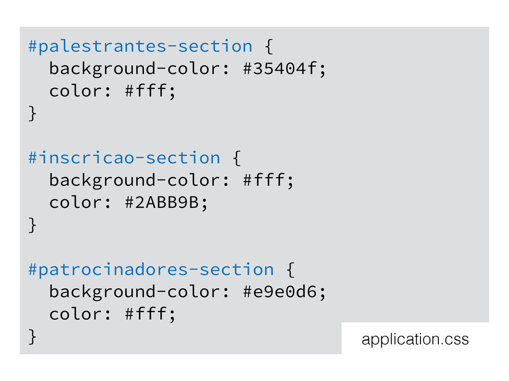
#palestrantes-section { background-color: #35404f; color: #fff; } #inscricao-section { background-color:
#fff; color: #2ABB9B; } #patrocinadores-section { background-color: #e9e0d6; color: #fff; } application.css
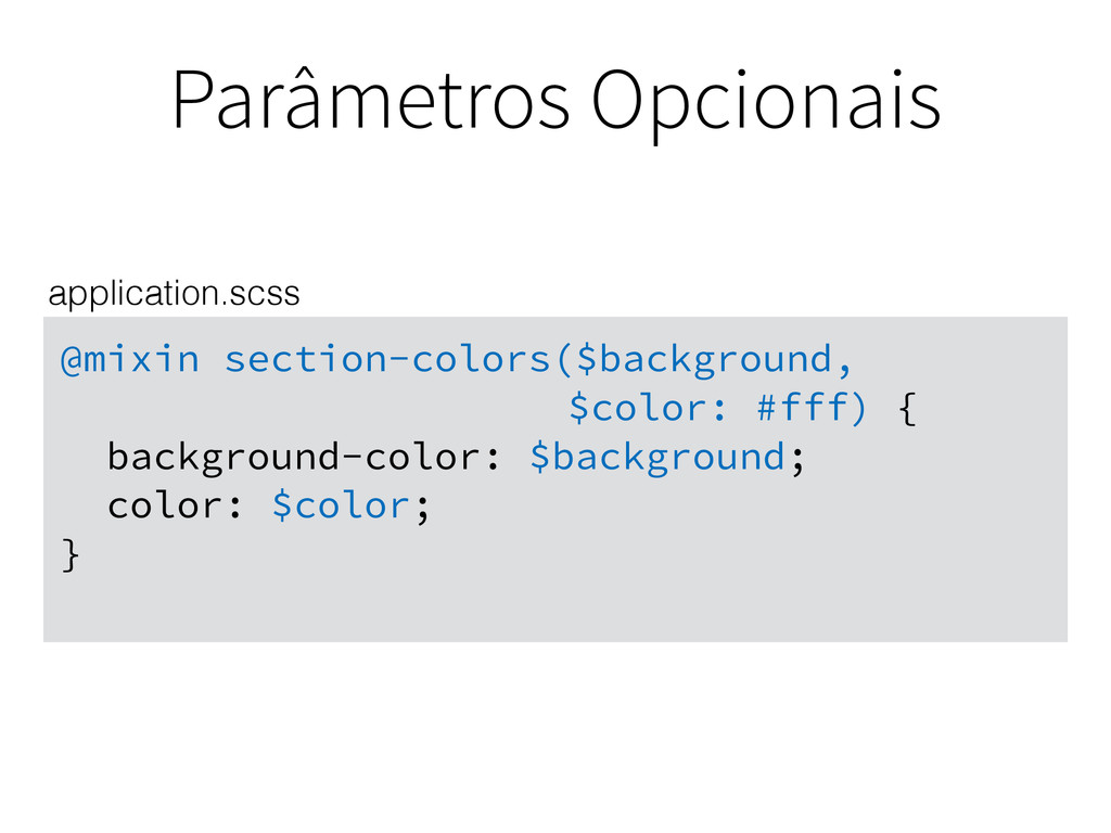
Parâmetros Opcionais @mixin section-colors($background, $color: #fff) { background-color: $background;
color: $color; } application.scss
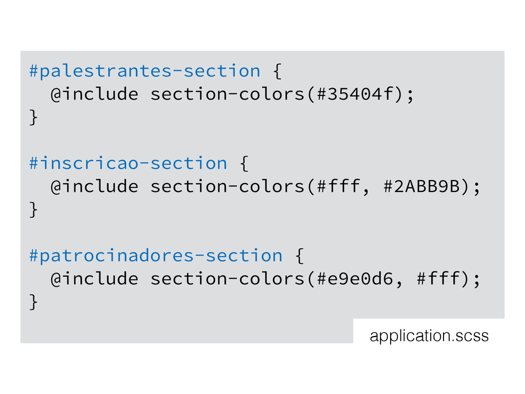
#palestrantes-section { @include section-colors(#35404f); } #inscricao-section { @include section-colors(#fff, #2ABB9B);
} #patrocinadores-section { @include section-colors(#e9e0d6, #fff); } application.scss
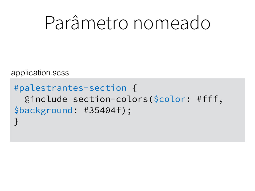
Parâmetro nomeado #palestrantes-section { @include section-colors($color: #fff, $background: #35404f); }
application.scss
Extend
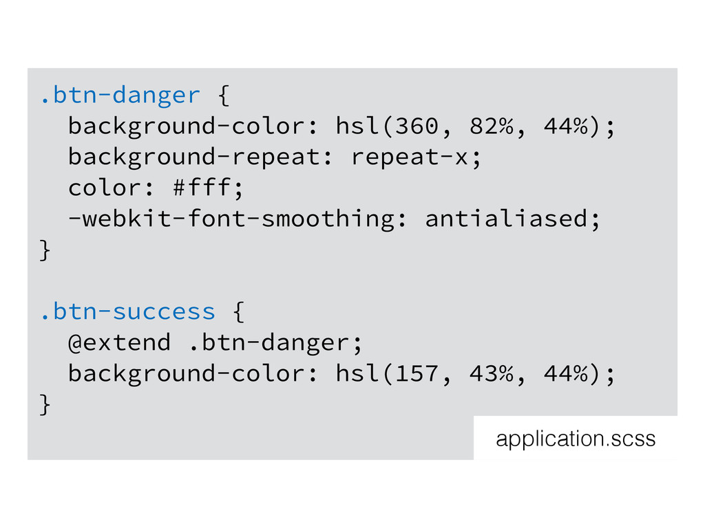
.btn-danger { background-color: hsl(360, 82%, 44%); background-repeat: repeat-x; color: #fff;
-webkit-font-smoothing: antialiased; } .btn-success { @extend .btn-danger; background-color: hsl(157, 43%, 44%); } application.scss
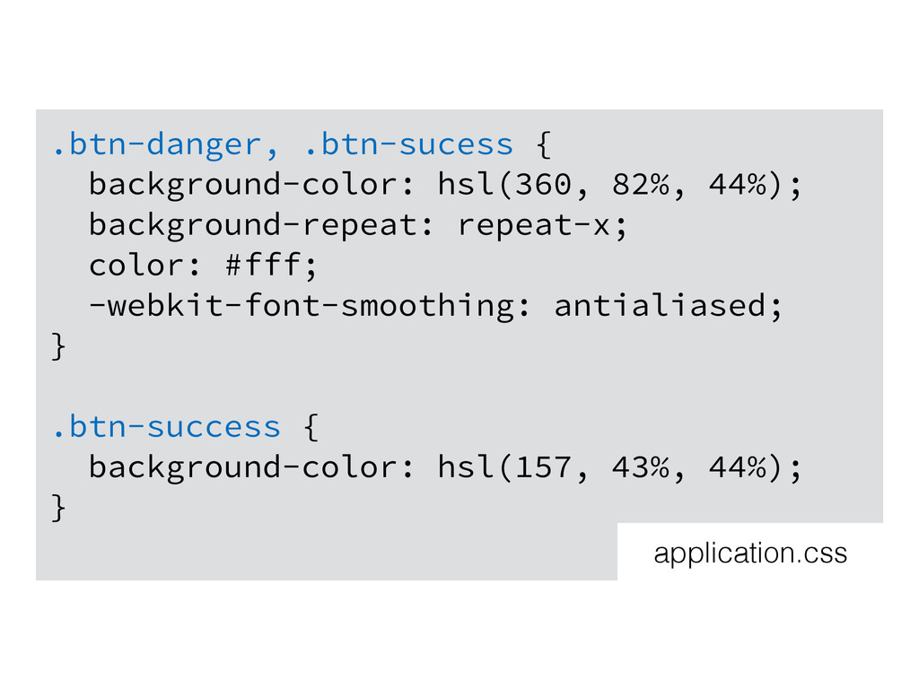
.btn-danger, .btn-sucess { background-color: hsl(360, 82%, 44%); background-repeat: repeat-x; color:
#fff; -webkit-font-smoothing: antialiased; } .btn-success { background-color: hsl(157, 43%, 44%); } application.css
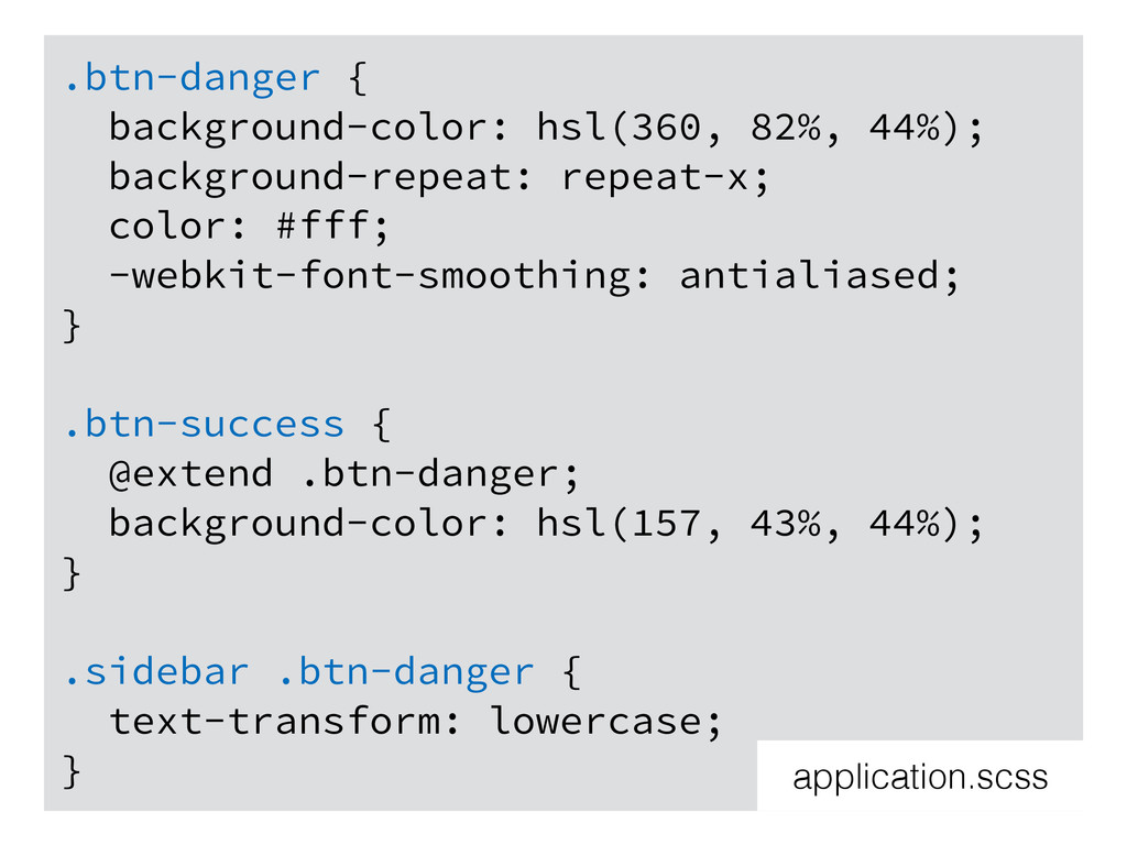
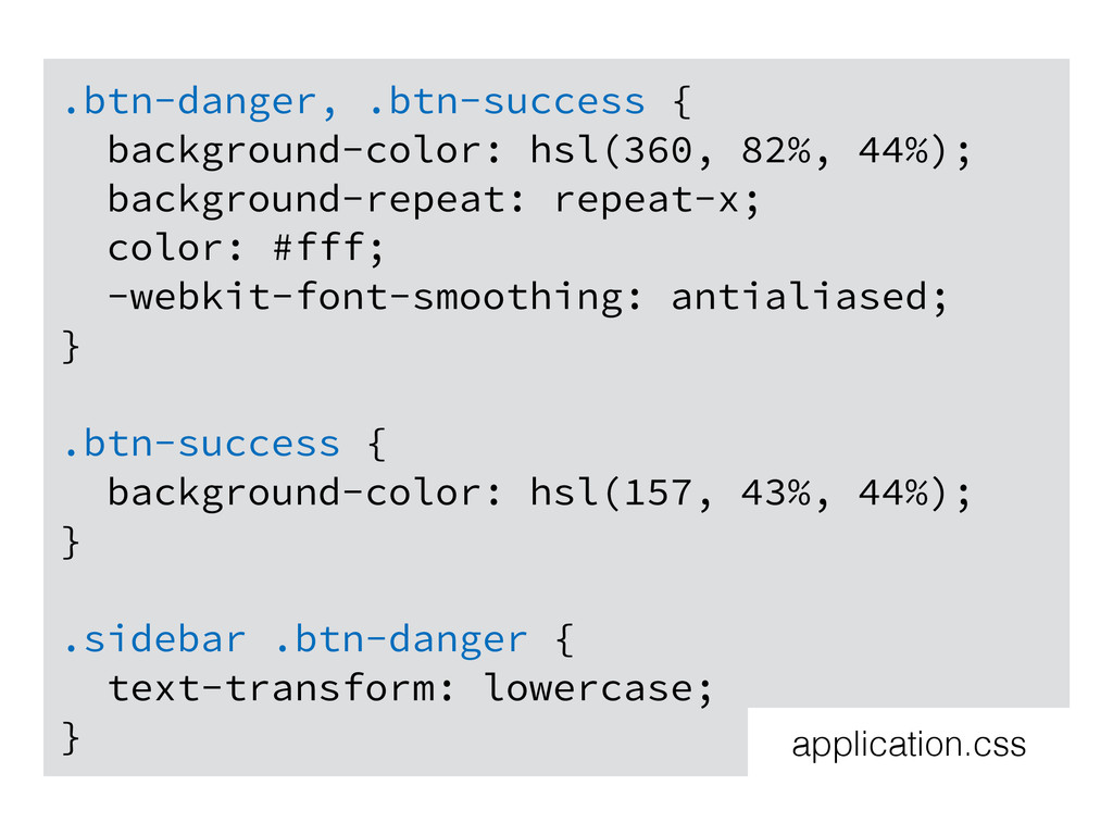
.btn-danger { background-color: hsl(360, 82%, 44%); background-repeat: repeat-x; color: #fff;
-webkit-font-smoothing: antialiased; } .btn-success { @extend .btn-danger; background-color: hsl(157, 43%, 44%); } .sidebar .btn-danger { text-transform: lowercase; } application.scss
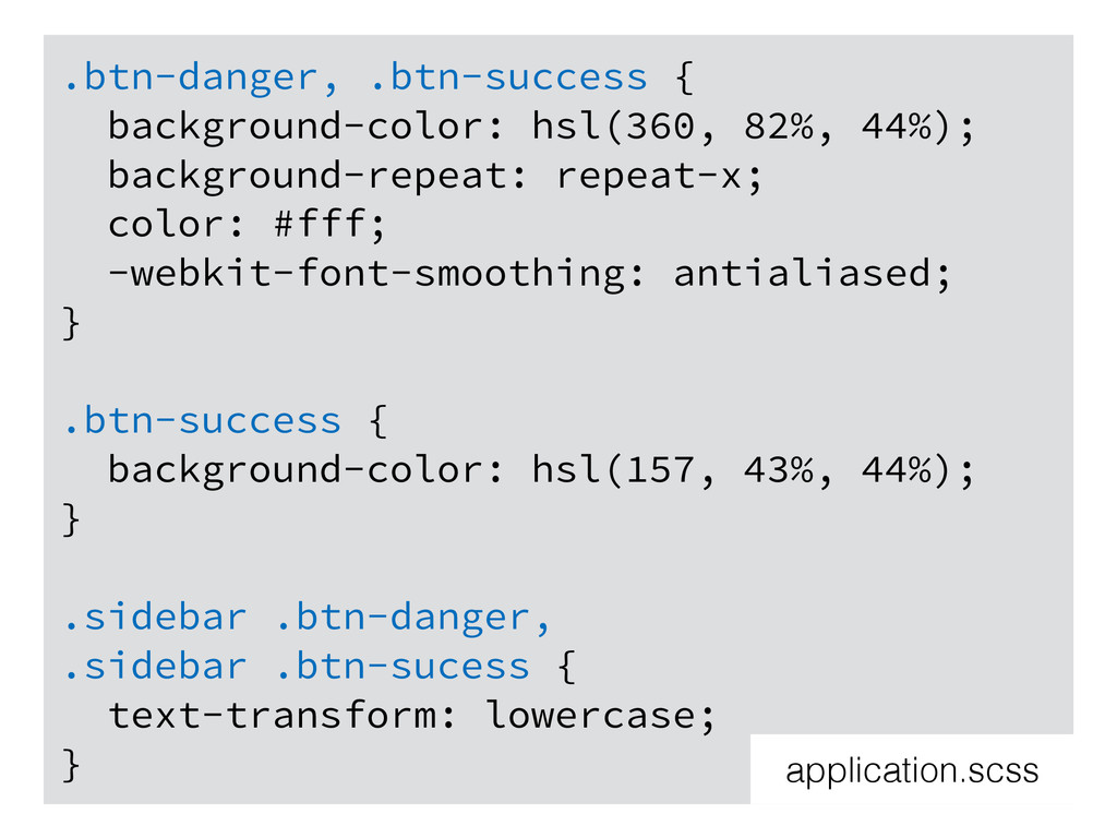
.btn-danger, .btn-success { background-color: hsl(360, 82%, 44%); background-repeat: repeat-x; color:
#fff; -webkit-font-smoothing: antialiased; } .btn-success { background-color: hsl(157, 43%, 44%); } .sidebar .btn-danger, .sidebar .btn-sucess { text-transform: lowercase; } application.scss
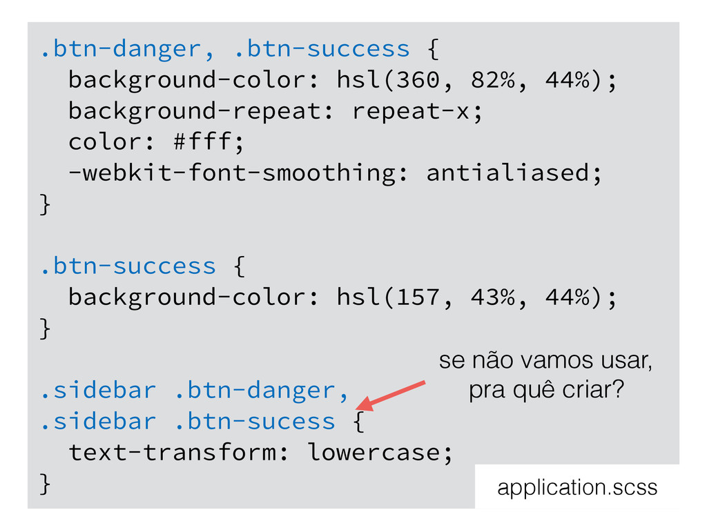
.btn-danger, .btn-success { background-color: hsl(360, 82%, 44%); background-repeat: repeat-x; color:
#fff; -webkit-font-smoothing: antialiased; } .btn-success { background-color: hsl(157, 43%, 44%); } .sidebar .btn-danger, .sidebar .btn-sucess { text-transform: lowercase; } application.scss se não vamos usar, pra quê criar?
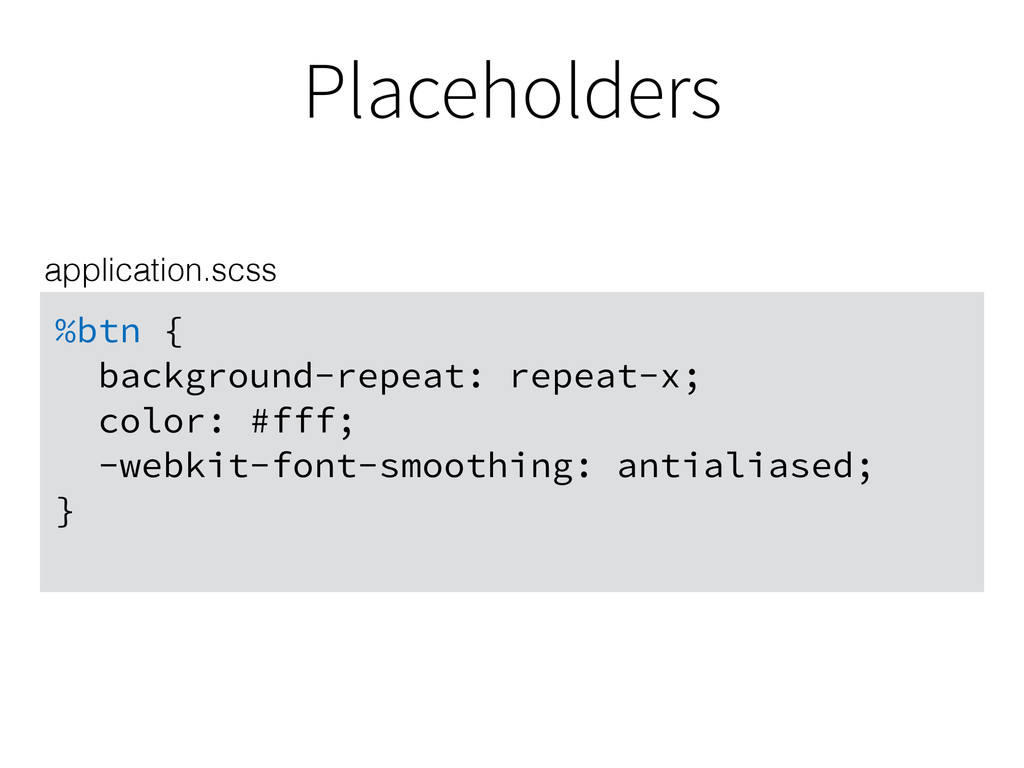
Placeholders %btn { background-repeat: repeat-x; color: #fff; -webkit-font-smoothing: antialiased; }
application.scss
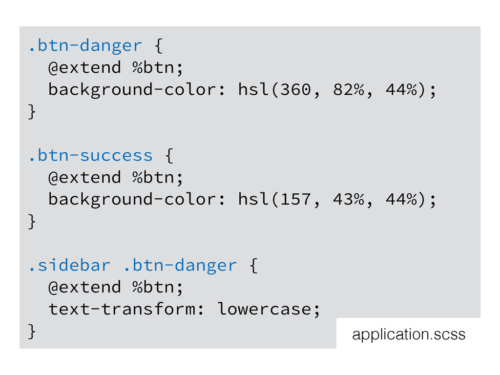
.btn-danger { @extend %btn; background-color: hsl(360, 82%, 44%); } .btn-success
{ @extend %btn; background-color: hsl(157, 43%, 44%); } .sidebar .btn-danger { @extend %btn; text-transform: lowercase; } application.scss
.btn-danger, .btn-success { background-color: hsl(360, 82%, 44%); background-repeat: repeat-x; color:
#fff; -webkit-font-smoothing: antialiased; } .btn-success { background-color: hsl(157, 43%, 44%); } .sidebar .btn-danger { text-transform: lowercase; } application.css
Recap mixins: grupos similares de propriedades usados várias vezes com
pequenas variações
Recap mixins: grupos similares de propriedades usados várias vezes com
pequenas variações extend: grupos de propriedades que são idênticos
Diretivas
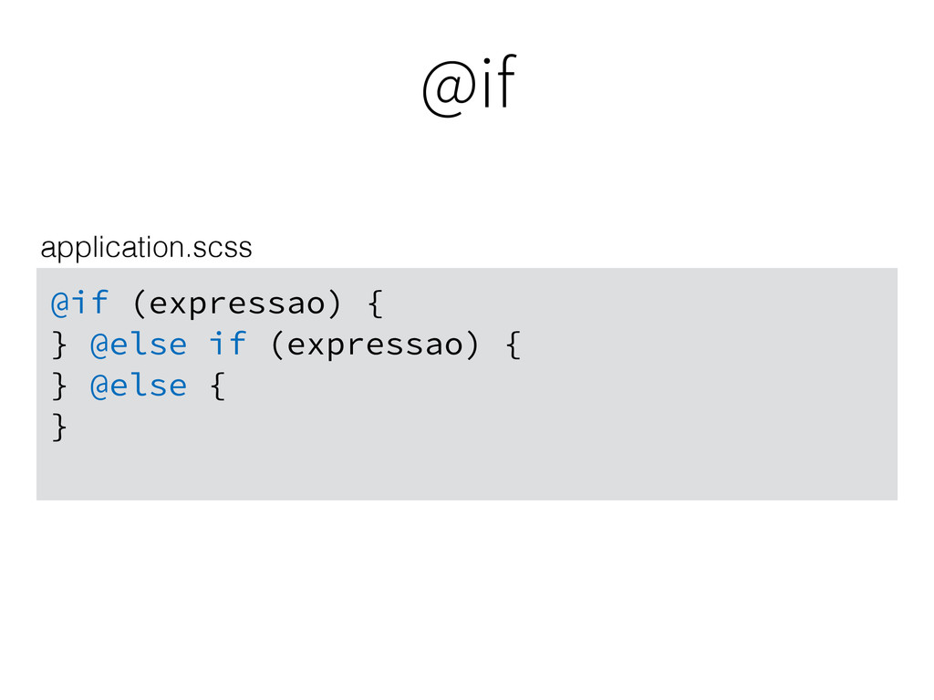
@if @if (expressao) { } @else if (expressao) { }
@else { } application.scss
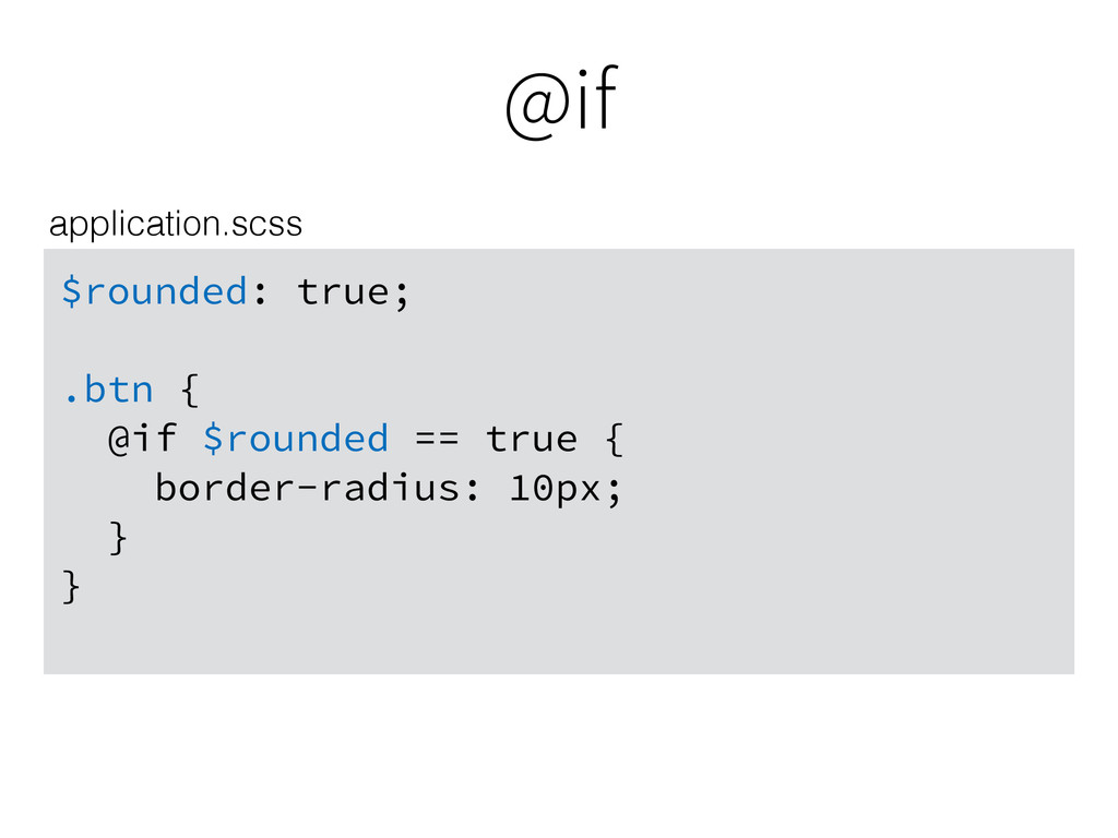
@if $rounded: true; .btn { @if $rounded == true {
border-radius: 10px; } } application.scss
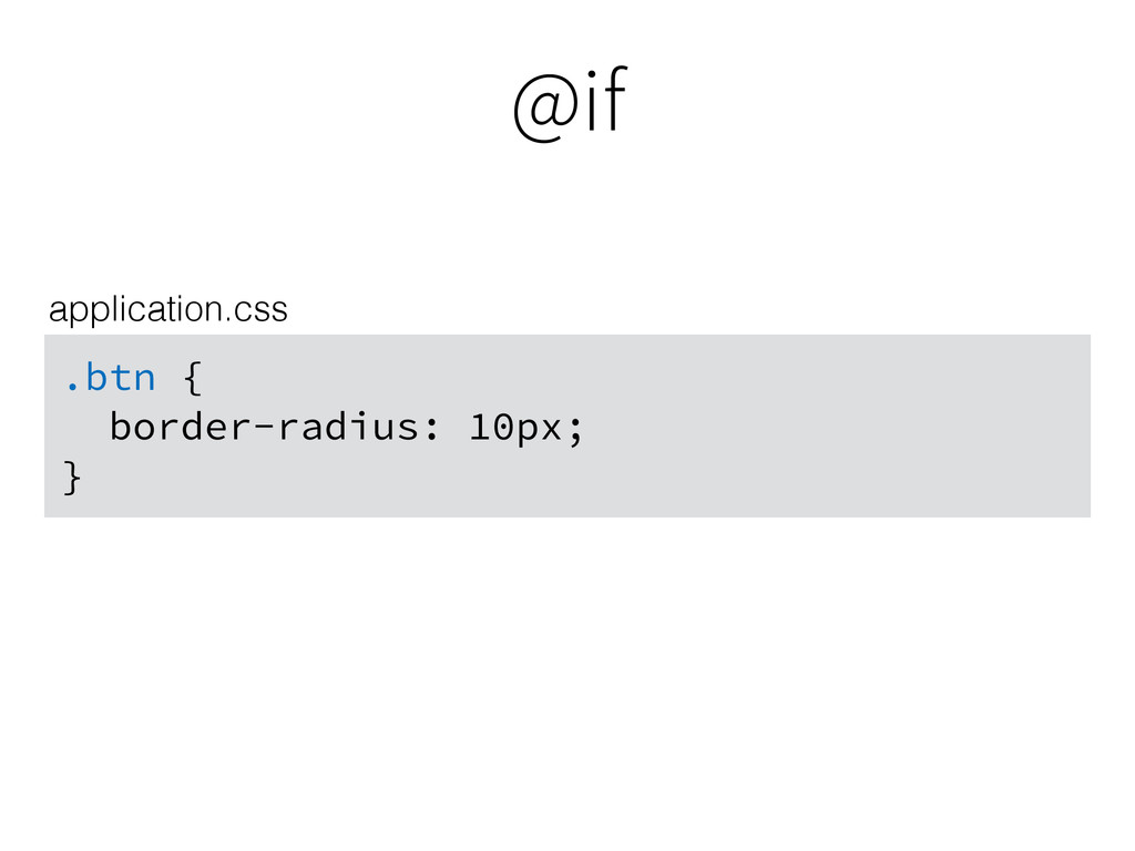
@if .btn { border-radius: 10px; } application.css
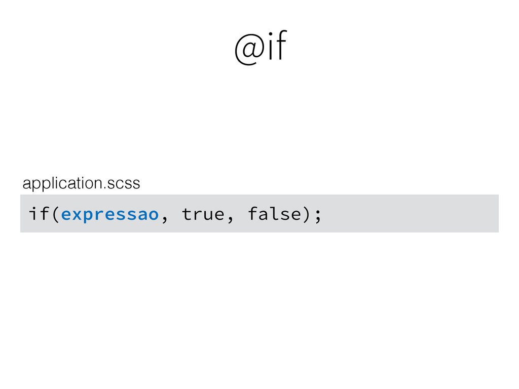
@if if(expressao, true, false); application.scss
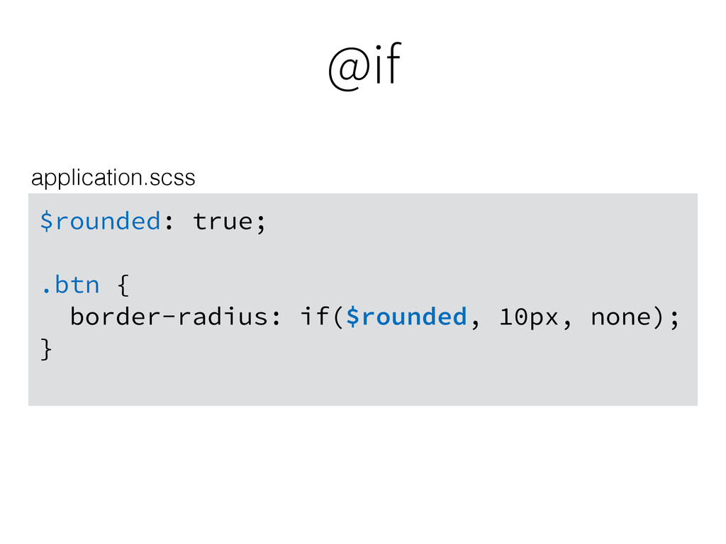
@if $rounded: true; .btn { border-radius: if($rounded, 10px, none); }
application.scss
@if .btn { border-radius: 10px; } application.css
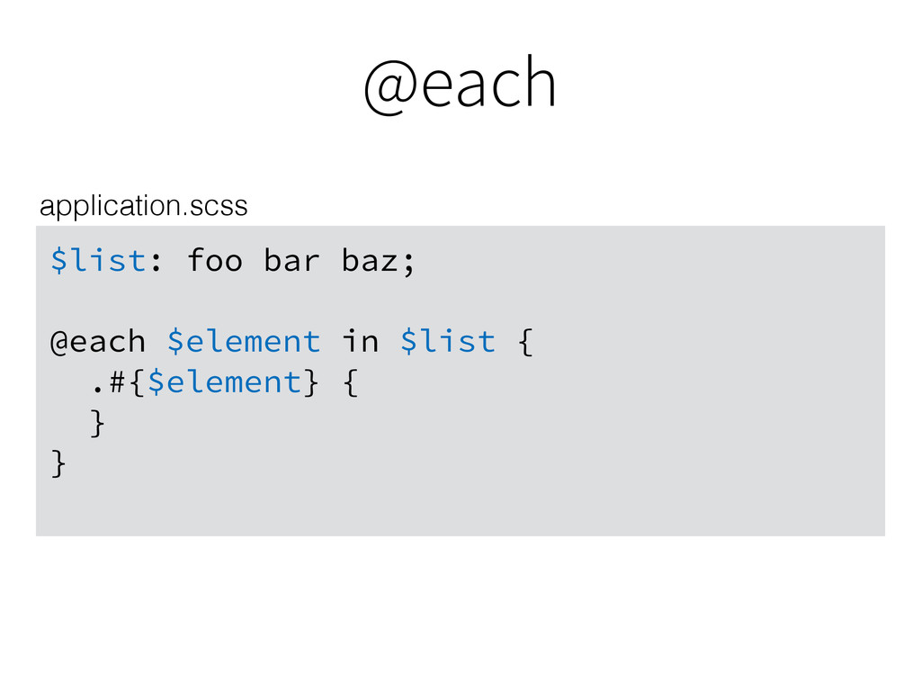
@each $list: foo bar baz; @each $element in $list {
.#{$element} { } } application.scss
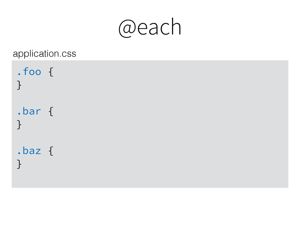
@each .foo { } .bar { } .baz { }
application.css
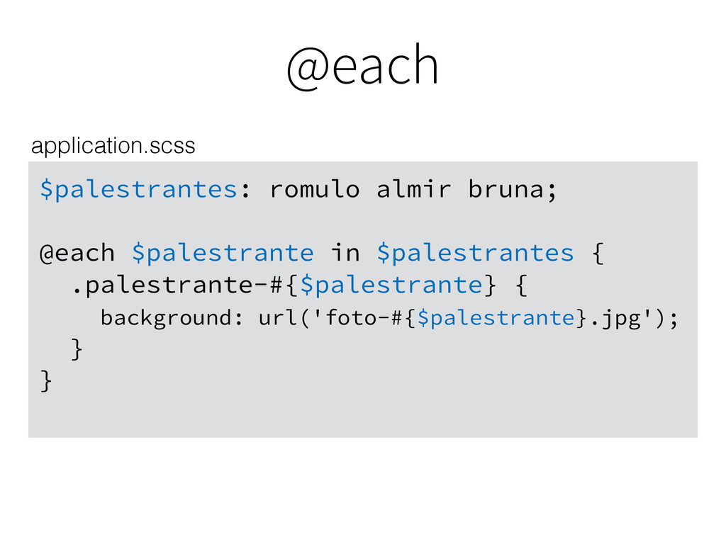
@each $palestrantes: romulo almir bruna; @each $palestrante in $palestrantes {
.palestrante-#{$palestrante} { background: url('foto-#{$palestrante}.jpg'); } } application.scss
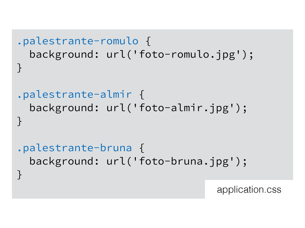
.palestrante-romulo { background: url('foto-romulo.jpg'); } .palestrante-almir { background: url('foto-almir.jpg'); }
.palestrante-bruna { background: url('foto-bruna.jpg'); } application.css
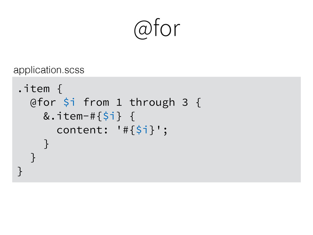
@for .item { @for $i from 1 through 3 {
&.item-#{$i} { content: '#{$i}'; } } } application.scss
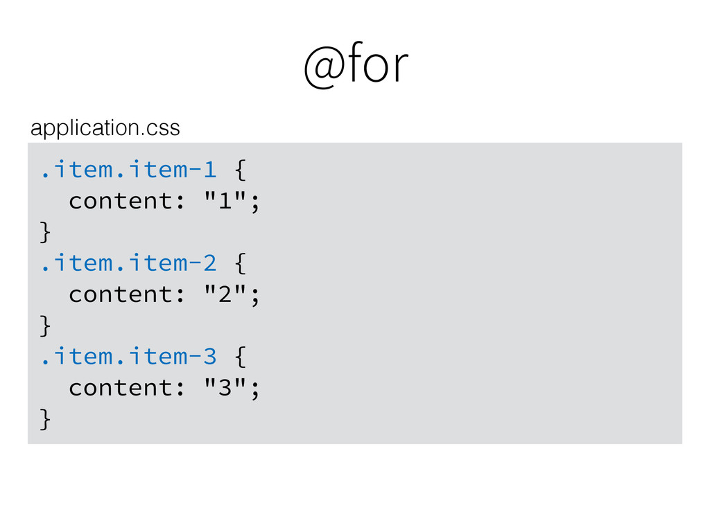
@for .item.item-1 { content: "1"; } .item.item-2 { content: "2";
} .item.item-3 { content: "3"; } application.css
@while $i: 1; .item { @while $i < 4 {
&.item-#{$i} { content: '#{$i}'; } $i: $i + 1; } } application.scss
@while .item.item-1 { content: "1"; } .item.item-2 { content: "2";
} .item.item-3 { content: "3"; } application.css
Hands-on
Depois de usar: http://i.imgur.com/xR2li6t.gif
Obrigado! http://i.giphy.com/5xtDarmwsuR9sDRObyU.gif
 romulomachado
 kn_to_maxpno
 hollycummins
 yusukebe
 licux
licux
 suikabar
 handlename
 jame2408
 suguruooki
 wemra
wemra
 nilpe
nilpe
 16bitidol
 seathinner
 eileencodes
 sarafernandez
 jeffersonlam
 lara
lara
 tomoyanonymous
 cromwellryan
 chrislema
 holman
 mojombo
 addyosmani
 mraible