Upgrade to Pro
— share decks privately, control downloads, hide ads and more …
Speaker Deck
Features
Speaker Deck
PRO
Sign in
Sign up for free
Search
Search
Introductory HTML & CSS
Search
Sponsored
·
Ship Features Fearlessly
Turn features on and off without deploys. Used by thousands of Ruby developers.
→
Ryhan Hassan
January 23, 2012
Programming
240
3
Share
Embed
Copy iframe code
Copy JS code
Copy link
Start on current slide
Introductory HTML & CSS
Ryhan Hassan
January 23, 2012
More Decks by Ryhan Hassan
See All by Ryhan Hassan
(TH Crash Course) Intro to JavaScript
ryhan
1
110
(TH Crash Course) Advanced HTML & CSS
ryhan
5
260
(Skill Swap Weekend) HTML5 & CSS3
ryhan
7
280
Other Decks in Programming
See All in Programming
Vue × Nuxt × Oxc どこまで使える?実運用の現在地
andpad
0
220
タクシーアプリ『GO』の バックエンド開発のおける AI利活用と若者のすべて
pyama86
3
2k
AI 時代のソフトウェア設計の学び方
masuda220
PRO
29
12k
LLM本来の能力を解き放つサンドボックス技術とAI民主化への適用
yukukotani
3
3.6k
[2026年度第1回ORセミナー] 計画最適化ベンチャーと競技プログラミング人材
terryu16
0
260
キャリア迷子上等 ─ "ない道"は自分で作ればいい
16bitidol
3
2k
Language Server 使ってる? 〜VSCode と Zed の場合〜 / Are you using a Language Server? ~For VS Code and Zed~
handlename
0
780
LLM Plugin for Node-REDの利用方法と開発について
404background
0
170
技術記事、AIに書かせるか、自分で書くか? 〜それでも私が自分の手で書く理由〜 / #QiitaConference
jnchito
2
1.4k
Claspは野良GASの夢をみるか
takter00
0
180
AI時代のUIはどこへ行く?その2!
yusukebe
21
7.1k
気づいたらRubyで100作品 ー クリエイティブコーディングが生活の一部になるまで / 100 Ruby Sketches Later: How Creative Coding Became Part of My Life
chobishiba
3
570
Featured
See All Featured
Sam Torres - BigQuery for SEOs
techseoconnect
PRO
0
280
Site-Speed That Sticks
csswizardry
13
1.2k
The World Runs on Bad Software
bkeepers
PRO
72
12k
技術選定の審美眼(2025年版) / Understanding the Spiral of Technologies 2025 edition
twada
PRO
118
120k
The Power of CSS Pseudo Elements
geoffreycrofte
82
6.3k
Tips & Tricks on How to Get Your First Job In Tech
honzajavorek
1
540
WCS-LA-2024
lcolladotor
0
630
The Cost Of JavaScript in 2023
addyosmani
55
10k
Leveraging Curiosity to Care for An Aging Population
cassininazir
1
270
個人開発の失敗を避けるイケてる考え方 / tips for indie hackers
panda_program
122
22k
The SEO identity crisis: Don't let AI make you average
varn
0
490
Navigating Team Friction
lara
192
16k
Transcript
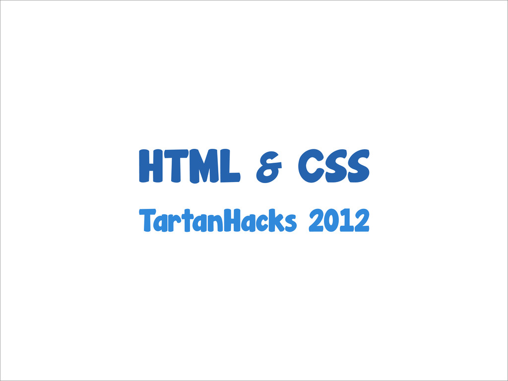
HTML & CSS TartanHacks 2012
@ryhanhassan
None
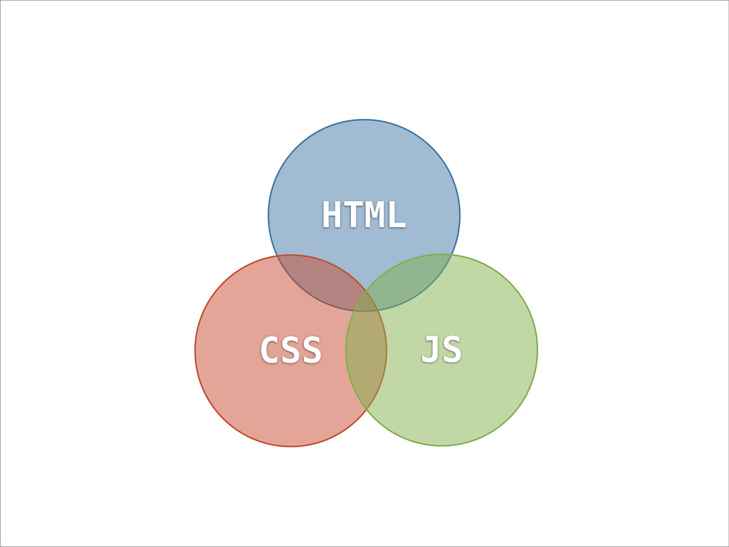
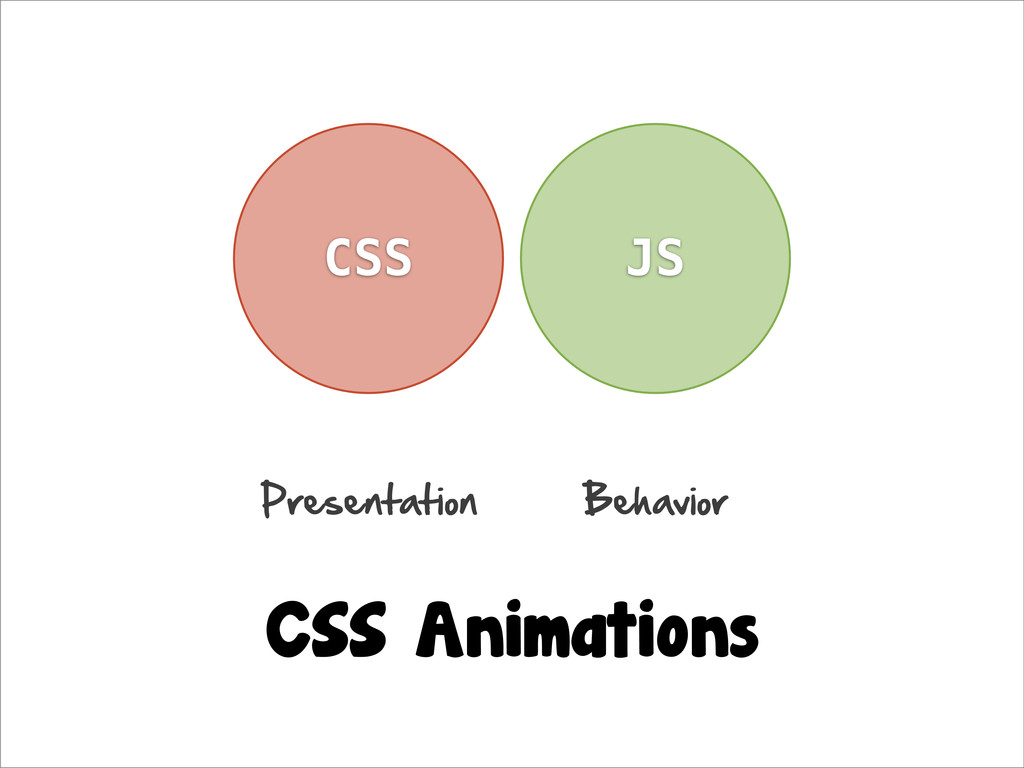
HTML CSS JS
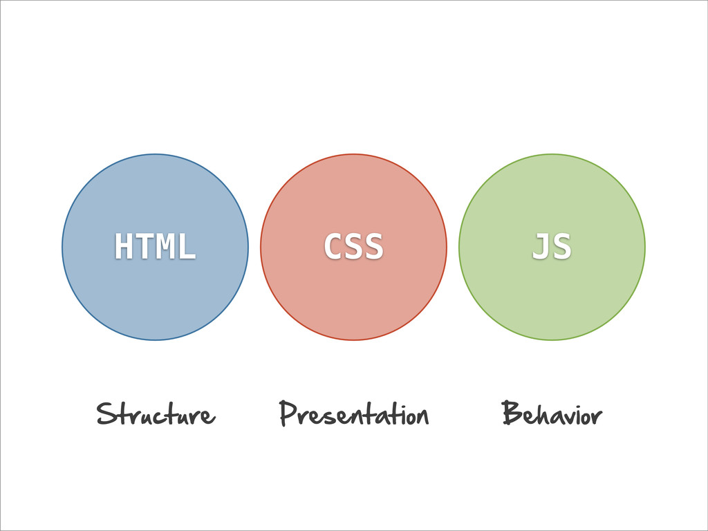
HTML CSS JS Structure Presentation Behavior
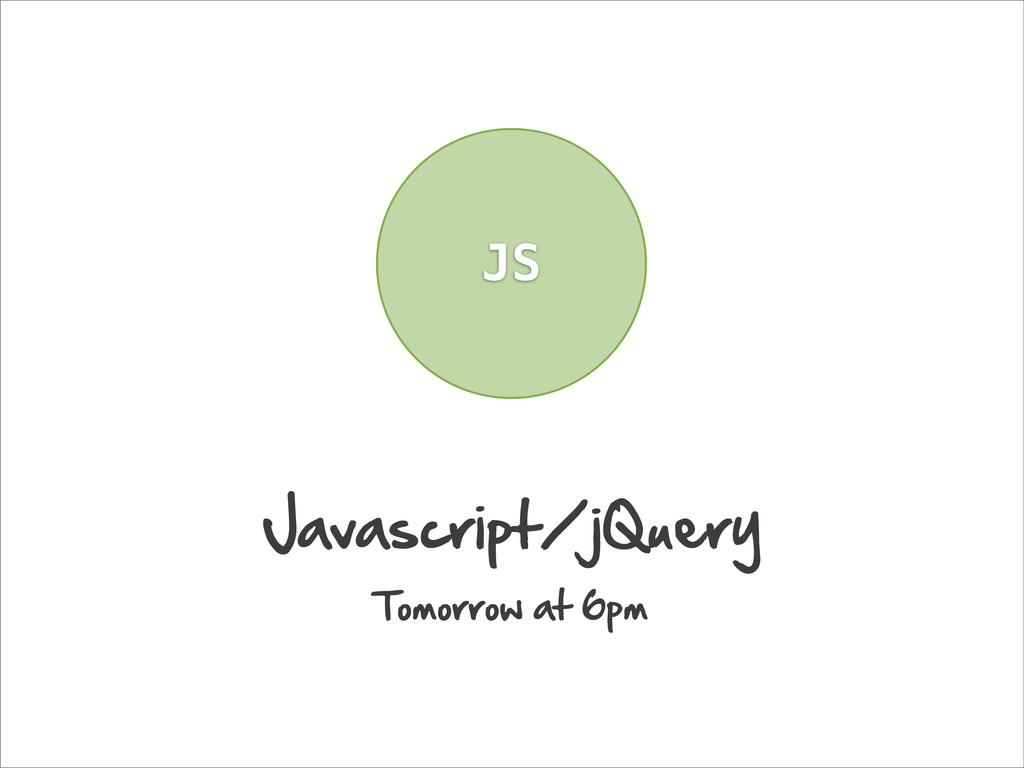
JS Javascript/jQuery Tomorrow at 6pm
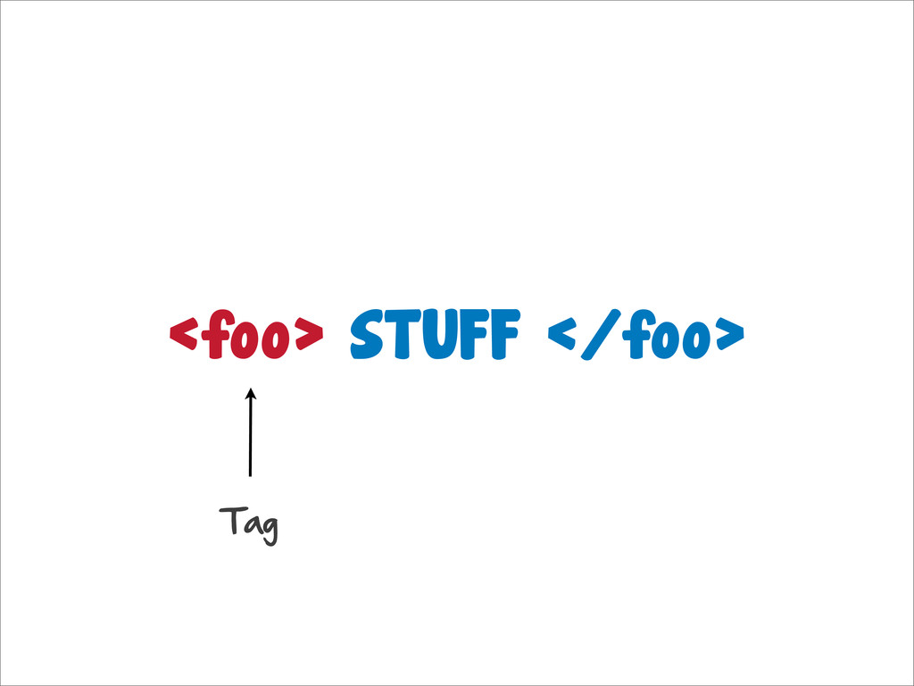
HTML Syntax
<foo> STUFF </foo> Tag
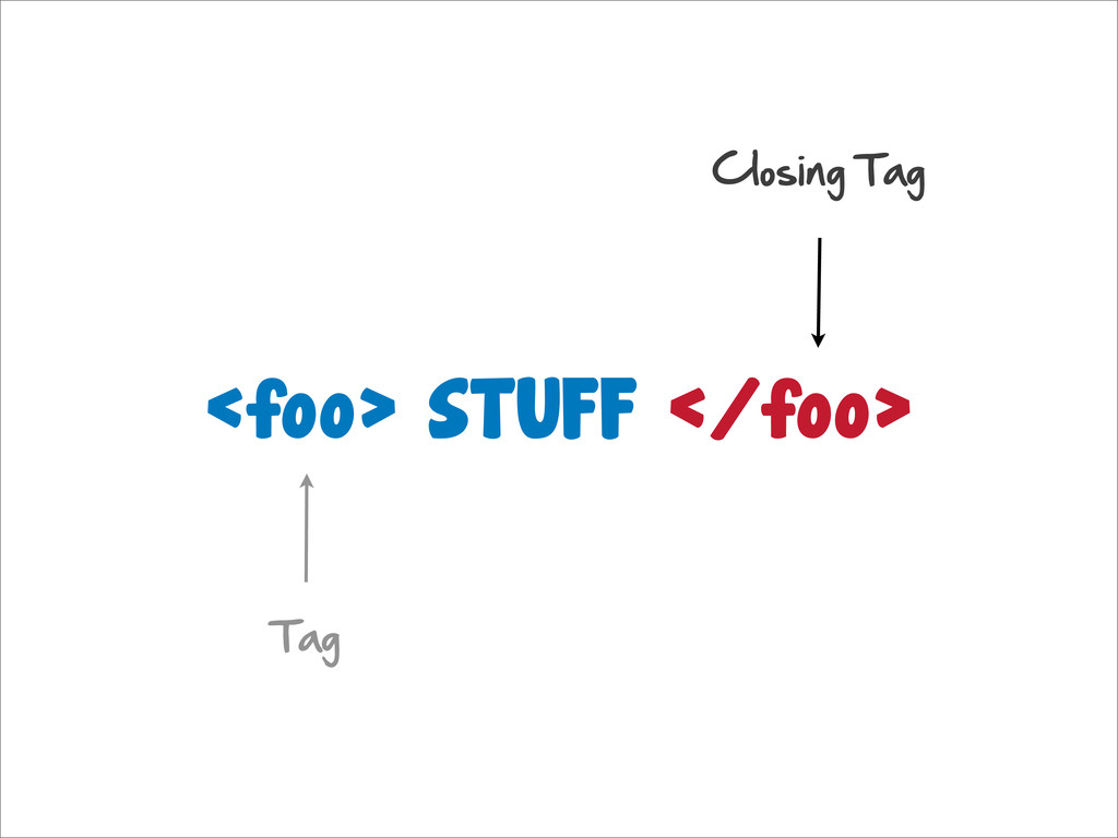
<foo> STUFF </foo> Tag Closing Tag
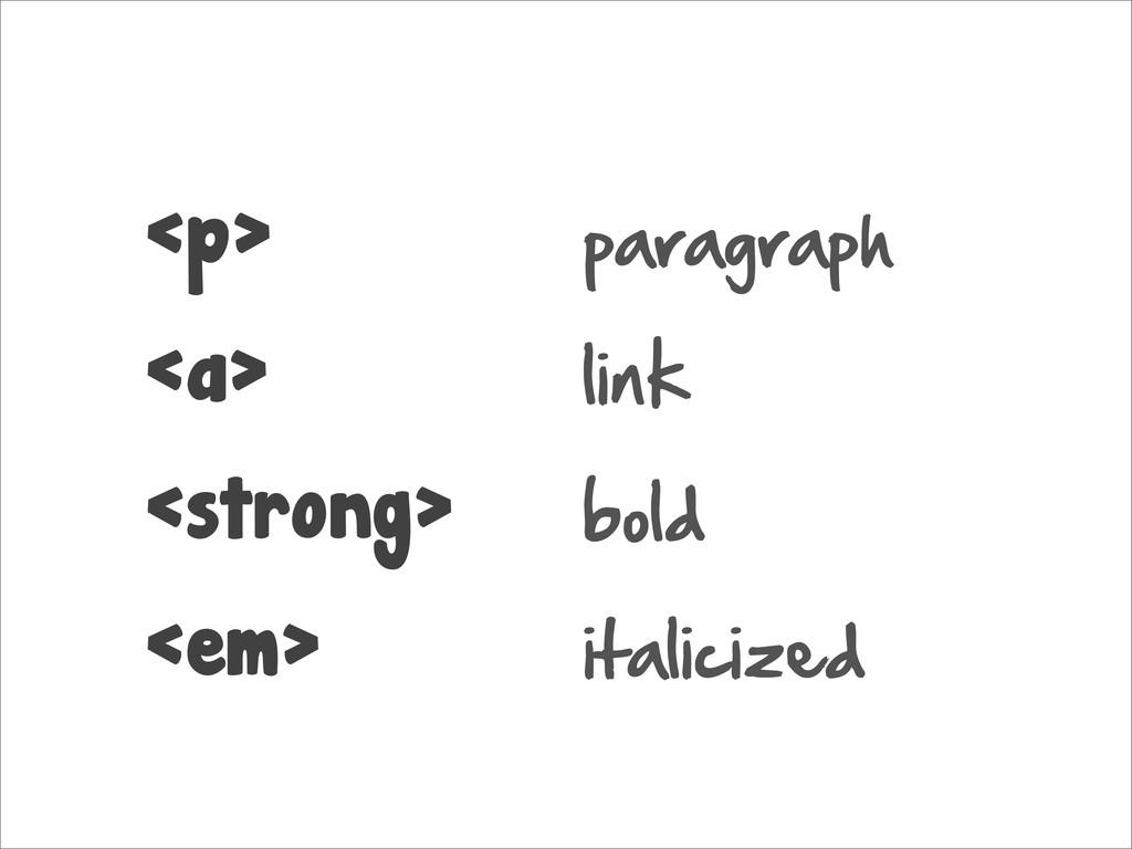
<p> <a> <strong> <em> paragraph link bold italicized
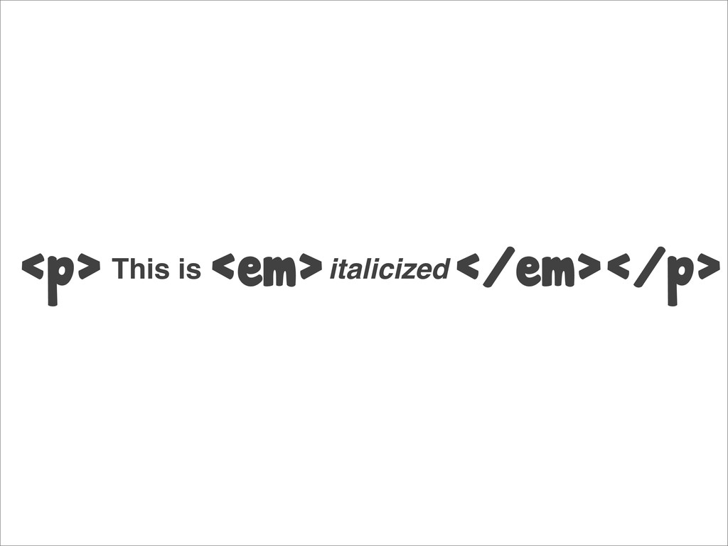
<p> <em> </em></p> This is italicized
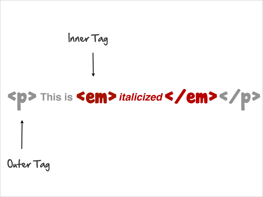
<p> <em> </em></p> This is italicized Outer Tag Inner Tag
Let’s Build a Page
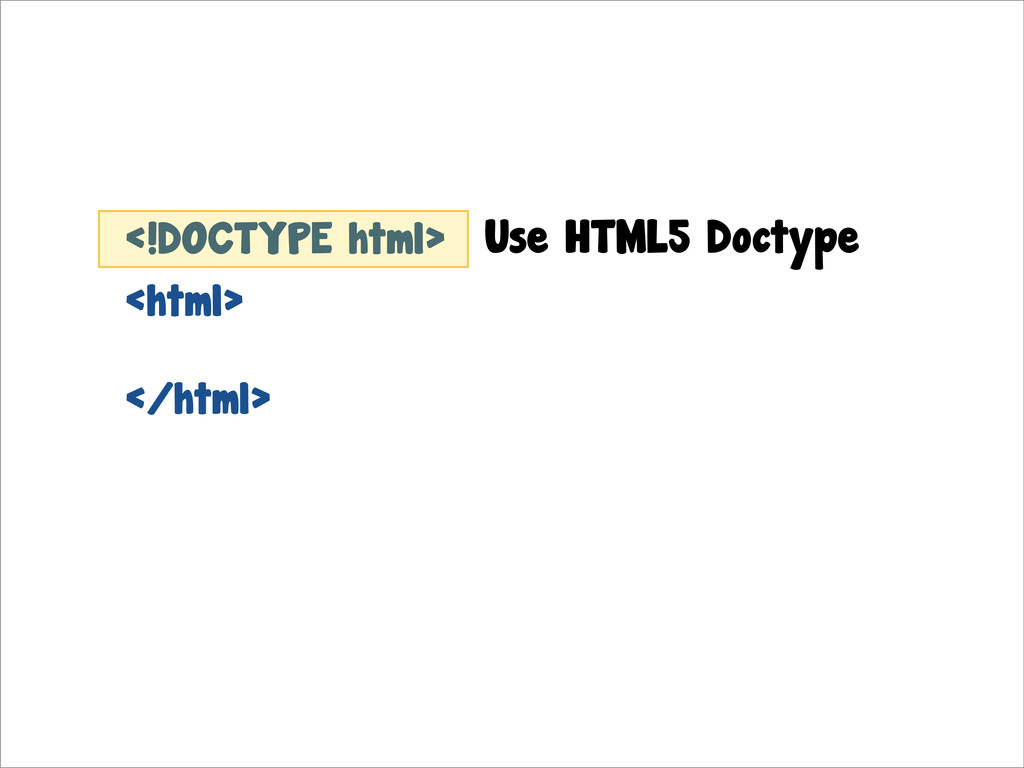
<html> Start with the tag. Let’s create index.html
<html> </html> <!DOCTYPE html> Use HTML5 Doctype
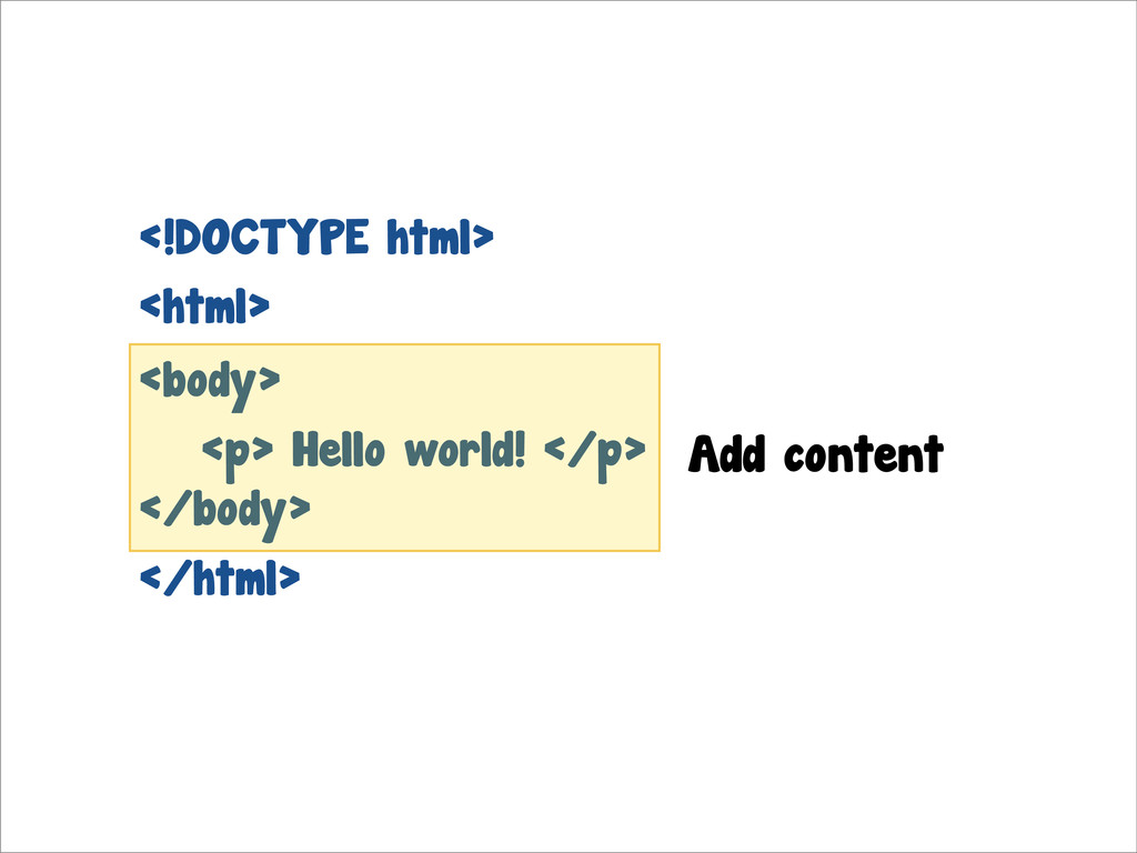
<html> </html> <!DOCTYPE html> <body> </body> <p> Hello world! </p>
Add content
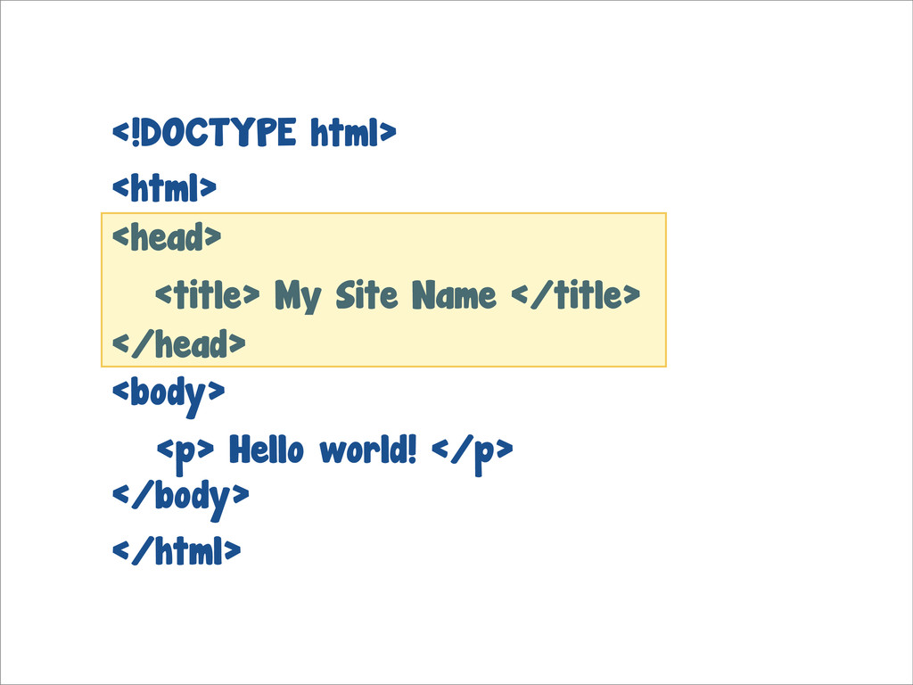
<html> </html> <!DOCTYPE html> <body> </body> <p> Hello world! </p>
<title> My Site Name </title> <head> </head>
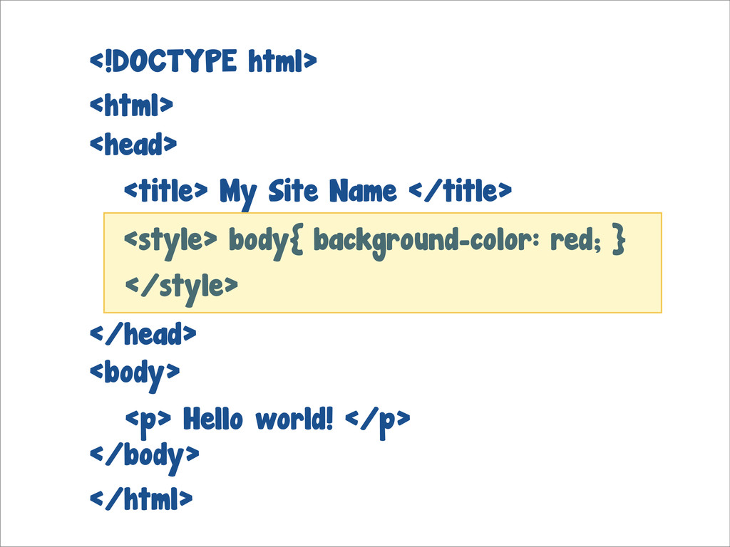
<html> </html> <!DOCTYPE html> <body> </body> <p> Hello world! </p>
<title> My Site Name </title> <head> </head> <style> body{ background-color: red; } </style>
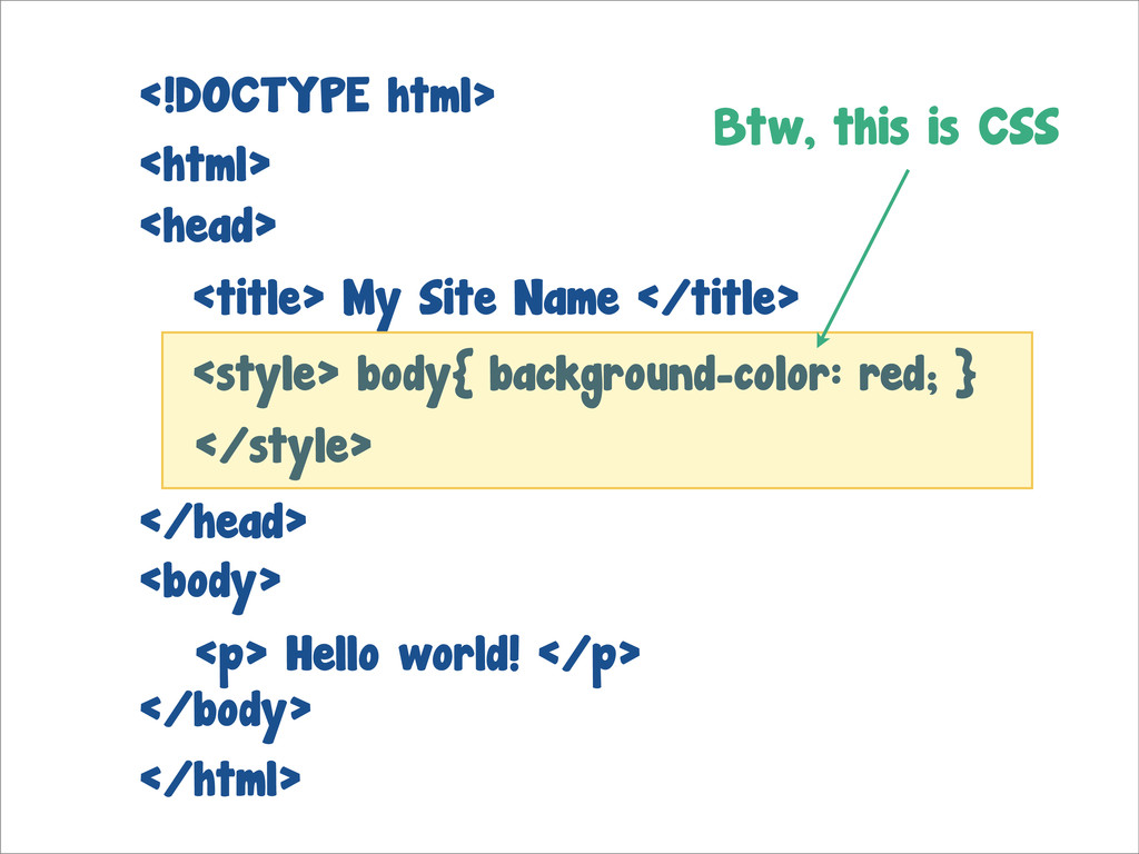
<html> </html> <!DOCTYPE html> <body> </body> <p> Hello world! </p>
<title> My Site Name </title> <head> </head> <style> body{ background-color: red; } </style> Btw, this is CSS
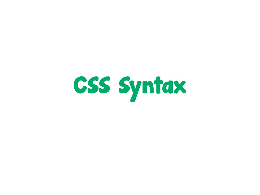
CSS Syntax
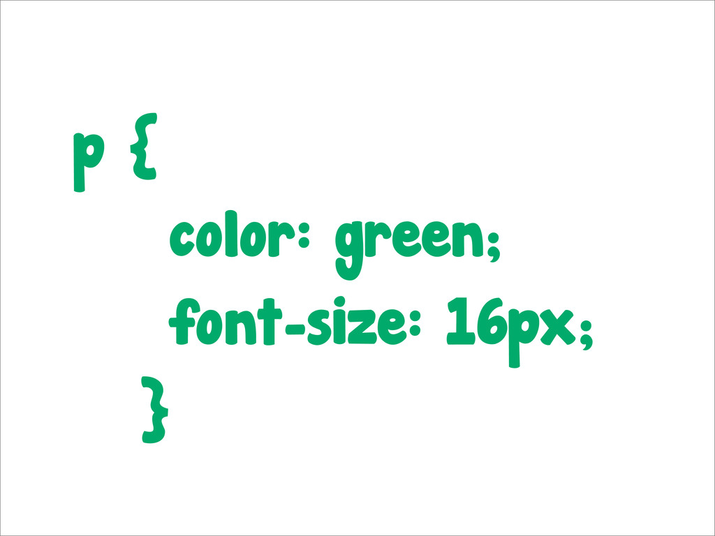
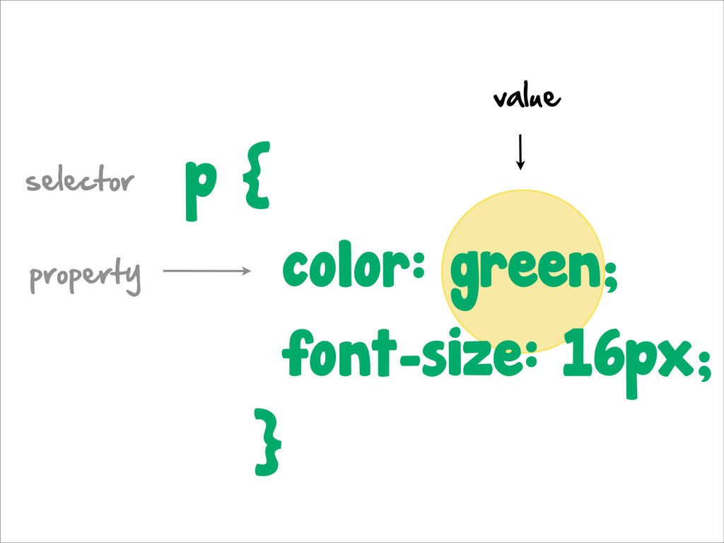
p { color: green; font-size: 16px; }
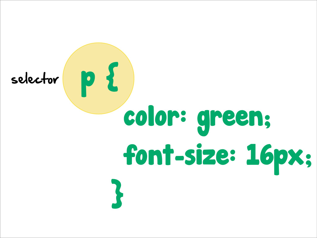
p { color: green; font-size: 16px; } selector
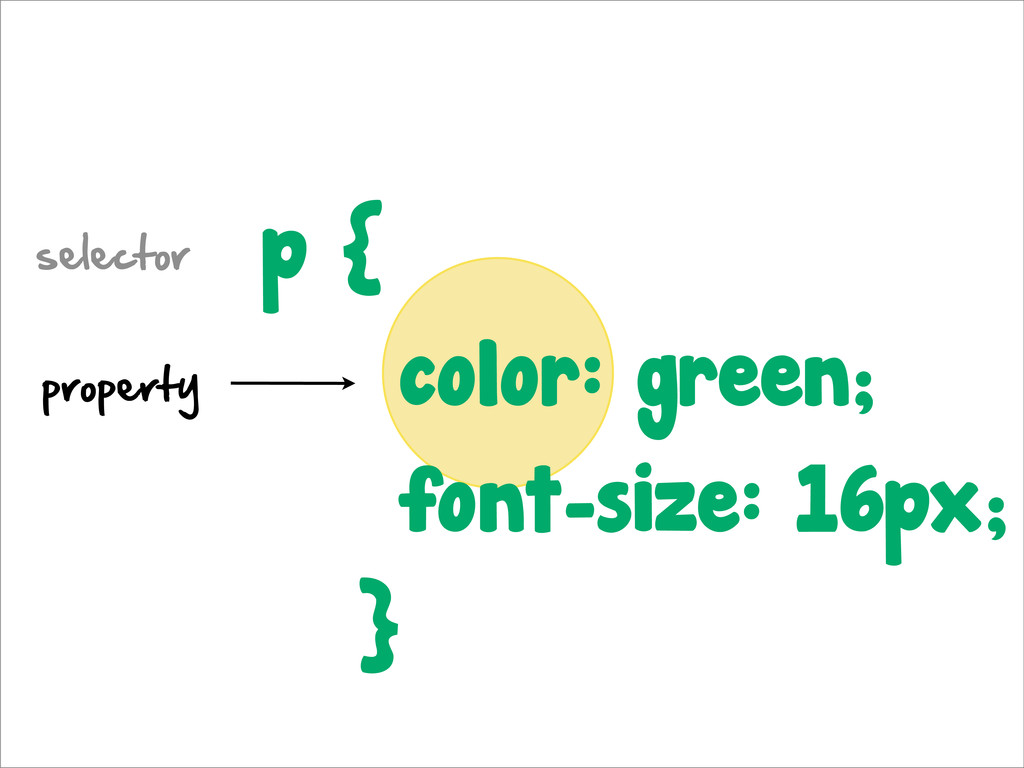
p { color: green; font-size: 16px; } selector property
p { color: green; font-size: 16px; } selector property value
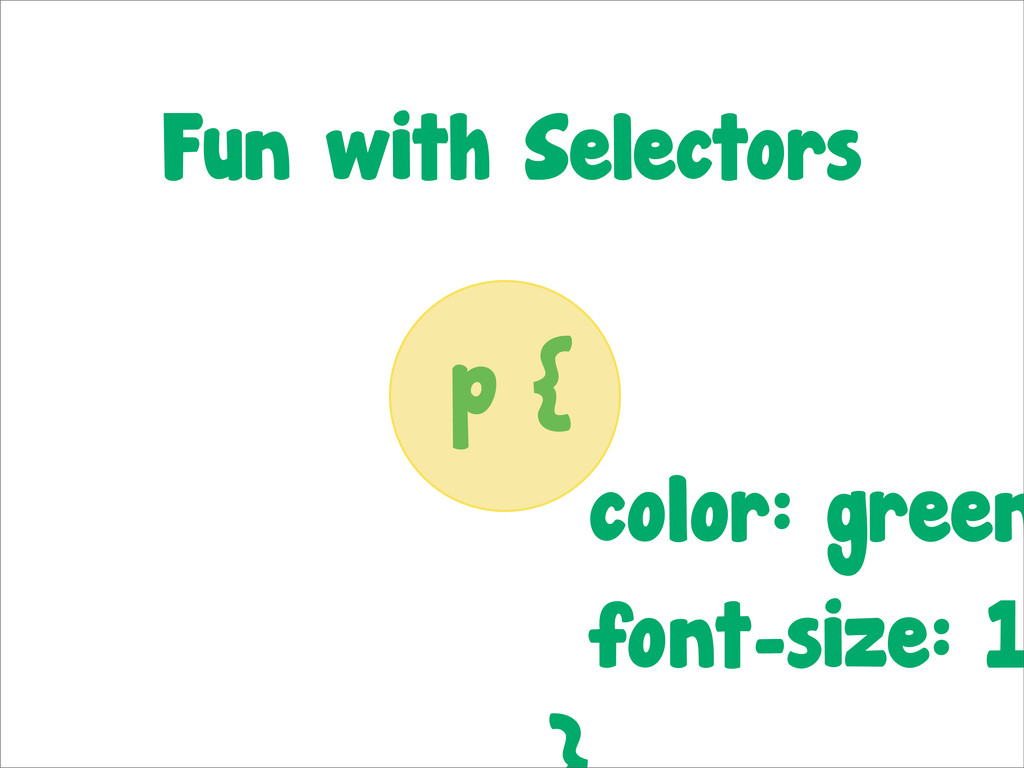
p { color: green font-size: 1 Fun with Selectors
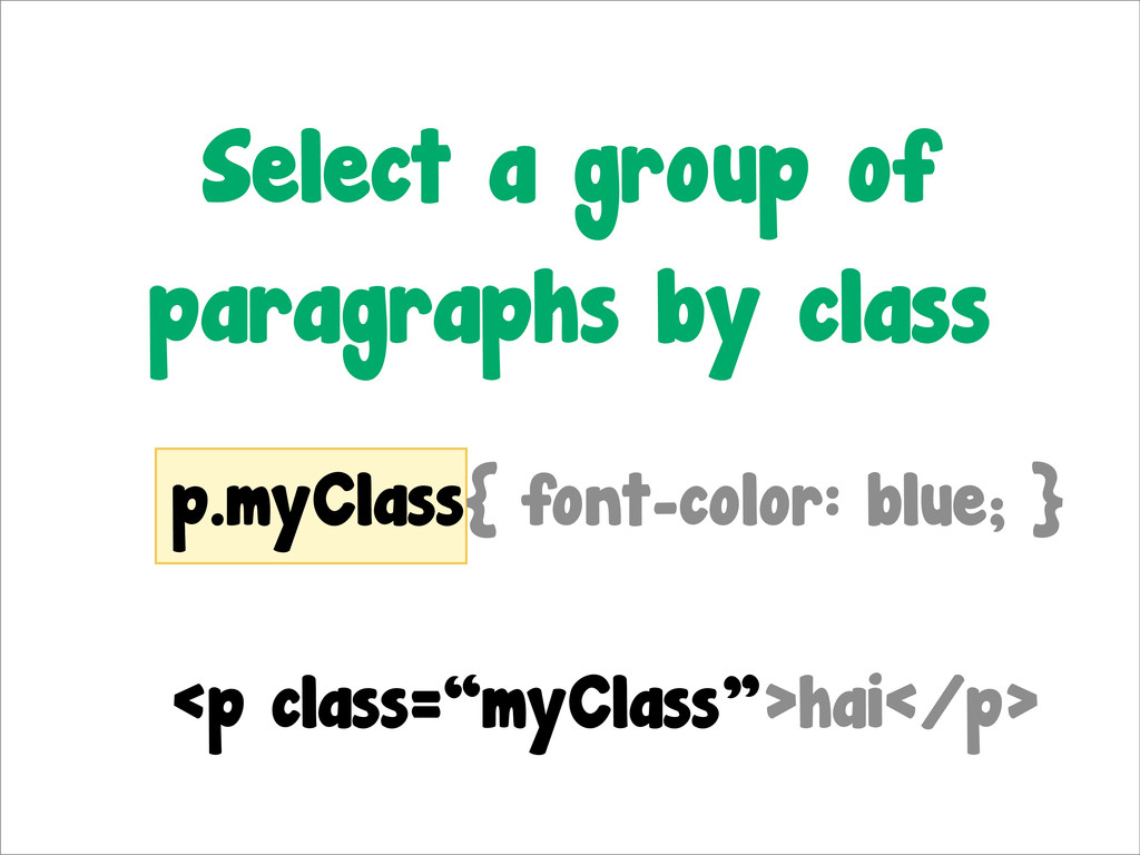
p.myClass{ font-color: blue; } <p class=“myClass”>hai</p> Select a group of
paragraphs by class
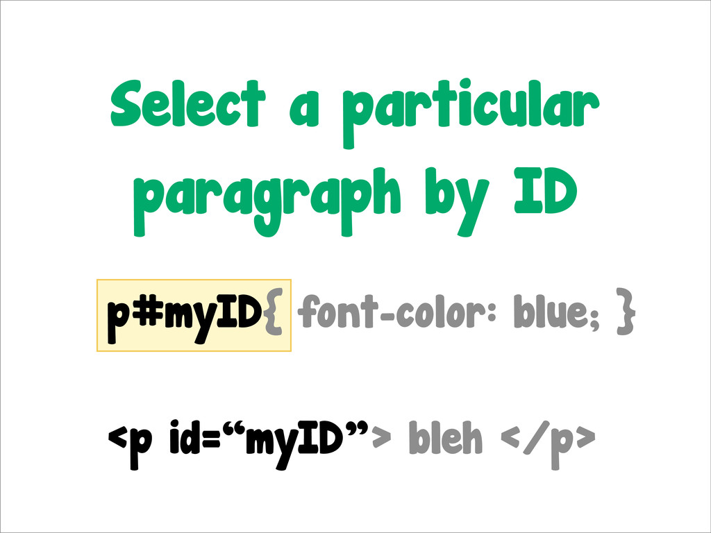
p#myID{ font-color: blue; } <p id=“myID”> bleh </p> Select a
particular paragraph by ID
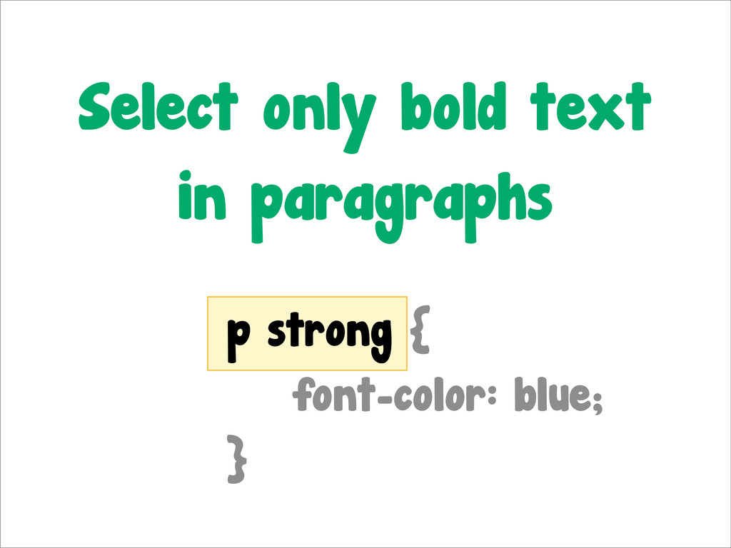
p strong { font-color: blue; } Select only bold text
in paragraphs
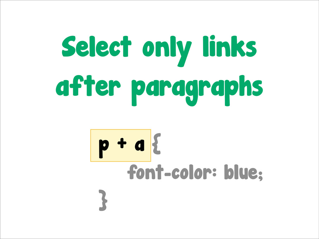
p + a { font-color: blue; } Select only links
after paragraphs
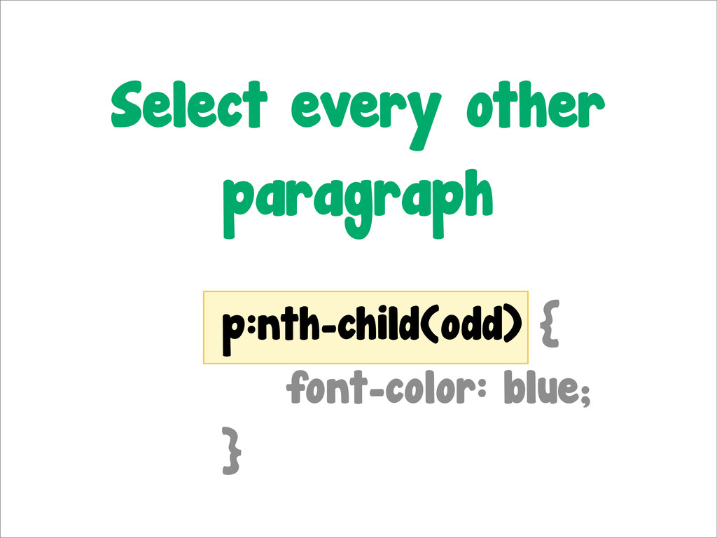
p:nth-child(odd) { font-color: blue; } Select every other paragraph
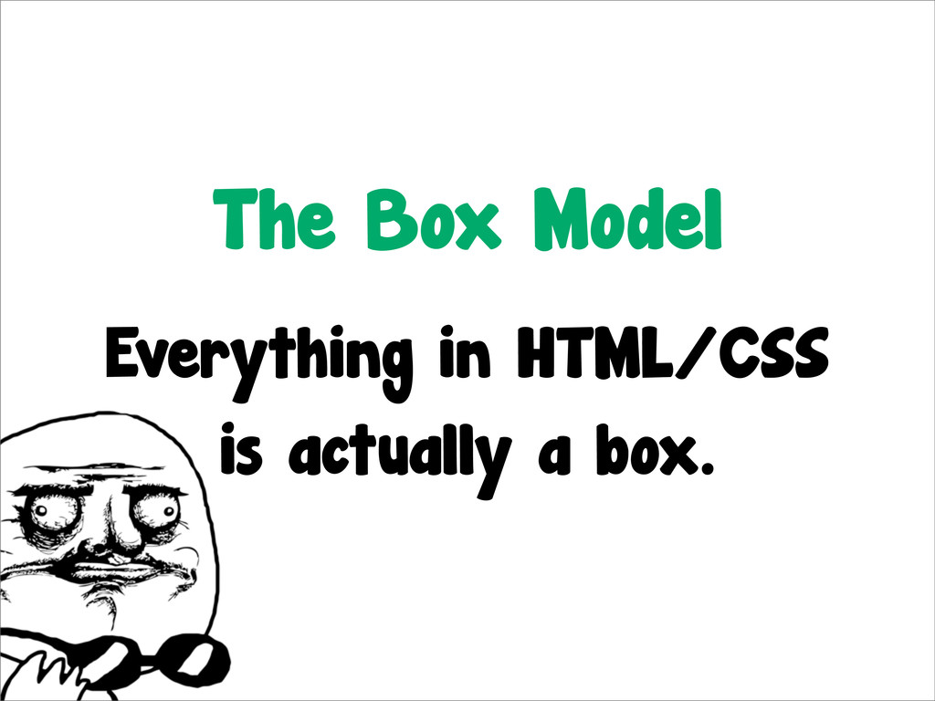
The Box Model
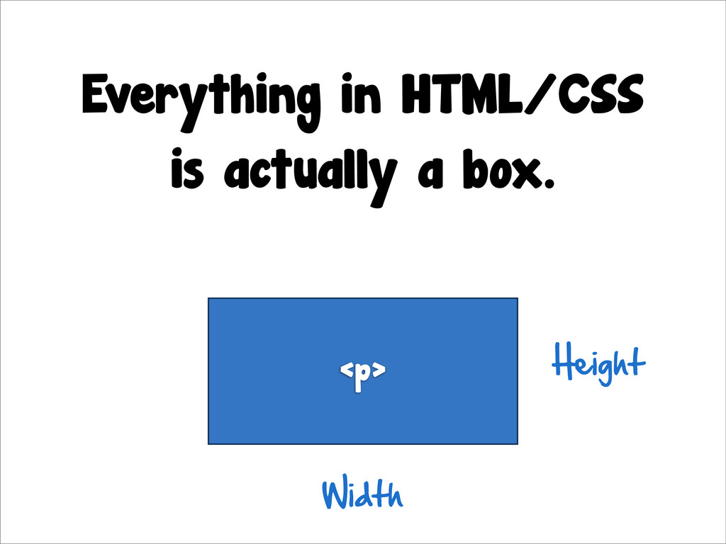
The Box Model Everything in HTML/CSS is actually a box.
Everything in HTML/CSS is actually a box. <p> Height Width
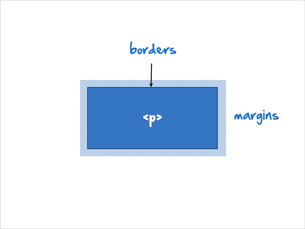
<p> margins borders
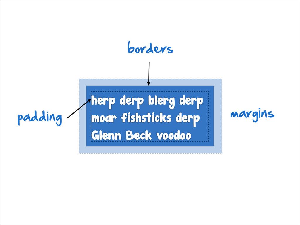
<p> margins herp derp blerg derp moar fishsticks derp Glenn
Beck voodoo borders padding
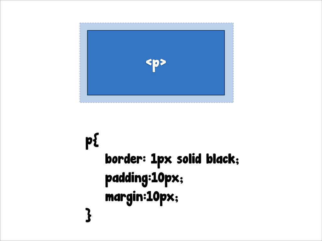
<p> p{ border: 1px solid black; padding:10px; margin:10px; }
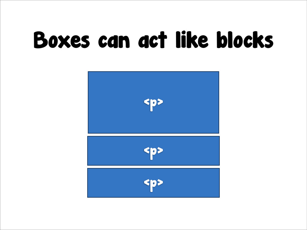
Boxes can act like blocks <p> <p> <p>
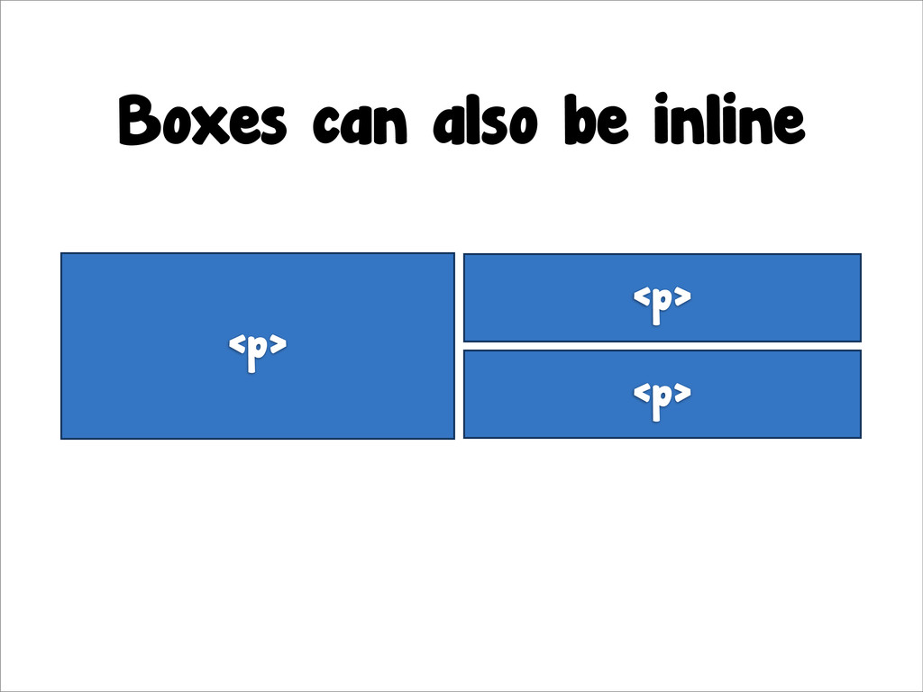
Boxes can also be inline <p> <p> <p>
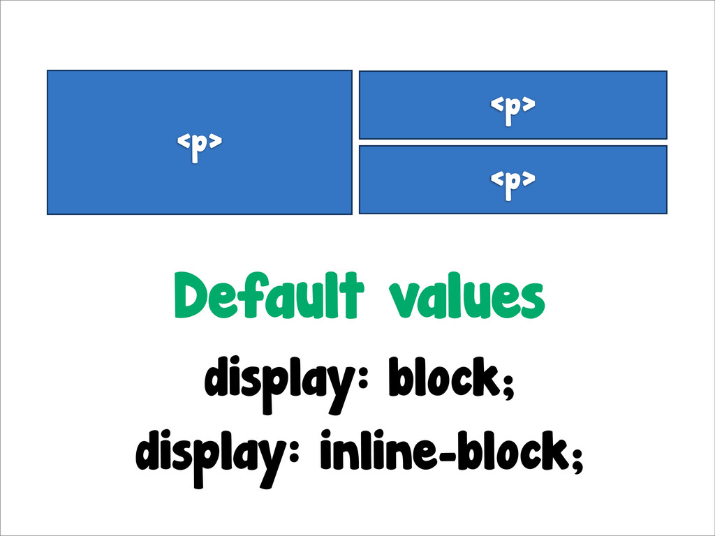
<p> <p> <p> Default values display: block; display: inline-block;
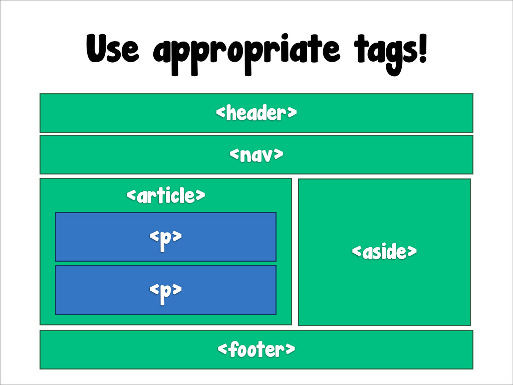
Use appropriate tags! <article> <p> <p> <aside> <nav> <header> <footer>
CSS JS Presentation Behavior CSS Animations
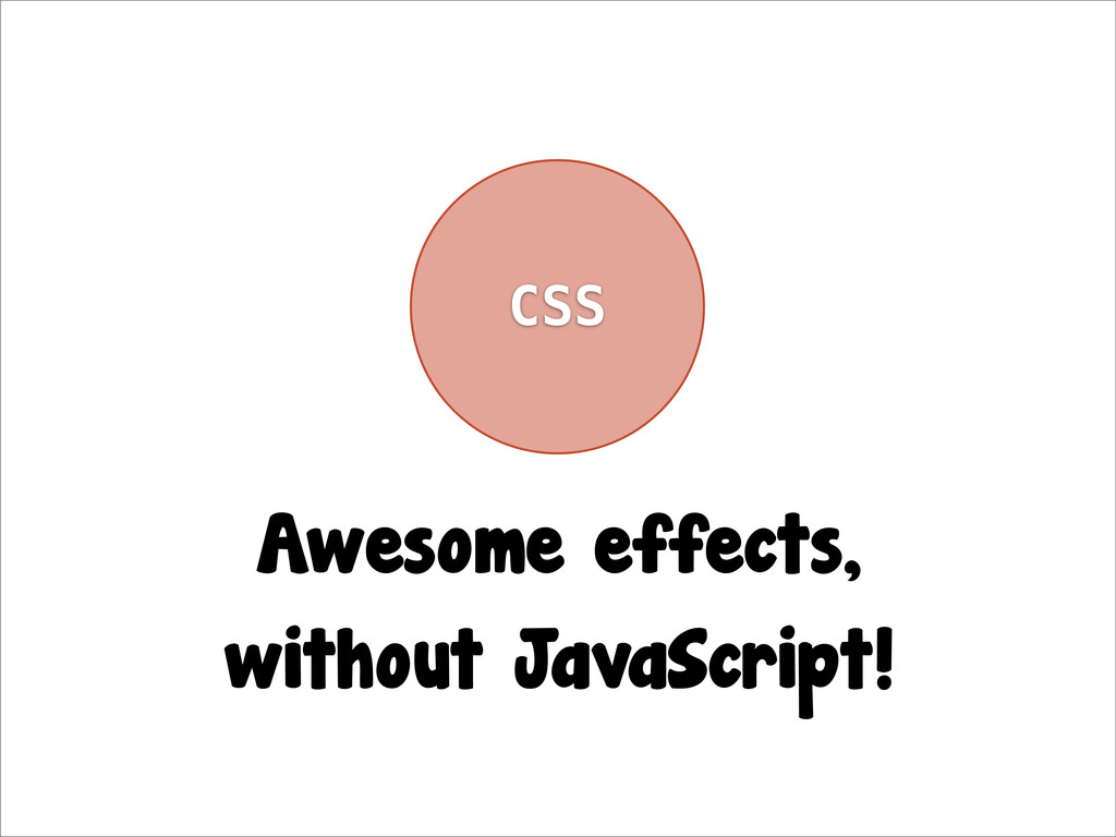
CSS Awesome effects, without JavaScript!
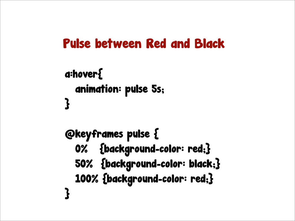
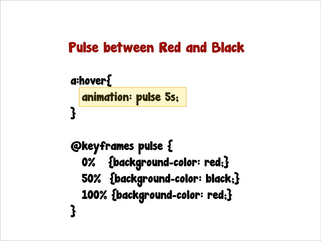
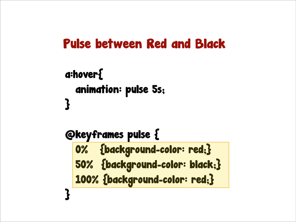
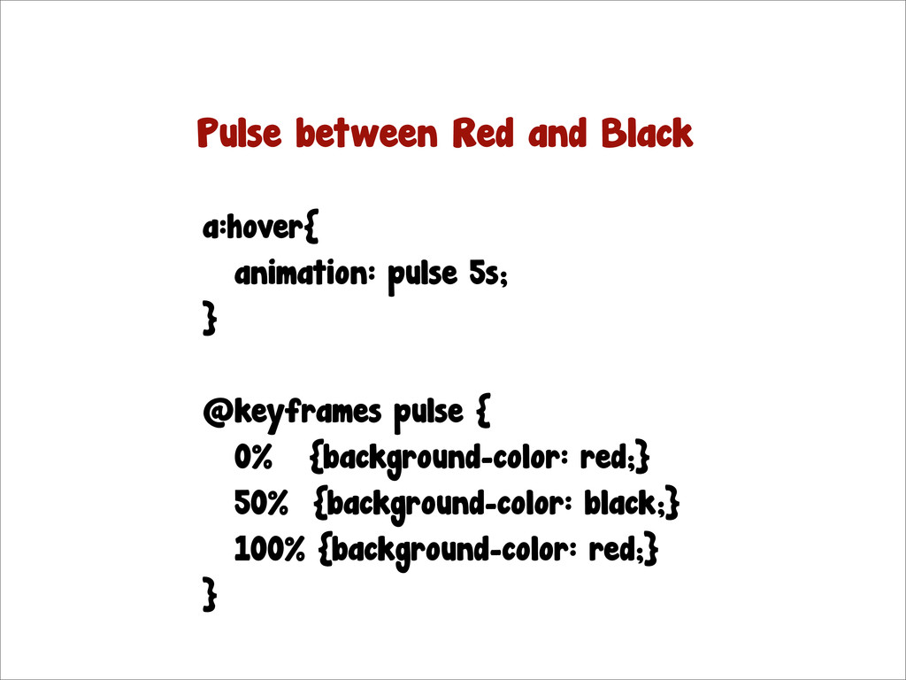
a:hover{ animation: pulse 5s; } @keyframes pulse { 0% {background-color:
red;} 50% {background-color: black;} 100% {background-color: red;} } Pulse between Red and Black
a:hover{ animation: pulse 5s; } @keyframes pulse { 0% {background-color:
red;} 50% {background-color: black;} 100% {background-color: red;} } Pulse between Red and Black
a:hover{ animation: pulse 5s; } @keyframes pulse { 0% {background-color:
red;} 50% {background-color: black;} 100% {background-color: red;} } Pulse between Red and Black
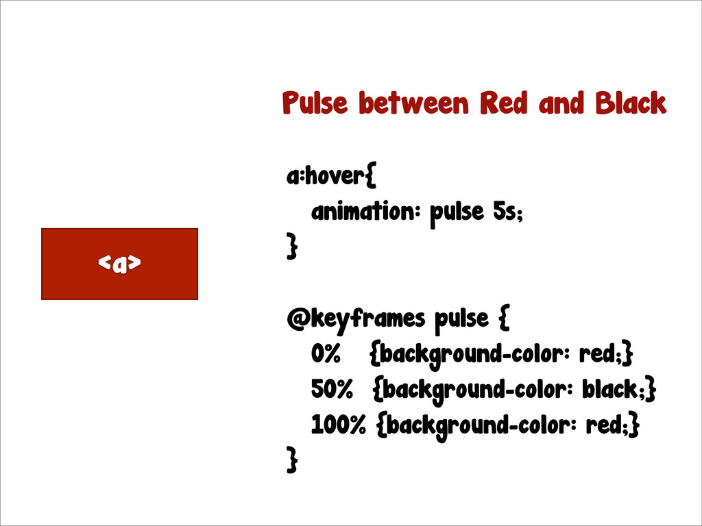
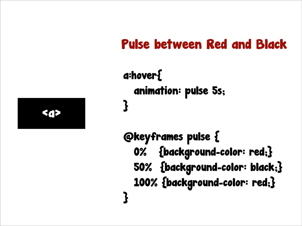
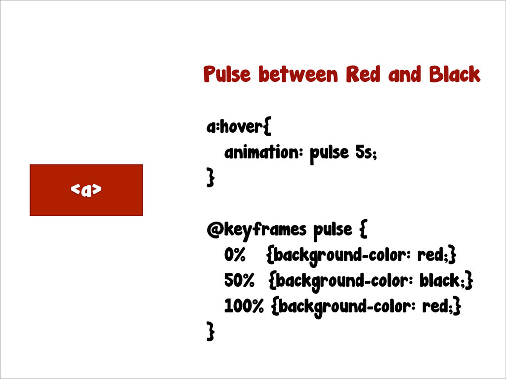
<a> <a> <a> a:hover{ animation: pulse 5s; } @keyframes pulse
{ 0% {background-color: red;} 50% {background-color: black;} 100% {background-color: red;} } Pulse between Red and Black
<a> <a> <a> a:hover{ animation: pulse 5s; } @keyframes pulse
{ 0% {background-color: red;} 50% {background-color: black;} 100% {background-color: red;} } Pulse between Red and Black
<a> <a> <a> a:hover{ animation: pulse 5s; } @keyframes pulse
{ 0% {background-color: red;} 50% {background-color: black;} 100% {background-color: red;} } Pulse between Red and Black
a:hover{ animation: pulse 5s; } @keyframes pulse { 0% {background-color:
red;} 50% {background-color: black;} 100% {background-color: red;} } Pulse between Red and Black
ANIMATE ALL THE PROPERTIES
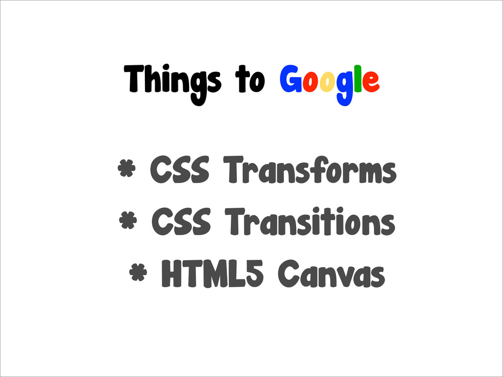
Things to Google
Things to Google * CSS Transforms * CSS Transitions *
HTML5 Canvas
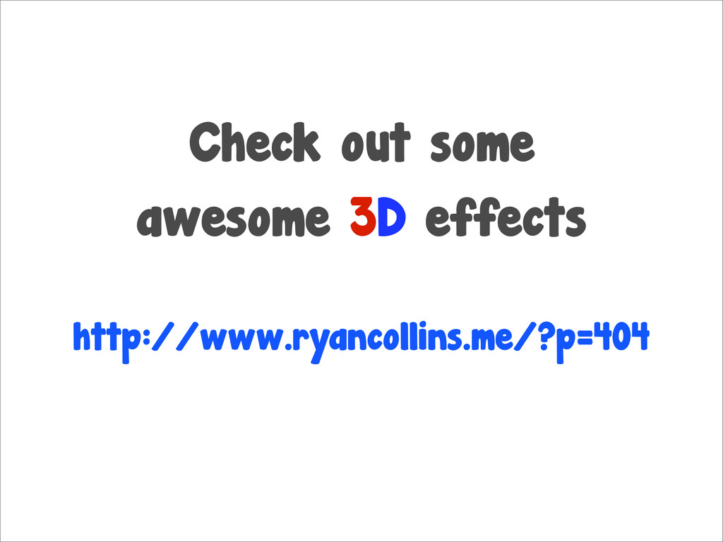
Check out some awesome 3D effects http://www.ryancollins.me/?p=404
Check out some awesome 3D effects http://www.ryancollins.me/?p=404
Media Queries Let your page adapt
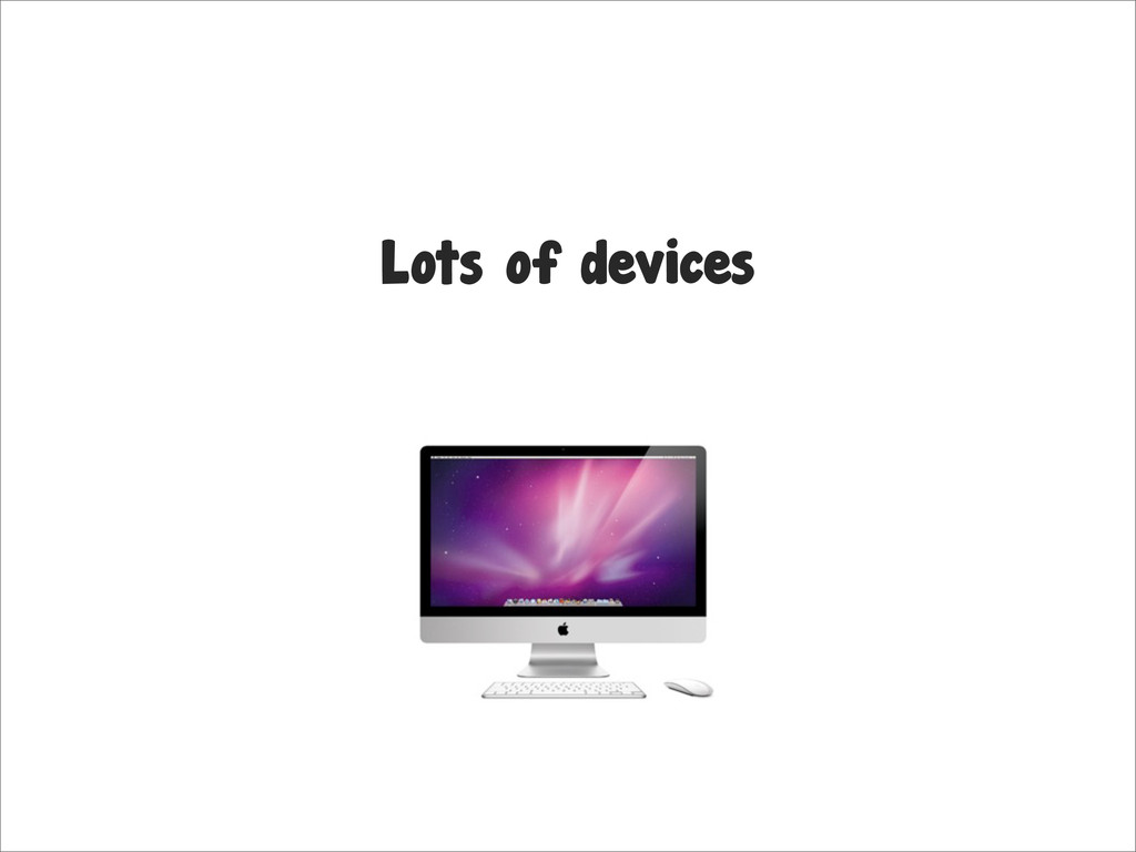
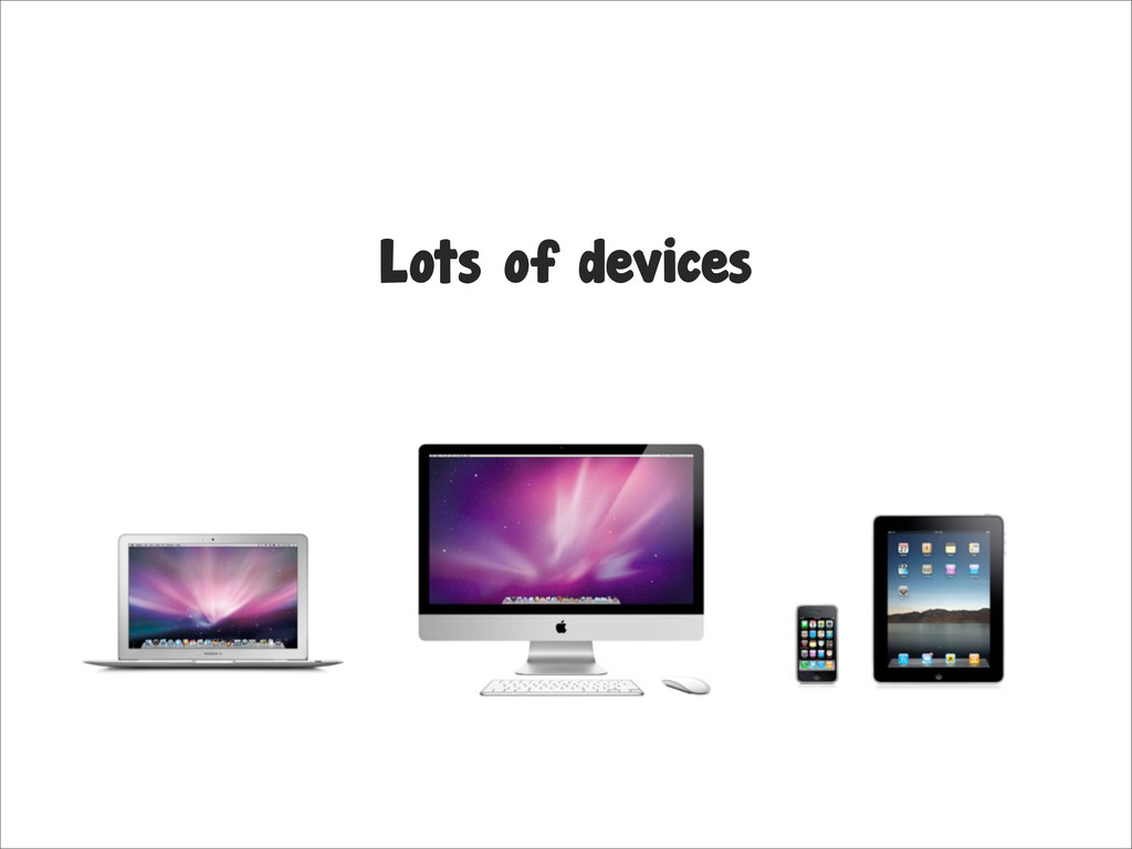
Lots of devices
Lots of devices
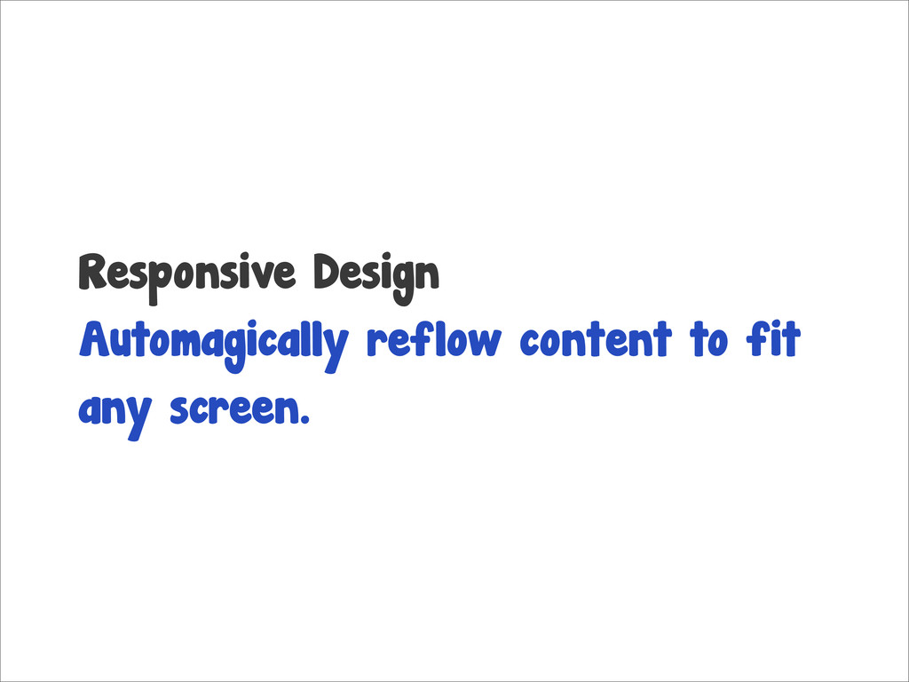
Responsive Design Automagically reflow content to fit any screen.
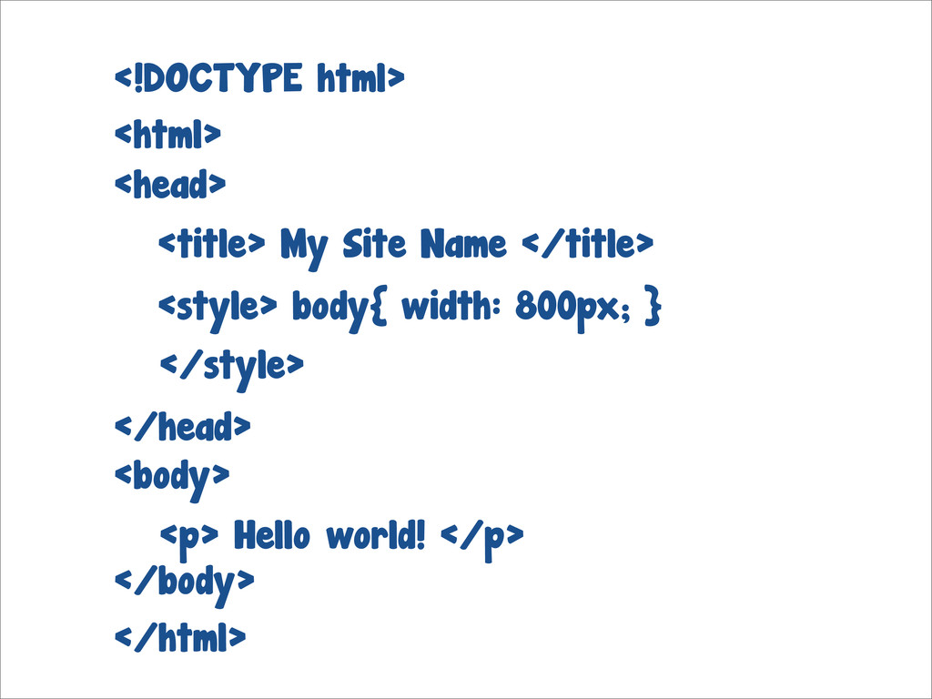
<html> </html> <!DOCTYPE html> <body> </body> <p> Hello world! </p>
<title> My Site Name </title> <head> </head> <style> body{ width: 800px; } </style>
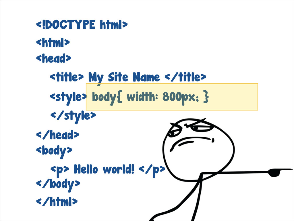
<html> </html> <!DOCTYPE html> <body> </body> <p> Hello world! </p>
<title> My Site Name </title> <head> </head> </style> <style> body{ width: 800px; }
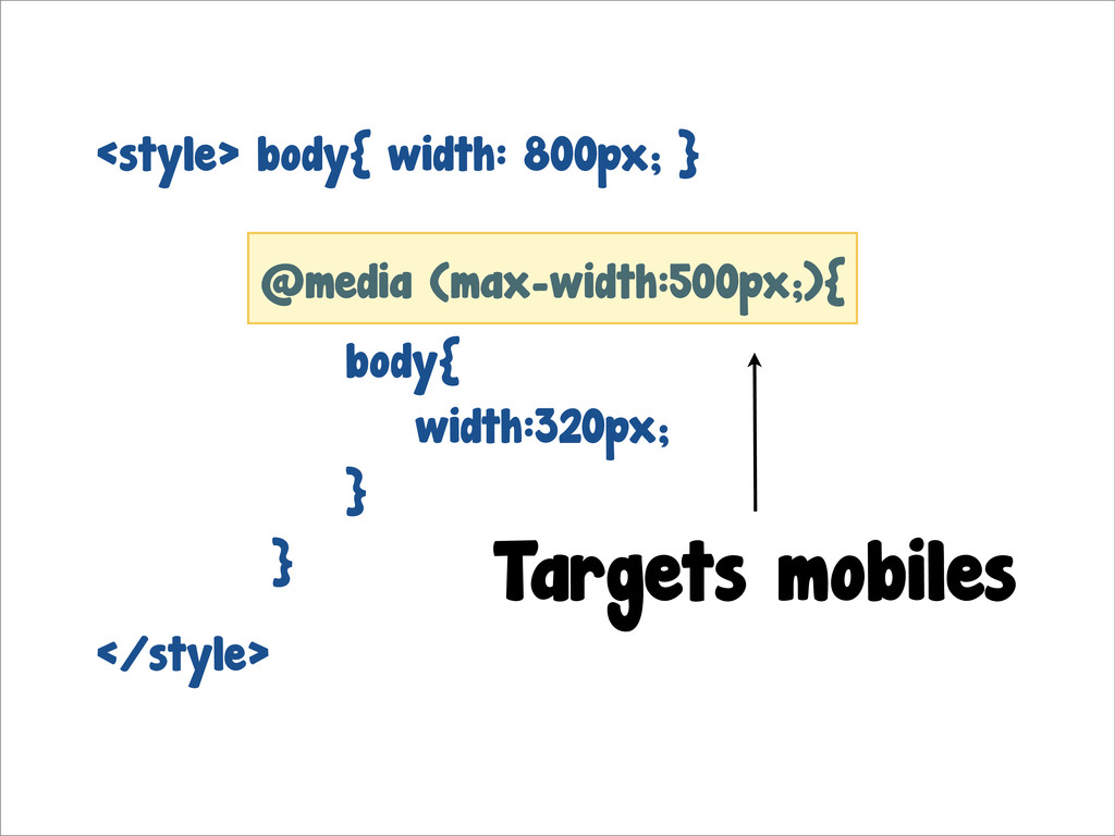
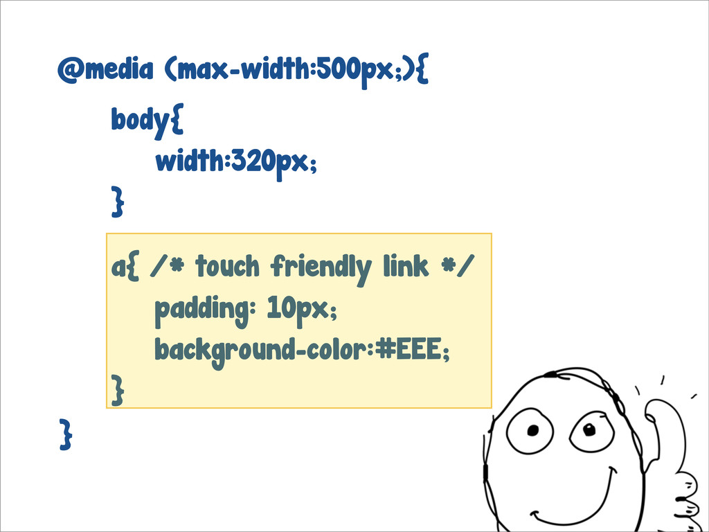
</style> @media (max-width:500px;){ Targets mobiles <style> body{ width: 800px; }
body{ width:320px; } }
a{ /* touch friendly link */ padding: 10px; background-color:#EEE; }
@media (max-width:500px;){ body{ width:320px; } }
Mobile Web Snazzy mobile views
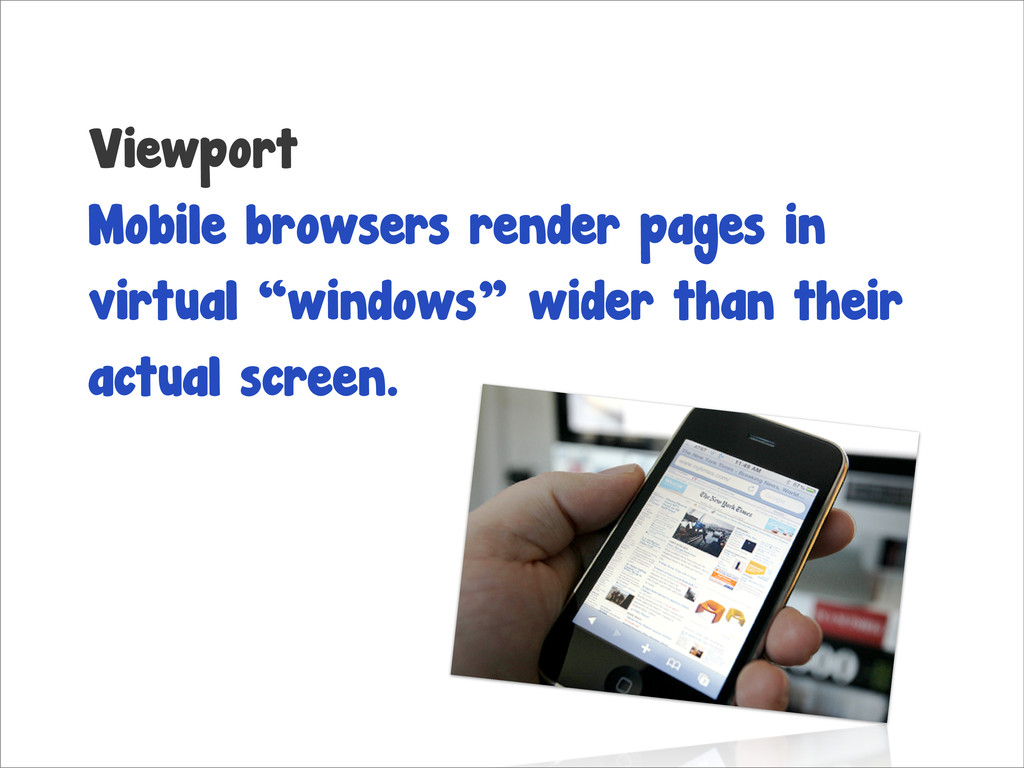
Viewport Mobile browsers render pages in virtual “windows” wider than
their actual screen.
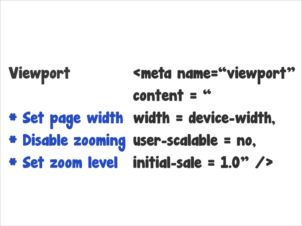
Viewport * Set page width * Disable zooming * Set
zoom level
Viewport * Set page width * Disable zooming * Set
zoom level <meta name=“viewport” content = “ width = device-width, user-scalable = no, initial-sale = 1.0” />
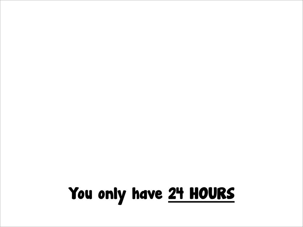
Hacking Tips How to build fast.
You only have 24 HOURS
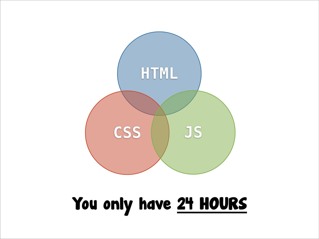
HTML CSS JS You only have 24 HOURS
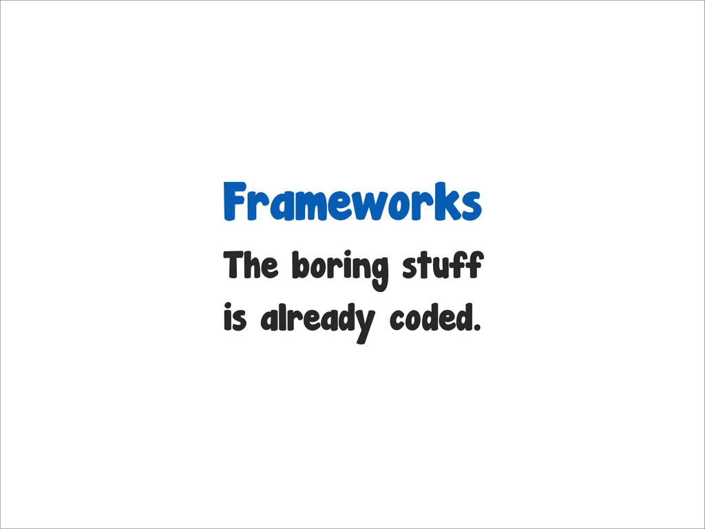
Frameworks The boring stuff is already coded.
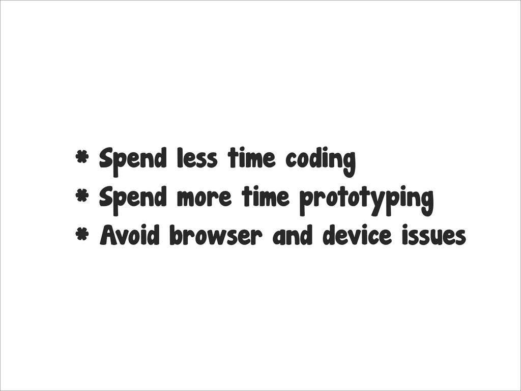
* Spend less time coding * Spend more time prototyping
* Avoid browser and device issues
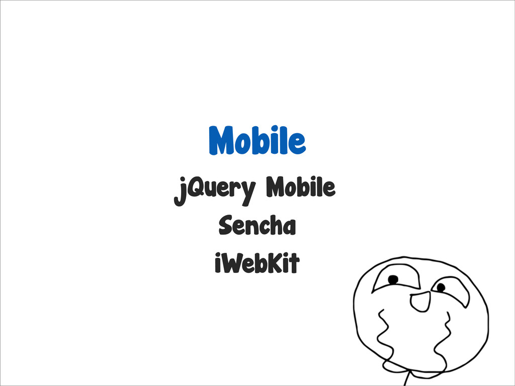
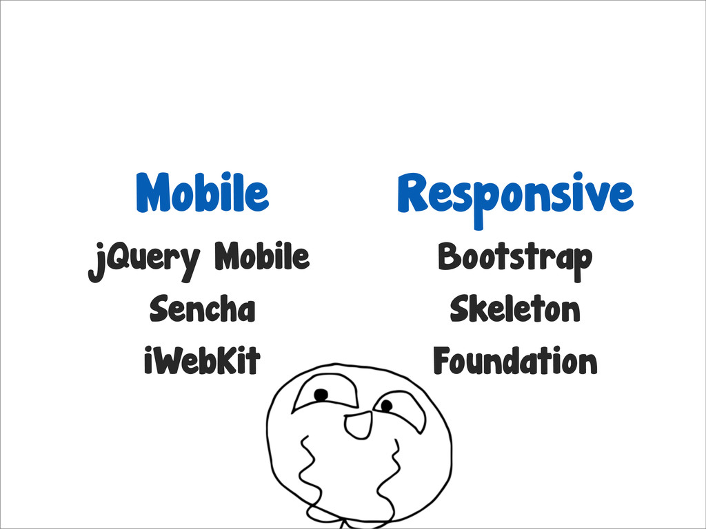
Mobile jQuery Mobile Sencha iWebKit
Mobile jQuery Mobile Sencha iWebKit Responsive Bootstrap Skeleton Foundation
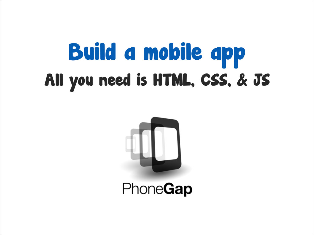
Build a mobile app All you need is HTML, CSS,
& JS
Go Experiment! Check out Bootstrap (twitter.github.com/bootstrap) and Skeleton (getSkeleton.com)
I don’t bite. @ryhanhassan
None
 ryhan
ryhan
 andpad
 pyama86
 masuda220
 yukukotani
 terryu16
 16bitidol
 handlename
 404background
 jnchito
 takter00
 yusukebe
 chobishiba
 techseoconnect
 csswizardry
 bkeepers
 twada
twada
 geoffreycrofte
 honzajavorek
 lcolladotor
 addyosmani
 cassininazir
 panda_program
 varn
varn
 lara
lara