Upgrade to Pro
— share decks privately, control downloads, hide ads and more …
Speaker Deck
Features
Speaker Deck
PRO
Sign in
Sign up for free
Search
Search
(TH Crash Course) Advanced HTML & CSS
Search
Sponsored
·
SiteGround - Reliable hosting with speed, security, and support you can count on.
→
Ryhan Hassan
January 18, 2013
Programming
260
5
Share
Embed
Copy iframe code
Copy JS code
Copy link
Start on current slide
(TH Crash Course) Advanced HTML & CSS
Ryhan Hassan
January 18, 2013
More Decks by Ryhan Hassan
See All by Ryhan Hassan
(TH Crash Course) Intro to JavaScript
ryhan
1
110
(Skill Swap Weekend) HTML5 & CSS3
ryhan
7
280
Introductory HTML & CSS
ryhan
3
240
Other Decks in Programming
See All in Programming
JJUG CCC 2026 Spring: JSpecify で実現する Kotlin フレンドリーな Java API 設計
ternbusty
1
160
セキュリティの専門家じゃなくてもできる。「セキュリティ意識」をアップデートして サプライチェーン攻撃への耐性を高めよう。
tk3fftk
5
720
肥大化するレガシーコードに立ち向かうためのインターフェース分離と依存の逆転 / JJUG CCC 2026 Spring
hirokunimaeta
0
540
並列実装の現場、2ヶ月間実務でAIを使い倒したAIもPCも私も限界が近い
ming_ayami
0
130
過去最大のMCPアップデート! 2026-07-28 RC版の謎に迫る
licux
6
260
[2026年度第1回ORセミナー] 計画最適化ベンチャーと競技プログラミング人材
terryu16
0
260
「AIで開発し、AIを届ける」をEvalでつなぐ 〜AIネイティブに始めるプロダクト開発の実践〜 / Connecting "Develop with AI, deliver AI" with Eval
rkaga
4
4.9k
IBM Bobを活用したレガシーアプリの最新化
oniak3ibm
PRO
1
190
Lemonade + Foundry Toolkit でお手軽アプリ開発
seosoft
1
320
3Dシーンの圧縮
fadis
1
750
ローカルLLMを使ってB2Bサービスを作っていての学び
yaotti
0
160
AutonomyとControlのあいだ:Graflowで記述するAIエージェント協調
myui
0
120
Featured
See All Featured
WENDY [Excerpt]
tessaabrams
11
38k
AI Search: Implications for SEO and How to Move Forward - #ShenzhenSEOConference
aleyda
1
1.3k
GitHub's CSS Performance
jonrohan
1033
470k
世界の人気アプリ100個を分析して見えたペイウォール設計の心得
akihiro_kokubo
PRO
71
40k
Visualization
eitanlees
152
17k
The B2B funnel & how to create a winning content strategy
katarinadahlin
PRO
1
380
Templates, Plugins, & Blocks: Oh My! Creating the theme that thinks of everything
marktimemedia
31
2.8k
Designing for Performance
lara
611
70k
Evolving SEO for Evolving Search Engines
ryanjones
0
210
Agile that works and the tools we love
rasmusluckow
331
21k
Fashionably flexible responsive web design (full day workshop)
malarkey
408
66k
Java REST API Framework Comparison - PWX 2021
mraible
34
9.4k
Transcript
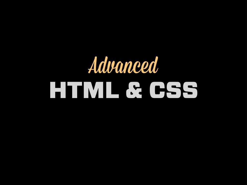
Advanced HTML & CSS
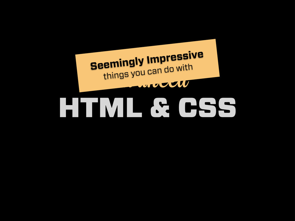
Advanced HTML & CSS Seemingly Impressive things you can do
with
@RyhanHassan
CSS Transitions
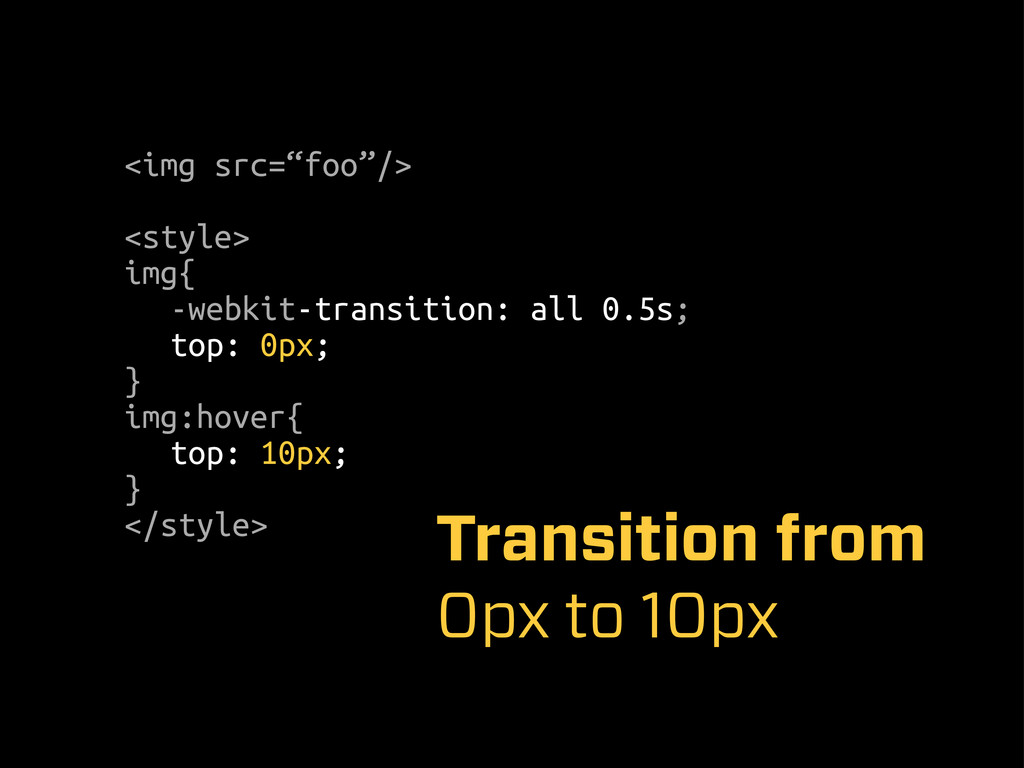
<img src=“foo”/> <style> img{ -webkit-transition: all 0.5s; top: 0px; }
img:hover{ top: 10px; } </style> Transition from 0px to 10px
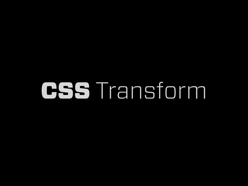
CSS Transform
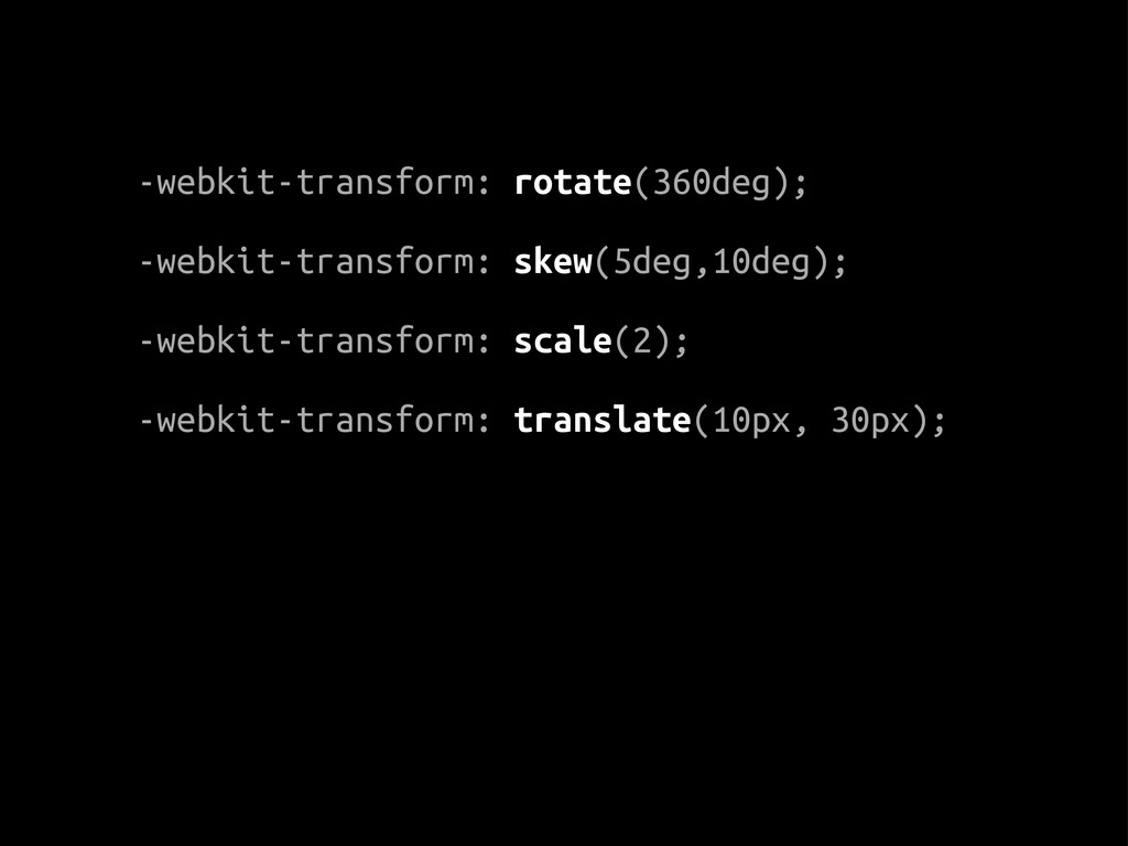
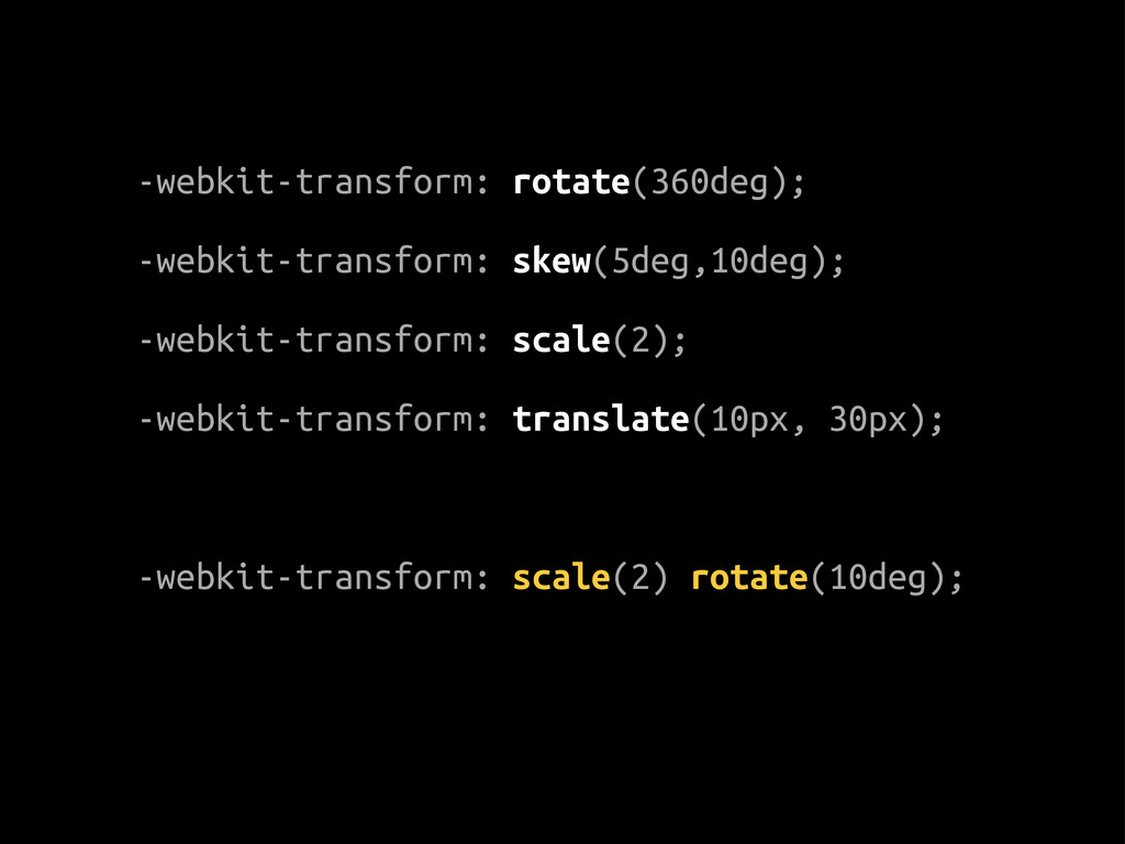
-webkit-transform: rotate(360deg); -webkit-transform: skew(5deg,10deg); -webkit-transform: scale(2); -webkit-transform: translate(10px, 30px);
-webkit-transform: rotate(360deg); -webkit-transform: skew(5deg,10deg); -webkit-transform: scale(2); -webkit-transform: translate(10px, 30px); -webkit-transform:
scale(2) rotate(10deg);
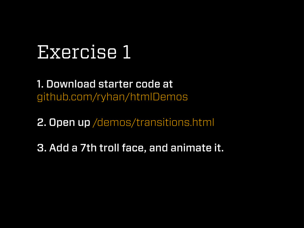
Exercise 1 1. Download starter code at github.com/ryhan/htmlDemos 2. Open
up /demos/transitions.html 3. Add a 7th troll face, and animate it.
CSS Animations
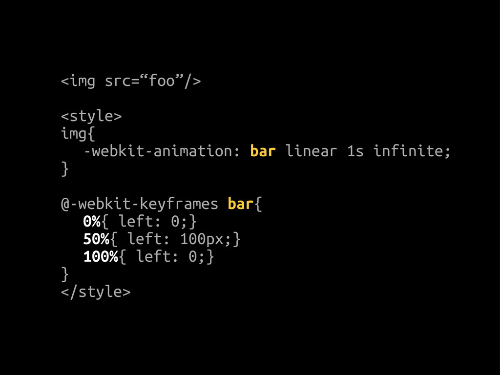
<img src=“foo”/> <style> img{ -webkit-animation: bar linear 1s infinite; }
@-webkit-keyframes bar{ 0%{ left: 0;} 50%{ left: 100px;} 100%{ left: 0;} } </style>
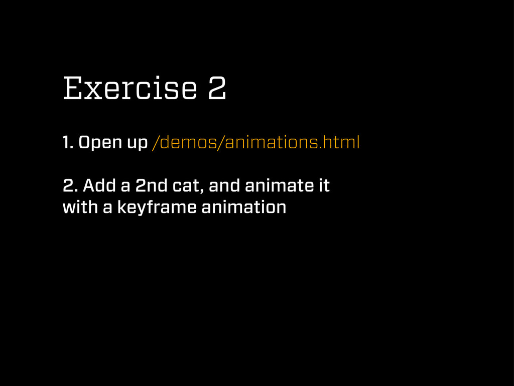
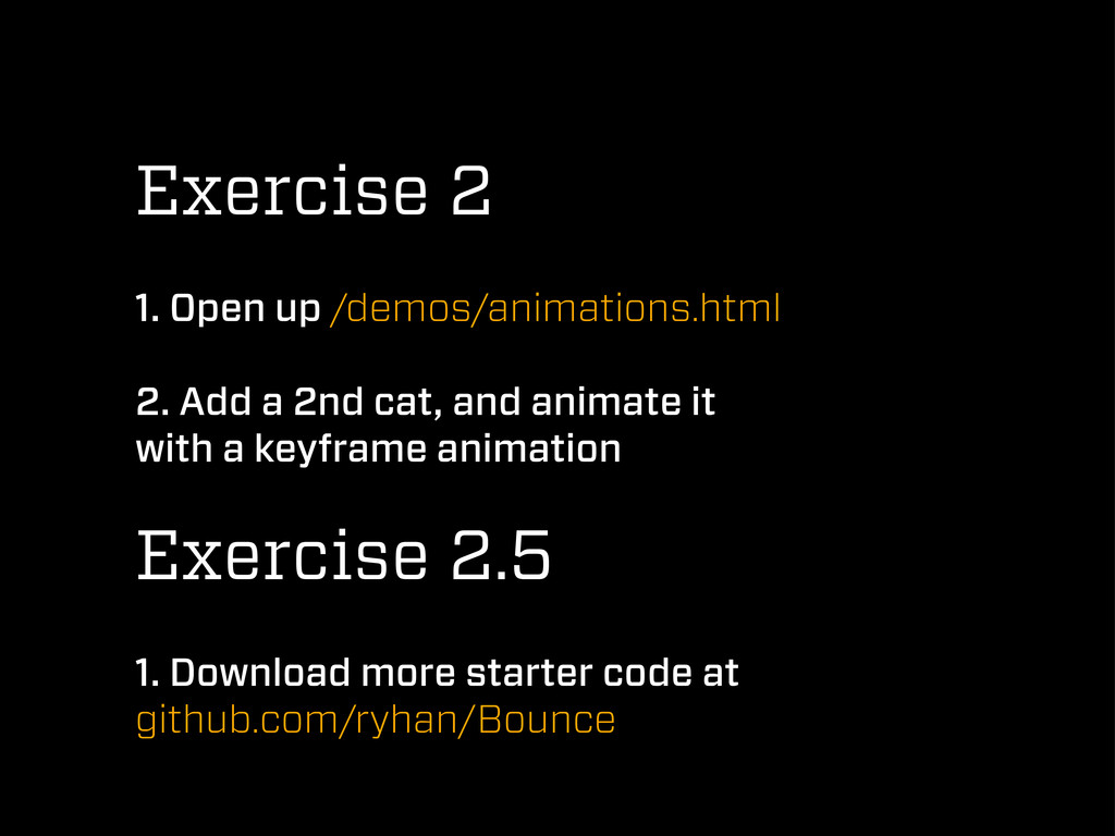
Exercise 2 1. Open up /demos/animations.html 2. Add a 2nd
cat, and animate it with a keyframe animation
Exercise 2 1. Open up /demos/animations.html 2. Add a 2nd
cat, and animate it with a keyframe animation Exercise 2.5 1. Download more starter code at github.com/ryhan/Bounce
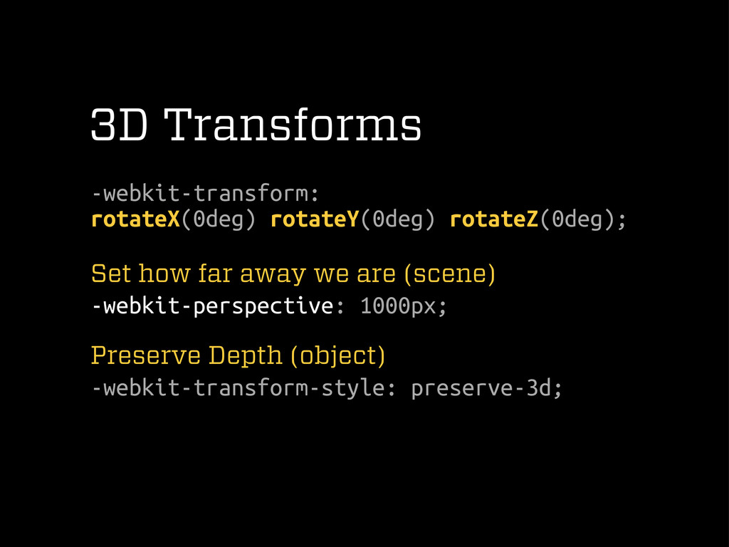
3D Transforms -webkit-transform: rotateX(0deg) rotateY(0deg) rotateZ(0deg); Set how far away
we are (scene) -webkit-perspective: 1000px; Preserve Depth (object) -webkit-transform-style: preserve-3d;
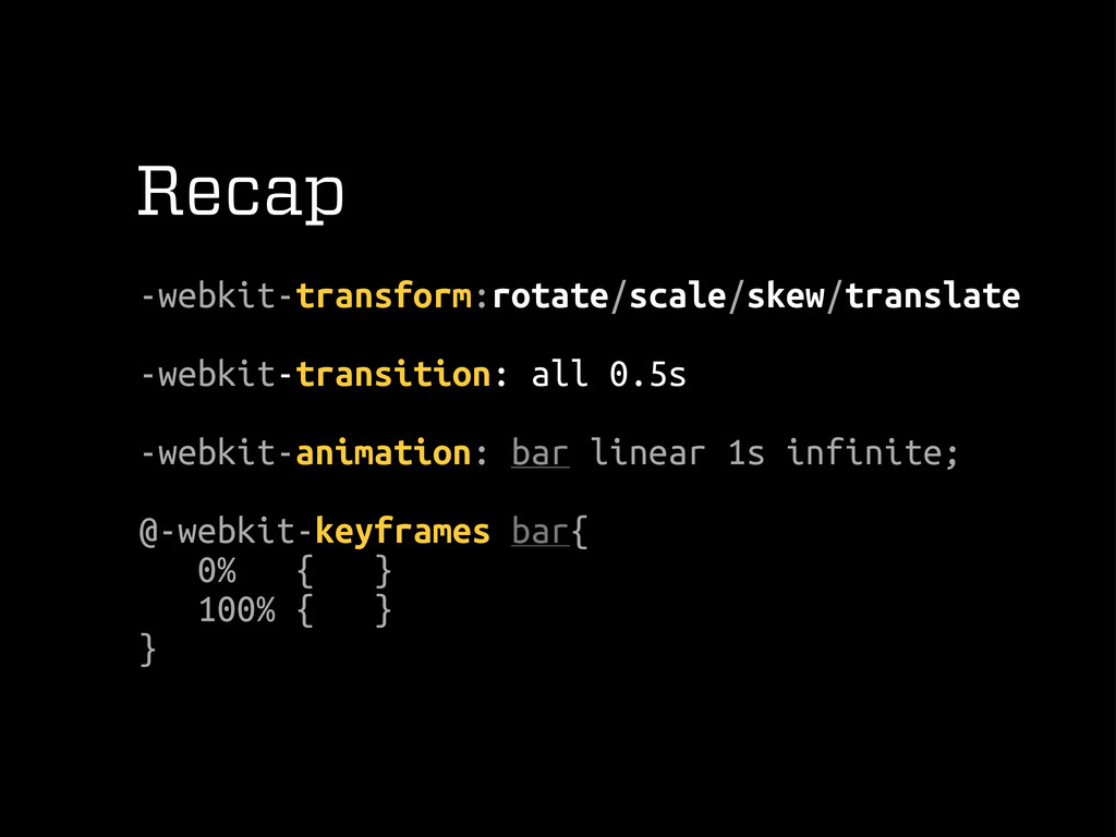
Recap -webkit-transform:rotate/scale/skew/translate -webkit-transition: all 0.5s -webkit-animation: bar linear 1s infinite;
@-webkit-keyframes bar{ 0% { } 100% { } }
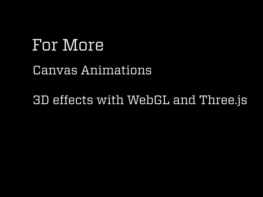
For More Canvas Animations 3D effects with WebGL and Three.js
Mobile Web
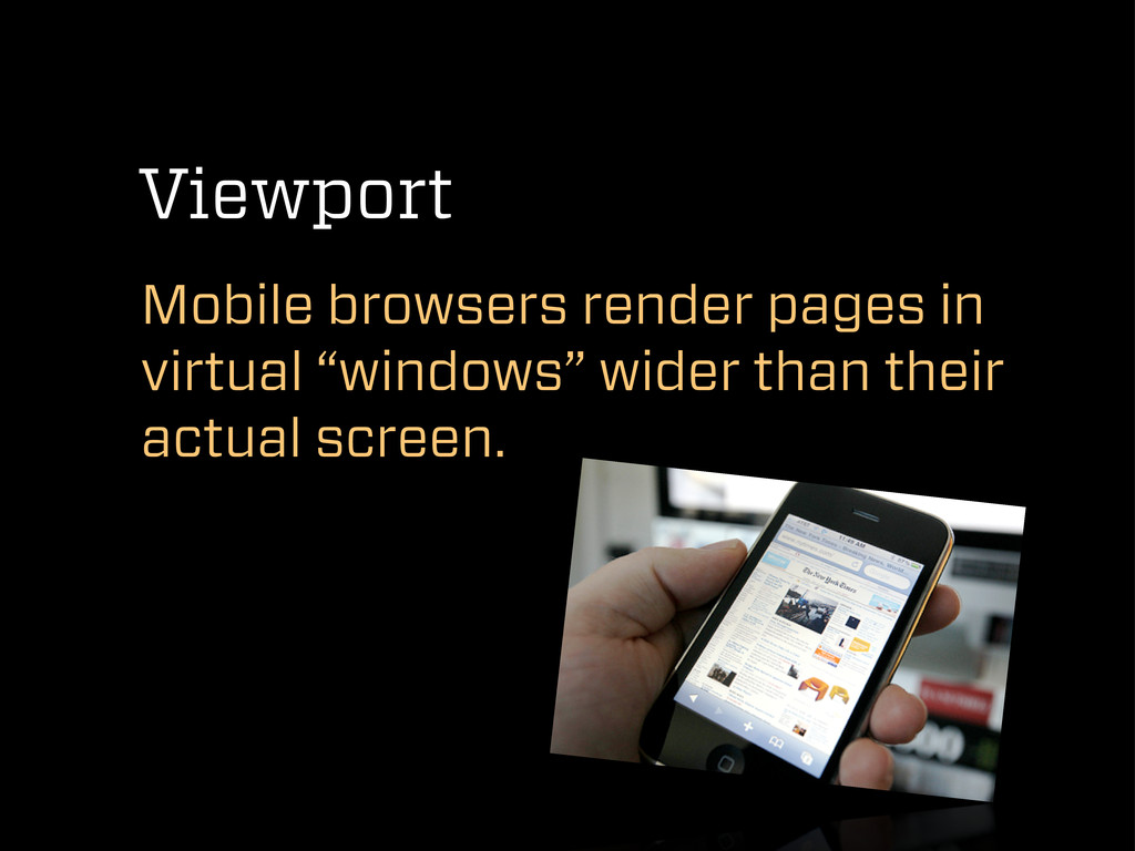
Viewport Mobile browsers render pages in virtual “windows” wider than
their actual screen.
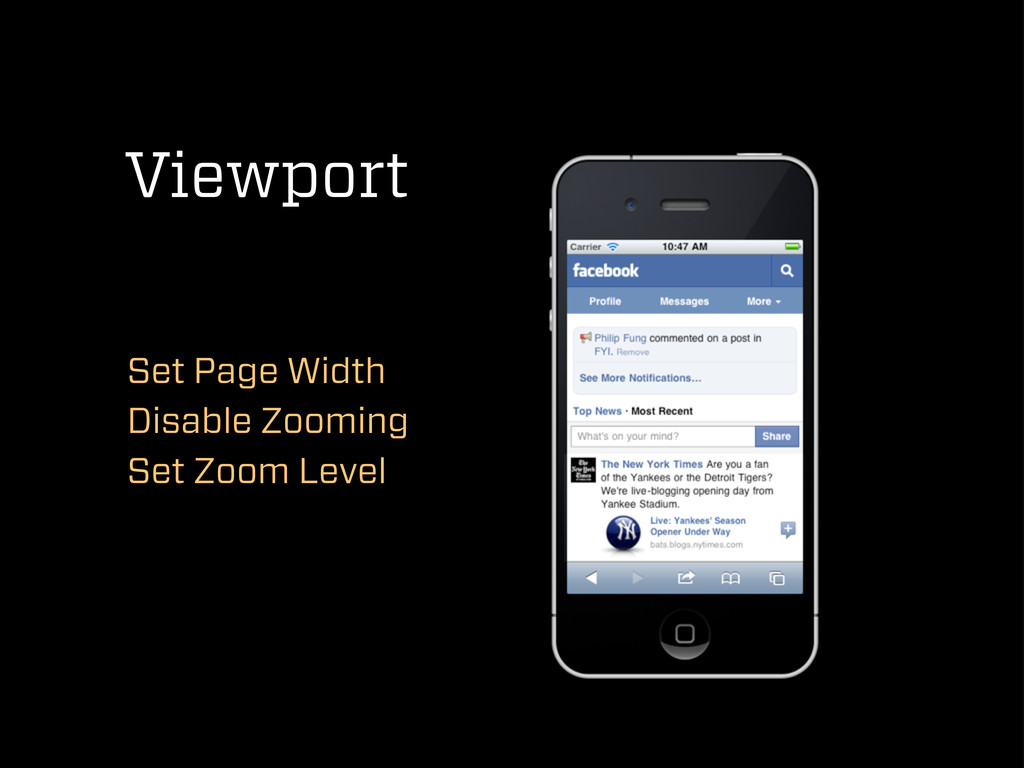
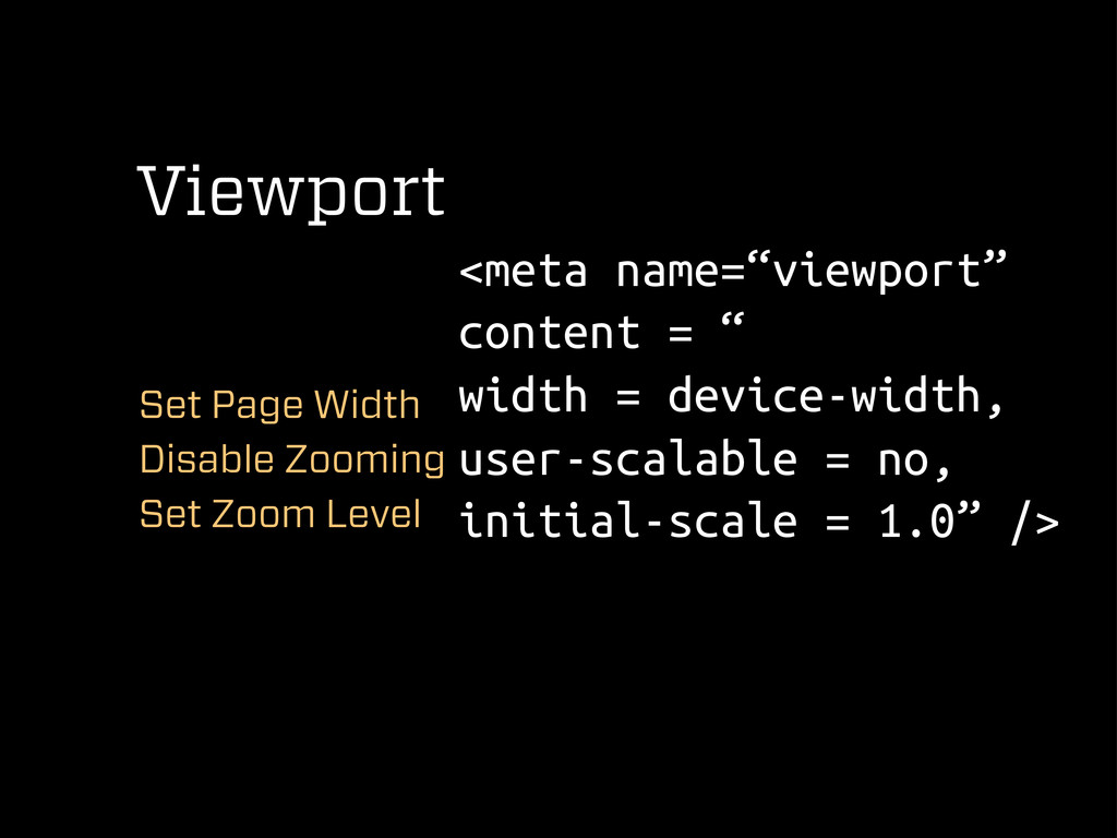
Viewport Set Page Width Disable Zooming Set Zoom Level
Viewport Set Page Width Disable Zooming Set Zoom Level <meta
name=“viewport” content = “ width = device-width, user-scalable = no, initial-scale = 1.0” />
Let your page adapt MediaQueries
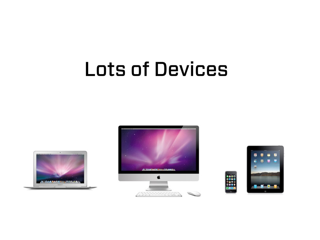
Lots of Devices
Lots of Devices
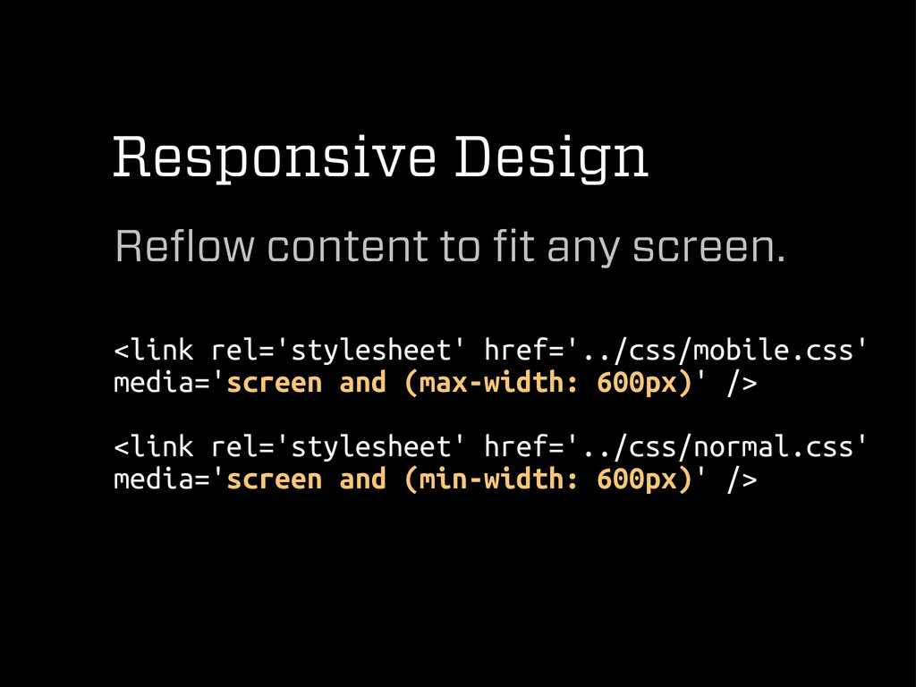
Responsive Design Reflow content to fit any screen. <link rel='stylesheet'
href='../css/mobile.css' media='screen and (max-width: 600px)' /> <link rel='stylesheet' href='../css/normal.css' media='screen and (min-width: 600px)' />
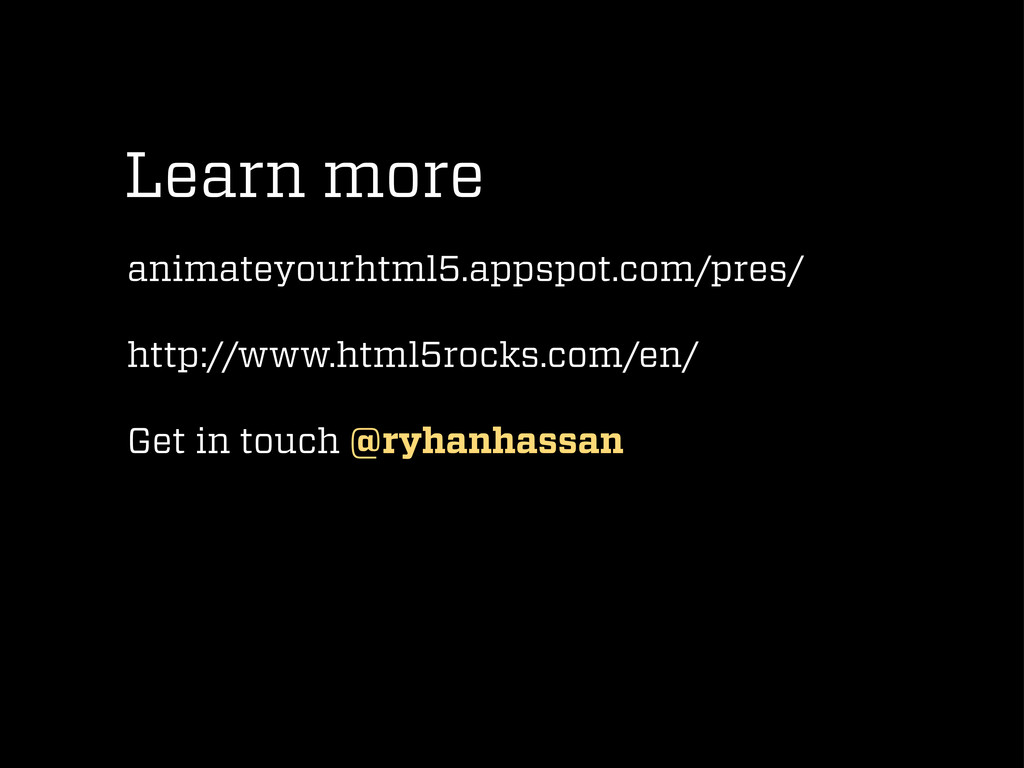
Learn more animateyourhtml5.appspot.com/pres/ http://www.html5rocks.com/en/ Get in touch @ryhanhassan
@RyhanHassan
 SiteGround - Reliable hosting with speed, security, and support you can count on.
 ryhan
ryhan
 ternbusty
 tk3fftk
 hirokunimaeta
 ming_ayami
 licux
licux
 terryu16
 rkaga
rkaga
 oniak3ibm
 seosoft
 fadis
fadis
 yaotti
 myui
myui
 tessaabrams
 aleyda
 jonrohan
 akihiro_kokubo
 eitanlees
 katarinadahlin
 marktimemedia
 lara
lara
 ryanjones
 rasmusluckow
 malarkey
 mraible