$30 off During Our Annual Pro Sale. View Details »

Pragmatic Responsive Images

Pragmatic Responsive Images

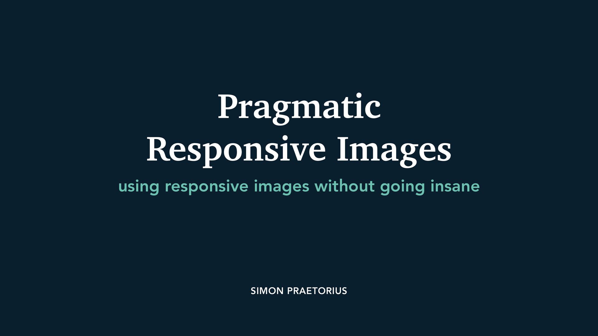
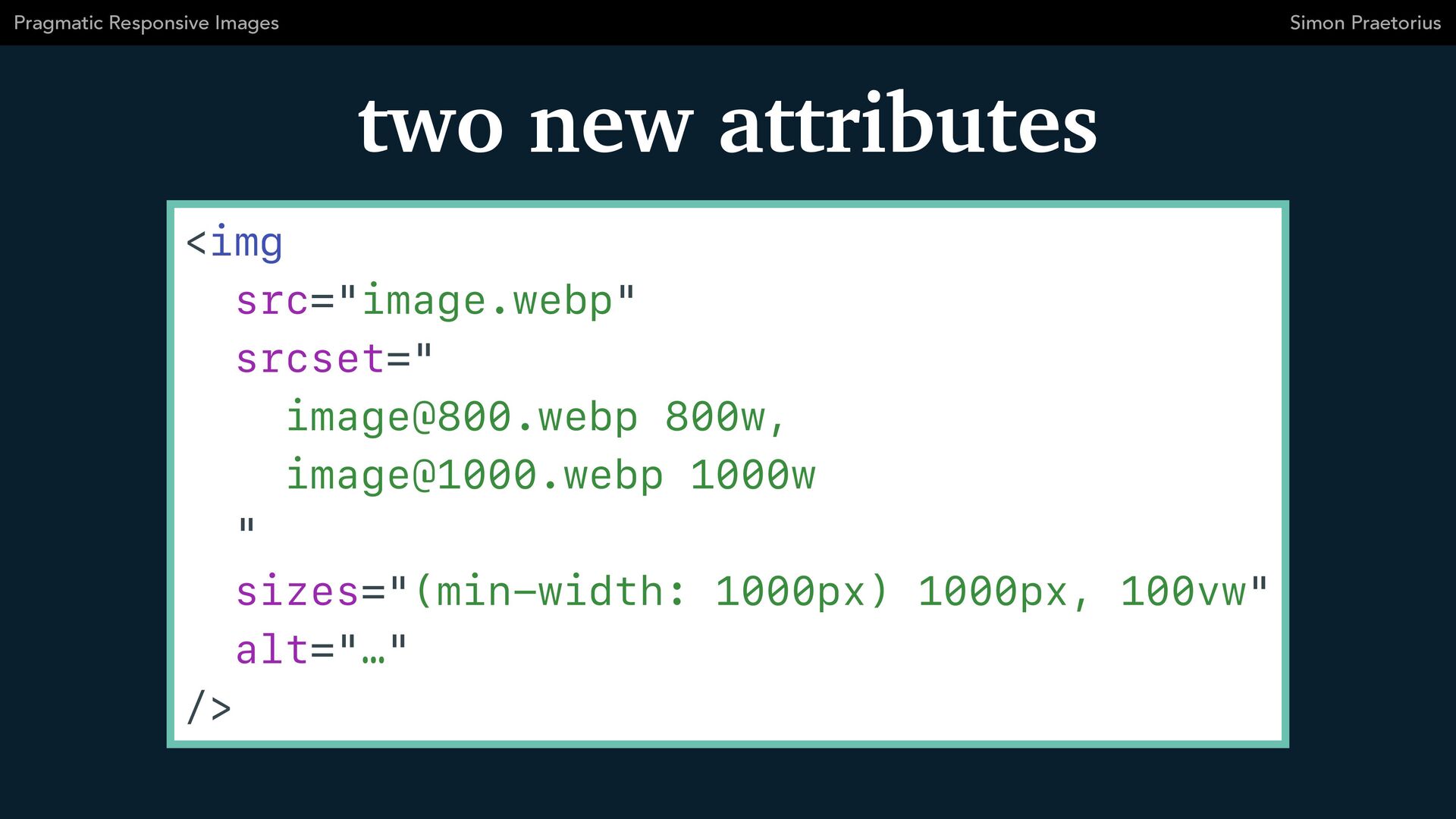
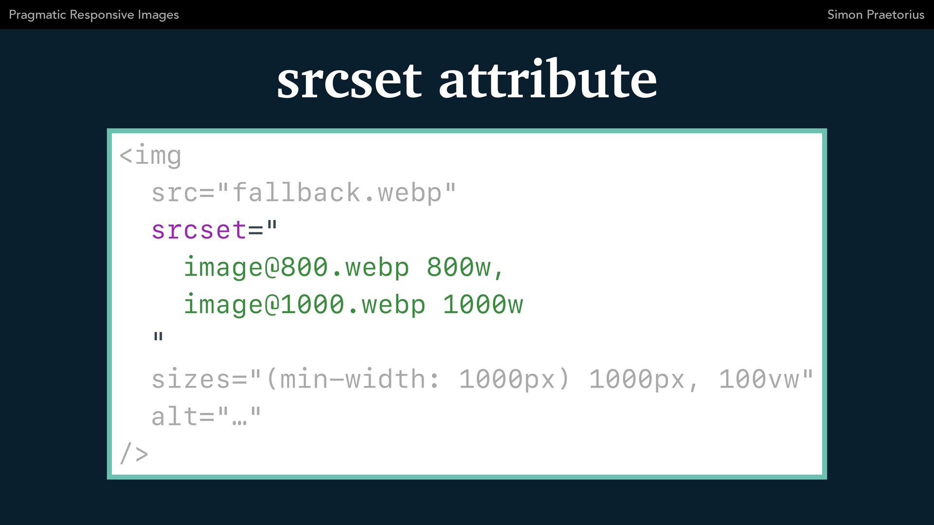
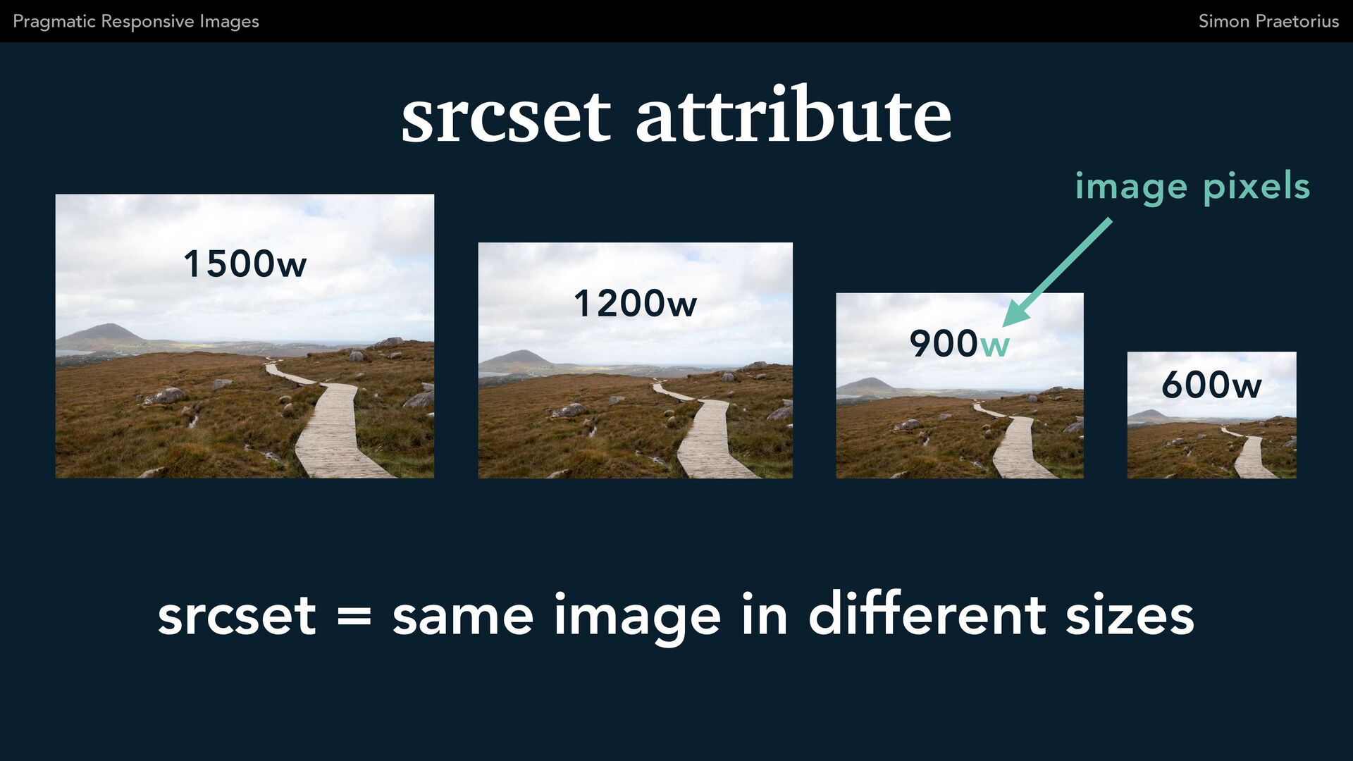
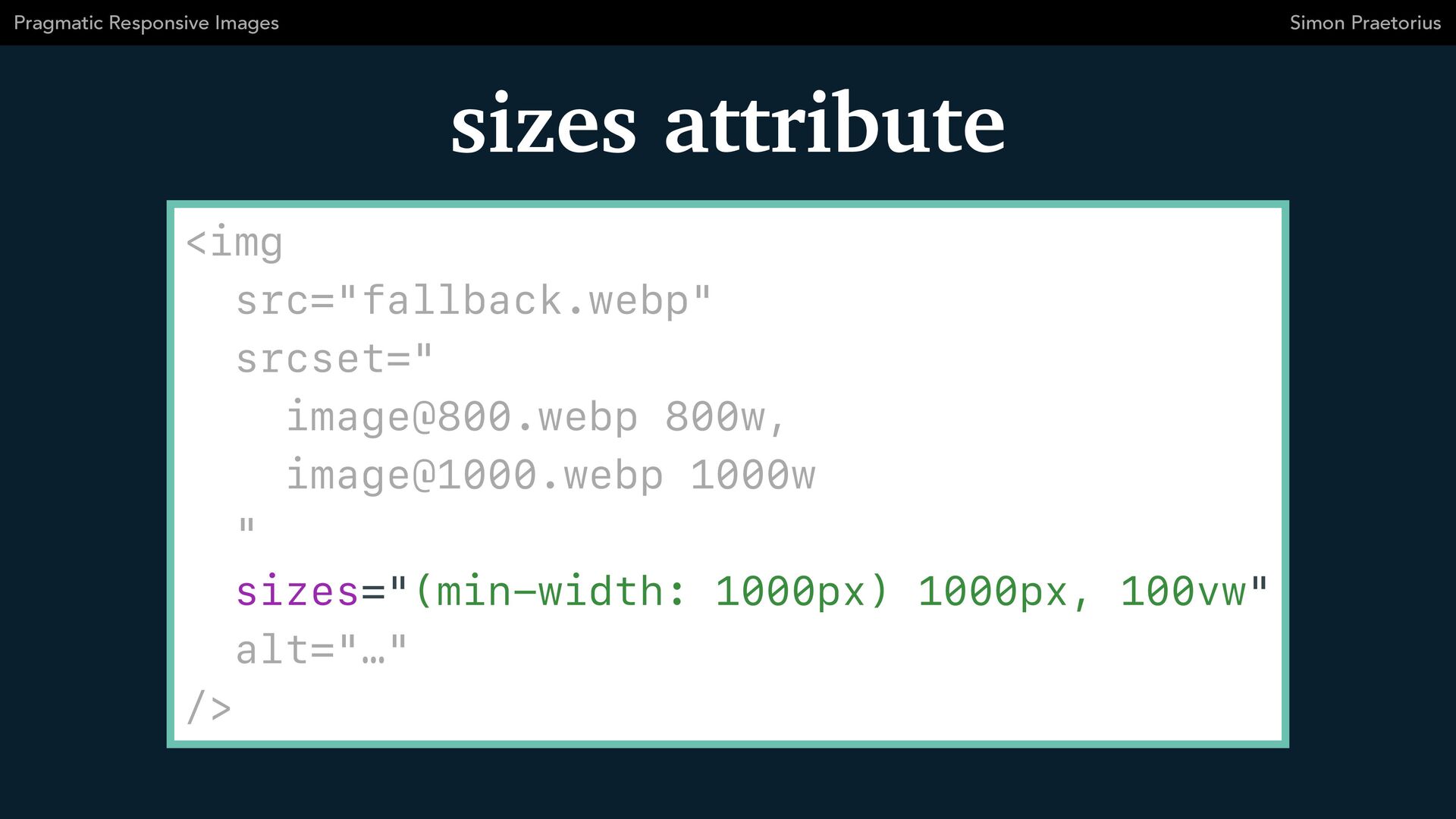
The topic of responsive images is full of confusion and misunderstandings. This is not a coincidence because it is a complicated subject with a lot of historical baggage. I've been searching for the perfect solution for years and instead found a pragmatic approach that has served me well in numerous web projects.

This talk was presented at HTML Meetup Hamburg.
https://hhtml.de/events/2023-09-28-third-meetup/

Simon Praetorius

September 28, 2023
Tweet

More Decks by Simon Praetorius

Other Decks in Technology

Transcript

  1. SIMON PRAETORIUS
    Pragmatic


    Responsive Images
    using responsive images without going insane

    View Slide

  2. ✦ 13 years in web agencies


    ✦ technical leadership in big projects


    ✦ independent since June 2023
    hire me for

    your project!
    Simon Praetorius

    View Slide

  3. Basics
    Simon Praetorius
    Pragmatic Responsive Images

    View Slide

  4. img tag
    Simon Praetorius
    Pragmatic Responsive Images


    src="image.webp"


    srcset="


    [email protected] 800w,


    [email protected] 1000w


    "


    sizes="(min-width: 1000px) 1000px, 100vw"


    alt="…"


    />

    View Slide

  5. two new attributes
    Simon Praetorius
    Pragmatic Responsive Images


    src="image.webp"


    srcset="


    [email protected] 800w,


    [email protected] 1000w


    "


    sizes="(min-width: 1000px) 1000px, 100vw"


    alt="…"


    />

    View Slide

  6. srcset attribute
    Simon Praetorius
    Pragmatic Responsive Images


    src="fallback.webp"


    srcset="


    [email protected] 800w,


    [email protected] 1000w


    "


    sizes="(min-width: 1000px) 1000px, 100vw"


    alt="…"


    />

    View Slide

  7. srcset attribute
    Simon Praetorius
    Pragmatic Responsive Images
    600w
    900w
    1200w
    1500w
    srcset = same image in different sizes
    image pixels

    View Slide

  8. sizes attribute
    Simon Praetorius
    Pragmatic Responsive Images


    src="fallback.webp"


    srcset="


    [email protected] 800w,


    [email protected] 1000w


    "


    sizes="(min-width: 1000px) 1000px, 100vw"


    alt="…"


    />

    View Slide

  9. sizes attribute
    Simon Praetorius
    Pragmatic Responsive Images
    1000px
    sizes = displayed width on website
    ≥ 1000px
    100vw
    < 1000px

    View Slide

  10. Simon Praetorius
    Pragmatic Responsive Images
    Which image file?

    View Slide

  11. Simon Praetorius
    Pragmatic Responsive Images
    ✦ srcset + sizes


    ✦ display pixel density

    (aka “high DPI” aka “retina” aka “2x”)


    ✦ cached images


    ✦ user preferences


    ✦ network speed


    ✦ …

    View Slide

  12. Simon Praetorius
    Pragmatic Responsive Images
    I choose 1200w!

    View Slide

  13. Use Cases
    Simon Praetorius
    Pragmatic Responsive Images

    View Slide

  14. same


    display size


    across all
    viewports
    e. g. icon, user avatar
    Simon Praetorius
    Pragmatic Responsive Images


    src="200.webp"


    srcset="400.webp 2x"


    />

    View Slide

  15. Simon Praetorius
    Pragmatic Responsive Images
    same


    aspect ratio


    across all
    viewports


    src="fallback.webp"


    srcset="


    500.webp 500w,


    700.webp 700w,


    850.webp 850w,


    1000.webp 1000w,


    1300.webp 1300w


    "


    sizes="


    (min-width: 1100px) 500px,


    (min-width: 700px) 50vw,


    100vw


    "


    />
    e. g. teaser card, image in column

    View Slide

  16. Simon Praetorius
    Pragmatic Responsive Images


    src="fallback.webp"


    srcset="


    500.webp 500w,


    700.webp 700w,


    850.webp 850w,


    1000.webp 1000w,


    1300.webp 1300w


    "


    sizes="


    (min-width: 1100px) 500px,


    (min-width: 700px) 50vw,


    100vw


    "


    />
    based on


    responsive design

    View Slide

  17. Simon Praetorius
    Pragmatic Responsive Images


    src="fallback.webp"


    srcset="


    500.webp 500w,


    700.webp 700w,


    850.webp 850w,


    1000.webp 1000w,


    1300.webp 1300w


    "


    sizes="


    (min-width: 1100px) 500px,


    (min-width: 700px) 50vw,


    100vw


    "


    />
    1x: 500w


    2x: 1000w
    1x: 350w – 550w


    2x: 700w – 1100w
    1x: 0w – 700w


    2x: 0w – 1400w
    srcset?

    View Slide

  18. Simon Praetorius
    Pragmatic Responsive Images
    1x: 500w


    2x: 1000w
    1x: 350w – 550w


    2x: 700w – 1100w
    1x: 0w – 700w


    2x: 0w – 1400w


    src="fallback.webp"


    srcset="


    500.webp 500w,


    700.webp 700w,


    850.webp 850w,


    1000.webp 1000w,


    1300.webp 1300w


    "


    sizes="


    (min-width: 1100px) 500px,


    (min-width: 700px) 50vw,


    100vw


    "


    />

    View Slide

  19. Advanced
    Simon Praetorius
    Pragmatic Responsive Images

    View Slide

  20. picture tag
    Simon Praetorius
    Pragmatic Responsive Images


    srcset="…"


    media="(min-width: 700px)"


    />


    View Slide

  21. Use Cases
    Simon Praetorius
    Pragmatic Responsive Images

    View Slide

  22. Simon Praetorius
    Pragmatic Responsive Images
    different


    aspect ratios


    for viewports


    srcset="[email protected] 800w, …"


    sizes="


    (min-width: 1600px) 1600px,


    100vw


    "


    media="(min-width: 700px)"


    />


    srcset="[email protected] 500w, …"


    sizes="100vw"


    />


    e. g. hero image, image slider

    View Slide

  23. Simon Praetorius
    Pragmatic Responsive Images


    srcset="[email protected] 800w, …"


    sizes="


    (min-width: 1600px) 1600px,


    100vw


    "


    media="(min-width: 700px)"


    />


    srcset="[email protected] 500w, …"


    sizes="100vw"


    />


    700px
    mobile crop
    desktop crop
    art


    direction

    View Slide

  24. Simon Praetorius
    Pragmatic Responsive Images


    srcset="[email protected] 800w, …"


    sizes="


    (min-width: 1600px) 1600px,


    100vw


    "


    media="(min-width: 700px)"


    />


    srcset="[email protected] 500w, …"


    sizes="100vw"


    />


    1x: 0w – 700w


    2x: 0w – 1400w
    700px
    mobile crop
    desktop crop

    View Slide

  25. Simon Praetorius
    Pragmatic Responsive Images


    srcset="[email protected] 800w, …"


    sizes="


    (min-width: 1600px) 1600px,


    100vw


    "


    media="(min-width: 700px)"


    />


    srcset="[email protected] 500w, …"


    sizes="100vw"


    />


    700px
    mobile crop
    desktop crop
    1x: 700w – 1600w


    2x: 1400w – 3200w

    View Slide

  26. There is no perfect image


    for everyone.
    Simon Praetorius
    Pragmatic Responsive Images

    View Slide

  27. Simon Praetorius
    Pragmatic Responsive Images
    ✦ no pixel-perfect sizes queries


    ✦ pragmatic srcset selection, focus on:


    ✴ mobile @ 2x


    ✴ desktop @ 1x


    ✦ only use picture if absolutely necessary
    Best Practices

    View Slide

  28. Questions?
    Simon Praetorius
    Pragmatic Responsive Images

    View Slide

  29. Thank you!
    Simon Praetorius
    Pragmatic Responsive Images

    View Slide

  30. Simon Praetorius
    Web Consultant, Coach & Web Developer
    www.praetorius.me @s2bproject
    @[email protected]
    [email protected]

    View Slide