Upgrade to Pro — share decks privately, control downloads, hide ads and more …

DevFest 2023 - Building adaptive layouts on Android

DevFest 2023 - Building adaptive layouts on Android

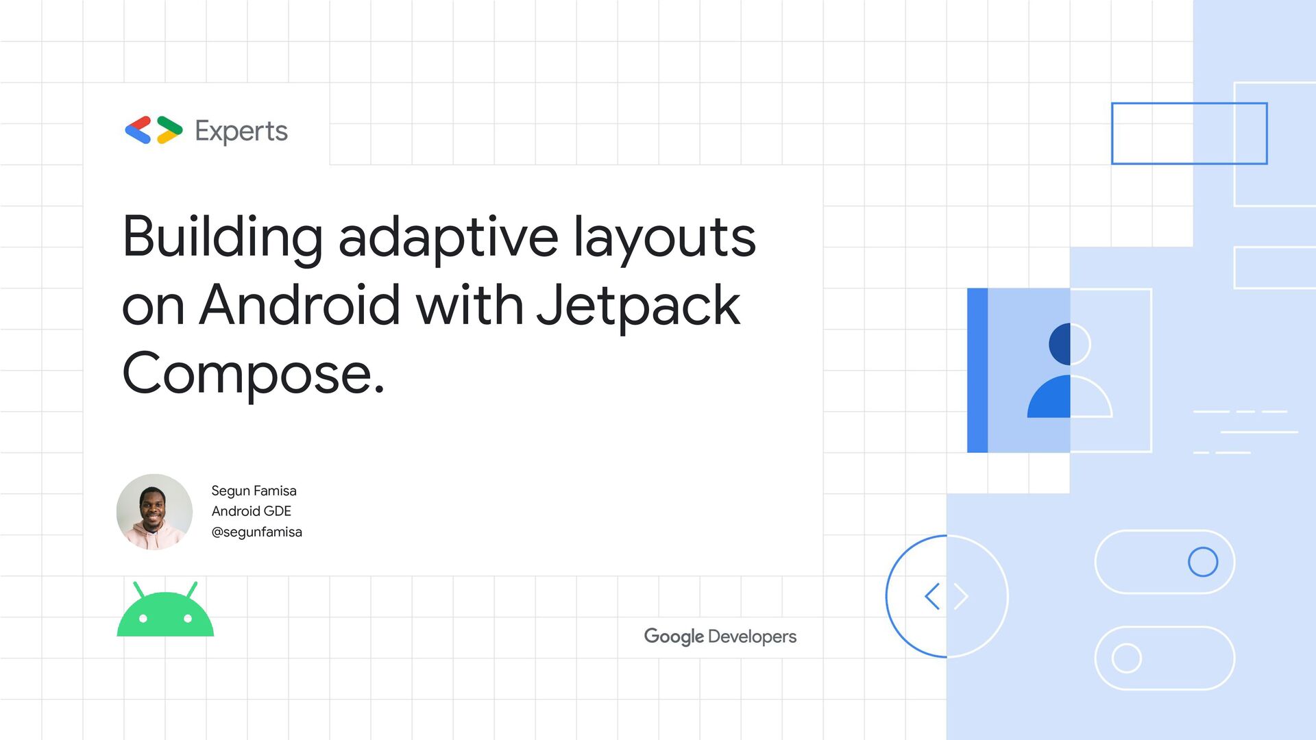
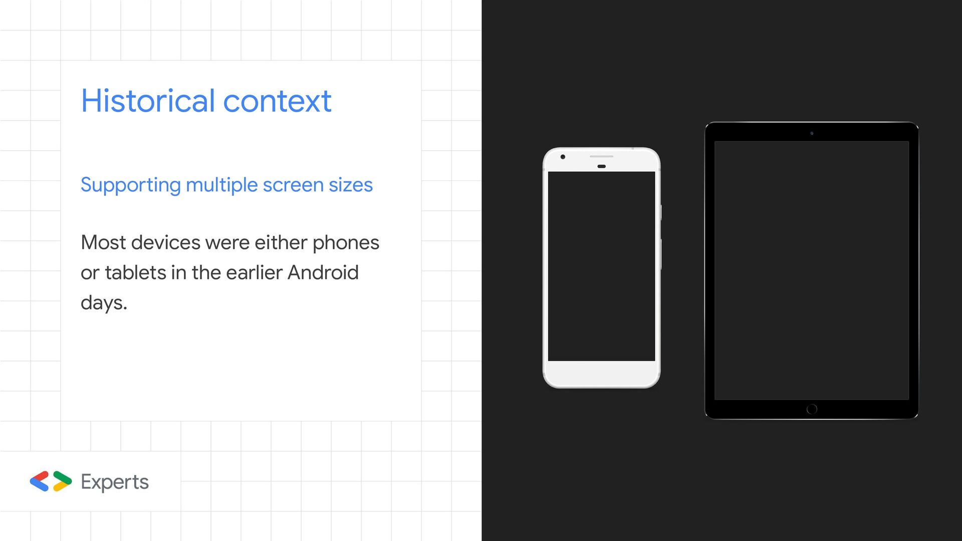
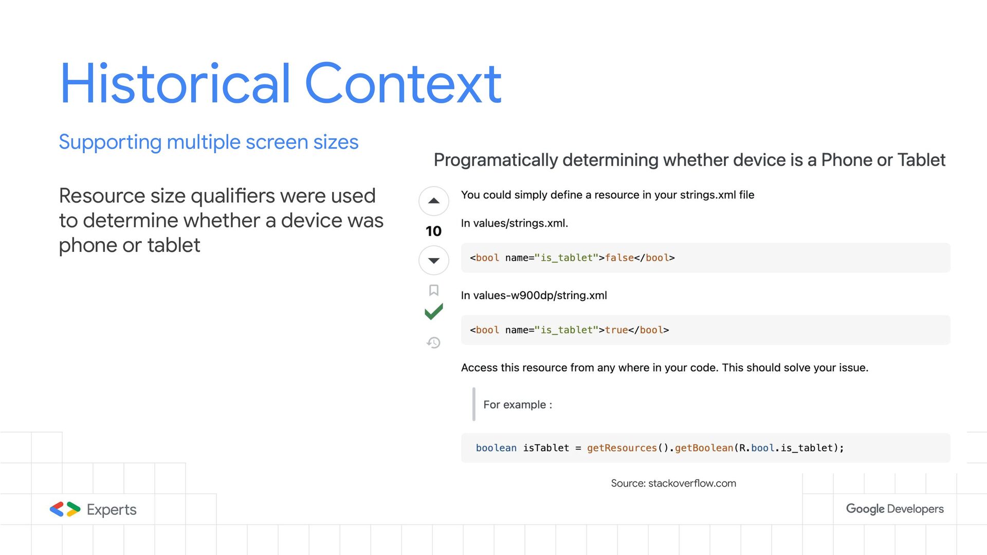
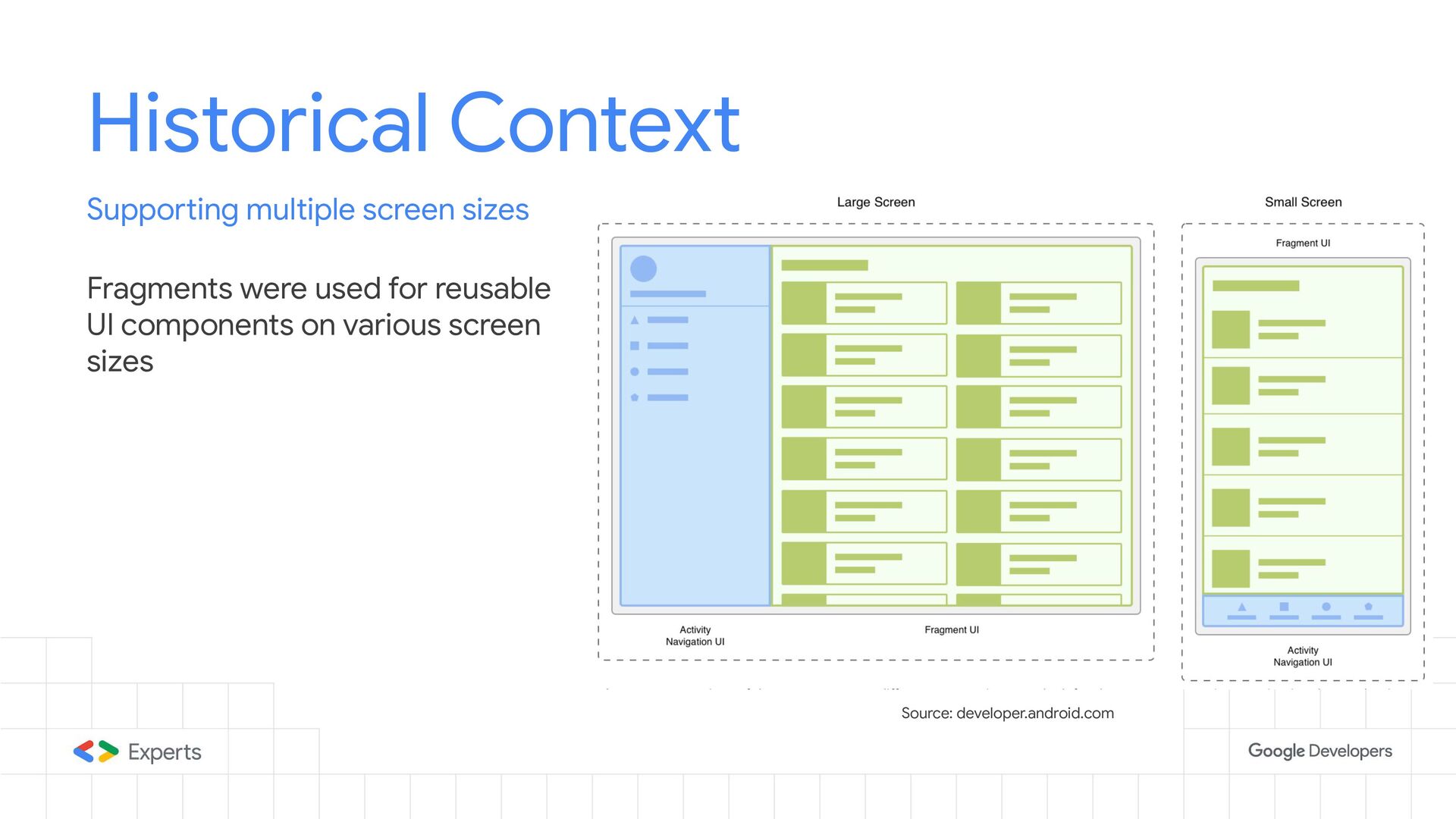
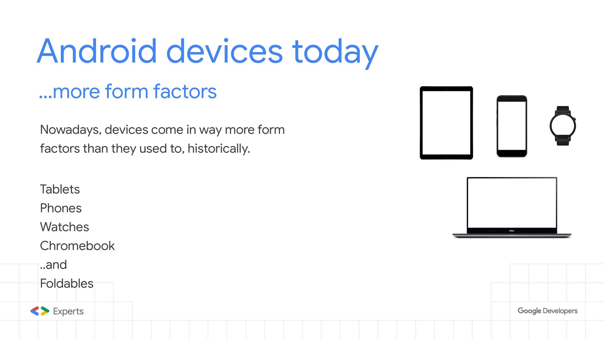
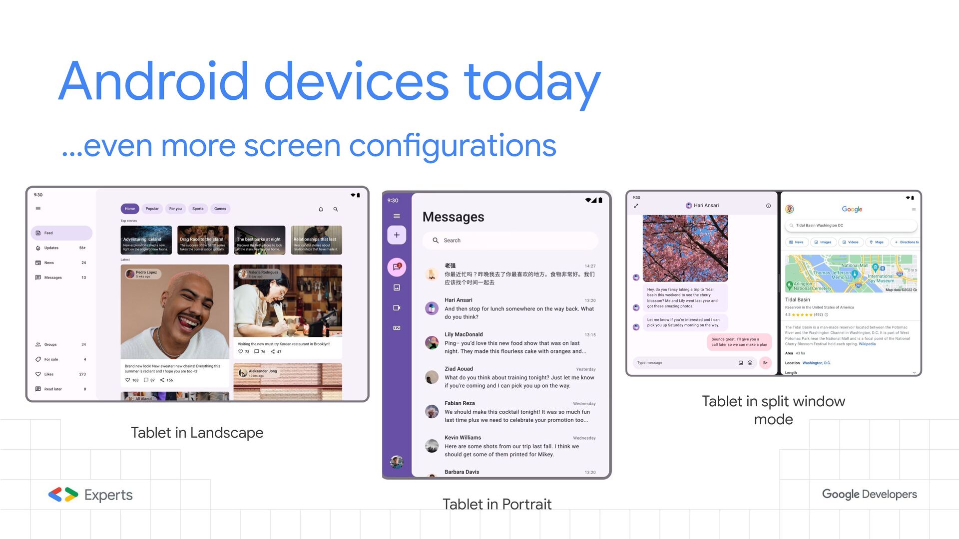
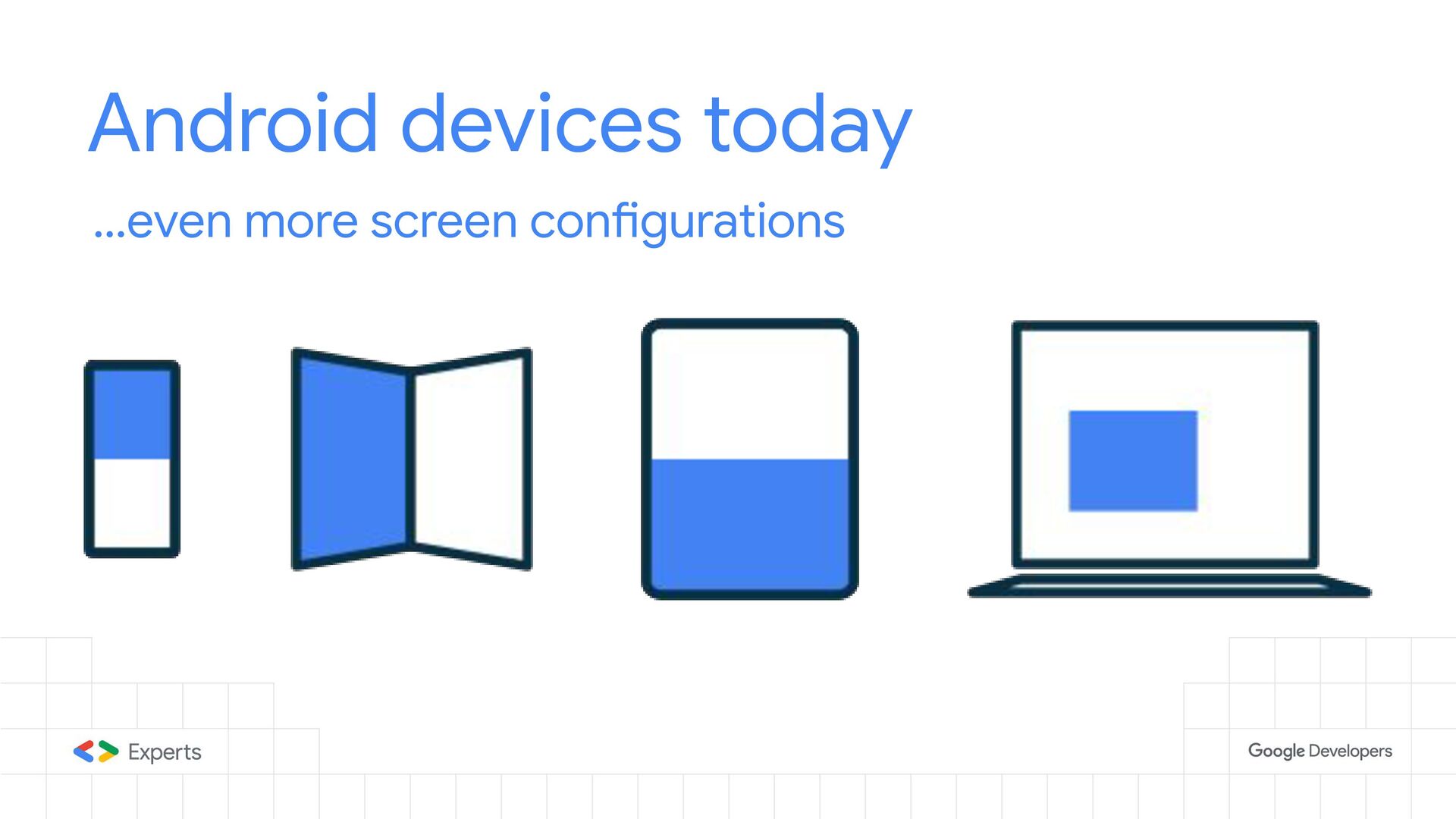
The Android development world has changed, and devices no longer fit into specific buckets like they used to - where mobile devices were phones or tablets. It is now possible for the same device to look like both, especially with the onset of foldable devices. We now have many other form factors like watches, TVs, and even car entertainment systems supporting Android. Now is the time to build smarter and increase productivity.

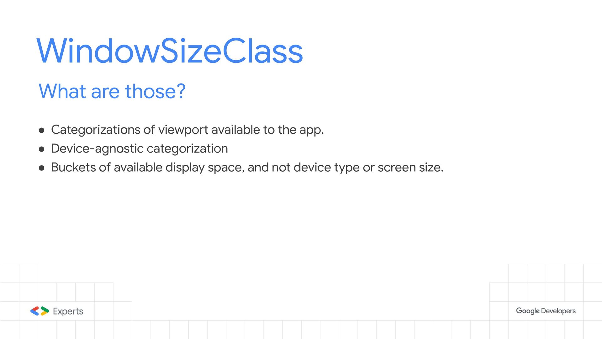
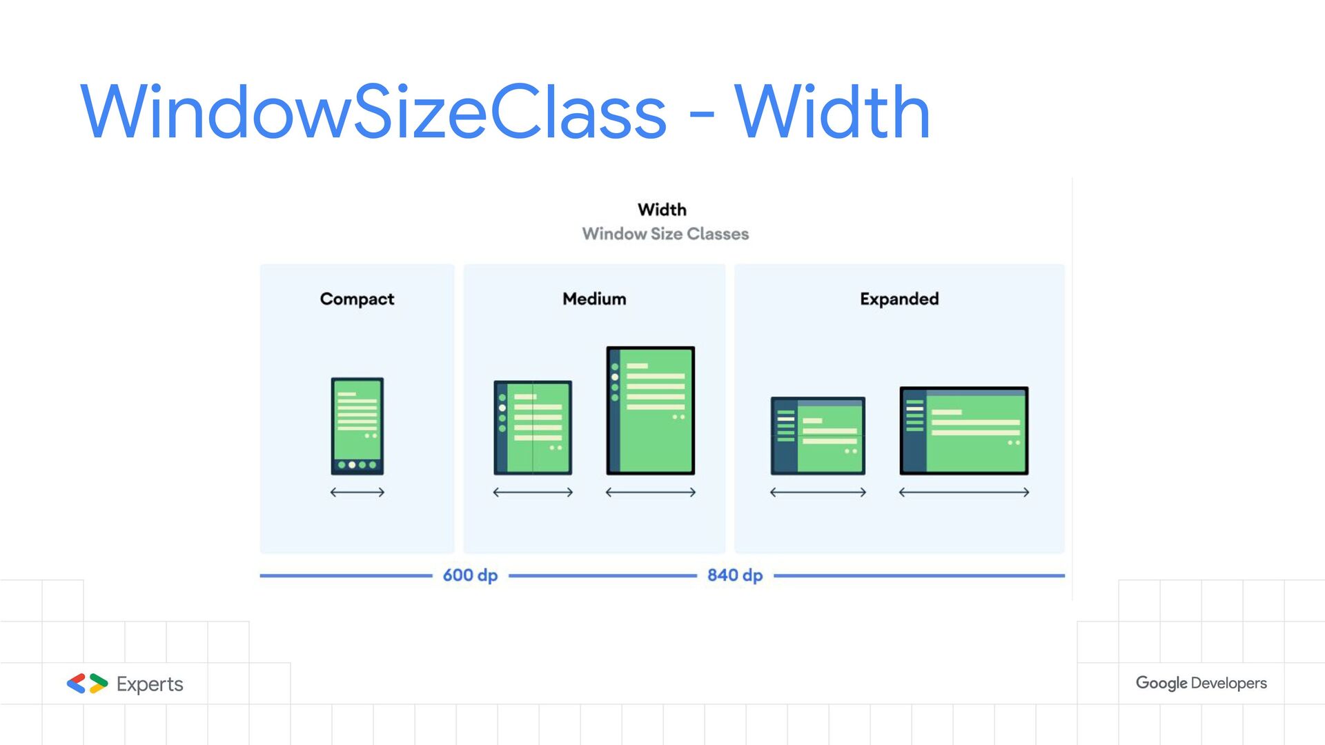
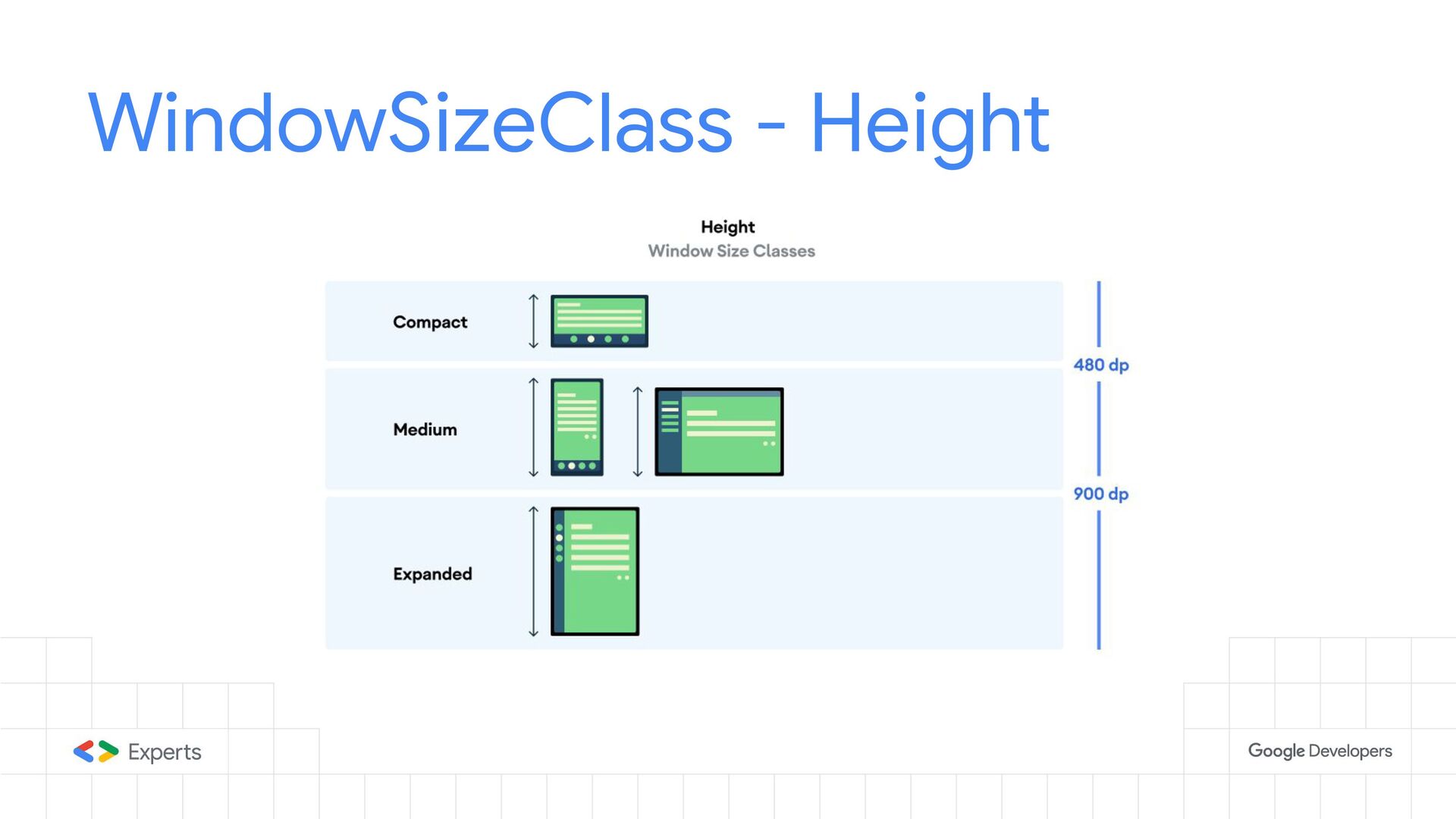
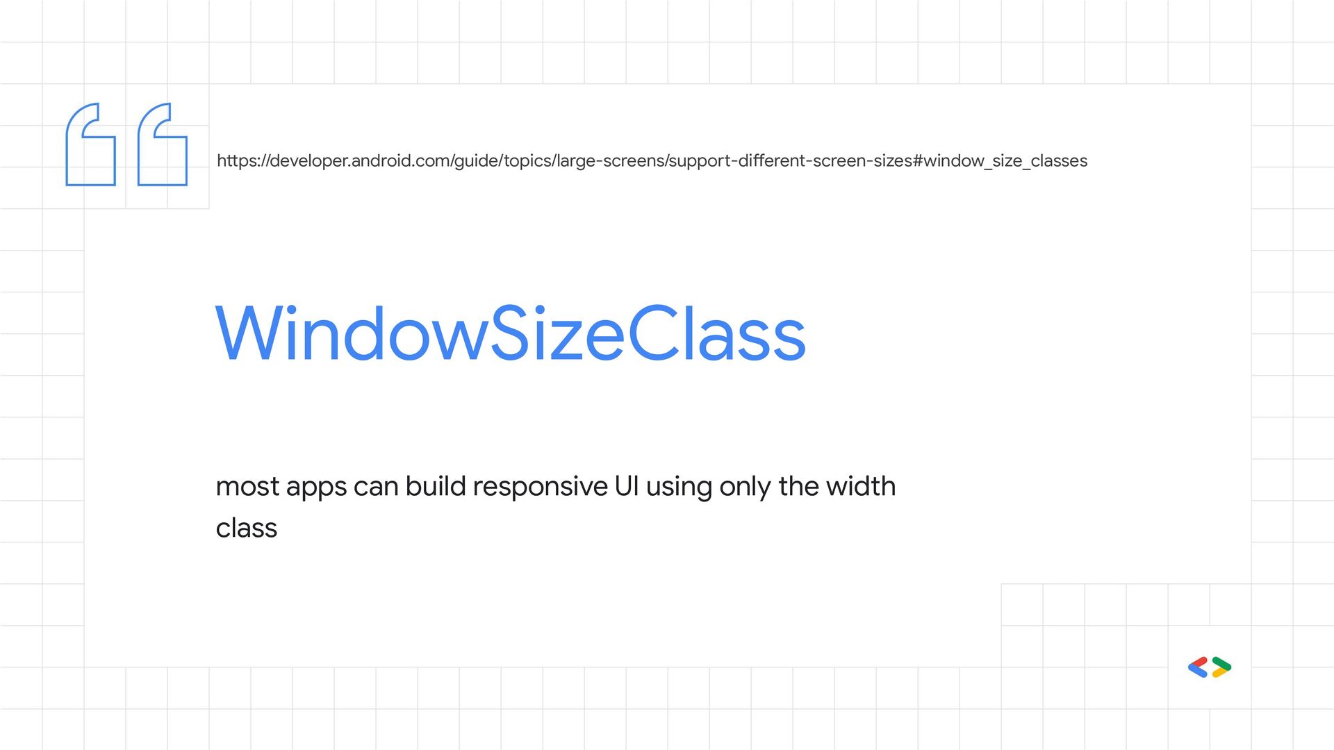
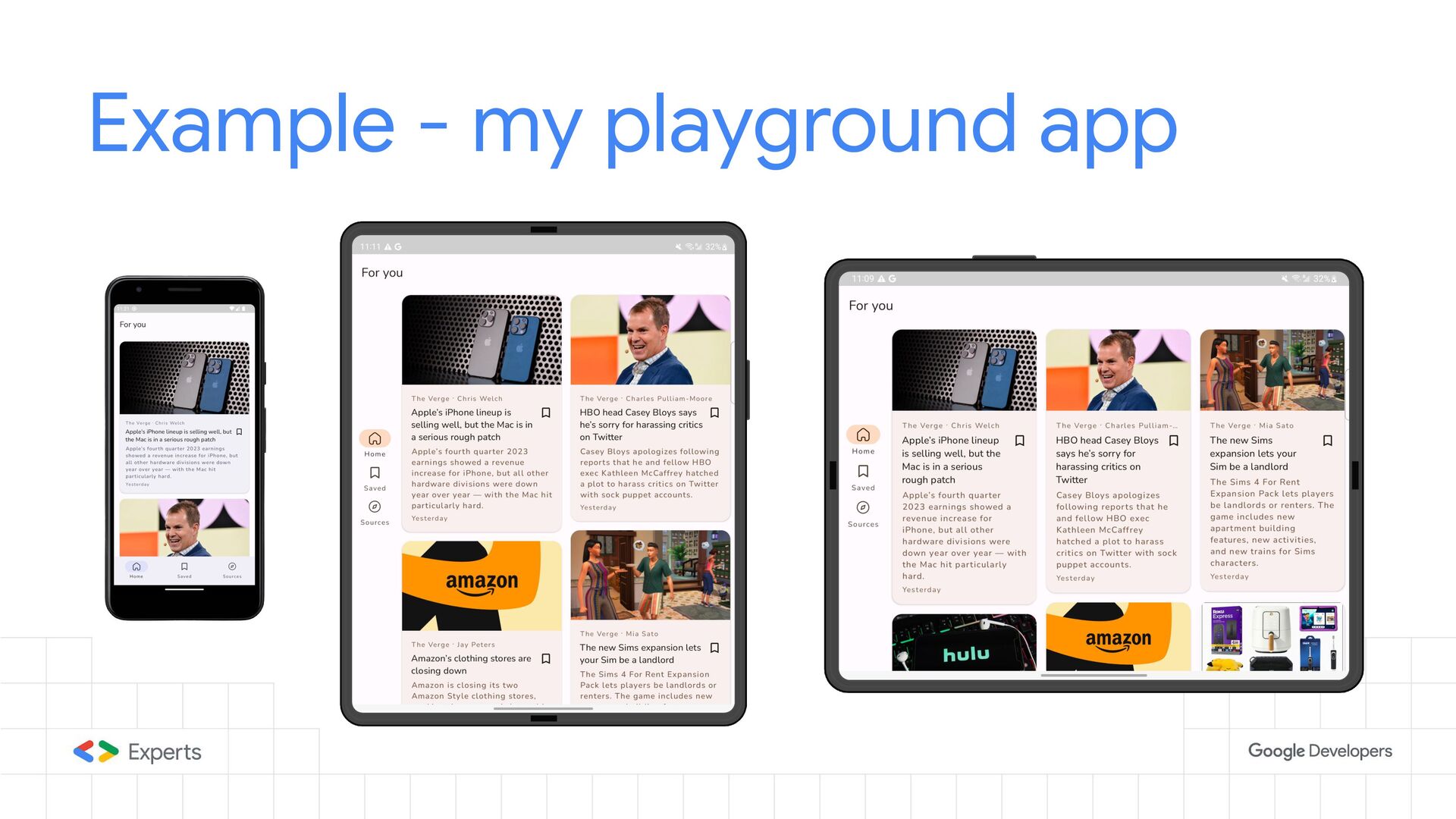
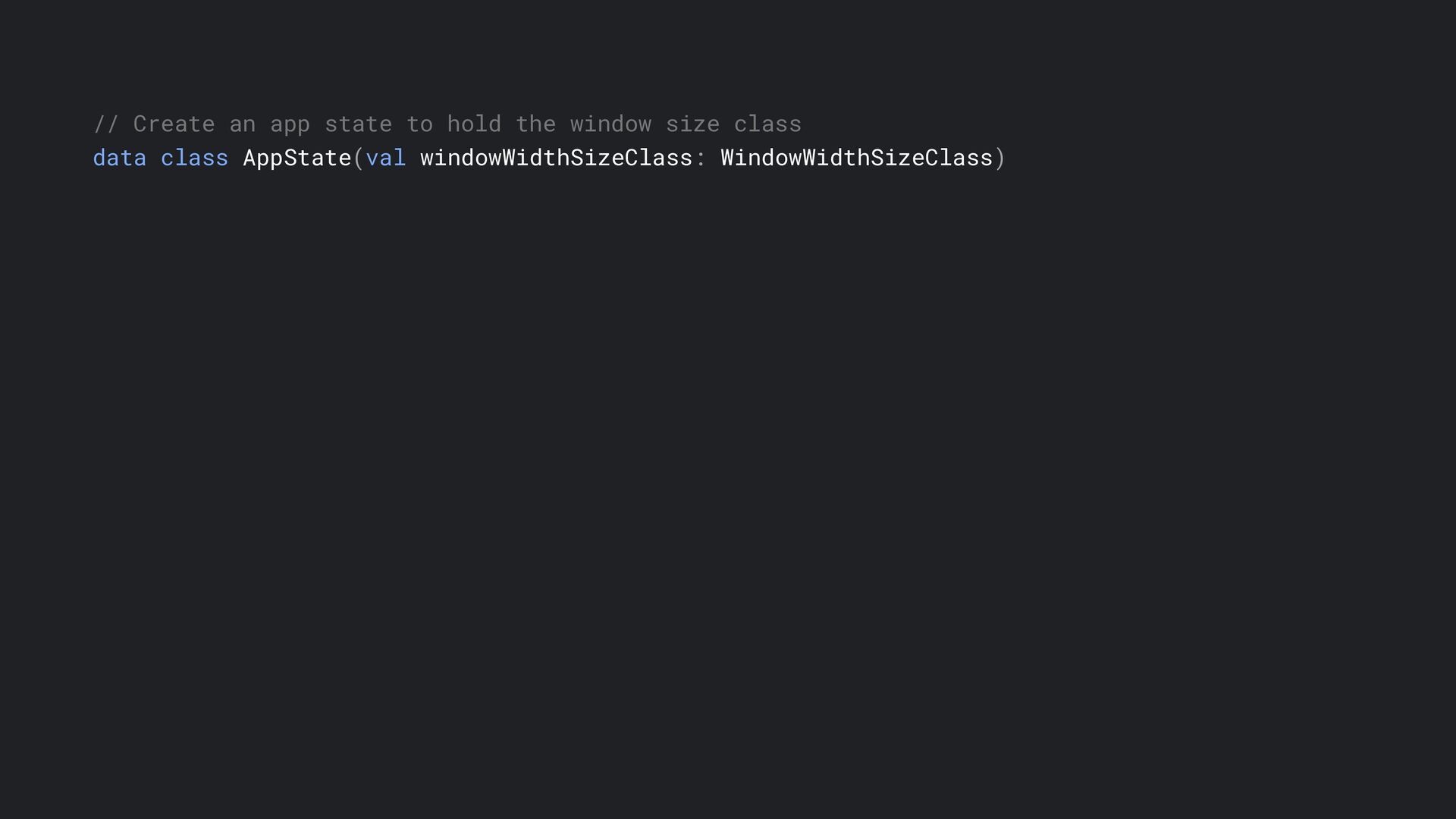
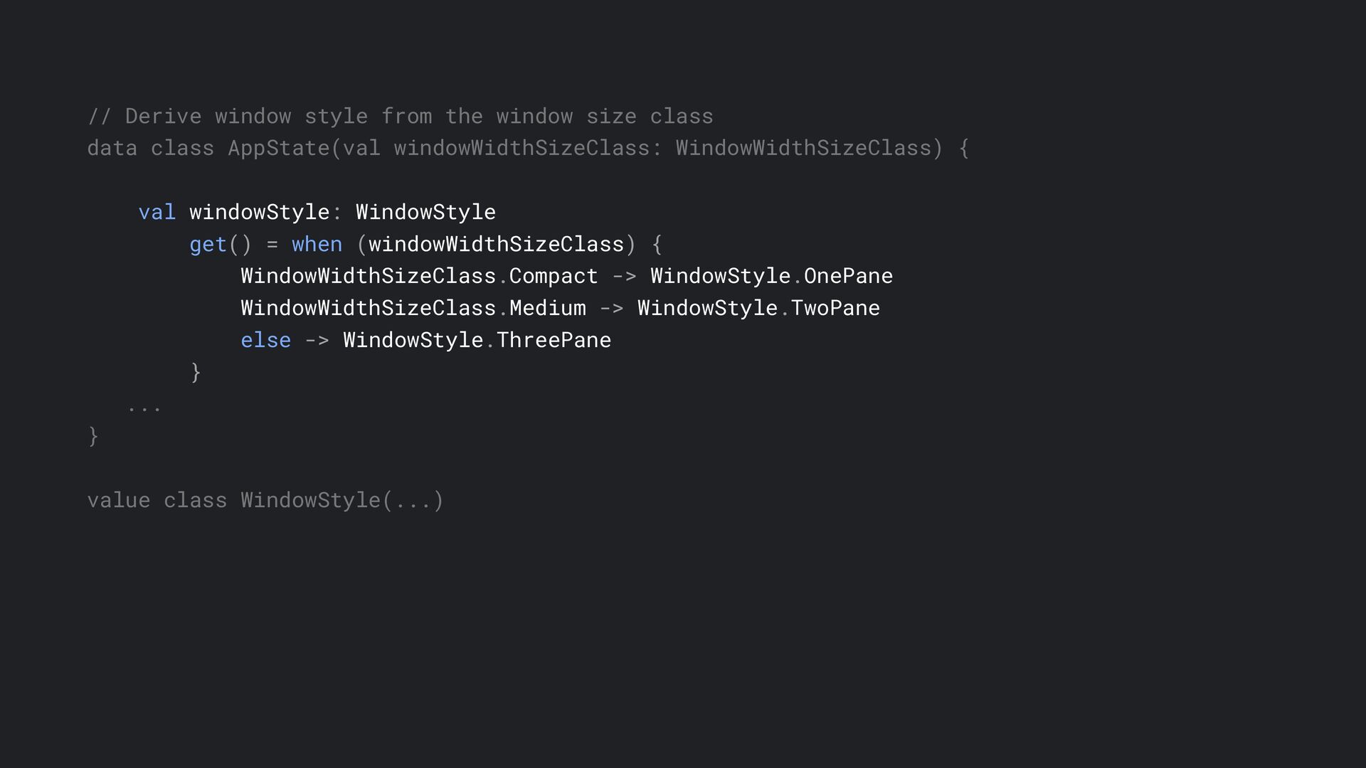
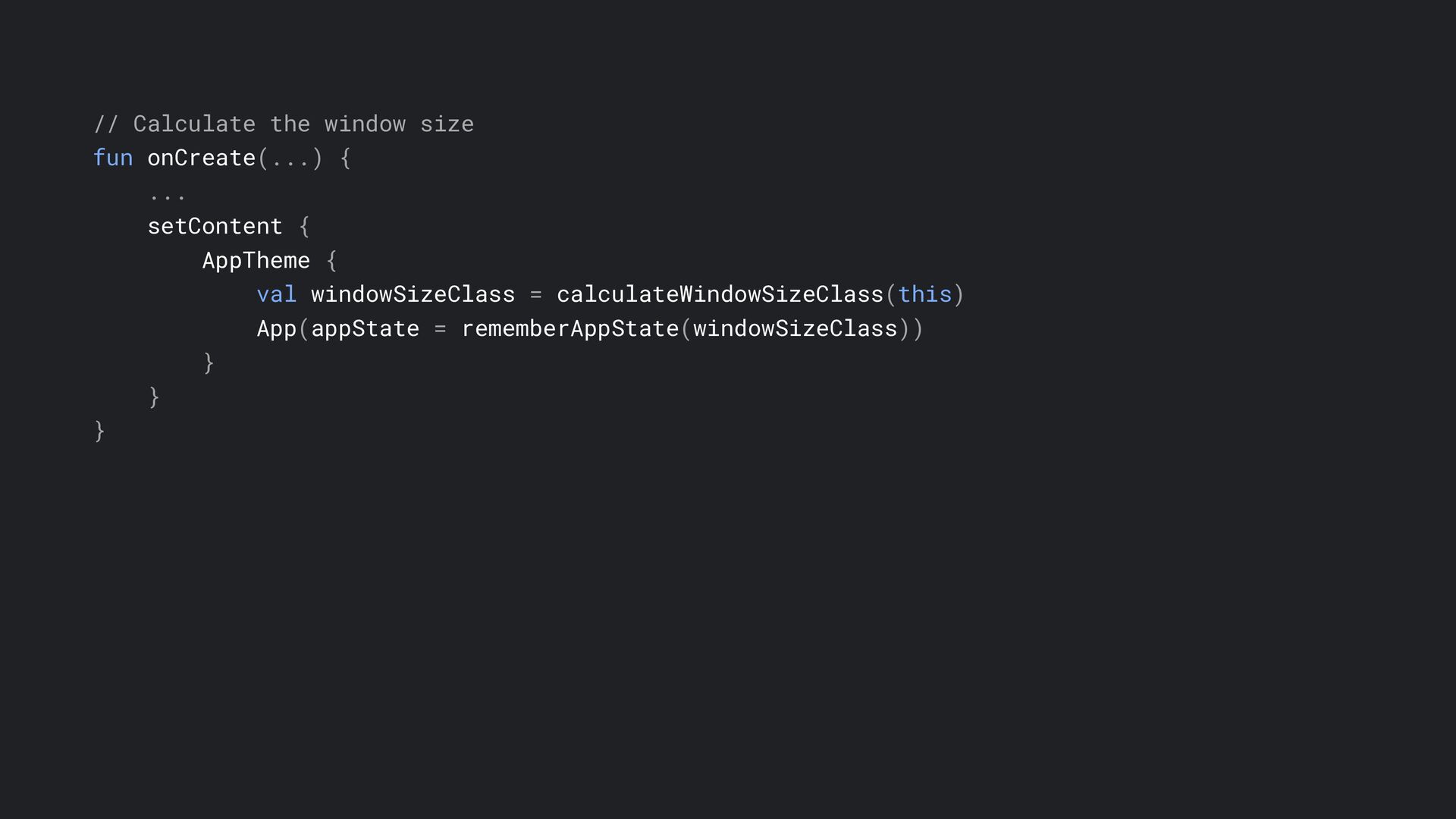
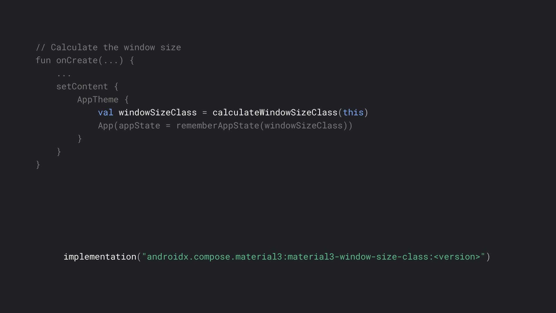
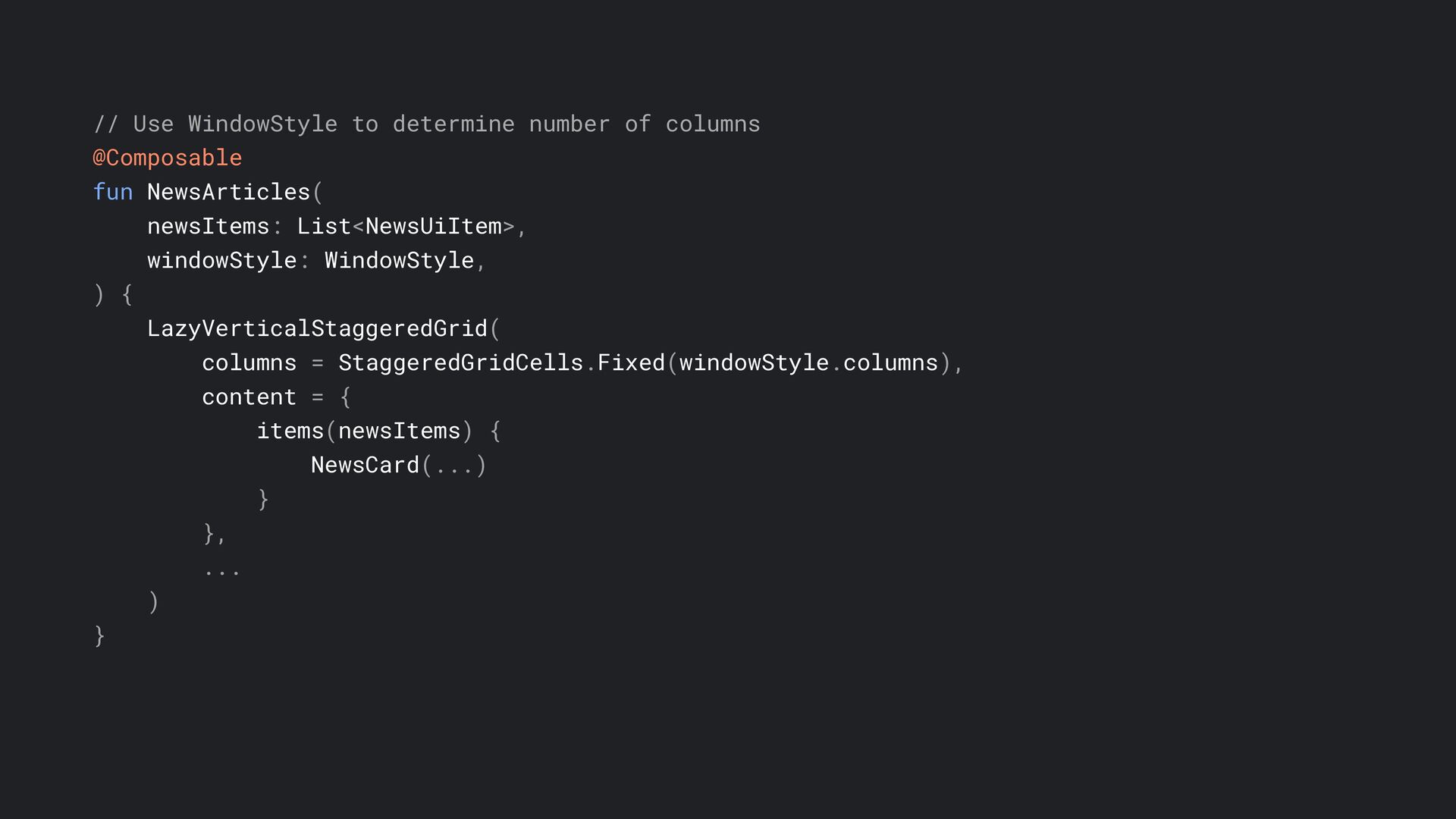
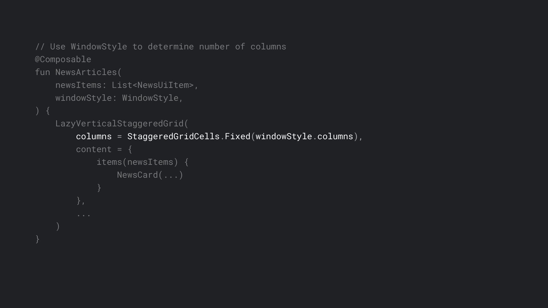
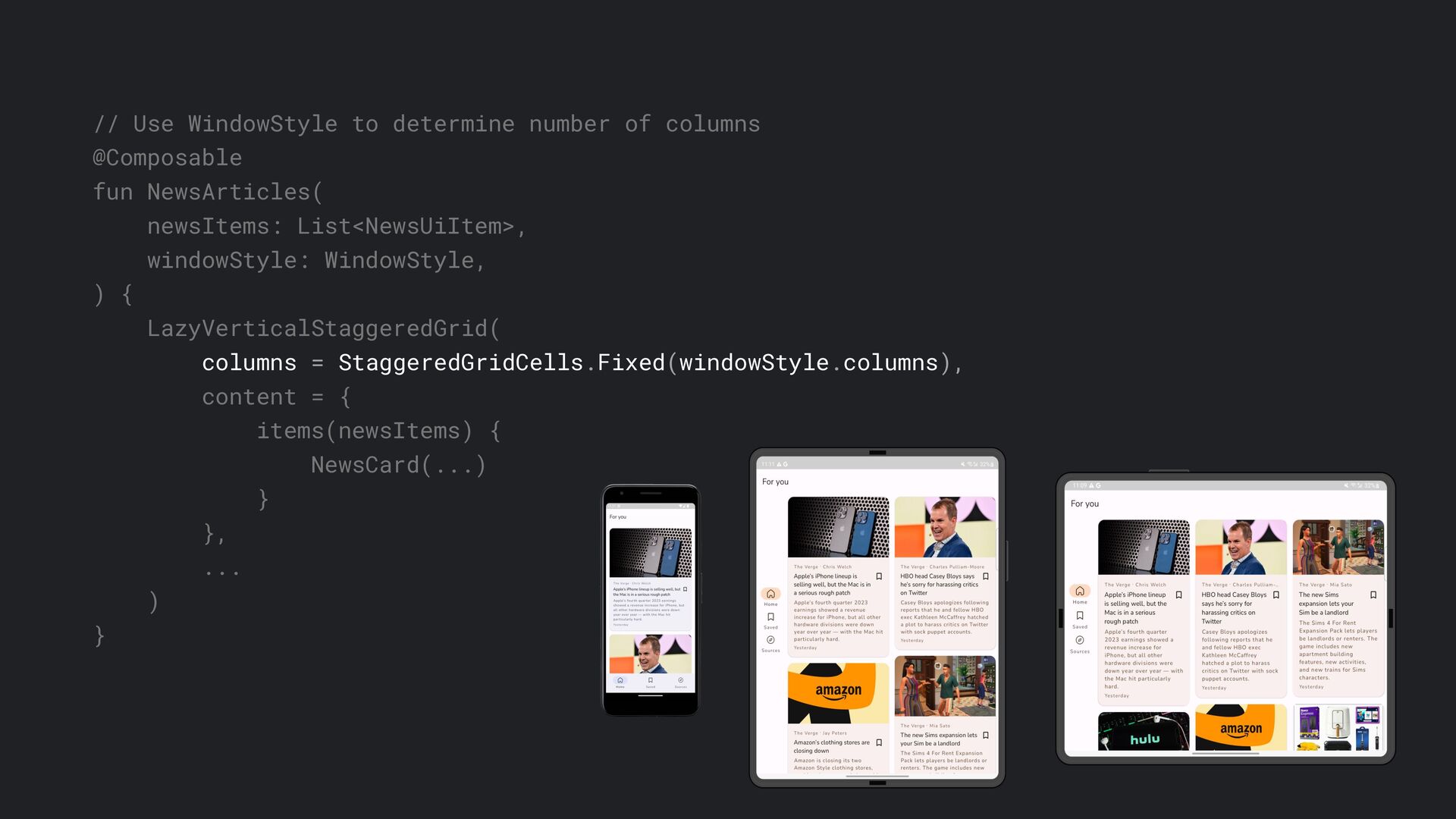
In this talk, we will go through how to support multiple form factors using powerful APIs introduced by Google. APIs like window size class and Jetpack Compose. We will examine how Jetpack Compose simplifies building adaptive layouts that improve user experience across Android devices.
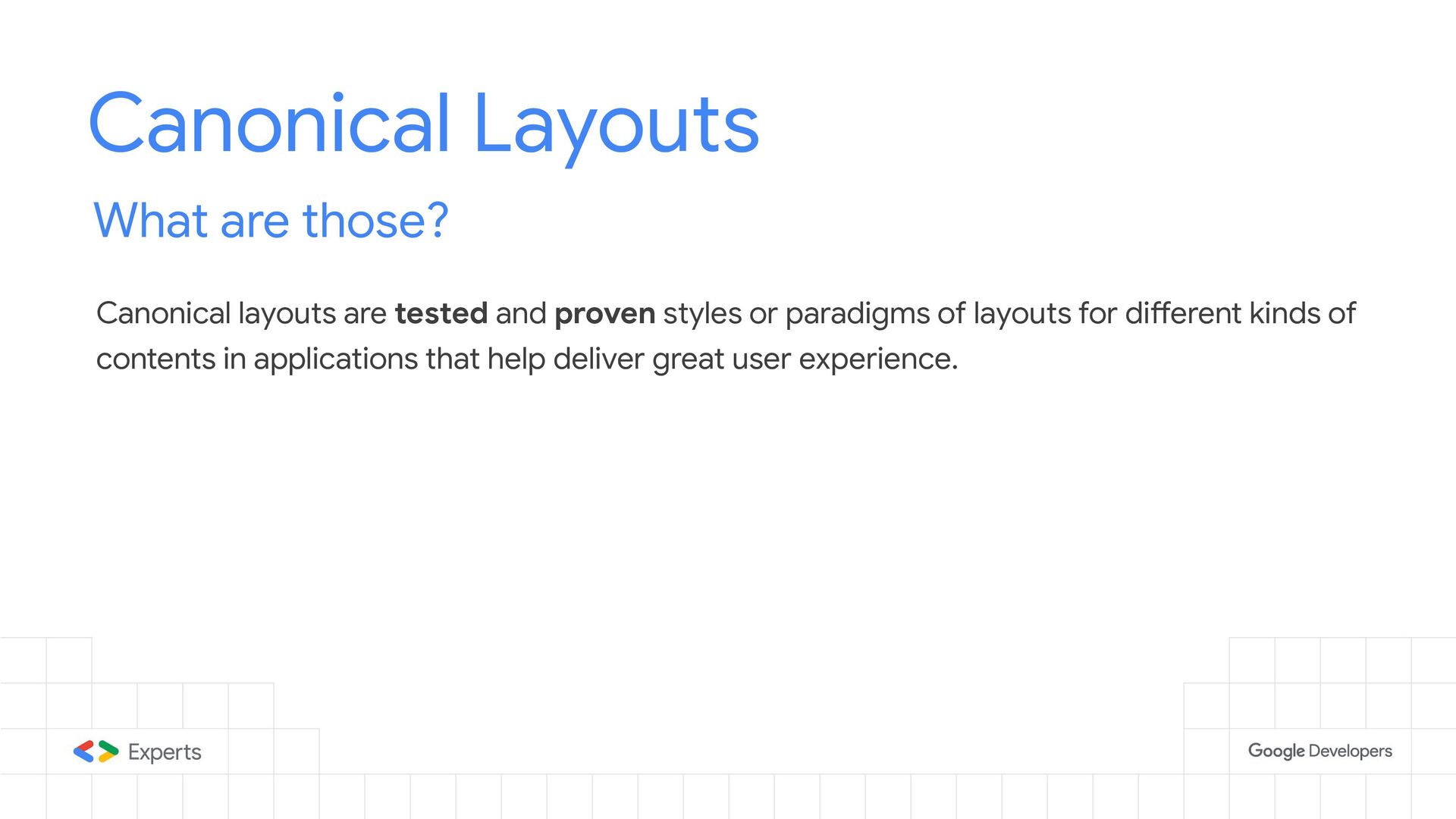
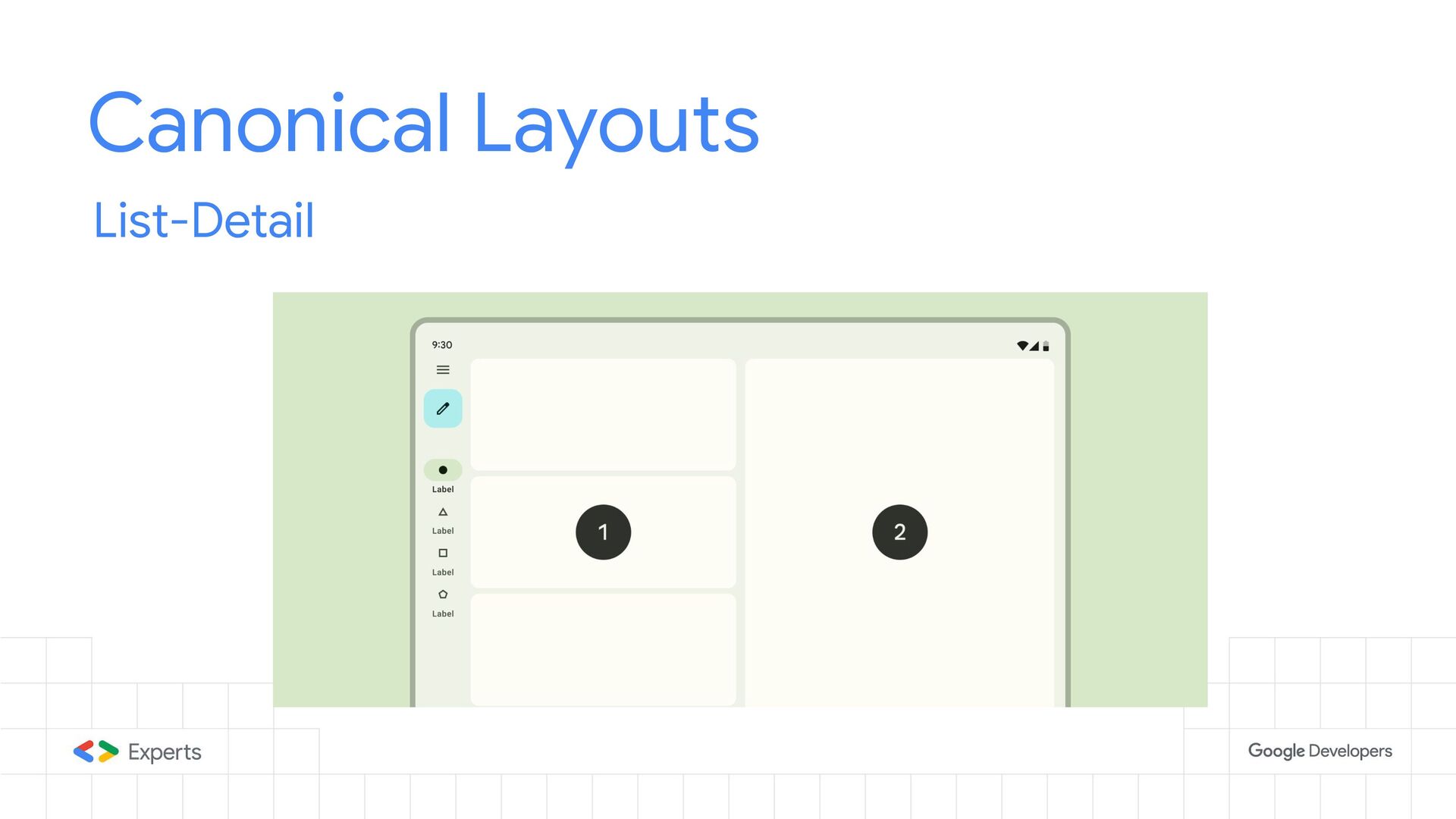
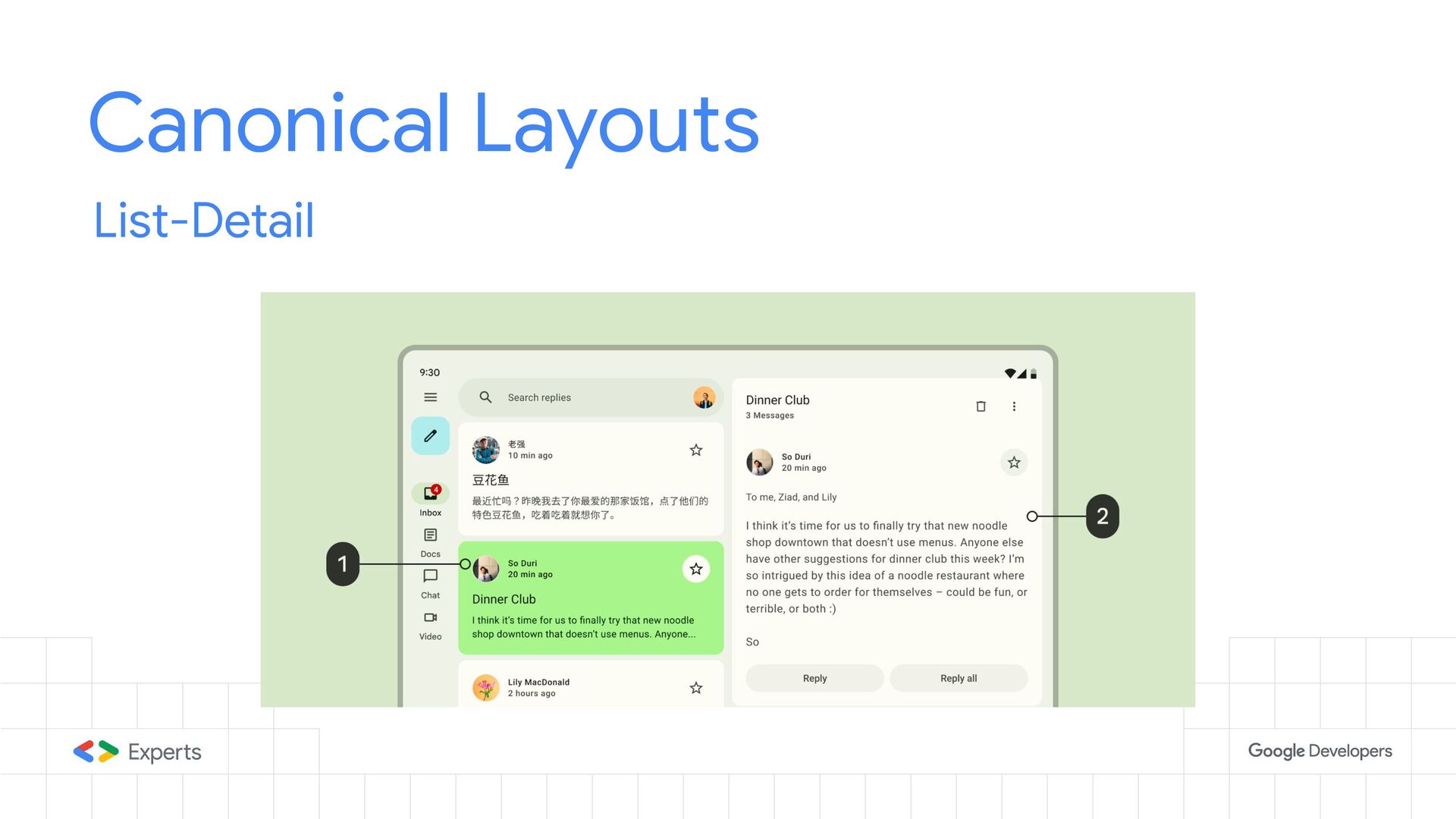
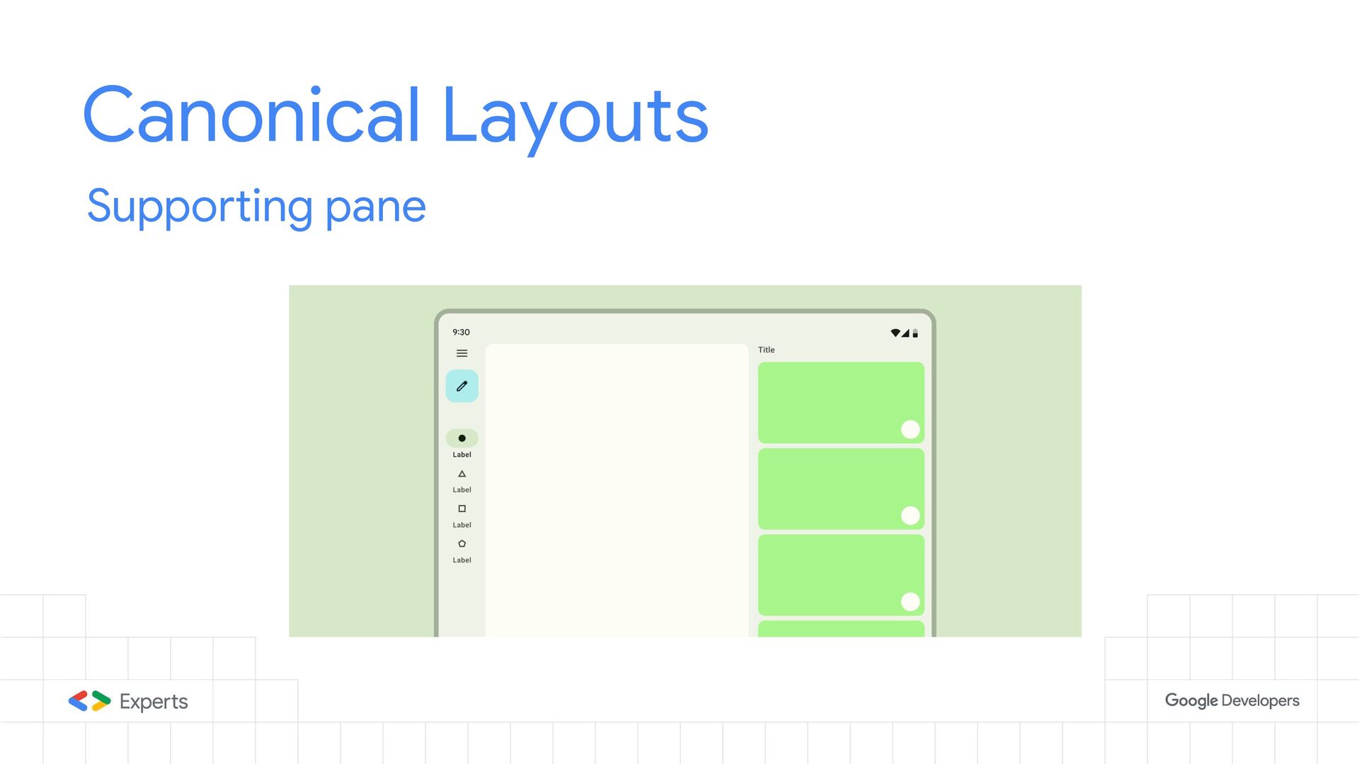
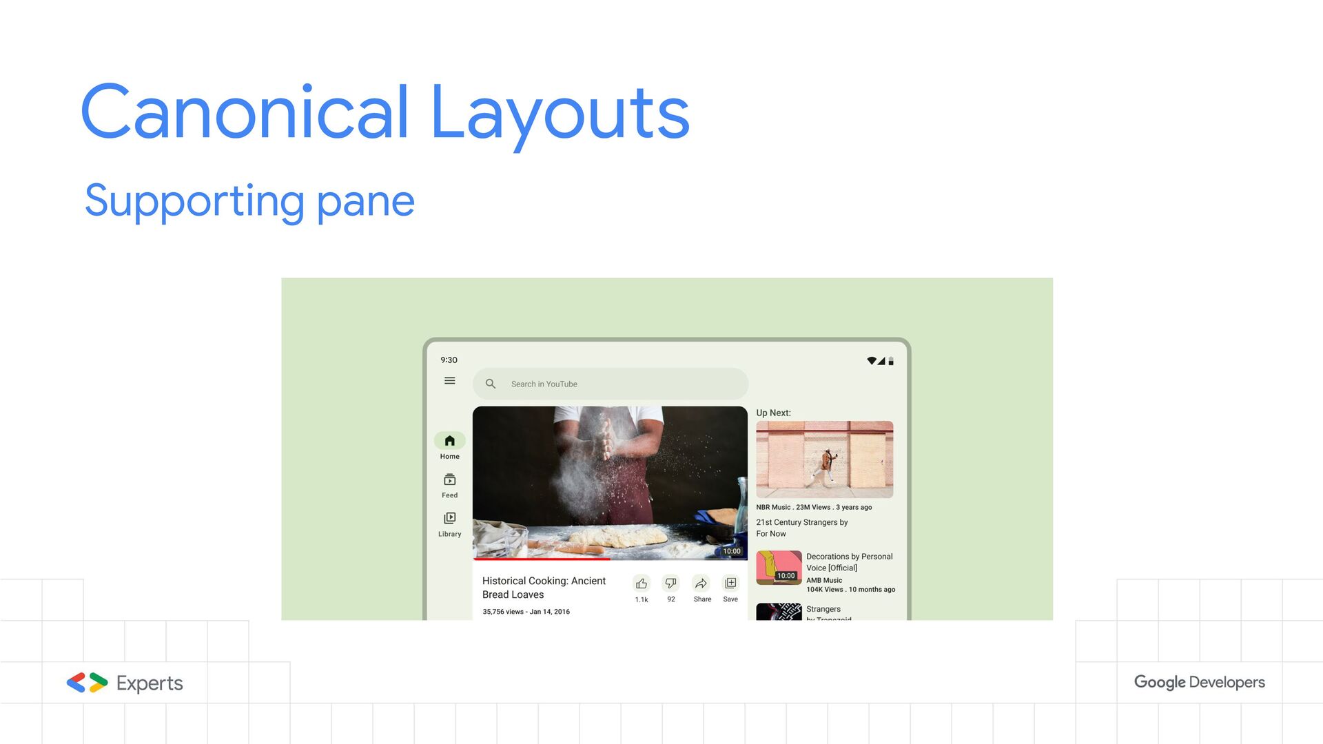
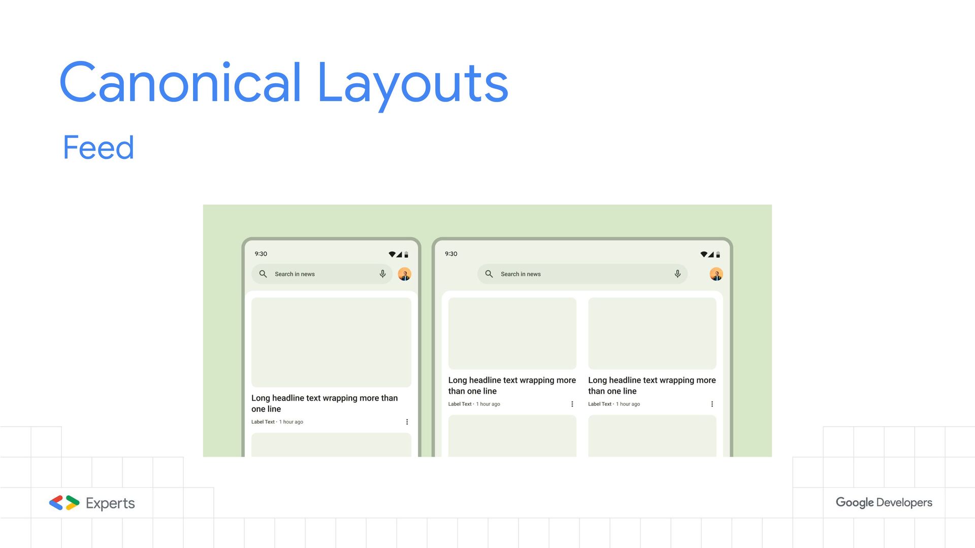
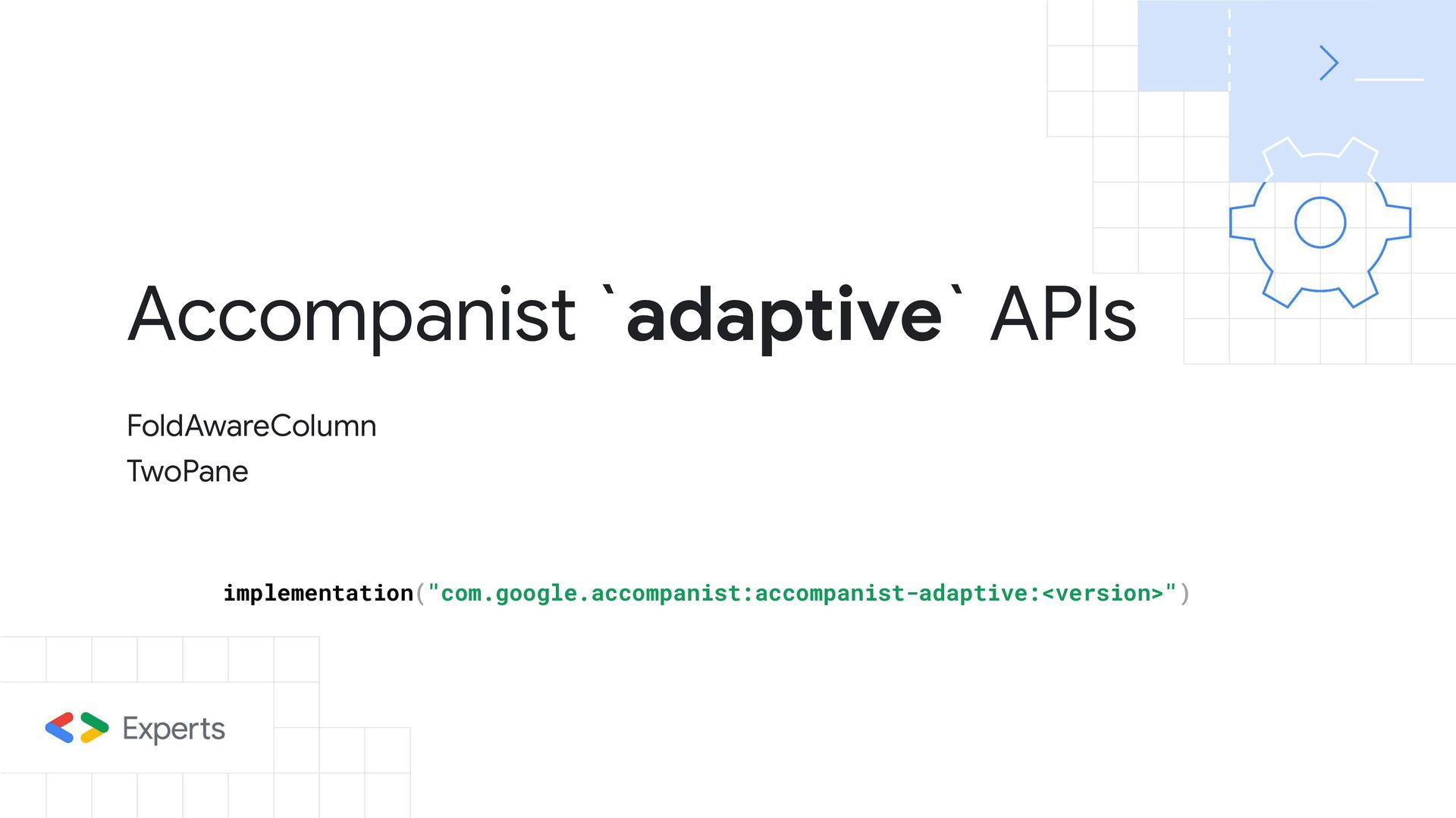
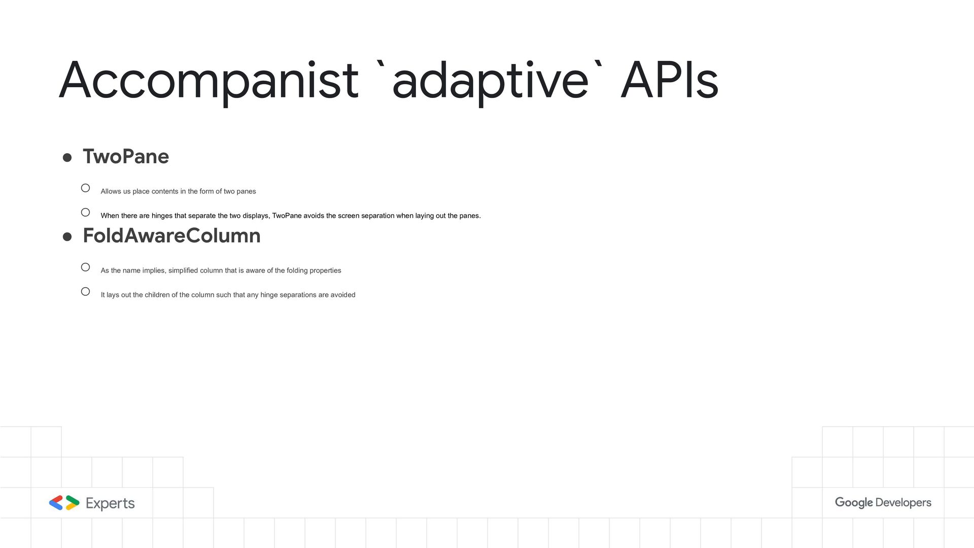
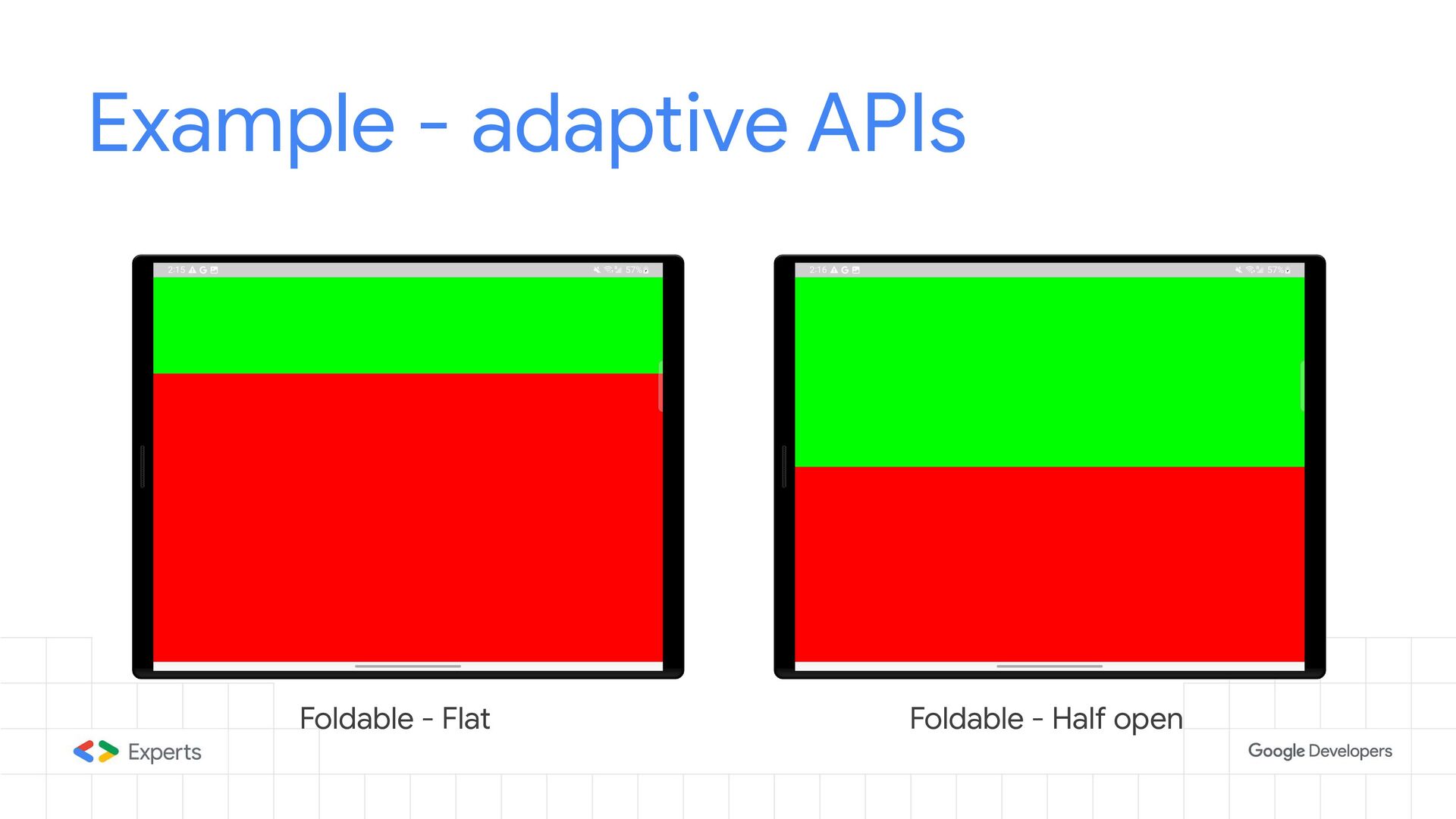
From tablets to foldable devices to TVs, we will also talk about canonical patterns for supporting adaptive layouts and examples from the Accompanyist library that we can use to achieve them.

At the end of the talk, you will learn practical steps you can take to support adaptive layouts in your app and ultimately deliver a top-class experience for your users.

Links used in the presentation:

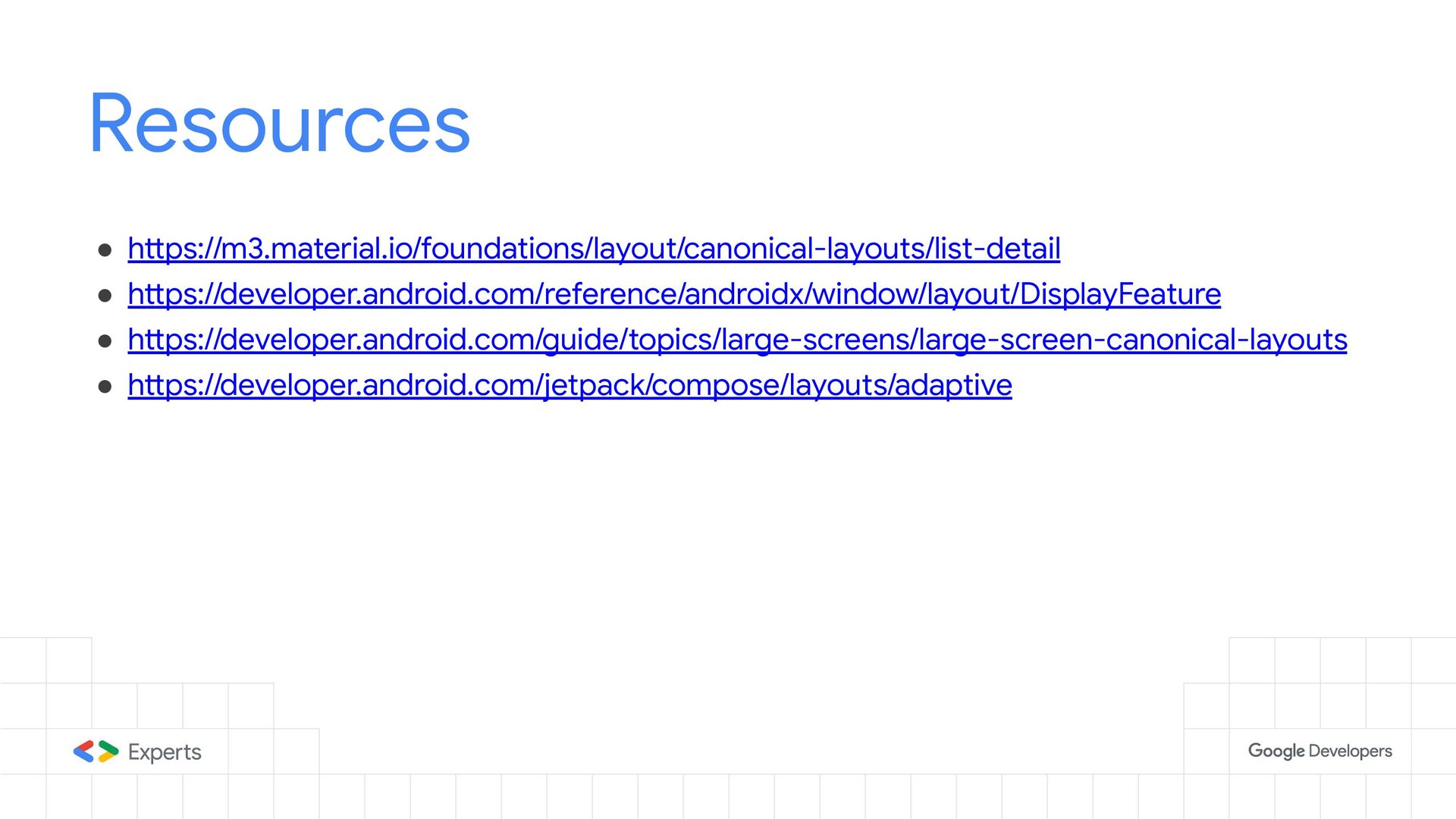
1. https://m3.material.io/foundations/layout/canonical-layouts/list-detail
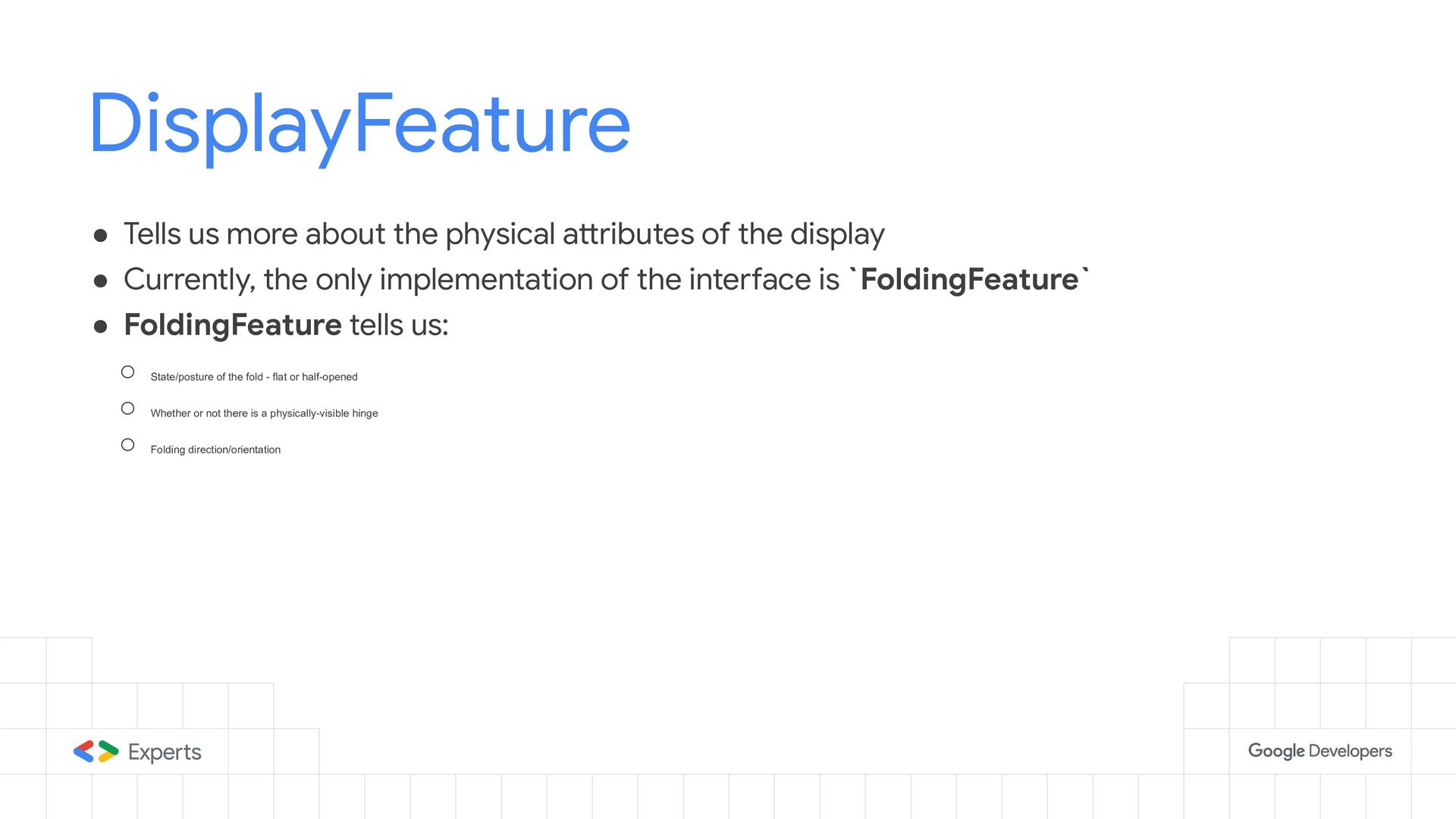
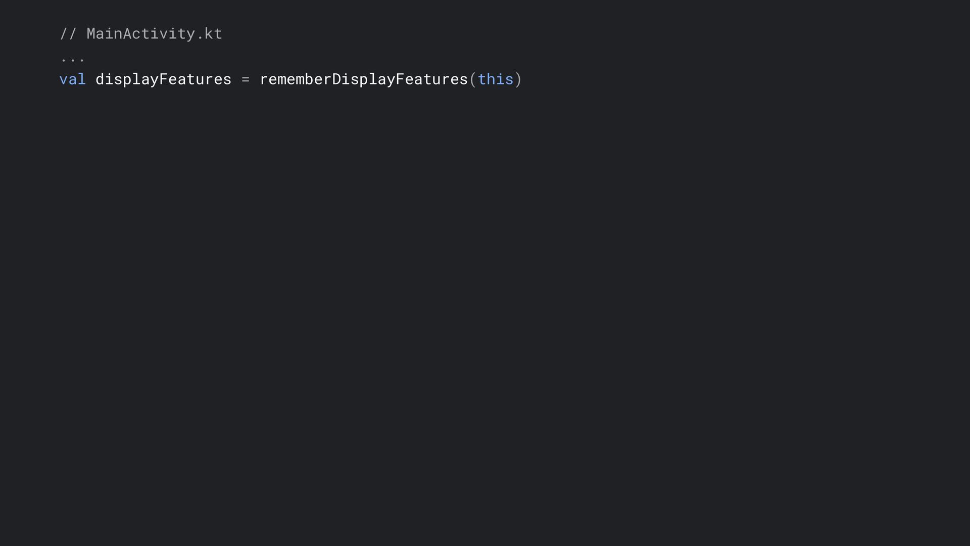
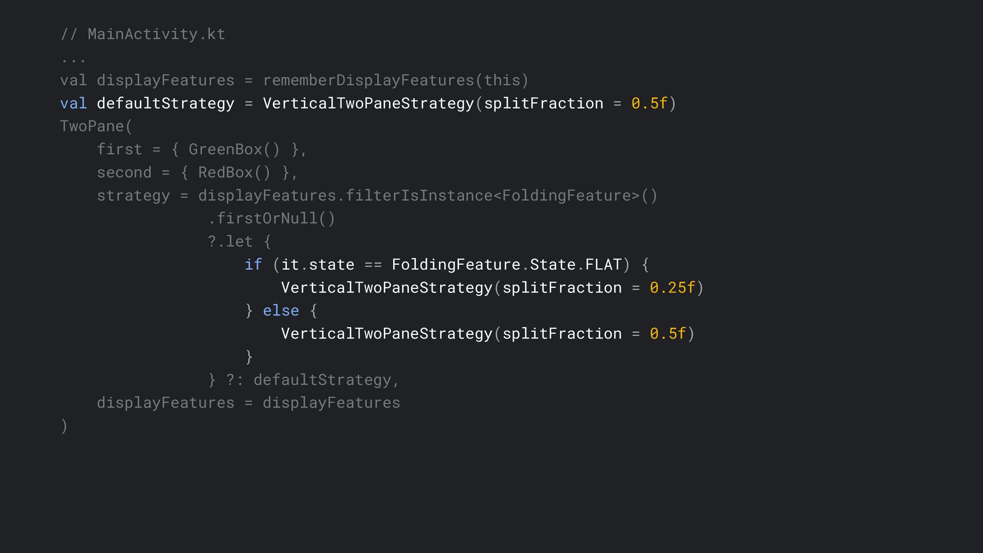
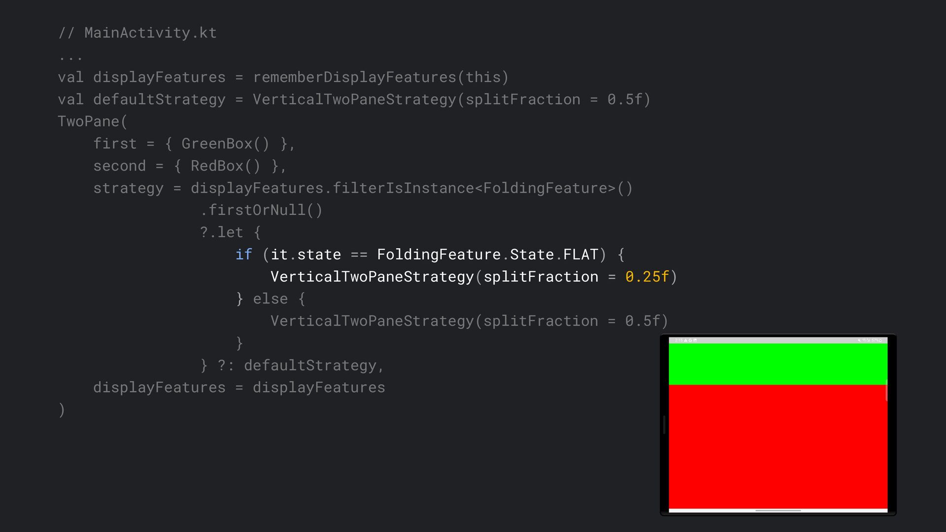
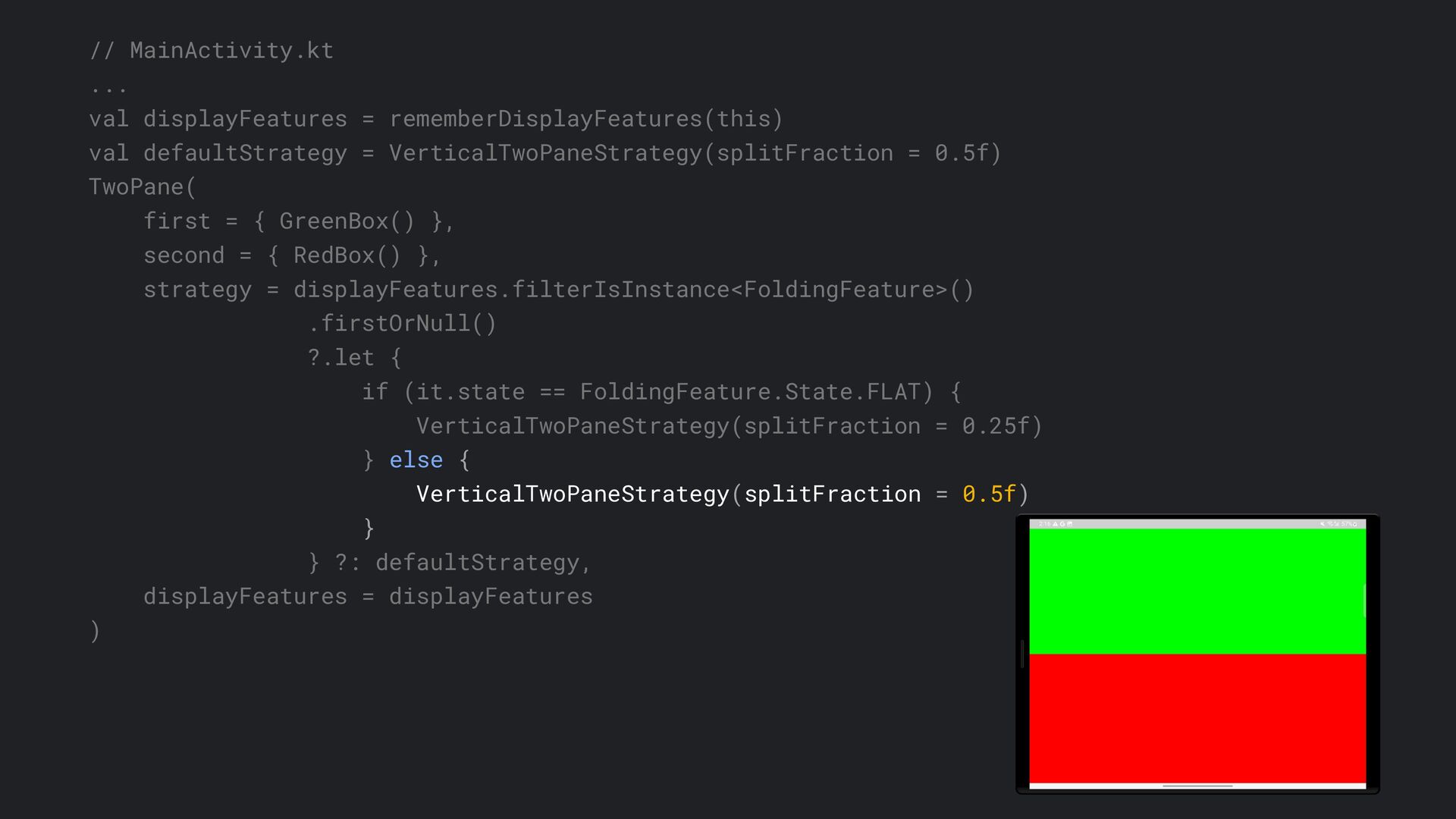
2. https://developer.android.com/reference/androidx/window/layout/DisplayFeature
3. https://developer.android.com/guide/topics/large-screens/large-screen-canonical-layouts
4. https://developer.android.com/jetpack/compose/layouts/adaptive
5. https://android-developers.googleblog.com/2023/05/optimizing-your-android-app-for-large-screens.html
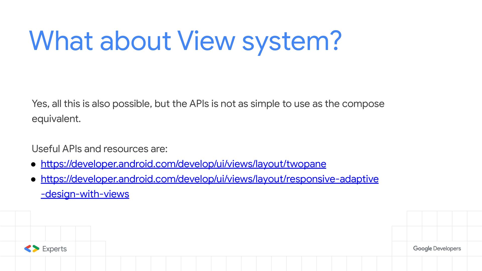
6. https://developer.android.com/develop/ui/views/layout/twopane
7. https://developer.android.com/develop/ui/views/layout/responsive-adaptive-design-with-views
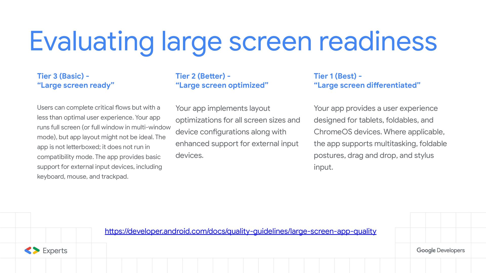
8. https://developer.android.com/docs/quality-guidelines/large-screen-app-quality

Segun Famisa

November 04, 2023
Tweet

More Decks by Segun Famisa

Other Decks in Programming

Transcript

  1. Introduction • Historical context of Android form factors • Current

    state of Android form factors • Adaptive layouts • Canonical examples • How to implement
  2. Supporting multiple screen sizes Most devices were either phones or

    tablets in the earlier Android days. Historical context
  3. Historical Context Resource size qualifiers were used to determine whether

    a device was phone or tablet Source: stackoverflow.com Supporting multiple screen sizes
  4. Historical Context Fragments were used for reusable UI components on

    various screen sizes Source: developer.android.com Supporting multiple screen sizes
  5. Android devices today …more form factors Nowadays, devices come in

    way more form factors than they used to, historically. Tablets Phones Watches Chromebook ..and Foldables
  6. …even more screen configurations Tablet in Landscape Tablet in Portrait

    Tablet in split window mode Android devices today
  7. Large screens What are those? Same device can be run

    in different modes with different screen configurations. Devices no longer fall into specific buckets based on form factor. Many app designs leave out other configs that are not portrait phone, leaving out all the other possible configurations. So we just call them “large screen” devices.
  8. Canonical Layouts What are those? Canonical layouts are tested and

    proven styles or paradigms of layouts for different kinds of contents in applications that help deliver great user experience.
  9. WindowSizeClass What are those? • Categorizations of viewport available to

    the app. • Device-agnostic categorization • Buckets of available display space, and not device type or screen size.
  10. most apps can build responsive UI using only the width

    class WindowSizeClass https://developer.android.com/guide/topics/large-screens/support-different-screen-sizes#window_size_classes
  11. // Create an app state to hold the window size

    class data class AppState(val windowWidthSizeClass: WindowWidthSizeClass)
  12. // Derive window style from the window size class data

    class AppState(val windowWidthSizeClass: WindowWidthSizeClass) { val windowStyle: WindowStyle get() = when (windowWidthSizeClass) { WindowWidthSizeClass.Compact -> WindowStyle.OnePane WindowWidthSizeClass.Medium -> WindowStyle.TwoPane else -> WindowStyle.ThreePane } ... } value class WindowStyle(...)
  13. // Calculate the window size fun onCreate(...) { ... setContent

    { AppTheme { val windowSizeClass = calculateWindowSizeClass(this) App(appState = rememberAppState(windowSizeClass)) } } }
  14. // Calculate the window size fun onCreate(...) { ... setContent

    { AppTheme { val windowSizeClass = calculateWindowSizeClass(this) App(appState = rememberAppState(windowSizeClass)) } } } implementation("androidx.compose.material3:material3-window-size-class:<version>")
  15. // Use WindowStyle to determine number of columns @Composable fun

    NewsArticles( newsItems: List<NewsUiItem>, windowStyle: WindowStyle, ) { LazyVerticalStaggeredGrid( columns = StaggeredGridCells.Fixed(windowStyle.columns), content = { items(newsItems) { NewsCard(...) } }, ... ) }
  16. // Use WindowStyle to determine number of columns @Composable fun

    NewsArticles( newsItems: List<NewsUiItem>, windowStyle: WindowStyle, ) { LazyVerticalStaggeredGrid( columns = StaggeredGridCells.Fixed(windowStyle.columns), content = { items(newsItems) { NewsCard(...) } }, ... ) }
  17. // Use WindowStyle to determine number of columns @Composable fun

    NewsArticles( newsItems: List<NewsUiItem>, windowStyle: WindowStyle, ) { LazyVerticalStaggeredGrid( columns = StaggeredGridCells.Fixed(windowStyle.columns), content = { items(newsItems) { NewsCard(...) } }, ... ) }
  18. DisplayFeature • Tells us more about the physical attributes of

    the display • Currently, the only implementation of the interface is `FoldingFeature` • FoldingFeature tells us: ◦ State/posture of the fold - flat or half-opened ◦ Whether or not there is a physically-visible hinge ◦ Folding direction/orientation
  19. Accompanist `adaptive` APIs • TwoPane ◦ Allows us place contents

    in the form of two panes ◦ When there are hinges that separate the two displays, TwoPane avoids the screen separation when laying out the panes. • FoldAwareColumn ◦ As the name implies, simplified column that is aware of the folding properties ◦ It lays out the children of the column such that any hinge separations are avoided
  20. // MainActivity.kt ... val displayFeatures = rememberDisplayFeatures(this) val defaultStrategy =

    VerticalTwoPaneStrategy(splitFraction = 0.5f) TwoPane( first = { GreenBox() }, second = { RedBox() }, strategy = displayFeatures.filterIsInstance<FoldingFeature>() .firstOrNull() ?.let { if (it.state == FoldingFeature.State.FLAT) { VerticalTwoPaneStrategy(splitFraction = 0.25f) } else { VerticalTwoPaneStrategy(splitFraction = 0.5f) } } ?: defaultStrategy, displayFeatures = displayFeatures )
  21. // MainActivity.kt ... val displayFeatures = rememberDisplayFeatures(this) val defaultStrategy =

    VerticalTwoPaneStrategy(splitFraction = 0.5f) TwoPane( first = { GreenBox() }, second = { RedBox() }, strategy = displayFeatures.filterIsInstance<FoldingFeature>() .firstOrNull() ?.let { if (it.state == FoldingFeature.State.FLAT) { VerticalTwoPaneStrategy(splitFraction = 0.25f) } else { VerticalTwoPaneStrategy(splitFraction = 0.5f) } } ?: defaultStrategy, displayFeatures = displayFeatures )
  22. // MainActivity.kt ... val displayFeatures = rememberDisplayFeatures(this) val defaultStrategy =

    VerticalTwoPaneStrategy(splitFraction = 0.5f) TwoPane( first = { GreenBox() }, second = { RedBox() }, strategy = displayFeatures.filterIsInstance<FoldingFeature>() .firstOrNull() ?.let { if (it.state == FoldingFeature.State.FLAT) { VerticalTwoPaneStrategy(splitFraction = 0.25f) } else { VerticalTwoPaneStrategy(splitFraction = 0.5f) } } ?: defaultStrategy, displayFeatures = displayFeatures )
  23. General tips • Avoid device type booleans e.g “is_tablet” •

    Prepare for dynamic aspect ratios • Adopt one of the canonical layouts as applicable to your app • Write compose unit tests for the screen configurations • https://android-developers.googleblog.com/2023/05/optimizing-your-android-app-for-lar ge-screens.html for more
  24. What about View system? Yes, all this is also possible,

    but the APIs is not as simple to use as the compose equivalent. Useful APIs and resources are: • https://developer.android.com/develop/ui/views/layout/twopane • https://developer.android.com/develop/ui/views/layout/responsive-adaptive -design-with-views
  25. Evaluating large screen readiness Tier 3 (Basic) - “Large screen

    ready” Tier 2 (Better) - “Large screen optimized” Tier 1 (Best) - “Large screen differentiated” Users can complete critical flows but with a less than optimal user experience. Your app runs full screen (or full window in multi-window mode), but app layout might not be ideal. The app is not letterboxed; it does not run in compatibility mode. The app provides basic support for external input devices, including keyboard, mouse, and trackpad. Your app implements layout optimizations for all screen sizes and device configurations along with enhanced support for external input devices. Your app provides a user experience designed for tablets, foldables, and ChromeOS devices. Where applicable, the app supports multitasking, foldable postures, drag and drop, and stylus input. https://developer.android.com/docs/quality-guidelines/large-screen-app-quality